#some of the colors are really similar but the effect is awesome
Explore tagged Tumblr posts
Visit Tumblr Blog
Explore Tumblr blogs with no restrictions, modern design and the best experience.
Last Seen Tumblr Blogs


Fun Fact
Women make up for the other 50% of Tumblr’s audience.
Text
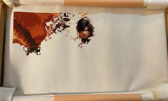
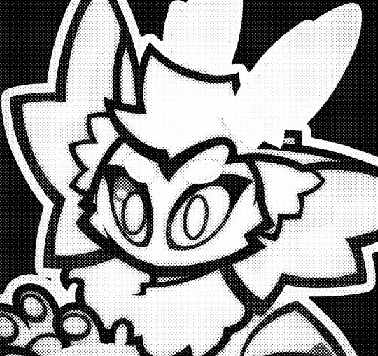
Started a huge full coverage cross stitch project, this is an amazing Final Fantasy XVI pattern by NeedleMinderLair on Etsy!
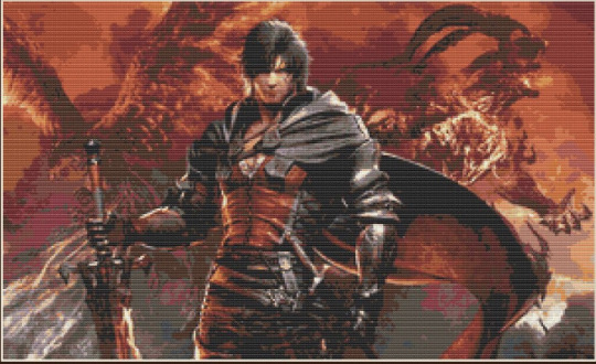
The final product will look like the below picture! You can tell where I got bored with Phoenix and wanted to move over to Clive haha 😅
#ffxvi#cross stitch#wip#final fantasy xvi#final fantasy 16#ff16#embroidery#yay another big project! not nearly as big as the gen 1 cross stitch thankfully haha#some of the colors are really similar but the effect is awesome
103 notes
·
View notes
Note
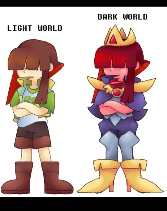
I was bored, so I decided to create Dark World versions of DR!Asriel and DR!Chara! (Even though they’ll never actually go to the Dark World in Twins Runes… but details).
Of course, since I love making my life more complicated, instead of just showing them to you, I’ve decided to write out my entire "creative process" as well.
Brace yourself, because this is gonna be loooong.
---
• Asriel
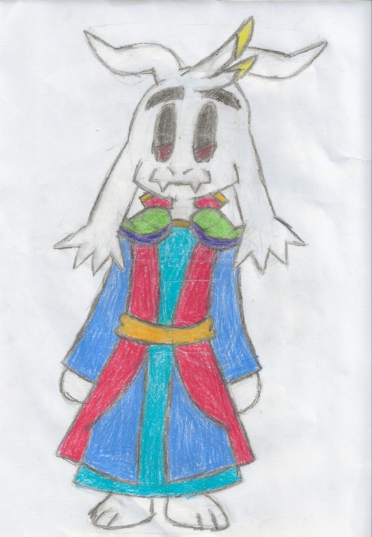
At first, I thought about making him look similar to Asriel from Deltarune Chapter Rewritten, adding a few details from an old Dark World design of Asriel you made a while back. It would have been simple, effective, and overall made perfect sense...
But obviously, NOPE.
Taking the easy way out? Couldn't be me.
So instead, I went for something a bit more "colorful", still taking inspiration from Asriel’s "God of Hyperdeath" version in Undertale.
For his class, I went with bard. Something like this:
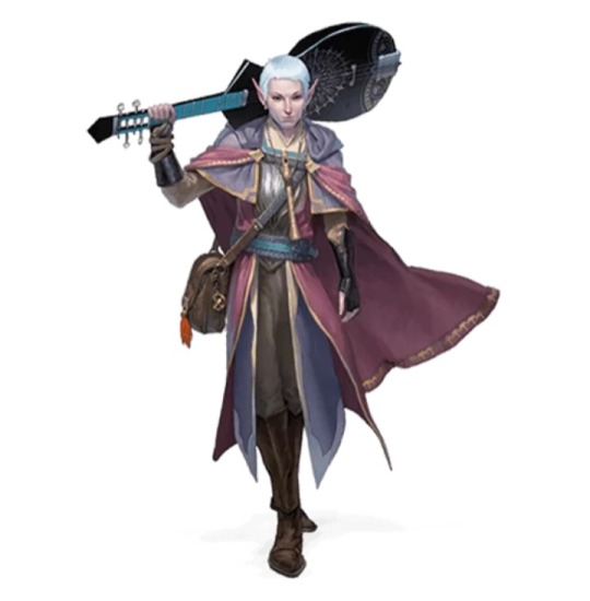
[Bard for D&D]
I don’t know why, but the idea of a bard in Deltarune has always cracked me up. Plus, I think it fits his personality as a "fake tough guy with a heart of gold."
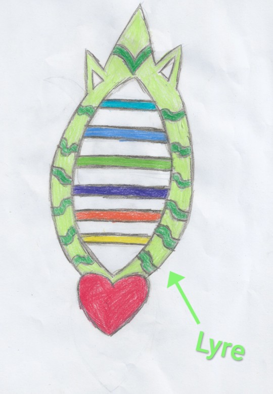
Now, onto his weapon. I took Asriel's Chaos Buster from his "God of Hyperdeath" form and turned it into… a lyre.
I know, not exactly a groundbreaking idea, but I can’t stop laughing at the thought of a lyre that, every time it hits someone, plays a dramatic music note… or maybe an electric guitar riff. I haven’t decided yet.
---
• Chara
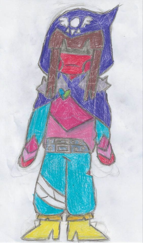
If I had a lot of inspiration for Asriel, Chara was a whole different struggle. There aren’t many reference images (and no, UT!Chara doesn’t count, because from what you told me, they should have a completely different outfit).
The only real starting point was this drawing, which was super helpful:
[By @Unabashedconnoisseurtwitt / @UCNSFW (One of these should be fine...)]
Aside from that, I had to improvise, taking inspiration from Deltaswap Kris’ outfit:
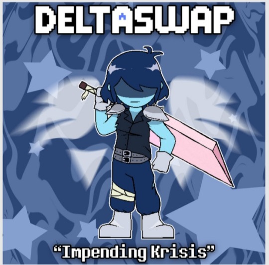
[By @panpan]
For their class, I went with thief/assassin (kinda like UT!Chara). Something like this:
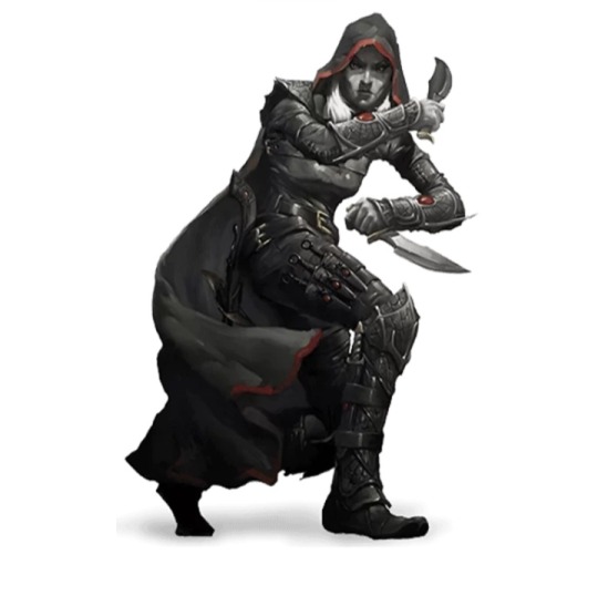
[D&D Assassin]
Now, let’s talk about their weapon.
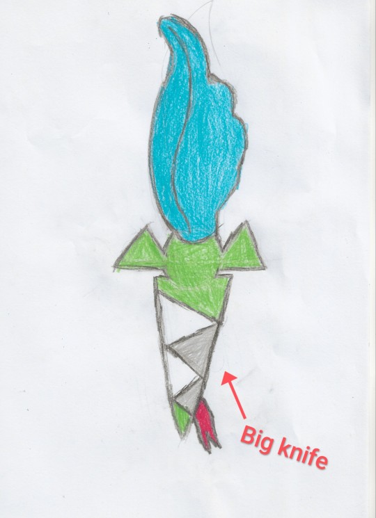
This part was easy: a knife.
But not just any knife.
A knife shaped like the Delta Rune. (No clue why, but I thought it looked awesome.)
I picture them having a dynamic similar to Susie and Ralsei in Chapter 1: Asriel happily playing music to spare enemies, while Chara… just stabs them repeatedly.
---
And that’s it! After months of pure artistic nothingness, I finally managed to draw something Twins Runes-related!
I really hope you like the drawings and that my endless explanation didn’t bore you too much.
Now, after this sudden burst of creativity, it’s time for me to disappear for another 3-4 months, just for consistency.
BYEEEEEE!
(PS: Thank you again for creating Twins Runes! It’s been forever since I worked on something this detailed, but your art really inspired me!)
These are really nice! I like the thought process that went into these! Really like the idea of turning Asriel's blaster into a lyre!
Funnily enough, I HAVE already created Dark World designs for these two, but never showed them off. Maybe some other day and definitely not under this ask. Don't wanna take away from your lovely fanart!
176 notes
·
View notes
Text
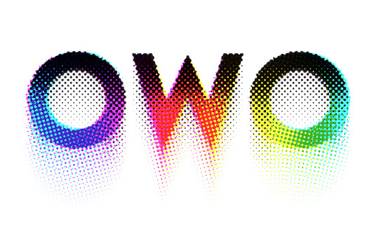
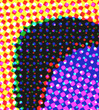
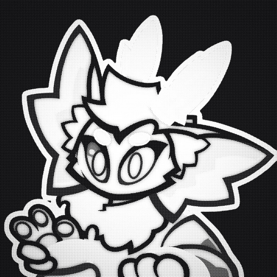
Was experimenting with halftone effects after watching this video and it almost has spiderverse vibes honestly. I actually learned some neat things about why printers use CMYK instead of just CMY so I thought I'd share !!
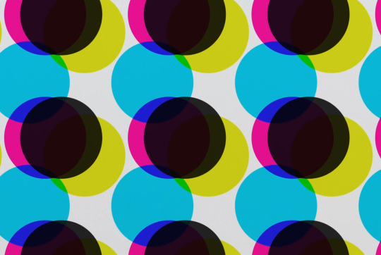
So in our optimal little computer space, Cyan (0,255,255), Magenta (255,0,255) and Yellow (255,255,0) all multiplied together gives us a perfect black (0,0,0) Awesome! The issue is that ink colors irl arent exactly perfect like this, and color is a bit more complicated irl compared to how computers represent it, so they aren't the greatest at combining into black if they aren't those perfect CMY values:
Left: CMY
Right: CMYK
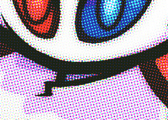

(thats not even black, its a dark blue in the original image but dark colors just look so much richer)
An important step to make sure you arent doubling up on the black values though is to divide the image by it's own "value" (the max of all 3 color channels) that way the value is equal to 1 everywhere, and you're letting the black ink take care of the value on its own.
Left: CMY (normalized value)
Middle: K (black)
Right: Combined


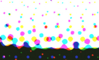
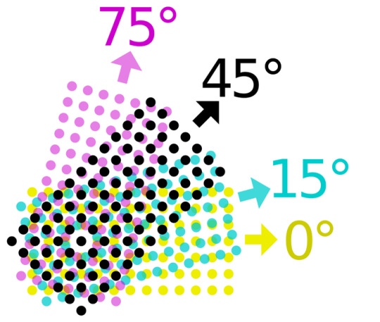
Now obviously the grids of dots cant be aligned perfectly with each other because you'd just get a bunch of black dots in unwanted areas, but if the grids are misaligned, then some dots become more prominent than others which tints the whole image. This was an issue because older printing methods didn't have great accuracy and these grids were often misaligned.
The solution was to rotate these grids such that they can move around freely while getting rid of that tint effect if they aren't perfectly aligned :D
(I have no idea how they came up with these angles but that might be something to look into in the future who knows)
SPEAKING OF MISALIGNMENT
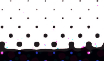
I wanted to implement that in my own filter to get some cool effects, and I discovered another reason CMYK is better than CMY for lots of stuff !!
With CMY, you're relying on the combination of 3 color channels to make the color black. This means if you have thin lines or just details in general, misalignment can make those details very fuzzy. Since CMYK uses a single color of ink to handle value, it reduces color fringing and improves clarity a lot even if you have the exact same misalignment as CMY!
Left: CMY
Right: You guessed it! CMYK


(yes these comparisons have the exact same color misalignment, the only difference is using a fourth ink color for black)
ANYWAY I just thought there was a lot of cool information in this tiny little day project, I also just think it looks really neat and wanted to share what I learned :3c


EDITING BECAUSE THERE'S ONE MORE THING I WANTED TO ADD
So, I talked about how to get K in addition to CMY instead of just CMY, but how exactly do you separate CMY from an image in the first place?
Well, CMY is a subtractive color space, meaning the "absence of color" is white, compared to RGB where it's black. This makes sense because ofc ink is printed on white paper. You can use dot product to get the "similarity" between two vectors, and this can be used to separate RGB actually! Using the dot product of a color and red (255,0,0) will give you just the red values of the image. This is cool though because if we get the dot product of our image and the color cyan (0,255,255), we can get the cyan values from our image too! If we first divide our colors by their value to separate the value from them, then separate CMY using those dot product values, and using K for our final black color value, our individual color passes end up looking like this:
While it's called a "subtractive" color space, I find it more intuitive to treat white as the absence of color here, and then multiply all these passes together. It makes it much easier to understand how the colors are combined imo. Notice how cyan is the opposite of red: (255,0,0) vs (0,255,255) and magenta and yellow are the opposites of green and blue respectively! This means you can actually kinda get away with separating the RGB values and just inverting some stuff to optimize this, but this example is much more intuitive and readable so I won't go too deep into that. THANKS FOR READING I know it's a very long post but I hope people find it interesting! I try my best to explain things in a clear and concise way :3

oh thank you I realized I should probably add an eyestrain tag
1K notes
·
View notes
Note
HEY HI HELLO
Sorry for the random message here In the asks, it's ok if you don't see this or answer it since you probably got a lot already and I understand if you don't see this!/gen
But first of all, I just wanna say
I CANT BELIEVE I HAVENT WATCHED YOUR ANALYSIS VIDEO SOONER IM SO FUCKING LATE MAN
It's so well done and so fucking funny, I was literally smiling and cackling through the whole thing, it's shocking how similar our humor is
NOT TO MENTION THE END SCENE AREE YOU KIDDING HOW DID YOU MATCH THE LYRICS SO PERFECTLY TO THE FUCKING LORE ITS INCREDIBLE 😭💜/GEN, POS
It's insane how much dedication is put into it, let alone singlehandedly feeding turbo fans as myself
Genuinely thought it's so nice seeing more content for a hyperfixation I've had since 2012, and the fandom coming back along with this video Genuinely brings me so much joy as someone who's loved this movie since I was a kid
Sorry for the ramble but genuinely thank you for making that video, I can't wait to see what other stuff you do, wreck it ralph or not I WILL be tuning in/gen, pos
Okay second of all
The main reason why I'm sending this is because of sometning I noticed while rewatching a scene in the movie
Now, this might be me over analyzing as I usually do but it feels TOO. OBVIOUS.
SO
IN the kart bakery scene where vanellope and ralph go to bake a kart, they obviously make their way into the building and into the main room
You see all the Karts of course, and It pans to the one vanellope chooses
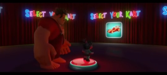
Which, at first glance you wouldn't really pay too much attention, especially when watching it for the first time, she's just picking the model she likes
..but looking back at the scene
Vanellope's kart model, how it was supposed to look, looks very
Familiar
Because the kart she chose..
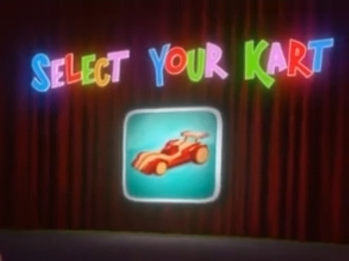
...is a red and white kart
With stripes down the middle, with a very similar shape to a..certain persons kart. Now this might just be nothing, it's probably just like I said, and over analysis on my part
But the kart the chose looks WAY too similar to turbo's, not to mention the stripe is down the middle, just like turbo's car on the cabinet art of him
And vanellope could've chosen ANY kart
But it was that specific kart she chose, out of any of the karts
Not to mention in some of vanellope's concept art...
(Art made by Lorelay Bove)
..Vanellope's concept design and turbos designs strike SCARILY uncanny resemblances to each others designs
From the helmet and colors
All the way down to her GOGGLES having the SAME. YELLOW. TINT. that candy's have in the movie, which have the same effect here. There's no way that this didn't have the intent to mirror turbo purposefully
So with that in mind, the kart vanellope chose in the kart bakery scene being turbo foreshadowing, wouldn't be too out of place, nor would it be too far off
Turbo's foreshadowing was always prominent, even in the smallest details you wouldn't focus on, just like he's infecting this world as a virus, little by little, everywhere. You. Turn.
Aaaand that's basically all I have to really say
Sorry for the long ramble, I've been thinking of submitting this for awhile now, especially after I told a friend about this and they mentioned that this should be submitted to you
So I decided to go ahead and just do it, no matter how wild my comparisons might sound-
Anyways, I hope you have a good day, night, or what time it may be, and keep being awesome! I can't wait to hear back if you see this! Bye-bye! ❤️🏎🏆
P.s
I've been quoting these since I watched the video and haven't stopped
Thanks for destroying my humor even more-/pos
Okay bye bye now-
-skitters away-
NO YOU'RE SO FUCKING RIGHT OH MY GOD VANELLOPE WAS ALWAYS A TURBO PARALLEL??? CHAT IS THIS TRUE. IVE NEVER SEEN THAT CONCEPT ART OF HER TEEHEE THANKS FOR SHARING
also God. This is 99% just a coincidence with zero merit because its such a common gesture- but Ralph and Vanellope doing their thumbs up.. maybe Turbo parallels ?? and like the EXACT same poses too:


Vanellope having one hand on the steering wheel and the other doing a thumbs up while facing the camera.


Ralph hunched over doing the double thumbs up with the visor tinting his face yellow. EXCUSE ME HMMM?? WHAT THE FUCK??
NOW COULD I BE CHERRY PICKING? PERHAPS. but when Turbo has barely a minute of screentime, there's not a lot i can pick from, and things SURE ARE LINING UP... (I'm cherry picking)
SO SHHHHHH... ❤️❤️❤️❤️ LET ME HAVE MY LITTLE CONSPIRASCY
#🎬#OK IM ACTUALLY GOING CRAZY NOW#ANALYSIS#OH MY GODF.#long post#turbo#wreck it ralph#vanellope#ralph#im. i cant ianymore#paralells#HES EVERYWHERE#OUHGHHHH HE'S SUCH A FUCKING CRYPTID#ask#also thank you for the ask teehee im glad you enjoyed :)#wir video
155 notes
·
View notes
Text
Late night talks~ ( ︶.︶) Zzz z
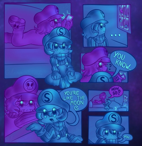

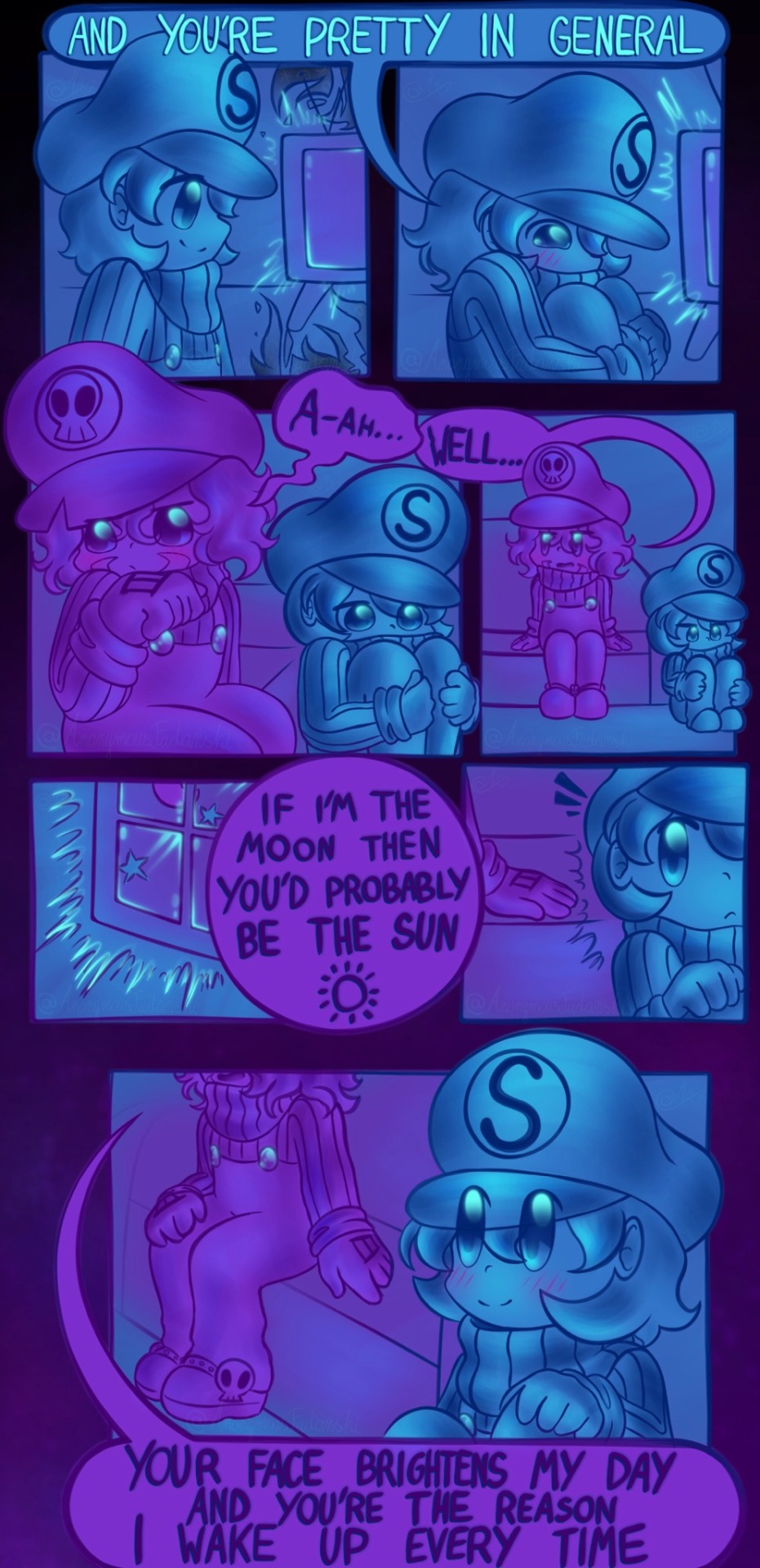
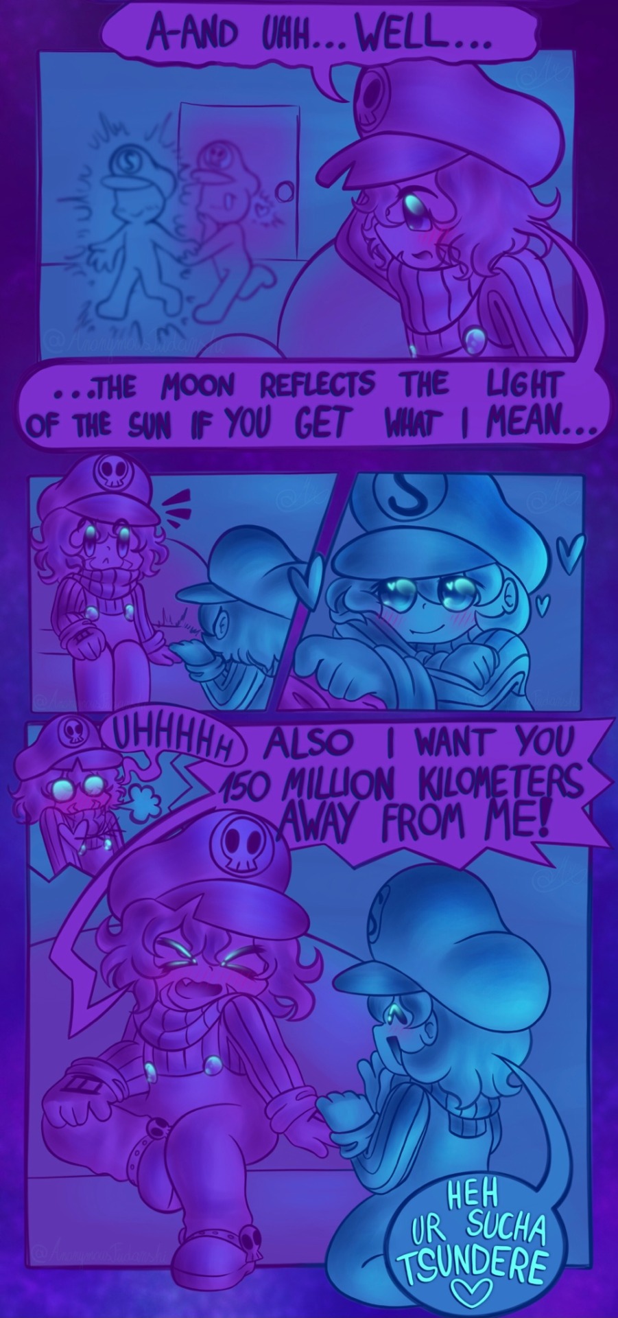
[Note: Sorry for how long this took to make >.<' Still I hope u like it :3 + Some commentary on how I made this below for those interested]
I was thinking for a long time. How do I make another super fluffy comic? Well at the early hours also known as 1:30AM on the 10th of January, finally a thought hit me. What if I made a comic based around the sun and moon ship dynamic? I wrote down the idea and decided I should probably write the script in the morning after I get some sleep + get access to my keyboard. That wasn’t what happened though. I wrote it all and then immediately went to sleep. Wanted to be ready for the next day if I was gonna be making this comic.
Woke up the next day and used ALL of the 11th on sketching out the panels. I was really happy with the script and my sketches so far so I was thinking: “Hey wouldn’t this be AWESOME if I made it super pretty and detailed?”. It would also allow me to convey some stuff better. The mood and atmosphere were something I really wanted to do well! However there was also a part of me telling me it would take superrrr long and maybe it wasn’t that good of an idea? I knew I could somehow work with a simpler coloring style and try to get a similar effect. To fix this conundrum I posted that poll :3
My anticipation to see the results was huge! But I told myself that I’ll be patient and see (I didn’t vote so I couldn’t see the votes). Never did I expect to get a total of 32 votes! That made me really happy =w=! With the final verdict set I finished the rest of the comic :)
Glad I stuck to my typical one color style >> Made this much easier to do + I like working with a small range of colors when it comes to comics ^^
294 notes
·
View notes
Text
look what finally remembered it has a tumblr account 💀 hi everybody
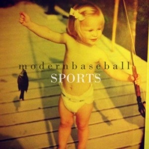
I drew a couple premades with colors based on albums that remind me of them, thought y'all would enjoy
nervous - who really cares (tv girl)
ripp - sports (modern baseball)
I ramble about them under here
janus shut up about tv girl challenge 💀 this isn't even really my favorite band lmfao I just feel like it suits nervous and pascal so well. there's this overwhelming vibe of longing in that whole album, like you had something wonderful and now it's gone and you're scared that that was the peak of your life, and it's all downhill from here. now it's just the memories and the bitterness and the things you left in each other's apartments. OUUGGH IM RGRGH AUGH
drawing-wise I like how nervous's drawing turned out. I have a tendency to absolutely destroy my colors and make them all muddy and blended so being limited to like five colors total and having to use the screen tones and dithering effects and stuff made it feel really... sharp, I guess? I don't like how it interfered with some of the details (like the face) but it was definitely a good way to tie everything together. main gripes with this one are the bandage on his leg (I know the blue is like symbolic or something but why is it so much darker than his skin it looks stupid) and the brick in the background because WHAT HAPPENED 😭 I finished this drawing at like 3am and I really thought I knocked it out of the park with that
ripp's is definitely worse though. the cover for who really cares is incredibly simple, but the one for sports is a whole picture, and I feel like I didn't lean hard enough into the yellows that dominate most of it. the piece looks nice, don't get me wrong; the colors are way richer than I usually would've chosen and it looks awesome, but... it doesn't look anything like the reference. which was kind of the idea. with nervous's, even though it's not incredibly similar to the album cover, you can see where I'm going with it. I don't think anyone would know that ripp's was based on the album cover unless you told them. I set myself up for failure the second I used more red/orange tones than the yellows and creams. whoopsie daisy I guess
I can't really pick out a single song that reminds me of ripp from this album, but I feel like the whole thing gives off "I need to get out of my hometown asap" vibes, as well as the weird awkwardness that comes with figuring out what to do next, which I feel absolutely screams ripp. go struggling small town boy! struggle to navigate early adulthood!
anyway idk I kinda hate both of them just because I've been staring at them for probably six hours combined and I'm about to explode
I might do more of these with other characters but there's not a lot of other premades that I associate with entire albums rather than random songs so idk we'll see
as a parting gift here's a shitty doodles of pascal and nervous as the dogs from twin fantasy by car seat headrest
(the words in the background are random lyrics from the album)
#sims 2#sims 2 premades#nervous subject#ripp grunt#I ain't tagging the bands I kinda don't want people to see this shit 😭 ESPECIALLY not outside of the sims 2 fandom#I could never explain this
85 notes
·
View notes
Text
Weird/random/obscure things I with were in Skyrim:
1.) Region specific fish. This already exists to some degree (only finding certain fish in cold areas/warm areas/underground) but I wish there were more. Like imagine fish specific to only Blackreach. Or specific to Solstheim. Specific to lakes and rivers vs the ocean (or rivers connected to the ocean). More variety of fish. Base game has 7 plus the fishing creation adds 22. The place I live in real life has nearly 250 species of fish, so there’s definitely some room for improvement. ESO has around 200 different fish you can catch, so it’s within the realm of possibility, although they reuse only a handful of the same models for all of them. I love fishing in video games.
2.) A more complex marriage/romance system. Wearing the amulet of Mara as a way of propositioning someone to get married is a fun idea and I think should stay, proposing to sometimes total strangers is a little weird. Most characters require you to do some sort of small quest for them (usually a fetch quest of some type), some require you to go through a series of quests (like Vilkas or Farkas, for example), but some don’t require any quest! And even then, I think it’s a little silly that someone would want to marry you just because you brought them a mammoth tusk (looking at you Ysolda). I think implementing some sort of affection meter would be a good way to make this feel more natural and realistic. Obviously, doing a quest for a person would boost this meter a lot, but other ways to boost it would be as easy as asking them questions, maybe speech checks, or giving them gifts (maybe having them have certain gifts they really like, ones they find ok, and gifts they don’t like at all). This way you could get to know a character some more before just going and getting hitched.
3.) Give the adopted children some more depth. All of the adoptable children have some sort of backstory that they mention (although they’re pretty generic and lack details). This adds the potential for a lot of depth. Getting to know the child you adopted, comforting them when they miss their parents, learning the things they like and dislike (similar to the gift system I mentioned before). Unfortunately, all sense of personality is forgotten the moment you adopt a child in game and they all become exactly the same, with all the same dialogue (dependent on the gender of the child). It makes it so there’s essentially no difference between adopting Lucia over Sofie, and not difference between adopting Samuel over Hroar. In the base game, they also all look the same, the only differences being hair style and color. The Nord children look like the Imperial children look like the Breton children look like the Redguard children. And there aren’t any elf or beast children you can adopt.
4.) Things happening without the Dragonborn directly being involved! Particularly the civil war quest-line. I think having it set up on a sort of timer system would be awesome. If after (x) amount of in-game days pass, and if the player hasn’t interacted with the Legion or the Stormcloaks, then the first quest is “completed” without the Dragonborn being involved. Maybe it could be random which side “completes” the quest (like for the first quest, which side gets the Jagged Crown, or which side takes a fort, etc.), or it could be based on whether you join Hadvar or Ralof in the beginning (adding some utility and plot reason for who you decide to go with, and then you could still choose who wins the war, without having to get involved). We also should see the effects of this in the game world. In places where either side has recently won a hold, there should be soldiers patrolling. Maybe being able to witness fights between Legion and Stormcloak patrols. Another good questline where this could work would be the Dark Brotherhood. If you don’t go and find Aventis Arentino after (x) in-game days after hearing the rumor about him, then the Dark Brotherhood will find him and kill Grelod. Obviously some quest-lines require the Dragonborn, but not all of them, and it would be interesting to see the world moving forward around you.
This is not an all inclusive list, this is just some thoughts I have. I’d love to hear some of y’all’s ideas! Also, I recognize that a lot of this stuff would be incredibly difficult to actually implement, this is just my sort of dream ideas of an ideal world!
#skyrim#tes#tesblr#tes v skyrim#tes 5 skyrim#stormcloak rebellion#dark brotherhood#skyrim dark brotherhood#splat speaks
15 notes
·
View notes
Text
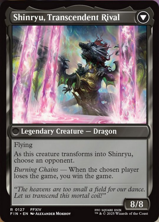
MTG x Final Fantasy Card Discussion (Pt. 3.1 - Zenos Yae Galvus // Shinryu, Transcendent Rival)
WHAT THE FUCK IS HAPPENING?! I go out with my friends for the night and the official FFXIV Twitter account suddenly drops a Zenos spoiler??? We aren't even in spoiler season, that's after the debut, which is in 3 days! I guess it is just time for MMO reveals, since they can't participate in birthday reveals? Oh well, let's talk zbout Zenos Yae Galvus. Also, this post is titled 3.1 since it is an update to the mono colored cards of the main set, which was part 3. Shantotto was 4.1 since it was an update to the multi colored cards of the set and Tifa was 2.5 since it was an update to the commanders of the commander decks, one that I'm also confident we won't have another update for.
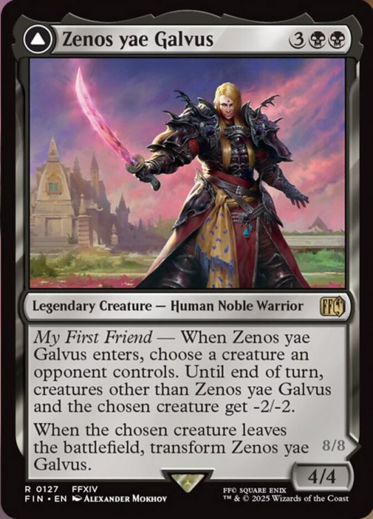
So, let's start with color identity. Mono Black is interesting. He was definitely Black aligned in some sort, since his sole motivation is for us to become as strong as possible so that we, the Warrior of Light from FF14, can give him a challenge and that he might finally transcend and be pushed again in life, since he doesn't care about literally anything else but that, even going far to protect us from potentially dying by anyone else's hands other than his. There is an argument that he should've been Black/Red, but he's not really Red aligned outside of the Warrior of Light and their continued existence. Aside from that, he's cold to basically everything else that exists, where Red is a lot more passionate about everything.
Well, let's get to the card. 5 mana for a 4/4 is a little below rate, but nothing too bad. Now the ability. Really, it is just one. When Zenos enters, you choose a creature that one of your opponents controls. Until end of turn, every creature that isn't Zenos or the chosen creature has -2/-2. Then, when the chosen creature leaves the battlefield (not just dies, exile counts!), Zenos transforms. So, let's review this side. 4/4 is fine for combat stats, you probably want an ability with it like Menace (though that's a bit counterintuitive with Zenos being the way that he is) or Deathtouch seeing as he's 5 mana, but it's not bad for it is. The ability is just freaking badass. You choose your "friend" and kill/debuff every other creature on the battlefield until end of turn. Then the goal is to hunt that friend down, get them off the battlefield and transform Zenos. This is so cool and a full thematic home run for Zenos.
Then we get to the flip side: Shinryu, Transcendent Rival. An 8/8 flyer that asks you to pick a new "friend..." or shall we say, a rival. That rival is an opposing player. When that player loses the game, you win the game. This is also awesome. Even as Shinryu, Zenos is still wanting to challenge his "friend," the only one that can give him a challenge and when they lose, he wins. It's the endgame, there is no further goal. Love it, love it, love it. Stats wise, it is a big scary dragon that flies. It will definitely be prime target for removal, so try to flip Zenos as late as possible or even have him on the battlefield as late as possible. Or have ways to protect him, like via equipment or auras.
Now, let's talk about this card. This is so hilariously a commander card, it isn't funny. The front side isn't too bad and works in 1v1 formats, since it is a Massacre Wurm like effect, similar to Sephiroth, Planet's Heir as well, and you can always target a super easy to remove creature. The backside just becomes a 8/8 flyer in a 1v1, since that ability means you win the game when your opponent loses the game... which yes, that is how a 1v1 format works. It's still an 8/8 flyer, which is scary and if it gets flipped before your combat phase, taking 8 damage is no joke, but still. It transforms from a very interesting card to just another scary flyer, which you have enough of, just look at most other dragons. In commander, this card is at its peak. However, like I said at the end of Shinryu's section, you will need to bring some sort of protection for him, since this is definitely the type of card you have to remove, even if it isn't the commander (hell, even more so if it isn't the commander, since exile then means permanently gone).
Now for the art. Credit to Alexander Mokhov. Link to his ArtStation. Let's start with Zenos. Fantastic background, very colorful and full of contrast (something FFXIV funnily enough is kind of bad at still) and Zenos is mostly looking great. The only thing is that his face feels a bit off, but it's a relatively small detail on an otherwise great art piece. I would say that I'm missing his katana barrel, but he actual ditched it right before he transforms into Shinryu. Speaking of, let's talk about Shinryu's art. This is just awesome. Everything is so on point, even having the arena of the third phase of the Normal version or the first phase of the Extreme version. Him doing, what I think is, Judgement Bolt is also so cool. This art is just fantastic, I have no notes. Well, maybe a slight note: his arms look really derp-y. They seem to just be flailing around, which is funny, but not entirely in character for Shinryu, haha!
As for the alternative art, since of course my man gets alternative art:
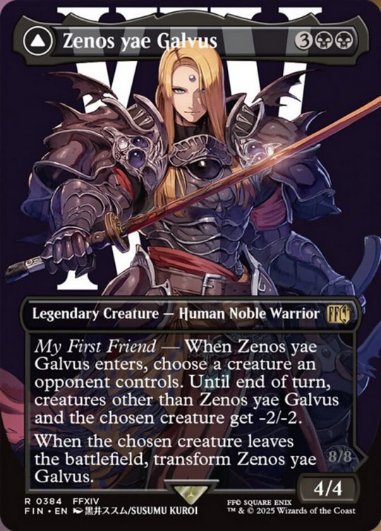
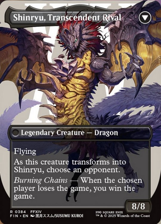
Credit to Susumu Kuroi. Link to their pixiv. So, aside from the blank backgrounds, which admittedly aren't as much of an issue since both of these arts are wide: HOLY SHIT, ALL OF MY YES. This is phenomenal. Even having Shinryu's tail go so far it goes into the background is such a good detail. Everything here is on point, they look incredible. Their posing is great, though a little boring in Zenos' case, though that also isn't out of character for him since he is about practicality... of being better than the Warrior of Light. These are just incredible, genuinely no notes, these feel like they could've been official FF14 art at some point.
And that's it... I think. Maybe we'll be back tomorrow, even though that would be incredibly stupid, we have the debut in less than 3 days at this point. Just leave until then. Full blown spoiler season will be right around the corner at that point anyway, if not outright starting on the same day. Anyway, thanks for reading and have a nice day o/
#mtg#final fantasy#mtg x final fantasy#card discussion#art discussion#woo zenos yae galvus#zenos#ffxiv#ff14#zenos yae galvus#shinryu
8 notes
·
View notes
Text
Into the Maw: Flavorful Land Runners-Up
Our runners-up this week are @nine-effing-hells, @reaperfromtheabyss, and @sparkyyoungupstart!

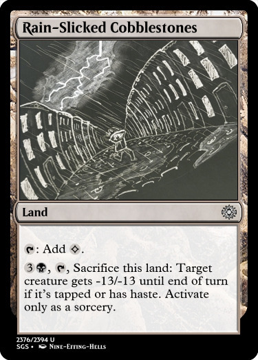
@nine-effing-hells — Rain-Slicked Cobblestones
Removal lands, how we love the. I imagine that this could be part of a cycle in a noir setting, where each land has a sacrifice punisher effect. -13/-13 is substantial, but at the cost of a land, and it's a great threat to leave up. I think that Battle for Zendikar did a similar cycle of lands, and those were awesome for limited IIRC, though some more than others. This one is pretty great, a threat to catch someone unawares. Black caring about tapped creatures is old-school but in a good way, and the -13/-13 is another callback that takes out some of the largest stuff but in a flavorful way, and I think is under-utilized a lot of the time. Indestructible is a heck of an ability. I wonder how necessary the sorcery clause is on this one, honestly, especially considering that the flavor implies something a little speedier.
And my goodness, the flavor of this card is phenomenal. I'll be honest on top of it: the art is gripping me in a way that makes me ask: where the heck have you been hiding this from us? I love this sketch and it makes me want to go back to New Capenna, but in a less glitz-and-glamor sense and more of a gritty demonic horror sense. Wouldn't that be phenomenal? Something that makes you slip and crack your head on the stones, something that's definitely an accident, something that's definitely not the result of sinister forces making you pay for snitching, and that's what snitches get... Like, come on, it's so cool! This card's got an insular, claustrophobic vibe that trips up those unaware, and you really executed the whole presentation in a way that makes me smirk into my glass of scotch. Except not, because it's nine in the morning and I gotta drive today.

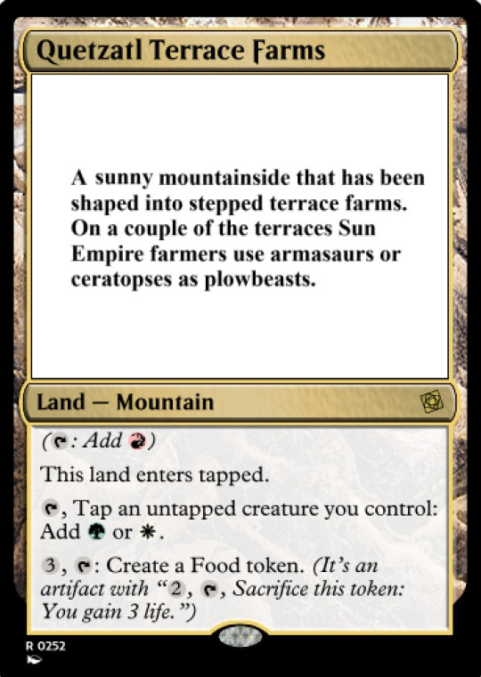
@reaperfromtheabyss — Quetzatl Terrace Farms
There were a few lands that worked with Food this week, but ultimately, I think that this one enamors me the most. As a fetchable utility land, it's pretty powerful, and I might even suggest that the Food-making ability have some manner of restriction (also tapping a creature? Activating only if you have tapped creatures?) to ensure that you don't get a wild amount of token value; Fountainport has already shown us how wild that can be. Color identity would also suggest that this "Mountain" should have some utility outside of being a mono-red lifegain land, and if I had any real mechanical qualms, that would be it. Limited would devour this thing (no pun intended) as a table-turning control piece with the amount of life you could stall out with each turn. If you imagine this as a colorless zero-cost permanent that entered tapped but had "{5}, T: You gain 3 life"—you see what I mean? It's an interesting balance question.
It's the way that this land comes to life that really gets me. They cut into the mountain and they make food—it's perfect. Harvesting life, the heart of civilization, a people in their element... I think this is a beautiful execution of the prompt. I love how you got the colors of the Sun Empire and the dinosaur connection and turned it into a land that makes sense, not necessarily for the associated mechanics, but for the feeling of the people that would live on that land and harvest it. That's the coolness of this, isn't it, the fact that you can demonstrate an entire other part of Magic's lore, not through a magic-strewn battlefield necessarily, but through the ways in which the world is made more whole. It's quite interesting to me.
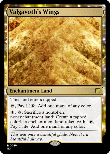
@sparkyyoungupstart — Valgavoth's Wings
Mechanically, of course, this card is a pretty grotesquely fun way to trigger enchantments entering every turn, provided that you're willing to sacrifice your lands. I know that some players at our LGS are land afficionados, and Crucible/Ramunap plus everything here...yeesh. It's awesome, really, because they're not untouchable and a single Paraselene will make things fairly miserable if you overreach, but isn't that the point of that fragility, somewhat? The sacrifices that you make end up biting you in the end. And maybe they turn your lands into Mana Confluence. I mean, that alone is pretty wild, isn't it? Mana Confluences every turn at the cost of a land makes fixing negligible, but the eventual cost wears away at you. Is it worth the Eerie/Constellation triggers? That's for the Enchantress player to decide. It's pretty cool.
Admittedly Duskmourn was a pretty cool concept as well, at least to start. I'll withhold my opinions on cheerleaders and phones later, but regardless, the name of this land? Perfect. Like, that alone is exactly the kind of sinister encompassing that was meant to be shown throughout the story, that spreading terror, that strange and sinister warping of the world. This card makes the player feel, in some way, that they're getting the demon's power by way of utilizing their lands, turning them into semi-everywheres, turning them into horrible mirrors of what was once, as the flavor text puts it, a beautiful glade. It's the two-sentence structure of the FT that kinda stumbles me, honestly. "Once a beautiful glade, now an endless hallway." could've worked fine, or something along those lines, but I feel that it eschews poesis for something that tries to be malevolent? I don't think it's quite there, but the strength of the land saves it for sure.
We've got a lot of work to do today at the shop, but I'll commentate as we get there <3 Thank you all once more for your entries!
@abelzumi
#mtg#magic the gathering#custom magic card#inventor's fair#commentary#runners up#flavorful land contest
9 notes
·
View notes
Note
3, 7, and 12, mista and fugo :3
TONY UNSHADOWBANNED PARTY I know this was from a month ago but I'm gonna answer it anyhow lmfao
(For this ask game)
3. Least favorite canon thing about this character?
For Mista, the Trish cleavage scene. You know the one. I don't think I have to explain this much. Boy Why Did You Do That. The only good thing to come out of that scene was jaunty jigglesacks + overeager horndog insane psychic damage combo of lines in the dub.
I could take this a lot of ways for Fugo tbh. Because there's a lot of things that drive me insane about him as a person, but looking at him as a character, I LOVE that he's rash and hurts his friends and his defining character moment is him making a selfish, cowardly decision. I guess I'd say his misogyny in Purple Haze Feedback? I'm admittedly a believer that, yes, he would fucking say that, but it sucks that he would. At least he gets better by the end lol. Fugo voice I'm sorry women Sheila E is me
7. What's something the fandom does when it comes to this character that you like?
I love that Mista has been designated Beautiful Brown-Eyed Bisexual Man by literally the entire fandom. Bi Mista brings us all together. And I do like the idea that his queerness is something he discovered much more slowly, and as a direct result of the gang. Something about that really ties in with the idea of the Bucci Gang as less of a realistic gang, more akin to a drag house or similar queer pseudo-family. Credit to that concept to Fox figcookie01 btw this is one of my favorite Vento Aureo analyses ever and it really informs how I conceptualize the Bucci Gang. Anyhow.
I also really like when people actually take care to explore his character and make him a very distinct, smarter-than-he-looks, older brother-type figure. It's really interesting when people explore his spirituality, too, whatever religion that may be, because that's a pretty important part of him. AND also OCD Mista truthers who know when to treat his superstitions and compulsions with some weight I love you forever. I think he's a character that gets watered down in fanworks a lot, but when his characterization's good, it's really good. There's plenty of artists and writers that have really blown me away with their Mista (and I say this as someone who's picky about characterization lol)
With Fugo, first of all. The PHF scars. Another thing that Mandela Effected the PHF fandom, but it's so so important to me. I love you physical, tangible, blatantly visible proof that Fugo has grown as a person since the day he abandoned the gang. Awesome. I also like that people mix and match his manga/anime colors, and every artist kinda draws him in a different way.
My favorite thing is probably the Fugo-Abbacchio stepkid and stepparent/siblings/Big Goth and Baby Emo Who Secretly Looks Up To Them dynamic. It’s awesome when it’s cartoonishly antagonistic and it’s awesome when it’s actually very sweet and heartfelt. Out of all the Bucci Gang dynamic interpretations the fandom’s produced, theirs is one of my favorites <3
12. What's a headcanon you have for this character?
SO MANY FOR BOTH OF THEM LOL. But I’ll try to list some I don’t talk about as much.
Besides The Carpenters, Mista’s a big fan of folk, acoustic singer-songwriter pop, and soft classic R&B/gospel. Artists with really strong voices tend to catch his attention. The Mamas and the Papas, Sam Cooke, Marvin Gaye, Simon and Garfunkel, The Seekers, and Gordon Lightfoot are some of his favorites. He’s also just a big sucker for love songs in general, and the hopeless romantic in him loves old girl groups like The Ronettes and The Shirelles. He’s also very much Schrödinger’s Guy to me. Cis? Trans? Who knows. Depends on what the situation calls for (though more often trans to me as of late). He’s just Some Dude.
Fugo’s a surprisingly good singer, but he’ll rarely do it if he knows other people are listening. A lot of times, he’ll sing in the shower, or when he’s alone in the car. As he gets older, he gets less self-conscious about it, and he’ll sing around the house when he’s with Giorno, or do duets with Mista for fun. There are also very much timelines in the Vento Aureo Multiverse in my brain where Fugo’s transfem. This also tends to coincide with transfem Abbacchio timelines, so there’s another layer added to Fugo looking up to Abbacchio, and I think Giorno (always transmasc to me) is really instrumental in helping her work through things and take pride in her transness. Maybe a little bit of a self-indulgent fluffy comfort hc that helps me work though my own genderisms lol
#ohh i missed my guys <- thinks about them every day#i need to talk about mista fugos more. blog policy everyone can send me mista fugos asks anytime btw.#jjba#jjba headcanons#pannacotta fugo#guido mista
26 notes
·
View notes
Text
Personally, I think that being able to enjoy creative media for what it is despite its flaws is a skill that is increasingly lost on a lot of YouTube film-discourse influencers and their fandoms. I'm specifically talking about movies and shows here, but I suppose this can be applied to other mediums as well.
Not everything needs to be a masterpiece like Arcane, Avatar the Last Airbender, Lord of the Rings, early Game of Thrones seasons, etc. in order to be good or even enjoyable. Like, I don't need all of my favorite pieces of art to be S tier all of the time.
Two specific examples on my mind are these: James Cameron's Avatar franchise and the Dragon Prince series. Yes, trust me... I am WELL AWARE that both of these things are flawed, and yet I thoroughly enjoy them.
"Oh my gosh, it's just Pocahantus in space with smurfs LOL!"
.......So? I don't know how to tell you this, but a lot of science fiction is essentially "What if X, but in space?" Yes, Avatar is not subtle about this, but taking inspiration from other things is not inherently a bad thing, nor is it plagiarism.
Further, simple story =/= bad story, and I will die on that hill!
(Side note, I do find it funny how it is often compared to Pocahantus, Dances With Wolves and Fern Gully all at once, none of which are the same story, but I guess being similar to all three things at once means....... unoriginal plagiarism? Dude, plagiarism is not just being similar to or taking inspiration from something. Also I'm beginning to wonder if the people parroting this tired meme have actually even seen these movies. Sharing tropes does make them the same thing!)
"Dragon Prince tried too hard to be like ATLA, and the Raylum romance was so stupid!"
And yet, many of its most vocal critics shat on TDP precisely because it was't as good as ATLA. They wanted it both ways. They wanted it to lean in to being its own thing, hated the ATLA Easter eggs they threw in (which I admit got kind of old), but also whined that "ATLA was good because X, and that's why TDP is bad!"
So which is it? Do you actually hate TDP this much, or are you viewing ATLA with rose colored glasses?
Like do people forget that ATLA had its own flaws? I'm sorry, has its place as a masterpiece in popular kids shows caused us to be uncritical of what it didn't do well?
Because personally, I didn't find the romance between Aang and Katara very convincing. Just because the writers had more time to (sort of) develop it doesn't mean it still didn't feel like it was just another "oh these two main characters MUST be love interests because reasons!" to me.
This is to say nothing of ATLA's pacing issues, which were to me most notable in season 2 and some of season 3.
But many of the issues with both these series boil down to not the writers themselves, but to the constraints their networks put on them. AND YET they were still able to pull off some pretty awesome story telling in both cases.
Like, yes blue people Avatar doesn't have a complex story, and has problems with how it portrays indigenous peoples/issues. I still like it.
Yes, it's mostly good for the visuals, and you know what... that's awesome! The realism is organic, grounded and immersive, which was a major departure from what other 3D movies were doing at the time the first Avatar came out. It's not just flashy CGI, it's flashy CGI used to tell a coherent story. Visual storytelling is a lot harder to pull off than people think, and there is just some really amazing visual storytelling in those movies! I love how behind the scenes there was a lot of world building that you can dig into if you want. But in the movies themselves they give you just enough to make it feel real, while also leaving enough room for you to insert yourself into the journey. In that way, the world building is almost like a drawing that looks hyper realistic, but on closer look the line work is very sketchy, but it's done so effectively that it gives your brain just enough information to fill in the rest. You can lose yourself in the beauty of the world, while be confronted with heavy topics of war, colonialism and environmental destruction. I look forward to how it will push the envelope with that juxtaposition in Ash and Fire. Yes, it's simple... but simple can still be good.
Yes, TDP didn't use the time it was given very efficiently, and ends on an unsatisfying note. I still like it.
Yes, there are some pacing problems, underdeveloped concepts, and wasted plot points. There are also some really profound overarching concepts, like forgiveness, breaking cycles of violent retribution, healing, etc. that I think it handles very well. I love how the cycle of retribution all connects back to Aaravos' quest to watch the whole world burn. No, I don't like how ham-fisted the fallout between Callum and Rayla was in season 4, but I loved how they built up to their resolution in season 6, and how it in turn contrasts with other characters' desire to hurt those who hurt them. Honestly, I think the issues with Rayla/Callum and Aang/Katara have more to do with romance just not being these writers' strong suit. But you know what they are great at? Making quirky, multi-layered characters whose growth is driven by navigating high stakes inner and outer conflicts. Creating unique magic systems. Writing dynamic redemption arcs (I really like Viren's redemption arc, there I said it!) Balancing dark and lighthearted tones. Making a series work despite stupid network constraints. None of these things are small feats, and I really wish they were given more credit for the things the TDP did right! You don't like the hanging plot threads? Tell Netflix to green light more seasons then!
The harsh judgments levied at both of these IP's seem to boil down more to what these critics' expectations were. They wanted it to be something else, but because it wasn't that, it was therefore bad.
I'm not saying there's anything wrong with not liking something because you were disappointed with the direction it took. I'm also certainly not saying there's anything wrong with disliking either of these works. Art is subjective, and you are entitled to your tastes.
But there's also something to be said about just letting a movie, show, book, or whatever be what it is, and judging it on its own merits, rather than comparing it to something you think it should have been instead.
It's a skill sorely lacking in popular film discourse these days. Negatively sells, sure. But don't just consume the reasons why X is bad. Challenge yourself to look for reasons why X might also be good.
#film discourse#rambling thoughts#James Cameron's Avatar#the dragon prince#the last airbender#film criticism#don't let the nuance die#a thing can be flawed but still good#you don't have to like everything about something to enjoy it
3 notes
·
View notes
Text
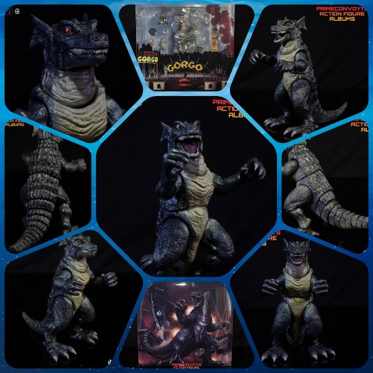
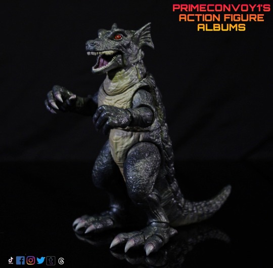
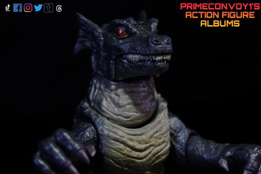
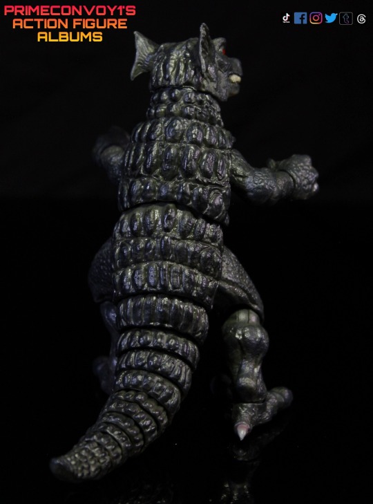
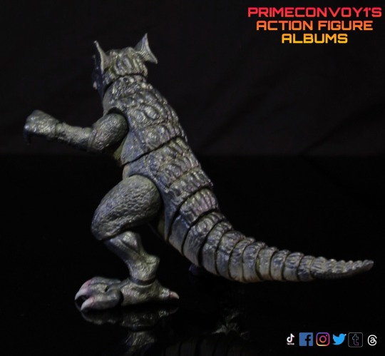
In action today is the Titanic Creations Gorgo figure set, based on the 1961 kaiju movie Gorgo, which I enjoyed watching on a Saturday afternoon as a kid.
This was a crowdfunded project that met all its goals to get produced, and I believe this is the first time we have gotten an articulated Gorgo in plastic form.
Sidenote: I know the larger figure (Gorgo's mother) in this set was called Ogra in the movie, but I'll be referencing it as Gorgo and the smaller one as Baby Gorgo.
The Gorgo set comes in a deluxe see through display package designed and illustrated by Matt Frank .
I love the presentation with the packaging, including the awesome illustration of the monster on the back. The art also shows a burning city backdrop with some nice art references of Dorkins circus that held the baby captive in the movie
You can also see all the content of the set, since the packaging is clear plastic.
Be mindful that some of the accessories can come loose inside the package. The small jet plane accessories sometimes fell behind the larger figure if the interior plastic clamshell is not closed properly.
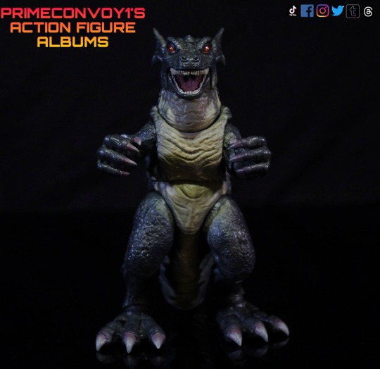
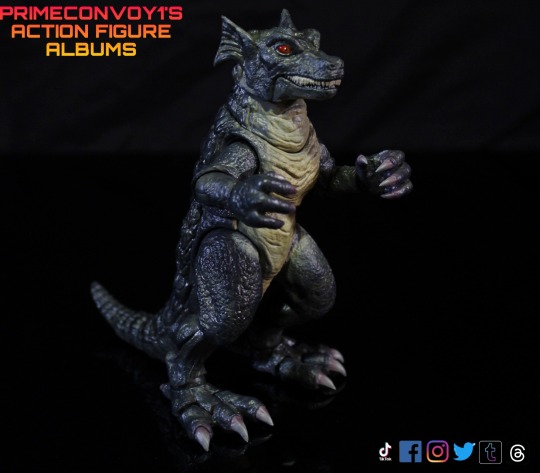
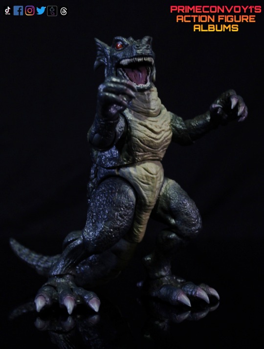
The main Gorgo figure was sculpted by @d0pep0pe and does an amazing job representing this kaiju.
Gorgo has ton of nice details including sculpted scales, wrinkled skin, and very crocodile like features going from its head down to the tail.
The face sculpt captures the beast well with its ferocious looking design. I especially like the detailing with the ear fins.
Gorgo stands a little under six inches tall when fully posed.
Titanic Creations suggested the figure had 26 points of articulation, but after fiddling with it, I found 39 points, if you count the 11 segments in the articulated tail. That's a bold amount for a company that is putting out a posable figure like this for the first time. Well done!
Gorgo can get into some decent poses, but the toe articulation isn't that strong to hold up the figure, if you're trying to get Gorgo in more dynamic poses. (Recommend squeezing the the front toes together where it plugs into the rest of the foot to help with a tighter joint.)
Gorgo also come with an alternate head that is the same sculpt as the default head but with brighter red glow-in-the-dark eyes! The feature does work, but the glow effect only lasts for a brief time after placing it in direct light.
I use this head as my default head, as the eyes pop more in my display.
Gorgo is done in a dark green color with beige paint going down to the front of the figure, it's underbelly, and underneath the tail.
She also sports some dark grey washes on the faces as well as the scales on the back of the figure. I really like how this fleshes out those sculpted details!
Gorgo comes with some sweet accessories that were unlocked tiers during the crowdfunding campaign.
First up is the Big Ben clock tower accessory to help recreate the iconic scene the movie.
Big Ben is painted mainly in gold which brings out those sharp lines on the building. The accessory also has some claw mark scratches sculpted into it.
Big Ben also has a break away feature, so the top of the tower can be removed.
The next accessory is the small bell sub, which appears to be painted brown and has a few sculpted details.
Next up are the jets and stand. The set comes with 3 jets sculpted in either soft grey plastic or rubber. The cockpits are painted black, which is a nice detail.
To display the jets, while fighting Gorgo, the jets come with a single round base and three black bendy wires that plug into the base and the bottom of the jets.
This was probably the weakest part of the set, as the wires don't plug into the base well and not much better into the jets.
There's also a bit of balancing act to keep them stable, once you do get them on the stand.
The final accessory is the Baby Gorgo figure, which stands a little under 2 inches. It's a static figure with no articulation. Sculpt is well done with similar paint apps to the larger Gorgo figure, just not as extensive. Even the red eyes turned out great, which is impressive for such a small figure.
Overall, I'm really pleased with this figure, and give kudos to the creative team that worked on this!
I look forward to your next kaiju endeavor!
On to pics, Primers! Will post more pics shortly.
#gorgo#titanic creations#Godzilla#kaiju#toy photography#actionfigures#toy artistry#toy photoshoot#action figure#action figure photography#toy photos#gojira#ultraman#articulated figure
20 notes
·
View notes
Text
OC Questions tag game (a-cosmic-elf questions answered)
I was tagged by @a-cosmic-elf in the oc questions tag game (answer 3 questions given in style of your OC then give three new questions to tagged people) I'm going to answer the three given me in with all 4 of my ocs as they are a really great way to develop them! - Seren Jones, Aeryn Ryder, Zofie Orel and Kiara Black
Since this is going to be a long post, answers behind a cut!
And I'll tag @vorchagirl @despicablediet and @bearlytolerant @staticpallour @fangbangerghoul @a-cosmic-elf @atonalginger @eridanidreams @toxiclizardwrites @therealgchu @aro-pancake with these three new questions to answer, no pressure though!
-Is there anyone famous you'd love to meet? -What is your favourite season (or weather if you don't have seasons)? -Is there anything physical you'd change about yourself?
First up Seren Jones (My Starfield Coemancer Starborn)
If you had a YouTube channel, what would you make? "Youtube? Oh viddocs? I dont think I'd have a 'make' channel. Mine would probably be a vlog of my exploration. I see so many incredible things when I'm exploring places I'd want to share that. I already take so many photos, so I think yeah, think I'd like to do something like that." Have you ever dyed your hair, or got a radical haircut? "Before I became Starborn, my signature color and cut was a silver pixie hairstyle. But after a few universe jumps I wanted to get away from that look and find a new one as I'd kinda let myself go and it seems hair just keeps growing no matter what. So I went to Enhance and I got it dyed this bright teal blue in a sort of short bob. Don't know how long I'll keep it, who knows. I know a version of me had much longer hair similar in style to Andreja's and it looked good, so maybe I'll try that when I finally settle down again." What’s the worst book you’ve ever read? "Carrie of the Cosmos. I'd read everything at a mining dig on some backwater moon I can't even remember the name of now and that was left. It's so cliched and predictable." Next - Aeryn Ryder ( My Mass Effect Reyes Vidal romancing Pathfinder)
If you had a YouTube channel, what would you make? "Video documentaries huh? Not sure what I'd be allowed to do considering how Tann rode Keri's ass on her documentary. Maybe 'how to maintain your armour, no matter the environment' type thing or... 'The beauty of Kadara for non exiles who want to visit'....Maybe I do want to piss Tann off." Have you ever dyed your hair, or got a radical haircut? "My hair is bright highlighted blue and purple already! Had that since I was blacklisted by the Alliance and thought fuck it, let's do what I always wanted but never could before. Luckily I can keep it like this as the angara have these awesome dyes that Lexi found are safe to use on human hair!" What’s the worst book you’ve ever read? "I actually don't really read books...not novels anyway. I never have time to really focus on one for long. I liked some of the asari mythology books I used to read, so I guess those."
Next Zofie Orel ( Deus Ex/Assassin's Creed OC)
If you had a YouTube channel, what would you make? "Oooh in another life, one where I don't have to not make myself too known, I could do one of those hands visible only jewellery making shows. The camera would be on my worktop and I could show the intricacies of working with silver and gold." Have you ever dyed your hair, or got a radical haircut? "When I got augmented, they had to shave my head to install the brain implants and I decided then to change up my look as my mousey brown hair was just too boring. I love red so picked the brightest I could find and have had this colour ever since and no damn Templar Hunter is going to get me to change it!" What’s the worst book you’ve ever read? "I read this trite publication about Hatshepsut, that was obviously written by a historian who didn't like his theories being proved false by new evidence. A common thing with historians I've found. 'Cant possibly agree with that, my book says otherwise.' Thankfully the new evidence that was found proved he was talking out of his arse." Lastly Kiara Black (My Thief/ Dishonored OC)
If you had a YouTube channel, what would you make? "What is a You...tube... channel? Huh... I wouldn't want to ever appear on a recording, thanks." Have you ever dyed your hair, or got a radical haircut? "Oh I once cut my long...long hair short with a pair of my father's sheers and nearly gave my mother a heart attack. All because I wanted shorter hair and she told me no. After that she took me to a barber and made him cut it into something 'feminine'. I watched that man like a hawk and since taught myself how to cut hair properly I've let it grow since then, but I mostly keep it braided back. With what I wear now, I might cut it again as the braid sometimes gets itchy against my neck. But dyeing it? My hair is black, almost blue-black, so no way would I dye it." What’s the worst book you’ve ever read? "The Seven Strictures...Militant religious doctrine masquerading as guidance."
4 notes
·
View notes
Note
i've been stuck in bed for a while with a perennial fatigue issue and it's nice to have your fics to read. not a lot of fic out there where the main character's stuck in bed a lot of the time. i really appreciate it <3 (ps if you have any fic recs... especially for stuff like you write... eyes emoji)
thanks, and best wishes to you :) i'm glad to hear that. sometimes it helps to read about characters who are in recovery, esp characters who are struggling to recover or are deemed "unworthy" of recovery (whether others have deemed that, or they've deemed it themselves. or both). you're always worthy of recovery, and of being patient with yourself as you do pursue it.
honestly, most of my biggest fic inspirations are outside of the dsmp fandom..... i brought a lot of the tropes that i loved from my past fandoms and applied them here. i had some other ppl ask me for those fic titles regardless, so i'll put them under a cut if anyone is interested. some are dsmp, some are not.
raise me up and pray for forgiveness by caydiink (dsmp): i love fics that contemplate severe medical situations, and here's one where cdream is immortal and has been drowning for 15 years. reading this in the middle of planning veteri-mycosis convinced me to go further with the body horror.
awakening by jr_filiux (devilman): this is literally just my own fic i'm sorry ;-; it was pretty successful and i carried some ideas from it into itwall. basically, a character sprouts wings overnight and it's painful and terrible, and just when they think it's over, more keep growing.
the color red by rifa (dragon age 2): cdream enjoyers (and prison arc enjoyers specifically) would like fenris, and i will die on that hill. red lyrium is an infectious, crystal-like material, and this fic is a cool look at how it functions, how a major infection would effect someone, and what recovery might look like for them. you would notice some similarities with veteri-mycosis.
the phantom's curse by gen (ace attorney): lawyers in a pirate au. awesome plotwork, and i was OBSESSED with the last few chapters. almost wrote a fic inspired by it where i went into more detail. if you read it, you'll see what i mean.
#asks#sorry anon this probably isn't what you were looking for as far as fic recs#i also have a fic rec tag if you want to check there for more dsmp stuff#i emphasize the Worthiness bit bc it's something i struggle with LOL
14 notes
·
View notes
Text
Cinema Studies Minor Gets Super Into Analyzing K-Pop Videos 2.1
Disclaimer: I'm still a student, no where near an expert, I will be wrong in some technical aspects. Also my interpretations are my opinion which means you may disagree and that's okay. Awesome even! Just be normal about it fr. This is also very out of order bc that's how my brain works. Also I am but a baby loretiny, which means my interpretations are shaky at best compared to what's been established. But the lore is confusing anyway so....
The World EP.FIN: Trailer Analysis pt 1: Sections
Why Not Film?
K-Pop's Obsession with Wong Kar-Wai
Ateez and Metropolis
Why Not Film?
I mean like filming on film stock. Because there is a film grain/noise... (overlay? mask? idk man i'm not an editor I forgot my terms) texture to parts of the video that I think is supposed to evoke the idea of a security camera (I would have LOVED some high-angle shots to drive this home but oh well) BUT could also just be representing that it's old/in the past because it is also in black and white.
the texture is especially evident on San's face. I think they just put a noise filter over this part, which creates grain that you'd find on old film
So why not just film on film stock? It's expensive and cumbersome my guy. they filmed this between schedules like.... digital editing and stuff is just so much easier.
Which leads me to the next section:
K-Pop's Obsession with Wong Kar-Wai
STEP PRINTING!!!! 8/10FPS!!!!! STREAKS!!!! WE! LOVE! IT!
I fucking love this effect which WKW first did by filming (on stock) at 8 frames per second (fps) and then repeating the same frame 3 times to create that streakiness. Filming at a low frame rate then playing it at a higher one (usually 24 fps, which I'm guessing is also what they used for this trailer, 24-32(ish) fps is the cinematic standard) creates fast motion. This process is called step-printing.
The subject(s) would stay still/ move very slowly while filming to give the effect that everything is moving fast around them while they're normal speed. Super cool, gives sense that time is passing around them and/or isolation from others, which is what I think is intended here since HJ and the teezers are isolated from society as they're trying to fight against the government. sweet sweet storytelling through style. OBSESSED!
Here is an example from Chungking Express:
But also: K-Pop in general is OBSESSED with WKW's style. I will make a list of MVs that rep that eventually, but off the top my head, Mamamoo's mv for wind flower is inspired by Fallen Angels. The color grading, cinematography, the scene references etc.
Ateez and Metropolis
Now for something completely different: Before I get into it I really want to emphasize how fucking instrumental cinema was in globalization, because when cinema first became an industry it TRAVELED like TRAVELED. and resulted in a mix of styles since the fucking like 1920s. AMAZING
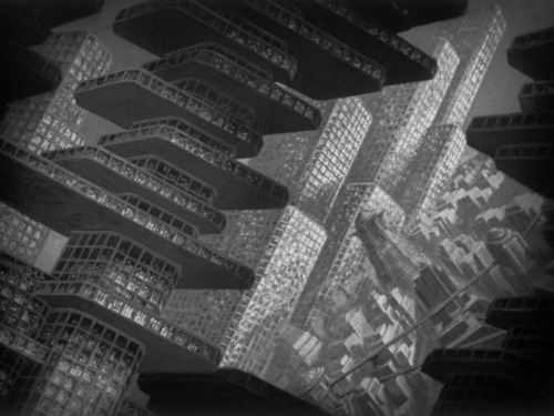
Okay so speaking of 1920s, let's get into IT! German Expressionism was a film movement that was born out of post-WW1 Germany and society's need to express (ha) the horrors of war they went through and since hyperinflation fucked up the economy so much, film companies were like "spend whatever" and blew budget on super elaborate film sets and facilities.
Expressionism is focused on the physical and really emphasizing features and such. It's hyperbolic as show in the screen shot from The Cabinet of Dr. Caligari:
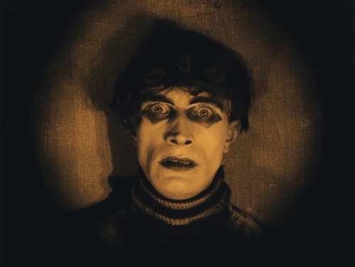
The subject's face is deepened by the make-up and lighting and shows their state of mind, a mindless corpse being controlled by another power (think Master/Puppet, but we don't have time to rly get into post WW1 Ger's anxieties)
It's also hyperbolic, as I said, which sometimes takes form in the sets. Specifically the establishing shots. These would traditionally be miniatures or painted, as they are easy and you can see how they're similar:
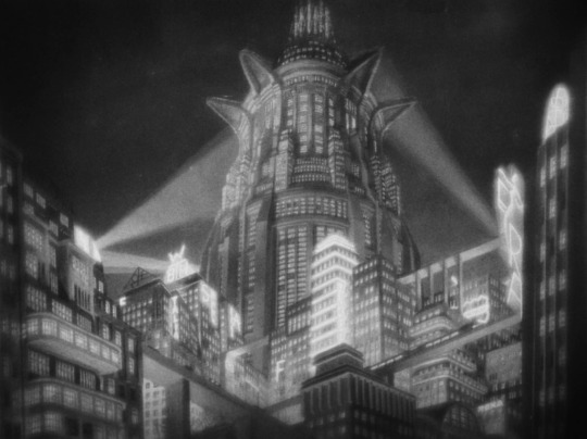
1- Metropolis & 2- The Cabinet of Dr. Caligari
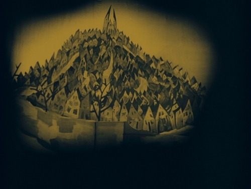
Notice anything? The lines maybe? Perspective? Symmetry? These are all qualities seen in German Expressionism which I will get into in a momement but first. Let me explain why I use Metropolis as an example. In short, they already referenced it in Guerrilla:

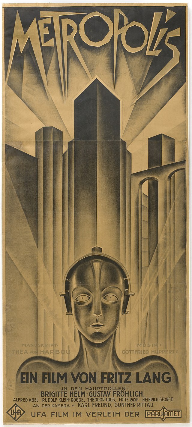
click to get the whole picture! Guerrilla MV and the film poster for Metropolis, the book cover is similar.
See the lines and perspective? The establishing shot at the beginning is the same, let's compare it to Metropolis again:
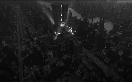
THE WORLD: EP.FIN Trailer & Metropolis
German expressionism is alive and well in film style and I'm so in love with how the director utilizes it.
Next, we're going to talk about structure and lines, along with style and how it helps the narrative.
[TO BE CONTINUED]
3 notes
·
View notes
Text
Collecting some important points from the notes, because this guide has useful points, but as many people are pointing out, it's missed the mark in several places.
Manage your blog the way you want to. Whether it's a blog with a million posts or just one, it does not matter. Enjoy Tumblr in your own unique way. (Just, you know, don't be a dick to other people.)
Don't feel guilted into reblogging. Tumblr does primarily run on reblogs, so if you're up for it, please do! But some parts of Tumblr push a moral guilt culture saying you have to reblog or otherwise you're a Terrible Person. Ignore that bullshit. You don't have to reblog everything you like. Do what works for you.
Likes are great and spark joy! Lurkers are always welcome here.
Same thing about guilt culture for tag compliments. The reblog alone is worth a smile. Nice tags are an awesome bonus, but far from a requirement.
If you do want to leave a nice tag but you don't know what to say, "love this, OP" or "pretty colors!" is fine! No need to be elaborate.
"Reblogs with text must have value" is an artifact of Ye Olden Days and no longer applies. Please do reblog with text! @roach-works explains it on this reblog. Go for it and have fun! (Although if you're just saying "lol" or "oof" or something similar, it is considered good etiquette to leave it in the tags.)
If someone doesn't like your addition, they can just reblog from further up the chain. Don't worry about being annoying.
Don't put anything in the tags you don't want OP to see, because OP can and does see tags.
Do not repost. (Reposting = making your own post with a screenshot of someone else's post/someone else's art/writing.) It's stealing. You're taking credit for something that isn't yours.
Don't censor tags. Unlike TikTok, Tumblr doesn't censor or take down posts due to tags. Don't use "d*th" and "s*x" or whatever, just say "death" and "sex." Tags are there so they can be blocked by users, whether that be for a disliked ship or a major trigger.
Judgement isn't a thing. People will respect your style no matter what it is. Unless you're being an asshole (making mean comments, starting fights, stealing someone's stuff, etc.), anyone who judges is just being a jerk.
DO reblog art and writing! Artwork and writing do benefit strongly from reblogs, because the more reblogs there are, the more attention they get, the more support the creators get. So if you do want to have a blog with lots of stuff on it, please do reblog art and writing and meta-analysis and the like. Creators really appreciate it.
To avoid being mistaken for a bot: 1) have a non-default icon, 2) make/reblog at least a couple posts so your blog isn't completely empty, and 3) have a blog description, even it's just "hello! just a lurker" or something like that. Creative usernames are helpful, but the bots got smarter about that, so it's become less of a factor.
Please don't use guilt tactics to get people to reblog. (Ex. "if you don't reblog this post about animal abuse, you don't care about puppies!") It's rude, and also a trigger for a lot of disorders, such as anxiety and OCD. Also, guilt tactics typically have the reverse effect; people won't reblog out of spite.
When it comes to comments and compliments, I go by this rule: if you have something nice to say and you have the energy, say it. Tags, replies, reblogs, whatever you're comfortable with. If you don't have one or both of those things, don't worry about it; the reblog and/or like says enough.
Different people have different social batteries and interests. If you want to get chatty in the replies all the time, go for it! If you don't have the energy or the desire to add anything, don't worry about it! I have days on both ends of the spectrum. Chatty or lurker or anywhere in between--it doesn't matter. Have fun however you want.
Finally: Nobody on Tumblr agrees on how to use Tumblr. Like, take one look at the replies, do you see how many different opinions are in there? There's some general trends and a handful of "don't fucking do that" rules, but there's no "right way."
This is a hodgepodge of weirdo geeky nerds who are frequently social outliers to start with; expecting consistency is like trying to stop time. It ain't gonna happen. So just do your best and have fun, newbies. We're glad to have you here.
so i have a mildly popular “reblog and put in in the tags” post going around and its. very clear how many people don’t know how to interact with a tumblr post
so, first of all, tumblr’s culture has changed a lot in the past couple years. there’s a genuine community effort to not start any drama, and ironically a lot of the current hostility is an effort to keep things calm. there’s also a change in how people interact with posts, so if you haven’t been here in a while please skip down to the tags/replies/reblog with text section.
for newcomers: you should be reblogging posts about as liberally as you would like something on twitter. if you only like stuff, people will think you are rude/a bot. you’ve probably heard people talk about “cultivating your dash,” and thats because this platform is 100% centered around your dashboard. trending matters less, unfollowing and blocking in order to shape your dash into it’s best form is widely accepted, the majority of the content you’ll find and interact with will be because of your dash, and the only way to put things on your dash is to reblog them. tumblr users are deeply distrustful of algorithms and have largely turned off the “see posts your friends have liked” function (i recommend you also turn of the various algorithms in settings → general settings → dashboard preferences).
so, once you’ve reblogged a post, there’s three ways to add content to it. the tags, replies, and reblogging with text. all of them have different connotations
the tags: an inside voice. originally they were meant for organizing your blog (and they’re still used for this), but they’ve also morphed into a way to share thoughts that aren’t funny/insightful enough for non-followers to be interested in. when in doubt, put your comment in the tags
replies: basically talking to your friends in class. your followers have no way of finding your replies (they don’t pop up on the dash, nobody gets notified except for the original poster) so chances are, only the person who made the post is gonna see your comment. it’s for quick one-offs that you’re okay with other people overhearing, but really is only made for one person. they’re like a public dm
reblog with text: an outside voice. you’re getting up on a stage in town square and entertaining people. make sure it’s funny or insightful— bottom line, add something new to the conversation. you should use this the least
general rules of thumb:
when in doubt, reblog. people will judge you if your blog is only personal posts and you only interact with other content by liking it.
the only things people will judge you for reblogging are personal vent posts. leave a like to give a little virtual hug
if a post is asking about your personality/opinions (i.e: tell me what’s the last tv show you watched, that kind of thing) put it in the tags
also if you see a nice edit, gifset, or art, reblog and say something nice in the tags! it’s that nice sweet spot of common enough that no one will notice but uncommon enough to make the artist’s day
68K notes
·
View notes