#so many good iterations of their designs
Explore tagged Tumblr posts
Text


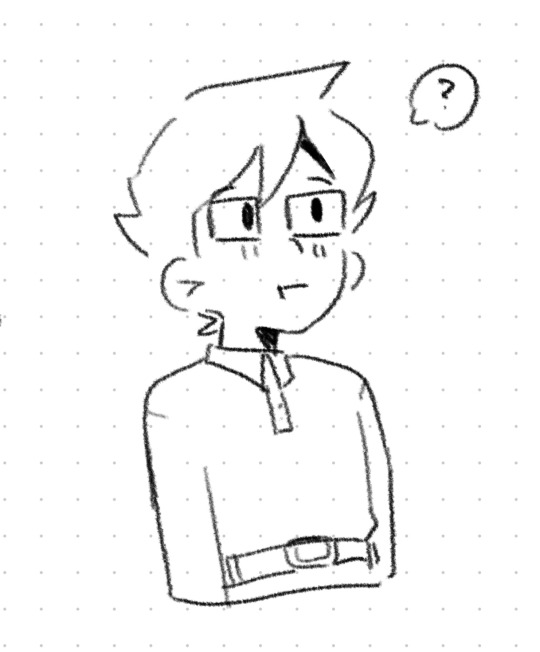

havent drawn them in a while 🥰
#my art#homestuck#rose lalonde#jade harley#john egbert#june egbert#dave strider#i totally forgot how to draw egbert#not dave tho he comes to my hand as natural as water is to a fish#and then for rose and jade i feel like theyre different every time i draw them#so many good iterations of their designs
914 notes
·
View notes
Text
i personally have very complicated feelings on the Gotham Knights video game and the routes it takes with characterization. i think it has a charm to it and it goes in an interesting direction with everyone (especially within the confides of the plot of the game) but it does have certain moments that veer painfully fanon for me. (such as: the dialogue where Tim drinks too much coffee) it's an interesting story for what it is but i don't view it comics-based for characterization and therefore don't care to interact with it much for like. fanfic purposes.
that *said* though. i do have to give the game some kind of credit for giving one of the top five JayTim moments that lives rent free in my mind. every since i played the game, the cutscene lives in my mind daily. it's the specific cutscene where Jason and Tim are arguing about whether or not Jason's non-lethal bullets are too dangerous for the field, and the argument leads to TIm *standing in front of the target* Jason is shooting and telling Jason to shoot him. it lives rent free for me. i never stop thinking about this.
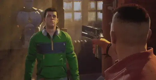
the absolute certainty Tim has that he is in no danger standing in front of Jason, who has a loaded gun pointed at his face. the way Jason *hesitates* for just a moment before lowering the gun. he thinks about it for just a second. Gotham Knights JayTim seem to get along very well and can rely on each other, but Jason still clearly holds a bitterness about his death and Tim that flickers through in some lines of dialogue under the guise of jokes. especially since this game deals *heavily* with concepts of Pit Madness causing an altered state of consciousness, i think it's believable that occasionally, Jason fights the urge to fight and hurt Tim for the feeling of being replaced.
i like their tension so much in this canon. they get along but you can *tell* Tim is afraid of addressing Jason's trauma or even addressing Jason head-on, and Jason leans into spooking Tim about it. which isn't very comics feeling in their dynamic, but it is an interesting way to place their dynamic if you're playing with a more timid Tim who's newer to the role of Robin. (which he seems to be in-game) he really doesn't want to offend Jason, or worse, piss him off. but he'll still face Jason head on for things like this, while completely aware of what Jason could be capable of.
and Jason seems very protective of Tim and respecting Tim as a Robin in typical Jason fashion. if Tim pushes, Jason *will* relent. he knows this is a kid who's proved himself and should be treated with equal respect, sometimes even more than Dick and Babs do in-game.
so for all that to culminate in Tim stepping in front of Jason's loaded gun that he *knows* is on the edge of being too dangerous, just to force Jason to listen? it's the most unhinged way Tim could've gotten his point across in this scene. he was literally daring Jason to hurt him and playing with a very dangerous fire. but he did it anyway bc he believed he could make Jason heel just at the thought of hurting Tim. and he was *right*. they're gay and i'm feral ty.
#necrotic festerings#jaytim#tim drake x jason todd#gotham knights game#i hate their character designs for what it's work#BUT the size difference. jesus.#anyway i could write a gotham knights jaytim fic i think#i'm *very* unsure the ages intended for these characters#bc tim certainly seems to be intended to be a teenager#whereas jason seems in his 20s so i think it's a gap that's bigger than the comics#which also makes it fun. usually you don't get a ton of age gap with jaytim they're just under 2 yrs apart#but this tim is definitely still a teen and jason is an adult.#and seems to enjoy being a bad influence on tim in the game so#there's such good fodder for some dead dove shit#anyway the funny thing is i like this game#you don't want to know how many hours i've played it#it's just best treated as a seperate iteration of the characters than being an adaptation of anything#esp since they're *so* vague and waffly on jason's backstory#as well as not giving a ton of info on how tim became robin#you assume it's similar to comics but some details leave gaps in the timeline. so idek#probably not somehting meant to be thought about too hard.#but i'm an overthinker at heart.#my point is they're gay. this is gay. it baffles me ppl don't look at this as the gayest shit alive.#tim daring jason to shoot him is the most tim drake thing in this game#well that and tim wanting to make a talon in the belfrey.#also NO one say a word about the gif quality /lh#i had to make it MYSELF#i do everything around here to show off their gay shit#sorta tempted to just make a masterpost of “every gay ass interaction between jaytim”#bc i've seen some clips from the titans show
169 notes
·
View notes
Text
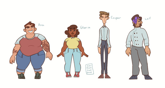
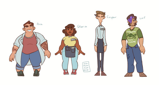
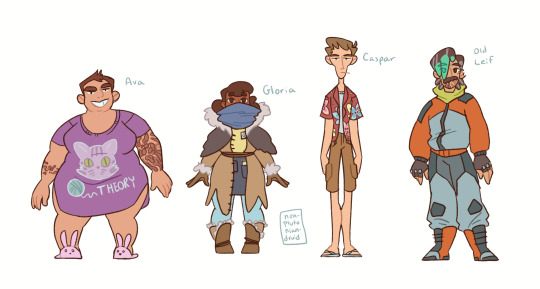
[ID: Three drawings of the four main characters of the podcast Midnight Burger, in three different outfits. Ava is a fat woman with short brown hair and light skin. She has a sleeve of tattoos on her left arm and a smaller band of tattoos on her right. Gloria is a chubby woman with medium dark skin and dark brown curly hair. Caspar is a tall skinny man with light skin and short sandy brown hair. Leif is a sturdy man with light skin and dark brown hair. It covers one eye, and the tips are dyed purple.
The first image, Ava and Gloria are wearing day clothes; jeans and a t shirt. Caspar is wearing slacks and a button down and Leif is wearing a chef's outfit. In the second, Ava has added a lab coat, and Caspar and Gloria have added an apron and nametag. Leif is wearing casual clothes; jeans and a t shirt that says "Aliens want me fish fear me". In the third, Ava is wearing pyjamas; a nightgown with a cat on it and bunny slippers. Gloria is dressed in a homemade fur coat over her usual outfit from her time in the freezer. Caspar is wearing cargo shorts and a floral vacation shirt, and Leif is instead Old Leif, wearing spacefuture coat and pants. His hair is graying and he has a mustache, and his hair is dyed teal instead of purple. End ID.]
I've been listening to a podcast called Midnight Burger which I really like, it has big Doctor Who energy lol. I have purposely avoided any and all fan-or-canon appearances for these characters that might be out there and gosh have i missed making character designs!
#midnight burger#midnight burger podcast#fanart#digital art#my art#leif gave me so much trouble lol#eveone else's design came together super fast#but i drew so many iterations of leif before i decided i would be giving him emo hair and calling it good#mucklewains not present mostly because zebulon is ALSO giving me trouble#this is sparked because of an idea for animation i had but no promises on that#a little bit bc getting the section i want downloaded has been a trial and a half rip#but also just in general its to early to say how far ill get
82 notes
·
View notes
Text

thinkging about enamel pinz
#if i do two i have to sell so many but i think a pair like this might be worth it!#cute poses and such yknow#trigun#vash the stampede#nickolas d wolfwood#i do this thing where ill think of a design i realy like and feel very sold on it#and im like hmm maybe i should iterate on this but inside i feel like im already sold on it#and idk if i am just really good at having ideas or im autistically stubborn
354 notes
·
View notes
Text

doin' a fuckshite again ✌, i'll see y'all artistically in five to seven business days this fucking script is so bitchily long. i swear to fuck if its gon be over 8 pages.
anyway Fish is gon be in it <3 fucking Finally he shows off properly
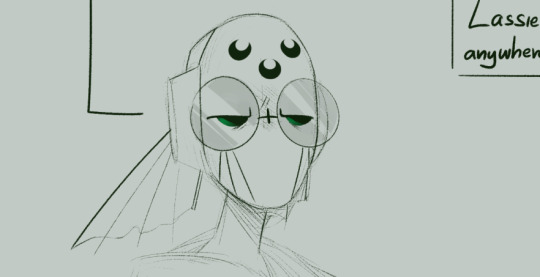
anyway,

#wips#rw#im Pissed this is for an AU this isnt even for the CANON SHIT i have SO MANY COMIC PROMPTS IN MY INBOX AURHGHGHRHG n i wanna do ALL OF EM#cmon pinky we can do this. we gon be careful this time around -gives it a lil smooch-#i think ill have to design more of the filler iterators for this one... aiya shit... back to the map i go#'oh i am so worried i wont be able to fit that many itties into the aeolus signal range with the rules i set 😥' -does the math n the-#-actual positioning planning Finally n gets 144 spaces in total- MAMBA MIIIIIIIIIA nevermind im good i aint makin That many shitlets#i Think. at least not designin em all </3 MAYBE namin more for the sake of navigation n smooth in-world talking#ill have to set up a timeline of who was constructed first... That is important to the itties fuck#actually i might peep up in here while workin on the already named iterators designs like i did with orion now that i think about it 🤔#anyway orion n sporadic r casual friends in canon n VERY close in off string au ive decided. he saves her from her can#i still wanna continue the Euros' 1st rot thing too hmmm...... ill try to thumbnail that n see how long Thats gon be
24 notes
·
View notes
Text
thinking so many thoughts abt iris fresh out of the vault so scared, confused, vulnerable, alone, grief about to hit in full force, and still malleable, just for poppy to be the first person to find her and she has iris wrapped around her finger for a while
#thinking lots of gut-wrenching thoughts to make miss ma'ams mental state even worse this early in her story#also to help solidify some details for funsies + actually develop the poppyiris dynamic and the complexities that come with it#was even thinking abt them both being the ones to give the other their face scars#plus I can have fun with iris's design bc I decided her fresh out the vault look is one of her older iterations from way back when–#and her current look is after she meets and becomes closer with nicky and he cuts her hair for her :]#I love rambling abt iris bc I just /don't/ talk abt her in depth beyond a select few close friends lmao so like iykyk I guess#I just have SO many new ideas since thinking up poppy being iris's first companion bc it just hurts so fucking good#also random nonsense that only I care abt:#a few weeks ago went bananas over imaging them playing co-op vampire survivors bc likeeee#the implications of iris picking luminaire foscari and poppy picking genevieve gruyere..#oooo ooouuuoughoughhhgggggoougggh#rambling#miss ma'am iris is that you#poppy
5 notes
·
View notes
Text

More of Caligo Narcyz...! Or excuse me, Clyde Elos. Don't know who that first man is yet.
A very young man Clyde, fresh out of medical school in 1896. Running off so he wouldn't take over the family business as the only surviving son was worth it, right? It's five years after his graduation that he cracks under pressure.
#My Art#Original Character#Original Characters#Ipseity#Ipseity: Caligo Narcyz#Ipseity: Clyde Elos#Yet another instance of 'I have so many tags for individual characters' auuughrhe#Sometimes I look at his 'in life' design and get so miserable#I'm too attached to the design of his Caligo Narcyz iteration but sir... your complexion... I say longingly planting my hand on the screen#Anywauys this is from back in February but the specific details are Still hazy#His parents were already sitting in the middle class but after putting all their chips in setting up (taking up?) an import company...#They were doing great! They were doing comfortable! They were riding the high of being among and treated as respectable company!#But they weren't doing too good in the kid department with their only surviving kids being Clyde and his older sister (yet to be named...!)#Which TLDR She actually had the passion and drive to take over but they wanted the male to be their actual face. Remain respectability yk#Fully willing to nepo-baby his way through this flight of fancy and let it fluff up his perception. But that's where his actual passions la#Whoops! Crazy that he hard commit to this career and let/wanted his sister be the actual business person she wanted to be.#He gets shoved into the field doctor/working within the military role as a 'If you're going to pursue this do it in a way that looks good'#His sister ended up getting the job she wanted...
3 notes
·
View notes
Text
this show is ASS I can't take it anymore, people saying mystery inc is good are a psyop
#seasonal speak#maybe s2 is better but your first season shouldn't feel like a gauntlet to get through#mysteries and monster designs are largely uninteresting virtually no good character moments#and it falls into many of the same harmful pitfalls of other iterations wrt appropriation#all velma and daphne talk abt are the boys everyone's characterization is so shallow how and why should I care abt their drama#also there was a scene where daphne wears lingerie as pajamas??? they're in high school in this iteration
11 notes
·
View notes
Text
the sense of having any lore about the ancient [ten to thirteen years ago] of marble hornets times like granpa granpa tell us a greentext story....the only hitch is not having stories and instead having "i guess you had to be there" tales from the fringes, unless instead of a hitch you frame this as a bit
#like what's crucial info from then? who knows. smthing neat abt mh is its iterative resurgences apparently lol. got a wavelength#from the start it was always [queer fans queer fans trans fans trans fans] etc to be sure#by ''thee start'' i mean i showed up a couple of months? weeks? before s2 started. i think amnesia: the dark descent was partly to thank to#i mean of course it is in all things no matter the topic. and i feel manesia the dark manscent in this chili's tonight#one of the more [umm] first true spikes in New Ppl was when that game with the pages got streamed a lot#not a lot to work with there re: [you are already at mh hq] but brought ppl in like umm yea it's a little youtube movie here....#Back In Those Days...when youtube had a Reply feature for videos which i would have forgotten was anything if not for tta really....#the saga of [we didn't have any crisp behind the scenes pics of tim's mask for a while so deciding what its design seemed to be was tricky]#or [lucky that alex's striped hoody had both the inner seam highlights & the patch on the waistband] re: identifying it....#the hoody was already Out Of Production lol the base masks were from michael's crafts which i hear has recently discontinued them; pensive#paper mache cosplays here we go....#anyways nothing makes a good story. one time i sprinted to beat everyone on unfiction to solve a scrambled dvd cover#i managed to post it first (here on tumblr) And Then on unfiction; where it was also first lol. this was ignored#(one reply did a nominal shoutout like ''[other user] and others'' lmao)#i blog to this day....where's unfiction (rhetorical)#they were great for crowdsourcing codes but the Analysis(tm) left many things to be desired (i mean on tumblr too sometimes of Course)#unfiction would be like ''why is this entry delayed [thinking emoji]'' & truly the answer like ''they explained the behind the scenes reaso#in this linked facebook post here (the funy saga of joseph losing the distinctive out of print hoodie before its Part Two appearance)''#and the unfiction thread would continue apace like ''hmm guess we'll never know'' yeah apparently not#unsurprisingly my best Retro Tales From Behind The Scenes would be like; that fun mh viewing party commentary bit live event....#that there was overlap w/my first coming out transly times & probably had my Best Experience w/that from the mh creators lol#that thesis simply Is the tale. the bit abides
4 notes
·
View notes
Text

((Why is making icons hell?!?!?! I only just now finished going through the fanart for Evan and Venti!!! Now I have to do that all over again for Scaramouche/Kabukimono/Wanderer!!!! Ahhhh!!!!))
#-melts into a puddle-#goodbye I need a break#ooc#still this is the most I've done for my blog in a while ngl#feels good to have many icons for two of my muses!!!!#Deca is always gonna be a problem I think unfortunately#but thankfully he has Resting Bitch Face and rarely emotes so I don't need many icons for him#As for Wanderer........... I literally gotta make three sets of icons for him#one for each major iteration/design he's had#orz
2 notes
·
View notes
Text
sitting there like has my art gotten better over time or do I just add way too much unnecessary detail now
#but lineart becomes honestly really meditative for me at times especially if im adding texture to something#i will say at least i dont pick such ugly colors anymore. i used to always have reslly bright colors and then i thought it was too much#and overcorrected imo so everything was desaturated and boring#oh i also used to color in the lines for like every single color on the character? idk how to describe it but it was tedious#i like it on other people's art but i dont have the patience and i dont like how it looks when my lines are “cleaner”#sometimes i do miss how i used to not care if what i drew was “cringy”#but i think im coming back out of that considering all i draw is like. gay shit and elves and various iterations of myself and also my ocs#i should redraw some really really old art after what im working on maybe#i almost started working on a redraw of when i drew yavanna in likr 2017-18 but i dont like the design i gave her at all#minus the weird branch ears those were cool#mostly im just frustrated it still takes me hours to draw lol. i dont know why i get insecure about it or about art in general#i guess bc no one in my family really does so they have this idea im good at it#and i wanna grab them and shake them sometimes and explain all the reasons im actually not and all the mistakes i regularly make#i dont know if that makes any sense and i dont know why i struggle to just take the compliment#i guess because i know im not good enough at it for it to be a job? except thats not it either because ive almost always wanted to write#its very dumb and weird. especially considering i dont really draw for other people. i mean i like when people like my art but unless its#for somebody specific im not necessarily going to take it very hard at all if its not to their taste. i just do it because i enjoy it#and because there are things i only know how to express through writing or drawing. and when one doesnt work sometimes its the other#maybe i just get frustrated i cant be good at everything#its not realistic but i always end up wanting to do so many things and getting frustrated when i dont pick them up right away#because OF COURSE i dont#ok where was i going with this#its nearly 2am and my head is pounding again i dont even know what day this makes it. at least a week?#i dont know
1 note
·
View note
Text
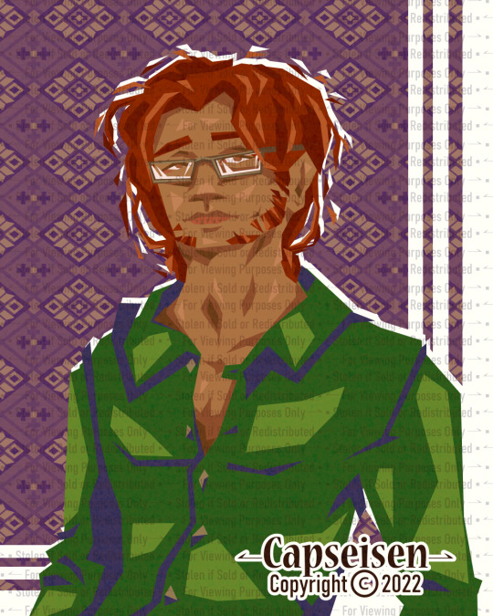


Val + Skye Lineless Portraits + The Terrible Trio ,, March 2022
#art by capseisen#digital art#drawing#lineless#chromatic aberration#portrait#group portrait#my works#artists on tumblr#original character#Valentín [he/him]#Skylar [he/him]#Katarina [she/her]#I like how I made Val look really good for how little time I spent on it#but Skye's came out weird#though I find it charming lol#so many design iterations for Val though#image description in alt
0 notes
Text
Smartphone cameras are NOT getting worse. (See below for phone photography tips)
I've now seen 3 pro photographers reviewing the iPhone 16 and complaining the cameras are "worse" and blaming Apple for not including revolutionary new camera technology.
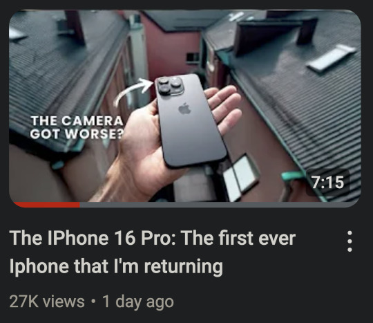


And I suppose this is partly Apple's fault. Their marketing and hype machine always goes overboard. But also, that's just how marketing works. Samsung has a "200 megapixel" sensor and Sony has a "Zeiss" lens. And I think it is unrealistic to expect smartphone companies to say "This product has entered the iterative phase and each new model will only be marginally improved over the last one."
Smartphones (from any brand) have become an appliance. You don't buy a new model of microwave every year. And you don't expect every new model of microwave to have new revolutionary technology. And that is pretty much the expectation you should have with most computer hardware from here on out.
And in some ways, that is a good thing. That means the design of the phone has pretty much been perfected and it will last you a long time if you take care of it. You will not be left behind and your phone will be able to handle any new software for most of its lifespan.
So, is Apple getting lazy or is there a reason their hardware is stagnating?
It seems that neither money nor marketing can change the laws of physics.
They cannot make transistors much smaller. Phones and computers are about as fast as current hardware designs can make them (unless there is a shocking scientific breakthrough). From here on out, heavy compute tasks that are beyond your phone or computer will be done in the cloud on giant computer clusters. Thankfully computers and phones seem to be plenty fast for the majority of tasks we ask of them.
I remember Katrina telling me her new computer didn't seem any faster. And I explained the computing tasks she does regularly were not really affected by the increased power and speed of her new computer. If something took 0.1 seconds before and now it takes 0.05 seconds, that is twice as fast. An increase in speed that looks fantastic in advertisements. But it is hard for our brains to perceive. She just didn't do anything on her computer that took it long enough for her to notice. But having a faster and more powerful computer/phone will increase its lifespan and resale value, so it is still prudent to get the best things you can afford at time of purchase.
And I'm afraid smartphone cameras are hitting their own hardware limitations. They can't make the sensors much larger to get better depth of field and low light performance. And cramming in more megapixels doesn't actually add much more detail, if any.
It's physics.
Again.
You cannot get any more performance out of a small plastic lens. Why do you think pro photographers haul around 10 pound lenses still?
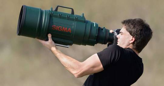
There is a formula for detail that never seems to be explained in any camera marketing.
Here is the simplified version...
Detail = Sensor x Lens
Let's say 1 is perfection. You have a sensor that performs at 0.5 and a lens that performs at 0.2.
The total detail will be 0.1.
But in the new model you increase the performance of the sensor to 0.8. WOW! That's so close to 1!
The total detail will be... 0.16.
Now let's imagine we've discovered a magic, physics-defying tiny plastic lens that performs at 0.8 as well.
The total detail jumps to 0.64!
But we all get sucked into a wormhole because we violated the laws of the universe.
Even if you were to design a near perfect (perfect is impossible) sensor that scores 0.99.
Without that magic plastic lens... 0.198
This is why I put Samsung's "200 megapixel" sensors in quotes. Because when paired with the same tiny plastic lens, there isn't much improvement. And that's why a 12 megapixel DSLR from 10 years ago with a giant honking lens can still capture more detail.
Most of the quality from smartphone cameras comes from the computational software processing. Phones actually take many photos at once and combine them to get you a decent image.

While that is still improving a little bit each generation, those improvements are stagnating as well. Until image processing can do a better job of inventing more detail realistically, smartphones are going to have to obey the laws of physics.
So... why are photographers saying the iPhone cameras are worse?
First, the ultra wide angle lens looks softer in low light.
And if you zoom between 1x and 5x, the images look less detailed.
But neither of those things make the cameras *worse*. In fact, the cameras are better for the most part. It's just that Apple decided to compromise on one aspect to improve another. Probably due to market research telling them most people prioritize certain things over others when taking photos.
They increased the resolution of the ultra wide angle sensor to match the detail of the main sensor, but that seems to have lowered the low light performance of the ultra wide. So in good light, you will see an improvement in sharpness. But they could not increase the sensor size to compensate and smaller pixels can have trouble with dim conditions. They probably discovered that people mostly use that lens in good light and they would appreciate the bump in detail more.
But pro photographers often photograph in more challenging lighting conditions because you can capture a more artistic shot. I don't think I could have gotten this shot on a smartphone.

But photo normies are just taking pics of their kids doing weird kid shit.
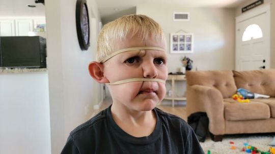
They aren't really trying to push the limits of their ultra wide angle lenses.
And they increased the zoom of the telephoto lens to 5x from 3x because most people never used the 3x. So images at 5x look great now, but unfortunately if you use anything between 1x and 5x, your image will be *digitally* zoomed. Which is never as good as optical zoom. They basically crop the photo, zoom in, and add sharpening.
So they prioritized people having longer reach and more zoom at the expense of that middle zoom range. Every camera system makes tradeoffs and compromises.
And I hate that I always feel like I am defending Apple, because they do have misleading and dishonest marketing regarding a lot of aspects of their tech. But hating on Apple gets more clicks so content creators also make misleading and dishonest claims.
And so we are just surrounded in a circle of hyperbole from all sides.
Now, if you know these limitations, you can change your approach to photographing stuff to keep them from being an issue. You can reap the benefits without dealing with the new compromises.
Here are some tips to help owners of the new iPhone, but also everyone else too.
Smartphone Photography Tips
Whenever possible, try to use the main 1x camera at only 1x zoom. This has the largest sensor with the most detail and works best in the lowest light. Only use the ultra wide or telephoto if you cannot get the photo otherwise. If you aren't sure you have enough light for ultra wide, take the photo, and then as a safety, take two photos with the main camera side by side and stitch them later with a pano app.
"Zoom with your feet" and don't use "in-between" zooms. Let's say your lenses do 0.5x, 1x, and 5x zoom. Even though you have the option to use other zooms, like 2x or 3x, that is going to compromise your picture quality. It is essentially going to crop your photo and enlarge it, which causes a loss of detail. If fact, if you use 4.5x instead of 5x, your picture will probably look like trash. You are always going to get better results if you can move closer or step back so that you are using the native focal length of your chosen lens. For example, let's say you are taking a photo and you judge the best framing to be at 4x. But you still have 10 feet of space behind you. If you back up and then zoom in to 5x, the phone will switch to that lens and you will get a much clearer picture.
Rule of thumb...
1 to 3x... try to move closer.
4 to 5x... try to move back.
If you hit a wall and end up at 4.5x, you might see if you have a panorama mode and try that instead. Switch to your 5x and do the pano. Or you can take two photos and then stitch them together with software later on. (Stitching panos with an app later will give better quality than pano mode, especially in low light.)
Low light needs stability. Get some sort of stabilizing device for low light photos. Either a phone case that lets you stand up the phone on its own or a mini tripod.
This thing folds to the size of a credit card.

Your phone will detect when it is stable and not being handheld. It will then automatically extend its shutter speed allowing it to drink in more light and give you a better picture.
Tripods are photography magic and will improve your low light photos quite a bit. Motion blur of moving subjects can still be an issue, but photos of a cityscape or landscape will look great.
For selfies, shoot a little bit wide and then crop in. This goes a little contrary to my earlier advice saying cropping lowers detail, but this is specifically for shooting a face. The 0.5x and 1x lenses on smartphone cameras are fairly wide angle. This can cause unflattering proportions with human faces. Wide angle lenses exaggerate distance. Near things look very near and far things look very far. To a wide angle lens, the tip of your nose looks like it is super close but your ears seem like they are a mile away. And that's why you may look a bit "alien" in your selfies.
People's natural instinct is to "fill the frame" with a face. The outer edges of a wide angle lens are more distorted than the very center. So try to keep faces away from the edges of the frame.
And one other trick you can do for selfies and pictures of faces is step back a few feet. Sometimes this is hard, especially with selfies, as your arm is only so long... but if you can take your face photos from just a little bit farther back, you will almost entirely eliminate unflattering distortion. In some cases, just stretching out your arm as far as it will go is enough.
Then you just crop the image with the framing you originally wanted, and your facial proportions will look great.
An example...
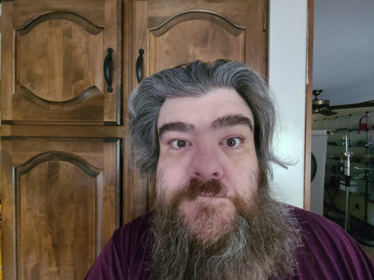
Here the distortion is bad because I am not in the center and the lens is too close to my face. The lens thinks my nose is really close and my ears are in Canada.

But when the lens is farther back the edge distortion is less prevalent and my nose and ears (relative to the lens) seem roughly the same distance away. So my proportions look great, but I don't quite have the framing I want.
But with a little cropping...


For social media there is still plenty of resolution to crop in. Cropping isn't bad, it's just always better to use it as a last resort or in a special circumstance like this. I get roughly the same framing as in my wide angle shot, but I don't look like I'm behind a door's peephole trying to sell you the Good News.
I wish they made a "mini" selfie stick that only extended a foot or so. With the main camera that is usually all people need to undo any wide angle issues. I have one of those mini tripods and that works well, but there is no activation button so I have to do a timer. Mirrors work great to help you get some selfie distance.
In any case, all cameras have limitations and compromises. Clickbait titles saying something is WORSE THAN THE OLD ONE are frustrating and wrong.
And people upgrading phones every year are silly. All current name brand smartphones have promised at least 5 years of software updates. I think Google and Samsung are offering 7 years on some models. And Apple has always just let you use your phone until it literally will not work with new software. Which has worked out to 8 years in some cases (with a battery swap).
Phones are now appliances. For now, hardware will improve 10 to 15% from generation to generation until physics breaks. So if you want a 50% improvement, wait 5 years and you'll think your new phone is awesome. If you upgrade every year, it is going to be difficult to see the change.
I hope to be starting a little course on smartphone photography in the near future. All modern phones are capable of taking amazing pictures. And as long as you understand their limitations you can mitigate or avoid them. And that is what I plan to teach.
688 notes
·
View notes
Text
The Nadu Situation
This has become a big topic in the community this week, so I wanted to add my thoughts to the discussion. My focus isn’t on the banning, but on the behind-the-scenes processes that led to it. I’m Head Designer, so I want to focus on the design elements of the situation.
When we make Magic there are a few things we do to try and make it the best it can be. First, we design in what we call an iterative loop. That is, we make something, we playtest it, we get feedback, we make changes on that feedback, and begin the next iteration of the loop. We try to get as many iterative loops in as we can before the set is locked (aka “no more changes”).
No matter where we set that line, there’s a last day to make changes. Moving that line earlier doesn’t change anything other than giving us less iterative loops to improve things. Also, we make lots and lots of last minute changes. The vast majority of them make the game better. I understand there’s more focus on the times we make a mistake, but it represents a truly small percentage of the changes.
Also, whenever we design a card, we ask ourselves, who is this card for? If we’re trying to make game play the best it can be, it helps to understand who will use the card, where they will use it, and what they will do with it. Obviously, in a game as modular as Magic, the players can often zig when we expect them to zag, but in general, this process leads to the best design.
We have two play design teams, one focused on competitive play and one focused on casual play. The competitive play design teams determines which cards they think have a shot at competitive play (remember we’re making predictions as where we think the environment might go,we don’t definitively know; we need to make an environment complex enough as to entertain tens of millions of players). The casual play design team then looks as the cards that don’t play a competitive role to see what casual role they can play.
With that said, let me respond to a few popular lines this week:
“Stop designing for Commander” - The nature of competitive formats is that only so many cards can be relevant. As you start making more competitive relevant cards, they displace the weakest of the existing relevant cards. That’s how a trading card game works. That means that not every card in a set (or even just the rares and mythic rares as the commons and uncommons have a big role making the limited environment work) has a competitive role. As such, we examine how they will play in more casual settings. There’s no reason not to do that. And when you think of casual settings, you are remiss if you don’t consider Commander. It’s the 800-pound gorilla of tabletop play (aka the most played, heavily dominant format). Us considering the casual ramifications of a card that we didn’t feel was competitively viable is not what broke the card. Us missing the interaction with a component of the game we consider broken and have stopped doing (0 cost activations), but still lives on in older formats is the cause.
“Stop making late changes” - Whenever you see an airplane on the news, something bad has happened. It crashed, or caught on fire, or had an emergency landing, or a door fell off. Why do we still make planes? Because planes are pretty useful and what’s being highlighted is the worst element. That focus can lead people to false assumptions. Magic would not be better if we stopped making last changes. A lot *more* broken things would get through (things we caught and changed), and many more cards just wouldn’t be playable. Our process of fixing things up to the last minute does lots and lots of good. Maybe it doesn’t get the focus of the screw ups, but it leads to better design.
“Everything needs to get playtested” - My, and my team’s, job is to take a blank piece of paper and make something that doesn’t exist exist. That’s not an easy thing to do. I believe play design’s job is even harder. They’re trying to make a balanced environment with thousands of moving pieces a year in the future. And if we’re able to solve it on our end, that means the playerbase will crack it in minute one of playing with it. One minute, by the way, is the time it takes the Magic playerbase to play with a set as much as we can. There are tens of millions of you and a handful of us. There simply isn’t time in the day to test everything, so the play design team tests what they think has the highest chance of mattering. They take calculated gambles (based on years of experience) and test the things most likely to cause problems. Will things slip through? There’s no way they can’t. The system is too complex to not miss things.That doesn’t mean we don’t continually improve our processes to lower the chances of mistakes, but nothing we’re going to do can completely eliminate them.
Designing Magic is difficult. Next year is my thirtieth year working on the game, and I think we have the most talented team we’ve ever had. Plus, just as we iterate on the designs in a set, we iterate on design processes of making Magic. How we make Magic today is light years different, and I believe better, than how we made Magic when I started. (”If I have seen further, it’s because I stand on the shoulder of giants.”)
One final thing. I’ve always pushed for transparency in Magic design. No one on the planet has written/spoken about it more than me. I truly believe Magic is better as a game because its players have the insight to understand what we, the people making it, are doing. We do ask for one thing in exchange. Please treat the designers who take the time to share with you the behind-the-scenes workings of Magic design with kindness. We are all human beings with feelings. There’s nothing wrong with feedback, but it can be delivered with common courtesy.
661 notes
·
View notes
Text
BBR thoughts 2024
Since I mentioned that I finally dusted off an old project of mine and was ruminating on how I'd remake it, I thought I'd elaborate a little, now that I've solidified some concepts. For funsies
This is gonna be a bit of a long and unfocused one, but I don't share my personal thoughts here often, especially the stuff about my projects I always marinate in. And for once it's something that people have existing context for, so hey why not
So for anyone who hasn't been following me for a gajillion years, The Black Brick Road of OZ was a webcomic that I posted around 2013-2015, back when I was in highschool going on college (which is kinda crazy to think about). It was sort of a darker twist on The Wonderful Wizard of Oz, although I definitely leaned a lot more into dark humor more than anything in those first few chapters
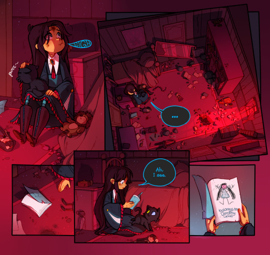
I don't think it's available to read anywhere anymore, and I know people have been asking me about it. So here's the full proper archive of BBR, as full as it can be with deceased Flash
I totally used it as an excuse to shamelessly and self-indulgently experiment. It had interactive pages and GIFs and was wayyy too overproduced for what I could handle or what was necessary, but I did have great fun making it while it lasted
Unfortunately, that excess and the fact that I've changed too much as a person by the time I was in college is what ultimately killed it. The direction I wanted to go in was practically unrecognizable from the original idea started back in 2011, so there were many old hold-ups that I felt ruined it
At the time I kinda wished I could start/rewrite it all over, but considering that I pretty much had the entire script done at that point, it felt like a pointless sisyphean task. So I just put it on a shelf and didn't look back for about 8 years, because I didn't know what else to do

Now to be fair, the nature of my art has always been iterative and cyclical; when I feel like my creative juices have run dry I prefer to leave a project to marinate and move on to something else; cycle through other old things and bring in new skills and perspectives into the mix when I'm ready again. Not very productive, but it is what makes me happy to work on my OCs; I'm doomed to hit a wall with them eventually and I need some time to be able to find a new direction
So that said, I'm glad that BBR was left to marinate for that long. I don't think I was prepared, emotionally or intellectually, to tackle it again until now. The Wizard of Oz book (and the entire series of them, really) has always been near and dear to my heart, but there's a lot of context around it that I'm only unpacking now that I'm older
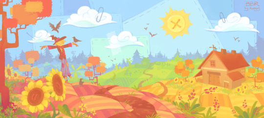
I think I always inherently feel negatively about the stuff I've made in the past, like its faults always jump out to me more than the positives, especially the more time passes. I've never liked that, and I do really appreciate the kind things people have to say about BBR to this day. The fact that it still can be recognized and remembered is very sweet
When I left it, I already found it "kinda cringe", and that feeling only deepened with years. When I took my first look back at it, asking the question "how would I rewrite it now?", at first I took a very cynical approach, as in "everything would have to be torn down"
But the more I sat on it, the more I found that I still see some merit and charm in the ideas I was putting out; I just didn't know how to execute them at the time (not to pretend that I know what I'm doing now, but I certainly know more at least). Turns out a lot of my old concepts could be changed substantially with just a few small tweaks. So I'd say that's a nicer way to think about my previous work

If you haven't seen yet, I posted a first draft of my new designs for some of the characters (the main group, the Goods and the Wickeds). Definitely subject to change, but more or less how I see them now
I'm just playing with these concepts; by no means would I attempt to remake BBR right this moment. Call it a pipe dream among my other ones. But just for fun, this is the direction I'd like to take:
Nowadays I'd probably make it a visual novel, with more emphasis on the visual part than the novel because I'm no English prose writer by any means. It'd still let me play a little with the interactivity while helping cut some corners on the drawing part (only some, I imagine I'd go hog wild anyway)
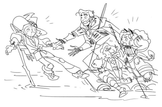
I've always intended for some events inspired by the sequel books to take place in BBR's past. Stuff like Jinjur's revolt or Ozma's rule preceeds the main events here. So I think it would be fun to follow the past of a few key characters alongside the main story. One chapter focusing on the present quest to see the Wizard, then one focusing on the past events (that are maybe reflective thematically); rinse and repeat
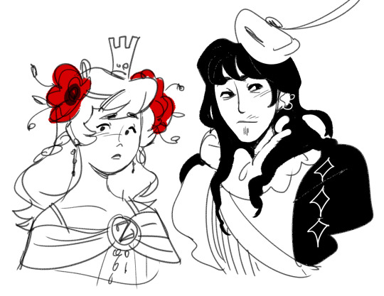
I'm also sticking a little closer to the original text in some regards. Not everything that I enjoy from the books would be translated here, it's still just a very loose fantasy on the material; but I'd like to be closer in spirit at least
I like mature, wise and powerful Glinda, I like kind and vulnerable Tin Man, I like the Wizard being a pathetic yet loveable liar, so I'm sprinkling in more of that for example
I'd like to keep some whimsy, but make it more grounded and a bit more serious to be coherent in tone. I think the original TWWOOZ book was a more realistic fantasy in some ways, even for the standards of the time; I like its simple but vivid tactile descriptions and details like bringing attention that Dorothy needed to eat and sleep
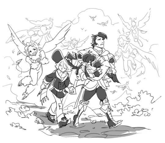
I find it funny that Baum specifically was averse to making his books scary or unpleasant, finding that unnecessary for telling a compelling kids story, but they still can get pretty dark and disturbing, at least for our modern sensibilities. Let's just say that I intend to use the Evoldo and Chopfyt storylines for my purposes. In that way, I feel like a "darker" Wizard of Oz retelling can still mostly be tonally in line with the original and balance it with enough heart and occasional humor

I slowly grew to appreciate the quaint old-timey quality of the original series, as well. The first book is both timeless and very much a product of the 1900s. Originally I tried to give it a little modern or at least anachronistic spin, but it was moreso because it's what I knew best, so these days I'd rather intentionally lean into the time period. Still not fully historically accurate by any means, but at least directly acknowledging the influence
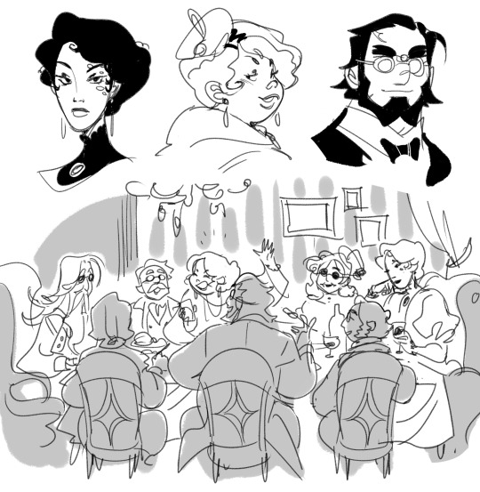
The events of the story span across 40 years of these characters' lives, so I'm drawing inspiration from the entire so-called La Belle Epoque: the time period around 1880s-1920s. Basically I'm cooking, and my soup is old Victorian fashion morphing into Edwardian fashion and slowly inching towards flappers
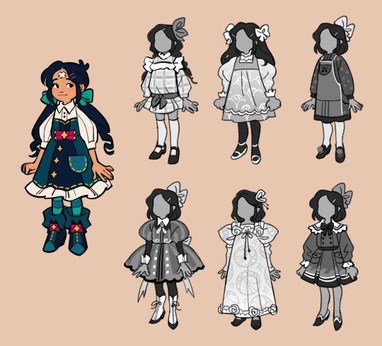
Some new Dolly outfits
Lots of crazy things, political changes and innovations were happening at the turn of the century, which I think is noted and reflected by Baum in the books as well; the character of Tik-Tok might not blow any minds now, but he was one of the first robot characters in literature at that point; and don't even get me started on Jinjur, etc. Plenty of really interesting stuff one could lightly ponder in an Oz adaptation these days
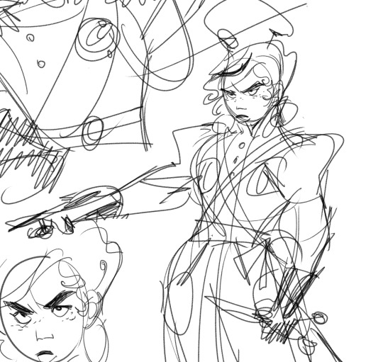
Aesthetically, art nouveau has always been a big artistic influence for me, and it'd definitely be its time to shine here. John R. Neill's illustrations of the Oz books often keep me company as well. Nouveau architecture in particular fits that fairytale whimsy extremely well imo
I'd allow myself a little bit of art deco here and there, but ultimately its intimidating geometrical splendor is an antithetical to the flowery nature of nouveau and I associate it with a completely different era. Definitely fitting some characters like my Wicked Witch of the West, but shouldn't be overused
One of my main problems with the original BBR was that eventually I lost track of what it was even about; and the original ending felt too mean and unfulfilling to be worth it. Now I'd like to stick to the theme of home and family as my main theme, but in a different, more bittersweet way than in the book
An interesting connection I made is that a lot of my aforementioned older key characters (the Witches, Jinjur, the Nome King, etc) all came from the same reformatory as kids, that's how they know each other. In my recent research I learned that in those reformatories it was usually frowned upon to release the children back to the families, which were seen as the original corrupting influence regardless of the circumstance. The reformatory did everything in its power to cut that connection and make itself the only family those wayward kids were supposed to know and love. That's an unexpected tie into the theme of home that I'd like to explore as well

So yeah that's the current state of it. I have a bunch of outfit concepts I'm slowly cooking, although I'm now sure whether I'd post them... But I do miss these funny guys, and I'm glad some people still do as well :)
678 notes
·
View notes
Text
The Architecture of Rain World: Layers of History
A major theme in Rain World's world design that often goes overlooked is the theme of, as James Primate, the level designer, composer and writer calls it, "Layers of History." This is about how the places in the game feel lived-in, and as though they have been built over each other. Here's what he said on the matter as far back as 2014!

The best example of this is Subterranean, the final area of the base game and a climax of the theme. Subterranean is pretty cleanly slpit vertically, there's the modern subway built over the ancient ruins, which are themselves built over the primordial ruins of the depths. Piercing through these layers is Filtration System, a high tech intrusion that cuts through the ground and visibly drills through the ceiling of the depths.
Two Sprouts, Twelve Brackets, the friendly local ghost, tells the player of the "bones of forgotten civilisations, heaped like so many sticks," highlighting this theme of layering as one of the first impressions the player gets of Subterranean. Barely minutes later, the player enters the room SB_H02, where the modern train lines crumble away into a cavern filled with older ruins, which themselves are invaded by the head machines seen prior in outskirts and farm arrays, some of which appear to have been installed destructively into the ruins, some breaking through floors.
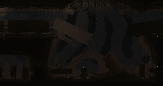
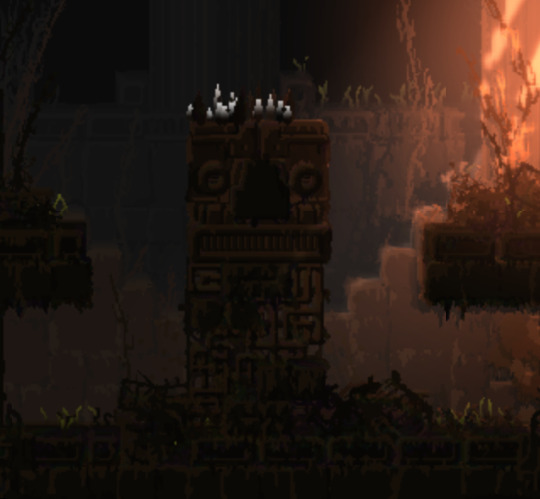
These layers flow into each other, highlighting each other's decrepit state.
The filtration system, most likely the latest "layer," is always set apart from the spaces around it. At its top, the train tunnels give way to a vast chasm, where filtration system stands as a tower over the trains, while at the bottom in depths, it penetrates the ceiling of the temple, a destructive presence. (it's also a parallel to the way the leg does something similar in memory crypts, subterranean is full of callbacks like that!)


Filtration system is an interesting kind of transition, in that it is much later and more advanced than both of the areas it cuts between. This is a really interesting choice from James! It would be more "natural" to transition smoothly from the caves of upper subterranean to the depths, but by putting filtration system in between, the two are clearly demarcated as separate. The difference in era becomes palpable, the player has truly found something different and strange.
Depths itself is, obviously, the oldest layer not only of subterranean but of the game itself. The architecture of Depths has little to do with the rest of the game around it, it's a clear sign of the forgotten civilisations that our friend Two Sprouts, Twelve Brackets showed us, there's not actually that much to say about it itself, it's mostly about how it interacts with the other layers of subterranean.
That said, Subterranean is far from the only case of the theme of layers of history. It's present as soon as the player starts the game!
The very first room of the game, SU_C04, is seemingly a cave. It is below the surface, the shapes of it are distinctly amorphous rather than geometric. (well. kind of, it doesn't do a very good job of hiding the tile grid with its 45 degree angles.)

But let's take a closer look, shall we?

See that ground? it's made of bricks. The entire cave area of outskirts is characterised by this, the "chaotic stone" masonry asset is mixed with brickwork, unlike the surface ruins which are mostly stone. This, seemingly, is an inversion of common sense! The caves are bricks and the buildings are stone. This is not, however, a strange and unique aspect but a recurring motif.
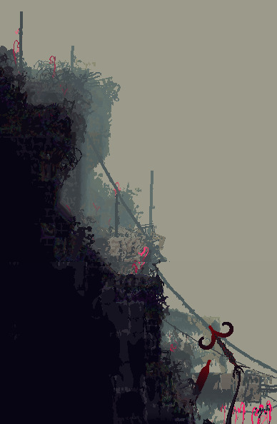
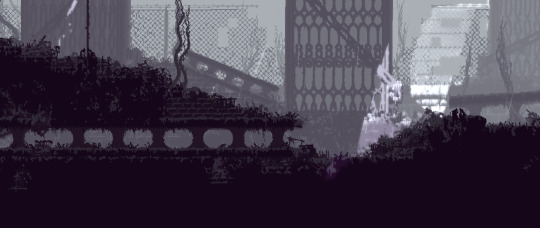
This occurs enough in the game for it to be clearly intentional, but why would materials such as bricks be used in otherwise natural looking terrain?
The answer lies in the "Layers of History" theme. This is in fact, something that happens in real life, and it's called a tell
To be specific, a tell is a kind of mound formed by settlements building over the ruins of previous iterations of themselves. Centuries of rubble and detritus form until a hill grows from the city. Cities such as Troy and Jericho are famous examples. The connections to the layers of history theme are pretty clear here, I think. Cities growing, then dying, then becoming the bedrock of the next city. The ground, then, is made of bricks, because the ground is the rubble of past buildings. The bones of forgotten civilisations, heaped like so many sticks!
#rain world#rainworld#rain world lore#rainworld lore#rw lore#rw#subterranean my beloved#thank you to videocult for making the first survival game themed around stratigraphy and new york city rats#i would've gone on for another paragraph about how OE relates to this but like.#that's dlc stuff#and i still think of the dlc stuff as modded content lol#better to keep it separate#also this analysis is not comprehensive! the layers of history stuff is common throughout#there's farm arrays there's the relationship between shaded citadel and five pebbles there's the stuff buried under garbage wastes#so much more#unfortunately i do not have much energy lol
859 notes
·
View notes