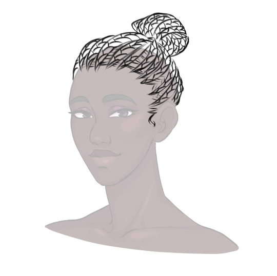
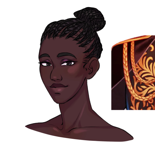
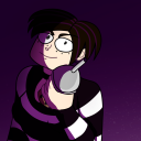
#so instead of using black lineart
Text
HAPPY BIRTHDAY MINNIE!
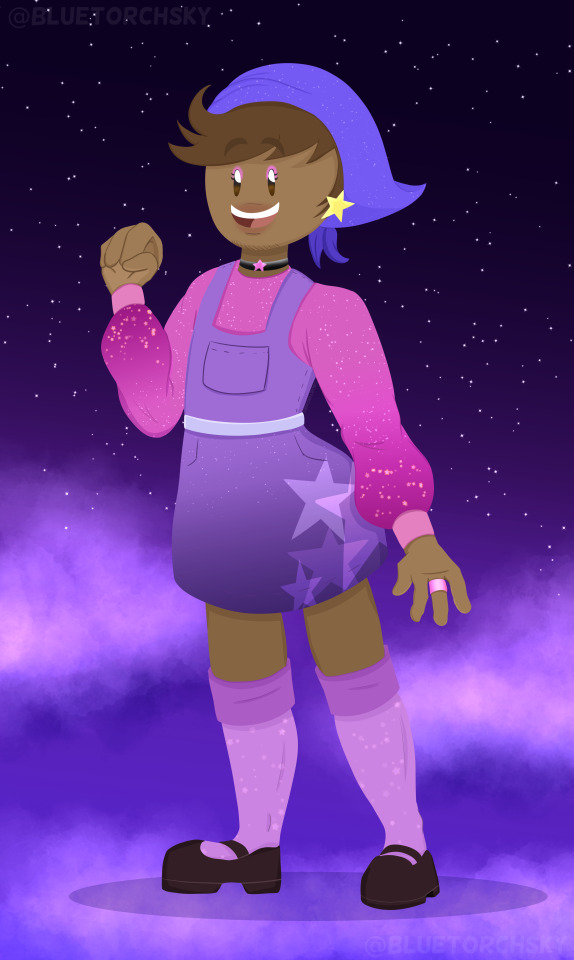
Danny! Are you ready?
Si! I'm coming!
Woah! Danny, where did you get your outfit?
Hehe, Fisarmonica and Violino made this for me! È così bello!
It sure is...especially with you wearing it, you make it ten times better.
Oh, stop Richard! You're making me blush!
Hehe, that's the whole point. Now let's go, our date awaits!
Yay! Mi amore~
--------------------
Happy Birthday Minnie! ( @capturecharlesau ) I hope you're having a wonderful birthday today, you deserve every bit of happiness, good fortune and great health that comes your way! You're an amazing friend, and I hope we can continue being friends. We've had our ups and downs, and you've been patient with me a lot as I do the same for you. I hope our friendship continues to strengthen for the years to come.
Happy Birthday!
#bluetorchsky#bluetorchsky art#the henry stickmin collection#thsc#thsc oc#henry stickmin oc#danny felizima#thsc danny felizima#and thus the tradition of me drawing my friend's ocs in different outfits continue#i actually had a list of doodles I wanted to draw#but time escaped me and this was the only one I could get out#so instead of using black lineart#i went lineless to make up for it heh
39 notes
·
View notes
Text
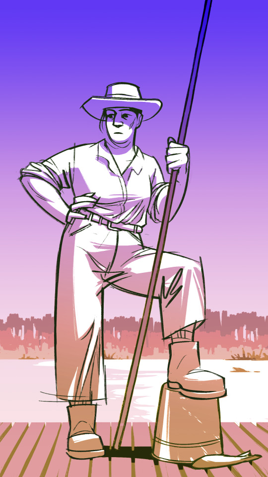
a day off at some country estate or other
#jeeves and wooster#jeeves#reginald jeeves#regina jeeves#genderbend#I kind of accidentally developed a headcanon that fem!Jeeves enjoys being more masc whenever she's fishing#or on her annual leave#since she has to be feminine day in day out working as a maid#and she likes feminine alright. but she likes to balance it out sometimes.#I feel so lazy using gradients instead of actually colouring/shading/painting but I do a lot of lineart these days#and it's hard to switch to thinking like a painter#if you thought i was done with my genderbends think again. 2 more black and white fanarts incoming. at some point.#to the two people who tagged me in genderbend-related posts I can't wait to read them I just needed to finish some art#idanit draws#idanit makes
105 notes
·
View notes
Text
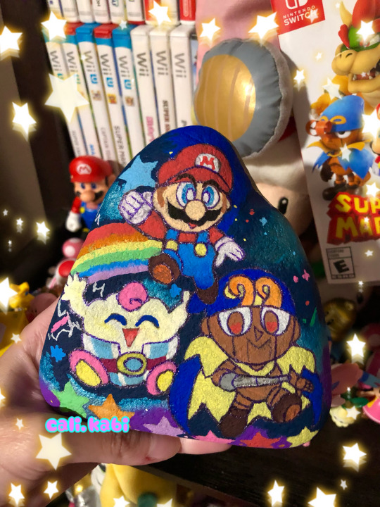
~ Super Mario RPG Trio🌟💫🍄
wanted to paint a rock related to some Mario <3 and a piece of decoration for my desk🎉 :) I love how everything came out so much I was going for the chibi with my posca style hehe ;w;🍬🎨
#my art#sydney’s art#geno super mario rpg#geno smrpg#mallow smrpg#poscapaintmarkers#poscamarkers#posca illustration#rock painting#traditional drawing#chibi Mario#chibi style#super mario rpg#mario rpg#i love the trio so much I hope Nintendo makes more merch of Geno and mallow in the future I would so buy them ;w;#used a glitter pen instead of a black marker for the lineart I usually do cuz I felt like this needed stars and sparkles:)
81 notes
·
View notes
Text

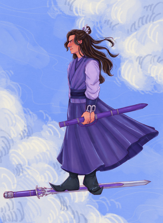
Flying with a purpose (just look at his face >:((( )
#katan art#mdzs#cql#the untamed#jiang cheng#jiang wanyin#sandu shengshou#I don’t draw for a few weeks and then I come back and just draw him#I drew the sketch in one of my classes there’s something about sketching when you aren’t supposed to that makes them turn out so well HAKDJ#I also just took my second sketch and used that as my lineart and it’s red vs black which was fun to do instead!!
167 notes
·
View notes
Text

its fine theyll set up a study group
[UNBLURRED UNDER CUT]

#Yugioh#YGO#Yugi Muto#Joey Wheeler#Jonouchi Katsuya#Phone Arts#HI. MY FIRST DIGITAL YUGIOH ARTS.. enjoy#expect a few more..#hey try 2 solve the equation in the tags. 4 fun#OH OH i know that the line coloring is different from my use but i accidentally did yugi with that color instead of black n it looked nicey#so! yeah#Usually I'm adamant abt coloring the lines but? The lineart is so tasty rn
8 notes
·
View notes
Text
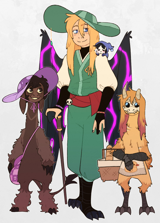
It's them. Again 💃
Back at it with somewhat different looks :]
(Some notes about them below the keep reading line)
For Tallulah's design, I gave her a cow tail instead, and I changed her fur pattern to be similar to a white-throated magpie-jay. And ofc, her hair is like-- right between black and dark brown in color, which I also put as her eye color :]
Gave her a bag (that has lil' images that represent her family) that I imagine works like Ramona's bag from [specifically] Scott Pilgrim: Takes Off. Where suddenly, Tallulah will just pull out a big fuck-off battle axe <3
Instead of having black hair with pink highlights, I made Chayanne's hair [sandy?] blonde with pink highlights.
As much as I love the duck floatie on his Egg design, it can be a pain to draw. So, while I was doing the lineart (to which I was going to draw the duck floatie as is), I decided to change it into an apron instead.
q!Phil's got some new clothes! Which includes: A cream undershirt, a green samue I took the sleeves off of, two lil' friendship bracelet (one purple and pink that's made by Tallulah, one yellow and pink that's made by Chayanne), and a lil' skull charm chained close to his waist uvu
For q!Phil's avian/elytrian side, I decided to just let him have talon feet 24/7, his wings are ofc fucked up from Enderpookie Enderking, and he was going to have tail feathers, buuut they ended up pretty hidden 'cause of his pose + the pants o(-(
q!Phil may not have chronic pain, but imo, it would still benefit him to use a cane while his wings are fucked up like that. So he's gonna be using a cane in my drawings.
And then we have lil' sleepy q!Missa. He's just in his sleeping garb in this drawing :')
#my art#QSMP#QSMP Fanart#q Philza#q Missa#QSMP Tallulah#QSMP Chayanne#Ph1lza Fanart#MissaSinfonia Fanart
591 notes
·
View notes
Text
…Okay, you may end up seeing these drawings yet again on a later date
I finished the page, which was small at 500x500 px, but I wanted to make the page bigger. I did that, and I drew one new thing, but now I don’t know what else to draw on there. So for now, I figured I might as well post the original full page right now
Yeah, sorry for the laziness
This is the other sketch I finished on there, for those curious
Anyways, so yeah, this new style practice I’m trying
The original page I tried these out on is this, which also isn’t full, but I thought trying it out with actual characters instead of just random poses and shapes would be better, so I switched over to Cookie Run characters
The method is still a work in progress when it comes to all the shapes and the red sketch layer
I suppose what I should do now is try drawing a bunch of different Cookies that have different body shapes, so that I have practice with that. As well as maybe attempt some full body ones
I suppose you can suggest some if you want, considering I don’t know who to draw other than like, Hollyberry or Avocado, since I should try drawing large but not buff characters here. But I should also probably draw more skinny, and also chubby
But on to what I actually drew
So I already talked about Peach Blossom and the top Dark Choco drawing prior, so no real need to elaborate
The Dark Choco and Dark Cacao one was me drawing them in their younger forms to see how they compare. Not for any sort of study thing, but just in a symbolic sort of way. Since they’re so similar looking
I think I had a lot more fun with Choco, especially his hair. I remember Cacao being mostly annoying for his weird cloak thing that I don’t understand
The hand pose was ass though. I knew the general idea of what I wanted, that being them with their hands over their swords, but I was struggling to figure out how to draw the hands. Not to mention I had to change the pose from the red sketch because the swords were further down than I put them. I still don’t think I did the pose exactly correct, but screw it, it’s good enough
I’m also noticing that Choco looks way lighter in skin tone compared to Cacao. Like yeah, I know he’s normally slightly lighter, but it’s far more noticeable here. I’m pretty sure it’s because I used Dark Choco’s ToA colors here (bc they work better with my black lineart), which are slightly lighter, as well as just that Dark Choco is wearing much lighter colors while Dark Cacao’s are relatively darker. So maybe it just makes them contrast more
I liked drawing them, but I also did basically do the same body type 3 in a row, so I should probably draw different characters
Anyways, let’s talk about that extra sketch
So for those who likely don’t remember, that there is an OC of mine called Prickly Pear Cookie
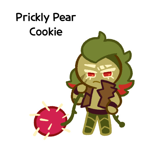
I made her entirely on a whim one day, and she doesn’t really have any character or story, just vibes, but I really like her design and wanted to draw it again
I probably should give her some sort of bra though. The shirtless chest looks cool but in my opinion sounds really uncomfortable without at least that
I did originally draw her with the green skin, but it looked weird so I shifted it to more of a yellow so it looks more human
Honestly I really like how she turned out
But yeah, I think that’s about it for now. Just wanted to show this
#I need to tweak and perfect it more#but it’s turning out relatively nice#I just need to stop falling back on old drawing habits#I need to relearn hands a new way#I have a reference that I found later on so I might use that#anyways#cookie run#dark choco cookie#dark cacao cookie#peach blossom cookie#art stuff#art style#cookie run oc#prickly pear cookie#my art
153 notes
·
View notes
Note
How do you draw Abodes Dreads/Braids? I'm a black creator and still (embarrassingly) struggle with them in the arcana style. (And in general XD) the way you draw her is gorgeous. And I must know the magic you poses.
Nothing to be embarrassed for! Unfortunately there's not much reference for black hair in the Arcana, so we all have to guess. I'd highly recommend looking at @kianamaiart and Simkray's hair brushes for other examples of stylising black hair (if anyone has examples of black hair in angular art styles, please share!!)
Anyway, I hope this helps!
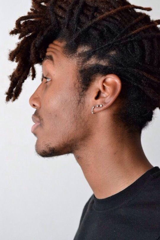
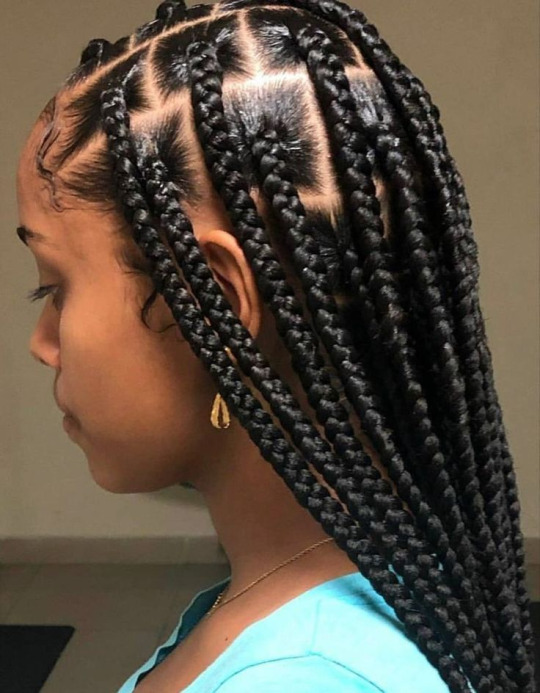
Dreads and braids are both segmented styles which makes their basic construction similar, however dreads are stiffer and hang less than braids, which are quite heavy
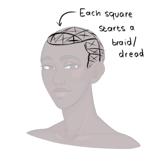
She usually pulls her hair back so I only have to pay attention to the hairline, but I draw each dread as a somewhat stiff tube. Where it connects to the scalp I feather in short, fine lines for the edges/thin hair that's attached to the skin.
To show the twisted texture of dreads, I add curved lines along each one. For me, this is a good balance of detail for the style (though I can still get tired of lineart -_-)
Then, as a final detail, I give Abosede imperfect ends, topping most dreads off with a thin twist. This is optional as some dreads don't have this.
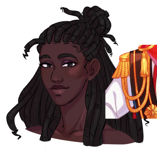
Then finally, for colour. I take reference for how they render ropes and add a series of light lines along each dread. Dreads don't reflect much light, so these are pretty faint.

For some braided hairstyles, you just replace the tubes I use for dreads with a simple plait pattern (as seen in Lucio's masquerade outfit). If you're aiming for cornrows, instead of the segments, draw the tubes along the scalp with sharp ends. Then fill them with a plait pattern. For extra detail, you can hatch lines in between the cornrows where the hair is pulled into the braid.
Braids have stronger highlights than dreads, and I tend to dot them in the centre of each part.
So this is my basic process. If you have more questions, feel free to ask!
#the arcana#the arcana game#hair tutorial#art ref#art tutorial#black hair#afro hair#art#i honestly haven't rendered abosede's hair much#mostly because there's so much lineart involved#for other art i tend to use braid/twist/loc brushes to make it easier#maybe i could try making some for the arcana style
3K notes
·
View notes
Note
Hello :D
I have been following you for the last year or so (a few days after I got my Tumblr lmao) and I absolutely love your art!
I have been wanting to study your art style for a while but don't really know where to start,,,
Could you please show me a small portion of your art process, if it isn't too much trouble of course. Thank you and have a nice day!
hello. oh my god. this took forever to find.
im sorry it took 2 WHOLE FUCKING MONTHS for me to respond to this but i wanted to put it off until i felt happy with my art process again, so here it is
my fall 2024 rendering tutorial!
(this will be very very long)

FLATS AND WHATEVER YOU WANNA DO WITH LINES GIRL. then make sure to recolor the lineart to better match your base. trust me it helps, bold dark lines are Not your best friend when rendering. wait for that post-rendering
i start off with a doodle or a sketch, and then filling it in with flats and other details such as blush

FIGURE OUT YOUR LIGHT SOURCE. FIGURE IT OUT GIRL YOU CAN DO IT you can make it as simple as possible, make it as big as possible, dont even THINK about the details.........just make it really fucking big so you at least know where the shadows and the light goes THEN add smaller shading details LISTEN TO ME. LISTEN TO ME OKAY!!!!!!!!
my key point with this is for you to learn lighting fundamentals.
it's SOOO ANNOYING but alas......they are all correct. it helps a lot.
one thing i also really want to point out is that i like creating a big shadow shape first before fixing up the little details (such as folds and whatever) because it helps me focus on the way the lighting actually works instead of tunnel vision-ing into making the shading make sense on the clothing.

contact shadows (i dont remember if thats what theyre called okay) theyre fucking ugly because im not actually thinking sorry 💔
okay so basically:
contact shadows (if that's what they're called) are the spots in shading and lighting where light will NEVER hit.
shadows are still influenced by the colors and lights around it (it's why a blue shadow and a yellow shadow feel completely different, despite both being shadows) so it's not always COMPLETELY dark.
BUT! there are small points in shadows where light never hits, and they're almost always super dark or pitch black.
it's hard to explain shadow and light so briefly for a tutorial, but you'll notice it when watching fundamental studies and when trying it out for yourself


YES i unclipped the multiply layer YES its ugly and terrifying but it makes coloring the multiply layer easier okay
the colors merged w multiply so now it looks cool and has depth
overlaying colors that actually make sense
so basically what i did was color the multiply layer that i used to shade the overall drawing
adding a band of red/orange/yellow around where the light hits, and blue where the shadows get big and wide, gives it a fake ambient occlusion effect in the way that a person would get if they stood under the sun with a clear blue sky
the colors don't have to make sense, especially because i never draw backgrounds, but coloring the shadows really help it give a sense of depth and extra subtle detail and effect that just helps make the painting look nicer
around the end, i also put in colors (in an overlay layer with a low opacity brush) that actually make sense in context of the drawing, which is the lit cigarette and the yellow eyelights
mostly because none of the colors were making sense and i needed to actually make use of the lighting that DOES exist in the drawing lol

adding a muddy golden yellow pin light layer (opacity turned down to like 40-50%) to make the light colors less ugly lol
i SWEAR by the fucking pin light layer style. it's so useful and so so underrated.
i used an almost brown-ish gold color on stop of all the layers, and with the pin light layer, it helped make the bright (almost blue-ish) white colors more warm and more yellow. it just helps make things more warm (something i prefer)
i could probably show what it looks like without adjusting the layer opacity to truly show off what i mean (like in the coming section) but i sadly forgot to do that lol


make a layer on top of your drawing with this color in these ranges YES the drawing is fully merged NO don't be afraid, the base was fucking ugly anyway 💔
make this layer into an exclude/exclusion layer style TRUST
turn down your exclusion layer opacity from a range of 10% to 40% literally until you're happy with the contrast and the way the color over the drawing. use your eyeballs. i know you can do it im so proud of you
this is pretty self-explanatory instruction-wise, so i'll go into why i do this instead
i really like art that seems like it has low contrast, with almost mid-gray shading and lines. i don't personally use dark and bold lines and shading, unless i find it necessary for the tone of the piece, so using this method helps lower the contrast of the art and make it look "pleasantly muddy" in the way that it's easier and softer on the eyes.
the inverted blue color also helps makes things warmer!
the exclusion layer style is still a bit of a mystery to me but i really like the effect it gives, even if i don't completely get how it works lol
if you want an alternative method to this, and if you have access to it (because i primarily use sai and sai only),
i absolutely encourage you to play around and experiment with gradient maps.
there are so many out there you can make yourself or even get from others that just give the painting an extra amount of depth and color variation. they're SO fun.
personally, if sai2 gets a gradient map update, it's over for y'all it will literally be so over no one will be able to stop me


then i merged everything and actually adjusted the contrast back up because it was looking too muddy for me 💔 but the color adjustments are still there so all hope is not lost
here's a comparison of the adjusted contrast in black and white
(adjusted on the left) (newly merged layer without adjusting the contrast on the right)
as you can see, i actually turned the contrast back up (despite talking all about how i liked things with less contrast lol)
i wanted to demonstrate that doing adjustments should be done in moderation, and is why i adjust layer opacity often when making color effects
you are free to play around with colors to help your style, but don't lose your initial idea and colors along the way.
you still need to trust your own colors and intuition!
along with that, i just want to say that it's completely okay to change your mind mid-painting, and it's okay to make somewhat drastic changes.
don't be afraid to change things you don't like or change your mind about certain aspects way later on
that's basically the whole thing of this!!! don't be scared!!!

now im gonna hold your hand when i say this..........but you need to learn how to render by yourself. it seems like i can teach you but i literally can't, because rendering is different on every piece and depending on how clean your base is. i have to render A LOT because of how fucking ugly my sketches are LMAO
to simplify it, think of it as obsessively cleaning up every detail you can see, but with a color picker and a clean, hard edged brush. if you have shit lineart, you don't have to redraw it cleanly over and over, just paint over it. that's basically what rendering is
THIS especially is where you need to be brave and stop being scared.
like i said, i can't teach you how to render, and it's something you have to discover yourself because rendering is something that will always be personal to every single piece you make. the way you render on every piece is different.
on one piece, you will barely need to render, and on another, rendering is more than half of your ENTIRE process.
don't be afraid to paint over your old art.
rendering is a process that's both very perfectionist yet also very careless.
find your balance and just go for it.

and then that's it……..u did it………..now yuo know how to paint and render. it's literally just layering shading and lighting knowledge until you think it makes sense and looks okay lol
additional note: since i render in only one layer (you don't HAVE to do this, but it'll be harder for you…), i also made slight adjustments with the transform (and liquify, if you have it) tool to make things more proportionate. (i drew the head too big lol)

if you compare the finished piece to the final unrendered base, you can see that a LOT changed, including a bit of subtle proportion adjustment.
particularly, the sleeves changed A LOT (because i really didn't like them)
but it's also over all cleaner and more coherent, instead of having haphazard colors and shading just thrown about.
rendering is when you finally use all 100% of your brain to finalize and figure out where the shading should go, where to clean up your lines, where to ERASE or ADD BACK in lines, and make sure all your colors look coherent.
it's not as intimidating as it seems, i only use a hard edged brush with a little bit of color mixing and my color picker.
it's like dragging and dropping colors to cover up mistakes, it's really quite fun when you get used to it
i wish i could explain it clearer but it's hard to describe without visuals!
i hope this helped, and i hope all my yapping isn't annoying (art as a special interest beloved)
have fun studying and trying to render in my art style!
#long post#art tutorial#rendering tutorial#art help#art tips#tutorial#kia doodles shit#artxstic-scr1bbles
129 notes
·
View notes
Note
Hey seiishin, I'm a beginner artist and i was hoping you could give a full tutorial on how you color?
hello! this is a bit of a hard question to answer since i dont think giving a tutorial of how i colour without learning any foundational colour concepts first would be very beneficial, so i'll try to give you some basic tips on picking colours instead since this is a very VERY expansive topic and im simply not the kind of person that can pass on that knowledge very well especially since im not the best at it lol
when im picking colours for my drawings, i try my best to "unify" the colour pallet so that it seems more cohesive, this tip from ggdg sums it up pretty well i think
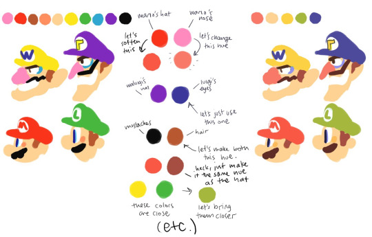
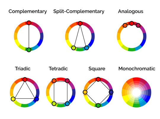
other than that, i usually try to pick colours that generally look good together based on different colour harmony concepts, like these!
i'll try and show you an example with something i'm working on right now. you'll notice i didn't colour pick tinkaton's colours from its art and went for a warmer pink and saturated the blues of the hammer a little.
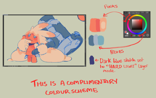
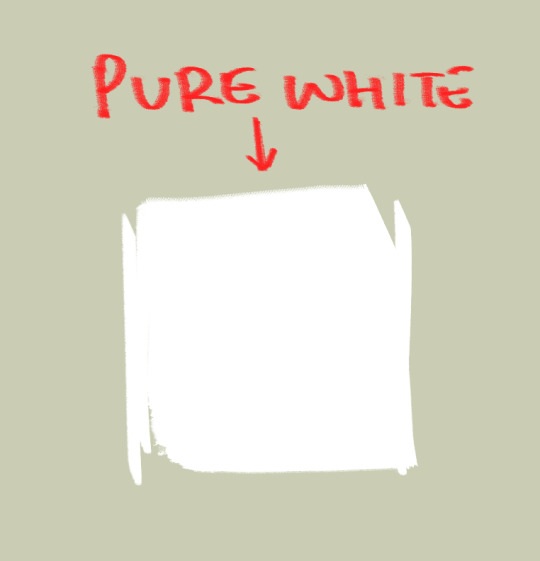
you'll also notice the canvases i draw on are NEVER pure white. this isnt to say pure white is something that can never be used but white is a colour that usually influenced by surrounding colours, so pure white in most pallets just wont look right. so its not usually a colour i would use as a backdrop if youre trying to pick good colours for your art. but again, there's always exceptions and this isnt a hard rule. here's pure white compared to the colour my canvases usually start with
another thing i should touch on briefly is colour relativity and the importance of value and saturation.
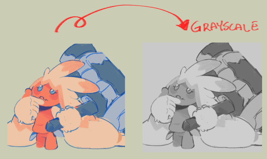
value is SUPER SUPER important for making sure all the colours in your art stand out from each other and read clearly. as you can see here, most of the values here stand apart from each other, and i can see that i probably need to adjust the darkness of the light blue in comparison to the pink hair tips, though the lineart separates them well enough already i think. this is also a good way tocheck you havent made any dark skinned characters too light. values are important guys!
hot tip: put a layer of pure black on top of your art and set that layer to "colour" and BOOM! you can see the values of your art in grayscale.
and i'll also briefly touch on colour relativity. because we percieve colours relative to each other, we usually read a colour as something its not when its surrounded by certain other colours. let's take a look at my background drawings in the cover i did for the shuichi saihara zine:
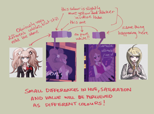
though i only used a bunch of different purples, when all of them are perceived in relation to each other, a warmer purple can look like blonde hair amongst all the other purples!
as for the brushes i use while colouring, i like textured brushes! i bought these so i cant share them for free but im sure there are many free alternatives out there
anyway, sorry if this isnt exactly what you wanted, but there are TONS of people out there that have worded this better than i ever could, i would suggest looking up some youtube vids on colour theory, but i hope these little tips are useful enough!
2K notes
·
View notes
Note
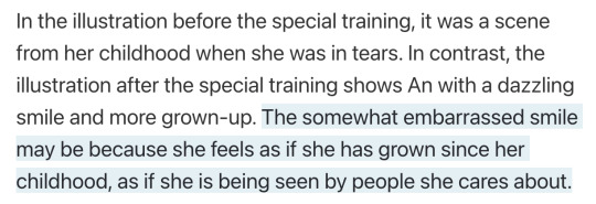
the way i only JUST realized that in An's "The Overflowing Feelings" card behind her isn't An's reflection no that is NAGI.....
and im pretty sure there is a bunch more symbolism in it because like. i think nagi is wearing a hospital gown in that card instead of her regular clothes but it is kinda hard to tell
sometimes i see an ask and think "i could make this so much worse" and this is one of those times.
that's not a reflection, that is straight up ghost Nagi. if you notice the grunge texture is actually overlaid over the entire illustration, not just behind the fence. it's not a mirror, it's a fence that separates the living (an) and the dead (nagi). i also like how everything except Nagi on the dead side is blurry even the plants that are right next to her. i can't give an actual explanation because annoyingly this set didn't get a blog post, but my personal interpretation of this is that it's meant to show how Nagi is still close to An even after she's gone (personally I like to connect it to An carrying her memory of Nagi in her heart becase she's clutching her shirt over her heart, but i think you could interpret it as Nagi watching over An from the spirit world too if you want).
i think it could be a hospital gown based on general appearance and the way it ties at the back, but as you said it's hard to tell. it would make some sense though since she died in hospital. but it could just be a generic black dress, since it doesn't look like the hospital clothes she wore in the story. also if you look closely you'll notice her lineart is in a white-grey color which makes her look more ghostly than An.
Also notice how all the other pillars have the red flowers on them (the ones from the gekokujo jacket). I believe these are gerberas, which are sometimes used as funeral flowers. i.e the flowers placed on the other pillars are to say goodbye, but she's actually right there with An.
i think i can still make this worse.
contrast with An's card from Vivid Old Tale. y'know, the one all about her relationship with Nagi and the first time they actually implied that Nagi's dead (they subtly hint at it in BFBY but it was far more obvious in VOT).
This set actually did get a blog post so I can go on about the symbolism. The cards in this set were based on the theme of "warmth and nostalgia", which heavily connects to the event being about An looking back at her childhood and time spent with Nagi, and how much she loves her home.
Sunflowers obviously tie in to that warmth, but they also symbolise positivity, happiness, and hope (the color yellow does as well). These connect with both her dreams in the present and memories of the past.
Also this part of the interview:
The people she loves have seen her grow up and smile compared to when she was a kid and crying after running away. Now while people she loves who have watched her grow up could be her mom or dad, or even Taiga, considering the untrained card...
The person she's smiling at is Nagi.
And that's what makes the LUTF set so fucked up because just LOOK there's so much contrast between them. Sunflowers representing VBS' hope compared to the despair in the LUTF set caused by their defeat to Taiga. The bright colors next to greyscale (and red, which has several different connotations multiple of which are applicable here), how cold the LUTF set is next to the VOT set. An holding flowers in both but in one they're flowers symbolising joy and in one they're flowers symbolising grief. The VOT set is youthful and lively but in the LUTF set everyone is angry, despairing and grieving a life lost.
The fact that the POV in An's VOT card is probably Nagi watching her all grown up (which she never got to do in reality) vs Nagi being dead and separated from An in her LUTF card, not to mention that Nagi is not watching her anymore but instead facing away because she's left An behind (but was she ever really with An in the VOT card in the first place?). An crying in both untraineds but in one she's being comforted by Nagi and in one she's crying because Nagi is gone.
In some ways it's like the VOT set is An's idealistic look at what life will be like when Nagi gets home and the LUTF set is An coming to terms with the reality.
this card fucks me up.
388 notes
·
View notes
Text

Linda Flynn Fletcher/Linda Cipher throughout the years! Full image ID under the cut cuz there’s a lot of text to transcribe lol
New Astrophysicist: Eager to start her new career! Wants to prove herself after Lindana’s legacy. Craves fame on her own terms. Willing to do WHATEVER it takes! Silver jewelry. Silver star shaped earrings. Purple headband. Colorful striped shirt. Purple choker necklace. White Labcoat. Bell bottom blue jeans. Shoulder length red hair.
Dating Bill: more confident in self and career. Starts dressing more professionally, without sacrificing personal sense of style. Starts wearing gold jewelry. Yellow button up shirt. Gold triangular earrings. Yellow headband. Black choker necklace. Blue jeans. White lab coat.
Possessed by Bill: PARTY GIRL! Colleagues just think this is what she’s like when she’s drunk. Acts kinda slutty? MESSY HAIR (Bill’s not used to vessels with so much hair, so he keeps messing with it.) lineart different - more Gravity Falls style than Dwampyverse style. Doesn’t know how to wear a shirt. Lost a shoe - Linda will have to find it later. Mostly same as last design, but without the labcoat.
Pregnant: hair grows faster during pregnancy. Shows off her belly! Patches clothes - Bill starts breaking things, but she blames their body’s hormones. Design is same for both pregnancies because she just reuses her old pregnancy clothes. Same “dating bill” design, but with longer hair, a crop top, and a green patch on her blue jeans. Gold wedding ring.
Full Bill Cultist: Dresses more and more like Ford. Invests in hippy stuff. More obvious about being with Bill. Colleagues think she’s starting to go a little bit nuts, but can’t argue with her results. Red turtleneck. Tan jacket. Shoulder pads. Black slacks. Brown sneakers. Gold triangle earrings. Gold headband. Gold beaded necklace with a big triangular bill cipher charm. Gold wedding ring.
Post Breakup: doesn’t take care of self. Ironically looks more like if Bill were possessing her. Still wears yellow, but it’s washed-out. Her relationship with Bill is broken, but still fresh. Tired, trying not to sleep a whole lot. Caffeine addict. Messy hair. Green headband. Green flannel jacket. Yellow t-shirt. Tan cargo pants. Green sneakers. TIRED.
Dating Lawrence: letting herself be a little bit cringe. Having fun! Reminding herself of things she enjoys outside of what she did with Bill, like music and fiber arts. No yellow OR red. She’s being DIFFERENT for a little while. Pony tail. Black scrunchy. Teal sweater dress. White belt.black leggings. Purple leg warmers. Black sneakers. Clunky upside down teal teardrop earrings.
Now: wears yellow again, but on her OWN terms now. Isn’t afraid anymore. Trying out new things! Opted out of rings with Lawrence. They have antique lockets instead. Whole family has them, including a custom-made locket for Perry. Takes a lot of classes. Content to be a stay-at-home mom with a lot of hobbies. Her career isn’t important to her anymore, she doesn’t even have one. She’s FREE. White short sleeved button up shirt. Yellow sweater vest. Green khakis. Yellow orthopedic shoes. Peach colored headband. Teal pearl earrings.
#gravity falls#phineas and ferb#linda flynn fletcher#linda cipher au#artists on tumblr#looney mooney rants#mooneyart#looney mooney art#fanart#character design
52 notes
·
View notes
Text
rough art tips to learn and then break at your leisure.
the distance between your eyes is roughly one eye. the corners of your mouth dont extend past the middle of each eye. ears are roughly in the middle of the tip of the nose and the eyebrow. the eyes are in the very centre of the head. the neck is just a Little slimmer than the width of the head (varies with fat distribution, but fat tends to build up under the chin). hair is easier to draw when you plot out the hairline and then where it parts. leaving appropriate distance on the side of the face (cheekbone area and back to ear) contributes to making characters look more realistic/hot as hell. i dont know specific tips for that so use reference. an amazing reference/study site is lineofaction.com . if you think of the face in planes it makes it easier to construct (look up tutorials). if you draw a spiral like a tornado it can help you figure out awkward perspective for extended limbs (look up foreshortening coil technique). tangent lines are when two lines intersect and cause visual confusion (when it looks like a line that defines an arm is part of the line that defines a building, for example) and avoiding them makes your art way easier to comprehend. quick trick to good composition: choose a focal point (where you want your viewer to focus), detail that area the most, and make sure various elements of the piece are pointing to that focal point. you can use colours to contrast hue, saturation, and brightness and make certain elements of your drawing stand out. drawing in greyscale can help you figure out values. using black in a piece isn't illegal but you should know what you're doing when you do use it- it desaturates a piece and if used as a shading colour can desaturate and dull whatever youre shading too. if you use almost-black lineart and then add black to darken the very darkest areas it will do a lot to add some nice depth. the tip of your thumb ends just above the start of your index finger- your thumb also has two knuckles and all your other fingers have three. if you see an artist doing something you like (the way they draw noses or eyes or hair or anything else) you can try to copy that and see if you want to incorporate it in your style <- this is ENCOURAGED and how a lot of us learned and developed our styles. there are ways to add wrinkles to faces and bodies without making the character look a million years old, you just have to keep experimenting with it. The smile wrinkles around your muzzle dont connect to your mouth or to your nose; there should be a small space in between smile or nose and the wrinkle line. eyes when viewed in profile are like < aka a little triangle shape. think of the pupil like a disk and apply foreshortening to it (it looks like a line when seen from the side instead of a full round dot). subtle gradients can add a LOT to a piece. texture can also add a LOT. look up Tommy Arnold's work (his murderbot pieces are some of my FAVOURITE) and zoom in. find those random little circles he added and try to figure out why he added them there. light bounces. there's lots of way light bounces. sometimes it even spreads through the skin. i do not know these light tricks yet but i want you to know that they exist. draw a circle to indicate hand placement, draw a straight line between that circle and the shoulder, and then (normally at a right angle) draw a straight line on top of that line to find the placement of the elbow. elbows are normally placed Just above the hip when standing and your arm is at rest. there are no bad colour combos if you're brave enough about it, just fuck with the saturation and brightness until it works. keep playing. try new things. add your own tips to this post if you want or even expand on some ive mentioned here. good luck go ham etc
#look at this post#the sum of almost all of my art knowledge#all that i can remember rn anyway lmaooo#shit i didn't mention the tips for backgrounds that i know#eh that's environment most of this deals with character work anyway#i learned most of this from tutorials and kind artists who like to talk about their work#i would not know NEARLY as much about creative shit as i do if it weren't for the people who were willing to talk about their skills#and their tricks and their observations. id be nothing without them i dont remember most of them but i am so so grateful for that kindness#so ig here ill spread that a little further#if you have any questions go ahead and ask i am a NERD about art okay i do not know everything but i am always willing to talk about what i#do know#art tips#one of the most important things for you to do as an experienced or beginner artist tho#is to PLAY#experiment#figure out what's fun and what looks nice and what looks nice faster and just. whatever the fuck you want to learn#it is SUCH a joy
274 notes
·
View notes
Note
Not ship chart related but I think your art is so pretty!! Do you have any tips? Especially with coloring if it’s okay <] (/nf)
waah thank you very much! i'll try and explain but here’s my colouring-specific tips, or at least how i choose my colours !! <3
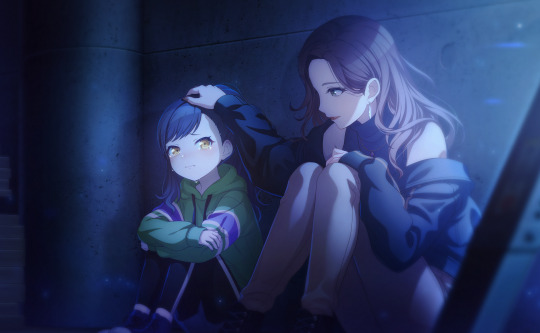
unless for stylistic reasons (e.g. greyscale drawing), i personally avoid pure black, greys and white for colouring. go and choose off-colours instead!
for lineart, black is okay but i always go for an actual colour anyways heheh. for the background colour of your canvas, sometimes an actual colour (rather than white or grey) may help you pick your palette to be more harmonised!
following this, i also don't like using pure/neon for colours, unless it's for a certain aesthetic or artstyle (e.g. the character has a "toxic/radioactive" aesthetic; the character is a scenedog (or similiar); or highlights).
see below for examples! they may be subtle but sometimes the subtly can make the difference you are looking for... if you're looking for a natural look. if you're aiming for the bright/old 2000's artstyle, then pure/neons may be your friend!
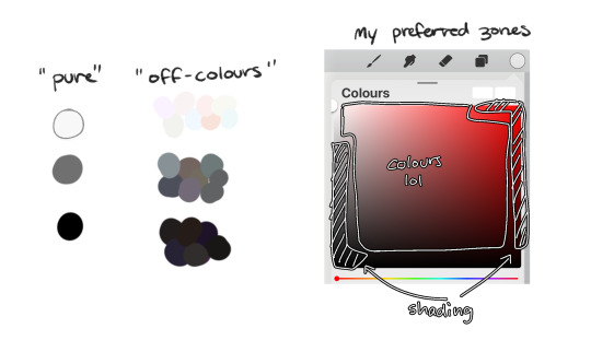
when i'm casually drawing characters (oc or not), i rarely colour-pick from the reference image.
i find that when you're "forced to make the palette", it can come out more pleasing to your style/atmosphere of the drawing!
it’s more personalised that way... like yea, that’s my favourite versions of those colours! i'm not saying that my colours are better though, only that "hey that's me! in those colours!!"
you can have the reference image on the side or go by memory. here’s me doing this with pride flags:
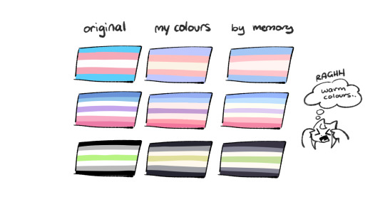
nowadays, when drawing the spooky month characters—who have simple designs god bless—i can just imagine their reference and adjust the colours in my head lol
example: if i know that Lila's colour palette is purple, and that her winter sweater is coloured lighter than her hair, then i can just go ahead and pick whatever shade i want following that rule!
(of course, always double check with the actual reference for physical design inaccuracies and skin tone if it applies. my advice above is just for general hair/clothing colours!
…because yknow you don't want to accidentally whitewash a character's skin in the name of aesthetics lol. if you’re unsure and want to be on the careful side, please do colour pick the skin at least !!)
moving on...
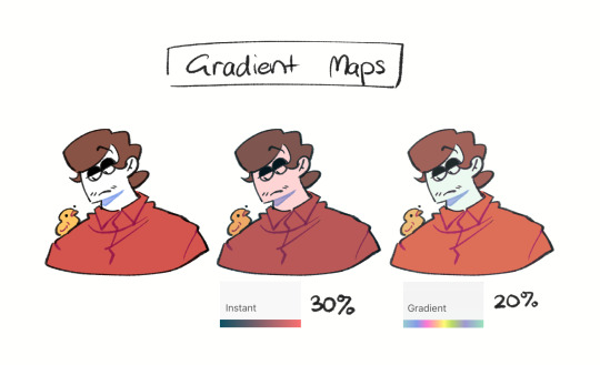
gradient maps and certain blending modes (like exclusion, luminosity and darken) can be a game changer too.
for normal drawings (e.g. drawings with no environment), i use darken the most because it changes a few colours rather than the entire piece...
(the percentages are opacity levels!)

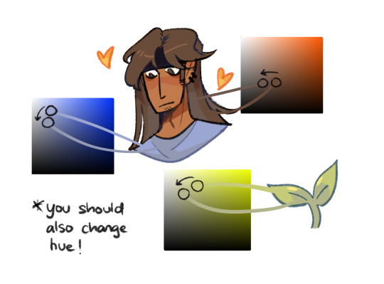
oh and as a really basic shading tip without using blending modes: sometimes, you just gotta go for grey. shading a warmer colour? use grey to make a cool tone. shading a cool colour? use grey to make a warm tone. not all the time (because you don’t wanna make your shading seem muddy), just sometimes…
and that's that! there's always exceptions to rules and often times, your headshot doodle ends up as one big experimental mess (in a fun way, hopefully)!
this is how i choose my colours though most of the time, it is just me going “good enough”
i think we're pretty similar on how we like warm colours! i enjoy going the simple/lazy route and avoid blend modes but then again, shading is a whole different thing…
hope this helps in any way !! <:3 !!! <3
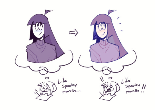
#if anyone wants to ask for specific tips i’m happy to share!#if i have any lol#[ the askbox mourns ]#[ the art of mourning ]#[ mourn's mourns ]#anyways yea i kinda do just imagine the spooky month characters with a light orange multiply layer and then try to replicate it irl#my personal/lazy rule is that if it looks good faraway its good enough AHAHA#spooky month lila#spooky month jaune#spooky month rick#spooky month aaron#spooky month#“actuallyyy the 'black cat' is actually dark grey—” SHHHHHH SHUT SHUT IT. SHUTUT !!!!! i need u to see the lineart /silly
87 notes
·
View notes
Text
nerd talk: how i did the riso thingy
the riso effect is achieved through riso printing, printing by layer with CMYK. a lovechild of screen printing/photocopying. it starts with the lightest color to darkest, in this case; yellow (Y), magenta (M), cyan (C), and lastly black (K). the same principle even applies to markers and watercolors
somewhat fun fact from what I've learned so far: while CMYK is subtractive, replicating riso digitally works best with ADDITIVE blending modes (darken, multiply, color burn, linear burn, etc)
crazy (i was crazy once—), right :D ? obviously there's no "correct way" to do it, so i suggest experimenting to fit your preferences <3
here's the separate layers. i cheated a little since i wasn't sure what i was doing (or if it would even WORK), the lineart isn't layered but hey ! the coloring sure is 😅😅
here's the colors together without the lineart. riso prints tend to look "misaligned" so i did the same thing (kinda looks like chromatic aberration 😬😬😬 whatever !!!)
psst.... color palette is from this post!
opacity matters as well ! to get the desired color, i had to experiment and constantly adjust the opacity of each layer 💀💀 (i did say "the workflow is deffo slowing me down atm" thats because i intended to make a color chart FIRST AND FOREMOST !!! GRRR)
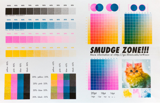
(an example of a color chart would be like this. i'd like to make one with my chosen color palette but noooo instead I eyeballed everything 💀💀 i was excited. sue me)
anyways ! sorry not sorry for infodumping. and im not an expert. however, riso is one of my recent favorite things to learn about. its a lengthy process to do it with illustrations imo. for my graphic design projects however? i might use this technique :D
72 notes
·
View notes
Text
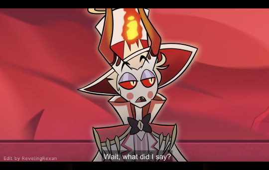

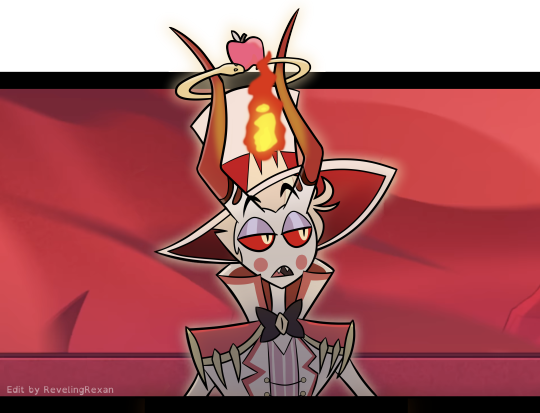
a silly screenshot edit i made of one of my favorite moments :)
...because i organized my bank accounts and wanted to give one of my cards a special cover!!
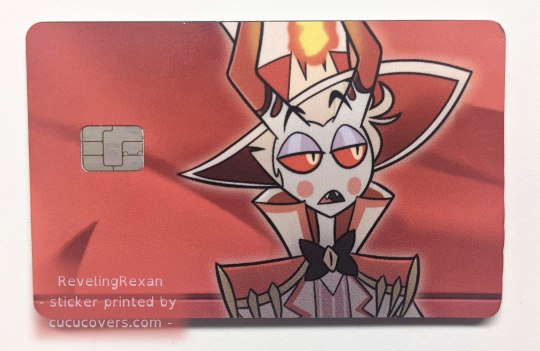
a brief note about applying the sticker to the card:
the directions said to line up the sticker to the opening for the chip, but it went better for me when i lined the sticker up to one of the long sides of the card. (but of course make sure the sticker would be in the right part for the chip)
bonus behind the scenes on my making the pic under the cut :)
_____

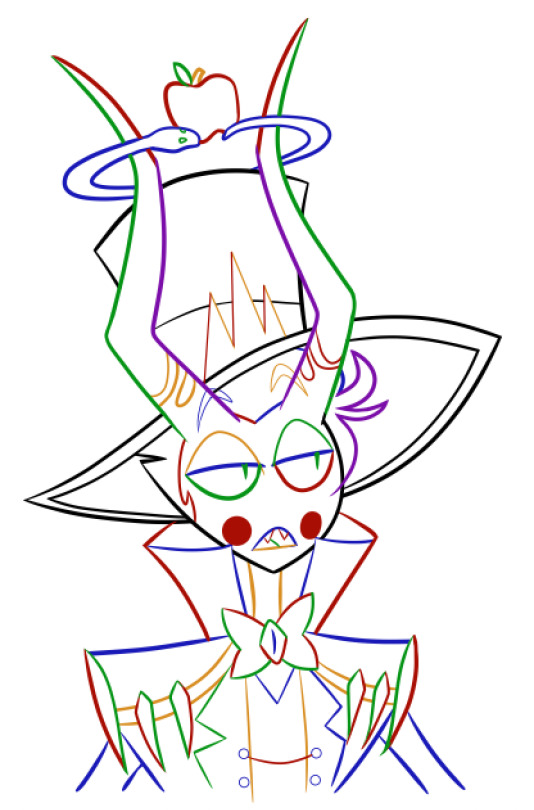
i tend to make several lineart layers when doing REALLY CLEAN lineart so i can more easily erase overlapping lines. (the first screenshot has lines that "overshoot" because that gives nice sharp corners and line width variety, but i need to erase the extra parts of the lines)
(i like these screenshots because Lucifer looks extra clowny with the outlines' colorfulness)
i realized on this project, since the final lineart is just going to be black anyway, that i can use different colors for each layer and then LATER make the lineart black. (realized it after already making some lineart, so you see some black here) that way, i can easily know what layer everything's on, instead of going through a bunch of layers and clicking them off and on to find a specific part

SO, RIGHT. VERY EASY TO THEN GET BLACK OUTLINES: JUST SET BRIGHTNESS TO ZERO. i usually use a program called FireAlpaca, and the way you do that there is: Filter > Hue… > drag the Brightness cursor all the way to the left

in this screenshot, you can see some of the effects i added to Lucifer to give him the nice shadowed look that Hazbin Hotel has, as well as where i covered Charlie at the tip of Lucifer's hat lol
i included my layers on the right of the screenshot to show how i set up the outline layers in the final version: as you saw above, i named my outline layers with the color used for them, then, once i was done with the outline, i placed the "outline before color change" folder above the base black "outline" folder. that way, if i later notice a mistake, i can simply turn on the colored outline folder and i'll see what color that part of the outline is and jump to the necessary layer, rather than going on a quest turning off and on a bunch of layers each time
since i duplicated my outline folder before changing the outlines in one of them to black, the base outline folder already has the color names included in the layer names
NOT ALL DIGITAL ARTISTS USE AS MANY LAYERS AS I DO LOL. I GO WILD WITH THEM SOMETIMES. MANY OF MY PROJECTS HAVE WAY MORE THAN 80 OR EVEN 500 LAYERS. people just tend to figure out what works for them. i wouldn't be surprised if i end up using fewer layers in the future. or a lot more. or go either way depending on the project
so, yeah, this is a screenshot edit, so i traced the main part of Lucifer's body. for the background, i used two screenshots. had to cut together and cover some stuff. here's the two screenshots unedited followed by a scribbled version to make things work lol and then the scribbled version that includes some extra touch ups/covers
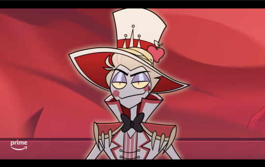

and some screenshots i took while working on this, when i unexpectedly got some cool-looking versions :3 first one reminded me of Day of the Dead looks (he DOES need to be more colorful to be more accurate) and the second is just rad


ANYWAY probably the most helpful thing to most people would be the colored outline thing talked about at the start lol, the stuff i bolded. that was IMMENSELY useful and i love black outlines more than ever XD
#hazbin hotel#hazbin lucifer#lucifer morningstar#hazbin hotel lucifer#screenshot edit#i feel like there's something else i wanted to mention under the cut but i'm forgetting lol#oH. IT WAS ABOUT CHANGING THE IN-PROGRESS COLORED OUTLINES TO BLACK LOL. GOT IT WOO#rexan's art#i got the sticker like two months ago and i STILL sometimes take my card out only to look at it XD#one of my best purchases ever lol#(it was about $15 in the U.S. and that includes shipping. i really wanted a Lucifer card)#(so worth it)
59 notes
·
View notes
Last Seen Blogs
haysgrove
Licofern brainrot 💀🌿

kartoffelsalatt
Kartoffelsalatt
tid-liddell
Stressed, Depressed, but Well-Dressed
scorpihoe
That’s Mr. 𝒫𝒽𝒶𝑔𝓊𝑒𝓉𝓉𝑒 To You
skeetilyspooch
henlo