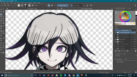
#so i duplicated the layer and colored the bottom one black and moved it slightly lol
Explore tagged Tumblr posts
Visit Tumblr Blog
Explore Tumblr blogs with no restrictions, modern design and the best experience.
Last Seen Tumblr Blogs

Fun Fact
The Tumblr office adopted Tommy, an 11-year-old Pomeranian.
Text
based on this screenshot i posted before:
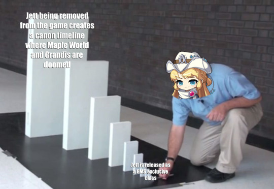
#maplestory#i can't believe jett being such a buggy mess that nexon finally didn't want to keep maintaining#possibly results in a canon doomed timeline for maplestory#jett when asked about what maple world and grandis are supposed to do without the adversary: i forgor 💀#sorry if the text is hard to read#since my old SSD died i lost the font i usually use#so i had to improvise using impact font but white alone would be unreadable against the white dominoes#so i duplicated the layer and colored the bottom one black and moved it slightly lol
13 notes
·
View notes
Text
youtube
Hey everyone, I've created a video that shows how I make a shifting 3D effect animation from my 2D artworks using Gimp!
✦ Written guide below the break ✦
I'm using Gimp 2.10 on Pop!_OS
Open your image in Gimp.
Create a new layer over the art, color to black, and lower the opacity.
Starting with a dark to medium gray color fill in each element, working from back to front, visualizing the figures in a 3D space. Black is the background, white is closest to the front.
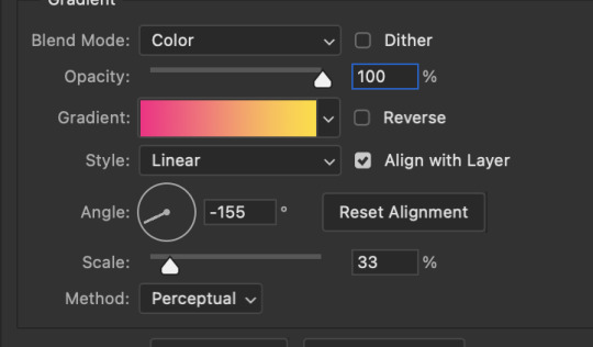
When your gradient map is complete, move the layer underneath the artwork and go to Filters➺ Map➺ Displace.
In Aux Input double click on the gradient map.
I personally prefer to work in Horizonal Displacement only, so I have to click the little chain link icon to the right to “break” the chain and allow only one axis to be displaced.
It doesn’t take a big shift to make an interesting effect, in this video I only move the artwork 2 degrees in each direction.
Here I displace two images total to create a perfectly looping four frame animation. Frame 1 shifts slightly to the left. Frame 2 is the original unedited painting. Frame 3 is shifting slightly to the right. The final frame is just a duplicate of frame 2, to create a perfect loop that goes: 1 2 3 2 … 1 2 3 2 … etc.
Make your animation! You can open all frames in Gimp to export as a GIF. Note that with your animation layers in Gimp, frame 1 is the bottom-most layer, going up from there.
For this video I simply opened the image files with my video editor Kdenlive, shortened each frame to 00:00;05 seconds, and made the loop that way.
Thanks for watching, let me know if you try this with your own work!
✿ Anka
#click through to youtube if you need captions -- i manually edit them so theyre correct#tutorial#art tutorial#stereograph#stereogram#3d effect#gimp art#gimp#Youtube#psychedelic art#trippy#figure painting#flowers#colorful art#audio commentary
9 notes
·
View notes
Note
EYES PART TWO✨✨✨✨✨
So I wanted to go over how I do most of my eye coloring as well. Most of my eyes are variations of this method, and you can do it using cel shading (solid-edged brushes) or soft shading (softer-edged brushes), or even a combination of both! It really doesn't matter. But because this is long enough already, I'll put this part under a read more.
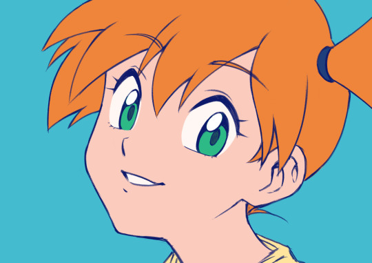
I'll be using this Misty sketch that I don't think I'll finish because it's clean enough already so I don't have to do lineart just for this haha. As you can see, I usually outline the white of the eyes as well so I can stay aware of the shape. I erase these lines once I apply my flat colors.
I'm using Paint Tool SAI 2 for this since it's what I draw in, but you can do all these steps in pretty much any digital drawing software (and 99% of them can be done even on MS Paint if you don't care about layers lol).
So the first step would be laying out the base flat colors. You can keep each color on a separate layer or merge them all together, it really doesn't a make a big difference so whatever feels most comfortable for you works just fine.
(I also made the lineart blue because I think it works better with the bright colors than the black but this is totally optional haha)
Okay so I know this sounds like the "how to draw an owl" meme but I'm going to start by shading everything else except the eyes. Overall shading isn't the main point of these tips so we'll save that for another day haha, but I recommend doing this so you have a clearer idea of where the light is coming from and where it's hitting, especially in more dramatic lighting situations, so the eyes don't look like stickers slapped on the picture. Of course, you don't really need to shade everything else first, but this is what I like to do for this kind of drawing. :P
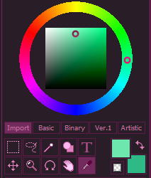
We'll be using this teal-green color as a base to pick our shadows.

I'll be picking the teal-green color twice using the dropper tool, so both color selection squares (bottom right) look the same as a starting point. This will help you see the difference between the colors more clearly:
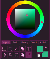
Since the colors in this drawing are vibrant, but not overly saturated, I won't be touching the further left or right sides of the square (which iirc is technically called HSV -Hue, Saturation, Value- square) to pick the shadows. Since the other shadows are slightly pinker than the base color as a personal choice, I also want the shadow to be a bit cooler than the teal-green color, so I will be moving slightly towards the blues on the wheel and slightly downwards on the square. Something like this:
Now it's time to apply this color to the iris! I make sure to leave a circular-oval shape at the bottom without any shading.

I think this looks good enough! But if you don't want to commit to a color, you can always put it on a separate layer so you can adjust the hue, brightness, saturation, etc., individually until it looks just right for your taste.
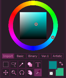
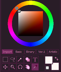
I already added some extra depth to the higher part of the iris with the lineart, but I'm going to pick a second shading color anyway just to show you the process. This time, instead of starting with the base teal-green color, we're going to pick the cooler, darker shading color twice so we can use it as a base:
And again, we're going to go a bit cooler (bluer) on the wheel and a bit lower on the square. Something like this:

And we apply this color to the top part of the shading area, following the curve:

You can leave it like this since we're doing a more solid cel shading style, but you can also use a soft brush or apply Gaussian blur afterwards to make this deeper shading subtler:

Or you can duplicate the solid layer, blur it and just have both at the same time! Just do whatever looks good for you. I think I'm going to stick with this one:
You could stop here and this would be considered complete! But I like to add two circular highlights (one bigger, one smaller) to the bottom of the iris. I don't remember when exactly I started doing this because it's been so long, but I feel like it's one of the few constants in my art style haha
So yeah, let's do that! First, pick the base teal-green color again:
And because the shadows are cooler, I'm going to move the wheel in the opposite direction so the highlight is slightly warmer. So, I'm going to move just a bit towards the green on the wheel, and towards the higher part of the square (and slightly to the left so it's lighter).
The result would be a lighter, greener color:

Again, you can draw these on a separate layer so you can adjust the color however you want.
Just for fun, I'm also going to add a highlight next to the big white one in the same teal color as the base of the iris:

If you want, you can duplicate the highlight layer, blur it a little bit and set it to a mode like Screen or Overlay to make the eyes shine a bit more:

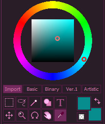
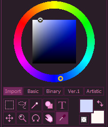
And of course, we can’t forget the sclerae! In order to shade them, we’re going to pick the white color. Again, pick it twice so you can see the difference side by side:
Since we’re going with cooler colors for the shadows, I’m going to go to the blue area of the wheel to pick the shadow color. I’m going to move a bit to the right on the square to make the blue slightly deeper while remaining light enough to work as a shading color for the white.
And now we apply this color to the top part of the eye following the curve of the eyelashes/eyelid! Remember that eyes, even when stylized, are representing an orb. I’m sure a straight shadow could look pretty cool in a very stylized art style though, it’s just not what I’m going for here.

And we’re done! There she is, all nice and shaded!
Keep in mind that you don’t have to do every step exactly like this. Sometimes I don’t feel like picking the colors manually, so instead I shade with a light, desaturated purple, blue or red-orange color (depending on the base colors) on a separate layer and set it to Multiply! Which can be a real time saver.

The purple in particular is my personal favorite because it works well with a lot of other colors!
Aaand I think that would be it! I hope this was helpful. Feel free to ask if you have more art questions. :D
Your art is so amazing especially with the human characters, got any tips on human tutorials if you don't mind me asking?
Thank you!! :>
I'm always glad to share some tips! Is there anything more specific you need help with? Humans have many different parts after all haha
#NOW it's complete!#I hope this was helpful!#feel free to ask any art questions (not just you but like in general. you as in the person reading this :P)#given the current climate I want to encourage more people to draw so if I can help by sharing some tips I'd be glad to#it may take me a while to get around to it if there's a lot of stuff to cover like in this case but I'll try to deliver haha#my art#my art tips#answered#smurphytoons#long post
106 notes
·
View notes
Note
how did you do the first gif on this set its so nice /post/676833836220416000/ted-lasso-appreciation-week-day-1-fave
hi anon! tysm for the compliments on the gifset!
i would first preface this by i am assuming that you know how to make a basic gif (i.e. sharpening, coloring) and a more intermediate understanding of gifmaking. however, if you do not, i will link a tutorial i did on my personal giffing process (the way i do it now is probably different from what i did at the time of the post)
tutorial under cut
so after i made the base gif, i duplicated it and applied a gradient map of a color of my choice (i chose hot pink for the first gif and a yellow for the third one). then i grouped all of the layers for that new gif into a group and labeled it (always label your layers!!)
with the group containing the colored gif, i changed the blending mode to lighten and moved the group slightly to the right to show off the pink gif that contours dani.
now i want to remove some areas that are not flattering and obscure dani's face. so i applied a layer mask on that colored gif, adjusted my brush tool (make sure the foreground color is black) and erased away the areas i didn't like. after feeling satisfied with what i got, i moved onto the next segment: the coffee beans with gifs inside them
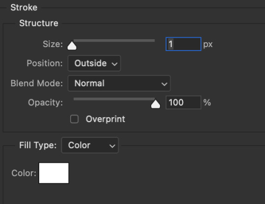
i went to flaticon.com (it's free, all you need to do is download the image and the attribution) to obtain my coffee beans image. then i prepared my three chosen gifs as usual with the added gradient map with the colors of the set. then i dragged the 3 gifs onto the open workspace of the coffee beans image. i first duplicated the coffee beans icon and applied these stroke settings
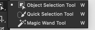
i turned off that layered visibility and proceed to attach the gifs to the bottom image. i first clicked off the visibility of all 3 gifs. then, i clicked on the magic wand tool
and i click the black parts of one bean. then i applied a layer mask to one of the gifs then turned on the visibility. ta da! the gif is inside the coffee bean! *note: adjust the placement of the gif prior to activating the magic wand tool. you can't change the position of the gif
then i repeated this step for the other two gifs. i turned on the layer for the coffee beans outline and i offset it a little bit to give it some movement.
now for the text in a circle.
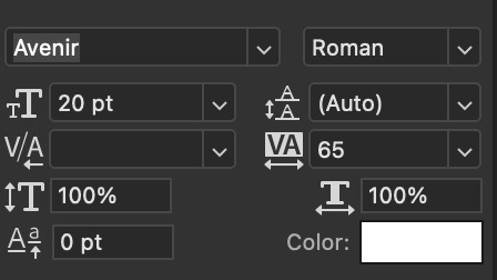
i applied the shape tool (with the eclipse option on) and i made sure the dimensions of the circle is even (i.e height and width are both 100 px). i took the text tool and right at the border, where ps indicates a wrap text, i applied my text with the quote. the settings below are for the text i used. (make sure the text is set to the difference blending mode)
and there you go! i hope i explained it clear enough. if you have any questions, pls do not hesitate! my inbox is always open 💕
#*yash.tutorials#userace#useralison#usermarcy#userkosmos#usercas#quirkyresources#completeresources#chaoticresources#allresources#hiresources#larlies
115 notes
·
View notes
Photo
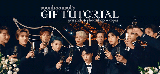
Welcome to soonhoonsol’s gif tutorial!
As a nice anon asked me how I make my gifs, I thought it’d be cool to create an in-depth tutorial :) Perhaps this can help some others enter the gif-ing world too!
What we’ll be using for this tutorial:
Software: Bandicam, Avisynth, Photoshop CC 2018, Topaz Labs
File Format: .mp4
Operating System: Windows
Disclaimer: This is just my method. Every gif maker works differently and has different preferences. What works for me may not work for you, and that’s completely okay!
Let’s get into it!
1. Find the best quality video you can find
This really depends on the content you want to gif. For variety shows, music videos or photoshoots, any video of [1080p] should be sufficient. Try not to use anything below 720p.
For stage performances, fancams tend to have higher resolutions [1440p, 4k]. Use these if your computer can handle it. If not, usually 1080p works fine. The best option would be to download .ts files, which provide clearer and less grainy videos.
For Seventeen, you can get .ts files from The Rosebay on Twitter :)
2. Screen recording
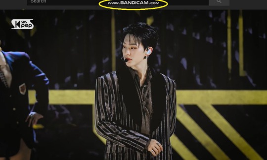
As a Windows user, I don’t have a built-in screen recorder on my laptop. So, I use Bandicam, which is a free screen recording software. The only con to it is that it has a watermark.
To combat the watermark, I always have the boundary box a little bigger than the video itself so that I can crop it out of the gif.
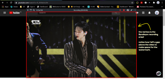
This is what the recording would look like:
Just record the scene(s) that you want to gif so your video file doesn’t end up too large! Your recording should be in .mp4 format.
(You may use pure .ts files in Avisynth but it never worked well for me so I usually screen record the .ts video and move on)
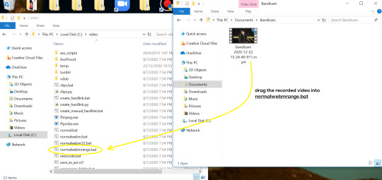
You can find your recorded videos in Documents > Bandicam.
3. Avisynth
I followed THIS tutorial to download Avisynth. This software is really helpful if you want sharp and clear gifs! I recommend to follow the steps in the tutorial as the below method stems from it.
- Once you have downloaded it, open up your recorded video from Step 2 and watch it. Take note of the duration you want to gif. (e.g. from 00:01 to 00:05)
- Drag your video file into normalwebrange.bat. On Windows, you can find this in File Explorer > Local Disk (C:) > video. For other .bat files, you may check out THIS tutorial.
- In the pop-up box, key in the start time for your gif (e.g. 00:00:01). It has to be in hh:mm:ss format. Press “enter”.
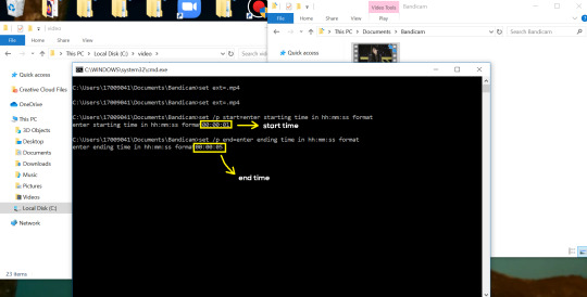
- Key in the end timing and press “enter” again. A resizer should pop up in an Internet Browser. I found that Firefox works best for me.
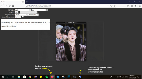
- In the resizer, you may indicate the size of the gif you’d like to make. You can also click and drag the video to resize and frame it to your liking. You may refer to THIS post for Tumblr dashboard sizing.
(These are some common gif sizes for stage performances):
1 gif - 540px by 540px (square)
2 gifs - 268px by 350px
3 gifs - 177/178px by 250px
- Under “Preprocessor”, select “debilinear” for the second box. For the first box, you may pick between qtgmc 30 (same frame rate as video) or qtgmc 60 (doubles the frame rate; smoother).
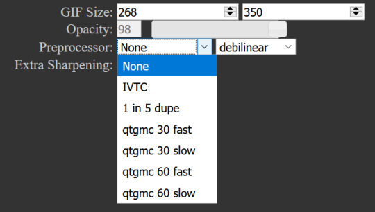
- You will also see “fast” or “slow” options. These are just how long the video will take to render. “Fast” will give you slightly lower quality as compared to “slow”, but usually is good enough.
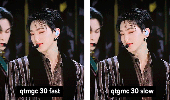
(You can see that his features are sharper and more defined in the “slow” gif as compared to the “fast” one.)
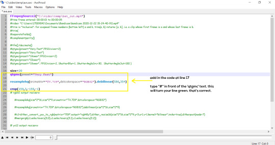
- Copy the code in the white box. Navigate to the scripting window (it should have popped up with the resizer) and paste the code at line 17. Type a “#” before qtgmc on the same line. This will prevent the software from lagging.
- Click on the inverted triangle at the bottom of the screen. Your video will now appear in the scripting window. Drag the slider to the intended starting point of your gif and press the “home” key on your keyboard.
- Drag the slider again to the intended ending point of your gif and press the “end” key on your keyboard. This blue area you see is the duration of your gif.
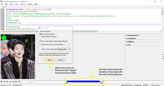
- On an empty line (I usually go to line 8), place your cursor there and click “Apply” in the mini pop-up window. Afterwards, remove the “#” from line 17.
- Go to File > Save or press Ctrl + S to save the code. Close the scripting window. The video renderer will pop up. When it’s done, it will automatically close by itself.
4. Using Photoshop and Topaz
I’m using my school license for Photoshop 2018, but if you don’t have that, there are plenty of cracked versions for free. I don’t have any to recommend though so I’m sorry about that :(
I followed THIS video tutorial to download Topaz plug-ins for free. I use Topaz DeNoise (the most helpful) and Clean, but you may use others if you’d like :)
Alright, let’s dive in to the steps!
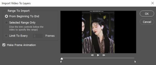
- Open up Photoshop and go to File > Import > Video Frames to Layers.
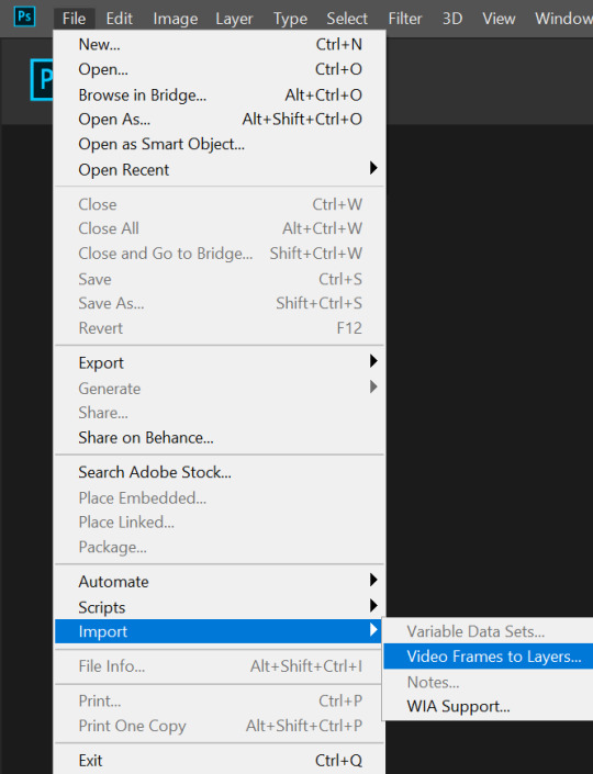
- A pop-up will appear. You can find your deinterlaced Avisynth video in File Explorer > Local Disk (C:) > video > temp > video.avi. Follow the settings in the picture and click “OK”.
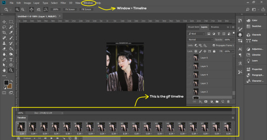
- Go to Window > Timeline to open up the timeline. You should be able to see your gif spread out in frames. If you press the play button, it should play like a video.
- (Quick optional step I learned from THIS tutorial) Go to Image > Canvas and set the Resample option to “Bicubic (smooth gradients)”.)
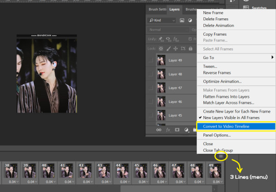
- Select the first frame of your gif in the timeline. Shift select the last frame. Go to Window > Layers. Shift select these layers as well.
- With everything selected, click the 3 lines at the top right corner of the timeline. Select “Convert to Video Timeline”.
- At the top of the screen, select Filter > Convert for Smart Filters. Your layers will condense into one layer. Don’t worry, your gif is fine.
- Now it’s time to sharpen the gifs. Go to Filter > Sharpen > Smart Sharpen. Play around with the settings to your liking!
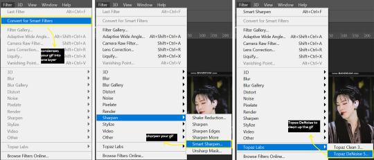
- If you’ve downloaded Topaz correctly, it should appear under Filter > Topaz Labs. If a pop-up asks you for an activation key, you may use THESE to activate it for free.
- Go to Filter > Topaz Labs > DeNoise and/or Clean and play with the settings until you’re satisfied.
5. Blurring
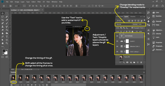
If your gifs have captions/logos that are distracting, you’d want to blur them out. Don’t be like 2018 me that blurred out the logo frame by frame; it’s very tiring. Instead, using this method from @scoupsy‘s tutorial, you’ll save lots of time.
- In the Layers tab (Windows > Layers), select the “New Layer” icon. It should be blank.
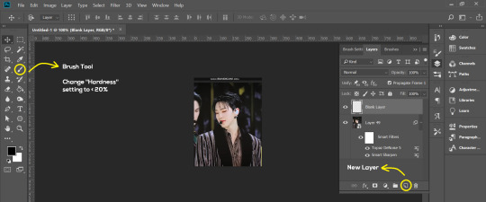
- Select the Brush tool. Make sure the “Hardness” setting is below 20%. This will blend the blurring nicely into the gif.
(For the sake of this tutorial, I will be blurring out the Bandicam logo to show you.)
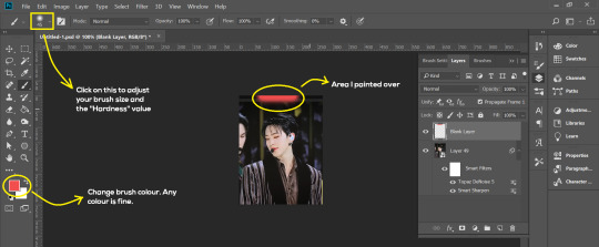
- Paint over the captions/logos. Make sure this is on the blank layer!
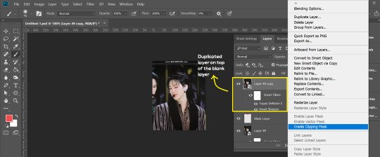
- Duplicate (Right Click > Duplicate) the gif layer and drag it so that it’s on top of the blank layer.
- Right click on the duplicate layer and select “Create Clipping Mask”.
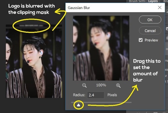
- Go to Filter > Blur > Gaussian Blur and play around with the settings until you’re satisfied with the level of blurring. Click “OK”.
6. Flattening & Colouring
- Once you’re done with sharpening and/or blurring, click on the 3 lines on at the right corner of the video timeline and go to Convert Frames > Flatten Frames Into Clips.
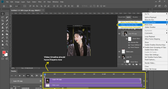
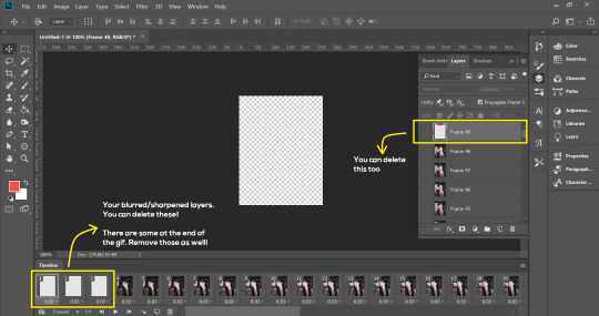
- Topaz layers and blurring will take some time to render so you can just chill for now~
- When it’s done rendering, click again on the 3 lines and go to Convert Frames > Make Frames From Clips.
- Convert it back to the gif timeline by clicking on the 3-box icon at the bottom left of the timeline.
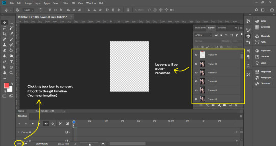
- Select the first frame of your gif. It must be the FIRST.
- Scroll to the top of the layers and select the layer at the top. Any other layers you add should be on top of this layer. VERY IMPORTANT!!
- In the Adjustments Tab (Window > Adjustments), there are many different things to play with. There’s a high chance you won’t use everything, but here’s a few of my favourites.
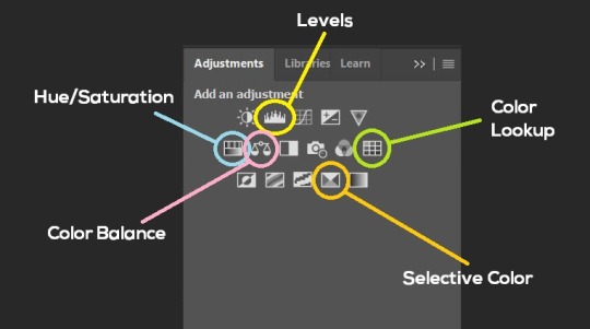
Levels - Adjust the brightness and contrast of your gif in depth.
Hue/Saturation - Useful for changing colours, or switching it to black and white.
Color Balance - Tweak the colours to your liking.
Colour Lookup - Comes with built-in LUTs that you can use as a preset. Great starting point for colouring. Saves time too. You can even download plug-ins for this. 11/10 tool.
Selective Colour - Adjust the vibrancy of specific colours.
- Colouring is completely up to the gifmaker. Go crazy go stupid :D
7. Exporting
We’re almost to the end!
- Set the timing for your gif.
If you used qtgmc30, the best timing would be 0.04s / 0.05s / 0.06s.
If you used qtgmc60, the best timing would be 0.02s / 0.03s / 0.04s.
- Once you’re satisfied with everything, go to File > Export > Save for Web (Legacy).
- Follow the settings in the picture below:
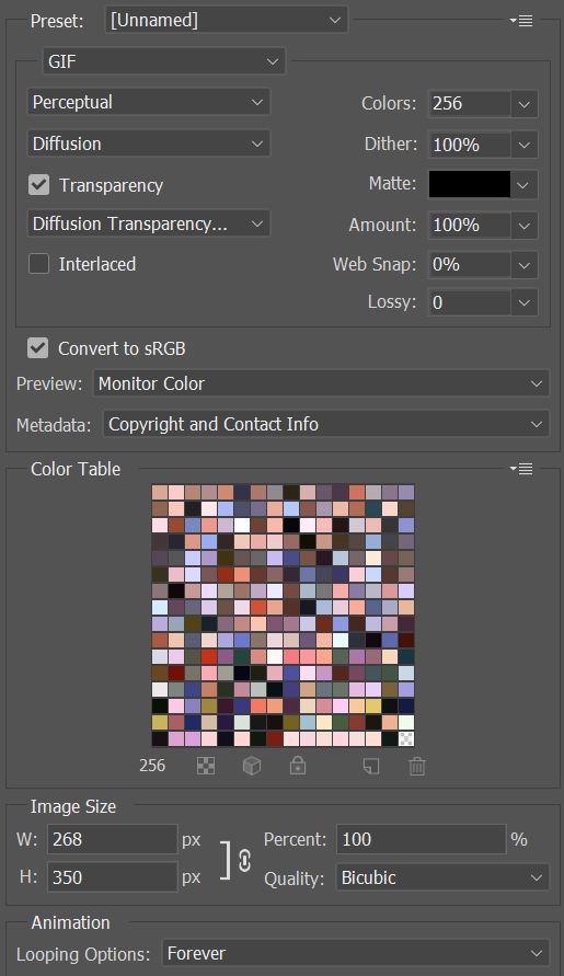
- Tumblr’s gif limit is 10mb per gif. Check the gif size at the bottom left of the pop-up window. Make sure it’s below 10mb; the smaller the better.
- Click “Save”. Choose where you’d like to save the gif.
- Done!
~~~~~~~~~~~~~~~~
And that’s it! You’ve successfully made a gif! Good job you :D
I hope this tutorial was helpful! Please leave some feedback if it helped, or if you have other methods you’d like to share :)
Lastly, if you have any questions, feel free to send in an ask or DM me!! :)
Good luck and happy gif-ing :’D
#gif tutorial#kpop gifs#avisynth tutorial#topaz tutorial#gifs#chey.resource#kpop#idk what else to tag so...#i finally posted the tutorial yay!!#please spare a reblog if you find this even remotely helpful thank you <3#also to spread it hehe i spent a lot of time on this#if anyone has any questions please feel free to DM me!!#i apologize if there are any spelling errors
232 notes
·
View notes
Text
Tu... torial? Pt. 5.
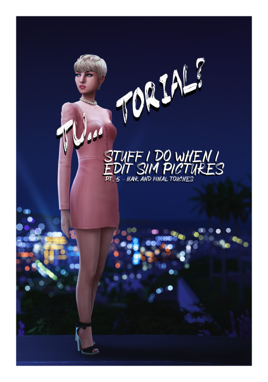
Final part of my tutorial! This is a little all over the place, because that’s how I am in this stage of editing. Also I didn’t proofread this...
Open this in dashboard for best view of the screenshots.
Disclaimer: I have no formal training for any kind of graphics stuff, I work in an office as a receptionist - I serve coffee for a living. I am absolutely self taught and while I consider myself pretty comfortable with photoshop, that doesn’t mean that there isn’t about a gazillion of other things that can be done that I have no idea about. There are people far superior than me in the Sims community. This is just how I do it, with techniques I have picked up through the years. Some things I go over in these will be pretty basic, some things a little more unorthodox. Disclaimer 2: My edits take time. This is what I do to relax, one edit takes several hours for me. Sometimes days :))) Disclaimer 3: My photoshop is in Swedish, which is my first language. I tried my best to find the English translations for every step that I do.
Tools used: The Sims 4, Adobe Photoshop 2020, One by Wacom Pen Tablet (very basic and unfancy).
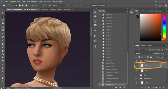
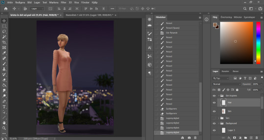
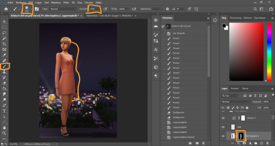
It´s hair time baby! I very much enjoy drawing hair on sims. I make a new empty layer on top of my base Sim layer.
This is where having a drawing tablet makes a huge difference. We need the brush to be sensitive to pressure to get the effect of hair strands. I chose a hard brush, small small size (how small depends on the picture size of course, but I usually land somewhere 6-9 px)
I pick up a color from the hair, I usually starts with a medium light color.
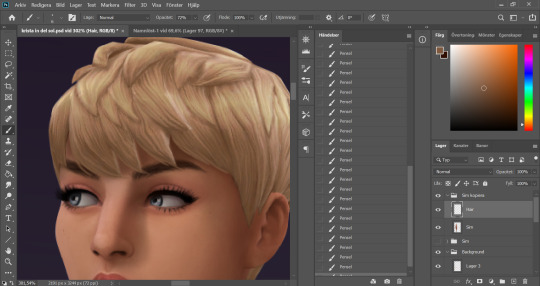
I start by drawing strands around any tips of the hair so they don't look quite so solid. I do this part with both short and long hairs. Hot lazy tip: straight unlayered hairs is the absolute easiest. This is a layered hair so I start with the bottom and work my way up. I pick up different colors from the hair as I go along, to add dept.
Continuing up in the hair and add strands to the pointy bits.
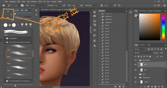
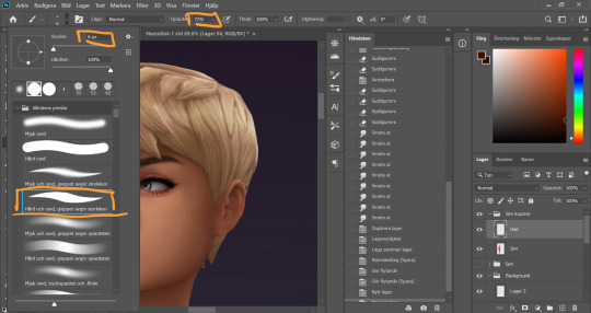
When I feel like the pointy bits have been softened I select one of my hair brushes. I use these ones by Para Vine.
I start painting "around" the hair with one of the lighter colors picked up from the hair, changing the direction of the brush every once in a while for a more natural result.
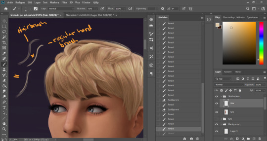
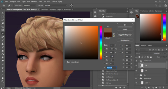
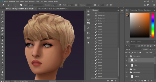
After this the hair is looking a little fuzzy, so I'm going to go back with my small harder brush to fill these parts out.
I don't add a lot of them, just small bits here and there for filling.
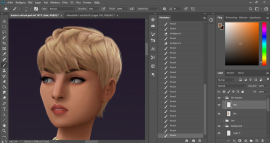
This is a little overkill but... now we have some of that "squary" thing going on in the hair as well that are still showing through our painted layer. Now we could paint over these, but painting can actually be overdone and I wan't to keep the hair recognizeable because the creator put a lot of work into it! So I go into liquify and smooth over any wonky lines still showing, just slightly.
A comparison of before and after hair. Still recognizeable, but softer.
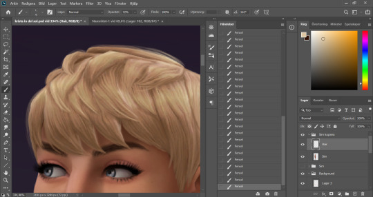
This is our result so far. We've come a long way, but we're not done.
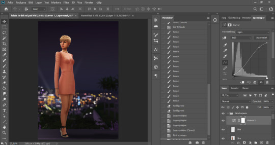
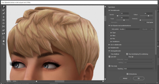
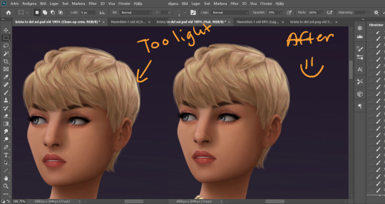
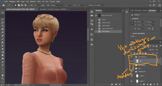
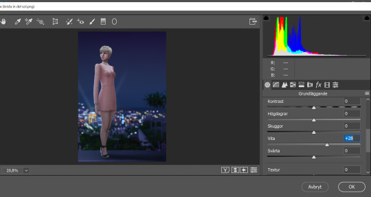
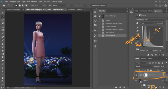
At this point (or actually sometimes sooner) I add an adjustment Curves layer, this will not end up in the finished image, this is just to give me an idea of what the image might look like with more contrast (which we will add later). I keep this at the very top of the layer panel and turn this on and off as I go. Very important to have it turned off if we are going to eyedrop a color and use that to paint, since it would pick up the wrong hue if we have it turned on.
Now I still want the front of my sim to be a little darker to fit my lighting, but I don't want to go over with any more shadow. So I duplicate my Sim layer, and go to Layer -> Adjustments -> Curves. This will only change the active layer, as opposed to creating an adjustment layer down in the Layer panel that will change all layers below it. I drag the curve down a bit to make my new Sim layer darker.
I add a layer mask to my new Sim layer, and bucket fill it with black color so the new layer gets hidden.
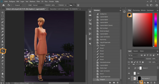
I chose an absolutely HUGE soft brush, with medium opacity, and starts painting white on the areas where I want the new darker layer to be showing. And blend by going back with black where the line is to harsh.
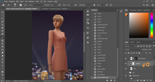
Time to add some highlights. I create a new empty layer between my two Sim layers, and add a clipping mask by holding Alt and hovering on the line between the new layer and my bottom sim layer, until the little square with the arrow symbol comes up and then click. This will make whatever I do on my new highlight layer, only show up on the areas where the layer underneath is filled.
Time to paint. I disable the curve adjustment layer for this. I choose a bright color, in this case a light pink because I didn't want a contrasting color for this picture. I go with a big soft brush around the edges where I want my highlight to hit. In this case, the arm, the hand, the arch of the back and the calf. I didn't add anything to the face in this picture because I didn't like the way it looked, but usually a little highlight to one of the cheeks is just *chef's kiss*
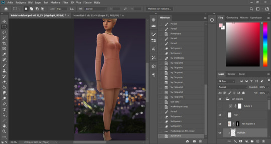
And somewhere around here I got really stuck and really struggled to follow with this tutorial. I felt the picture was lacking something and I tried several different things. I added light rays, tried creating different light sources, there was a moon at some point. But I ended up with just a simple additional gradient shadow down in the right corner (on a new layer down in the Background layer group). Life changing…
And then I didn't like the pink highlight on the skin (sigh, this is how I work, but it’s not recommended to be this indecisive) so I removed that and added a more beige-yellowee highlight instead. And forgot to take a picture after the highlight was added....
And now I go into nitpicking mode. I add a new empty layer on top of my Sim layer, I add it under the highlight layer so it automatically takes on the clipping mask of the Sim layer, I name it Clean-up Crew and go in to refine anything slightly wonky. Picking up colors with the eyedrop tool and going over flaws with a tiny brush.
When I fixed this little light area on the back of her head I left the Clean-up Crew layer and went to my Hair layer instead, because I still have that separate and it's above all the other layers.
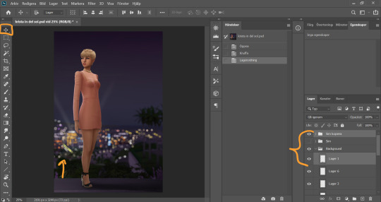
I thought my sim was a little too far down in the picture so I moved her up by selecting my whole Sim layer group and the layer on which I have her ground shadow, chosing the move tool and pushing them up. This will move all the layers in the Sim layer group as well as the ground shadow layer equally.
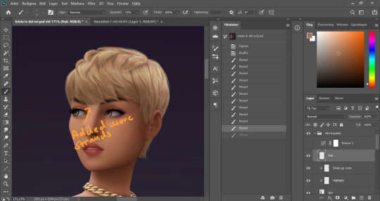
I'm telling y'all, nitpicking mode could go on forever. Added more strands to the bangs.
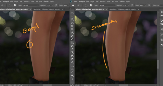
Noticed a little pointy part on the calf, so I wen't into Liquify on the base Sim layer and smoothed that out. Since the highlight layer has a Clipping Mask corresponding to the Sim layer, the highlight stayed in place.
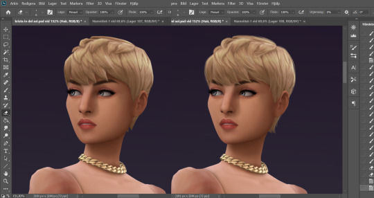
I duplicate my Sim layer group once more, and merge the layers within this group. So now the Hair, Highlight and Clean-up Crew is all merged onto the Sim layer. I hide the previous Sim groups.
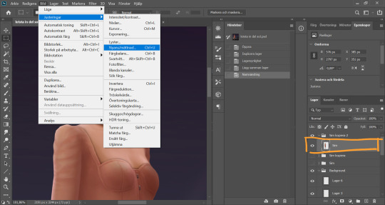
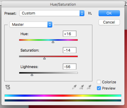
With my new Sim layer selected, I go to Image -> Adjustments -> Hue/Saturation. I want to make my Sim a little less bright so it will match the background a bit better.
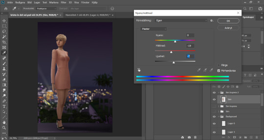
I drag down the Saturation and Brightness slider a bit until I like what I see. After this I save my whole image as a PNG-file because from now on I want to edit the whole picture but still want to keep this psd-file as it is for anxiety purposes. Important: I disable my curves layer before saving this as a picture, I don’t want that brought with me into the next steps because I will be adding new curves there.
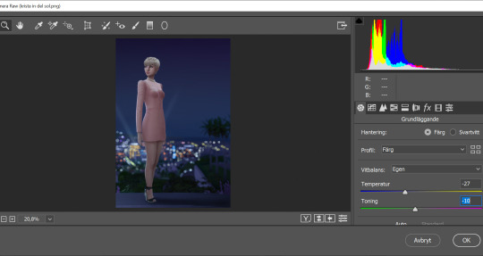
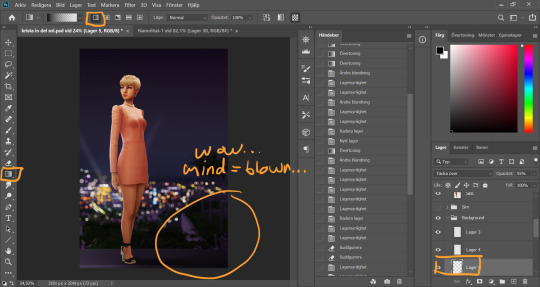
I open my new saved PNG-file. I go to Filter -> Convert for Smart filters. This will allow us to go back and change any filters we add to this layer. I go to Filter -> Camera Raw Filter and for some reason this window opens up humongus. I start by dragging down the temperature. How much depends on the picture, usually more if it's nighttime.
I pull up the Whites a bit for a cleaner look.
Now I add a Curve Adjustment Layer. Now you can add Contrast in the Camera Raw Filter as well, but I prefer the curve layer because I like to control the different levels. This way I can make my darkest parts a little brighter, giving just a little washed out flair to it all.
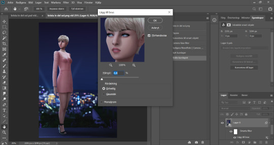
I select my background layer again and go to Filter -> Noise -> Add Noise and choose a level that I think looks good. This just brings the picture together a bit more. Also vintage vibes :)))
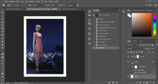
I add my frame (because it´s my aestethic and I think it looks cool on tumblr) by resizing my workspace and adding a filled white layer underneath the background layer.
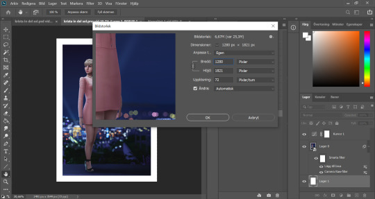
I resize my picture (Image -> Image Size) because we don't need it to be huge.
And they I just fine tune the Filters and Curves until the end of time :’)))
And that is that my friends! That’s the end of the tutorial! I hope you could follow somewheat and that someone found it useful. Thank you for reading and never be afraid of contacting me if you have any questions :) I’m very friendly.
65 notes
·
View notes
Note
if join the server will you tell me how to make gifs like the bandom creators server header you made 😲
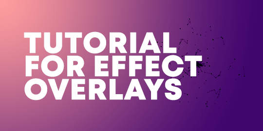
you don’t have to join the server to learn this lol! anon is referring to this style of gif:

it’s actually pretty simple which surprised me. continue reading if you’d like to learn how to do it!
so first of all, you’re going to want to find the gif you want. whether this is a falling snow effect, a stars effect, anything like that. i got this one from @overlaygifs but i’m sure you could find more by searching “overlay gifs” on tumblr. this is the one i used.
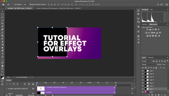
what you want to do is have everything else ready and then you’ll add the gif fairly far along in the process. so for this, i created a new document with my dimensions, added the gradient for the background, and put on the text. i’ll be doing all of this over for this tutorial, so:
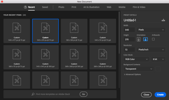
these are the settings i used. then i used the gradient tool to make a gradient directly on the background, and added the text.

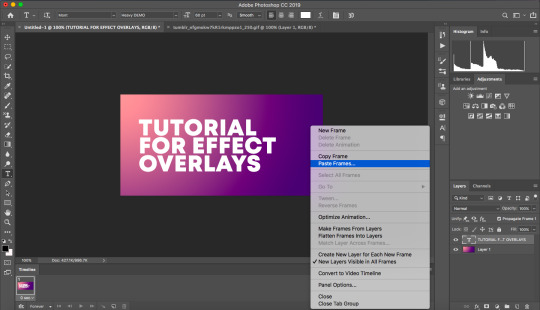
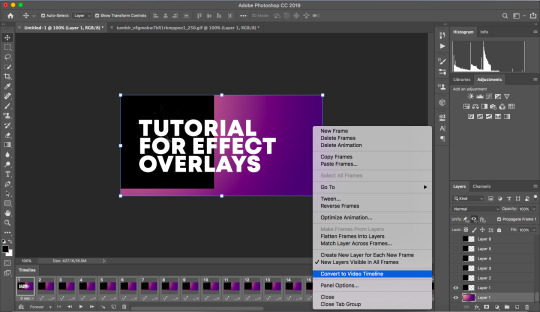
make sure your photoshop workspace is set to “motion.” click at the bottom where it says “create frame animation.”
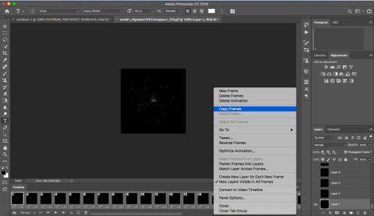
now comes the part with the gif. you’ll want to open the gif in photoshop. it should come up with all the frames at the bottom; select them all using ctrl/command + shift, and then go into the three little lines at the top right of the frame menu at the bottom and select “copy frames.”
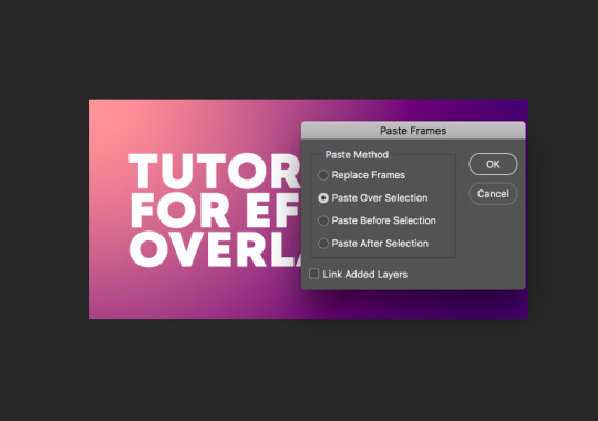
then, go back to your canvas, click on the same menu, and click “paste frames.” it will bring up a menu when you do this -- make sure you click “paste over selection.”
once you do this, the canvas will look like this:
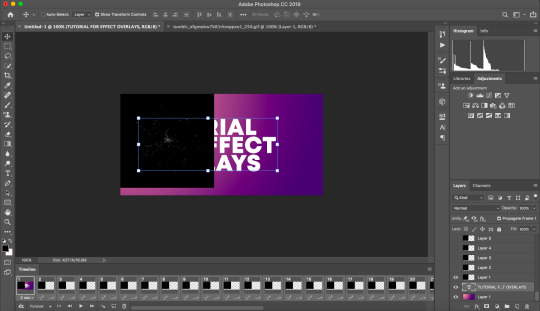
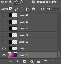
you’ll want to drag the text up so that it is at the very top of the list of layers on the right lower menu. then, you’ll notice that your gradient background is only visible in the first frame. in order to combat that, select your gradient in that lower right menu, and click the layer visibility unifier (the eye with the chain). repeat this process with the text layer.
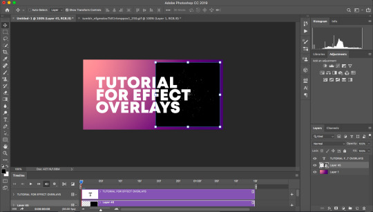
once your layers are properly positioned and made visible, go to that same menu on the bottom where you copied and pasted the frames and click “convert to video timeline.”
once you’ve done that, you’ll be left with this:
go over to the layers on the right and select all of the ones that are just the gif (don’t select the gradient or the text!). for reference, this would be all of the layers above my gradient layer in the above screenshot. once you have them selected, go to filter > convert for smart filters. if it shows you a warning just accept. once you’ve done this, the gif will be converted into an object you can move around, and you can then position it how you’d like on your canvas.
now comes the magic of this, which is changing the blending so that the black disappears. double click on your gif in the layers menu on the right to bring up the blending options. i don’t fully understand blending styles and i won’t pretend to, but i know that lighten, screen, color dodge, linear dodge, and lighter color will all make the white parts only show up. really it’s up to personal preference as to what you’d prefer, they all look slightly different. just play around! if you’d like it to be more vibrant and visible, you can right-click on the layer in that layers menu and duplicate it. that’s what i did here. then save and export your gif as you would normally. you’ll end up with the gif that i posted at the start of this!
alternatively, if you’d like the gif here to be black instead of white, once you have converted everything to video and made the gif into a smart object, select the gif either on the right layers menu or using the move tool and hit ctrl/command + i. this will invert the gif! then you can blend it using the settings multiply, color burn, or linear burn, and duplicate it for extra strength as you’d like. you’ll get this:
aaaaaaand there you go! i hope this was helpful. feel free to shoot me a message if i can clarify anything or help you any more :~)
#tutorial#gif tutorial#photoshop tutorial#mine#jadkjdhf i really hope this is comprehensible it's wayyyy too late#anonymous#my ask tag
56 notes
·
View notes
Photo
Black-and-white sculpture: Letter A
First, I used the curvature tool to add points along the interior of the capital letter A. I pulled these curvature points inward and outward to create the silhouette of a woman wearing a dress. I used the pencil tool to refine some of the curves, especially around the hair and the face, because it was difficult to be accurate with the curvature tool. I then copied and pasted the letter manually in a radial pattern. The A’s increase in size as they get further from the center point; this was done to best hide the edges of the letter. Finally, I added a radial gradient behind the pattern to add depth and interest to the piece.
Black-and-white sculpture: Letter S
I started by using the radial repeat function in Illustrator on the capital letter S. I had slightly elongated the letter after creating the outlines to disguise the letter a little more. I then created a new letter S object. I enlarged and elongated this one, then manually aligned, copied, and pasted the letter around the central repeat pattern to disguise any remaining edges around the letters. I duplicated the entire shape on a layer below and colored it black, then changed the original shape to white. Next, I moved the black shape so that it was slightly offset from the white one like a shadow. Finally, I added a radial gradient behind the shape. I loosely followed the rule of thirds by moving the center of the shape to the bottom third of the page and to the right.
Colored sculpture: Letter W
First, I used the curvature tool to add points and bend the edges of the letter W to make the angles less harsh and more graceful. Next, I manually copied and pasted the letter to create a smooth vine-like pattern. I alternated between mirroring, rotating, and simply placing the letters depending on which orientation would hide the letters’ edges, until I had a smooth and consistent pattern. I colored it green, then I duplicated the shape on a layer below, colored that dark green, and arranged the lower dark green shape so that it looked like a shadow. Above the vines, I created a new layer with the same bent W, used the radial repeat function to turn it into a flower, and then colored it in light pink with a yellow center using shapes below the outline layer. I repeated the flower so that they became part of the pattern. Finally, I added a pale-yellow-to-pale-green gradient below it to add some depth and interest.
Colored sculpture: Letter K
First, I elongated the K slightly, and then duplicated and mirrored it to create a column with interior diamond shapes formed by the two branches of the letter. I then added a few other K’s horizontally within the larger diamonds. My aim was always to hide the edges, so I kept pasting and arranging horizontal K’s until it looked even and clean. I then used the shape builder tool to create shapes in the spaces between the letters. Then, I colored each of the inner shapes in red, beige, yellow and blue. I was inspired by a stained-glass window so I chose light, airy colours and left the outlines black like windowpanes.
1 note
·
View note
Text
Garden Variety, part ii: the rest of them
All of the flowers below in this post are original patterns! None of them are written down for your consumption, but if you’re really serious about crocheting, you can deduce them out yourself or take what you like and recreate it in a way that is so uniquely yours that you’ll never be able to look at mine without feeling like there’s something wrong with them. And though I’ll admire yours, I’ll look at them and feel the same way.
All of these are options on my uquiz “Which crocheted flower embodies your Spirit?” but there are bonus pics below this cut right here:
Let’s start early in my flower-growing process. Please be kind.
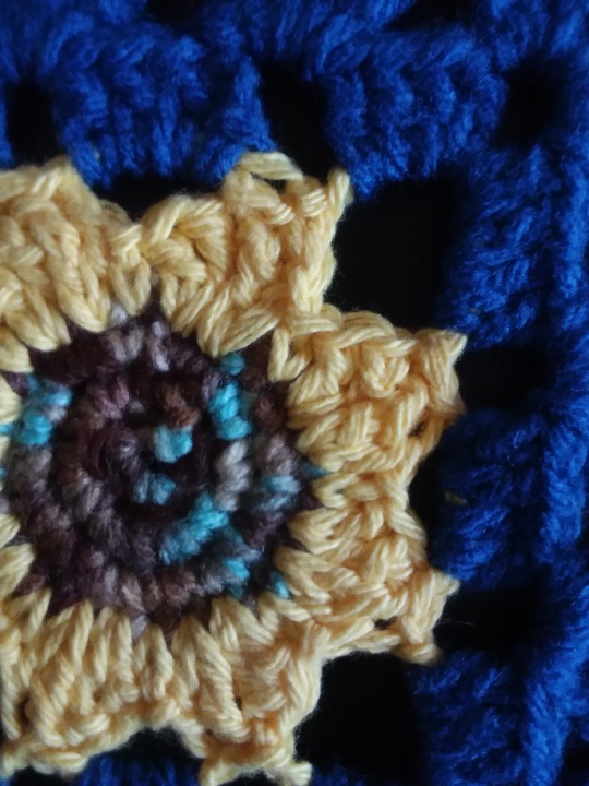
Mountain Flower
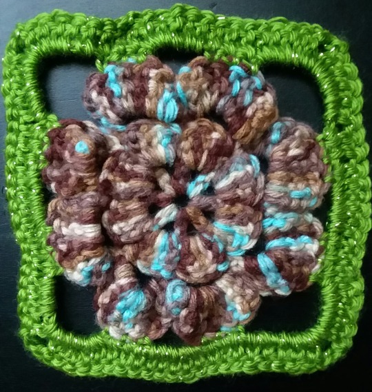
[image description: a green sparkling square border around a flower with 8 large petals, two on each side of the square, so there are nearly triangular holes in the corners. The petals are a predominantly brown yarn with speckles of light blue and beige. end ID]
An early pattern-free flower. As you can see, there’s some experimentation with bulging double crochet petals built on rows of chains. You’ll be seeing that stitch combo quite a bit. It’s simple, it’s effective. Highly recommend the ol’ [8 dc in 5 ch space]*. Here’s your uquiz description: “I wondered what to call you to distinguish you from the others. You're a brown flower with flecks of blue and beige. One of the first attempted without a pattern. The petals bulge up like mountains, and they are the color of earth and sky. Grounded and dreamy.”
*I made these numbers up; I have no idea what the counting was here.
This flower, and what we’re calling The Nest, and The Sunflower were featured on this post at my real blog. Here’s some more pics of the Nest:
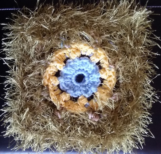
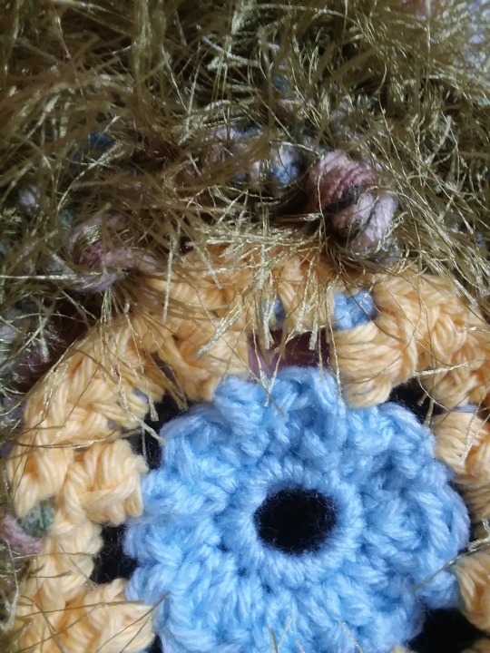
[image description: a very furry, green square with a ring of bubbly yellow stitches around a light blue flower with 8 petals. Second image: a close up of the same square where one furry corner is at the top of the image, and wisps of fur are seen crossing over the yellow flower. Close up, you can see that the yellow petals are cluster stitches around light blue posts. You can also see that there is a non-furry green camo yarn making similarly clustered stitches around the yellow ring. end ID]
To be honest, I don’t know how I feel about this one. The uquiz description is basically: “You’re chaotic,” and will probably be the description that gets changed the most retrospectively. What do you think of it? Is it alright? Is it awful and I should have pretended it never happened? Well, let me remind you that the point of the Quilt in which this resides is partially to explore texture, and there are some textures happening here.
The Sunflower
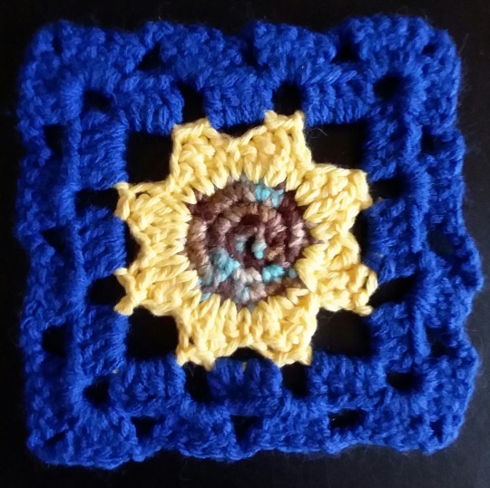
[image ID: an 8 petaled yellow sunflower with brown and blue speckled seeds. It sits in a blue square background, almost classic granny square so it looks almost checkered on the black background. end description]
It is actually only younger sunflowers which follow the sun (in a circadian rhythm similar to our own), while the older flowers generally face the east, which helps attract pollinators with their warmth. Like the African Flower - pink, there is a reference to Harold and Maude in the uquiz description for this flower because. I mean, it’s a sunflower. “They’re so tall and simple.” Maintaining that simplicity, the border is basically just your classic granny square. That and the Maude associations; hell, I guess this is your granny’s square after all!
[image description: another picture of the sunflower, close up and with slightly different lighting so the yellow looks less washed out by the actual sun. The blue border almost fades into the black background. end ID]
Next we have this white flower I have literally no memory of making:
[image description: a white flower with a circular center and rounded leaves sitting in a dark blue field with a notebook page background which makes the blue easier to see than the black background featured in the uquiz result. end description]
Moving on.
The Septagon
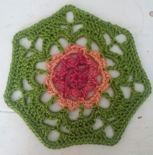
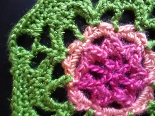
[image description: a green lacy crocheted septagon sitting on a white background. The inner flower has 7 pink petals in a small circle surrounded by a peach row of thinner petals. This is all one yarn. Second image: a close up where it is set on a black background with the flower taking up much of the right side of the image. The sun hits the yarn in ways that emphasize the fuzz surrounding the wool-blend pink and salmon flower. It looks almost purple in places. End description]
I’m still obsessed with this one. I’m so obsessed my ability to name it eludes me. It will always be only the Septagon to me. The best 7-sided piece in the Quilt. I can’t remember if the 7 sides were deliberate, or if it all just came together like this without my willing it at all. This piece sprung forward from some Fae’s crochet hook, and I merely take credit for hir inspiration.
And finally, The Rose, a piece so finicky it has ended my floral series for now.
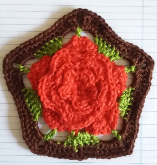
[image description: a layered red (almost orange in the lighting) flower. Each layer has 5 petals. 5 little green leaves surround the flower, and it's planted in a brown pentagonal "pot." The crochet pentagon rests on a notebook background to emphasize the rich brown yarn. end description]
It’s a mountain of double crochet/half double crochet petals.
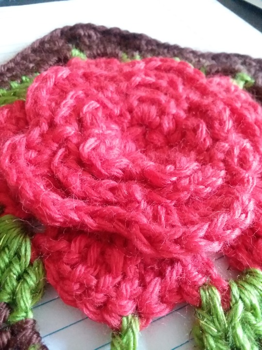
[image description: a close up of the rose part of The Rose. The photo is taken at an angle to showcase how the petals pile up on top of each other. You can tell there is a cat in the house because there are so many hairs clinging to the red flower, and only some of them are yarn-related wisps. end ID]
Let me show you the back so you understand why I’m done crocheting flowers for a little bit. If you don’t speak crochet, saying it’s “a mountain of double crochet/half double crochet petals” means nothing to you. If you do crochet, you might also be like, “but what do you mean by that, Clancy?” Here’s what I mean:
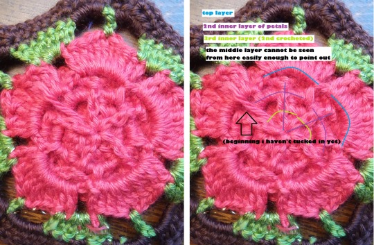
[image description: two side-by-side duplicate pictures of the back. In the right image there are blue, purple, and green curved lines indicating roughly where 3/4 of the rows are located in relationships to one another. Two straight purple lines indicate where the triple crochets which anchor the second row (also indicated in purple), showing that these seem to reach all the way through the center hole. A black arrow points to “(beginning I haven’t tucked in yet)” a loose piece of red yarn. In the left image, without text, you can see two distinct bottoms of rows before all the parts obscured by these two top rows. In fact, the green line indicating the 3rd interior row of petals doesn’t look like it corresponds to anything, and in the key, it says “the middle layer cannot be seen from here easily enough to point out.” You can faintly make out the wood grain behind the flower more clearly than the 3rd and 4th rows of petals. End ID]
#crochet#flowers#not all squares#squares#uquiz#you are only obligated to reblog the post with your quiz results flower
1 note
·
View note
Note
Not an edit request, but could you make a tutorial as to how you do the color swaps? Or is there a tutorial video you know of that I can watch? Thanks :))
I can try my best to kinda explain! I can’t do a video and I never watched any videos myself, so it’ll all be text and screenshots! I’ll put it under the read more!
For starters: I do use Krita for all of my edits including the color swaps! There may be different techniques for different programs, so keep in mind you may have to use a slightly different method for your program!
First you’ll wanna open your sprites! I usually keep both my sprites in their own tabs but it won’t hurt to put the sprites together! I’ll be putting them together for this!
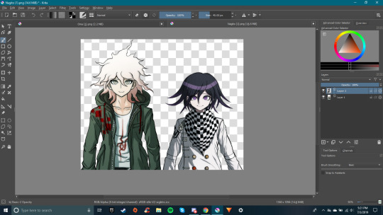
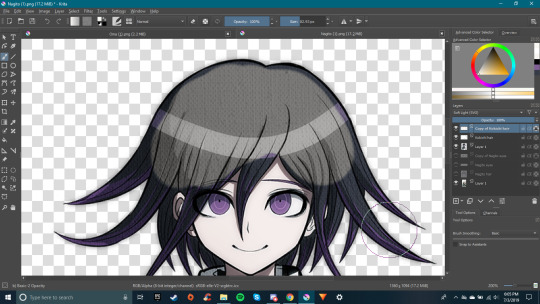
Now for the fun part! The recoloring! I use the color picker to chose the color I need, in this case, Kokichi’s hair color! I’ll do a new layer on top of Nagito’s sprite and rename it to what it’s gonna be so I won’t get confused later!
After that, I’ll apply a mode to the layer (Either color, multiply, soft light, etc, etc,)! For this part, Nagito’s hair is white while Kokichi’s is purply-black, So I’ll use Multiply!After you apply the mode, start coloring! I usually just straight up color it in like a coloring book, but if you know of an easier way then go ahead and try it!
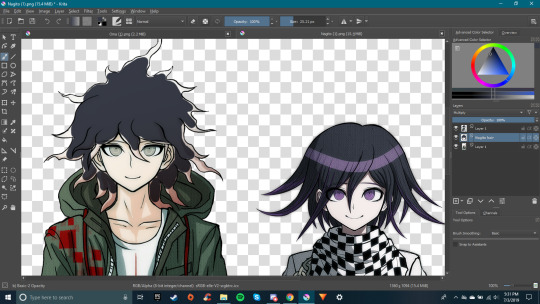
(Let’s pretend that’s all colored in ;0) Now let’s do his eyes! Create a new layer for Nagito and rename it to your liking before making the layer mode Color! Then color pick Kokichi’s eyes for the color and color in Nagito’s eyes!
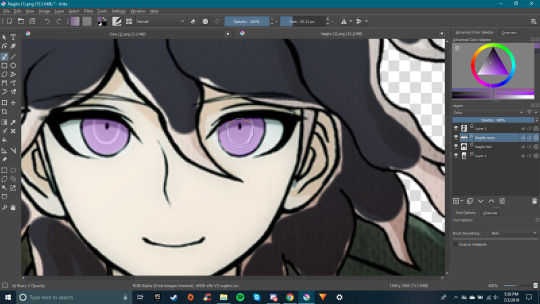
Hmmm Those are a bit bright compared to Kokichi’s actual eyes! Let’s darken them a bit! Right click on the layer and click “Duplicate” and set the new duplicated layer to the mode soft light! Then turn on Alpha lock (On Krita it is checkered square on the side of the layer), change your color to black, and draw over the eyes again!
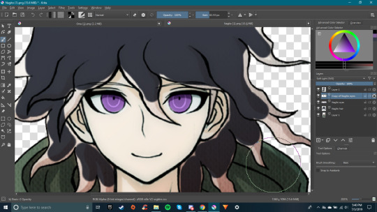
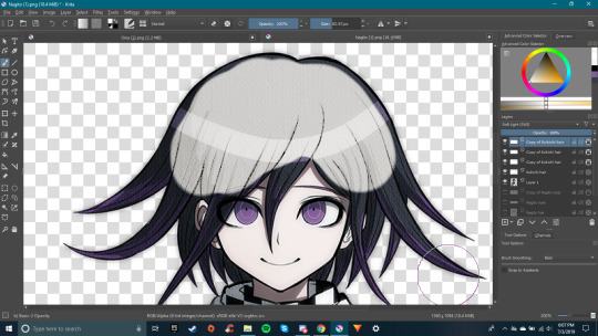
Better! I normally do one sprite at a time, but for the sake of this tutorial, let’s move over to Kokichi to talk about other techniques! Whenever you shift focus to another sprite, hide the layers (Usually it’s the little eyeball!) that you used on the first sprite so you can color pick the colors you need!
Uh oh! Problem! We color picked Nagito’s hair color, and tried setting the layer mode to Color, but Kokichi’s hair is just turning black! Multiply doesn’t work either! Soft Light makes his hair lighter, but it’s still purple!There are a couple different ways that we can do this though!1. We can just redraw his hair and color/shade it in without having to use filters.2.We can color in using the Screen layer mode, being careful to avoid the lines in his hair (Screen mode will lighten the lines unlike the other modes, and if using a color close to white, will require the opacity being turned down so you can see the texture underneath).3. We can use a Color layer and a couple Soft Light layers to obtain close to the right shade.What you use here will be completely up to you, and again, you might find a whole nother way that’s easier than any of these! For this in particular I’m gonna go with the option that seems the most annoying! Using multiple color and soft lights! I use this one most of the time! But using the screen option is similar so I will talk about it as well.
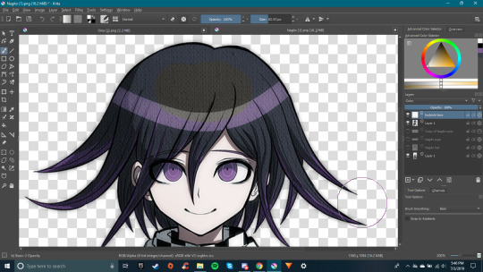
The easiest way to do this method is to do your Color layer first, duplicating it, and changing that layer to Soft Light. (Tip! Make your Color layer fully black or white, even if your color picked color is almost white, it’ll look better and be easier to work with if the Color layer is a true black or white!)
Still not bright enough? Keep duplicating the layers until you get what you need! (Tip! You can also dupe your Color layer that’s a true white, make it into Soft Light, and it should make it easier! Just make sure it’s below the layers that are of your color picked color!) Sidenote: if you went with the screen option here, you would’ve needed to put a white Color layer under your Screen layer and then lower the opacity of the Screen layer, but it would’ve turned out to only two layers as opposed to four with this method. Also if you used the screen option, you will need to follow this next step aswell!
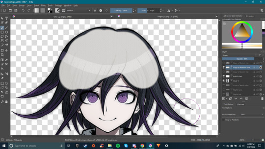
Ok! This is close enough! But now my lines are all wonky(Lighter if used Screen)! Well we can fix that!Make sure you’re on your top layer and switch to your erase tool! Make the brush size the size of your lines and erase where the lines are!
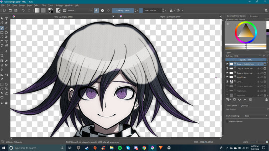
All better!
Now Nagito has a bit of brown on the bottom of his hair! How will we do that?Simple! We’ll use the gradient tool! I won’t be able to show you on sprites since I didn’t color that low, but using the tool is super easy I think you’ll be able to get it just with text!First color pick the brown color of Nagito’s hair and make sure you’re on the top layer and that it is alpha locked! Then drag from the bottom of the hair up to a little bit above Kokichi’s eyes with the gradient tool. When you let go of the mouse, a gradient will pop up there! Continue the steps until you get the amount of brown you want!
I think this is all I have to talk about/teach! Really the way I do color swaps is all about messing with layers and colors until I get what I need. If I can’t get that color or a color close to it, then I’ll just redraw that part of the sprite!I hope this helped a little, and if anyone has any other tips to add on, feel free to reblog and add them! Even if they’re not for Krita!
33 notes
·
View notes
Text
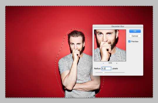
Desktop Wallpaper Tutorial

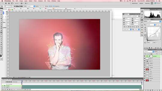
Hey guys! I made this wallpaper for my computer yesterday and made myself a tutorial to go along with it (just in case I ever wanted to recreate it with a different image) and decided to post it here for you!
I followed this tutorial but I did tweak it a bit as well as add and remove some steps. All in all I used the original tutorial as a guideline but I wanted to make sure I give credit where credit is due.
This is my first tutorial so please be kind! Everything will be under the cut for your convenience!
Step One:
Create a new document of 1440x900px
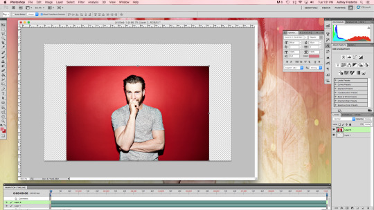
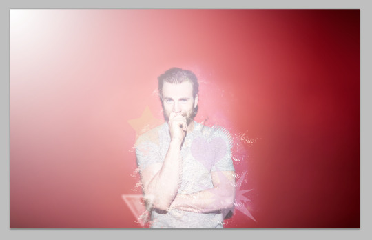
Open the image you want to use (in this case I’ll be using this image of Chris Evans)
Place your image into the new document
Resize if necessary
Step Two:
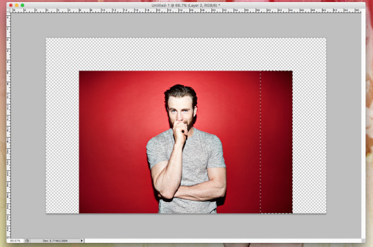
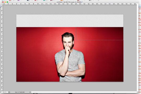
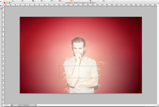
Select the rectangular marquee tool
Select a piece of the image to use as a background like so
Step Three:
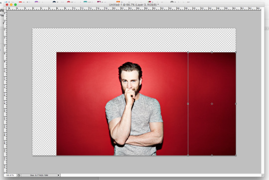
Duplicate your selection to make a new layer (Ctrl+J on PC/Cmd+J on MAC)
Then hit Ctrl+T (or Cmd+T) and transform your selection like so
Step Four:
With your image layer selected Repeat step three on the opposite side
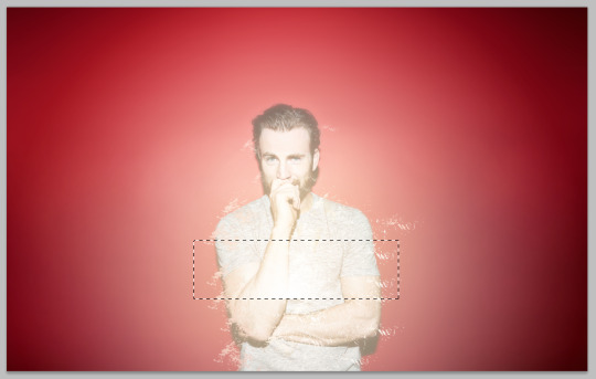
Step Five:
With your image layer selected
Select your rectangular marquee tool and select a piece of the image near the top
Step Six:
Repeat step three and stretch your selection across the top of the image to the center

Step Seven:
Repeat step six on the opposite side
Step Eight:
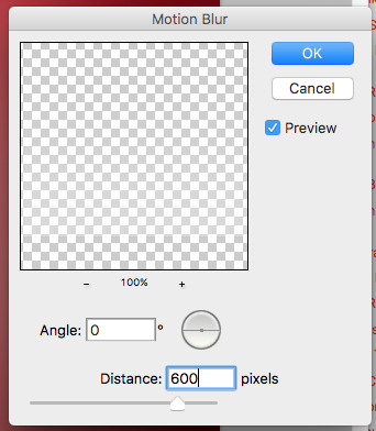
Merge the previous two layers together
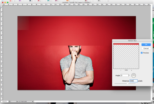
Step Nine:
Now go to Filter > Blur > Motion Blur and set the values to the screenshot below
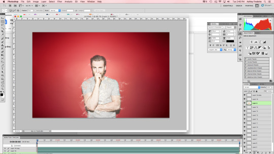
Step Ten:
Add a layer mask to this layer
(note: if you are using the same image I am using, go back to your background layer and fill it with black -- i had to do this because after I applied the blur I was seeing some of the transparent background behind the red)
Step Eleven:
Press the letter D on the keyboard to reset your foreground and background colors to black and white
Select the brush tool and select a medium sized brush with a soft edge to smooth out any edges and reveal the pieces of your original image that got covered
Make sure you have the actual layer mask selected when you are doing this

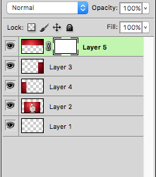
Step Twelve:
Merge all of your layers together (Ctrl+E on PC Cmd+E on MAC)
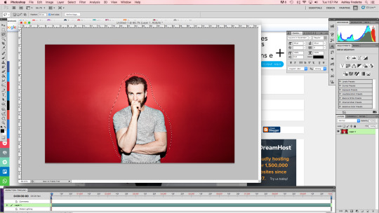
Step Thirteen:
Select the lasso tool and set the feather to 50px and select your image like so
Step Fourteen:
Invert your selection (Ctrl+Shift+I or Cmd+Shift+I)
Go to Filter > Blur > Gaussian Blur and use the settings below
Step Fifteen:
Create a new layer
Select the gradient tool
Choose the Radial Gradient Mode then choose the gradient that goes from white to transparent
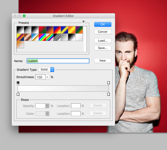
Step Sixteen:
Select (with foreground color) the color #e4c495
Click the center of your document then drag to the edge in order to create a dot
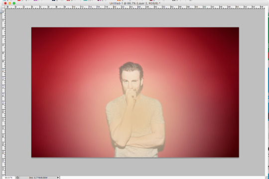
Step Seventeen:
Change the blend mode of the layer to Screen
Set the layer opacity to 50%
Step Eighteen:
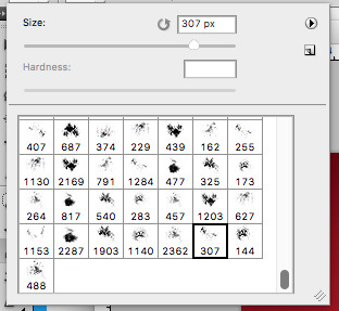
Click here and download this set of brushes and install them
Once the brushes are installed select the Clone Stamp Tool and use the brush show in the screenshot below
Step Nineteen:
Create a new layer
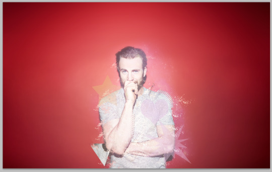
Make sure the All Layers option is selected in the tool options bar
While holding Alt click on a body part and then click on another section of the screen to create some particles (be sure to put every click on a separate layer)
You can play around with brush sizes as well as placement
Go in and erase (with a large soft brush) any spots you’re not sure look quite right
This is what you should have so far (or something similar)

Step Twenty:
Create a new layer
Select the Rectangular Marquee tool and make a selection in the center of your image like the image below
Step Twenty-One:
Select the gradient tool and choose Radial Gradient Mode
Select a gradient that goes from white to transparent
Click the bottom of the selection and drag up to create a gradient like the one pictured below
Step Twenty-Two:
Go to Filter > Blur > Motion Blur and set the numbers below
Step Twenty-Three:
Deselect the selection and press Ctrl+T (Cmd+T)
Rotate the box slightly and set the layer to soft light
Press Ctrl+J (Cmd+J) to duplicate the layer
Select the move tool and move the copy slightly over
This is what you should have so far
Step Twenty-Four:
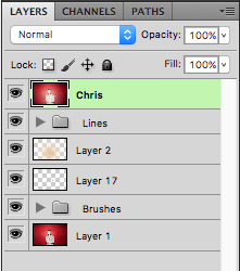
Let’s clean up our layers area a bit by creating some groups
Click the folder icon at the bottom and then while holding shift, click on the top two layers
Drag them into the folder you just created and rename it Lines
Create another group for the layers created when using the Clone Stamp Tool and name it Brushes
Your Layers should look like this now
Step Twenty-Five:
Click here to download this image pack
Open any image you choose and select the Magic Wand Tool
Click the black background to select all of it
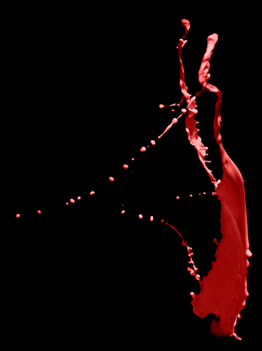
This is the image I’m choosing to use
Step Twenty-Six:
Now go to Select > Modify > Expand and set the value to 1px
Press Ctrl+Shift+I (Cmd+Shift+I) to select the inverse of the image
Press Ctrl+C (Cmd+C) to copy the selection
Step Twenty-Seven:
Go back to the document we’ve been working on and hit Ctrl+V (Cmd+V) to paste the image
Use Ctrl+T (Cmd+T) to adjust the size of the image you just pasted and move it to where you’d like
Press Ctrl+Shift+U (Cmd+Shift+U) to desaturate the layer
This is what you should have so far (or something similar)

Step Twenty-Eight:
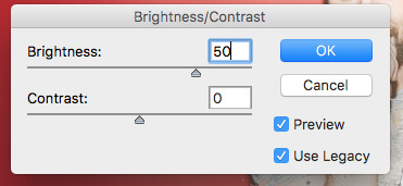
Go to Image > Adjustments > Brightness/Contrast
Set it to the numbers below
Step Twenty-Nine:
Use the eraser tool to erase any unnecessary parts of the image
Step Thirty:
Go to Edit > Transform > Warp
Distort the image as you see fit
Step Thirty-One:
Move that layer to the layer below the gradient dot
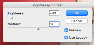
Go to Image > Adjustments > Brightness/Contrast
Set it to the following
Step Thirty-Two:
Set that layer to Multiply and set the Opacity to 43%
Step Thirty-Three:
Press Ctrl+Shift+Alt+E (Cmd+Shift+Alt+E) to merge all layers into a new layer
Rename this (I am choosing to rename mine Chris)
This is what your layers palette should look like now
Step Thirty-Four:
Create a new layer
Select the line tool and create 15 lines as pictured below
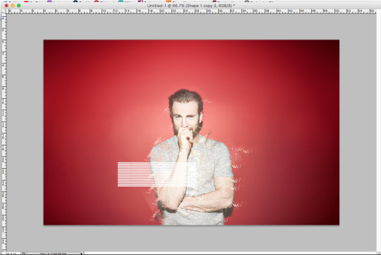
Step Thirty-Five:
Press Ctrl+T (Cmd+T) and transform the lines to a 45 degree angle
Step Thirty-Six:
Go to Select > Load Selection to bring up the selection around the lines
Go to Layer > Delete > Layer to delete the layer with the lines
Click on the Chris layer
Press Ctrl+J (Cmd+J) to copy the selection to a new layer
Select the move tool and move the copied selection until your image looks like the picture below
Step Thirty-Seven:
Select the Polygon Tool (or Custom Shape Tool or both!)
Use any color combinations you’d like (I am using #e7c178 and #ddb3d0)
Create a few different shapes (all on separate layers)
Set each layer’s opacity to 40%
Then add the layers to a group and name the group Shapes
This is what we’ve got so far!
Step Thirty-Eight:
Next save any image of the stars (I just searched google and found this)
Open it in Photoshop and paste it into your document
Move it and adjust it however you’d like
It should look something like this
Step Thirty-Nine:
Set the layer to Screen
Select the Eraser Tool
Using a medium sized soft brush erase any hard edges
Step Forty:
Go to Layer > Adjustments > Hue/Saturation
Set the values to the picture below (or to whatever suits your photo best - remember you can change any and all of these things as you like to suit your color scheme!)
Step Forty-One:
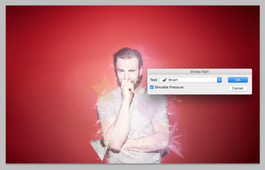
Select the Chris layer and then select the Polygon Lasso Tool
Make a selection of a small triangle
Press Ctrl+J (Cmd+J) to create a new layer from the selection
Press Crtl+T (Cmd+T) to transform and move the selection where you please
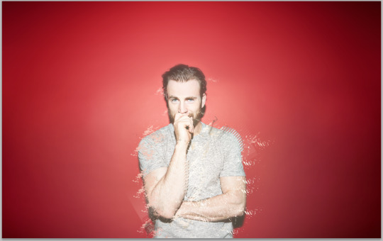
This is what we should look like at this point
Step Forty-Two:
Reset your foreground and background colors to black and white by pressing D
Press X to swap them (meaning your foreground color should now be white)
Select the brush tool and a small soft brush
Press P for the pen tool and draw a path around the triangle we created in the last step
Right click on the path and choose Stroke Path
Input the values below
Step Forty-Three:
Go to Filter > Blur > Gaussian Blur
Set the Radius to 3px
Set the layer opacity to 20%
Press Ctrl+J (Cmd+J) to duplicate the layer
Set the duplicated layer to Overlay with an opacity of 80%
Add both triangle layers to a group (named Triangle) and then set the opacity of the group to 70%
Step Forty-Four:
Click the very top layer and then create a new layer
Select the gradient tool and then select Radial Gradient
Select a gradient that goes from white to transparent
Click the top left corner of the document and drag diagonally down to the bottom
This is what it should look like so far
Step Forty-Five:
Set the opacity of the gradient layer to 75%
Go to Layer > New Adjustment Layer > Curves
Set the graph to look like the picture below (or adjust the curves to your liking!)
Step Forty-Six:
Click on the group called Lines and duplicate it
Move it above the Chris layer
Select the move tool and move the group so the picture looks like this
Step Forty-Seven:
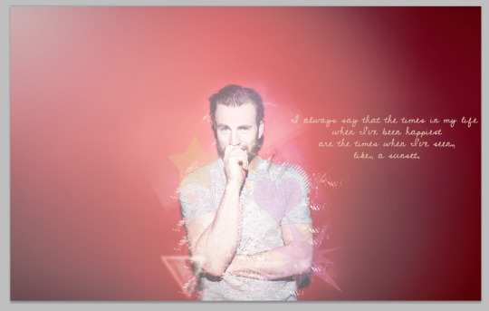
Select the type tool
Select a font (I’m using Cedarville Pnkfun1 Cursive *which I found on dafont.com here*)
Select a color of type for your text (I’m using #e9cfb8)
Type anything you want, in this case I am using a quote from Chris
I set my font size to 30pt (this worked for the font I’m using) then adjusted the words and centered the text so it looks like the image below
Step Forty-Eight:
Press Ctrl+Shift+Alt+E (Cmd+Shift+Alt+E) to create a new merged layer
Go to Filter > Sharpen > Unsharp Mask
Set the values to this: Amount - 79%, Radius - 0.6px, Threshold - 0 levels
Step Forty-Nine:
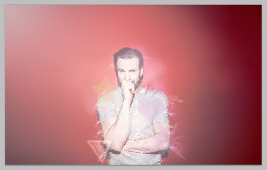
Save your file as both a PSD and a JPEG (I do this just incase I feel like I want to go back and edit anything on the original)
You’re all done!
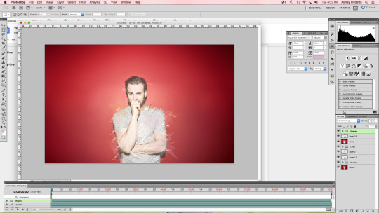
The final image should look like this!
15 notes
·
View notes
Text
Album Cover and Back Text Experiments + Designs (Photoshop)
Here are the text developments i was experimenting with to create my album. The name that I chose for my album from the list of names in the last thread was ‘Atlas’ and that is what I am experimenting with here. Each experiment that I have created here has a brief explanation on how it was made and the step what went through it to reach the final product.
All of the type faces and effects could be made into a unique and interesting cover and back page for my Album.
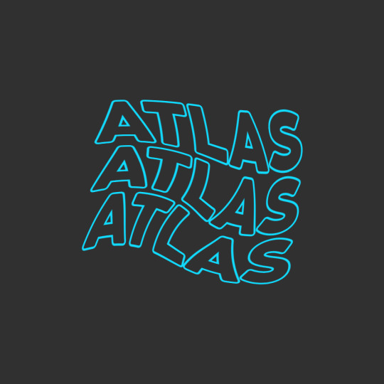
This first piece here was rather quick to perform as there is not a lot of step that need to be taken into action to make it happen.
The first thing you want to do is type out your message or word, here for me it was ‘Atlas’ Once done with this you want to head over to the. Blending options tab and make your way over to the ‘Stoke’ sub section and simply apply the stroke in the color you are working with. Then go over to the blending options and turn the ‘Fill Opacity’ down to 0% by doing this you are left with the outline of the letters and the middle showing the background in the layer below.
By then you will have one of these words or phrases to then you want to duplicate the word by using cmd + right click and drag both beneath and above. Once done with this you can then selection all of the word layers by shift clicking all the layers and turn it into a smart layer, combining all the layers into one editable layer.
By then you can start manipulating the words however you want. This can be by any tool, liquify, blur etc. By in this situation I went with the ‘Swirl’ effect under ‘Filters’ then ‘Distort’ in the sub section. When applying the swirl effect you should be left with something that looks a little like mine above.
Font - ‘Coco Goose Classic’
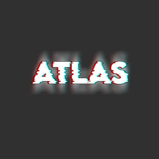
With this one it brings back the the glitch effect and practise that I have gone over and used multiple times during my time in this course by now, mainly in last terms project.
Here I show my understanding of the glitch effect at a higher lever and with more experience with the style and also the software in general. Just like the picture above it looks rather refined and complicated to pull of but is a lot more simple the further you strip it back. By starting off with this one you want to type out your starting word in white, as this give the glitch look the most dramatic effect. Then you want to duplicate the white text layer 2 more times so that they are directly under the first text layer, you can do this by using cmd + J.
After duplicating the layers you want to head into the blending options for the 2 new created layers then in the options for one layer you want to remove the R channel from RBG and for the other channel remove the G and the B once this is done you can move the under layers to both the right and left of the white text as seen above.
By then you want to selected all the text layers and rasterise them then group them into one layer (this makes it easier to make the next edits). Once merged together you need to use your marquee tool to selected bit you want to move slightly to make the glitch effect. This doesn't have to be precise, any cut will look good. Although you want to mix up how big you are doing the cuts to leave a level of inconsistency in the effect and not to man made. The cuts can be made by holding the cmd + arrow keys left and right from when the area is selected with the marquee tool.
Then it’s a matter of doing some final adjustments to really make it shine. Such as here I duplicated the glitched text using cmd + J then applied motion blur in a vertical formation to add additional depth and a light black stroke to the text for additional contrast in layers.
Font - ‘Lemon Milk’
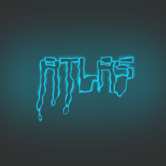
This neon sign just like any other neon work in photoshop is simple yet amazing. The glow mixed with the unique curves and drips in the text is enough to pull anyones attention. Start of by using the same technique you used in the first effect to leave the text with just the stroke. Once done with this you head over to your blend settings and then head over to outer and inner glow making sure that the out glow is more powerful than the inner glow. Set them to what your think it a good level to be set at (or what you think looks the best in your opinion). Also make sure this glow Is in the same color or hue as the text you are working with.
When you have made your text glow you want to make your way over to the Liquify tool. Something I am getting very familiar with now in my work. Adjust the size of the brush using the bracket keys and start to drag wherever you think looks good. (This piece is very versatile to how you like it and what you think looks good). Here I used a mix of the ‘Forward Warp tool and the ‘Pucker tool’ to create the drops at the end of the letters.
When backed out of the Liquify menu the last touch you need it to use the soft brush in the same color as the text to create a few large blogs behind the text in a fresh layer to add in a faded glow in the background to make the text stand out more. When making you dots of added glow make sure you turn the opacity down to not make it to over powering.
Font - ‘Minecraft Game / Menu Font’

This is the first piece of work I have made where I have incorporated the use of the mask layer tool in it and I honestly love how it came out looking. This would look great as a company logo or a great addition to my portfolio if added into the right style of work.
To start of with you want to start with the shape tool and draw out a long skinny rectangle in which covers most of the canvas. Then you want to duplicate that shape layer however many more times until it reaches near to the bottom of th page. When that happens you will have tones of single shape layers that you want to shift selected and then transform into a smart object. Then again for the last time here in these experiments go to filters and use the liquify tool. In the tool this time you don't want to make many drastic changes as the more subtle the better with this one as you can see above.
When finished you want to type out either the word or the letter into a new layer you want to have the effect masked onto and magic wand it all. Then in the layer with the lines on you want to make a layer mask and once its make you want to ‘unsee’ the text layer and the effect will be printed onto the letter.
This effect is so versatile and im sure I will find many uses in the future in more work when it comes to using the mask feature as I have tend to stay away from it in the past as I was not 100% certain on how it worked but now using it and properly getting stuck in with it I couldn't love it anymore!
0 notes
Text
Lettering in Webcomics - a Reference Post
Imagine you have finished the perfect artwork for the latest update for your webcomic. You feel so proud about it you want to hang it on your wall. You want to post it immediately! You want everyone to see it! But before you can do that, you need to add dialogue between your characters.
And that’s where you get stuck. No matter where you place the speech balloons, you’re covering too much of your drawing. It all looks badly placed. You accidentally make a speech balloon that goes from side to side of the frame. It’s a major disaster! What did just happen and how can you avoid it? Let’s answer those questions now.
The charm about comics and webcomics is that they’re a combination of text and images. It’s true its main strength is the fact the reader can look at the art depicted, but a webcomic is never complete without dialogue or text.
However, filling your webcomic to the brim with text and dialogue is not how webcomics work. It’s rare to find the exception to these rules, such as Homestuck, and even then it’s only because of the difference in format. It’d be tedious to read a webcomic that has paragraph after paragraph crammed in a single frame!
As if all that wasn’t enough, you also have to remember that if you place the text badly, it’ll make the reader overlook the art you worked so hard on or even get confused, cardinal sins in this type of work. If you strive to be a webcomic author, you must understand how to place dialogue and text properly. That’s what this post is here for! Here are some handy tips that will allow your webcomic’s text shine without sacrificing anything in the process!
GREAT! WHERE DO I START?
Not so fast, enthusiastic creator! Lettering isn’t something you add in the end. You need to plan this carefully from the beginning. Webcomics are a visual medium, and that’s a double-edged sword. You can communicate a lot through art, but there’s not much space for dialogue unless you plan carefully from the very start. You can’t clutter the page with line after line after line!
That’s why, before starting to draw the page, you need to be aware how much dialogue you’ll have this time. Write it somewhere, analyze how much space you will need. Keep in mind the text is a piece of a larger picture, so to say. You can’t let it overshadow the rest of the page.
I’M DONE PLANNING.
Congratulations on completing the first step! Now you may start drawing. Whether you sketch on paper or digitally doesn’t matter, what matters is that you sketch. Why? Because this way you can plan where you’ll place the speech balloons. It’d be a shame if at the end your dialogue covered too much of the art, this can be easily prevented if you sketch. While you draw, imagine where you may be placing the speech balloon, and avoid drawing too much inside that small area. You also may adjust the size of the frames, leaving enough space for the speech balloons without having to sacrifice part of the art.
So you got your art done! Well done, now place the speech balloon. There are many speech balloons you may use, depending on what you want to communicate.
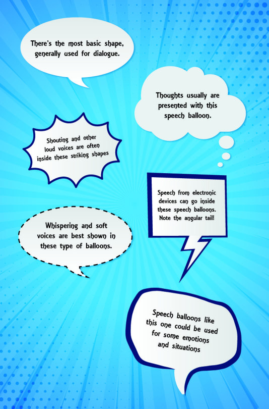
These are more like guidelines, the most used meanings for these type of speech balloons. You as the author of the webcomic have the liberty to adjust speech balloons according to your style and needs. You could modify speech balloons to make them fit a character. Color, shape, font, all that are qualities you can change according to situations. You’re the one who has the last word on the matter!
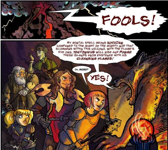
---Guilded Age
To keep your speech balloons orderly, try to accommodate the words in the shape of a square. Avoid long lines, occupy as little space as possible with the speech balloon. Make sure the tails are pointing at the character who is speaking. It doesn’t have to touch the character; all it needs to do is point in the general direction the character is at.
Angelica Maria, the author of Solstoria, mentioned this as her usual technique on how to accommodate text inside a speech bubble:
I try to keep the text in a speech bubble looking like a "Square", so for example
"Oh no, I'm being
held accountable
for my actions!"
The middle line can be extended slightly depending on the shape of the bubble. This is just something I keep in mind, it's not something you have to follow to a T or anything. I just want to make the lettering look somewhat good.
Wait, but how to position the speech balloons? Generally, it’ll be better to position them in a way that’ll guide the reader’s eyes in a natural direction – left to right, in other words. Take this for example:
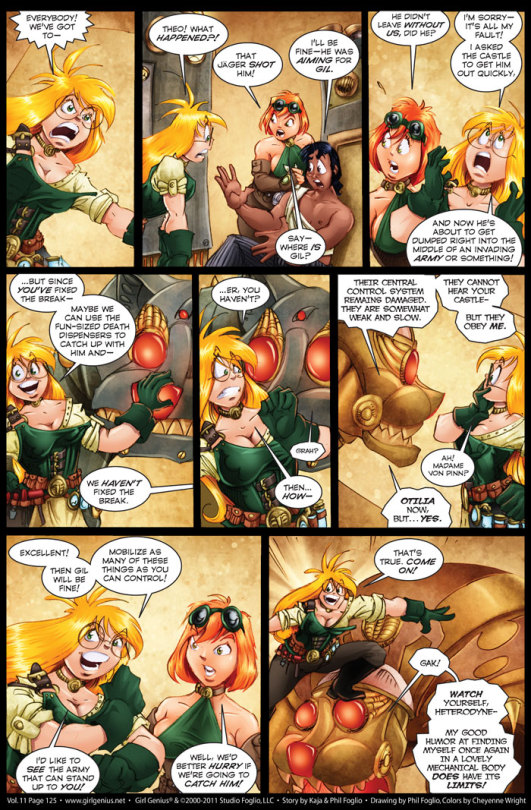
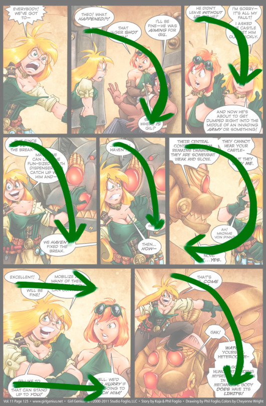
---Girl Genius
See? The speech balloons are positioned in a way it’d be easy for the reader’s eyes to move towards the right. The dialogue always starts on the top left corner and moves either in an arch towards the bottom right corner or in the top and bottom parts of each frame. It’s not a requirement to set your speech balloons this way, but it’ll certainly make it easier for the reader to read!
To put it in a nutshell: as a rule of thumb, remember to direct the balloons placement in a way that leads from left to right or from top to bottom.
Another thing you have to remember and keep in mind if what font you’ll use for your lettering. What kind of font would be the best for your dialogue? Any font that’s legible at small sizes will be good. Maybe Comic Sans would be your first thought because, just as its name says, it was created for comics, and that is because Comic Sans is meant to be readable at small sizes. That doesn’t mean you have to limit yourself to using Comic Sans. There are many other fonts that could be useful to you!
I recommend you take a look at this website. It has many fonts that can be used in the comic book industry, and most of them would be good for your webcomic, no matter the genre. Some are paid fonts, but there are many fonts that are free to use and can be useful to you.
Here, take a look at some fonts you could use! Compare and decide!
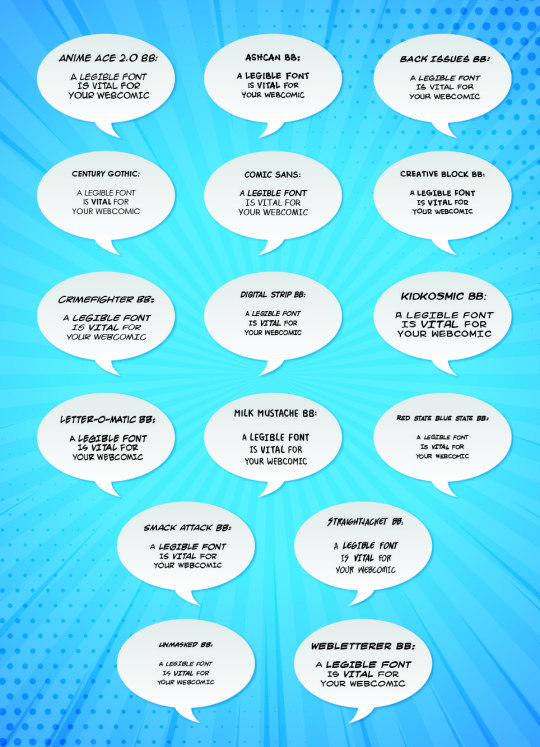
Personally, I like how the Back Issues font and the Kid Kosmic font look!
Generally, it’s recommended you use all-caps in the webcomic, as it’ll be easier to read. Most of the fonts you’ll find for comics often only have capital letters, so most of the time you just will have to type without worrying about activating the all-caps function.
I HAVE THE FONT AND THE IMAGE. NOW WHAT?
Open your sketch or finished image in your software of choice. For the purpose of this post, I’ll suppose you have Photoshop. Most software you can use for these purposes have the same basic functions, so it doesn’t really matter.
Create a new layer above your image. This layer will hold the speech bubble itself – the writing will go in a different layer. Don’t start drawing ellipses or circles yet! Instead, write the text you want to use, and place it where you want it to be, and the size you want it to be. If the text tool didn’t automatically create a layer when you used it, manually make a new layer and place the text there. It’s a good idea to have one layer for each speech bubble, don’t lump all speech bubbles in the same layer.
Once you have the text written, you can make the speech bubbles themselves! The quick option would be to use the ellipsis tool and fill it with white color, but the result will end being rather generic. How about you try to draw the speech balloon by yourself? Use a tablet or, if you don’t have one, use the pen tool. It may take some practice, but this should give your webcomic a more professional look.
You don’t have to make the balloons perfectly round. As long as it’s decently round and doesn’t look like something splattered all over your image, you’ll be okay.
Remember to leave some space around your text, though! Constricting your dialogue into a speech balloon smaller than it is not a good idea.
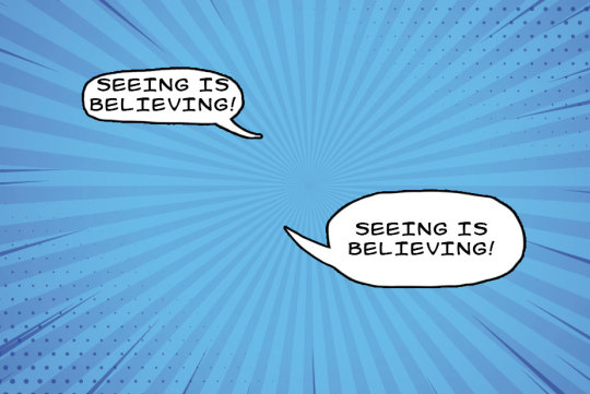
See?
Also, there’s a technique that could make this easier for you. In Photoshop, there’s a special layer effect called ‘stroke’. If you configure it correctly, everything you draw on that layer will be surrounded by an outline. Make sure to configure it so there’s a black border, of two or three pixels wide, and that it’ll be placed externally. Use a brush with a white color to make the speech bubbles, it’ll immediately be outlined, with no additional effort on your part! If you want to recreate these characteristics in new layers without having to open the window again, all you have to do is duplicate the layer while it’s empty. That’ll give the same characteristics to the copied layers!
Those are the basics of speech balloons.
Dialogue isn’t the only text you may use in a webcomic, though. There’s also expository dialogue, like a monologue, thoughts or notes you’re adding to the page, for one reason or another. What to do, then?
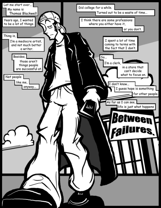
---Between Failures
Usually, these are done in these rectangular boxes. These could be considered similar to speech balloons in many ways, and follow many of the tips and rules speech balloons have. When asked, the author of Between Failures said this:
I've only done this two or three times in the entire run of the comic. It's not talking because it would make the character look insane if he monologued out loud to himself for a couple of pages. This is basically just expository narration to set up the premise of the comic in a single page.
How much expository narration is necessary for a webcomic? It’s not like there’s a definite answer to such question or a guideline you need to follow, but it may be worth remembering that webcomics are a visual medium. Sticking to the ‘show, don’t tell’ may be a good choice, since illustrating some of the exposition may help get it across better than text would, with the risk of breaking the pacing a bit. It all depends on the situation, so trust your intuition, ask yourself what you’d like to see!
I UNDERSTAND!
Excellent, I’m glad to hear that.
Oh, right, there’s one thing more you may want to hear about: can you stylize your speech balloons? Give them your own touch? By all means, go ahead! If you feel it’s appropriate for your webcomic and you think it looks good, then experiment all you want. Gauge how the speech balloons look in your webcomic, maybe ask for a few opinions...do everything you can so the end result is something you’re happy with.
It doesn’t have to be anything complicated. Simple measures such as a shadow or a border around your speech balloon can be quite effective to make your webcomic have a distinctive mark to make it stand out from the many, many webcomics available on the Internet.
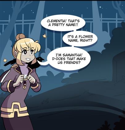
---Solstoria
I started adding them because I removed the black outline on the bubbles and felt they looked better with a drop shadow and now concrete outline. I also removed the outline of the comic panels of Solstoria in general around that time too! I just did it because I wanted to try something different and I liked how it looked. I know Solstoria isn't highly structured, but I enjoy experimenting with it.
As you can see, speech balloons aren’t something done spontaneously if you want professional results, but the effort will be worth it!
---
I hope everything discussed in this post is of some use to you. Good luck to all your endeavors in the field of webcomics!
9 notes
·
View notes
Text
Colour Porn Tutorial
The sweet @silvernightsky requested a coloring tutorial on this gifset of Jace Herondale and Alec Lightwood in Shadowhunters. There are plenty of ways to achieve this effect, but today we’re trying to keep it simple ✌🏻✨ So today i’m going to show you how to go from this:
to this:

Here’s what you’ll need! ● Photoshop (I’m using Photoshop CS6) ● Basic knowledge on making gifs ● Please like/reblog if this post helped you in any way! ● If anything is unclear, don’t hesitate to ask ● Click ‘read more’ to view this tutorial
Step 1: Choose a scene you want to gif. I recommend using scenes that don’t have a lot of movement and/or already have a pretty solid colour in them, that you can work with later. Make your Screencaps (I recommend KM Player for this!) import them into Photoshop, crop and sharpen your layers like you would normally do. This should leave you with something that looks like the first picture above. Step 2: The next thing we want to do is to apply our base coloring. I usually start off with a ‘Curves’ and a ‘Levels’ Layer, but this part is entirely up to you. This is just my way to get a good base that i can actually work with (; These are my settings for both of those layers:
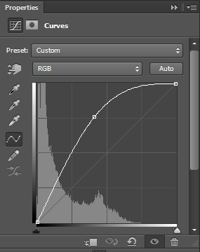
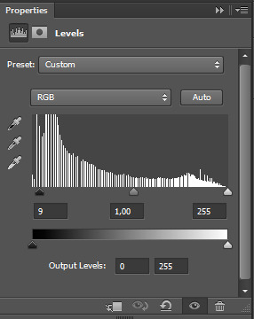
Which leaves me with this:
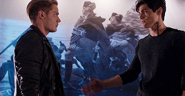
Step 3: Now we’re able to see those already existing colours much better and have achieved a nice contrast between those. So the next thing we are going to work with is the blue background. It’s too dull for my taste, so we’re going to add a ‘Vibrance’ Layer. Those are my settings:
Which leaves me with this:
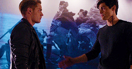
The blue is more vibrant, but now their faces look way too red. To fix this we’re going to create a new ‘layer mask’ on the Vibrance Layer. To do this you have to select the layer and click on this symbol at the bottom right

A white square should’ve appeared right next to your layer
Now we want to erase some parts of that layer. Make sure the white square is selected, choose a soft brush (make sure the colour of said brush is set to black!) and start to erase the colour you want to get rid of. I recommend zooming in and, if you want to keep a little bit of the colour, to set the brush to a lower opacity. After erasing some of the parts this what we’ve got:
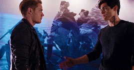
Step 4: On to the fun part! Now we want to use one of many ‘Selective Color’ Layers. In this first step of getting the purple tone we’re going to enhance the blacks and play around with the cyan section. Again, those are my settings:
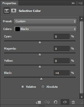
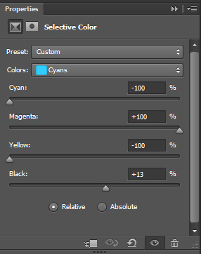
Now just duplicate the layer you just created and you should get something like this:

Isn’t that a beautiful, dark purple? YES! But the top of the picture looks very odd and isn’t purple at all, so we need to fix that. You could try and play around with another selective color layer, if you want to, but there’s an easier way to get the background colours to look the same. So the next thing we want to do is to ‘create a new layer.’ To do this, just click on this little symbol at the bottom, right next to the trashcan.

Now we want to grab the ‘Eyedropper Tool’ which is this symbol on the left

And click on the darker parts of the purple background. This way you will be getting the right tone for our next step. The colour i ended up with was: #7d76d6. Next we’ll be changing the setting of our new layer to ‘Color’
Then we’ll grab a soft brush with our selected colour and start to paint the background. Again i’d recommend zooming in a little bit and to use a lower opacity at the parts that are moving slightly - in this case their heads. This is what it looks like once i’m finished:

But it still looks too blue and not vibrant enough for me, so i used another ‘Selective Color’ Layer and played around with the blues this time
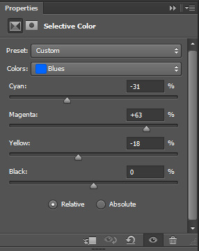
Just duplicate this layer, again, and you’ll get something like this:
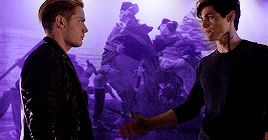
Step 5: This step is optional, because we’ve already got the colour we wanted to achieve, but this looks a little to dark for my liking. So i added another ‘Curves’ and ‘Vibrance’ Layer with the following settings:

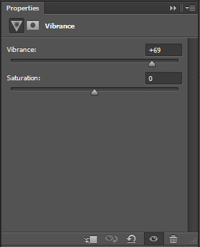
Now you’re free to add your text and save your gif!
And this is it!
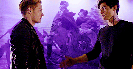
With this technique you can also go for other colours or enhance those that are already there ... it’s up to you! 🌈
I hope you enjoyed this tutorial and please like/reblog if it was helpful in any way 💜✨ *sidenote: please be careful when the character/actor/whatever in your gifset is a POC. Playing around with the red/yellowish tones and vibrance will mess up their skin tone in 99% of cases. so please be patient and make sure that you keep their original skin tone, or at least not whitewash them.
#chaoticresources#itsphotoshop#completeresources#yeahps#*tutorial#*tutorial:colorings#*tutorials:gifs
659 notes
·
View notes
Text
How To: Disney Button Display
I have been searching for a way to display my Disney buttons without having to spend an insane amount of money on custom shadow boxes and frames for years. The latest trend is to turn them into magnets, but let’s be honest, I have too many of those too! After a thousand Google searches of displays that left room for about 5-10 buttons, I finally decided to create my own display. This display is great for a few reasons.
1. It's a bit fancier than your average cork board and doesn’t involve any custom framing. 2. The lack of glass means you’re free to view your buttons without the glare! 3. The display doesn’t require pulling apart the buttons so you can easily remove them from the display and wear them to your next Disney trip if you’d like! 4. You can add on to it so if you collect more over time, you’ll have an easier time adding them to your wall. 5. It’s great for holding small AND large collections of buttons. Whether you’re displaying 8 or 82, this display works. 6. It also works if your Disney buttons are already pin-less, crooked, or broken! Additional instructions are included at the end if this applies to you.
I wanted to share this project with you in full detail so that anybody can create this display! I was really happy with how mine turned out. Here are the step-by-step instructions on how to make this wooden display!

What You’ll Need:
* Paint Ready Balsa Wood (available at local craft stores)
* Paint (we used ArtMinds interior/exterior soft gloss acrylic paint in Onyx)
* Command Light Clips, Indoor or Outdoor (1 for each button you’re displaying)
* Nails
**Keep on hand: Ruler, X-acto Knife and razor/file (if you plan on cutting wood), foam brush, measuring tape, leveler, scissors, hammer, and nails.
What Size Boards You’ll Need:
This all depends on how many buttons you are displaying. We were working with a 5′ wall and wanted about 6″ of space between the edges of the wall and the display, so we went with a 4′ long board. Michael’s doesn’t carry 4′ boards though, so we bought extra boards to cut and add length. For STANDARD DISNEY BUTTONS, we found that the board only needed to be 1/8″ deep and 3″ tall.
Our wood came in 1/8 x 3 x 36″, so we got extra boards to make that 36″ into the 48″ we needed. My recommendation is to lay out all your Disney buttons with the spacing you want, and measure it out. Feel free to do multiple layers. We displayed 82 buttons. With 48″ long boards, we were able to fit 15 on each row. We created 6 rows for all our buttons.
Basically, if you’re planning a 4′ long design, here’s what you need for 1 row:
1 1/8 x 3 x 48″ board OR 1 1/8 x 3 x 36″ board and 1 1/8 x 3 x 12″ board
Note: If you’re reading this and already thinking “Geeze I’m not that crafty, this is not my style”, be aware that the preparation is the hardest step. Once you figure out what you want and the size boards you’ll need, the rest is a breeze!
STEP ONE: Prepare Your Boards & Buttons
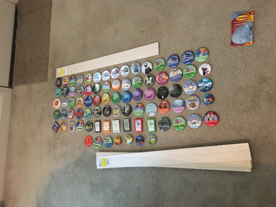
Line up your buttons in the way you wish to display them. For us, we took color, style, and event into account. We decided to take out all duplicates. Similar special event buttons were kept together and “I’m Celebrating” and Birthday buttons were scattered throughout so we didn’t have entire sections of green/blue. Figure out your spacing, measure it, and buy appropriately sized boards.
Next, resize your boards, if needed. Measure out the length you need, and mark it with a pencil. Then, perforate it with an X-acto knife on both sides of the board. From there, you can cut through or snap the boards. Last, file down the edges with a razor or file so the end is clean.
STEP TWO: Paint Your Boards
We used a 3″ foam brush to help speed the process up. Paint the fronts, sides, and ends of the board with two coats of whatever color you like. We used a deep black so that the colorful buttons would pop! Two coats is ideal.
Tip: Make sure your first coat is completely dry before painting with the second coat to prevent stickiness.
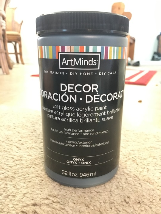
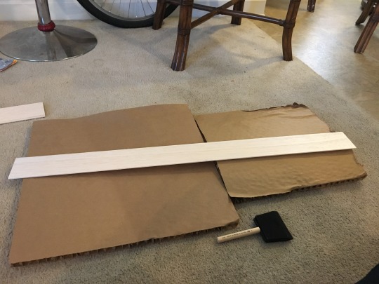
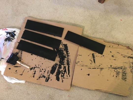
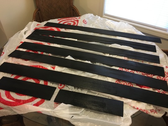
STEP FOUR: Prepare Command Hooks
You can use any command hooks that you like, but we preferred the look of Command Light Clips (indoor or outdoor) for a few reasons. 1. We liked that it made the buttons lie as flat as possible instead of hanging forward. 2. They were the shortest hook available, so the top of the button hid it well. 3. The hooks had a thicker ledge, preventing the button from sliding and hanging sideways.
To prepare, trim the excess pull tabs with scissors. This pull tab is normally used for easy removal of the command hook. Because you won’t be using them as removable dorm-room hooks, you won’t need that extra pull tab.
Then, peel off the blue command strip side and stick it to the command strips, leaving the “wall side” on for now.
Keep in mind that it doesn’t really matter what color the adhesive is on the back of the hooks. The button will cover it anyway.
STEP FOUR: Figure Out Spacing & Apply Hooks
Do one trial run to see how you would like your spacing. For most standard Disney buttons (using a board 3″ tall), you’ll want the bottom of the hook to be 1″ from the top of the board. Some Disney buttons will have the pins more to the center of the button. You can adjust as necessary. We kept ours all the same.
Then, do the math to figure out the spacing between each button. We had already decided we wanted our first and last hooks to be about 1″ from the edges. From the center of that hook to the end was 1.5″ on each side. Since we did this to both sides, 1.5 x 2 = 3. So our 48″ board was now basically 45″. We then took our 15 buttons (equivalent to 14 spaces) to figure out the rest. 45″ divided by 14 spaces = 3.21″. So we measured roughly 3.21″ in between each hook to ensure even spacing.
Tip: Even if your buttons are slightly different sizes, it’s a good idea to keep the spacing the same. This helps keep it all look more uniform, and means that if you ever want to rearrange your design, you can.
After you’ve figured out the spacing you want between each hook and you’ve done a trial run to double check your math, use a ruler to measure out your spacing and stick the hook down in its spot one at a time.
After you have the first row complete, you can use that as a guideline to line up the other hooks so you don’t have to measure it out each time.
STEP FIVE: Secure Boards to the Wall
Use a leveler to secure them to your wall safely. Nail it to the wall as you would any other wall decor. We did one on each end and one towards the middle for extra stability.
For reference, we spaced our boards 2 inches apart from each other. With each board being 3″ tall and having a 2″ space between each other, our entire wall design ended up being 28″ tall.
STEP SIX: Hang Your Buttons
This is the easy part! In the order you choose, pin your buttons around the base of the clip, just as you would when pinning it to your shirt.
Last but not least: Enjoy your creation!
**If you have broken buttons, or are the type of person to never re-wear the buttons and you’re looking for a way to save money, follow instructions 1 & 2. Then, instead of using command hooks, apply hot glue to the rim of the button and secure to the wood. Hot glue guns can be as cheap as $7 (glue sticks included) at Walmart. If the pin is still on the back and getting in the way, use wire cutters to remove the pin part before hot gluing. Then follow Step Five to secure it to the wall. Note that if you hot glue them down, you won’t be able to hide the nails under the buttons unless you secure it to the wall first. It is advised to leave room for the nails and hang it after you secure the buttons in case you wish to move the decor at a later time. **
I hope you enjoy this craft! It was fun to design and put together, and it feels so good to finally have our buttons displayed the way we want them. Each button of ours has a story behind it and we can’t wait to share them with people whenever they come over to visit.
If you’re looking for another fun how-to, I made a simple Tangled Flags craft a while back that is great for parties or room decor. You can find that here.
Questions/Concerns? Message me and I’d be happy to help!
Happy Crafting!
#crafts#howto#craftideas#disneybuttons#disney#disneybuttondisplay#disneypindisplay#buttondisplay#dcp#disneycollegeprogram#dcpalumni#wdw#waltdisneyworld#disneyland#dlr#disneylandresort#magickingdom#animalkingdom#hollywoodstudios#californiaadventure#EPCOT#bugsland#carsland#honorarycitizen#24hourevents#birthday#anniversary#imcelebrating#officialdisneybuttons#disneyprograms
1 note
·
View note
Link
Upon its world premiere at this year’s Cannes Film Festival, Killing Them Softly attracted attention for its powerful performances and stylish filmmaking. Its cinematographer, Greig Fraser, recalls, “Watching James Gandolfini and Brad Pitt act together was one of the highlights of my career so far. That’s the part of the job that really amazes me — not shooting out of helicopters, but watching these actors do their thing.”
Directed by Andrew Dominik, Killing Them Softly follows several small-time criminals whose fates become intertwined with the armed robbery of a high-stakes poker game run by Markie (Ray Liotta). The robbers are Frankie (Scoot McNairy) and his junkie friend, Russell (Ben Mendelsohn), who have been hired for the job by Johnny Amato (Vincent Curatola). The robbery brings the mob’s activities to a temporary halt, and a dispassionate hit man, Jackie Cogan (Pitt), is brought in to investigate the crime. He subcontracts a fellow hit man, Mickey (Gandolfini), to help him restore order.
Speaking to AC a few months after Cannes, Dominik recalls that in developing the look of the picture, he and Fraser spent several weeks exchanging ideas and shooting tests in Los Angeles. “I was very interested in doing something that didn’t look lit, and Greig’s attitude about that was really good — his [approach] is very much about reacting to what’s there at a location and supplementing it,” says the director. “Our basic idea was a low-con image, a kind of creaminess, that harked back to a look that might have existed in the Seventies. Greig suggested that Panavision anamorphic lenses in tandem with the kind of lighting style we wanted would produce a really creamy image, and we shot a lot of tests with Panavision lenses on his [Canon EOS 5D Mark II] DSLR. Then it was a matter of coming up with a look [on film] that would match what we were getting on the 5D, because we loved that. It was a very shallow depth-of-field with layered grays — there were no real blacks in it. That look is pretty impossible to duplicate on film, I think, because once you get down to the release print, moving away from contrasty images is kind of tough.”
A new film stock, Kodak 500T 5230, proved to be key, according to Fraser. “We were the first feature to use it, and it has a beautiful creamy quality,” he says. “I didn’t test much of it, mind you, because we didn’t have enough time. We shot some as we drove around L.A., printed it, and thought the results looked amazing. We then put in an order for about 200,000 feet of it, which gave them a little shock up there in Rochester! But they came through.
“We shot most of the movie on that stock, all the night interiors and exteriors,” he continues. “It’s not as contrasty as [Kodak Vision3 500T] 5219. Comparing 5219 to 5230 is like comparing photo prints on glossy paper and matte paper. 5219 is glossy, and 5230 is matte. 5219 zings; it’s sharp. With 5230, the blacks absorb you a bit more; they take a little more effort to welcome you in. You can almost feel the textures and touch the tones.”
Some of the images in Killing Them Softly possess a strange soft quality, with slightly blurred backgrounds and bright flares. These moments were partly fashioned by the HS50, an older-generation lens customized by Panavision optical engineer Dan Sasaki. Fraser explains, “We asked Dan to shift some of the lens elements to help throw the background crazily out of focus, with a slight doubling of the out-of-focus elements. He made the bokeh even more elongated than it usually is; the falloff was fantastic, and we also got a great flare at the bottom of frame. It was a very interesting and exciting effect.” This optical magic is particularly noticeable toward the end of the film, in a shot of Jackie walking at night with fireworks going off in the background.
Throughout the shoot, for which he also employed G-Series and Super High Speed lenses, Fraser emphasized the bokeh by maintaining a shallow depth-of-field, shooting between T2 and T2.5 even in day exteriors with the help of ND filters. “Everyone’s been trying to get the anamorphic image as sharp and clean as possible, and there we were, trying to mess it up,” he notes wryly.
When defining the look of Killing Them Softly’s nameless town, Dominik and Fraser used a choice geographical phrase: Shitsville. Fraser explains, “Although we shot on location in New Orleans, we were aiming for something generic, a little town between New Orleans, Boston and D.C. that we called Shitsville. We wanted the place to look like it’s on the down-and-down, on the way out. We wanted viewers to feel just how smelly and grimy and horrible it was, but at the same time, we didn’t want to alienate them visually. That was the challenge!”
The bleak, often violent world presented in the film is often suffused with a low-contrast softness. “That’s a combination of stock, lenses and lighting,” says Fraser. “Where possible, I always used soft lighting. Cinematographers sometimes use hard backlight to give the appearance of sharpness, but I tried to avoid that. We were going with soft lenses and soft lighting, and often with soft faces. Creaminess is what Andrew and I wanted, not milkiness, which is different. Creaminess is something you feel you can enter into, like a bath; you want to be absorbed and encompassed by it. These were our lofty expectations. It wasn’t always completely obtainable, but we did our best.”
Desaturation was another key to the look, and one of the filmmakers’ criteria for locations was that they not be too colorful. In prep, Fraser tested flashing 5219 (because 5230 was not yet available) with a Panaflasher to reduce contrast, but he finally opted to obtain some of that feeling in the digital grade, which the filmmakers conducted with colorists Olivier Fontenay and Mitch Paulson at EFilm in Hollywood. “Throughout the DI, we were always trying to pull down the highlights, pull up the mids and have everything kind of meet in the middle,” Dominik recalls.
Fraser’s approach to a location is to start with the existing lighting. “I won’t say we shot with natural light because we controlled everything,” says the cinematographer. “The Kodak 5230 helped us blend [our lighting] in with the locations. We tried to just augment what was there with approximately the same color, and to end up with something beautiful.”
To get more perspective on his technical approach to the picture, Fraser suggested we speak to two of his collaborators, gaffer Jay Kemp and key grip Kurt Kornemann, who also worked with him on Let Me In (AC Oct. ’10). Kemp notes that Fraser’s approach to lighting locations in Killing Them Softly involved matching the spectrum of urban lighting and fluorescents, much as they did on Let Me In. “On this movie, we tended to embrace the green world,” says Kemp. “We balanced mostly to an urban metal-halide and cool-white environment, which is a hyper-blue with a green spike. Then it was a matter of incremental balancing to try and get the sources even closer in color. Depending on the scene, we either embraced the green or timed it out. In general, green enhances urban stories like this one because it’s true to the environment.”
This approach is evident in the lighting of Frankie and Russell’s robbery of the poker game, a scene that was shot in a restaurant with yellow-tiled walls. The scene includes many reaction shots of the card players, in addition to shots of the nervous robbers. “We could have made that scene moody and smoky, but we chose to deglamorize it and make it look more like a supermarket,” says Fraser. Part of the reasoning, he adds, was to differentiate this heist from an earlier one that is shown in flashback.
“At first I was a bit unsure about the restaurant location, but Andrew has a bloody great eye, and he liked it,” continues Fraser. “I had to struggle a bit. It was all toplight, but I did add some fill for the eyes. We added greenish fluorescent practicals above instead of Kino Flos. We corrected some of the green, but kept a little bit. I’ve never had much success making Kino Flos look green; I get better results running green tubes and pulling the green.”
Putting most of the lighting overhead allowed the crew to move quickly as they grabbed shots below. “We had just one day to get this scene, and there were a lot of shots, so we had to move through it,” says Kemp. “We had to cover 10 actors, and Greig wanted a fast solution [for lighting] so Andrew could concentrate on performances. The location was pre-rigged by our rigging department, and then we came in and pre-lit. There was a front room and a back room, and we rigged both to give Andrew and Greig some choices. They chose the back room on the day.
“We quadrupled the Cool White fixtures overhead by adding industrial fluorescents with a switch bay to turn individual units on and off,” continues Kemp. “We created a blue-green environment with a bed of Cool White fluorescents above and used black teasers to keep light off the walls. Greig’s work on these kinds of scenes was often a mix of toplight and eyelight, and we added very little below; we kept the camera side darker and lit from the top or backlight zones. We’d steal some toplight with beadboard bounces or maybe add a 2-by-2 Kino Flo with Cool White fluorescent tubes, and for close work we used a Litepanels Mini corrected to Cool White fluorescent.”
Because the yellow-tile walls were so reflective, Fraser also employed some negative fill. “On the tighter shots,” Kemp explains, “we brought in 4-by-4 floppies to get unwanted [bounce] off the actors’ faces.”
The film includes a number of dialogue scenes between Jackie and a mob contact (Richard Jenkins) in the latter’s parked car. Fraser recalls shooting a quick test in Dominik’s own car in Los Angeles during prep: “We liked the feeling of a light-colored car — you feel enveloped, safe and warm.” In the scene, the bright interior acts as a source of reflected light. “It was like putting the characters inside a softbox,” says Fraser.
Long day-exterior scenes are a challenge for cinematographers because of the sun’s movement and changing cloud patterns. To minimize varying light conditions over the two days they spent shooting Pitt and Jenkins’ car scenes, the filmmakers positioned the vehicle in the shade under a bridge, and Fraser supplemented the natural light with two 220-watt daylight-balanced Creamsource Classic LED lights from Outsight.
“There were no lights inside the car,” says Fraser. “We used negative fill from behind camera mostly to eliminate camera shadows, but it also gave their faces some shape. We added one Creamsource, and then another, to add a little bit of oomph.” To manage the natural daylight in the background of some shots, he added a single or double net far enough from the car to be invisible. “Because we shot on film, we had the ability to pull the background in a little in the DI if it wasn’t quite right,” he notes.
Pitt and Jenkins “were solely lit with the two Creamsources for those scenes, which is pretty remarkable,” adds Kemp. “The lights were punched through a 4-by-8 frame of Lee 250 [Half White Diffusion], mostly above the windshield. They required some correction to be true 5,600°K without the green spike that can be typical of LEDs.”
Though the lighting was simple, the car interior “was a big grip job” because of the black solids used to create negative fill, according to Kornemann. “We had multiple 20-by-20 solids flying in the air, and we were dancing those around the car all day long,” he recalls. “Two of them were on stands, and one was on a flyswatter hanging off a Condor. We had four to six lines going back to the crane and to the ground for stability in the wind.”
Although Killing Them Softly features very little hard light, Fraser’s soft light can be very strong indeed, as in a daytime scene in which Jackie intimidates Frankie in a bar. “We wanted a strong source outside, so the front of the room was very soft,” says the cinematographer. “The idea was to create as soft a light as possible and also give the actors quick resets. We didn’t have to do a big lighting change every time we changed shots.” Pitt and McNairy were backlit by a 100K SoftSun positioned to hit the windows of the location. “It wasn’t a specular source; it was a nuclear ambient source, directional without being harsh,” says Kemp. “We used the SoftSun to create explosive ambience and supplemented that with three Arrimax 18Ks for more directional pushes. We filled and shaped the faces inside with the Creamsource Classics and Litepanels LED 1-by-1s and Minis on the bar. We played the Creamsources very low and very diffused, as if daylight was bouncing back at the actors.” Kornemann recalls blocking sunlight with 20-by solids on stands in the street outside.
Another striking use of strong soft light occurs in a hotel room where Jackie confronts Mickey about his performance on the job. Fraser had three 18K Arrimaxes shooting down directly into the windows from across a courtyard, and not much else. The sheer curtains on the window transform the 18Ks into a powerful soft source. “When the window was off camera, we let hard light hit the sheers to create a soft ambience, and when it was on camera, we softened the 18Ks,” says Kemp. “There was very little [lighting] inside the room, just a Litepanels 1-by-1 or Mini for eyelight.” Fraser notes that Dominik’s angles were simple: “We shot two sizes of Gandolfini and Pitt, a mid and a tight. Andrew was just concentrating on the actors.”
“I knew going into this film that we weren’t going to go in for a whole lot of coverage — we were just going to have each character have his shot,” says Dominik. “The idea was to simply sit there and let the characters do the work. I had so many really good actors on this movie that it was kind of pointless to direct. I mean, you could, but they knew who those characters were and what they were doing.”
Fraser’s treatment of night exteriors in the film is notable for the absence of strong visible sources. Instead, a distinctive, low-contrast pall is sprinkled with bright glints of light. “I love sourceless night,” he says. “When you go out in the middle of nowhere, you don’t see backlights and frontlights. Ever since I started shooting, it’s been my passion to create sourceless nights. I wanted the nights in this film to have an enveloping ambience.”
“Greig’s night lighting is transparent,” affirms Kemp. “He gives the scene a coating of toplight, but without you feeling the source. Sometimes I’ll want to add another light, and he’ll say, ‘No, it’s about putting one light in the right place.’ Sometimes that one light is a Condor with a huge softbox, and we’ll make 2-foot incremental moves with it until we find the sweet spot — and Greig is pretty masterful at finding the sweet spot that doesn’t give the source away. Then he might add an LED eyelight and fortify the background with on-camera practical industrial fluorescents and metal-halide or high-pressure sodium-vapor light fixtures. All of that combines to create a very realistic look.”
The toplight coating in Killing Them Softly was provided by two types of softboxes suspended from Condor cranes. One comprised Arri X HMIs, the other Kino Flo Image 85s, and both were modified with Diving Bells, tall cones of Full Black Grid and Duvetyn with a wide base that can accommodate gels or diffusion. (Created by Kornemann, Diving Bells were also used extensively by the team on Let Me In.) The HMI configuration included four 4Ks in a grid “pointing through a 12-by with controllable siders,” says Kemp. “We added blue and green gels to them to match metal-halide, and we used DMX ballasts so we could control them from the ground wirelessly with Luminaire software that was set up by [best boy electric] Theo Bott. That saved us from putting a man in the Condor.”
The Image 85 softbox was less powerful, comprising six eight-tube units of 600 watts each that were fitted with “daylight tubes with green and blue [gels] added to match metal-halide,” says Kemp. The X-Light softbox was used for most of the high-speed photography, but the Image 85 variant was used for close-ups because it was cool enough to be positioned fairly close to the actors and offered a more appealing quality of light.
In one striking night-exterior scene, a reluctant Markie is “invited” to get into a car by two fellow mobsters (played by Max Casella and Trevor Long) on a deserted residential street. Rain begins to fall, and the image is both poetic and realistic, with various points of light in the distance giving depth to the frame. Fraser used the Image 85 softbox for toplight and augmented it with dozens of small background lights, including industrial metal-halide units on tall Mombo Combo stands and 8' industrial fluorescents. (All of these were powered by small putt-putt generators.)
“We put commercially available compact fluorescents on C-stands or on buildings in the distance to create specular points of light,” Kemp recalls. “They were only 13 to 27 watts apiece, but they read as background streetlights — or any type of source, really. We hung them everywhere; they just float in space and give depth to the scene. We used metal-halides either in frame or as crosslight to create those pools of light you typically see on city streets. We dressed all this to shot. If we had a frame that included a large area of black information, we’d fly these units in the background to give some depth. If we were shooting in a residential neighborhood, we’d often ask residents to turn their porch lights on to achieve a similar effect.
“Many cinematographers would have used five Condors to light a scene like that, but Greig’s approach created natural depth with great efficiency,” adds Kemp. “It wasn’t in our budget to have layers of Condors lighting the background, and in any case, that wasn’t the aesthetic Greig wanted.”
For a sequence that shows Markie being brutally beaten by the two men, Fraser shot the action with a PanArri 235 at a 45-degree shutter angle. Dominik notes that this was a departure from his original idea, which was to shoot high speed with a Phantom Flex. “We tried to maintain a certain ironic distance in some sequences, and the beating was going to be done in that style, but when I saw the Phantom footage, I decided not to use any of it,” says the director. “The images were so beautiful, so extraordinary, that cutting them into the picture would have completely undercut all the violence, which I wanted to be rude and shocking. Greig’s video footage of the stunt rehearsal of the beating had this real sense of spontaneity and ugliness to it that felt more appropriate.”
For wide shots of the beating, the main source was the X-Light softbox diffused with ½ Soft Frost. Close work was keyed by the Image 85 softbox, which was hung very low, “literally 2 feet above Ray Liotta’s head,” says Kornemann. “It was a not an easy scene to shoot. We were in wetsuits for two nights while they dumped rain on us continuously! Ray and the other two actors were terrific sports about it.” Fraser had an 800-watt HMI Joker Bug mounted to the camera for part of the scene to achieve what Kemp describes as “a front-lit photojournalistic effect.” Dominik notes, “I’m a big fan of front lighting, and I wanted the beating to look horrible but just slightly glam in a way.”
The filmmakers did make extensive use of the Phantom Flex for another nighttime attack, Jackie’s car-to-car shooting of Markie. This sequence inspired one of the more unusual lighting effects designed for the production: a remote-trigger LED gunshot effect, which Fraser’s crew created in close collaboration with Al DeMayo and Lee Parker at LiteGear. “The LED gunshot effect was originally designed for the scene in which Jackie shoots Markie, but when we talked to Al and Lee about engineering the effect processor, we asked them to make something that would be universally applicable,” recalls Bott. “The effect was actuated by a Piezo trigger attached to the grip of the gun, and the trigger was tuned by the LiteGear effects processor to respond to the vibration of the hammer striking the firing pin. By attaching the Piezo trigger to the handle and having the sensor remotely tuned, we had the flexibility to use the effect with whichever firearm was used in the close-up. It was intended to be enhanced in post, and was conceived in part as a visual-effects reference.
“Al and Lee also offered us the ability to plug any lighting fixture utilizing 12-volt barrel connectors into the effects processor [up to 15 amps 12-volt DC], so we designed and built a variety of LED LiteRibbon fixtures to accommodate the needs of specific scenes,” Bott continues. “The effects processor and trigger device worked both AC and DC, and were small enough that the actors could conceal them in their wardrobe much like a wireless lav microphone. Because of this flexibility, the effect worked in almost every scene in which Jackie kills someone on camera.”
For extreme-high-speed close-ups of bullets flying from the barrel of Jackie’s gun, the filmmakers shot at 12,000 fps with a rotating-drum Millisecond High Speed Camera from Cordin Co. “The Phantom is great for recording details like droplets of water and ricocheting shells at high speed, but we needed a camera even faster than that to capture those bullet close-ups,” notes Fraser. “We could set the Millisecond to spin at X revolutions per second [and sync it] to expose the film when the gun was fired.”
Looking back at his work on the picture, the cinematographer muses, “A lot of directors would have been a little anxious about filming a seven-minute dialogue scene without any unusual framing or a lot of camera moves, but that’s where Andrew is great: he knew this film was about the performances and that with actors like these, we didn’t need any gags or tricks to make those scenes feel ‘more exciting.’ It’s about great dialogue performed by great actors, and that’s really what every cinematographer hopes for, isn’t it?”
Dominik notes that the film’s roster of strong performances did complicate the edit, however. “When you’re young and new to filmmaking and only 10 percent of what you shoot works, that tends to be alarming till you get to the cutting room and find out that you only need 10 percent of it to work, and actually, the fact that only 10 percent works makes life easy because you can just throw 90 percent away,” he says. “On this film, the edit was difficult because the rushes were of such high quality performance-wise that it was impossible to choose. It was really a nightmare trying to decide which take was better.”
Additional reporting by Rachael Bosley.
0 notes