
Statistics
We looked inside some of the posts by sketched-in-the-stars and here's what we found interesting.
Average Info
Notes Per Post
22
Likes Per Post
21
Reblog Per Post
0
Reply Per Post
1
Time Between Posts
7 days ago
Number of Posts By Type
Photo
15
Text
1
Last Seen Tumblr Blogs


Fun Fact
Post activity is at the highest at 4:00 pm EDT; notes peak at 10:00 pm EDT.
Photo

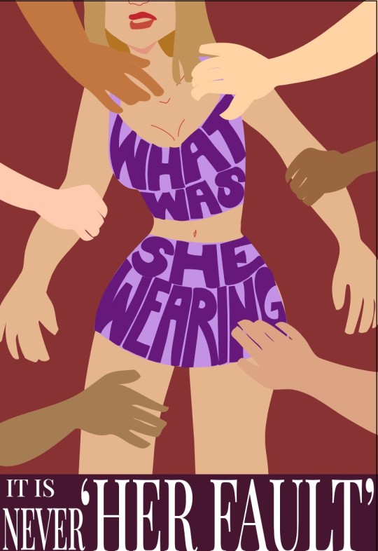
The purpose of this poster is to address and discourage victim blaming, specifically in the context of sexual assault. Many people tend to think women are asking to be assaulted based on how they are dressing, and my poster is meant to call people out for that kind of thinking. Clothing does not equal consent, and people should be blaming sexual assaulters rather than victims.
When designing this poster, the first thing I did was sketch out some thumbnails on paper. I find it easier to brainstorm on paper rather than traditionally – the ideas flow better, in my opinion. After I selected a layout that I liked from the thumbnails, I moved to my digital raster-based drawing program to sketch out an idea for the poster. After that was done, I imported the sketch into Illustrator, fitting it to 13 x 19- inch dimensions, and then I traced over the lines. Something I realized was that I had to go by shapes rather than lines – I had to outline the whole body, for example, as a shape, even if it wasn’t all going to be showing. This was a very new workflow for me and so it took me hours just to get all of the shape outlines created. After that, it was a matter of picking a color scheme. I created two separate color schemes for the work-in-progress, but I ended up selecting the one on the left for its softer and more cohesive colors. Finally, I added the text. I asked for feedback and learned that my initial text design competed with the text on the clothing, so I reduced the size and changed the colors of the text box.
During the creation of this poster, I mainly used the pencil tool and compound paths, because all of my shapes were organic and drawn by hand. I used complementary colors for the skin and background; the skin is varying tones of orange-brown, while the background is a grayish blue. I wanted there to be contrast, but I lessened the saturation of both colors so that it was not too harsh on the eyes. For the words on the clothing, I used contrast of values by making the clothing much lighter than the words for legibility. Finally, the bottom text is black on white for simplicity and to not distract from the illustration, which is the main focus of the poster.
2 notes
·
View notes
Photo
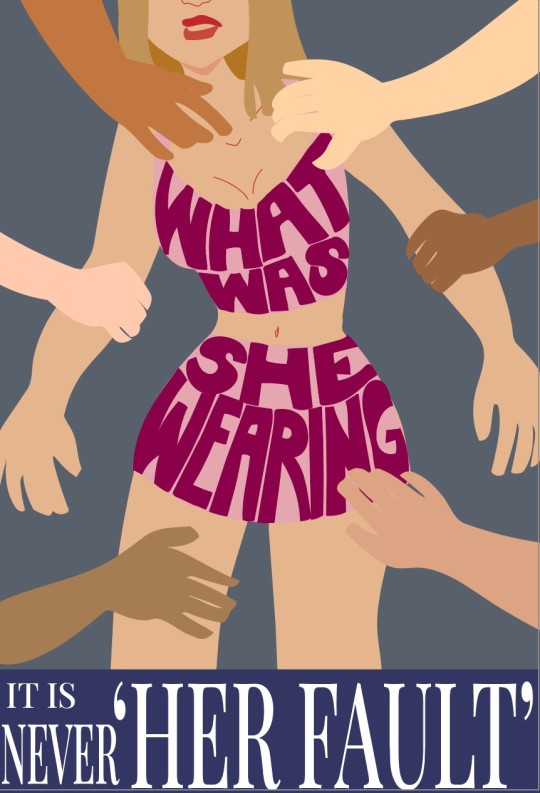
Two work-in-progress layouts for the poster project :) (I reused the shapes because it took me so long to make them that I didn’t have time for a completely different second layout)
1 note
·
View note

Photo
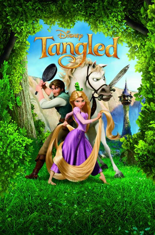
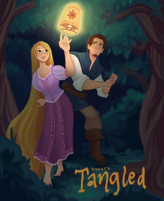
Final submission for the redesign project! I’ve attached a photo of the original poster too, for comparison.
2 notes
·
View notes
Photo
work in progress poster redesign! I need to finish detailing the main image as well as properly add the text in Adobe Illustrator.
4 notes
·
View notes
Photo
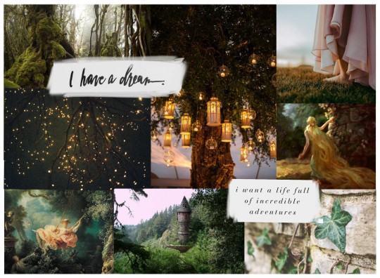
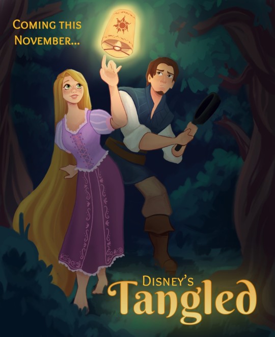
This is a moodboard for a redesign project. I’m going to be redesigning the movie poster for Disney’s Tangled (2010) <3
2 notes
·
View notes
Photo
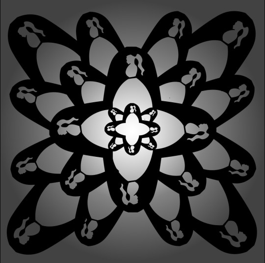
Black-and-white sculpture: Letter A
First, I used the curvature tool to add points along the interior of the capital letter A. I pulled these curvature points inward and outward to create the silhouette of a woman wearing a dress. I used the pencil tool to refine some of the curves, especially around the hair and the face, because it was difficult to be accurate with the curvature tool. I then copied and pasted the letter manually in a radial pattern. The A’s increase in size as they get further from the center point; this was done to best hide the edges of the letter. Finally, I added a radial gradient behind the pattern to add depth and interest to the piece.
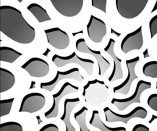
Black-and-white sculpture: Letter S
I started by using the radial repeat function in Illustrator on the capital letter S. I had slightly elongated the letter after creating the outlines to disguise the letter a little more. I then created a new letter S object. I enlarged and elongated this one, then manually aligned, copied, and pasted the letter around the central repeat pattern to disguise any remaining edges around the letters. I duplicated the entire shape on a layer below and colored it black, then changed the original shape to white. Next, I moved the black shape so that it was slightly offset from the white one like a shadow. Finally, I added a radial gradient behind the shape. I loosely followed the rule of thirds by moving the center of the shape to the bottom third of the page and to the right.
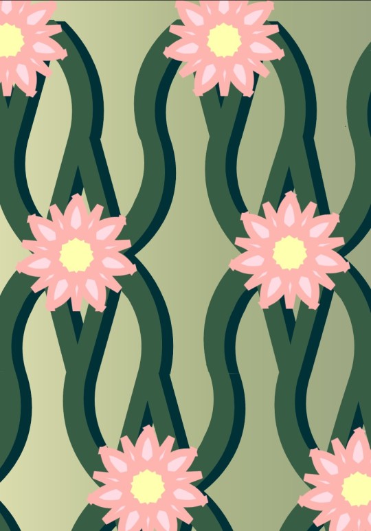
Colored sculpture: Letter W
First, I used the curvature tool to add points and bend the edges of the letter W to make the angles less harsh and more graceful. Next, I manually copied and pasted the letter to create a smooth vine-like pattern. I alternated between mirroring, rotating, and simply placing the letters depending on which orientation would hide the letters’ edges, until I had a smooth and consistent pattern. I colored it green, then I duplicated the shape on a layer below, colored that dark green, and arranged the lower dark green shape so that it looked like a shadow. Above the vines, I created a new layer with the same bent W, used the radial repeat function to turn it into a flower, and then colored it in light pink with a yellow center using shapes below the outline layer. I repeated the flower so that they became part of the pattern. Finally, I added a pale-yellow-to-pale-green gradient below it to add some depth and interest.
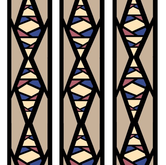
Colored sculpture: Letter K
First, I elongated the K slightly, and then duplicated and mirrored it to create a column with interior diamond shapes formed by the two branches of the letter. I then added a few other K’s horizontally within the larger diamonds. My aim was always to hide the edges, so I kept pasting and arranging horizontal K’s until it looked even and clean. I then used the shape builder tool to create shapes in the spaces between the letters. Then, I colored each of the inner shapes in red, beige, yellow and blue. I was inspired by a stained-glass window so I chose light, airy colours and left the outlines black like windowpanes.
1 note
·
View note


Photo
From Aristotle and Dante Discover the Secrets of the Universe, by Benjamin Saenz
1 note
·
View note


