#silhouette painting tutorial
Explore tagged Tumblr posts
Visit Tumblr Blog
Explore Tumblr blogs with no restrictions, modern design and the best experience.
Last Seen Tumblr Blogs


Fun Fact
Tumblr posted its first advertisements in May 2012 and subsequently earned $13M in revenue.
Text

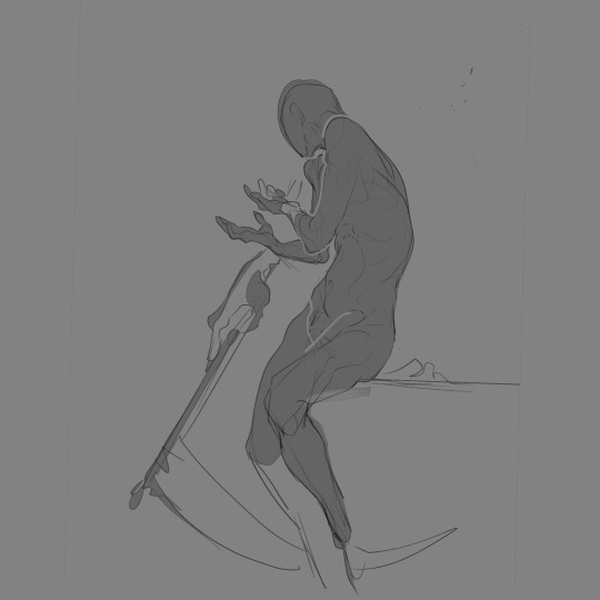
✨🥀 Let's mourn with mama
#my art#snappy's art tag#kirby oc: sir meteor#mama meteor#mama posting#on my background painting arc#shout out to gouache landscape tutorials I had to watch a few of those to learn new techniques#and shout out to my plant collection for being there when I needed to study plant silhouettes#but this piece… Ough#there’s a sweetness to it there’s a melancholy to it#for those who have read far enough: did you guys notice the red flowers :) starting at the base of the skull and pooling around meteor#yeah#could mean anything
168 notes
·
View notes
Text

The Northern Lights
Started 2025 with something ‘easy’, a quick tutorial to follow along to without stressing on what to draw. 😊
This is the James Julier Northern Lights Tree tutorial.
#procreate#thesathei’s art#procreate tutorial#artists on tumblr#digital painting#landscape#landscape painting#default brushes#northern lights#james julier tutorial#art practice#nature#silhouette#trees and forests
8 notes
·
View notes
Text
I like this part cuz the before n after is so satisfying 😞
#art process#speedpaint#digital drawing#digital art#artists on tumblr#art#sketch#sketching#creative process#digital sketch#fixing art#silhouette#lex art process#my art#my artwork#my sketches#trust the process#idk how to tag this#tiktok#art tiktok#art tips#art hacks#art tutorial#digital art tutorials#digital art tips#clip studio paint#clip studio art#csp#cspaint
35 notes
·
View notes
Note
could you give a tutorial on how you draw/shade water? Its so good the way you draw it
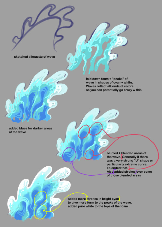
this is as quick + basic as i could describe it! Though in my last illus with the wave in it, i also did dip more extremely into colors as well (some shades of light green and purple were used).
124 notes
·
View notes
Text

DIY bunny jeans – oh yeah! I wonder if I have any bunny-able pants... (meaning, pants that take color well). Tutorial by Kinsey at A Beautiful Mess.
#wearables#jeans#pants#trousers#DIY#embellishing#updating#dye#fabric paint#bunnies#silhouettes#yellow#orange#tutorials
0 notes
Text
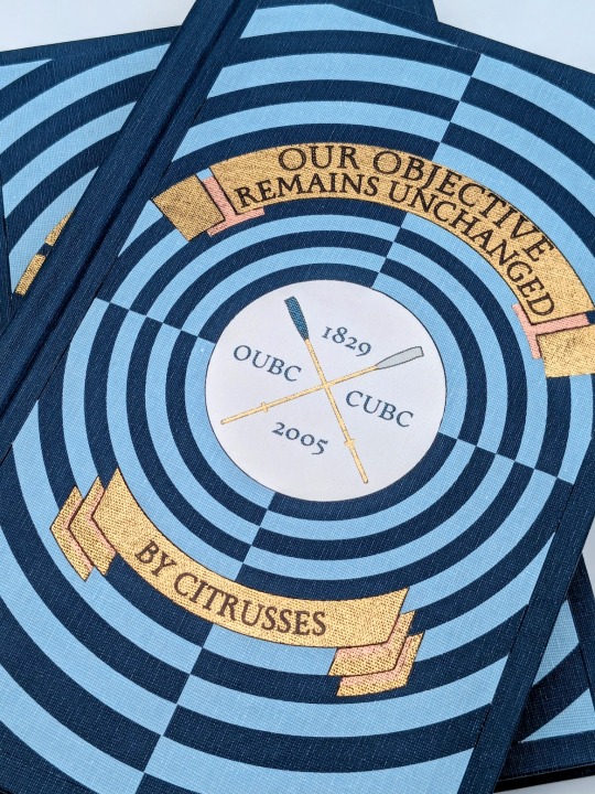
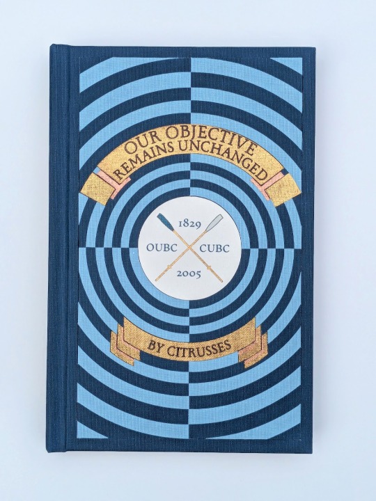
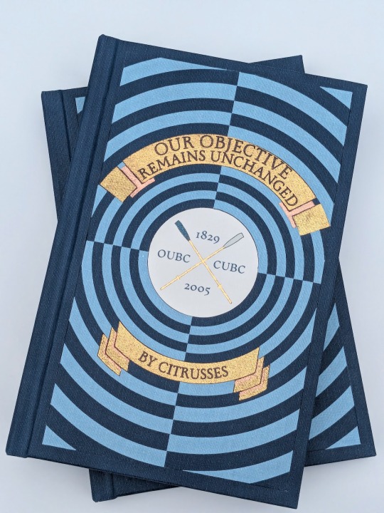
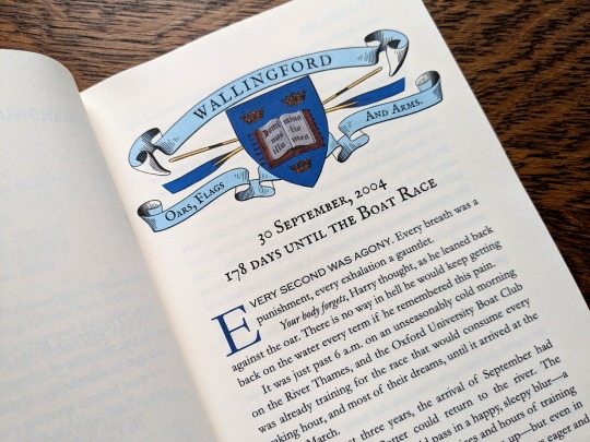
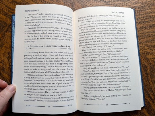
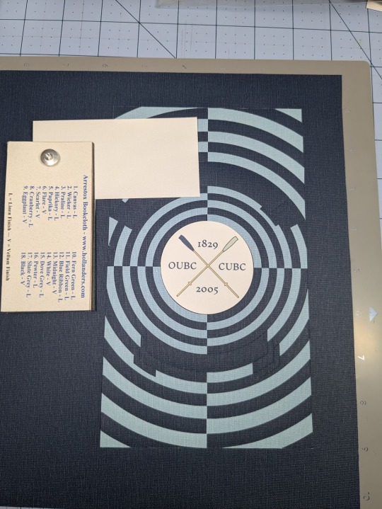
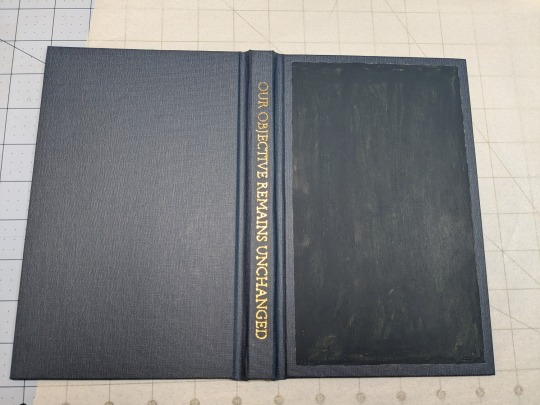
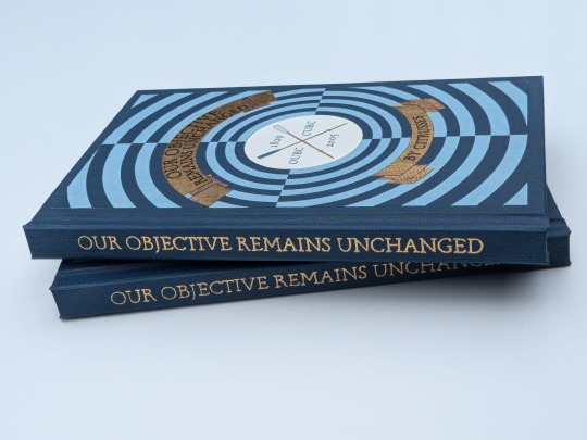
Our Objective Remains Unchanged by @citrusses
"Harry Potter, returning member of the Oxford University Boat Club, has two goals for the spring of 2005: beat Cambridge, and beat Draco Malfoy. Perhaps not in that order."
This has to be one of the most creative and meticulously researched fics I have ever had the pleasure of reading. If you haven't read it yet, don't walk— run! Citrusses is an absolute genius, and kindly gave me permission to bind her masterpiece.
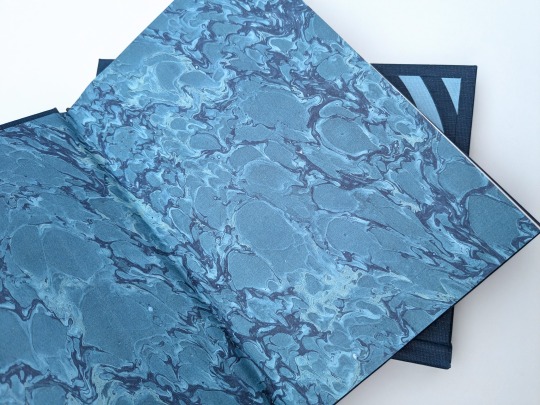
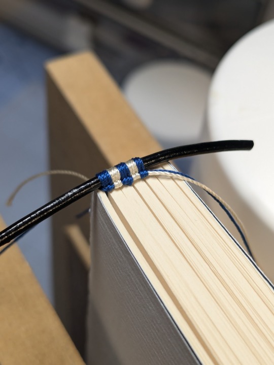
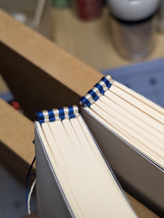
The cover of this bind is made out four different shades of Allure bookcloth cut by my Cameo 4, and the centerpiece is printed and hand foiled. The banners were machine foiled in gold and black with hand foiled rose gold shading. The endbands were hand sewn with Gutermann silk thread.
You can find more pictures and information about my process under the cut.
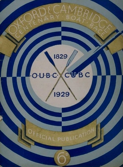
The amount of inspiration this fic gave me was overwhelming, and Citrusses' writing fully immersed me in the world of competitive rowing. While designing this bind, I was struck by the sheer wealth of Oxford rowing memorabilia available to me. I settled on this 1929 illustration from an official publication on the Oxford and Cambridge Centenary Boat Race for the cover.
"How hard could it possibly be?" I thought, foolishly. The answer was HARD, but I'll get into that later.
Due to the wealth of design options, I believe that this may be the best typeset I have created to date. Thanks to the help of my friend @tsurashi-bindery, I was able to learn the basics of InDesign (kicking and screaming all the way). There will be spoilers in the text of these photos, so try not to read them if you haven't finished the fic!
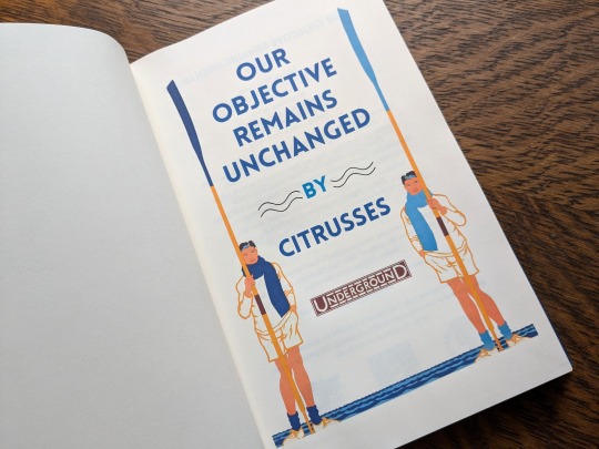
For the title page, I modified To See the Crews in Training by Charles Pears (1930). I believe that this was part of a series of advertisements for the race in the London Underground.
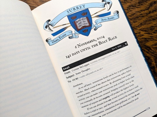
For the chapter headers, I redrew the crest from an Oxford Oars, Flags, and Arms postcard, presumably pre 1914. I also had some fun creating a mock email using La_Temperanza's How to Mimic Email Windows on Ao3. Cormac's email makes me laugh every time I read it, and Citrusses provided an appropriately pompous subject.

I also had lots of fun editing the oars from the official OUBC logo to serve as dividers and decorations for the page numbers.
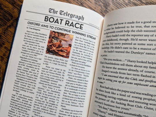
Additionally, I got to edit a full newspaper page for the fic! I was very excited find an opportunity to slip Leyendecker's The Finish (1908) in.
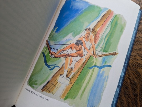
The fic ended beautifully, so I wanted to include one last element at the end to capture the atmosphere. I settled on L'aviron (1932) by Milivoj Uzelac. It makes me feel as though Harry and Draco will continue rowing together long after I've closed the book.
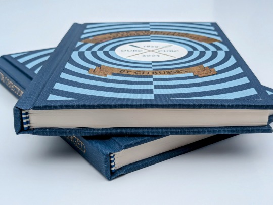
I of course had lots of fun sewing the headbands, and got to do it with not one but TWO copies!
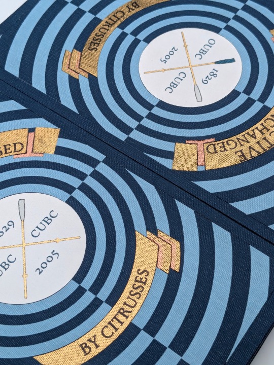
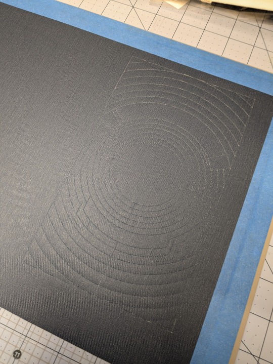
Things got tricky when I had to recreate the cover. I had a poor understanding of how vector images worked, and ended up having to redraw it three times. Once I finally cracked and taught myself how to use Illustrator, the program crashed...and I had to redraw it a fourth time!
I set the vector to cut on my Cameo 4, and I assembled the pieces together like a puzzle on my Silhouette mat. I used Allure's indigo, skylight, white, and black bookcloth in the process. I will be making a tutorial video on this method, so I will keep it brief here.
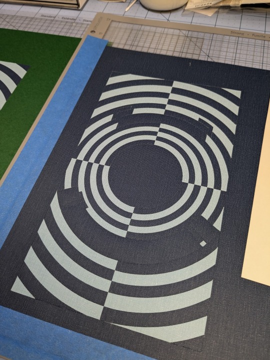
I also cut a piece of bookcloth to 8.5"x 11" and fed it through my inktank printer to print the center design. I then cut it out using the print and cut feature on my Cameo 4. Both of these methods were a first for me, and they were very scary!!
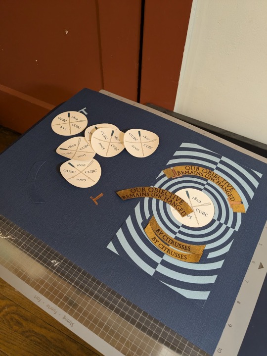
To be perfectly frank, the foiling was a nightmare and I don't want to get into it. I machine foiled the gold, and then foiled black lettering on top of it. I foiled the rose gold shading by hand, and then foiled a thin black outline along the edge of the banners to make them stand out more.
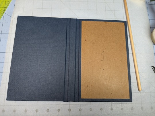
I hand foiled the spines (because I'm scared of measuring), painted the exposed board (to hide any gaps in the inlays), and used transfer tape to lift my design from the Silhouette mat and onto the cover.
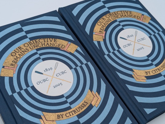
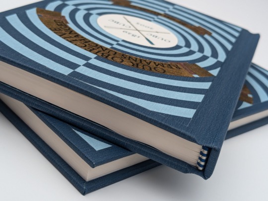
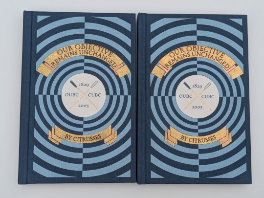
One more fun detail— my copy and the author's copy are sisters! The dark blue and the light blue are inverted on the author's copy, making it distinguishable from mine. This is the first time I have made an author's copy for a fic, and I was admittedly incredibly nervous. I always worry about what authors will think of my work, but Citrusses gave me an incredible amount of encouragement and support throughout the process! Thank you for trusting me with your precious fic!
This story is a work of fanfiction and can be read on Ao3 for free. My bind and typeset are for personal use only and not for sale or profit. Keep fandom free!
#book binding#fic binding#fanbinding#fanfic binding#drarry#our objective remains unchanged#harry x draco#my binds
345 notes
·
View notes
Text
as per a request in my local renegade server: here is my process (such as it is) for the stenciled covers i've done for my binds. obviously, huge thanks to everyone in the renegade discord for teaching me most of what i know about bookbinding. this tutorial only exists thanks to the resources they've made available and the conversations i've had there.
material list
vinyl cutter (i have a silhouette portrait 3) + mat + blade
stencil vinyl (i have this one, but have had some adherence troubles with it. unclear whether this is just The Nature Of Stencil Vinyl or whether there's a better brand out there. adhesive vinyl can also be a viable option, although i haven't personally experimented with it yet.)
transfer tape (i have this stuff. it's fine.)
weeding tools (i have this hook and a very fine tip pair of tweezers. i highly recommend getting a hook, especially if you—like me—are haunted by the specter of carpal tunnel. get an off-brand one or get one on sale, though. i only have the silhouette brand one because it was on clearance.)
acrylic medium (i have this one because it was on sale at the time i was buying acrylic medium. when i replace it, i will be replacing it with a matte one. the gloss definitely has a noticeable sheen that i don't love.)
acrylic paint (literally any paint will do. i've been mostly using the decoart extreme sheen because it's $4 at michaels. you may be noticing a theme here.)
stiff stenciling brushes (the ones i have are similar to these but cost even less. again, there's a theme here.)
an iron and some parchment paper (jury is still out on whether using heat to "set" the pattern is necessary, but i do feel like it melts the paint a bit into the bookcloth and lessens the extent to which the pattern sits above the bookcloth.)
your trusty bone folder
instructions and a truly hideous number of words under the cut.
step 0.5: discern what will make a good stencil and what will make you hate yourself, your life, and the art of bookbinding
there are a LOT of different ways to put titling on a book. you could do a paper cover with a printed design or paste paper labels onto bookcloth or foil your title onto your cover with heat activated foil. the best method depends on what kind of design you have in mind, what tools you have available to you, and what materials you're working with (for example, i've had very bad luck getting acrylic paint to adhere to Allure bookcloth, but Allure does foil like a dream).
as far as stencils are concerned, you can kind of sort cover designs into three categories:
BEST for stencils: big, bold shapes on larger format books (think letter folio or letter/legal quarto)
OKAY for stencils, but you might hate yourself: intricate detail at a large enough form factor for it to be cut well by your vinyl cutter
BAD for stencils, you will die and it will hurt the entire time you are dying: lots of intricate detail and lots of fine lines
below are examples of category 1, 2, and 3 (all designed for letter folio). to be clear, category 3 can technically be possible, depending on the design. but only undertake it with the awareness that you will die, and it will hurt the entire time you are dying.
step 1: design a thing to put on your cover
i'm not going to go too in depth on this because cover design is a HUGE can of worms. a few pointers, though:
i never start designing my cover until my text block is done. this allows me to design my cover at "full size" based on the measured size of my text block and cover boards.
i fully lay out my cover in a separate program before exporting a transparent PNG to silhouette studio (or whichever proprietary software you have to use to communicate with your particular vinyl cutter). i use affinity designer. some free options would be inkscape (if you want to work with vectors) or gimp.
i design my cover on a document with dimensions of (HEIGHT of boards + 20 mm) x (WIDTH of boards or spine + 20 mm) and 10 mm margins. the area within the margins represents the actual dimensions of the thing i'm designing, while the area outside of the margins creates a mask that prevents me from getting paint on things i don't want paint on (like the covers, if i'm creating a spine stencil).
i always outline my document with a 3 or 4pt black line. this creates the outer edge of my stencil and provides my vinyl cutter with a cut line. if you're working with a smaller vinyl cutter (like the cricut joy) there are ways to jigsaw designs together from smaller pieces of vinyl, but i'm not the person to ask about that. i specifically bought a portrait so that i didn't have to worry about that.
here's an example of one of my affinity files from a recent cover. i've exaggerated my outline to make it clearer. you can also see that i use affinity to experiment with color combinations. before i export, i turn all my elements black and make any backgrounds transparent, meaning that the PNG i import into silhouette studio looks like the one on the right.

step 2: cut and weed your stencil
again, not going to go terribly in depth here. there is a veritable army of youtubers out there with tutorials about how to use [insert propriety vinyl cutter software here]. but, again, a few pointers:
with my particular vinyl cutter and stencil vinyl, i usually cut my stencils with the material set to "washi," depth at 1, force at 13, and speed at 4. google, experiment, see what works. also, you want to put your stencil vinyl on the mat with the blue vinyl facing UP, and you don't want to mirror your design. with stencils, what you see is what you get.
i cut my vinyl a bit bigger than necessary because i'd rather waste a bit of vinyl than have to worry about a stencil falling off the edge of my vinyl because i misaligned it on the mat.
unlike HTV, you will be weeding out all the black parts of your original image. be prepared to hate the letters "e" and "a" forever, because you will have to somehow keep the little eye of them in place while you pry out the rest of it.
step 3: apply your stencil to your case
alright, now let's get into the meat of it. i always stencil after my case is finished but before i case in my book. this means that if i totally fuck it up, i can trash the case instead of the entire book.
additionally, i completely stencil my spine first (as in lay down stencil, paint, remove stencil) and then stencil my covers. i've found that it's easier when you don't have stencils overlapping and sticking to each other.
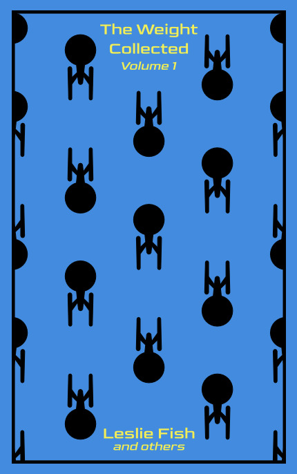
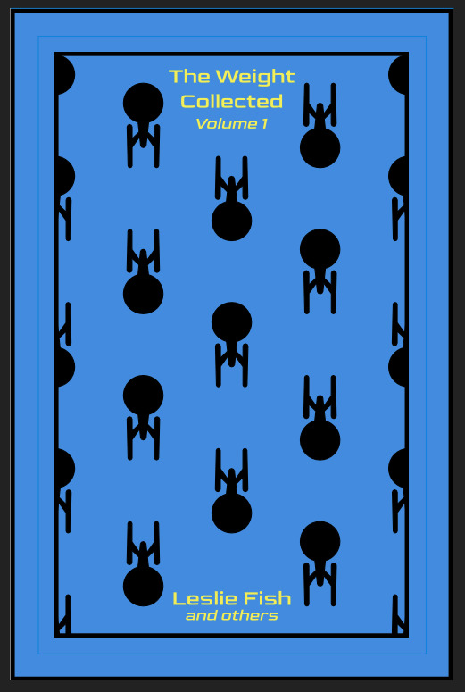
OPTIONAL STEP: mark guides onto your cover to help you position your stencil. whether or not i do this step depends on the design. a lot of the time, i just eyeball it. but for some designs, precision is key. for those projects, i use my ruler to mark out guides in white chalk for where i need certain elements of the stencil to fall. (i used guide marks for the "penguin clothbound" copies of the The Weight Collected that i've been using as an example in this post—the black rectangular boarder would've made uneven placement REALLY obvious.)
use transfer tape to remove your vinyl from its slick backing. what i've found is that you really, really don't want your transfer tape to be too sticky. you want it just barely sticky enough to pick up the stencil if you rub it down with a bone folder or your fingernail. i have a piece of transfer tape that i stuck to my jeans a bunch of times and then proceeded to use for 8 books in a row. it is, frankly, still a little bit too sticky. i have rolled it up so that i can use it for the next 8 books, at which point it will presumably be the right level of stickiness.
position your stencil. when you're happy with it, rub it firmly down with your bone folder. then do it again. then use your fingernail to score down over the titling text. then pray. in my experience, stencils prefer to stick to transfer tape rather than bookcloth. ymmv.
start at one corner of your stencil. carefully begin peeling back the transfer tape. i've found that essentially folding back the transfer tape (like, the corner that's been freed from the stencil being folded back away from the stencil) helps the tape to release. go slowly, rubbing down with the bone fold as necessary.
after you've finally manage to pry the tape off, go back and smooth down the stencil and firmly rub it down to get it to adhere to the bookcloth as thoroughly as possible with as few ripples or air bubbles as possible.
step 4: paint time!
here is a secret that the renegade discord taught me that i am now passing on to all of you: before you put any paint on your stencil, put down a layer of clear acrylic medium. the medium will finish the job of pasting down the stencil to your cover, and any leaks that happen in the process will be clear medium instead of colored paint (and will therefore be basically unnoticeable). ergo:
stipple a thin coat of acrylic medium over your stencil. you want to use an up-and-down daubing motion, not a brushing motion. brushing will get paint under your stencil. let dry.
after your medium is dry, stipple a few thin coats of your colored acrylic paint onto your stencil. let dry between coats. (i usually find that two coats is enough.) again, try to keep your coats thin. you don't want a thick layer of paint because that will create a raised surface above your bookcloth.
let your paint fully dry. i usually leave it overnight, but if i'm feeling especially impatient, i still make sure to at least give it a good three or four hours.
peel up your stencil. your weeding tools will once again come into play here to pry up little bits and pieces of stencil (like the stupid eyes of the "a"s and "e"s that were so annoying during the initial weeding stage).
step 5: optional setting stage
again, jury is still out on whether or not this is necessary, and the effects are pretty subtle. but i do it every time anyway. some tips:
use an iron on very low heat (i keep mine at the low end of the synthetic setting) and with steam turned OFF
keep a piece of parchment paper (NOT waxed paper. you want the slick paper that you put under cookies to keep them from sticking to the pan.) between the iron and your cover.
press the iron down, don't rub it like you're ironing a shirt. it's possible to smear your paint doing that (ask me how i know).
i usually lay the iron down on a section for 10-15 seconds at a time, then lift it and move it to another section.
start with less of everything (less heat, less time) and build up. always better to be conservative with this.
i usually continue until the paint is warm to the touch, then move onto another section. after it's cooled, i evaluate if i feel like it's melted into the cloth enough. if not, i repeat the process.
step 6: BOOK
congrats, you have put a design on a book cover. the world is your oyster. go forth and make books. become ungovernable.


114 notes
·
View notes
Note
Would you ever consider making an art tutorial regarding how you draw white line art on a black silhouette? (Specifically Malady) My brain can't comprehend how you make it look so perfect 🥲
Sure! It's honestly pretty simple, I just use a clipping mask to color all the lines white. But for those who don't know how to do that, here's a quick tutorial on how to do it in Clip Studio Paint.


Hope that helps!
98 notes
·
View notes
Note
Oh uh forgot to ask in the previous ask (the one with the digital piece of candy and scurrying and stuff)
How do you draw art so good
Like
Is there a method you use or is that just the style you've gotten over time?
you've activated my trap card
I'm just gonna preface that this tutorial is from someone who was not professionally trained and didn't have a lot of free time for art, so a lot of the tips I have is short cuts I use to get the best results quickly
If you genuinely want to get better at art then please look at references and practice that is always the best
However if you are like me and only really do art for fun but want to go faster then these are for you pfppt
Overall I'd say my style is influenced by speedpaints I would watch when I was younger, I like analyzing how people do things and what makes something look "good" to me
I always recommend watching them because they will often have techniques you've never seen before or do things a certain way that you can try out yourself
I consume good art, it feeds me
but seriously it can be super helpful when developing your own methodology, or just generally trying something new
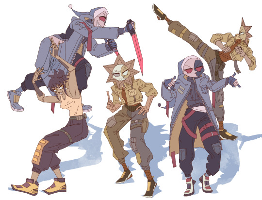
Usually it starts with me pulling some references from artists I really admire and sort of sketching out how they do the things I like
For example 8um8le has like super good anatomy and poses so I focused on trying to replicate how they do that
venemous-qwille is super good at color and pulling focus so that's what I focused on in my study of them
In general I'd say my process is sketch -> silhouette -> color -> shading -> render
I really don't like doing lineart lol

I'd say for the sketch the most important part is using references and just kind of fudging it until it looks correct anatomically/physically
General rule of thumb is spend time on areas of interest, and keep non important areas light (like the stitching on his pants)
I don't do lineart because I think its unnecessary for most paintings I do
I naturally tend to put more time and focus on areas of interest (like hands and feet) and if you use a brush with opacity for the sketch, those areas are naturally going to be darker in the final sketch
Of course this is gonna be different for everyone but it's what works for me
Sometimes I do a really really sketchy layer underneath my sketch/lineart, just so I know where everything is going
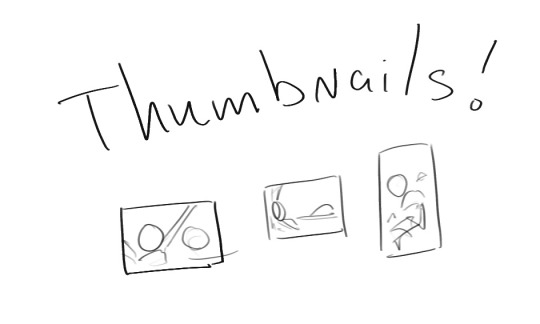
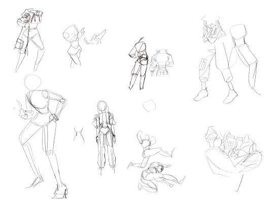
Use thumbnails! They are great to help figure out the general layout of things and what pose I wanna do
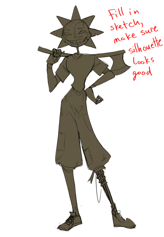
Next is what I call the "silhouette" layer
This is super important for me cause it helps me refine the figure and make sure the pose/anatomy looks correct, also depending on what color I choose for the silhouette helps guide what colors I'm going to use on top
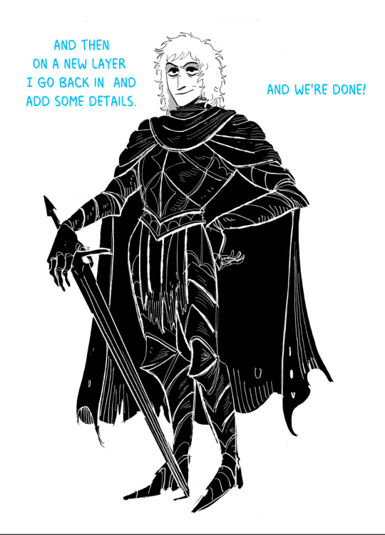
This piece is a good example of how it works. The silhouette shows me how the figure interacts with the background, how the pose looks and if its any good
The silhouette layer doesn't have to be super clean, as long as it follows the sketch decently well and shows where the figure is then its fine
I also sometimes make the silhouette layer multiple colors to help guide shading and vibe
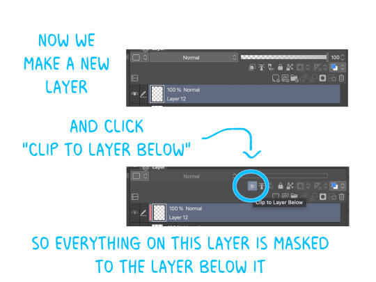
Next is the coloring layer. I usually make this a clipping layer on top of the silhouette layer, or I change the silhouette layer to alpha lock, either way it saves me time on coloring everything in

Sometimes I am super rough with the coloring too, using like an airbrush or my fav watercolor brush just to generically block in color where I want it
Works out cause most objects have like a bounce light to them from surrounding objects, so this is sort of a cheat I use to get that effect without all the work lol
Also don't be afraid to have the lower silhouette layer shining through, having multiple colors sort of subtly shining through the piece helps lots
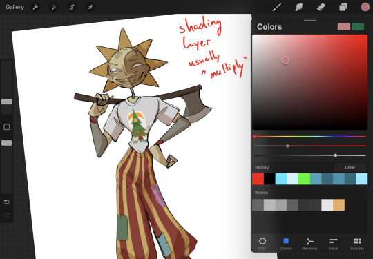
Next is the shading layer, this is usually another clipping layer, usually set to "multiply"
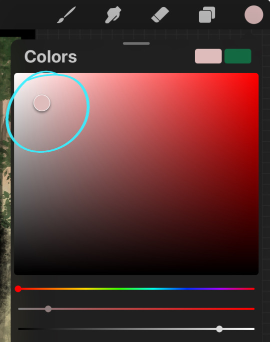
The colors I pick here is usually within this range, any color works, just depends on the piece and vibes.
Since this piece is set in a sunset forest I choose a more desaturated orange for the shading layer
I know there's a whole thing about multiply layer being a crutch (and it kind of it) but it is a useful tool when you just want some darker values across the piece but don't want to go through the process of color picking every single darker shade
Also in my opinion it looks better than picking a darker color and setting it to a lower opacity, idk I just think the color has more "depth"
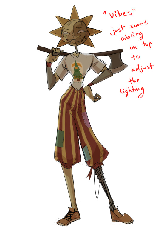
Next is the hardest to explain, sort of the vibes layer
Usually its just a layer of more concentrated color on top of the normal color and I fudge with the settings and values until I get a result I like
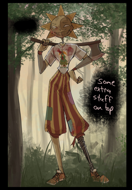
Next is the longest step, is the "extra" or the render stage.
Usually I add a background before this step so that if I need to merge the figure better with the background I can
If I render with a white background but he's supposed to be in a dark forest, its going to mess with the lighting severely
Also this is when I add more "vibe" layers on top to get the figure to match the background better
Backgrounds in general I recommend checking out @/derekdomnicdsouza on instagram he's got lots of great tutorials for breaking down backgrounds simply

I'd say general rule for the rendering layer is to focus on the areas of interest and spend less time on areas you don't care about
I even blur stuff out on the edges I don't want people to see, partially to save time on fixing mistakes in areas I dont care about (oop), but mainly to help draw the eye to the areas I do want people to focus on

Theoretically parts of the background should like mesh with the characters, parrallel lines are a no no unless they are directing a viewer to look somewhere, things that are perpendicular help bring things together
tbh I'm still not the best at layout and probably need more practice, but overall this is what I like doing
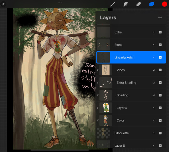
Overall this is what my layer set up ends up being
Sort of a sandwich with the lineart/sketch as the "meat" lol
Color and basic shading below the sketch, clean-up and rendering on top
I like this method cause it's super flexible if I ever want to try something different or try to replicate someone's style
I can make each step less or more messy depending on the end result and can add a lineart layer if need be. Also if there's a part that is straight up not working or needs to be removed its super easy to do cause I can just paint over it on the "extras" layer, color picking from the surrounding area to get the same vibe
Generally rule of thumb for my style is: get the initial layout of colors, form and shading to look good, then the rendering should be smooth sailing
Really the best advice I can give to get better at art is to enjoy what you're doing and become very very obsessed with drawing a silly little guy
You'll eventually get very good at drawing them pfptpf
#sundrop#moondrop#long post#art tutorial#fnaf sun#fnaf moon#I draw them way too much holy guac#ask#this is for you asker#idk if anyone else is interested in this kind of stuff#i apologize for ranting lol#also me struggling to spell silhouette like 15 times
120 notes
·
View notes
Text
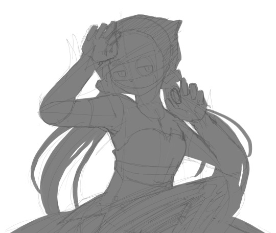
super quick tutorial on how i draw hair (I'm following a reference, bottom right)
establish the silhouette and hairline

2. separate it into chunks, its best to put the separating lines where the hair flow changes (ex. the top hair vs the side section)

3. draw the hair following the guidelines made, strands (details) are drawn mostly where the separating lines are

final: drawing more details + hair strands -- important to not overdo it as for my style, LESS is MORE (bcs i paint over it anyway) so i do the details in clusters (rather than filling every empty space). i tend to do two/three lines to signify hair strands

this is an extremely basic approach on how i draw hair, as mentioned, i paint over my sketches so there's no need for me to be drawing every detail, my best advice for drawing hair is to keep the basic shapes of the sections and to not draw every single hair strand there is-- this is how *i* draw hair, it's according to *my* style so i encourage you to study other artists' work that aligns with how you want to draw :D

#kkelseysart#my art#art tips#art tutorial#clipstudiopaint#hair#hair tutorial#artists on tumblr#art help#digital art#somebody asked me how i Draw hair and was only able to illustrate it now#its very overdue
246 notes
·
View notes
Note
Hello! First i wanna say i love you color work! Second i was wondering if you could help me with finding a term//resources. i'm a digital artist and i'm aware of using like thick brushes to block out silhouettes but i cant exactly grasp the method of Blocking colors > Refine> Details...
Is there a name for this method(so i can find sources better) or maybe a tutorial you could point me instead.(a gold mine would be work process things! but no pressure! )
Thank you for you time and for always being kind to n00bs like me -^.^-
I call it blob method............. But I don't know if there is a real name for it- honestly most of the time i see it done in painting. If you watch oil painters they sometimes work the same way (keeping the whole painting wet means they can rework and refine things endlessly until it dries - similar to digital). Search 'alla prima', wet on wet
Heres a sinix video that works kinda similarly to how I do (first part not so useful)
Sometimes I do use a line sketch, mostly when working with more rigid forms like humans or buildings, then I think the skeleton is more important.
But you don't have to do something if it really doesn't work for you. I spent years trying to force myself into something I wasn't !!


Here's some gif timelapses of my process so you can see. You can download them and look slower if you want. Hopefully they help
But I think my process is just a result of not getting it right the first time around and I just keep working on it lol
good luck 💕👍
174 notes
·
View notes
Note
Hel!o, again! I meant ur Van Helsing poster 😊 Happy Holidays if you celebrate 😊

i'd be more than happy to! happy holidays to you as well! here's the kind of poster i'll walk you through how to make:

the most important thing you need to think about with this type of poster is which shots will blend best with each other. i recently made a blending tutorial for another anon and you can find it here. in it, i go a bit more in depth on what types of shots will blend best, and you can also check out the blending tutorial tag on my resource blog, @gifmakerresource.
overall, dark on dark blends the best. the lighter your scene(s), the harder it's going to be to see. when making this poster, i went in knowing i wanted to use this silhouetted shot of van helsing. silhouetted shots are one of the best kinds of shots you can blend with because the silhouette itself will be much darker than the surrounding area.

this is what i started with (after cropping and sharpening). the dimensions i used are 540px x 700px but the height can be whatever you want. next, i wanted to focus on lightening the background and further darkening his silhouette.
here are my coloring layers (which will, of course, vary with every shot and every movie):

and here are the specifics for each layer in order from bottom (first) to top (last)*:


*note: the blue selective color layer also makes the same adjustments to cyan
i created a new layer (ctrl+shift+n) and painted over the extra-bright parts around his head for later blending. this is a layer i added after the fact once i found all the shots i wanted to use and blend together.

this is the second shot i used:

once cropped, sharpened, and converted to a smart object, i bring it over to the existing canvas, making sure it's properly aligned with ctrl+t, and set the blending mode to screen.
here are my coloring layers:

and the details for each (and if you're wondering, to color code your layers, right click in the box where the eye is and select your color):

and this is what the gif looks like prior to using a layer mask:

it's not terrible, but i wasn't happy with how much of the second gif could be seen outside of the silhouette. this is also a good illustration of how dark blends with dark best, compared to dark and light or light and light. i grouped together the second gif and the coloring layers (select the appropriate layers and ctrl+g) and then added a layer mask to the group by clicking this at the bottom of the layers panel:

when using a layer mask, you're only working with 2 colors: black and white. using a soft circular brush (0% hardness), as you can see in the selected thumbnail titled Group 3, i used black to color all around van helsing's silhouette. if you make a mistake when coloring, simply press x to switch to white and brush over the desired area and your gif will reappear. it's a way to "erase" a layer without permanently deleting it and is something i use frequently!
i used another layer mask so the gif was only visible right around the top of his hat:

and the coloring layers (note the gradient map is applied to the gif using a clipping mask [right click on the gradient map layer and choose 'create clipping mask'] so it only is applied the the layer immediately below it [the third gif] and not everything below it):

details:


this is the final gif before all the typography:

for the typography, i don't really remember why i didn't just use a transparent png of the movie logo other than knowing i had the actual font they use on the poster already installed. you can find it here (dafont). at the top of this screenshot, you can see my font settings and at the bottom, you can see the blending modes i added:

and here are those details (click to enlarge):


using the same font, i added these two layers and positioned them where i wanted:

the names layer is 24pt and adventure is 36pt. to create/position the typography, i was referencing one of the movie posters btw!
for the final two layers, i used the font sf movie poster, which you can download here (dafont) and decreased the opacity of both to 30%:

ignore the warning symbols - i had to replace the font files and ps is mad at me

the "larger" letters are just capitals while the smaller ones are lowercase. i'm pretty sure this is the typical font used at the bottom of movie posters. i believe i either typed all this out referencing one of the posters or i went through the imdb page for the movie and went through the cast and crew sections.
and that's it! we have our finished gif! making a poster like this can result in a large file size, so keep in mind that tumblr's upload limit per gif is 10mb. i believe this gif is 45 frames, which is probably pushing it with these dimensions. if you finish your gif and find that it's over the limit, i HIGHLY recommend using ezgif's optimizer. you upload your file and then adjust the lossy slider and you'll be surprised just how much it drops the file size down without a noticeable difference. i also use this site to convert webp files to gifs/pngs when necessary.
if you have any further questions or didn't understand something, please let me know! i'm always happy to help :) and lmk if you ever want a tutorial on any of my other gifs! happy holidays!
#answered#Anonymous#gif tutorial#my tutorials#flashing gif#gifmakerresource#completeresources#dailyresources#chaoticresources
56 notes
·
View notes
Text
A Young Person's Introduction to Late 19th-Century Western Fashion
hello fellow youths
General information Banner, Bernadette. "Exposing Victorian Influencers Who 'Facetuned' Their Photos. (Photo Manipulation was EVERYWHERE)." YouTube. July 17, 2021. English Heritage. "Fashion Through History: Episode 1 – Victorians." YouTube. February 9, 2023. Lady Rebecca Fashions. "100 Years of Fashion // The Fashionable Plus Size Silhouette from 1820-1910." YouTube. June 5, 2021. Victoria and Albert Museum. "100 Years of Fashionable Womenswear: 1830s – 1930s | V&A." YouTube. July 18, 2023. Zebrowska, Karolina. "Victorian Fashion Is Not What You Think It Is." YouTube. March 19, 2019.
Accessories Banner, Bernadette. ""Afro-Victorian": Bringing Historical Black Women's Dress into the 21st Century w Cheyney McKnight." YouTube. October 20, 2021. Cox, Abby. "A Fashion Historian Explains the History of the Handbag." YouTube. January 26, 2023. Rudolph, Nicole. "Dangerous Things in Victorian Pockets : Mens Pocket History." YouTube. March 2, 2024. Rudolph, Nicole. "The Controversial History of Color Season Analysis." YouTube. November 4, 2023. Zebrowska, Karolina. "Disgusting and Creepy Victorian Fashion Trends." YouTube. October 17, 2018.
Bustles and hoopskirts Donner, Morgan. "Weirdest Victorian Invention: The Bustle-Chair (and we made one)." YouTube. November 20, 2020. Lady Rebecca Fashions. "100 Years of Underwear // The Changing Plus Size Shape from Regency to Victorian to Edwardian." YouTube. May 1, 2021. Lady Rebecca Fashions. "All About Bustles! A Deep Dive into 1870s Fashions." YouTube. December 26, 2023. Rudolph, Nicole. "Why were Victorian Hips Controversial?" YouTube. September 12, 2021.
Cosmetics Birchwood, Vasi. "1800s Makeup Is Not What You Think." YouTube. July 21, 2023. English Heritage. "Queen Victoria Makeup Tutorial | History Inspired | Feat. Amber Butchart and Rebecca Butterworth." YouTube. May 20, 2019. Zebrowska, Karolina. "I Used Only Victorian Cosmetics For a Week." YouTube. July 26, 2023.
Fabrics Rudolph, Nicole. "Did Silk Spontaneously Combust in the Victorian Era?" YouTube. August 8, 2021. Rudolph, Nicole. "The History of Elastic." YouTube. July 4, 2021. Rudolph, Nicole. "The Truth About Arsenic in the Victorian Era." YouTube. January 24, 2021.
Gowns Bullat, Samantha. "Dress Historian Analyzes Victorian Mourning Clothing of the Mid-19th Century." YouTube. March 14, 2021. Lady Rebecca Fashions. "All About 1860's Fashion // What did Civil War-era fashion look like?" YouTube. November 12, 2022. Lady Rebecca Fashions. "How did fashion evolve from 1850-1859? // 1850's Fashion Deep Dive." YouTube. October 1, 2022. Rudolph, Nicole. "Victorian Fast Fashion? The Truth about the History of Disposable Clothing." YouTube. February 6, 2022. SnappyDragon. "Were the Pre-Raphaelites painting accurate medieval dress . . . or Victorian fairtytalecore?" YouTube. April 26, 2024. Zebrowska, Karolina. "19th Century Fashion - How To Tell Different Decades Apart?" YouTube. November 17, 2017.
Hair care and styling Banner, Bernadette. "Following a Victorian Home Made Hair Care Routine (1889)." YouTube. September 11, 2021. Lady Rebecca Fashions. "Getting Dressed in an 1888 Daisy Costume // Easy Bustle-Era Hair Tutorial." YouTube. November 13, 2020. Lady Rebecca Fashions. "Getting Dressed in the 1870s & 1874 Hairstyle Tutorial." YouTube. February 23, 2020. Rudolph, Nicole. "Why did Victorian Women Cut their Hair Short?" YouTube. December 18, 2022. Laundry and housekeeping English Heritage. "A Tour of the Laundry - The Victorian Way." YouTube. September 6, 2019. English Heritage. "How to Wash Up - The Victorian Way." YouTube. March 18, 2021. English Heritage. "Laying the Table at Christmas – The Victorian Way." YouTube. December 14, 2022. Walkley, Christina, and Vanda Foster. Crinolines and Crimping Irons: Victorian Clothes: How They Were Cleaned and Cared for. Peter Owen Limited: London, 1978.
Outerwear and working wear Birchwood, Vasi. "What Irish Working Women Wore in the Late 19th Century | I Made the Clothing of My Irish Ancestors." YouTube. June 23, 2023. English Heritage. "The Real Mrs Crocombe | Part Four: A Victorian Cook's Outfit." YouTube. July 5, 2018. Stowell, Lauren. "It's Hot: Let's Look At Some Bathing Suits." American Duchess. August 18, 2023. Rudolph, Nicole. "The History of Jeans, T-shirts, and Hoodies: Time Travel 101." YouTube. March 20, 2022. Zebrowska, Karolina. "The 1851 Women's Pants That Made The Victorians Go Crazy." YouTube. March 2, 2020.
Shoes Rudolph, Nicole. "100 years of Antique Boots." YouTube. February 10, 2024. Rudolph, Nicole. "How to Make Regency & Victorian Shoes: Beginner Shoemaking." YouTube. June 27, 2021. Rudolph, Nicole. "The Myth of Tiny Feet "Back Then"." YouTube. September 26, 2021.
Undergarments Banner, Bernadette. "I Wore a (Medical) Corset for 5 Years. How do Victorian Corsets Compare?" YouTube. November 7, 2020. Banner, Bernadette. "Making Some Frilly Victorian Underwear || 1890s Combinations." YouTube. February 9, 2019. Birchwood, Vasi. "What Victorians Wore to Bed." YouTube. May 5, 2023. Cox, Abby. "I made weird Victorian underwear (it's a knit onesie) & a pretty 1890s corset || historical sewing." YouTube. March 21, 2021. Lady Rebecca Fashions. "How 8 Different Historical Corsets Affect the Same Plus Size Body." YouTube. December 12, 2020. Rudolph, Nicole. "100 Years of Corset History: How 8 Corsets affect the same body." YouTube. November 29, 2020. Zebrowska, Karolina. "How Did Victorian Ladies Stay Warm in Winter? || THE EXPERIMENT." YouTube. January 22, 2021. Zebrowska, Karolina. "How Did Victorian Women Deal With Their Periods?" YouTube. October 17, 2019.
#victorian era#history#fashion#karolina zebrowska#youtube#video#nicole rudolph#bernadette banner#abby cox#lady rebecca fashions#american duchess#shoes#hair care#hairstyle#morgan donner#1800s#1860s#us history#american history#cosmetics#gilded age#reconstruction era#1850s#1870s#menstruation#1880s#1890s#gibson girl#reference#edwardian era
167 notes
·
View notes
Note
Hey op. I really love your art and would love to learn more of your style
Do you perhaps stream or have tutorials? If not that's fine, I just wanna learn more about the breakdown of your pieces and such <3
Hi nom!
Thank you! I don’t do streams or tutorials, but I’m more than happy to share some here if you like. If you’ve got more specific questions, let me know.
In fair warning most of my work is based on intuition more than studies, so my ability to articulate any sort of process is limited.
Attempt to Articulate Process 1.0
1. I start with motion and shapes. My goal with this is to capture the tone and mood of the piece as a whole. (Since I nearly always feature a hyper-emphasized subject rather than multiple subjects or environment pieces, usually this part is shown in a person I am drawing and what they are doing/preoccupied with.)
Sometimes I use lines/line art to capture these, sometimes I just select parts of my canvas to block out in different colors or paint in broad, clean strokes.
Here’s an example of this in an old draft for @ddeck ‘s Jedi OC:

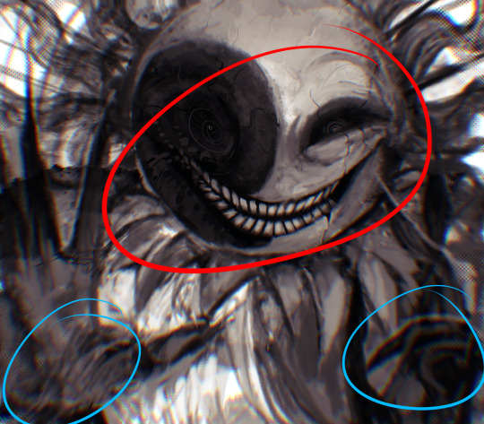
Breakdown: You can see I have used both lines (in the background skeleton you can still see traces of, as well as the face and shoulder of the clothes, defining finer details) and colors in blotted, blocky, or clean shapes (the majority of the subject). The motion lines are complimentary in opposing directions, shown in the blowing hair and growing vines. The gaze of the viewer is drawn by the perspective and focal points of finer details in the piece, complex shapes or lines (hands, face, seams in the clothes, etc.).
2. While finalizing my motions and shapes to build on, I pay attention to voids and contrasts for what’s being viewed/communicated to come through clearly at a glance:
The shape of a subject can be emphasized by rotating it or stylizing the shapes themselves to leave spaces where the background will come through (voids). I think of this a lot like carving clay, using perspective and paint/eraser alternating to get dramatic shapes. The colors used can be contrasted as well to emphasize depth of a subject. Here’s another example:
Breakdown: There are plenty of voids both large and small to carve out the shape of this OC creature from the background. Additionally, the color of the background and accents to the creature contrast strongly while emphasizing the motion in the piece, to carve that silhouette out even further. Fun-ish Fact: Sometimes I give the impression of lines without there being any, by leaving gaps in the base colors of the subject where line art would define the shape of, say, crossed arms or the contouring of a subject. Basically I use void lines instead of line art, sometimes.
Here’s an example of steps 1 & 2 in a piece I’m currently working on:

3. After that it’s just lighting, detailing, and shading all the way. Here’s where it usually gets wild for me, because I rarely approach this the same way. The one thing I always do is add another layer to repaint over what I had before.
I either paint in simple, broad, low-opacity strokes after selecting the parts of the subject I want to be affected by the color and texture I’m using, or in tiny, boldly solid strokes that come together for an impression. Here’s an example of each:
Primarily broad strokes:

Primarily detailed strokes, ad nauseam:


Worth Noting: Backgrounds aren’t my forte. For them, I tend to use broad strokes and focus on setting a mood with the colors, shapes, motion, and textures, and using both to highlight the shape of the subject. Sometimes I will throw in a little spice of details in the background for accents or symbolism, but usually I prefer if they’re geometric thematic mood-setters or flat color shapes. You can see this in all of the above examples.
This isn’t comprehensive, and all this is for my digital art pieces that don’t take as much time to make, but I hope it’s helpful as a starting reference.
Thanks again for asking!
#OmPu ask hours#artists on tumblr#tutorial-ish#I struggled articulating this so this is delayed#long post
21 notes
·
View notes
Note
hi! not exactly a request but i do wanna ask, whats your process when you're rendering more paint like art? (if that makes sense, English isnt my first language so apologies hdskhsjdbd) i really love how you use the colors and im curious how you do it :0
i’ve been meaning to answer this one for a while so here’s how i painted miku in today’s post (put under the read more because yeah prepare for a long post
i’d also like to preface this by saying that i never follow a set way of doing things, so in terms of what my personal process is like, these are only broad strokes of what i do! sometimes i’ll combine or skip parts entirely, depending on how i feel. also, this is not a tutorial, just how i do things, so please don’t treat it like one :’D this will read like the ‘how to draw an owl’ picture if you do
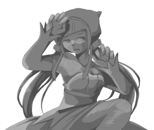
first, like every artist, i sketch. more specifically, i’m getting an idea of what i want to paint later on. this could be how a scene is set up or in this case, how a character is posed. here i’m not concerned about details or getting everything perfectly, i’m only planning how the thing will be composed. maybe a lot of canvas size changing, or adjusting what miku’s doing (note how busted miku’s right hand looks from all the transforming!) however, i still have to be concerned with how clear the sketch will be to future me, because the sketch won’t be any good if i can’t read what miku’s doing

after that, i lay down a flat gray under the sketch, mainly focusing on giving miku a clear silhouette. this is also a good time to make adjustments to the composition on the fly if i suddenly feel like something can be improved upon, like shortening miku’s left arm from the sketch!
after painting a flat silhouette, i start shading in grayscale, focusing only on lighting. i usually do it in two passes, one for the lightest and darkest tones i’ll use (not black and white) and then a second for midtones to blend them better with the base gray but i forgot to screenshot the result of the first pass 🗿 nevertheless, here is where i can start adding some amount of details. i’m not including any extra accessories yet, just focusing on the base design of the outfit and the character herself (for anyone wanting to draw characters from That Gacha Game, this is how i personally make the process more bearable for myself.) i still use the dark gray to separate where certain details (like the facial features and fingers) begin and end, mainly to make colouring more bearable later.
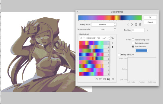
now here’s where i get the Good Colours. it’s a cheat lol. i put a gradient map layer over the grayscale painting so that there’s a little bit of color to start. some gradient maps can be applied as is, some need the layer settings adjusted to make it look good. this one, for example, is a (free) gradient map set from the csp assets store that needs you to set the layer opacity to 20% and to set the blending mode to color to achieve this result. in general, i tend to pick which gradient map i want to use based on vibes, or basically whether i want the work to be warmer or cooler, colour-wise. but this does do quite a bit of lifting for the colors in my stuff.
and then, finally, i add the colours. i add flat base colours in an overlay layer. at this stage, i’ve made the character silhouette clear enough that i don’t need to refer to the sketch anymore for what miku looks like. also, the gradient map layer does its magic by making the shading a bit more vibrant than it would’ve been without it. after that i paint over with a new layer to add details like the lace.
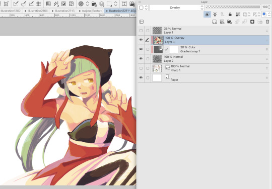
and then i put some extra shading on top. basically this is where the ‘better lighting’ happens. again, this isn’t a tutorial, so i’m not here to say what each part of the lighting is, but i’ve labeled which layers do which job. in other works where the lighting within a scene is more defined (from a window, from a small crack in the walls, etc) the glow dodge layer may be more opaque and sharper, but since this isn’t a work with that, the lighting was applied using an airbrush. the linear burn layer is also there to make the whole thing darker so the glow dodge doesn’t end up oversaturating miku. i also usually match the lights to the vibe i want, and use a complementary color for the shadows. so here you can see i have warm colors on the glow dodge layer, but light purple on both the linear burn and multiply layer.
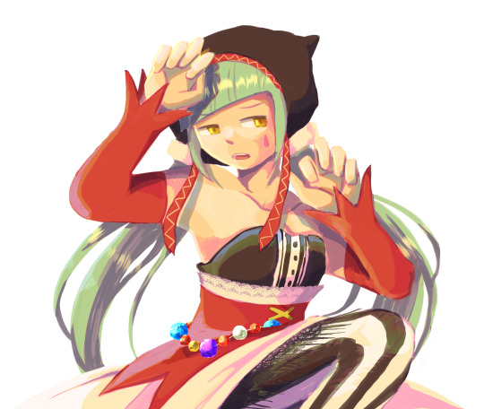
and that’s it for the character—here’s a gif showing how each layer adds to miku! (sorry it’s so toasty)

as for the background, depending on the complexity, it may go through a similar process, or if i can settle with flat image backgrounds, i just go for that. it’s ok to use external image materials. i didn’t have a background in mind for this miku in specific, so i got some default csp materials and threw together something
and that’s about a rough overview of what my process for more finished works looks like! again, art is a fluid process so i never specifically stick to certain steps all the time, and you shouldn’t either. i can probably answer why i’d pick this colour over another in one particular work, but it’s something that kinda has to be learned on a grander scale. i think everyone can already feel what colors work with what atmosphere or what setting, even if they can’t immediately explain why. colors and composition do take some level of experimentation to find what works best!
125 notes
·
View notes
Text
TECHNO BUILD PART . SOMETHING. WAS I EVEN NUMBERING THESE? ANYWAY WE’RE STARTING ON THE HEAD
You’ve seen the profile picture already, so I guess I’ll show you how we got there. so here’s the head base!!
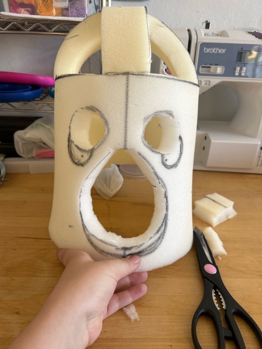
i started with a pretty standard bucket head base based on Skye High Studios’ tutorial. I use a thicker foam but that’s literally only because I don’t actually have any 1/2” foam on hand. Because of that I added like 2 inches to the length she suggests to make it fit well (as i learned from my last head, which is just slightly too tight ;; )
at this phase i like to sketch out the silhouette of what i want it to look like over the blank base. i also install mesh panels to allow for just a touch more ventilation if needed later down the line!

then comes the building up the shape i’m going for, and carving it down! there are patterns you can find out there for specific species, but honestly i just like eyeballing it to make “pattern pieces” and then tracing that twice for symmetry.
i use an electric kitchen knife for carving foam which is, honestly, endlessly amusing to me.
at this point i’ll put it on to make sure it fits well and check the movement when it’s actually worn, just to make sure it’s looking how i want!
then comes carving out the eye holes—at this point i wasn’t sure exactly what i wanted from them, i was between using the actual eye holes as eyes and doing separate eyes further back and painting mesh to match the fur for the actual eyes. more on this later.
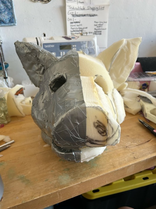

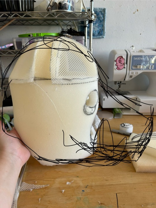
after the eyes are cut out, i cover half of the head with duct tape inside and out, which will be the base for all of my patterns later.

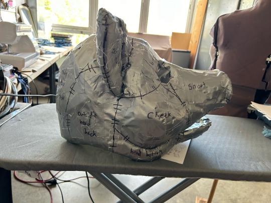
once it’s covered, i’ll draw in where exactly I want my seams to go. first off is figuring out markings—techno doesn’t have any markings in the fur but I did know I wanted a different material for the inside of the ears and the end of the snout. then it’s a matter of figuring out where it’s gonna be flattest if you cut it apart, and not immediately obvious where your seams are. fur *is* very forgiving on this front, because the pile will hide the seams if they’re not too bulky.
i also like to add hash marks on all of the lines to have a point of reference for where things line up. taking pictures at this stage is SUPER important to have a guide to reference back to later during assembly!
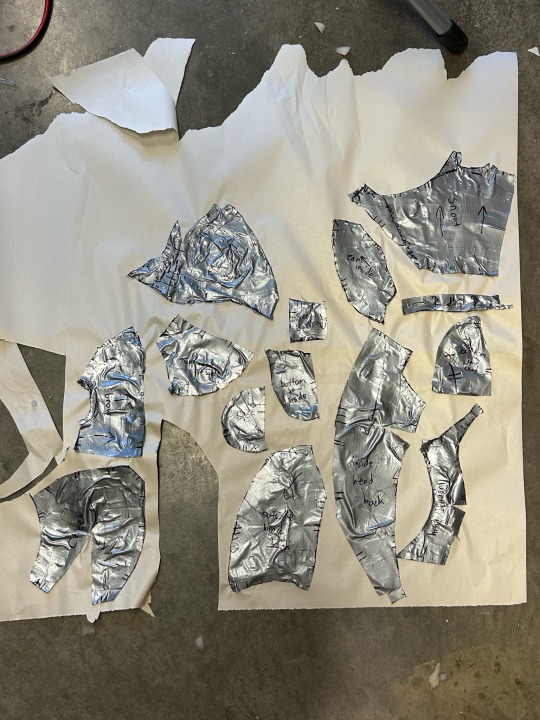
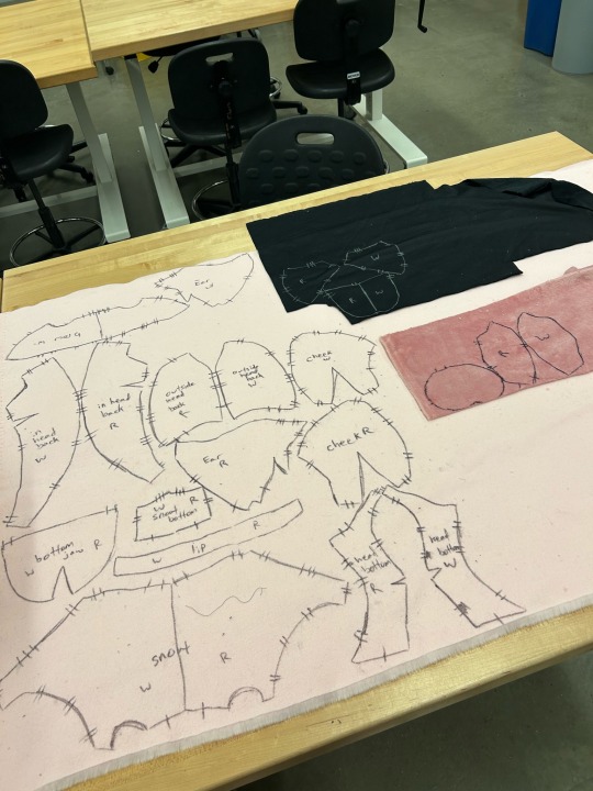
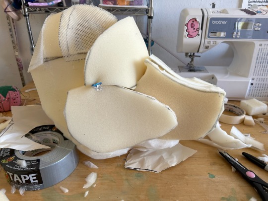
i cut apart the duct tape directly off of the foam base, and place it as flat as possible on newsprint. When necessary, I cut darts into the piece to make it lay flat, which will be sewn up first during assembly. I then cut those pattern pieces out again and trace them directly on the back of my fur. i use a black or silver sharpie for this—anything else has the potential to bleed when the suit is washed!!
i have unfortunately run out of space for pictures in this post, so part 2 on the head will come SOON (LIKE I PROMISE THE POST IS ALREADY QUEUED)
34 notes
·
View notes