#setting all the photo filters to oversaturated
Explore tagged Tumblr posts
Visit Tumblr Blog
Explore Tumblr blogs with no restrictions, modern design and the best experience.
Last Seen Tumblr Blogs


Fun Fact
Mobile US users spent an average of 115.8 minutes on Tumblr app monthly.
Text
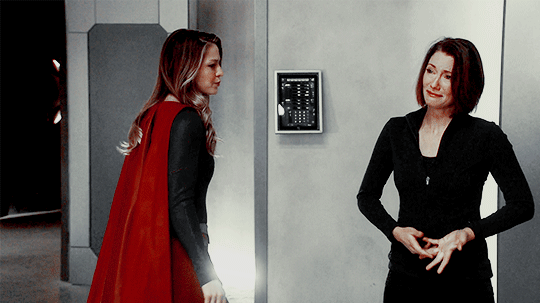
Something tells me they're going to like their Christmas presents. 🥰
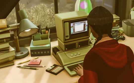
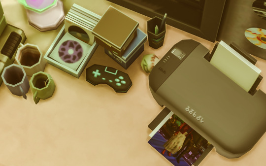
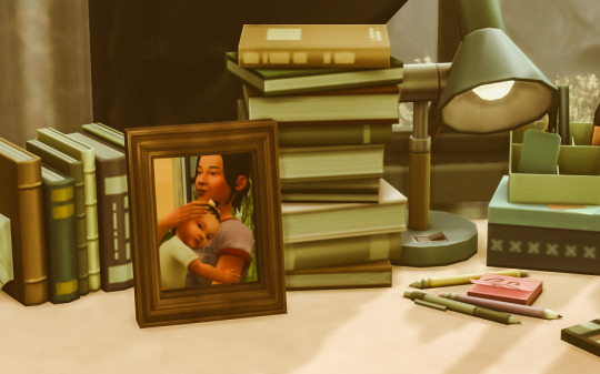
#setting all the photo filters to oversaturated#i don't know if you've ever tried printing a photo on a desktop inkjet printer but... iykyk#cherry's going to be real pissed when they run out of printer ink halfway through that third photo 😤#rebuild a city#ts4 bacc#2_16#ts4#ts4 gameplay#cherry woodard
52 notes
·
View notes
Text
wait actually. list of things i like/dislike abt infinity nikki :3
note that ive been playing like my child self w love nikki (skipping past basically all of the lore unless sm catches my eye)
things i dislike:
its a gacha game and thus inherently predatory. esp when its marketed towards kids.
very little diversity. you can tell skin color was a second thought to the developers. there’s only four skin tones and when you press clear, the skin tone clears as well. there’s no way to set a default skin tone. a lot of the lip sticks look oversaturated on the darker skin tones. they did not care enough to adjust it and thats horrible.
i know we’re playing as nikki but i Would like at least some body diversity w her.
we need a clear resources button dear god.
i want an option to only send/receive snapshots from friends. let me take photos w my friends :(
option to send photos to our friends in chat!! and emotes!!!!!!! photo taking is half the game man.
the fact that summoning your whimcycle is locked behind that paid bike :’’’ im sick of losing it bro.
less of a dislike and more of a i want more of this but: this game neeeeds more poses, lighting, and filters for the photo mode. the fact that theres no pause for clothing animations and no facial expressions has also been killing me.
i want a way to download photos from the album. i also want a way to favorite photos from the album.
some of the clothing animations for longer skirts are kinda stiff
i want more styles so bad. its so hard trying to put together a masculine outfit w the current selection
the store outfits are killing me they need to stop.
i really want more custom outfit slots its killing me to only have four. this is a fashion game i need more.
having to evolve outfits in a particular order fucking sucks. also needing copies of the entire outfit for an evolution fucking sucks.
i want more energy i feel like im divided between 17 different things that all require energy that i dont have.
again, super demanding on you graphics. like i get why but it gives me a heart attack.
i want a styling battle animation skip button.
i know its for lore reasons but the fact that we cant use gliding or shrinking everywhere sucks.
i want a layer button for tops and bottoms
i want to be able to use the outfit quicksap ability while in camera mode. also want an option to turn off hand helds in camera mode.
need more black hairs im gonna start killing someone.
need better kindled inspiration hints
things i like:
genuinely beautiful game visually stunninggg. the fact that there are no quest locked areas and we can head into photo mode basically anywhere is sooo sooo cool to me.
photo mode is also beautiful and allows the players to have so much creative freedom. like they know what we want. we can pose our nikki and pause her mid animation, we can put lighting on her in different colors, she has different poses depending on circumstances (ex: sitting at a particular area, interacting w an item), we have focal length, adjustable aperture, the npc’s pose with you etc etc. its sooo sooo cool and interactive. and i love that the lighting and filters have intensity adjustments.
the details on the clothes and scenery are sooooo beautifully done. everything is gorgeous i want to stop and take a million photos all the time.
the fact that they are so responsive to their playerbase is awesome. most of the common complaints have already been dealt with.
pretty generous which im actually surprised abt. launch was huge ofc they gave us a free four star outfit for nikkis birthday, a free four star outfit for pre registering, and like 120 free pulls. and for cny theyre giving us like 4 free sets + two evolutions whcih is sooo crazy to me and they have items in store tht you can buy w diamonds!!!! the hanfu set and its evolution was less than two ten rolls! and they have a placeable picnic set for the same amount of diamonds you get in your dailies!!!! thats crazy!!
i really like that we can choose make up i think thats fun sorry.
the fact that you can find npc’s in the open world :’))) <3 it makes the world feel sooo lived in its wonderful. AND AGAIN! THEY POSE WITH YOUUUU!!!!!! i do wish we could choose their poses but ill take what i can get.
i do think snapshots are a vv fun way to interact w people <3 its vv fun seeing other peoples photos when youre not overwhelmed lmao.
the jump height is soooo whimsical i love it every time i jump in any other game it feels so dull now.
i like that the combat doesn’t require you to level your nikki. they get so creative bc of that too. the boss battles needing you to use different abilities is sooo cool.
bettina design. i need her carnally.
the songs for this game are soooo gorgeous. their event has a chinese opera-ish song thats soooo sooo beautiful i love it sm. and the osts are awesome.
actually made momo likeable lmao
nikkis sooooo cutiepie :’) <3 ok this one isnt specific to infinikki i have bias from LN sorry.
separating hats and hair clips / necklaces and chokers is suuuch a genius move i love being able to layer accessories.
the frogs have different dialogue if you wear the shirt they gave you :’’’)
being able to replay the domains whenever we want? amazing work. also wonderful for photos.
2 notes
·
View notes
Text
Digital Avatars Get a Makeover: The PFP Revolution Courtesy of iFoto's PFP Maker
In the realm of social media, where first impressions are pixelated and avatars reign supreme, a conversion is underway. It's not just about the content we post; it's about the face—err, profile picture—we choose to don online. Enter PFP Maker by iFoto, a tool changing the way we present ourselves in the digital world.

Have you ever wondered why we're drawn to the allure of a unique avatar? It's more than mere vanity; it's about crafting a digital identity that resonates with our true self—or the self we aspire to be. PFP Maker isn't just a simple picture editor; it's an alchemist of digital personas. With a few clicks and a dash of AI magic, everyday photos morph into works of art that can be as varied as the styles we dream in.
Imagine walking into a party and seeing everyone donning the same face—generic, smiley, and utterly forgettable. That's the equivalent of using an unaltered photo as your profile picture. But what if you could swap that face for a cartoony version of yourself, or perhaps a portrait in the style of a Renaissance painter? Suddenly, you stand out. You're memorable. That's the power PFP Maker by iFoto controles.
Let's delve into the nuance. It's not merely about changing your appearance; it's about curating an image that speaks to your identity, or the identity you want to share with the world. Is your style edgy and modern? Go for an abstract geometric conversion. Are you a vintage soul? PFP Maker can whisk your photo away to a bygone era with a classic filter. The tool's adaptability feels like having a tailor-made avatar, stitched to the fabric of your personality.
I've experimented with PFP Maker myself, and the process is engaging. It's like stepping into a funhouse mirror that reflects not just your image but your mood, your day, or even the vibe of the season. iFoto's AI is the unseen artist here, sensitive to subtleties and eager to please. You upload a photo, pick a style, and voila, the algorithm works its magic. It's a simple concept, but the impact is profound.
Take a moment to think about: why do we gravitate toward personalized avatars? It's about representation—having a digital embodiment that truly speaks to who we are. And in an age where social media is often a platform for self-expression, PFP Maker amplifies that voice. It's the difference between being a face in the crowd and being the face that everyone remembers.
Now, let's talk about the practical side. In a world oversaturated with content, a standout profile picture could mean the difference between blending in and making an impact. Whether you're networking, gaming, or just expressing yourself on platforms like Twitter, Discord, or Steam, your PFP can set the tone for your interactions. It's a silent introduction that speaks volumes.
There's also an element of fun in this digital conversion. We're not just creating a static image; we're playing with the idea of identity itself. What if I looked like this? How would that change my online presence? These are the questions PFP Maker invites us to ask—and answer. It's a playful exploration of self through the lens of AI-driven creativity.
As we trip deeper into the digital age, the tools we use to present ourselves are evolving. PFP Maker by iFoto is a beacon in this development, offering us a canvas to paint our digital souls in bold, vibrant hues. It's a tool that doesn't just change our profile pictures; it changes the way we think about self-representation in the online world.
So the next time you're considering a profile picture update, why not take a walk on the artistic side? With PFP Maker by iFoto, the canvas is yours to fill, and the styles are limitless. After all, in a digital ocean of faces, why not be the most colorful fish in the sea?
#iFoto#PFP#PFPmaker#ProfilePictureMaker#driverphoto#AI#AIportrait#VisaPhoto#Headshots#passport#linkedin#AIPortraits#ProfilePicture#Resume#producthunt#portrait
0 notes
Text
Children's Music as an Agent of "Yassification"
My reddit account got flagged for spam and all my old posts were removed so I'm backing this up here for posterity.
youtube
DISCLAIMER: I’m going to be using a lot of generalizations here about gay men/young girls but I would be remiss if I didn’t mention that no demographic is a monolith. These experiences are common (and I think will resonate with many) but not universal and if your experience was different, that’s valid too. This is a very “if you know, you know” topic, and if you don’t know… well you probably know something I don’t.
So if you’re on certain circles of the internet (like this one) you’ve probably heard the term “yassification” pop up recently. It’s a meme term began as something of a joke but I think it’s actually evolved into a useful term for a specific phenomenon so I wanted to discuss it a bit.
I’ll begin by setting the clear definition for the term that I’ll be using for this post:
Yassify (verb): to make something more “fabulous” by rendering it brighter, sleeker, glamorous and more beautiful, especially in a way that is traditionally feminine and appealing to the sensibilities of young queer people
To abstract this a bit further, yassifying something means turning it into something that would make you scream “YAAAASSSS!,” a phrase a comment on the video I linked jokingly describes as “the battle cry of the gays.” It’s a bit similar to bimboification but with different implications (less pornographic, more LGBT).

Know-your-meme has a very detailed history of the term but in my opinion (and there are conflicting sources on this) the moment that kicked it into the internet mainstream and lead to the current wave of usage was when this image of the famous “Dust Bowl Migrant Mother” photo edited to be smiling went viral and lead a meme so big Teen Vogue did an article on it. To quote:
For the last few years, Instagram filters have been altering the way we think about beauty and makeup. Yassification takes that one step further (or, maybe more like one hundred steps) by oversaturating images with FaceApp filters to exaggerate the “beauty” features to the extent of becoming unrecognizable.
While the hyper-FaceTune trend has died down a bit, the term has stuck around and today enjoys a more abstract usage. Yassification no longer requires a literal face to be filtered, instead the very spirit of something can be run through a metaphorical FaceApp and come out the other side yassified and ready to serve. Here are some examples:
Legos -> Lego Friends
KK Slider then -> KK Slider now
Katherine Hudson -> Katy Perry
Survivor -> America’s Next Top Model -> RuPaul’s Drag Race (the yassification of reality television)
Are we all on the same page now? Good.
youtube
Inherent in all this is an undertone of queerness. Yassification is, in a way, rebellious because it takes things that are dark, serious, and oftentimes coded as masculine and transforms them into something fabulous. When something is yassified, it is claimed for the gays.
It’s shallow, yes, and unfortunately tied to some toxic aspects of consumerism, but to throw out another buzz word that’s having its moment… it’s camp. Yassification is not meant to be taken seriously, it’s a celebration of fun before anything else.
Appropriately enough, when I type “yassify” into YouTube the third video to appear is “Faceshopping” by SOPHIE (seizure warning). A queer anthem, this song has also become something of an unofficial theme for the yassification movement thanks to its impossibly glossy sound and lyrics which focus on commercialism and aesthetics.
Using this song as a starting point, we can get a feel for the general “sound” associated with yassification: any music that is bright and poppy, and ostentatiously so. Mainly this is bubblegum pop and club music but the specific genre is flexible as long as it feels the spirit. Think about the kind of stuff that would blow up on stan twitter.
youtube
So why am I talking about children’s music? Well, to quote one tumblr user:
Not enough people talk about this Kim Possible song that sounds like it was produced exclusively for gay clubs.
The song in question is “Say The Word,” sung by Christy Carlson Romano for the soundtrack of the landmark Disney animated series Kim Possible, and as this user points out it has massive undertones of yaaaasssss. The attitude, the gratuitous autotune, that bubblegum beat… there’s no question about it, this track was meant to yassify.
Do I really think that listening to Kim Possible makes kids gay? Of course not, that’s not how it works. But I do think that a child could listen to a song like this and really connect with it and it could be an early indicator of certain interests that will follow them as they grow up.
Children who are often limited in what media they’re permitted to access (or at least were before everyone had smartphones lol) so songs like this are an approachable avenue of exposure to a certain lifestyle/aesthetic that (as we’ve established) is heavily gay coded. We could say the Kim Possible soundtrack is a gateway drug to, say, a Charli XCX mixtape.
Yassification is associated with bright colors, loudness, commercialism, a fashion focus, and children’s media (specifically media targeted at young girls) is built off of these tenants as well so it’s just a hotbed for yas.

Obviously everyone likes toys, cartoons, video games, etc. but gay and gay adjacent people have a special connection with them. Similar to the relationship between gays and horror many gays find solace in the imaginative worlds created for youngsters. The hyper stylized aesthetic and imaginative themes of something like, say, The Winx Club or Steven Universe, are attractive to gay audiences in the same way as more mature films like The Fifth Element or Spiceworld.
Tying into this is a focus on strong female characters and themes of magic/adventure, more things that are like catnip for the gays but sometimes lacking in mainstream adult media. Being able to see traditionally feminine characters portrayed as free agents rather than romantic objects, with an added emphasis on female friendships and self-acceptance, can be so empowering for people who fall outside of the norms of mainstream masculinity.
youtube
So when we take these principles and apply them to music, timeless bops are born! The genres and sounds most adults consider child friendly have a lot of overlap with the aforementioned sounds of the yassified, and thus children's media is flooded with dance pop, '00s r&b/bubblegum, disco, pop-rock, all perfectly designed to be as frothy and ear catching as possible.
Many of these yassifying children’s songs come from musicals and tv shows but there’s also a market for specifically created image songs as well that I’ve found are particularly prone to yas.
These songs provided us pop girls to stan before we even knew that was a thing, and our society is built off of them.

In my opinion, the unquestioned queen of childhood yassification who ties all of these ideas together is Sharpay Evans from the High School Musical franchise. Pink, glamorous, and unapologetically bitchy, her legendary demand that everything be “fabulous” became a rallying cry for a generation of young girls and boys who would grow up expecting nothing less. She even had a gay sidekick! She must have yassified millions of children.
Also in the royal pantheon is are the Bratz Dolls, who have had a (much deserved) resurgence of popularity recently as people finally recognize their status as style and music icons. Notably they had a more rock influenced sound but still fit the definition of yas music very well (see also: Hex Girls and Ember).
Other landmark moments in junior yassification:
Lizzie McGuire - What Dreams Are Made Of
Barbie - A Girl Like You
Oliver and Company - Perfect Isn't Easy
Sonic the Hedgehog - My Sweet Passion
Novi Stars
Monster High - Empire
Warioware - Ashley's Song
Sailor Moon - The Power Of Love
Everything the Cheetah Girls did
I invoke historical examples because, well, they're from my childhood, but the yassification machine is still alive and well in the modern age too. For more contemporary examples we can look at things like the recent Teletubbies album or the new L.O.L. Surprise album that was, I kid you not, called Fierce.
It's good to know there's still people watching out for the kids.
#I worked too hard on this for it to be made invisible#will probably trawl through my account history and back up some other posts too#long post
0 notes
Text
Fundamentals 1: Week 4
15th March
At the end of this class where we are learning about the basic photo editing tools in Photoshop, Toby gave us a homework task where we have to choose two coloured photos and two black and white photos and edit them using the same adjustment tools. I decided to use photos that I had taken on my phone (which doesn't have a great camera on it) so I was excited to see what I could do to improve them.
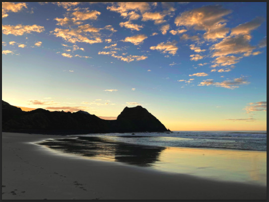
The first photo I used was one I took at my favourite beach, Blackhead.
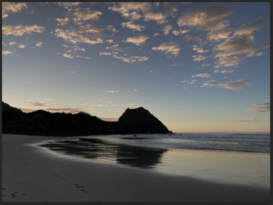
As you can see from a first glance the photo looks pretty dull and doesn't have a lot of vibrance to it. The sun was only just rising behind the hills so it is also a bit dark from where I took the photo. What I want to do here is make the photo brighter while still maintaining the dark shadows and silhouette, and also make it more saturated to bring out the colour in the sky and the clouds. As always my first step is to bring up the curves adjustment layer.

I adjust the top of the curve to bring it closer to where the pixel information starts on the lighter side (far right). Just by doing this there is already an improvement on the brightness of the sky as well as the reflection on the water while the shadows are still dark. You can also see that by adjusting the brightness there is slightly more colour present in the right side of the sky. I added a couple more points to the curve to play around with brightness but felt pretty happy with how it looked. My next step was to add the hue/saturation adjustment layer.

Straight away the saturation makes a huge difference to the photo. There is so much more colour and vibrance in the sky and on the water which definitely looks more realistic and how I saw it through my own eyes. I didn't feel the need to change the hue at all as I was really happy with how this has turned out. Just in case, I decided to have a look at the colour balance layer to see if I could improve the photo any further.
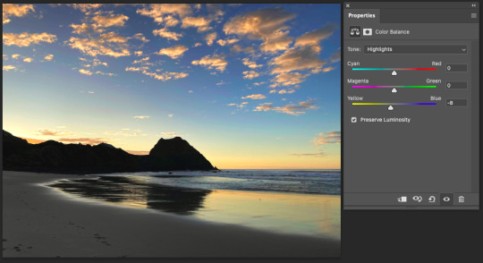
After playing around with the colour balance of the photo I realised that there wasn't much that I could do to make the photo look better (in my opinion). While looking at the highlights I added the slightest hint of yellow which makes the photo look slightly warmer and after that I think I found my desired end result. Really happy with how it looks especially when comparing it to the original photo. Here's how they look beside each other:
Oh what a surprise, the next photo I decided to use was also from Blackhead. I think this was actually from the same morning as the first photo.

As you can see it is equally as dull and dark so some adjustments need to be made. First things first I bring up the curves adjustment layer.
I actually found this curve to be quite tricky to adjust. While I wanted to make the sky look brighter it actually started to lose some of the pixel information on the far right side in the middle. I felt like this was the best look I could get where the sky is slightly brighter (and already looking more vibrant) without making it look washed out. I also added a curve in the darker area so that the rocky landscape was a bit more visible and detailed. My next step - hue/saturation.

Adjusting the saturation definitely made this photo more vibrant and lively. Again I couldn't add too much saturation as the white part of the sky would start to lose information and just look oversaturated. But I was really happy with this, making simple adjustments like the curves and saturation can have such a positive change on the quality of the photo and make it look more realistic - like it wasn't taken with an average quality camera. I didn't feel the need to look at the colour balance layer because this already was the desired look that I wanted. Here's a comparison of the two photos:

The next photo is one that I took at New Brighton beach in Christchurch using a black and white filter on my phone's camera

The sun was setting behind me so the majority on the landscape is quite dark and the only bright area is the water and the clouds. My goal here is to add a little bit more light to the sand and sky without over doing it.

I found this photo was quite difficult to adjust without making the sky too light where it would lose information. While I was making the sky brighter I started to lose the shadows of the clouds so it was hard to find the right balance of both. I managed to add some more light to the sand so I was happy about that. It definitely felt harder to correct a black and white landscape photo as the details are quite small and easy to lose while making adjustments. It's a photo that I could try keep making tiny adjustments to but overall I was happy with the end result. Here's a comparison of the two photos:

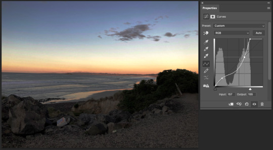
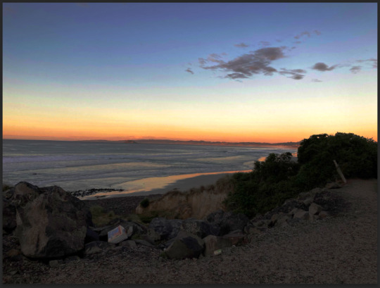
And the last photo! One of my hometown, at the Oamaru harbour. I also used a black and white filter on my phone when taking this photo.

The black and white filter added a vignette sort of look which would be hard to correct so I decided to focus on the centre area of the photo and adjusting the brightness to add a bit more detail. To the curves adjustment layer!
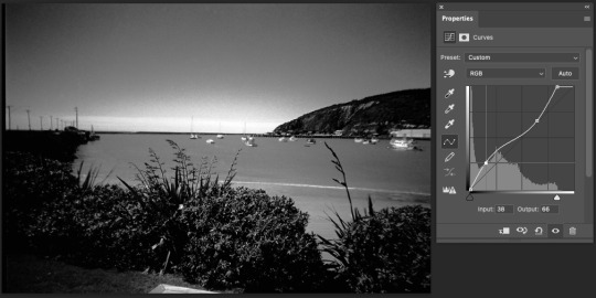
I brought the top of the curve close to where the pixel information started which definitely improved the detail of the lighter areas in the photo. As you can see in the bottom half of the curve I added a point where I brought some of the darker pixels into the lighter area of the graph. By doing this I made some of the darker pixels, mostly around the bushes in the foreground but also on the hillside in the background a little bit lighter which again added some more detail to the photo without losing any information. I was happy with the end result especially when comparing it the the original photo, the slightest adjustments can make all the difference. Here's how the two photos look together:


I really enjoyed this homework task as I had the chance to work on my own photos and edit them to get the desired look that I wanted and also learn that it can be difficult to get the desired look but to try achieve it anyway. It was also a great way to continue getting familiar with the adjustment layers and tools on Photoshop.
0 notes
Text
social media use ft. Bo the puppy
Generally in regards to social media I am what could be considered pretty inactive. I minimally scroll facebook and instagram. I’m often scrolling through reddit but rarely posting anything. Looking at my screen time breakdown, it’s really not an excessive amount of time spent on social media. Or maybe it is, and I'm just delusional, you let me know. But really, social media may be a bigger presence in my life if I wasn’t so busy already. School, work, a puppy, and balancing relationships are more than enough “social interactions” in my day.


The other day (Tuesday if anyone cares enough to know) though I was struck with the wave of desire that comes with having a cute pet in the 2020’s to create an instagram for all 60 of your closest followers to scroll past. Reaching to the example set by the elder internet generation known as millennials(just kidding, don’t come for me. I’m like on the oldest possible side of Gen Z so imagine my pain being lumped with 2012 babies ) I selected a cute photo, used a filter and posted it. Now for the followers. I had none, or rather my cute dog had none. So I set about following many many other dog instagrams, businesses, and people we know. We got more followers than I was expecting, and I’ve made a second post at this point as well.
I mostly created this instagram for two different reasons. One, I can post pictures of my dog as much as I want on his instagram versus mine so I don’t oversaturate my personal account with only dog pictures. Two, I want to try my hand at creating the perfect “aesthetic” and cohesive page. There’s a lot that goes into creating that visually flowing yet dynamic page you see from anyone of your more well known personalities. A small bonus is that I’ve already been offered small amounts of free pet products from businesses as long as we post a picture on our page tagging them. I’m not super pressed about maintaining the puppy’s account, but I am going to attempt to keep it going. It really has been kind of fun already.

While making this account I honestly was feeling a little stressed. Overall it has been a positive time but I feel like there are so many little things to be aware of if your goal is aesthetic cohesiveness that it can be difficult. Color pallets, personality and visual identity, grid layout are all factors. It does give a kind of validation boost when a post is liked or a follower is gained. It’s also a bit exciting to try something new. I think you also have to be okay with flops too. It’s a good exercise in acknowledging that you may make poor design choices, and have to entirely redo the whole page the more you learn. Ignorance isn’t always bliss, but sometimes it helps!

0 notes
Text
The star trek food cubes are haunting me again. I want to put them in my mouth.
So here are the theories on how to make them.
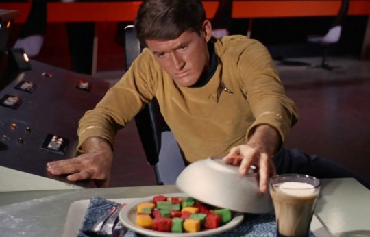
[ID] Screencap from The Conscience Of The King shows Lt. Riley uncovering a plate of food cubes [end ID]
Tofu, diced.
Marinate in liquid(s) of choice (e.g, lemon juice). Cover with cornstarch. Add red, green or yellow food colouring to blocks as required. Roast and serve.
Suggestion: marinate the cubes in different flavours to correspond to their colours.
Prototype recipe
Melon, diced.
This one is low effort: Red cubes= watermelon, other cubes= melon. Allegedly, the original on-set props *were* dyed melon (but I don't have a solid source), so this may be the best fit.
Royal icing/icing sugar.
This one is just candy: make 3 batches of royal icing, one red, one yellow, one green, dice when half-set and leave to fully set.
Cake, fondant.
Possible, if we assume Lt. Riley was drinking milk in that scene from The Conscience Of The King (Pictured above). This one is also easy to make, assuming you don't object to fondant.
Jelly, cubed.
(Jell-O). Dishonourable mention; this one is too see-through for my liking.

[ID] Screencap from Where No Man shows Kirk eating a green food cube, which looks blue here. [End ID]
Potatoes, Diced.
Roast Potatoes, Diced
This idea comes from CoolPete.com, and my first thought was "please don't put food colouring on the potatoes".
Cool Pete provided a photo of the finished results, and the natural colour of the potato offsets most of the food colouring to make them all look greener than intended. The red food colouring comes out the best. I suppose colour theory dictates that you should use blue food colouring on the potatoes in order to get green cubes, but don't quote me on that.
With this in mind, I'm going to tentatively suggest a horrible idea:
Roast Sweet Potatoes (Yams), Diced
In theory, the redness of the yams might allow the Yellow Food Dye to look more yellow, and make the red more vibrant. There's a greater chance that you will be able to use the green food colouring without it looking blue here, but use at your own caution, because the finished product may look oversaturated. Perfectly edible, but potentially unappetizing (the first bite is with the eye).
Closing Comments:
For uniformity of texture, tofu or melon seems to be the best way to go. If we are to believe that the "food cubes" in-universe are supposed to be fruit (according to that same trekbbs thread, they're placed in glasses in Journey To Babel), then watermelon and cantaloupe are begging for our attention, but we must ignore them, for melon alone does not a meal make!
“I wonder if they were actually supposed to be some kind of fruit in-universe, too? IIRC, in "Journey to Babel" the copper aliens put them in their drinks, which seems a strange thing to do if they were supposed to be the 23rd century equivalent of tofu cubes or something.”
-Avro Arrow
This isn't the end, merely the beginning. I will test out a couple of variations of these meals and report back on which one I think is best.
My current hypothesis is that the tofu will allow for the most variation, as you can marinate it in naturally-colourful liquids of various colours. If it's colourful enough you could forgo the food colouring altogether, or marinate it in something colourless (like salted water) and then add seasonings and food colouring if you wish.
I intend to start by using tofu with diced potatoes as a side, though if I test out too many cube-shaped meals at once, my household will get suspicious, so I need to space this out over the course of a few months. I'm going to use the tag #Food Cube Trek, so filter it if that's not something you'd like to see.
#Food Cube Trek#food cubes#star trek#star trek TOS#girl help I can't stop thinking about the food cubes#long post#cooking with quark
219 notes
·
View notes
Text
Ninjago characters as things people in my online class say/do:
Lloyd
-trying their goshdarn best to do the work, always having major technical difficulties (theyre using Wu’s computer and it’s older than Wu himself)
-has no idea whats going on, usually doesnt know what class they’re in
-once fell asleep in lesson and didnt realise it ended, they were just there alone in the zoom call for about 20 mins without realising it
-theres like an 80% chance they’re having a mild breakdown over not being able to do the work, and theyre sat on the floor eating cool aid powder like its sherbert and video calling Nya for help.
-profile pic is a cute (but blurry) group photo of all the ninja
Kai
-rarely actually goes to the lessons, especially morning ones
- if he does, he doesnt try to do any of the work
- (its fine, hes the sort of person whos like secretly smart and he understands it well enough to get about average grades without doing much)
-he once kicked everyone out of the zoom call because the teacher accidentally set it up wrong and let everyone do admin things on the call, he also kicked the teacher out of the call before, it was absolute anarchy :)
-profile pic is a really bad picture of Nya doing a weird face, she hates it
Cole
-unmuted his mic to show everyone a remix of making my way downtown and that video thats like ‘just did a bad thing’, ya ko this one
-still thinks he needs permission to go to the bathroom or get a snack even though the teacher cant see or hear anyone usually so nobody can stop him from just going
-shows everyone cute photos of pets, we dont know if theyre his or not but they are very cute.
-profile pic is a selfie with a snapchat filter
Jay
-sucks up to the teacher so that he can trick them
-always joins the lesson with a message like ‘hiii miss/sir :) ☺️ how’s your day so far 💛✨’ then makes everyone pretend they cant find the work. and of course, because Jay was one of those pretending they cant find it, the teacher thinks it must not be there, because he wouldnt lie, of course not
-hes also the only student who ever ever ever turns their camera on, exept maybe Kai, but Kai doesn’t do it on purpose
-profile pic is a stock image of a sunset that he found on google images thats been oversaturated to death and still has a watermark
Nya
-once unmuted her mic in a lesson where Jay and Kai were messing arround, yelled that she didnt want to be in a lesson that was a waste of her time, and that the teacher was a failure who couldn’t control a class, then left
-tries to seem like less of a nerd by adding meme formats to her answers to questions sometimes, nobody’s falling for it
-if the teacher picks on someone who doesn’t know the answer, she sometimes dms them the answer so they dont get in trouble, unless its Kai, she dms him the wrong answer sometimes
-profile pic is a really bad picture of Kai doing a weird face, he hates it
Zane
-absolutely carrying the class work-wise. always the first to answer the questions, unless its Jay, but Jay always just asks google or Nya
-usually never actually talks other than to answer questions, reacts to everything the teacher says in the chat with a 👍
-when Nya unmuted her mic and talked about the teacher not being able to control the class, Zane Jay and Kai spammed the chat with ‘Yess Nya!!! 🤠🎉’. Zane didnt realise that he was the only one doing it unironically
-hasnt changed his profile pic so its just his initials, but secretly, he has changed it, to an identical picture of his initials but in a different colour. Zoom automatically made his profile pic red, and he made it grey-blue.
#long post#lego#ninjago#lego ninjago#lloyd garmadon#lloyd ninjago#kai smith#kai ninjago#cole brookstone#cole ninjago#jay walker#jay ninjago#nya smith#nya ninjago#zane julien#zane ninjago#hc#online school#school#online class#ninjago lloyd#ninjago kai#ninjago cole#ninjago jay#ninjago nya#ninjago zane
125 notes
·
View notes
Text
gif coloring tutorial
for @sappho-mia
a photoshop tutorial on how to make gifs that look like the ones in this gifset. I will only explain how to do the coloring, so if there’s any other part of gifmaking that you’d like for me to explain, let me know and I’ll make another tutorial or send you some tips!
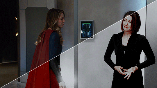
I’ll show you how to go from this:
to this:
1. exposure
shows have the lovely habit of underexposing every scene, but you don’t want people looking at your gifs like this
so: time to brighten that shit up!
I have a psd (an edited version of the one in this tutorial by @redkrypto) that I use and adjust for basically all my gifs, but for the sake of this tutorial I’ll do this step by step.
photoshop has a few good options for changing the exposure. first, go to window > adjustments to get this:

which is your biggest friend. the ones on exposure are these 4:
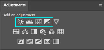
I’ll be honest, I have no idea what the difference between levels (the second one) and curves (the third one) is. they both adjust the tone of your gif - with the option to make the dark tones, the light tones and the midtones either brighter or less bright, separately. this’ll make your gif look less flat!
let’s take a look at levels:
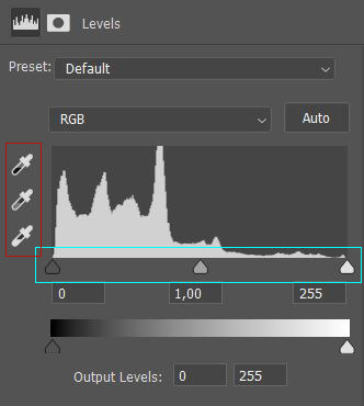
this might look daunting but I promise I don’t really know how to read the histogram either, I just use the little sliders (cyan) and see how it looks. you can also use one of the eyedroppers (red) and click on a part of your gif that you want to be black, white or grey, and the rest of the image will adjust to this. it might be a little too intense - in that case you can lower the opacity of the layer (see image below).
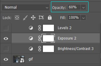
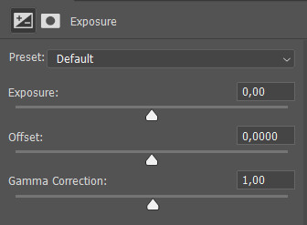
then there’s brightness/contrast and exposure. the difference between these two is that brightness will mostly affect the parts of your image that are already bright, while exposure will affect the whole image. the exposure window has another option I use often too, gamma correction. with gamma correction you can change the gamma levels of your gif, and I have no idea what that means but it sure does look good lmao
there not one ‘right’ way to do this, so just play around a little and see which ways you like the most :)
after brightening, our gif looks like this. yay!

for comparison:

2. coloring
I remember feeling very overwhelmed with all of photoshop’s options at first. I will discuss all of the ones I used to create this gif, but you definitely don’t have to use or understand all of them in order to make beautiful gifs!
two adjustments I use in pretty much every gif are hue/saturation (cyan) and selective color (red).
first, selective color. selective color basically gives you the option to single out a color in your gif and change it. the most important thing to understand here is which colors are opposites: red and cyan, green and magenta, blue and yellow. so if you’d want your yellows to be green, you use the magenta slider.
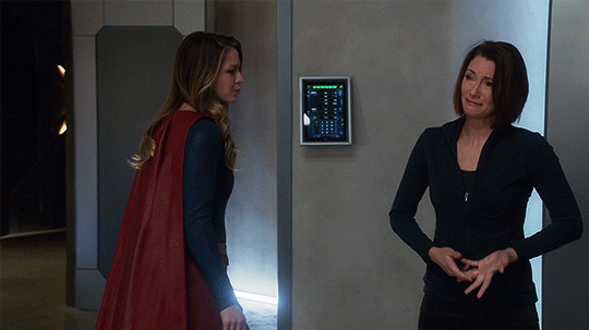
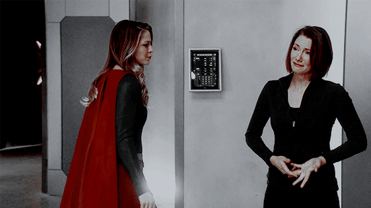
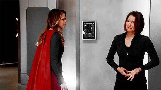
for the gif we’re making, we want kara’s cape to stand out, because red is going to be the only color left. these are the settings I used:

now it’s gonna look a little oversaturated, but we’ll fix that later on. I also made the yellows more red and less yellow and increased the blackness a little.
another way to make a color stand out is by removing the other colors -- the background is mostly yellow, green, cyan and blue. so we’re gonna go to hue/saturation and completely remove their saturation, which will make the wall behind them look gray.
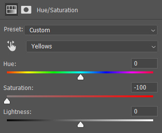
in the saturation window, you also get the option to reduce the lightness (and the hue, but we’ll get to that later). reducing the lightness does not do the same thing as increasing the blackness in selective color: reducing the lightness will give it more shadow, while increasing the blackness in selective color will make for example a lilac go to a purple, or a red to a deep red.
for our gif, I reduced the lightness (-13) and the saturation (-3) of the reds. now it looks like this:
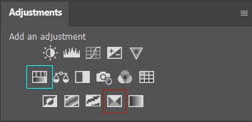
the next step will make the gif look weird at first but after we add the other layers, it’ll look better. go to adjustments > photo filter and select ‘sepia’ (it’ll be a warming filter first - click on that and you’ll see all the other options). then increase the density:

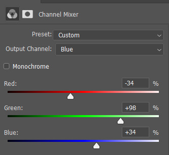
next, we’ll move to channel mixer. channel mixer is one of my favorite adjustment layers because it’s the easiest way to make your colors look really different. there are three channels (red, green and blue) and the best way to use it is to just try things out and see how it looks. my settings for this gif were:

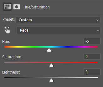
then I added another saturation layer and reduced the saturation for the yellows, greens, cyans and blues, and removed the saturation completely for the magentas. for the blues, I also decreased the lightness, and for the reds, I changed the hue a bit so it looks less yellow:
another selective color layer (with opacity and fill both at 65%):

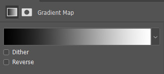
then add a gradient map (bottom right in the adjustments window). make sure it goes from black to white, and isn’t reversed. this will make the gif look a little softer! opacity: 20% fill: 50% (or your whole gif will be black and white)
increase the red saturation a bit and increase the blackness with selective color, so it’ll look like this:
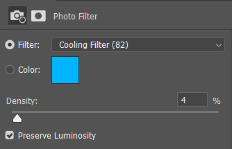
see if your exposure needs some tweaking, remove all the colors you don’t want (the background is mostly yellow now) and add another photo filter, a cooling filter this time, and set it at 4%.
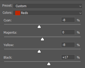
finally, one last selective color layer:
and that’s it, we’re done!!

3. some final tips
it matters which layer is on top. if you use selective color to turn all the green into cyan and put a saturation layer on top of that, not a lot will happen if you increase or decrease the green saturation. but if you increase the cyan saturation, every part that photoshop recognizes as cyan now will become more saturated.
some scenes are a lot harder to color than others, and you’re allowed to just ignore the existence of those scenes. :-)
use folders or “groups” to put layers together. my psds are very chaotic but this helps me find things!
when making a set, your gifs should look good together, not just on their own - sometimes seeing my gifs together makes me realize I need to change the coloring / brightness in some of them. to make sure this realization doesn’t happen when I’ve finished all of them already, I always put them in a tumblr post in my drafts while I’m still working on them.
use creator tags when posting your gifs. so don’t just tag it as “supergirl” but also “supergirledit” and not just “kara danvers” but also “karadanversedit” - this is the easiest way for other people and other creators in your fandom to find you! if your set doesn’t show up in the tags (when you search supergirledit and click on “recent”), send me a message and I’ll help you figure out what went wrong.
try to make your coloring match the ‘mood’ of your gifset - is it dramatic? soft? angsty? romantic? should there be intense contrasts? lots of reds, or calmer blues? same goes for the font you choose, but that’s a whole other tutorial (that I am probably not qualified to give haha, but I can point you in the direction of some people that are really good at it!).
you’re going to make a lot of gifs you don’t like, and that’s okay. it doesn’t mean you’re not good at it, it means you’re learning and improving! and it can also mean that you forgot to turn off the night shift on your laptop and your ‘red’ gif turns out to be... definitely not red. lol

if you have any questions, don’t hesitate to ask!! good luck & have fun :)
#completeresources#allresources#gif tutorial#coloring tutorial#photoshop#photoshop tutorial#ps tutorial#dailyresources#mytutorials#I didn't use color balance for this one but that's a very useful one too!#and vibrance too#though that one makes ALL of your colors more vibrant and that's not always ideal
148 notes
·
View notes
Note
I saw on someone else's post that you offered to show them how to make gifs? I am super interested in making The Magicians gifs so I was wondering if you could teach me as well? Or even make a public post or tutorial or something? Thank you!!!!
Yeah, of course! There are a lot of ways to make gifs, some of them undoubtedly better than what I do. But, for me, I have a couple methods I generally use, one with Photoshop (when I want very specific control over the colors, composition, type styles, etc.), and the other with just a free tool (when I just want to make a gif that looks decent and not sink a ton of time into it).
I’ll go over the free tool method here; it’s more straightforward and limited, but wayyyy friendlier for someone just starting out. Also, again: it’s free. (But lemme know if you wanna talk Photoshop and I’m always happy to open that giant can of worms.)
One nice thing about gifs becoming the one true currency of the web is that a lot of gif-oriented sites have built gif-making tools in the past couple years and made them free and easy to use, so we can all become gif-producing worker bees, constantly toiling to keep up with the internet’s insatiable demand for gifs.
I use Gif Brewery 3 for mac, built by Gfycat. (There’s also Giphy’s GIF Capture which I’ve used a few times and didn’t hate.) So for the purposes of this tutorial, Step 0: Download and install Gif Brewery 3
So! Now let’s make a gif. Let’s say I want to make some gifs of Margo taking her throne as high king.
Step 1: Open Netflix in Google Chrome (i.e. not Safari because it blanks your screen if you try to record your screen while a video’s playing) or play a DVD on your computer, or pull up the scene you want on YouTube. Basically get a video of the scene you want playing on your computer screen in whatever fashion you prefer.
Step 2: Open Gif Brewery and select “Record Screen.” Resize the window that Gif Brewery then opens up so that it frames the video, hit record, and then play the part of the video you want to gif.

Step 3: When you’re done with video, click “Stop.” Gif Brewery will then open the video clip that you made in their interface. You can close your browser and the blue frame window. You can see the full clip you just recorded in Gif Brewery. Trim the extra bits off of the clip by dragging the green bar to define your start point and the red bar to define your end point.

Step 4: Resize! Tumblr’s main content box is 540 pixels wide. So if you’re making a gif that’s meant to be full width, you can size down to that width. Make sure “Maintain Aspect Ratio” is checked. (Now’s a good time to also crop if you want to, say, gif only Margo’s face without the space to her left and right.)
Step 5: So now we have something that’s the size and shape of a gif. If you want to add text, now’s a good time to do it. Use the “Text” button at the top of the window to open the Text box. Here you add your text, adjust the font weight, size, color, and border if you’re using one. I’m going to use a Billie Eilish lyric for this example because I’m cliche as hell.
If you’re making a standard-style gif with a text caption, you’ll use a bold san serif font like Helvetica, with a black border around it to make sure it’s readable, and then keeping it small and centered at the bottom of your gif, like so:

But! if you’re feeling Artsy, go nuts with your font choice and placement. Find a font that captures the tone your message and clip are conveying. You can find a wide range of free fonts on Google Fonts or good old DaFont. I want that badass Margo ‘tude, so I’m using a grungy font and Margo’s signature bright fuschia. Drag the text box to move and resize it until you’re happy with it.

Step 6: Time to fix your colors! Screen captured images basically always look more dark and muted than they should. The fix is to fuss and fuss and fuss and then fuss some more over the colors. Gif Brewery has limited color controls, but as I’ve learned, you can still spend an inordinate amount of time fussing over them. The Magicians makes this an especially good exercise in finding the limits of your patience because they’re always backlighting scenes in a way that blow out your brightness when you try to make even small edits. (Which is why I’m switching over to a different shot that’s easier to work with for this example. Margo’s hella backlit in our gif.)

Exposure Adjust: Increase exposure to make your brights brighter
Gamma Adjust: Increase gamma to make your darks richer
Saturation: Increase to make the colors as rich as they can be
Vibrance: I also like increasing vibrance for even more of a pop of color
Hue Adjust: their hue controls are funky, but you can make some minor adjustments if at this point your gif looks weirdly too red or yellow.
Play around until you find what looks good to your eye. For a gif that’s meant to look like it’s colored normally, watch out for things like: the whole thing looks too dark and you have to squint to see the details; you overbrightened and now the white is blown out and blinding; or you oversaturated so much things look pixely and glitchy.
Step 7: Open the Settings panel with the button at the top right. Time for more fussing to make sure the timing, frames, and settings are how you want them.

HERE’S THE THING: Tumblr does NOT let you upload gifs larger than 3mb. So everything you’re doing in this panel is a balancing game to keep your gif under 3mb without letting it look like trash. These are the settings you’ll fiddle with most often:
Speed is set to 100% by default. But you may want to slow it down, especially if your clip is only a couple seconds long. Slower means it’s easier to see the subtle changes in a character’s expressions and it makes the action look less jerky. The slower you set your speed, the more frames will be added to the gif, so keep an eye on that.
Frames per Second is what it sounds like. The lower you set this number, the fewer frames you’ll use, but the animation will look jerkier. You want enough frames per second that your animation looks as smooth as a hot knife sliding through butter. 12 is their default. I try to not go lower than 10. When I’m feeling particularly luxurious, I’ll set this to 15.
Color Count: Gifs can use as many as 256 colors and as few as 2, if you don’t care about your gif being an offense to nature. You can set it to the low 200s without compromising on quality, though, so that’s what I did here.
Step 8: Hit “Create” and wait an inordinate amount of time while your gif renders. When it finally, finally does, check the filesize on the bottom right. In the above gif, you’ll see my gif was 2.1mb. Perfect. So I can hit save and it’s done. But if it had said anything larger than 3mb, I’d have hit “Cancel” and then fiddled with the settings some more to get the number of frames down.
Alt-Step 6B: If I want to do anything fancier/artsy-ier/more unique than this kind of gif, this is when I’d usually crack open Photoshop. But there is some room for creativity within Gif Brewery. Let’s go back to Margo and look at some of our options:
In the Filters menu, you can see there are a number of bre-built Photo Effects to play with. Sometimes they look awesome; sometimes they look like trash. So experiment! There’s also rando filters like Halftone effects. And the Color Effects can give you options like adding a vignette, fading the colors to old-timey sepia tones, or creating a duotone like I ended up doing.
Have fun with it and look for effects that will support the tone you’re setting with clip and text you chose. So like for this Margo example, going black and white, or dark and heavy, etc. would not have been tonally consistent with the badass vibe I’m going for.
And I… think that’s it? At least to get started. Hopefully that helps, let me know if you have any questions! Or want to talk about anything beyond the basics. I’m always happy to dive into the specifics of how a particular effect was made, or how to add more advanced refinements.
#bookster-lover#tutorial#pls don't judge my gif-making abilities based on#the shitty gifs I had to make to capture my screen
49 notes
·
View notes
Text
The novel I'm currently reading is set in Renaissance Florence, and it's gotten me thinking about the Hannibal film. I know I've done (more than) my fair share of whining about the NBC show. Hannibal (2001), though, is its own kind of awful.
Hannibal is by far my favorite of the original three novels. (It’s also the one with the lowest aggregate ratings...go figure.) However, with hindsight, it's easy to see that the film adaptation was not destined to become the stuff of legend like its predecessor The Silence of the Lambs. It was missing three of the key (Oscar-winning) ingredients: director Jonathan Demme, the wonderfully faithful pen of screenwriter Ted Tally, and the earnest determination of Jodie Foster as our heroine.
But! It still had plenty of things going for it. It had master actors--Gary Oldman and of course Anthony Hopkins revising his most (in)famous role--and solid actors, too, like Julianne Moore, who’s serviceable in the lead if not as passionate and iconic as Foster. It had an accomplished director, one at least capable of greatness, in Ridley Scott, and it had living legend Hans Zimmer as its composer. It should have been entertaining, at least, and well-made.
Yet with all these high-quality ingredients, it not only falls far short of Silence--not only fails to adequately tell the novel's story... It fails on a more fundamental level by not even being a good film.
And here's where Florence comes back into it: part of the reason why it fails is, I think the frankly awful cinematography.
Setting Hannibal's half of the story in Florence was a stroke of brilliance on the part of author Thomas Harris. Florence, the cradle of the Renaissance, capital of Tuscany, birthplace of Dante (from whose Divine Comedy this series took such inspiration) and of Machiavelli, home of more art, music, architecture, and history--and of course wine--than you can shake a stick at--full, too, of mystery, corruption, and violence. Is this not the perfect place to meet anew Hannibal Lecter, Renaissance man, amateur artist, lover of opera and architecture--and of course of wine? Is it not also the equally perfect place to meet Hannibal Lecter, monster, a mysterious man of violent, even deadly, whims?
tl;dr Hannibal is, in a way, a kind of human embodiment of Florence. It’s why he’s such a fascinating character: he’s cultured and three-dimensional and interesting not because he’s a serial killer, but in spite of it. The serial killer part is almost an aside.
And the contrast here, between Hannibal in Florence and Clarice Starling in the U.S., is entirely intentional: our heroine Clarice, the ambitious young woman who ended the previous novel as a savior and rising star, is now trapped in a "little lowceiling life" and a failing career. Hannibal, meanwhile, occupies a literal palace with high ceilings ("the height of the room disappears into darkness"). Florence is not the ultimate paradise of the story, the setting of Hannibal and Clarice's happily ever after, but it is still a far cry from the dark basement office currently occupied by Clarice, or indeed from the dark basement cell in the now-abandoned Baltimore hospital which she visits early in the novel.
A lot of things in the Hannibal novel did not make it from the page to the screen. Some would've been harder to translate visually than others. However, this striking contrast between a "little lowcieling" existence and a high-ceiling'd, palatial one should have been even more effective on film. It is, after all, more a visual contrast than anything. Clarice's story is set in dark, soulless offices and a barely-lived-in apartment; Hannibal's, in one of the most vibrant and storied cities in Europe.
But...

...the filmmakers somehow get it backwards! As depicted in Hannibal, Florence is desaturated, seen through a strange bluish, low-contrast filter that makes it a strangely monochromatic--quite an odd way to present a famously warm-toned city in the heart of Tuscany.
(I liked Blade Runner, too, Ridley Scott, but chill.)
Shot this way, Washington D.C., even the Hoover building (which is anything but an architectural masterpiece), looks more appealing, or at least brighter and less foreboding, than the Florentine cityscapes. While this D.C. may not be as aesthetically pleasing as a centuries-old Italian city, with its trees and actual colors, nor is it as cold, hard, or unfeeling.
In other words, a good deal of the movie is just kind of ugly.

These cinematographic choices are more puzzling still since, over the course of the story, Clarice is (in theory!) coming to the conclusion that nothing is left for her in the Bureau, nor, ultimately, in the United States at all. Her life has become a kind of prison, and by making the choice to accompany Hannibal--and to take him as her lover--she frees herself. More importantly, she begins to live for herself in a way she hasn’t done before.
Yet in the film, Hannibal’s life, his world, appear just as dark and unwelcoming as Clarice’s.
Just for the hell of it, here’s a comparison of two unedited-by-me shots of Florence, one from Hannibal (top) and the other a photo from a similar angle.

I tried to choose a photo of the same image with as-similar-as-possible lighting and that wasn’t oversaturated (there are many photos of the Florentine skyline with a great deal more color)...and it’s still twice as bright & colorful as what’s shown in Hannibal.
Unfortunately, it doesn’t much matter to the story that Hannibal’s Florence is a grim, monochromatic place, because the film alters the novel’s ending so as to make it unrecognizable. If Clarice Starling does not escape her psychological and emotional chains and chase freedom with him, our titular character represents...what, exactly? And what is the purpose of the larger story? Where is the Paradiso at the end of this Divine Comedy? Neither main character grows or changes (Hannibal’s all-important backstory is, in fact, erased entirely); neither seems to learn anything, nor to get anything they desire (save, perhaps, the deaths of Verger and Krendler). So presenting Florence as dark and dull doesn’t make much of a difference. The story simply isn’t there.
But if the sanitized script--a screenplay which stripped from Harris’ story every important element*--was the cancerous growth that sucked any and all narrative significance from the reels of Ridley Scott’s Hannibal, maybe the cinematography was an ugly, early symptom.
That, and those baggy-ass suits they stuck on poor Sir Tony. No wonder he spent most of the movie chewing gum and looking bored.
*John Brigham’s death, Jack Crawford and his defense of Clarice, Mischa and her death, Ardelia Mapp, Clarice’s psychotropic therapy and her subsequent choice to be with a man she sees as her equal and her partner in all senses of the word...
#hannibal 2001#hannibal meta#hannibal film#hannibal movie#hannibal wank#long post below the cut#and lots of rambling and analysis of this ugly trainwreck of a film#thanks to Bunnies for looking over this before I posted it!
26 notes
·
View notes
Text
In defense of ‘selfie-culture’
So, I have this friend.
He’s a dude.
He’s a cowboy. We don’t talk about his opinions about trans-folk (beyond the scientific articles I post under his Facebook status’ summarised as ‘men are men and women are women’), because if we did we wouldn’t be friends anymore.
It’s a weird situation.
I kind of walk this line between liberal and conservative, living where I do and working in the industry I do, because I like my work, and if I were as loudly liberal as I occasionally want to be, I would never get a job again. It’s a small world, word travels. Ask me about dodging ‘gal pals or lovers’ questions after a traumatic breakup if you ever want a soap-opera story.
Anyway, my friend.
He said something the other day that really bugged me, and it’s kind of stuck with me. It’s about selfie-culture. As a person with an interest in history, I actually think selfie-culture is cool as hell. Imagine if we had selfies from Shakespeare and Joan of Arc and Sylvia Plath for crying out loud.
There’s a poem that I’ve found a couple of conflicting sources for, so forgive me, and it starts with ‘Your generation would probably live-tweet the apocalypse’. It’s a defence of social media that I really enjoy, and it has a lot to do with why I (to some extent) support selfie-culture. In this world where there’s a million-billion dollar industry dedicated to making people feel like crap about themselves, self-love is an act of rebellion. Do I wish more people felt comfortable to upload no-make-up, double-chinned, pimpled, crows-feet-and-all, bad lighting, bad angle, love-handles showing selfies? Yeah, obviously. Do I think there’s a certain level of fakery to the majority of selfies people put on Instagram? Duh! As previously mentioned, there’s a whole damn universe of advertising and media saturation telling people they should be skinnier, fitter, happier, richer, more successful, blah, blah, blah.
Speaking for myself, I feel more real in the pictures I take of myself. Do I take twenty-five and carefully examine every line and shadow of all twenty-five before choosing the one I put up? Yeah, duh. So sue me; I like to feel good about myself. And that’s kind of the bottom line. If a person can snap a shot of themselves where they like the lighting, where they’re in a place where they’re having fun, on the way to a date, or whatever it might be, as long as they feel good about themselves, who the hell are we to judge them for it?
Maybe we should bring back asking strangers to take our picture, but (again, speaking personally) there’s something a little forced about those kinds of photos. We start thinking about what the person behind the camera is seeing, all those little imperfections that we can’t control. In the context of today’s society, I like the idea of taking back control of how I am seen, in some small way.
I’m a big fan of candid photos. I’ve taken beautiful photos of friends and family when they don’t know I’m taking them, and at the end of the day, they are my favourite shots in the world to see on Instagram. They’re the moments I like to imagine future cyber archaeologists and anthropologists staring at in wonder, imagining what life was like for their ancestors the same way I’ve stared at portraits in the London Museum. And yes, most of those ‘candid’ moments aren’t half as spontaneous as the subject would have us believe. But does it take away the feeling of unselfconsciousness in those kinds of shots? Realistically, is a fake candid photo any different from the Mona Lisa? You know we’re not seeing what the real Mona Lisa was actually like, we’re seeing her through Leonardo’s eyes. With selfie-culture, we’re getting the privilege of seeing that person through their own eyes. Occasionally, it’s an oversaturated, filtered version. Less self-portrait, more self-insert fanfiction. In that case, how about addressing the wider culture of bullying, dieting and unattainable beauty standards, instead of attacking girls in the dog filter on Snapchat?
Call it vanity if you like, but it’s estimated that today more photos are taken in ten minutes than the entirety of the 1800s (fstoppers.com). Trillions of photos are taken every day. Billions of people snap a moment, a memory, every hour and immortalise it online, in the cloud.
I have a locket with a portrait of my grandmother and her university boyfriend inside it. I have dozens of pictures of my brother who passed away, and hundreds of my friends and parents and young brothers. I have a selfie from the week after I got my heart shattered into a million pieces by the woman I thought I was going to marry, and I have one sitting in the airport alone going home to Australia in the aftermath of that break-up. Those moments are so fucking significant because there was nobody else there, it was just me. It was just me and my phone and when I look at those pictures, I can see the shadow in my eyes, the redness around my nose from blowing it. I also have a selfie I took the day I realised I didn’t need to be a university graduate to follow my dreams, and one standing on the beach with the sun setting in the background the moment I knew I was going to be okay after my grandfather passed away.
Nobody else took those photos and despite the fact I shared all these images online, there is a significant part of them that belongs to me alone, and a lot of that has to do with the fact that I took them.
Let’s fight the disease, not the symptom. In and of itself, there’s nothing wrong with people taking photos of themselves. There is something seriously wrong with industries that prey on young people’s insecurities.
#chevy speaks#selfie culture#intersectional feminism#media#diet culture#photography#glbtq#life lessons#love#australia#Millennials#blog#social issues#social justice#consumerism
1 note
·
View note
Text
Here is a Detailed Guide to Create an App like Airbnb
Do you also have a Home-Away-from-Home idea and looking to get a replica of a giant in the industry-Airbnb? If yes, then you just need to spend 8 minutes to learn how to build and develop an application like Airbnb for vacation rental.
Although there are rumors that the vacation rental industry has become oversaturated. But Unicorn in the market like Airbnb currently owns only 10-15% of the vacation rental market, which means there is still a lot of space for another unicorn to disrupt this niche.
So, now the question is how to create an app like Airbnb and how much heavy it will be for your pocket. Here is a full guide that can help you build the same model as Airbnb to launch your startup.
This blog covers:
What is Airbnb?
Fundings of Airbnb
Why you should consider building an app like Airbnb?
Who are Airbnb Competitors to take into account?
How Airbnb works?
Airbnb business model
Airbnb results
How to make an app like Airbnb?
Airbnb features and costs to develop them
Team and Technologies
Final Estimate to Create an App like Airbnb
Let’s dive in:
What is Airbnb?
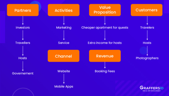
Airbnb is one of the best and popular homestay platforms, which through its property rental service allows travelers to stay at the local’s place and make the experience better for both hosts and guests. With its headquarters in San Francisco, the company operates online hospitality and online marketplace service all over the world through web and mobile applications. The members can use the services to offer homestays to tourists visiting their place.
It took a long journey of 9 years for Airbnb to generate sustainable revenue out of its product, and to turn it into the mobile application, which was initially started with a website.
Fundings of Airbnb
This homestay app connects travellers who are seeking comfortable and affordable places to stay with homeowners who have such inspiring places around the world. Airbnb has more than 4,500,000 listings around 191 countries and 65000 cities.
Company had already funding from 15 companies round to date and has raised $4.4 billion.
Why you should consider building app like Airbnb?
Applications like Airbnb and Uber are considered to be the best examples of progressive ways of human-within society interaction. Two has successfully earned unicorn status because they aided in building a “sharing economy” model. Airbnb helps travellers in getting the property for stay at cheap cost and also an opportunity to host to earn by renting their property.
There is significant growth in terms of vacation rental demands in travel industry; however, the supply has not increased to that level. Hence, there is wide scope to venture this niche by launching your startup with application like Airbnb.
Who are Airbnb Competitors to take into account?
Airbnb is not the only platform has put its foot in the game-changing travel format. Some of the companies, which can also considered while building an application like Airbnb:
1. HomeAway: It holds over 1 million global listings and offer similar services like Airbnb. There are also a few additional services that it offers like an insurance program. It operates some other sites also like TravelMob, VacationRentals and VRBO.
2. Roomorama: This app ask users to share their personal ID’s, bills and also personal pictures to ensure that the application is safe for guests.
3. FlipKey: This is a company owned by TripAdvisor and has a large base of users. They offer more than 5000 special deals every day to maintain the loyalty of users.
How Does Airbnb Works?
Airbnb has two types of users-guests and landlords.
How Does Airbnb Work for Guests?
Step 1: The user goes to the web or mobile applications, and registers in as a guest.
Step 2: Next, they complete the profile and add necessary data as ID number, profile picture and more.
Step 3: The client can choose appropriate place to live like type of space, price, location and more.
Step 4: The guests requests a stay and receives confirmation for the same.
Step 5: It is required to pay for the reservation before using the service.
Step 6: The final step is to enjoy the stay.
How does Airbnb work for hosts?
Step 1: The users are required to register as a host and confirm that they over the age of 18.
Step 2: After that, user can add the property on Airbnb. The host can add data about the accommodation like type of apartment, location and number of guests who can accommodate.
Step 3: Landlords are required to upload the real pictures of the apartment and also mention the price.
Step 4: When the guest requests a stay, discuss all the details like clean standards, quiet hours and a host can start a conversation.
Step 5: If everything is fine, the host approves the stay. However, landlord also has an opportunity to reject the stay if it is required.
Step 6: The host receives the payment in 24 hours after the check-in by guests.
Airbnb Business Model
Airbnb offers applications for two major mobile platforms i.e. iOS and Andorid, and also have a web application. Airbnb also supports smartwatches so that users can receive a notification faster and stay up-to-date without any changes.
The company generates its revenue by the booking fees that it receives:
· For every transaction, host has to pay 3% to Airbnb.
· Guest has to a pay 6-12% of the booking fee, depending upon the size of the reservation.
Airbnb Results
ü According to SimilarWeb, Airbnb is the fourth downloadable in Travel niche
ü On average, more than 2 million people chose Airbnb every day.
ü Airbnb generated around $1.26 billion in revenue in 2019, which means a growth of around 14.7%
ü The service is available in 191 countries, offering around 7 million accommodations.
ü Airbnb has more than 150 million active users across the world.
How to Build an App like Airbnb?
There are several steps to follow while building an application like Airbnb:
Step1: Make a business plan:
Coming up with an idea is not enough. You need to decide your goal, follow the business plan and stay organized.
Step2: Find the developers:
To create Airbnb clone app, you need experienced web development. You can go for building in-house team or outsource your development needs to countries like India.
Step3: Build a User-friendly Design:
The Airbnb app interface is easy-to-use and intuitive. Users tend to abandon applications that have an interactive design, so make sure to pay attention to your UI/UX design.
Step4: Integrate essential features:
Initially, you can consider building application like Airbnb with some basic features. Get the MVP version of the application, understand the needs of users and get feedback. After you have find what users are looking for, you can consider adding advanced features to make your application unique.
Step5: Test the App
Before launching an application, make sure your development team test the application carefully to eliminate the bugs.
Step 6: Update regularly
Maintain the app regularly and keep adding new and exciting features.
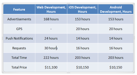
Airbnb App Features for the Guest and Their Cost

Registration:
To start using the application, the guest would be required to first register on the application. The basic model would include providing users with email and password registration. Additionally, it is important to create a “Term and Policy” screen since users should agree with the policy of use.
Login:
Make sure to add provide users with options like login with Google account, Facebook and email. Each integration takes approximately 8 hours of development. In addition to this, it is important to add functions like “Log-out” and “Forgot Password” to make sure your application is user-friendly.
Search:
It is better to add an advanced search system to option, where user can find their temporary dwelling applying various filters like the number of guests and date of the trip.
Favorites:
This feature offers users the option to add their favorite places to the list. After that, they can select the desired one from their “favorite marked” accommodations.
Profile:
An app like Airbnb has two types of users-guests and hosts. Make sure to add a feature so that both guests and hosts can edit the profile and add personal data like name, age, sex and so on.
Chats:
With chat features, guests and hosts will find it easy to communicate and discuss things like location after requesting a stay. Guests can ask for photos of the property before visiting the place. Moreover, developers can also add various statuses like reading and typing to make the application more user-friendly.
Payments:
It is good to offer various payment methods to make the process easy for the user. Also, there should be an option available to add and remove cards.
Order:
The last feature of any booking service application is requesting for a stay. The users select the house to stay in and should be able to book it if the accommodation on the required data is available.

Airbnb App Features for the Host and Their Cost

Accommodations:
Airbnb lets the landlord create an ad about their accommodation. They are required to describe all the details like the number of guests, the apartment type and more. Additionally, it is required to upload photos and videos, and set the price of listed property according to per night.
Notifications:
This function is useful to make Airbnb more convenient. For instance, as soon as the guest made a request, the owner can get an instant notification. Hosts can also be notified about booking changes, unchecked requests and more.
GPS:
Clients can look through the location where they want to stay in to find apartments near cafes and exciting sights.
Here are some advanced features that you find on Airbnb application, which you can consider adding at a later stage:
Superguest and superhost
Multiple language support
Currency Converter
Airbnb Plus, which provides high-quality and well-equipped homes.
Team and Technologies to Build an App like Airbnb
Building web and mobile application like Airbnb require the following specialists:
Business Analyst
Project Manager
2 Android Developers
2 iOS Developers
UI/UX Designer
Back-end Developers
Front-end Developers
QA Engineer
To build a mobile application like Airbnb, the developers must be skilled in trending programming languages such as Kotlin (Android) and Swift (iOS). For web development, you require software engineers who know Javascript.
Tech Stack for App like Airbnb
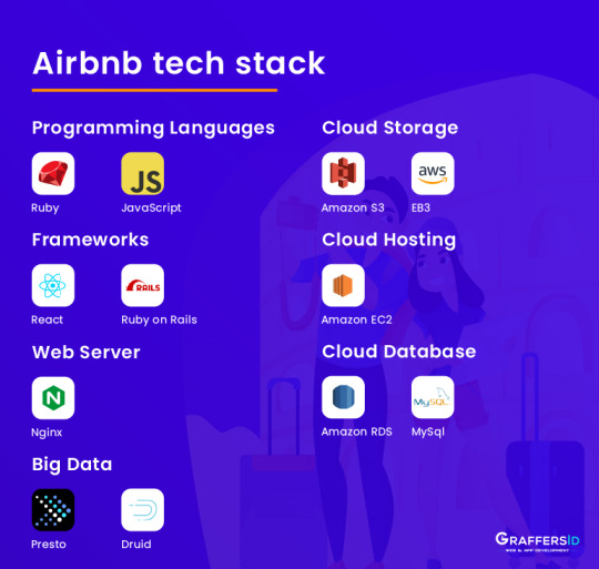
To build an app like Airbnb, you need the following tech stack:
Programming Language: Kotlin, Swift and Javascript
Front End Frameworks: React.js, Express.js and Angular
Backend Frameworks: Ruby on Rails, Node.js, Meteor.js, Django
Server-Side Technologies: Azure, OpenStack, Google Cloud, DigitalOcean
Network-level caching services: Redis, Nginx
Databases: MSSQL, MySQL, Cassandra, Azure DocumentDB, MongoDB.
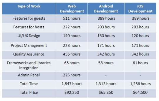
Final Estimate to Create an App like Airbnb
Considering all the factors, the final cost of building an app like Airbnb can reach approximately up to $92,350 for web version and $65,650 for mobile app (one platform)
Summing Up
Making an app like Airbnb is a different thing and scaling it to get a million users is a completely different thing. In this guide, I have explained the process, all the necessary features and technology stack that is required to build an app like Airbnb. However, if you are still struggling to start with the MVP or develop a prototype, feel free to get in touch with us.
1 note
·
View note
Text
Alien skin exposure x

#Alien skin exposure x for mac#
#Alien skin exposure x skin#
#Alien skin exposure x upgrade#
Additionally, using proprietary algorithms Exposure X handles RAW images from a wide range of popular cameras. Exposure X edits non-destructively, so a photographer’s original photo is never touched and changes can always be undone. Users can browse preset styles visually with a grid of images to see how they will look on their photos. When used as a standalone app, Exposure X is fast at photo organization, practical edits, and creative styling.Įxposure X is configurable so photographers can move tools exactly where they want them and hide ones they don’t use. It can be used as a plug-in for Photoshop and Lightroom, or as a complete photo editor on its own. Photographers can explore these visual ideas for inspiration and then quickly refine them to develop their own personalized style.Įxposure X adapts to any workflow. Exposure X covers every interesting corner of photographic history, such as funky Lo-Fi cameras, classic Kodachrome, modern portrait film, or all the way back to old-fashioned Daguerreotypes and autochromes. Each look encompasses many subtle changes that work together to inspire a specific emotion. Exposure X streamlines routine tasks and gives photographers a rich set of software tools for developing beautiful photos.Įxposure X imparts a human touch to digital photos through its carefully researched and flexible library of analog looks.
#Alien skin exposure x skin#
Raleigh, NC (December 8, 2015) – Alien Skin Software today introduced Exposure® X for OS X® and Windows®, a digital imaging app that helps photographers quickly organize, edit, and enhance their photos. New Creative Editing App for Photographers Now Available
#Alien skin exposure x for mac#
(The personal-computer versions of Snapseed and FX Photo Studio are for Mac only.)Īlien Skin Exposure 4 comes an option to emulate old-style Kodachrome slide film.Alien Skin Software Introduces Exposure X Competitors include Snapseed, CameraBag 2, and FX Photo Studio. Or people can try a host of alternatives, many of them cheaper.
#Alien skin exposure x upgrade#
Upgrades cost $99, but those who bought version 3 in November or later get the upgrade free. It works as a plug-in for Adobe Systems' Photoshop and Lightroom. Of course, all the settings are adjustable, and Exposure 4 has a better interface for managing all the options than Exposure 3, Alien Skin said. If you want to hearken back to an earlier time, Exposure 4 is a good way to do so. And it's got hundreds of new presets for styles such cyanotypes and wet-plate photography.ĭigging through the settings is like touring decades of photo history-you get far more than the usual collection of washed-out Polaroid, oversaturated Fujifilm Velvia, and antiquey sepia tones. Version 4 of the $249 software brings new abilities in reproducing defects such as light leaks or dust and scratches that film-era photographers usually strove so hard to avoid. One color-toning option for Alien Skin Exposure 4. It's not a coincidence that the software has the tagline "Taking the digital out of digital photography." The Exposure software brings a certain precision to its task, carefully emulating the look of actual film-early Kodachrome, say, or Kokak Tri-X 400 pushed a stop-for those who remember. But for the more serious out there who want to go beyond the obvious smartphone apps, Alien Skin Software plans to release Exposure 4 tomorrow. By now, the idea of applying filters to give photos a retro look is well established.
0 notes
Link
12 eye-opening ways to get more Instagram followers in 2020
12 ways to get more Instagram followers
Do you want more Instagram followers? Don’t we all? With over 1 billion monthly users, an ultra-smart algorithm, and tons of clever creative brands, getting more followers, isn’t well, nearly as easy as it used to be. But it isn’t impossible. Here at Social Tipster, we’ve uncovered some really great strategies to help you grow your account in 2020. So let’s take a look!
#1 Get crackin’ on IGTV IGTV Video is definitely, the future of Instagram. Tons of brands are now creating and sharing, video series on IGTV and it isn’t oversaturated yet, so this is a really good way to stand out. If you’re thinking about launching your first IGTV series this year, now’s the times start planning. It could do a lot for your follower count.
#2 Partner with micro-influencers Instagram influencer marketing is one of the top ways for brands to reach new audiences quickly and it’s all about the micro-influencers. Why? Well, based on our research, micro-influencers get a higher engagement rate on their Instagram posts than really big influencers. so it can mean better results for your business.
#3 Branded hashtags Use a branded hashtag to create an Instagram community. There are tons of examples of businesses creating unique branded hashtags that get picked up and shared by thousands, even millions of users.
Getting your followers in the habit of posting with your branded hashtag is an incredible way to drive more discovery on Instagram not to mention it can be a really awesome source for user-generated content. Use this amazing hashtag generator to ease your research.
How to Generate Leads With Instagram Stories in 2020
#4 Get into the related accounts suggestions on Instagram Okay so this one’s a little complicated, but getting into Instagram’s suggested accounts is a great hack to get more followers and basically what it boils down to is that the keywords in your Instagram name and the relationships that you have with other accounts are super important.
By liking, engaging, and following accounts that are similar to yours you can show up as a suggestion when someone else follows those accounts.
#5 Branded and complete Instagram profile Number five tip on ways to get more Instagram followers is to have a branded and complete Instagram profile. We have been singing the praises for a beautiful Instagram aesthetic for quite some time but it’s as important as ever.
If you want to get more Instagram followers this year you need to pay attention to what your Instagram profile looks like as a whole including your, feed, bio, profile pic, stories highlights, and more.
The reason this is so important is that when someone visits your Instagram account you really want to convert that from a visitor into a follower. You want them to hit that follow button so they need to understand what your business is about at a really quick glance by looking at your profile.
#6 Post more video content to your feed The sixth tip on ways to get more Instagram followers is to post more video content to your feed. So like we’ve mentioned, video content is blowing up on Instagram. It tends to getmore engagement than photo posts and videos take up more space on the explore page so it could be a really great way to boost your discoverability.
You don’t have to add really highly produced video content in order to take advantage of how video gets you more followers, you can use apps like pixel loop to add like an animated element to an existing photo which then saves it as a video. You could post a boomerang or again all of those show up as videos on Instagram and those are really easy ways to kind of add a bit more variety to your feed.
#7 Share more selfies I am NOT kidding, research shows that photos that include a face get an average 38 percent more engagement on Instagram.
So posting a selfie could be a great way to get your content and profile in front of a lot more people and you know what, trust me I did this last year and I got a ton of follower growth because I was just sharing my face in almost all of my photos and it got people to really feel like they were a lot more connected to me and my growth increased.
How to Increase Your Instagram Saves in 2020
#8 Explore Instagram advertising So Instagram is a really competitive marketplace for brands but there is some real opportunity to break through that noise by running great ads that target new audiences and here’s more good news. Running an Instagram advertising campaign isn’t that hard.
#9 Promote your Instagram content on other platforms Another important tip on ways to get more Instagram followers is to promote your Instagram content on other platforms.
Cross-promoting your Instagram content onto other channels like Facebook, Pinterest, and even your newsletter or your blog is a really easy way to guide your existing followers to your Instagram account, and if you take our fifth tip on the building a complete Instagram profile there’s a good chance those new visitors will hit the follow button.
How to get more visibility on Instagram in 2020
#10 Create a custom Instagram stories filter for your brand So this might sound a little wild but AR Filters on Instagram stories blew up in 2019 and we only expect this trend to continue and now that spark AR studio is in open. Better, anyone and everyone can design and create Instagram stories filters for their brand.
This is a really great way to get your name out there. When someone uses your AR filter your account name will appear at the top of their story. So everyone who watches their story will be able to see that you created the filter.
#11 Collaborate with amazing brands The power of collaborating with like-minded and complementary brands is huge it means you can introduce your profile to a new and engaged audience that you never reached before based on our experience when an Instagram user discovers your profile through a co-marketing campaign they’re way more likely to hit that follow button.
How to Set Up Instagram Gift Cards Stickers and food order button 2020
#12 Write longer captions on your posts that tell a story Instagram used to be all about the visuals, a cohesive aesthetic, high-quality photography and on-brand images were a must, and while you still need to be thinking about your grid, we’re seeing Instagram captions take center stage. In fact, we’ve spoken with a ton of influencers who have told us that writing longer captions helps them grow their accounts.
Recap Growing your account can often seem like a challenge when you follow the right techniques and strategies you can definitely get more followers. So let us know in the comments which of these tips surprised you the most or which ones have actually really worked for you thank you so much.
How to Use Instagram Tagging for More Exposure in 2020
0 notes