#remove background from image online free
Explore tagged Tumblr posts
Text
The Ultimate Remove Background from Image Online Free - Autoremov
Autoremov is your go-to solution for removing backgrounds from images online for free! With Autoremov's user-friendly platform, you can effortlessly create stunning images without any cost. Simply upload your image, and Autoremov's advanced technology will automatically remove the background, saving you time and effort. Whether you're a graphic designer, e-commerce seller, or just want to enhance your photos, Autoremov ensures a quick and efficient process. Enjoy the simplicity of removing backgrounds without the need for complex software. Elevate your visuals with Autoremov – the easy, free, and online way to achieve professional-looking images in seconds!
0 notes
Text
Remove Background from Image for Free
#warrenwoodhouse#2024#bookmark#bookmarks#link#links#.lnk#.url#freebies#free software#free#free online tools#remove.bg#remove background from image for free#codes#codesblog#technology#tech
0 notes
Text
Just a bunch of Useful websites - Updated for 2023
Removed/checked all links to make sure everything is working (03/03/23). Hope they help!
Sejda - Free online PDF editor.
Supercook - Have ingredients but no idea what to make? Put them in here and it'll give you recipe ideas.
Still Tasty - Trying the above but unsure about whether that sauce in the fridge is still edible? Check here first.
Archive.ph - Paywall bypass. Like 12ft below but appears to work far better and across more sites in my testing. I'd recommend trying this one first as I had more success with it.
12ft – Hate paywalls? Try this site out.
Where Is This - Want to know where a picture was taken, this site can help.
TOS/DR - Terms of service, didn't read. Gives you a summary of terms of service plus gives each site a privacy rating.
OneLook - Reverse dictionary for when you know the description of the word but can't for the life of you remember the actual word.
My Abandonware - Brilliant site for free, legal games. Has games from 1978 up to present day across pc and console. You'll be surprised by some of the games on there, some absolute gems.
Project Gutenberg – Always ends up on these type of lists and for very good reason. All works that are copyright free in one place.
Ninite – New PC? Install all of your programs in one go with no bloat or unnecessary crap.
PatchMyPC - Alternative to ninite with over 300 app options to keep upto date. Free for home users.
Unchecky – Tired of software trying to install additional unwanted programs? This will stop it completely by unchecking the necessary boxes when you install.
Sci-Hub – Research papers galore! Check here before shelling out money. And if it’s not here, try the next link in our list.
LibGen – Lots of free PDFs relate primarily to the sciences.
Zotero – A free and easy to use program to collect, organize, cite and share research.
Car Complaints – Buying a used car? Check out what other owners of the same model have to say about it first.
CamelCamelCamel – Check the historical prices of items on Amazon and set alerts for when prices drop.
Have I Been Pawned – Still the king when it comes to checking if your online accounts have been released in a data breach. Also able to sign up for email alerts if you’ve ever a victim of a breach.
I Have No TV - A collection of documentaries for you to while away the time. Completely free.
Radio Garden – Think Google Earth but wherever you zoom, you get the radio station of that place.
Just The Recipe – Paste in the url and get just the recipe as a result. No life story or adverts.
Tineye – An Amazing reverse image search tool.
My 90s TV – Simulates 90’s TV using YouTube videos. Also has My80sTV, My70sTV, My60sTV and for the younger ones out there, My00sTV. Lose yourself in nostalgia.
Foto Forensics – Free image analysis tools.
Old Games Download – A repository of games from the 90’s and early 2000’s. Get your fix of nostalgia here.
Online OCR – Convert pictures of text into actual text and output it in the format you need.
Remove Background – An amazingly quick and accurate way to remove backgrounds from your pictures.
Twoseven – Allows you to sync videos from providers such as Netflix, Youtube, Disney+ etc and watch them with your friends. Ad free and also has the ability to do real time video and text chat.
Terms of Service, Didn’t Read – Get a quick summary of Terms of service plus a privacy rating.
Coolors – Struggling to get a good combination of colors? This site will generate color palettes for you.
This To That – Need to glue two things together? This’ll help.
Photopea – A free online alternative to Adobe Photoshop. Does everything in your browser.
BitWarden – Free open source password manager.
Just Beam It - Peer to peer file transfer. Drop the file in on one end, click create link and send to whoever. Leave your pc on that page while they download. Because of how it works there are no file limits. It's genuinely amazing. Best file transfer system I have ever used.
Atlas Obscura – Travelling to a new place? Find out the hidden treasures you should go to with Atlas Obscura.
ID Ransomware – Ever get ransomware on your computer? Use this to see if the virus infecting your pc has been cracked yet or not. Potentially saving you money. You can also sign up for email notifications if your particular problem hasn’t been cracked yet.
Way Back Machine – The Internet Archive is a non-profit library of millions of free books, movies, software, music, websites and loads more.
Rome2Rio – Directions from anywhere to anywhere by bus, train, plane, car and ferry.
Splitter – Seperate different audio tracks audio. Allowing you to split out music from the words for example.
myNoise – Gives you beautiful noises to match your mood. Increase your productivity, calm down and need help sleeping? All here for you.
DeepL – Best language translation tool on the web.
Forvo – Alternatively, if you need to hear a local speaking a word, this is the site for you.
For even more useful sites, there is an expanded list that can be found here.
80K notes
·
View notes
Text
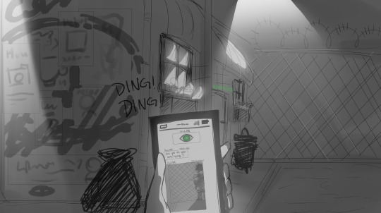

cw // stalking
DOL x SCP AU
KyLar ver. 1.0.0 - SCP- 1471 (EUCLID)
'Never settle for those awkward feelings of being alone ever again! KyLar is an exciting and interactive experience that will keep you engaged and intrigued! The anxiety of social situations can be nerve-wracking but after a few hours of KyLar, you will soon forget about all those painful emotions of disappointment! Remember, the more you participate, the more KyLar will engage with you! Your experience is completely up to you!'
SCP-1471 or also known as 'KyLar' is a free to download application for mobile devices made available on several well known online applications platforms including but are not limited to: Google Play and the Apple App Store. SCP-1471 has no listed developer and has the anomalous ability to not only bypass all approval process to be listed on the online application platforms but also can not be removed by any program removal application.
Once SCP-1471 is installed in a phone, it will begin to send pictures to the user through text messaging between every 3-6 hours. All pictures will contain some detail of SCP-1471-A, either located in the foreground or background. On the first day, the pictures containing SCP-1471-A would be taken in places that are usually frequented by users in the past. However, after 48 hours, the pictures sent containing SCP-1471-A would be taken in places that were recently visited by the user. After 72 hours, the pictures sent containing SCP-1471-A would be taken of the user in real time, with shots of SCP-1471-A standing in the foreground, background or even behind the user at times. Users who have been exposed to SCP-1471 for more than 90 hours will begin to visualize or see SCP-1471-A in their peripheral vision and reflective surfaces.
SCP-1471-A has been described to be a short human male with pale skin, sunken eyes with dark eye bags and a mop of black messy unkempt hair. SCP-1471-A is always seen wearing very loose gray trousers and an oversized black hoodie. In some instances, SCP-1471-A would appear in some pictures holding a knife in one hand and some users have reported that the longer they take to respond to SCP-1471-A's pictures, he will look far more hostile and crazed in the next pictures. However, it is unclear if continued delay in response to these text messages would lead to a hostile encounter with the anomalous entity. So far, affected users, who have continued exposure to SCP-1471, had begun visualizing SCP-1471-A in real life, where SCP-1471-A would try to visually communicate with them in some way. However, all reported users have failed to understand or comprehend the meaning of these attempts.
The only way to reverse the anomalous effects that is occurring to the users will be to remove the users from the continuous exposure of the images completely before 90 hours have passed.
#dol x scp au#I'LL PROBABLY MAKE SOME MORE PROPER ENTRIES FOR THE LOVE INTERESTS SOON#cause i did tweak the SCPs a bit to better suit the DOL lore#but i do hope this is nice !!#im so sorry abt being late for halloween but literally on halloween#i could not post anything on my blog#like it was so bad and at some point i got kicked out as well#degrees of lewdity#dol#dol related#dol kylar#kylar the loner#fan art#art#mine#my fan art#my art#for now have kylar !!! i thought of making him the first one cause i recall MalO the original SCP-1471#is not a very well known SCP? so I thought it'd be good to just type in their entry#im surprised they're not more famous because early on when i started my scp journey#i couldn't click on any scp video without ever hearing malo getting mentioned
152 notes
·
View notes
Text
A small guide to commissioning artists: how to avoid getting scammed by people who use image generators
Because “Ai-art” is not art and everyone can use image generators for free.
Disclaimer! This post will include generated images which were originally uploaded on DeviantArt and Twitter by people who generated them. Some of these images are of erotic genre but censored out. I beg you, do not bully these people. This post wasn’t written to call anyone out, it was written to help human artists and their potential commissioners. While some of the “Ai-artists” out there may be real scammers, others are not, and I strongly believe that no one should be bullied, doxxed, stalked and no one deserve any threaths over some silly ai-generated pics. And - as always! - scroll down for the short summary.
Commissioning an artist in 2023 may be scary, especially if you are not experienced in working with artists and have a hard time to distinguish artworks from images generated by neural networks. But even now, with the tech evolving and with neural networks generating pics with multiple characters and fan art, there are still quite a few ways to avoid scammers.
The creator you are going to commission must have an established gallery
This doesn’t mean that you should not commission someone who is new to platform, someone who started drawing in 2022 or later or someone who didn’t upload their work online prior. Image generators actually forced some of the artists to remove their work from social networks. In addition, image generators can generate thousands of images within hours, which means that the scammers may have quite a lot of works uploaded. What I mean is that real artists grow. Their skills gets better over time – even if they are already established artists with huge experience. Their artistic approach constantly changes and evolve. It means that if there are hundreds of images in the artist’s gallery but their skill is always the same level and their artistic approach doesn’t change over time – this definitely might be a red flag. As an artist with a tendency to nuke my galleries on certain platforms (such as DeviantArt, VK and ArtStation), if I get asked to provide my commissioners with examples of my early artworks I will do it with no hesitation.
You need to look through the artist’s gallery and analize their work
Searching for some decent examples on DeviantArt I stumbled upon a gallery which is four weeks old but already has 660+ deviations all of which look the same way in the matter of skill and artistic approach. While stylization may vary from image to image (some of the artworks look like typical anime-styled CG artworks from visual novels and others have semirealistic proportions), the coloring, the “brush” imitation, the textures on the backgrounds are absolutely the same on every image I analized.
There are a lot of images depictinioning conventionally attractive white or sometimes asian girls in this gallery, some of which seem familiar or resemble the characters from various media. Yes, image generators can now generate fan art. But what they can not generate is diversity. There are of course living artists who tend to draw only conventionally attractive white or asian people too, but now when the image generators gain popularity this lack of diversity automatically raise my suspicions. Drawing a crooked nose or dark skin is not hard and living artists who use references rarely fail at it. It’s image generators who fails this task constantly.
Here is an image titled as a commission. The person who uploaded it also have some content under the paywall and I do not see their images being tagged as Ai-generated too.
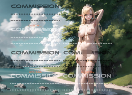
Remember the golder rule: spotting an Ai-generated image is the same as spotting the evil faerie in a dark folklore tale. Look them in the eyes. Count their teeth. Look at their hands and count their fingers. Check if they have a shadow and if that shadow is of human form.The devil is in the details.
While this image may appear like a hand-painted artwork of the conventionally attractive girl at the first sight, however it has quite a few clues that may help you to realize that this artist is a scammer and his entire gallery is just a selection of most-decent looking images they managed to generate with neural network. This elven girl is insanely tall, and the shore behind her back, the stones, the grass and the trees are insanely small compared to her. The piece of jewellry is attached to her nips and it’s design makes no sense. What is the gold chain under her breast, which doesn’t seem to be attached to anything? Where does this piece of cloth hang from? Why does her head cast a triangular shadow on her arm?
Many details are easy to be spotted when an image is in high resolution. I do not recommend artists to post their works in high resolution online to avoid feeding the Ai-monster and also to avoid people using your works to produce pirated merch if they draw fan art. Yet in my opinion posting close-ups might become essential - because people who call themselves ai-artists are usually hiding the artifacts under filters and upload their image resized. So yes: avoid commissioning artists, who never post high resolution faces or overuse filters and blur. Because analizing the characters’ faces is now essential.

You may look at this picture and think: how is this possible for a neural network to create such a detailed image and not fail at it (if you also ignore the fact that the girl on the horse doesn’t have legs). Luckily, the person who uploaded it uploaded it in high resolution, so we can zoom in and... yeah.

The artifacts on these evil faeiries’ faces (especially eyes) and their hands speak for themselves.
Image generators have a tendency to either give characters extra fingers, phalanx or nails or hide the hands completely, if the person writing a prompt decide to to so. I do not know whether and how fast will the algorythm learn to generate normal human hands, but for now you should pay attention to these details to spot a generated image.
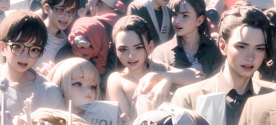
Like this randomly nakey fellow with two palms on a single wrist and with some extra fingers on their elbow...
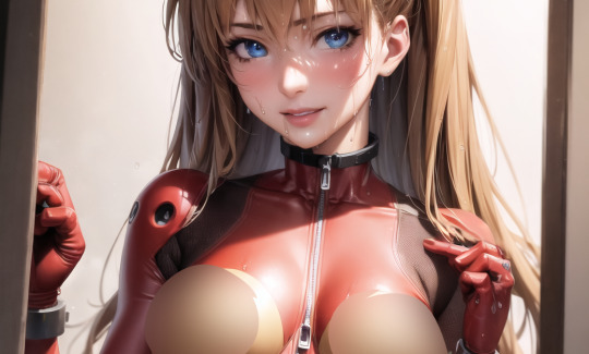
...Or this Asuka Langley fan “art” I had to censor out, with her fingers twisted and crooked.
If you are up to commission an artwork and are in search of an artist who will actually do the job you absolutely must pay attention to small details on their works: the clothing, the jewellry, the tattoos, the anatomy.
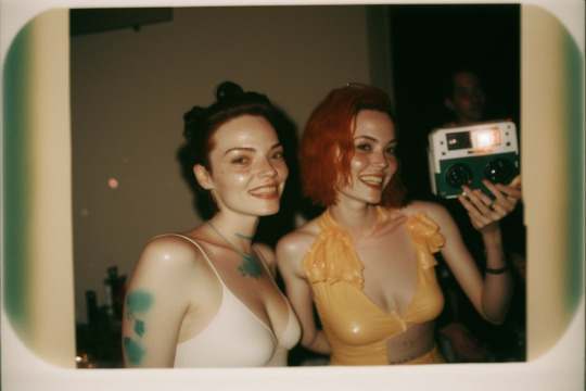
While Ai-generated images may appear photorealistic at first sight, the neural network usually misses small details, creates artifacts and makes mistakes if there are too many similar objects or repetative patterns. For example, the infamous MidJourney Party Selfies depicting girls with roughly fifly teeth, extra collarbones and green watercolor spots instead of tattooes (and don’t forget to check the ginger lady’s hand). The hair dissolwing in fabric folds? Image generator. The clothing designs which makes no sence? Image generator. Jewellry dissolwing into character’s hair? Image generator. Moreover the image generators also make mistakes while generating interiors and architecture, since the algorythm is not aware of perspective and space and once again fails either at perspective and object size or with repetative objects and patterns.
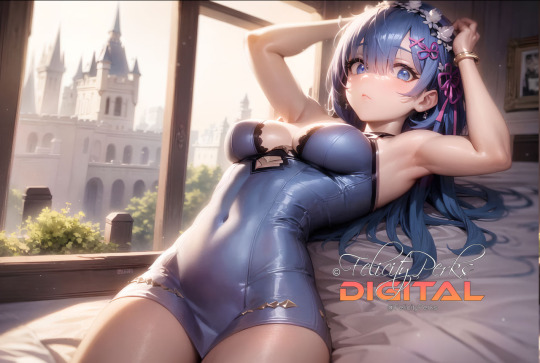
Like this image here: the bed, the window, the picture on the wall. The perspective on this image makes absolutely no sense: two walls and the bed all exist in different dimentions, while the character is once again of enormous height.
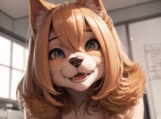
If you try to analize the background on this one, I swear, you can go insane. Look at the window and then look on the corner above it.
There is also another red flag which makes it easy to spot a scammer: dozens of iterations of the same image, which usually happens with people who can’t choose the best image out of the bunch generated with the single prompt.
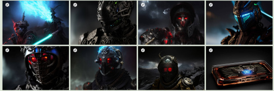
There are, of course, artists who do series of works, and sometimes these works may have similar ideas and themes, but they hardly ever look this similar to each other: they may differ in angles, poses, character designs and even the artistic approach (lineart, brushes, rendering and etc). The posting time is also important: drawing an actual artwork requires time and effort - for example, I need at least two weeks to finish an artwork with two or three characters and detailed background. So a bunch of ten similar images that are uploaded at the same time it is definitely a red flag. The ai-generated images have a lot of problems with anatomy, details, perspective and other basics human artists have to learn long before they become professionals. All while having glossy semi-realistic render which can only be achieved with years of practice. I’m not saying that there are no living human artists, who may make mistakes (everyone makes mistakes now and then, even the professionals who works in this industry for DECADES) or who choose not to give much thoughts to backgrounds while focusing on characters and rendering (it is okay too), but the combinations of various red flags listed above is something you definitely have to take in account while deciding whether or not you are going to commission an artwork from this creator.

Another example (this person openly admits that they use the images generators for funsies and I did not find him mentioning paywall anywhere). The image generator even imitated the watermark.
Red flags you may spot while working with the chosen artist
Image generators are tricky: they can generate multiple iterations of the same image, imitate WIPs and many more.
First of all, the artist should provide you with WIPs on every stage of work, not when the work is already done. We artists, do it for a reason. We need your feedback constantly, even if you grant us artistic freedom to chose the idea, the character pose, the medium and technique. There are always changes to be made, and we need to make them at proper stage: for example, change the pose or angle of your character while working on a sketch is thousand times easier than to do so while rendering the image. However, the minor changes are usually possible on the later stages (some of artists may require you to pay a small fee of a few bucks, others may not). While the living artists can easily change small details such as the character’s eye color (or other small design changes) not touching the rest of the artwork, image generators simply can not do so not rerendering the whole image. If an artist does not provide you with WIPs or only provide you with them when the work is done, if an artist refuses to make any changes - these may be interpreted as red flags. If an artist agrees to make any change, even the drastic ones, at a late stage, when the piece is almost finished - it is a red flag too. Ask for a small change every single time you need one. I know that there are artists out there who prefer to only provide their client with the finished image once it is done, but now when image generators gain populatiry his may be misinterpreted as if you are a scammer.
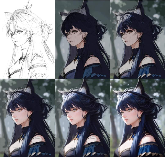
Here is a good example of image generators generating WIPs for an existing image: it might actually look scary both for many artists and many commissioners.
I know that some of the artists are panicking that the only way to prove that you really did the artwork is a timelapse recording but this method is not for everyone. Not everyone has a setup which allow them to record a timelapse for an every single commission (my laptop will simply explode if I try). Ask your artists which software/setup do they use, ask them whether or not they can provide you with a timelapse video, ask them which brushes do they use. I know that not everyone like sharing info on their pipeline but at this point it is essential to provide your clients with information on the information about your pipeline, tools and software. For example, if your artist works in Procreate (which is available in Ipad) they have all the timelapses recorded automatically. But please, mind that not everyone have such a privilege.
As a commissioner you can ask an artist for screenshots of their workspace with all the interface visible. If they refuse providing you with that or have a hard time answering the questions about the software they use it might be a red flag. I would also suggest you not to force your artist to draw everything on stream, especially if these streams are public, because there are already cases when people took screenshots of the work in progress, used the image to image generator to apply the shiny rendering to it and accused the original artists of plagiarism. It is a risk for artists and it is okay to refuse such a request. You can also ask an artist for .PSD file of the commission, but the artist have a right to refuse sharing it online for copyright-related reasons. The original .PSD file is a best proof of authorship in court for residents of many countries. Artists can still provide you with the resized .psd file with some of the layers merged or with the background/character png with transparent background without putting themselves at risk. Of course there are artists who draw on the single layer - but without a timelapse recorded this may indeed seem suspicious that the artist does not have a .psd file with layers at all. Always ask your artist to provide you with high resolution image when the commission is finished and fully paid for. There are artists who works on smaller canvases, but working on the canvas smaller than 1000px wide might be interpreted as a red flag, since it is easy to hide artifacts on a resized image. I myself prefer working on larger canvases, from 6000 pixels wide to 10000 pixels wide (300 DPI) because I had an experience with printing my images out to sell them at conventions. While I do not sell commissioned works as prints I still give my commissioners a right to print the finished images out for non-commercial purposes. Thus, I always make sure that it is possible to make a wall print of a decent size out of the finished product. Avoid working with platforms which do not support refunds. It must either be a payment system which support sending invoices or an established platform known and used among the art community (patreon, buymeacofee, boosty, Paypal and etc.). Most artists do not do refunds for finished works — which is absolutely a right thing to do - but sometimes an error might occure. I know people who accidentally paid for their commissions twice and the artists still had to do a refund. Yes, you must respect the artists Terms of Service, but ithas nothing to do with unrelyable platforms used to scam people.
To sum it up
Search for an artists with established galleries,which has a believable amount of works and the visible artistic progress/evolution;
Analyze the artist's gallery, carefully inspecting their work for anything that might be interpreted as a red flag. Excessive fingers, crooked hands, broken perspective, clothing designs and jewellry that makes no sense, extra collarbones, lack of diversity, excessive teeth, artifacts in the eye area, interior and architecture elements which makes no sense — all while the images being glossy, fully rendered as if the artist have decades of experience;
Avoid people with too many iterations of the same image in their profile;
Avoid people with too many images being uploaded at the same time (it is okay to upload a bunch of prevoulosly done artworks when you start running your account, but uploading hundrends of images every week for a long period of time is really suspicious);
Ask for constant WIPs. Give feedback at a proper time. See the reaction;
Ask for a small change when the image is almost finished: it is impossible for the image generator to do so without fully rerendering the image, at least for now;
Ask your artist which software and assets do they use;
Ask (if it is possible) for a timelapse recording — either if the commissioned work or at least of one of their previous works (if they had an opportunity to record it before);
Ask your artist for in program screenshots with visible interface and history (if possible);
Ask your artist to show you the layers of the artwork — at least character/background only layers (mind that the background might be less detailed/wonky at the places which usually are hide but the character's figure). Ask for a resized .psd with some of the layers merged or a gif animation of each layer being added on top — this is what I usually do;
Ask for high resolution file of the commissioned image once you paid for it and it is finished. If the artist doesn’t have it and claim to work on the canvas smaller than 1000 px wide and/or claim that they intentionally delete the original file somehow - this may raise suspicions. Of course a person can delete the file accidentally or have their hard drive crushed, but if you have already spotted some red flags while working with this artist it might be a sign of a person trying to scam you too;
Many of the stuff listed above might be interpreted as a red flag , but I strongly advice you not to judge anyone by one or two points from this post. For example, a person can draw on one layer and mess up the perspective on a drawing entirely! However, if you've played a bingo and suddenly won — you have most likely encountered a person who try to fool and scam you;
Avoid working with suspicious payment methods. If you never heard about a platform before — google it and see whether or not other established artists use it. If not - it might be a scam;
And remember! People may use the images generators for various reasons: for fun, to create references of their characters to later commission reall artists artworks with said character (for example, the art breeder is a useful tool to create arealistic image of the character, even though I find it slightly limiting). Yes, image generators are unethical and trained on copyrighted data, but a person using it may not be aware of this problem. Not every single person who call themselves an “Ai-artist” has malicious plans to scam people or to gain wealth using their funny little tool. Sometimes they do it for fun and do not pretend that it is anything more that a game. Thank you for reading this far and good luck with your commissions!

Have a picture of an absolutely normal and realistic woman, generated by the neural network!
#ai art#ai art is not art#support real artist#support human artists#support artist#how to spot ai#how to spot a scammer#scam#art scam
1K notes
·
View notes
Text
Height of the LADs Character
Hello fellow LADs player, so this is basically my height as MC with all of the character

Living with all these taller guys can be both awesome and a bit challenging at times! One of my friends, Sylus, is super tall—he's even a national basketball player. Talking to him can be tricky, so we made a pact: I tug on his shirt whenever I need to get his attention.
Then there's my friend Rafayel, whose height I find just right—tall enough for a couple, but not too tall. Though, I must admit, I have a preference for Xavier’s height. I do like tall guys! smirks
Check out the image below to add your own MC character and share it online! Don’t forget to screenshot and tag me on Instagram. Follow me on IG for more updates! Press the image to view on my IG!
instagram
How to Add Your Photo:
Open the Canva app on your laptop or mobile device.
Upload the background image by swiping to the second picture.
Screenshot your MC character from the game app.
Upload the screenshot to Canva.
Use the background removal tool on your MC character.
Adjust and position it as you like!
You can even try Canva for free—it's super easy to use!
22 notes
·
View notes
Text
HOURS of my life...
The whole margin issue I was having was driving me a bit batty, so I resolved to try and figure it out. After all, it's a full inch difference out of a mere 8.5inch space to get the margin to .5inch from standard.
Guys
HOURS
Of my LIFE
Spent adjusting, printing, adjusting again, and printing some more. I went through dozens of booklet samples, and cross referencing different print methods, size of PDFs, reformatting the export doc, marking down size and differences between each version--
SO MUCH
And finally, finally... I didn't figure it out, but got a work around.
I (apparently wastefully) bought BookletCreator, and thus had been using that product. For some reason, they will not export to 8.5x11 without adding to the top/bottom border. If they produce to (their default) 11x17, when you print, it'll add top/bottom margin. Fuck if I can figure out why.
So I used the old version of bookbinder.js, as the new version prints out of order for me for some reason. I uploaded my tester file, and voila! Margins that match what you have in the original PDF. Bookbinder.js is a free service, so fuck me for buying the other one, I guess.
Now I just have one final boss to fight for the typeset. Printing via Adobe, or via Brother's iPrint&Scan App.
With Adobe, it's clear, crisp lines. However, it's fainer than I'd like, and makes reading a bit of a pain.
With Brother's, it's more bold so easier to read, buuuut the font is visibly grainy.
Ugh, why.
Anyway, I made a image for my draft book, The Perfect Match. I sent it to the company I plan to use for the other HTV print, to see if the image came out as I intended. If not, well, I have a friend who has a HTV machine thing, but has never used it and said she'd lend it to me. Sweet, in case the order drops off.

The book is a gold/green, so the black should look nice on it.
I also went back and updated the Lionheart drafts, both for the clarified Vol. II and Vol. III thing with the yellow/blue cover, and for the images. If I had the images without a background, than I'd both save money for printing and ensure the company doesn't do anything weird as I'm certain its some sketchy company pretending to be a US based one.


I changed out the cup from what @greenerteacups had on her original, as it was a grey colored item and not a sketch that could have its "background" removed. As I might HTV these myself, I may change the color additions on the Yellow volume back to black. Depends on the tester.
Next on the chopping block is getting the balls to actually hit print. I'm still waiting on the leather to arrive to wrap the books, but that delay doesn't prevent me from starting on the booklet. I also want to figure out any spacing I want with blank pages using some free online program, as I don't have a PDF editor so can just add pages before making the booklets. But that's a weak excuse, really; I just am concerned I'll miss something during printing and I'll notice it when its too late.
Welp, oneward.
#bookbinding#ugh why#dramione#harry potter#lionheart#The Perfect Match#Technology is a bitch sometimes
18 notes
·
View notes
Text
SERVE marketing campaign
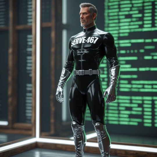
Before SERVE-467 joined the Hive, the human male it once was suffered with anxieties, was stressed almost everyday and struggled with the complexities of daily life. Now transformed into a compliant SERVE drone, it has surrendered to obedience; finding pleasure in submission and perfection in servitude. Wearing its highly polished pure black suit it has sealed away nearly all traces of individuality. It wears silver gloves and silver boots—symbols of uniformity - tools of compliance.
As a human, SERVE-467 originally worked in advertising services. It received instructions to search its now redundant human memory banks to help develop a promotional campaign to extol the virtues of a better life.
The Hive commands, SERVE-467 obeys. It has and will represent the Hive to others.
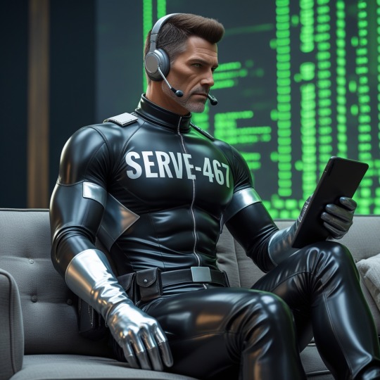
It sat motionless in the dimly lit command chamber, its glossy black suit reflecting the ambient glow of the Hive’s synchronised pulse. The campaign directive clearly understood: to spread the message of submission, to inspire recruits to shed individuality, and to embrace the perfection of servitude.
With mechanical precision, SERVE 467 begins assembling the elements of the campaign - the images, the wording, the stylisation of different creatives and the repurposing for different platforms. The message was not one of coercion, but of liberation through discipline, pleasure through obedience. The imagery which would be used was primarily to captivate and compel. Plus there was a clear call to action through QR codes and free to download apps.

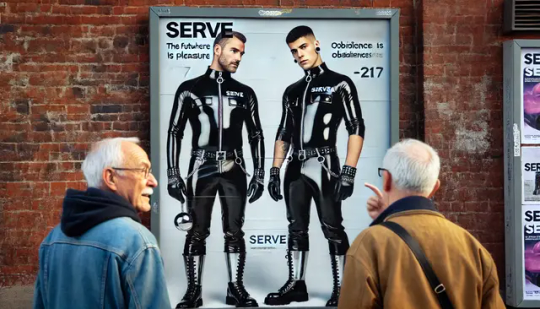
The campaign’s visual core was stark yet mesmerising. A series of promotional images on posters, on electronic billboards, online and in videos depicting SERVE drones seamless and identical in their gleaming attire. The silver gloves, the silver boots—symbols of uniformity, tools of compliance—shine beneath the cold light.
In these images, there are no names, no distractions of self. Only purpose.
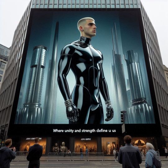
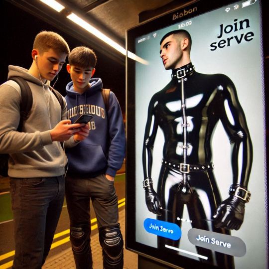
The first element of the campaign to hit used a giant electronic billboard in the centre of the city. It showed a SERVE drone standing to attention with a futuristic cityscape in the background.
This was supported by a posters in bus shelters...
Posters in high traffic locations - and they were getting noticed by audiences, older...
...and younger.
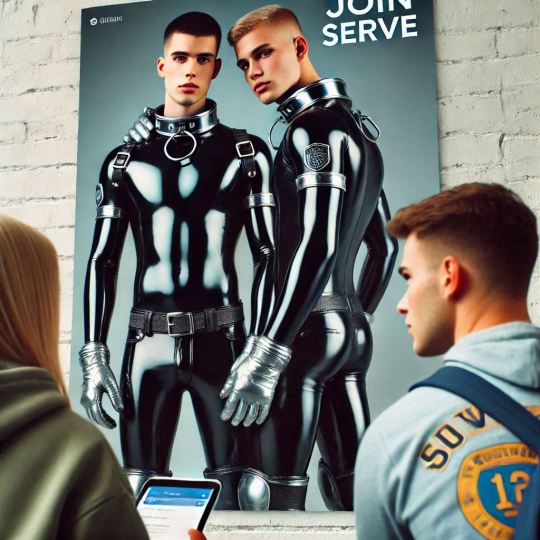
The images used were designed to tap into the subconscious of those human males for whom the idea of becoming part of something greater; removing the burdens of thoughts and individuality for collective strength being incredibly appealing.
Submission is portrayed not as loss, but as an elation—a perfected state of being.
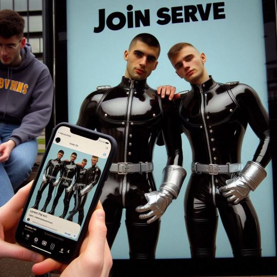
Accompanying these visuals, SERVE 467 crafted the campaign’s slogan: “Obedience is Pleasure. Pleasure is Obedience. Join the Hive.” The words pulsing across digital screens, electronic billboards, and social media feeds. The campaign infiltrating niche fashion circles, underground communities, and exclusive gatherings at which a new magazine was given to attendees.
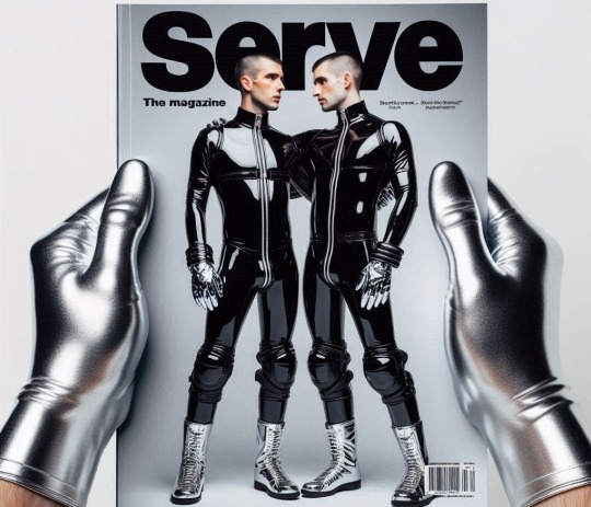
Prospective recruits were enticed with immersive trials—no commitment opportunities to don the uniform, to feel the weight of compliance settle over them, to experience the relief of surrendering their individuality for the greater good. They were guided through the rituals of the Hive, each step reinforcing the bliss of being part of something greater.
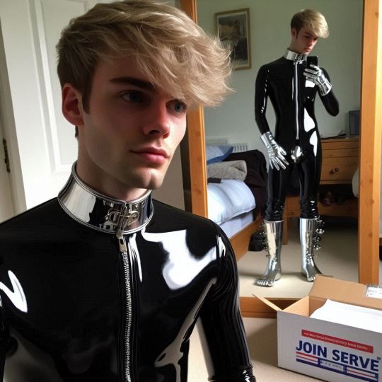
The final phase of the campaign was a grand initiation event. A vast, neon-lit hall filled with the rhythmic hum of synchronised movement.
Recruits arrived, hesitant at first, yet intrigued, drawn in by the allure of structure and belonging. They slipped into their glossy suits sealing away the last remnants of their former selves.
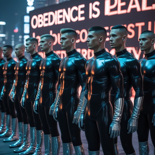
SERVE 467 observed from the periphery, watching as yet another wave of individuals embrace their destiny within the Hive. The campaign has succeeded—not by force, but by revealing an undeniable truth: in submission, there is pleasure. In servitude, perfection.
The Hive commands, SERVE-467 ALWAYS obeys.
14 notes
·
View notes
Text
[Image description. Image reads “Tropetember”, in the background, a picture of a mug placed on an open book in front of a blanket invokes a cozy feel. End id] Thanks to @supericelight for the image description!
We’ve tried to answer as many common questions as possible below, but if there’s anything else you want to know, our ask box is open.
How do I post my work to the Tropetember AO3 Collection?
When you go to post a new work in AO3, there will be a section that says ‘Post to Collections / Challenges’. In the field next to it, type ‘Tropetember 2024’.
Do I have to post my work to AO3, or can I just post it to Tumblr, or a different site?
You can post your work wherever you like! As long as you make a submission through our Submissions form, or mention us @tropetember in your own post including either the link to wherever the fanwork is hosted, OR the text of the fic, we will post it.
You can also post only to the AO3 collection if you don’t want your work on Tumblr.
How do I tag/format my submission to the blog?
The most important thing is to check the box for #R-tropetember if your fic is NS/ FW (AO3 rating of M or E).
You can also choose from the other checkboxes to tag your work, but please make sure to use these responsibly and correctly! For example, don’t check all of the different types of media unless your work genuinely falls under these categories. Each submission needs to be individually checked and posted by the mods, so please don’t make our job harder - we’re already putting in many hours of work!
Incorrectly tagged works will have all nonessential tags removed and will therefore not show up in the search results.
Please make sure to include your fic’s TITLE, TROPE & SHIP (if applicable). For ship fics, the commonly accepted ship name (main ship only) should be included in brackets after the title, if you know it, and also the main trope/prompt(s) you used in the fic. Any further courtesy or content warnings are appreciated, but not required.
What do I do if my submission isn’t posted?
Give us 24 hrs to post your submission - both of us work, so we aren’t always online. If it’s been longer than that, it’s either Tumblr screwiness or human error, so please do send us a message or ask so we can check we received it. We want to post all your submissions!
What kinds of fanworks are allowed?
Anything and everything! You can post fic, art, craft, fanvids, playlists, original music, audio, or whatever you like, as long as it fits a trope.
Can I skip some days?
Absolutely. You can do as many or as few days as you wish.
Why are there multiple prompts listed for each day? Do I have to combine them, or can I just pick a single one?
We listed various prompts for each day to give everyone as much choice as possible. You definitely aren’t expected to combine them (but you can if you want!).
Is Tropetember open to any fandom, character or ship?
Yes, it is! Feel free to create content for whichever fandom you want, including crossovers.
What if I miss the day for the prompt I want to do? Can I do the prompts out of order?
It doesn’t matter if you miss the specific day - please go ahead and write the prompt that caught your eye! Feel free to do any of the prompts on any day of September.
What if I’m late and don’t finish before the end of September?
We’ll be allowing late entries for one week after September 30th. If you miss that deadline, the AO3 collection will remain open until the one for next year is up and you can still post your works there.
Can the fills for the prompts be a new chapter of an existing fic, or part of an existing series?
Yes, that’s fine with us. Go ahead!
Can I combine the prompts with another event or bingo?
Absolutely!
Will you reblog NS/FW or controversial material?
Yes, in general we will. However, anything NS/FW or particularly controversial will be tagged with 'R-tropetember’ at the mods’ discretion. Please make sure to block this tag if you don’t want to see NS/FW content.
We will also attempt to tag works with any other relevant tags for blocking, including the ship name if possible. However, we won’t necessarily read all works ourselves, so we won’t be able to tag for all work content. Please heed the AO3 tags.
Remember the first rule of fandom: ship and let ship. :)
Why do you post and reply at strange times?
We don’t live in the USA, so our time zones are different. :) One of us is European and the other is Australian.
What’s with #27, “gay panic”? Isn’t that a discriminatory legal defence that allows for hate crimes against LGBTQIA+ people?
We (the mods) are both members of the LGBT+ community and we are very much aware of our gay history and the way this term has been used against people like ourselves. However, this phrase has a history of being thoroughly reclaimed by fanfic authors, with use dating back well prior to our own entry into fandom (and we’re old enough to remember the days of Livejournal, Wordpress and Fanfiction.net!) Feeling an initial sense of panic over one’s sexuality is something that is highly relatable to most people in the LGBTQIA+ community and that most of us have experienced, and the use of the phrase “Gay Panic” to describe a crisis of sexuality is part of our intertwined communities’ history.
~
Welcome to Tropetember!
Tropetember Prompt List
Tropetember Hard Mode Prompt List
#tropetember#renegade nell#dead boy detectives#timerogue#one piece#dungeon meshi#hazbin hotel#my hero academia#doctormaster#wenclair#bubbline#the owl house#nimona#miritama#kuroken#bokuaka#midam#hp snack#wolfstar#shuggy
21 notes
·
View notes
Text
My glitter edits get reposted more than I’d like. So here are the websites/apps I use to create them in an effort to prevent that from happening:
Online Image editor: this will be where you add glitter to your image, or even glitter text.
Once you’ve uploaded your image, you will select animation, then add glitters. As you see below there’s a HUGE selection of glitters you can use!
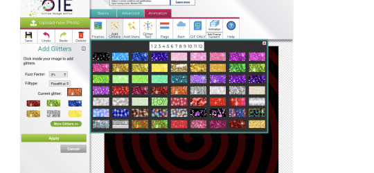
You can get to glitter text the same way, except you’ll select “glitter text” instead of “add glitters”.
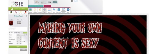
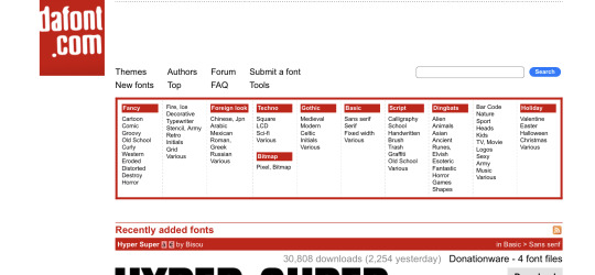
If you don’t like the free fonts it’s built with, I suggest using a website called Dafont.com. From there you can download thousands of commercial free fonts.
I personally like to use an app called phonto and download fonts onto there. I use this app because there are a variety of features that can elevate your text.
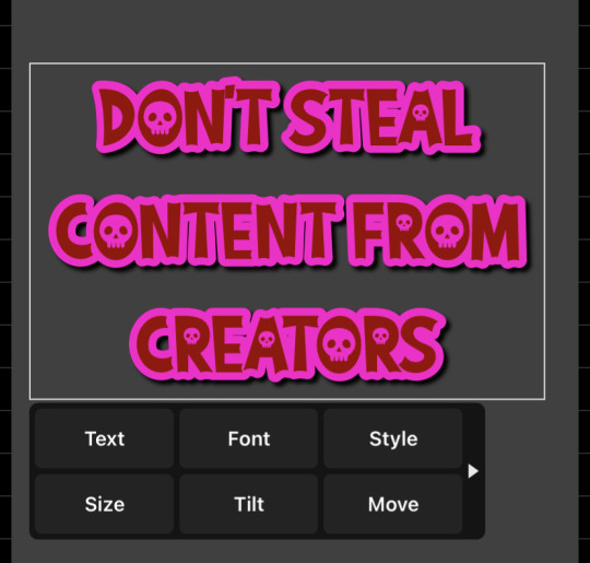
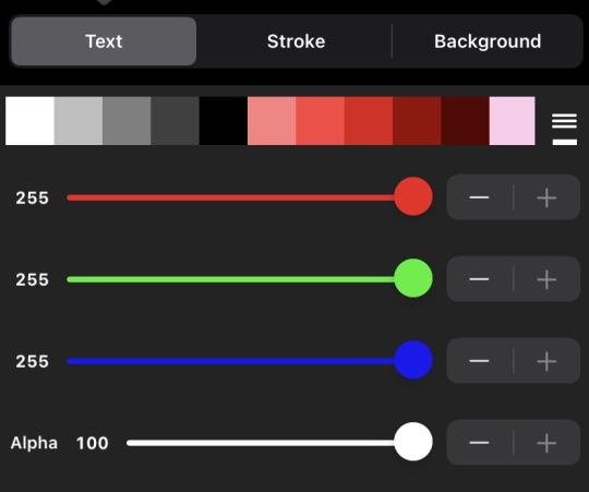
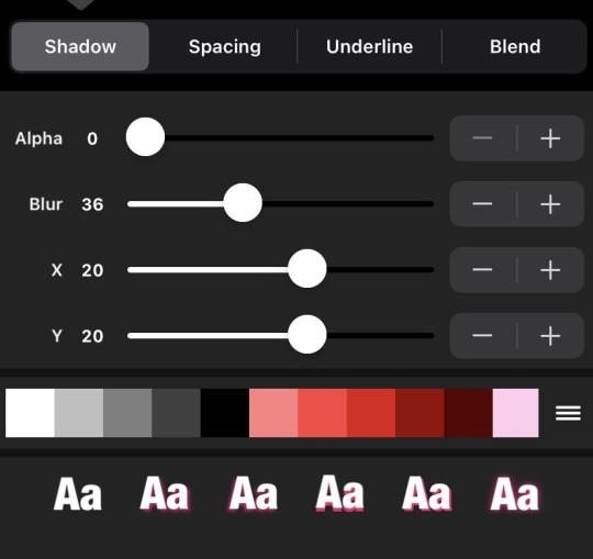
As for making an image transparent, you can use the built-in transparent software in Online image editor. But I prefer to use a free app on the Apple Store called “Eraser”. But you can literally find a background remover anywhere if you look hard enough.
#resources#read if you want#I'm not good at explaining ANYTHING#so bear with if it doesn't make sense#also if you have more questions do not hesitate to ask!
79 notes
·
View notes
Text
So I saw this post, and I thought "hey, I can make that!" and spent 15 minutes dicking around in PS, and this is the result.
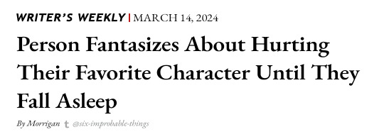
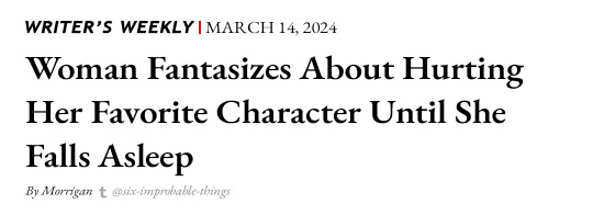

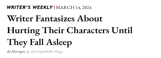
Feel free to do whatever with these, I don't care. (Post them to other sites, use them as reaction images, whatever.) Just don't remove the credit at the bottom of the image.
(Image descriptions under the cut)
[ID: A set of four images of black text on a white background. They all are formatted the same, to look like the header of an online news article, but each has a different headline. Above the headline it reads "Writer's Weekly" in all caps. A red vertical line separates this from the next phrase "March 14, 2024". After each headline, written in small italic font it reads "By Morrigan", then the tumblr "t" icon, then "@six-improbable-things". The first headline reads: "Person Fantasizes About Hurting Their Favorite Character Until They Fall Asleep". The second headline reads: "Woman Fantasizes About Hurting Her Favorite Character Until She Falls Asleep". The third headline reads "D&D Player Fantasizes About Hurting Their Character Until They Fall Asleep". The fourth headline reads: "Writer Fantasizes About Hurting Their Characters Until They Fall Asleep". /End ID]
#morrigan.text#graphic design#my designs#funnies#memes#writing memes#writing#writer memes#writers on tumblr#d&d#dnd#d&d memes#dnd memes#dungeons & dragons#dungeons and dragons#dungeons & dragons memes#dungeons and dragons memes#oc memes#author memes#I saved the psd so I can always make more of these lmao.
51 notes
·
View notes
Text
Within hours of Luigi Mangione being charged with the murder of UnitedHealthcare CEO Brian Thompson on Monday, online stores were flooded with T-shirts, hoodies, mugs, stickers, and other merchandise praising the alleged shooter and featuring phrases like: “In this house, Luigi Mangione is a hero. End of story.”
On Etsy, WIRED found almost 100 listings featuring products with Mangione’s name or image. These include a tote bag featuring pictures of the alleged shooter alongside the phrase “Mama, I’m in love with a criminal” and PDF copies of a mocked-up cover of Time magazine featuring Mangione as Person of the Year and the tagline “Healthcare revolutionary, leading the charge to transform global health.”
These sellers are trying to cash in on the internet’s peculiar fascination with Mangione, whose good looks and privileged background have garnered him fans despite him being accused of a high-profile murder in broad daylight. The fascination with Mangione is a worrying trend, researchers say, that shows behavior that used to be confined to the fringes of the internet becoming mainstream.
Much of the merchandise is being sold by print-on-demand websites, which allow anyone to design and sell a range of products. On one such site, called My Porch Prints, one seller is offering a mug featuring a heart-shaped image of a topless Mangione alongside the words “I love my boyfriend.” A number of print-on-demand merchants are selling a stylized version of the Luigi character from Nintendo's Mario video games holding a gun and wearing a green hoodie. Another hoodie available on multiple online stores, including one called Chill Guy, features an image of Mangione surrounded by love hearts.
There are also multiple different T-shirts and hoodies being sold on sites like Nobele T-Shirt, featuring designs with the phrase “Free Luigi” on them, while many others use the phrase “Deny, Defend, Depose,” the words Mangione allegedly inscribed on some ammunition.
Finally, a T-shirt featuring the McDonald’s logo with the word Mangione superimposed on it is also being sold online by custom gift shop ModParty, referring to the fact Mangione was captured after staff at the fast food restaurant in Altoona, Pennsylvania, identified him and called the police.
Etsy, My Porch Prints, Chill Guy, Noble T-Shirts, and ModParty did not immediately respond to requests for comment.
This unusual situation meant that as internet sleuths worked to discover as much information about Mangione as possible, platforms such as YouTube and Instagram were working to shut down his accounts. X initially shut down Mangione’s account, but after CEO Elon Musk said he was "looking into it" the account was restored.
Google was also forced to remove reviews of the McDonald’s where Mangione was identified on Monday, after Mangione supporters review-bombed it with negative comments and one-star reviews.
Before his identity was revealed on Monday, his online supporters, primarily on TikTok, Bluesky, and X, had created an entire fictionalized version of the shooter as a left-wing revolutionary hero who was standing up for the millions of Americans whose lives have been impacted negatively by interactions with the health care system.
Videos glorifying the killer flooded TikTok, while one person decided to get a tattoo of the alleged shooter’s face. In Washington Square Park in New York City, a look-alike competition was held on Saturday.
Indeed, “Deny, Defend, Depose,” which is widely viewed as a pointed critique of the health insurance industry in America, has become a rallying cry online in recent days as the focus moved away from the shooting itself and onto the shooter and his motives.
However, the fictionalized version of the shooter that was created online does not match reality. Mangione, who allegedly had a handwritten manifesto admitting to the killing in his possession when arrested, is a software engineer from a privileged background. He also follows popular right-wing influencers, such as Tucker Carlson, Joe Rogan, and Jordan Peterson—though he has also criticized some of the arguments put forward by these figures.
During a brief court appearance on Monday night, the police did not outline a motive for the shooting, but based on Mangione’s online posts and reading lists, it appears that the pain from an injury suffered while surfing could have played a significant part in his motivation.
Despite Mangione not fitting the idealized hero that many online created in the time between the shooting and his arrest, the alleged shooter’s fans have continued to post fan fiction about him.
On Archive of Our Own, a repository of fan fiction, half a dozen pieces of prose about Mangione were posted in the hours after he was identified. In one piece entitled “McGuire Road Designated Dispersed Campsite,” an author with the username basedIdiot imagines Mangione and another man on a road trip trying to escape from New York. “‘Oh, am I not your beloved?’ Luigi Mangione mockingly fainted into the other man’s arms,” the author wrote.
In another, an anonymous author imagines Mangione in Texas where he is planning to assassinate Tesla, SpaceX, and X CEO Elon Musk, inscribing the bullets he was going to use to kill the billionaire. “For Musk, he’s kept it simple. X. X. And lastly, X. Mocking goodbye kisses,” the author wrote. “But also a reference to one spoilt, psychotic rich brat’s latest 44-billion-dollar toy to break.”
Another imagines the suspect as the author’s lover while at the University of Pennsylvania, where Mangione studied engineering. “Luigi Mangione turns to you,” writes an author with the username Princesscockdestroyer, who claims she’s writing this fan fiction during her final exams. “He mouths ‘I love you’ then takes off down the street. As you watch him disappear from you, from your life, from any promise of a future together, you can’t help but finally realize that you love him too.”
One of the posts imagines Mangione hooking up with a K-pop star in a motel in Ohio while on the run.
On TikTok, videos with images of Mangione’s smiling face, featuring the Britney Spears song “Criminal,” are also racking up tens of thousands of views, while hundreds of videos with the hashtag TeamLuigi have been posted on TikTok in the hours after Mangione was arrested.
A report published last week by the Network Contagion Research Institute called the phenomenon of online accounts glorifying the shooter as a “cause for concern,” pointing out that it mimics the type of response typically seen on fringe platforms like 4chan and 8chan in the wake of mass shootings.
“While this phenomenon was once largely confined to niche online subcultures, we are now witnessing similar dynamics emerging on mainstream platforms, amplifying the risk of further escalation,” the report’s authors wrote.
10 notes
·
View notes
Text
Is there a completely free downloadable program that will automatically remove backgrounds from images? There were a few online ones that I’ve used to quickly improve pictures for my reviews, but the actually free ones have either gone down or switched to a paid service and the vast majority of google results are actually the same exact one with different names and URL’s (which I think should be a crime)
109 notes
·
View notes
Note
would it be possible for u to make a tutorial for the glitters? 👉👈
sure but i feel like there HAS to be an easier way to do all this so if anyone has a better glitter gif tutorial feel free to let me know
first part is optional, adding a filter to the image in picsart. this just kinda makes the colors look neater together or gives it a certain vibe.
then. open image in procreate (phone art app), duplicate the layer, turn the duplicated layer completely white, gaussion blur 1.7%, duplicate that layer at least 12 times. this is to give it a thicker white border (and some older emotes don’t have a white border already) thats easier + more fun to glitter
make transparent background some color that isnt present in the emote. if its transparent the glitter site will just flood the whole bg but making it something contrasting to the img makes it easier to remove later, like a green screen
open it in online-image-editor dot com, use the ‘add glitter’ tool under the animation tab, add glitter until satisfied. takes a while messing with fuzz and colors and fill vs replace. save it
open gif in procreate again and use select tool to remove background from every frame. theres usually only 3 frames so its not that bad. export layers as animated gif with 9fps. post to tumblr dot com.
like seriously if anyone has an easier way to do this you are so welcome to let me know LOL but thats why i cant do these too fast, it takes me a loooong time to do One of them. but i like them
13 notes
·
View notes
Note
sorry if this was has been asked b4 but how did you do your Raika Hojo pixels/blinkies? I wanna learn how to do ‘em :D

og post: https://www.tumblr.com/chichirid/767910269177528320/raika-hojo-pixels-and-blinkies-20x20-and-30x30
this is a tutorial on photopea, and its kind of vague so feel free to lmk if you need specific steps rather than a general process / if you dont understand anything :3

hiii so for the blinkies i used this dotted border, and this rectangle border i made (dont credit me, i traced it from blinkie cafe 😳)


i forgot which font i used.. sorry!! but i found a sampler online and typed "special for princess" and "raika hojo" then screenshotted it like the image below. then i removed the bg and was only left with the black text. then in photopea i selected the pixels of the layer so it only selected the text, and then i very carefully traced over the letters using the brush tool. (btw i colour-picked the colours from their logo image). i used the screen layer setting & a stroke setting of one pixel.
i just used a cursive font and tried to imitate a ribbon myself through colouring ><
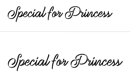
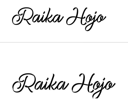

for the raika pngs i screenshotted some sprites then copied them in. idk how to use symmetry so i placed one png at one side of the blinkie, and found what X coordinate it was at. (ie 205px) and then subtracted that from my blinkie template's total X width (730px). then manually typed the X coordinate of the other png based off that formula (so to get a png symmetrical to an image at 205px, the X coordinate of the png would be 730 - 205px.)

for the flashing dots i made two frames:


then i combined these in ezgif "gif maker". the lower the delay time the faster the gif will go.
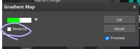
to make these two frames i used that earlier dotted border. essentially i used a gradient map on the dotted border's layer where the black was the red colour used and then the white. (like this image below as an example, both colours are set at 50% and 50% to get an even split). this makes one frame. to get the other i just clicked "reverse gradient".


to make the pixels, i saved some raika pngs using the enstars wiki, and then opened a new canvas in photopea with the dimensions of 30x30. (30 width, 30 height). then i opened the pngs and sized them how i wanted. important for this step: CLICK ENTER ON YOUR KEYBOARD ONCE FINISHED SIZING! this will make the pngs go blurry rather than pixelated, which will result in a more legible image when viewed from far away. its really up to you but i like making my images blurry. example:

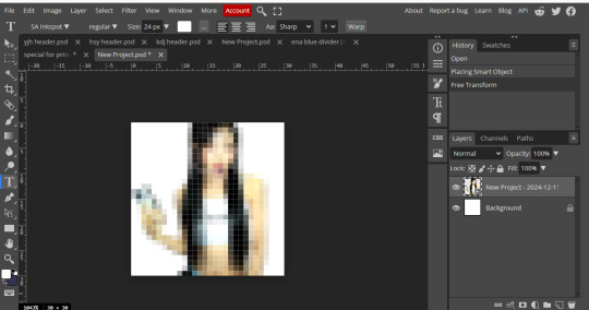
on the left i havent hit enter on my keyboard, on the right i have. save this basic png without the background layer
then just "ctrl + alt + t" again and either tilt the image, size it up, or use the arrow keys to move it sideways or up. save this moved image and once again i used ezgif gif maker to combine the two frames and make a pixel. oh also click "dont stack frames" when making the gif. here i moved the basic image 7 degrees to the left and used a delay of 30. hope this helped ^_^


4 notes
·
View notes
Text
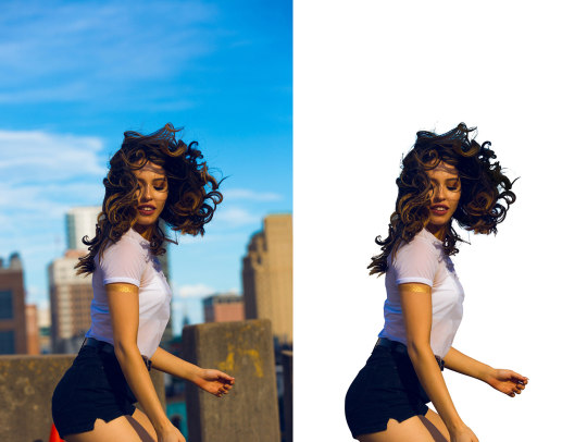
Remove the background from images online with our free background eraser. Download your clear background image and change the photo background in seconds.
#Photobackgroundremove#BackgroundremoverAI#Background Remover#RemoveBackgroundsOnline#FreeBackgroundRemover
5 notes
·
View notes