#regardless of the psd i use
Explore tagged Tumblr posts
Text


Will I ever see you again? Maybe.
「 amelia & obi wan edits. *ੈ✩‧₊˚. @jedimastre 」
#kenobiian#listen#im not going to be able to get them match any closer than this#regardless of the psd i use#I THINK I DID A GOOD JOB ALL THINGS CONSIDERING#like this was hard#&. AMELIA#&. A. REL: OBI WAN
11 notes
·
View notes
Text
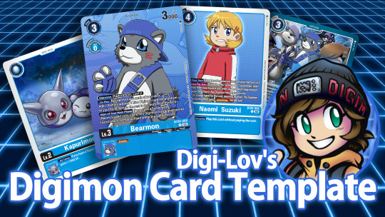
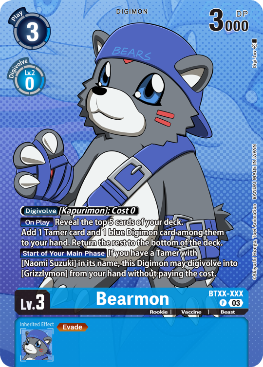
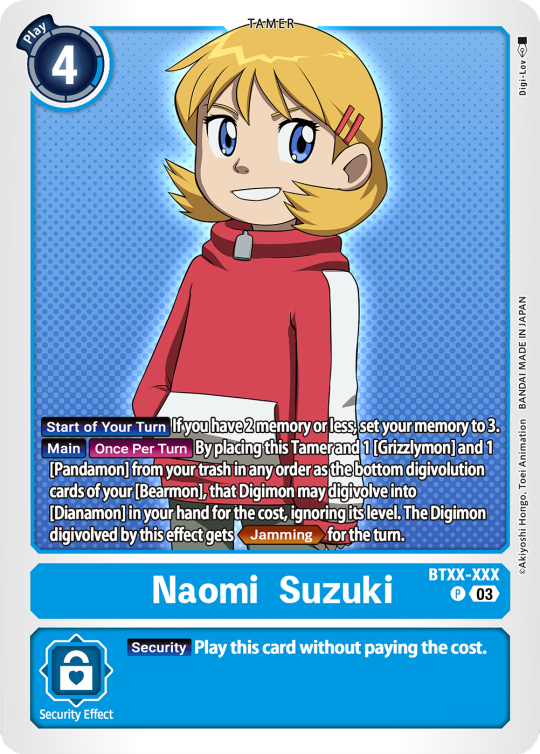
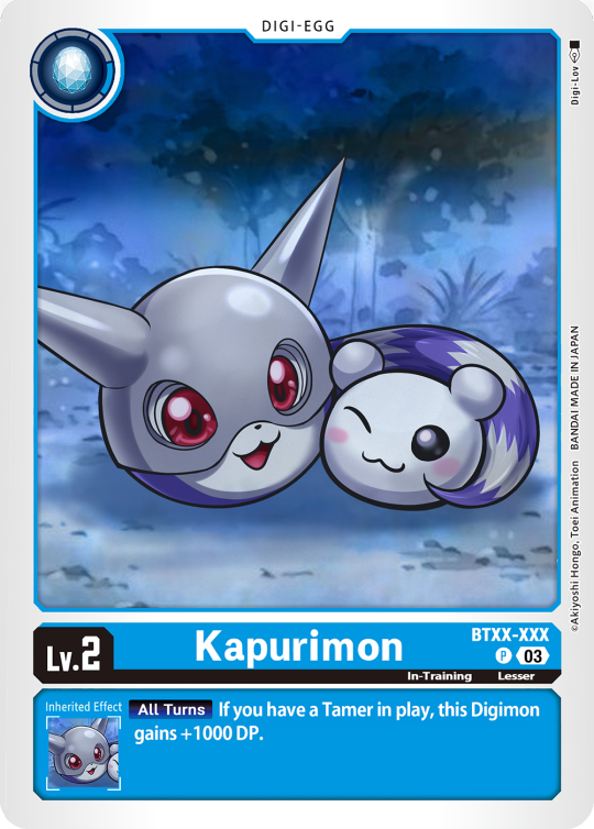
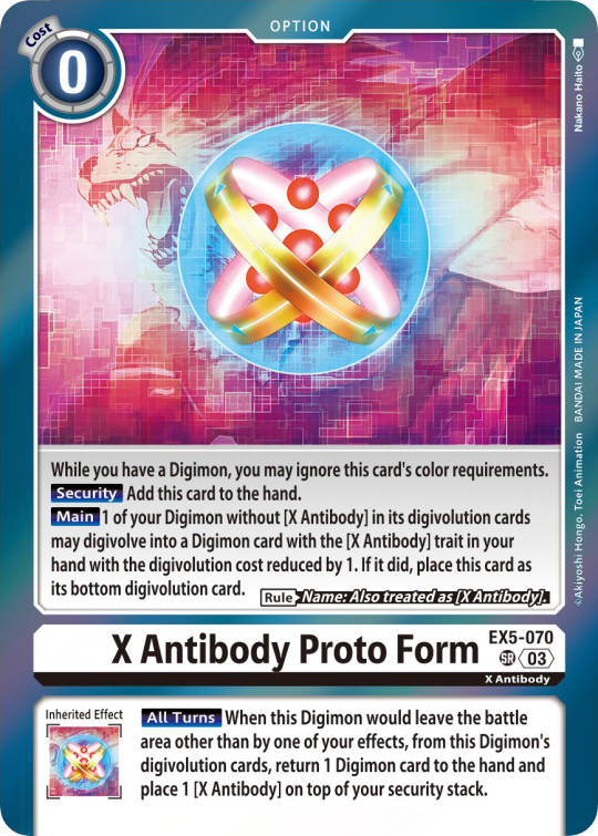
Digimon Card Template->
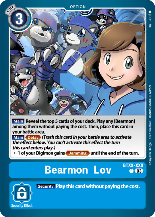
Hey guys, I finally finished the templates! A few words to read before using, and more words under the cut if you will. I'd love to see any and all cards you create, so feel free to leave me an ask or DM! Also if you feel like supporting me a little, feel free to stop by my ko-fi->
First off, all fonts you need for the template are in the "Card Template Fonts" rar file. Remember to install them first before opening the files. Second, I recommend working with the PSD file in Photoshop, if you can. It has more and easier customization. If you use CSP, do use the CSP files. The PSD Text layers don't work in CSP, as well as certain other settings. I did my best to adapt the file to CSP, and it should work fine!
The Files have "HELP" layers in certain folders, I recommend reading them! Some of the Information I will repeat under the cut.
HAVE FUN! I wanna see lotta cards!
Okay, below the cut I'll leave some notes on how the Digimon cards are designed, as of the num <03> era at least.
Digimon cards have seven different colors. Red, Blue, Green, Yellow, Black, Purple, and White. White cards are rare and reserved for special Digimon/Tamers, and usually don't interact with other colors. For easier reading, Yellow and White cards have black text in their colors, instead of the usual white text. On multicolored cards, card including Yellow (or white) have white text with a black outline. (before <03> if Yellow was the first color, the text was black with white outline instead, but they unified it with the update) The color on the left is considered the first color. Since the design update, the Card color is displayed in a color wheel around the Play cost. The digivolution cost bubble also recieved a color wheel, as well as the buble being split into the differen colors. Imagining it like a clock, the top color is the first, and then circling clockwise. Digi-Egg, or Lv.2 Digimon are always single color.
[tricolored cards have been introduced just recently and super rare. use sparingly]
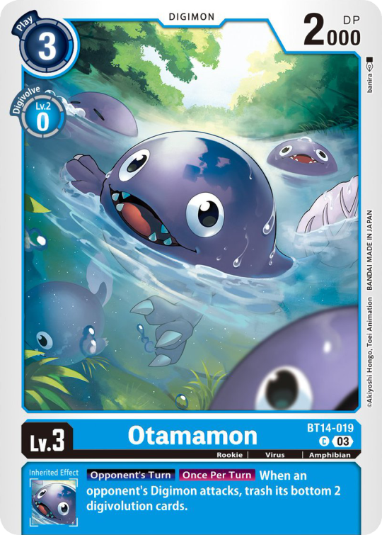
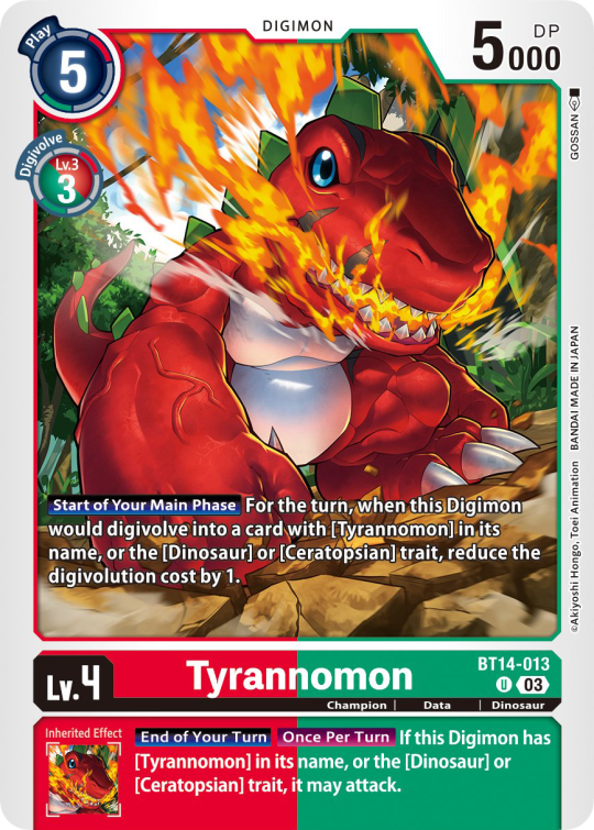

Now to the Effects. The main effect is in white color with a black outline (also outlines on the keywords), while the Inherited Effect doesn't have outlines (unless it's a Yellow double color). If the Digimon has no Inherited Effect, there will be a small dash in the box.
Only white cards have black text in their main effect.
The effect text will start in the lower bottom of the image, not all the way at the bottom, and go down from there. If the Effect is too long it will move up.
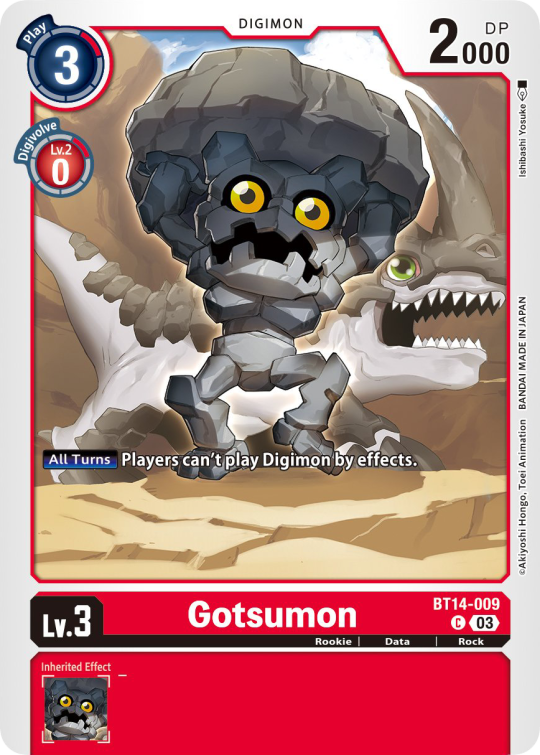
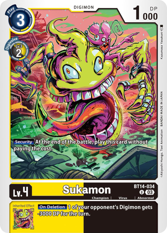
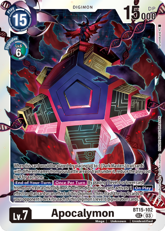
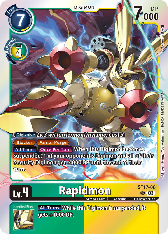
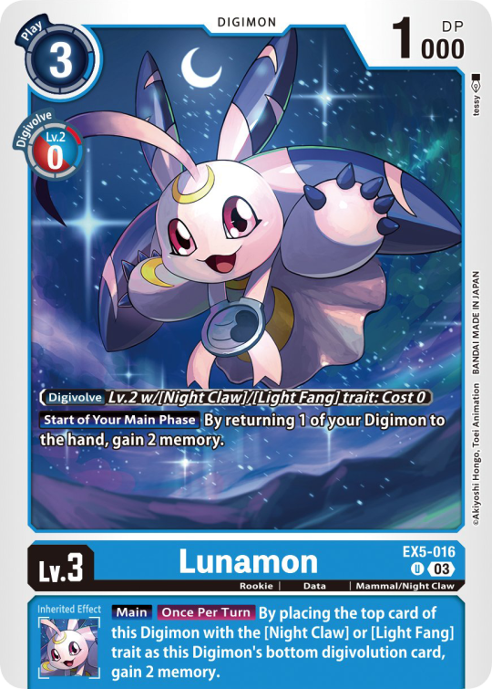
Besides the regular evolution requirements, Digimon may have special "Digivolve" rules in their effect. This can make an evolution from a specific digimon cheaper, allow X Antibody Digimon to evolve from their normal counterparts, serve to overlook color requirements, or to allow evolution from certain traits, etc.
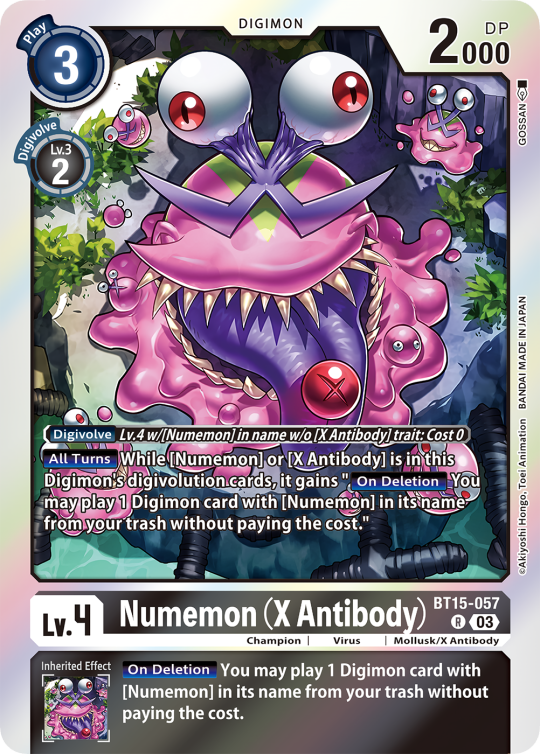
Some Digimon may also have an extra "Rule" in the bottom corner.
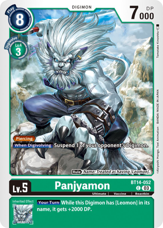
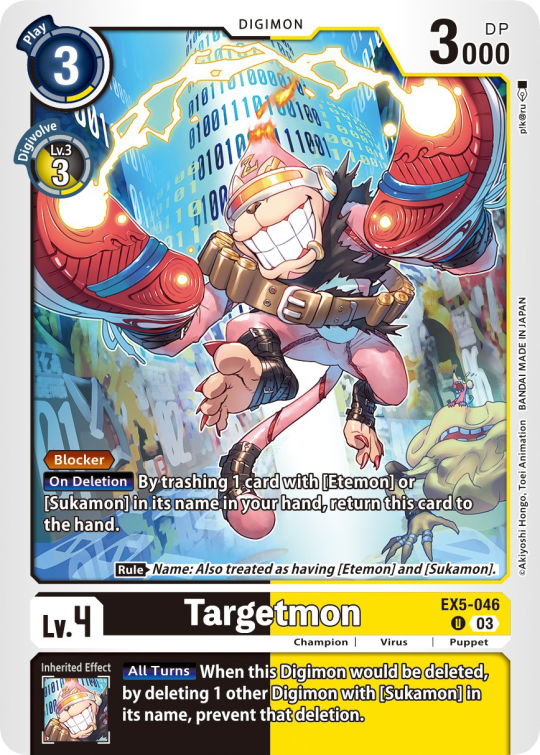
Ace Digimon will always have [Hand][Counter]<Blast Digivolve> effects. Most of them have no inherited effects. They also have a significantly cheaper play cost than comparable Digimon, but in turn have the Overflow mechanic. EX6 introduced Blast DNA Digivolution, which specifies the required Digimon by name, and not just Level and color.
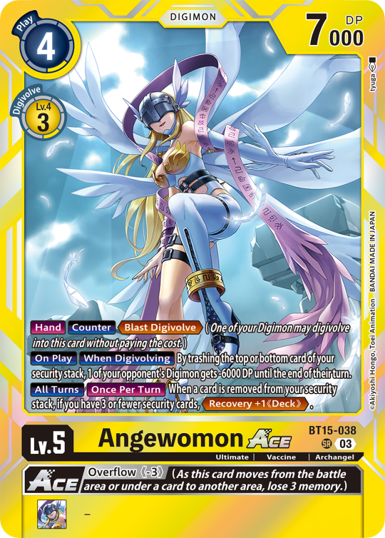
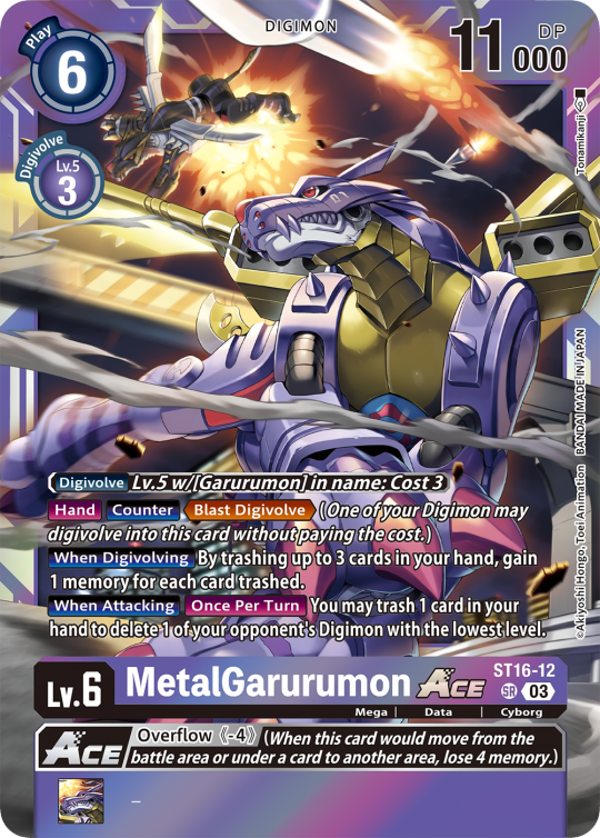
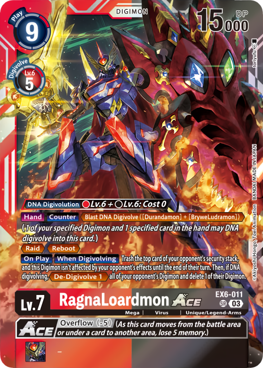
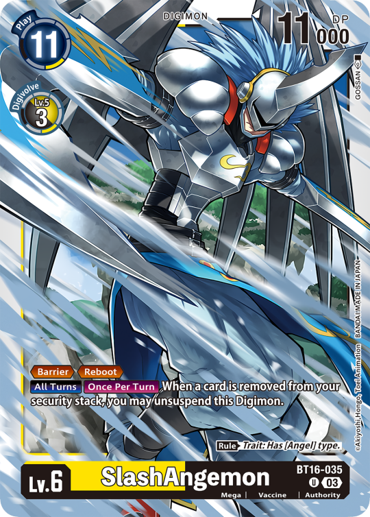
Lv.6 Digimon usually don't have inherited Effects, some might though, if they were made with Lv.7 evolution in mind. Furthermore Lv.6 Digimon pop out of their frame, even on the normal arts.

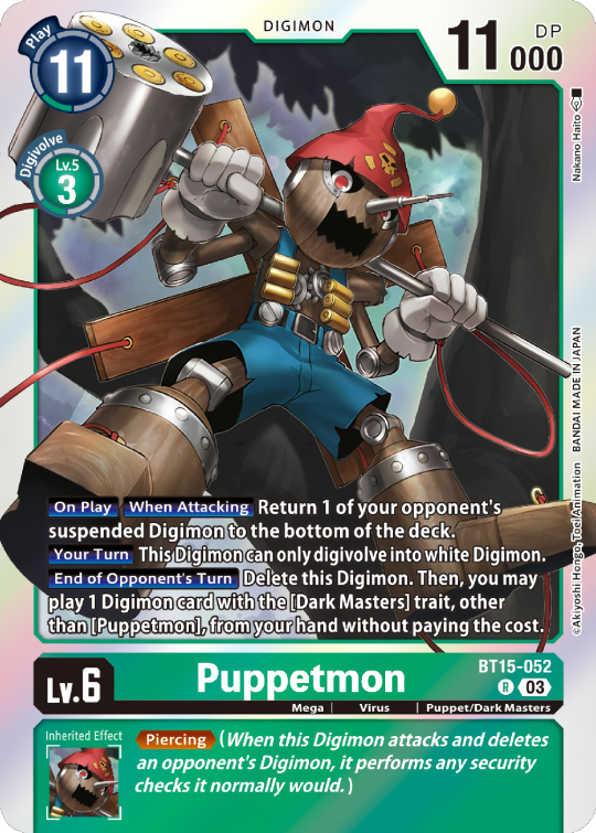

Now Tamers originally had neither traits, nor inheritence effects. But certain Tamers now do! Tamers with Mind Link effects, or the kids from Frontier for example, will have Inherited Effects.
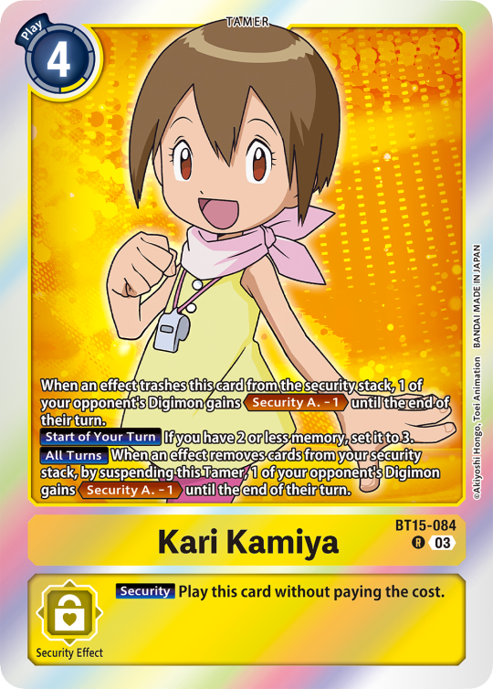
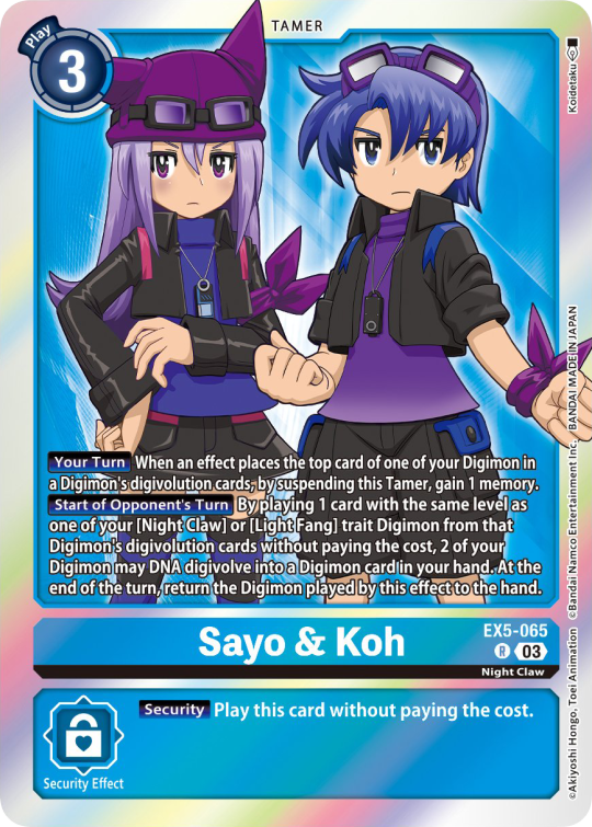
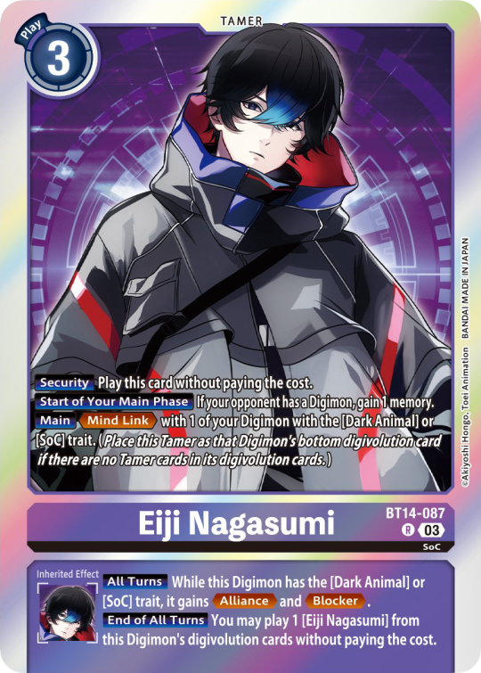
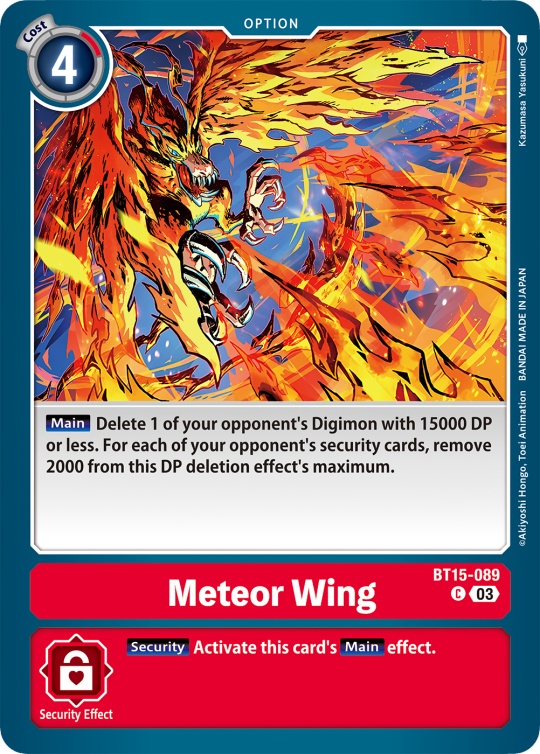
Option cards have a grey backdrop for their effects, and the effect text is black. This black effect text carries over to full/alt arts, regardless of color. The have a (use) cost instead of a play cost. They can also have traits or rules, but it is rare.

#digimon#digimon tcg#digimon card game#digica#digisafe#デジカ#digimon card#digimon template#template#digi community#digi lov edits
411 notes
·
View notes
Text
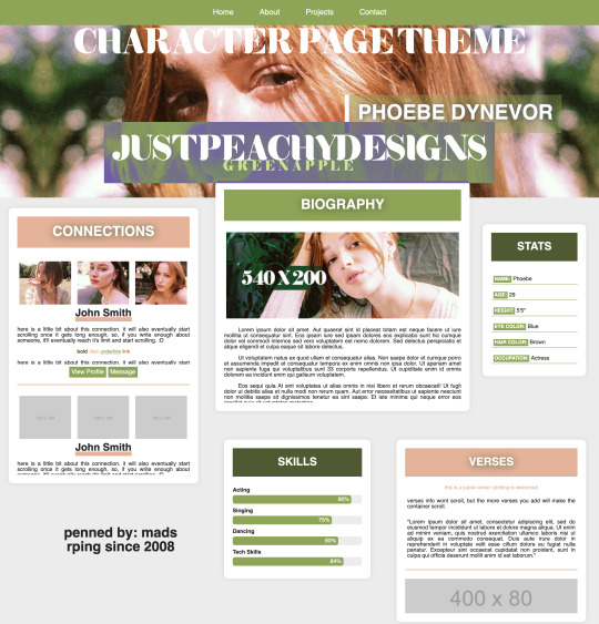
Green Apple Character Page Theme
[ preview ] + [ code ]
This is a Roleplay Character theme page.
The code is on payhip as a 'pay what you want' file. So it's completely free, but if you'd like to donate, it is much appreciated.
This is my first attempt at creating a page after copious amounts of css and html studying, but it's still not perfect, so I hope you find use of it regardless. It is commented in the code to hopefully help you navigate it easier.
Rules:
You are allowed to edit this code to your liking, but you're NOT allowed to redistribute this theme as your own, or in general. Do not remove the credit from the theme. You can move it around, but don't get rid of the link back to my page.
Features:
Header Image - 100% width x 400px height
Navigation Bar
Connections - 120x100 images
Bio - 540x200 image
Verses - 400x80 images
Stats
Skills
I created this code with 'root' styling, so much like main themes, the color customizing can be done at the beginning of the code where you see 'root'. There are elements in the code that are given those colors, so if you change one of the hex codes, it'll change other colors in the theme itself. If you have any questions, feel free to message me.
*whispers* the psd used on the images is this one*
#rph#themehunter#rp theme#character theme page#jpdpage#jpdtheme#jpdre#i'm sorry it's not super responsive in terms of screen resolutions#but this is my first theme ok? I'M JUST A BABY
61 notes
·
View notes
Text


Rosgoldic / Feminine-In-Nature Attraction

attraction to femininity/fin-ness in some form or the other; a general fem-in-nature attraction. what form of femininity one is attracted to and how they feel/express it is up to the user.
fem/fem-in nature, may be, but isn't necessarily related to woman/femaleness

one can experience this label if they're just attracted to one form of masculinity (i.e. feminine presentation and nothing else, such as with some twinks, boygirls, sapphics, or nonbinary people, fem genders/neofem/juxera and nothing else, etc) or multiple/all forms of femininity.
it's made to be inclusive regardless of gender or orientation (straight/gai/homo/neither, m-spec/mono) and is fully customizable to fit your personal needs (you can specify what forms of fem-ness you are attracted to, or what fem-ness means to you)
it can be used for any attraction or as a stand alone term (i.e. rosgoldicplatonic/bi-poly rosgoldic/rosgoldromantic) it's not juvelic at its base, but it can be modified to fit however the user would like it to. get freaky with it!


psd + related terms + taglist !!
psd download
nin/topazic ; min/cobaltic
@radiomogai @sylviestial @io-archival @imoga-pride
heavily based on fingender/finromantic, i personally found the orientation limiting. i had many other notes and thoughts on this label but decided to just leave it short for everyones sake.


#💾﹕organize#🌈﹕coining#rosgoldic#x in nature attraction#x-in-nature attraction#in nature attraction#in-nature attraction#liomogai#liom#mogai#qai#mogai coining#liom coining#qai coining
20 notes
·
View notes
Note
hi! i love seeing your gifs in tags and how you make the reds pop! could i ask about how you approach your coloring process? :)
sure!! sorry that it took me so long to get to this, anon. disclaimer that most of my Fun Coloring comes from me saving every PSD i've used for a gif before & then re-using them and putting them with other PSDs and then saving that combo as a PSD and then combining that new PSD with a different one but maybe messing with opacity or which layers are visible this time, etc. i'm not coming up with the coloring 100% from scratch every time i make gifs and usually the only thing i do new is the base coloring; i talked a little about that here, but i also put together a quick video on the process that goes into my base coloring!
i used the mav media availability from this gifset as the base as that was my most recent gifset when you sent this ask.

so, in the middle is a gif made with just my base coloring (+ with my usual gif actions; you can see the settings for them in a screenshot in the post linked above) compared to a gif made from the unedited footage (left) and a gif with the base coloring + the coloring i used in the posted gif (as far as i remember 😭 it looks a little different from the posted gifs but that could just be down to the base) (right).
even just doing some simple adjustments to the base helped greens and warm tones stand out in the middle gif — it really doesn't take take a lot to pump up the colors! i'd be perfectly happy posting that middle gif as-is. but if you want to see some of the other steps i add when doing more 'fun' coloring, i go through a little of that process under the cut!

the coloring i used on the original mav gifset was the same coloring i used to make this oskar gifset; i've been using it or a variant of it on most of my media avail gifsets recently so it should generally be a good representation of what my process to enhance reds looks like, generally.
when i say that most of my 'fun' or stylized coloring comes from layering a bunch of different saved colorings from gifsets past, i mean that this particular coloring looks like this:

of those ten (!) folders, three aren't even visible, and four have their opacity set below 100%. there are subfolders within those folders that also have their opacity set to something weird. this is not a super teachable coloring because it's just something ........ built up? from over the years?? but i'll walk through it a little more regardless.
something that i add to pretty much every gif i make is combo of two gradient overlays that flatten or soften the overall appearance of the gif. on this gif, the folder with the two gradient overlays was set to 50% opacity; the gradients themselves are the default black & white gradient set to reverse (white to black vs. black to white) at different opacities — one at 36% and the other at 14%. those numbers mean almost nothing as i'll usually play around with the 'flatter' folder every time i move it onto a gif. the big thing is just making sure the gradient is set to overlay!!

this is what the gif (with the base coloring) looks like with the flatter folder added vs. without it.

this just softens & brightens the look of the gif, smoothing out harsher colors while maintaining the amount of contrast achieved through the base coloring.
then i moved over the next folder from the psd from the oskar gifset, which is a million other folders in a trenchcoat, all of them set to a different opacity.

the final gif uses this folder at 25% opacity which makes like. a negligible difference to enhance greens & warm tones, as seen in the process gif below.

the further i get into explaining my process the less convinced i am that this is actually helpful 😭 i really do just save every coloring i do for a gif and then take bits and pieces and add it back and mess around, over and over again. when giffing the stars, i tend to like to enhance both warm tones and the color green, but with different lighting & backgrounds i have a billion variants for doing that, and then i come to decide later that i liked the way the skin looked in this gif + the way the background looked in this gif + the way clothes look in this gif, so i pick each saved psd over for spare parts and add them back at my leisure.
a lot of this looks like the process i did for the base coloring; just instead of focusing strictly on color correcting, i'll look at using hue/sat and selective color adjustments to enhance or shift the way green looks. and then i'll need to go in & adjust the color balance, and then i want to do something to the vibrancy, and then i want a subtle gradient so that it's slightly darker in the corners & brighter where the guy's face is, etc.
for every folder i add that's a million subfolders, like that 'robo dramatic' psd pictured above, there's a couple like these two, with minimal adjustments just grouped together for organization's sake:

everything i do is very much trial & error and just seeing what looks right with what kind of footage. just play around in photoshop & figure out what works best for you!! save the colorings you like so you can use them (or parts of them!) later!! so on and so forth.
if you have any other questions please feel free to come back to me with them but also please be prepared for me being just as bad at answering them as i was at answering this one 💖
#replies#sorry if this isn't more helpful!!!#i realized as i tried going through Every Part of my process that it's probably like. not actually super helpful#on account of me rarely doing coloring from scratch these days
19 notes
·
View notes
Note
Hihi!! I was wondering if I could please request tumblr layouts of Selene (pkmn)? Totally absolutely ok if not, and I hope u have an amazing day regardless!! ^_^
selene layouts


for @pkmn-blue 🌈
rules ; like, reblog and credit to use
psd by me
tags ok !
#🪼 ) edit#tumblr lyts#tumblr layouts#tumblr resources#tumblr icons#layouts#pokemon layouts#pkmn usum#selene pokemon#moon pokespe#resources#psd#psd used#requested
51 notes
·
View notes
Text

hi! me again! with another template, because we started talking about how the arcanist lookbook was such a banger concept with insane graphics, unique info and animations but they got rid of them. so ofc I ended up making the still lookbook into a template for OCs
you can get the PSD file here!
and thank you so much to the arcanistsanctum blog for providing the lookbooks, this template was based using Oliver Fog!
read below for more info!
there's a hidden layer that has some guidelines from me if you don't know what the general gist of this template is, just turn on the visibility to read it!
there's only three fonts you need for this: adobe gurmukhi, adam warren pro and luminari. you can find them around online 🏴☠️
the format of the item text varies--the text and titles can be moved around. you're free to play around with it! check out different arcanist lookbooks in the blog linked above!
you don't have to change the "20th century" section, that stays the same for every character regardless of their era--it's alluding to UTTU Magazine's release, not the character's respective time
#reverse 1999#reverse: 1999#reverse 1999 templates#reverse 1999 oc#purinsu sheets#pavia continues to be my beloved guinea pig
40 notes
·
View notes
Text
I’ve been making fashion centered art for years, and here’s a thread of tips, resources, etc, that has helped improve my clothes
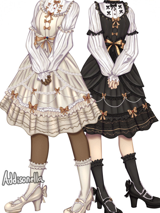
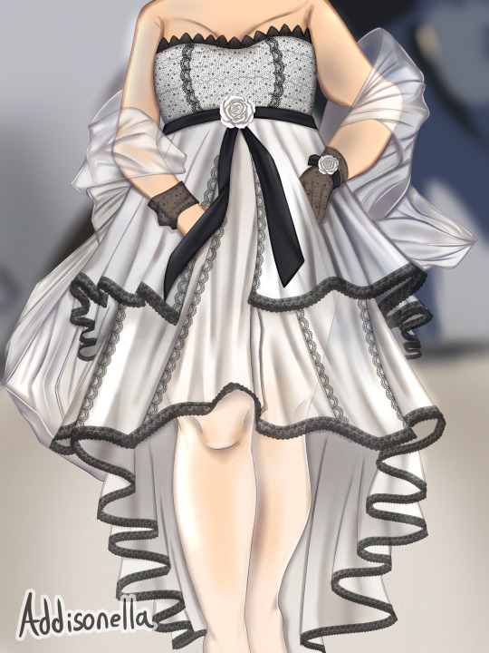

Disclaimer some of these are free, and some of these have a price. Regardless, use whatever works best for you
Draw in a box lesson 0-1: These lessons are crucial fundamentals that will make so much about the art process easier. Specifically, how to represent 3d objects in a 2d space. My understanding of folds and ruffles improved a lot after these lessons. It also helps you guess how clothes will sit in certain poses and on different body types if you don’t have a direct reference.
Marco Bucci’s video on clothing folds: It’s brief, to the point, and insanely informative. Great for people with low attention spans. Take out a sketch book, take notes, and draw the examples he explains. Not only did I learn a lot, but I have something physical to reference every time I’m stuck.
Studies: I went to Pinterest, found some clothes, and labeled the different folds I saw to help me get better at identifying them. After this, I would sketch the reference to put my observations into practice.
Identify the clothes you prefer and drown yourself in it: I love jfashion, especially lolita fashion. I’m constantly interacting with the fashion on Pinterest and xhs. The more I see it. The more ideas I add to my “visual library” the more I can reference to (hopefully) make more creative illustrations in the future. Follow brands that create the clothes you like/typically draw and examine what you wish to recreate in your art.
If you gather enough pictures and file them somewhere. You should have a solid amount of references put in one place to refer to. I’m saying this for people whose Pinterest feed/algorithm has been completely destroyed by AI who want to become independent from it.
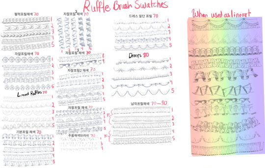
Okay, brush time. These are brushes I use in my art, which is pretty hyper fem, so they may not be useful for everyone. They're worth checking out, anyway.
Ruffle brush by @doitchu_brush: If you work with ruffles often, it's definitely worth the price. Here’s the brush swatch I made in case anyone wants to see how they work. https://www.acon3d.com/en/product/1000032987
CSP brushes:
Kawaii lace brush - Content ID:2041603
Laces - Content ID:2048336
Lineart Plaid Tile and Brushes - Content ID:1720380
2 types of pearl brushes - Content ID:2089582
Flower patterns - Content ID:2115308
Flower Ice Tulle Lace - Content ID:1985477
Free flower patterns - Content ID:1911211
Lace trim - Content ID:1809465
Airbrush for clothes light and texture - Content ID:1783197
Lastly, some unbearable self promo lol. I sell coloring pages of my work my kofi. You can buy the png for $3 or the psd for $5 for more flexibility. I used to color lineart to improve when I was little, so I'm sure it can be helpful to someone else, too!
#digital art#anime art#illustration#anime#artists on tumblr#fashion#fashion illustration#addisonella#lolita fashion#art advice#art tips
8 notes
·
View notes
Text


“ A god who wondered every day if he was worthy, without realizing, that was the very thing that made him so…"

჻ϟ჻ Marvel Thor Indie RP ჻ϟ჻ MCU based ჻ϟ჻ ჻ϟ჻ slight comic & heavy myth influences ჻ϟ჻ EST: 12.Nov.2013 ჻ϟ჻
|| Heavily canon-divergent from Ragnarok onward || || Driven and developed by threads and personal headcanons || || Adored by: Mir || 30 + || she/her || private & selective ||
|| Verses || Memes || Plots || Perma starter & Interaction call
A study in: duty & honor personified, survivor’s guilt, the godly urge to rage and release some of the pain, a quest for a home within himself and within others, finding value in others, finding value in living, guiding with a strong but gentle hand, learning still, processing the inevitability of death, remaining kind when all else is cruel, forgiveness without forgetting, containing and not abusing power, finding joy and purpose, honoring what once was and creating a new future.

updated 05-2025 : I have not seen Love & Thunder and I will not be adopting anything from that movie, please also keep in mind that during Ragnarok his arc goes bananas and canon-divergent. I can’t stress this enough so please, please check out my rules and the Ragnarok PSA for clarification. I have also not seen Loki the series yet, I plan to still but don’t have the mental stamina for it yet, I apologize.
psd: @jjcre8 <3
family: @torxnn || @hollustu
exclusives/affiliates: @untamedtempest || @utsxlevshiy || @summerxmelodies || @frostkingoftheapocalypse || @yellingmetatron || @ssolessurvivor
mains: @lettherebemonsters || @talvisoldat || @kingoftheravens
( RULES BELOW THE CUT )

BLOG & MUN INFO: Private and selective MCU based RP blog, this means I rp only with mutuals at this time. Multi-ship/verse/continuity. Mun + Muse are both 30+, we will not rp with anyone under 21+ regardless of the plot/topic. I have no specific triggers, all questionable content is tagged with general tags ________tw or ___________ cw.
Blog and writing can contain NSFW and/or highly triggering content, please read my stance and PSA regarding that.
ON WRITING: Medium to High Activity, this means I am online quite a bit, speed of replies however is depending on muse, real life stuff and can vary from absolutely insanely fast rapid-fire to a bit longer. Multi paras and novellas will usually be queued to keep my sanity from going haywire.
I consider myself adaptive and literate ( English is technically my 3rd language, and typos are the bane of my existence please forgive me any errors ). I’m comfortable with any length, script/chats, multi-paras, novellas and everything in between. There is no need to match length, just give me enough to work with and it’s all good.
ON INTERACTIONS: The best way to start writing together is to poke me in IM, throw something via Ask, or make use of the Memes . There is also a permanent starter & interaction call here that I check when I’m inspired to write small or big interactions/starters.
OC and Multi-muse friendly. I am however selective with both.
For OC’s, it’s helpful if you have a plot in mind already and your character is developed with some info/bio I can read up on, feel free to come to me with suggestions ^^
Multi-muse blogs are also welcomed and loved. However, we appreciate well-developed muses, and we love developing relationships with said well-developed muses.
I cleanse my following and followers regularly, if we haven’t interacted IC or OOC after quite some time I will cultivate my lists accordingly. No hard feelings, the door is always open. This also goes for following to remade blogs or new blogs, I will pick and choose if I follow you elsewhere.
ON TIMELINE & CANON: I’m in general very anti-Marvel and very MCU critical, especially when it comes to the movies and some directors. Negativity regarding this is rare, if I post about it it will be tagged with “ marvel wank “.
My muse and timeline are hella canon divergent since Ragnarok, things are cherry-picked from canon.
Please make sure to read my Ragnarok PSA and Endgame PSA. When in doubt, poke me with questions :3
ON MY CONTENT: I don’t enforce reblog karma on my blog, so feel free to reblog memes, general gifsets, quotes, music or whatever else from me <3
Please don’t reblog my world building posts or head canon posts without checking with me if it’s okay.
As much as I appreciate people’s approval of my creative works these posts are for my muse and for his universe specifically ( or even verse dependent ). More often than not things spread like wildfire in the fandom, and I don’t necessarily like my content to be exposed to a large group of people. It messes up my activity feed, it opens doors for needless discussion and discourse, and it is more likely to get stolen or copied. Please consider this before reblogging any of these posts and contact me if it’s okay to reblog a particular post. Original posts that are verse or ship dependent are off-limits by default, as are posts not created by me but by others for my muse or our verse.
ON RELATIONSHIPS: I match your freak, IC and OOC.
Any NSFW content will be played out with partners we’re comfortable with and we established a relationship with. If your sole purpose for interactions with us is shipping and/or smut I’d rather you look elsewhere, I’m probably not the right partner for you.
I ship Thor with a LOT of people, he loves a lot and loves hard, we ship chemistry first and foremost. He is not picky in the slightest, but plotting and development are awesome things! We don’t assume or insta-ship ( not even if the ship is canon), and any kind is welcomed. Brotp’s, enemies, strange neighbor, weird uncle? Yes please.
Ships are only possible with development, when there is undeniable and natural chemistry, and especially if we vibe well OOC, I’m not a fan of pre-plotted ships.
Exclusives/Affiliates:
For my own comfort I prefer to build relationships for my muse that are meaningful and will last. This means that I have main muses/partners that have our love and trust and we will prefer new plots and threads with them over new partners.
However we will not be exclusive with anyone unless there is a mutual exclusivity.
Please note that the exclusivity/affiliation extends to faceclaims also, I’m old af and Thor is set in his ways, neither of us enjoy confusion or chase faceclaims.
Regular non-shipping rps:
There is no issue however with rp-ing as a certain character if I already am with someone else, however I will keep everybody out of each other’s world.
Don’t assume kinship, or friendships. Thor will approach canon characters according to the MCU timeline and will treat them as such.
Thor only has children in side-verses and plotted verses with specific muses. In default/main he has no children ( yet ) so any replies or approaching him as his offspring will result in confusion. Please approach me first to see if I A) am open to new threads and B) am willing to plot something before interacting.
Please don’t be mad if I deny participating, I will always inform you about the reasons.
I take relationships, IC and OOC, very seriously, and expect the same courtesy in return. This means I value OOC communication and enthusiasm a lot, and will expect depth and development between us as muns and our muses. This goes for romance but also family, friends and any other sort of interactions. Wordlessly dropping essential ( key word essential ) and plotted out threads, or disappearing for prolonged periods of time without any sort of communication, or blatantly discarding a ship is hurtful, it kills my muse and the will to invest in interactions.
CURRENT STATUS:
* Inbox/Submit box: OPEN
* IM: OPEN to mutuals
* Plotting: OPEN
* Memes: always OPEN
* Discord available to mutuals after we have interacted for a while.
#჻ϟ჻ psa ( of importance)#pinned post#(( had to redo the thing it was bothering the heck out of me ))
13 notes
·
View notes
Text
How to make GIF's from videos

I consider myself relatively knowledgeable on GIF making, but I am not an expert. This tutorial mainly focuses on making GIF's and sharpening, for a PSD tutorial see here.
A few things to note before starting:
I struggle with sharpening GIF's- Especially real-life GIF's. For some reason I can't quite wrap my head around when/if the GIF's look too sharpened, so the tutorial part on this may seem lackluster.
I only use photopea and ezgif for GIF editing and capcut for cutting videos. I won't be able to answer questions about other software's (ie photoshop).
Tumblr has a GIF size limit of 10MB. It's the bane of my life. Always check how big your GIF is.
And with no other questions let's begin.
How to make a GIF from a video
Find the video and download it (real life)
This is a very obvious step but one that is important. I would always recommend finding videos in good quality. I often use tiktok, free videos from sites (like pixabay) and Instagram.
As for downloading them, I would recommend avoiding '[website] downloader' sites for a few reasons. A) they get shut down and replaced with spam sites frequently, thus making them unsafe to use, and B) they often times make you watch an add or remove ad blocker before giving you the highest quality download option.
I would always use cobalt.tools for video downloading.
Find the video and download it (anime)
This is more complex and I won't detail my download methods publicly. All I can say is not to use the anime watch sites to download your videos from, they're often low quality and have watermarks- Plus a lot of the sites have pop-ups ect which make them unsafe.
If you want a video tutorial I can't link you one from YouTube. This is not a YouTube tutorial. Nope.
Anyway, once you have it you will need to use capcut to shorten the video length (and potentially change the file) however you will need to make an account. Annoying I am aware, but it's the best video cutting software I know of and has caused 0 issues for me.
Not that when I first used captut the video save settings had the video at 720 pixels, however you want 1080 pixels because it makes everything smoother and higher quality. Once you change this setting you don't have to change it again.
Make the GIF
I always use Ezgif for this part. You need to use the video to GIF option and upload your video. Then choose the length of the video you want to turn into a GIF.
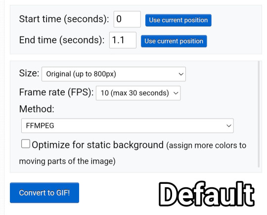
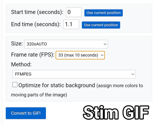
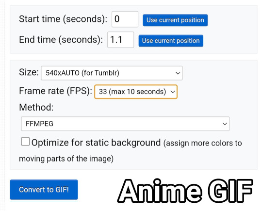
You will be met with a screen like this under the video.
Frankly I do not know what all of this means so that's why I only edit the size and frame rate.
With the size, you don't want it too big, smaller gives you more wiggle room for size with tumblrs size limit. However, with anime videos there's often less colors/detail, so they can be bigger and still look good.
The frame rate is important, the higher the frame rate the better quality it is, so regardless of GIF always have it this size
Then you hit convert to GIF and there you go.
If you need to crop the GIF use the crop tool and if there's any points of the video you don't want (ie frames of the next scene) you can use the frames tool (note that imo it's easier to use the photopea timeline for this)
Editing the GIF
You can just leave the GIF as it is, or you can make it sharper and/or add a PSD in photopea.
For stim gifs I will simply direct you to this tutorial because I can't understand the irl GIF sharpening process without photoshop's tools.
However, for anime ones you can use the smart sharpen tool, I either leave it on the default setting, or turn down the radius to 0.1-0.5
You can find the sharpening tool in filters > sharpen > smart sharpen
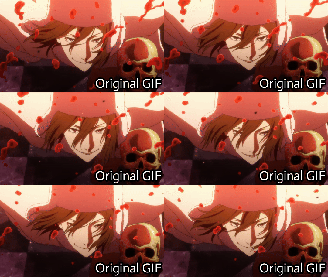
And here are some comparisons.


I spoke about PSD's here, but here's an example of the GIF with one and sharpened.


9 notes
·
View notes
Text


a blog for editing resources, including overlays, cutouts, line stickers, psds, tutorials, etc. run by @/grimescum. how to request
please at least skim over everything under the cut. if you dont, i reserve the right to be a little bit of a bitch about it

( ! ) message board –
jan 14 📌 updated tag list!
jan 4 📌 inbox & requests back open!
📌 donate to my ko-fi if you'd like! ♡
( ! ) content – with the exclusion of graphics taken from picsart and occasionally pinterest, i only upload raw, unedited graphics to be used in edits.
– the same generally applies to images of characters; i don't upload cutouts of fanart unless the artist has given permission for their artwork to be reuploaded
– my crediting can be a little wonky at times, but i generally don't credit pictures sourced from large companies such as walmart.
– this blog has no queue, i post whenever i feel like it
( ! ) interaction – spam likes and reblogs are perfectly fine in moderation!! if you're going through an entire tag and liking/reblogging everything you see, i'll block you temporarily
– credit for my work is not necessary, but it is advised to credit the original creators for their work if provided.
– i block freely, mostly according to my main blog's dni. don't be stupid. this also includes r4dqueers and pr0ship.
( ! ) other asks – i read them all! kind comments are part of what keeps me going, so regardless of how quickly i respond to them, know i appreciate every single one deeply.
– you can also ask for a promo!
( ! ) requests – i take requests for finding pngs of or based on whatever you give me, be it a character, prompt, aesthetic, image, etc.
– i'm selective about what i choose to do, so please don't be upset if i decide not to. it's nothing against you personally.
blacklist, media i won't do or will be very picky about: d/smp or related, genshin impact or anything by hoyoverse, kp0p, harry p0tter, p0rn (because of guidelines)
whitelist, media i will do no matter what: any of the fandoms im into!
– i'll also try to find the source of any image you send to me if you can't or don't feel like doing it yourself.
– i have autism, so being as specific as you can helps a ton! there is a difference between edits "based on" and "of" a character to me. also, if you want a certain kind of graphic (ie. a drawn divider rather than an image cutout), please do clarify that
( ! ) tag directory – under construction! a new tagging system is coming soon. for now, please refer to my rentry.
edited by me, fandom, inspo, made by me, op talks, promos, psds, reblogs, resources, tutorials
backgrounds & images, banners/headers, basics, borders (cutouts), borders (drawn), colorable, cutouts, digital scrapbooking, digital stickers, dividers, drawings, fonts, frames (cutouts), frames (drawn), gifs, icons, masks, overlays, patterns, templates/bases, textures
from canva, from flaticon, from google drive, from line, from picmix, from picsart, from pinterest, from pngwing, from roblox
aesthetics
( ! ) miscellaneous links – other links worth putting here.
archive this blog! internet archive (no dl) grab-site (dl) archive bot (dl) httrack (dl) imgdownloader (no dl)
posts 99 resource sites my psds
more resources eros' resources pluto's resources
my resource drive (decode from base64 to get link) aHR0cHM6Ly9kcml2ZS5nb29nbGUuY29tL2RyaXZlL2ZvbGRlcnMvMUxDUGEyV3JnZFpVdHFvNVVPeVZYLTJCWHpJTnVZQVJD
#!! .rblgs#!! .edited by me#!! .inspo#!! .tutorials#!! .psds#!! .op talks#!! .made by me#ℹ️ : masks#ℹ️ : borders (drawn)#ℹ️ : overlays#ℹ️ : cutouts#ℹ️ : digital stickers#ℹ️ : frames (cutouts)#ℹ️ : dividers#🔎 : from pinterest#🔎 : from picsart#🔎 : from canva#🔎 : from line#🔎 : from flaticon#ℹ️ : digital scrapbooking#ℹ️ : textures#❓︎ : text
27 notes
·
View notes
Text
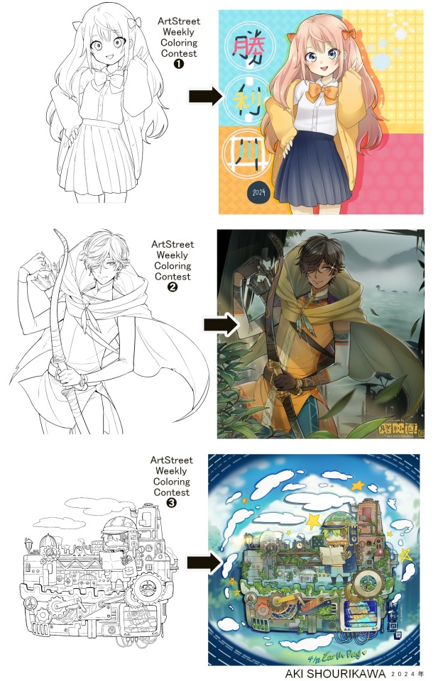
Blog No.003🍊 24年5月10日
「Let's Talk About Coloring+Rendering!!」
~ The Chaos of Akehhh-style Layering w/ Colors & Values ~
ArtStreet recently released some weekly coloring contests and as someone who likes joining 'em + colorwork being the absolute joyous part in drawing for me, I got really into it!! One of them somehow won and I still have the raw .mdp file of it with most of the layers unmerged... so, I thought there might be some value in sharing my chaotic coloring progress with it. There may never be an opportunity like this again...
CONTENTS:
Preface・・・・・・・・・
The Linework・・・・・・
Composition + Planning・
The Render・・・・・・・
Additional FX Tips・・・・
The Layers of Dread・・・
1. Preface
I use the free software MediBang Paint, which is made by the same folks who made the aforementioned art-sharing website, Artstreet. Although its file type extension is .mdp, it can also save as and open .psd files all the same.
If interested, you can download it on their website here! I believe it's available in both PC, Apple, iOs, and Android (also on the PlayStore). ☞And here is my google drive link of my fully rendered entry's raw .mdp file. I also included a .psd version that should be accessible with most other softwares like Photoshop, Clipstudio, etc.
NOTE: Not sure how some layer effects will be displayed apart from MediBang though (either in name or function) . But I think "multiply" and "overlay" is fair game on most drawing/photo-editing softwares with layer systems.
Either way, ↑this is just a bonus thing if you wish to see for yourself how much my MediBang cries everytime I work on something, since visuals of the rough step-by-step will be provided here as well!
At the end of this post, all of the layers' purposes will be explained...y-you'll see...
■And just as a disclaimer: I'm an instinctively self-taught illustrator who is a heavy visual learner, so there are certain methods I do that I cannot readily explain with back-up studies on color theories or formally taught techniques in art schools and the like/certain made-up terminologies that may or may not exist as something else. I mostly operate on instinct, observation, subjective preferences, and vibes, so this would just be me trying to verbalize my process (with visual aid) as a means of share-rambling, rather than actually directly "teaching" anything, I think haha You can take it as a cautionary tale too, honestly-
※I will also be going through this with the assumption that the reader has some background knowledge on digital illustration and general drawing basics + lingo. If you have any questions or needed clarifications, please feel free to let me know!
Although art can be fundamentally "wrong" when it comes to achieving certain specific styles, structures (especially when involving realism as the standard), or general executions of intentions/themes, I am of belief that there is generally no wrong or right 'way' for drawing anything; or for doing ANY type of artistic endeavor for that matter. This might be perceived as a "bad anatomy defender" / "no need to improve, then" stance on my part, but it is absolutely not the case! An artwork is never finished, there's always room for improvementsーa galaxy's size of a room especially for myselfーbut I just think anything at all that brings you an expressive or creative outlet, joy, or peace of mind is worth pursuing, regardless of your own skill or tact and there's no shame in that. I do not wish anyone, especially people starting out with drawing to be discouraged for having their own different approaches in comparison to other people's works by misconception of, "oh, am I doing it wrong?". Sometimes having different or an uncommon worldview is not always a 'bad' thing, I think. Heaven forbid artists actually start getting creative and unique―
What I will be presenting here is simply my one way out of thousands of thousands of different possibilities. So, let's start★
2. The Linework
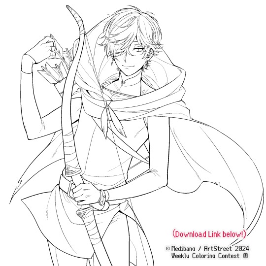
Equally lengthy talk of lineart is probably for a later discussion, but here is the template provided by ArtStreet for the contest + what will be colored in for today.
☞The contest has since ended, but you can still download the lineart template here if you'd like!
3. Composition + Planning
The contest rules said it's "OK to draw backgrounds", so let's go!!
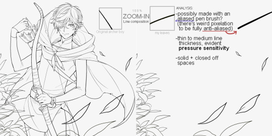
I had already decided on how I want to color it early on: It will be more scenic in nature, rather than stylistic. So, there will be more focus on looking 'real' than 'aesthetically stylish'! Just so it doesn't look disconnected or too out of place, I tried to draw my additions similarly to how Mr. archerman's linework looked as much as possible.
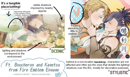
This how I visually define "scenic" VS "stylistic" illustrations (in my head)
I like experimenting and mixing different rendering techniques with varying linework styles and tend to think about my approach with the rendering long before the coloring process, even waaay before I line my final sketch, usually. But for this, I'm simply working with what was given to me.
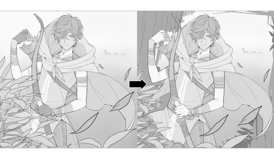
At first, I just wanted a "cool breeze w/ leaves flying away ahhhh refreshing~~" mood, but the space at the side of his head looked rather empty as is, even with Nessie. So I thought about putting him inside a vague...darkly-lit abandoned ruins-setting to eat up some of that space.
And with that, it's time for colors.
4. The Render
My coloring process is the lengthiest and often makes people who see me color in real-time scream in horror, but I think it's actually fairly simple and can be summarized into three nutshelled stages:
①Fill in the colors with a finalized palette of your choice,
②cry Continuously render until your arms fall off you're satisfied.
③ cry even HARDER (optional) Adjust accordingly to fit in better with other elements of the illustration, such as with the focus/subject to background. *will be explained later.
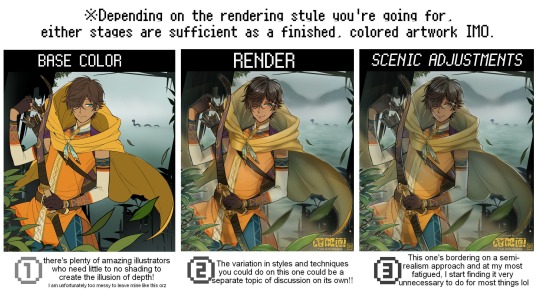
oh and btw, the usage of the words 'render(ing)' tends to be confusing with its association with other mediums like 3D models, but when it comes to drawing I like to think of it this way:
🎨Coloring is the planned/intentional selection of your color range, tints, tones, and palette to use in a drawing, ☀Rendering is the act (or product) of the set of techniques (including effects, filters, etc.) you use with the colors/values to create the illusions of depth, shadows and light, movement, warmth/cold atmospheres, etc in a 2D illustration.
But that's just how I define it with my own step-by-steps. Otherwise, I think either term is pretty much interchangeable.
Anyhoo, what do you think should this man's hair, skin, eye, and clothing's colors be?
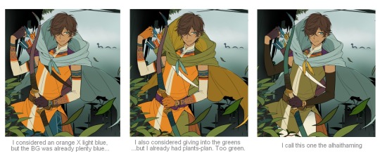
here are some of the variations on the color picks of his outfit that rotted my brain for about 3 hours straight, like it's a 2000s dress-and-match flash game
The many submissions for the contest had many fun color combinations and interesting interpretations I personally think should've won. I saw a lot of blonde archer-princes wearing greens, browns, and blues, as a lot also went for the "forest hunter boi" vibe. But I was saddened by the lack of my favorite colors being used as the primary colorーorange and yellow. So, let's use those!!
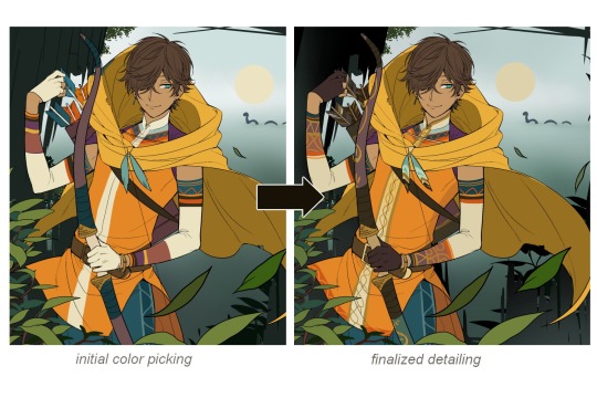
The start of my coloring/rendering journey is never at Layer '1'.........
―Starting with what I've always referred to as "environment prep":
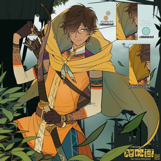
The purpose here is to 'set' the base colors so they match with the environment or general atmosphere. Get ready to see this over and over
This could mean adjusting the saturation, or spraying gradients of the BG's most prominent color on parts that...gives me anxiety the most-
As someone who tends to work with very, very bright color schemes with character designs, trying to blend in when the illustration is meant to be scenic or 'serious' in tone without it being a distracting eyesore can be a challenge. So, this is what I do to counter it.
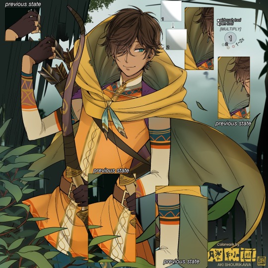
Shading is usually an early step for me as well, even though I think it's a lot of other artists' near-to-final step. I tend to lean towards an abomination mix of soft shade and cel shadeーthe strokes are sharp enough to trace where the shadows start and end, but softened around the edges for effect.
I also tend to apply an additional spray of subtly darker shade on top of the first one? It's usually on spots where I think the light source won't be hitting as much. I wouldn't do this for simple styles (stylized illustrations like with a chibi style), but for scenic illustrations I find it's necessary to achieve that depth against a fully-rendered environment.
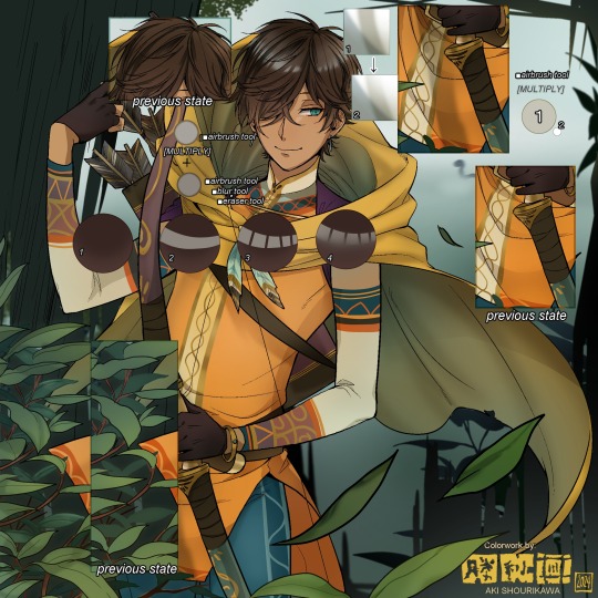
※Just a side note: You may see multiple things changing around, but in real time I'm most definitely working on one part at a time lol. These visual aids were ripped off the raw .mdp by hiding some of the layers, so that's why different areas seem to progress together all at once, even if that's a bit idealistic in actuality.
Apart from the previous adding of shades with a multiply-mode layer for the preliminary shadows, I add one more layer of shadow on there for objects or other characters that can cast distinct shadows on the subject. In here, it's the bow and the hovering strap across his chest.
Lighting is also starting to be added as well.
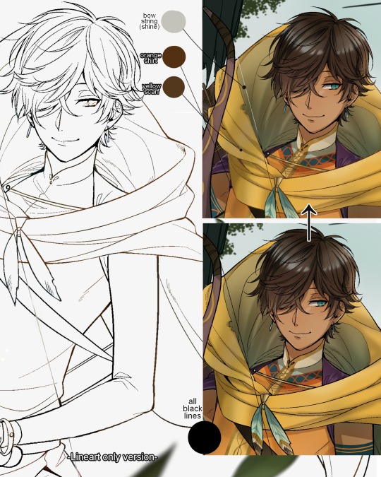
One direct alteration I did with the lineart template was change the line's colors. I find it really softens them to mix better with their filled-in colors + as well as not stand out too harshly against a light-colored scenic background.
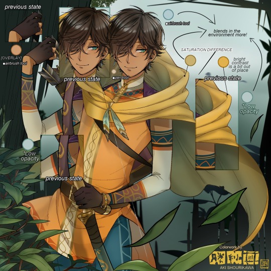
I think you now have a good idea over my hyperfixation on making sure colors are 'vibing' well against the BG lol A lot of these steps are basically just doing the same thing over and over with new layers for the sake of this purpose, really.
And after that, just repeating all the stuff we did with the character onto everything else (background, foreground, objects, etc.) until you're satisfied with it!
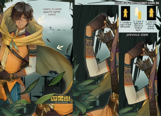
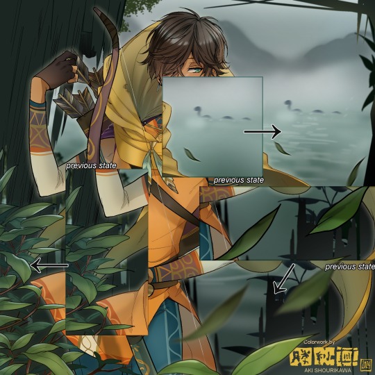
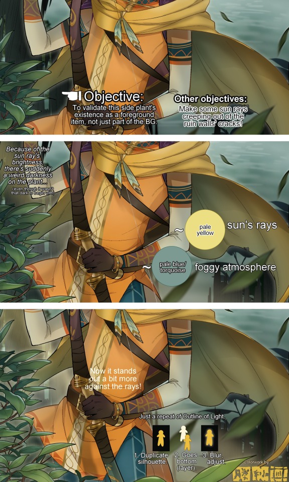
A lot of these changes are very subtle on their own, but makes all the difference in the bigger picture, I think!
Just maybe some additional finishing touches for some boom shakalaka and...that's pretty much it! You will notice that throughout the entire process, there's a lot of random little things that suddenly appear or change with seemingly not much purpose or meaning on its own. I unfortunately have always drawn in this sort of vague, quickly impulsive, directionless way since I was a child and I don't think even I will ever understand it, logically. It's mostly a... continuous string of instinctive feelings of "HEY let's do it this way, if not there's like 10 other things we can try next", is the closest I can get to an explanation of how it feels.
I don't know if it's common for other artists to think or function this way, but I do know for a fact that many people seem to be surprised and confused when they see me drawing in real time this way. Everytime I get asked 'how' I draw certain things, I say things like 'I turn my brain off and vibe with many, many layers with a broken back.' and people think it's just a dismissive joke. I-it's really not, it's literally what happens, I don't have any secret shortcuts for you-
Hopefully this very lengthy post + visual aids can help demystify some misconceptions on what "really" goes on when I'm drawing! It's also a bit of an update of my tutorials made for friendos starting out with digital drawing back in 2015!
Anyway, the rendering stage is where the simplified steps ② and optional step ③ branch out like a fork in the road for me; I don't think one is any "better" than the other, I think doing either is simply a matter of personal preference and artistic choice;
➋being leaving all that 100++ layers rendering that we just did alone and calling it a day,
➌being a little bit more extra w/ additional shadows/lighting that corresponds with the environment the character is in.
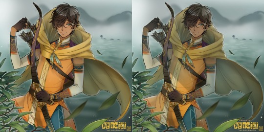
I removed the walls to see the whole figure better in a side-by-side comparison. I like the unadjusted (L) without the wall, but with the walls in the final illustration, I think adjusted (R) felt 'right'. What do you think?
There are some things, although realistic, don't look that good as a visual aesthetic and are just downright excessive/unnecessary to add to certain types of illustrations.
Then there's things that aren't possible in real life, but artistically? Looks really dang cool. Being biased for either ends of the hyperrealism and hyperstylized spectrums of styles is fine; only as long as no discrimination is involved towards people who don't share your opinions, in my opinion-
and to conclude this section, I say,
『 You go render however you wantーhellーno colors even necessary if you wish!
Simple ≠ laziness, just as much as complexity ≠ skill。』
I will never stop yapping about how a lot of minimalist styles require so much more amounts of planning and effort to make sure everything is nice and clean, especially compared to mindless rendering loops like these. Mine's a maximalist hell and I wouldn't have it any other way, but I greatly envy minimalist artists that can render with just something like my step ① with so much grace and tact; not a single stray or wasted stroke!! Anyone who dismisses these types as "lazy" I will violently stuff inside a couchーwithout any potato snacks to snack on!!!
5. Additional FX Tips
Just a shorter section for some optional finishing touches tips'n'tricks used in this I frequently (ab)use☆
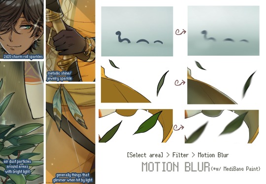
◆ From the very beginning, even before I understood how to draw, it's always been a tradition to doodle around sparkles all around the place. I usually do it with MediBang's sparkle brush if I want it to look polished, or simply draw it manually using either the pen or airbrush tool for a cruder charm.
◆ Motion blur is great, and MediBang in particular also has different types of blur effects like Gaussian and regular blurs. If your software doesn't have these effects / if you're working traditionally but still want to achieve the illusion of motion in a still drawing, you can still achieve the same effect through your linework! Try looking into incorporating action lines (commonly seen in manga and comics) into it. Otherwise, purposefully drawing something blurily to begin with oughta work as well.
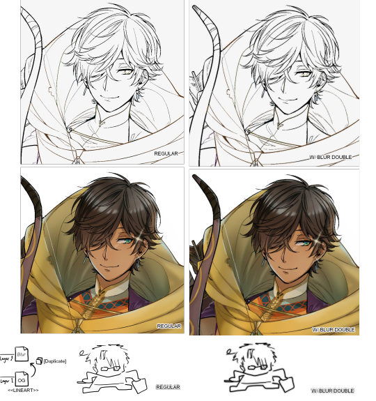
◆ Apart from changing the lineart's colors, there's also this little effect that is achieved by duplicating the lineart and blurring it. It gives something like a...'dreamy' quality to it? The higher the blurred copy's opacity is, the more emphasized it makes everything look.
6. The Layers of Dread
At long last we've arrived... at my MediBang's repeating demise for all of eternity...
Here's a preview of what the .mdp/.psd file of this colored entry's unhingedmerged layers looks like + how I try to validate their existence. When I work on full-sized illustrations, I tend to merge layers as I go, so this is probably one of the rare times I can show something like this without either mine or your PC dying. If you'd like to see, play around with, and toggle them for yourself in all of its............glory, feel free to download it here.
Yes
we're starting at Layer 611. Enjoy.
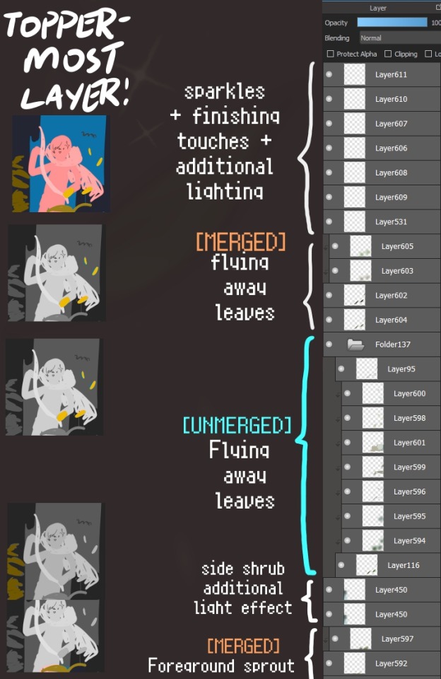
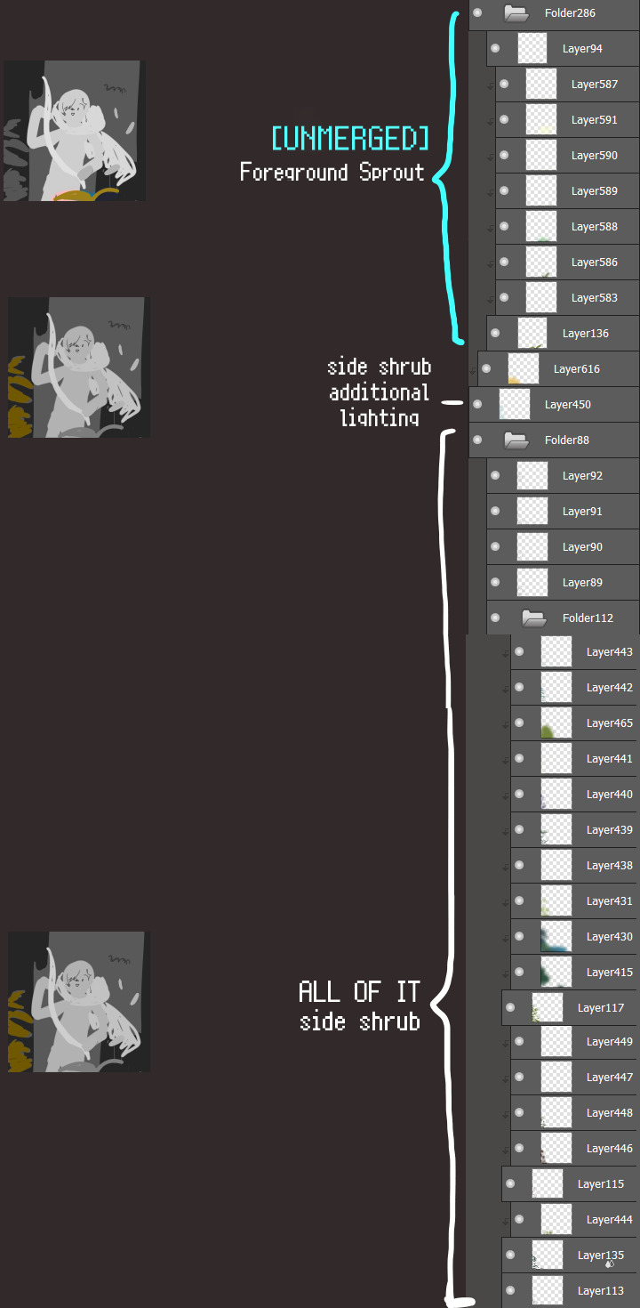
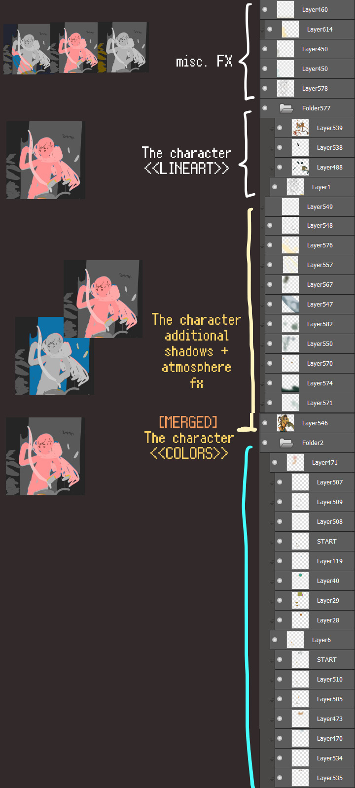
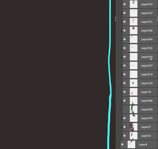
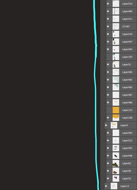
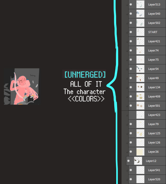
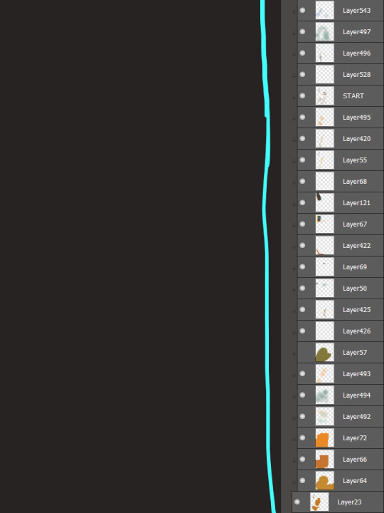
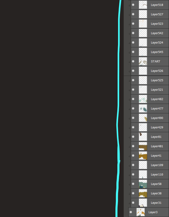
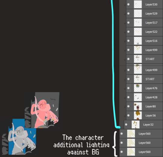
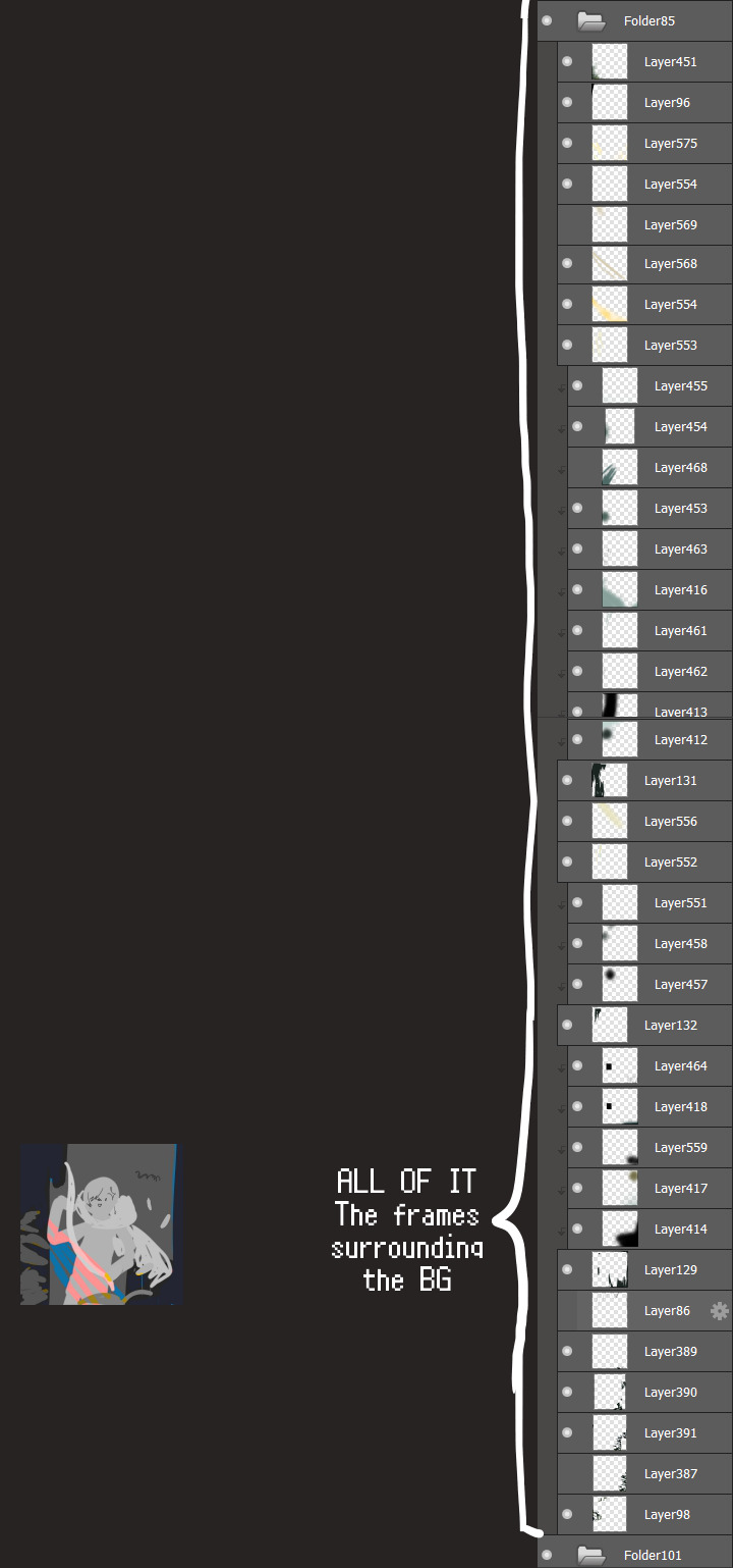
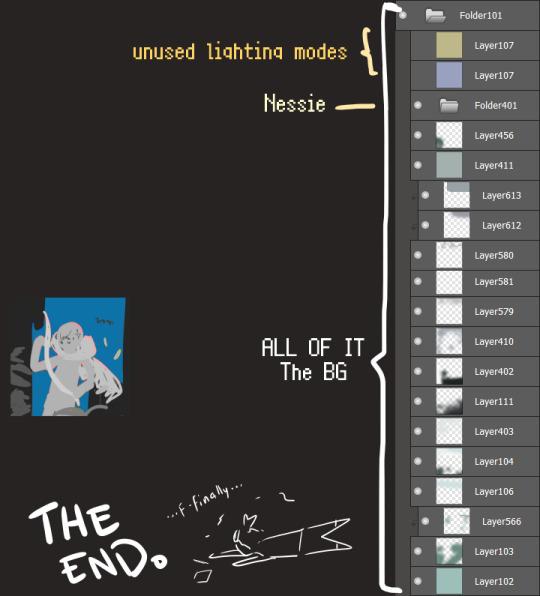
I will now delete my PC's copy because jfc that's one too many MBs ...and it's still eons lighter than what I usually work with on my own full illustrations from sketch to finish......。 (;´༎ຶٹ༎ຶ`) thank you for reading this far and making it out alive, goodbye for now...
・・・ホームページALL LINKS・・・
・Art Gallery・Commission Info・Ko-fi shop・
#art blog#long post#coloring#coloring tutorial#art tips#art tutorial#digital art#digital illustration#digital drawing#digital art tips#digital art tutorials#medibang#drawing journal#drawing process#illustration#coloring practice#nessie#the loch ness monster
30 notes
·
View notes
Note
/post/717036849048256512/mikelogan-michael-logan-is-a-fictional do you think you can make tutorial on how you made that text? thanks! :)
Of course! Thanks for asking 😊
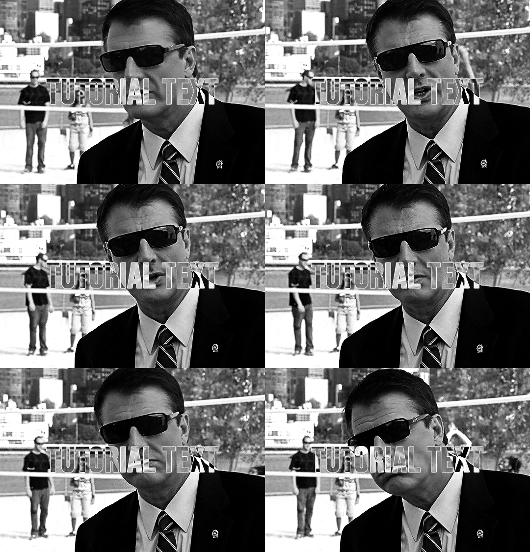
i don't have a psd saved of that exact post, but this is close enough!
assuming you know the basics of making a gif (if you don't, check here), sharpen your gif and slap down your coloring. this particular example is using a black & white gif, but this effect can be really cool in color as well (more on that later).
create your text using whatever font you like. i find that this particular effect looks best with bold fonts rather than thin serifs or scripts. now we have this:

here are my settings in case you're curious:

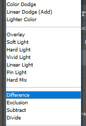
if you're looking to get this exact effect, make sure your gif is b&w and your text is white. now we're going to change the text layer's blending mode to difference using the drop-drown menu (where it says difference -- yours will say normal):

that gives us the main piece of the puzzle:
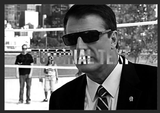
right now, the text is hard to read though, so let's add a thin outline by double clicking on the text layer. these are the settings i used:

normally i also add drop shadow at ~150 degree angle and 3, 3, 3 for the distance, spread, and size. regardless, the text is much easier to read now and we have our gif!

his sunglasses are so fucking stupid
the fun part with this effect is how many different color options you can play around with! here are some examples (using blending options and gradient or color overlays set to [usually] hard or linear light):
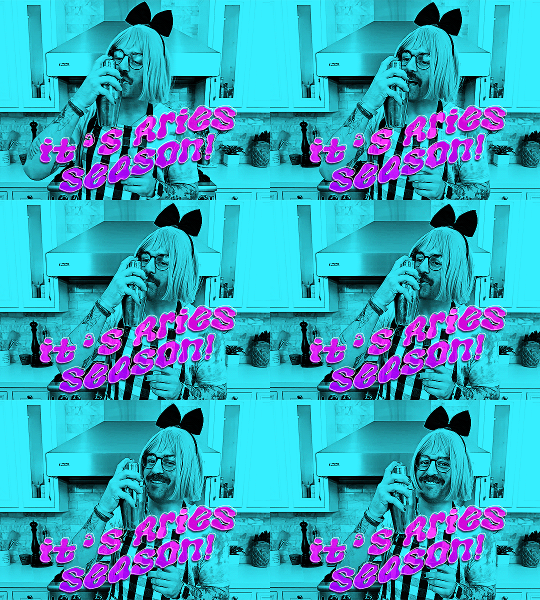
x

x

x
please let me know if you have any questions!! 💙
#answered#Anonymous#my tutorials#gif tutorial#completeresources#dailyresources#gifmakerresource#typography tutorial#typography
73 notes
·
View notes
Note
hi dari! hi, I’ve heard so want to start by saying that I enjoy your Sim content that you post on Tumblr!! everything is so beautifully made and I enjoy keeping up with your gameplay so much! As someone who is fairly new to playing the Sims, but also enjoy some so much, I am considering starting my own simblr page - to post my own content!
however, I am a wee bit nervous because I have no idea where to start and there are not a lot of tutorials on how to really get started on this (as far as taking screenshots, learning the proper way to set up Gshade and make it actually look appealing, and so much more!). So please if you have any advice I am all ears or I would be happy to message you privately possible! 🤍
Hello! Thank you so much for the kind words. You are too kind and the community needs more people like you so start sharing! 🤎
As for as advice on posting your gameplay, I understand why you'd be nervous, but honestly the best thing is to post what you want because you want to. When I started, I didn't play with mods, Gshade or edit my screenshots. It was simply because I loved playing and sharing my gameplay with this community that had inspired me.
I don't think you need any of those things to share your stuff on here but if you'd like to start using them then some good resources to check out are in the tags here like 'ts4 resources' or 'ts4 psds". Some really good creators have been kind enough to share resources there. Youtube is also a great resource for tutorials especially on downloading Gshade/Reshade. You can also check out my resources page for my personal specifics for my gameplay if that's what you want.
At the end of the day, if your motivation is to post because you want to share and be part of the community, then just start posting regardless of all that. 🤎
(sorry that was long lol but if you need help with anything else and feel more comfortable messaging privately go ahead🤎)
5 notes
·
View notes
Text


Cobaltic / Masculine-In-Nature Attraction

attraction to masculinity/min-ness in some form or the other; a general masc-in-nature attraction. what form of masculinity one is attracted to and how they feel/express it is up to the user.
masc/masc-in nature, may be, but isn't necessarily related to man/maleness

one can experience this if they're just attracted to one form of masculinity (i.e., masculine presentation and nothing else, such as with some butches, enboys, bears or nonbinary people, masc genders/neomasc/proxvir and nothing else, etc) or multiple/all forms of masculinity.
it's made to be inclusive regardless of gender or orientation (straight/gai/homo/neither, m-spec/mono) and is fully customizable to fit your personal needs (you can specify what forms of masc-ness you are attracted to, or what masc-ness means to you)
it can be used for any attraction or as a stand alone term (i.e. cobalticsensual/unlabled cobaltic/cobalromantic) it's not juvelic at its base, but it can be modified to fit however the user would like it to. get freaky with it!


psd + related terms + taglist !!
psd download
fin/rosgoldic ; nin/topazic
@radiomogai @sylviestial @io-archival @imoga-pride
heavily based on mingender/minromantic, i personally found the orientation limiting. i had many other notes and thoughts on this label but decided to just leave it short for everyones sake.
this has been on my drafts for months dawg,,,


#💾﹕organize#🌈﹕coining#cobaltic#x in nature attraction#x-in-nature attraction#in nature attraction#in-nature attraction#liomogai#liom#mogai#qai#mogai coining#liom coining#qai coining
20 notes
·
View notes
Text
I got tagged by @girlvinland ! Thank you! <3
Rules: In a new post, post the names of all the files in your WIP folder regardless of how non descriptive or ridiculous. Let people send you an ask with the titles that most intrigue them and then post a little snippet or tell us about them. Tag as many folk as you have WIPs.
I don't have any writing WIPs but I do have some art wips ! Those are:
1) color-cups.psd
2) Mr_Shapes.psd
3) Peregrina-glass-comp.psd
4) ren-marika-awooga2.psd
I don't have too many! I really like working on only a few things a time. Some of these are wayyyy more finished than others.
Not sure who to tag so pls do this if you wanna!
#ask games#asks#i misunderstood the directions at first LMAO#i do have writing technically but its all just tabletop planning#girlvinland#THANK UUU <3
3 notes
·
View notes