#redesign your logo -character switch
Explore tagged Tumblr posts
Visit Tumblr Blog
Explore Tumblr blogs with no restrictions, modern design and the best experience.
Last Seen Tumblr Blogs


Fun Fact
Hackers stole 65M passwords from Tumblr in 2013.
Text
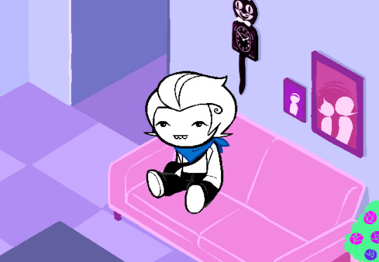
This week's characters: Ross. Pronouns: he/them + moon/rot/grave/haunt/boo
Roy. Pronouns: he/its + star/pop/mic/bug
Robert. Pronouns: he/xem + sun/pop/fizz/confetti
#behind the screen -out of character#redesign your logo -character switch#spooky month roy#roy spooky month#hatzgang#hatzgang roy#hatzgang robert#spooky month robert#robert spooky month#spooky month ross#ross spooky month#ask blog#character asks
6 notes
·
View notes
Text
Oh hey, Homestuck 2 updated. With a flashback, no less. It's been a loooong time since we've seen Harry, but I remember liking him. Honestly I like all the new characters more than the HS2 incarnations of the old characters.
You’re still at home. Stuck.
oh_you.jpg
Oh Jesus, John and Roxy in the "Guardian" style. Kind of interesting the presentation, though, that this is how the kids see their parents. Good way of explaning why where weren't like this before.
that SUPPOSEDLY DIVINE NEGLIGEE’s inability to accommodate your dads AWKWARD MAN-BOD was downright sacrilegious
I just like this sentence.

It's weird that we're getting a room introduction for Harry, the one character who actually got one in HS2. Huge emphasis on costumes and outfits here, which is what leads a lot of people to think Harry might be a Heart player. That's into fan-theory, though. In actual Homestuck, Kanaya was the "fashion" troll, and Jade was the one who had all the different outfits she kept switching between, so add "Space" to the board here. Also, the fucking Bunny is back.

Harry is basically trying to get a redesign here, and he doesn't like his bag. He does apparently need something to carry his stuff in. That's...odd. He has a sylladex, we saw him use it before this flashback takes place. Is the bag like Dad's wallet, a physical item representing a video game-y abstraction?

This is the best panel in the update

Okay, Harry has "Sleezy Headbanger" and "IdeogranicDramaturgy" in his contact list. These are new characters, and the second update in a row with mysterious new names in people's phones.

You know, it's really weird that the Omega Kids don't have logos, requiring Vrissy to be represented by a silhouette of her own head here. Especially since Harry changed closes in this very update and didn't take advantage of the opportunity to do some branding. Those simple shirts were famously good-selling merch, and they served a story purpose, so it's odd HSBC isn't doing them.

Man, Harry is just all the original four kids, isn't he? He's got the rambly nature of Dave with the dumb sincerity of John.
D'aww
VRISSY: I think they should 8e here Soon, so let's take a seat and Chill out, okay? HARRY: ...my my, how can i resist ya? ;) VRISSY: Oh my G8D, I told you Never to S8y that Again!!!!!!!!
Is that a fucking Mamma Mia reference? Out of nowhere, without Vrissy even setting him up for it?

Anyway, we're caught up to the present, and the three kids are united.
Though, Given Vrissy's sudden furious rage, it looks like the four kids are meeting up for the first time. We're actually going to get a conversation with the four new kids, something that never happened with the four originals in HS1. I'm actually really excited for this. Yiffy gets to meet another person who just furiously hates her sight unseen. What a novelty for her that'll be!
27 notes
·
View notes
Text

Edit: Revised some things, original version under the cut for posteriority ___
At long last, a first draft of Jos's redesign!! \o/ This took way longer than I would have liked because I was dreading trying to draw what they were leaning on (I started this before the last sorXa drawing, if you can believe it, which is why that and the Cohost memorial were on 3 by 5 notecards), but I eventually opted to demote it to concept art instead of a polished piece just so I could make use of all the effort that'd already gone into it.
Some design notes:
This headset was originally meant to replace their old one, but as previously mentioned that would have meant losing a bunch of homages to other characters, which I decided wasn't worth the upsides of this version. I might still keep it as something they use when doing mechanical work as a sort of welder's mask version of their normal headset, but I intend to make the revised version of their usual headset much closer to its old design. Or maybe it won't be a headset, but a single earpiece with goggles or something? Who knows! I sure as hell don't!
Their hormonal implants are a little more low-profile now, and one on their right arm has been moved to the other side of their abdomen, partly inspired by the fact that I've since started weekly E injections (and my doctor has instructed me to switch sides each week), and also because...
They now have a tattoo of the Clover logo where their implant used to be. I've admittedly never been much for tattoos, but I figure they already have one on their lip (so they're clearly not averse to getting them), it's almost kinda weird to have a cyberpunk setting where none of the major characters have any noticeable tattoos in this day and age, and it brings in some extra green in a way that makes more sense than the old design for their implants IMO. Also I think I like the idea that Clover didn't really have a good emblem until sorXa showed up and designed this one, which means this is a tattoo of their girlfriend's art, and I think that's cute <3
As previously mentioned, the work pants are based on some designs from Dovetail Workwear, but I think none of the details are necessarily unique to their designs. Just thought it'd be worth mentioning if anyone wants to look through their catalogue for design inspiration like I did, or to like. fuckin'. buy pants like this? I can't vouch for the quality though so shop at your own peril.
Also regarding the workpants: that grey layer over protective material is ethermail, the same stuff used in a lot of the armor designs I've done for Machine at Arms
Their wristband has migrated to their other wrist. No idea if it'll stay there, not even sure it'll stay at all, we'll see. Maybe I'll replace it with yet another tattoo, even! You'll find out shortly after I do. That's just how it is on this Clara of an artist(...???) (a warning klaxon blares as a hit squad closes in on my location).
As an aside, I've also since opted to stop referring to their gender as "demiwoman" and instead have decided on "woman+", which I think describes them better? They're 100% woman, but also they've got more going on on top of that. That's right, they have bonus gender. They're just that cool. B^) (I'm totally not biased as someone whose gender dealy is similar to theirs, just using she/her instead of they/them like Jos does. Totally. >__>)

#Dr. Jos Bonheur#Machine at Arms#Aqueous OC#Aqueous sketch#concept art#character design#Aqueous illustration#Aqueous art
3 notes
·
View notes
Text
First Look at Season 2′s Sirena
In case you missed it, on this fine Captain Picard Day, we got the first real trailer for season 2 of Star Trek: Picard. You can find it all over the web by now, I’m sure, but here is a link if you haven’t seen it already.
In this trailer, we get a glorious 2 second look at La Sirena, and of course I’m going to spend way too much time exploring every detail of that shot.
Fair warning if you don’t want to know anything about the trailers and want to go into season 2 completely unspoiled: This is your moment to hit J to skip!
From the trailer, it’s pretty obvious that our motley crew find themselves in some kind of alternate timeline/dark future/mirrorverse-adjacent twisted reality, probably because of Q shenanigans. The characters all get a bit of a visual redesign, and so does our little Speed Freighter.
Here is the one shot we get in all its glory:

And below the cut, I’m going to pick apart aaaalll of the little (and not so little) changes I’ve noticed.
Observation 1:
Let’s start somewhere random because I can (and because structurally, it seems to be the biggest change so far): There is now a gridded frame separating the bridge and the main deck.

It runs inside the front-most support beams. If you look at the deck plans, it’s in the place where a bulkhead was originally planned but then taken out (marked in green below).

In season 1, the forcefield Soji puts up when she hijacks the ship is set in the exact same place.


Observation 2:
Next, because it’s sort of glaringly obvious: The logo on the headrest of the chairs has changed. We get the clearest view of the captain’s chair, where, instead of the double swirl of the Sirena logo, we now have a red delta reminiscent of Starfleet insignia (only symmetrical, which is just weird).

It’s likely the same insignia as Rios’s new badge:

Observation 3:
Next, because it is making me incredibly sad: My beloved red paint is gone 😭
The railing around the drop to the lower deck, the two support beams at the back of the upper deck, and the circle around the engine lights have all lost their beautiful, slightly worn red highlights and are now grey (or possibly white, it’s hard to tell with the lighting).

(Also, because I feel it needs to be said: That is one unhappy Rios right there...)
This repaint does not bode well for the outside of the ship. In this symmetrical, grey dystopia, a van Halen paint job doesn’t seem likely to stay in place. Who knows, maybe we’ll go back to the silver Araña Cosmica designs? Although since the delta and the lights and displays are still red, some red highlighting on the hull might be preserved.
Anyway. I already miss the beautiful red accents. If I needed any more hints that this is a dystopian alternate reality, this is it...
Observation 4:
While we’re talking about red things: the lights along the support beams and the centre of the ceiling!
For the majority of season 1, the lights at the side of the deck had a blue highlight at the top and bottom, while the ceiling lights were white.

Eagle-eyed Picard viewers may have noticed that at the very end of episode 10, “Et in Arcadia Ego Pt. 2″, we already saw a switch from blue highlights at the side to a warm red.

In the redesign, the lights at the side stayed red and the ceiling lights now have the same colour.

It’s difficult to say how much of this is down to colour grading, but from the images themselves, the new red lights have a much colder hue then the highlights in season 1.
Side note: I was wondering briefly whether the new colours might be because of a red alert. However, as we see in season 1, for a red alert all of the lights turn red, including the ones along the support beams (white in the trailer) and the vertical strips next to the holodeck (also white in the trailer), so this is probably just the new colour scheme in whatever alternate reality Rios finds himself.


Observation 5:
And a final red thing: In the gridded wall at the back of the bridge, there are two shapes that seem to be little control panels.
It’s too grainy to make out any details, so they might also be plaques or the labels of some container or other, if the gridded arch doesn’t reach all the way to the floor. But if they are control panels, it’s very clear that Sirena’s user interface has undergone a redesign as well.
Here is the panel from the trailer:

Essentially a dark red background with bright red control elements.
And this is an example of what the UI (specifically the tactical console on the right side of the bridge) looks like in season 1:

As you can see, season 1′s UI consists of grey and orange designs on a black background, with some white/beige highlights. If the red shapes are indeed control panels, the difference is quite striking.
(And yes, the image of the tactical console is part of the Deep Dive on Sirena’s UI that I have been procrastinating since... February. What is time? I am so sorry 🙈)
Observation 6:
And finally, one last observation to round out this little exploration: whatever Rios is transporting in this new timeline, it’s being kept in cargo containers the likes of which we’ve never seen before.

One day, I will make a collection of (very grainy) screencaps of all of Sirena’s various cargo containers, but for now, here are a few examples:

The containers in season 1 are all branded with the mermaid/wave double swirl of Sirena’s logo. (Here are just a few, trust me, it’s everywhere!)

Likewise, the mysterious new containers have circles on them that might be the same insignia that’s emblazoned on the headrests of the bridge chairs.

It’s very grainy and difficult to tell, so I’m not entirely sure. It’s definitely a possibility, but the longer I look at it, the less certain I am. The circles on the containers might not be broken by the points of the red delta like the circle on the headrest, it’s impossible to say for sure, so at the moment I don’t think it’s the same logo. But there is that possibility.
Either way, the containers look very intriguing and vaguely ominous, so very fitting for whatever horror our poor Rios has found himself in.
And thus concludes this mad little observational spree. What a way to spend an entire evening on literally two seconds of footage 😄
I’m sure there’s a bunch of stuff I’ve missed, if you find any more details, I’d be thrilled to hear about them!
I’m very curious to find out where the showrunners are going with season 2, the hints so far have been... interesting. I guess we’ll have to wait and see if we’ll end up with a completely new version of La Sirena to explore.
#star trek picard#la sirena#news#picard season 2#cristobal rios#aramis in space#season 2 trailer#upper deck#bridge#cargo spaces#ui#design#alt!sirena#(which is what i'll be calling this until further notice - or until someone else comes up with a better name ;9)#not gonna lie: i'm still not 100% sure what i think about this - either the new sirena design or the direction the plot is headed in#i suppose we'll have to wait and see and hope for the best#and in the meantime we can continue geeking out over the sirena we've had so far#tomorrow: a look at a podcast with lots of information about la sirena. i'm really looking forward to that!#and now i REALLY need to sleep#this took me way too long#didn't help that i've been live tweeting the whole thing 🙈#but occasionally I need to indulge the need to Let People Know That I'm Doing Things
36 notes
·
View notes
Text
Tinder Reviews 2020

Pondering which dating application will get you the best outcomes in the most brief measure of time?
In any case, since you're searching for Tinder audits, you've likely got a few inquiries. Is it only a hookup application? Am I unreasonably old for Tinder? Is moving up to Tinder Gold worth the expense? Is it any great in case I'm searching for a long haul relationship?
This Tinder survey has all that you have to choose in the event that you should jump on Tinder, or if an application like Bumble, Hinge or CoffeeMeetsBagel may be a superior fit for you.
Moment Bonus: Steal our 14 untouched BEST Tinder openers so ALL your matches in a split second feel a wild desire to react to you.
Tinder Pros and Cons
The reason is basic – swipe directly on a photograph in case you're intrigued, left in case you're definitely not. At the point when the two individuals swipe right, a match is made and you can begin trading messages. It's a typical "moment satisfaction" position for dating applications, yet Tinder has its own one of a kind upsides and downsides:
At the point when It Makes Sense To Upgrade
Visit explorers should consider redesigning. That way you can begin trading messages with nearby singles in your goal city, and have dates as of now on the books when you arrive.
It additionally bodes well to update in the event that you live in a uber city and continue coming up short on right swipes. Hanging tight 12 hours for more can get a bit of baffling…
In the event that you wind up with a huge amount of matches, moving up to Tinder Gold can spare you time by just taking a gander at profiles of individuals who have communicated enthusiasm for your profile as of now.
Avoid the overhaul in the event that you don't live in a zone with a great deal of different clients, particularly on the off chance that you would prefer not to drive a long separation for dates. It's likely not worth the month to month venture.
Tinder Q&A
In case you're not utilizing Tinder yet, you might be asking yourself one (or the majority) of these normal inquiries:
Am I Too Old For Tinder?
Potentially. 85% of Tinder clients are in the 18-34 age section, so in case you're in your mid 40s or past, you might not have the same number of clients in your general vicinity. In the event that you wind up with not many (or no) profiles to swipe through, think about widening your hunt criteria. You may likewise need to utilize Tinder related to progressively "genuine" dating applications, as Bumble or The League, where you're increasingly able to discover individuals 30+.
Is Tinder Just For Hook Ups?
At the point when it originally propelled, Tinder unquestionably had a notoriety for being a hookup application. That is changed fairly, as just 15% of ladies surveyed said they were searching for a one night stand.
pull in ladies on the web
Presently you'll discover clients searching for a whole range of connections, from easygoing experiences to marriage.
Does Tinder Post To Facebook?
Tinder doesn't post on your divider, or send warnings to your companions. There's no chance to get for anybody to know you're on Tinder except if they go over your profile while utilizing Tinder themselves. (In case you're stressed over that incident, move up to Tinder Plus so can constrain your profile's perceivability to just individuals whom you've just preferred.)
Yet, in case you're apprehensive about your Facebook and Tinder records being connected, you can restrain how a lot of the two interface.
You can *almost* use Tinder without Facebook by following these means:
Subsequent to pursuing Tinder, go to the "Settings" page on Facebook
Tap on "Applications", at that point tap on "Tinder"
Change "Application Visibility" to "Just Me"
Go to "Settings" on Tinder
Turn "Show Me On Tinder Social" off
Cutoff whichever data you don't need shared by tapping on the blue check marks
How Do I Post On Tinder Feed?
Tinder feed
At the point when you empower Tinder Feed, any progressions you make to your Tinder profile will naturally be noticeable to your matches on their Tinder Feeds. What's more, the other way around – any progressions they cause will to be unmistakable on yours.
Instances of what's shared incorporate transferring another photograph or changing your Spotify song of praise. Discover precisely how to utilize Tinder feed here.
How Do You Get Tinder Picks?
Tinder Picks
Tinder Picks are picked for you consequently by the application's AI-driven coordinating calculation. You can see your Top Picks by tapping on the gold precious stone, yet free clients can just look at one of the profiles. Tinder Gold clients can scrutinize every one of them, and by and large get somewhere in the range of 4 and 10 Top Picks each day.
It's a smart thought to check the application day by day – Top Picks revive like clockwork. To become familiar with how Tinder Picks work, click here.
What Is Tinder U?
Tinder U is an undergrad just branch of Tinder. To get Tinder U, you have to things:
An ".edu" email address
Being physically situated on a school grounds the first occasion when you sign in.
Something else, Tinder U is equivalent to normal Tinder. You can flip between a feed made exclusively out of understudies on your grounds just as close by schools, and your normal feed involved nearby singles who meet your pursuit criteria. To peruse increasingly about Tinder U, go here.
What Is Tinder's Festival Mode?

Tinder Festival Mode
Celebration Mode is a component that will show an exceptional identification on your profile that tells different uses you're intending to go to a forthcoming concert. It works by means of an organization with Live Nation and AEG Worldwide, so you'll have the option to choose up and coming celebrations in the US, UK, and Australia.
The more you swipe, the more Super Likable cards you'll likely get. They spring up arbitrarily as you swipe. They join a reward Super Like, which you'll have to utilize right at that point.
To discover increasingly about how this Tinder highlight functions, click here.
Does Tinder Let Users Specify Sexual Orientation And Gender Identity?
Indeed – Tinder has a variety of alternatives that enables you to determine both your sex personality and your sexual direction. You can likewise control whether that data is shown on your profile:
Direction and Gender Identity on Tinder
Beginning On Tinder: A Step By Step Guide
1. Download The App
googleplayitunes-application store-logo
Likewise with most dating applications, you'll need a Facebook record to utilize Tinder. A significant part of the data in your profile is auto-populated from your Facebook profile, so making a Tinder record is simple.
On the off chance that you would prefer not to sign in through Facebook each time you want to swipe, you can avoid that progression by confirming your Tinder account with your telephone number.
2. Pick Your Tinder Photos
You can utilize something like 6 photographs, which will be naturally chosen by Facebook from the outset. You can swap them out with different photographs from Facebook or your camera roll just by tapping on each numbered box.
Tinder savvy photograph include
Tinder's Smart Photos highlight monitors every photograph's fame and changes your lineup as needs be. On the off chance that you'd preferably have absolute control, you can without much of a stretch turn that element off by utilizing the switch found legitimately underneath your photograph show.
Photographs will represent the deciding moment you on Tinder, so make certain to look at these master Tinder photograph tips. In any case, for the time being, here are the 4 components the most alluring Tinder photographs all share for all intents and purpose, as indicated by science:
There's a high level of complexity among you and the foundation
You're the main individual noticeable in the edge
It shows the upper 2/3rds of your body
You're looking at the camera
3. Round Out The "About Me" Section
Numerous individuals try not to compose anything in this area, however don't commit that error. Tinder profiles with a bio rounded out get a greater number of matches than profiles without one, so why not stack the chances in support of you however much as could reasonably be expected?
You can pack an astonishing measure of innovativeness into a 500-character profile, and offering a couple of alluring goodies about you and your life assembles fascination and trust. That is fundamental if she will react to your message, or consent to meet face to face.
To accomplish most extreme fascination focuses, your Tinder bio ought to accomplish these 3 things:
Grab her eye
Summon an enthusiastic reaction, similar to a grin or a giggle
Establish a decent connection by featuring a couple of alluring attributes
Here's a case of a Tinder "About Me" for folks that hits quite a few notes:
Interesting Tinder profile model
For more motivation, look at these 4 Tinder profile models that are demonstrated to get results!
4. Connection Instagram And Spotify
Tinder enables you to associate your Instagram and Spotify records to your profile on the off chance that you need to flaunt more photographs or offer your preference for music. You can likewise pick one tune off Spotify to be your "Subterranean insect
trim," an example of which can be played right from your profile.
While this can be a decent method to associate with somebody, you ought to most likely do a little Instagram spring cleaning first. Ensure every one of your pics show you in an appealing, positive light. She doesn't have any acquaintance with you, so only one insane photograph could leave a terrible impression and brief her to proceed onward.
spotify on Tinder feed
Changes to Spotify, for example, changing your song of devotion, will be shared to Tinder Feed if the component is empowered. Changes to your Instagram won't show in Feed.
5. Set Your Search Criteria
Change your age and separation with Tinder PlusTinder search criteria is restricted to most extreme separation, sexual orientation, and age go, which can all be balanced in the "revelation settings".
You additionally have the alternative to shroud your profile in the event that you would prefer not to be unmistakable to other individuals.
6. Start Swiping!
Since your profile is set up, you're prepared for the fun part: swiping. To discover your matches, tap the fire symbol at the highest point of the screen.
Swipe right in the event that you like them, left on the off chance that you don't, and up in the event that you need to "SuperLike" them. Free clients just get one SuperLike every day, so use it astutely. You can likewise tap the green heart of the red X on the off chance that you would prefer not to really swipe. The yellow bolt will fix your last swipe on the off chance that you have Tinder Plus or Tinder Gold, and the blue star will "SuperLike" a profile.
Be that as it may, it doesn't need to be. With VIDA, Tinder is a tranquil, bother free experience.
1 note
·
View note
Text
5 Causes To Rent A Graphic Design Skilled
Find the best Graphic Designer on your venture and browse portfolios for brand design, visible design and website design. When phrases alone will not suffice, and art alone is not sufficient, a graphic designer places the two together in a satisfying approach that catches attention and delivers a message. This issue has nothing to do with the geographic location of your designer, the character of the mission or the value of the work. By the end of this InDesign training you'll be aware of the tools you may want to govern textual content, re-size artwork and design your own mission. Many designers cost this upfront payment earlier than working on your design. If the designer has experience working as a freelancer search for critiques online that's obtainable on Google or a contract website. With the downturn in full swing, I discovered it prudent to return to my first passion, and I launched my new graphic design business in 2010. And not just any degree-most wished a bachelor's diploma in graphic design, web design or art, with the bigger companies almost requiring it. They work closely with UX (user experience) designers (who decide how the app works) and UI builders (who write code to make it work). Sure, the expertise to create will proceed to make our lives easier as designers, but they'll by no means change us. By no means. A degree in graphic design helps to develop a myriad of design skills after which serves as a proof of your expertise. Graphic designers can work for quite a lot of different firms in industries across Canada. It involves the art of planning and projecting concepts and experiences with visible components and textual content. Graphic designer” will be one of the hardest positions to fill in any business. FotoJet uses a template-primarily based method to creating collage projects and, best of all, you do not have to be a graphics professional to turn out some "professional trying" imaging projects. It is very important take into account that designers are lifelong learners. Now that now we have hit on the most extremely demanded graphic design expertise, I will show among the others that were highly demanded. Visual designers have to know person experience, user interface, and internet design. An in-home designer offers the familiarity of a full-time employee, but also comes with all the prices and liabilities associated with one. An exceptional graphic designer is aware of methods to collaborate - not simply with different designers and clients - however with non-design crew members like writers, marketers, developers and venture managers. We are able to really analyze digitally the kind of content and graphics which might be getting more media impressions, extra likes, extra saves and, in the end, are more appealing and converting to an viewers. Candidates for graphic design positions ought to exhibit their creativity and originality by knowledgeable portfolio that features their finest designs. Graphic Design is an area the place many creative people discover their area of interest in the fashionable profession panorama. Graphic designers create visible ideas that encourage, inform, and remodel. Newspapers, advertising companies, expertise-oriented firms, and different organizations generally employ designers. As properly, following widespread trends, graphic designers give the thing up-to-date look which is an essential issue of belief for a lot of users. This course draws upon the data and expertise students have gained by their major program programs in the graphic design curriculum to produce a professional portfolio. Our designers have compelling artistic qualities and years of data blended with expertise to provide a wide variety of designs that utterly satisfy finish customers. Graphic artists' reputations can grow with years of expertise, so that graphic designers and artwork directors turn into aware of them and their fashion and switch to them once they're searching for their specialty. Learn to avoid pitfalls, improve your design process, reply to demanding shoppers, and resolve the creative problems that are involved in building a brand's id. Enuke Software holds esteemed experience in Graphic designing for enterprise web sites as effectively different social and informative websites. Graphic designers create visible communications seen every single day, every minute, across the globe. iconiceyes web design may work for a design agency as an worker, or you can start your personal freelance design enterprise. The median revenue for full-time graphic designers was $forty eight,seven-hundred in 2017, and consists of each historically employed and self-employed people. And if you happen to plan to grow to be a graphic designer sooner or later, I'd advocate learning the basics of every of them. Incomes a school degree in graphic arts can be an important part to success: most employers want candidates holding a bachelor's degree, in line with the U.S. Bureau of Labor Statistics (BLS). Knowledgeable design eye can polish and convey coherence to your brand. Have a basic understanding of what it takes to begin your own business as a contract designer. Lucas Young is a designer that blends illustrative elements with typographical ones seamlessly to create slick and effective design. Our workforce of designers is competent in designing logos, model and model identity for shoppers. Dribbble is a group of designers sharing screenshots of their work, course of, and initiatives. Use a graphic designer to create your first emblem or redesign your current company emblem. The graphic designer is ready to attract consumers consideration in a inventive approach. Due to this fact, graphic designers usually work closely with individuals in promoting and promotions, public relations, and advertising. Even a great graphic designer will not be right for your online business if they've never designed the kind of undertaking you are hiring for.
1 note
·
View note
Text
i am never going to use this tumblr for posts again
alright so since i finally got out of testing today and i learned how to scroll frame by frame through youtube videos, i am going to reward myself by doing an unnecessarily thorough breakdown of the quanzhigaoshou live action trailer imagery(watch cn fanbase beat me by a country mile)
nighttime cityscape/highway scene fades out
team happy walks into one side of an arena, wearing competition uniform (i will explain this later)
we switch to team excellent era, coming in through the opposite side of the same arena, also in competition uniform. their side of the arena is lit in red, not blue. are they playing at the same time? is this happy vs ee? :shrug:
also, why tf is a backpack part of all these uniforms? how much stuff do esport players need to carry anyway? did a backpack company sponsor the production??
panning shot of signs, looks like they’re for huang shaotian or blue rain
that’s cruel, br-fen. why does captain get no love :cry:
shot continues moving, now the signs are for han wenqing
based on lighting, i don’t think they’re the same shot
fade out to scene of arena packed with fans and players
if I’m getting these signs right, looks like it’s (right to left, moving with the camera):
team void, tiny herb, tyranny, blue rain, excellent era
so, all stars
honestly, the scale’s kinda small. thumbs down to location scouting – the weird lighting polyhedrons confirm that it’s the same arena as the one from the happy/ee shots in the beginning, so expect ~location weirdness/ambiguity~
unnecessarily synchronized card insertion
based on the card logo, i wanna say tiny herb?
ee responds in kind!
tyranny puts headphones on in unison. the headphones are white. also, i think this is their casual uniform. based on the giant maple leaf in the background, i would say that this is an away game with ee, but the worn metal and circle room in the background look more like tyranny’s supervillain clubhouse
now ee is playing. this shot looks like ee turf – they’ve got white-backed seats, and that weird angular lighting motif. also they’re wearing black and blue headphones because ~product placement~
i say turf, not arena, because there don’t appear to be any actual player booths in these two shots, the set design looks like what we’ve seen for the clubhouse pics (this is because the production couldn’t afford to film all of the games in actual arenas, isn’t it)
also, ee is wearing competition uniforms.
now tiny herb is playing on what looks like the same set, but with the background lit in red, not blue. maybe they’re playing against ee? also from this angle I can clearly see that they are *headsets*, not headphones, which means that vc is not banned by this version’s alliance. some dude in blue is hanging out in the background, probably an official of some sort. I am not sure whether this is their casual/competitive uniform
a guy in ee uniform sweeps his hands across a keyboard with unnecessarily colorful backlighting
~product placement~
ye xiu (yang yang) stands in front of ‘glory pro league’ hologram thing with his back turned, wearing the happy casual uniform
mouse shots! keyboard shots!
face shot! (of ye xiu, wearing casual uniform (puma!) and headset (white))
group shot of happy walking down arena hallway, wearing competition uniform. this is where I explain this bit. so as far as I can tell, every team has (2) uniforms: a casual uniform, which looks like a tracksuit and those enormous thick sweatpants had an ugly, ugly, baby, and a competition uniform, which looks dorky as hell. all of the female characters manage to elevate the terrible costuming by being beautiful, but are dragged down by the fact that apparently the alliance uniform for women mandates a miniskirt, because apparently no one has gotten cold legs in an arena, ever. (to be fair to the costume department, its not that they did a terrible job, its that their job was to replicate esport uniforms, which are a hot mess)
the main difference between happy’s casual and competitive uniform, btw, is that the casual one has a high collar and the puma branding, and the competitive has this funky sweater? not-collar thing
idk fashion words
also, ye xiu is wearing a mask because Reasons
(the reason is that judging by chen guo, this is from the challenger league arc, and the producer/director/writer/whoever decided to move around certain things)
boom! ee vs happy in the big arena, baby~~~
one dude from each team is standing under the spotlights, probably sx and yx by process of elimination
presumably!yx is NOT wearing a mask. maybe it gave him acne
pan across team happy getting ready to play in their booth? idk where this is
i see at least three types of headsets in this shot, and wei chen, who is not wearing his. maybe he got knocked out early?
now it’s the weird circle room that was in that early shot with tyranny! advertising on the ceiling lights, nice
I … have no idea what’s going on here. giant ee leaf on the sides, bunch of logos I can’t make out in the back, there are just *way* more people in here than any match would call for
like I think the dudes in the middle are wearing ee casual uniforms, but everyone else seems to be wearing black tracksuits? i don’t even know
ye xiu, geared up in full hobo gear (long coat&hoodie), storms out of the ee club set that was previewed in earlier set pics.
keyboard and mouse action!
ye xiu playing in the ‘storage room’ on a gaming laptop. also, he’s changed into a *different* hoodie
I have no clue what brand the laptop is; it’s the same as some of the monitors in a couple of earlier shots, might be Chinese?
yu wenzhou cameo
ye xiu hobowalking sadly in the snow (ngl, the hoodie make me laugh a little)
excellent era (w/su mucheng) walking into some stadium wearing casual uniforms. they are piss ugly
(the uniforms, that is. also ee minus mucheng, but who’s counting?)
happy coming from the opposite direction, also in casuals
and they pass each other! dramatically!
probably!yx taking a glory badge out of a box. can’t make out the details, but it says ‘1’ at the bottom, so these are probably the drama replacement for championship rings
tang rou focus shot! also, if that’s her line in the vo, I am *very* pleased
“turn all of the ‘can’t be done’s into ‘can do’”
yu wenzhou shot in casual uniform
ye xiu on The Motorcyle (pfft)
chen guo prepping for a celebration at Happy! she is Very Excited about that champagne tower. not sure who the two messing around with balloons in the bg are
tang rou in a cab looking upwards –
-to su mucheng, walking inside a stadium while wearing ee competition uniform
huang shaotian smiling at yu wenzhou while the rest of br preps. also, the blue rain competition uniform is an Abomination, which you will not appreciate until seen face on
ye xiu, whispering ominously ‘this is the last match’ as happy leans in around him
wei chen and… steamed bun? who is making a weird face, thumbs up
‘good luck’ whispers wang jiexi
and steamed bun *grabs* the challenger’s league cup, lifting it to wild cheers
chen guo and the crowd are ecstatic
partayyyyyyy
‘I will NOT give up’ says han wenqing, man who nobody, ever, has thought would give up
han wenqing and huang shaotian fistbump as tyranny and blue rain walk down a hallway, both dressed in their competition uniforms. zhang xinjie is confused. yu wenzhou is smilingly tolerant of the fact that hst is fistbumping right across his chest (huang shao is going to DIE, later)
okay so,
uniforms
tyranny’s looks fine! maybe the best competition uniform in the alliance (the bar is not high)
they’ve got a pretty normal chevron pattern across the front, some stripes. about the only problems are that the pants are a *little* too tight, and that some tyranny members are absolute maniacs who zip their jackets up all the way so it looks like they’re wearing the worlds weirdest collared shirt
blue rain …
so the closure is not that bad! pretty unconventional, an asymmetric zip with two fasteners across the top and some kinda … shawl collar? idk. I actually like it
but the pattern … i feel like someone said to the costume department, ‘you know, all of these uniforms have too many straight lines in their designs. we should add some curved lines. give the curves to blue rain! they’ve got no girls, so it’s the only way they’ll get any!’ and then they doubled down by adding raised piping for emphasis
that, and the way that uniform material looks like some kinda spandex-velour mix … it reminds me of the star trek:the next generation uniform! also, the casual uniform does the same curved line thing except in the opposite direction, and as a cutout, so its even worse
chen guo cheering in crowd
maybe a projection screen? tyranny and ee logos up on the wall
and happy logo SLAMS shut
ye xiu with his hoodie looking sad and pathetic in the snow up at happy
happy in competition uniforms coming downstairs (chen guo, so challenger’s league)
also damn, happy internet café is *swanky*
I mean, my eyes would hurt from the glare after a while, but it’d be pretty
EXCELLENT ERA
trophies. looks like seasons 1,2,3 going down to the left
sun xiang at the whiteboard lecturing ee. he is the only one not wearing the casual uniform. where is your piss ugly uniform, xiang xiang? this is a team endeavor, you’re not allowed to not wear it. it builds morale
BLUE RAIN
yu wenzou smiles
huang shaotian … fake guitars? with … something that’s been bundled up
TINY HERB
i guess this is why they redesigned the logo, so it would match the aesthetic and could be slammed shut like this, but i still don’t like it
honestly, tiny herb training room aesthetic is incredibly beautiful and soothing
but still way too much white, what the hell ppl, don’t you know about eyestrain?
‘today we’re training how to put our headsets on, synchonizedly’ sponsored by hp
also apparently that *was* the tiny herb competition uniform earlier, since this is the casual one. hmm. a bit too olive drab. tyranny’s still winning
signature wang jiexi EYES shot
TYRANNY
tyranny training room looks a lot less like a supervillain lair when brightly lit! go figure
now it looks like an overexposed supervillain lair *set*. progress!
captain han is ANGRY
hands clasp in front of happy members in the bg. tang rou is def not paying attention
is ye xiu wearing a mask AND a hat??? dude, chill
happy walking into crowd of fans&paps … somewhere. why is steamed bun kneeling next to the door? :it is a mystery:
group cheer! no ladies
group … orange juice! with su mucheng! damn, qiao yifan’s tall.
confetti in the stadium, and reporters charge forward
judging by teams and signs, this is all stars, so reaction to ye xiu’s dragon raising its head?
‘beautiful!’ ejaculated ye xiu
key and mouse action ~~
and the crowdteam happy goes wild!
team fist pump! someone has put their phone on their chair. I hope they don’t sit on it
ye xiu putting on headset in happy internet café. cant tell if this is hobo!hoodie or hoodie no.3
ye xiu :eyes:
key press. wtf program starts up with ‘s’
cgi is cgi
everything looks super gloomy and overcast ~ i hope they do more varied environments
and we see lord grim! they’ve gone for a really…tarnished metal? look for the MMU
like, I would not mistake it for an umbrella.
yang yang face
THE KINGS AVATAR
Okay, so if you were looking for anything of actual substance in this, looks like they’re doing ch.1 - 1052 at least, probably 1-1060, so the end of the challenger league arc.
12 notes
·
View notes
Text
June 7: Going through the Smash E3 Trailers
Well, the title says it all. How to best predict or understand what we might see on Tuesday? Look at the history. I should note I’ll be ignoring Melee, as the nature of how information on it came out (and how people reliably accessed it) makes it more of an outlier.
E3 2005: A new Super Smash Bros. game for the Wii, then-called Revolution, is announced.
E3 2006: The first trailer for what is now named Super Smash Bros. Brawl releases.
youtube
Veterans: Mario, Link, Pikachu, and Kirby - four of the five main Smash fighters. Samus is also shown, albeit in a way that doesn’t confirm her inclusion in her classic form.
Meta Knight (Newcomer): One of the most popular characters requested, Meta Knight follows Peach as the first newcomer revealed and part of a franchise already represented. You can also argue his placement references his (and the Halberd‘s) involvement in “The Subspace Emissary.”
Pit (Newcomer): Another highly requested character, filling the Ice Climbers’ role as an iconic retro hero. Notably, he also sports a drastic redesign.
Zero Suit Samus (Newcomer): ZSS was probably never anyone’s most wanted character. However, her inclusion is necessary; she obliquely represents the new Final Smash mechanic.
Wario (Newcomer): Outside of Sonic, Wario probably was the most wanted character - but fans assumed he would use his classic costume. This shows he will be fighting as a wildly new fighter, one who represents a sub-series that started after the release of Melee.
Snake (Newcomer): Shocking everyone, the last reveal is of, for the first time ever, a third party character into the battle, and one no one would have rightly expected. Snake’s inclusion sparks a change in the Smash community where previously laughable, mocked suggestions can “potentially” be plausible.
Alongside characters, we also see new, unnamed stages: Battlefield, Halberd, Castle Siege, Pokémon Stadium 2, Skyworld, Mario Circuit (Brawl), and Yoshi's Island (Brawl) (Shadow Moses Island would be revealed in accompanying screenshots). A Nintendog hints at the new Assist Trophy item. And we see incredibly “super attacks,” later dubbed Final Smashes, which fighters can acquire by collecting a ball with the Smash logo.
E for All, 2007: While not part of E3, this is the period in which the public is allowed to play a demo for Brawl, featuring Sonic the Hedgehog - who had been revealed only eleven days prior. As for E3 itself, 2007 has a fifteen second video revealing only Donkey Kong. I’m not going to highlight it here for space.
E3 2011: A new Smash Bros. game is announced, which will appear on both Nintendo 3DS and Wii U.
E3 2013: The first trailer and sizable accompanying information for what is now named the collective Super Smash Bros. for Nintendo 3DS & Wii U are released during a Nintendo Direct.
youtube
Veterans: Mario, Link, Samus, Kirby, Fox, Pit, Donkey Kong, Pikachu, and Bowser.
Villager (Newcomer): while Villager’s chances and popularity were debated and debatable, Animal Crossing is a huge franchise for Nintendo. Using him to almost literally lead off the cast makes sense.
Mega Man (Newcomer): A new precedent is set: unlike with Brawl, newcomers to Smash For (excluding clones) were given individual trailers. Having Mega Man’s be the first makes sense; he was possibly the most requested guest fighter after Sonic.
Wii Fit Trainer (Newcomer): Unlike the other newcomers, Wii Fit Trainer - the game’s new surprising, out of nowhere fighter - is now revealed in the Direct itself but on the show after the fact. Her reveal comes at a demonstration in which Sakurai plays a match, and before a video of him discussing the game’s ideas is released.
Altogether, we see extensive information from those trailers. New stages are later revealed to be Battlefield, 3D Land, Gerudo Valley, Spirit Train, Skyloft, Arena Ferox, Living Room, Boxing Ring, Town and City, Wii Fit Studio, and Wily Castle. Of noteworthy shots, one is of a jungle-esque stage, and the other is a platform-less version of Battlefield; in an April 2014 Smash-centered Direct these would be revealed as part of Smash Run and an Omega Form, respectively. Finally, one CGI scene shows Mario followed by five other fighters on Battlefield, arguably hinting at the Wii U version’s Eight-Player Smash mode.
E3 2014: Attention ahoy. You’ll note that this isn’t a trailer; instead of taking up one part of the Direct, Smash bookends Nintendo’s (rather good) showing.
youtube
Mii Fighter (Newcomer): The Miis were no one’s favorite choice for a character, but they excite because they introduce to the series the ability to actually customize your own fighters - a godsend in a series beloved and notorious for how wide its breadth of inspiration reaches. This also dovetails with the end of the show, in which Palutena, the newcomer and only other fighter whose special attacks vary wildly like them, closes out the event.
Pac-Man (Newcomer): Pac-Man is unveiled at a private showroom after a massive Smash Bros. invitational tournament, one in which sixteen competitive fighters play on a build which would later be available to E3 attendees. The invitational itself provides some information that had been revealed and clarifies other points, from how certain Assist Trophies function to the utility of different items.
E3 2015: While Nintendo does not feature Smash in any capacity during its Direct and only minimally during its post-show “Treehouse Live at E3″ segments, they announce and release a wealth of downloadable content for Smash For. Lucas, announced months prior, is released alongside fellow veteran Roy and newcomer Ryu, from Street Fighter.
youtube
So...what can we take from this?
Well, I think it says a few things. Mostly, the newcomers shown off will be fairly big in terms of fame and popularity. I know that seems insultingly obvious, but it’s true. A third party fighter especially seems likely; if the game really is coming out this year, it makes sense to show any and all they can. Like, I feel like if Ridley is coming to Smash, showing him off here seems the smartest, given his colossal popularity, instead of on the side or as an unlockable fighter.
I think it’s also interesting how some are chosen. Of all the newcomers, only three - Meta Knight, Zero Suit Samus, and Palutena - came from prior series. And of those, Meta Knight’s the only one whose entire design isn’t tied to a mechanic introduced in that game. This isn’t to say they’re not going to appear here at all, just that most likely we may see new series represented.
Those two fighters lead me to something else: there will very likely be mechanics, items, powers, or modes the trailers will obliquely show or reference without explicitly saying. I do suspect that those 2005 and 2013 trailers deliberately hinted at the story mode and Eight-Player Smash, respectively. So while most crazy theorizing will be just that, maybe you will stumble upon or uncover something that’ll turn out huge.
However, this also says we should not put all our stock in only this showing. In an interview today with the Hollywood Reporter, Bill Trinen admitted that they will be keeping some Smash surprises for after the event. It shouldn’t surprise anyone; this series has never been one to show all its cards. So be excited, hope for more stuff, but also remember that this won’t be the be-all and end-all of this new iteration. All of these videos only prove how no matter how much information we get, so much can, and will, be hidden.
Also, as a minor point, it’s likely that Smash may not be relegated to just one section of the event. I suspect it’ll both start and end it, the way it was in 2014. As important as this game is for Nintendo, they have other stuff to show. Pokémon Let’s Go is a big deal, there’s potentially Fire Emblem for Switch (and other announced games in development), there’s the increasingly inevitable announcement of Fortnite; they may have a lot on their plate (one rumor says it might be upwards of forty-five minutes - which is apparently about twice as long as the fairly packed one last year).
But finally, just remember that all of these are nothing more than precedents and commonalities. A lot of Sakurai’s general directions here make sense, but we don’t know if he’ll be using the same kind of character trailers the last game(s) did or going back to the Brawl “general stuff” kind of trailer, or something entirely different.
(Link to my writings on Smash Bros for Nintendo Switch)
5 notes
·
View notes
Text
Weekend Top Ten #463
Top Ten Tweaks I Want to the Series X Experience
I got an Xbox Series X for Christmas. Well, more accurately, I got one on launch day, but for Festive Reasons it remained boxed up till Christmas. Anyway, since then, I’ve been able to play the sexiest of new Xboxes, plugged in to a moderately-fancy 4K TV for the first time too; this is my first proper taste of 4K gaming and certainly the first time I’ve ever played a game at 120fps (it was Star Wars: Squadrons, fact-fans!). So despite the dearth of exclusive content the “next-gen difference” has been very real for me.
I could go on about all the things I like about the console: how fast it is, how quiet, how genuinely aesthetically pleasing I find it when it’s sitting there on the floor, all hard angles and funky green holes (I do genuinely worry about my kids spilling apple juice into its vents however). Playing on the new Xbox is transformative in the sense that things just kinda work; it’s a smooth and painless experience navigating the dash, switching users, booting a game, etc. True, the fact that the dashboard itself is unchanged means it doesn’t jump out at you as being all-singing, all-dancing, but it’s like upgrading a phone or a PC within the same OS ecosystem; what you know, but better. Games look gorgeous in 4K, they run like butter, 120fps gaming is a treat, and HDR is transformative. However, there are a few areas where I feel improvement is needed, and that’s what I want to talk about today.
This post isn’t criticism; for the most part, these are work-in-progress areas of an always-evolving UI and general experience. Like I say, actually playing games on the thing is a joy, and its technical grunt can’t be denied (I’ve not encountered a single performance issue in Cyberpunk 2077, for example, although I have come across some amusing glitches, such as a character doing finger guns throughout an entire shootout, turning a tense combat experience into a scene from Spaced). But as we go forward, taking advantage of the power of the machine (and perhaps moving away from having to support the “old-gen” Xbox One family of consoles), here is a list of tweaks, improvements, and features I’d love to see added to the Series X/S down the road.
Manage Quick Resume: Quick Resume, when it works, is a marvel; jumping instantly to the last moment you were in a game, with virtually no loading. It feels responsive, it feels fast, it feels next gen. When it works. Understanding that there are some games where this isn’t supportable (live service games, for instance), there are too many games where it either doesn’t work right yet, or where it will spontaneously “forget” a Quick Resume. So I’d like it improved and refined. Plus, open too many games in the interim, and your Resume will likewise be “forgotten”. But how many? I dunno. I think it varies. So why can’t we see how many? Give us a Quick Resume button on the dash or in Settings, let’s see how much space is allocated to it, see what games are there, etc. Maybe a warning if one is about to be “pushed out”. Maybe we could pin a game, so it’s always in Quick Resume? Or maybe we could increase or decrease the SSD space allocated to it? Basically, it’s a terrific feature that needs streamlining.
Improved Achievements: back in the 360 era, Achievements were amazing. They really changed how I played games like Crackdown or Gears of War, and there was much friendly rivalry over Gamerscore. Since then, they’ve kinda been forgotten. Finding them now is actually a chore, and the navigation interface is almost non-existent; it’s like Microsoft don’t care. Meanwhile, Sony have overhauled their similar Trophy system, with meta-games and multiple kinds of rewards. Microsoft kinda tried this when the Xbox One launched, with time-limited “Challenges”, but it was a bit of a damp squib. However, they really need to improve Achievements. Give them their own tab on the Guide; make them really easy to view and filter, not just as a social thing, but as a reward all on their own. Use them to track game progress, give us loads of stats about each achievement! Let us pin them to our profile, or have a trophy cabinet of ones we’re most proud of. Make them relevant again, basically.
Improve the App: the Xbox app has had a lot of improvements and refinements recently, but it’s also lost a lot of functionality. There are now at least three Xbox apps anyway – a “normal” one, a Game Pass one, and one that lets you fiddle with Family settings. How about just one that does it all? View your game library, including Game Pass, and let you download and purchase games, as well as play them (I must say, the app is brilliant when it comes to cloud gaming – the touch control layout is really good too). Searching for Games on the Store but not being able to buy them feels a bit weird, and other functionality seems buried in menus. What do I want to do in an Xbox app? In order, probably view achievements, purchase and download games, and see what my friends are up to (oh, and cloud gaming, obvs). It seems weird to me that so much of this is obfuscated or impossible. I do like the ability to download games you don’t own, however (useful for pre-installing a game, especially a disc-based game), and I love the “Rewards” aspect of Game Pass; but it feels the most basic functionality is what’s missing.
Improved Guide Customisation: the Guide has improved a lot during the Xbox One’s lifetime, although I’d argue it’s still not quite the dashboard-in-miniature that you had with the Xbox 360. I like the fact that it’s now customisable, but I’d like it even more if that went further. Yes, some of this is “make it easier/better to view achievements,” but also I’d like to decide which features can be part of the Guide. Jump straight to Netflix, or a particular game? Have my Quick Resume management there? Game Pass? Oh, and make it easier to get into settings; it should be as few button presses as possible. I mean, if they essentially stuff Achievements, Games & Apps, the Store, and Settings in there, I’d be pretty happy.
Better use of Avatars: Avatars are a bit controversial I think; they’ve never been as loved as Nintendo’s Miis, and as time’s gone on their stock as only decreased. But they exist, so why not use them? It’s okay that we can get them as a sort of “live picture” when viewing a friend’s profile, but how about making it into a kind of interactive “room”, showing off Avatar Awards and with our top Achievements framed on the wall? And make more games like Joyride Turbo or A Kingdom for Keflings that make use of Avatars. MS could really do with some kind of party game, Nintendo-style, that incorporates their multiple franchises/characters, and lets you play as your Avatar. But to be honest the thing I think they should do the most is redesign them again. They’re a bit too uncanny valley at the moment; too much details but all smooth and bland, like a CG cartoon character from twenty years ago. Either allow us to make them more gnarled and grotesque like a Sea of Thieves character, or go entirely the other way and make them really stylised, like someone from Ooblets or Untitled Goose Game.
Managing Games from Dashboard: one of the things the PlayStation 5 does that sounds quite cool is the ability to jump to specific points in a game, straight from the dashboard. Whilst I don’t think it would be quite as useful, long-term, as Quick Resume, I do like the idea of “right-clicking” a game and saying “resume last checkpoint” or “go to multiplayer lobby”. At the very least I’d like the option to skip all the launch logos and go straight to the main menu. I’d also like the ability to tinker with aspects of the game right then and there; choose which elements to uninstall, say. This is sort of possible, but although a game like Gears 5 will ask you which bits to install (single-player or multiplayer components, for instance) you don’t appear to be able to uninstall separate sections, at least not from the dash. I’d like to see this implemented system-wide; imagine being able to choose exactly which games – and game modes – to install in Halo: The Master Chief Chronicles, for instance.
Customising the Home Screen: the Xbox isn’t really that customisable, which I think is a bit strange, because I spent a large part of my teens making Windows look really hideous with its vast suite of personalisation options. You can create “Groups” of games and apps, but I’d like it also if you could make your actual Home screen look more you. Instead of (or as well as) recent games, how about pinning one or two biggies? Maybe having folders that expand instead of scrolling down to other lists? Or being able to resize icons? Or how’s about we look up the list a couple of spaces and incorporate our Avatars a bit more, if we so choose?
Simplify Sign-In: I still miss the 360 controller’s little green quadrants; you always knew who you were. Nowadays, because the whole console is tied to a particular account, it can be hard keeping track if there are multiple users signed in, to the point where it’s possible to lose progress or accidentally kick a game from Quick Resume because you weren’t aware that – despite switching user – for some reason the controller was still assigned to someone else (I know it’s possible to sync a controller specifically to one profile but you shouldn’t have to rely on that). Some kind of system-level way of warning or asking who the user “is” – without changing a game’s status – would be nice, as would a permanent on-screen notification visible on the dash. Either that or rejig the controller and bring back the quadrants!
Track Game Usage: the Xbox sort of does this, but like Achievements it feels a bit half-hearted and almost forgotten about. Basically, I like to know the date I started a game, the date I last played it, how long I’ve been at it for… as well as other useless game-specific data such as how many headshots I’ve scored, how many miles I’ve ridden Roach, how many times I’ve chainsawed some dude in two, that kinda thing. They could tie all this in with the “Avatar Home Screen” idea and improved Achievements to allow you to deep-dive how you play on the Xbox!
Share Account Across Family: now most of what I’ve been talking about here as been, essentially, tweaks or redesigns of their UI; features that I’d love to see on the dashboard, either system-level or essentially as new apps. Some of these are more realistic than others, I know; some are probably of interest only to a small proportion of users who share my weird tastes. This last one is more of a re-evaluation of how Xbox views their accounts and their notion of “Family”. Basically, I’d like it if everyone in my family – that is, the four of us who live in this house and use the same Xbox, and who are all joined as an official “Family” according to Microsoft – could share all products and services in perpetuity. This doesn’t seem that unfair; if we were only using disc-based games on a pre-internet console, then there’d be nothing stopping my daughter playing my copy of Forza on another Xbox in another room whilst I’m playing Halo at the same time; or my wife theoretically playing Civ on the PC. Because games are increasingly digital and tied to an account – to say nothing of being playable only through that account’s subscription – it makes it more restrictive. I’d like it if I could install the Game Pass app on a tablet and allow my daughters to play it with their accounts, so I’m essentially sharing the service with them. Similarly, I’d like it if digital purchases could be shared among family members, not just on the “Home” Xbox (in this case my new Series X) but also on the household’s other hardware (my old Xbox One). Could they do this by requiring some kind of online handshake? Or having, I dunno, three consoles designated as a family’s machines? I think all of this may be a bit pie-in-the-sky, but you never know; Microsoft are pushing at the fringes of digital ownership and cloud gaming, so maybe acknowledging that people in a household will want to play all their games everywhere at once might mean that we’ll see some of these features sooner or later.
So there we are; ten things I’d like to see Xbox adopt going forward. As is hopefully evident, none of these are fixing glaring problems, just improving existing features, or adopting new ones that I think would be quite good. But let’s start with that Quick Resume thing, because there really are an awful lot of logos and menus at the beginning of Gears 5.
One final thing: I have a sneaking suspicion I’ve used this gif before. Oh well.
0 notes
Text
Conventions Prep and Set Up
New Post has been published on http://sorcery101.net/news/conventions-prep-and-set-up/
Conventions Prep and Set Up
Like I said in January most of my money comes from conventions. It’s from 10-12 different conventions a year. Here’s a break down of all the prep which goes into those trips.
HOW I PICK SHOWS
First, I need to pick which shows I go to. Since, convention sales are a big part of my income is really comes down to profit margins. I go back to any show where I have made $500 profit. (Though I might change that rule to 175 profits per day because more and more shows are becoming longer than 3 days. ) So after everything is paid for I need to take home at least $500. Some times I can make a low sales show work because I live close by or can crash at a friends house. For example, Rose City Comic Con has my lowest sales of my regular shows but I live in Portland and on the same lightrail line as the convention center. So my costs are $5 a day in public transit tickets and the table cost which is $200. The other side of this is sometimes it means not returning to shows where I can have fun and see a lot of friends. I’m probably never going back to MoCCA because the tables are $450 (last I checked a few years ago) and a plane ticket cross country is $400-600. So it means even if I crash at a friends how I would need to sales twice as much as Rose City to just break even.
Now I am always looking for new shows, especially ones in February, June, August, and November. Those months usually don’t have shows. When I go to a new show I ask friends who have been and look at plane tickets. I try to figure out how sales will go. Right now, I’ve on the fence about trying Heroes Con, DINK, and Denver Comic Con. I have heard good things from several friends but in both cases but I need to cover a hotel, flight, and table. So I might give one a try in 2019, but this year is out. Also keep wanting to hit up Wondercon, which would be much easier, but it keeps conflicting with Anime Boston which is one of my best shows. This year was one of the few times that conflict didn’t haven’t but I got waitlisted.
When I go to a new show I bring my 2 test boxes. My 2 test boxes includes:
10 of each Cautionary Fables and Fairy Tales
10 of Can I Pet Your Werewolf
15 Misfits of Avalon vol 1
5 Misfits of Avalon vol 2
5 Misfits of Avalon vol 3
15 Fame and Misfortune
15 Better to Find You With
20 From Scratch
5 Sorcery 101 vol 1
2 Sorcery 101 vol 2
If I sell all of this that will make me 1500 gross. In most cases that will get me over my $500 profit goal. Part of why I’m hesitant about Heroes Con and the others is I would have to sell all of it to make goal. Even then I might not.
PREP
Now that the shows are picked for the year, I try to make sure I got everything organized. Every December I go through all my past convention notes. I box up or order anything I’ll need for that con every. In my closet right now are several boxes that have written on their side:
AB (short for Anime Boston)
1 of 5
Holds BTFYW/BUFFY/MOA1 (short for The Better to Find You With, Buffy, and Misfits of Avalon vol 1 respectively)
On the inside flap of the box it will say
Buffy – 10
BTFYW – 40
MOA1 – 40
So as soon as I open the box I know exactly what is inside.
I always take as many books as I sold the year before rounded up to the nearest interval of 5. If I sold out I’ll add 5-10 to that number. So in this case Misfits sold 39 copies at Anime Boston last year, which is why I’m bringing 40.
Doing this lets me know if I need to order or reprint books before the season starts. Like I bought 200 copies of Misfits of Avalon and 50 copies of Buffy from Darkhorse to have them at shows through the whole year. It’s not that I don’t expect Buffy to sell, but more I want my con sales to focus on my creator owned things rather than work for hire so I limited Buffy sales to 10 – 5 per show.
I also have a con kit box that goes to every show. In that is:
Promo Flyers
Sharpies
Cough drops
Aleve (my preferred headache medicine)
Tums
Ear plugs
Square Reader
Sold out form
This will get update before every show. Promo flyers are obviously so people can find me website later. Sharpies are for signing and sketching in books. Square reader is how I take credit card sales at shows. Paypal also makes one but I like Square better. Cough drops, Aleve, and Tums are for if I start to feel sick during the show. Usually I use Fisherman’s Friend cause they are stronger than other cough drops. Since I mostly sell books and books are heavy I do my best not to over bring those. That makes the sold out form important.
If has a blue border to match the price tags and table cloth on my con display which is the same blue on my website. I circle the book or write what they want in the blank space. I usually write the persons name and address cause I have an easier time writing my own hardwriting. Basically, someone can pay for a book or original page at the con and I will ship it to them for free.
GETTING TO THE SHOW
Books are heavy and that is mostly what I sell. This isn’t much of a problem if I’m car pooling with a friend. Load the car up and go. If I need to fly to a convention, I used to try to fly Virgin America cause they let you check up to 10 bags. But they got bought by Alaska Airlines. I can still check up to like 10 bags but it’s way more expensive. So this year I will mail them ahead. I try to send them a month ahead of me. If the books get lost, then I’ll check them.
Mailing them ahead of time is also why that “AB box 1 of 5” label is important. Because then I know which box got lost and what was in it.
If I’m not staying with a friend and I’m mailing stuff ahead of me, I need to call the hotel or convention to find out how long the hotel/con will hold my books and if there is a fee.
All of my display stuff that I’ll explain in the next part, fits into a large suitcase that I always check.
DISPLAY AT THE SHOW
The last step before the show begins is my display. I tried to brand my display with the same color scheme as my website. I linked you to my Sold Out Form and that blue is color of my table cloth and the color of my price tags.
Books are where I make most of my money and what I want people to focus on. They are front and center. My books get displayed on a colaspable shelf like this one . It is 18 inches wide which works for me because all my books are 6 inches by 9 inches or 9 inches by 6 inches. I keep meaning to paint it black or blue so it will also match my website. This keeps all my books upright and facing people who are browsing. It also keeps them close to eye level. All the covers are clearing visible. Some of the books in the back get hidden, and because of that I try to group books vertically. So Misfits of Avalon vol 3 is in front of the Misfits of Avalon vol 2 which is in front of Misfits of Avalon vol 1. Someone who is familiar with the book will still see the series clearly, but volume 3 in front will let people who have other volumes there is a new book. But the title is still clear so that new people can flip through the series. Cautionary Fables and Fairy Tales also gets stacked vertically.
For each book I have made a price tag. They are 10 inches tall and 6 inches wide. They fit nicely behind each book and poke out. Sorcery 101’s price tag is 7 inches tall and 9 inches wide for the same reason. I do individual price tags because of something I learned from reading “Why We By: The Science of Shopping.” People only spend like 30 seconds reading signs. So a giant price list is less likely to me read than an individual price tag.
I have tote bags and still haven’t quite figured out how to display them. I try to find a place to lay them flat so the design is clear.
Also laying flat is my portfolio. I don’t usually sell prints because I’ve had better luck selling books. Prints of my character did okayish. But most people I sell to at shows have never heard of me and it’s easier to tell someone to try a book than to grab a print of a character they don’t know (And I don’t think people should sell fanart.) Also, laying flat is my price list for commissions. Commissions I could make more money off of if I put more focus on them. However, I don’t really like to do commissions at shows. I’d rather stay in selling/pitching mode rather than switch back and forth between that and drawing mode. Also, I ink traditionally so it’s hard to make my work portable. All in all, I’m okay with them being an after thought. If you want a commission, you are better off shooting me an email before the show and picking it up there. I did recently get an ipad pro to draw digitally. So I might try to do digital commissions at shows now that I can be less concerned with bring all my inking stuff.
I also have two banners behind me. They are both the tallest version of this banner. I picked that one because while most people have 3 foot wide banners, the 2 foot wide one will fit in my large suitcase. But the 3 foot one doesn’t. One design is the blue black and white color scheme of my website. That one has my name on it and characters from different comics. I might redesign it in a year or so. The other design has Danny lighting his cigarette and has Sorcery 101’s logo on it. The Kel McDonald banner is more helpful for people who already know me. The Sorcery 101 banner brings over more people who don’t know me. They ask about the title which leads to my sales pitch. The Sorcery 101 banner is also easier to spot cause it is bring orange. So if you need to design a banner and are still unknown, maybe make a banner for your comic rather than you. Both of these banners are VERY TALL. They are hard to miss.
Giving someone a clear way to find you is important. I think that makes one of the most popular ways to display prints at shows a bad idea. I see it most at anime cons, but it happens are every show. I think it’s just more prevalent at animecons because the artists lean younger and therefore are less likely to have the funds for a big banner. There is a thin wall of prints taped together and only a small space for the artist to poke their head out. If you google anime con display you get 9 million examples of this. I don’t want to pick on anyone by grabbing a picture so I drew what I’m talking about.
First off, that display is flimsy and I’ve seen more then one fall over. Second, they are hard to put. My display can be put up by just me and takes ten minutes or so. Also, the sign being in front of the table means when the con floor is crowded someone can’t see it and therefore find you. Then the mass of images will blur together with nothing standing out from far away. If you and several other people in a row have a display like this is will be hard for someone to see you. And finally, this wall puts a wall between you and the person who wants to buy stuff. It’s hard to see if someone is browsing through that tiny window and hard to engage with a customer. If you want to do a print wall, try to put it behind you rather than in front of you. You should be visible. Part of why folks are coming to cons is to talk to/see you.
And the final part of my display is me. I’m not a very fashionable person. But I try to dress nicer than I usually do with a button up shirt. I pick button up shirts with a collar and a front pocket that has a button flap. The front pocket is where I put my large bills so the flap is to make it so they aren’t visible. Obviously most people have a cash box or bag, but I worry about losing it/forgetting it. I also wear a tie that matches Danny’s piano key tie. So I match my books and merch a little too. Now that Sorcery 101 is done I might switch to something kinda werewolfy if I can find it.
And all that is before the show even starts. Next month I’ll post about at the show stuff.
1 note
·
View note
Text
Welcome to the clownhouse !!
This is a nice little ask blog where I'll make doodles and write for my asks! This blog will rotate weekly with three random characters each week. Feel free to ask anything aside from NSFW and Triggering topic heavy things, TWs for canon-typical violence and things of that sort are fine, but that is all I will allow.
Please note that these asks will be heavily head canon and AU based! So, if that isn't what you came here to see, kindly leave me be!!
Tags will inevitably all be Lemon Demon refs. Character intros - You're at the party (and you're not alone) Character switches - Redesign your logo. Dead Characters/character deaths - You are dead, and buried. Out of Character posts - Behind the Screen Answered asks - On my touch-tone telephone Closed Asks - The Arcade's empty Opened Asks - Step into the mist!
3 notes
·
View notes
Photo

I am almost an entire month late in doing this, lol, but here it finally is! It's pretty fun to put this all together and see what my focus was for each month~ Thank you all for sticking with me throughout the year and thanks to all the newcomers who've joined me in my journey of art <3 Here's to another great year of art! \o/ I have a lot planned and I'm probably too ambitious, but here we gooooooooOOOOOOOOOOO!! I'm gonna give little blurbs about each month's piece or what I remember going through each month haha, so feel free to read over my ramblings and such >w>
January -
I chose this piece because of the lighting and the expression. I really liked how the torn down wall turned out behind him and overall this is one of the best completed works of that month. It was a hard choice between this one and one with a sunset behind a female crocodile woman, but I ended up choosing this one for the color in the hair and that it was furry while the other one was a human with crocodile features. (both were not my commissions)
February -
This is probably one of the best pictures I've ever done to be honest haha. I still love the idea of it, the layout, the lighting, ALL of it. I even entered it into a scholarship contest and WON. But the best part of that contest was that it was for my university and this is KIRBY FANART xD that still kills me! haha
March -
Every time that I hang out with my friend :userVibrantEchoes: I end up drawing either Kirby or Pokemon stuff and this piece came from one of my sketches I did while hanging out with her. It was really just something I pulled out of files to work on after completing commissions in a stream but I experimented with lighting and I remember switching between two versions of my preferred art program (because a new update was released that changed nearly everything about the main tools I use) in order to get used to how the new version worked. This was a complete experimentation for all kinds of things but it turned out to be the best piece of the month (in my opinion anyway lol)
April -
Apparently April was when I started to get REALLY into Overwatch, haha. All the work I had available to choose from was Overwatch related and most of those were sketches or colored sketch style comics that I had done at the time. So I went with one of my FAVORITE colored sketch pieces where I had included a big ol' essay about Hanzo and how I adored that character and for what reasons, applying all I'd learned in my psychology classes as well as my own personal experience with depression and loss of family and difficulties with siblings to my claims. Then I tied in how McCree works really well as either a good friend or a lover for him based on their pasts. People seemed to LOVE it too! Though I honestly was expecting some sort of hate for that analysis of him but lots of people commented (this feedback is mostly on tumblr, btw) and messaged me about the analysis or left tags on their reblogs about how they were thinking similar things or that I did really well with it. I love getting feedback on anything, but the sheer amount of it for THIS post... it was amazing and totally worth it.
May -
I shipped a few different pairings from Overwatch >w> Pharmercy is also one of them~ This piece was a pun on how Mercy's line in the game says "healing stream engaged" and I put a ring on her finger and titled it "Healing stream (and healer!) engaged!" ...unfortunately no one commented on that :'c
June -
This is around the time that I started switching from drawing BnF artwork to drawing furry art almost exclusively. I had been MAJORLY involved with the BnF roleplay community there for a while and did a lot of work for people on that site between doing my own roleplays. This was done for a dear friend of mine from that site of one of his new characters. Tagging on from the Pharmercy piece in May - I had become really drawn to doing a glow effect for some reason and wanted to do some sort of magic piece. So this one came about. The character himself was a mimic octopus, hence the designs on his skin and the almost tentacle texture to his hair.
July
-
In July I spent a LOT of time sketching and doodling furry stuff so I didn't really have any "fully finished" things to choose from for this month. After attending Texas Furry Fiesta in March I wanted to get more involved with the furry community but I didn't know how. I downloaded Telegram and tried talking with the artists/friends I had met at the convention but nothing was really sticking with me because I barely knew anyone local. But July was when I found out about the local Texas chats and started attending furmeets and events, made friends, etc. I started making LOTS of stickers for myself of my brand new fursona design to use in the chats (after years of having two separate sonas I combined the species into one that feels like ME rather than characters). Overall it's been a fantastic experience and I've made SO MANY new friends in the local furry community, it's great. BUT! Splatoon 2 had also come out and I discovered Marina because of one of my new furry friends who was/is obsessed with Splatoon and fell in love with her design >w> so I did a little bit of fanart for her during this month~
August -
The last month before school starting up was also the last time that I drew the kemono design of Dimitri with his BnF boyfriend Onnen the elk. At this point I had fully decided that I was moving on from BnF to get more involved with the furry community and I had mostly stopped drawing Overwatch fanart all the time too. I believe my computer was broken at some point and the game had to be deleted, the drive wiped and such. I lost a lot of files that I had been working on... but I didn't re-install the game and ended up not playing anymore because school started up at the end of the month and it was my last semester so I had some pretty big classes that needed my attention more.
September -
I'm really amazed that I had next to NOTHING for this month to choose from. All I had done in September was school work, some Telegram stickers, and maybe some sketches here and there. So what I chose for this month is an example of one of my favorite stickers that I had completed during the month (for Siber) and one of my projects during that month was to use Adobe Illustrator and design a sign or logo then use the laser cutters at the school to both do etching and cutting. And I redesigned my logo from about a year before and included elements that are super important to me (bunny and dragon, since I'm a dragunny, and the star since my last name is Starr). I also created my own font for the actual letters in my username too, which got me big points in my critique in class. It totally went to my head when everyone in there was just blown away with my design of it x3 I was struttin' the rest of the day~
October -
This piece is super emotional for me. As some of you may be aware; I lost my dad a few years ago. For some reason the thought came to mind that when/if I get married I'm not going to have my dad around to dance with me during the traditional father-daughter dance and then I tried to remember if he and I had EVER done that together and I'm pretty sure we never did. Maybe when I was very very young, but I don't remember ever going to anything like a "father-daughter dance". So... this is a drawing of a moment that will never happen. Also - my dad's fursona is a lion with a "chipped" afro, by the way. He loved the character I designed for him too x3 It's just kind of hard to see that in this drawing since it's cropped and he's mostly behind my sona's head
November -
I didn't have much to choose from for this month as I was still super busy with school, but this is when I started getting back into traditional art and began making badges for people~ One of my first commissioned traditional badges was for a local fur and I really like how it came out :3c so that's the one I chose to represent this month! \o/
December -
Another piece with Siber here, haha. But this one had a bunch of elements in it that I really enjoyed doing. There's the "magic" effect with the music around him, the color scheme is super wintery, there's foreground and background elements that I think really make the picture work well, and I really just like this picture haha. I think it's a strong representation of my styles mixed together since all I'd drawn of him up until this point was stickers so I was pretty set into a certain way of drawing this character. But this turned out really well and I just really like it haha
Boy that was a lot of blurbing >-> lolol Thanks for reading if you did! I'd love to read your comments on what month is your favorite or if you had a piece from last year that is definitely one of YOUR favorites that I didn't include (I'm super interested in that actually, please let me know lol) Do you think I chose good work for this? :3c Do you think I over-explained my own reasons behind choosing these? lol Lemme know what you think in the tags or comments or through my inbox! \o/ I DO definitely read all of that ~ ❤❤❤ And thank you again for following me ❤❤❤
#art summary#art summery 2017#art summary 2017#2017 art#2017#art summary meme#furry#anthro#anthropomorphic#kirby#meta knight#magalor#metalor#pokemon#mother#child#marowak#cubone#overwatch#jesse mccree#mccree#hanzo shimada#hanzo#mchanzo#sad#crying#pharmercy#pharah#mercy#fareeha amari
3 notes
·
View notes
Text
2018-03-17 01 GAME now
GAME
Attack of the Fanboy
Star Wars Battlefront 2 Progression Redesign To Release on March 21st
Lugia Raids Return to Pokemon GO
Super Bomberman R Heading To PS4, Xbox One And PC With Platform-Exclusive Characters
Attack on Titan 2 Review
Shadow of the Tomb Raider Officially Announced
Brutal Gamer
Inquisitor – Martyr gets release date, new trailer, and fresh screens
March 21st Valiant Previews: Ninja-K and Quantum and Woody
Toys R Us announces sale or closure of all US stores, addresses global operations
Nintendo Download: Best Puffballs Forever!
Toy Fair 2018: DC Collectibles booth highlights
Game Banshee
Mount & Blade II: Bannerlord Developer Blog Q&A
Might & Magic: Elemental Guardians Pre-registration Open
The Banner Saga 3 “Bolverk, Leader of the Ravens” Trailer
Warhammer 40,000: Inquisitor - Martyr Release Date Announced
Anthem Developer Q&A
Game Informer
Nintendo Showcasing Upcoming Indies
EA Details New Progression System For Battlefront II
The International 2018 Taking Place In Canada
Ace Attorney Anime Getting Second Season
Fortnite Mobile Invites Going Out Now
Game Watch
Radio Tuner mod for Final Fantasy XV allows you to add your own soundtrack
Star Wars Battlefront II New Upgrade And Customisation System Coming Soon
The Council shows off its accolades in new trailer
Tropico 6 New Gameplay Trailer Shows New Features
Surviving Mars Review
Gematsu
Omega Labyrinth Z banned in the United Kingdom
Trailblazers gameplay trailer
Switch Nindies Showcase Spring 2018 set for March 20
Oddworld Inhabitants teases March 20 reveal
BlazBlue: Cross Tag Battle adds DLC characters Jubei, Aigis, and Carmine
IGN
Sea of Thieves Achievements are Actually Riddles
State of Decay 2: A Deeper Look at the Upgraded Base-Building System
IGN UK Podcast #426: Love Annihilation
Abe's Exoddus Remake Reveal Possibly Teased for March 20
EVE Online Players Pay Amazing Tribute to Stephen Hawking
Niche Gamer
Oddworld Inhabitants Tease March 20 Reveal
DotEmu Announces Publishing Label The Arcade Crew, First Title is Throwback Shooter Blazing Chrome
505 Games Publishing Monster-Ranching RPG Re:Legend
Thimbleweed Park Gets Physical Release on PS4 and Switch
Valkyria Chronicles 4 Western Release Set for Fall 2018
Nintendo Life
Feature: CIRCLE Entertainment On Outgrowing 3DS, Embracing Switch And Maturing As A Publisher
Video: Get To Know The Cast Of Upcoming Switch RPG Penny-Punching Princess
Monster Boy And The Cursed Kingdom Switch Pre-Orders Are Ten Times Stronger Than PS4
Max Brass And Dr. Coyle Will Heat Things Up In The Next ARMS Party Crash
Video: Trailblazers' New Trailer Is All About Its Colour-Boosting Multiplayer
PC Invasion
Star Wars Battlefront 2 improved progression system details revealed – Live next week
The Witcher’s Geralt joins Soulcalibur VI roster
Shadow of The Tomb Raider release date set for September
Extinction gets a story trailer ahead of next month’s release
Bio Inc. Redemption Review
Playstation Blog
Little Witch Academia: Chamber of Time Arrives on PS4 May 15th
PlayStation VR: All The Games Coming in Spring 2018
The FIFA Ultimate Team Birthday Party Begins Today
The Crew 2 Races to PS4 June 29, First Look at the Harley Davidson Iron 883
Minit is A Grand Adventure Played One Minute at a Time, Out April 3
Reddit Gaming
TF2 problems
Puns.
When a cheater can't control his power
I made a Doom Logo in my metalshop class, what do you guys think? Its not done yet.
Decided to ignore them haters and made another picture. Feel free to tell me how “unrealistic” it is. :3
Xbox News
Buy Xbox One X, Get Sea of Thieves for a Limited Time
New Preview Beta 1804 System Update – 3/15/18
Inside Xbox One X Enhanced: Burnout Paradise Remastered
PlayerUnknown’s Battlegrounds on Xbox Hits the 5 Million Player Mark!
Surviving Mars Launches Today on Xbox One
0 notes
Text
3 Lessons to Learn from the Slack Rebranding Controversy
“Dude, I ‘Slacked’ that to you earlier.”
Sound familiar? Unless you are still woefully morning the loss of AIM, you’re likely using Slack at work.
Having launched in 2013, Slack is a collaboration hub for work. Allowing people to work together more efficiently by keeping conversations, files, and to-do lists in a single app that operates across desktop and mobile.
We use it here at IMPACT, and quite frankly, our remote culture depends on it.
At the end of January, Slack introduced a major change. Gasp!
They decided to redesign their logo, and users around the globe were less than satisfied with the results.
I mean really, who actually likes change?
But, in most cases, the reactions went beyond not liking a little change.
There were the comparisons:
Clippy how you have changed. #slacklogo #slackbot #clippy pic.twitter.com/ra5vCQ5OOr
— Nate Schloesser (@nateschloesser) January 17, 2019
We all love ducks! 🐣🐥🦆 #slacklogo #slack pic.twitter.com/IhVlkyTg9a
— Dan (@Betraydan) January 17, 2019
wow, love the new slack logo pic.twitter.com/s0pf0AHsju
— Chris Warriner (@King_Darian) March 1, 2019
And then, the really bad comparisons:
... pic.twitter.com/cQAOH37RE7
— Christian Dakota (@codydohertyy) January 16, 2019
Yeah...that’s a little rough. But, as it goes with logo design, once you see it, you often can’t unsee it.
Finally, there were the unoriginal accusations:
Let’s play that fun new game: “Is it the new Slack logo or a random medical group?”#branding #slack #logo #design pic.twitter.com/a4RldEJRO1
— Christopher Grande (@chrisgrande) January 16, 2019
@SlackHQ #slacklogo Updated Again 🎉 But now it looks quite familiar 🙃 😄https://t.co/4SipOqCcLA pic.twitter.com/9GDXr8UBu5
— MiniCreo (@MiniCreo_Apps) March 1, 2019
I don’t know what all the fuss is about. Personally I love Slack’s fresh, unique, never-been-seen-before logo update… pic.twitter.com/tpFc9PuPGk
— Ryan (@thisisryanon) January 17, 2019
But, to their defense, Slack isn’t the only brand to ever find themselves at the wrong end of the Twittersphere.
Airbnb went through a similar social situation in 2014.
I can't get over @Airbnb's logo looking like a clinic for women's health. pic.twitter.com/fAFbrQ0dYx
— Simone Giertz (@SimoneGiertz) September 21, 2016
As did Uber in 2016.
Aww, Uber killed off its iconic butthole logo. RIP in peace little butt https://t.co/qFkFjWwRQD pic.twitter.com/LBdqacSCwR
— Casey Newton (@CaseyNewton) September 12, 2018
While some of these examples are pretty funny (come on, your 15-year-old self knows they are), others raise serious social and emotional concerns.
It proves the point that everyone can always relate a logo to something.
With that said, there are some key takeaways with Slack’s rebrand that we should all take into consideration next time we find ourselves in the same seat.
1. Have a Reason for the Redesign
This might seem obvious, but trust me when I say it’s not. Sometimes we see clients who are just bored of looking at their logo, and they want someone with creative inclinations to work their magic.
That’s never, ever a good idea.
Slack actually didn't do that. They had practical reasons behind their decision to redesign. In other words, they got this part very, very right.
Excessive Restrictions
Slack knew that their existing logo, though liked, was simply not doing the job they wanted it to.
Their first logo was created before the company launched. It was distinct, fun, and the octothorpe (a fancy name for pound sign or “hashtag”) mirrored the character users saw when creating a channel.
But, they quickly found that they made it too complicated.
The logo was 11 different colors (holy crap! Can you imagine trying to embroider that, or do any kind of offset printing?!?). Plus, if it was placed on any color other than white, it looked horrid, failing to contrast.
The logo also had a very specific 18º rotation.
Talk about a brand standards nightmare. I honestly don’t understand how they dealt with it for so many years.
To compensate for these difficulties, Slack developed multiple versions of the logo that worked for very different purposes.
But, this meant that every single version of their app button was different, and, each one was different from the actual foundational logo. What? Kind of defeats the point of having a logo in the first place.
With any type of brand cohesion out the window subsequent designs for the brand suffered. There wasn’t a single, recognizable style that represented Slack.
A redesign seemed like the only solution.
Having recognized and understood the visual mistakes their brand was making, Slack commissioned help from the team at Pentagram, who helped bring their new visual identity to life.
Now, I’m not saying if I endorse the new visual identity, but given the parameters listed above, Pentagram delivered.
Pentagram describes the process in a case study on their website:
“Derived from the original logo and built on a grid, the new octothorpe is comprised of two basic geometric shapes––a speech bubble and lozenge––that can be extracted and used as graphic elements. The speech bubble evokes communication and connectivity, and will form the basis of a system of customized icons, illustrations and motifs with rounded corners that echo the shapes of the logo. The new octothorpe can scale up or down to optimize legibility at various sizes.”
Visual problem = solved. That makes any designer’s heart happy.
The Brand & Company Is Evolving
Every brand goes through evolutions, sometimes those happen naturally as culture and core values progress with the changing environment. Sometimes, these evolutions happen at a specific crossroads.
For Slack, it’s the latter.
Slack is planning a direct IPO in 2019.
Visually, it’s time to stop messing around with 11 troublesome colors on an 18º rotation. It was time to get serious and step up to the plate with a recognizable logomark that can be taken seriously by investors.
When your company goes public, it enters a new tier. Your name becomes known even outside of your users and your logo has to age well.
Did Slack’s hashtag really have a 10-year shelf-life? Or maybe even longer?
Does the new mark have the potential for a 50-year heritage?
While that question has yet to be answered, it is clear that some sort of change was needed.
2. Consider Your Audience
Now, here’s where things start to get a little fuzzy. Slack’s redesign also teaches us a lot about considering your audience during a rebrand.
Yes, the new logo solves a lot of problems Slack was having with their visual identity and, it certainly helps mature the brand in the eyes of investors, but what about its users and prospects?
Here’s where they missed the mark.
Desktop & Mobile Experience
The response from Slack users was HUGE.
All of a sudden, on February 26, they had new icons across their desktops and mobile devices and it was hard to find.
We went from a very bright, argyle patterned app to one that primarily used aubergine with some small colored icons.
I used to have a desktop app that was clearly legible and distinct in my Mac’s dock. After the redesign, it became one that barely stands out unless I have a notification bubble sitting on top.
Even worse, just a few short weeks after the unveiling of the rebrand, Slack decided to switch up its look on mobile, making it difficult to differentiate from apps like Google Photos and iPhoto.
As an avid Slack mobile app user, it’s incredibly frustrating that a once distinctive app is getting lost in my “messengers” folder along with the likes of Google Hangouts and Facebook Messenger.
As it currently stands, these extremely familiar app colors are almost lost on the aubergine background. It blends into the background of my dock, barely noticeable between my Creative Cloud apps. If it weren’t for the notification bubble, I might not even notice it was there.
The jury is out on whether these changes went through user testing groups, but they absolutely should have. At the very least, the implementation of the desktop app design could have better highlighted the new logo.
Unexpected Connotations
So, some of the tweets above were pretty harsh.
In fact, a number of people were downright offended by the imagery, suggesting that the white space of the new logo resembled a swastika.
Were they wrong? Absolutely not.
Colors and symbols have different meanings in different cultures and contexts and even if you personally do not see it that way, it does not stop others from doing it.
Again, I can’t confirm that Slack didn’t do their due diligence when it came to testing the new logo, but outcomes like this show the importance of doing so.
As a brand, you need to take into account how your symbolism can be perceived by everyone in your audience.
As a Designer & Brand, What Can You Do?
It’s 2019.
As a graphic designer placed in charge of visually representing a brand, you have to consider how every angle of your design is representing that brand, and what this imagery could mean in terms of backlash.
Misinformation and harassment are front and center. Gone are the days of keeping your opinions to yourself, tucked away in forums, or on a small personal website.
Slack’s logo launch endured all of it. The good, the bad, and the downright ugly.
Again, part of the strategy for any public facing brand needs to be considering how the imagery associated with that brand (as unintentional as it may be) could be misinterpreted. No matter how good your intentions, things today can be twisted into something hideous or hateful.
As a designer can you prepare for and control how each individual interprets your work?
Of course not, but you can take some steps to try and prevent it.
Think about submitting your imagery to test panels to essentially rip it apart.
If you want to know what the Twitterverse is going to do with a potentially unsavory mark, test it. At the very least, you can prepare your teams for the potential backlash and plan on how to address these types of opinions.
This test-first mentality can help you stand strong as Slack did, as opposed to a situation like Gap, where they pulled their rebrand in the first week.
3. Pay Attention to Competition & Differentiation
One of the key components of any redesign is the ability to bring originality to a brand.
A logo should be clean, replicable, identifiable, and like nothing you’ve ever experienced before.
At least, that’s the dream.
Unfortunately, reality is a bit more complicated. Hear me out.
One of the biggest areas of backlash Slack endured was their inability to be totally original.
The new logo was compared to medical groups, other tech startups, and some of the most familiar apps on our phones (Google Photos, iPhoto, etc.).
Differentiation is important, but, from a design perspective, the lack of it may have been very intentional.
People are largely attracted to what is familiar. That’s why UX on different websites, for instance, can start to look and feel eerily similar.
But, that’s actually a really good thing.
Users know exactly how to use a familiar site. It lowers friction and makes navigating easier.
Logo design trends in a similar direction.
For example, ever since Apple decided to ditch skeuomorphism for flat design around 2013, the majority of logo and app designs have followed.
In 2019, there is hardly a logo out there that hasn’t been strategically decluttered, simplified, and flattened. Consequently, everyone ends up looking the same, but still different.
I usually sort my app icons by color because it's easier to look at and remember but this is just getting confusing. 🙈🙈 pic.twitter.com/vQatzi9xJA
— Noukka 🐨 (@noukkasigne) February 27, 2019
Is Slack’s logo overly inventive and groundbreaking? You can certainly make the argument that it isn’t and perhaps there should have been more effort to help it be more distinct.
However, it is likely they’ve made the decision to be on trend with their industry.
This conscious decision to blend in might be a good look in terms of a risky investment (and their IPO status), but to users, it’s just as comfortable as the rest of their home screen.
Thinking About A Rebrand?
Do it for the right reasons.
You don’t want to take on a project like this simply because you’re tired of your logo. Make sure you have concrete reasoning for a redesign.
Make sure you are partnering with an agency that understands these reasons and owns them as if they were their own reasons for the project.
That agency should not only be well-versed in design, but aware of the competition and the community that surrounds your brand.
If they have the ability to expect certain backlash or be compared to certain brands, you can own the situation and respond with unflawed reasoning to be able to uphold your decision.
Keep these questions in mind when interviewing an agency for a rebrand:
Why do you want to work with my brand? This company is going to give your brand the biggest makeover it’s ever seen. Do you trust them with scissors and your Rapunzel-length hair? Make them prove it to you.
Can you walk me through your process? Logo design is a highly collaborative process embedded with brand messaging strategy and subjective emotions. Make sure your agency of choice understand how heavily each weighs on the desired outcome and test them on how they get there.
How will you contend for my brand against my competitors? Make sure your agency of choice recognizes your competition’s tactics and understands how to apply them to your goals.
Who will be on my team? For the same reasons as question two, make sure the team pitching you is the same team that will be delivering. You’ll need to be able to trust this team with your brand. Be sure you're comfortable from the start.
What does branding mean to you? This one is tricky. There is no “right” answer here, but instead, one that feels right to you. Hint: There is a wrong answer - a logo.
So, Do You Actually Like the New Slack Logo?
That’s a tough question that’s going to come with a tough answer.
I respect the new Slack logo. As I mentioned above, it solves a very specific set of problems for the brand. In my mind, that’s a really successful redesign.
From a totally subjective, “do I like it” emotional standpoint. Eh, it could have pushed a little further. There was an opportunity to set the trend as opposed to following it. It doesn’t exceed expectations for me -- but it certainly won’t stop me from slackin’.
All images (excluding tweets) via Slack.
from Web Developers World https://www.impactbnd.com/blog/lessons-new-slack-logo-rebranding-controversy
0 notes
Text
I have to be honest, I have been dodging this article for awhile. Any time you touch on certain subjects, you will bring out the bigots, trolls and pathetic people in general. Having decided to voice my own OPINION here, I wanted see what shakes out. I have been a comic book fan and collector for the better part of my life. Comics were a survival mechanism for me in my youth. As an only child, I came from a relatively poor family from a poor state with comics being all I had at times. I collected them all, starting with Daredevil first and then I moved on to Uncanny X-men, Master of Kung-Fu, Rom the Space Knight, Warlord, and eventually discovered Superman. I have no favorite house. Oh! you like Superman so you like DC…Oh! you like X-Men so you like Marvel. No! I like comics with great writing, great art, and a strong but centered message or that are at least entertaining. Both of the major comic book houses and most independents have been able to do this at one time or another in their long histories, but that seems to be in the past of late. I have found myself slowly canceling comics that I have collected for years and redirecting those funds to collecting runs of older comics. So, what is going on?
Lets talk about DC first. DC Comics had my favorite stories through most of the late 90’s and the early 2000’s. I collected all the “Super” titles for many years as well as most of what Geoff Johns produced during the 2000’s. In 2011, DC decided to revamp their lineup and modernize the characters for a new audience with a focus on digital comics. They dubbed this the New 52. I was writing for another, now defunct “Geek” site at the time. One of my first assignments, I read and reviewed every title that was in the first run release of the New 52 for an article on the digital move in comics. Some of the books were good, some were great, but most just fell short. The first red flag that popped up for me was how DC’s creative heads viewed criticism of their moves within the New 52. Jim Lee was quoted at a convention as saying that it was alright if people didn’t like what they were doing because as long as they were talking about comics that was what they wanted. I found this to be a curious take on people saying that they just didn’t like the direction that DC was heading. How was that going to sell issues and keep people interested in your titles? The last straw for me personally was the Lobo revamp. The new Lobo was a complete disaster and lost all the edge and grit that made the character likable in the first place.
DC finally relented to fan pressure and in 2016 they ended the New 52 and switched to the Rebirth launch which was an attempt to bring a lot of the “old” style back, re-establishing the original numbering system, while cherry-picking the better parts of the New 52. It appears to be working as sales for DC are doing immensely better. There is still controversy however, despite fan pressure for some basic costume changes to key characters, DC editors have decided to continue with the “no briefs” policy on title characters like Superman and Batman. Sometimes it is just hard to admit that they made an error in judgement, but so it goes.
Marvel is yet another story. I loved Marvel in the 70’s and 80’s, but have not liked the direction of the company increasingly since the 1990’s. Marvel has always been on the cutting edge of comics since Stan “the Man” Lee was running things, but they’ve had their issues over the years. However, Marvel has entered into a crisis like they have not seen in awhile. Sales for the House of Ideas for the first time in history are losing major ground to it’s competitors. They still are number one, but they are barely hanging on as DC has been coming on strong. Why? One word: Diversity! Marvel decided that it was a good idea to kill off, repackage, or otherwise just ignore canon and revamp the Marvel Universe for the sake of making it’s readers embrace what they see as more diversity. Sad thing is, Marvel was already a diverse house before it started on this creative blunder. They have gay and pan-sexual characters as well as characters in pretty much every major racial and/or ethnic group you can name. DC has been diversifying as well, but Marvel definitely wins the award here.
The problem here is not that readers are bigots that don’t want diversity in their comics (which was the explanation that Marvel recently gave for their slump in sales), but rather is the connection that readers feel with specific characters. When major changes are done to characters, then readers have trouble relating to those characters that they have been collecting (in some cases for decades or more). It is bad enough to do this kind of revamp to one character, let alone to multiple ones across your lineup. The editors at Marvel also got caught up in an artistic blunder with the X-Men: Gold controversy. The controversy was created by trying to diversify talent at Marvel without properly vetting those new talents especially when they came from unstable political regions (regardless of the politics).
Marvel fails to realize that their characters are a brand and changing the essence of a character is the artistic equivalent to “New Coke.” If you take a Pepsi and change the logo but the formula for the drink is the same then you have a repackaged Pepsi (ie. we have given Captain America a new costume/shield). If you take a “different” character and put him in the Captain America costume you’ve changed the essence of the character (ie. we changed the formula of our drink but it is still the same great logo in the traditional can). If you change the fundamental character and the costume than you have created an all new product that may pay a small amount of homage to the original, but has nothing really to do with it. If you cease producing the old product in lieu of the new one than you are asking for failure of both by creating contempt for a forced new product (ie. New Coke).
So, where does that leave us? I believe that the overall message here is simple. Fans DO want more diversity in their comics, but NOT at the expense of the heroes that they have grown to love and have invested both financial and emotional capital in over the years. The major comic houses have grown stale. They rely on the old characters and instead try to repackage them for resale instead of seeking out diverse writing and artistic talent that will take old characters to new heights and give them new, fresh stories with new casts of characters. They don’t even encourage the older talents in the industry to create anymore. Many aging creators are jumping ship to independent or self-created labels so they can maintain control of their new properties.
The major houses have grown a bit lazy on the development of new characters and are afraid to take any risks at this point. What does that mean for fans? It means we won’t see the development of new characters like Deadpool, Venom, Cable or positive redesigns on mid-tier characters to make them better like Mr. Terrific, Animal Man and Luke Cage like in the past. How many new characters can you name from the major comic houses in the past ten years? Not too many, I am guessing. Instead, we can look forward to racial, ethnic, gender or sexuality changes on current established characters, constant costume redesigns, gimmick or recycled story lines and a further muddying of the canonical waters. But what do I know, I have only been doing this for 40+ years.
What Ever Happened To The House of Ideas? I have to be honest, I have been dodging this article for awhile. Any time you touch on certain subjects, you will bring out the bigots, trolls and pathetic people in general.
#Batman#Books#business#Cable#Captain America#Comics#DC Comics#Deadpool#Diversity#geek#Jim Lee#Luke Cage#Marvel Comics#MCU#New 52#rebirth#Stan Lee#Superman#Venom#X-Men
0 notes
Text
2019 Mercedes-Benz AMG S63 For Sale
New Post has been published on http://www.latestcarprice.com/2017/09/2019-mercedes-benz-amg-s63-for-sale.html
2019 Mercedes-Benz AMG S63 For Sale
2019 Mercedes-Benz AMG S63 For Sale – The particular S-Class is surely an old name plate regarding Mercedes, dating completely to the actual ‘50s. In the past, Merc knew as it all the Sonderklasse (“Special Class” in their native German), implementing the actual “S-Class” logo during the early ‘70s. Nowadays, you can obtain a selection of S-Type versions, although the quickest from the group touts the actual characters “AMG” on the trunk area cover. Updated by the automaker’s self-sufficient overall performance department, these types of titans regarding European car provide every one of the conventional comforts and also deluxe you would count on, however, add a speck of furious DTM-inspired overall performance at the top, developing one particular serious piece of auto as a result. Available in many different entire body styles, two-door variations incorporate a coupe plus a cabriolet, with possibly the particular twin-turbo V-8-operated S63 or the twin-turbo V-12-powered S65 rounding out your powertrain choices. Trying to keep issues clean, Merc just introduced updates for your 2019 design calendar year, such as modified styling along with a modern V-8 for that S63, yet again carrying on with all the custom founded about 50 percent a dozen ages before.
Exterior
Per sector renew practice, the newest AMG S63 along with S65 get a handful of changes to the exterior design, with the largest variation noticed in the front stop. Changing the extroverted model’s bisected mesh intake project is several chromed-out vertical slats, cut off only through the requisite about a few-pointed Mercedes star. Merc phone calls that all the Panamericana grille, providing a new jerk to the front-end of these in the past considerable autos as being the Carrera Panamericana-profitable W194 300 SL.
Furthermore, the newest AMG two-front door turns into a revamped entrance splitter, which Merc claims help in reducing overall front-end elevate. The side content gets a new redesign along with smaller sized, body shapes, as compared to the much longer, leaner eats noticed well before.
Interior
Walk into the particular interior of your brand new AMG S-Course, and you’ll locate a sumptuous, deluxe-laden interior space that is positively dripping inside high-stop consultation. We think the layout appearance fantastic when high-conclusion components like Nappa natural leather, dark keyboard lacquer clip, and carbon fiber content doodads pervade through. When you most likely expect, there are Mercedes and also AMG badges galore, which include embossed trademarks additional straight to the furniture. There is also a good analog time clock coming from IWC, having 3D milled metal hands and also metallic appliques.
See Also: 2019 Mercedes-Benz E-Class For Sale
More importantly, drivers are going to traction a 3-spoke Overall performance-variety steering wheel, using a toned underside, tire-installed paddle shifters, as well as leather protector. Possibilities include black Nappa leather as well as Dinamica microfiber. Providing the rear coddling are AMG power seats by using a memory space functionality and thicker part bolsters, along with a seat heating function for all those sitting in front.
Drivetrain
Probably the largest, a lot of impactful revise towards the modern Mercedes-AMG S-Class is exactly what the S63 will be prepared under the engine. The two coupe and cabriolet models can come provided with an AMG-developed 4.-liter V-8 filled by a pair of dual-browse turbochargers. The new 4.-liter switches the sociable 5.5-liter V-8 turbo powerplant used in the last products, once again installing all the turbochargers inside of the “vee” from the V-8 inside a “hot vee” design, sharpening accelerator answer and also lowering the increase spool moment as a result.
While the displacement had been decreased, the brand new 4.-liter features much more power than the outdated 5.5-liter – up to a max of 612 horses involving 5,500 along with 6,000 rpm, and that is a 27-horse boost on the aged 5.5-liter. Torque is scored on 900 Nm (664 lb-ft) between 2,750 and also 4,500 rpm.
Prices
Mercedes offers nevertheless to publicize recognized premiums amounts, but we’re not anticipating way too many changes in this value. For the present time, MSRP for that 2019 Mercedes-Benz AMG S63 starts on $164,750 for your Coupe and also $176,400 to the Cabriolet. Step up to the S65, as well as you are looking at $236,250 to the Coupe and also $247,900 for the Cabriolet.
#2019 Mercedes-Benz AMG S63#Cabriolet#Coupe#Engine#For sale#Interior#Latest Car Price#New Cars#Price#Release date#Review#S65#Specs
0 notes