#redesign was made by my friend i just added my own details :]
Explore tagged Tumblr posts
Text

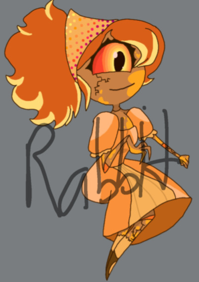
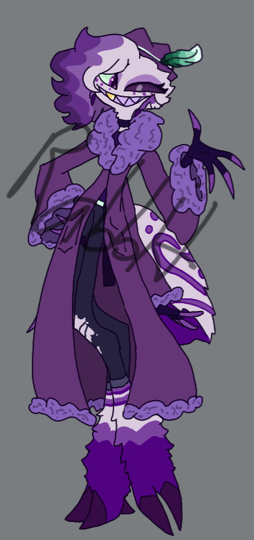

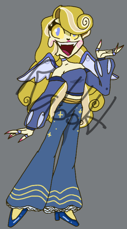


My Hazbin Hotel Redesigns (so far)!! These were made FOR FUN!!! i always do redesigns and such for most fandoms I'm in anyway. Also most likely an AU ?
Info:
Ideas yet but i think i am actually gonna make in my redesign/au whatever the fuck,
Vaggie and Charlie aren't dating yet, AD is her QPR and Cherri Bomb is his bestie.
Vaggie is an Angel thats very slowly seeing the corrupt side of Heaven, and meets Charlie by almost killing her. But obvi doesn't.
ALSO i think I'm gonna rename Vaggie, Cupid bc SUPPOSEDLY it is a mixed mytho anyway and i know Cupid isn't an angel ? But i figured Eros could be the real deal and Cupid is just Vaggie's nickname MAYBE or smth.
Bc i kind of think it would be interesting if Cupid was a fallen Angel .
The spear was her Angel weapon n then the bow n arrow is her later weapon
Ough i forgot to say i just got wrapped up in the sudden Vaggie/Cupid idea but UM
AD is gonna be an Ex overlord bc i said so. Instead of a pornstar.
He's still a SW but pole dancing is for fun more than anything and none of it will be seen as "gross". I'm not taming him down TOO much. Hobby wise etc.
Umm also Charlie is gonna be Grey Bisexual and Aromantic.
Cherri isn't there often bc she still likes the chaos. I like to imagine she used to work for Velvette but then escaped later on bc she wants to do shit her own way.
She loves art, esp like spray paints. Her bombs even have paint inside of them so theres a splatter everywhere she goes.
I think Cherri would also be friends with Sir Pentious in the end tbh. Haters to Besties.
Little details for the characters and their partners:
AD having mint colors + feather for Husk
Vaggie slowly getting blue details as she's in hell, hinting she's gonna be with Charlie
Charlie Having pink make up to hint she's gonna be with Vaggie.
Not shown:
AD and Charlie have matching phone charms
AD and Cherri have matching knives
this is all a WIP but I'll prob do screenshot redraws at some point! I wanna maybe work on making OCs first.
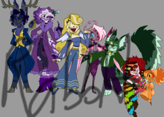
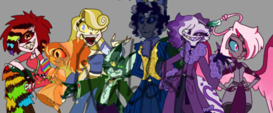
Note: Do not copy (inspiration is fine !!!!), steal, repost, use for NFTs/AI art, Do not trace etc. Okay to tag as kin/ID/fictive/me, okay to make fan art of!! And its 100% okay to have our designs interact and/or our designs interact with ocs !!!!!!
( please click on them, tumblr ruins the quality )
#Abyss' Art#hazbin hotel#Hazbin hotel redesign#alastor#angel dust#charlie#husk#vaggie#Cherri bomb#Nifty
50 notes
·
View notes
Text
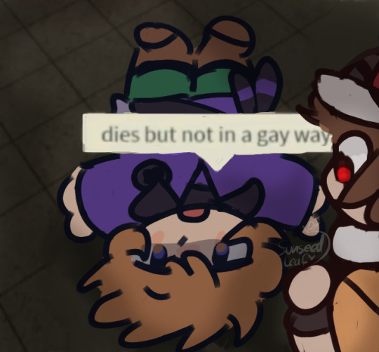
art dump timeee
lots of pokemon stuff i hope you like it :) this is a looooooooooong post
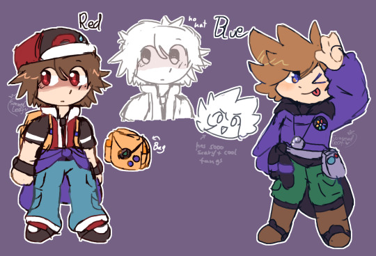
Originally these were just design mashups, at least, that was the plan for my "redesigns"... but it really made me realize how little they change Red throughout the generations. hence why he looks VERY similar to his canon design, i just added some things i guess. for Blue i could go absolutely ham with things i wanted in his design since there's so much to choose from. the fang idea comes from my friend. also, these are pretty much used for an AU based off of the RG project romhack by @shima-draws (i hope tagging is okay aaa) bc i played it with my friend and we really liked it and it converted him into a pokemon fan and namelessshipper :) In the end we made our own AU based off of it because other characters got thrown into it. we're continuing the timeline in soul silver :p
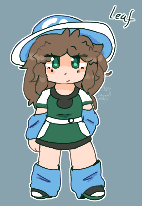
Here's a design for Leaf, she's Red's sister in my headcanon, i again went for the design mashup thing so that's why she looks like a mashup of Green and Leaf. i don't have much to say here....
Then there's some designs i can't show but it's for the reason that they are just human + trainer versions of sonic exes (not joking, i wish i was. my friend dragged them into our mini-roleplays, only two and they were Red's traveling companions and later Kris's too.)
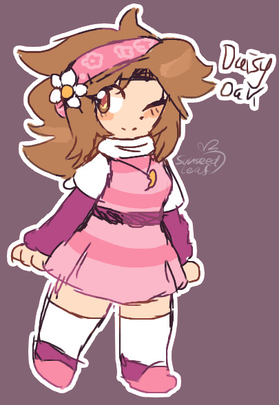
Then here's a redesign inspired by other Daisy designs. dunno why but i just wanted her to be pink....
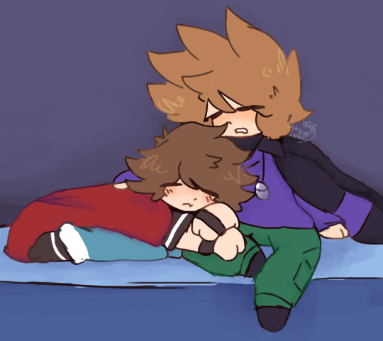
Eepy...
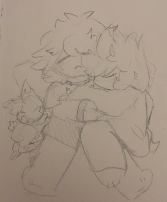
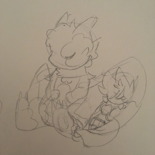
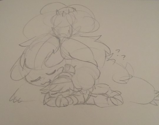
even more eepies....
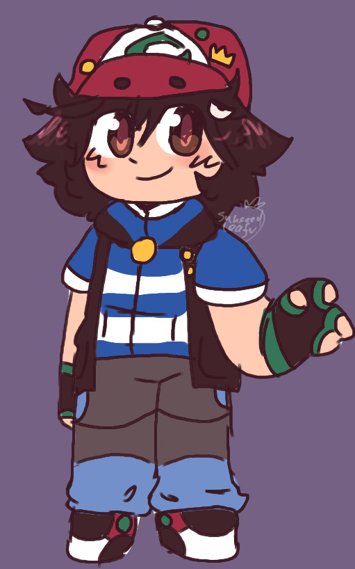
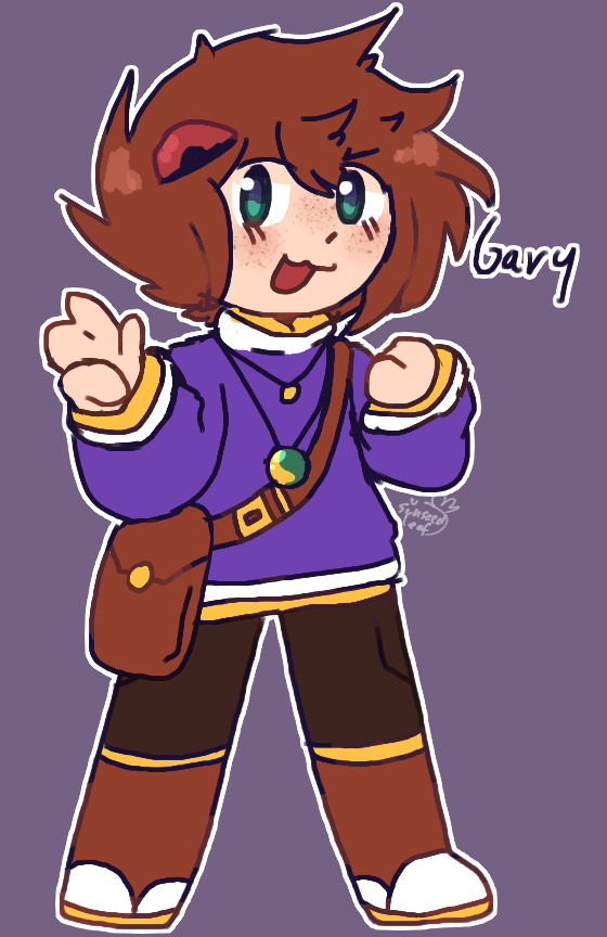
then i made some silly redesigns/design mashups for Ash and Gary
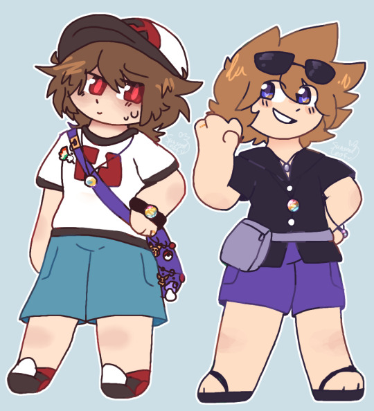
And drew Red and Blue in alola. married dudes -w- Just in general my headcanon is that Red collects keychains, he probably has boxes worth of keychains and puts different ones on his bag every day, he even did this as a child he just didn't stop even into adulthood. Still a kid at heart with his silly keychains more headcanon rambles: Blue hates the cold but loves the warmth and Red loves the cold and hates the warmth. please put him into a freezer he can't handle the heat of alola- also yeah i know i messed up the number on Red's shirt, i learned how to draw 96 after this, i promise
And now we get to Pokemon Soul Crystal,,, which is just pokemon soul silver but with a patch that makes Lyra into Kris lol
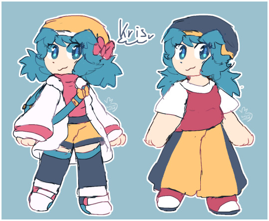
Here she is!! i tried incorporating some bits from Lyra and her comfy outfit is based off of Gold i swear i love Kris's design in canon, the hair is a lil funky tho so i made the pigtails a bit shorter and poofier
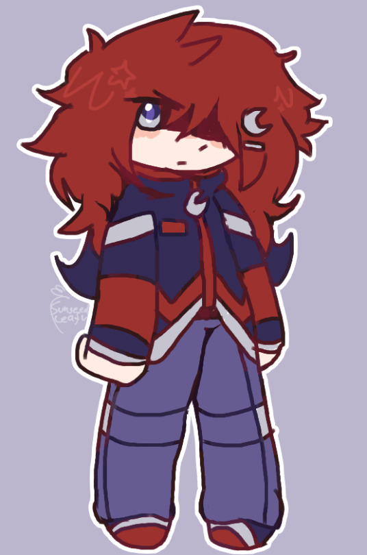
then we got Silver here... again not much change, i love his design, i just wanted to add some moon details bc why not
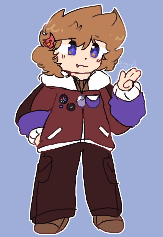
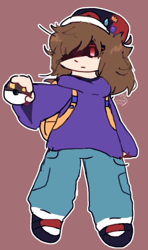
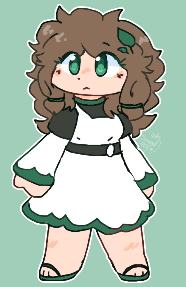
I'll batch these together! here's some redesigns for the OG trio for Soul Crystal
Blue is supposed to look like he's been crying (sorry Blue :C) Red just makes me think of pokepastas im sorry, once he gets off mt. silver he'll get a haircut. Leaf is just. i dunno, i don't really know how to characterize her... she cares a lot about people but she's kinda bitchy about it. tough love i guess.. I think after soul crystal is over i'll get working on an continuation of that that isn't tied to a game where she gets more of an important role so i can work on her character. Blue is wearing lots of reds/warmer tones cause why not and Red is supposed to wear lots of blues/colder tones to give a little bit of a connection i guess.
Now, here's the final drawing before i show shitpost stuff, this was drawn with a drawing tablet rather than a mouse like usual
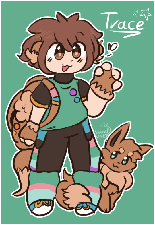
lines are a little funky but i like how this looks, i just need a bit more practice, i'm rusty on drawing with a pen
and now, shitpost:
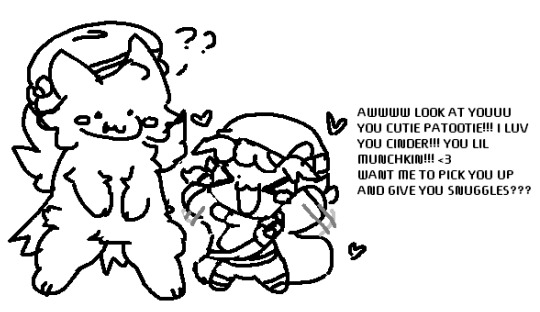
i love Cinder the Typhlosion,,,, he's so cute

i know this is at the top of the post but i wanna put this here again and credit the idea for this: here.
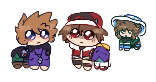
that's all, goob bye i'll go back into hibernation
#pokemon#blue oak#leaf pokemon#red pokemon#redesigns#namelessshipping#daisy oak#ash ketchum#gary oak#silver pokemon#kris pokemon#trace pokemon
51 notes
·
View notes
Text
Thoughts On Muffins Rescripted So Far
For anyone wondering, I will give a brief summary of what Muffins is. The Muffins Saga is a My Little Pony: Friendship is Magic grimdark fanfiction series. The series started with a short 2013 fanfiction titled "Muffins", which was a spin-off to an infamous MLP:FiM fanfiction "Cupcakes" by Sergeant Sprinkles. Thirty-six prequels, sequels and midquels were written, with six supposedly remaining.
Due to the controversies surrounding the author, Rainbott made their own reclamation of Muffins. This version of Muffins is called ‘Icing On The Cake’, and has a few differences from the original. I want to go over the synopsis I’ve seen so far and give my thoughts on what I like and what I don’t like. I should clarify that while I am critical of some aspects of this re-write, I didn’t make this post to shit on Rainbott. This is a blog hardly anyone reads, and I’m not trying to be rude. I’m just giving my opinion on it. I will clarify this: I like the concepts presented in the re-write, I’m just uncertain about the execution and how that’ll go. I say this out of love for the original, the concepts presented in Icing On The Cake, and my personal opinion.
If you want the tl;dr: I have mixed thoughts on Icing On The Cake, but I like that it makes an attempt to bring new life to an old story. I like the fact that Pinkie is portrayed as more of a manipulator, and I like that there are a lot of unique, creative ideas in the story.
Topic: Onyx ‘Minkie Pie’
So, I’ve seen a lot of Minkie redesigns. I even made my own. And I think this one stays close to the original, while adding some new stuff in with it. The blue and the purple look good together, and her cutie mark is unique with a heart shape to it. It’s a pretty okay redesign.
I don’t really like how in her backstory, as it kind of goes against what Muffins originally characterised Cloudy as. I mean, it’s a re-write, right? Haha, that rhymes. Cloudy… I mean, Peppo… Also, look. I know she isn’t the brightest, but how can a NEWBORN be ‘taught’ demonic things? Cloudy isn’t that thick, even if she pretty is. I don’t know, it seems low stakes to me.
Something I noticed is that Derpy and Apple Bloom’s name are consistently spelt wrong. Derpy Hooves is spelt as Whooves, and Apple Bloom is spelt as Applebloom. Also, I feel like Maud - from the synopsis - doesn’t play a massive role. That’s kinda sad… anyway, I still disagree with giving Minkie the ability to spot lies.
Pinkie Pie’s Project - I think the cheese grater is still a problem. I mean, Nightmare Moon is feared, right? A villain. Why would a child want to replicate a villains actions, especially when fillies fear Nightmare Moon? I thought it was going in the direction of “Pinkie makes a sacrifice for Nightmare Moon” but eh… personally, I’d have Rain Cloud be stumbled across by Pinkie Pie, who was her best friend, and Pinkie breaks down and doesn’t know what to do. The cheese grater incident (which occurred before) gave her inspiration to keep her friend with her forever, by baking her. She then takes revenge on Rain Cloud’s behalf, taking out village bullies, before her morality shrinks as her urges become unbearable and she begins preying on innocent.
Just my idea.
3. Beauty Lies Within
It’s alright. It’s essentially the same as the original, and I loved the original story. I’d say it was my favourite Muffins story.
4. Stuck In The Limelight
Eh, I don’t mind it. It’s alright.
5. The Fun Never Ends
I feel as if this re-write excludes a major detail that was one of the stronger original points: Minkie protecting AB and Derpy. Idk why it was cut.
6. The Last Crusade.
I like it. I like how manipulative Pinkie Pie is.
7. The Rest
The story at this point gets… a bit ridiculous. And then by A Glimmer Of Hope, it gets beyond ridiculous. And the time travel is where I kinda lost it. So, by time travelling, did Apple Bloom just abandon her old timeline? What happened to the Inkie, Minkie, Blinkie and Derpy of that world? The ending also feels a bit too optimistic, too perfect. What did any of it mean, if in the end, Apple Bloom would just travel back in time anyway? What impact did killing Bellatrix really have if it was ‘erased’ from the past? I feel like by having a perfect, rose-tinted ending, it kind of sours what could’ve been a great story. Because I like some of the concepts in Icing On The Cake, I just don’t like the synopsis we’ve been given so far. And it’s that disappointment is something that could’ve been great that’s why I’m even making this post, not hate, not anger, but disappointment and a love for a concept. My comment on Rainbott’s video doesn’t have any of these criticisms, because I don’t like going out of my way to tell people I don’t like this or that. This is just my opinion. This version of the story also treats Pinkie like the ultimate root of evil, when in reality, what the original Muffins did right was highlight the effects that long term abuse from a highly religious family could cause.
To give an example of a good time travelling story, let’s look at one of my favourite pieces of media, Higurashi. In Higurashi, spoilers, the true protagonist is revealed to be Rika Furude, who has been stuck in a time loop for a hundred years or so, trying to find a way to prevent all her friends deaths. In the end, things turned out fine, but there were still sacrifices to be made. The time travel worked in that story because it flips the idea of ‘being given a chance to do things right’ on its head. Rika was given many chances to, but like a human, she couldn’t figure it out easily. So she began to slowly deteriorate in her psyche. Even when she reached the ‘perfect world’, things weren’t guaranteed to be perfect. I mean, Sotsu and Meguri are the result of Satoko not getting therapy for her trauma. In this Muffins Rescripted, all of the characters horrendous actions are undone. They don’t even remember it, except AB & Pinkie Pie. I mean, even in Life Is Strange, Max faces consequences for messing with time. Time travel is generally an overpowered tool of fiction, and it can be used to tie things up neatly, even if a story is written into a corner.
We can’t know for certain how the story will go as we are only given a synopsis, but from what I’ve seen, I have mixed feelings. I think something oddly endearing about Muffins was that it felt down to Earth. There was no magical fights. And while I understand it’s intentional to stray from this, I really think the charm of Muffins is in a way… its edginess. The fact that things reflect the real world. The fact PRISON exists (yes I’m aware there’s a pony cop in the show. one.), the fact that Babs tricks kids into eating apple seeds, the fact that there are *serial killers*. The fact that the plot doesn’t rely on magic. It’s sort of an ironic twist on the original. The fantasy and sci-fi elements out of left field just rub me the wrong way… genre whiplash, sorta.
But hey, we’ll have to wait until the stories are actually out to make our full judgments.
Edit: I made this post just a year and three days ago. I just want to add that this comes across as a bit harsh, but I swear it wasn’t intentional. I can be too blunt sometimes, it’s not intentional. I didn’t make this post to attack Rainbott or insinuate they were a bad writer. I was just giving my raw thoughts on the story. No one accused me of that, for the record, I just picked up on it re-reading.
15 notes
·
View notes
Note
Hello! Since you said that you have Mors for nearly ten years I am curious how he came to be and how much he (maybe) changed in all those years. (Really amazing character btw <3)
Thank you for your compliment and question! Very interesting question and the answer will be... big. And full of my old cringey drawings, enjoy. :D
So, it was far 2014, in my rat era (at that time I was obsessed with rats, but I still love them). Searching for rat art I came across a bunch of rat-dragon hybrids and it inspired me to make my own design. So I made the first sketch (December 2 as I can track) and as I decided to make it not just general species design but a distinct character I drew this colored ref.


So basically it was just a rat-dragon, neutral but pretty aggressive.


Mors was one of my characters, who developed through text rp. And for one rp plot my friend suggested to make Mors demon and insert him as an antagonist. It was about half a year after his creation and since then he is an evil demon.


But at that time Mors had pretty plane, one-dimensional personality and his motivations usually came from his hedonism, greed, possessiveness, sadism and ill curiosity. He still got that features now, but I've added some more dimensions.


Coming up with his humanization (so it doesn't piss me off) was a long path.


I believe, this sketch was the first, where I decided to give Mors this... ehh... side bang (but here it isn't as long as now).

And as general design wasn't changing so much, his personality was constantly undergoing some modifications. Mostly related to empathy and romance (and some of his powers, but it all has blended in my head, so I won't go into details). So it shifted from "his inability to love is a punishment and he is unsympathetic bastard" to "demons can't love so they don't get vulnerable" then to "he can't love due to his psychopath and narcissist nature". Even that has changed a little — Mors can love, but it can be almost as dangerous and traumatizing as his hate, since he doesn't know how to make healthy relationship.


In 2019 I made redesign and these colors are still actual now. As I remember, his personality was pretty similar to what he has now, only shifting a little.

About inspirations and influences. I suppose, maybe Mors' palette and this goatee were influenced by Jafar from Aladdin. Or maybe goatee came from basic image of Devil/Mefistopheles as is his whole archetype. Also he took his exquisite manners, calm demeanor and tailcoat with gloves from Sebastian from Black Butler. Hannibal from series defined his cruel and manipulative side and Lucifer, also from series, gave him that "Oh no, I'm a monster 😭" drama queen thing. Actually I once started to make his kin list but forgot about it mid-process. I will make it, I promise.


So, Mors came the long path from quite plane character, both in design and personality, to a complex person with his virtues, flaws and inner conflicts. He is still a bad guy though, but it doesn't mean he can't get better *wink*.
Thanks for reading! I hope it was interesting.
3 notes
·
View notes
Text
Stupid/silly rant abt something that probably only I care abt xd
(god i spent so much time on this)
So, for the last two days I've tried to make a redesign of the shadow-magical-girl chica outfit
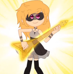
This one ⬆️⬆️
And it literally sucks so much* that it leaves me with no idea to redesign it without changing everything from it
*in regards of design according Ann's Character, not if the outfit in itself, that is actually really cute*
So I'm just going to point out some things that bother me and mention what I think it would work instead
The outfit as it is
Look, i know this might be a personal bias, BUT magical transformations should be fun!!The excuse of "it's magic, it can do whatever it wants" gives us the opportunity to make cute outfits and stuff!!
Look, the dress is cute, alright, but adding a little bit more of details can really seal the deal here, maybe a bow in there, or some chains if we are going w a more "edgy" design, or adding a few markings on the boots to make them less flat. (Look i know that the design also can not be overly complicated bc the model would be hell to animate, but this girl needs accessories!)
Look, if you added a few random things over the original design it would make it a little bit more interesting, you could call it a day, right? Well yes, but that's what takes me to my second point...
This design is nonsense!!
Look, magical transformations are usually based in a certain theme or idea surrounding the character. Here are some examples
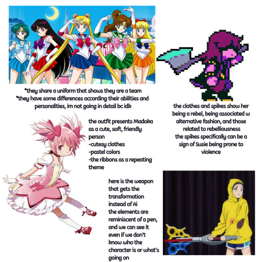
So, with that in mind, what can get get from chica transformation? (That story wise is supposed to show her growth as a person bc it shows that she accepted "her shadows"*)
*what are the shadows anyway, opposite personalities, their biggest fears or just ~bad vibes~?)*
Well, nothing, being the look so basic, and even with the long hair, something that is uncharacteristic of chica, she doesn't look like herself (you can edit the eyes and say it's joy, and it would look more credible) and it's only a problem for Ann, because both Freed and Bonnie have transformations that show their characters
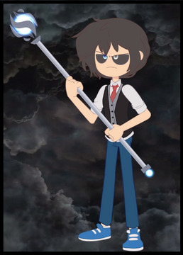
This one is more of a fusion of Freddy and Fred, with the school uniform for Freddy (being his most recognizable look), and the vest for Fred (i want to remember the outfit that Fred uses in the wolf in sheep clothing has a black vest, this one could be representing that but idk)
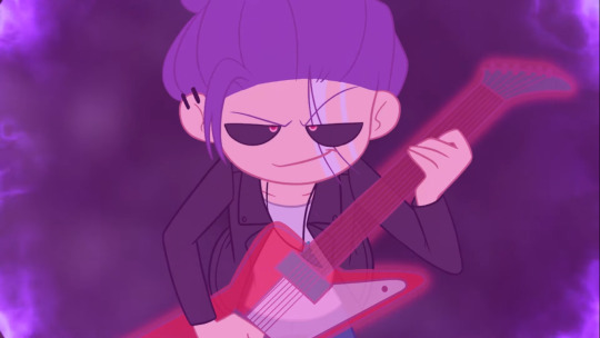
This one does a Great job, because shows a lot of Bonnie personality (his love for the guitar w the pick, the characteristic hairdo that he does when playing, even the outfit is more "rock" idk how to explain)
So, how did this happen?
Well it's really simple, Chica doesn't have any personality of her own, or things she's recognizable for.
Both Freddy and Bonnie have things that they are known for (Fred and the Yaoi guitarist), that are used in the transformation, Chicago on the other hand isn't recognized for anything else beyond being The Girl™ of the band, in that sense, the transformation does a nice job representing that.
But Chica is more than that
In the series we see different aspects of her, she likes having and supporting her friends, she likes sewing and making clothes, she's the last one to give up on anything, she started a band with the trouble kid, an apathetic dude, a micro niche celebrity and the strange new kid, and somehow she made it work! So there's really no excuse to have her as basic as that.*
Oh hey btw i did make a design for her, but as I said before its really different from the original, and then I realized it kinda looks like @cinnabundolly12 Design--- this one that is waay cooler than mine, so I gave up and made this strange rant
*to be completely fair, Chica has a lack of troubles or conflicts of her own, most of them are related to the whole group, she has a little self doubt one chapter and then sings her song and that's it, she's also very bland as a character xd*

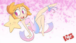
I just put the drawing here bc i liked how the body came out and I will probably delete the file from my phone later
I based the design from here
And it just follows a star theme, i used that bass I found on Pinterest lol. Also I did try to implement some elements from the original but lol ¯\_(ツ)_/¯
#fnafhs#fhs#chica fnafhs#rant#im open to criticism btw. if you have something to say go ahead lol#i spent like 3 or 4 hours on this lol. im so bored#does anyone even read my tags?🫠#like para que fernan lo vea xd
17 notes
·
View notes
Text
-HELLo and welcome-
Hello, my name is Sweets and welcome to my little blog in this little corner of tumblr. I'm just a little salty, jaded woman on the Spectrum from the states who enjoys writing/drawing and bitching about everything. Oh, and I'm sorta a fan of Hellaverse. Sorta.
This blog was made for me to share my Hellaverse/Helluva Boss/Hazbin Hotel rewrite(s) I’m working on while also giving me a space to share my thoughts on the show(s) soI don't spam my HB/HH roleplay blogs with critical content. I'm salty af, what can I say.
My Helluva Boss rewrite is called I.M.P: Immediate Murder Professionals and my Hazbin rewrite is called Hazbin Hotel: Redemption Arc (at least until I can think of a better name but I like it as of now). I talk a little about the direction of my stories will take here.
What this blog basically is:
This is all the fault of my friend Nihlis! We both happened to be fans of Hellaverse (and still are in some sense) but have been turned off by the writing focus and decisions made within HB Season Two and found Hazbin Hotel to be a bit 'lackluster' to say the least. You can argue that the writing in the serie(s) as always been hot garbage but I felt HB Season One wasn’t as bad as it is now but going back to S1 also opened our eyes a lot to the problems that plague the series from the start but only now taking full notice of. After plenty angry, salty discussions and a little pushing and honestly a bit of boredom on my part: This blog was formed.
This blog will be very Hellaverse/Vivziepop Critical, but never to the point of down right spiteful (as I said, I’m a/I was a fan of the show). If just sharing someone thoughts and criticism, even if it’s constructive or/and not to bash Vivziepop as a person but to criticize her as creator turns you off, then this isn’t the place for you. You’re more than welcome to share/send in your own thoughts regardless if it’s positive or negative, along you’re polite and civil about it. I WILL DOWNRIGHT INGORN HATE/ATTACKS/HARSSMENT ON ME, MY FRIENDS, FOLLOWERS OR ANYONE ELSE (including Vivziepop and everyone that worked on the show). This isn’t the place for that!
What I plan for this blog is to share my rewrites/restructuring/redesigns of how I (and/or Nihlis if he wishes to add some of his own thoughts to this blog) would handle/fix/would tell the story with the source material given to us plus adding my own twist on things, big and small.
I also hope to gain feedback for myself so I can grow as a writer and artist as well. Pleased don’t feel shy to share your suggestions or questions about this AU via ask. Heck, don’t feel shy to link to your own designs or AUs I love see them! Maybe we can even bounce ideas off each other!?
I am not a professional writer nor do I claim to be one. This is all for fun at the end of the day
What this blog isn’t:
A hit piece. While I will be very critical on this blog about my thoughts on Vivizepop’s writing, character design (tho I’m no expert when it comes to that neither) and some of her own actions, I do not hate Vivizie as a person even though I do have some thoughts about her personality. I do not know her in real life, I just consume some of her content and question some of her writing decisions. Whatever happens or doesn’t happen to be going on behind close doors at SpindleHorse Toons is not the point of this blog so I will not be addressing the allegations thrown out unless I feel it’s needed, let alone my own thoughts on the matter. There are blogs that do address her actions and behavior in more detail however.
I’m also not trying to 1up/have a ‘gotcha!’ moment on Vivizie. Like I said, this is all for fun. I’m just another salty jaded fan on the internet that should be no more insignificant to her just as any other fan and ‘hater’.
Um, so yeah. Hi~
#Helluva Boss#helluva boss critical#haha promo go brrrrr#viziepop critical#hazbin hotel rewrite#hazbin hotel critical#helluva boss rewrite
15 notes
·
View notes
Note
what's deltapack AU tell me everything or send a link to a masterpost if u have one :> I love love love love AUs! do you have any drawings of your characters a s well?
OH BOY WELL. THERE IS A LOT. AND A LOT OF MY POSTS TALKING ABOUT IT... ARE KINDA OLD?? BUT!!
heres my two latest asks answered abt dpau that are good starts!!
1) the """basics""""... despite the length it is the starting stuff you need to know. just overexplained
2) here, links to post number 1 and talks about the basic lore for blank. brief-ish, only goes on more detail for some things, but skips over certain important scenes and events (but not like.. the core ones lol. and cliffhanger ending-ish i guess)
i also reccommend going through my dpau/datapack au tag on art fight, it has all my characters for this au there. they have some art there and descriptions on basic info on them too! I ALSO HIGHLY RECCOMMEND IT, BECAUSE I WILL DISCUSS CHARACTERS WHO I HAVE NOT DISCUSSED ON ANY OF THESE BEFORE!!! so check it out to see who's who.
THIS IS OLD, SOME OF IT NEEDS UPDATING, BUT MOST OF IT STILL STANDS UP!! some basic terms used in dpau and such from my old unfinished info google doc about dpau!!


and if i feel less anxious, i may share some fanfic chapters i have written for this. there's 1/2 i may share, which are connected. specifically about spamton Accidental Acid Nacho Dip and his escape from the mansion and some character drama ! i want to rewrite it because i made spectre too dramatic there, i think, and the background swatchlings get... very confusing. but it's the most well written one, i think. i have some stuff on blank's incident and argument with berry, but i cringe while reading it so... i'll see. i may also share any other notes and unfinished things and whatever if you'd like. i'll see what's in a ok-with-sharing stage
more random stuff for you!
blank's playlist ! i say it's still a work in progress - but i havent updated it in a long while.
divided into two parts, addiblank and corrupted blank. addiblank is my nickname for blank before his corruption.
some other characters also have playlists, but they are less developed
RANDOM FUN FACTS!!
most of the characters are named by one of my friends who helped with ideas and things for the au.
there's several czech pun names, including berry's middle name. berry b addison... they don't like sharing their whole middle name.
blank's voiceclaim is bo burnham, and i realized the two accidentally had similarities, so i purposefully added some quirks to blank to make him a bit more like bo as an inspiration.
tired swatchling is based on a roblox voicechat roleplay with my friends - i played as a... well. tired swatchling who's number one thing is hating rouxls kaard.
yes, blank does have rats in his hair. the cursorats! my own species i made !they're the rats to maice's...mice. they're based on gamer rgb glowing mice. the names of his pet cursorats are, pantaloonie, remy, the one (and only) and spaghetti
pantaloonie he can cook
maddison is heavily and i mean heavily based on my personality, if you added a bit of jerma. he is a canonical twitch streamer
blank and berry are also based on me, but also my best friend and our dynamic we had/have growing up! we've known each other since we were like..3 years old. we go way back and have seen each other in different stages of life like this, and certain periods just... inspired these two characters. and just. me. blank is a representation of me with people i trust, and being heavily indulgent in the things i like... berry is the quiet me around people i don't trust, and the character who struggles with a lot of the same social struggles i have as a neurodivergent person. all of these characters are a bit nd i can not write normal characters. sorry.
tired swatchling's and mocha's parents are two swatchling moms, chroma and aroma! i need to redesign aroma a bit, and make "modern" designs for them, since their current designs are them while younger!! these ladies have aged a little bit since - despite darkners lack of aging visibly after they become full grown adults.
spectre's name is not pronounced like specter! it's pronounced like spec-tray. they were my first swatchling oc, too, and for self indulgence they feature a spade on the back of their suit - considering that's my symbol i've adopted for several reasons, deltarune being one of them. we go way back.
swatchlings have uv light vision!! they also have uv light markings only other swatchlings can see!! they have a event/holiday where they paint on their bodies where their invisible markings are to celebrate their differences! literally! each swatchling has a totally unique marking, that is not determined by anything! it's generated randomly upon hatching. (grows in like a day or two after hatching.) this is how swatchlings differentiate each other even if they may otherwise look the same! they also all like being unique, using make up and cool hair styles and outfits... a luxury working specific datapack swatchlings may not have - so they got these markings, since nobody else can see 'em!
clambert has a pet tasque named perci. she has a complicated, long name but i keep forgetting it. and i keep forgetting to save it. im not asking my friend to remind me agian currently it is lost in like a year worth of instagram dm scrolling and i dont even go there anymore.
blank's design is inspired by ena!
hash was originally just a named background character... that appeared in a little thing i wrote. just like, an possible dpau intro? it made sense for me to use a regular visitor character, and i gave them a name... but my friends loved them a lot so... hash is an oc now! they are also inspired by almond cookie. they are a maskless swatchling, too
also, my other maskless swatchling oc, tag, was a concept for a loong time before i finished her design. i was stuck on the name.. but... tag was an obvious choice. since yknow. hash. tag. lmao
brodi adobi and his company is based on adobe, obviously. his design is inspired by portal colors, and his voice claim is jave johnson. he hates lemons. also, he knows almost nothing about art, he just sells art supply shit. he goes on a lot of talk shows.
malina is an lightner oc, that i have had since before deltarune chapter 2. hell, she was actually an undertale oc first, made around 2020, as i have realized i never had a proper undertale oc.... i really like nicecream guy, so i made him a sister character! i then decided to make her a deltarune character with chapter 2, as she now fit in there way better! she has her own story- HOWEVER. The story of the main cast is... very seperated from the main story of DPAU. She follows just the main cast, but she does exist in DPAU and my headcanons to her story apply! she's best friends with sweet cap'n cakes! and scratch. because why wouldn't i put my self insert there
oh yeah, scratch is my deltarune sona and basically self insert!! they are the fourth member of sweet cap'n cakes. they are based on a soundboard and a karaoke machine! they were also inspired by napster and hatsune miku, and gamer headphones with cat ears. they are also very self indulgent with my color choices. they're me, but a silly music robot who makes ytps on the spot, and is just silly goofy 24/7 without the problems real me has
i did write a short chapter thingy with malina!! i have like... entire scenes thought out for her how she follows along with the gang in the main game. this... slipped out of my head mostly, id have to read my old notes. she also has a snowgrave route!! and that also splits into like.. 2 "endings" and both are! not good! so no arms ?
malina is also a florist! and unlike me she enjoys doing it! i regret my school choice and this is a random cry for help! she helps out asgore at his store. also, some of the experiences she talks about kris with, and some little experiences i have made up for them, kris, and noelle and their whole lil' gang while they were kids are based on some stuff i did as a kid myself
snooper isn't an important character in dpau, he just exists there, but i love this beast. his hair is the twitter logo, he says l+ratio unironically, and his speech pattern is inspired by quagsire in from PMD. he has his own page on my website! not just that, but a whole mystery fun hunt! if you go there you can even get his petz mod of himself :D
blank also has corrupted speech, similar to spamton. just.. more fucke.d no advertising, just fucked. imagine a walking glitchy ytp. been compared to withered chica's voice. he can also make static noises and his voice can change tones as well. he also quotes movies and past experiences which will sound exactly the same as they did before. he's like a fucked up radio. his speech is very annoying to write at times, but here's some old examples back before i gave up on adding all the effects and jumbles while rping. msot of the time he is like... audible just glitchy. when extremely emotional his voice breaks more. OK. NOW TO THE EXAMPLES.


icon censored because i hate the art. also blank uses he/they pronouns, but he/him is his primary. back then i used they/them on him more. he is sososoosos fucked up <333333
sometimes he just does this.


oh yeah did i tell you he almost constantly oozes goop from his mouth and eyes? my man's fucked up
maddison canonically plays fortnite and im leaving you at that. more facts later. i set a reminder to do something an hour ago and i still havent done it . i told you i can talk about this au for long
6 notes
·
View notes
Photo

i just think two bad bitches should be in love is that too much to ask
theres a whole au attached to this art
#lou dofus#noximilien coxen#yea this is a sort of redesign of unmasked nox as well bc idk how to say it but he looks Bad in the short#redesign was made by my friend i just added my own details :]
20 notes
·
View notes
Text
H20 mermay redesign
So in honour of mermay, and my rewatching h20 a couple of months ago, I did a redraw of the characters from h20 with my own head cannons and some explaining of my redesigns of course (: I really think that an animated reboot (not the one Netflix did) would be perfect for this show, and I wanted to convey my ideas. I also did try the make the designs resemble the actors at least a little bit.
Ricky
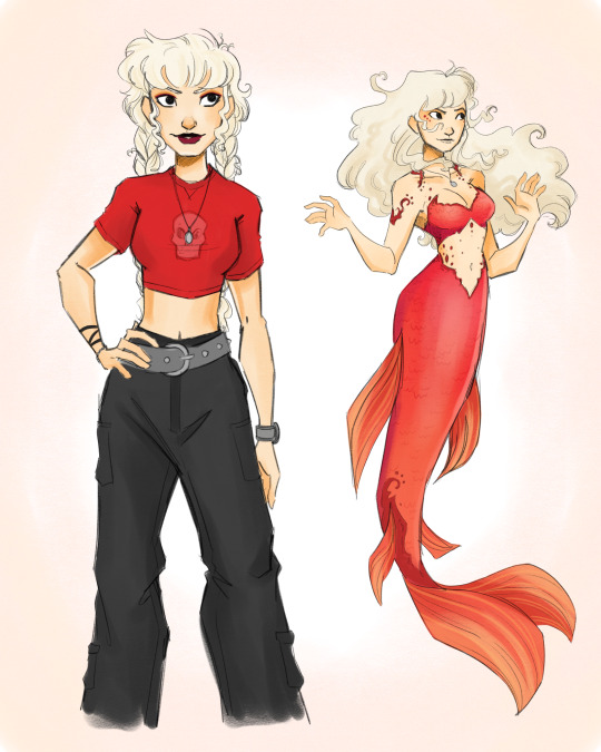
I love Ricky with all my heart, she’s definitely in my top 3 characters from this show. I’m obsessed with her hair in season one, especially when she puts it into braids. I kept her red motif from the first season as well. I want her to wear very early 2000s-esque grunge clothing. In terms of her mermaid look, I changed her colour to this orange/red-ish colour, and added details to make it look like flames.
I know a lot of people like to headcannon her as a lesbian, but personally I don’t. I think that she’s definitely pansexual with zero preferences and would go by she/her pronouns but would be ok with they/them.
Cleo
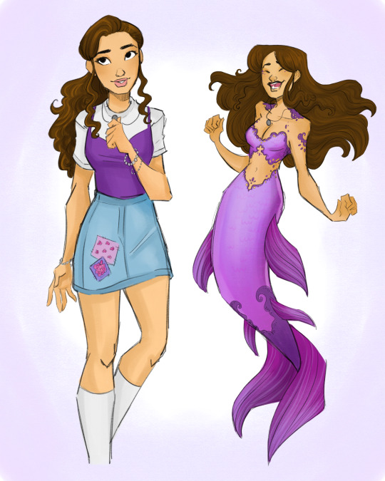
I honestly had so much fun with Cleo’s design. She has a bit of a bohemian style in the first season, but I decided to trade for a little more preppy look that I think reflects her character more. She’s sweet, caring, a little naive, but good spirited. So I put her in a trendy outfit with some cute patches to keep that homemade look. For her mermaid look, I wanted it to look like lace to mirror the patches on her skirt, and of course, it had to be purple.
My asexual ass has to headcannon her as ace and heteromantic. She’s also got the purple motif so that just adds to the ace-ness. She/her pronouns.
Emma

Emma’s design came really easily to me. I wanted to give her a kind of periwinkle colour scheme to match her ice. Her human design is simple, but I really wanted to keep it modern and trendy. Athleisure with high socks and bicycle shorts (and of course a sparkly top). Her mermaid design also came really easily to me, as I gave her sharp sparkly edges to resemble ice. Is it difficult to make a blonde, ice-themed character not look like Elsa? Yes
If anyone in the main three is a lesbian in my eyes it’s her. She’s hella gay with she/they pronouns.
Charlotte

Lol I don’t think I have anything positive to say about charlotte but damn I had so much fun drawing her. I really wanted her to look soft and sweet but give her the nastiest attitude ever. I put her in a preppy school girl outfit with soft pastel pink to make her look unassuming (at least to Lewis) and of course the necklace that the other three girls have.
She/her, straight.
Will

Threw a curveball at you didn’t I? That’s right, this is where my head cannons start, along with my inability to draw abs. Rewatching season 3, it only made sense to make him a mermaid instead of Bella, and I honestly feel like it could’ve been more interesting. Imagine him as a diver who got just a little too curious around Mako, and accidentally turns into a mermaid. His dreams of become a diver are ruined, however he got to be happy doing what he loved (exploring the ocean). It just makes more sense in my opinion.
For his main colour, I changed his motif of blue to green. I wanted to keep the blue colour for Emma and Lewis, and I honestly just felt like it suits him better. In terms of his powers, maybe the ability to control plants? Idk
He’s probably straight, maybe bi-curious. Goes by he/they but wouldn’t object to any pronoun. The chillest dude.
Bella
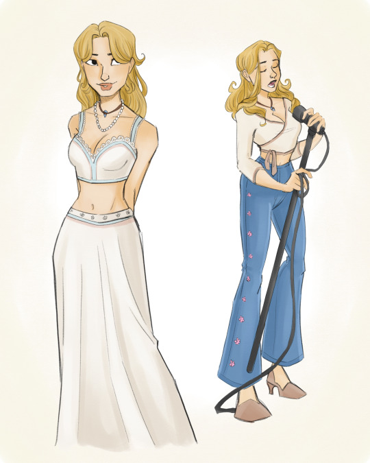
Bella was probably the hardest to adapt just cause I don’t love her character in the show. I decided to make her not a mermaid, and instead a love interest. I felt like it suited her better. I wanted to keep her colour palette soft and muted, and put her in sweet, bohemian style clothing. I feel like she would become a good friend of the main trio after the betrayal by charlotte. She would be an excellent friend and totally keep their secret as well as fall in love with Will.
Definitely bisexual, not opposed to a flirtationship with Emma (I just want them to meet) She/they.
Lewis
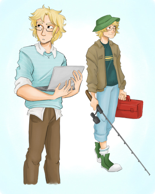
Look at this disaster man. I put him in messy clothes cause he probably couldn’t give two shits about what he looks like. He really does just want to go fishing.
Biromantic asexual (yes I am in fact projecting onto these characters). He/him.
Zane

I personally love Zane. I know he’s not everyone’s cup of tea, but I love characters who are shitty people and even when they’re on “the side of good”, they continue to be shitty people. Just more focused and positive. When I was a kid I was 100% on board with his relationship with rikki, and honestly a part of me still is. So for my headcannon, he doesn’t cheat on her, the cafe doesn’t get in the way of their relationship, and he treats Rikki so much better. Cause they had fantastic chemistry and I don’t want it to go to waste.
For his design I gave him two looks, a casual motorcycle riding outfit, and of course a business suit. I made his main colour black, but I had to give him dark red accents as a nod to Ricky.
Heterosexual, he/him.
Lastly
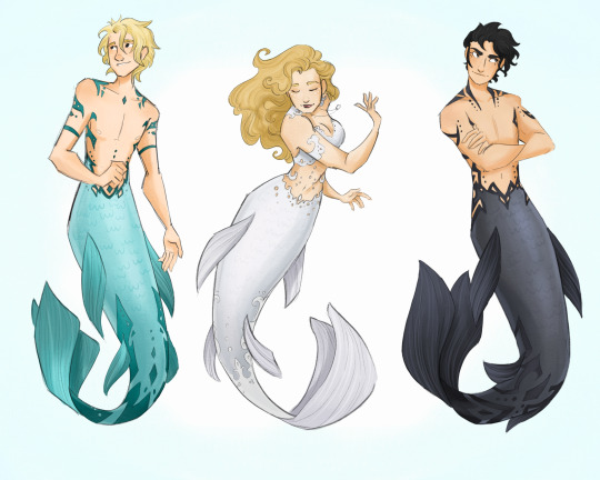
The love interests as mermaids. This is not a part of my headcannon (yet). In terms of powers I have a couple ideas that do, in fact, include Lewis being able to talk to marine life. Poor boy will never go fishing again. In terms of Bella’s powers i really hate what they gave her, so I was thinking wind or bubbles or something air-related. As for Zane? He’s definitely the hardest to pin down for powers but I’m thinking either shadow manipulation or storm related powers (like lightning). Maybe a combo of both.
Well I’m done writing this all out and mermay is over so fuck me I guess. That’s what I get for making this post with 20 minutes left of may. I hope you had fun reading my post and looking at my art. I probably won’t draw more of this headcannon but idk I do what I want
#mermay#h20 just add water#h20#h20headcannons#h20 Cleo#h20 Emma#h20 rikki#h20 will#h20 zane#h20 lewis#h20 charlotte#h20 Bella#Will and Bella#Zane and Rikki#Cleo and Lewis#for my 30 followers I love you guys thanks for tolerating me#I’m late for mermay#do you ever just want to be softly held as someone caresses your head and tells you they love you#cause I do
457 notes
·
View notes
Text
Heyoo!! I've been hard at work and I have a couple drawings of my Monkie Kid Au's characters'll look like! I won't give spoilers yet cause I need to figure out the overall story for the comic(cause some bits are still a work in progress), so yeh! I'll give a short explination for each drawing tho if it helps.(also, Sorry if this is super long 😅)
Anyways, to start off with, we have MK!
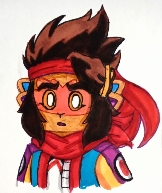
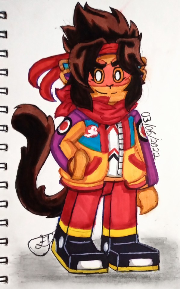
To start off with, since I'm making him the son of Macaque and Sun Wukong, he's gotta have a monkey form! Soo I gave him the tail but for the ears, since Sun has 2 and Macaque has 6, I thought I'd just meet in the middle with 4. Soo you bet he'll have sensitive hearing now with this, next is the outfit, I kinda kept it simple,changing a few bits but I tried combining the S1 and S3 jackets together, buut I thought 'why not add some purple to him?'. Oh and the bandana! I wanted it to be Sorta reminiscent of Macaque's scarf, and yeh, that's basically it for now.
Now Onto Mei.
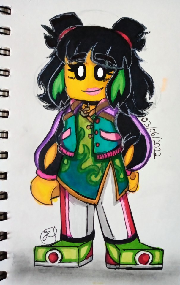
I wanted to give her a type of bomber jacket just the middle part being shorter than the previous jacket she wore. Annddd the dress shirt she has underneath, I wanted to keep it her style soo I watched the last 4 episodes of season 3 again and came up with making a green flame design on it. Though i thought adding some pastel purple and pastel pink details would work with her as well, plus some red as a reference to the samadhi fire. Also, Can't go wrong with a choker that has a flame charm on it can you?
Next up, our resident fire demon, Red Son!
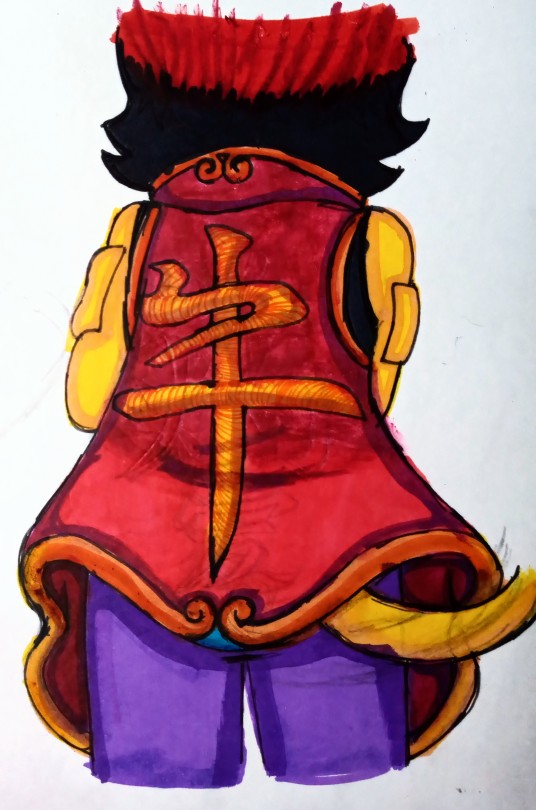
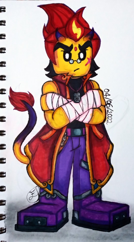
I wanted to add some Demon Bull king elements to him as a start, sooo, the tail came in and I added a set of horns that'll be growing in. I kept most of his old outfit just adding extra details to the shoes andd adding a dog tag that has the Chinese symbol for "Family" on it. Ohhh but the jacket was the most fun to draw, I wanted to keep it both fancy but pretty exaggerated. Sooo I used the Yu-Gi-Oh Character Seto Kaiba as a reference. Now this is only one version of the jacket since he'll have a separate one with his original logo on the back. Buuut this sleeveless version has the symbol of the Ox from the Chinese zodiac on the back of it, though I wonder, where did he get it from? 🤔
And lastly, We have Sun Wukong and Macaque themselves!
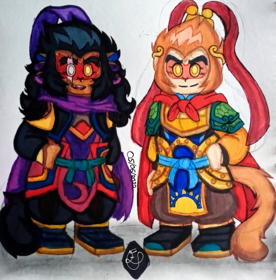
Now, I thought about keeping a sort of Sun and Moon motif to them whilst looking at their previous outfits for ideas.
For Macaque, the first thing I did, was to make sure I kept Macaque's blind eye(which he may hide from time), I switched up his scarf colour since he got rid of his old one and gave it to someone else. The rest sort of fell into place after that.
For Sun Wukong on the other hand, I used refs of his outfits and armour from the show, but also looked at the Monkey king:Reborn 2021 movie's version of Sun anndd the 2015 Monkey king:The Hero is Back movie's version of him for help with keeping his outfit traditional but adding my own ideas to it. For the pauldrons on his shoulders, I came up with the idea that he may have been given a couple scales from his friend the White Horse Dragon before he passed away, used those to make his armour. Oh and I tried making it so each colour represents a past friend of his, So Tang Sanzeng, Zhu Bājiè, White Horse Dragon, Nezha and a bit of Macaque too.
But, the MAIN part I wanted to keep, was the Golden Fillet he wore during his journey to the west with his master and allies. Granted he got rid of it but a headcanon of mine is that he kept it, after he was able to take it off, as a memory of his master, Tang Sanzeng. So I stretched it out a bit wider and made it a sort of crown(Idk what that type of crown is called).
So yeah! That's it for now and I'm so sorry if anything sounds like I blabbered on or didn't explain some parts enough, I'm not the best with explaining things, I just draw to have fun tbh. Anyways! I hope you like them! And please, go ahead and suggest below who you think I should redesign next and whatever ideas you have for them.
Also thank you so much @djmurphy and my friends on twitter for helping me with my Au, I may not have a name for it yet but again, thanks so much for helping me with it! I couldn't have done it without you guys 🥰
#lego monkie kid#monkie kid#monkie kid fanart#qi xiaotian#lmk red son#lmk mei#macaque lmk#six eared macaque#monkie king#sun wukong lmk#red son monkie kid#my artwork#traditional drawing
179 notes
·
View notes
Note
Would you be interested in explaining the designs you've made for team RWBY?
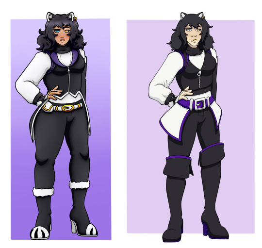
The thing is with my own designs is that i am a self-admitted perfectionist. I'm really hard on my own designs, and even now I keep changing things around because it doesn't look as how I pictured it. So, the designs I'm showing might not be the exact same in the future save those I really love.
I thought it'd at least be fun and that to include the original attempt I made back in 2020, just to see how I changed and reasons behind it too. These designs are for AZRE primarily, which has different story plots to canon, so the later designs reflect that rather than being purely redesigns of any canon outfit.
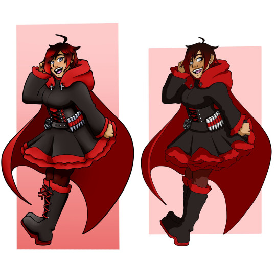
Ruby’s first design really didn’t change all that much from both the original and her canon Beacon outfit. It didn’t need to since the original outfit was that good, but I just added a few details to help push the design more.
I added the red midsection and lace to her corset similar to her Mistral outfit so that that section stood out against her black dress, and just introduce some of her colour there. Similar reason with the red laces, especially since my 2020 drawings don’t have laces because I was very lazy and didn’t like drawing them.

Her Mistral outfit is honestly still my least favourite of my designs.
It’s changed a lot since I took inspiration from her V2 alt outfit. The black pinafore keeps the black on her chest, and so the red of her corset pops out and makes Ruby look better protected for the trip to Haven, which was the main inspiration for the outfit. Longer skirt, thick tights, and more armoured boots for long walks, while adding some details to show that time had passed in her tattered cape and longer hair.
Her shirt is a darker grey rather than the white, and I honestly prefer it that way. I do like the idea of Ruby wearing Weiss’ colour on her in Mistral, showing she misses her friend, but the darker silverish grey not only makes the bright read contrast more, but matches the cool colours pop with her tanned skin.
Plus, I added some design elements for Penny. The wrist cuffs aren’t the maroon colour they were originally anymore since the black works better with the grey, and she’s wearing the neckpiece that Penny wore too. Lil’ pieces just to have her close friend in remembrance, and works as something for her cape pins to attach to that isn’t her shirt.
I also really like her boots. They’re probably my favourite boots out of all the ones Ruby wears, which is funny since they’re on the outfit I like the least. The crosses stick out from the black, with the added leather parts just making them look more protective for Ruby while out of Beacon.
That being said, I think next time I’d widen the gap of her skirt to show more of the red petticoat underneath, and add some of the rose patterns I’ve seen on other designs too. Just so there’s something interesting there, since this outfit is honestly a bit plain imo. Also, I’d get rid of the red gloves, I just don’t like how they look with her outfit honestly, but I wanted to keep red on her arms with the removal of the red sleeves she had previously.
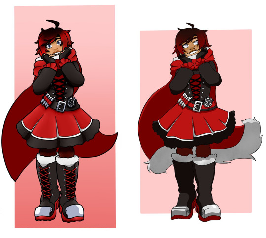
Ruby’s Atlas outfit hadn’t changed that much because I love it that much.
It’s obviously a big jump from her canon Atlas outfit. I kept the big skirt with additional fur to help make her look warmer, but I kept the look of her corset and dress underneath. The dress was changed to red and really helps with the colour, being contrasted with the black and white details to stop her from blending into the big red cape behind her.
I love the white trim on her hood, but I did remove the white fur at the bottom since it looks a bit too heavy for Ruby. Similarly, the boots have their shoelaces back to help introduce more red on her bottom half, since with the red dress she was looking a bit top heavy in terms of colour.
You can’t see with her hood on, but while she’s lost the wrist cuffs from her Mistral outfit, I still have her wearing the neckpiece from before, which I keep as a staple in the rest of her outfits.
Really, I just kept to her silhouette while adapting it for Atlas, keeping Ruby warm while trying to make sure her red was prominent, but not too much given the cape. I think the introduction of white is nice with the fur, but in the line up it’s a bit jarring that she doesn’t continue wearing it afterwards.
Really, this is still one of my favourite designs of all the characters, that’s how much I love it.

Similarly to the Atlas outfit, her Vacuo outfit hadn’t changed much besides a few colour changes and added detailing to the shoes. I guess I really just didn’t like drawing shoes years ago.
Since there isn’t a canonical Vacuo outfit just yet, I’m gonna go more into comparing the two here.
Really, I wanted to tone back the black for this outfit, as Ruby would be in a desert climate while wearing this, so I used the skirt/shorts combo that she had in Atlas and used it for here instead. I wanted a more lighter outfit look with the red taking over more, while still keeping some of the darker colours to temper it.
I pulled her corset up over the bust just so it looked more protected and support her bust more, but the shirt is something I’m still torn on even now. The cool silver grey like before pops with the tanned skin, works well with the warm red, and it carries the silver with her eye colour and metal parts throughout the outfit.
But I also really like how the pure white pops against the skin, and looks nice for a Vacuan climate. I think I’m leaning more towards the grey, but I also get if people lean towards the white more. Tis tricky.
Same as with her other outfits, the boots had been detailed more, keeping the red soles and laces to introduce the colour to her bottom half, and it’s the one time I don’t mind extra belts, since the belts on her boots are a real thing and better secures them to her legs. Plus, the black of her boots and her thin red tinted tights help to contrast her legs from the bright red skirt.
Also the bandages over her face still keeps a little white on her even with the different shirt.
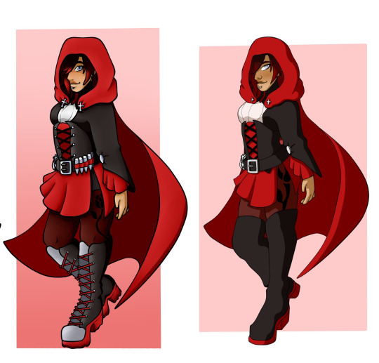
Same here with her adult outfit, it’s a design I made without specifically redesigning a canon outfit.
I really was inspired from Anna’s outfit in Van Helsing, which was used for Summer, so Ruby’s adult outfit takes a lot of inspiration from her mother’s. I kept the shorter skirt for a more mature look compared to her puffy skirt, and helps her red travel more through her outfit while being framed by the black corset, shorts, and long sleeved shirt.
Now she has the red sleeves reminiscent of her Beacon outfit, keeping the red on her arms, along with the red soles and laces on her shoes. With the red skirt and black boots, her darker maroon tights helps contrast her legs while protecting them on any mission. I’d maybe do something to help the rose on her thigh stand out more, since the black decal is hard to see on the already dark tights.
The white spot on her chest was something I thought would help add a bit of interest on her chest, similar to how the white spot on Blake’s chest does. I’m not entirely sure on the colouring since it’s the only white, I might change the silver grey of her boots to white so it looks more coherent, but I’m not entirely sure yet.
Not much I actively dislike about the design besides a few bits that need to be fixed.
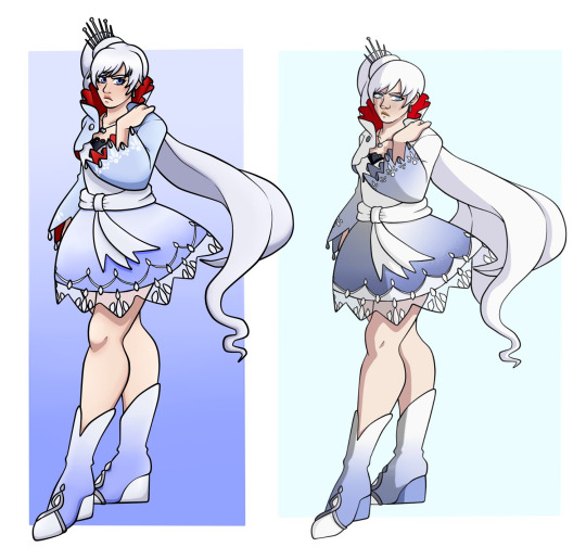
Similar to Ruby, there’s nothing too major about Weiss’ outfit.
Her blue is very prominent in her outfit here, to the point where it overpowers the white, but at this point in the story that’s what I was going towards. Weiss is very much still in her father’s mindset, and his colour overpowering hers is a visual note I wanted to put in with Weiss’ Beacon outfit.
But still, I moved the red from just inside her collar to inside her entire jacket. It’s a nice contrast against all the blue, and helps separate her blue jacket from the white/blue gradient dress. It’s also like her defiance is underneath, not completely gone despite Jacque’s best attempts.
The blue dress now helps the white sash stand out more as well, as well as her white shoe decals.
Also, she does not have her scar here. Since these designs are for AZRE, Weiss didn’t get her scar yet, so her design here reflects that.
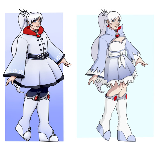
I hate Weiss’ old Mistral outfit. She looks like a clown.
The long dress that Weiss wears in canon V4 is still the same for when she’s in Atlas, but I changed her outfit to this when she escapes. I wanted the white and black to show more, and for the blue to retreat more as Weiss starts to defrost almost. I kept the blue gradients on the hem of her skirt and sleeves, so that the white decals on her sleeves stand out more.
Her jacket style is taken from her Snowpea outfit, but I rounded out her jagged edges to give her a more softer look. The black fur linings of her jacket and dress help to contrast her pale skin from her white clothes, making it easier to keep track of her limbs while she’s moving. Same reason for the black tights, as they contrast with the light blue boots.
Her red is more open now, in her collar and the gems on her shoes. I didn’t want to overdo it with such a bright colour on a palette like Weiss’, so the main focus is always on her neck and face, while any additional details are kept small as to not be too distracting. I also shaped the red gem on her jacket as an apple, a nice nod to her allusion.
It’s almost professional in style, more away from Weiss’ obvious rich lifestyle given her place in the story at this point, but I wanted to keep some of the previous style in small amounts. So, she still has some jewellery in her earrings and choker, which is the only sharp looking piece on her now.

I haven’t changed the girls’ Atlas outfits that much just because I love them.
Similar here, Weiss’ outfit isn’t that different to her old one save colour changes and the change of her dress and shoes, but it’s an obvious jump from her canonical Atlas outfit. I wanted to move away from Disney Princess, and this is really where I took inspiration from her Snowpea outfit, namely the jacket.
I had the jacket shortened with it’s capes taking the signature bell shape that Weiss has. The silver decals help add some interest and detail to the white background, and I added the metal dangling things on the end as a nice parallel to Winter’s design too. The all white jacket is contrasted more with the black sweater and dress underneath, stopping Weiss from looking like an all white blob.
Plus, her white boots and tights separate her legs from her darker midsection. I wanted to keep the blue to all her designs, but in Atlas it’s really minimal, allowing Weiss’ own colour to show prominently while being accented by black; Blake’s colour. Her tights have a gradient to help stand out against her white boots, with the white soles now being swapped for black instead.
I’m not sure about the red decals on them though. The actual colour is fine since it’s small and not that distracting, but i was trying to have the red apples like in her previous outfit. I’m not sure how successful I was with it, but I’m very much on the fence with it.
Obviously, the biggest change in this outfit for Weiss is the hair. I’m firmly on the short hair Weiss hill, it’s where I will put my grave, and I think her returning to Atlas with a new look, completely separating herself from the Weiss in the past, is a very good storytelling choice for her. Especially since she’s always been connected to how she wears her hair.
The little crown is less stylish than her original one, but I kept it since it adds a little something to the top of Weiss’ head.
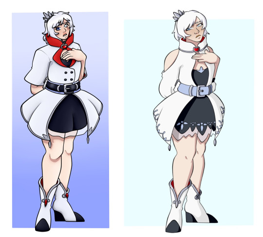
I didn’t really like this redesign that much when i finished it, but looking at it now, I’m warming up to it more.
It’s still not my favourite, and I’m not entirely sure why, but I wanted to go for a lighter outfit for Weiss in Vacuo. Her white ass is still gonna burn, but just slap some sunscreen on her, she’ll be fine.
I kept the jacket style from her Atlas outfit for the bottom, thought removed the decals for some reason? I would honestly put them back, I don’t understand why I took them off. Still, the white jacket contrasts with her black dress underneath, with the style changed to her more common style dress rather than the sweater/skirt combo from before.
I added the see through fabric at the bottom for a little detail, like the fabric from her Beacon outfit, but I’m not too sure about it. Honestly, it looks kind dumb, so I’ll probably change it to more of a white petticoat underneath, like the petticoat on her Mistral dress in canon.
Her pale legs at least contrast with her dark dress, and the red in her boots keeps the boots from blending in too much. I kept the black soles with white boots as a nice inversion of her earlier boots, and to have the black travel through the outfit more with the white.
The red collar is still the main use of her red, keeping the attention on her face, with the additional open collar underneath. I shortened her sleeves for Vacuo, keeping the bell shape, but they look kinda plain. Some black there would be better.
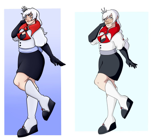
Pretty much the same here, just like Ruby’s.
I went more towards a business woman vibe for an adult Weiss, just because of her role in AZRE in the later years, while still keeping some of her old fashion. The white and black are pretty even in use on Weiss now, but I kept the white mostly on top to keep it as her most prominent colour. The white with her longer hair also helps with bringing the colour more throughout her design also.
The greyish sash was changed to blue so I had something to separate the jacket from the shirt more, and to keep that little bit of blue on Weiss. She had moved on from her father, but she still has that little piece with her, having used it as a bow to add to herself.
I also shortened the hair from her original look. She grew it out over the years, but it’s obviously not as long as it originally was, now being kept in a more motherly style of a low ponytail, similar to Willow’s. Really, I wanted Weiss to have some parts of her parents in her design, but something she had made for herself rather than something forced upon her like before.
Her bright red collar is bigger, and with the mostly monochromatic colour scheme now, it’s the first thing to jump out when you look at her, helping to keep the eye on Weiss’ face where the scar is.

Blake, why were you so pale originally?
Obviously, the two biggest things I changed for Blake was her skin tone and her eye colour. The darker skin tone is a warm colour that helps with Blake’s mostly cool colour scheme, as well as making her light eye colour pop out more. With her heterochromia, I liked that design point from her concept art and gave it back for her, since she now still has the yellow for Yang, but also blue to match Weiss; two important people for Blake’s development.
Other than that, I really haven’t changed all that much for Blake. Her headscarf is something specifically for AZRE, as she adopted that custom from the tribe she was living in, which helps to cover her face and keep Blake’s identity a secret. The jacket was changed to cover up more of the white on her chest, still keeping that white spot for some contrast while introducing small purple linings for detail.
Her neckscarf was swapped for a more closed bolero jacket, connecting Blake with her mother, and the zippers on her shorts were taken off for more streamlined shorts since I didn’t really like the original zippers.
As for the purple, it’s been shifted towards indigo rather than the pinkish purple she uses later on. The gradient was lightened to allow the black boots to stand out from the black tights, but I kept the purple to a minimum so that the black could stand out as Blake’s primary colour.
The scars are also a specific AZRE choice. I just liked scarred characters.
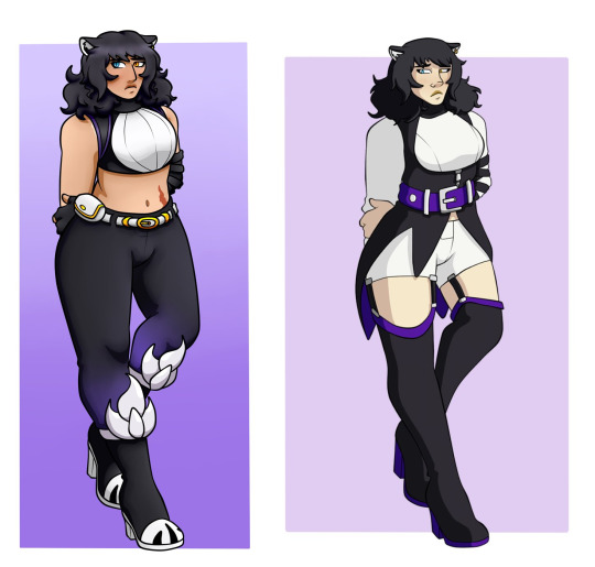
I know a friend of mine still really likes my original Blake redesign, but I’ve honestly moved away from it. I just don’t like it that much anymore.
I still kept to the tank top and pants that Blake has in her canon Mistral outfit, except I obviously removed the giant white jacket. She’s in Menagerie, she doesn’t need it. The black tank top now completely covers her chest, with the purple belt being replaced by the black jacket she always wears that holds the magnet. I kept the white chest with her black jacket around it, keeping the shirt interesting while framing her chest more.
Similarly, I kept the white belt and gold metal, but her pants have the same purple gradient as her leggings, so that the boots stand out more. I also added the claw marks like on Ghira’s shoes, just for some white on the bottom and because I think it looks cute for Blake to mimic her father’s shoes.
The giant silver emblems on her boots also help, which is something I added because I wanted to incorporate her emblem in a more interesting way than slapping it on her leg. I’m not completely sure about it, but I think I like it.
Like before, her asymmetrical gloves are still there, now having fingerless gloves for better protection. At this point, I would’ve had Blake cut her hair rather than in Atlas, but that’s just me. The shorter, curlier hair helps to set her apart from Yang’s hair, and from Weiss later on who has thinner, straight hair.
Since I wanted to add gold into her design like in canon, I mostly kept it to her belt, eyes and the one earring, just so it doesn’t clash too much with the silver than Blake still wears also.
Past me, stop it with the belt flaps.
I wasn’t putting Blake in the catsuit. Really, I kept to the fancy jacket and suit style that Blake mostly wears, just changed up a little to help with the Atlas climate. Most of her trademark features are still there; the white on her chest, the assymetrical arm wrappings, her long tailed jacket.
Her long white sleeves also give more of an illusion to sleeveless Blake, allowing the black of the ribbons and gloves to stand out, while also covering her up properly for the cold. The jacket tails had been shortened considerable, no longer covering Blake’s legs completely, with the black framing the white shirt and keeping the black on the top.
It stopping just above the black pants mostly helped the white shirt to separate them, keeping the black jacket from blending in with the top of the pants. similarly, that’s why I added the white trimming along with some detail. I removed a lot of the purple from Blake’s original look, and the stupid looking belt flaps for the more natural looking jacket flaps at the back.
Her boots had been shortened too, with some white fur trimming just to help separate the boots from the pants. Really, I kept the colouring mostly monochromatic, with the yellow, silver and purple being kept to a minimum. I used the purple mostly for the collar of her jacket and such, still keeping it for a bit of colour on her.
Really, this is where Blake’s darker skin tone really helps. The pale skin from before just blended in with all the white she was wearing, whereas now it pops out more. This shows how important the skin tone is to a design.
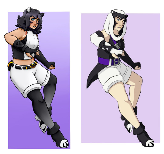
That first design was one I did for Mona’s commission years ago.
I still like some bits of it, like the idea of the white headscarf, but I ultimately ditched more of this besides the shorts and shoes for Blake’s updated look. Given that it’s in Vacuo, I wanted to make sure she wasn’t wearing too much black, but use it in a way that her colour still got across without it being overpowered by the white.
I think I did alright, but I’m not entirely sure tbh.
I went back to her Menagerie outfit for inspiration on this one, with the tank top and white chest coming from that. Her white shorts are longer with the tanned stomach separating the two. I kept the black tights but with a white gradient on them this time rather than purple. The main reason for this really is, similar to Weiss, I wanted these two characters to adopt each other’s colours as the story progressed.
Weiss is shedding Jacques’ blue, Blake is shedding the WF’s purple.
I would really add some more detail to Blake’s shorts here. Add the pockets and lines to make it seem more like shorts, since it looks really plain there honestly. Not only that, but the giant white spot on her chest is starting to overpower the black on her shirt, so I would tone it back just a little.

These two outfits were for two completely different AUs. The old one was just a generic Adult!RWBY design line, while the new one is specifically AZRE!Blake.
I still like the old one for Blake in Menagerie, though I’m not sure about the white sash thing on her waist. I believe I was trying to mimic the coat tails, but it just looks dumb. Everything else is pretty cute, especially the style of the shirt with the black lace patterns and extra arm drapes.
Her new one is really just her canon Mistral outfit but colour inverted and changed. Since she’s in Atlas, I changed the tank top underneath for a full shirt, closed the jacket up, and just gave her gloves.
The black jacket is contrasted with the white shirt, gloves and pants, separating important sections of Blake’s body from each other, while having her colour on top and prominent. I shortened her thigh highs to keep the white in equal parts, with the gold details being changed to white as well. For Blake, I wanted to keep the gold to just the metal parts, while her purple is on the necklace, jacket collar and inside of her coat tails.
I wanted a more proper look for Blake, but still good for Huntress duties, since Blake very much still fights even as she’s older.

I will never know peace knowing that past me used brown for Yang and thought it looked good.
I never really talked about Yang’s canonical Beacon outfit, and I’ve talked about her Hunter outfit enough. It’s my favourite outfit, and really the only thing I changed was upping the saturation to a more cream yellow for her jacket, and changing the black shirt to red for a bit of Ruby’s colour. Really, Yang is the one to wear all of her team’s colours and make it look good.
Plus, the Yang necklace is a neat nod to her Chinese heritage in connection to her name.
As for her canon Beacon outfit, which is what I originally did for the outfit, I like it. It’s definitely Yang’s best outfit out of her canon line up, besides her Hunter one obviously, but ever since the beginning, she was really struggling with proper colouring.
The overall look is great. She reminds me of a sexy biker, which is obviously the look they were going for with Yang. The leather makes her look more protected, similar with her boots, while the different styles of her socks and bandana give her a bit of asymmetry that really works for her. The only thing I don’t like is the style of her sleeves.
They look really childish and puffy. Yang having a more streamlined jacket style later on was great move away from these.
The brown they use is warm at least, and the yellow shirt with her gauntlets at least help to keep her colour on her outside of her giant hair. With the gold detailing, this outfit at least tries to show that Yang’s colour is yellow rather than brown and orange. But the different colours she uses is too much; yellow, two shades of brown, orange, white, black and purple, she’s been suffering from poor colour schemes since the beginning.
I don’t get why they didn’t change the orange to red, allow her to wear Ruby’s colour since she’s meant to be so protective of her sister.
Still, it’s a good outfit, but I do wish she kept her Hunter one instead and her later outfits kept to that design.

I hate those stupid boots.
The biggest thing I wanted to keep with Yang’s design is that she doesn’t have her right arm. It’s a drastic shift in design from before, but I like it. Originally, I kept the jacket sleeve tied up, like how she does it while in Patch, which is something i still like. But in her newer one, I kept the jacket sleeves short and instead have Yang wear a yellow compression bandage instead.
I obviously went for the Hunter colour scheme instead of the canon one. The black jacket helps with the bright gold decals, and the bright red collar stick outs, working similar to how Weiss’ red collar does in bringing attention to Yang’s face. The yellow cuffs adds some colour and interest to the jacket, while her emblem being on the right brings attention to the arm that Yang lost.
Her red undershirt had been changed to a longer cream dress, keeping the yellow throughout Yang’s midsection while helping the black belts not blend into her black pants. Similarly, that’s why I put the yellow bows on her boots for. With the gold buckles and soles, it helps put some yellow on the bottom half of Yang’s design and help the black boots stick out from her pants.
I upped the saturation of the purple on her sash from the more muted colour in her old design, and her canon design. Her purple is always so desaturated and it makes me sad. The purple outside and red instead match the gradient of her eyes too, which I really like.
With her hair, I kept it up in the ponytail she wore in Patch for the rest of her outfits. I like the style of it, it looks more mature for Yang, and helps concentrate her bright yellow hair to her upper body.

She reminds me of a bee.
Really, the biggest criticism I have is that the dress and jacket combo is really similar to her Mistral one, but that is also because I like the look of it that much that I kept it for this one too. I changed the style of the jacket to have a white fur lining on the inside, introducing more of Weiss’ colour to contrast with the black leather, and so it looked more suitable for Atlas weather.
The emblem was moved to the left to balance it more, since the black glove extending all the way up her arm meant that her left side was very lopsided without the emblem there, especially compared with the yellow compression bandage on her right side. It’d obviously be less apparent when she’s wearing her yellow gauntlet, but I wanted the design to be balanced even without her weapon.
Pretty much like the last one, I had the yellow dress down to mid thigh to help the black belts stand out, but her boots had added white fur now to separate them from the pants. The yellow is more apparent on her shoes than before, along with the yellow bows remaining, so her colour is visible throughout the design.
I also swapped the red collar for a scarf. I think it’s cute, a nice way for Yang to stay warm, and a cute nod to Ruby’s cape.
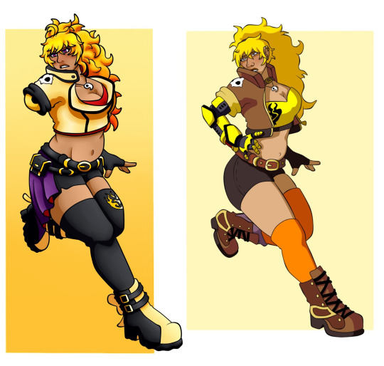
I didn’t change a whole lot when updating this look honestly.
I liked the design of her jacket, but just changed the style of it slightly. Closing it up to not only concentrate the red shirt on her chest, but just making Yang look better protected around the chest area as well. Her jacket has completely shifted from black with gold to pale yellow with black, as I wanted to make it slightly better for Vacuo and not have Yang running around in black leather. It’s still gonna be hot since it’s, you know, leather, but it’ll be fine.
It’s pale enough that she doesn’t look like a bright yellow mess, and her lower half taking more of the black helps to balance Yang’s colour out. It also helps that her darker skin tone makes the yellow pop, rather than blending in with her canon pale skin.
The black cuff and details stand out against the yellow, and helps to separate her limbs from the jacket, especially the brighter yellow compression bandage she wears. I added the little ursa skull for a bit of detail, and to connect Yang to the bear motif of her allusion.
Her shorts and leggings help to neutralise her entire look, while the small gold details pop out, carrying Yang’s colour down her legs and bottom half. The exposed skin still has her sexy look, showing off Yang’s confidence that she reclaimed after Beacon.
The one thing I do miss is the style of the boots from her original redesign. I liked the little designs on them, but I also really like her new boots too, especially with the cute bows.
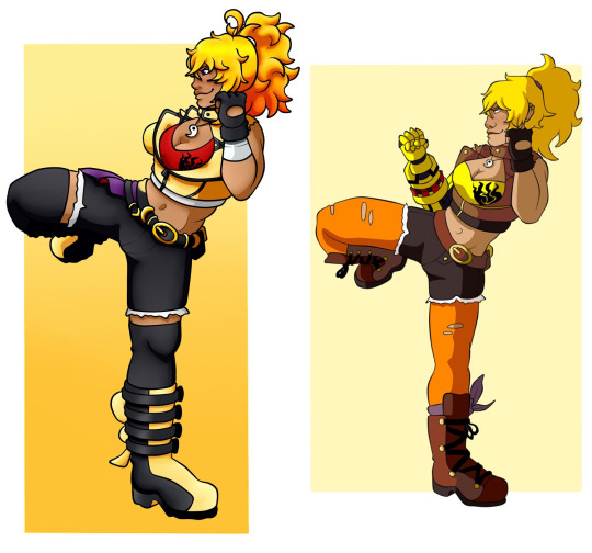
I still really like Yang’s adult look.
The yellow jacket from her Vacuo look is still there. Originally, I coloured it in black with gold details, similar to her old jacket colours, but because she already wears so much black on her bottom half, with little gold except on the shoes and belt, her yellow was really being lost. So, I kept it as yellow with black details. Since her hair is shorter and still kept up, the yellow jacket isn’t at risk of being lost in her hair.
Her shorts are more jean textured now, with the white trimmings helping to separate them from her black leggings, similar with the yellow front of her boots and bow keeping her shoes from blending in also. The silver cuff on her arm is an AZRE specific point, so it obviously wouldn’t be there for this Yang in any other AU.
While I like the look of it, I’m not completely sold on the look. For some reason, the yellow jacket isn’t working like it did for Vacuo, and it might be the lack of sleeves. I think adding the sleeves back might improve it for me. Similarly, her emblem on her shirt is black on a deeper red, so it’s a little hard to see compared to a yellow shirt.
#rwby#rwby redesign#outfit critiques#ruby rose#weiss schnee#blake belladonna#yang xiao long#answered#luke.txt
43 notes
·
View notes
Text
Fully Completely 1
Warnings: non-consent sex and rape (series), attempted violence, mutual irritation.
This is dark!Loki x reader and explicit. 18+ only. Your media consumption is your own responsibility. Warnings have been given. DO NOT PROCEED if these matters upset you.
Series Synopsis: There’s a new face in Birch and he’s come to haunt your door.
Sister series to Smalltown Bringdown, When the Weight Comes Down, and Little Bones
Note: I did not plan to get the first part done so soon. I will probably be setting time aside as I write this to also work on some original stuff. When it comes to that, I’d love if y’all might let me know what you think would be a better medium to release it? Kindle, Patreon, etc. I’m really not sure but if it was Patreon it would like be two series running at once with a chapter of each a month + Q&A and maybe some bonus materials? I am a noob at this shit and it wouldn’t be for a while yet.
Anyways, I’m rambling...
Thanks to everyone for their patience and feedback. :)
I really hope you enjoy. 💋
<3 Let me know what you think with a like or reblog or reply or an ask! Love ya!
Chapter 1: She simply slammed the door
💀💀💀
The garage smelled like oil and snow. The cold air seeped under the closed metal door as you sat on the low stool and affixed the new headlight to the propped up Harley. It was only the start of an impractical rebuild; your brother wanted everything metal replaced with chrome. You thought it was obnoxious but the parts were paid for and you could never complain for money.
You were funded exclusively by the town’s club, your garage not far from The Asp where the members hung out and revved the engines you found yourself looking at more often than you liked. You were good at what you did though and privileged for it. You had the protection of the club without having to devote yourself truly to its bounds.
You checked the wiring and rolled away from the bike to change the station as the radio crackled. The snow kept setting the speaker to static and the noise was driving you mad. You flipped the switch to play the cassette stuck in the drawer, the old stereo beaten up and filthy. Springsteen’s gristled tones filled the shop and you wheeled back to your brother’s ride.
With the storm would no doubt come more work. Your fingerless gloves itched more than they kept you warm. Your fingertips were numb as you touched the frigid metal and the sweat of your palms made the fabric uncomfortable. You were used to it, rather tolerant as your task kept you distracted.
You were interrupted as you bent to look under the tank and get a good look at the exhaust and the rest of the beast’s entrails. You had the new pieces still wrapped and didn’t intend to do it all at once. Jerome could wait for his tacky redesign.
A loud banging came at the metal door and you glanced over in irritation. Anyone in Birch knew to come in the painted door to the left and not hit the large one. You huffed and stood with a groan, your hips sore from the low stool.
You fixed the front of your fleece-lined denim jacket and pulled the tail of your plaid shirt from inside your jean pocket. You’d been hunched over so long you were all wrinkled. You went past the large door and into the small entryway off the left of the garage and opened it with a tinkle of the rusty old bell above.
You stuck your head out into the gales as the snow continued to fall and squinted at the man in his thin jacket. He stood beside the long luxury car as another man with wild orange hair remained in the driver’s seat and blew into his hands. They were out of place in the small town and you could tell by the way the man scowled at the door that he knew it.
“Hey,” you called to them, “there’s a place down the street. I don’t do walk-ins.”
“Oh, hello, Miss…” he let his voice trail off as he neared and you stared at him rather than provide your name. His accent, his attire, the curl of his lip, it was clear what he thought of you and the bodunk town, “actually I was referred by an acquaintance. One, James Barnes.”
“Bucky?” you furrowed your brow.
“Mm, yes, that one,” he said, “my car will need detailing. We had some difficulties on the motorway.”
“Right,” you tried not to scowl, “well, if he sent you, I guess I can help.”
You left him and the door clattered behind you. He followed a few steps after as you went to the switch and pushed it to raise the wide door of the garage. You waved in the driver of the car and he carefully pulled in beside your brother’s bike.
He got out and you were surprised by his size, he was taller even then his companion and wider; neither could be described as short. You lowered the door as the thinner man walked along the shelves and the long table along the other side of the garage. The bigger man stood by the car and tucked his hands in his pockets.
“Not much better in here than out there,” the dark-haired man turned back to you, “you have heat in here?”
“You need a better coat,” you said as you rounded the back of the car, “and some boots.”
You glanced pointedly at his leather shoes and bent to reach under the table. You pulled out the space heater and plugged it in as you set on the wood. You cranked it up and smiled at him tritely.
“So, what’s the damage?” you asked as you looked to the other man.
“Headlight, maybe,” he said in a peculiar accent, “some scratches. We had a bit off a run-in.”
You neared and bent to examine the front of the car. You sighed as you tilted your head and clicked your tongue. It was easy enough to beat out the dents and buff out the scratches with a quick refinish. The headlight would need to be replaced and you knew they didn’t carry anything for that model in town. No one there was pretentious enough to drive it.
“If you want the headlight done before you leave town, it’ll take some time to get the replacement,” you warned.
“Oh, and how do you know I’m leaving?” he taunted coyly.
“Well, I know you’re definitely not sticking around,” you scoffed.
“Why wouldn’t I? A quaint place like this, I’m sure there is so much to explore,” he said dryly.
You had no delusions of what Birch was but it wasn’t the part of outsiders to deride the dead end. You stood straight and put your hands on your hips.
“You can go back to your castle, my lord, but you will have to wait out the storm,” you sneered. “Two days for the scratches. If you want to take it back after that and wait for the headlight to arrive, that’s fine with me.”
“Two days for the scratches? Surely you could do it before the morning,” the black-haired man insisted.
“I could but I have other work to do,” you replied, “so you can be patient and take your turn in line after all the hicks who live here.”
You went back to the table and grabbed your phone from where you tossed it earlier. You unlocked it and searched the model of his car and scrolled through the parts list.
“You’re Bucky’s guest so I’ll send the bill to him?” you asked, “though you do look to be able to afford it yourself.”
“You can invoice him directly,” he assured, “so you’re one of them?”
“One of them?” you repeated as you focused on checking out. The damn internet kept cutting in and out.
“My brother, those men in this town, I never knew a woman--”
“I’m not a biker. My brother is in the club,” you assured him, “so that big blond dope, he’s your brother?”
“Regrettably, yes,” he slithered, “Loki Odinson,” he introduced himself as he rubbed together his hands, the leather gloves doing little to protect his fingers, “my driver is Korg, and you’ve yet to tell me with whom I am trusting my property.��
“Again, there is a shop down the street. Prices aren’t bad,” you finished up your purchase and tucked your phone in your jacket pocket.
He met your eyes as you turned to him and he looked down his nose. You kept on and brushed past him as you went back around the car and sat by your brother’s bike.
“Sorry about the boss,” the other man, Korg, intoned, “he can be a bit--”
“Don’t apologise for me,” Loki snipped, “I needn’t atone to her.”
You rolled your eyes and wheeled around the side of the bike, “if that’s everything, you two can head back out. I’ll let you know when the car’s ready.”
“We might wait for the snow to calm,” Loki suggested.
“I close in an hour, you’re not staying here all night,” you sniffed.
“Trust me, I have no special desire to spend more time with you than necessary,” he retorted, “I don’t think I’ve ever met a woman so volatile as you, dear, and I’ve only just met you. I never expected you people to have very many manners but perhaps what I did presume was too much.”
You bared your teeth but kept at your work. You would worry about kicking him out when you finished the wiring.
“To be fair, had you not spoken first, I might’ve assumed you were a man,” he added.
You paused and glanced down at the open tool box. You weren’t unused to the comments, you weren’t girly in any way but it wasn’t like you were trying to be a man. You wore what was comfortable and in your work, practicality prevailed over aesthetic. Yet, your years of ridicule as a kid made you less tolerant of the comments and those had stopped long ago because you made sure they did.
“Oh, darling, have I upset you?”
“Don’t call me that,” you said as you reached into the toolbox.
“Well, you’ve not given your name and I’d hate call you what I truly think of you--”
The wrench flew from your hand as you stood and spun to him. It barely missed his head and bounced off the wall and plunked onto the table beside the heater. His eyes rounded and the other man looked at him. There was a thick silence as you glared at him.
“If you weren’t a friend of Bucky’s, I wouldn’t’ve missed,” you hissed, “now I will kindly, before I reach for a bigger wrench, ask you to leave.”
He pushed his shoulders back and tilted his head as his lips thinned dangerously. He swallowed and beckoned the other man with two fingers. His cheek twitched as if he would grin and he nodded subtly.
“Well, darling, how amusing you are. These brutes must adore you,” he snarled, “the exterior does indeed say it all.”
You bent and reached for another tool blindly. He blinked and quickly dodged as you flung the next wrench and he followed his henchman to the entryway. Your temper was a match for many men. It kept you safe.
“Barnes did not say his mechanic was a madwoman,” Loki called back as the bell rang.
“What, are you going to tattle on me?” You stormed towards the doorway, “you precious little princess?”
“Princess?” he met you in the doorway as Korg behind him held the door open and the snow blustered in, “I know Barnes will do me no other favours, but do you think he’ll do you any?”
“Get out,” you spat and shoved him, “I don’t need men to take care of me and I have no problem in proving that.”
He bit the inside of his lip in a crooked smirk and winked before he turned away and strutted out into the snow, shielding his face from the wild winds. Korg trailed behind him and the door sprang back into the frame. You crossed your arms and glared at the peeling paint.
You were tempted to tow his car out and let it weather the storm but you were smarter than that. If he was doing business with Bucky, you would be a fool to get in the way of it.
💀
The snow dwindled to a lazy dusting, the ground thick and treacherous. That day, you started early and around noon, you headed across the street to the diner for your usual lunch of a club sandwich and black coffee. You didn’t have to order as all the waitresses knew what to expect. You weren’t unfriendly but your association made many standoffish.
You tapped on the lip of your mug with your thumb, fingers hooked through the handle. The sleepy town felt dead in the winter. You were used to the dullness of Birch but tolerance was hardly happiness. It was home, where you’d grown up and you had no certain desire to get out, but you wouldn’t mind a little more than what was expected.
You yawned and gulped down the last of your coffee. It was bitter and left a few grounds on your tongue. You leaned back and grabbed the monthly newsletter from between the salt and pepper shakers. You read through the fun facts which weren’t very fun or even new. They were copy and pasted out Guinness and Reader’s Digest.
You looked up as you sensed someone approach your table but it wasn’t the waitress. The man from the day before slid coolly onto the seat across from you at the booth and smirked over the table. You raised the newsletter again and folded it backwards to read about the weekly knitting circle down at the rec center that was also the library.
“Good afternoon to you too,” Loki said, “it must be fortune I ran into you, I was hoping to inquire after my car--”
“I told you, two days,” you said tersely as you continued onto your horoscope …‘a new force will bring change’... You hated this tripe. You swore, every month they just switched the blurbs under each sign and hit print.
“So be it,” he cleared his throat and you lowered the paper as he shrugged out of his jacket.
“What are you doing? I eat my lunch alone,” you said.
“Well, to be frank, I was pointed here on the promise of some famous cabbage soup,” he explained as he folded his jacket over the seat next to him, “you looked like you needed company.”
“I don’t,” you assured him.
Kimmie came over and set down your sandwich. She greeted Loki and you saw the way she eyed his tailored suit. He stuck out in the town of flannels and denim.
“Hello, sir, can I get you something to drink?” she asked.
“Tea, English breakfast,” he ordered smoothly.
“Oh, sorry, we only have um, um, sorry, peppermint, earl grey, ginger lemon, and green,” she listed off as she tried to remember them all.
“Earl grey,” he sighed, “and a menu.”
“No, no menu,” you insisted, “and you can take his tea to another table.”
“And when we’re through, I’ll take the cheque,” he ignored you and snickered under his breath.
“Kimmie, can I get a to go box?” you asked as you shimmied off the seat and snatched up your coat, “I have to get back to work.” You took out your wallet and counted out the usual amount plus a tip, “thanks.”
“Of course,” she smiled awkwardly and glanced between you and Loki.
She scooped your sandwich back up and scurried away with it. You felt him watching you as you walked away and went to stand by the till as you watched Nora flit into the kitchen. She packed up your food and returned with the box. You took it and headed for the door, ignoring the arrogant out-of-towner on your way.
“Wait,” Kimmie called out your name and you turned back as she held up your keys, “you dropped these.”
You met her halfway and took them from her with a mutter. Again, he was watching you… or still watching you. She spun and promised she’d have his tea shortly.
“Hmm,” he hummed and you head to the door again, “interesting, I never would have put the name to the face.”
You pushed out into the snow and gritted your teeth. You thought of getting the work on his car out of the way quickly so he would leave you alone but your spite made you want to put it off entirely. Whatever. He’d be gone soon enough.
#loki#dark loki#dark!loki#loki x reader#birch#fully completely#series#sequel#dark fic#fic#dark!fic#thor#mcu#marvel#au#biker!au#biker au#biker boys of birch#bucky barnes#korg
581 notes
·
View notes
Text
Dedicated Interest - pt 1
Costume Innovation
The moment when a Class 1A member became interested in you would be days into the second year of school when you actually approached them after the second year lunch. With your notepad in hand and confidence spurred on from Power Loader himself supporting the redesigns, you head towards your target: Momo Yaoyorozu.
You’ve seen her fight—you’ve seen all of the future heroes fight. Support Class students are encouraged to watch Hero Course students in order to gain inspiration. Over the winter break, something in you had the urge to fix many of the hero students’ costumes—particularly the ones in Class 1A. They seemed to need your help the most.
The cafeteria is massive. But the tall girl isn’t hard to spot. With her long, black hair and confident, but charming voice, you’re able to locate her pretty easily. Getting her away from the girls she’s walked in with is the hard part.
But you don’t stop. In fact, you just go for it. It’s now or never, afterall.
“Yaoyorozu,” you ask, “can I talk to you for a minute?”
“Oh yeah, sure!” She replies, “don’t wait up for me guys. I’ll be there shortly!”
You lead her out into the hallway. The noise of the cafeteria can still be heard, but it’s muted enough so you two can clearly hear each other.
“Have we met before..?”
“Not formally,” you reply, “I’m one of the Support Class students, L/N Y/N. I was watching a bunch of the students compete and I was inspired to do costume redesigns.”
You pass her the notepad. A barebones sketch of her is underneath a more detailed drawing of your suggested hero outfit. With inspiration from both her summer and winter costume, it gives more strategic thought to her hero costume than there was before. There is an open back with an easily detachable front that can optionally be worn with a cloak. Elbow pads and knee pads provide joint protection, as well as shoes that’ll support her instead of the heeled boots she’d been fighting in. The cutouts are strategically placed, with spots on her thighs, lower legs, back and stomach. There still is an element of modesty, as her breasts aren’t halfway out all the time anymore and it’s all in her original color scheme.
“This is…” She pauses. You can’t tell what’s on her mind.
“Sorry if I overstepped my boundaries, I promise not to bother you anymore!”
“This is ingenious!” Momo replies, “Tell me, when do you think you could have this made?”
“Oh umm… I would have to get you measurements and source the materials, but that shouldn't take too long. A week, maybe two tops? Nothing new’s being innovated, it’s just a matter of taking it from my notes to an actual thing…”
“Sounds great.” She takes the pencil you keep clipped on your notepad and writes down her number, “I need to get to lunch but I’m free this afternoon for measurements. Text me!”
“I will!” You take the notebook, clutching it against your chest. Yaoyorozu was the right person to start with.
===
You immediately added Yaoyorozu’s number after lunch and now you’re getting a ping from it.
Yaoyorozu: Hey, I’m free anytime from 4:30-6:30pm. What time works best for you?
You look at your clock now. 4:30’s coming up soon. A number of your classmates are still in the 2-H Workshop, but it isn’t so busy that you wouldn’t bring in another person—that’s only when Hatsume’s working, as she’s a safety hazard in and of herself.
Y/N: Now’s fine! I’m in the 2-H workshop. It’s in the east wing.
The chatter of machinery and the lyrics to some pop song trail along in the background. You’ve mostly tuned it out, so Yaoyorozu has to tap on your shoulder to get your attention.
“Y/N?” Her calling you by your first name gets you out of your daze and you reply, “Oh, hi Yaoyorozu!”
You turn to face her. A bit of heat heads to your face as you see Yaoyorozu’s skin tight outfit. She certainly isn’t uncomfortable in her skin.
“You like my outfit? It’s designer—part of Mount Lady’s recently dropped workout line.” She replies, “I thought I’d wear something closer to my skin in order to get proper measurements done.”
“Oh yeah. That’s smart. Let me grab my tailor’s tape and a sticky note!” You rummage through your school bag for spare supplies, pulling it out and pushing your classwork aside, “Here it is! Now we’ll start from the top down, getting all of the measurements and then you can be on your way.”
“Sounds perfect.” Momo stands straight, arms and legs shoulder width apart. She’s obviously done this before.
As you hum along to the music, Momo watches you. You don’t notice, but she stares at you, dedicating every little detail to memory. Something in her wants to replicate everything you have for herself. Though, as you stand up and put your tape measurer down, she coughs and clears her mind of it’s racing thoughts.
“So… what were you working on?”
“Schoolwork, nothing much.” You admit, “Just some back to school safety briefings—as if most of us didn’t come in during the winter to continue our projects. You probably don’t want to hear about it.”
Momo proves you wrong, “What other projects do you have going on?”
“Oh uh… well, Power Loader’s gave us a robotics project to work on and I’ve been specializing in costumes so I’ve been trying to create a list of heroes and hero students to make improved costumes on. You’re the first I’ve actually been able to do hands-on work for though… That’s for this, by the way!”
“How could I refuse?” Momo asks, “Your improvements and overall design is better than what I could’ve come up with on my own.”
“I guess…”
“May I ask,” Momo says, “How did you come up with this design?”
“Mostly by watching your trainings, as well as current pro hero costume trends.” You repsponds, “Most female pro heroes have their legs exposed in some capacity, but don’t have any sort of knee protection—which I think is stupid. And if we do knee protection, we need elbow protection. And I’d advocate for more coverage in order to have protective plating underneath the suit, but since you need your skin out, I had to limit it to specific areas. And the cloak came really handy for that! Plus I could have it cover your back in order to let you conceal items you create and have you… I’m rambling, aren’t I?”
“No, no! It’s fine.” Momo replies, “I find this fascinating. Please continue!”
“Well… I’ve noticed that in a pinch that you’ll lose your top and then have to make yourself new clothes. But since your shirt is magnetic and can be put back together, you can save… materials as well as use that space for other things.” You continue with a laugh at yourself, “I don’t really understand how your quirk works, but I hope this costume will work…”
“I convert fat lipids into other atoms and release them from my skin.” Momo explains, “but I think your idea will work.”
“Let’s see.” You reply, “Well, I think that’s all I need from you. Thanks for sticking around and listening to my rambling, Yaoyorozu.”
“Call me Yaomomo. My friends do, anyway.” She tells you, “Text me anytime!”
“Oh uh, cool.” You tell her, “I will.”
She eventually leaves you to your devices, but you don’t leave her thoughts. In fact, you are steadily taking up a large portion of her thoughts as she contacts her house staff to start construction on a wing in the manor to give you the biggest, best laboratory possible.
204 notes
·
View notes
Photo

🔋 Tecna, Fairy of Technology 🔋
=============================================================
Next is Tecna! Finally catching up with these, this one was originally made a few days ago, so more recent. Tecna’s was really difficult for me in the way that her style seems to vary across the many other redesigns I saw before, so I kind of went for three different looks here to fit the main ideas that were floating around in my head. But yeah, I hope you enjoy!
More details about her looks can be found under the ‘readmore’!
=============================================================
- For Tecna’s physical appearance, I imagine her to be the tallest of the Winx, with a petite and thin/lanky build that is a little boxy. Hair is still the same classic magenta color and short style, though a little more messy and with a slight undercut. Teal eyes, but with a little more of a paler skin tone than in canon. For extra physical details, I imagine her to have a little bit of an androgynous appearance(but still quite feminine in her own ways), with the main detail for her here being a slit in her eyebrow.
- For her color scheme, I kept the purple in various shades as well as the bolder green, while also adding in some neutrals like black and some neon shades of other colors. Another more tomboyish member, I kept the more sporty style she has in the first couple of seasons as her casual or at-home attire, while giving her a business casual look to wear most of the time. The more futuristic/punk look is one she would wear mainly if she is going out somewhere with her friends, giving her a chance to dress up a little more from her normal tone-downed looks. Mainly only wears solid-colors, but will some pieces with neon-colored stripes or holographic elements.
- For accessories, I imagine she would not wear a lot of jewelry, as most of her accessories would just be some of her tec. The main one I did giver her here is a purple smart-watch, as I think she absolutely would have one, especially if she gets to customize more of its functions and such.
#winx club#winx#winx club tecna#tecna winx club#winx tecna#tecna winx#tecna#redesign#character design#revamp#fashion
15 notes
·
View notes
Note
ehh, of course i want to send some OC asks, too! if you feel like it, maybe: 🌌💥🎵🌪️ and 💗? you can answer for whoever you want, i'm interested in all of them!
Ahhh Lale you're so kind! Thank you for asking, I really appreciate it!
🌌what was the inspiration behind your oc? what was the first thing you decided about them?
For Carys, I just had a specific idea of "mermaid" with Marco. However, I wanted her to be able to freely swim through the oceans, which I felt like OP very much sets up as something "mermaids can't do." So I thought about Sea Kings instead and figured I could do half human/sea king and make it work that way. :)
For Solomon, after I had decided on Carys' backstory, I knew I needed someone who was her friend that could explain 'human' concepts to her. Since I had a character that was largely raised by 'animals' and had very little interaction with the human-world, Solomon would be able to bridge that gap. I didn't expect to fall in love with him so much. ;u; But I first decided I wanted to make him a chill, surfer-ish dude.
💥what emotions do they have trouble dealing with?
Carys - Has a problem with feeling weak. Her culture puts strength above all else. She gets very difficult to deal with during those times, however it's only physically weak that she cares about. Emotionally she doesn't really think about.
Solomon - When he falls in love, he falls hard and fast. So if that love doesn't work out, he has a hard time getting over it and takes him a VERY long time to do so. Pining lil boy.
🎵what is their playlist like? their favourite artists? do you associate a particular song with them?
GASP! I do have an answer for this, yes. I have a longer playlist for Carys, that features a lot of songs that are either referenced in her fic or she personally sings.
Carys - My song for her is "Siren" by Joan Shelley. She doesn't have a favorite artist as she only listens to 'songs' that the ocean has heard before. I doubt she really understands what an 'artist' is compared to just...random people who sometimes come together to sing music.
Solomon - "Harvest Moon" by Lord Huron. I also have a playlist for him but it's not as long. It's very pining, I think after meeting Umi his taste in music would get a little more cheerful lol.
🌪what is the biggest change you've ever made to them? how have they changed from their original version?
Hmm idk what happened to the emoji but moving on.
Carys - After getting some art for her, I changed her tail shape! Also added some little details here and there. But besides her physical appearance, her actual personality/backstory hasn't changed much since I began just been expanded upon.
Solomon - Has gone through a couple of redesigns as well but all very small. However, his personality/motivations has gone through the most change! As I originally meant him as best friend/wingman filler he's gotten more and more of his own personality + story that is outside of Carys.
💗if they have a crush, is it noticable? what changes when they're in love?
Carys - Yes and no. Carys had never been in love romantically before, so it took Solomon telling her that she was for her to realize. (on the ace spectrum) after she realized that, she didn't waste any time in deciding to court Marco. Carys is loyal regardless, but the expectations change drastically compared to a friend/family to a mate. It's tradition expectations that she holds from her sea king side.
Solomon - He tries to play off having a crush, but yes it's pretty noticeable. He's just a little back and forth, as he falls hard and he knows that about himself. But once Solomon starts dating? He's in it to win it, overall eager to please and super happy to just be around his partner. He is, at his core, still a little lazy lol. So I think that could cause problems but overall Solomon in love isn't to different from him any other time but he DEFINITELY bends over backwards for his partner, more than he would for a friend. (Whipped, I would call him whipped.)
2 notes
·
View notes
Text

I might as well start by talking about this guy, possibly my oldest Edge Of Entropy related OC. His name is Augury, and while I can't go into extreme detail about his role in my series, he's one of the oldest surviving angels in Lucidus's army and knows a lot more than he lets on. He's a bit grumpy though (and would probably snap at you if you called him old.)
Now for his origins, and what makes him such an old OC. You're not going to believe this, but he actually started out as a Roblox OC! Let me explain; back in 2018 I was super into Roblox myth accounts and decided to try and make my own called "TheFirstOfThe_Last". His avatar looks like this (you can probably see a few vague similarities!):

However, this got absolutely nowhere as there's next to no lore JUST around him. His """"game"""" is also VERY poorly made and just isn't worth your time to check out. Where he DOES have lore is in my Roblox game The Garden, which is why he's so special to me. (For those who don't know, The Garden and the adventures my friends had there HEAVILY inspired EoE, and a few areas and concepts are directly taken from it.) He's one of 2 characters that originated from that game (the other being Quimitalum, who is known as Hyperclaws in game.) He appeared in the abandoned city area, leaning against a wall by a broken radio. You could talk to him and he'd give you some very small bits of lore about the game (which I will go over another time). For whatever reason, I removed him almost immediately after I added him, but recently I managed to restore the version he existed in and see what his dialog was. If you're interested in seeing it, I covered it all in a video here:
youtube
Shortly after rediscovering him I decided to redesign him and re-use him for Edge of Entropy, and he fits into the lore nicely! (I think he might even be a personal favourite of mine now!) He doesn't appear in book 1 since I revived him late into creating it, but he'll definitely appear in book 2, probably as a supporting character. I plan to have him be a reoccurring character.
Also, a few little eastereggs about him! You might've noticed a number on his coat and hat (18729), this number is The Garden's release date, July 29th, 2018 formatted YY/M/DD! Another little easteregg you'll probably see (or not...) involves a bit of his lore. He was the first remember of the last numbered battalion in Lucidus's army (which is why he has a number and other angels don't), making him the first of the last. Hehehe, see what I did there?
Anyways, absolutely ecstatic that I have a place I can absolutely RAMBLE about my OCs and not have it immediately buried
2 notes
·
View notes