#im open to criticism btw. if you have something to say go ahead lol
Explore tagged Tumblr posts
Text
Stupid/silly rant abt something that probably only I care abt xd
(god i spent so much time on this)
So, for the last two days I've tried to make a redesign of the shadow-magical-girl chica outfit
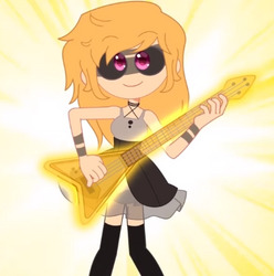
This one ⬆️⬆️
And it literally sucks so much* that it leaves me with no idea to redesign it without changing everything from it
*in regards of design according Ann's Character, not if the outfit in itself, that is actually really cute*
So I'm just going to point out some things that bother me and mention what I think it would work instead
The outfit as it is
Look, i know this might be a personal bias, BUT magical transformations should be fun!!The excuse of "it's magic, it can do whatever it wants" gives us the opportunity to make cute outfits and stuff!!
Look, the dress is cute, alright, but adding a little bit more of details can really seal the deal here, maybe a bow in there, or some chains if we are going w a more "edgy" design, or adding a few markings on the boots to make them less flat. (Look i know that the design also can not be overly complicated bc the model would be hell to animate, but this girl needs accessories!)
Look, if you added a few random things over the original design it would make it a little bit more interesting, you could call it a day, right? Well yes, but that's what takes me to my second point...
This design is nonsense!!
Look, magical transformations are usually based in a certain theme or idea surrounding the character. Here are some examples
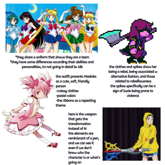
So, with that in mind, what can get get from chica transformation? (That story wise is supposed to show her growth as a person bc it shows that she accepted "her shadows"*)
*what are the shadows anyway, opposite personalities, their biggest fears or just ~bad vibes~?)*
Well, nothing, being the look so basic, and even with the long hair, something that is uncharacteristic of chica, she doesn't look like herself (you can edit the eyes and say it's joy, and it would look more credible) and it's only a problem for Ann, because both Freed and Bonnie have transformations that show their characters
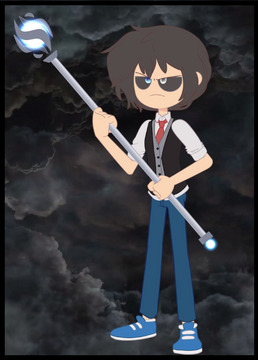
This one is more of a fusion of Freddy and Fred, with the school uniform for Freddy (being his most recognizable look), and the vest for Fred (i want to remember the outfit that Fred uses in the wolf in sheep clothing has a black vest, this one could be representing that but idk)
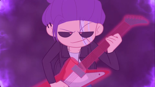
This one does a Great job, because shows a lot of Bonnie personality (his love for the guitar w the pick, the characteristic hairdo that he does when playing, even the outfit is more "rock" idk how to explain)
So, how did this happen?
Well it's really simple, Chica doesn't have any personality of her own, or things she's recognizable for.
Both Freddy and Bonnie have things that they are known for (Fred and the Yaoi guitarist), that are used in the transformation, Chicago on the other hand isn't recognized for anything else beyond being The Girl™ of the band, in that sense, the transformation does a nice job representing that.
But Chica is more than that
In the series we see different aspects of her, she likes having and supporting her friends, she likes sewing and making clothes, she's the last one to give up on anything, she started a band with the trouble kid, an apathetic dude, a micro niche celebrity and the strange new kid, and somehow she made it work! So there's really no excuse to have her as basic as that.*
Oh hey btw i did make a design for her, but as I said before its really different from the original, and then I realized it kinda looks like @cinnabundolly12 Design--- this one that is waay cooler than mine, so I gave up and made this strange rant
*to be completely fair, Chica has a lack of troubles or conflicts of her own, most of them are related to the whole group, she has a little self doubt one chapter and then sings her song and that's it, she's also very bland as a character xd*

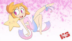
I just put the drawing here bc i liked how the body came out and I will probably delete the file from my phone later
I based the design from here
And it just follows a star theme, i used that bass I found on Pinterest lol. Also I did try to implement some elements from the original but lol ¯\_(ツ)_/¯
#fnafhs#fhs#chica fnafhs#rant#im open to criticism btw. if you have something to say go ahead lol#i spent like 3 or 4 hours on this lol. im so bored#does anyone even read my tags?🫠#like para que fernan lo vea xd
17 notes
·
View notes