#recording tutorial
Explore tagged Tumblr posts
Note
Hi, I love your art sm! I have a question about your process; how do you get references for your art? Are you at the point where u don’t need them, or do u have a go to website? Or take photos yourself?
thank you! I explained my process a bit here in this ask LINK depending on the time and energy, i am pretty much at the point where i can figure out some poses by memory alone. but i need one first very crude sketch in order to like to have visuals about what i like to do? or how to pose the body. So: step 1. Crude sketch step 2. Redraw it properly (sometimes i can right away use the sketch for coloring) step 3. Proper line art for coloring (examples below)
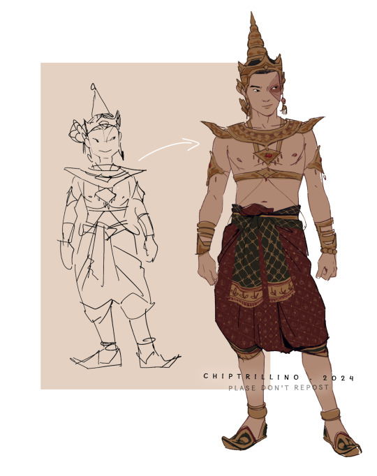

(ID in ALT text)
i don't spend much time combing through the internet till i find the one pose i would like to draw now. i just start to doodle. see something i like. and then refine it. i look up images if i have trouble with some anatomy or i need some help with colors and pattern. but its then things like... "toothy smiles" "male torso with belly fat" "guy stretching nude" "long hair in water" "human skeleton with muscle" "underwater photoshoot" check out how it more or less works and then adapt it to the drawing i am working on. i have been drawing for over 15 years now. i have build up a bit of a visual library, and have reached the point that sometimes i see artworks and know which pinterest image was used as a reference because people stuck to only one photo of a model and basically redrew the original just with some refinement. nothing wrong with that just not something i do or at least avoid doing.
#chip!ask#chip!explais#chip!tutorial#not sure if this counts though...#zuko#ty lee#don't ask me for video recording i am awfully slow with these and my anexiety pumbels up into the sky#also i still have to figure out glace and nightshade but it takes forever to make tests with these....
955 notes
·
View notes
Text
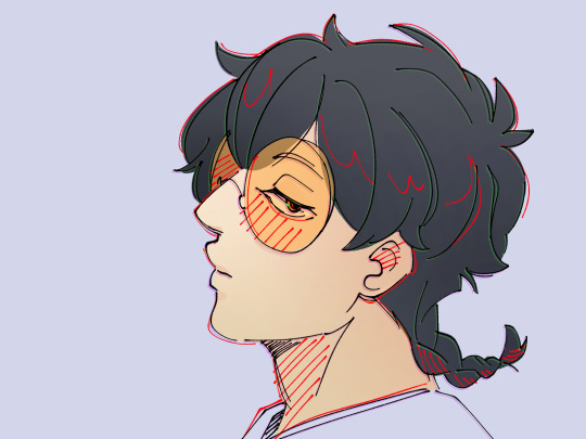
So then I dusted off that Clip Studio Paint program collecting dust on my laptop and used it. I'm horribly not used to it...
#FOR THE RECORD#I have looked at tutorials and such#And everytime I watched one my soul melted#I just struggle learning/adapting to new things aight
122 notes
·
View notes
Note
Sending this as anon bc I'm shyyyy but hi!!! Ive been following you for a while and I LOVE the way you draw Yuji so so so much. Adore him even. He's my baby and I love him. You draw him so GOOD I go emotionally feral every time you draw a new Yuji thats how much I love him I was wondering if you have any tips when it comes to rendering his hair??? I've been drawing him for months now and I still struggle every single time I draw his hair and it's beginning to annoy me so much. I really really love the way you render his so I was sort of wondering how you go about doing it??? If thats not a bother of course. I can't stress this enough but I love your art and you've been a big artistic inspiration for me for the past few months!!! Hope you're doing well :)

hi anon!!! ik your question was about hair specifically but i got carried away and ended up with a timelapse of the whole render ..but i figured it's been a while so consider it a bonus! I'll go into a few specifics under the cut in case i get Also carried away rambling :'> it's a lot easier to Do than to explain but I hope u can still take something away from this <3
i'm on a painting kick so that means i mainly work by taking big swatches of colour blocks and then going in and refining them. u can see in the beginning of the video i start by just throwing down approximate colours and values according to where i want my light source to be before cleaning everything up. I use a combination of a hard angled chisel for flats, a chalky/textured oil brush to blur edges, and a textured tapered brush pen for detail.
rn the way i draw hair uses a lot of Big shapes that i try to separate into somewhat believable layered hairstyles by using small, high contrast shadows to give the illusion of depth. speaking of shadows, smth i play around with when it comes to yuuji specifically is shading his hair with colours that border on either brown or grey--depends on th piece ofc, there are times when i saturate this boy to hell and back, but i find using neutral shadows Grounds the pink a lot
honestly a good rule of thumb when rendering layers is light on top dark underneath fshdsdh a lot of the time hair rendering is just one big convoluted gradient. i break up the monotony with thin sharp lines around the edges where colours meet to imply individual strands, but lately i'm trying to cut back with how many strands i render in detail. i don't think this video is the best example of it (or maybe yuuji's hair in general doesn't lend itself well to what i'm trying to achieve), but ideally I'd like wider swaths of colour with fewer interrupting fine lines. megumi is a lot more forgiving w this i find
in a similar vein , i think in general it's rly hard working with hair like yuuji's which in official art is just . a nondescript spiky puff on top of an undercut... if u want to be more faithful to his design be my guest but i personally try to rectify his hairstyle by picking a few points of origin for the hair chunks in order to make the growth direction and volume make sense. since i draw yuuji's hair a lot longer than it is in canon, for reference i tend to look at a lot of women's undercut/pixie cut styles to get a better idea of how to layer everything. i like making his hair swoopy and fwippy rather than Spiky, if that makes sense
those r just some things i do, but honestly i wouldn't worry abt being terribly precious with it. hair is rly forgiving in that there are a million ways to make it look good , i think that the most important thing is being aware of your light source and adjusting your values accordingly. play around, see what works, have fun with it! and don't resist it if u find yourself being led in a completely different direction lmao ik i just went over my current process but i think i've brought up before how hair is often the most volatile of all the features i draw and i change up how i approach it A Lot .
i'll shut up now bc ive Already been talking too long but thank u so much for your kind words and I hope u found something abt this helpful!!!
#answered#art advice#my art#timelapse#jujutsu kaisen#jjk#jjk fanart#yuji itadori#this was sitting in my inbox staring at me and i could not focus knowing it was there so i dropped everything fr a timelapse#i thought abt recording myself when i got to yuuji's hair on my current piece but yuuji in that one is a. too small and b. facing away#wld not have made a good tutorial subject lmao#also this is the fastest ive finished a render in Months my hand hurts lmao im out of practice#im always so insecure abt the quality of the advice i offer i RLY hope im not just spewing bs here#the thing about drawing for over 2 decades is that eventually u forget how you draw#ANYWAY now this is done surely NOW the universe will let me work on megumi uninterrupted.....
108 notes
·
View notes
Text
I haven't seen any posts about this yet but l've seen some fan art that makes me feel this needs to be said:
Don't forget Leah Sava Jeffries has darker skin when making Annabeth Chase fan art!
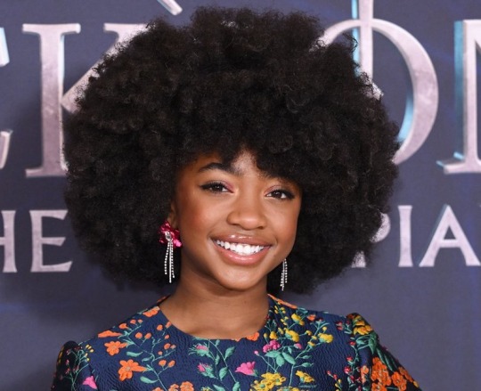
She is much closer to Lupita Nyong'o than Zoe Kravitz when it comes to shading, reflection, and complementary color usage :).
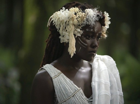
Lighting for dark skin is different on light skin. Light skin gets changed by lighting, and dark skin reflects the lighting. Below is a lovely shot of Nyong'o's character from Wakanda Forever in mourning. The filmmakers emphasize the umber qualities of her skin in contrast to the funereal white and (arguably harsh) light across her shoulder below.
Try to pick spots that aren't directly in or near the light, and try mixing 3 or more! You can put it into a color mixer online, or even color pick, lower the opacity, and lay the shades over each other until you find one that fits. And of course, the more 'realistic' you want to go with shading and lighting, the more shades you're going to want to be able to explore vivaciously :D.
Let's take a look at the same 3 beautiful actresses I mentioned at the beginning, with a bad color picked area and a better-ish color picked area. (Please keep in mind, these are not perfect comparisons, as I was not able to find pictures of all 3 actresses under the same kind of lighting.)
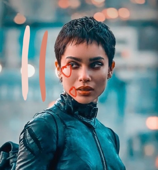
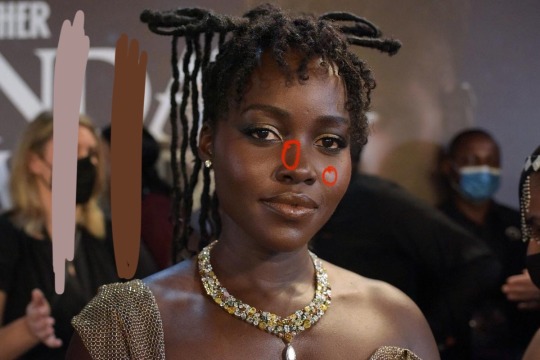
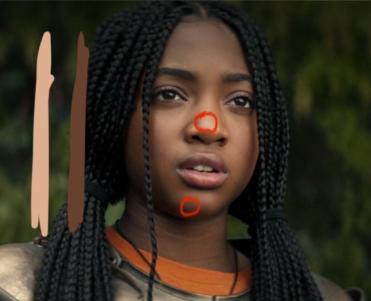
Kravitz's has a clear difference between the two, but they aren't too far apart, in comparison to Nyong’o’s and Jeffries’s. Note the dullness in the poorly picked shades as opposed to the better ones. Also keep in mind that while Kravitz has a rosy undertone (at least in that picture - it’s from The Batman, which has stylized coloring) Nyong’o has a slight cool undertone (I can’t pin down quite what, but the picture is definitely not stylized like Kravitz’s).
Jeffries runs more ochre or russet, but neither of those are pink. They are more red than terracotta or umber, but to call Jeffries’s face rosy would be wrong. Err more towards the golden when drawing her.
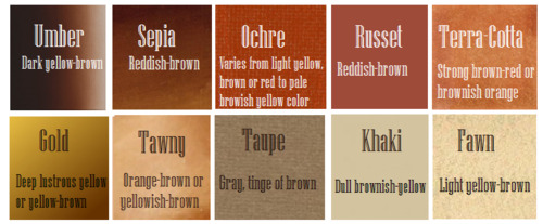
^^saved an image from a writing tutorial long ago, but can’t seem to find it. If someone recognizes it, I’ll link it. EDIT: it’s from this post. Thanks @autumnrowancollector ! <3
And also, the darker skin gets, the less likely warm undertones are going to appear. Don't be afraid to use blue or purple or even green on occasion!
Additionally, cool lighting on dark skin is always a win imo.
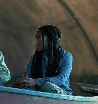
(I was going to use that picture of Jeffries as Annabeth by the lightning bolt, but then I realized the lighting on her face doesn’t quite match up with where it should hit from that angle, and I realized they kind of just turned everything bluer, so screenshot time!)
(Also if you want another really great live action example, check out anything Aldis Hodge is in, like Leverage and Black Adam)(and of course there’s Spiderverse <3 but I want to post pictures of Hodge)
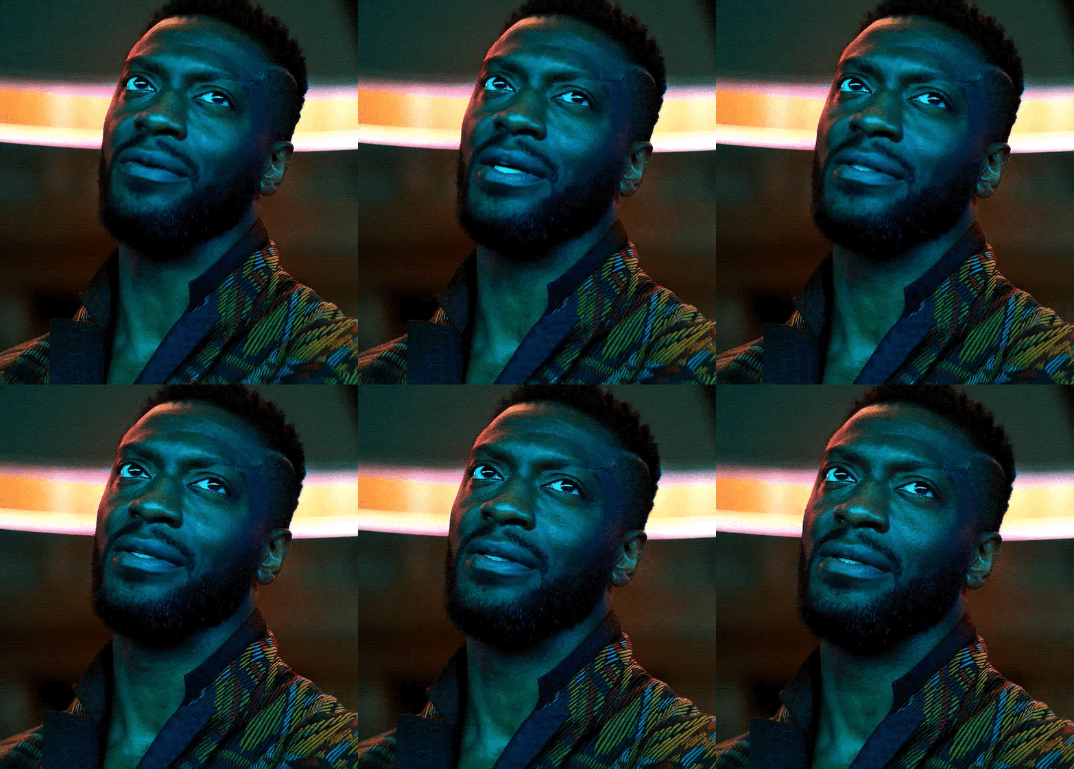
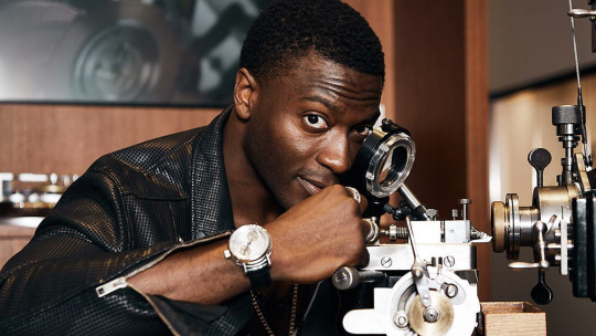
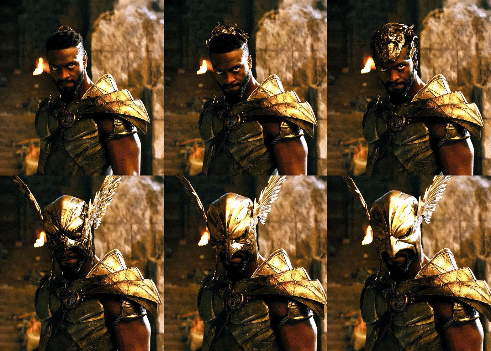
Now, to here’s a list of more experienced people’s advice:
Black facial features & hair
Shading digitally for a (somewhat) monotone Black character
Stylistic choices and places to start looking for inspiration (besides a search engine).
Coloring Black people’s lips
A better coloration tutorial
Also a nice tutorial for Indigenous skin tones, just in case yall want to draw Piper or use this information for other dark skinned characters :).
EDIT: Some actresses who are closer in skintone to use for Annabeth, provided by the lovely @blackfemmecharacterdependency ! If you can’t find a reference for Jeffries in a specific lighting, maybe check out these ladies’ pictures! It’s a reblog, so scroll down.
TLDR: Don’t make Annabeth pink and pale, make her dark and golden.
#Annabeth chase#Percy Jackson#percabeth#leah sava jeffries#pjo#leah jeffries#art tutorial#percy jackon and the olympians#I love superheroes and so of course all of the actors I thought of were from superhero movies lmao#also for the record my advice is mostly from reading others’ tutorials and observation#and I don’t really use it a lot because I stick to lineart a lot lol#like down to mentioning Hodge (love himmmm) as a reference for good lighting on dark skin#there’s another post floating around here that specifically mentions him and Leverage for that#I’m tagging this as an art tutorial but really i want it to be more of a master post#master post so yall can see the tutorials I usually use#but then I ended up writing about Jeffries specifically because I’m dumb#I wanted to go to sleep four hours ago I’m dumb#I really want to draw her and ginger Percy but#irl it’s starting to get busy at school again :/
374 notes
·
View notes
Text
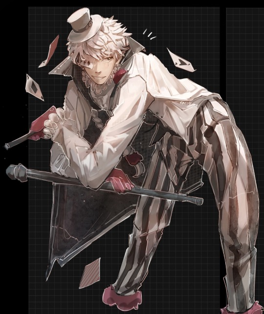
<3
#ty anon who reminded me about a coloring tutorial i recorded one of me explaining how i drew this so ill be making a process video soon <3#bungo stray dogs nikolai#bungou stray dogs#bungo stray dogs#bsd#bsd fanart#nikolai#nikolai gogol#bsd nikolai gogol#anime#fanart#anime fanart#kokoart
1K notes
·
View notes
Text
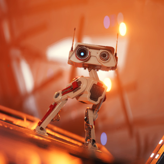
BD-1 | Jedi Survivor
#thanks for all of your comments and tags on his video!!!!#so much of my attitude towards these edits is “I wish this existed but whoops guess I have to make it exist”#which is both intimidating and fun#gonna swap back to photos for a bit but gifs and alt-angle stuff will return once I have oomph to record again#might make a tutorial for photomode stuff#star wars jedi survivor#star wars jedi fallen order#jedi survivor#jedi fallen order#bd 1#star wars
263 notes
·
View notes
Text
i NEED more audios and slime tuts from the outsiders, any understudies or original cast... if anyone has them (and don't mind sharing them) pleaseeee lmk!! thank ya'll sm
#the outsiders#the outsiders musical#ponyboy curtis#the outsiders ponyboy#outsiders musical#musicals#slime tutorials#recording#dallas winston#the outsiders movie#chet baker the outsiders#the outsiders audio#yayyy
50 notes
·
View notes
Note
Hi, sorry to be a bother but do you have a tag for posts explaining how you draw/colour? I think I remember seeing one of your posts on shading/colouring technique and I can’t seem to find it, your art is so pretty and the way you use colour makes me speechless every time.

thank you both!! I usually have it under "tutorial" tag, but I'll repost this one and add onto it :>


hopefully that helps!! I've mostly been eyeballing colors nowadays but layer modes can also help you pop your saturation or lighting/shading :> just be sure to pay attention to how bright your colors are overall, the method I use to make the colors feel vibrant is to pair it next to a more muted color/one that contrasts it on the color wheel
527 notes
·
View notes
Text
How does Rover blink?
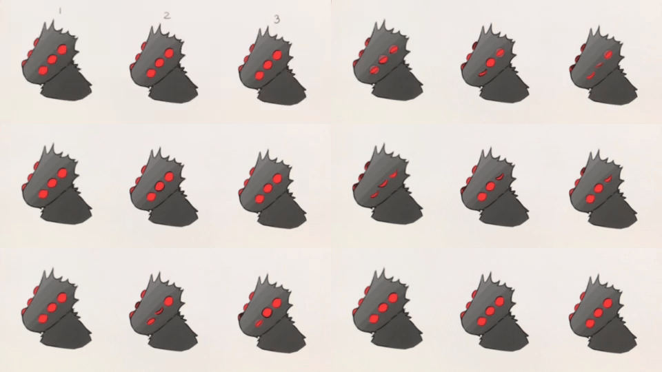
#i tried reaally hard t export the animation but maybe im too stupid to understand the tutorials#so yeah Im still recording with my phone 🗿#opm#opm fanart#opm rover#silly lil goober I love him so much
110 notes
·
View notes
Text
hi I'm fighting with XSplit & DaVinci Resolve right now
#the first time i recorded it was too low res so technically this is now my third time painting Natalene's hair#hair tutorial: yes but more like a text guide and a video example
49 notes
·
View notes
Text
y'all have to be so nice to me about my art. i'm just out here doing my best with a slightly broken mechanical pencil and it's crappy eraser, my dollar store sketch book, and a decade old chinese phone.
#loyal talks about stuff and things#for the record: the chinese phone? best phone i've ever used i'm dreading the day it fully dies ;__; what will i do without you....#also i looked up a tutorial for this next drawing and i swear i did my best
29 notes
·
View notes
Text
BEE KISS TOMORR- *dead* /j
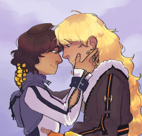
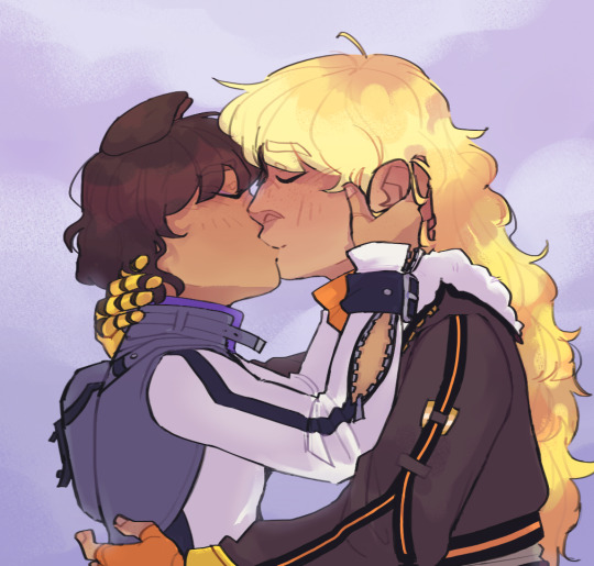
If anyone wants to watch me drawing this like a little victorian child then the timelapse is below the cut 🤣
(FLICKER WARNING. It's all through out so be careful!👍 )
#RWBY#Bumbleby#Blake Belladonna#Yang Xiao Long#Foxarts#YOUR HONOR I HATE THEM (that's a lie actually)#I'VE BEEN STARING AT THIS FOR 3(?) DAYS NOW AND I'M SICK#Technically this doesn't contain spoilers but let me know if I should add the tag!#In reality I think cloud scene will happen episode 7-ish BUT being delusional is what being a bee fan is all about-#This is the first time I've actually tried drawing a kiss sooooo hope it turned out ok xDD#I am the one who looks away when anyone kisses for more than 2 seconds so.#Kisses aren't very photogenic that's all I'll say (I had 3 tutorials open and 5 references pulled up)#This was so messy- I forewent line art because I hate it and I thought it wouldn't be bad to just clean up the sketch. I was kind of right.#Watching back the recording is funny because I've always known I'm disorganized but just watching it play out is hilarious.#Enjoy my little notes and doodles 😌😌#They're so soft I want to scream.#I SURE HOPE I DIDN'T FORGET ANYTHING 😭#Risking my livelihood for these stupids since 2020 *strikes pose*#Anyways that's enough of my rambling.#HAVE A NICE DAY Y'ALL!!
675 notes
·
View notes
Text
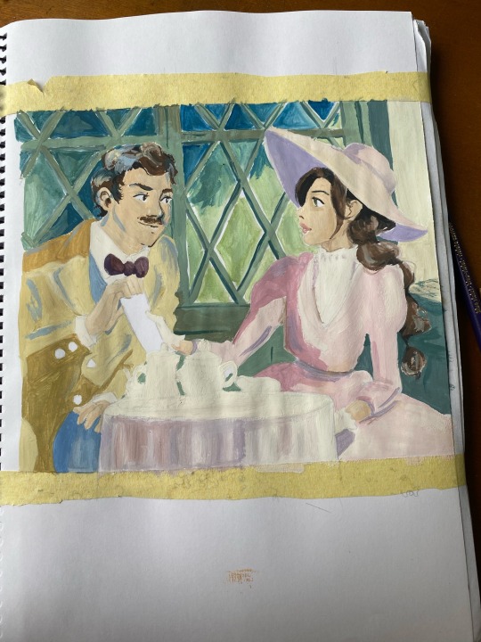
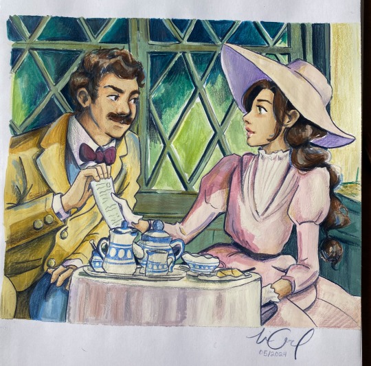
My painting process!!🫶
I just wanted to share a tiktok I made where I document my painting process bc I get a lot of comments/messages about it & maybe you’ll be interested in seeing how I do it & maybe even try it out for yourself!!!!🙏💓🙏
I was also thinking about maybe doing a tutorial if anyone’s interested where I ACTUALLY explain myself instead of just showing the process.. lmk what you think😇🙏
And here you can see a comparison of a painting before and after I added the colored pencil🙏 (really need to trust the process here lol)
#I am a FOOL 😤 I downloaded like 5 reels off of insta for this post#and I can only post one😔🙏#if you want to see more lmk and I’ll try and figure it out jajajajajajajajaj#I just love painting and talking about art in general I hope you enjoy this!!😙😙#in the end this is the one that I think most clearly shows my process#so you don’t get the CURSED voiceover on a watercolor painting I made jajajajajajajajajaja#does anyone else despise hearing their voice in recording or is it just me#art resources#art tutorial#art#art process#traditional art#spirited away
75 notes
·
View notes
Text
The Outsiders Slime Tutorial
Hi, I’m looking for a bootleg of The Outsiders Musical from its World Premiere Run at La Jolla Playhouse. I have seen the show on Broadway and while it was amazing, I would do anything to see footage from the world premiere. I could not afford a trip to San Diego last year, but I did read all of the reviews, and the major takeaways I had were that the show was longer, there were more songs and characters (justice for randy fr) and i believe dally’s death was different? i also really want to see the original original cast, you know? Anyways, if anyone has a bootleg or knows where I can find one (because let’s be real, there has to be footage out there) PLEASE LET ME KNOW IM BEGGING
Edit: I do have an audio recording of the Broadway version and I will trade it for this bootleg if that’s what it takes
#bootleg#broadway#broadway musicals#musicals#slime tutorial#the outsiders musical#curtis brothers#ponyboy michael curtis#the outsiders#fanfiction#johnny cade#stay gold ponyboy#randy anderson#recording
41 notes
·
View notes
Text

Wonder what they made him do...
#david hayter#mgs#mgs delta#mgs3 delta#probably just promo stuff but i'm intrigued#i imagine they probably asked or will ask jim piddock to record lines for the new tutorials#maybe they had to modify some snake lines in response or something#not expecting any stuff aside from that but hope it's something more interesting
23 notes
·
View notes

