#r lattice package
Text
Visualizing Big Data: R’s Powerful Graphing Capabilities
In today’s data-driven world, effective visualization is crucial for understanding complex datasets. R, a popular programming language among statisticians and data scientists, offers a plethora of powerful tools for visualizing big data. This blog post explores R's graphing capabilities and how they can help you transform raw data into meaningful insights.

1. The Importance of Data Visualization
Data visualization is the graphical representation of information and data. It enables data scientists to:
Identify trends and patterns within large datasets.
Communicate findings clearly and effectively.
Facilitate decision-making based on visual insights.
In the context of big data, where volumes of information can be overwhelming, effective visualization helps distill complexity into digestible formats.
2. R’s Graphing Libraries
R boasts several powerful libraries for data visualization, each with unique strengths:
ggplot2: One of the most widely used visualization packages in R, ggplot2 follows the Grammar of Graphics philosophy, allowing users to create complex and aesthetically pleasing graphics easily. It is highly customizable and supports various plot types, from scatter plots to heatmaps.
lattice: This package is great for creating multi-panel plots and allows for the easy visualization of relationships in multivariate data. It is particularly useful for displaying data grouped by factors.
plotly: For interactive visualizations, plotly is an excellent choice. It extends ggplot2 and allows users to create interactive charts that enhance user engagement and exploration of the data.
highcharter: Another interactive visualization library, highcharter integrates with Highcharts to create beautiful and responsive visualizations suitable for web applications.
3. Creating Visualizations with ggplot2
Let’s look at an example of how to visualize big data using ggplot2. Suppose you have a large dataset containing information about global temperatures over time.
Loading the Data: Start by loading your data into R.
Basic Plot: Create a basic line graph to visualize the temperature trend.
R
Copy code
library(ggplot2) # Sample data data <- data.frame( year = 2000:2020, temperature = c(14.5, 14.7, 14.8, 14.9, 15.1, 15.3, 15.5, 15.6, 15.7, 15.8, 15.9, 16.0, 16.2, 16.4, 16.5, 16.6, 16.8, 16.9, 17.0, 17.1, 17.3) ) # Creating a line graph ggplot(data, aes(x = year, y = temperature)) + geom_line(color = "blue") + labs(title = "Global Temperature Trends (2000-2020)", x = "Year", y = "Temperature (°C)")
Enhancing the Visualization: Customize the plot by adding themes, colors, and labels.
R
Copy code
ggplot(data, aes(x = year, y = temperature)) + geom_line(color = "blue", size = 1) + geom_point(color = "red") + labs(title = "Global Temperature Trends (2000-2020)", x = "Year", y = "Temperature (°C)") + theme_minimal()
4. Interactive Visualizations with Plotly
To make your visualizations more engaging, consider using plotly for interactivity. Here’s how you can turn the ggplot2 graph into an interactive one.
R
Copy code
library(plotly) # Create an interactive plot p <- ggplot(data, aes(x = year, y = temperature)) + geom_line(color = "blue") + labs(title = "Global Temperature Trends (2000-2020)", x = "Year", y = "Temperature (°C)") # Convert to plotly object ggplotly(p)
5. Visualizing Big Data Challenges
When working with big data, visualizing large volumes of information can be challenging. Here are some strategies to effectively visualize big data:
Data Aggregation: Summarize data before plotting to reduce complexity. Use techniques like averaging or grouping by categories.
Sampling: If the dataset is too large, consider sampling a subset for visualization purposes. This can provide insights without overwhelming the viewer.
Dynamic Filtering: Utilize interactive visualizations to allow users to filter and explore the data themselves, which can lead to more personalized insights.
6. Conclusion
R's powerful graphing capabilities make it an invaluable tool for visualizing big data. With libraries like ggplot2, plotly, and lattice, data scientists can create compelling and informative visualizations that reveal trends, patterns, and insights. By mastering these tools, you can elevate your data analysis and effectively communicate your findings, helping stakeholders make informed decisions based on visualized data. Embrace the power of visualization in R, and unlock the potential of your big data!
0 notes
Text
Using ggplot2 in R Language
Introduction to ggplot2
There are three strategies for plotting in R language.
base graphics using functions such as plot(), points(), and par()
lattice graphics to create nice graphics, however, it is not easy to create high-dimensional data graphics.
ggplot package, it is an implementation of “Grammar of Graphics”.
To plot using ggplot2 in R Langauge, a data.frame object is required as an…

View On WordPress
0 notes
Text
Using R and Python for Data Analysis
Overview of R and Python
R and Python are two of the most popular programming languages for data analysis, each with its unique strengths and capabilities. Both languages have extensive libraries and frameworks that support a wide range of data analysis tasks, from simple statistical operations to complex machine learning models.
R
R is a language and environment specifically designed for statistical computing and graphics. Developed by statisticians, it has a rich set of tools for data analysis, making it particularly popular in academia and among statisticians. R provides a wide variety of statistical and graphical techniques, including linear and nonlinear modeling, classical statistical tests, time-series analysis, classification, clustering, and more.
Python
Python, on the other hand, is a general-purpose programming language known for its simplicity and readability. It has become extremely popular in the data science community due to its versatility and the extensive ecosystem of libraries such as Pandas, NumPy, SciPy, and scikit-learn. Python's simplicity and the power of its libraries make it suitable for both beginners and experienced data scientists.
🌟 Join EXCELR: Your Gateway to a Successful Data Analysis Career! 🌟
Are you a recent graduate or looking to make a career change? EXCELR's Data Analyst Course in Bhopal is designed just for you! Dive into the world of data analysis with our comprehensive curriculum, expert instructors, and hands-on learning experiences. Whether you're starting fresh or transitioning into a new field, EXCELR provides the tools and support you need to succeed.
🚀 Why Choose EXCELR?
Industry-Relevant Curriculum: Stay ahead with the latest trends and techniques in data analysis.
Expert Instructors: Learn from seasoned professionals with real-world experience.
Hands-On Projects: Apply your knowledge through practical projects and case studies.
Career Support: Benefit from our dedicated career services to land your dream job.
Don't miss out on the opportunity to transform your career! Enroll in EXCELR's Data Analyst Course in Bhopal today and step into the future of data analysis.
👉 Apply Now and take the first step towards a brighter future with EXCELR!
Key Features and Capabilities
R
Statistical Analysis: R is built for statistics, making it easy to perform a wide range of statistical analyses.
Data Visualization: R has powerful tools for data visualization, such as ggplot2 and lattice.
Comprehensive Package Ecosystem: CRAN (Comprehensive R Archive Network) hosts thousands of packages for various statistical and graphical applications.
Reproducible Research: Tools like RMarkdown and Sweave allow for seamless integration of code and documentation.
Python
Versatility: Python is a general-purpose language, making it useful for a wide range of applications beyond data analysis.
Extensive Libraries: Libraries like Pandas for data manipulation, NumPy for numerical operations, Matplotlib and Seaborn for visualization, and scikit-learn for machine learning make Python a powerful tool for data science.
Integration: Python integrates well with other languages and technologies, such as SQL, Hadoop, and Spark.
Community Support: Python has a large and active community, providing extensive resources, tutorials, and forums for troubleshooting.
Applications and Use Cases
R
Academia and Research: R's strong statistical capabilities make it a favorite among researchers and academics for conducting complex statistical analyses.
Bioinformatics: R is widely used in the field of bioinformatics for tasks such as sequence analysis and genomics.
Financial Analysis: R is employed in finance for risk management, portfolio optimization, and quantitative analysis.
Python
Data Wrangling and Cleaning: Python’s Pandas library is excellent for data manipulation and cleaning tasks.
Machine Learning: Python, with libraries like scikit-learn, TensorFlow, and PyTorch, is widely used in machine learning and artificial intelligence.
Web Scraping: Python’s BeautifulSoup and Scrapy libraries make web scraping and data extraction straightforward.
Automation: Python is used for automating data workflows and integrating various data sources and systems.
Tips and Best Practices
R
Leverage RMarkdown: Use RMarkdown for creating dynamic and reproducible reports that combine code, output, and narrative text.
Master ggplot2: Invest time in learning ggplot2 for creating high-quality and customizable data visualizations.
Use Dplyr for Data Manipulation: Familiarize yourself with the dplyr package for efficient data manipulation and transformation.
Python
Utilize Virtual Environments: Use virtual environments to manage dependencies and avoid conflicts between different projects.
Learn Vectorization: Take advantage of vectorized operations in NumPy and Pandas for faster and more efficient data processing.
Write Readable Code: Follow Python’s PEP 8 style guide to write clean and readable code, making it easier for collaboration and maintenance.
Conclusion
Both R and Python have their unique strengths and are powerful tools for data analysis. R shines in statistical analysis and visualization, making it a preferred choice for researchers and statisticians. Python's versatility and extensive libraries make it suitable for a wide range of data science tasks, from data wrangling to machine learning. By understanding the key features, applications, and best practices of each language, data professionals can choose the right tool for their specific needs and enhance their data analysis capabilities.
4o
#DataAnalysis#DataScience#Python#RLanguage#DataVisualization#MachineLearning#Statistics#Programming#DataWrangling#Bioinformatics#FinancialAnalysis#BigData#Analytics#TechBlog#DataScienceCommunity#DataScienceTools#DataAnalytics#DataScienceTips#Coding#DataTech#AI#ML#DataScienceLife
1 note
·
View note
Text
Introduction to R Programming- A Comprehensive Guide
R is a powerful and versatile programming language specifically designed for statistical computing and graphics. It is widely used among statisticians, data analysts, and researchers for data analysis, visualization, and predictive modeling. This guide will introduce you to the basics of R programming and provide a solid foundation to start your journey in data analysis with R.
Why Learn R?
R is renowned for its robust statistical analysis capabilities, extensive visualization options, and an active community that continuously contributes to its development. Here are a few reasons to learn R:
Comprehensive Statistical Analysis: R has a vast array of statistical and graphical techniques, including linear and nonlinear modeling, time-series analysis, classification, clustering, and more.
Data Visualization: R is equipped with powerful libraries such as ggplot2, lattice, and plotly, which facilitate the creation of complex and aesthetically pleasing data visualizations.
Open Source: R is free and open-source, allowing anyone to contribute to its development and access a wealth of packages and resources.
Community Support: With a vibrant and active community, finding help, resources, and inspiration is easier, making the learning process smoother.
Getting Started with R
Installation
Before diving into R programming, you need to install R and RStudio, an integrated development environment (IDE) for R.
Install R: Visit the CRAN website and download the latest version of R for your operating system. Follow the installation instructions.
Install RStudio: Go to the RStudio website and download the free version of RStudio Desktop. Install it following the provided instructions.
Basic R Syntax
R Console
The R Console is where you can directly type R commands and see the output. To open the console, launch RStudio and select the Console panel.
learn r programming that offers numerous benefits, particularly for those interested in data analysis, statistics, and data science. Here are some key advantages:
Statistical Powerhouse: R is designed for statistical computing and data analysis. It has a vast array of packages and functions specifically for statistical analysis, making it a powerful tool for statisticians.
Data Visualization: R excels in data visualization, with packages like ggplot2, lattice, and plotly enabling the creation of high-quality, detailed, and customizable graphics and plots.
Comprehensive Packages: The Comprehensive R Archive Network (CRAN) hosts thousands of packages that extend R's functionality, allowing users to find tools for virtually any data analysis task.
Open Source and Free: R is open source and free to use, making it accessible to anyone and fostering a large, active community that contributes to its development and support.
Reproducible Research: With tools like R Markdown and knitr, R allows for the integration of code, output, and text in a single document, facilitating reproducible research and dynamic reportin
Conclusion
learn r programming for beginners that can significantly enhance your data analysis capabilities. With its extensive range of functions, packages, and community support, R is an indispensable tool for statisticians, data analysts, and researchers. This guide provides a foundation to start exploring the vast potential of R, but the key to mastery is continuous practice and exploration of its diverse libraries and tools.
1 note
·
View note
Text
Module #9 Visualization in R
Module # 9:
In this module, we reviewed three types of visualization in R: basic visualization without any package, lettuce and ggplot2.
Choose any data set for your visualization from Vincent Arel Bundock dataset list: https://vincentarelbundock.github.io/Rdatasets/datasets.html
Using this data, generate three types of visualization on the data set you have chosen. In your blog, discuss and present your three visualizations you will create and express your opinion on these three different types of graphics output.
---
I have chosen the College Distance data
First I created a basic histogram:

The first visualization is a basic histogram of academic scores, showing the distribution of scores across the dataset. This type off visualization is very straightforward and effective for understanding the general spread of a single variable in this case academic scores.
Code:

Then I created a visualization using the lattice package:

This visual showcases a grouped box plot of wages by gender. It provides insights into the distribution of wages for each gender, including the median, interquartile range, and potential outliers. This type of visualization is useful for comparing distributions across different categories. In this case between males and females.
Code:

Finally I used ggplot2 to create a scatter plot:

This visualization looks at and depicts the relationship between distance to college and academic score, with points colored by gender. This plot not only highlights the distribution of scores relative to the distance but also a comparison across genders. Thgis kind of a visualization is effective for exploring complex relationships and patterns within the data.
Code:

0 notes
Text
Gnu octave 3d plot

#Gnu octave 3d plot how to
#Gnu octave 3d plot code
Rows is limited to the order of the piecewise polynomials, order. Vector of the x-locations of the constraints.Ĭoefficients (matrix). The optional property, constaints, is a structure specifying linearĬonstraints on the fit. The splines are constructed of polynomials with degree order. The fitted spline is returned as a piecewise polynomial, pp, and Values close to unity may cause instability or rank With the knowledge gained, the second part of the project will be to implement a Property Inspector. Semiconductor material often described by diamond crystal lattice (or the related zincblende lattice). 3D distribution can then be plotted using Matlab/Octave. In this project we use ELK to simulate the spatial distribution of electronic charge density in diamond. The initial phase of the project will be learning how the implementation was done. 3D plot of the charge density of diamond using ELK, Octave an VESTA. Increasing values of beta reduce the influence of Octave has a preliminary implementation of a Variable Editor: a spreadsheet-like tool for quickly editing and visualizing variables. Viewed 193 times -1 I was trying to draw four points in 3D using GNU Octave. The value ofīeta is restricted to the range, 0
#Gnu octave 3d plot code
Three iterations of weighted least squares are performed. A waterfall plot is similar to a meshz plot except only mesh lines for the rows of z (x-values) are shown. Code function animcamera(fname) draw a sombrero and turn it around n 50 x y linspace (-8, 8, n) xx, yy meshgrid (x, y) r sqrt. If robust fitting is to be applied to reduce the influence of outlyingĭata points. The optional property robust is a logical value which specifies Length of the period is max ( breaks) - min ( breaks). Whether a periodic boundary condition is applied to the spline. Everytime I try to run the following program it keeps saying invalid use of script in index notation. To plot multiple one- or two-argument groups, separate each group with an empty format string, as plot3 ( x1, c1, '', c2, '', ) Multiple property-value pairs may be specified which will affect the line objects drawn by plot3. The optional property periodic is a logical value which specifies It used to be able to plot 3D graphs but not anymore. P is a positive integer defining the number of intervals along N-D array, then x(j) is matched to y(:,…,:,j). X is a vector, and y is a vector or N-D array. I don't see such an option when I plot 3D surfaces in Octave using GNUplot. In Matlab I can generate a 3D surface plot/mesh plot and rotate it to whatever reference frame I choose. But I have a question regarding plot rotation. Plot(time,velocity,’:bo’,’LineWidth’,7.: pp = splinefit ( x, y, breaks) : pp = splinefit ( x, y, p) : pp = splinefit (…, "periodic", periodic) : pp = splinefit (…, "robust", robust) : pp = splinefit (…, "beta", beta) : pp = splinefit (…, "order", order) : pp = splinefit (…, "constraints", constraints)įit a piecewise cubic spline with breaks (knots) breaks to the I am relatively new to Octave but have relied on Matlab knowledge to get around. Velocity=sqrt(gravity*mass/c)* tanh(sqrt(gravity*c/mass).*time) Gnu Octave is a matlab work-a-like that does array manipulations and provides a programmable mathematical workbench. It is based in matGeom and extends it with several other functionalities, e.g. Last I check, it incorporates gnuplot for its graphing functions. Gnuplot does line graphs and some 2D plotting of regular array data. The geometry package is multipackage providing functions to manipulate geometrical entities in 2D and 3D. The basic command is plot(x,y), where x and y are the co-ordinate. Octave has powerful facilities for plotting graphs via a second open-source program GNU-PLOT.
#Gnu octave 3d plot how to
Long In this tutorial you will learn how to plot data in Octave. The octave script with comments shown below to plot the time vs velocity graph. Octave Tutorial 5: How to plot data in Octave with extracts from Introduction to Octave, by P.J.G. Let’s learn the steps involved to specify markers in the Octave/Matlab plot command with attributes like edge color, face color, and marker size, etc.
0 notes
Text
Ipack survey program

#IPACK SURVEY PROGRAM SERIES#
R-release (arm64): survey_4.1-1.tgz, r-oldrel (arm64): survey_4.1-1.tgz, r-release (x86_64): survey_4.1-1.tgz, r-oldrel (x86_64): survey_4.1-1.tgzĬalibrateSSB, cjoint, csurvey, eatRep, ggsurvey, glm.predict, hopit, lavaan.survey, MedSurvey, pedgene, relaimpo, samplingbook, spsurvey, sptm, StatMatch, svydiags, svyVGAMĪnthro, apc, APCI, calidad, capm, casen, ccdf, convey, COVIDIBGE, cregg, DAMisc, dearseq, DHS.rates, dvmisc, ech, EffectLiteR, effects, ergm.ego, FamAgg, GB2, GJRM, GreedyExperimentalDesign, httk, ICS, ICtest, iNZightPlots, iNZightTools, IRexamples, jskm, jsmodule, jstable, lboxcox, LLM, mase, MatchThem, MCM, microsynth, mixcure, MixedIndTests, OmnibusFisher, OVtool, PNADcIBGE, PNSIBGE, poliscidata, pricesensitivitymeter, RCPA3, RNHANES, robsurvey, SAMBA, SBdecomp, SightabilityModel, srvyr, ssfit, StroupGLMM, SUMMER, surf, surve圜V, svrep, SvyNom, svyweight, tab, tableone, twang, twangContinuous, twangMediationĪnthroplus, apyramid, BIFIEsurvey, broom, broom. Stats, graphics, splines, lattice, minqa, numDeriv, mitools (≥ 2.4)įoreign, MASS, KernSmooth, hexbin, RSQLite, quantreg, parallel, CompQuadForm, DBI, AERĮstimates in subpopulations Two-phase designs in epidemiology Analysing PPS designs Quantile rules A survey analysis example R (≥ 3.5.0), grid, methods, Matrix, survival Post-stratification, calibration, and raking.
#IPACK SURVEY PROGRAM SERIES#
Variances by Taylor series linearisation or replicate weights. Market research companies with existing teams of trained enumerators can charge premium prices. Summary statistics, two-sample tests, rank tests, generalised linear models, cumulative link models, Cox models, loglinear models, and general maximum pseudolikelihood estimation for multistage stratified, cluster-sampled, unequally weighted survey samples. Findings from Farmer Mini-Grants in partnership with the Vermont Grass Farmers Association.Survey: Analysis of Complex Survey Samples This Implementation Package (iPack) is a self-contained package aimed to assist and guide States in certain aspects of their preparation for Universal Safety Oversight Audit Programme (USOAP) Continuous Monitoring Approach (CMA) activities, particularly in providing pre-audit information to ICAO using USOAP CMA Online Framework (OLF).How we can improve grazing practices in order to support water quality.What impact we can have on the whole region's farm and food system, economy and ecosystem by a networked regional approach to good grazing. As the ICP lead, which of the following IPAC program components do you feel you could use some support in.Dairy Grazing Apprenticeship program to help keep new and young livestock farmers learning what they need to be successful graziers.Understanding the potential for wood-chip pads to relieve pressure on recovering pastures and as out-wintering areas.Tools for grass farmers to monitor grazing behavior and forage utilization in real time.How we can affect water quality in the entire Connecticut River watershed by bringing a team problem-solving approach to work with individual farms.The potential for alternative management practices to provide ecosystem services while increasing farm resiliency to climate change.Investigating Vermont wool for non-traditional uses, including pellets for farms and gardens.How small adjustments in management practices can affect milk production, in trials examining the timing of supplementation for organic dairy cows.Soil quality impacts of farming methods, through trials of forage species, agroforestry projects, and research into compaction.Demonstrating effects of biological and mechanical compaction best management practices on soil properties and water movement.Increasing Ecosystem Services and Climate Change Resilience In Dominant Agroecosystems of the Northeast.Enhancing Research and Education for Grass Farmers (Philo Ridge Project).Connecticut River Watershed Assistance (Long Island Sound RCPP).Timing of Supplementation for Dairy Cows.This study compared iPACK + ACB (adductor canal block) with PAI (periarticular infiltration) + ACB and ACB alone in terms of postoperative analgesia and functional improvement. Implementing and Evaluating Woodchip Heavy-use Areas for Livestock in the Northeast Purpose The infiltration between the popliteal artery and the capsule of the posterior knee (iPACK) has been described to provide analgesia without loss of muscle strength and is effective in functional recovery.Please visit our sharedįor more information. UVM Extension Grazing Programming work across three teams throughout Vermont to be the go-to resource for all your grazing needs. Our purpose is to understand what is and what isn't working in grass-based farming systems now, and to explore, understand, and share promising practices for a resilient future.
0 notes
Text
Pleasant Distractions
Pairing: Karmagisa
“Heeeyy, Nagisaaa,” Karma whined, draping his body over Nagisa’s back like a second coat and wrapping his arms around the shorter boy’s chest with a pout, “Come ooon. Hang out with meee.”
With a roll of his eyes, Nagisa turned back to his science textbook and resumed reading, doing his best to ignore the distracting noises that Karma was emitting.
An ionic compound is a giant structure of ions
“Nagisa.” He could feel tapping on his shoulder.
Strong electrostatic forces of attraction between oppositely charged ions hold ionic compounds together
“Hey, Nagisa.” The tapping became more rapid.
These forces, called ionic bonding, act in all directions in the lattice
“Naaagggiii-“
Nagisa snapped his book shut and let it rest on his crossed legs. He turned his head to look at the pouting redhead behind him, “Karma, we need to study for the test we have next week. The whole reason I agreed to come to your house in the first place was because you agreed to have a study session with me.”
“But I already know everything.”
“Well I don’t,” Nagisa retorted, “if you’re not gonna help me revise, can you at least do something quietly by yourself. I swear, if you distract me one more time, I’ll leave.”
At the other’s words, Karma immediately tightened his hold around his waist and pulled him closer to his chest so that he could drop his head against the crook of Nagisa’s neck. He murmured, “I just want to spend time with my little viper. Is that too much to ask?”
Nagisa reached his hand up to pet the red strands that made up Karma’s hair and replied with a smile, “I already see you everyday at school.”
“Yeah,” Nagisa shivered at the tingling sensation that was caused by the movement of Karma’s lips on the junction of his neck and collarbone, “but I wanna spend more time with you now. Besides we can’t do any of the fun stuff in class.”
“‘Fun stuff’?”
“Yeah, you know: kissing, making out, mouth to mouth..”
“Karma!” Nagisa whisper-yelled, blushing madly, “I really do need to study.”
“You’ve been studying for ages. At least take a snack break.”
Nagisa sighed, knowing that his boyfriend wouldn’t be letting this go anytime soon and just not having the energy to deal with Karma when he’s in his ‘whining-mode’, “Alright, fine. Just for five minutes, though.”
Keeping his hold on the smaller boy with one arm, Karma leaned sideways to grab a shopping bag that lay discarded beside them and riffled through its contents. With a smirk he offered a small muffin that was contained in plastic packaging, “blueberry muffin for my blueberry muffin?”
Nagisa rolled his eyes in response then tore open the packaging to retrieve the treat inside and took a bite, giving a pleased moan and the taste of sharp, sweet blueberries and fluffy muffin.
“Hey Nagisa,” with an answering hum, he turned towards Karma, “you’ve got a little something right here.”
Nagisa blushed when he felt Karma’s warm hands cup the entirety of his cheek so that he could brush away stray crumbs (that he knew for sure didn’t even exist) with the side of his thumb. Unconsciously, he melted into the touch, feeling soft and giddy at the tingling shots of fuzziness that ran up his spine at the way Karma’s eyes seemed to soften. It was so unfair how he could become all malleable with only a single touch from Karma, how he always ends up giving in because he does not want this to become a habit, damnit. He could feel his resistance dissipating as Karma grabbed one of his shoulders to turn him around so that they were now face to face and he knew he had to act quickly before he lost the little control he had. However, to be fair, if things did go the way that he knew that Karma was planning for them to, he wasn’t a hundred percent certain that he’d actually be too upset…
But still, he used all of his energy to lean away, despite every neuron telling him to stay in that safe hold that always provided warmth and comfort and protection, “I need to study.”
“I know,” Karma’s smile was far too innocent for his liking, “which is why I’ve decided to help you.”
“Really?” he couldn’t keep the suspicion out of his tone if he tried.
“Yep,” the red-head replied, popping the ‘p’, “only I’m not gonna help you study for science.”
He knew it, “okay then. What are you going to help me study for?”
“Something far more interesting,” Karma’s smirk turned devilish and all of a sudden, Nagisa felt like the little mouse that was begging the lion for mercy from that book of Aesop’s Fables he used to read as a kid. The taller boy leaned in, grabbing a fistful of the fabric under the collar of Nagisa’s shirt to tug him closer, and whispered into his ear, “how would you like to become a prodigy in B*tch-Sensei’s class?”
Nagisa’s ponytail shot up, ruffled, as his flustered face blossomed red. He placed his palms on Karma’s chest in a feeble attempt to push him away, “I-I really don’t think I need to study for that.”
Karma’s eyes glinted, “Oh really, why’s that, Nagi? You think that you’re already good at it?”
“N-n-no,” he stammered, his face burning like an inferno, “I-I just don’t think that it’s necessary, you-you know? It-it’s just that high-high schools don’t exactly have that stuff in their entrance exams, r-right?”
Karma let out a thoughtful hum as he buried his face into the curve of Nagisa’s neck, goosebumps ran through Nagisa’s arms as he whispered, “sounds like you’re making excuses, Nagi.”
“I-I-”
Karma kissed his cheek, murmuring against the soft flesh of his boyfriend’s cheek, “come on, Nagisa. I know you want to~”
Loki Odinson, give him strength.
“Karma,” he said, gulping slightly at the way the other’s golden irises pinned him down when he leaned back.
Karma took hold of his chin, “Yes, Nagisa.”
“I-I suppose that maybe a small break wouldn’t be too bad.”
Karma’s mouth twisted into a Cheshire Cat grin and all Nagisa could see was a flash of gold before every sense was consumed by the red haired devil incarnate with one arm wrapped around his back and the other on his cheek, with the cloth of his crimson button up scrunched up in Nagisa’s hand, with the increasing pressure of their lips pressing each other. Nagisa’s eyes slid closed as he let Karma take the lead, getting lost in the way everything just flowed like things always did when he was with Karma, in the way everything just felt so right as Karma angled his head so that he could kiss deeper. Nagisa could feel Karma’s hand crawl up the back of his head and hook his fingers inside the curve of the hair band that sat at the base of his ponytail before swiftly pulling it down in one smooth move, causing long strands of cerulean to unfurl downwards like a cataract of silky blue locks. Getting breathless, Nagisa used whatever strength he could muster to push himself back so that he didn’t pass out completely. They both looked at each other for a split second before the magnetic force they felt inside them increased in magnitude and they found themselves kissing once again and -
Nagisa gasped when he felt his back roughly hit the floor, wincing slightly at the loud thump it made. His head was still spinning and he looked up at Karma, who was towering above him with his palms on either side of Nagisa’s shoulders. Whilst his face was slightly pink, his eyes held concern, “sorry Nagisa. I got a bit excited there. You’re not hurt are you?”
“I’m fine,” Nagisa laughed breathlessly. He tried to get up but found that he was still too dizzy so he flopped back onto the floor again with a groan, “and here I thought I’d get some studying done.”
All he could hear was Karma’s deep chuckles before he felt himself get carried into a bridal style and deposited onto the taller boy’s bed. When Karma laid himself next to him and gathered him into an embrace, he said, “if I fail, I’m not coming to your house for at least another two weeks.”
“And people say I’m the mean one,” Karma said, apparently unbothered by his threat, “Guess I’ll just have to kidnap you and wait for the stockholm syndrome to settle in.”
“Karma!”
“Okay, okay. Just five minutes alright. We can both start revising for the octopus’ stupid test then.”
“We were both supposed to revise anyway! But alright, if it’s just for five minutes then it’s okay.”
They did not get up after five minutes.
#assassination classroom#akabane karma#karma akabane#karmagisa#shiota nagisa#nagisa shiota#my writing
29 notes
·
View notes
Text
Global Telecom Towers Market Analysis of Growth, Trends, and Forecast 2021 - 2025
Telecom towers are referred to as mobile sites or mobile towers which are built to provide services in a predetermined region. Telecommunication towers exhibit different cellular ranges, based on the size, frequency and power ratings of the transmitter, and on overlap provided by other towers in the area. The telecom tower provides a broad variety of multi-channel frequencies to thousands of mobile phones within the network zone. The main benefit of multichannel frequency is that it can connect tens of cellphones in just one network like conference calling, where most devices are connected to a single network and transmit and receive at the same time. In addition, it provides better data transfer speeds and connectivity. A telecom tower is a high-strength steel structure with a transceiver unit in the top to cover the maximum possible area.
Get Sample Reports Here - https://www.kennethresearch.com/sample-request-10065245
Market Segmentation
The Global Telecom Towers Market has been segmented on the following basis:
Based on the type of tower:
Lattice tower
Guyed tower
Monopole tower
Camouflage towers
Mobile (vehicle mounted) tower.
Based on Mounting area:
Ground Based Towers
Roof-top Towers
Other
Based on Applications:
Urban
Countryside
Based on Ownership:
Operator-owned
Joint Venture
Private-owned
Market Dynamics and Market Growth
We're in the midst of a telecommunications revolution. The technology has moved so fast that it gets obsolete within no time. 3G increased the demands on the systems and 4G escalated the volume of data traffic beyond anyone's anticipation, changing usage patterns.5G will drive demand even further, and will require newly expanded capabilities.
The factors resulting in the growth of the telecom towers market are:
Rising penetration in rural and off-grid areas and the recent disposition of small cell power systems used for LTE
Rising number of mobile phone users and Internet users.
Increasing competition among service provider for better network coverage leading to reduced tariff plans.
Fast upgradation of technology resulting in increasing demand for better services.
Joint ventures by the existing and new players in the market further increasing the competition.
Market Restraints
Health concerns regarding the harmful effects of high-frequency radio waves.
Environmental concerns regarding power supply systems to towers.
High installation and operation costs of the telecom towers.
Government regulations on limiting the telecom towers in the specific regions.
Recent trends have shown the large potential of strengthening of telecom tower network, where several new technologies are expected to grow. Ongoing researches on the Internet of Things, remote healthcare services, etc. are some emerging technologies projecting to increase the load on telecom tower in the next few years.
Global Telecom Towers Market: Regional Outlook
Telecom Towers market geographically is segmented in North America, Europe, Asia-Pacific (APAC), Middle East and Africa (MEA) and South America. Indonesia has the largest market in Southeast. Myanmar is likely to robust growth in the number of telecom tower installations in the coming years, due to developing smartphone penetration, decreasing tariffs and entry of new telecom operators on the marketplace. In Cambodia, companies are focusing towards the installation of grid towers, that run on renewable resources.
Key Players in Global Telecom Towers Market
Major players in the Global Telecom Towers Market are Indus Towers, Reliance Infotel, Viom Networks, Aster Pvt. Ltd., Bharti Infratel Ltd., American Tower Company, BSNL, GTL Infra, Eaton Towers Ltd.
Report Contents
Regional Analysis
Report Highlights
Market segments
Market Drivers, Restraints and Opportunities
Market Size & Forecast 2016 to 2022
Supply & Demand Value Chain
Market - Current Trends
Competition & Major Companies
Technology and R&D Status
Porters Five Force Analysis
Strategic and Critical Success Factor Analysis of Key Players
About Kenneth Research
Kenneth Research is a reselling agency providing market research solutions in different verticals such as Automotive and Transportation, Chemicals and Materials, Healthcare, Food & Beverage and Consumer Packaged Goods, Semiconductors, Electronics & ICT, Packaging, and Others. Our portfolio includes set of market research insights such as market sizing and market forecasting, market share analysis and key positioning of the players (manufacturers, deals and distributors, etc), understanding the competitive landscape and their business at a ground level and many more. Our research experts deliver the offerings efficiently and effectively within a stipulated time. The market study provided by Kenneth Research helps the Industry veterans/investors to think and to act wisely in their overall strategy formulation
Contact Us
Name: David
Email : [email protected]
Phone: +1 313 462 0609
1412, Broadway,
21st Floor Suite MA111,
New York, NY 10018
1 note
·
View note
Text
Semiconductor Manufacturing Equipment Market to Observe Rugged Expansion at a Top CAGR by 2027
The semiconductor manufacturing equipment market is anticipated to record notable growth by 2027 on account of soaring adoption of electric vehicles worldwide. In addition, increasing prevalence of IoT devices is set to drive market expansion over the forecast period.
Semiconductor manufacturing equipment refers to equipment that are typically used to produce semiconductor devices. Booming consumer demand for higher performing semiconductors has stimulated constant improvements in the technology employed in the products. Moreover, increasing focus on R&D activities to develop high-quality semiconductor manufacturing equipment to match the fast-paced progress in chip technology has fostered product outlook in recent years.
Get sample copy of this research report @ https://www.gminsights.com/request-sample/detail/4233
Furthermore, industry players are employing lucrative strategies to gain a competitive edge in the market, which has positively impacted the overall business landscape. For instance, in September 2021, Applied Materials, Inc., a key software, services, and equipment manufacturer for semiconductor devices, launched its novel products namely, the VIISta 900 3D hot ion implant system and the Mirra Durum CMP system.
The VIISta 900 injects ions while minimizing the damage caused to the lattice structure, thereby providing 40 times lesser resistivity as compared to a room temperature implant. Meanwhile, the Mirra Durum CMP system combines cleaning, polishing, drying, and material removal measurement in a single system to produce consistent wafers with the finest quality surfaces. Both products have been designed to assist silicon carbide (SiC) chipmakers in achieving 200mm production.
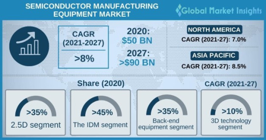
In another instance, in November 2020, ASML, a leading manufacturer of chipmaking equipment, completed the acquisition of Berliner Glas Group, a major manufacturing technology provider that specializes in optical systems. The deal enabled ASML to broaden its product portfolio and production capacity significantly.
The semiconductor manufacturing equipment market has been segmented on the basis of supply chain process, product, dimension, and region. With respect to product, the market has further been categorized into back-end equipment (test equipment, wafer manufacturing equipment, assembly & packaging equipment, and others) and front-end equipment (water surface conditioning equipment, lithography, polishing & grinding, and others).
Request for customization @ https://www.gminsights.com/roc/4233
Under back-end equipment, the assembly & packaging equipment segment is projected to amass substantial gains by 2027, progressing at a CAGR of approximately 7.0% over the forecast timeframe. Mounting demand for advanced packaging-based chipsets in consumer electronics products and connected devices is likely to bolster segmental growth over 2021-2027.
From the regional point of view, the LAMEA semiconductor manufacturing equipment market is expected to register around 6.0% CAGR through the analysis period to reach a sizable valuation by the end of 2027. Rising number of government initiatives supporting the development of the semiconductor manufacturing industry across LAMEA is estimated to boost regional market expansion over the following years.
Table of Contents (ToC) of the report:
Chapter 1 Methodology and Scope
1.1 Scope & definition
1.2 Methodology & forecast
1.3 Data Sources
1.3.1 Primary
1.3.2 Secondary
Chapter 2 Executive Summary
2.1 Semiconductor manufacturing equipment market 3600 synopsis, 2016 - 2027
2.1.1 Business trends
2.1.2 Regional trends
2.1.3 Product trends
2.1.4 Dimension trends
2.1.5 Supply chain process
Browse complete Table of Contents (ToC) of this research report @ https://www.gminsights.com/toc/detail/semiconductor-manufacturing-equipment-market
About Global Market Insights:
Global Market Insights, Inc., headquartered in Delaware, U.S., is a global market research and consulting service provider; offering syndicated and custom research reports along with growth consulting services. Our business intelligence and industry research reports offer clients with penetrative insights and actionable market data specially designed and presented to aid strategic decision making. These exhaustive reports are designed via a proprietary research methodology and are available for key industries such as chemicals, advanced materials, technology, renewable energy and biotechnology.
Contact Us:
Contact Person: Arun Hegde
Corporate Sales, USA
Global Market Insights, Inc.
Phone: 1-302-846-7766
Toll Free: 1-888-689-0688
Email:[email protected]
#Semiconductor Manufacturing Equipment Market Analysis#Semiconductor Manufacturing Equipment Market by Type#Semiconductor Manufacturing Equipment Market Share#Semiconductor Manufacturing Equipment Market Development#Semiconductor Manufacturing Equipment Market
0 notes
Text
Module #9- Visualization in R
One of the things I look forward to most when getting into data science is how much variety there is in creating graphs and make them standout. I thoroughly enjoy making things look artistic and well put together. Because of this, I have found myself enjoying just about every assignment where we get to use "ggplot" and I can explore more and more features that this program offers. For this week, we were also able to utilize a new program in R Studio called "Lattice". I think this program, just like with "ggplot", could become more interesting the more that I use it and understand it. For this week, as it was my first time experiencing it, I do not entirely love what it offers. I did, however, note the different geological graphs that it seems to offer and was intrigued to try these in the future.
One of the steps with this week was having us choose our own data from a list of hundreds. I actually really enjoy this as my least favorite thing in high school was being given a topic that I did not feel passionate about and having to run with it. Being able to choose our own allows me to find something I find intriguing. Unfortunately, I am indecisive and chose about 4 different data sets before I settled on one called "hurricNamed" which listed the names of different Hurricanes from the 1950's to the 2010's. This data also had wind speeds and recorded pressures as well that I wanted to utilize in this assignment.
To begin, I plotted a simple scatterplot using the code:

This created the graph below. To be honest, this graph is not really what I was wanting to create for this section, but I was repeatedly getting errors or was not getting a graph that even made sense.

The next graph that was created was done so with the code:

which created the below graph. As this is the one with the Lattice package, I am actually incredibly disappointed with it. I was looking forward to making something incredibly interesting with this one.

As I have the most experience with ggplot, I made the graph with it using code:

This allowed me to make, what I call, the "fruity pebble graph".
Instead of using the Year and Wind Speed as I did with the others, I switched the values to be the Wind Speed and Pressure and then had the dots plot based off the year value. This one is honestly my favorite graph of the three and I feel like it has more meaningful data included as well.

0 notes
Text
R Plots Par
R also allows combining multiple graphs into a single image for our viewing convenience using the par function. We only need to set the space before calling the plot function in our graph. We only need to set the space before calling the plot function in our graph.
Basic Application of pairs in R. I’m going to start with a very basic application of the pairs R.
4.3 Customising plots
All of the plots we’ve created so far in this Chapter are more than suitable for exploring your data. If however, you’d like to make them a little prettier (for your thesis, publication or even your own amusement) you’ll need to invest some time learning how to customise your plots. The good news is that the base R graphics system allows you to change almost any aspect of your plot. There are however a couple of things to bear in mind. Firstly, although many of the approaches we introduce in this section will work with most base R plotting functions, there’s no true consistency between functions. What works with the plot() function isn’t guaranteed to necessarily work with the boxplot() function. This can be a little frustrating to begin with but gets easier the more experience you gain. If you crave a little more consistency take a look at Chapter 5 where we introduce the excellent ggplot2 package. Secondly, when you start customising plots you’re confronted with a huge number of options and arguments to try and remember. This isn’t necessarily a bad thing as this is what makes base R graphics so flexible but it’s a lot to take in. Often a quick Google or peek at the relevant help pages will jog your memory. Thirdly, learning how to customise plots in base R isn’t just about what code you need to use, it’s also about learning the process of building a plot. We often start with a basic layout of our plot and then add layers of complexity until we achieve the desired results. This requires a little experience (and trial and error), but again becomes easier with practice. Lastly, this section covers the basics of how to customise base R graphics and most (if not all) of these approaches will not work for plots created with the lattice graphics system.
4.3.1 Customising with arguments
Let’s return to the basic plot we made previously in this Chapter. This was a simple scatterplot to examine the relationship between the shootarea and weight variables in the flowers data frame.
The pairs R function returns a plot matrix, consisting of scatterplots for each variable-combination of a data frame. The basic R syntax for the pairs command is shown above. In the following tutorial, I’ll explain in five examples how to use the pairs function in R. If you want to learn more about the pairs function, keep reading.
Whilst this plot is adequate for data exploration it’s not going to cut the mustard if we want to share it with others. At the very least it could do with a better set of axes labels, more informative axes scales and some nicer plotting symbols.
Let’s start with the axis labels. To add labels to the x and y axes we use the corresponding ylab = and xlab = arguments in the plot() function. Both of these arguments need character strings as values.
OK, that looks a little better but the units (cm2) looks a little ugly as we should format the 2 as a superscript. To convert to a superscript we need to use a combination of the expression() and paste() functions. The expression() function allows us to format the superscript (and other mathematical expressions - see ?plotmath for more details) with the ^ symbol and the paste() function pastes together the elements 'shoot area (cm'^'2' and ) to create our axis label.
But now we have a new problem, the very top of the y axis label gets cut off. To remedy this we need to adjust the plot margins using the par() function and the mar = argument before we plot the graph. The par() function is the main function for setting graphical parameters in base R and the mar = argument sets the size of the margins that surround the plot. You can adjust the size of the margins using the notation par(mar = c(bottom, left, top, right) where the arguments bottom, left, top and right are the size of the corresponding margins. By default R sets these margins as mar = c(5.1, 4.1, 4.1, 2.1) with these numbers specifying the number of lines in each margin. Let’s increase the size of the left margin a little bit and decrease the size of the right margin by a smidge.
That looks better. Now let’s increase the range of our axes scales so we have a bit of space above and to the right of the data points. To do this we need to supply a minimum and maximum value using the c() function to the xlim = and ylim = arguments. We’ll set the x axis scale to run from 0 to 30 and the range of the y axis scale from 0 to 200.
And while we’re at it let’s remove the annoying box all the way around the plot to just leave the y and x axes using the bty = 'l' argument.
OK, that’s looking a lot better already after only a few adjustments. One of the things that we still don’t like is that by default the x and y axes do not intersect at the origin (0, 0) and both axes extend beyond the maximum value of the scale by a little bit. We can change this by setting the xaxs = 'i' and yaxs = 'i' arguments when we use the par() function. While we’re about it let’s also rotate the y axis tick mark labels so they read horizontally using by setting the las = 1 argument in the plot() function and make them a tad smaller with the cex.axis = argument. The cex.axis = argument requires a number giving the amount by which the text will be magnified (or shrunk) relative to the default value of 1. We’ll choose 0.8 making our text 20% smaller. We can also make the tick marks just a little shorter by setting tcl = -0.2. This value needs to be negative as we want the tick marks to be outside the plotting region (see what happens if you set it to tcl = 0.2).
We can also change the type of plotting symbol, the colour of the symbol and the size of the symbol using the pch =, col = and cex = arguments respectively. The pch = argument takes an integer value between 0 and 25 to define the type of plotting symbol. Symbols 0 to 14 are open symbols, 15 to 20 are filled symbols and 21 to 25 are symbols where you can specify a different fill colour and outside line colour. Here’s a summary table displaying the value and corresponding symbol type.
The col = argument changes the colour of the plotting symbols. This argument can either take an integer value to specify the colour or a character string giving the colour name. For example, col = 'red' changes the plotting symbol to red. To see a list of all 657 preset colours available in base R use the colours() function (you can also use colors()) or perhaps even easier see this link. More colour options are available with other packages (see the excellent RColorBrewer package) or you can even ‘mix’ your own colours using the colorRamp() function (see ?colorRamp for more details).
The cex = argument allow you to change the size of the plotting symbol. This argument works in the same way as the other cex arguments we’ ve already seen (i.e. cex.axis) and requires a numeric value to indicate the proportional increase or decrease in size relative to the default value of 1.
Let’s change the plotting symbol to a filled circle (16), the colour of the symbol to “dodgerblue1” and decrease the size of the symbol by 10%.
The last thing we’ll do is add a text label to the plot so we can identify it. Perhaps this plot will be one of a series of plots we want to include in the same figure (see the section on plotting multiple graphs to see how to do this) so it would be nice to be able to refer to it in our figure title. To do this we’ll use the text() function to add a capital ‘A’ to the top right of the plot. The text() function needs an x = and a y = coordinate to position the text, a label = for the text and we can use the cex = argument again to change the size of the text.
We think our plot now looks pretty good so we’ll stop here! There are, however, a multitude of other arguments which you can play around with to change the look of your plots. The best place to quickly look for more information is the help page associated with the par() function (?par) or just do a quick Google search. Here’s a table of the more commonly used arguments.
ArgumentDescriptionadjcontrols justification of the text (0 left justified, 0.5 centered, 1 right justified)bgspecifies the background colour of the plot(i.e. : bg = 'red', bg = 'blue')btycontrols the type of box drawn around the plot, values include: 'o', 'l', '7', 'c', 'u' , ')' (the box looks like the corresponding character); if bty = 'n' the box is not drawncexcontrols the size of text and symbols in the plotting area with respect to the default value of 1. Similar commands include: cex.axis controls the numbers on the axes, cex.lab numbers on the axis labels, cex.main the title and cex.sub the sub-titlecolcontrols the colour of symbols; additional argument include: col.axis, col.lab, col.main, col.subfontan integer controlling the style of text (1: normal, 2: bold, 3: italics, 4: bold italics); other argument include font.axis, font.lab, font.main, font.sublasan integer which controls the orientation of the axis labels (0: parallel to the axes, 1: horizontal, 2: perpendicular to the axes, 3: vertical)ltycontrols the line style, can be an integer (1: solid, 2: dashed, 3: dotted, 4: dotdash, 5: longdash, 6: twodash)lwda numeric which controls the width of lines. Works as per cexpchcontrols the type of symbol, either an integer between 0 and 25, or any single character within quotes ' 'psan integer which controls the size in points of texts and symbolsptya character which specifies the type of the plotting region, “s”: square, “m”: maximaltcka value which specifies the length of tick marks on the axes as a fraction of the width or height of the plot; if tck = 1 a grid is drawntcla value which specifies the length of tick marks on the axes as a fraction of the height of a line of text (by default tcl = -0.5)
R Plot Parameters
4.3.2 Building plots
For even more control over how your plot looks we can build our plot up in layers, customising each step as we go along. For example, perhaps we want to create a plot of shootarea and weight as we did before but this time we want to change the symbol colours of our data points depending on what level of nitrogen the plants were exposed to. The general approach is to use the high level plotting function plot() to create the general plot (axes, axes labels etc) but without the data points by including the type = 'n' argument. We then use the low level function points() to add the plotting symbols for each nitrogen level separately choosing a different colour for each set of points. Let’s go through this approach a step at a time. First we’ll make the plot but suppress plotting the data using the type = 'n' argument in the plot() function.
We can now use the points() function in combination with our square bracket ( ) skills to only select those data from the low level of nitrogen. Whilst using the points() function we can also set the symbol type and the symbol colour using the pch = and col = arguments.
We can now use the points() function again to plot data for the medium level of nitrogen and change the symbol colour to something different. Notice that we do not reuse the plot() function here as we are just using the low level function points() to add data points to the existing plot.
And finally to add the high level of nitrogen data points to the plot and add our text label (‘A’) to the plot as before.
The only thing left to do is to add a legend to the plot to let your reader know what nitrogen level each colour corresponds to. We’ll use another low level function,legend() to do this. The legend() function requires us to provide the x and y coordinates to specify the position of the top left of the legend in the plot, a vector of colours, symbol types and labels to use in the legend. The bty = 'n' argument stops a border being drawn around the legend and the title = argument gives the legend a title.
If you want to see all the code together.
The table below highlights some of the low level potting functions you might find useful.
FunctionDescriptionlines()add connected lines to a plotcurve()draws a curve corresponding to a functionarrows()draws arrows between 2 pointstext()adds text to a plotmtext()adds text to one of the 4 plot marginsaxis()adds an axis to the current plotrect()draws a rectanglelegend()adds a legend to the plotpoints()adds points to the plotabline()adds a straight line to a plotgrid()adds a rectangular grid to the current plotpolygon()draws a polygon
This tutorial uses ggplot2 to create customized plots of time series data. We will learn how to adjust x- and y-axis ticks using the scalespackage, how to add trend lines to a scatter plot and how to customize plotlabels, colors and overall plot appearance using ggthemes.
Learning Objectives
After completing this tutorial, you will be able to:
Create basic time series plots using ggplot() in R.
Explain the syntax of ggplot() and know how to find out more about thepackage.
Plot data using scatter and bar plots.
Things You’ll Need To Complete This Tutorial
You will need the most current version of R and, preferably, RStudio loaded onyour computer to complete this tutorial.
Install R Packages
lubridate:install.packages('lubridate')
ggplot2:install.packages('ggplot2')
scales:install.packages('scales')
gridExtra:install.packages('gridExtra')
ggthemes:install.packages('ggthemes')
More on Packages in R – Adapted from Software Carpentry.
Download Data
NEON Teaching Data Subset: Meteorological Data for Harvard Forest
The data used in this lesson were collected at the National Ecological Observatory Network's Harvard Forest field site. These data are proxy data for what will be available for 30 years on the NEON data portalfor the Harvard Forest and other field sites located across the United States.
Set Working Directory: This lesson assumes that you have set your working directory to the location of the downloaded and unzipped data subsets.
R Script & Challenge Code: NEON data lessons often contain challenges that reinforce learned skills. If available, the code for challenge solutions is found in thedownloadable R script of the entire lesson, available in the footer of each lesson page.
Additional Resources
Winston Chang'sCookbook for R site based on his R Graphics Cookbook text.
The NEON Data Skills tutorial on Interactive Data Viz Using R, ggplot2 and PLOTLY.
Data Carpentry's Data Visualization with ggplot2 lesson.
Hadley Wickham's documentation on the ggplot2 package.
Plotting Time Series Data
Plotting our data allows us to quickly see general patterns including outlier points and trends. Plots are also a useful way to communicate the results of our research. ggplot2 is a powerful R package that we use to create customized, professional plots.
Load the Data
We will use the lubridate, ggplot2, scales and gridExtra packages inthis tutorial.
Our data subset will be the daily meteorology data for 2009-2011 for the NEONHarvard Forest field site(NEON-DS-Met-Time-Series/HARV/FisherTower-Met/Met_HARV_Daily_2009_2011.csv).If this subset is not already loaded, please load it now.
Plot with qplot
We can use the qplot() function in the ggplot2 package to quickly plot avariable such as air temperature (airt) across all three years of our dailyaverage time series data.
The resulting plot displays the pattern of air temperature increasing and decreasing over three years. While qplot() is a quick way to plot data, our ability to customize the output is limited.
Plot with ggplot
The ggplot() function within the ggplot2 package gives us more controlover plot appearance. However, to use ggplot we need to learn a slightly different syntax. Three basic elements are needed for ggplot() to work:
The data_frame: containing the variables that we wish to plot,
aes (aesthetics): which denotes which variables will map to the x-, y-(and other) axes,
geom_XXXX (geometry): which defines the data's graphical representation(e.g. points (geom_point), bars (geom_bar), lines (geom_line), etc).
The syntax begins with the base statement that includes the data_frame(harMetDaily.09.11) and associated x (date) and y (airt) variables to beplotted:
ggplot(harMetDaily.09.11, aes(date, airt))
To successfully plot, the last piece that is needed is the geometry type. In this case, we want to create a scatterplot so we can add + geom_point().
Let's create an air temperature scatterplot.
Customize A Scatterplot
We can customize our plot in many ways. For instance, we can change the size and color of the points using size=, shape pch=, and color= in the geom_pointelement.
geom_point(na.rm=TRUE, color='blue', size=1)
Modify Title & Axis Labels
We can modify plot attributes by adding elements using the + symbol.For example, we can add a title by using + ggtitle='TEXT', and axislabels using + xlab('TEXT') + ylab('TEXT').
Data Tip: Use help(ggplot2) to review the manyelements that can be defined and added to a ggplot2 plot.

Name Plot Objects
We can create a ggplot object by assigning our plot to an object name.When we do this, the plot will not render automatically. Slot catalogue. To render the plot, weneed to call it in the code.
Assigning plots to an R object allows us to effectively add on to, and modify the plot later. Let's create a new plot and call it AirTempDaily.
Format Dates in Axis Labels
We can adjust the date display format (e.g. 2009-07 vs. Jul 09) and the number of major and minor ticks for axis date values using scale_x_date. Let'sformat the axis ticks so they read 'month year' (%b %y). To do this, we will use the syntax:
scale_x_date(labels=date_format('%b %y')
Rather than re-coding the entire plot, we can add the scale_x_date elementto the plot object AirTempDaily that we just created.
Data Tip: You can type ?strptime into the R console to find a list of date format conversion specifications (e.g. %b = month).Type scale_x_date for a list of parameters that allow you to format dates on the x-axis.
Data Tip: If you are working with a date & timeclass (e.g. POSIXct), you can use scale_x_datetime instead of scale_x_date.
R Plot Parametric Curve
Adjust Date Ticks
We can adjust the date ticks too. In this instance, having 1 tick per year may be enough. If we have the scales package loaded, we can use breaks=date_breaks('1 year') within the scale_x_date element to create a tick for every year. We can adjust this as needed (e.g. 10 days, 30 days, 1 month).
From R HELP (?date_breaks): width an interval specification, one of 'sec', 'min', 'hour', 'day', 'week', 'month', 'year'. Video slots gratis spelen. Can be by an integer and a space, or followed by 's'.
Data Tip: We can adjust the tick spacing andformat for x- and y-axes using scale_x_continuous or scale_y_continuous toformat a continue variable. Check out ?scale_x_ (tab complete to view the various x and y scale options)
ggplot - Subset by Time
Sometimes we want to scale the x- or y-axis to a particular time subset without subsetting the entire data_frame. To do this, we can define start and end times. We can then define the limits in the scale_x_date object as follows:
scale_x_date(limits=start.end) +
ggplot() Themes
We can use the theme() element to adjust figure elements.There are some nice pre-defined themes that we can use as a starting place.
Using the theme_bw() we now have a white background rather than grey.
Import New Themes BonusTopic
There are externally developed themes built by the R community that are worthmentioning. Feel free to experiment with the code below to install ggthemes.
More on Themes
Customize ggplot Themes
We can customize theme elements manually too. Let's customize the font size and style.
Challenge: Plot Total Daily Precipitation
Create a plot of total daily precipitation using data in the harMetDaily.09.11data_frame.
Format the dates on the x-axis: Month-Year.
Create a plot object called PrecipDaily.
Be sure to add an appropriate title in addition to x and y axis labels.
Increase the font size of the plot text and adjust the number of ticks on thex-axis.
Bar Plots with ggplot
We can use ggplot to create bar plots too. Let's create a bar plot of total daily precipitation next. A bar plot might be a better way to represent a totaldaily value. To create a bar plot, we change the geom element fromgeom_point() to geom_bar().
The default setting for a ggplot bar plot - geom_bar() - is a histogramdesignated by stat='bin'. However, in this case, we want to plot actualprecipitation values. We can use geom_bar(stat='identity') to force ggplot toplot actual values.
R Plot Options
Note that some of the bars in the resulting plot appear grey rather than black.This is because R will do it's best to adjust colors of bars that are closelyspaced to improve readability. If we zoom into the plot, all of the bars areblack.
Challenge: Plot with scale_x_data()
Without creating a subsetted dataframe, plot the precipitation data for 2010 only. Customize the plot with:
a descriptive title and axis labels,
breaks every 4 months, and
x-axis labels as only the full month (spelled out).
HINT: you will need to rebuild the precipitation plot as you will have to specify a new scale_x_data() element.
Bonus: Style your plot with a ggtheme of choice.
Color
We can change the bar fill color by within thegeom_bar(colour='blue') element. We can also specify a separate fill and linecolor using fill= and line=. Colors can be specified by name (e.g., 'blue') or hexadecimal color codes (e.g, #FF9999).
There are many color cheatsheets out there to help with color selection!
R Plots Par
Data Tip: For more information on color,including color blind friendly color palettes, checkout the ggplot2 color information from Winston Chang's CookbookforR site based on the RGraphicsCookbook text.
Figures with Lines
We can create line plots too using ggplot. To do this, we use geom_line()instead of bar or point.
Note that lines may not be the best way to represent air temperature data givenlines suggest that the connecting points are directly related. It is importantto consider what type of plot best represents the type of data that you arepresenting.
Challenge: Combine Points & Lines
You can combine geometries within one plot. For example, you can have ageom_line() and geom_point element in a plot. Add geom_line(na.rm=TRUE) tothe AirTempDaily, a geom_point plot. What happens?
Trend Lines
We can add a trend line, which is a statistical transformation of our data torepresent general patterns, using stat_smooth(). stat_smooth() requires astatistical method as follows:
For data with < 1000 observations: the default model is a loess model(a non-parametric regression model)
For data with > 1,000 observations: the default model is a GAM (a generaladditive model)
A specific model/method can also be specified: for example, a linear regression (method='lm').
For this tutorial, we will use the default trend line model. The gam method will be used with given we have 1,095 measurements.
Data Tip: Remember a trend line is a statisticaltransformation of the data, so prior to adding the line one must understand if a particular statistical transformation is appropriate for the data.
R Par Margin
Challenge: A Trend in Precipitation?
Create a bar plot of total daily precipitation. Add a:
Trend line for total daily precipitation.
Make the bars purple (or your favorite color!).
Make the trend line grey (or your other favorite color).
Adjust the tick spacing and format the dates to appear as 'Jan 2009'.
Render the title in italics.
Challenge: Plot Monthly Air Temperature
Plot the monthly air temperature across 2009-2011 using theharTemp.monthly.09.11 data_frame. Name your plot 'AirTempMonthly'. Be sure tolabel axes and adjust the plot ticks as you see fit.
Display Multiple Figures in Same Panel
It is often useful to arrange plots in a panel rather than displaying them individually. In base R, we use par(mfrow=()) to accomplish this. Howeverthe grid.arrange() function from the gridExtra package provides a moreefficient approach!
grid.arrange requires 2 things:1. the names of the plots that you wish to render in the panel.2. the number of columns (ncol).
grid.arrange(plotOne, plotTwo, ncol=1)
Let's plot AirTempMonthly and AirTempDaily on top of each other. To do this,we'll specify one column.
Challenge: Create Panel of Plots
R Plot Part Of Data
Plot AirTempMonthly and AirTempDaily next to each other rather than stackedon top of each other.
Additional ggplot2 Resources
In this tutorial, we've covered the basics of ggplot. There are many great resources the cover refining ggplot figures. A few are below:
ggplot2 Cheatsheet from Zev Ross: ggplot2 Cheatsheet
ggplot2 documentation index: ggplot2 Documentation
Par Mfrow C 1 1
Get Lesson Code
0 notes
Text
2022 Ducati Scrambler 1100 Tribute Pro First Look (5 Quick Facts)
By: AdvWisdom
Title: 2022 Ducati Scrambler 1100 Tribute Pro First Look (5 Quick Facts)
Sourced From: advwisdom.com/a/2022-ducati-scrambler-1100-tribute-pro-first-look-5-quick-facts/
Published Date: Fri, 15 Oct 2021 08:10:21 +0000
Ducati has removed the covers of its newest member of the Scrambler family – the 2022 Ducati Scrambler 1100 Tribute Pro. The largely cosmetic update pays tribute to the Bologna-based brand’s first air-cooled two-cylinder engine, launched 50 years ago in 1971. Based on the Scrambler 1100 Pro, some mechanical changes are also planned. Now is the time to read the Fast Facts.
The 2022 Ducati Scrambler 1100 Tribute Pro is based directly on the Scrambler 1100 Pro. That’s a small bite, but the fact remains that Ducati designers used the rugged 1100 Pro as the starting point for this tribute motorcycle. To this end, all technical specifications remain the same between the two models. The powerful water-cooled 1079 cc engine is not deterred by the Euro 5 emissions standards and delivers a whopping 86 hp at 7500 rpm and a torque of 66.5 ft-lbs at 4750 rpm. In addition, the fully adjustable Marzocchi 45 mm fork and the KYB damper with adjustable spring preload and rebound damping support the classic steel lattice frame. Finally, IMU-enhanced cornering ABS, traction control and three selectable driving modes are standard.
Its Giallo Orca paint scheme pays homage to the Ducati style of the 1970s. At the center of the styling of the 1100 Tribute Pro is a classic Ducati logo from the mid-1970s, designed by legendary Italian designer Giorgetto Giugiaro. In addition to the yellow paintwork, we also see a brown leather saddle that spices up the retro elements.
Round mirrors add a touch of retro. Old school round mirrors replace the more modern mirrors on the 1100 Pro.
Wire spoke wheels replace the cast aluminum wheels. Nothing says vintage like wire-spoke wheels, so they fit the 1100 Tribute Pro. The 18/17 inch rim combination is black anodized.
The 2022 Ducati Scrambler 1100 Tribute Pro is priced at $ 13,995. Expect this tribute model to arrive at dealerships in March 2022. Until then, you can enjoy the pictures and soak up everything that this Italian review has to offer.
We have the Ducati Scrambler 1100. tested
2022 Ducati Scrambler 1100 Tribute Pro specifications
ENGINE
Type: L-twin
Displacement: 1079cc
Bore x stroke: 98 x 71 mm
Maximum power: 86 hp at 7500 rpm
Maximum torque: 65 ft-lbs at 4750 rpm
Compression ratio: 11: 1
Valve train: Desmodrom, 2 vpc
Refueling: Ride-by-Wire EFI with 55mm throttle body
Cooling: air
Transmission: 6-speed with even gears
Coupling: Web multiplate with assist and slipper functions
Final drive: chain
CHASSIS
Frame: tubular steel grille with rear aluminum subframe
Front suspension; Travel: Fully adjustable Marzocchi 45mm inverted fork; 5.9 in
Rear suspension; Spring travel: rod-supported, rebound damping and adjustable via spring preload KYB damper; 5.9 in
Wheels: wire spoke with aluminum rims
Front wheel: 18 x 3.50
Rear wheel: 17 x 5.50
Tires: Pirelli MT 60 RS
Front tire: 120/80 x 18
Rear tire: 180/55 x 17
Front brakes: 320 mm semi-floating discs with Brembo 4.32 4-piston brake calipers
Rear brake: 245 mm disc with single-piston floating caliper
ABS: Bosch cornering ABS
DIMENSIONS and CAPACITIES
Wheelbase: 59.6 inches
Rake: 24.5 degrees
Track: 4.4 inches
Seat height: 31.9 inches
Tank capacity: 4.0 gallons
Estimated fuel economy: 45 mpg
Empty weight: 464 pounds
Color: ocher yellow
2022 Ducati Scrambler 1100 Tribute Pro Price: $ 13,995 MSRP
Previous article2021 BMW R nineT Pure Review: Option 719 Edition + Select package
Twins everything, drive everything. No fuss, no must. Editor-in-chief.
!function(f,b,e,v,n,t,s) {if(f.fbq)return;n=f.fbq=function(){n.callMethod? n.callMethod.apply(n,arguments):n.queue.push(arguments)}; if(!f._fbq)f._fbq=n;n.push=n;n.loaded=!0;n.version='2.0'; n.queue=[];t=b.createElement(e);t.async=!0; t.src=v;s=b.getElementsByTagName(e)[0]; s.parentNode.insertBefore(t,s)}(window, document,'script', 'https://connect.facebook.net/en_US/fbevents.js'); fbq('init', '1901460439869241'); fbq('track', 'PageView'); (function(d, s, id) { var js, fjs = d.getElementsByTagName(s)[0]; if (d.getElementById(id)) return; js = d.createElement(s); js.id = id; js.src = "https://connect.facebook.net/en_US/sdk.js#xfbml=1&appId=1891176894485517&version=v10.0"; fjs.parentNode.insertBefore(js, fjs); }(document, 'script', 'facebook-jssdk'));

News.... browse around here

check out this site
Read More
0 notes
Text
Scope in Data Science

Sas Vs R Vs Python
It is legendary for net development, software development, and data science. R is an open-supply programming language for statistical computation.
R is a well-liked programming language that is used for statistical modeling. It is beneficial for performing analysis on massive scale information and visualizing data. R is a should know the language for a knowledge scientist, because it incorporates the core statistical packages.
SAS then again, supplies all kinds of Business Intelligence, Statistical, and analytics instruments. However, it nonetheless lags behind in additional superior tools of machine studying and data visualization. Python is the most well-liked alternative for programming language not just by information scientists, but in addition by software developers. It also lets you develop your individual net applications through which you'll host interactive graphs for the customers. Python additionally offers an interface for varied kinds of databases.
Dplyr is a simple to make use of bundle that uses a declarative syntax to carry out its operations in wrangling knowledge. With dplyr, you possibly can choose, modify, filter, mutate and carry out a number of different operations. Should you make a distinction between distinction between SAS GUI offerings? Are you talking about JMP or Enterprise Miner or the programming-based choices. I even have labored with all three--am a licensed base programmer with two university degree course work.
Click here to know more about Data Scientist Course in Bangalore
JMP, in contrast to E Minor and standard programmed, is meant for those missing power with coding and largely seems to compete for Minitab users. R has 125 lively user groups worldwide, and the variety of consumer group meetings has increased by a big amount within the final year.
I Python pocket book– an online-based mostly interactive surroundings – makes it easier to share your code with anther. Don’t fret, by the point you’re done reading this article, you'll know without a doubt which language is the proper one for you. SAS is best for corporate setups that may afford it and make full use of it.
Python is known for its wide variety of packages on machine learning. It additionally supplies versatile packages of internet-development, GUI programming and far more. However, the visualization packages of R corresponding to ggplot2, Lattice, RGIS are far more diverse and visually aesthetic.
SAS is customized for business requirements and is used heavily by giant scale companies. This makes SAS a specific language for business intelligence needs. Also, the excessive prices make it an unaffordable device for a lot of. Therefore, we conclude Python and R to be the most effective tools for aspiring knowledge scientists. Since Python is a versatile language, you can use it for growing internet-applications as properly. When it involves SAS, it's an surroundings for programming that's designed for statisticians with little give attention to difficult syntax.
Navigate to:
360DigiTMG - Data Science Data Scientist Course Training in Bangalore
Address: No 23, 2nd Floor, 9th Main Rd, 22nd Cross Rd, 7th Sector, HSR Layout, Bengaluru, Karnataka 560102
Phone no: 1800212654321
Visit on map Data Science Course
0 notes
Last Seen Blogs

ozzaban
Ozza ban

social-anxiety-mylife
Social Anxiety

thebrowncow-blog2
The Brown Cow

drone31
Sans titre

tiredshortperson
tired short person