Don't wanna be here? Send us removal request.
Text
Welcome to OrbitR!
My latest project, an R Package called OrbitR, created for my final in my R PRogramming class. This was born not just as a class assignment but as a culmination of my passion for astronomy and data science. Over the course of my academic journey, each of my final projects, irrespective of the class, has veered towards astronomy. OrbitR stands out as a reflection of this.
The Genesis of OrbitR
The creation of OrbitR was driven by my desire to make the complex and beautiful dynamics of our solar system accessible and engaging to others in the educational sphere and beyond. Unlike traditional academic assignments, OrbitR was crafted with the aim to persist and evolve, much like the orbits of the planets it simulates.
What is OrbitR?
OrbitR is an and educational R package designed to facilitate the simulation and visualization of planetary orbits within our solar system. It leverages the R programming language, known for its statistical and graphical capabilities.
Key Features of OrbitR
Get Planet Information: Users can retrieve detailed data about any of the major planets in our solar system, such as their distance from the Sun and diameter.
Visualize Orbits: The package includes functions to plot simple, yet informative, visualizations of planetary orbits.
Calculate Positions: OrbitR can calculate the current position of a planet based on simplified models, ideal for educational purposes.
Simulate Orbit Adjustments: Perhaps the best feature of OrbitR and the one that took the longest to make work. It is the ability to simulate changes in a planet's orbit by adjusting variables like velocity, allowing users to explore 'what if' scenarios.
The Included Dataset
Central to the utility of OrbitR is its dataset, which contains predefined information about the eight major planets of our solar system. This dataset includes the names of the planets, their average distance from the Sun, and their diameters, facilitating immediate, out-of-the-box usage of all the package's functions without the need for external data.
How OrbitR Works
Here’s a brief rundown on how users can interact/use with OrbitR:
Installation and Setup: Users can easily install OrbitR from GitHub and load it into their R environment.
Engaging with Functions: With simple commands, users can fetch planetary data, plot orbits, and simulate modifications to these orbits.
Educational Application: OrbitR is particularly suited for educational environments.
Conclusion
OrbitR embodies my passion for astronomyand data science, as well as evolving into an exercise to making learning interactive and accessible.
Happy exploring!
0 notes
Text
Module # 11 Debugging and defensive programming in R
For Module 11, our assignment was to debug a block of code.
tukey_multiple <- function(x) { outliers <- array(TRUE,dim=dim(x)) for (j in 1:ncol(x)) { outliers[,j] <- outliers[,j] && tukey.outlier(x[,j]) } outlier.vec <- vector(length=nrow(x)) for (i in 1:nrow(x)) { outlier.vec[i] <- all(outliers[i,]) } return(outlier.vec) }
The error was simple to define when running the code. The function tukey_multiple operates by iterating over each column of the input matrix x, applying the tukey.outlier function to detect outliers in each column and storing these results in the outliers array. The, an empty vector outlier.vec is initialized to hold the final detection results for each row.
The function proceeds to check each row to determine if all elements are marked as outliers, recording the results as TRUE or FALSE in outlier.vec. After completing thee iterations, it returns the outlier.vec vector, which indicates the outlier status for each row. The function initially contained a bug due to the use of the && operator, which is unsuitable for the required element-wise comparison. This was corrected to use the & operator, enabling proper element-wise logical comparisons.
The corrected function ensures accurate identification of outliers across the matrix rows:
tukey_multiple <- function(x) { outliers <- array(TRUE, dim = dim(x)) for (j in 1:ncol(x)) { outliers[, j] <- outliers[, j] & tukey.outlier(x[, j]) } outlier.vec <- vector(length = nrow(x)) for (i in 1:nrow(x)) { outlier.vec[i] <- all(outliers[i, ]) } return(outlier.vec) }
afterwards, the function ran fine.
0 notes
Text
Module # 10 Building your own R package
For Module 10, we have been assigned to begin creating an R Package that will be used for the final project.
I have decided on an R Package that is related to my passion, astronomy, and continues the trend of all my final projects being astronomy related.
My Package is called OrbitR and it is a celestial body tracker.
It is a package that calculates and visualizes the positions of planets, moons, and satellites. It provide functions to predict their positions at any given time, based on their orbital parameters.
I have chose to do this kind of package for two reasons:
Realistic Scope: This package has a well-defined goal which is calculating and visualizing the positions of planets, moons, and satellites. It allows for a clear delineation of functions and data structures needed, making it easier to plan and develop.
Accessibility of Data: Orbital parameters for celestial bodies are widely available and well-documented, making it easier to find reliable data sources to base calculations on. This accessibility reduces the time needed for data acquisition.
Description:

I chose the CC0 License to give it over to Creative Commons and allow used and modification by the public.
For Imports, these are other packages what I am anticipating might be needed. The final project might end up with less or more of them.
Github Link: https://github.com/DissidiaTime/OrbitR
0 notes
Text
Module #9 Visualization in R
Module # 9:
In this module, we reviewed three types of visualization in R: basic visualization without any package, lettuce and ggplot2. Choose any data set for your visualization from Vincent Arel Bundock dataset list: https://vincentarelbundock.github.io/Rdatasets/datasets.html Using this data, generate three types of visualization on the data set you have chosen. In your blog, discuss and present your three visualizations you will create and express your opinion on these three different types of graphics output.
---
I have chosen the College Distance data
First I created a basic histogram:

The first visualization is a basic histogram of academic scores, showing the distribution of scores across the dataset. This type off visualization is very straightforward and effective for understanding the general spread of a single variable in this case academic scores.
Code:

Then I created a visualization using the lattice package:

This visual showcases a grouped box plot of wages by gender. It provides insights into the distribution of wages for each gender, including the median, interquartile range, and potential outliers. This type of visualization is useful for comparing distributions across different categories. In this case between males and females.
Code:

Finally I used ggplot2 to create a scatter plot:

This visualization looks at and depicts the relationship between distance to college and academic score, with points colored by gender. This plot not only highlights the distribution of scores relative to the distance but also a comparison across genders. Thgis kind of a visualization is effective for exploring complex relationships and patterns within the data.
Code:

0 notes
Text
Module # 8 Input/Output, string manipulation and plyr package
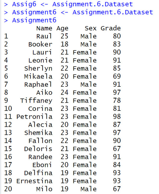
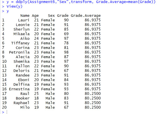
Step # 1 Import assignment 6 Data-set to R Download Import assignment 6 Data-set to R. Then, Run the commend "mean" using Sex as the category (use plyr package for this operation). Last command in this step: write the resulting output to a file.
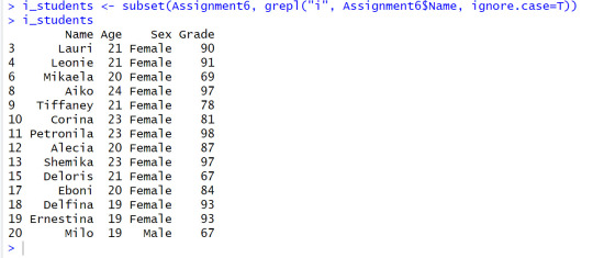
Step # 2 Convert the data set to a dataframe for names whos' name contains the letter i, then create a new data set with those names, Write those names to a file separated by comma’s (CSV)
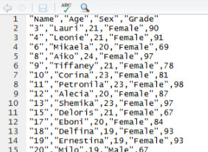
Step # 3 Write the filtered data set and convert it to CSV file

0 notes
Text
Module # 7 R Object: S3 vs. S4 assignment
For this assignment, we had to download a dataset (I used the built in Iris dataset) and determine if generic function can be assigned to the dataset. I was able to successfully assign a generic function summary_stats() to the iris dataset. However, if our dataset had been of a different type that didn't have a suitable method defined, I wouldn't be able to assign a generic function to it (i.e a vector or matrix)
Input:

Output:


Questions:
How do you tell what OO system (S3 vs. S4) an object is associated with? To determine the associated OO system of an object in R, you can use the class() function. If an object has a single class, it is likely associated with S3. If it has multiple classes, it is likely associated with S4.
How do you determine the base type (like integer or list) of an object? To to determine the base type of an object in R, you can use the typeof() function. This function returns the fundamental data type of the object, such as integer, list, numeric, etc.
What is a generic function? A generic function in R is a function that behaves differently based on the class of its arguments.
What are the main differences between S3 and S4? S3:
Informal object-oriented system.
Uses class attribute of an object for method dispatch.
Relies on naming conventions for method selection.
Does not support formal class definitions or inheritance
S4:
Formal object-oriented system.
Uses the setClass() function to define classes.
Supports formal class definitions, inheritance, and multiple dispatch.
0 notes
Text
Module #5: Doing Math
Our Assignment for week 5 was the following:
Find the value of inverse of a matrix, determinant of a matrix by using the following values: A=matrix(1:100, nrow=10) B=matrix(1:1000, nrow=10)

At this point, I get two errors:


This is because Matrix A does not have an inverse because its determinant is zero. Also, Matrix B is not a square. In order for a Matrix to have an inverse, it must be a square. Matrix B is a rectangle due to it’s vast amounts of columns.
To prove this, I made a new matrix using my professor's example demonstrating matrix inversion and determinant calculation.


0 notes
Text
Module # 4 Programming structure in R
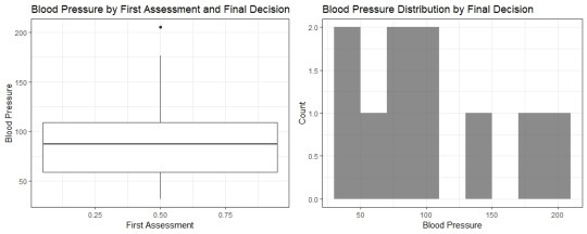
For Module 4, we were given data to enter into dataframes and turn into a side-by-side boxplot and histogram.
data <- data.frame(Freq = c(0.6, 0.3, 0.4, 0.4, 0.2, 0.6, 0.3, 0.4, 0.9, 0.2), bloodp = c(103, 87, 32, 42, 59, 109, 78, 205, 135, 176), first = c(1, 1, 1, 1, 0, 0, 0, 0, NA, 1), second = c(0, 0, 1, 1, 0, 0, 1, 1, 1, 1), finaldecision = c(0,1, 0, 1, 0, 1, 0, 1, 1, 1)) bp <- ggplot(data, aes(x = first, y = bloodp, fill = finaldecision)) + geom_boxplot() + labs(title = "Blood Pressure by First Assessment and Final Decision", x = "First Assessment", y = "Blood Pressure") + theme_bw() histo <- ggplot(data, aes(x = bloodp, fill = finaldecision)) + geom_histogram(binwidth = 20, alpha = 0.7) + labs(title = "Blood Pressure Distribution by Final Decision", x = "Blood Pressure", y = "Count") + theme_bw() grid.arrange(bp, histo, ncol = 2)
After writing and running the code, I was able to get this side-by-side boxplot and histogram:
0 notes
Text
Module # 3 Data.frame
Our assignment this week wa sto create a dataframe in R and calculate the mean. Here are my results.

When copying the given data into R, their was a syntax error in the Name vector that rendered the whole R code as a text string. I had to manually retype the names and made sure the quotations were correct. I suspect this is on purpose so that we are more aware of syntax errors.
Creating the dataframe was then easy, however, trying to calculate the means of specific columns was something I had to look up the syntax for. I found colMeans but then ran into an error because the first column was made of strings. I then had to calculate the means for the 2 columns that were actually numerical and was able to get this outcome:

0 notes
Text
Module # 2 Introduction to basic R functions and Data Structures
For the assignment, we were asked to run a specific function:

The result comes out as 19.25. The assignment calls to explain why this function works. First, we assign the vector to assignment2.
Then the function myMean contains the vector of numbers and calls for the function to return the value of sum(assignment2), which stores the sum of numbers in the vector assignment2, divided by length(assignment2), which stores the numerical length of the vector in assignment2.
Thus, it produces the result of 19.25
0 notes
Text
R Programming Class
Github Repo: https://github.com/DissidiaTime/R-Programming.git
0 notes
Text
Visual Analytics Final Project
Identifying a Dataset:
My final project will demonstrate the rate of trust EU countries have in their respective police forces in the year 2013 using Tableau. I will be comparing and contrasting the data gathered with the rates of happiness of various EU countries.
Firstly, we must check which countries have the highest trust in their police force. The rate of trust in police forces is an important measure of a society's level of social cohesion and safety. In Europe, the level of trust in the police varies widely across different countries, with Norway showing the highest level of trust and Germany showing the lowest level of trust in 2013. We first will look at one visualization of this found online, which includes citizens’ trust in one another, and glean some information from our peer.:

This variation in trust levels can be attributed to various factors such as the perception of police effectiveness, accountability, and transparency. In countries where the police are perceived to be more effective and transparent, citizens are more likely to trust the police force. On the other hand, in countries where the police force is perceived to be less effective, citizens are less likely to trust the police.

Analysis of Data:
Based on the dataset, the trust in police varies across European countries, with different levels of average ratings of trust on a scale of 0-10. Denmark has the highest level of trust in police with an average rating of 7.9, while Serbia has the lowest level of trust with an average rating of 4.3.
It is interesting to note that several countries, including Belgium, Estonia, Latvia, Lithuania, Luxembourg, Malta, Norway, Switzerland, and Turkey, have an average rating of trust in police above 6, indicating a relatively high level of trust. On the other hand, some countries, such as Bulgaria, Greece, Spain, Portugal, and Slovenia, have an average rating of trust in police below 5, suggesting a low level of trust.
It is worth noting that the dataset provides information only for the year 2013, and the levels of trust in police may have changed over time. Factors such as changes in the political landscape, police behavior, and incidents of crime may influence the levels of trust in police in different countries.
Comparison with Tangential Data:
Interestingly The rate of happiness seems to be somewhat correlated with the trust in citizens have in their respective police forces. We can see this in the World Happiness Index, where Norway, Finland, and Sweden all rank in the Top 10.

Summary:
For my visualization, I used Tableau. However, To get a higher contrast with the world map and hone in on Europe as the colorful focus I ended up using a dark world map in greyscale. To summarize the conclusions we’ve drawn: the data on European countries' trust in police shows that the trust varies significantly between countries, with Finland and Denmark having the highest levels of trust, and Serbia and Slovenia having the lowest. The citizens’ trust in the police correlates with rate of happiness according to the World Happiness Index.
The dataset is sourced from EuroStat and is found here: https://ec.europa.eu/eurostat/databrowser/product/view/TAI08
0 notes
Text
Visual Analytics Module # 11 assignment
For our visual anayltics assignment we were instructed to review Tufte in R at this link: http://motioninsocial.com/tufte/#introduction
and generate one of the 3 visualizations show there:
i. Marginal histogram scatter plot ii. Dot-dash plot in ggplot2 iii. Dot-dash plot in lattice
The code given was:
x <- 1967:1977 y <- c(0.5,1.8,4.6,5.3,5.3,5.7,5.4,5,5.5,6,5) pdf(width=10, height=6) plot(y ~ x, axes=F, xlab="", ylab="", pch=16, type="b") axis(1, at=x, label=x, tick=F, family="serif") axis(2, at=seq(1,6,1), label=sprintf("$%s", seq(300,400,20)), tick=F, las=2, family="serif") abline(h=6,lty=2) abline(h=5,lty=2) text(max(x), min(y)*2.5,"Per capita\nbudget expanditures\nin constant dollars", adj=1, family="serif") text(max(x), max(y)/1.08, labels="5%", family="serif") dev.off()
I decided to attempt to generate the dot-dash plot in lattice using the code given in the Tufte in R link. Using this code, I was able to generate the plot example with mtcars:
library(lattice) x <- mtcars$wt y <- mtcars$mpg xyplot(y ~ x, xlab="Car weight (lb/1000)", ylab="Miles per gallon of fuel", par.settings = list(axis.line = list(col="transparent")), panel = function(x, y,...) { panel.xyplot(x, y, col=1, pch=16) panel.rug(x, y, col=1, x.units = rep("snpc", 2), y.units = rep("snpc", 2), ...)})
Generating the example visual

0 notes
Text
Module # 9 assignment - Multi-variates visualization graph
The five basic principles of design are:
Alignment
Repetition
Contrast
Proximity
Balance
For this graph, I used the ggplot2 package to tackle the question:
Is There a Difference between Reported Weight and Actual Weight between Males and Female?
Using a dataset from this repository: https://vincentarelbundock.github.io/Rdatasets/datasets.html
The dataset is under the Item titled Davis

In this visual, the x axis was assigned to the reported weight, whereas the y axis is actual weight. The color value was assigned with sex.
Conclusion: Although women had a higher tendency to underreport their weight, we can see that men also tended to underreport their weights as well. Women did have a larger disparity in weight in relation to reported weight.
0 notes
Text
Module # 6 Doing math in R part 2
1. Consider A=matrix(c(2,0,1,3), ncol=2) and B=matrix(c(5,2,4,-1), ncol=2).
a) Find A + B

b) Find A - B

2. Using the diag() function to build a matrix of size 4 with the following values in the diagonal 4,1,2,3.

3. Generate the following matrix:
## [,1] [,2] [,3] [,4] [,5] ## [1,] 3 1 1 1 1 ## [2,] 2 3 0 0 0 ## [3,] 2 0 3 0 0 ## [4,] 2 0 0 3 0 ## [5,] 2 0 0 0 3 Hint: You can use the command diag() to build it.
I was unable to figure out how to solve his problem. I read the documentation of diag() as well as rereading the Art of R Programming CH9-10. I feel like I missed something very simple, or am simply blanking on something I know. I will have to revisit this problem this week.
0 notes
Text
Module #6 Basic Histogram and Peer review
For my graph, I chose to make a histogram based on data of the academic salary for Assistant Professors, Associate Professors and Professors in a college in the U.S. The data was collected as part of the on-going effort of a college's administration to monitor salary differences between male and female faculty members.
Link to dataset used: https://vincentarelbundock.github.io/Rdatasets/datasets.html
Item is titled Salaries, and items are listed in alphabetical order in the page.
Documentation on dataset: https://vincentarelbundock.github.io/Rdatasets/doc/carData/Salaries.html

I created a scatter plot using ggplot2. I believe I followed Few and Yau’s rules with descriptive analytics by ensuring the plot is neither unreadable as well as not using any over detailed junk in the plot. I also color-coded the sexes in order to create a clear visual for observation. I labeled both the X and Y axis clearly.
0 notes
Text
Module 3: Adding vector graphics to a data visual
Our assignment this week was to add vector graphics to the Tableau visual we created last week using Adobe Illustrator:
{PhotoURL-500}
I went with a more simple and professional look, as my graphic would be presented to those look for hospitals. When people think hospitals, they generally do not think of cartoony or over the top, so I kept it simple with cool tones and a more serious presentation.
Illustrator was a bit difficult to use, as it overwhelms with options, but looking up tutorials was easy and it was a fun tool to gradually learn
0 notes