#or a very soft‚ desaturated red. but a very very specific shade
Explore tagged Tumblr posts
Note
how did you achieve the bright and colorful look in your art?
Like the super neon coloring
I want my art to look like that so much but it always ends up looking lifeless and desaturated as heck
The most important thing to allow colors to pop is to pair them with dimmer backgrounds and other contrasting colors. Also, using black correctly helps in color definition too. I’ll use a recent drawing to show you what I mean.
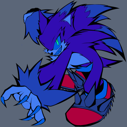
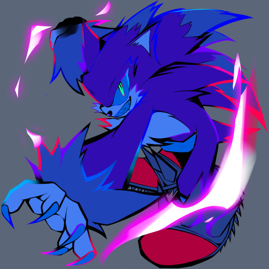
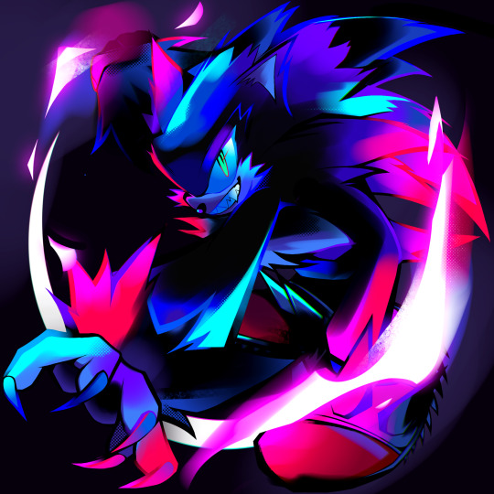
As you can see, the base for the above drawing consists of various dark blues and red. To make it more interesting, I usually select the lineart and add colors to it. Purple, blue and red are my favorites to use. The final result was made using shades of black, neon pink and light blue. Using white and soft brushes helps in making everything shine a bit better on the black bg.
If you’d like, search online for pairs of colors that work together well. Studying color theory may help too! I also use the tag “drawing tips” under most asks that inquire on how I usually draw, you can look that up too if you’d like.
I can’t really see your art to help you specifically with your issue, but this is the basics of how I do it.
Sorry if the language used isn’t very clear! Thank you for asking ❤️
176 notes
·
View notes
Note
MOD AZUL LMAO HOW ARE WE FEELING ABOUT TWST GOJO?✨️✨️✨️
LMFAO Iove that you guys have just taken to asking me about every update as they come out because of my low activity due to canon events right now. I genuinely fond out when stuff drops in TWST JPN pretty much as soon as you tell me. /srs
Some card spoilers below the cut!
Honestly, I know you made the comparison to Gojo but I look at him and I see beside from a goth Beatles cover band. 💀 Definitely excited to see what the event entails though! Fun facts about Mod Azul, the first Disney movie I watched as a child WAS Nightmare before Christmas, so this actually has me very excited for obvious reasons. I do love the design, but my man looks like an absolute SHITHEAD - I fully expect this event is going to be meddling. I know people are speculating he may be twisted from the Mayor, because of his pupils, and that wouldn't surprise me at all. To be honest, I almost wonder if he is twisted from the general concept more so than any one character. I see more indicators that he was twisted from Jack than anyone else in his design because it's very skeletal - though I do wonder if Oogie Boogie will be making an appearance in some way.
The new cards look super cool - I feel like the costume and hair designs lean even further into Yana's previous work on Black Butler than pretty much everything we've seen so far! I also think it's pretty cool that the Halloween even is actually using a notably different color palette and style than past Halloween events.
TWST has always had a very saturated color palette, even in the Halloween events, so it's super cool to see them play with the actual color language itself. I've pulled Jade's halloween cards to compare them for you to illustrate the differences:
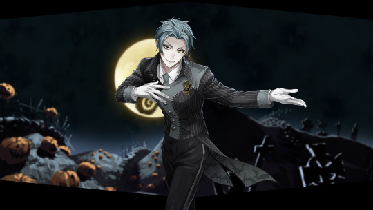
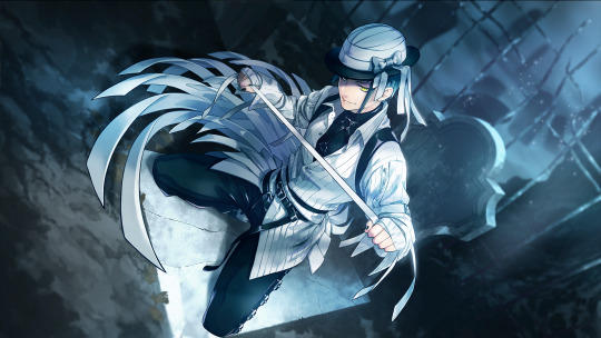
Particularly in the hair - you can see how Jade's hair has been desaturated and sort of greyed out, which I think is a super cool way of incorporating the Tim Burton style into the game. ALSO
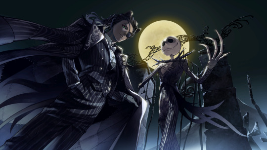
LEONA'S REGULAR CARD IS HANDLED WELL. I'm trying not to get my hopes too high, but even with the desaturate palette so far, he is still able to maintain some depth to his skin while still looking paler to match with the style. Now I am certainly hoping I don't eat crow - I know how things went with the Kings Garb card, but I'm going to hold out hope that we will get a really cool Leona SSR. Aside from the Fairy Gala, we haven't really had a "formal wear" Leona card, and I'm really hoping that the SSR looks good!
To give some clarification what I mean - when you are desaturating a color palette, specifically for darker skin tones, you want to mute the saturation of the color without losing the depth of the color. When we are speaking about skin tones, human skin is made up of a mix of colors - primarily yellows and reds, though we also get some blue as well. When you're working with a dark skin tone. In that sense, you don't want to add grey, you want to neutralize some of the warmth with blue tones and even fully dip into blue tones in shadow, which this artist has done. I have actually color picked this palette and put it against a white background to show what I mean and wow this is a gorgeous color palette!!
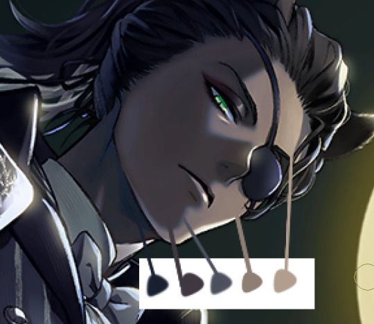
It definitely depends on the monitor and the brightness settings, but on the monitor I have calibrated to do illustration on - those colors are Navy Blue, A dark lipstick Mauve, a soft violet, and then some brighter orange brown and yellow brown where the moonlight is hitting. Even in the shadows, those cooler colors (the purples) are warmer shades of those colors that make sense with his skin tone. It's a beautiful palette using a ton of gem tones and cool colors and I'm holding out hope that the groovies keep with this trend, especially considering we have both Leona and Jamil getting much needed SSRs this go around.
So far as other thoughts - in Japan the event has been called "Lost in the book with Tim Burton's The Nightmare Before Christmas", which leads me to believe this will be similar to the Stitch event where the boys end up in a book in an entirely alternate world and will likely wake up not knowing what happened. I'm also guessing given the track record with the Halloween events and the fact that Nightmare before Christmas is a musical that we're likely going to get more Twistunes with this Halloween event. I don't know if we're going Masquerade levels with it, but I certainly hope we get to hear Leona and Sebek sing, and we know that Jamil can!
Also this event includes Vil, Leona, AND Malleus, so I fully expect at some point these three are going to beef because you can't put these three drama queens in a room and have them NOT devolve into arguing. I eagerly await that.
Also I don't know if they are keeping any of the Christmas theme of nightmare before Christmas, but if they do I cannot wait for the boys to ILLEGALLY DETAIN SANTA CLAUS.
#not writing;;#twisted wonderland#answered;;#twst#event thoughts;;#I also hope they get kneecapped by Lock Shock and Barrel#'which one?' all of them
9 notes
·
View notes
Text
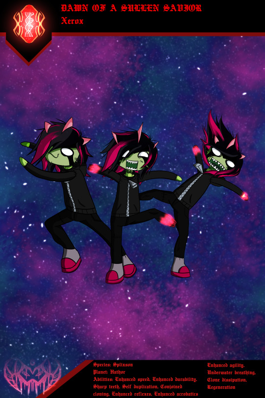
"Searching, waiting for something to love again. 'Till then, I'll be wandering through the in-between"
Xerox, the Omnitrix's DNA sample of a Splixson, from the planet Hathor
This is no ordinary Splixson. It's an unique one, to put it at that. His eyes are pure white, looking as if they were scribbled on his face. He remains sporting the whiskers that regular Splixsons have, as well as the 3 horns, alongside the lines going down from the eyes. While still chunky, short and adorable, he's a bit more slim, with legs far less stubby unlike the regular species. Xerox also has long, soft, straight black hair with a fringe to the right, in an emo fashion, with parts of the fringe and a few streaks dyed with an electric pink colour.
Similar to his species, he remains at a rather small stature, no taller than a human child, if not just a very tiny bit taller, but a difference so small you basically cannot tell the difference in height between him, a child, and another of his species. He sports a mostly dark outfit, with a dark grey hoodie, and jeans of a darker shade. His shoes have an interesting palette: a really desaturated, almost grey-ish purple colour, alongside darker cerice soles & toes. Underneath the clothing, there are several sensory orbs/nubs all over his body.
One interesting note about this specific transformation, is that unlike the rest of his brethren at his home planet of Hathor, he appears to have stitches all over him; his face, neck, limbs, etc. and he seems to be more like a living, breathing plushy, given that when he's seen duplicating himself, he rips out his limbs, and there's red dyed toy stuffing within his body, albeit still having organs and such. He sports skin of varying hues of green, as it almost looks like if he's had several skin grafts, which are also connected to the body with the stitches aforementioned. Another peculiar thing to notice about this particular form, is that he doesn't look as vicious or monstrous or aggressive as the rest, nor does he look "mutated" or malformed.
Abilities:
Enhanced Speed
Enhanced Durability
Sharp Teeth
Self Duplication
Conjoined Cloning
Enhanced Reflexes
Enhanced Acrobatics
Enhanced Agility
Underwater Breathing
Clone Dissipation
Regeneration
Weaknesses:
Small Size (Vulnerable to bigger enemies)
Electricity Vulnerability
Immobilised By Ice
Forced Combination
Panuncian Predation
Poor Cold Resistance
Recharge Mode Inhibition (Cannot turn back to human if all clones aren't dissipated or if they're too far away to come back and combine as one)
#b10#ben 10#ben 10 omniverse#ben 10 series#fanfiction#art#artwork#ben 10 alien force#ben 10 fanart#ben 10 oc#ben 10 ultimate alien#ben ten#ben 10 ditto#ditto#ben 10 fandom#ben 10 fanfiction#ben 10 au
10 notes
·
View notes
Text
The Kharidia Main Hall - pt 2
Let's talk colors.
As not to hide any bit of my process, I admit the colors were picked directly from a screenshot from Russian videogame Pathologic 2.
This action was intended just to limit my colors to a specific area of the color wheel and to use only certain saturations.
I likely could have picked the colors myself, but I was all colors of sick that week, and it would have taken longer. Not to mention, this was an immensely helpful exercise even if I already had the skills.
The setting of Pathologic 2 is very dull and dusty in color, yet warm. These were all traits I knew I wanted to emulate early on in the first iteration of Spaceships and Vodka. The warm beige, dark oranges and olive tones create a sort of calm elegance, but with just a shift of lighting they can grow eerie. The perfect setting for a thrilling mystery.
Backgrounds can make or break a comic so ensuring a sense of harmony was very important to me on this venture. The base lighting was hand picked. A deep, desaturated red for the shadows and a light blue from the opposite end of the color wheel for the highlights. Then a soft yellow overlay over the top to create a gentle golden glow.
As with ALL my art, everything is hand drawn. I use no 3d assets, no auto fill, no AI. It mostly boils down to preference. But as such, all of this was lined and rendered manually. Art deco has many repeating geometric shapes, so ensuring that each corner was carved out against the next via use of light and shadow was important in order to ensure a sense of depth. However it was also incredibly time consuming. There are still many mistakes and imperfections in my art, but at least in that way I can accept that I made it.
As for characters. Each character has a basic "neutral light" color scheme. This is primarily intended for use on the VCR to allow the viewer to have a reference point of visuals.
As each character enters the Kharidia, they will have a color palate swap to something more suitable. These will all be hand picked as Pathologic 2 doesn't seem to have a shade of red vibrant enough to suit Mirium's hair color.
Sample art will be made.
Finished this background that took forever


#spaceships and vodka#leonardo eats carrots#webtoon#webcomic#comic#tapas#webtoon canvas#tapas comic#art#background art#art deco#art deco art#interior design#murder hotel#cruise ship#please reblog#lore#world lore#character lore#info dump#comic lore#art analysis#analysis#color theory#color palate#perspective art#hand drawn backgrounds
9 notes
·
View notes
Note
For the ask game In my head I tend not to see my online mutuals as physical fig..ures... I'm not sure how to phrase this. Umm here
If I interpret the writing as a specific emotion I will see a brighter or darker shade of color I've paired with said mutual with at that time. So for you it's shades blues and reds.
General and happy tones tend to be sky blue to pastels. Passionate takes tend to be bright reds with bits of soft pinks that flow up (I think Hatsume has a bit to do with the pinks). Sad tends to be a very desaturated blue, almost a grey, with swirls of dark blue mixed in. So on and so forth
But!! I can also see facial expressions depending on the tone or whats being said as well. But instead of seeing the same face it's usually of characters I know or think you like. Sometimes they only fade in during a sentence or word and sometimes they actually the whole thing. Which character I see depends on whether or not they'd actually say or do whatever it is your saying.
So like passionate, I usually see Hatsume. Any quips or sarcastic comments tends to be Urameshi. Happy has quite a few characters that have popped up, like Naruto, Botan, Kirishima, etc.
I think that about wraps it up. It's really hard to explain but I think thats the best detail I can give.
Huh, that's definitely interesting. I believe I've heard of that before, dunno if it's from an old friend or the internet though.
I find it funny you say Yusuke for the quips and sarcastic comments cause I've maybe seen half of Yu Yu Hakusho 😂 and I got a friend that loves Yusuke so he tends to act like the character at times
It's also embarrassing to have bits of soft pink show up in passionate takes cause that's definitely cause of Hatsume which just points out how much I simp for her and it's funny cause I didn't like her when I first saw MHA ahsksbddb
2 notes
·
View notes
Text
Writing Question Tag Game
Tagged by @sleepyowlwrites. Hello, your nickname is now Nowl. Short for Hypnowl. I love portmanteaus.
rules: you answer a question, make one up, and then ask four or so people.
Question: what colors are your characters’ thoughts, usually? do the events of the story change the colors? is the color neon or desaturated or pastel or stock crayon brightness?
Oh boy, oh boy, oh boy. This is somehow the perfect question for me. I read it initially as more of a thought exercise but I’m a nerd about worldbuilding and colors so it’s actually pretty literal in my universe. Incoming long post, so here’s who I’ll tag and the question while the post’ll be under the cut.
Question (for others): If you had to change the events of one specific major plot point, what would it be, why, and what effect would it change in your story?
Tagging: @magic-is-something-we-create, @goblingraveyard, @akindofmagictoo, @theramwrites and anyone else that’d like to participate.
So for context, magic in Telvan is split up into different domains that represent reasoning and intent behind actions. Its also color-coded. Hieromancy is a branch of magic in Telvan that essentially ties you to a domain and gives you a power based on your psyche, with the mechanics being reasoned through said domains. As such, most of their thoughts can be seen with a singular color. Your respective color shimmers and shifts as you yourself change, with more magically oriented people being more saturated than others often. You can always tell someone’s domain by their eye color, which’ll always match their domain if they’re a Hieromancer. Most characters I’m writing about at this time are Hieromancers, but let’s look at the Making a Killing cast specifically.
Shiloh falls under Motivation, which is represented by the color silver. This domain’s name is pretty straight forward and is about anything that motivates you, be it fear, security, or anything that gives you a reason. Like a lot of the cast, Shiloh represents a negative aspect, in this case vengeance. Her color is extremely sharp, focused and never wavers. It’s evocative of the shine of metal.
Canel isn’t a Hieromancer but does fall under the Exchange domain, which is blue. This one’s about anything with a tradeoff, such as a transaction. For Canel, it specifically means personal sacrifices for others. Valiant goals but also lofty ideals, Canel’s blue is very soft and pastel, like blue cotton candy.
Schro’s about Change, which is signified by red. Change represents unpredictability and fits Schro to a T. Always revealing a new side to himself, Schro’s red is sometimes a deep ruby or a murky burgundy.
Syxion’s domain is Creation, otherwise known as the color orange. It’s stubborn and stalwart as its the reason the earth still holds shape. For Syxion it means a new form and the strength to keep it up its appearance. His color’s the same shade as his scales, a dim rusty orange.
Frank’s a zombie, which always fall under the green Gift domain. It represents anything that can be given and that includes life, actual gifts, and diseases. As a result of whatever happened to him in his past lives Frank’s green is extremely bright. He likes to be a bit fancy and prefers calling it chartreuse instead of bright green like the others do.
Bonus: Paze Duhl, as the creator of the magical contract, falls under the Order Domain. A goldish yellow that never fades, his color demands attention.
#writing question tag game#i like talking about colors a lot#honestly couldnt resist gushing with a question like that#telvan worldbuilding#writeblr#wip#writing#creative writing
2 notes
·
View notes
Photo
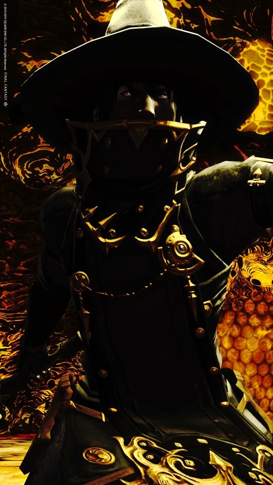
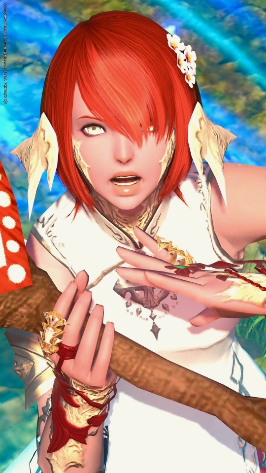
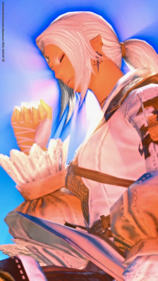
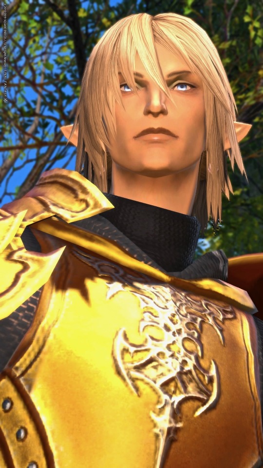
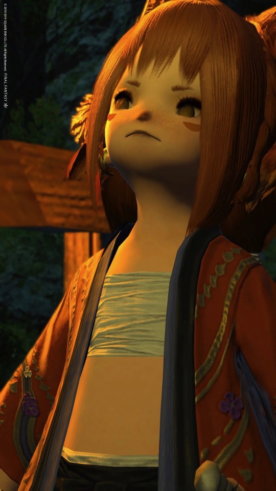
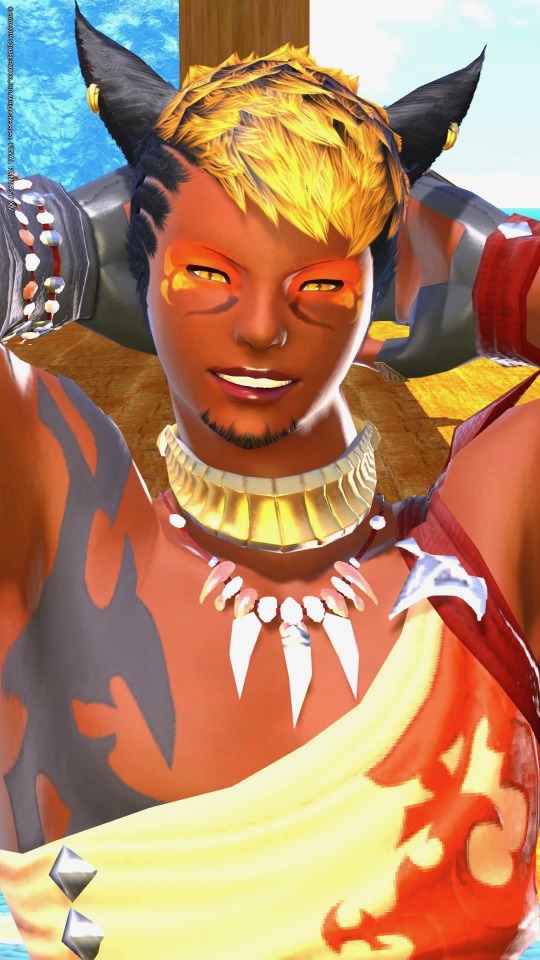
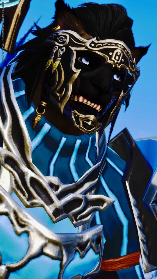
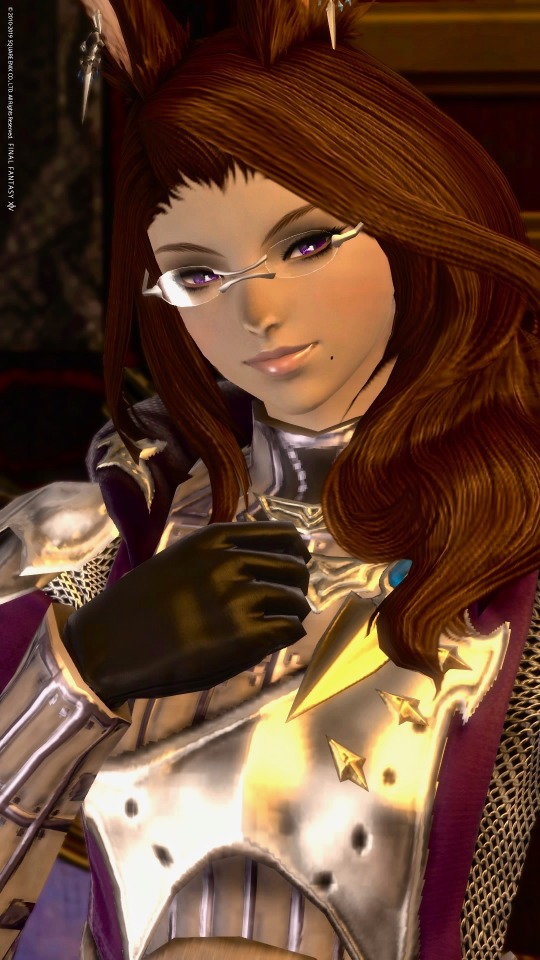
Explanation of design approach and some personality info under the cut.
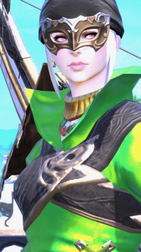
Essentially, the way I’ve been approaching this I wanted to make each world feel like a self-contained and cohesive team. Nivienne is actually from Lamia and so isn’t designed to mesh with the others, but I use her a lot and have a design strategy for her so she’s included. For team Famfrit as a whole, I wanted to make sure that each personality and design would feel distinct and that the main color for each character would stand out. Most are also pretty obvious lol--black mage is black, red made is red, white mage is white. Areas I went different are gold dragoon (or aurum dragoon if we’re being fancy), purple scholar, green bard, orange ninja, blue warrior.
CENRIC ASHER
My main and a hyur midlander black mage. With him I wanted to push against the concept that hyurs are inherently vanilla or “boring”. Imo there is nothing wrong with designs that look like they could occur in nature, but with him I wanted to do an edgy personal spin in the classic Final Fantasy black mage look where the character is a dark silhouette with glowing eyes, a high collar, and a broad hat. Sometimes he wears other things too but the overall concept ties to that particular look. In personality Cenric is a pretty angsty guy due to having been a con artist who got a lot of people killed with medical fraud. He lies a lot out of fear of the reaction he’d get if his background was known. Possibly a little nuts, thinks he is the son of Nald’Thal and bound to spread death and destruction wherever he goes--striking enemies and allies alike, regardless of his own wishes. Probably actually just has Duskwight heritage. Has pretty hardcore imposter syndrome about being Warrior of Light, but in partial response to having been destitute and outcast for a long time he tries to play into the persona of a powerful, luxurious, mysterious black mage brimming with forbidden knowledge. In reality he is intimidated by most children, can’t whistle, and is a bit of a smartass when he’s not panicking his way through conversations.
J’MOR TIA
My red mage alt, I wanted to do a few experiments with him! One was that Red Mages usually read very sophisticated and swashbuckle-y to me, and I wanted to play more into the rapier as an almost roguish weapon. Very physical. He’s somebody who you initially would not assume is a magic user but who is just as versed and capable on that front as the ivory tower casters haha. I also wanted to make him a combination of ethnically black (contrasting Cenric who is ethnically Arab but weird) and a male miqo’te because I have never seen that combination before. I wanted him to feel very charming and like he has kind of rugged good looks. Just a bit too scruffy for pretty boy. Personality he is probably the most shonen hero of my alts lol. He has stuff he struggles with (he and his sister both wanted to be adventurers but she opted out after taking things way too far in a fight and getting scared of her own power) but doesn’t get stuck in his head nearly as much as some other characters do.
CESAIRE DELAROUX
I futzed with this guy for a while—main inspiration comes from a particular kind of horse called the Akhal-teke.
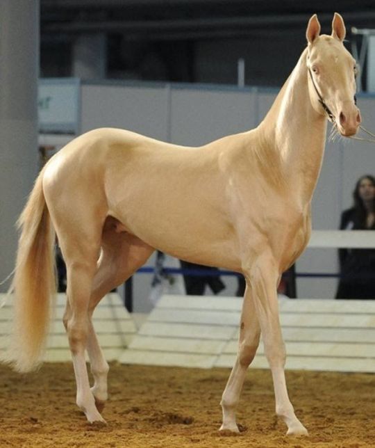
Also because I have seen some really cool and pretty elezen that specifically worked to play up gold as a color scheme, and in this case I wanted to evoke a kind of warm, soft golden light. Originally I was going to make him a contrast to Cenric and make him much paler, but I wound up going that route more with Asklona instead with drawing loose inspiration from certain forms of albinism. I went more gold to make sure Cesaire would stand out visually from Asklona. Another reason for this route is because I want to make a character who looks very light and pure, but in practice has hardcore bloodlust. XD Wanted one case for playing into that possible WoL element haha. I also thought it might be neat to make a character who could serve as a kind of foil to Zenos in many ways and might credibly say yes when invited to be besties. Cesaire is still a mostly heroic guy but I figure he’s a bit like Dexter if that makes sense.
KIYO SHIROGANE
An auri white mage from Hingashi! To me it felt a little odd that the Ruby Princess of Sui-no-Sato has more of a magenta color scheme than red. I wanted to tie Kiyo to Kugane specifically in part because I think the parallels between geomancy and white magic (land, sea, sky) are super cool imo, there are a fair number or Raen au ra in Kugane with less lore exploration, and I wanted to make a character whose past trailed behind her in a clear and interesting way while she travels. So for Kiyo I kind of took inspiration from the idea of a red pearl (pearls often being white as per the horns and scales but then she has vivid red hair) and from the idea of blood tied to injury and medicine. Plus ya know, white magic. I also took light inspiration from candles conceptually. I totally forgot that Shirogane is the housing district also lol so now she has backstory lore that her family had been heavily involved in establishing the area. Kiyo comes from a large and noble family with a ton of political and economic influence, being herself somewhat sheltered and naïve. She is very sincere, playful, outgoing, and does her best to be kind. Very animated!
OSK YASKARET
For Osk, I was essentially going (ʘ_ʘ;;) because I knew that I hadn’t used ANY brown hair so far and it was making so uncomfortable lol. So I thought about what combination would be appropriate, distinct, and striking enough to fit within the cast while also being distinct. Gray and brown feel like chinchilla colors to me and I think are nice in a way that wouldn’t be out of place with rabbits/viera. I wanted dark eyes since again, I hadn’t yet for this group... so dark purple wound up being her main color. Since I was going scholar, I also wanted to keep the sense of intellect and feeling like a healer without being mistakable for astrologian or white mage. I still want to build into her look, but another aspect I wanted to incorporate--saw a lot of people arguing about the inherent sensuality of Viera, so I figured for her I wanted to make her look elegant and sophisticated but more conservative in glamours. I didn’t want her to instantly read like she hopped out of the woods either. Figure she’d have had time to adapt since.
I’m still very much debating backstory and personality or her but am leaning toward her being the offspring of a viera who left the woods while pregnant. I like the idea of Osk wanting to connect with her heritage but feeling somewhat adrift. I also want to incorporate Nym lore because omg I want more Nym in-general. Personality I do think Osk is probably a little bit of a smug bunny but things remain super tenuous.
ASKLONA WANNEYNWYN
Asklona I literally wanted to make a super soft feeling, hyper feminine lady roegadyn because most interpretations I’ve seen have been either harder feminine or tomboyish. Still fun imo, but given the grief some fans heap on femroes I really wanted to show that this kind of look is doable. I usually try to incorporate the black noses on Hellsguard designs (tiger roooooes) while with Seawolves I tend to push either fully into something natural or fully into something unnatural. So ex. the most desaturated option or else just run with blues and greens. Asklona is specifically a bard because it is pretty and fancy imo and I haven’t seen a lot of roegadyn bards in-general. Asklona I mentioned before is modeled off of certain kinds of albinism, but by that I want to make the disclaimer that pink eyes don’t generally occur in people (pale blue or violet is more likely) and that normally there are some eyesight problems that come with the condition as well as ease of getting sunburn. I don’t necessary play into that with Asklona/am going artistic license because I mean final fantasy we can lift swords bigger than we are. I know these things get overlooked a lot though so it seemed worth specifying. My choice to go this route was because I wanted to make myself use more pastels lol and I figured this would be a fun spot to contrast Cenric. I think in backstory Asklona’s father lost his mind to a siren, and Asklona pursuing adventuring as a bard is partly to take revenge and partly in the hopes that she can call her father back with song. Her involvement becomes more complicated over time but I think that’s the general direction. I picked green for her color scheme because it’s a color that feels like it evokes both the woods of Gridania and the sea itself... and because pink is a shade of red and with green being complementary, I figured it would make the pinks stand out a lot. Asklona is tied to Limsa Lominsa and besides looking for outfits that will flatter her body type I am trying to evoke the ocean in her designs. Pirates, sailors, the works. Personality I am still figuring out a bit but I think Asklona is definitely a shameless flirt, can read as insensitive and self-centered at times as she indulges in what makes her happy. She plays herself off as much more shallow than she is and in-general focuses on pursuing pleasure as a way of avoiding heavier issues.
KOKONO KONO
The scrappy daughter of a Doman fox auspice and a Thavnairian lalafell, Kokono saw her mother waste away with homesickness after fleeing the Garlean occupation. She has two brothers, one who returned to Doma while the other remains in Thavnair witht her father. Kokono hates the idea of loving a place so much you would die over it and decided to travel Hydaelyn, causing mischief while indulging a deep-rooted curiosity and love for discovering new places. Has severe commitment issues. Can be prone to swearing and being insensitive because the shocked reactions amuse her a lot, but her heart is ultimately in the right place. I designed her literally to make a lalafell fox because with the dark nose option + werewolf ears it is SO EASY to make tiny canines and I don’t understand why more people don’t do this. Like I could make an elegant white fox lalafell or a yorkshire terrier lalafell or any number of things. We can have itty bitty dogs! And like Kiyo I wanted some background to be evident in her clothes too. I designed her before I picked her backstory and mainly went for rule-of-cute/what would most evoke the red coat of a fox.
SVATOMIR AZORYA
Last of team Famfrit, he’s a Warrior Hrothgar. Very conceptually rough, I’m interested in playing him much more reserved and traditionally masculine in a lot of ways. I think a character in that vein will help balance out against the other Warriors of Light I made for that world. Design goal here was to make him look as wolf-like as possible haha. I think we have plenty of cat people already with Miqo’te.
NIVIENNE LECLAIR
From Lamia, I’ve talked a bit about her before so copypasting that in.
Basically, when I decided to try doing the whole WoL/Emet-Selch fic writing misadventure it was just a personal challenge for funsies. I’d seen other people do some really interesting and impressive stuff using unnamed lady WoLs. Hadn’t really tried something like that myself so I decided to go full improv with it.
Except my instincts tend toward specificity lol, so I scattered details according to what would make for fun scenarios or cute details. I wanted the lady to be a certain level of tall so I went with elezen. I needed to describe a readily portable weapon that would mesh with that sweet, sweet Amaurotine lore, so I made her a summoner. So on and so forth. Very seat-of-the-pants.
Particularly since the fic I have coming up is gonna be bigger, I’m thinking name is okay now lol.
Cenric as my black mage main is a dark, broody guy who doesn’t quite realize he’s nicer and sillier that he gives himself credit. So I decided Nivienne should be much more socially adept (read: not a lameass poser), very mischievous, confident… but lowkey has some heavy shit going on. Girl can be ruthlessly manipulative. Other WoLs of mine have different personalities.
As I was going through fic stuff, I decided I wanted to visually tie to and contrast with Emet-Selch since shipping. He’s got gold eyes and accents on his regalia? She’ll go silver, but her skin will have a more golden tone. He’s got dark hair with a white streak? She’ll have light gray hair, tie into the ruff of his coat. So on and so forth.
Name-wise, I actually fucked up initially by going too on-the-nose. Nivienne is another (more elezen-French) name for Nimue. Given how that story goes I figured it would be fitting here.
As a couple of other notes--color scheme being gray was experimenting to try for a different-but-distinct summoner aesthetic. I wanted to play up horns/third eye concepts (not strictly in the Garlean sense) and create a vibe that wouldn’t feel like white mage, or red mage, or black mage, etc. I also saw people arguing that female casters all end up looking like magical girls, so I wanted to really make sure that she had a different look from that while still being very feminine.
11 notes
·
View notes
Text
Color Magic 101: The Anatomy of Color
Welcome to lesson one in this series I’m creating for beginner Art Witches!
We have all seen and heard about color correspondences. Red = Anger/Passion Yellow = Happiness etc. but the truth is that there’s much more to color than just it’s name. The psychological effects of color, and therefore the magic we can do with it, are much more heavily influenced by those other components. So let’s take a look at the three components to color: Hue, Value, and Saturation.
Hue

Put simply Hues are the categories of color. They are the general name we refer to a color by. Sky blue and Midnight blue are very different colors but they both fall under the Hue Blue.
In the vast majority of magical practices this is as far as the study of color goes. There are many lists of correspondences associated with each Hue which include planets, days of the week, deities, etc.
Begin a color journal- Start by listing Hues and what your personal associations are to each one. Does the color purple scare you? Does yellow calm you down? This information will be the basis of your color spellwork.
Value

Value refers to how light or dark a color is. It’s typically broken down in a 1-10 scale; the lighter range (called High Key colors) are referred to as Tints whereas the darker (Low Key) colors are called Shades. When creating art and visual spells there should be a full range of values throughout the piece. (unless specifically done otherwise for a purpose). When you want to draw attention to a particular area you can do that by creating high contrast there (very light values next to very dark values).
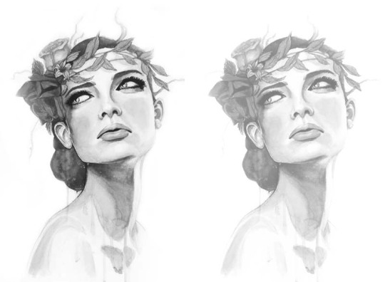
“Wood Nymph” -Lumi
As you can see the image on the left, which has a full range of values (1-10), is far more eye-catching than the image on the right which has only the top 4 or so high key values. By putting the darkest black next to the lightest white in the eye area it creates an attention grabbing contrast and directs the viewer's eye. ....Last but not least...
Saturation/Chroma
This term is probably the most misused/misunderstood property of color. It refers to the intensity of the color. This is the range between pure color (most intense/vivid) and grey (no color, only value). This does NOT affect the value only the color.
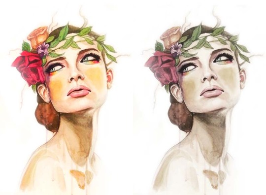
The left image is very saturated, the colors are vivid and recognizable. The version on the right is very desaturated, almost completely colorless, but the values haven’t changed only the intensity of the color.
We have powerful emotional responses to these variations which, once we understand how to use them, can help us craft powerful spells.
Homework-
Color Journal- Grab some paper and a pen (doesn’t have to be fancy) and start critically analyzing your associations to color. What do you associate each hue with in general? Are there specific variations of that color that stand out to you? Which ones are more negative/positive? which ones do you feel most connected to? We’ll be getting into the science of favorite colors in the next lesson but for now get a baseline for your personal connection to color.
Create a Value Range- Just like the graphic here, get used to mixing your medium of choice into 10 separate values. You’ll gain more control with your medium and a better eye for full value ranges. You can use paint, ink, pastels, pencil, crayon, whatever you like to work with but keep it strictly to values, no color just yet. Record your experiences in your journal.
Saturation Survey- Find or make a series of images that are saturated and desaturated. What did you feel while making/finding them? What emotional impact does the color intensity have on you? Does a desaturated image look ghostly and creepy or soft and comforting? Do the vivid colors of a saturated image make you feel excited and amped or anxious and overwhelmed? Record your findings in your journal.
I hope you have a good understanding of the anatomy of color now. Try to incorporate some of the terminology we used when referring to color in your daily life to get used to categorizing them for later use. Maybe you want to use that high key desaturated yellow from the sunrise you saw in a spell for new beginnings and fresh starts! The next lesson will be exploring the science behind your favorite color so stay tuned.
Let me know if there’s a topic you want to learn more about, how your color study is going, or if you are a fellow art witch (or are considering this path) and found this useful.
Stay Creative Witches!
-Lumi
#art#artists on tumblr#artistsoninstagram#female artists#art witch#witchcraft#types of witchcraft#artsandwitchcraft#color#color theory#color magic#101#lesson#learning#learn#learn colors#study#free resources#value#saturation#hue#artwork#witches of tumblr
1K notes
·
View notes
Note
Sorry to make this long tutorial even longer but I realized maybe I should clarify the final step -- the Color layer -- with visuals for anyone who needs it, and also explain the after-effects I used to alter the overall colors and add blur and noise. So here’s the TOP SECRET ARTIST TRICKERY under a cut

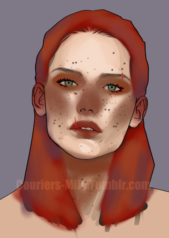
This is what the colors I applied over top of my base painting actually look like when set to “Normal” blending mode. I used a soft airbrush and toyed around with different hue and saturation levels to get the look I wanted in the areas I wanted. The under-painting is already her skin tone, so I didn’t need to cover the whole thing, only the areas where I wanted to vary the color, such as adding a faint blush to her nose, ears, and lips where faces tend to be a little more red due to capillaries.
You’ll notice that the color on her nose and cheeks looks brown; it’s a very very muddy, desaturated red. When I change this layer to Color mode, only the actual hue of that color will remain, applied to the shades and values of the underpainting.
So the reason I picked such a muddy red is because if the red was very strong, she might look like she has a cold or was attacked with a makeup brush loaded with blush. This desaturated red translates into a soft, faint pink when it combines with the much lighter values of the underpainting, as you’ll see below. I played around with opacity of the brush itself. You can see I applied this red-brown very lightly on her cheeks to make sure it was as soft as possible in the final product.
You can also see I started off applying a fire-engine red to her hair. This ended up looking more jarring than what I wanted, so I mixed it up with low-saturation purples and oranges to take the color down to an lesser vivid, but still intense auburn. Play around with different colors in the same color family!
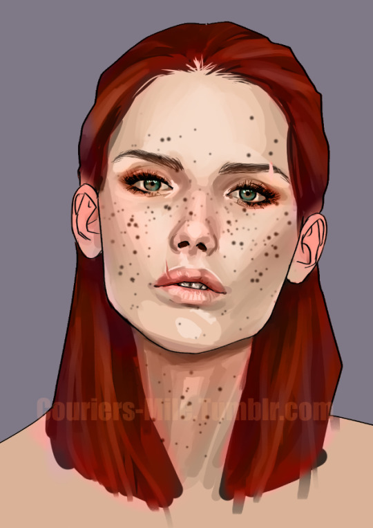
Here is what she looks like with that layer set to the Color blending mode. I had trouble getting her ears to look the way I wanted -- I like the little punch-up of realism you get when you redden ears -- so here I’ve created a new layer and brushed on a soft pink, which I will set to Multiply, seen below.
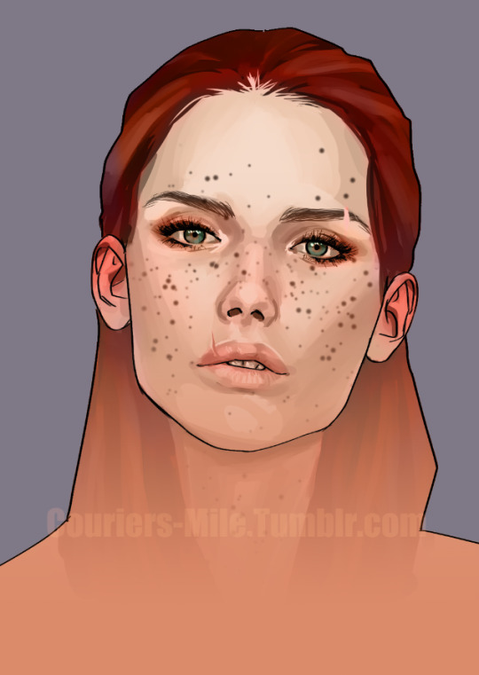
Now I’ve set the new layer of pink on her ears to Multiply and they look more lively. I want to create a sort of blue-orange gradient effect for the final image, but I want it to look a certain way. To get the specific effect I’m going for, I applied a light orange color-to-transparent gradient from the bottom up on a new layer, which I will set to multiply below.
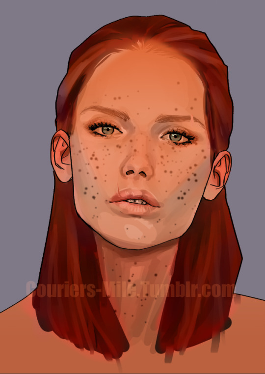
Now I’ve set the orange gradient from the last step to multiply, I’m going to add the blue-green gradient that fades down from the top. I plan on using a specific layer blending mode that has an interesting effect, so I actually used nearly the OPPOSITE color to set it up: a very vivid orange. You can see I used a gradient to drop the orange down from the top and then erased it off of the parts I don’t want it to cover up, in this case her hair and eyes and a little but around the tip and underside of her nose (so that pink shows through). After that, I’m going to set the new orange layer to Exclusion.
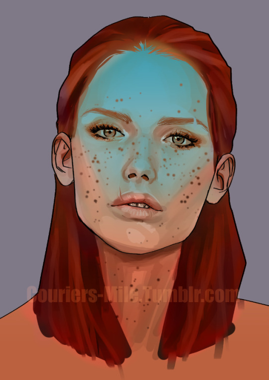
Here’s what happens when you set that bright orange from the last step on the Exclusion blending mode. Neat huh? It’s a lot more intense than I want, though, so I’m going to toy with the opacity to soften that up. Feel free to play around and see how intense or soft you want this effect to be. I ended up putting the opacity of the Exclusion layer at about 60% below,
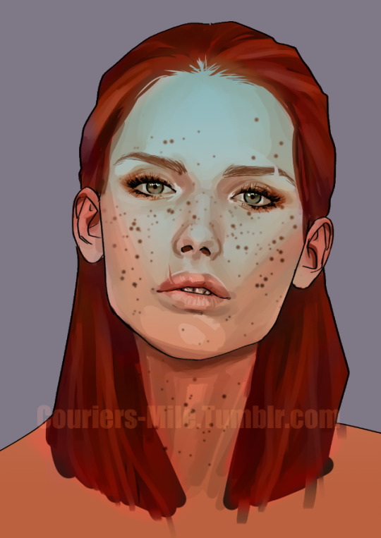
So there’s how I got the color effects on the final product!
As for the blur and the static:
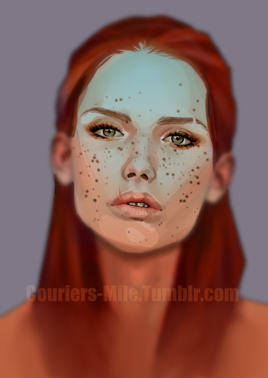
I want the final product to be soft and realistic and have this depth of field effect.
I started by dumping all of my layers so far into a folder for safe-keeping, and then I made a duplicate of the folder. The first folder, I set as invisible in the layers menu and then left alone as my backup copy of all the separate component layers in case I need to make changes later.
On the line art layer in the duplicate folder, I erased certain lines that weren’t totally necessary and would reduce the realism of the final product, so the black lines around her jaw in particular and parts of her mouth were erased. I then merged the whole duplicate folder into a single flat image by right-clicking the folder and choosing “Merge Selected Layers”.
I then went to the Blur subtool under the Blend tool menu (hotkey J in CSP) and used the blur tool to soften out the image where I wanted -- blending the bottom of her hair and blurring everything but her face -- to get that depth of field effect I wanted.

Finally, I created a new layer above the whole work and went to Filter > Draw > Perlin Noise, and lowered the Scale slider all the way down and clicked OK. I then set the noise layer to Overlay, and reduced the opacity to what looked good to me, in this case 35%
So that’s how all that works!
What’s your method on drawing heads and coloring? Your artwork is beautiful and really inspiring!
I often have a reference! Sometimes I stick very closely to my reference, other times it’s a guide for basic facial structure or even just the lighting alone. I’m sticking close on this one because I did it mainly for an example.
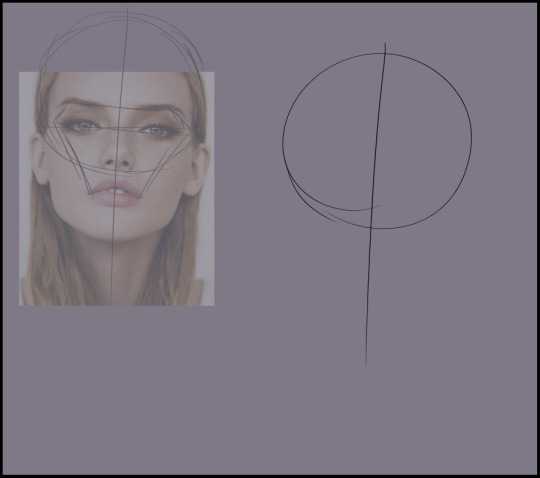
Since in this case I’ve been asked what my process is I just drew as I tend to draw which means I’ve eschewed a lot of the detailed guidelines like what you’ll find in the Reilly Method because I’m relatively accustomed to facial proportions. If you’re a beginner I do recommend studying up on proportions and maybe trying the Reilly Method!
So for myself I’ve just started with a circle and the vertical centerline. You’ll notice I’ve drawn the circle and centerline over my reference first, as well as a kind of diamond shape. Having those lines on my ref image makes it easier for me to parse what I’m looking at and copy the same general spatial relationships between features in my drawing.
I’ve added a similar diamond shape on my drawing and marked out the bottom of the nose and seam of the mouth. This diamond shape is something I picked up from another artist on Tumblr, @vetyr (who is Art Goals) did a post about it a while back iirc
Since I skipped marking out guidelines in my own process just some basic notes of what I keep in mind: the bottom of the nose coincides with the bottom of the circle marking the cranium. The brow line is generally closer to the center of the circle than the eyeline.
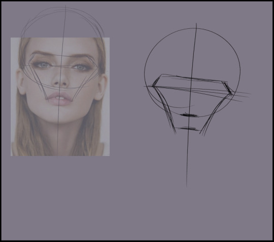
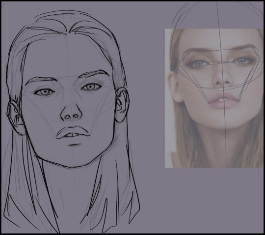
Roughly marking out the locations/sizes of some features. I’m not very mechanically precise so my process is pretty messy and involves several layers of increasingly tight sketches. At this stage I’m scratching it out quick and just trying to get everything roughly in place
Added the outline of the head.
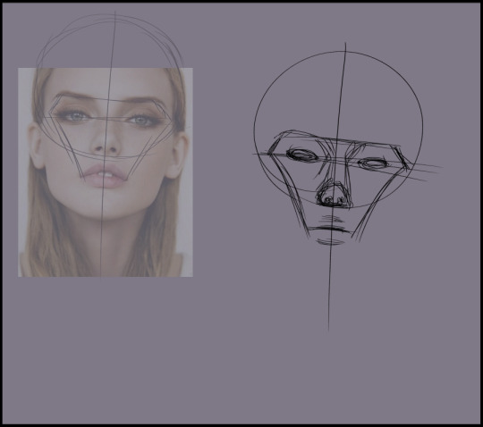
I lower the opacity and make a new layer for my second pass. Now that I’ve got the general idea of spatial relationships down I’m looking at getting more accurate shapes, but I’m still going rough at this stage because I’m zoomed out making sure not only is everything generally the right shape, but still proportionate and relatively symmetrical. It helps me to go kind of loose and zoomed out for a few passes not worrying about perfection, so that I’m still considering how the whole thing works together as a whole and not skewing parts of it out of proportion by honing in too close and focusing on pieces in isolation.
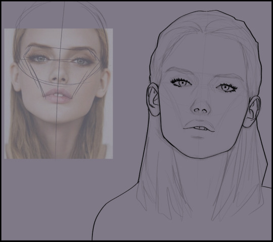
I flip it horizontally, lower opacity again, and make another pass on a new layer straightening out any bits that were skewed out of symmetry. As I go in making smaller, neater shapes. My former sketches have some rough guidelines marked in as I went to track details and facial plains; I’ll keep those sketches up on a low opacity to help guide my shading later.
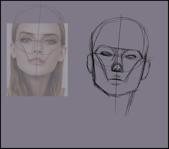
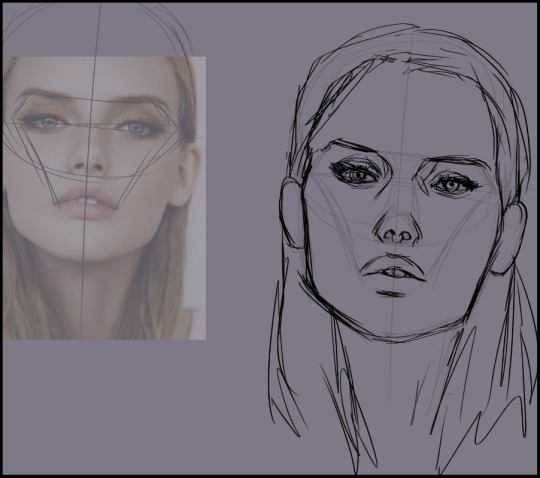
I flip it back, lower opacity one more time and make a final “neat” line art focusing only on the smallest, most detailed areas. My priority here is mainly “if I decide not to fully render this and I need to leave my line art on in the final product, I only want as few lines as necessary to keep the face legible. Each of my previous sketches are on increasing opacity from 10-20% so that the neatest sketches are more apparent but not getting muddled in with my final lines.
I made sure I had a solid, unbroken silhouette outline, and then used the magic wand tool to select the area outside my character, then inverted my selection so the entire bust is selected neatly with minimal effort. Then I filled it using my base skin tone.
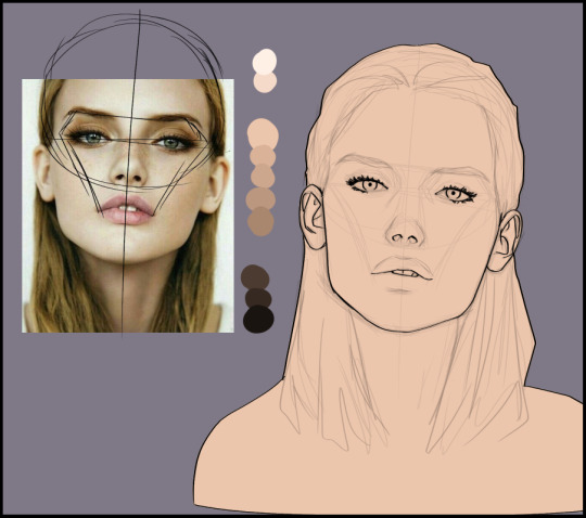
To the left you can see the palette I made for myself. Starting from the base tone, I create 4-5 gradually darkening swatches. The difference in shade from one to the next is VERY slight because there’s not a lot of heavy value difference in the overall planes of the face. From there, there’s a pretty hard jump to my darkest shades I’ll be using. These will be in very small (eye/nose/mouth details) or heavily shadowed (neck, areas where hair falls over skin) areas only! Same with my highlights.
My lightest shadow goes over a pretty broad space. I’m working on a masked later clipped to my base layer. I’ll be using a hard brush (actually plain old G Pen) to block in my shades, though in this case because this shade is the starting point of all my shadows I just paint bucket filled it in and then blocked the base tone back into the areas that will be better lit. Like chipping away at a block instead of adding onto it. It saves me time.
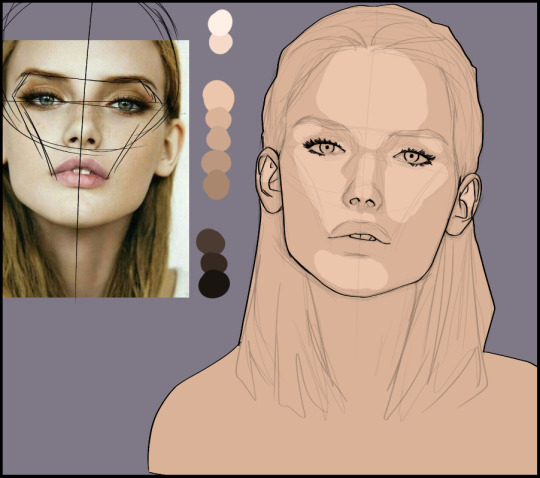
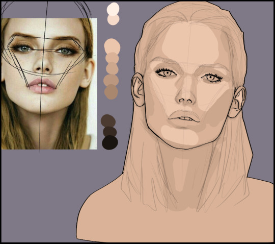
I hop on down the line to my next darkest shade and block it in areas like the cheekbones, temples, sides of the nose, eye sockets, etc – as I add each of these shades, I’ll be doing so in smaller and smaller areas, following my reference.
To be continued in a reblog! It’ll be a longpost orz
2K notes
·
View notes
Text
Afraid of Orange? Not-So-Scary Ways to Use This Hue in Your Home
With Halloween approaching, having orange decor at home may seem like a terrifying prospect. Indeed, interior designers and paint pros warn clients that when it comes to this color, caution is a must.
“Orange sparks controversy and strong reactions,” notes Rebekah Clark, owner of Decorating Dens Interiors at Clark Team Designs. Generally, you either love it or hate it.
“Orange is one persnickety color, because it goes from burnt umber to caution cone very fast,” points out Justin Riordan of Spade and Archer Design Agency.
This is a shade best suited for an extroverted homeowner, as it exudes enthusiasm, excitement, and warmth, adds Clark.
And if you’re a fan, orange is currently having a moment.
“Rust and Hermès orange are definitely trending—shoppers on our site adore it in velvet and mohair upholstery, lacquer furniture, and decorative pillows,” adds Anna Brockway, co-founder of Chairish.
For most homeowners, baby steps are recommended. To help, here are nine ways to work this unusual shade in your home.
1. Orange up your door
Photo by BiLDEN
Spice up an otherwise drab front door with bright orange, recommends Riordan, who likes a high-gloss version of Benjamin Moore’s Topaz.
“You’re adding interest, creating a focal point, and improving your curb appeal—all at once,” he says.
2. Enliven a half-bath
Photo by Jagoe Homes Inc.
Color pops work well in small spaces, including a hallway, wet bar, or half-bath.
Riordan used Sherwin-Williams’ Obstinate Orange in a small guest bathroom recently.
“This deep, multidimensional color receded into the background while the white porcelain fixtures became the visual superstars,” he says.
3. Accent a wall with orange
Photo by blackStones
Draw the eye toward and make a statement with an orange wall, especially if the idea is to use the color with intensity, offers Clark.
“Otherwise, apply it in small increments, such as painted on the backs of bookcase bays, as accent chairs, lamps, or other accessories,” she adds.
4. Mute the intensity
Photo by Elad Gonen
If you’re daring enough to give over a whole room to orange, consider picking a muted shade, suggests Liz Toombs, president of PDR Interiors.
“If the color is too bright or bold, it could easily overwhelm your space,” she warns.
Karen Gray-Plaisted of Design Solutions KGP likes a desaturated tint of orange.
“A soft peach kitchen would look lovely if the color of the cabinets, counters, and flooring all support this shade,” Gray-Plaisted says.
5. Create a moody study
Photo by Mia Karlsson Interior Design
Orange pairs nicely with earth tones such as brown and beige, making it a prime candidate for a man cave or study, according to Gray-Plaisted.
“Try a dark orange tone here, such as Cavern Clay from Sherwin-Williams,” she says.
6. Make coming home fun
Photo by Pinneo Construction
Orange, like red, is an energetic color that inspires playfulness, notes Toombs. Paint this shade in your entryway, mud room, or even laundry room, which may make sorting and folding a bit less like drudgery.
7. Give it to the kids
Photo by Alan Design Studio
Who better to live with orange than your wild child? Use this punchy, exciting shade on a room for rambunctious kids, whether boys or girls.
When Riordan was going through the adoption process and didn’t know if a boy or girl was coming, he painted the nursery walls orange.
“We decided to toss out pink and blue and go with Charlotte’s Locks from Farrow & Ball, which was the perfect partner to our mahogany crib—and our son,” he says.
8. Avoid odd color pairings
Photo by Brookfield Residential YYC
Frankly, unless you’re specifically striving for a Halloween look, avoid pairing orange and black, says Jamie Novak, author of “Keep This Toss That.”
“And pink clashes with orange—it’s a definite ‘don’t,'” she adds. Also, steer clear of terra cotta at all costs, especially if you want to sell.
“I’ve heard that homes with this shade in the living room sell for less than their expected value,” she explains.
9. Mix and match
Photo by CHRISTOPHER LEE FOTO
Blue is the complementary color to orange—but stay within the same saturation when you mix the two, say the pros.
“You can accomplish this by choosing an orange and a blue that are in the same section of the paint chart in stores,” says Toombs.
Orange and aqua are fabulous together, says Novak. “If you already have these tones in your room, enhance them with a dash of orange in a pillow or table runner,” she says.
The post Afraid of Orange? Not-So-Scary Ways to Use This Hue in Your Home appeared first on Real Estate News & Insights | realtor.com®.
0 notes