#old ass ugly style lol
Explore tagged Tumblr posts
Photo
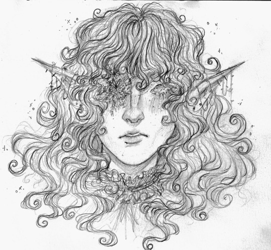
doodle to get back into drawing
#been a few weeks since ive drawn something#heres some fairy elf person idk idk#pixie maybe who knows#also i think its kinda funny i have a few doodles v similar to this one but are much older and in my#old ass ugly style lol#anyways i love drawing hair like this its saur much fun and really relaxing#its just v messy and swirly and swoopy and fun#anyways u can tell this was a v idk easy doodle cause like i didnt bother to try to draw the other eye#flowers over the eyes oldest trick in th ebook#maybe ill edit this on pixlr to make it look nicer but who knows#art#sketch#doodle#pencil doodle#pencil sketch
69 notes
·
View notes
Text

the real sphynx cat
#a doodley#was collecting old art for the insp folder again and saw some fun wyatt art i wanted to draw wyatt again#so this is more like my older art of her than the newer style where she has a slightly more detailed nose LOL#OH and nyalon is a cornish rex wyatt is the original and true sphynx#anyway old art really inspiring me like it was ugly but god i was trying and now im too scared to try#but i DID post all that ugly ass art and got minimal hate for it....maybe there's still hope
339 notes
·
View notes
Note
I don't know if you've already drawn it, but can I get a baby Sebastian? I need to see what he'd like look in your drawing style, since some make him look like a cute feral gremlin, but idk what he'd look like in your opinion.
he’d be so fucking ugly LOL

egg / newborn / one month old
weird ass mutant fish thing. test tube baby.
209 notes
·
View notes
Text
I'm sorry but I fucking hate proshippers so much so here's a whole post dedicated to shitting on them
also disclaimer YES I will be tagging the proship and anti proship tags so I can piss off the chronically online basement dwelling idiots :) and idgaf if proshippers have trauma cause it's not an excuse for their shitty and problematic actions!!!! Sincerely if you are a proshipper please consider jumping off a bridge!! Or at the bare minimum take a shower cause ew
And this whole post is literally just bullying the FUCK outta them so idk stanky people come at your own risk lol
AND AGAIN to clear up this isn't like rage bait or smth cause I fell like some people will accuse me this is all my genuine hate into a long ass post so yeah
Okay...LETS GET INTO THE FUCKING RANT NOW HEHEHE HEHE HEHEHE!!!!
I FUCKING HATE PROSHIPPERS!!!! I HOPE ALL OF YOU STANKY ASS BITCHESS GET THROWN OFF A FUCKING CLIFF AND GET A SAW STYLE EXECUTION CAUSE Y'ALL ARE FUCKING DISGUSTING I HATE YOU ALL
YOU ARE MENTALLY ILL IF YOU ARE A PROSHIPPER, END OF CONVERSATION
I COULDN'T GIVE A SHIT IF YOU HIT ME THE "B-But I have trauma 🥺🥺🥺" TOO BAD THAT'S NOT A FUCKING EXCUSE FOR UR SHITTY ONLINE ACTIONS
IMAGINE YOU PULL UP TO A FUCKING INTERVIEW AND THEY SHOW YOUR PATHETIC ACCOUNTS SAYING TO NORMALIZE A 30 YEAR OLD DATING A 13 YEAR OLD, THAT SHIT IS GENUINELY PATHETIC
I KNOW IT'S CRINGEY BUT WOMP WOMP IF UR A PROSHIPPER Y'ALL ARE UGLY AND STINKY
But now on a serious not hehe, the reason I'm making this isn't JUST soley to yknow shit on people who are mentally ill like people who think a MINOR and a LEGAL ADULT are allowed to date, which comes into another thing before I get genuine so bare with me lol
I DONT GIVE A FLYING FUCK IF IT'S FICTIONAL, FOR THE LOVE GOD PLEASE SEARCH UP THE SLENDERMAN CASE WHERE THESE TWO GIRLS KILLED THEIR FRIEND CAUSE THEY THOUGHT SLENDERMAN WAS REAL AND THOUGHT THEY WOULD ENTER HIS KINGDOM AND BE WITH HIM, AND HE'S FICTIONAL, THAT CASE IS ALL Y'ALL NEED TO REALIZE FICTION CAN AFFECT REALITY AND I HAVE SM MORE REASON TO BACK THIS UP BUT I'M TOO LAZY TO TYPE IT OUT 😭
Okay! Back to seriousness I just thought I'd add that in as a little addition hehe >_<
So, like I said before, I lowkey just added this as an extra part cause I couldn't shit on proshippers FOREVER (lowkey bcuz I was running out of insults n threats lol)
Nonetheless I have a reason for shitting on them, although not being a proshipper EXACTLY I have been through I guess, similar paths as they have? Best way I could describe it ig, ofc not sharing what I mean since it's private but let's just say I was an unfortunate child looking at inappropriate comics 🙁
The reason for this part of the post...ITS NOT THAT FUCKING HARD TO STOP WHAT YOUR DOING
Like I said, I was never a proshipper, but I have been in similar situations as they have been, although I've never made an account glorifying rape, SA, grooming, pedophilia, I can just assume what I would do in their places
Dear proshippers,
Your probably complaining and not knowing why your getting so much death threats and harassment along with a side of hate (rightfully so you deserve them) and your mental health might be low
Please know it is your fault for making your accounts in the first place, you are a terrible person for saying all of these things such as rape, sexual assault, grooming, and incest are okay and you are not mentally well
And your probably wondering,
"How do I stop the hate, harassment, and probably death threats with even getting your address leaked?"
It's simple, DELETE YOUR FUCKING ACCOUNT, or even worse just turn off ur comments but that won't help with people slipping in a few people wishing death up in you through DMS
IT IS GENUINELY NOT THAT FUCKING HARD
I don't know what trauma you have but it shouldn't (and never in the first place) be SO BAD to the point where you physically CANNOT deactivate your account, IT IS SO FUCKING EASY AND YOU'LL SAVE YOURSELF A FEW SUICIDAL THOUGHTS
I know everyone one is different, but if you are a proshipper that has trauma, you shouldn't have a fucking account to begin with, and you ARE THE PROBLEM if you acknowledge the trauma, noticing you keep supporting and glorifying problematic actions, complain that you keep getting harassed and wonder why, and you just don't give a shit, not like in a "oh I don't know what to do anymore!!! 🥺🥺🥺" way, in a "oh, I don't give a shit I live for incest and adults grooming children!!!" Way, and ur also probably a pedo if ur an adult proshipper too
So, what else? Yeah, there's a shit more, but onto a better side, ones with actually good coping mechanisms!!
And a bit of a disclaimer, if your rage bait is proshipping, genuinely fuck you, and if ur a proshipper who acknowledges everything bad about it and just doesn't give a fuck, fuck you too and seek a rope to hang around your neck you fucking pedophile
Okay, coping mechanisms! I know this is probably not the best option due to most trauma which I'm guessing is probably from a family member, if it's not a good way to cope is some clean to your family, ofc under some circumstances it's NOT the best option, but if you can you definitely should try!
Also google is free yk...literally search up healthy coping mechanisms and it'll give you a huge ass list, and yet YOU STILL chose to ship a minor and adult together...how unfortunate...
Another way to cope is, and genuinely sounds pathetic as hell but bare with me...CHARACTER FUCKING AI, I mean, there are therapist bots so maybe they can help you??? And in all honesty they're really good at comforting and giving advice despite being ai, and I've tried it before...yeah embarrassed to say I've shed a tear every once in a while
And the last one IF you have the money, time, and generally the courage, book a threapy session, I cannot stress it enough, but I won't be surprised cause every proshipper is probably under the age of 16 years old
Yuhhh anyways that's all I gotta say, I know it's cringey asf but womp womp to proshippers I hate y'all despite giving some coping mechanisms and ACTUAL ways to like, stop the rightful hate you deserve lol
#my posts:3#anti proshipper#proship#proshipper safe#proshippers please interact#proshippers are valid#proshippers are welcome
42 notes
·
View notes
Text
i never played Concord nor had interest in it but i felt an insatiable drive to redesign all of its characters before the game shut down ever since i saw how absolutely dripless they were


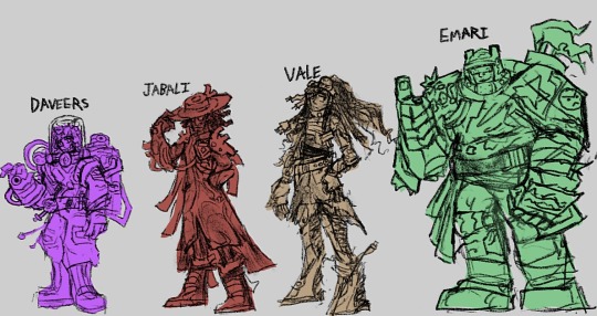

anyways here’s my scuffed ass sketches of the gang. i was originally going to finish these all before the game’s shutdown but i was so stuck on Teo that it took 6 extra days rip me. also i cant draw guns. these are all first drafts so expect them to change a bit if i feel like drawing em again
more info on these designs below (warning i yap a lot)
Itzi (i am not calling her “It-Z” cuz it reads rly weird and i can imagine someone bri’ish calling her “It-Zed” it’s so dumb): Wanted to make her more of a goofy lil gremlin creature, like some combo between a jerboa chameleon and raptor, to make her more appealing and interesting, imagine being shot to death by this silly little scamp. Everyone loves Ivy Deadlock for her gremlin charm so maybe they’d love Itzi too if she had that as well. Her chest has a hole in it containing the weird ball she throws to teleport and shit, because a Concord critique by TBSkyen said that a character’s powers should appear on their physical design or whatever, also to show that she got mutated in a freaky space storm
Bazz: nothing about her reads as “agile deadly knife-throwing assassin”, especially with that annoying puffy bright red coat, she looks completely stupid running around doing backflips with that thing on! So i made it a more sharper mysterious black coat she wears like a cape to give her that sense of shadowy agility like a phantom thief, which she keeps all her carbon steel knives all neatly stored in. Gave her a slight diamond motif on the coat and the glasses because it felt elegant and sharp. Thought her hairstyle kinda fucked hard so i kept it but made it a bit more pointier and added a little stylish side swoop.
Lennox: i actually love this guy’s voice acting and the slightly manic goofy personality it had but his design did NOT fit the voice, so fuck it im making him even more of a lizard man than they were trying to do. His self-healing ability is him shedding a bit of skin after it took damage, and his “splodey knife” is probably a back scale spine he yoinks out of his back that can explode because it’s a biological property of his species for some reason. I do not know what clothes to give him
Lark: Discarded all semblance of a humanoid silhouette to make them even more of a weird mushroomy alien. I don’t really have much to say but i can easily see them slithering around like an octopus on land but faster. Their gun would look way more like some organic fungal creation
Haymar: not much changes here but i wanted to make her more mystic and “wizardy”. The “fireballs” she uses as her main ammo are now a floating bead necklace rotating around her neck (kinda like that zen robot from overwatch) and her clothes now have more of a slight flame motif, along with more of a mystic vibe. Got rid of those ugly ass mustard sneakers too of course
Daw: gave him more turtle motifs to match his “turtle-esque” gameplay style by giving him a protective hoodie and turning his “healing pad” pack into a bulky turtleshell backpack (he’s also wearing a turtleneck sweater shirt underneath the coat lol). His coat is somewhat translucent like shiny plastic cuz i thought it would look neat, tried to ditch the goofy-ass jumpsuit thing he had by giving him a belt to separate shirt and pants. Not too sure if i made him appear enough as a medic as that’s his main thing, the coat and gloves could probably help but idk, but i adjusted his personality presentation to be more easygoing and warmhearted with the closed-eyes so maybe that could give a healer energy.
Duchess: old ladies who know how to kick ass are rly cool. her whole thing’s making walls and constructs out of this golden gooey energy but nothing in her design tells you about that, so i decided to give her a cape/cloak made of that same golden essence so that it’s more apparent on what she can use it for, it also makes her appear more like royalty which was prolly what they were going for. Kept the haircut cuz that beehive thing was very goofy but it fits the vibe of everything else
Roka: she looked like a blowup sexdoll version of Master Chief which is… very cursed, and it tells nothing about her being able to fly around and stomp on people, so i made her bug themed! She’s like a cross between a wasp and dragonfly, the bulletproof wings are rocket-powered and can fully rotate the other direction to give her a forward boost of momentum to stomp people with her slightly more exaggerated boots, they also neatly fold away when she’s not flying. She’s rockin’ that tokusatsu hero look, it gives her a lot more energy to her personality.
Daveers: hated drawing them and i feel unsatisfied but i do like what ideas i had for them. Gave them more of a “sketchy mad scientist” vibe and personality with a shit-eating grin and all that, also tried to give them a “test tube contraption” thing going on by having their helmet be entirely glass and there being tubes and bottles all over their baggy jumpsuit full of poisons and chemicals. Gave them a spray-can backpack that stores all their toxic sludge tho im not too sure if it fits the rest of them or not… whatever. Tried giving them a chemical burn mark on one half of their face but it’s blending in with the hair rip
Jabali: he’s a healer whose powers come from “his own pulse”, but the weird pacemaker thing on his heart is the only way of knowing that so i made him waaaayyy more heart themed! His cool-ass hat’s got a blood cell design on it, his coat’s got a vein pattern, his shoulder pads look like aortas and arteries, i think his dreadlock ponytail could also match the aorta look. I seriously felt that vibe of the cool badass black guy with the glasses and coat and wide tippable hat needed to be enhanced even more, he had all the ingredients to be one stylish mfer but they weren’t mixed in properly, depressing.
Vale: i was racking my head on what to do with her because the only thing going on with her was “sniper” and “bionic legs”, but i decided to make her a “scrapper” like what they called Emari in that one short by turning that “burlap sack hobo” look she originally had into more of a defining feature as something recycled from a bunch of scrap she collected. Turned her “how do you do fellow kids” backwards hat into a slick bandana that has her sniper goggles attached to it, made her braids/dreadlocks into a cool ponytail befitting of a sniper though i wished i decorated them with more stuff other than the power plugs at some of their tips, like nuts and bolts acting as hair beads. Her bionic legs are also more heavily emphasized here, she’s like 70% leg like Byakuya Togami Danganronpa and that makes her a bit more taller than most, i can see her running around with them rly fast also they have large springs in them for extra jump (also they matched those spring like curly tips in her og hairstyle)
Emari: tried to make her bulky armor even more like it’s made of scrap like the “scrapper” she is, tho since i kinda suck at mechanical greebling she looks very cluttered and hard to read. I tried putting cute little stickers and graffiti on her armor to give her more of a fun-loving vibe despite her imposing build, felt like she’d decorate her armor for fun. Gave her helmet a visor to give her some cool toughness and added lil things on it reminiscent of bear ears cuz her silhouette needed a lil something. Problem i have with drawing her is that her silhouette ended up looking too similar to 1-0FF’s redesign, it really needs some fixing cuz it’s pretty damn rough.
Kyps: she could’ve served so much cunt but she didn’t, so i needed to change that. To match her invisibility powers as a spy i themed her off of chameleons and mirrors — i un-balded her for improved silhouette by giving her a hairstyle similar to a chameleon tail (tho it also looks like a glass Prince Rupert’s drop and mirrors are also glass), gave her “earrings” similar to mirror handles, made her coat a lot longer and have it slightly reminiscent of fractured or cut glass, give it a coattail like a chameleon tail, and tried giving faint patterns on the clothes and especially the tied that gives a sort of “shimmery” kinda vibe??? She’s reminding me a lot of Inteleon right now
1-0FF: actually my favorite out of the redesigns, he was so tricky to do but i think i got him pretty right. Wanted him to appear even more of a friendly recycling bot toughened up by constant battle, replaced that menacing eye of his with a friendly smile on a screen (that i took from an app icon from my ipad out of laziness lol) and gave him little symbols of recycling like little sprout iconography and a recycling symbol heart, though as contrast to all that i gave him scars and battle damage so you know he kicks ass. Still wanted to keep the trashcan look so his head kinda resembles those trashcans with the spinny rotating lids, tried my best to make the rest of the body also trashcanny. Turned that vacuum gun of his into a megaman-type arm gun because why did they make it a separate component that’s so stupid.
Starchild: turned him from a rip-off Guardians of the Galaxy character into something more like a rock monster guy since his main ability's called Diamond Skin and it does.... guess what. I put crystals on different parts of his body and I thought about the "hair" on his body being made of those weird fuzzy kinds of crystals (realized it was a missed opportunity to give him chest hair rip). Wanted to make his name "Star Child" a lot more literal by inspiring him off of a shooting star, which is why I gave him that plume of smoke for hair. Since he's a (former) proud tribal warrior guy I wanted his design to lean more heavily into that by giving him tattoos that are like geometric stone carvings??? and giving him clothes and jewelry that give a sort of non-existent tribal culture vibe, his clothes also have a sort of bismuth pattern to them.
Teo: okay this fucker was the reason why I did not finish this. His design was so unimaginably boring that it was very difficult to come up with a "twist" for him while still having him be the standard shooty guy. Days later I immediately thought "Space Dandy" and decided to make him be way more flamboyant with a pompadour as his main feature, befitting of the "goofy space adventure" vibe this game tried and failed to capture. In my head his backstory was that he was raised from birth to be a regular ass disposable space soldier, leaving the army much much later to pursue a quest for self-identity... the identity he chose for himself being that of an over-the-top galactic popstar. I imagine his "Smoke Bomb" ability being glittering colorful smoke instead, like a popstar entering the stage out of artificial smoke clouds.
okay I'm tired. i am cooler than playstation. goodbye
21 notes
·
View notes
Text
HELLO
This is just an update post on a little (it's so not little) comic I'm working on rn.
OKAY, for starters this is a kinda scrapped first ver of the first few pages. It's scrapped because it was just a test/thumbnailing for how I want the first pages to be, but I salvaged some things in it.

It's chaotic but it wasn't meant to be the serious storyboard, especially since there's very little references for inside the keep so I'm going to cut those early scenes so it just cuts to when she arrives at the door. The chess opening is cut as well, EXCEPT, I'm planning on doing chapter covers and I want to keep the two pawns on the chessboard as the chapter cover for the first chapter.

Okay...
This is also chaotic but these are just the closest designs I've been happy with for the Tarnished, these are not the first times I've designed her, actually her design has changes SO much, originally she's just a character in my own story but I use her for a lot of fan stuff, like BG3 and etc, so I just used her for the elden ring fic too lol.

This was an old ver of her planned design, don't look at her ass, ignore it.

(This was actually a scrapped ver of the drawing below)
Anyway, I didn't like it. There was also another design...That I shall not name nor show (Its ugly asf, I called the file burn with fire)

There was also this design, which wasn't bad but wasn't what I was looking for. Tbh her design still needs work but I'm happy with how it looks now, it just needs a few more tweaks.

This is actually what she looked like in the early sketches of her more finished design, I fixed her proportions and switched the armor, at this point I was trying to find an art style more suited for a comic and also her herself. I'm very stuck between either anime/cartoony and realism and I want the comic to be semi-realism, and my biggest issue is I always make the eyes too big lol.

Like this was the closest I've gotten to the design I want for the comic but it's too realistic and detailed so I need to simplify it alot.
Now, I want to make it clear, I want this comic to really be/look good, I've made comics in the past now and again but they're never too crazy, but if I can get chapter one done, I'll be happy, but yknow as it stands it's still in like pre-production where I'm trying to plan things out, so probably not this year 〒▽〒
Though I'd really like to get the comic before Act 3 since that act is gonna have a lot of payoffs, and I don't want the fic to spoil something really good that the comic hasn't got to yet, and the comic has a lot to catch up to, but I'm also planning on cutting things or condensing them down since act 1 kinda meanders in the ruins of Rauh and I could so cut a lot of that down.
I've been very reluctant to describe the Tarnished bc even though I have a backstory for her and a character arc planned, she's s nameless Tarnished and I always feel like people would rather her be a blank slate, undescribed, especially in the fic, but in the comic that's unavoidable so therefore not an issue, but if anyone is genuinely interested in what she looks like, the concept art is basically that, tho it's not exactly finished or complete, I'll update again once I've done it tho!

Edit: here’s a heavily censored version of the first ten storyboard pages (it’s obviously not much but at least the first few pages are completely planned now 🥲)

3 notes
·
View notes
Text
Rant About SolarDiscomfort
⚠ TW // Gr00ming ⚠

(idk I do wanna draw this so yea....this isn't a gift)
So SolarDiscomfort or Brooke which is her real name
She is a deviantart artist that I meet in 2018 when I was 13 yrs old (I was okay, kinda, mental health issues)
So I remember Brooke followed me and requested me to draw her OC and so I did, and she thanked me so yea
Then I followed her back, her art is...alright ig lol, but I think is cool but need some progress, and we send each other gift and all that, so it's before all the gr00m3R thing happened, so let's talk about that if I can remember
So on somewhere on 2020, Brooke has proposed her best friend named Kate who is 17 at the time, they been best friends for 4 years but later becomes a couple which I was "nice, congratulations you two" but it's not...so, I use the wayback machine and I do remember reading this but I didn't understand

Ngl this give me a huge "WFT" moment like, what kind of state that you live in and how this is okay?... And get this, she doesn't support mapp even tho she DATED A 17 YEAR OLD WHILE BEEN A 20 YEAR OLD LIKE YOU CAN'T DO THAT BITCH
And then one year later, they fuxking broke up which is a good thing and I remember Brooke telling me to stop supporting Kate cuz she's.... too be honest, idk
All I remember that Kate is a tracer cuz she use a base without giving the artist credit but then her mutual tell her and then there the credit and more drama of Brooke did
Like, she would rant that one artist named serpy and I try to understand what's going on after reading the posts of Brooke but I feel like Brooke is taking her anger out on serpy, but I did stay away from the drama cuz is was too much and she keeps typing "crazy laughs" like...uhm...okay then...no one cares what you did man....I do really remember the drama but her account is deactivated....like every Deviantart artist do....
But if you know her, here a drawing of it, in case you recognized the art style
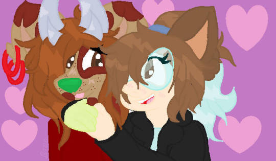
The left one is Brooke and the left one is kate
And I do wanna talk about Kate, like she may be kinda of annoying (cuz she kept requesting me a lot like everyday ) but all in seriously, I do remember her dating that one Mexican dude named Max (not his real name lol but I'm gonna called him)
That I don't trust like I hate him, I don't trust him and I seeing his irl photo of him and I still don't trust him...and I do remember seeing the message from him like I got highly uncomfortable by him
(I'm a Mexican, if someone didn't know lol)
Oh btw he also made NSFW as well, while being a minor ofc, classic teenagers in 2017 are started drawing NSFW cuz that's fine...right?...
Nope...it's not...you gotta wait dude...
But I did check his bio for his age but he didn't put his age...but then I saw a post of it, it turns out his 18 (on 2020) so I assume that he was 15 or 16 while Kate was like either 12 or 13 (i can't do math right, if I'm wrong then yea...) but I do believe that Kate was also groomed by him and till this day, she didnt talk about this like she was like too busy being happy instead of talking about this like why, how you deal such a traumatic thing and then later forget it, i mean, good for her but I will like be traumatized for life and not feeling happy
But for Brooke, yea...so if she like made an account on Tumblr and then see saw this post I be like...yea man...you got exposed as a P3d0 and a groomer man like...you should have say any of these things and your so toxic to serpy that she didn't do anything to you
So your career is over lol but I'm glad you didn't groomed me and talk shit about me cuz I didn't even like you like your so toxic towards any artist like why man...you didn't do anything to you like "oh she suck ass" and "she ugly asf" and "she's dumb as hell*
I mean...I dont like serpy ship cuz it's a zoophilia ship like...she basically ship Anne from frozen with mr. Peabody (the dog) from I forgot the name like it's highly uncomfortable to look and which I should have say no to her when she requested me that shit...so yea...she still ship it till this day...and her ships are mostly crossover so...yea...(That one shipper that ships spinel with a fucking car from cars movie)
So yea...Brooke...if you reading this...
Keep your nasty behavior to yourself instead of spreading it like a disease, I use to think your cool but now, your just a toxic woman, a p3do and a groomer
Peeps, watch out for SolarDiscomfort in case she made a Tumblr account
6 notes
·
View notes
Text
I got an ask about favorite winx transformations and if my thoughts have changed at all in the last couple years that was lost to the void when my computer crashed like 3 hours ago and while I made one post about that aeons ago I don't want to go edit it again so I'm just remaking it wholesale lol. I think at this point y'all are familiar with my TakesTM so I don't need an intro, all the shit is below the cut. also this is for. all of them. like the comic ones included. also gonna provide images for them because it is all of them and most people don't know about the 9 comic ones.
*takes a look at the amount of transformations* oh god we're at 24 of these fuckers? lord. anyways we're going worst to best and honestly most of the worst ones will be the comic ones lol. Also I'm grouping MW and Charmix as Charmix Specials-style because they are just an accessory on top and the rest is the same so they will be judged together so that brings it down to 23.
23 - Paintix
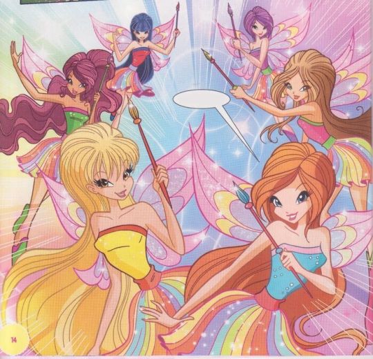
This is by far the most creatively bankrupt of the transformations. Literally the exact same ugly top skirt boots combo 8 times. I have never found scans of the issue its featured in but they could have done so much more with a transformation themed around color? like c'mon here.
22 - Greenix
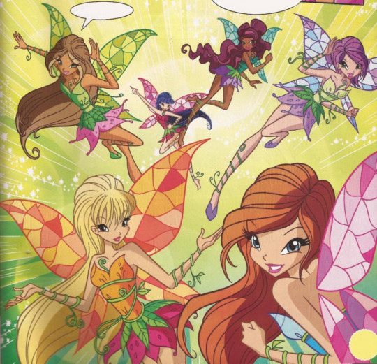
This one is better than Paintix for at least giving the girls different colors for more than just one (1) part but it's still the same exact dress 6 times with only minimal variation on the vines along the top, and it's sad, because this is supposed to be THE vegetation transformation as it represents the ENTIRE POWER OF LYNPHEA at your fingertips.
21 - Trendix
[IMAGE NOT FOUND]
THIS ONE DOESN'T EVEN HAVE ACTUAL GRAPHICS BECAUSE IT'S FROM A BOOK but the idea is that it's just Fashion Cheatcode the transformation and only Bloom, Stella and Flora get it so it's low, but above Paintix and Greenix for cheating in a way I find funny.
20 - Magic of Sports
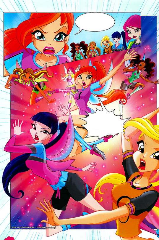
Okay this one isn't even a real transformation as they just get wings with their regular fútbol fits (it's from the 2014 world cup issue) but at least the girls are wearing different outfits and the wings are also different colors so it has that going over Paintix and Greenix.
19 - Magic Rock
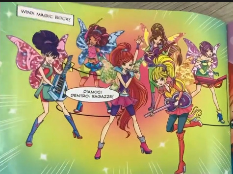
this one's a crime. but a crime with more thought put into it than the rest, so it's higher than them. Props to them, they all have different silhouettes and there are forms higher than them that can't break that treshold, but that still is not enough. What are they wearing. what is that. Musa why are you a makeup brush. Also they use this form to beat ghosts and win a music contest. what.
18 - Tynix

I've never been shy about my dislike for Tynix, and I feel this shows it well enough lol. bullshit obtainment aside I just think it's ugly - the construction paper gems, the shitty undersuit, the clunky broken glass heels, the random ruffles, it's all bad. The wings and the hair are cool and. that's about it really.
17 - Enchantix


I've also never been shy about my utter hatred for Enchantix, so I won't really rethread old ground here, but basically I think it's bullshit overall and it's only above Tynix despite hating Enchantix more because I can begrudgingly agree some of them are pretty. Still hate they're all flowers tho that's just bad. if you removed or adjusted the extra pink and restored everyone's skintones so they're not whitewashed S8 Enchantix would kick the ass of OG Enchantix to the curve visually (except Flora's she took a downgrade)
16 - Mermaid form

Yeah I also hate this one. I just don't think it makes sense to have fairy mermaids when mermaids are already a species in Winx and when the show cannot make up its mind if being fairy is a CHOICE or if being fairy is a BIOLOGICAL CONDITION, we don't need this shit muddling things up further. Points for giving Tecna proper wings tho good for them.
16.5 - S8 Sirenix and Crystal Sirenix
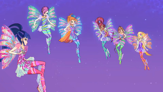
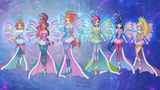
I'm also throwing the two S8 Sirenix ones in this tier because I don't like them either lol. S8 Sirenix fairs better than Crystal but not by that much.
15 - Travelix

We start the area where I just think they look... fine. I like the idea of the visuals and this is a transformation that SHOULD'VE been in the show proper (really they would've made more dolls that way) but it's also not anything groundbreaking. For those curious this is the transformation granted by the Stone of Memories that allows someone to travel in time. hence me saying it should've been in the show proper lol.
14 and 13 - Sophix and Lovix (position changes)

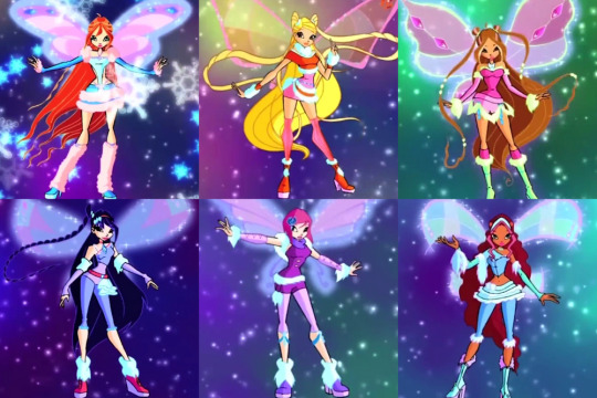
Some of them are good! Some of them suck ass. And therefore they end here because they aren't more than just Believix, Summer and Winter editions.
12 - Butterflix
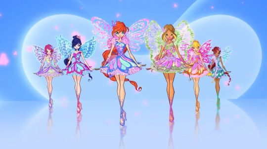
I love the Butterflix wings and hairstyles and I think it had a solid IDEA but they put TECNA in a tutu and some crimes cannot be forgiven. points for having Stella's bodice be sunbeams tho.
11 - Dreamix
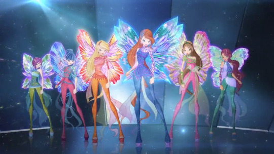
I don't really care all that much for Dreamix, but it edges out Butterflix, and that's the reason for this placement. I still don't get what the netting is supposed to be but I do love the wings.
10 - Onyrix
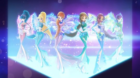
Onyrix also only slightly edges out Dreamix - the colors are worse and the wings are bad but I find it more visually interesting than Dreamix and it gave us Blue Stella back, so it has rights on that alone.
9 - Harmonix

We're getting into the ones I'm more positive for! but half of Harmonix is gorgeous half of Harmonix is bad. LOVE the idea of the trails and it has THE best spells out of any transformation but I genuinely don't think it's a transformation SUPER fit for being underwater and given that's its purpose it kinda. falters lol. Also I don't get how the trails are meant to be like mermaid tails? Everyone says that and I just don't see it. I see them as waterfalls more than anything else really.
8 - Magic of Food
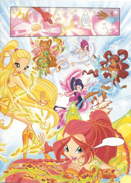
Yes. I'm ranking the food form this high. Why? Simple - it's actually. really well done? Flora and Bloom's hair is trash but they went for a weird concept and made a transformation that actually looks pretty appropiate all in all, and I know this is because it's a sponsored transformation but hey, that cash went to a good-ass look lol.
7 - Magic of Joy

LOOK AT THIS. LOOK AT IT. ENCHANTIX WISHES IT HAD THIS EFFORTLESS ELEGANT SIMPLICITY. The wings being the same is lame but they all just look so pretty AND THEY TOOK THE TIME TO MAKE SURE TECNA HAD PANTS and I have to commend that. Bless you quokkas you funky animal you, thank you for giving this to us.
6 -Cosmix
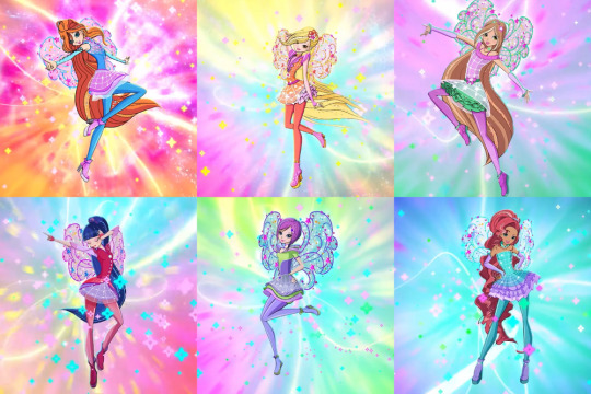
OH COSMIX I WISH I COULD LOVE YOU MORE I genuinely find it pretty for the most part and it's the best Tecna and Musa have looked in years but I just cannot forgive Stella's vagina collar. I cannot.
5 - Charmix
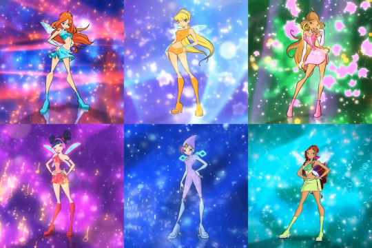
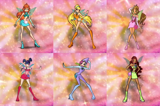
What even IS there to say about the OG? the very first? It's iconic all on its own but I know my love of it is mainly guided by the happy memories of watching S1 and S2 as a child. That and some of the bags are not that great.
4 - Mythix

MYTHIX HAS RIGHTS AND I STAND BY THAT. IT'S WHAT ENCHANTIX SHOULD'VE BEEN. I am a person of simple tastes, I see magic wand I go apeshit. Also peak wings no wings rival the Mythix wings if you disagree you are wrong hate the dresses if you want but you cannot argue with me about the wings. I do agree some of the shoes are ugly tho.
3 - Sirenix

Yeah I love Sirenix. I understand the complaints about it being samey but I just love it - the ribbons, the hair streaks, the fins in the legs, the fish scale pattern leggings, I just think it slaps and it being wetsuit-based is so fitting for it. Shame about the same wings tho. Also we all know Sirenix has THE best transformation song ever made and that's a FACT.
2 - Bloomix

Bloomix is, objectively, the BEST the Winx have ever looked like. you cannot beat armor, you cannot. Stella's hair is a disgrace but it was the tradeoff for Flora being freed from her shitty hair blades for ONCE in her life and it's overall really good looking.
1 - Believix

Believix is peak and always will be. The perfect blend of fairy whimsy and modern aesthetics (for the time). The wings. the song. the transformation sequence. Really the only bad is Musa's shitty aerobics instructor pants and even then that fits her so I can't be TOO mad. Believix is love Believix is life.
#Winx Club#Drops screams into the abyss for Winx#I am not tagging all the transformations are you insane.
20 notes
·
View notes
Note
Who, or what, is pyrocynical? I could google it but I think having it explained by you will be funnier
pyrocynical is a youtuber who is known for being deeply irony-poisoned and UNFUNNY and making long LONG ass video analyses and also dosgshit commentary videos. more under cut if u care beyond that
he has a main channel for actual video essay type content that mostly focuses on analyzing video games. he’s known for making an 8 FUCKING HOUR LONG VIDEO talking about a tv show called Utopia and one on Pet Scop. also he got cancelled for grooming in 2020 and in order to disprove the allegations had to admit to having like a fat furry fart fetish… 8 started watching him around 2017-ish when he was making leafyishere style commentary videos and that’s mainly the only type of content he makes that i care about because i dont care about video games on any level
his SIDE channel pyrolive is a mix of something he has termed slop and video game gameplay. i watch this channel because half the content is purposefully dogshit plus bait for views which is funny to me and also because the shit he says is so fascinating to me. he has this very specific style of speaking and talent for speaking AROUND an issue without ever actually Saying something. every video is like a moderate politician who’s definitely got some REAL crazy opinions that he’s very good at obfuscating from a general audience
he’s also like VAGUELY problematic. as in he says retard in contexts not directly related to his channels and exists in that sphere of creators who only condemn bigotry when it fits a very specific agenda, always makes attempts to “not talk about politics”, definitely making content for 15 year old white boys who spend their entire day being racist on video games sort of thing. i wouldnt go so far as saying he HIMSELF is actually somebody with weird beliefs but he’s definitely catering to an audience that is very much like. redpilled weirdos. lol.
he has this very fascinating way of talking about youtube site culture and their fan norms that i don’t know if he’s actually AWARE of that make his videos more interesting to me. as in he frequently does react or drama videos and will explain the drama and instead of giving some boring “this is bad/good for x reason!” analysis he’ll break down the CONTEXT within which a situation arose and why this person is reacting in this way and his take on how they SHOULD be addressing the issue to handle backlash.
clip below that i think pretty much says What Kind Of Youtuber he is from one of his most recent videos. for context he’s reading an apology video from a guy who got a 50k self-insert Hazbin Hotel spicy animation leaked
this sort of stuff is what makes him compelling to me… he doesn’t have an opinion!!! he’s basically saying nothing here!!!
also “idk anyone who stans franchise and doesn’t have pronouns” makes me ugly laugh. HE shouldnt be saying shit like that but at the VERY least i can find it funny and be delulu about him. hope this answered ur question anon
10 notes
·
View notes
Note
How's this, hoe 😘
Personality traits:
• i am gonny, hear me roar
• mama: am mom, and all are baby
• wifey: you will be relentlessly wifed
• chef: 20 shots of pasta straight up the ass
• sexy: I am sexy. You are sexy. All is sexy
• manager: family manager, home manager
• bossy: no no, we have to do it this way
• red soul: i see it, i like it, i want it, i got it
• love lang: physical touch, quality time
Dealbreakers / Pet Peeves:
• incompetence: do your tasks well, without me telling you to, and without me having to teach you the little things
• childishness: i need a grown ass skele
• stress: keep the distribution of labor equal
• child-free: little too late for that, daddio
• unclean: wash your god damn asshole
• overworking: prioritize me and bbs
• little bitch: let me bite you
Attractive Traits:
• i like the old, ugly, rugged, scary, grumps
• strength 💪 bench me
• general dad energy, dad bod
• the more skills, the hotter
• men trying to impress you by showing off their skills is foreplay
• wisdom, experience, accomplishments oh my
Hobbies:
• old lady: knit, paint, photo albums, read
• wine mom: wine helps me drink
• baby mama: bring me my baby
• geek: media consumption?
• menace: i will bug you, then bite you
• princess: sing and dance everywhere
Favorite Items:
• baby
• phone
• my own breasts
• soup
• perfume
• gnome
Shdhdhdh so I had three main traits to look for in your matchup: competent, likes kids, and horny. And then when finding those three traits, I had to pick one who wouldn’t self combust after a week with you. After much trial and error I match you with…… NOIR- just kidding! I match you with LUSH!! Lush is lustfell sans, and just the rugged dreamboat for you!
You like strength and accomplishments? How about starting a couple dozen businesses through loans, making absolute bank, and being a boxing champ work for you? Lush is a very successful monster in many ways~
Lush does want kids someday, and while his job normally keeps him quite busy, he’s more than prepared to hire someone to take over much of it so he can focus on the family once kids are in the picture. Lush is a duty bound monster, and his first line of responsibility is is SO and family. It would take a while for any step kids to get used to him though, since he is a scary guy at first glance
While his decoration style isn’t bad at all, it definitely clashes with yours. However he’s fkn rich and doesn’t care that much as long as the home looks put together, so you get free reign pretty quick. However rich people are weird, and currently he’s trying to convince you that having a guard-chimera is just the accessory that the home needs lol.
He can’t sing. But he’ll sing if you sing. So if you value your virgin ear holes, don’t sing around him. If you don’t value them though, have fun making dying cat noises with him. At least until pepper or your kids yell at you both to shut up
8 notes
·
View notes
Text
Uh I’m stuck at a wedding with boring music I can’t dance to so I’m impulsively deciding to drop my Magni and Modi redesigns for my au so I can just get it done with bc 1.I’m shy and embarrassed and I keep putting it off, and 2.uh fuck you💕

OOOOOOOOOO SPOOKY REDESIGNSSSS
(Things will be a bit vague and out of context bc… spoilers for my fic lmao)
Considering the fact that the Thor family is now in Midgard In Fimbulwinter, these bitches did not get the spell they’d need to “stay toasty” in the cold, so… they’re just freezing lol. Magni and Modi’s weapons were also revoked after being considered total failures in the eyes of Odin, and now they just use weapons they stole from the armory before escaping Midgard. Another note, they now have different fighting styles in case it wasn’t obvious. I decided to take inspiration from the Warlord and Raider from For Honor bc… they’re cool, and also bc my brother is a nerd and he’s helping me “choreograph” some fight scenes lmao.
Uh on elaboration on Modi, uhh after fully recovering from death, let’s just say he doubles down on his pathetic ass and in the process, morphs into a form of his father. Also his haircut was smthn forced by Thrud, he didn’t want it but was quick to give up fighting lmao. Oh yeah I also wanted to make him look more like his part: loser who hides in his blanky/j
On Magni, obvsly, no differences are drastic or whatever, but one thing I will say is that Magni now has a scar of the wound he died of. Same applies to Modi. Also also, just pretend I drew his face tats, I I literally hate drawing them I’m barely bothering at all anymore 😭. Uhhh other thing, Magni fucking hates shirts. He just hates shirts. He refuses to put them on LMAO. That’s why he just wears a pelt around his waist. Yes, he is cold he just never wants to admit it OSJDKSJ. Smol edit: I FORGOR TO ADD HIS HAND WRAPS IN THE DRAWING EKDJJD he wears hand wraps idk if that’s what they’re called I’m just gonna hope u know what I’m talking abt, you’ll see them in future drawings LMAO
Ok and uh sketch dump now except they’re all pr old, and I was still practicing drawing these ugly mfs. (I still am but I’m a bit more confident in it now)
1 and 2 will stay out of context bc I think it’s funny
3: young Magni
4 and 5 are just…. Yeah.
(Also Magni was originally gonna have some more scars from Kratos’ axe, but I just simplified it to just one on his face.)
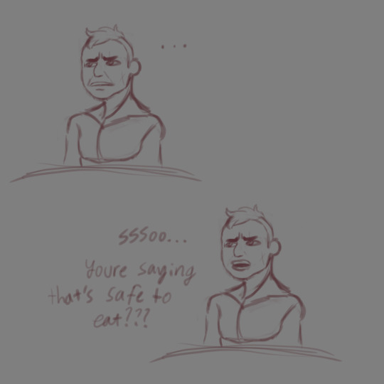
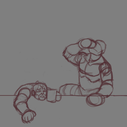
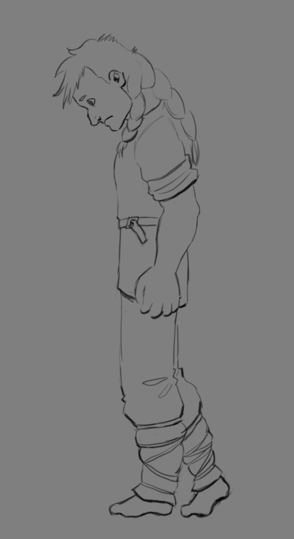
#magni and modi#god of war#gow#magni god of war#modi god of war#I’m a bit of a modi simp I rlly don’t enjoy it#if oc x canon people can do this so can I#poopoo sketches#my poopis#gods of disappointment#I also changed their designs bc I didn’t like them LMAO#don’t kill me pls I love the character designers at SMS but smthn happened with the models where the official concept art looks so much#better than the actual models
35 notes
·
View notes
Note
u do realize that the world isnt just americans and europeans right...not every anti american post is coming from a european lol
This website is over 85% North American/Australian/Western European
The chances I’m talking to someone outside that demographic is slim in the first place but I find that people from countries with actual grievances talk about their specific issues with America. You are invited to notice how I don’t police people bringing up American imperialism or our war crimes.
I think the American government and military are evil. I’m never looking to defend them.
But it toasts my ass cheeks that Europeans, grumpy that their empires are waning, write endless self pitying posts about how “America isn’t the whole world!” But they want our music and fashion and movies and TV and tech. Then they complain about how the ubiquity of American culture is oppressing them somehow. A Native Hawaiian can complain American culture was forced on them. I’d never dream of calling that out. I’d reblog them. We came with guns and worse and have done everything possible to erase their culture. But I’m sorry Pierre and Gustav, no American came and tied you to a chair Clockwork Orange style and made you watch “Iron Man VII”. If you hate that American culture is ubiquitous, feel free to go see a local film and skip Barbie! Vote to invest in entertainment. Koreans are killing it with producing TV and music the whole world wants to enjoy. Japan has had global anime fans for decades. I’m rooting for Indian and Thai movies to gain more popularity. Like stop bitching and make your own media and prioritize it.
And God forbid Americans on an American website use Fahrenheit instead of Celsius. Or don’t tag a legal tip with #sorryforbeingamerican
It’s the height of hypocrisy that Europeans frequently accuse Americans of always centering themselves while un-ironically demanding that 50% + of tumblr’s userbase cater to the preferences of its Euro users and not you know, their own.
And this isn’t even getting into Europeans using America’s problems and issues to deflect their own history of brutal imperialism. Let’s talk about their appalling treatment of Romani people. Let’s talk about “cultural purity” being a dog whistle for white supremacy and ugly Nationalism. Let’s talk about rampant anti semitism.
When Europeans rant about “hey American you’re not ackshully Italian/Irish/French/German because your great great grandfather came from there.” despite Americans explaining we know we aren’t literally from another country you can feel them dying to call you a mongrel race american that has no blood right to their country. Because if they didn’t care about cultural and racial purity they’d listen when Americans explain what our mixed heritages mean to us and how we express it as individuals, communities, and as national points of pride. They’d be excited that so many Americans do try and learn the language and do want to visit and do want to learn the culture.
Oh and by the way, let me know how Western Europe feels about the US military if Putin ever sets his sights further west than old soviet countries. Because I’d bet money suddenly they don’t have a problem with the American military-industrial complex. Most Europeans aren’t anti imperialist- they’re anti AMERICAN imperialism. They like us just fine when we enable their subjugation of their own empires. They love our money and our protection.
Anyway Tl;dr I’m aware not everyone criticizing the US is European, but the butthurt hypocritical posts they make are they only ones I’m talking about.
8 notes
·
View notes
Note
i want to hear more about your hayami hiro hyperfixation!
Have I ever told you how much I love that they gave Hiro a big yellow bow in his middle school idol outfit


I love him! He's ADORABLE!!!!!!! I wish there was merch of him in this outfit, it's 100% my favorite of his. I've definitely posted about this bow before, but when do you see a masculine character that you're supposed to take seriously in a big bow. Never. And then they made him wear it again in Pride the Hero. He genuinely looks amazing in it. It's a big poofy yellow bow, he looks like a tiny soft boy. It's great. I headcanon that he continues to wear this outfit at Over the Rainbow lives when him and Kouji sing Pride together, forever. Like I want a 26 year old Hiro still wearing this knock off school uniform and big yellow bow. And the crowd goes CRAZY.
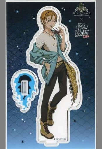

I've also posted about this merch before, but this is my favorite merch outfit they've ever made for the guys. Hiro with his hair up 😅 I think it looks so good. The different style for Kouji's hair is really great too. You never really see anime guys with different hairstyles, but I really like the ones from this collab. But their entire outfits here. Hiro and Kouji are wearing matching leopard print belts, insane. What a fashion take, why does it work. Hiro is in a crop top here btw!!!!!!!!!! Like it's hard to tell because of the jacket but crop top Hiro!!!!!!!!!!!!!!!!!!!!!!!!!! Yeah I actually love everything about these outfits so much. I want a street Over the Rainbow song that we never got but deserved. Kazuki center Over the Rainbow.
Sorry I'm just picking random Hiro things I want to talk about lol
Something I was thinking about the other night was how Kouji and Kazuki both have pretty consistent symboling, at least in King of Prism anyway. I would argue Kouji doesn’t have a symbol in Rainbow Live. But in King of Prism Kouji is associated with honey, honestly not in the show but in the fandom, right. Because of that famous post where the person was like “Honey came out of his ass!” I still think that phrase is really funny. And Kazuki is really simple, he says burning, his thing is fire. But with Hiro I think we see the symbols associated with him evolve over time. It started with the yellow Rose and the use of yellow with him, we don’t necessarily see the yellow fade away, like I’m assuming the in-universe fandom still gives him yellow roses quite often. That’s just one of his idol things, like idols have callouts and a Hiro thing is that his fans give him yellow roses. But when Over the Rainbow starts he gets this heavy association with apples. It has to be an Adam & Eve, I’m pretty sure it’s an Adam and Eve thing, but I haven’t really figured it out. He’s Eve and Kouji is Adam? That’s what it is right? But what? I don’t know, it’s a stretch, maybe it isn’t an Adam and Eve thing, but my symbolism brain has a really hard time seeing someone take a bite out of Apple and not thinking it’s in Adam and Eve thing. But then there’s the third symbol and in my opinion the best one, or if anything this is the symbol of post-character arc hero. Like SSS era Hiro is heavily associated with crowns. Because he’s the King. Like specifically this style of crown:

And I never complained about it, but my personal gripe is that I think the traditional pointed crown is a lot less ugly LOL. But that’s irrelevant, regardless I think associating Hiro with crowns points to his character arc. That he overcame all of his struggles in Pride the Hero and came out a stronger person. I also just think this was his transition into an adult. I mean they probably officially said his age in Pride the Hero at some point, I’m pretty sure it’s 17, but he turned 18 in October of that year. And in my eyes him becoming the Prism King is him becoming an adult. It’s him casting aside the immaturity of childhood, and like committing to the things he loves. Committing to his job, his friends, his idol group. He is not a highschooler who can be manipulated anymore, he’s not a kid from a broken home. He’s an adult who won his life back. He’s overcome tragedy and this is his crown. Well not the one in the photo above, that’s from Prism Rush when they did like a fantasy thing, let me find a picture of his actual crown. I’m literally staring at it irl because he’s wearing it in a piece of merch that I have in my room.

I NEVER NOTICED IT HAS A HEART ON IT????? OH MY GOD WHY IS EVERYTHING ASSOCIATED WITH HIM SO ADORABLE
Anyway he deserves the crown. His arc to Prism Cup winner is stronger than Aira's imo (because Rhythm had the stronger arc in PR:AD heyyyyyyyyyyyyyyy) It was clearly set up for him to win from the beginning but you can tell he's really the director's baby boy character. No other character could come close to winning.
In 4 years when he's 21 there is a 1000000000000% chance he wins again. I think Kazuki will be worn down by then (it's not that he's gotten worse it's that he spends a lot of his time working with kids and would put that before training). Kouji doesn't have the dancing or jumping skills. I think he knows that though he'd still try and try harder than anyone but Hiro. Yuki could maybe do it, but I genuinely think he's the only Septentrion boy who has a shot currently, the rest of them aren't focused enough on Prism shows and specifically that skill. And like ofc Shin could be cheezy prism power winner but idk he seems kinda like Kazuki in that his focus is spreading the love of prism or . whatever instead of actually grinding out skills in being a performer. I think even good guy Alec is still too destructive/wild to win though he could second place.
Apparently the Joji/Ace duo is actually super skilled? like based on their score in SSS. But that's TWO PEOPLE idk gang I love them but I want Ace before he turns 20 to realize that maybe he should sing for himself (I do love their duo though I just want it to be healthier for them both). Can Louis still jump? Does he still do prism shows after SSS? Something tells me no, but I mean who knows.
Anyway Hiro would win :) I want 21 year old Hiro to kick 16 year old Yuu's ass. I want Kouji to give 120% and still get his ass kicked and have a character arc where he has to realize like, he can't win but Hiro couldn't win without him, he's literally singing his song.
I am not kidding when I say I think about the next Prism King Cup like daily. I think the ages of the Septentrion boys works really well for a story there. It's not that I have it fully planned out, it's that I think through every kind of situation that could happen. It's so good.

They look so dumb. These 3 18 year olds are the most famous idols in Japan (I think Kazuki is 19, who cares.)
If they're 21 for the next Prism King cup, and (I'm rereading this like an hour later and I forgot you can drink in japan at 20 oh well,) after everything happens and they're just relaxing together again the night of the performance, Hiro and Kouji get fucking SMASHED. They just have that vibe. Kazuki either parties with them or is straight edge, I flip flop on that characterization for him. I also think all the girls are with them at that party, and it's like "mweh ur only 20 u can't drink," but Wakana is the type of 20 year old to NOT care and drink anyway, and Kouji is 100% slipping Ito drinks when only the two of them are looking. The other girls don't seem like drinkers. Bell is probably a wine mom later in life. A wine lesbian if you will.
The last thing I wanna rant about is that one group photo where Kazuki is getting his feet smashed, where is it.

Imagine if I had this saved instead of just googling it and scrolling every time.
Look at Hiro's stupid little hat. Look at his wink! No wait look at his hat, that's amazing why did he wear that?
Kouji ur looking the wrong way your boyfriend is on your right. Unless you're actually looking at Kazuki being tortured, then carry on.
This is probably the best Kazuki vs Kouji height photo, because with the whole group Kazuki looks SO SMALL. The girls are all in heels but I mean that gives them like once inch. He's so short. I love it.
Like you could be saying "Kouji is looking at his girlfriend and she's holding his arm hmmm," And I'm over here saying "Kouji is wearing MATCHING ROSE PINS WITH HIS BOYFRIEND," any questions?
I just realized these are different suits then the suits they wear in that one OTR business intro in SSS. I know cuz I have a standee of those suits lol. I guess they're famous they probably need more then one suit. Hiro and Kouji's are worse here, but Kazuki's is better for the bowtie.

Actually I lied, Hiro and Kouji have better colored suits and waistcoats above, but I really like their gay matching roses idk.
I don't have a conclusion for this post, it's just a bunch of random observations I have on my mind constantly about Hiro. In conclusion, Hiro Hayami is gay. or bi idk. I feel like he thought he liked Bell but comphet. So he calls himself bi, but let's be honest he's only dating Kouji. Or Kazuki i'm down for the street kings ship. Kazuki and Two H. Or he's dating both of them, I'm a very pro poly person.
God I could talk about Two H or Poly OTR for a long time, but I wont today I will stop typing. Sorry about my hyperfixation!!!!!!
#ramblings#king of prism#hayami hiro#oh god why did I write so much#I will put this in queue so it doesn't look like I wrote it write after writing the last one
3 notes
·
View notes
Text
unhinged rainbow magic post 7 of 12
We started having yet more opinions by the time we reached these bitches let me tell you but it’s gonna get worse from here!
PETAL FAIRIES (not flower fairies cos I guess that was already copyrighted by that woman with the delightful drawings Cecily Hodgeson? Idk)
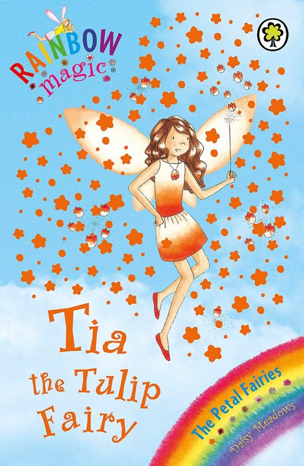
Tia YES I Actually Love This Looks like a tulip! The vibes are on point Colour scheme is delightful Caramel hair is finally working So simple but works so well Timeless but still got them 2000s vibes hell yeeeaaaahhhh
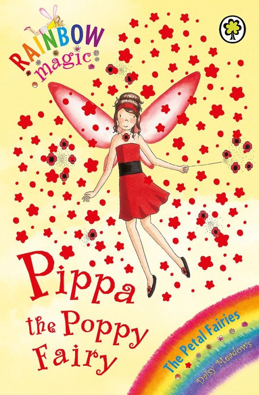
Pippa You can either do the hairdo OR the headband NOT THE COMBINATION You need a scrunchie, not a headband Once again the poppy vibes are splendid Are they all gonna have the same boring-ass ballet flat shoes? That being said I do like the flowers on the shoes Necklace is TOO BIG and looks like a WOUND, get the war images out of here jesus Dress is cute tho plus the massive waistband actually works here!
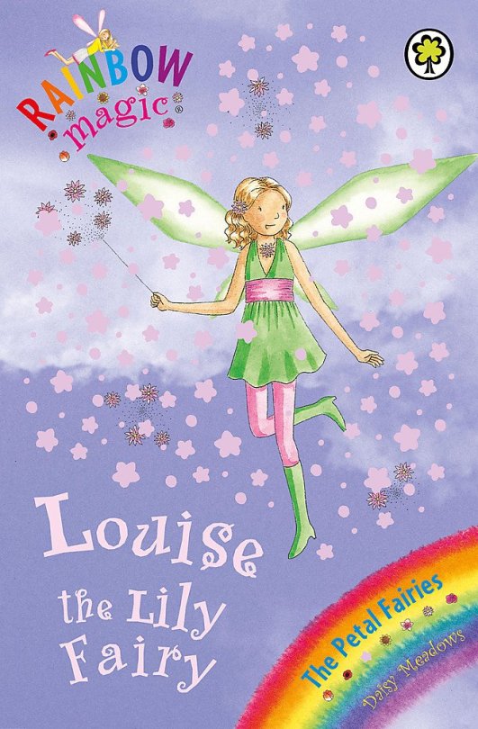
Louise The combination of colours? Green and pink? Are you a fimble bitch? White and green would have really worked so why the pink bro??? The necklace looks like its eating her. It’s a lot. Halter neckline + massive waistband that somehow makes it an empire waistline + leggings under a dress Knee high boots! So from the waist down she’s pulling it off Leggings + boots = spies vibes which is a compliment well done Louise DIFFERENCE OF OPINION - hair my friend: not the worst but I hate the flower and overall it’s not helping the look me: colour works, I like the flower especially if you get rid of the necklace, hairdo is so 2000s and she’s rocking it

Charlotte Still kinda gay hmm Why is the sunflower fairy so blue? Is it meant to be the sky? This is the One Time they’ve fucked up dark hair (so far anyways lol) The outfit is a vibe but it’s so meh (ig could be worse tho) Colour combination isn’t horrific it’s just… interesting I can’t tell whether the blue trousers, brown belt, and yellow flats works or not Very 2000s - low waist, flares, big flower belt, crop top Necklace is too big AGAIN! The petals are unproportional bro! You’ve got some baby sunflowers that haven’t been loved adequately going on here! There is too much brown and not enough yellow! But like overall why is there more brown and blue than yellow? Have they ever seen a fuckin sunflower??????????

Olivia I LOVE THE HAIR it’s a yes from us luv This is how you don’t fuck up a headband! This is how u use a scrunchie! Most detailed belt we’ve ever seen Really like the colour scheme - delightful surprising lil bit of yellow Pink vest? We’d lilac instead but keep the shoes pink The very existence of this vest looks like she got dresscoded bruh Shoes are adorable! This is necklace that could work IF IT WAS SMALLER currently it looks like a starfish is attached to her neck lmaoooooo
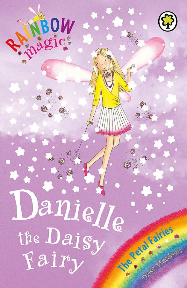
Danielle Primary school teacher vibes (wraparound shawl, long bead necklace, the pose) - she definitely lives vicariously through the four year olds she teaches Double necklace????? Is it Necessary????? (it’s a pasta necklace painted pink) Ballet flats are back! The skirt/dress is delightful but the cardigan is Not, a lil yellow belt would be better holy fuck Why is the hair teaching me maths? I like the length and style of her hair but the colour is off because the cardigan is too goddamn yellow

Ella LOOK AT ALL THAT PINK I’d honestly prefer a darker pink or even burgundy though, my childhood internalised misogyny is rearing its ugly head here Ballet shoes for bad bitches! This is the SECOND petal fairy to be unintentionally empire-waistlined by her massive belt Can the petal fairies please stop wearing entire flowers as necklaces please? How about a singular petal each? You don’t need an entire fuckin flower! Skirt looks twirlable tho yayy Really like the waviness of the hair yeeeee and the colour is cute
15 notes
·
View notes
Note
Have a little SasuSaku headcanon!
While Sasuke doesn’t care that much about the length of hair, he will sometimes comb his fingers through Sakura's hair. Because while her hair is short now, she still takes excellent care of it (mostly through leftover habits from when she had long hair) so it’s silky smooth and Sasuke just likes touching it
It's like his fourth favourite thing to touch on her :P
Aaaaa, I love this! That would make her melt every time. She would just love to feel his fingers running through her hair. Sakura loves having her hair toyed with, it's another reason why she keeps it so nice. So its soft and silky to the touch. He could easily relax her and make her fall asleep just running his fingers through her hair over and over. Great way to de-stress her too, or calm her from being mad.
She probably regularly lets her hair grow out long. Gets tired of taking care of it/how it looks. Then cuts it off and starts over. Though if Sasuke commented that a particular style looked good on her, she might keep it that way for a while. But still eventually get bored with it.
She never goes to any hair dressers either. She just lops it off herself and then trims it up to how she likes it. Sakura has gotten real good at styling her own hair over the years that going to someone else to do it would feel wrong.
She probably styles her own kids' hair too. Just lets them decide what they want when they're old enough to figure out what they like or dislike. Even if they want some ugly ass hair style she hates, she'll give them it because it'll make them happy. And then take pictures of the bad hair style to embarrass them later when they're older.
I'm assuming his three other places is titties, butt, and lady bits? LOL.
3 notes
·
View notes
Text
MARIO BOXARTS RANKED BECAUSE ODYSSEY'S CAME UP IN A CONVERSATION WITH A FRIEND
also i'm just snipping tooling these from my backloggd mario list lol
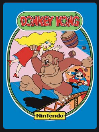
this is whatever! it's got donkey kong feet and the colours are fairly easy to look at and hey it does tell you what the game's about but also like eh, never been into this old ass artstyle, pauline has more focus than the playable character

good start to the real series! this trend in NES boxart where they'd show actual sprite art from the game so as to let you know what you're getting into is pretty cool and by now this pose is so recognisable that we just know straight away "yo this dude's JUMPIN like some kinda PLATFORMER", also they're not using Mario's usual design but instead fire mario which i kinda like because it's very contrasty and shit, good time all around

what is this, what am i getting into, this could be fucking anything. mario's holding 2 fingers up because it's mario 2 but like what else am I supposed to get out of this. not a huge fan

"Super Mario 2 Bros.: Mario Madness" ass graphic design what the hell, also Mario's front leg looks like it's coming out of his cock, never really lovedt his art, he has a turnip because you can pick up turnips and things in general which yeah that's showing off a central mechanic in the boxart which is good but otherwise ehhhhhhhhhhh

super mario 3 bros ass graphic design, but this one's a lot more iconic and generally beloved, doesn't do much for me though other than show a new powerup off and one that sure does look like Mario's flying, woah this is bigger and better. Nice contrast in the background, generally nice art, but shrug

Mario is completely flying here with a cool new cape and yo who the fuck is this absolute mount taking centre stage on the box? That's bold and different! Also from here onwards we've pretty much found the Mario logo design specifically, these colours and that font are still appearing today. Do think the background could stand to have slightly more going on though

Mario is flying again, even more obviously, but now that we've made the leap to 3D we've got an actual 3D render instead of just 2D key art - even the logo and backgrounds and shit are 3D. This is Mario's big jump! Note that the earth is round as if to imply that this is Mario's largest and most open adventure yet. That goomba kinda fuck ugly though. General visuals are of the time but this one is still really good and entirely accomplishes what it set out to do
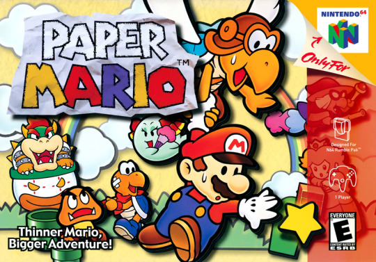
red strip obscuring some of the art bothers me but this is pretty peak boxart, more than anything else it's just nice art that embodies the new visual style for this game alongside including tons of the game's unique and charming character designs - maybe doesn't quite get plot or even genre across but it sure as hell looks good so
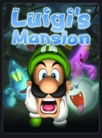
not a fan. it's Luigi which is a plus and he's clearly afraid and there are ghosts there and the logo's good but just none of these renders are all too good and Luigi's disembodied head and arms are kind of uncanny
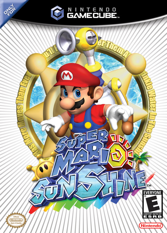
what even were they fuckin trying dude. Okay it's a fine Mario render and he's got a new tool to help him out, sure - thje logo is also solid even if it reads more as Super Mari Sunshine instead of Super Mario Sunshine - but it's the everything else. Hardly feels tropical other than the title, Delfino Isle is NOWHERE to be seen, and what in the actual fuck is that word art text circling around that you can't even fucking read. Epic failure.

PEAK ALERT PEAK ALERT good god this art is amazing, goated as all hell art style with some of the best designs Mario and Luigi have ever had and a clearly colourful world with dangerous new foes in the background, sure! Just sick as hell
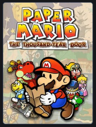
closer to the game's actual art style than 64 was but otherwise kind of a step down to me - Mario is so in front of everyone else that their designs don't really shine as much as they could.

I fear we have yet another complete fucking flop on our hands. These renders are surprisingly poor for the time and then the boxart itself accomplishes about 10 times less than the original game did. We're communicated that there's more playable characters now and we've lost everything else and even gained weird shitty motion blur on a static image to boot.

colours aren't quite as easy on my eyes as those of Superstar saga but banger art and character designs still shine through, and hey all the babies are clearly here too that's cool, perhaps a bit busy tho
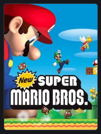
now see I quite enjoy the art and think these renders are good enough by now to rep on a box art - said box art also shows off the mega mushroom super duper well in addition to a clear return to the 2D gameplay that's been gone or so long, but I also find this boxart weirdly deceptive lol? Namely in that Mario and Luigi can't exist simultaneously in the game except in multiplayer, but the multiplayer isn't enough of a focus for me to think "rep it on the boxart", so idk

Paper Mario goes 3D which is communicated well here, and all our playable roster are here with nice artwork for everyone - even the support fairy things I forget the name of are flying around without being too distracting - looks nice really. Though I kinda think Count Bleck doesn't need to be there? Or if he is that he's moved around somewhat? Like he's weirdly distracting being positioned like that

ladies and gentlemugs it is with great honour that I present to you actual kino - gorgeous as hell logo, super great render, and the core premise off the game laid out so beautifully that all you need to do is take even a glance at this box, and you know exactly what you're getting into. Space is pretty as hell, this boxart is pretty as hell, this game is pretty as hell, you just know from looking at this that you're in for an incredible time.

okay now the Mario and Luigi series would adopt this general design sense going forward and I'm pretty eh on it, I like the new logo and the tiny Mario Bros walking on top of it, and hey all the art is still good, but like I don't think all this negative space really achieves anything and I think more could've been done

now we go for a box I quite like, the red along the bottom is nice and appealing and then the main artwork showcases that we've got actual emphasised 4 player multiplayer now plus Yoshi plus at least one cool new powerup, ain't that sweet? Also some of the NSMB boxarts get a lil busy but I think this one is in the perfect zone of not too busy right now.

once again I come bearing kino, in what's effectively just the Mario Galaxy boxart but with a different set of nice artwork and also with Yoshi, plus his powerups shown of throughout the background, very cool. I prefer the comparatively more simple Galaxy 1 boxart and I've never loved how 2 favoured light blue skies, but still really nice
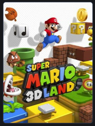
now this one is. nice. certainly shows off the titular 3D - and triples up on the return of the tanuki suit with both super leaf in the background and land having a tail and the goomba having a tail also. But eh idk there's not much of an identity here lol. it's just lots of "things that are in Mario"

here's one that's also a "things that are in Mario" featuring a bonus misleading "are Mario and Luigi here because multiplayer?" visual, but the yellow patterned background stands out and the coin emphasis is there which is this game's main unique selling point, so yk it's decent

I don't love this art style as much for Paper Mario but it's colourful, it has lots of stickers which is the name of the game, lots of random hosuehold objects in wacky Paper Mario style, like yeah no this is pretty solid
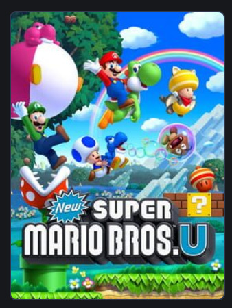
okay now see this is where the nsmb covers just start throwing too much shit at you at once - there are 3 different types of yoshi all doing different things here and a piranha plant attacking luigi and a goomba that's bubbled up and yellow toad has the new powerup but the new powerup is also rolling out of a question mark block and it's like dude slow the fuck down man!

now this one is obviously less iconic than the original Luigi's Mansion boxart but I do think placing more emphasis on the mansion and giving Luigi an actual body is a step up, though having a standard Mario boo there instead of the cool original ghosts is a lil sad
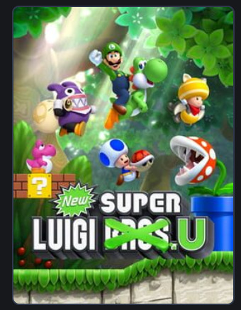
god the more the series itself goes through fatigued the more I feel fatigue writing about it, but hey this is the final NSMB one so. It's whatever. Still a bit cluttered but mixed up the backgrounds at least. Eh. Logo design neat I suppose
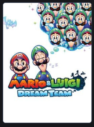
so continues aforementioned whatever trend and I still don't really like it - but suppose this one uses the space better than Bowser's Inside Story does. Once again new styled logo thing still cool
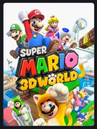
shows off 3D and multiplayer fun and the new powerup in a nice way and there's more original iconography to the game so it's a step up from 3D Land, but also there being 2 of everyone still feels so weird lol

peak as all hell, love the Mario design and the simple render gets across all that it needs to - construction ass yellow and the simple font gives it a homebuilt feel and it's very obvious what the game's actually about. Somehow they managed to communicate that without being super busy as well.

I think this one technically uses more of the space than the other white background boxarts and it's neat that Paper Jam is in the Paper Mario font, but for a crossover like this I really think there needed to be more done lol, this just looks so dull and plain and shit

this is a solid enough paper mario boxart, gets the main gimmick across pretty quickly without like overwhelming you on anything, doesn't evoke much else but it's fine

now here is some absolute fucking PEAK dude, so immediately gets across exactly the theme the game is going for with an epic globetrotting adventure, photograph aesthetic just gives this a travel log vibe and all the different world designs and costumes and core mechanics are conveyed super well, it also managed all that while being really easy to read and shit, just an absolute W all around

kind of feels like a linear downgrade from Maker 1 tbh - like the art is more expressive and Luigi is here which is a plus - the game actually supports multiplayer too so you're not being misled. But I think Maker 1 was just a little more elegant and immediate in getting across what the game is actually about.
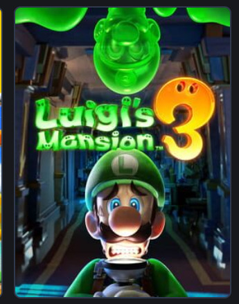
would call this my favourite of the Luigi's Mansion boxarts despite not even having ghosts - cause hey it has a pretty neat mansion and Luigi is doing a good expression and he has a body still and also Gooigi is in there, I'm about it, just looks good

pretty fuckin weak ngl! It's kinda just "here's paper mario characters lol" with the origami gimmick only occupying a corner of the screen that your eyes just aren't drawn to. Just doesn't hit
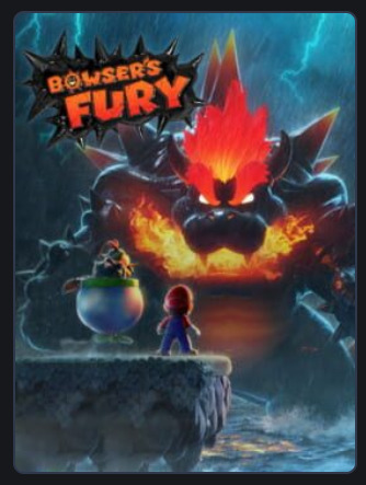
last off! this. it looks cool! fucknig gigantic kaiju bowser. he's important enough to take centre stage in the boxart and the game reflects that. he's so out of control that even his own son is teaming up with you to stop him. I'm about it.
anyway done thanks for reading
1 note
·
View note