#noodlets
Explore tagged Tumblr posts
Note
Who sent this ,,, wasn't me.... 😳 ??
Hi my love :3 I love u !!!!!
do u have a gf heh.. 😳 😳
oh my godddd i wonder who sent this?? 🤔🤔🤔 ahh i guess we'll never know 😞😞😞
But since you're so curious, dearest anon who i do not know!!! Yes i do >_<
her name is eury... heh.... its @cybnoo.... i love her very much.... teehee....

3 notes
·
View notes
Note
Noodlets keeps popping up in my head help
LMAOOO
take them out
17 notes
·
View notes
Text

Instán küldte tegnap a férjem ezt a chili beef dan dan noodlet, ajánlom
22 notes
·
View notes
Text

uu mmmm clown i draw a few months ago? his name s noodlet
12 notes
·
View notes
Text
Fuck no.
I mean.. Can't be worse than your situation..
Just have to accept the fact that Noodle is gonna be having Noodlets.
@juiceboxjiffy
|:<
8 notes
·
View notes
Photo

Hey there! We’re Noodlets Studio - a team of four snazzy Immersive Media and Game Design students looking to cook up juicy new experiences for people like you to enjoy with your friends and family.
On our Tumblr, we’ll be posting our development logs and updates on our upcoming cooking party game, Yi’s Eatery. It’ll be a chaotic couch co-op cookstravaganza across VR and mobile devices that puts you and your friends in charge of cooking, crying, and customer service! We look forward to seeing you enjoy our game!
#game dev#game development#games#gaming#vr#virtual reality#party games#singapore artist#made with unity#unity 3d#unity development#art#artists on tumblr#indie#indie devs#indie game dev#digital art#cooking#noodlets
44 notes
·
View notes
Text
An Amateur’s 3D Creation Tutorial
Intro
Hi, it’s Kai Yuan, your resident 3D generalist of Noodlets Studio. I’m currently writing this while having a minor cold so I’m sniffling every 5 seconds while bopping to the range of Lady Gaga to Lorde to Conan Gray, stay healthy everyone! In order to make up for my apparent lack of dev logs, I’m going to show you how I create a little stove for Yi’s Eatery. All points made here are going to be super condensed for the sake of not running this article too long.
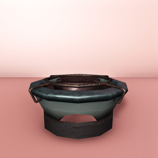
As with all of our tutorials, we are just amateurs having fun making games and sharing our experience as amateurs with you! :D
The Process
Step 1: Preparation
Always start with a plan in mind! I say that although I always start creating 3D assets with only 2 active brain cells half the time. Either way, you should still have a plan. This means first of all, gathering references of whatever object you want to create (even if you have a concept art to work off from) and beginning to understand your object’s form. With the stove I created, I used this particular reference image.

You can already see the similarities but these similarities help to sell the object as real. The closer the form of the object is to an actual reference in real life, the more believable it is even if rendered in a non-realistic way.
Once you have enough references and you start to slowly grasp the object you want to create, you should start pinpointing the basic shapes and forms of the object. In the example of the stove, it’s easy to notice that it has a cylindrical shape. Some objects have different components (EG: A car engine) and each component may have a different shape. It’s all about analysing your object and deepening your understanding of the object you want to create.
This preparation process doesn’t take too long for most objects, since a google search and basic shape knowledge is all you need. But taking the effort to prepare will save you a lot of blank staring at your 3D software.
Step 2: Modelling
Here’s where the nitty gritty starts to happen. I will preface this by saying that I frankly can’t show you the full process because you’d be reading this till the next day. We have a Youtube video on our Noodlets Studio channel where I modelled the stove on a livestream if you’re interested. In this article, I will just mainly share the important concepts for 3D modelling using the example of the stove.
The creation of all 3D objects follows the simple process of starting with big shapes and then slowly “zooming in” and editing the 3D object with increasing detail.

The above picture illustrates this concept of going from big forms to small details. This is where the knowledge from your preparation comes in. It really helps during the start when you have to block in your big forms. In the example of the stove, I start from a single cylinder and slowly build out the shape as shown in the picture above.
A few functions I like to use (in Maya) when adding in details are the “Bevel” function and the “Insert Edge Loop/Multi-cut” function.
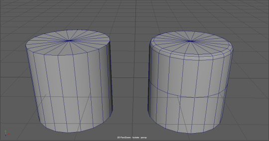
These functions simply revolve around adding more edges/points to manipulate, which is the basis of how you add more details in your 3D object. More points = more details.
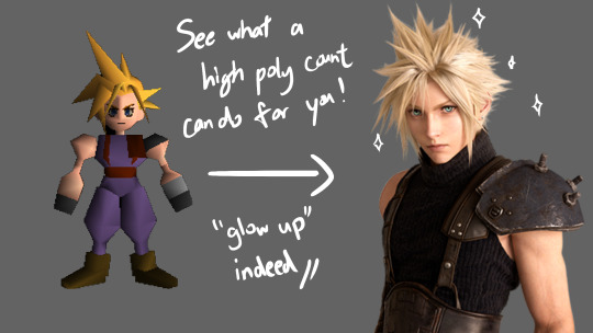
When you are adding details to your objects, you have to be mindful you are not adding too much details. Not every corner needs to be beveled and you certainly do not need to unnecessarily cut edges if you are not going to move/extrude them. More points = more details BUT also = more computational power used to render 3D objects. The art style of your game also determines how you model your 3D objects, some require low polygon counts to achieve a cartoon look, some require higher polygon counts to achieve a realistic look. Although, most of us generally prefer the former because it’s easier to do.
Step 3: Texturing
The next step after modelling your object is to UV unwrap it. UV unwrapping is the process of creating a UV map where a 2D image can be projected onto the 3D object’s surface.

In the example above, all the faces of the cube were laid out on a 2D plane, which then a texture can be projected onto the UV map and have it reflected on the 3D cube. This is merely the simplest example of a UV map, most UV maps are more complex and require a strong understanding of shapes. For example, this is the UV map for our stove that we created.

Most 3D software allow you to do UV unwrapping of your 3D models, although, you might want to look up a few dedicated tutorials first before jumping into it. This part of 3D modelling is easily one of the most frustrating and difficult parts to understand as there is 0 creativity involved, just pure brain power. :(
Once your 3D model is fully unwrapped, now you want to actually texture it. The simplest way of doing this is to export your UV map into Photoshop or any painting software of your choice and simply paint on it. However, there are a few caveats to take note of. You cannot physically see how your painting affects your 3D model without exporting the texture out into your 3D software. Thus, editing your texture map will be a long arduous process of importing and re-exporting.
In order to circumvent this, we can use dedicated 3D texturing software like Substance Painter which lets you see how your texture is reflected on the model itself. It has the further advantage of allowing you to further enhance your texture with some neat tricks. With a normal map, it will create the illusion of details on a flat surface.
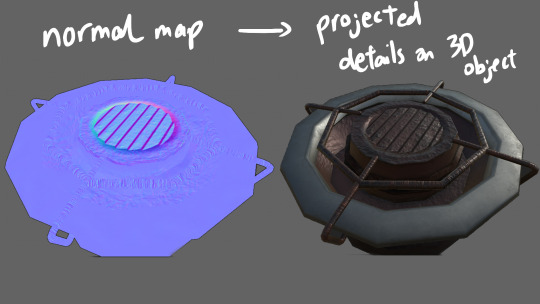
These maps can actually be hand painted in Photoshop, but everything is packaged together in a 3D texturing software like Substance Painter so it’s easier to implement all these details.
Step 4: Finalising
Once you got your textures ready, now it’s time to bring it all together! If you are creating a game, you would bring this into your game engine like I did. Or you could also keep it in your 3D software and render it, but that’s a whole other bag of worms.
For the video you saw on our socials, I just slammed a quick backdrop and gave it some lighting to bring out the details of the stove and the final result is as you have seen before.

That’s about it for my tutorial. I hope I have given you an insight into how 3D game objects are created, even if you are just a random passerby. For actual 3D artists out there, hopefully your eyes didn’t burn too much, I’m still trying to get better and I hope to create better 3D models in the future.
Thanks for reading this! My cold has slightly healed while writing this article, remember to stay safe out there! :D
-Kai Yuan
2 notes
·
View notes
Note
It's everyday bro, with the Disney Channel flow 5 mill on YouTube in 6 months, never done before Passed all the competition man, PewDiePie is next Man I'm poppin' all these checks, got a brand new Rolex And I met a Lambo too and I'm coming with the crew This is Team 10, bitch, who the hell are flippin' you? And you know I kick them out if they ain't with the crew Yeah, I'm talking about you, you beggin' for attention Talking shit on Twitter too but you still hit my phone last night

in order:froze - @loverealmsdolphi - @spacesneakersmemoca - @recklesshauntingsheep (mod sheep) - @heartenvykcalb (mod kcalb, me) - @masqycherryblod (mod cherry) - @ticcitobyreficul - @tggwikiamacarona - @noodletewadanohara - @mryguertenakurotsuno - @kurotsun
#mod kcalb#masqy#loverealms#spacesneakers#recklesshaunting#heartenvy#ticcitoby#tggwikia#noodlete#mryguertena#kurotsun#kcalb's drawings
39 notes
·
View notes
Text
makizuno -> noodlete
12 notes
·
View notes
Text


Chibi HoS "who ate my noodleT-T"
62 notes
·
View notes
Text
Environment Concept Art Tutorial
Intro
Hey everyone, it’s Nicole, Noodlets Studio’s Visual Director! I also happen to don the hat of the team’s concept artist. That’s what this article-slash-tutorial is all about!
So, what exactly is concept art? Concept art falls under the umbrella of illustration; its main purpose is to be a visual representation of an idea (or concept…!) for usage in games, films, etcetera. There are many different types of concept art - characters, environments, props. We’ll be focusing on the latter in this tutorial!
I will not be covering any digital art software basics here; I’ll assume that anyone reading this knows their way around their drawing software.
I’d just like to preface by saying that I am, by no means, a master at this craft, and that I too am learning more about creating concept art day by day. Nevertheless, I’d like to share my process and some tips and tricks I use that I’ve picked up over my years exploring the realm of digital art. Let’s begin!
The Process
Step 1: Thumbnailing
Thumbnailing is an important step in the concept art process. It facilitates the speed of the initial idea flow, allowing artists to try out different angles and compositions before deciding on the one they wish to detail further.
The Conventional Way
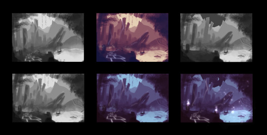
I start out in grayscale. Which means completely black-and-white, like the two thumbnails on the left!
I personally like keeping my thumbnails loose by blocking shapes in with a medium-sized textured brush and the lasso tool. At this stage, I play around with the composition, placement of items, and try out different colour palettes to see which would fit the best. Some tips:
Keep values in mind! When in the grayscale stage, the balance of lights and darks should be there, with ample contrast so that the elements do not look muddy when colour is added later on.
Check if your composition is balanced. The placement and size of objects can carry significant ‘weight’.
Separating stuff into the foreground, middleground and background helps to create depth. Use values to show the distance!

(Notice how the closer the plane is to the camera, the darker it gets?)
The Time-Saver Way (art purists, close your eyes)
*Note: These time-saving methods are just that: methods to work faster. They do NOT replace learning the fundamentals of art, though they can be helpful for studies! They should mostly be reserved for studio projects.

Usually people would sketch or block their thumbnails out, but well…when you’re really pressed for time...using your own 3D assets and shifting the camera around to try out different compositions might speed up the process. (Here, I’m using @theboynoodlet’s environment block-in assets)
There’s been an age-old debate about ‘cheating’ in art but really, when you’re on a tight deadline, digital tools have opened a vast array of options to speed up your work. Lots of concept art pieces are created by photobashing and using 3D models. As long as you don’t trace over other people’s work and claim it as 100% your own effort, there’s nothing stopping you from using tools to get your work done fast on a deadline. Remember: work smart, not hard.
Step 2: Blocking

Once you’ve selected the thumbnail you like best, it’s time to enhance it! Start blocking in the details with a smaller brush. I still do this step in grayscale, so I can keep an eye on the composition and values as I’m painting.
Step 3: Detailing and Colouring

After blocking comes the colouring! The method I use to add colour is by using adjustment layers on top of the grayscale layers. The adjustment layers I usually use are:
Colour Balance
Curves
Levels
I play around with the shadow, midtone and highlight hues until they fit the colour scheme that I’m looking for.
I then render more using normal raster layers and a round watery brush. Don’t be afraid of multiply and luminosity layers! They can help with adding shadowy and light areas.
Textures
In the event that you’re working on concept art that is more photorealistic, using textures from stock images and free brushes can help to add a whole other layer of realism to your piece! Play around with layer modes and lighting to help integrate the textures more seamlessly. My usual go-to layer modes for these are multiply, overlay and soft light.
Step 4: Final Touches
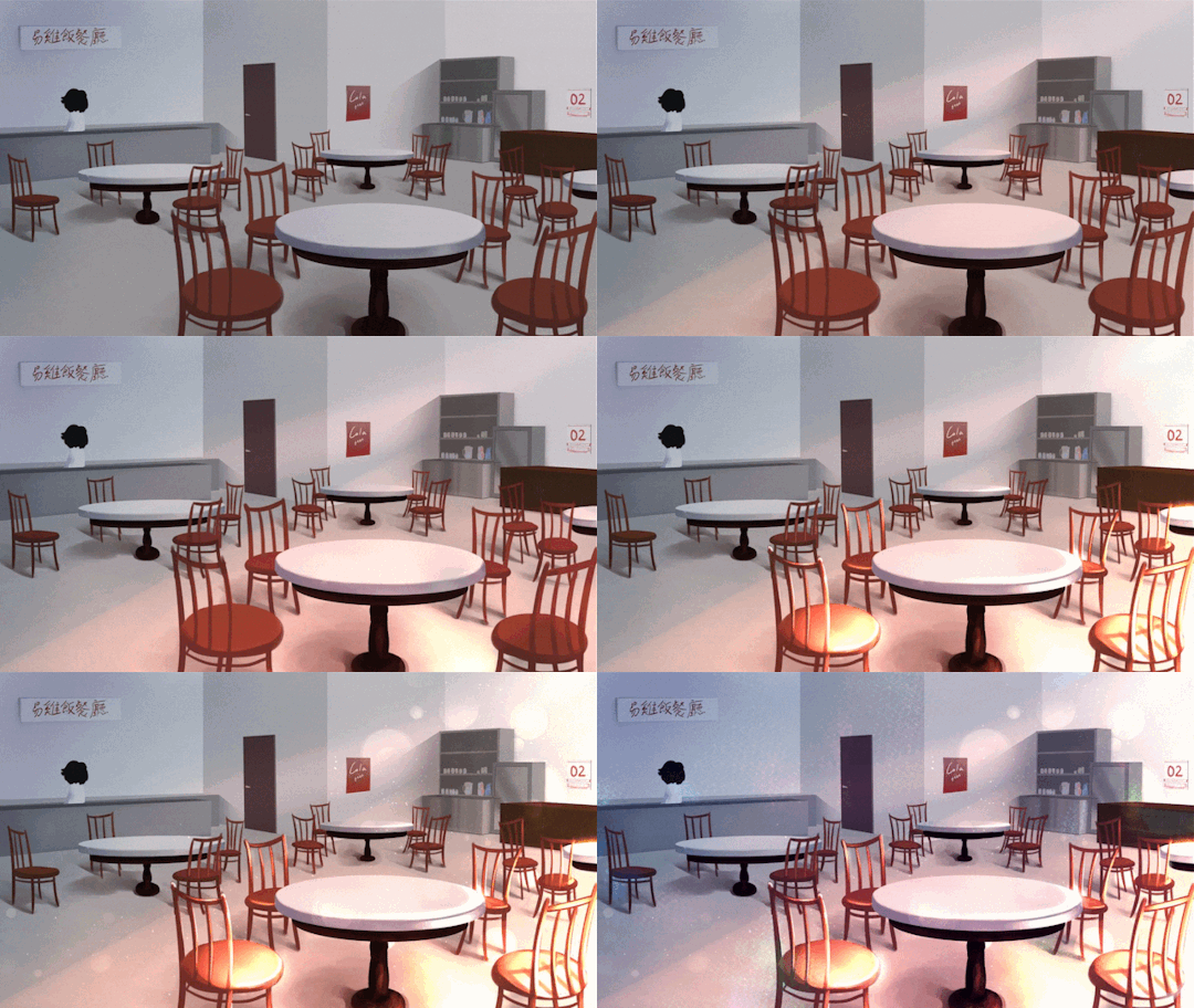
At this stage, I add lighting, particles and textures to spice up the environment art more. With the power of digital magic, adding final touches is much easier than in the traditional medium. Many free brush packs are available online for download. (I recommend Brusheezy for Photoshop brushes and Clip Studio Assets for Clip Studio Paint!)
I also use more adjustment layers to balance the colours and ensure that the picture has a decent contrast overall.

Conclusion
That’s it for this tutorial! While there are many techniques that other talented artists use for doing concept art, these are the steps that I take. I hope it’s been informative and at least a little bit helpful <3
Till next time!
9 notes
·
View notes
Text
First Post!
Hi! I’m Krystal, the visual effects + sound effects designer, and the programmer of Noodlets Studio! I’ll be using this blog to post progress reports on the development of our upcoming game, Yi’s Eatery! Occasionally, I will post some Unity tutorials, too!
A little bit about myself:
Talk to me about extended reality (XR) stuff! i.e. Anything related to virtual reality (VR), augmented reality (AR), or mixed reality (MR).
I’m a jack-of-all-trades, master of none ;(
There was a point in my life where I really loved scrambled eggs. I’d eat it everyday in between meals as a snack; Hence the blog name.
I hope you find my devlogs informative 🤩
1 note
·
View note
Photo

lil cute Lia portraying her love for her little noodlet <3
(I actually love the noodlet nickname, Cora may use it all she wishes <3)
7 notes
·
View notes
Photo


wheee let’s compile all my recent fodder rescues + dressups, featuring one Not-Fodder Re-Dressed Boy Amon (he’s the noodlet)
i’m doing things like experimenting with other color palettes and aesthetics are out there.
and i like it.
6 notes
·
View notes
Photo

Photo by noodlet
2 notes
·
View notes
Text
I'm! Love! The them!
What gorgeous little noodlets. Three cheers for Paloma and for you :)

paloma is an excellent mommy 💕
234 notes
·
View notes