#mollweide
Explore tagged Tumblr posts
Text
MOLLWEIDE vs WINKEL II

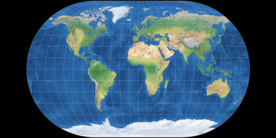
Mollweide Pseudocylindrical Equal-Area
The Mollweide projection was first invented by by Karl Brandan Mollweide in 1805, it was then reinvented by Jacque Babinet in 1857 who termed it the Homalographic projection. It is often used for statistical maps where preserving the relative sizes of regions is useful but shape preservation is unnecessary, due to its equal-area property. I have also seen it often used for star charts and other maps of space such as of the cosmic microwave background.
Winkel II Pseudocylindrical Compromise
The Winkel II projection was published alongside it's more famous cousin the Winkel Tripel by Oswald Winkel in 1921. All three of Winkel's projection had a similar construction method, they were the arithmetic mean of the Equirectangular projection and one other projection, and the Winkel II actually uses it's opponent here: the Mollweide projection. The result is a projection similar to the Winkel Tripel but with straight parallels, which gives slightly higher distortion but in places that are perhaps more familiar from other pseudocylindrical projections.
[Direct comparison as these projections have the same aspect]
[link to all polls]
Political:
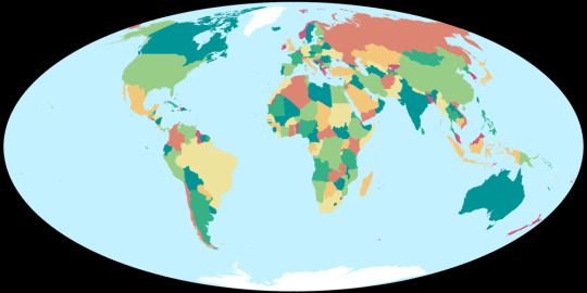
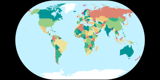
Tissot's Indicatrices:
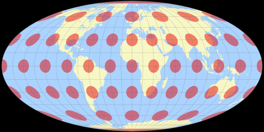
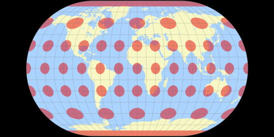
Images created by Tobias Jung (CC BY-SA 4.0) from map-projections.net
14 notes
·
View notes
Text
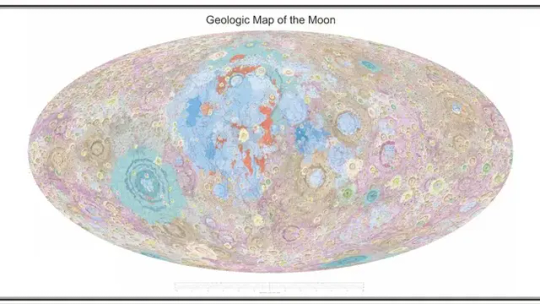
i am being EXTREMELY NORMAL about this Mollweide projection geologic map of the Moon made by Chinese scientists in 2022 that I just found out existed
0 notes
Text
favorite conformal projection: mercator (me)
favorite equal area projection: mollweide (friend)
favorite compromise projection: kavrayskiy VII (dad)
75 notes
·
View notes
Text
Highlights:
CYLINDRICAL (meridians are equally spaced vertical straight lines, parallels are horizontal straight lines)
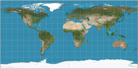
Equirectangular (ca. 120 CE): my favorite! X-Y coordinates on the map correspond exactly to latitude and longitude on Earth's surface, simple and straightforward. Parallels and meridians are all evenly spaced perpendicular lines. Doesn't preserve perfectly shapes or relative sizes, but approximates both.

Cassini (1745): the equirectangular projection, if first Earth is rotated 90° so that the central meridian becomes the Equator

Mercator (1569): gets a bad rep because it inflates areas at high latitudes (so mostly northern continents, since the southern are close to the Equator). In fact, it cannot show the Poles because they'd be infinitely far away. However, it perfectly preserves shapes and it's useful for navigation because sailing with constant bearing always traces a straight line on this map. Some variant of it is used in most web maps.
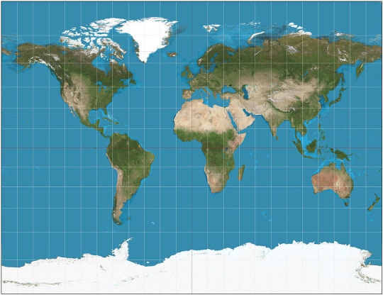
Gall (1855): variant of Mercator's that can actually show the poles. Landmass shapes are no longer perfect.
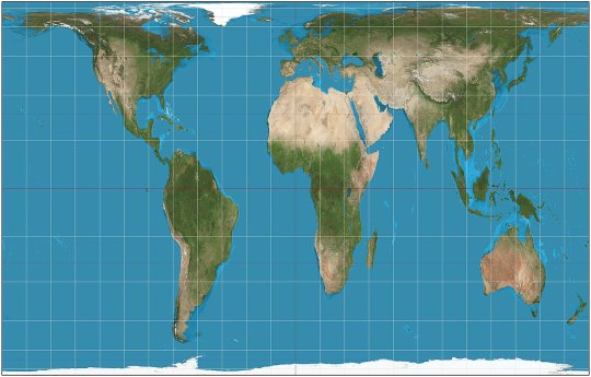
Gall-Peters (1855): kinda the reverse of Mercator: they sacrifice landmass shapes to preserve perfectly their relative areas. Landmasses near the Poles are squashed rather than stretched infinitely. Lambert (1772) has a less extreme version.
PSEUDOCYLINDRICAL (the central meridian is a vertical straight line, but other meridians may be curves, though still equally spaced on any given parallel; parallels are still horizontal straight lines)
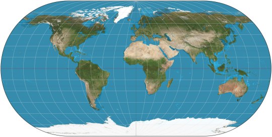
Ortelius (1540): preserves neither shapes nor areas, but compromises between both. All meridians except the central one are arcs of circles.
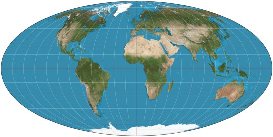
Mollweide (1855): preserves relative areas. Fits exactly in an ellipse, and all meridians except the central one are arcs of ellipses.

Collignon (1865): triangle. Preserves relative areas, somehow.

Goode Homolosine (1923): preserve relative areas and keep landmass shapes reasonably well, at the price of cutting huge gashes through the oceans.
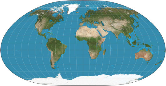
Loximuthal (1935): constant bearing lines are straight lines on the map, like in Mercator. Preserves neither shapes nor areas. Weirdly asimmetrical hemispheres.
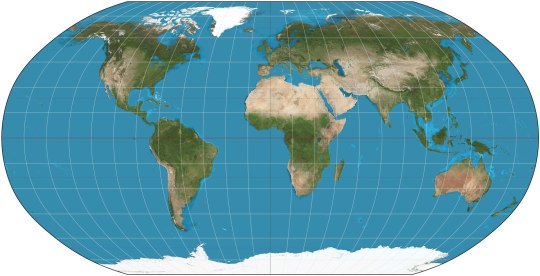
Robinson (1963): preserve neither shapes nor areas, but approximates both quite well. Kavraisky has evenly spaced parallels. The similar Equal Earth (2018) preserves relative areas.
CONIC (meridians are converging straight lines, parallels are arcs of circles)
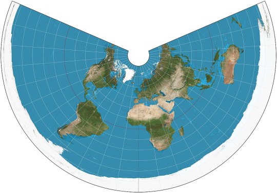
Equidistant conic (ca. 150 CE): another of the old ones. Preserves only the distances along meridians, like the equirectangular.
PSEUDOCONIC (the central meridian is a straight line, the others may be curves)
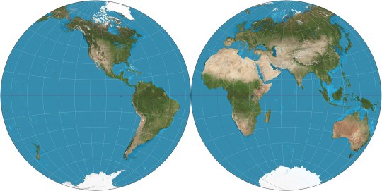
Nicolosi globular (ca. 1000): splits the map in two circles, replicating the feeling of watching the world from space from two sides.

Werner (ca. 1500): heart-shaped, preserving relative areas, with the parallels being concentric circles around the North Pole.
AZIMUTHAL (meridians are straight lines meeting at the center, parallels are concentric full circles)
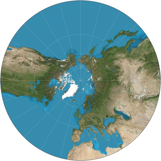
Gnomonic (ca. 580 BCE): probably the oldest map projection. Unfortunately it can only show at most part of one hemisphere, with the Equator being infinitely far away, much like the Poles in Mercator.
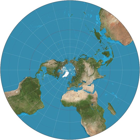
Stereographic (ca. 150 BCE): as before, but only the opposite pole is infinitely far away. The far hemisphere is still distorted, so it's still used in two parts, each centered on one pole.
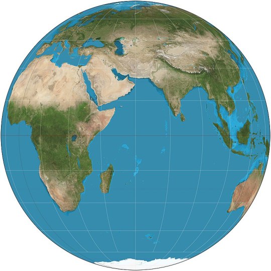
Orthographic (ca. 150 BCE): basically just what the Earth would look like if observed from infinite distance: it shows exactly one hemisphere.
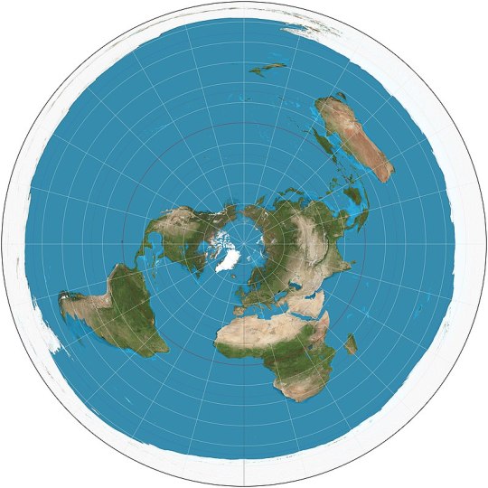
Azimuthal equidistant (ca. 1000): all parallels are full circles centered on the North Pole, and the South Pole is also a circle surrounding all. The map used on the flag of the United Nations. Most Flat Earthers think the Earth has this shape.
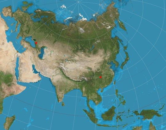
Two-point equidistant (1919): preserves distances on the straight line that passes thrrough two arbitrary points. A favorite of history atlases: it's usually used to portray Asia with as little distortion as possible despite its unfortunate proximity to both North Pole and Equator.

Hao projection or plane terrestrial globe (2002): popular in China, replicates as much as possible the curvature of a globe.
PSEUDOAZIMUTHAL (central meridian and equator are straight lines; other meridians curve toward the central meridian, other parallels curve away from the equator)

Wiechel (1879): the meridians form a pinwheel! Preserves relative areas, but which great distortion of the opposite hemisphere.
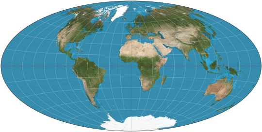
Aitoff (1889): looks like the Mollweide with diverging parallels. Mostly relevant because of:
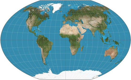
Winkel Tripel (1921): arithmetic mean between Aitoff and equirectangular; the map used by National Geographic.
OTHER
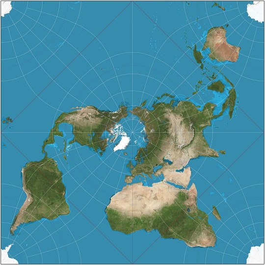
Peirce quincuncial (1879): a perfect square that can be tiled regularly in all direction. I think Flat Earthers should start claiming that Earth look like this and that there are infinite copies in every direction.
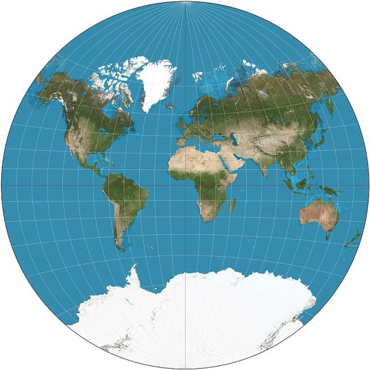
Van der Grinten (1904): built ad hoc to map the Earth onto a circle, preserving exactly neither area nor shapes.
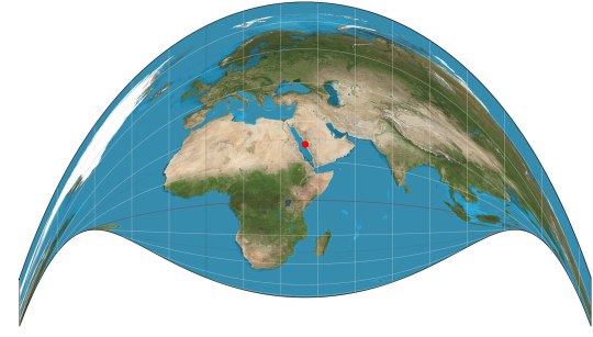
Craig's retroazimuthal or the Mecca Map (1909): looks crazy, but preserves the direction from any place on Earth to one specific point; in fact it was invented to help Muslims find easily the direction to the Mecca.
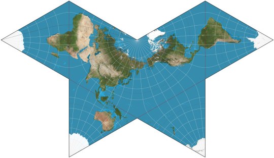
Cahill's Butterfly (1909): adorable, and can be folded into a perfect octahedron.

Dymaxion (1943): approximates shapes and areas, and preserves close connections between continents, at the price of a really weird shape.
61 notes
·
View notes
Text
FARANDOLE DE PHÉNOMÈNES CYCLONIQUES - 24/10/2023 - 12 H 00 UTC
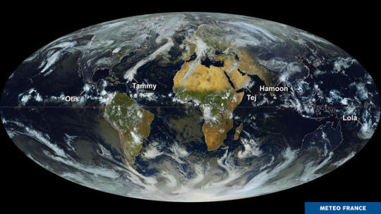
Composition d'images de plusieurs satellites, le 24/10/2023 à 12 h 00 UTC : intégrant des données de 7 satellites, ce planisphère de milieu de journée est présenté ici en projection Mollweide, dont la caractéristique principale est de conserver les surfaces en toutes latitudes.
On y découvre plusieurs phénomènes cycloniques éparpillés dans les océans Pacifique, Indien et Atlantique. Mais seul le cyclone Lola est localisé dans l'hémisphère Sud, sous l'équateur terrestre.
Il concerne actuellement l'archipel du Vanuatu et a atteint une intensité exceptionnelle pour la saison.
0 notes
Link
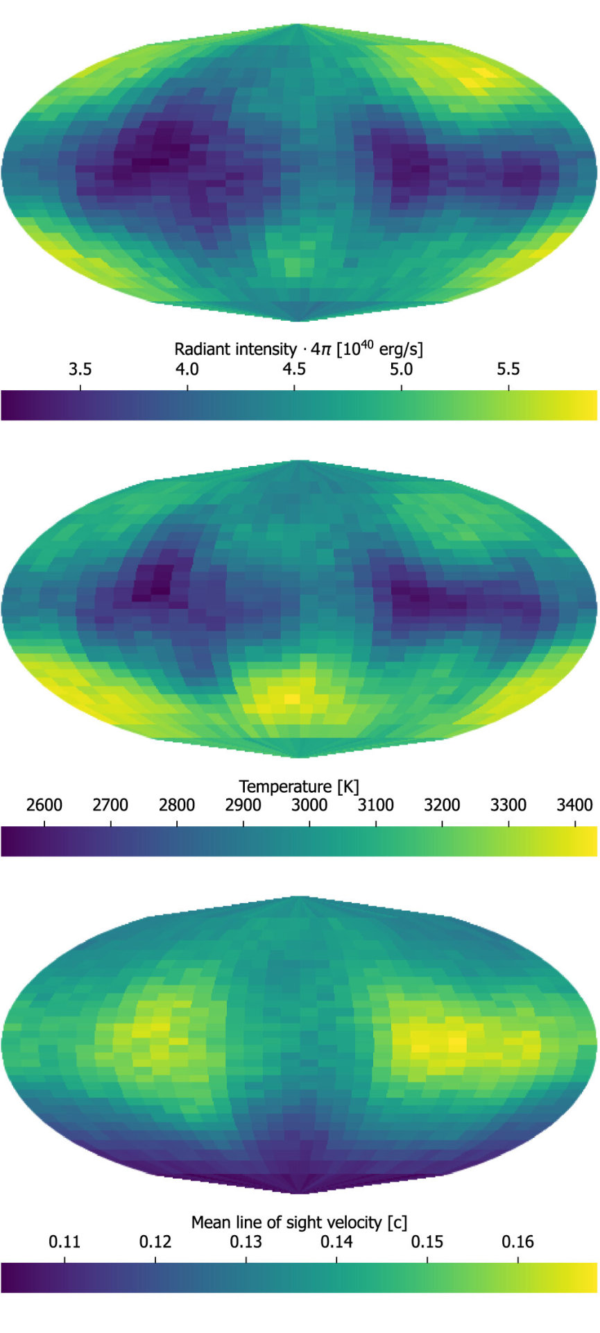
In 2017, astronomers detected gravitational waves from colliding neutron stars for the first time: a kilonova. Enormous amounts of heavy metals were detected in the light from the explosion, and astronomers continued to watch the expanding debris cloud. Researchers have continued to study this event. Now, using a three-dimensional computer simulation, they have created a new recreation of this merger — second by second, as it happened — giving insights into all the high-energy mayhem and heavy elements formation in this catastrophic event. This artist’s impression shows two tiny but very dense neutron stars at the point at which they merge and explode as a kilonova. Such a very rare event is expected to produce both gravitational waves and a short gamma-ray burst, both of which were observed on 17 August 2017. Subsequent detailed observations with many telescopes confirmed that this object, seen in the galaxy NGC 4993 about 130 million light-years from the Earth, is indeed a kilonova. Such objects are the main source of very heavy chemical elements, such as gold and platinum, in the Universe. “The unprecedented agreement between our simulations and the observation of kilonova AT2017gfo [also known as GW170817] indicates that we understand broadly what has taken place in the explosion and aftermath,” said Luke J. Shingles, scientist at GSI Helmholtz Centre for Heavy Ion Research and the Facility for Antiproton and Ion Research (GSI/FAIR) in Germany. Shingles is the lead author of a new paper in published in Astrophysical Journal Letters. Neutron stars are the crushed, leftover cores of massive stars that long ago exploded as supernovas. The merging stars likely had masses between 10 and 60 percent greater than that of our Sun, but they were no wider than an average-sized city. The pair whirled around each other hundreds of times a second. As they drew closer and orbited faster, the stars eventually broke apart and merged, producing both a gamma-ray burst and a rarely seen explosion called a kilonova. This event was observed on August 17, 2017 by the LIGO–Virgo gravitational wave facilities. Several telescopes watched the aftermath of this event including the space telescopes Swift, Hubble, Chandra and Spitzer missions, along with dozens of ground-based observatories. The Pan-STARRS survey was able to capture the fading glow of the blast’s expanding debris. At a press briefing shortly after the detection of this event — observed both in graviational waves and light — researcher Edo Berger, from the Harvard Smithsonian Center for Astrophysics said, “These observations reveal the direct fingerprints of the heaviest elements in the periodic table. “The collision of the two neutron stars produced 10 times of mass of Earth in gold and platinum alone. Think about how as these materials are flying out of this event, they eventually combine with other elements to form stars, planets, life … and jewelry.” The data from all the observatories now have allowed the researchers to produce, for the first time, a three-dimensional simulation that recreates the neutron-star merger and the subsequent radiative transfer with tens of millions of atomic transitions of heavy elements. A three-D morphology of a kilonova. Mollweide projections of direction-dependent quantities for 3D AD2 UVOIR packets arriving at the observer between 1.3 and 1.7 days: radiant intensity times 4? solid angle (top), mean temperature at last interaction (middle), and line-of-sight velocity at last interaction (bottom). For these figures, we use 32 × 32 direction bins, uniformly spaced in azimuthal angle (horizontal) and cosine of the polar angle (vertical) to give the same solid angle in each bin. Credit: Luke Shingles et al, 2023. The researchers said that with a 3D model, the observed light can be predicted for any viewing direction. For example, when viewed nearly perpendicular to the orbital plane of the two neutron stars (as observational evidence indicates for the kilonova AT2017gfo) the model predicts a sequence of spectral distributions that look remarkably like the observations for AT2017gfo. “Research in this area will help us to understand the origins of elements heavier than iron (such as platinum and gold) that were mainly produced by the rapid neutron capture process in neutron star mergers,” said Shingles in a GSI/FAIR press release. In their paper, the team said about half of the elements heavier than iron are produced during an event like a kilonova, within the environment of extreme temperatures and neutron densities. The explosion ejects matter with just the right conditions to “produce unstable neutron-rich heavy nuclei by a sequence of neutron captures and beta-decays. These nuclei decay to stability, liberating energy that powers an explosive ‘kilonova’ transient, a bright emission of light that rapidly fades in about a week.” The researchers said their 3D simulation combines several areas of physics, including the behavior of matter at high densities, the properties of unstable heavy nuclei, and atom-light interactions of heavy elements. With further research, they hope to increase the precision with which they can predict and understand features in the spectra, which will further our understanding of the conditions in which heavy elements are synthesized. The post A Kilonova Simulated in 3D appeared first on Universe Today.
0 notes
Text
Simulazione della morfologia tridimensionale delle kilonovae
Risultato della simulazione 3D di una kilonova. Proiezioni di Mollweide di grandezze dipendenti dalla direzione per pacchetti UVOIR 3D AD2 che arrivano all’osservatore tra 1,3 e 1,7 giorni: intensità radiante moltiplicata per l’angolo solido 4phi (in alto), temperatura media all’ultima interazione (al centro) e velocità in linea di vista all’ultima interazione (in basso). Per queste figure sono…
View On WordPress
0 notes
Text
CAHILL-KEYES vs MOLLWEIDE
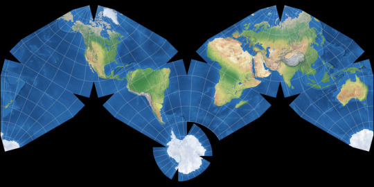
Cahill-Keyes Polyhedral Compromise Round 1: [Cahill-Keyes vs Mercator]
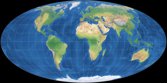
Mollweide Pseudocylindrical Equal-Area Round 1: [Mollweide vs Winkel II]
Two very different projections here!
The Cahill-Keyes projection is Gene Keyes' modification of Cahill's original projection to reduce land splitting and subtly improve distortion (However it isn't conformal like Adam's version). It has extremely low distortion of all types, and it's design gives it a layout similar to regular maps while allowing Antarctica to be represented more accurately.
While the Mollweide is one of the most widely used equal-area projections, it's almost certainly the most common projection used in scientific papers other than maybe the equirectangular, used for fields like palaeogeography, climate science, or cosmology. However being an equal-area projection means it has some very bad shape distortion around the edges, with Alaska or New Zealand becoming unrecognisable.
[Direct comparison on map-projections.net]
[link to all polls]
11 notes
·
View notes
Text
actually, you can have a flat map that accurately shows sizes—you just can’t simultaneously accurately show shape (i.e. preserve angles locally)!
Here’s one such equal-area projection, the Mollweide projection:

You’ll notice that the cost of preserving size is the distortion in shape at some places, in this case as you get nearer the poles.
But there are a very infinite number of ways to do this; here’s e.g. an Albers projection:
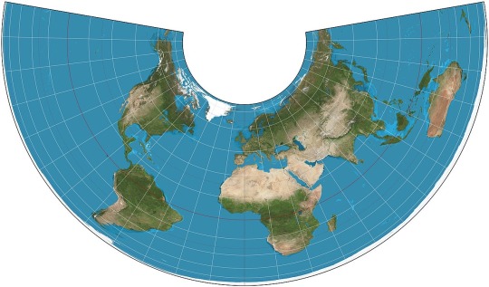
Look at how distorted Australia is, or Antarctica! But, hey, they’re the right size, relatively. No way around that trade-off; just different trade-offs to make.
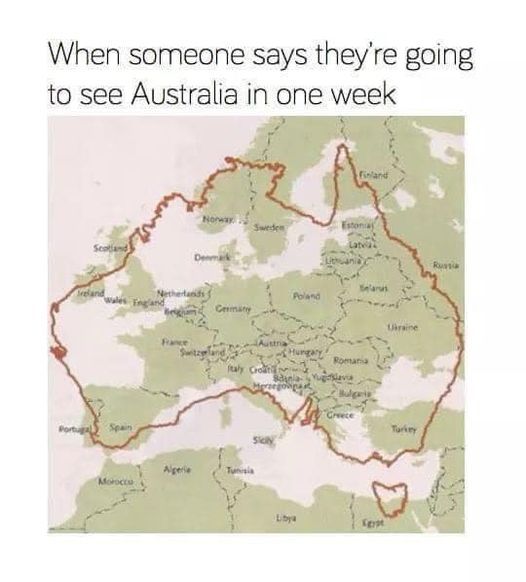
In their defence, a lot of it is sand.
40K notes
·
View notes
Text
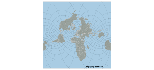
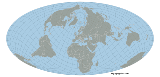
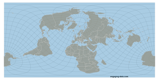
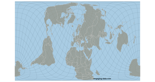
The world centered on Slovenia in four different projections (Mercator, Mollweide, Equirectangular, Gall Peters)
14 notes
·
View notes
Photo
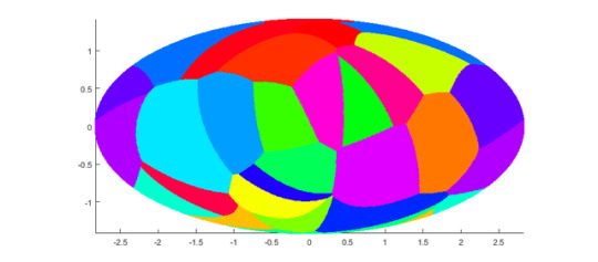
oh hey, I got it working! this is an equal-area projection, so the differences in cell size aren’t quite as extreme
(n=24)
12 notes
·
View notes
Note
I was reading about map projections today and I wanted to know your opinions. What’s the best one in your opinion? The worst?
Yoooooo ok this is a super fun question, alright. this is long, so it's below the cut.
so I'm gonna do my typical "nuance-obsessed radical descriptivist" thing and start with: the thing about map projections is that they're tools. We use them to solve the problem of "put sphere onto plane" but the reason we're solving that problem can differ a lot, and so different projections are good for different things.
The first thing I'm gonna call out is Mercator.
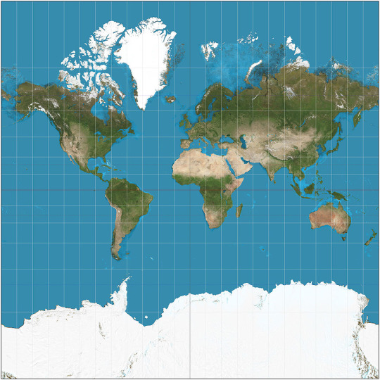
Here's my spiciest spicy take:
Mercator is not a bad map projection.
Mercator is a map projection that exists for a very specific purpose, and that is: north is always up, west is always left, northwest is always at exactly 45 degree angles, et cetera. It's the ONLY map projection that has the property that the entire compass rose is 100% correct at every point of Earth's surface (except the poles, which are at infinity on Mercator anyway.) So for travel maps and road maps, it's actually the BEST projection. (Specifically most digital maps -- including Google Maps -- use a modified thing called Web Mercator that's got a few small modifications in it for faster calculation.)
Does Mercator horribly distort the sizes of things when you look at the whole earth? Sure does. But that's not what it's for. That's like complaining that a hammer makes for a lousy table saw.
Ok, now, speaking as a mathematician, my favorite for simplicity and elegance is the stereographic projection.
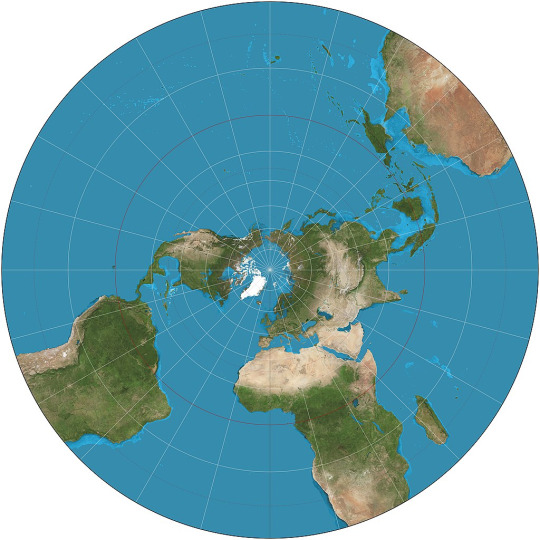
The stereographic projection is based on a simple idea: set the sphere down on the plane, put a light at the top, and project the Earth onto the plane. In this case, the plane is balanced on top of the Earth and the light is at the South Pole.
Two cool things here: first, this maps all circles to circles, so it's used for maps of the Moon and Mars to accurately show the shapes of craters. Second, this projection idea applied to the complex plane is also the basis for the Riemann sphere, which is a really cool way of representing the complex numbers, and helped me a lot in my complex analysis class during my phd.
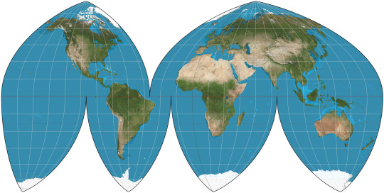
My favorite map projection for just looking at the whole Earth, like on a wall, is Boggs eumorphic.
Now I'm gonna throw the order off a little, because I also need to talk about one of my least favorite map projections here: Goode Homolosine.
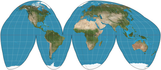
If you've seen one of these two before, it's almost certainly Goode Homolosine. They both are frequently "interrupted", which is the sort of orange-peel effect that lets you see the landmasses clearly but cuts up the oceans.
Goode Homolosine uses the Mollweide projection close to the poles, then abruptly switches to sinusoidal partway down, leaving ugly bumps in the outline. I do not like this lumpy boi.
Boggs Eumorphic, on the other hand, is a smooth mathematical average of Mollweide and sinusoidal. And it looks BETTER! But for some unfathomable reason, whenever you see an interrupted/"orange-peel" map projection it's usually Goode. But Goode is pretty Badde, while Boggs is Top Doggs.
uh.
where was I?
oh right. The last good map projection I want to talk about is the cutest map projection. If you map all the parallels to equally spaced concentric arcs radiating from the north pole, you get the Werner projection:
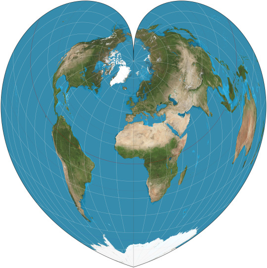
IT'S A HEART!!!
And it's equal-area AND equidistant. That wasn't someone going "how do I make the earth look like a heart?" That's just what pops out of the math. MATH LOVES US.
Ok, now to talk about my least favorite. I already bitched about Goode. Let me reiterate: I fucking hate Goode Homolosine.
Now for a less controversial take: Ughhhh gall-peters is terrible.

Going back to my descriptivist leanings, I have to ask: who is this FOR? Sure, it's equal-area, but people who claim it's good because it "doesn't distort the size of Africa" clearly don't know anything except the Mercator projection. It stretches Africa like crazy! The only parallels it looks accurate at are the middle parallels, specifically like the US and Europe, meaning this honestly feels MORE eurocentric than anything! It's pointless, I hate looking at it, it only exists because people are afraid to map things to anything other than a rectangle, I'm moving on.
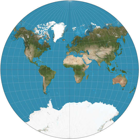
Van der Grinten: for when you want all the downsides of Mercator without any of the pesky benefits, and it really bothers you that the earth is a circle but maps are square. (Yes, I stole that joke from xkcd. Because I completely agree with it.)
And finally: Collignon.

aa
aaaa
AAAAAA
AAAAAAAAA
AAAAAAAAAAAAA
29 notes
·
View notes
Text
OP has already pointed this out numerous times in the replies and reblogs but Mercator Projection is not used because the kind of distortion it creates is seen as morally superior, it's used because it makes certain kinds of math easier.
This includes Rhumb Lines (i.e. if you draw a straight line between two points on a Mercator Projection map and then measure the angle from that line to the latitude longitude lines you can theoretically find that direction on a compass at the first point, go in that direction and reach the second one even if it's not the shortest distance). This is extremely useful for navigation without computers.
However for navigation with computers, it's still very useful because of a related property: while the shapes of very large things are distorted, it shows the shapes pretty accurately for small areas at most latitudes: e.g. North America or Asia are both heavily distorted, but if you look at, say, Borneo and Iceland on a Mercator map, they're both approximately the right shape, the projection just makes Iceland look almost as big as Borneo. This is very convenient for making a computerized map system like Google Maps that you can freely zoom in and out on to almost any scale, which is why most map websites / softwares use a variant called Web Mercator, which I think is just Mercator that doesn't bother accounting for the Earth being not quite spherical.
There's some other "Makes the math easier" projections too, like Equirectangular, which, as Randall Munroe puts it, maps X and Y to latitude and longitude, or Azimuthal Projections, which preserve direction and distance to a specific point.
Other map projections are used plenty, especially for things like infographic maps showing the entire world, which Mercator isn't very good for. This is where the controversy really happens: if you're making a map of something like the geographic distribution of Tumblr posts arguing about map projections, the map's primary job is to "look right" and "look fair," which means the most important things are subjective, which means there's room to fight over why your favorite projection is better. Some of the more commonly used ones include:
Equal Area Projections: these show the relative sizes of things correctly but have a lot of shape distortion.
Cylindrical ones have the same amount of distortion at any given latitude, but they have only one latitude (positive and negative) where shapes aren't distorted (the standard parallel). Everything near the poles is both squashed vertically and stretched horizontally to make the map fit a rectangle while keeping area the same, and if the standard parallel isn't zero anything closer to the equator than the standard parallel is stretched vertically. The Gall-Peters Projection puts its standard parallel at 45 degrees, and has been promoted for reasons of avoiding Eurocentrism, but ironically while it may avoid making Europe look bigger but ironically Southern Europe and the northern US / Southern Canada have their shapes preserved most accurately while equatorial countries get vertically stretched.
The Mollweide Projection avoids the vertical squishing/stretching problem by making the map an ellipse that gets narrower in proportion to the shrinking circumference of a latitude circle as you get closer to the poles. The downside is this makes the choice of the central longitude line much more important: areas near the central meridian are close to their true shape even near the poles but ones far from it get heavily distorted: with the Greenwich Meriddian in the center, Greenland and Iceland look fine but Alaska and New Zealand look horrible.
Some equal area projections try to make the shape distortion less bad by compromising between some vertical compression at the poles and some horizontal compression compared to an equirectangular projection. This includes the Eckert IV and Equal Earth Projections. There's also other ones with wonky shapes.
Perspective Projections (including Orthographic) are basically just "draw a picture of a globe." They inherently can only show half the world (for Orthographic) or less (for any other perspective projection) and some of that is heavily distorted, so you need multiple maps for a whole world map.
Polar Azimuthal Projections: the favorite projections of the UN and the Flat Earth Society. Centered on the one pole, shows the region near that pole well, regions near the equator with heavy distortion, and regions past the equator with REALLY heavy distortion unless you stop the map at the equator and include another one for the other hemisphere.
Compromise Projections: not to be confused with the equal area compromise ones: these don't preserve area OR shape but try to compromise between them so it looks okay to everyone. You've probably seen these a lot. Popular ones include the Robinson Projection, Kavrayskiy VII Projection, Winkel Tripel Projection, and Natural Earth Projection.
Projections With Splits: I'm lumping together polygonal projections like the Dymaxion and various ones named "Butterfly" with the Goode Homolosine because they have a similar philosophy of keeping the shapes of the continents as accurate as possible and going "fuck the oceans" and splitting the map apart in the middle of them to avoid stretching and deforming anything too much: if you imagine unwrapping a sheet of material covering the globe, the other projections only cut it in one place and otherwise stretch and squash it, whereas these tear or cut it until it lays approximately flat.
As for the "Northern Hemisphere on top vs Southern Hemisphere on top" debate: the Prime Meridian being in Europe is Eurocentrism, but North being on top is like... the Northern Hemisphere objectively has the majority of the land and the vast majority of the people, including most of the "Global South," and most of the rest is still pretty close to the equator. I think almost 90% of humanity lives north of the equator and by my back of the envelope math around 97-98% of people live north of the Tropic of Capricorn.
(and as always there's a relevant XKCD: 977)
maps being "misleading" about the size of countries and continents is not a global conspiracy to make you think western countries are more important (bc size = importance obvs), it's because you can't accurately depict a sphere in 2d. it's literally not that deep.
839 notes
·
View notes
Text
reblog so more ppl can vote :))
3 notes
·
View notes
Text
i actually have so much nostalgia for mollweide projection i know it sucks but.
4 notes
·
View notes
Text
😎🤣HELLO, QUE HORAS SÃO AONDE VOCÊS ESTAM?
Então como irei iniciar, acredito que inicialmente nós iremos dialogar um pouquinho sobre este novo assunto muito importantíssimo e maravilhoso para estudar e localizar-se sem precisa do recurso tecnológico conhecido popularmente de GPS.
Então, meus queridos e amados receptores, os senhores ou senhoritas já ouviram sobre cartografia? Acredito que a grande maioria sim, então esse é o nosso assunto para conhecermos um pouquinho sobre essas maravilhosas atratividades do mundo.

E, agora? Mãos à obra!
O que será que é cartografia?
Cartografia é a ciência que representa em formas de gráficos os espaços geográficos. Além disso, esse estudo cartográfico nos dar uma concepção, produção e a divulgação da representação de vários mapas. Entretanto, esse lindo estudo contém representações físicas cujo relata a realidade social, não só social como econômica, histórica e cultural.
Segue abaixo um exemplo de um mapa cartográfico:

Oxente, vocês acharam que acabou foi? Meus queridos isso é apenas o início.
Antigamente, a cartografia era representada em forma de desenhos. Com o decorrer dos anos houve um avanço tecnológico ao qual deu-se a necessidade da utilização de dispositivos tecnológicos, por exemplo, o computador é um dispositivo que facilitou a vida dos estudantes cartográficos dando-lhes possibilidades de construírem modelos digitais de terrenos e suas respectivas analises por meio do sistema de informação geográfica (SIC).
O mapa representa o espaço geográfico com característica qualitativa e quantitativa. Contundo, esse por sua vez, nos traz mensagem sobre objetos, formas, fotos e acontecimentos do espaço. Desse modo, a cartografia é uma ciência, uma arte e uma técnica de apoio a geografia.
Observar-se que a percepção e a visualização no espaço geográfico mudam conforme muda a escala. Quanto maiores são as generalizações menores são as escalas, ou vice-versa.
Desse modo, a cartografia pode ser dividida em duas: sistemática e a temática. A cartografia sistemática é aquela cujo é realizado por engenheiros cartógrafos, ao qual iram realizar medições necessárias dentro do ambiente terrestre. Um exemplo do trabalho destes profissionais são as cartas topográficas. Já a cartografia temática é representada com diversos temas, por exemplo, uma pesquisa sobre recursos minerais, densidade demográfica entre outros.
Segue abaixo um mapa com as pesquisas sobre indivíduos empregados ou não, como exemplo de um mapa temático.

Então receptores, vocês sabem quais são os elementos de um mapa? Caso não, então nós iremos conhecer agora todos nós no mesmo momento.
1. Título- tema ao qual será expresso no mapa.
2. Escala – representa quantas vezes o tamanho real foi reduzido para ser colocado no mapa.
3. Orientação – é uma rosa dos ventos ao qual define a direção norte, sul, leste e oeste no mapa.
4. Legenda- são os elementos ou cores que estão no mapa.

Ei você aí continue lendo viu estou de olho em vocês.
A representação mais aceita da Terra é o globo terrestre. Contudo a representação dimensional do mapa dividir-se em três partes:
1. Equidistante: são representação sem distorções nas distancias, porém os ângulos e as áreas são distorcidos.
2. Equivalente: são representação sem distorções nas áreas, porém contém distorções nas distancias e nos ângulos.
3. Conforme: são representação sem distorções nos ângulos, porém com distorções nas distancias e áreas.
Analisar-se que as projeções cartográficas são representadas de três formas, dentre eles destacam-se a projeção cilíndrica, cônica e plana azimutal.
Projeção Cilíndrica: a forma cilíndrica contém uma certa facilidade em desenhar sua respectiva forma com seus meridianos e os paralelos. Essas formas foram tão importantes que se tornaram popular, conceituando que esta seria a forma certa de representar a terra. Além disso, vale ressaltar que nenhuma geometria é 100% perfeita, sempre haverá algum tipo de distorções.
A projeção cilíndrica, representa áreas com espaços geográficos grandes, ou seja, próximos a linha do Equador.
Desse modo, as projeções cilíndricas dividir-se em alguns critérios geográficos:
ð Projeção de Mercator- os continentes contêm formas corretas, porém contém defeitos na extensão territorial.
ð Projeção de Peters- a forma do espaço territorial está correta, porém os continentes contêm seus respectivos defeitos. Essa é uma percepção que não favorece o governo.
ð Projeção de Goode- apresenta as massas continentais e oceânicas, mas de formas de formas diferentes.
ð Projeção de Mollweide- apenas distorce os continentes.
ð Projeção de Robinson- contém poucas distorções das massas da terra.

Projeção Cônica: essa projeção apresenta a forma de cone. Os meridianos formam uma rede de linhas retas iguais nos polos e os paralelos formam círculos concêntricos. São regiões de médias latitudes e poucas distorções.

Projeção Plana ou Azimutal: essa projeção é conhecida de polar, poliédrica ou equidistante. Como os anteriores são linhas imaginárias que corta os paralelos e os meridianos, mas nesse caso a forma é um círculo. É utilizado para representar altas latitudes, como todas, essa por sua vez apresenta deformações a partir do ponto central.

Meus queridos amigos nós vamos conhecer um pouco sobre escala, neste especifico momento.
Escala é a relação numérica entre o mapa e a realidade, ou seja, quantas vezes for reduzido para ser colocado no mapa. Mapas são medidos em centímetros ou milímetros cujo são os quilômetros ou metros na realidade dos mapas.
Quando o denominador da escala for pequeno contém pequenos detalhes e sua área são grandes.
Denominador de números altos contém maiores detalhes no mapa.
Para sabermos estas diferenças utilizamos uma fórmula para este procedimento, cujo é a fórmula geral.
E = d
D
E= escala
d= distância no mapa
D= distância real
São utilizados convenções geográficas em formas de símbolos, sinais ou cores para interpretar os mapas. Pode –se citar:
Curvas de nível: representa o relevo terrestre, ligando os pontos iguais a altitude.
Hipsometria: diferem as altitudes do relevo pelo emprego da escala.
Batimetria: diferenças de profundidade do relevo submarinho pela utilização de uma escala.
As orientações e coordenadas geográficas informa alguns aspectos de cardeais. Contudo, analisarmos sempre onde o sol aparece continuamente, ao qual chamar-se de nascente, leste ou oriente. Desse modo, onde o sol desaparece chamar-se de poente, oeste ou ocidente. Para descobrir os pontos cardeais, aponta a mão direita para o leste, e a mão esquerda para o oeste, a nossa frente está o norte e atrás encontrar-se o sul.
Dessa maneira, as linhas imaginarias traçadas no mapa são divididas: em paralelos e meridianos. Os paralelos são linhas traçados paralelamente a linha do Equador 0° dando-lhe latitude, os paralelos variam de 0° a 90°. Essa linha por sua vez divide o hemisfério em norte e hemisfério sul. Já, os meridianos, são linhas imaginarias traçadas a linha do Equador, dando-o origem a longitude. A base do meridiano é o Greenwich 0°, esse por sua vez divide a terra em dois hemisférios: Oeste e Leste até 180°. Além disso, os meridianos definem os fusos horários.

Então, meus lindos jovens nós chegamos em um ponto muito delicado do nosso assunto, mais acredito que vocês iram gostar, pois é muito importante e interessante.
Os fusos horários é definido pela diferença de um lugar a outro, ou seja, nós vamos descobrir o porquê do Japão ser noite e no Brasil ser dia, ou vice-versa.
Inicialmente, iremos iniciar com alguns conceitos. Todos nós temos que saber que o fuso oficial do Brasil é 45°. Contundo, quando formos calcular temos que observar se estão no mesmo hemisfério, caso estejam no mesmo hemisfério sempre subtrai, caso esteja em hemisfério diferente quando for realizar a conta sempre irá somar. Quando realizar analise visualmente observar que para a esquerda diminui e para direita aumenta. A cada 15° muda 1 hora.

Agora, nós vamos praticar algumas questões:
1) Uma família embarca em uma viagem às 14:00 horas, do dia 03 de março, de um ponto A (localizado a 30° O) com destino a B (localizado a 45° L). O tempo de voo é de 10 horas. Qual o dia e o horário de chegada da família ao ponto B?
R:
30° O 15° O 0° O 15° L 30° L 45°L 14:00 15:00 16:00 17:00 18:00 19:00
Inicialmente, nós vamos somar os fusos citados no texto, pois eles estão em hemisfério diferente.
45° + 30° = 75°
Agora, nós iremos dividir o resultado anterior pela diferença de cada fuso.
75° 15= 5 horas
Descobrimos a diferença de horário da cidade A e da cidade B.
Agora, nós somamos o resultado encontrado mais a duração da viagem.
10h + 5h = 15h
Posterior, é só pegar o horário que a família saiu da cidade A e somar mais o horário anterior encontrado.
15h + 14h = 29h
Como passou de 24h, este por sua vez ganhou um dia, então diminuímos um 1 dia.
29h – 24h = 05:00
Em virtude do que foi apresentado, concluir que a família chegou na cidade B dia 04 de março as 05:00.

32 notes
·
View notes