#minus the colours and details and background
Explore tagged Tumblr posts
Visit Tumblr Blog
Explore Tumblr blogs with no restrictions, modern design and the best experience.
Last Seen Tumblr Blogs


Fun Fact
The KCSC sent more than 20K requests to delete posts related to prostitution and porn to Tumblr from January to June 2017.
Text
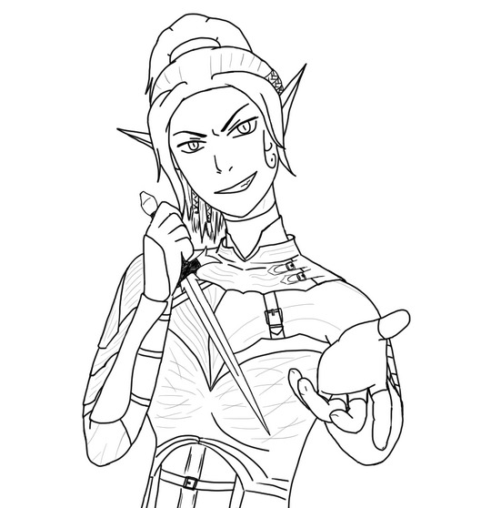
That Baldur's Gate 3 cover art with Astarion. But it's Sebille.
#Divinity#Divinity: Original Sin 2#DOS2#Sebille#DOS2 fanart#my stuff#well sort of#attempt#minus the colours and details and background#obviously heavily referenced from the original#I don't think I'd have managed the damn left hand otherwise 😅 and even then it was quite hard#but you know what turned out to be particularly cursed? that dagger surprisingly#being at an angle is the worst thing for any object to do#I tried to make Sebille look close to what her character model looks like in the game but also tried to do one of her cover art outfits#turned out a bit cartoon like but I suppose that's alright#I might try to colour it sometime#I haven't coloured anything yet and I have to figure it out#for now I'm happy I've got as far as I have#also my death grip is really showing on this one haha#I SWEAR I calibrated the pressure settings but yeah#my hand knows only murderous intent
50 notes
·
View notes
Text
i cant stop thinking about how fucking illegal bluelock is...
as has already been pointed out, these kids are NOT getting fed properly
also the whole 'score more goals and you'll get better food' thing like, has to be against the geneva conventions or something
directly tying sufficient nutrition to physical labour performance CANNOT be legal
also you're telling me none of these kids have dietary restrictions? like oh you're celiac and can't eat miso soup or gyoza? have fun surviving solely off of white rice ig
why does the bluelock building have no windows. do these kids get sunlight and fresh air any time other than when they're playing football?? are they all just super vitamin D deficient???
is the grass on the football pitches in bluelock even real? or is it all artificial?? im pretty sure not being around any kind of nature/plantlife for months at a time is bad for your mental health
(it probably explains why everyone in bluelock is so rabid, when's the last time any of them saw a tree?)
also the lack of windows is a fire hazard, does the building even have fire escapes? smoke detectors? emergency exits?
none of these kids fucking consented to being a livestreamed reality TV show/sports documentary
do they get royalties from BLTV? its obviously making money but somehow i doubt that ego is giving all the bluelockers a cut of the profits
also; i forget which volume its from but theres an extra with the top 5 most popular BLTV clips, one of which is kaiser confronting/issuing his declaration of war to isagi in the BM locker room
this suggests that theres cameras and mics in the locker rooms in bluelock, the locker rooms where people change clothes, the locker rooms where TEENAGERS change their clothes
idk the exact intricacies of sports academy type situations but japan has child labour laws and im pretty sure that making kids work out so much every day theyre regularly throwing up or can barely stand goes against said labour laws
also like; safe guarding, and duty of care, and child protection laws, probably
schooling is only compulsory up to the end of middle school in japan so technically none of the bluelockers have a legal requirement to be recieving an education
BUT; doesnt bluelock essentially make them high school drop outs?? its not as if they can miss months of class and then still graduate on time
what happened to all the kids who got locked off?? are they just repeating a year or did ego crush their regular career prospects along with their footballing ones?
do the NEL coaches (minus loki i suppose) have the correct legal permissions to be coaching minors?
typically, adults need qualifications and background checks to be in a position of authority (like coaching) over children or teenagers, so like do we think the NEL coaches have that orrrrr... ?
also like how the fuck does all that work with Loki, who's only 17?
the way pre-NEL, ego was constantly popping up to chime in on conversations suggests that he was visually and auditorally monitoring these kids 24/7, including in the communal bedrooms
if thats not technically ilegal then its at least DEEPLY FUCKING CREEPY
whatever the fuck is going on with kunigami and the wildcard HAS to be some kind of illegal, like i think we're actually bordering on human experimentation and/or psychological torture at this point
the NEL is like multiple weeks long right? what fucking VISAs are all the non-japanese players on?? a solid chunck of them are probably under 18 too right?? this is a paperwork nightmare
does the NEL bidding system constitute as gambling under japanese and/or international law? what laws are there when it comes to betting on u-18 athletes/athletic leagues? is this extortion? i feel like this may be extortion
this is such a minor detail but that one colour spread of ubers doing barou's hair shows aiku holding scissors and like im pretty sure sharps being accessible to minors (not aiku obvi, but most of the other bllkers) with no adult supervision is a safeguarding issue
there's fucking tasers in their suits, tasers that they didnt know about
im like 99% sure even manufacturing those clothes is illegal, let alone having people, especially minors, wear them
also, again, isnt that a massive safeguarding issue? what was ego gonna do if he sent shidou into cardiac arrest?
so i know they all 'consented' to participate in the bluelock project and live at the facility (if you can call impulsively running through a door 'consent') but that wasnt with the knowledge that they'd basically never get to leave unless they flunked out
so like, does this count as unlawful imprisonment? there was something about parents consenting too so maybe not, but it still feels iffy, especially considering most of them didnt get their phones, their ONLY means of communication with the outside world, back until after the u20 match
which is, again, a safeguarding issue; denying anyone (but esp kids) communication with the outside world for weeks at a time is cult shit, if it's not specifically illegal in japan it's still, in the very least, immoral
speaking of the u20 match, did the bluelock XII get paid for that or what? it counted as a professional football match right? i feel like they should be getting paid for it
same goes for the NEL actually too, like even forgetting about the BLTV aspect, the bluelockers are playing in a professional football league on the u20 squads of professional football clubs, they should be making fucking wages from this
i know theyre getting bid on but theyre not actually GETTING that money rn so are they just doing all this work for these clubs for free currently?
do the tracksuits have the taser function too or is it only the athletic body suits? what if team Z had decided to jump kuon in the communal bedroom after lights out? does ego have any way to stop these kids from beating each other to death when theyre not on the pitch??
like, are there any staff at bluelock other than ego, anri, the canonically-mentioned-but-never-seen-medics, and what i assume must be a decently sized team of catering and cleaning staff??
also; no way was putting shidou in a fucking straightjacket and muzzle legal
like, even the cops in japan are only allowed to handcuff people or hold them in restraint positions, let alone ego and anri having someone forcibly cosplay hannibal lecter, shidou should sue
honestly i think the whole 'throw away your self preservation and dedicate your every breathing moment to football' ideology probably counts as emotional abuse and/or brainwashing
in chapter 204 after he collapsed at the end of the BM vs MC match, isagi wakes up in a bed in noel noa's office
he'd been changed out of his clothes whilst unconcious and then, rather than kept in the infirmary or sent back to his own room, was left alone with an adult in a room with (im pretty sure) no cameras or other people for literal hours???
not that im saying noel noa would do anything creepy, but just that conceptually that whole situation is an absolute legal nightmare on so many levels
do you think the non-bluelock NEL players get to leave the building orrrrrrrr..?
im fully aware that half of these thing are explainable by suspension of disbelief and also that kaneshiro and nomura werent thinking about this stuff when they wrote it, but please consider the following; i love being a hater <3
#bluelock#blue lock#bllk#i want the spin off manga thats just all 300 bllkers sueing ego and anri and the JFU#og post //
97 notes
·
View notes
Text
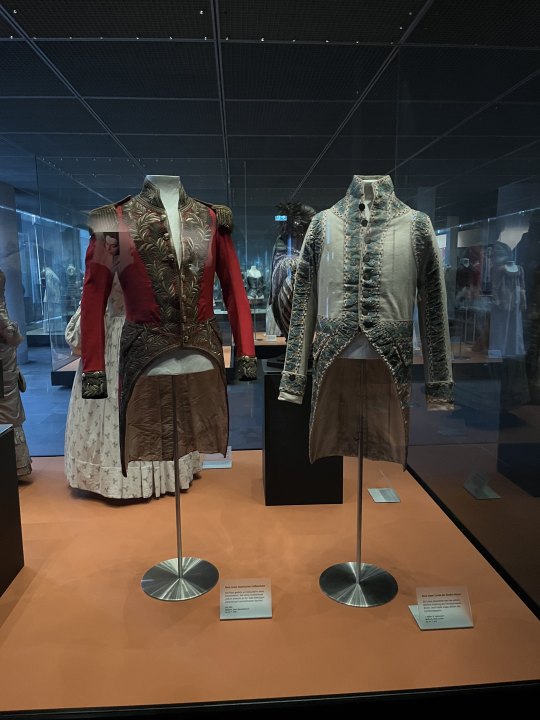
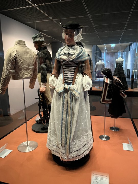

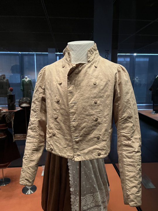
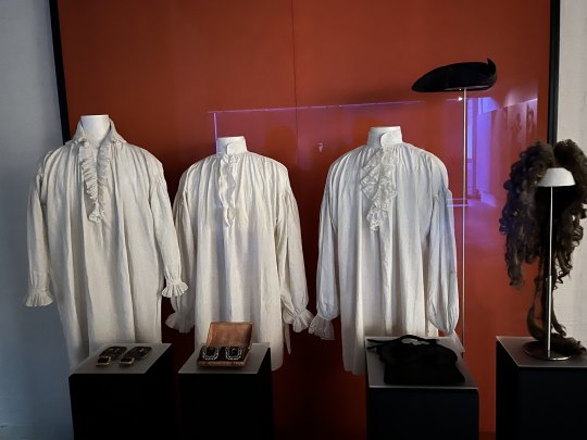


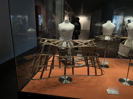
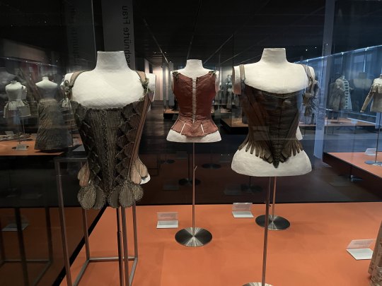

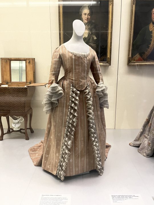
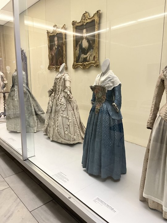
And here, as promised to the dear @vinceaddams come a lot of extant Garments from my recent Visit at the German National Museum in Nuremberg. I am trying to give as much Information about each Picture as I can though unfortunately not all of the Pictures were taken by me and I could take Pictures as extensively (including Info Signs) as I would have wanted, lest I be abandoned in the Clothing Section. Also the whole Section was awfully dim, which made it rather difficult to read some of the Signs. The last three Pictures were taken in a different Section, thus the more pleasant Lighting.
Servant Livery, bavarian Court, mid 19th Century (left); Servant of the Count of Cannotreadhisname, first half 19th Century (right)
Woman's Folkdress, Lötschental/Wallis (Switzerland), Museum dates it 1830/1905 which is an awfully broad Range, but maybe it was altered later; shows wonderfully how late 18th Century Styles were preserved in european Folkdress that came to be in the 19th Century proper
Various Men's Garments throughout the 18th Century, as there are Closeups of each, the respective Detailinformation will be provided further down.
Men's Spencer, c. 1810s-1820s, Linen and Cotton, the Sign didn't say it explicitely but due to it's Placement in the Exhibition and comparable other Pieces I have seen, I think this is more of a common Man's Piece of Clothing.
Three Men's Shirts, various Shoebuckles, a cocked Hat, a Periwig and what I assume to be a Hair Bag. This Display Case had a rather badly illuminated Sign, so sadly I have no further Details about the Pieces.
Justeaucorps, c. 1695, Wool, Silk, Metal Trim.
Waistcoat, c. 1695, Silk, according to the Museum it was worn together with the Justeaucorps, which seems to be a nice Colour-Combination.
Breeches, 1790-1800, Silk. Very pretty Pair, but the bad Lighting doesn't really let it show.
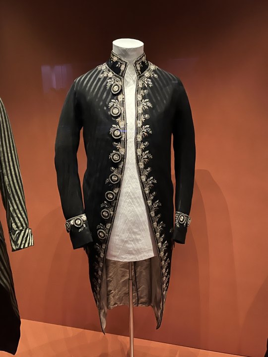
Habit à la francaise, c. 1790, Wool, Silk, Embroidery (What a Material Specification...). I really like the Combination of those subtle dark on dark Stripes and the Embroidery.
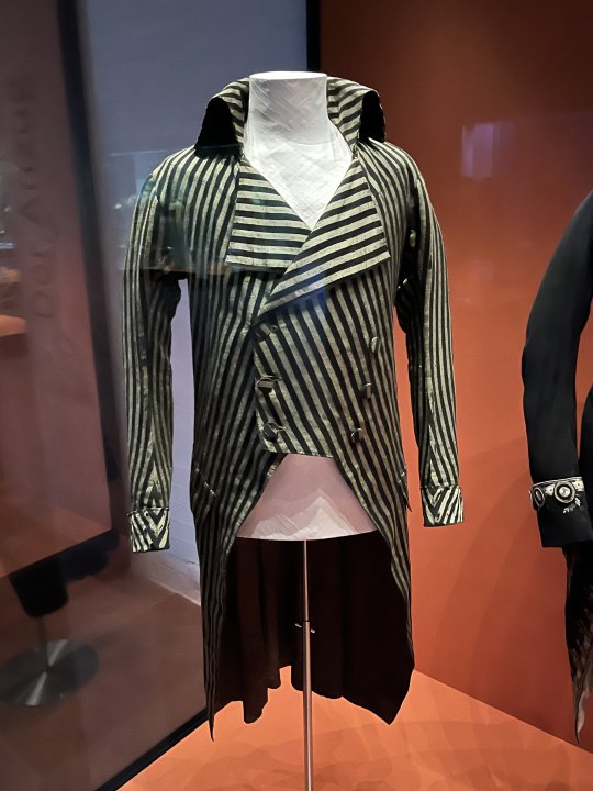
Tailcoat, c. 1790/1795, Cotton, Silk, Linen, really peak 1790s Look honestly.
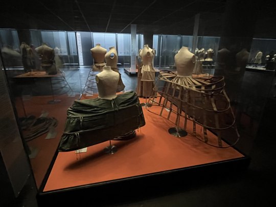
Very wide Court Panniers, with Pocket Hoops and Crinoline in the Background. Alas no Detail Information for this and the next two Pictures.
Frontal View of the Pannier. I suppose I have to get one of those at some Point, if only for how extra they are.
Three Pairs of Stays, two from the Front, one from the Back. Sadly I don't feel confident enough to Date those and I have no Pictures showing the Info Signs well enough.
Lots of pretty Dresses that were exhibited in another Section of the Museum. The right one is a Robe à l'Anglaise, but that's all I can tell.
Another beautiful Anglaise, notable for being preserved in its Entirety with original Ruffles.
More pretty Dresses. Unfortunately due to Time Reasons I have no Pictures of the Suits displayed across the Dresses in the U-shaped Display, though I have to say one of them had a very much not authentic Lacebib hanging from the Neck...
That's all the cool Clothing Pics I have, at some Point I will return and take loooots more Pictures from all the Angles too. Also at some Point I might write to the Museum about the Lighting, there surely is a better Solution when having your Objects barely visible with unreadable Signs while still protecting them from UV-Rays.
Bonus-Pic 1:

Me, in historical Dress, c. 1750 (minus the Shoes), standing in a historical Kitchen.
Bonus-Pic 2, for the Boat-Crowd:
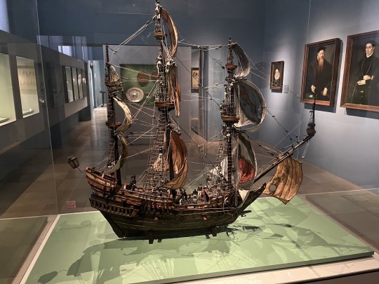
Beautifully detailed Modell Sailing Ship, early to mid 17th Century if I remember correctly. Interestingly enough all the little Sailor Figurines on it were very much early 19th Century in Style, so I assume the previous owner had those added at some Point, before the Museum acquired the Model in the late 19th Century. (The Incongruence sadly wasn't addressed on the Info Sign, so I might contact them about this too.)
#Aus dem Leben einer Taugenichts#Extant Garments#Historical Fashion#Germanisches National Museum#18th Century#19th Century#Museum
167 notes
·
View notes
Text

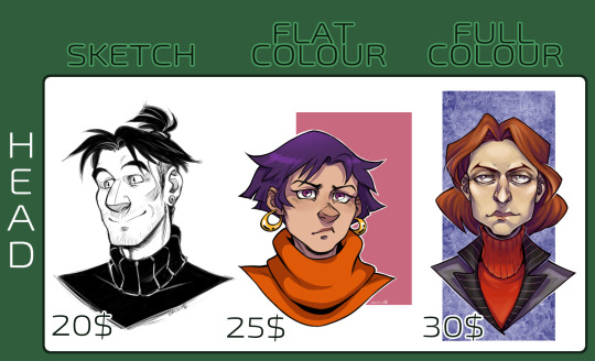
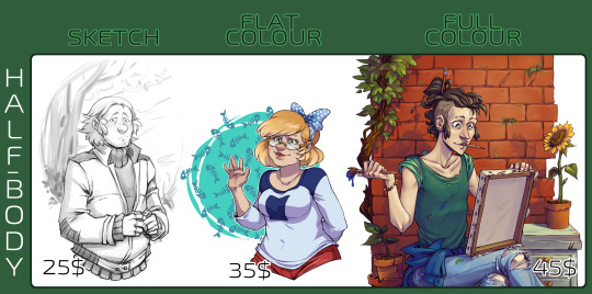
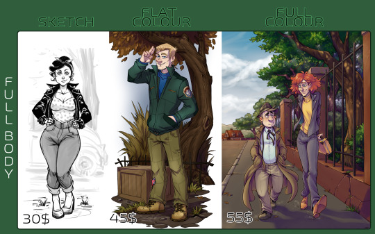
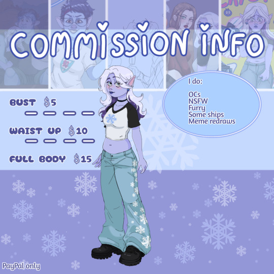
COMMISSIONS INFO
How do I work: Message me here, note the kind of drawing you want, explain what exactly you want me to draw, provide with references if possible. If I agree to work on your commission, I'll give you a link to my Boosty page, where you can use a donation pool (PayPal\bank card payment), to pay for a commission.
What will you get: A small sketch preview of your commission with an option of One free fix - if something is not quite right or bothering you - I’ll fix it. (Next three fixes will cost 5$ for each fix. Over three fixes the price will get raised on 5$ for each subsequent fix.). When picture is done completely I’ll send you a PNG file, full size.
How to pay: For now the only way for me to get payments is through Boosty (it's like an alternative to Patreon). You can pay full price or half of it at the beginning, and other half - after looking at the small preview.
Notes:
All the prices are listed without backgounds. For head shots backgrounds are free. For pictures of a half body backgrounds will cost from 15 to 20$. For a full body pictures backgrounds will cost from 20 to 30$. The more details - the more the price.
The prices are listed for a single character. For every additional character the price will grow by this formula - original price minus five bucks. (for example: a half body with a flat colour (35$) + additional character (30$).
What I WILL draw: Fan characters, OC’s, game\movie\book\cartoon characters, animals, etc. What I WON’T draw: Gore, porn, mecha, etc. I have the right to reject your commission if it’s out of my comfort zone, has questionable themes, or something I do not like\can’t really draw. If you have questions - feel free to send me an ask.
Why Boosty and not PayPal?: due to PayPal blocking all of russian accounts, I can no longer work through it. Unfortunately it means there's no invoices and a different website I can process payments through. All payments go through my page on Boosty, through a donation pool. The payments can be made through your PayPal account or a bank card! (If an instruction or any help will be needed - I'll provide an instruction with screenshots. The platform is safe and is used by many artists, who has been dropped and left out by PayPal or Patreon). At the moment Boosty has some issues with PayPal and probably the only method of payment avaliable is by a bank card. Boosty is trying to resolve the issue. There's also a Hipolink as an alternative... If you need any reassurance in my trustworthiness - you can see a bunch of previous commissions I've made for a lot of people here, or on twitter }: )
#madd draws#commissions#price list#art commisions#commissions open#art#difital art#artists on tumblr
29 notes
·
View notes
Text


COMMISSIONS OPEN ON KO-FI!!
I have 5 slots open for each tier, minus the $25 dollar tier which only has 3!
These are sketch commissions, and as such are cheaper, but have no revisions (except for one minor revision for the $25 tier), no line art, and no backgrounds (2 bg styles available, as well as colours of your choice). You get to pick bust, half-body, or full-body though!
More details on my ko-fi!
58 notes
·
View notes
Text
vyvy4n’s commission info🐊
DM me here or Discord with the same @
Examples


I specialise in character design & character illustration!
My art tag is there too⬇️
Prices
Base price (full body sketch) — £5
(5th and 11th image)
+ Colour — +£5
(6th, 8th, 9th, 10th, 12th image)
+ Line art & shading — +£5
(Everything else)
+ Another character — £5
(Use your imagination lmao)
+ Simple background — +£5
(9th image)
+ Detailed background — +£10
(1st image)
Questions
How do you accept payment?
At the moment I only accept payment through PayPal. Once I have sketched out your drawing I’ll send it to you with a watermark, ask if everything is how you like it, and then ask for payment.
Will you draw ____?
Nonhumans (furries, robots, animals etc.), yes.
Original characters, yes.
Create references/designs/redesigns, yes.*
(*all designs in the examples minus Magneto, Wolverine, and Doom are my own.)
YCH/redraw of a reference, yes.
In a different style, yes.
Comic strips, yes.*
Gore/injury or NSFW, yes.*
(**both of these, depending on the detail you request, could easily double the workload compared to a regular drawing. Depending on the complexity I may ask for a slightly higher price.)
Anything else you’re not sure about we can discuss but the only thing I’d say no to is problematic stuff
How long will it take?
As an estimate, sketches should take between a day and a week, and detailed drawings should take between a week and a month.
Once I’ve started your drawing I’ll have a good idea of how long it’ll take and will message you beforehand
If you need the art before a certain time, let me know
Where can I use the art?
Anywhere! I’ll draw profile pictures if that’s how you’re specifically planning to use it, and if you’re going to post it anywhere please don’t crop my @ off. Anything else for personal use is completely fine!
I’ll ask if I can use it on my own page and if you’d like to be @ on the post before I do anything with it myself
You may use any of my art commercially but please inform me before you do so.
Thank you for listening to an independent artist.
If you can’t or don’t want to commission me, spreading my posts around to people who might helps me just as much <3
10 notes
·
View notes
Text
@razielim this started out as an ask and got outta hand x)
I remember once you talking about movement in videogames gabe. About how satisfying and important just the act of moving can be (which arghhhh yess I couldn't agree more!), and compared it with movement in dreams. And I remember you mentioning Asscreed II as an example and I was thinking (as I was listening to some asscreed ambience on youtube), do you think the visuals and music also contribute to that dreamlike feel too?
I've noticed more recently how like, in spite of the attempt at capturing all the historical places realistically and faithfully, they don't feel like that, or, perhaps I should say, they feel as realistic as a dream of Florence or Venice can be?
The colours are all somewhat muted (like if everything has the opacity not quite at 100%, contrast and vibrancy is way down too). Just a more muted colour palette in general (big emphasis on white with light pinks and oranges and browns, greyish blues and greens with just the occasional sharp bright red of clothes or flowers);
Just so much white! The white interface of the animus and the animus loading effects of the towns being reconstructed on these white digital canvases. And the draw distance (Silent Hill taught me that if you want that dreamlike atmosphere you play with that draw distance son, obscure details, don't let players see everything, imply don't just show)! The skies! I can't remember a vibrant blue sky in this game, it's always a greyish blue or white or pink.
I dunno tell me if I'm talking outta my ass, I think it helps evoke this dreamlike/nostalgic feel. And this extends to Jesper Kyd's music too, how it's oddly experimental honestly? It's not authentic Italian Renaissance-era compositions or something that sounds close enough. Minus the chase and combat ones, the town ones (Home in Florence, Dreams of Venice, Leonardo's Inventions, etc) have this ethereal feel and tranquility to them. It's like the visuals: somewhat muted, somewhat vague, they don't draw too much attention to themselves, listening to them it's like walking through that same white haze the visuals have.
It's this, AssCreed II's movement, visuals and music are dreams of the Renaissance in white laminated glass to me:

::::::::::::::::
EDIT:
I
JUST
realized
that whoever did the box art for the game MADE MY POINT FOR ME BY HAVING THE DEFINING IMAGE THAT ENCAPSULATES ASSCREED II BE:

White-ass laminated glass-looking background with the contrasting vibrant red and the blurred hazy characters.
#Dreams of White Laminated Glass - my new band name!#razielim#assassin's creed#assassin's creed 2#videogames
6 notes
·
View notes
Text
❄️ Commissions open❄️
I'm very nervous about this aaa qwq
~ ❄️ DETAILED INFO ❄️ ~
• You can choose between black and colour lineart, for free.
The same if you prefer a cleaner or dirty lineart (personally I like the dirty one better, hehe)
• Sketch, lineart and flat colour have the same price.
• You can choose between two drawing styles. First is my personal one (you have more examples on my Instagram) and the second, which is the one I use lately, with Disney Pixar features.
• Payment is non refundable after you receive the finished piece. If commission is canceled before this for any reason, I’ll refund the money minus 30%.
• I have the right to post or not to post your commission on any of my social media. If you don’t want me to post you should note me about it beforehand, and it’ll double commission price.
• Extra character —> +50%
• Character sheet —> $30
• I don't do complicated backgrounds because I DON'T KNOW 😭
Transparent/Gradient —> Free
Simple backgrounds —> +20%
• You can ask for WIPs, and you can request 3 free changes.
• Do:
OCs
OCxCANON 🖤🖤🖤
Some ships
Fanart
Nsfw
Furry
Meme redraws
• Don't:
Anything I'm not comfortable with
Unrealistic big sizes
Hypersexualization
Mecha
Complicated backgrounds
• Don't be afraid to ask!!
❄️❄️IMPORTANT.❄️❄️
• I first make the drawings on paper, and once done, I make them digitally using ibis paint from my phone, so due to the performance of my cell, the images cannot exceed 3000px :(
• I will send the final work by email or wherever you prefer.
• Payments only by PayPal.
• I will only start working once payment is sent.
• The waiting time for delivery of the drawing will be between two or three weeks, although sometimes it may happen that I finish it sooner :D
However, you can talk to me as much as you like. <3
• On my Instagram I show you more of my work:
https://www.instagram.com/zzcorpserosezz?igsh=MXFxam95eG1hOHpwbQ==
THANKS!
4 notes
·
View notes
Text
As per consent of OP heres an analysis of this drawing!
(Just things ive noticed, keep in mind im not a professional im just trying to get better at art, and share some of my process sometimes)
First of my favorite, FAVOURITE ASPECT IN *ANYTHING*
Contrast, honestly when it comes to art im married to contrast and had like 20 kids with it. Id turn into a trad wife for the consept of contrast (im male).
—-—-—-—-—-—-—-—-—-—-—-—-—-—-—-—-—-—-—-—-—-–
NOW NOW- Atcual analysis:
▪︎ Main focal point
The campfire, and two subjects in the frame. Aspects that draw attention to it:
–Multiple different colourations/values all in one place, creating contrast between the amount of details troughout the pease [Which you can also acheive via putting most details everywhere exept the focal point, which is less common but still effective and possible]
One of those being the fact white only appears there (minus some star like dots on the aquatic space serpent(?) creature),
–Speaking of that creature, it only having those "spikes" (ik those aren't spikes dont know how to call them) near the head. Crossing over boundaries of the body in the background that usually aren't crossed at all. As well as overall busyness in that area. (The ear & eye as well)
So while yes, there's lots of going on there, its no where as close to calling to the eye as the focal point. Whilst also serving a good purpose which is mentioned below in a different example (be that intentional or not)
Bringing us to our next point of THA BODY.
The partial, slight calling *a bit* to the right, where theres a bigger gap between different parts of the body. That slightly bigger contrast than usual on the further right help draw attention to how the room isnt in shadow (as it seems during the first few seconds) yet is filled up by the creature instead.
–And also, just like i said, the smaller gap between the noodle body helps draw less attention exactly because theres less background showing. As well as the barrier of the drawing above and bellow being closer to the surrounding colours.
~This is a lot, ik, but i kept it super short ^^
Thats all ive noticed, and even if that bigger gap who serves a good use both composition and contrast wise isnt intentional—
Just like Bob Ross once said,
"Theres no mistakes, only happy accidents"
~Much love, Ev <3
—-—-—-—-—-—-—-—-—-—-—-—-—-—-—-—-—-—-—-—-—-–
Also yummy art, gimmie 14 of em' right now /j
Also i checked the taggs- cool dragon. Yumy. I wonna eat him like how kids wonna eat that square-circleish detergent thing.
Also theres at least one thing i noticed that i havent metioned!! Whoevers watching have fun and try figure it out! Maybe youll find more things i missed? Have fun! Art is a hobby, not a job (and if it is, its suppsed to be both!)

965 notes
·
View notes
Text
Animatic Workings
This is just some more detailing on my now completed animatic, minus a few potential tweaks. Since there are many scenes, I'll just include some that I feel have points worth discussing.
Scene 5

Scene 5 uses the same character design as the previous scene, but includes a part on academics, that being Em being praised for her life cycle drawing, something she is very excited about. These are moments I class as important within this animatic, as they grow steadily more frequent.
Scene 7

Scene 6 is the first time we see an actual grade on any of the homework or schoolwork, and Em is so pleased with it that even without anybody being present, she pins it up onto the fridge. I think of this as being a turning point, the beginning of a shift in focus, and the point in where her colours will start to dull. This scene uses perhaps my least favourite character design for Em, so I unceremoniously have her facing away from the camera in all scenes that it is present.
Scene 9

This scene uses quite a lot of perspective also, and since it begins with dad having the camera pointed to schoolwork in his lap, I think I will have to design the background with a longer bed in mind. This isn't a new premise for this film, with scene 2 in particular having a very big and open background design, but considering I have designed the bed sheet as patterned, I have my work cut out for me. Additionally, this would be the scene in where Em switches glasses, hence the bear from scene 2 wearing her old glasses in the back.
Scene 10


Scene 10 seems simple at first until you realise that the room completely rotates at one point. Bluntly putting it, I have no idea as to how I am going to achieve this effect within a 2D space. I know the walls will probably all have to be separate, but that's as far as I have gotten with it. This will take some experimenting with.
Scene 12

This scene uses the background I originally submitted for my first rendition of the project, though I think I will tweak it to fit in more with the style progression. I didn't want to have to scrap more of my assets than I was comfortable with, so I decided to re use.
Scene 13


Scene 13 will be a tricky one for me, as there is a huge crowd present in the foreground and I haven't decided yet if I am going to animate them or not. Besides that also, the camera zooms in on Em, who looks tired and is completely grey at this point before the film pauses on her face. It isn't entirely clear how tired she is in the animatic, but she is meant to look exhausted.
Scene 14


Scene 14 is of course the conclusion, and marks the first time since the beginning that we get a shot that isn't in the home movie. Em watches the film with a gritty look on her face and glances around the room at the products of beating herself down to get the best grades. The rewind sequence should be easy enough to complete, though achieving the timing for the pause might be a bit tricky. By the end she has gone back to basics as it were and draws the smiley face from the first shot, the only thing other than the TV that will be in colour.
All in all I am much happier with this animatic than I was with my last one, and I'm actually excited to begin further work on the backgrounds. I will post the animatic in full in the next post.
0 notes
Text
Brutal Orchestra Art Hitlist
Just a list talking about each of the characters that I’ll have to go through drawing in Brutal Orchestra. Will detail plans and thoughts on ones I haven’t done, and reflect on the ones I have :)
Nowak/Bosch
I’m coming for you (two)...
Boyle
Done! Clean and simple inclusion of lore elements with a more interesting pose than I normally go for, really happy with how this one came out!
Hans
Done and dusted, I really did try to see if I could include SOME element of her items and such, but no luck... it cluttered the drawing far too much and there were too many conflicting themes. I tried my best to just elevate a lot of the simpler elements of Hans, and used one of her main abilities as a base for the concept.
Also included the fact her arms look kind of like spindly nerves as that’s how they seemed to be imagined by a lot of the community in canon! I think I made her look really nice and I’m still happy with it.
Burnout
Finished :) Probably my rawest piece yet, mega happy with how visceral I depicted him, as he deserves to be!!
Fennec
Fairly happy with how he turned out! I was trying to vary my angles since I have a habit of drawing characters facing right so I wanted to make sure to introduce some variety to the portraits. Plus, it’ll look even nicer by the end when they’re all lined up next to each other.
He definitely seems a lot more jungle-y than he would let on but... A lot of his abilities seemed that way so I couldn’t help it. Not like it’s a bad thing, green + blue is a pretty good colour combo
Anton
I was definitely happy with him for a first attempt at this project, especially with how I shaded the mask, but I’m almost definitely going to go back to redo him. In hindsight there isn’t enough Anton swagger going on (minus the finger guns) and I think some element of his rude/skittish/gamble-orientated nature has to be shown off somehow.
Splig
Possibly my strongest work concept wise so far, or it’s tied with Kleiver. I’m really proud of myself for composing it in a way that shows off the Tao symbol they have in one of their attacks, and also demonstrate their syringe attack. It all looks pretty fluid as well.
Only nitpick I’d have with this one is that it’s much more rough and simple(?) compared to my other works. Though, to be fair, this piece was the shortest to draw out of everything so far (about 2 hours or so)
Pearl
donezo... massive maw angle was definitely a good idea
Thype
My second drawing. Still really happy with the more oil paint-like thing going on for him, but similar to Anton, I feel like I could've shown off more from their lore/attacks.
I’m less likely to try and to a complete redo like I am for Anton on this one, but I may make some adjustments? We can call it a remaster. Remaster sounds good and professional (which I am)
Griffin
I think I stuffed in as much lore as I could in the drawing (minus the fire, but I feel it would’ve oversaturated it.) My progress on lighting and shadows seems to be improving a good amount!! Excited to translate this skill into future drawings
Arnold
went with a more abstract and rough approach to convey arnold having a bit of a breakdown.. I think it worked really well and definitely a style I’d like to experiment with more in the future
Dmitri
Finally done... mega happy with the fire effects and I’m glad I could up the quality of the background more than just a standard black one or textured one!
Mung
Mung
LongLiver
Finally managed to unlock him, and despite my initial worry that I wouldn’t be able to do something that creative, I managed it! I’m starting to get more comfortable with simple concepts done with more artistic flair if I can’t figure out a way to include their lore or attacks too much within the drawing itself. I also think this drawing shows off a bit more of my Disco Elysium style roots :) very proud of it!
Clive
Resident badass completed!! There was a point where he looked super bland and his head look way too long (like an egg) so thank god for the glow that was added later on... and the shortening of the skull
Kleiver
Even with the limited colour palette, I’m super super super happy with this one. This piece could’ve been kind of boring with just Kleiver shushing but my inspiration basically screamed out of nowhere that I could have bloodied music trails emanating from the stain on his hammer... Head. It doesn’t really show off his attacks but it shows off his brutality and lore enough that I’m absolutely satisfied with how he turned out. I nailed that hand pretty well too.
Cranes
Incredibly with the more simple and clean approach I took!! my first time trying out rain and such so I was really satisfied with how it turned out
Agon
My spookiest work yet, probably... I still really like this one :) depicted his yelling the best way I knew how! Super abstract but fits him well
Rags
Really really happy with her, I think the shading and colours came out excellent. Managed to fit some good stuff about her concept and item wise as well :) I think my only gripe might be that it’s a little less coherent than it could’ve been, with some of the parts of the drawing being quite dark.
However, I’m still really happy with it!!
SmokeStacks
Did this because some guy on reddit asked for it really nicely, even though SmokeStacks wasn’t even on my radar at the time... But they seemed to like it! I did too. I was initially trying to position SmokeStacks like every other portrait up close, but I realized I really wanted to show off the smoke more than the stacks part so I went ham on making the smoke look spooky and ominous.
He’s meant to be sitting on a pile of trash which is kinda hard to tell but I’m pretty happy with this one too.
Leviat
I like how dynamic and “pop-y” I made this one :) experimented with a style I didn’t do too often and was worried about how I’d handle the mass of flesh/teeth and masks thing but it turned out really nice
Bimini
Put as much for the character as I could into it! I think probably the most “packed” in terms of references so far... I do wish I could’ve done something a bit more with the background though
Gospel
so spacey... so gospel... it’s perfect
Mordrake
Mega happy with this one concept and execution wise :) holds a special place in my heart!
17 notes
·
View notes
Text
All About Tarot: The Major Arcana

The Wheel Of Fortune

The Wheel Of Fortune, also known as La Roue De Fortune, is associated with the element fire, with chance, destiny, fate and what have you, and is the 10th in the majour arcana, the 11th to be pulled in a fresh deck.
Upright, this card talked about (good) fortune, an unexpected windfall, karma, destiny, cycles, life being in a state of constant change, things working in your favour, chance, turning points and more.
Reversed, this card mentions bad or "lousy" luck, a lack of control, the past, misery, disappointment, upheaval, unwelcomed changes, setbacks/drawbacks, external forces at work, oncoming challenges and more.
In general this card of course talks about luck and possibilities, maybe talking about what your influences are to help you understand why youre having a streak of "good/bad luck". this card seems to be here to help point out things you might not notice or say what you know but noo to hear it confirmed for you. that doesnt always mean its going to be good or bad, just like gambling theres always a 50/50. (minus any possibility of cheating, these cards see right through you)
Common depictions may include of course a wheel, similar to a prize wheel from a game show or something with multiple points to show multiple possibilities or directions, a compas perhaps. its very common to see a map and compass or a ship's wheel and someone at the helm ahold of it. all this to show that with so many directions to go life has many options and potentialities just waiting for you and choosing the path you take is life's game of chance.
white and blue as well as a shade of gold, yellow, orange or brown are very common within this card's colour scheme, often a blue background with white clouds. red is a common accent colour among the art for this card.
another common thing to see is some flying creature or person, commonly four in each corner or few circling the "wheel of fortune" in the centre.
However on the rare occasion the wheel of fortune isnt an actual wheel you may see a lone person with more than the regular amount of limps in place of the many points that signify the different directions.
If you have any more details you'd like me to adress or questions you have you'd like me to answer please let me know!
help support me on kofi - previous card - full post
#the wheel of fortune#wheel of fortune#tarot#tarot wheel of fortune#wheel of fortune tarot#the major arcana#major arcana#major arcana wheel of fortune#tarot blog#tarot cards#tarot reading#witchblr#tarot witch#tarot deck#witch blog#tarot divination#tarot readings#tarot community#cafe menu#for pinned#about the major arcana#all about tarot#about tarot
8 notes
·
View notes
Text
After YEARS of trying to find the perfect TMNT tattoo...
I was cleaning up my room a couple weeks back and I stumbled upon the TMNT: The Ultimate Visual History book my family had gotten for me a few birthdays ago.
There’s always this like, turn-around I do of “getting back into” TMNT (not that I ever truly leave it, it’s so ingrained in who I am as a person that it’s always in the background of my life). I was just flipping through it and came upon this sketch of Raphael drawn by Peter Laird that made it into the book.

My mind just clicked and went, “Yep. That’s the one.”
So I’m getting him done Tuesday. Everything will be the same minus the signature and the addition of his mask being in colour (I HAVE to...the color red means so much to me and there would be no way for me to leave that detail out).
Pics to come when I’m all tatted!
#Beta's Life#TMNT#Raphael#Tattoo#SO EXCITED#He's going on my arm - right below my shoulder tatt on my right side#FINALLY GETTING MY BOY#TMNT: The Ultimate Visual History
28 notes
·
View notes
Text
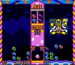
rating most of king dedede’s appearances in kirby media part 1 (1992-2010)
disclaimer: this is my opinion, i would love to know everyone elses opinion too
1. kirby’s dreamland and kirby’s adventure

I love kirby’s dreamland sprites. They are just all so perfect and small. A really good usage of the limited pixels the GB sprite team was given 8/10

I don’t know if this is because it was a scan or what but. where are his trousers. 4/10 got that early games manual look
yet again, dick out, ugly ass line on his shoes. his mouth??? the lack of gloves is just really obvious here + im just not a fan of the ahegao face. 2/10 i hate it.


I know they had limited colours but he just looks so muddy. 6/10 because they’re the same as kirby’s dreamland
2. kirby’s pinball land


YES. they are similar to kirby’s dreamland but MORE. 8/10
3. kirby’s dream course


much better with the colours but yet again no trousers. he also looks like he’s offering kirby a syringe 4/10
4. kirby’s block ball


same/similar sprites to pinball land but something about them feels wrong. 5/10
judging the dedede at the top here. he looks like he’s trying his best. for the friendly smile and thumbs up he gets 6/10
5. kirby’s avalanche


i just... i dont know how to feel about this one. he feels like hes been drawn in a different artstyle to kirby and the yellow is bad and his shading is bad. what’s with the arm placement. why is his chest yellow. 2/10
an absolute embarassment -1/10
5. kirby’s dreamland 2


wonderful. he looks so sleepy. 9/10
still no trousers and weirdly detailed hands. but. there’s a certain je ne sais quoi to his face and posture. it just works. 7/10
6. kirby super star


there’s just something lovely about these sprites that i can’t put my finger on. maybe its the :D. 8/10. points reduced for the colours
teehee teehee 6.5/10
7. kirby’s dreamland 3

i have a love hate relationship with kirbys dreamland 3. the sprites? exquisite. the backgrounds and stage design? hatred. looks muddled. however, i am here to rate dedede appearances, and in kd3? incredible. what a kind, soft and wonderful design. 10/10 tuck me in to bed

they were just so absolutely correct with these that the lack of trousers doesnt even register. 10/10 i just am in love with his face.
8. kirby 64: the crystal shards


this right here? peak. absolute peak. he didn’t need trousers. he didnt need gloves. he didnt need shit. the perfect amount of rotundness paired with a little buff, not to mention the face? exquisite. 100/10


just when you thought it couldn’t get any better the renders show up. there are no words. 101/10
9. kirby tilt n tumble

club penguin

club penguin / 10
10. kirby right back at ya (i am so biased)


i just love him in the show. his characterisation though not canon now worked so well. i would love to see a reboot where we see him go from bbeg to adoptive father funnyman. that said. 9/10 for the drawn portions of the show, 5/10 for the model. it looked like shit but it was 2001.


i take great joy in how expressive he can be. 9/10
11. kirby nightmare in dreamland/squeek squad/amazing mirror


a perfect middle ground. perfect balance of colour and shading. nightmare in dreamland is a wonderful remake of kirby’s adventure and i enjoyed the sprites just as much too. 8/10 he also has trousers, undershirt and gloves now.

what a kind, polite gentleman. i want to squish him, his flesh looks really malleable. perfectly rotund. he lacks the dedede edge and for that i’ll have to minus a point, but i adore this graphic with all my heart. 9/10
i dont like this one. bad proportions. 4/10
12. kirby air ride

the wiki was really lacking kirby air ride model images, which is a shame because i adore this model. just angry enough to have that dedede feel. excellent eye placement (you’ll see what i mean with later models). overall good design. I do feel like the colours are a little dull, but honestly a really nice job 8/10
13. kirby canvas curse


orb/10


go girl give us nothing. reminds me of shitty flash animation. 4/10
14. kirby super star ultra aka one of the best kirby games


MAGNIFIQUE. all the visuals in kirby super star ultra were on point. my absolute favourite of the 2000s kirby games 10/10
does anyone remember the cutscenes. i love the cutscenes.
15. kirby’s epic yarn
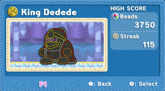
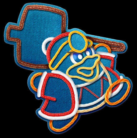
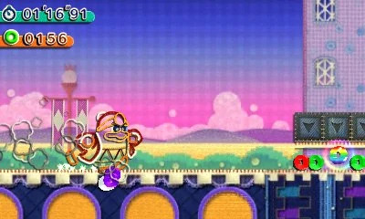
i feel like this might be controversial, and i hate saying it because epic yarn is one of my absolute favourite kirby games, but i just dont like his design that much. 5/10

HOWEVER. this is excellent 20/10
HI IF YOU READ THIS FAR! you deserve a potat- *gets shot and died*
please give me your dedede design opinions, i just love talking about blorbo from my games
13 notes
·
View notes
Photo
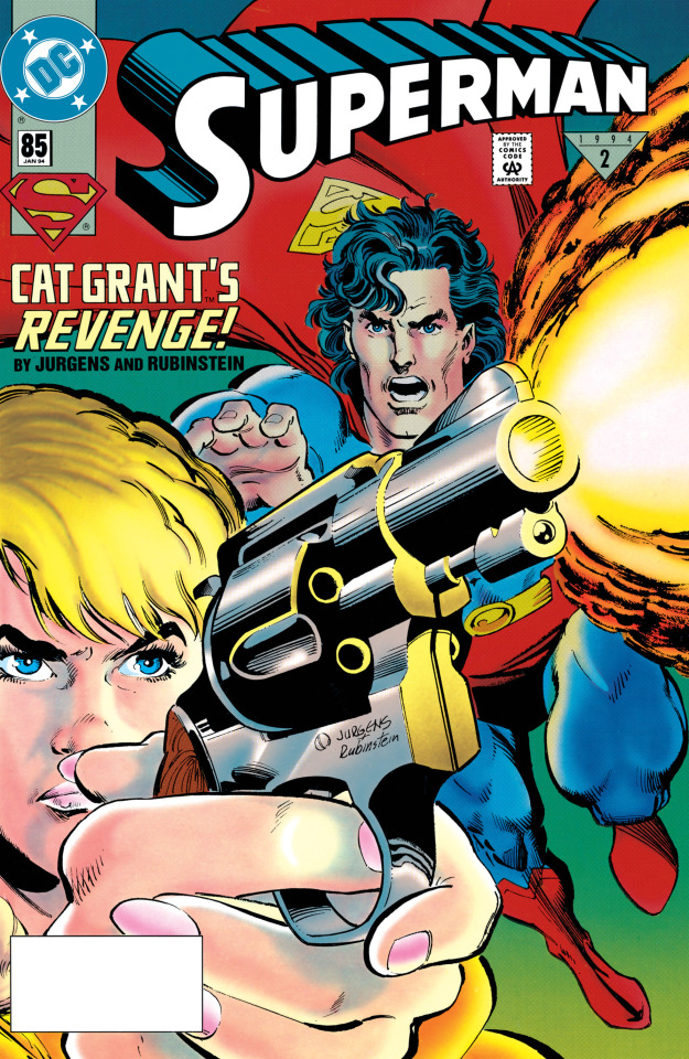
Superman #85 (January 1994)
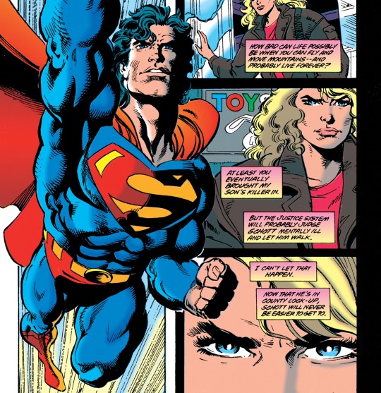
Cat Grant in... "DARK RETRIBUTION"! Which is like normal retribution, but somehow darker. On the receiving end of Cat's darktribution is Winslow Schott, the Toyman, who suddenly changed his MO from "pestering Superman with wacky robots" to "murdering children" back on Superman #84, with one of his victims being Cat's young son Adam. Now Cat has a gun and intends to sneak it into prison to use it on Toyman. She's also pretty pissed at Superman for taking so long to find Toyman after Adam’s death (to be fair, Superman did lose several days being frozen in time by an S&M demon, as seen in Man of Steel #29).
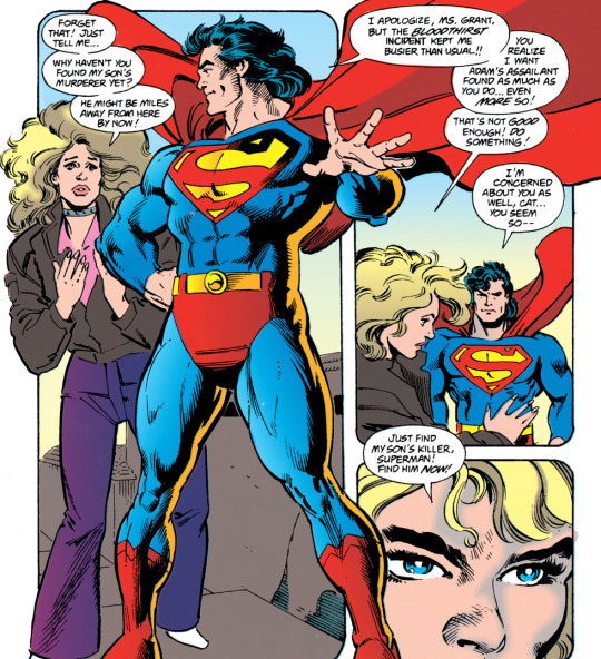
So how did Superman find Toyman anyway? Basically, by spying on like 25% of Metropolis. After finding out from Inspector Turpin that the kids were killed near the docks, Superman goes there and focuses all of his super-senses to get "a quick glimpse of every person" until he sees a bald, robed man sitting on a giant crib, and goes "hmmm, yeah, that looks like someone who murders children." At first, Superman doesn't understand why Toyman would do such a horrible thing, but then Schott starts talking to his mommy in his head and the answer becomes clear: he watched Psycho too many times (or Dan Jurgens did, anyway).

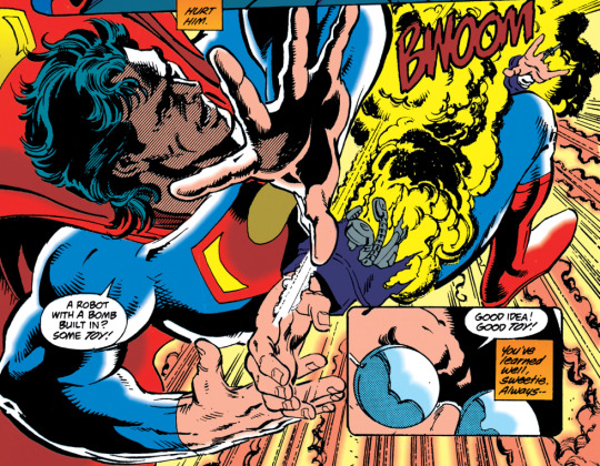
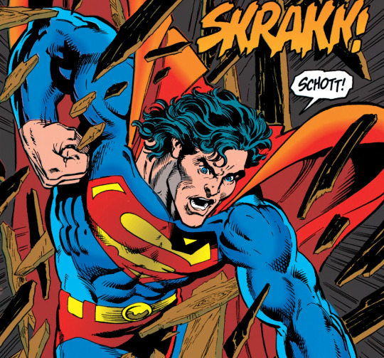
Immediately after wondering why no one buys his toys, Toyman makes some machine guns spring out of his giant crib. I don't know, man, maybe it's because they're all full of explosives and stuff? Anyway, Toyman throws a bunch of exploding toys at Superman, including a robot duplicate of himself, but of course they do nothing. Superman takes him to jail so he can get the help he needs -- which, according to Cat, is a bullet to the face. Or so it seems, until she gets in front of him, pulls the trigger, and...

PSYCHE! It was one of those classic joke guns I’ve only ever seen in comics! Cat says she DID plan to bring a real gun, but then she saw one of these at a toy store and just couldn't resist. Superman, who was watching the whole thing, tells Cat she could get in trouble for this stunt, but he won't tell anyone because she's already been through enough. Then he asks her if she needs help getting home and she says no, because she wants to be more self-sufficient.

I think that's supposed to be an inspiring ending, but I don't know... Adam's eerie face floating in the background there makes me think she's gonna shave her head and climb into a giant crib any day, too. THE END!
Character-Watch:
Cat did become more self-sufficient after this, though. Up to now, all of her storylines seemed to revolve around other people: her ex-husband, Morgan Edge, José Delgado, Vinnie Edge, and finally Toyman. After this, I feel like there was a clear effort to turn her into a character that works by herself. I actually like what they did with Cat in the coming years, though I still don’t think they had to kill her poor kid to do that -- they could have sent him off to boarding school, or maybe to live with his dad. Or with José Delgado, over at Power of Shazam! I bet Jerry Ordway would have taken good care of him.
Plotline-Watch:
Wait, so can Superman just find anyone in Metropolis any time he wants? Not really: this is part of the ongoing storyline about his powers getting boosted after he came back from the dead, which sounds pretty useful now but is about to get very inconvenient.
Don Sparrow points out: "It is interesting that as Superman tries to capture Schott, he at one point instead captures a robot decoy, particularly knowing what Geoff Johns will retroactively do to this storyline in years to come, in Action Comics #865, as we mentioned in our review of Superman #84." Johns also explained that the robot thought he was hearing his mother's voice due to the real Toyman trying to contact him via radio, which I prefer to the "psycho talks to his dead mom" cliche.
Superman says "I never thought he'd get to the point where he'd KILL anyone -- especially children!" Agreed about the children part but, uh, did Superman already forget that Toyman murdered a whole bunch people on his very first appearance, in Superman #13? Or does Superman not count greedy toy company owners as people? Understandable, I guess.
There's a sequence about Cat starting a fire in a paper basket at the prison to sneak past the metal detector, but why do that if she had a toy gun all long? Other than to prevent smartass readers like us from saying "How did she get the gun into the prison?!" before the plot twist, that is.
Patreon-Watch:
Shout out to our patient Patreon patrons, Aaron, Murray Qualie, Chris “Ace” Hendrix, britneyspearsatemyshorts, Patrick D. Ryall, Bheki Latha, Mark Syp, Ryan Bush, Raphael Fischer, Dave Shevlin, and Kit! The latest Patreon-only article was about another episode of the 1988 Superman cartoon written by Marv Wolfman, this one co-starring Wonder Woman (to Lois' frustration).

Another Patreon perk is getting to read Don Sparrow's section early, because he usually finishes his side of these posts long before I do (he ALREADY finished the next one, for instance). But now this one can be posted in public! Take it away, Don:
Art-Watch (by @donsparrow):
We begin with the cover, and it’s a good one— an ultra tight close up for Cat Grant firing a .38 calibre gun, with the titular Superman soaring in, perhaps too late. An interesting thing to notice in this issue (and especially on the cover) is that the paper stock that DC used for their comics changed, so slightly more realistic shading was possible. While it’s nowhere near the sophistication or gloss of the Image Comics stock of the time, there is an attempt at more realistic, airbrushy type shading in the colour. It works well in places, like the muzzle flash, on on Cat Grant’s cheeks and knuckles, but less so in her hair, where the shadow looks a browny green on my copy.
The interior pages open with a pretty good bit of near-silent storytelling. We are deftly shown, and not told the story—there are condolence cards and headlines, and the looming presence of a liquor bottle, until we are shown on the next page splash the real heart of the story, a revolver held aloft by Catherine Grant, bereaved mother, with her targeting in her mind the grim visage of the Toyman.

While their first few issues together meshed pretty well, it’s around this issue that the pencil/inks team of Jurgens and Rubinstein starts to look a little rushed in places. A few inkers who worked with Jurgens that I’ve spoken to have hinted that his pencils can vary in their level of detail, from very finished to pretty loose, and in the latter case, it’s up to the inker to embellish where there’s a lack of detail. Some inkers, like Brett Breeding, really lay down a heavier hand, where there’s quite a bit of actual drawing work in addition to adding value and weight to the lines. I suspect some of the looseness in the figures, as well as empty backgrounds reveals that these pencils were less detailed than we often see from Jurgens.
There’s some weird body language in the tense exchange between Superman and Cat as she angrily confronts him about his lack of progress in capturing her son’s killer—Superman looks a little too dynamic and pleased with himself for someone ostensibly apologizing. Superman taking flight to hunt down Toyman is classic Jurgens, though.
Another example of art weirdness comes on page 7, where Superman gets filled in on the progress of the Adam Morgan investigation. Apparently Suicide Slum has some San Francisco-like hills, as that is one very steep sidewalk separating Superman and Turpin from some central-casting looking punks.
The sequence of Superman concentrating his sight and hearing on the waterfront area is well-drawn, and it’s always nice to see novel uses of his powers. Tyler Hoechlin’s Superman does a similar trick quite often on the excellent first season of Superman & Lois. The full-bleed splash of Superman breaking through the wall to capture Toyman is definitely panel-of-the-week material, as we really feel Superman’s rage and desperation to catch this child-killer.
Pretty much all the pages with Cat Grant confronting Winslow Schott are well-done and tensely paced. While sometimes I think the pupil-less flare of the eye-glasses is a cop-out, it does lend an opaqueness and mystery to what Toyman is thinking. Speaking of cop-outs, the gag gun twist ending really didn’t work for me. I was glad that Cat didn’t lower herself to Schott’s level and become a killer, even for revenge, but the prank gun just felt too silly of a tonal shift for a storyline with this much gravitas. The breakneck denouement that Cat is now depending only on herself didn’t get quite enough breathing room either.
While I appreciated that the ending of this issue avoided an overly simplistic, Death Wish style of justice, this issue extends this troubling but brief era of Superman comics. The casual chalk outlines of yet two more dead children continues the high body count of the previous handful of issues, and the tone remains jarring to me. The issue is also self-aware enough to point out, again, that Schott is generally an ally of children, and not someone who historically wishes them harm, but that doesn’t stop the story from going there, in the most violent of terms. In addition to being a radical change to the Toyman character, it’s handled in a fashion more glib than we’re used to seeing in these pages. The mental health cliché of a matriarchal obsession, a la Norman Bates doesn’t elevate it either. So, another rare misstep from Jurgens the writer, in my opinion. STRAY OBSERVATIONS:
I had thought for sure that Romanove Vodka was a sly reference to a certain Russian Spy turned Marvel superhero, but it turns out there actually is a Russian Vodka called that, minus the “E”, produced not in Russia, as one might think from the Czarist name, but rather, India.
While it made for an awkward exchange, I was glad that Cat pointed out how her tragedy more or less sat on the shelf while Superman dealt with the "Spilled Blood" storyline. A lesser book might not have acknowledged any time had passed. Though I did find it odd for Superman to opine that he wanted to find her son’s murderer even more than she wanted him to. Huh? How so?
I love the detail that Toyman hears the noise of Superman soaring to capture him, likening it to a train coming.
I quibble, but there’s so much I don’t understand about the “new” Toyman. If he’s truly regressing mentally, to an infant-like state, why does he wear this phantom of the opera style long cloak while he sits in his baby crib? Why not go all the way, and wear footie pajamas, like the lost souls on TLC specials about “adult babies”?
I get that Cat Grant is in steely determination mode, but it seemed a little out of place that she had almost no reaction to the taunting she faced from her child’s killer. She doesn’t shed a single tear in the entire issue, and no matter how focused she is on vengeance, that doesn’t seem realistic to me. [Max: That's because this is not just retribution, Don. It's dark retribution. We’ve been over this!]
#superman#dan jurgens#joe rubinstein#cat grant#adam morgan#toyman#dan turpin#joke guns that only exist in comics#cat grant the dark retributor#coming soon to image comics
20 notes
·
View notes
Text
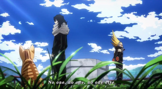
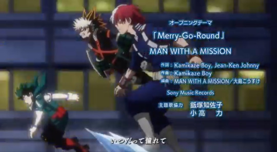
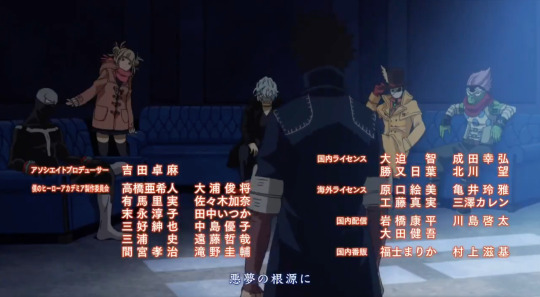
My Thoughts on the New MHA Opening and Ending
I have thoughts, and I will share them because oh boy if I don’t get this out I’m gonna explode
Vague Spoilers for the manga (up to chapter 258 and vigilantes) because I discuss the upcoming arcs, but I don’t discuss any major plot points in detail. Still, proceed with caution if you’re anime only
Keep in mind, this OP and ED will cover the Endeavour Agency Arc and the MVA Arc, so I will be judging them accordingly.
First, the OP
This is a good OP... in theory (that’s going to become my catchphrase for this post). It’s nice to look at and flows pretty well, but my biggest problem is that it doesn’t do it’s job. An OP is supposed to be a sort of... summary (?) of the Cour it plays for. That means any cool plot points, emotional beats, and important characters should be featured in some way, shape, or form. We’ll talk about that more later, but first let’s discuss the music.
The song is really good. I have a feeling it will continue to grow on me as I listen to it more often, but yeah my first impression is that the song sounds great. My only complaint about the music itself is that it ends kind of abruptly (I noticed this is the JT opening too). The previous openings used to have a bit of instrumental to “play us out” and lead us to the end card, but this one feels like it ends very suddenly and unnaturally.
As for the visuals...

Yeah alright I’ll admit, the visuals are stunning... in theory. I appreciate the variety in backgrounds and colours, it makes the OP really interesting to look at. This was actually one of my biggest problems with the JT Opening, it all took place on the training grounds, so there was no variety (everything was metal tubes with a blue sky, with only 3 shots set somewhere different). I appreciate the style of this OP.
But like I said, that’s only in theory, as in, through screenshots these are all pleasing to look at. The pacing of this OP is wild, and I truly don’t know who to blame for this.
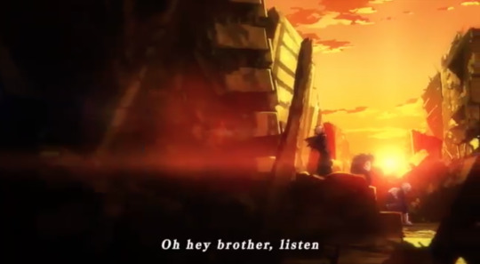
That sunset shot above? It lasts approximately 12 seconds, zooming in every few to make it seem like something is happening (when in reality it’s still the same poses, angles, etc). While there’s nothing wrong with a nice, drawn out shot, it becomes irritating when compared to the pacing of the rest of this op.
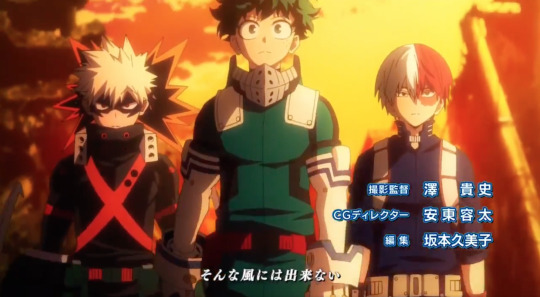
At the 41 second mark, we are given the shot above. It has flowed directly from the previous sunset scene. We still have not moved away from the image of the trio (aside from the opening shot and the title card) yet we’re approaching the halfway mark of the OP.

The next shot is the MLA, which lasts about 5 seconds. Ok, perfect. Not too long, but also not short enough to be confusing. It cuts away a little fast once the dude on the far left appears, but does anyone actually know who that is? No, seriously, I’m asking. I don’t remember his name and he’s not on the wiki, so I can only assume he’s not important. Therefore, it’s not all that bad if the shot cuts away shortly after he comes into frame. The audience is able to take in the scene without having to pause...
... And then the problems start
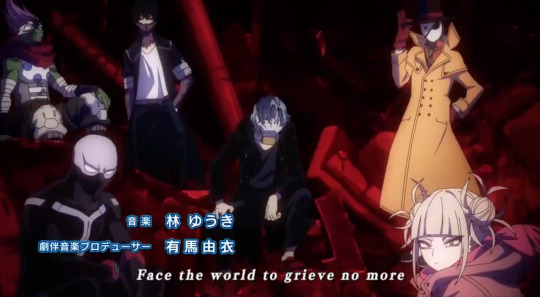
While this shot is fine in theory, it pans up fast and cuts away quickly. You know how hard it was for me to get this screenshot? Really hard. You want to know why I struggled so much? Because, due to the timing of the cut and the way it pans upwards, it’s almost impossible to pause on Dabi’s face. I literally had to go frame by frame to get it, because he’s in shot for so little time that naturally pausing is guaranteed to miss him.
When watching this in real time (without pausing) the cut away makes you feel as if you missed something because “something was there, I just couldn’t register what because now it’s gone”. Unlike Compress, who wears a very colourful coat you can recognize the entire time, Dabi’s pants are more blended into the background.
It also doesn’t help that this shot is literally composed to draw your attention away from Dabi until the last possible second. Due to framing, your eye is naturally drawn to the brightly coloured Toga in the foreground, making it super easy to miss Dabi in the back (until, of course, his bright face appears and contrasts against the background, drawing your eye just in time for the scene to change, leaving you to wonder who or what you missed).
I know this sounds like nitpicking, but this shot is the only group shot we get of the League, and is also the start of a seriously weird trend for the villains in this OP getting the short end of the stick.

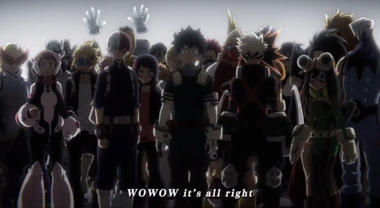
Anyways, then we get what I’ll call “The Carousel Shot” in which every Class 1A kid shows up and poses dramatically, as if they were on a carousel. It’s a lovely sequence and I really enjoy watching it but... why is it in this OP?
Seriously, this is a genuine question. Class 1A barely shows up in the Endeavour Agency Arc, and NONE of the students are in MVA. This sequence (not counting the three boys at the end) lasts 8 seconds. Why is this much time dedicated to characters who are barely in the arc? (Unless Studio Bones extends their work studies into fuller plot lines which oh my gosh please don’t do that, or if they do, do it quick).

We then get what I call the “Oh God I Blinked And Missed Everything” sequence, which lasts 3 seconds (not including the longer, moving shot of Shigaraki at the end) and features NINE INDIVIDUAL IMAGES, none of which are related to each other. Not only is this 3 images per second, but the fact that they are all unrelated means you can’t even use previous information to fill in the blanks.
What do I mean by that? Well, imagine if I show you 9 images of various pro heroes posing. If I play that in 3 seconds you’ll absolutely miss some of them, but as long as you catch some you’ll still get an idea of what I’m trying to show to you. Your brain is able to fill in the gaps that “I recognized 4 pro heroes, therefore the rest must have also been pros” even if you didn’t register every single frame.
That doesn’t work if every frame features a completely different subject. The shots in this sequence vary so widely that it’s impossible to find a through line. Some feature multiple characters, some feature one, some are closeups, some are super far away, some are character’s we know, others are characters we don’t. It’s impossible to get a solid read on what you’re being shown.
Now, again, there’s nothing wrong with these super quick shots... in theory. The problem comes from the fact that these shots are the only indicators for some of the major themes that will be explored during this Cour (like Twice’s growth and young Shigaraki).
That being said, let’s move away from criticism and talk about speculation, because hidden amongst this sequence are two... interesting images.
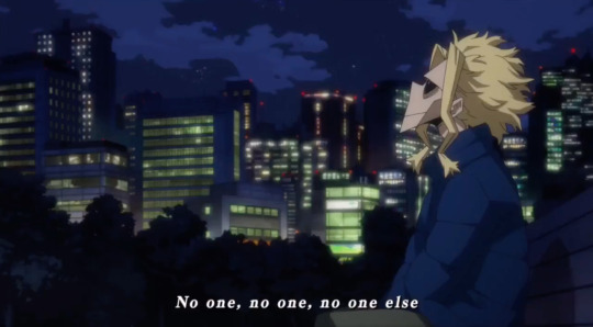
This All Might one is very reminiscent of the shot in Chapter 257, where Aizawa and All Might have a conversation while staring up at the stars. However, this is technically the start of the “War Arc” (or the “prologue”, if that’s what you want to call it), so this might indicate that we’re going to get farther into the series than a lot of us guessed.
(Many people suspected we’d get to that cliffhanger at the start of the season (if you read the manga you know the one), but after seeing the pacing for JT a lot of us assumed we’d be lucky to even finish Endeavour Agency. It seems we’re back to the cliffhanger now though lol).
This is another really interesting shot because it’s indicative of Shirakumo, meaning we might get to see Aizawa and Mic confront him some time this Cour (this also makes sense, since this confrontation technically happens before that All Might scene I mentioned in the previous paragraph).
But the cat specifically is a really strange addition. That cat is named Sushi and, correct me if I’m wrong, but I don’t think Sushi is ever mentioned in the main series. I think he’s only in Vigilantes.
This might just be a little Easter Egg for Vigilante readers, but I’m personally hoping that they’ll add at least a few Vigilante shots in there to really tug at the heart strings. I’d say I want a whole Vigilante episode but I don’t think they have the time (unless they really cram MVA, which I do NOT want).
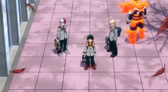
I don’t have much to say about the last bit of the OP. The action shot between the 3 boys was nice, and it follows the sort of narrative through line they established from the early shot of them sitting at the sunset. I also like the shot of Endeavour fading in to replace All Might, even if it’s very simple.

But I want to talk about an overarching problem I touched upon earlier in that villain shot: the way the villains are handled in this OP.
This is a good OP... in theory. The problem is, it doesn’t represent half the arcs in the cour! Every shot of the League is so rushed that you can barely register that they were on screen before they’re gone.
I have no idea how many Episodes Endeavour Agency will take, but I’d assume 3 (4 if you count the Christmas episode). 12 episodes for this Cour minus 3 for Endeavour Agency = 9 episodes left. If we truly do get the prologue for the War Arc (and if we assume it’s only 1 episode) that leaves us with 8 villains episodes.
8/12 episodes (aka two thirds of the Cour) will likely be about the villains. And yet they’re pushed to the background so hard in this OP.
I want to dream, and I want to believe that this OP is going to magically change when MVA starts. The song fits super well, and I can imagine like an inversion of the OP but from the Villain side! Wouldn’t that be neat? Imagine right after the “it’s alright” part Shigaraki just freaking decays the title card... oh man that would be so cool. But, alas, I highly doubt they’d do that.
Side rant, but you know what was so fun about MVA in the manga? It’s that, for 21 chapters, we leave the kids behind and the villains become our protagonists. Suddenly Shigaraki is the one we’re rooting for, suddenly we’re learning backstories for everyone, and suddenly we find ourselves just as attached to the villains as we are to the kids. It’s an inversion that��s SO RARE to find, and I think many people (myself included) were hoping it would be reflected in the OP.
A big part of being the protagonist means featuring heavily in the OP, and a lot of us just wanted the villains to get that honour, even if only once. As is, the OP still treats them as the antagonists when... really they aren’t. Not right now, at least.

So yeah, final thoughts on the OP are that it’s good, it’s just not very representative of the arcs it’s supposed to cover. If this was just for Endeavour Agency, I’d say it’s actually really cool, but if we assume that this is what will play for the Villain Arc, then it simply doesn’t do it’s job. And it makes me sad to say that because, again, this OP is really well done.
If I had to rate it? Hmmm
If Studio Bones actually grants my wish and creates a different visual for the Villain Arc (while using the same song) and then this version only plays for the Endeavour Agency Arc and the War Prologue? I’d give it an 8/10. It’s really good, but it could use a few more elements that are clearly derived from the Agency Arc (ahem, Todoroki siblings).
But if this is the OP that will play for the entire Cour? a 6.5/10. It’s nice, but it’s not representative of one of the arcs it’s going to cover. And, unlike other arcs like Pro Hero or Summer Exams, the villain Arc is so important and takes up so much time that it honestly feels like a bit of a disservice.
Now for the Ending

I want to say that I appreciate how soft this ending starts. This cour will likely feature a lot of episodes that end on... heavier themes, and I think the sight of peaceful, falling raindrops is the perfect way to let the audience process their emotions before starting the ending in earnest.
The song itself is very nice, and I like that it’s a bit slower than the more recent endings.
(Side note, but the FUNNIEST moment in the entire series is when Sir Nighteye dies because it’s so emotional and everyone is standing around his bed in his heartwrentching silence, only for the ending to come BLARING IN out of no where. If you forgot how jarringly hilarious it was, go listen to the Eri ending and tell me that’s not the funniest thing this series ever did. Anyways yeah I’m glad that’s not gonna happen this Cour).

This ending is a bit all over the place in terms of it’s visuals, but honestly I think it works. Most endings usually have a theme tying them together (all the Class 1A girls, a fantasy AU, old photographs, planning a party, etc) but this ending’s theme is a bit harder to identify.
That being said, I think it’s just supposed to show everyone going about their day. It’s calm, it’s peaceful, and it’s just very sweet to think about

I like this shot. Actually, scratch that, I like this whole sequence. I enjoy anything that allows Class 1A to chill and have fun.
Hawks is featured quite heavily in this ending which, fair. He’s pretty important in this arc.
I really love the shot where Endeavour immediately switches to Hawks, I thought that was a lot of fun, and very good symbolism on how Hawks wants to be like Endeavour. I also love all the shots of Baby Hawks, because it’s adorable.

Something about this shot is just so cute. It’s the little domestic things like waiting for a bus that make this ending feel... idk the word, real? It shows a side of the characters that we’ll never see in the episodes, but we know have to exist.
Like yes, of course the kids have to wait for the bus. We never see it, but of course there are those moments of quiet. Agh, I love it.
The villains also make an appearance and I’m very happy about that (I’d love to see more of the villains just chilling around, I think they deserve it). I kind of wish they weren’t sitting in a dark room for the sake of being edgy, since I think it would be nice to see the villains just... sort of existing, but honestly it’s still a nice shot. I also like how this shot sort of mirrors the first one with Class 1A (someone coming in while everyone else is sitting and waiting for them).
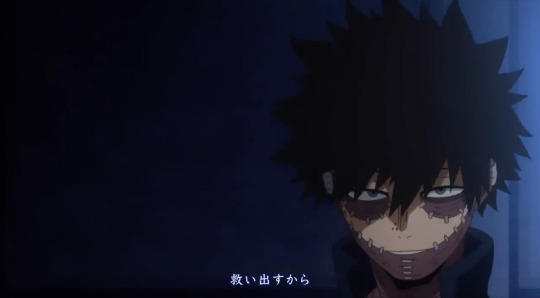
That being said, as much as I love looking at Dabi and his stupid face (affectionate)... why is Dabi the one getting the closeup?
Mind you, endings don’t need to be connected to their Cours (they can be, like the Eri one, but they don’t have to be). But this ending does seem to be connected to the arcs it intends to cover, given all the Hawks appearances, the boys wearing their work study scarves, etc.
So, I ask again, why Dabi? Out of the six League members, we learn the backstory for four of them in this arc (Shigaraki, Toga, Twice, and we very briefly learn about Spinner). The only two left out are Dabi and Compress.
I can only assume they chose Dabi because he’s constantly in contact with Hawks, and therefore that makes him important? If the OP told us anything, it’s that Bones values the Endeavour Agency Arc over the Villain Arc lol...
... Oh my gosh please tell me that’s not actually the reason Dabi is focused on here BONES WAI-
Anyways, the ending comes to a close with Hawks watching over the kids and Endeavour. The relaxing time is done, it’s time for work studies.
Overall impression? It’s great. It’s hard to screw up an ending, so as long as you have something pretty on screen, it’s wonderful.
I’ll give this a 9/10
#bnha#bnha season 5#dabi#keigo takami#bnha season five#katsuki bakugo#shoto todoroki#mha season 5#mha season five#bnha op#bnha opinions#izuku midoriya#bnha hawks#ok to reblog#actually yes please do reblog if you found this interesting#I worked hard on it
30 notes
·
View notes