#might do a speedpaint of me coloring this
Explore tagged Tumblr posts
Text
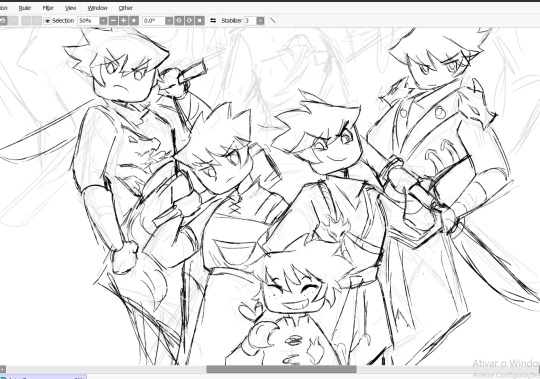
Kai my beloved
#funfact fire is my favorite element and so is the color red#might do a speedpaint of me coloring this#not of the lineart or sketch because I get anxious of making mistakes lmao#I'll try to finish this next month it's just hard because of University#Suprisingly I'm graduating on programming and not arts so I don't have alot of time to draw :/#ninjago kai
323 notes
·
View notes
Text
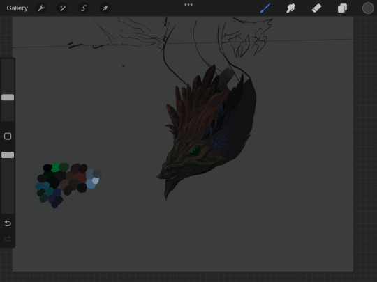
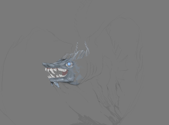
Realism is fun till it isn’t and I realize I’ve already committed too far and can’t just scrap it but I know it will take me too long so here are some sacrifices you may see finished later on
#dragon#myart#creature#I still generally have inspiration for the first one so that one will probably get finished first#I really like watching the speedpaints procreate automatically records even though it’s crunchy and has a weird green tint#specifically on realism because it’s wild for anything else and is actually psychotic#Mostly because I just suddenly start experimenting with brushes and start turning layers off and on for a good chunk of it#I use 3 layers usually for realism#One for the actual drawing one for the sketch and one for a base color#It makes it better I think because it’s more similar to actual painting or something#That might not be the reason I dont really know#It’s just better I do it that way#Maybe because I can’t get distracted and lost?#Realism is also a great source of learning for me#Even if i never really finish stuff like this#I might this time though who knows#Sorry for leaving you guys stranded I’m chasing a really big train across the country#My priorities are with locomotives#“You guys” (I say to my very few followers 🤑🤑 (that probably followed me in the first place for dragon adventures stuff))#I do what I want and what I want is not dragon adventures right now#Right now I want locomotive#I’m not hijacking that train it sounds like I’m going to hijack that train#however#i would appreciate owning a big train I feel like I would enjoy that#Side note how do my DA followers feel about the genetic traits in the event eggs making motorouk w/ the error trait worth like 100mil#I feel ill when I can recite all of the full species names from memory#It does make sense though I’ve been playing since the first event in 2019#I’m committed what can I say#Almost forgot a tag oops#art
11 notes
·
View notes
Text
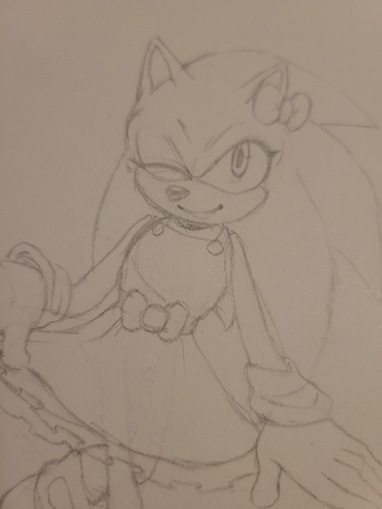
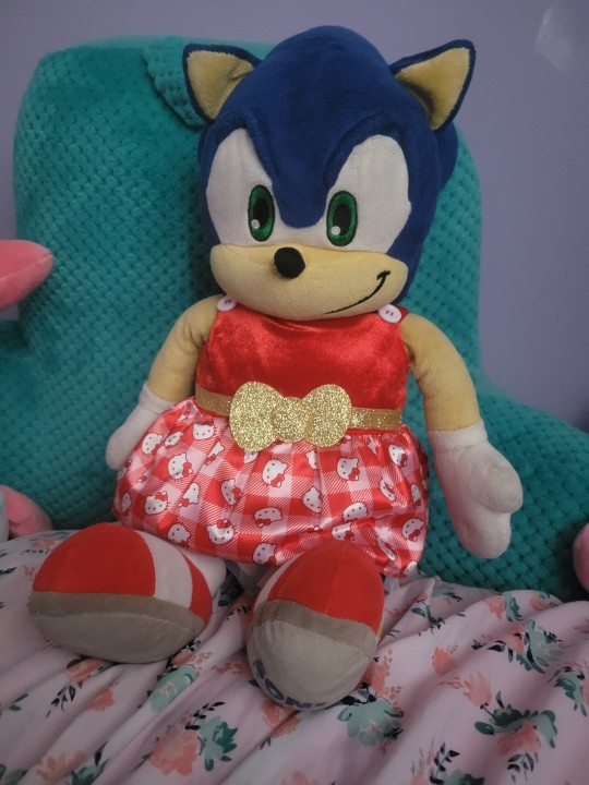
Cooking rn
#wip#mom got me this super cute pink hello kitty bab with that red dress#and my first thought was to immediately slap that thing on him#and then draw him in it too#red is such a good color on him it matches with his shoes and contrasts with his fur so well i love it#might possibly make a speedpaint out of this one bc i think it'd be fun#i keep thinking abt lisia's theme from pokemon oras i think it fits the vibe#i love putting sonic in silly little outfits i need to do that more often
9 notes
·
View notes
Text
So JJK is over and my LMK brainrot is back , added with the fact i am playing a MOBA game and am being blessed with delicious illustrations it prompted me to make this


Now i am going to ramble about this because this is the first time in forever where i kinda pushed myself to make a FULL art piece-
I will be standing for this-
Let me tell you, i had no confidence in this and the composition was supposed to be way different, but this still happened. This took two days because i kept procrastinating , walking around my room dreading drawing the background BIG ADVICE FOR BEGINNER ARTISTS Watch speedpaints. You will learn so much by watching the process and that was this for me I have the tendency to kinda burn myself out and finish everything in a day and then never actually finishing. Tried something different for this and made a cheap silhouette of a sketch, then drew over that and used greys and whites fort the shadows. Then i think i colored everything in a base color (and i finally used a palette) and then i tried to find the lighting and shadow colours. It was weird. And what im saying is that i planned most of it instead of diving head in withour a plan. Crazy i know-
I also just learned about dpi PROPERLY and unfortunately made my piece so big that it kept stalling paint tool sai-
let me just post the progress shots
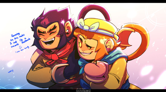


I also fucked up macaques reference and fixed it in a whim somewhere. You can see it here. I honestly wasn't planning to follow the lmk at style but that kinda happens when you're starring too much at the references.
There's still a mess and i wanted to render it a bit better ,the way i normally do but i didn't. Anyways i did enjoy the process and i actually miss them so much and i might watch LMK all over again Especially Wukong and MK
Btw this was supposed to be a moving illustration and i just didn't
I have Live2D but no
(Btw please check out my profile if you have the chance and thank you for reading this! Love you-)
#lmk art#lmk sun wukong#lmk fanart#lmk macaque#lego monkey kid fanart#lego monkie kid#lmk monkey king#lmk shadowpeach#shadowpeach#six eared macaque#lego monkie king#OK BUT I FOUND OUT HOW TO DO THE EFFECT IN THE FIRST AND I FELT LIKE A KID ON CHRISTMAS#btw im sorry i dont ever post anything for any holidays#it will be the same for the chinese new year and valentines day
2K notes
·
View notes
Note
What's ur inspo for art? ur art style is so cute... any art advice?? Jajsjdkkaka, I understand if u wanna gatekeep 👁👁
I meant to answer this several days ago but couldn't find it in the sea of asks welp
Anyway as I mentioned before we don't gatekeep art related stuff in this household, artists help other artists.
Honestly it's hard to name an inspo but I do have artists I look up to a lot (this might be a bit long)
Kanisuke, you guys might be familiar with her, she's the artist of the upcoming yandere inside game Yandere Town. I know it's not out yet but I'm actually obsessed with this game and have even translated all the character intros (they are a bit old atp so there might be some mistakes) and actually if you see a Yandere Town related post high chance it's from me. Not only her art but I love her writing style as well.
Hakuri-sensei, their manga Sachi iro no One Room is definitely one of my biggest inspirations. I love the relationship between Sachi and her "captor" and it's the only manga I actually cried my eyes out while reading.
Tayu-sensei, all of their work for Yuugen Romantica (one of my fav drama cd series) are breathtaking and they've also developed even more since then, their current works are just so stunning and I love studying the way they draw hair
Shirahama-sensei, she👏is👏a👏queen👏 honestly I don't have much to say, go read Witch Hat Atelier it's an artistic masterpiece and a giant love letter to art itself
Furumi-sensei, another queen! She's the artist of my favorite Fate Grand Order character Ashiya Douman. I've even bough her art books before, honestly she is just so talented. I don't know what she was drinking when she came up with Douman but I need some of it
Usagi Routo-sense, another fgo artist AND JUST LOOK AT HOW INCREDIBLE THEY ARE AT USING COLORS LIKE??? HOW??? Their art is like cocain for my eyes I could look at them for hours
AU, one more fgo artist and oh my god guys this person right here is one of my biggest inspirations just look at their drawings. I'm not kidding I actually spent hours just inspecting how they shade outfits. I'd sacrifice my soul just to get a chance to watch them draw live
☝︎ FAN, an Ashiya Douman fanartist and god guys the comics they draw!!! They are the cause of some of my current biggest fetishes ngl
Oyo-sensei, an fgo artist and is also the main artist of 18trip. They have such a clean art style that's very pleasing to the eye. I especially love the reference sheets they draw.
Shibatora-sensei, she is the artist of my FAVORITE drama cd series Shinai naru Thanatos and my overall favorite yandere character from any fiction Seo Eito. Honestly if you know me irl probably the first thing you'd mention about me would be my chronic Shinai naru Thanatos addiction because based on what everyone says I start speaking about it within 2 weeks of meeting someone new.
ORKA, the artist of A Stepmother's Marchen. Anyone who knows that manhwa probably knows why she's on this list, her art has so much soul and passion in it, literally every single panel looks like a painting and it makes me want to cry just looking at it
82 Pigeon, an incredible incredible Korean artist, I think they also give art lessons? I really tried to get them but couldn't figure out how. They also have a youtube channel and I learn a lot just by watching their speedpaints
181 notes
·
View notes
Note
TLDR: Got any drawing exercises to recommend?
I’m in loooove with the way you use lines, shapes and colors/shading to show form in your art. The way you draw bodies shows a lot of understanding of the shapes that go into them, and that’s something I often personally struggle with. I’m familiar with the shapes of a face, but when it comes to connecting them to the shapes of the body and so on, I get frustrated that it’s jumbled instead of cohesive.
I was wondering, when you’re looking to practice, whether that’s anatomy, line-making, still life shapes or whatever, do you have any exercises you’ve done and would be willing to share? I’ve been trying to crawl out of the no-art-depression-hole for a bit and want to start with things that don’t take much willpower but help me improve
I might be the worst person to ask this! My relationship with art is not typical and I do not practice mindfully! (I just draw whatever I want and that's my practice, y'know?
Anyways, here's my progress of how I learnt to draw :3

Step 1 is proportions - breaking up the human body into manageable blocks and pieces. And step 2 is learning the muscles that build up the body, and from there you can simplify as needed... Or do that thing anime art kids do and skip directly to the simplified bit! (You probably shouldn't do that but if it's a hobby who cares!)
For specific tutorials, I find that proko is probably the best mix of entertaining/educational content you can find, but aside from that I watch a lot of speedpaints.
As a sort of get rich quick scheme, I think the absolute easiest way to get stupidly good at art is studying perspective - but you at least need a basic understanding of proportions and anatomy before you can draw someone in a funky perspective.
Everything in life is in perspective, and every piece of work you will ever make will have perspective in it. Perspective is sort of like an all-encompassing thing in our reality that you don't realise is there, and maybe even not realise is missing in your work (just that something feels... Wrong) AND LIKE NOBODY EVER TALKS ABOUT IT! WHAT THE FLIP!!!
I don't really have a specific source for learning perspective, because I've been on-and-off trying to wrap my head around it for a few years (I'm still awful at it but I'm getting there...!) here's a video!
I do think that drawing with progression in mind might help, but I think with art (as a hobby) the most important thing is probably love for a special guy and joy of creation. You have to love what you're drawing and the simple act of creating, or it just won't work out. If you're in a depression hole maybe just try creating for the sake of it, and don't give yourself too many expectations :)
#and composition that one is important too#but comp is more “how make picture look good” and less “how get better at art”#but picture looking good does indeed make you better at art so!#and besides if you have eyeballs that work youre already further along with understanding composition than perspective#because again#its an all encompassing thing we dont notice is all around us#we know picture look good because we have eyeballs that work#but we dont know why this cube look weird and this one doesnt. because cubes all look normal irl and you dont think about it#ok done. anyways yeah i dont recommend figure studies that shit is boring#if youre just doing this as a hobby ofc#heph answered#im showing too much of my personality here im going to bed#also i realise that im not answering the question#but i do also think the not connecting to body shapes thing might be an issue of perspective#draw different body part in perspective. start connectimg them. boom profit
120 notes
·
View notes
Note
Hii so I just wanna say I love your art! It is so lively and vibrant, and this leads me to a little question, how do you color your ilustrations? I am struggling with colors rn so I hope I am not a bother.
I wish you a good day <3
Hiii !! Sorry omg I didn't see your ask 😭
Huhh it is kinda hard to explain,, maybe showing you speedpaint might give you an idea !
And i tend to pick color in this area !

85 notes
·
View notes
Text
I finished it >:3

(Speedpaint and lineart under the cut :D)
Okay, so... I kind of love them as a throuple haha I just feel like that perfect balance of personalities and temperaments are there that just tick all my boxes haha I like the idea of most of the ships I've seen for this show tbh, but this little idea stood out enough for me to wanna draw it >:3
This was so much fucking fun.

Honestly, I kind of can't decide if I like the full-flats or just the lineart better on this one. Maybe someday I'll render the colored version to have the same soft quality as the lineart - but also maybe not XD
If you guys know me at all, I don't usually do full lineart for my pieces, but this one just came out so... yummy I love the texture and the line weight/quality I got in this one sm! Yeah, just a really fun little project overall :D
MINOR FLASH WARNING!
I forgot to hit record at the very beginning, sorry about that, but you barely missed anything which is good! XD
Also getting sleepy half-out-of-frame Pomni to not look 13 was a fucking STRUGGLE my girl is so tiny and round lmao
Anyways, watching TADC for the first time this week was super fun, and I did a lot of traditional sketches of the characters (mainly Jax lmao) so I might share those at some point, who knows. I love getting into a new animated show, I feel like it always pushes my art so much and helps me to expand my shape language, etc. especially translating from 3D to 2D.
Honestly I think having to translate it down into 2D really helped me retain more of my own style rather than getting stuck in the show's animation style (which happens a lot with Hazbin/Helluva - which I'm fine with, but when I do want to branch out with those particular characters I do find it harder)
I'm super excited for more episodes to come out!
#my art#digital art#fanart#tadc#funnybunnydoll#the amazing digital circus#throuple#tadc pomni#tadc jax#tadc ragatha#jax x ragatha x pomni#jax x ragatha#ragatha x pomni#pomni x jax#funnybunny#jagatha#jax#pomni#ragatha#artists on tumblr
103 notes
·
View notes
Note
Do you know. Is there anyone out there who is missing you? Who would notice your absence? Assuming they even remember you. Is there anyone to care? With how ornery you seem I'm not sure if there would be. I can't see anyone caring beyond what you could do for them. I'm not sure if any of 'us' care beyond the amusement you provide :)
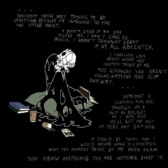
((this fool spilled espresso on the universe in a nutshell . wtf
((obviously he is unaffected by this, you can tell by his sure and proud body language
((asks open now until . idk how long. a while
((under the cut is my process yap session. this was agood one to do it on bc i had to redraw the whole pose and scene, and the head angle allowed me to show off the Noggin Prism. i would have done like, a speedpaint type thing, but my insecure ass cant handle ppl seeing the 900 mistakes i make every time 😭😭😭
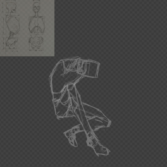
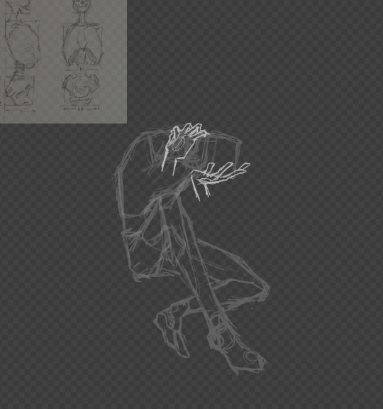
((so first i usually draw out the hipbone, ribcage, leg forms, and approximate head shape/position. for this guys figure im going for a combination of the machinist and goth anime legs uncle. hes got no arms but i usually put in shoulders for an expressive silhouette. i dont do the legs every time, as sometimes for more simple poses it isn’t necessary.
((second i figure out what i wanna do with the hands, drawn on a separate layer. good time to remember sketch is just a general loose layout, and you can change things whenever you decide.
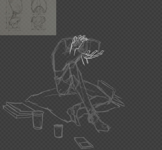
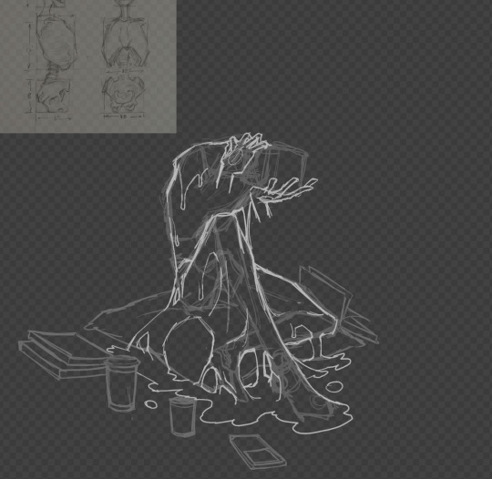
((third i do whatever props are supposed to be around. i do this after the pose bc i usually base the “camera” angle around what makes sense for the pose, then i know what perspective they should be.
((fourth i do the goop. i do it after the pose and hands because its similar to the way i would draw clothes - kinda held up by and draped over the body forms.
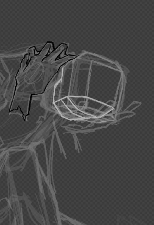
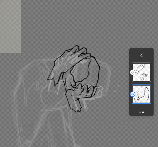
((step five i dont often need to do, but for when i have to draw the head at an unusual angle, i make this boxy mapping shape. this step is a little complicated so i wont explain it in full, but its super helpful and easy once you understand the shapes that make up a face. if enough people wanna know i might make a separate post for it.
((step six is lineart. i did the full face lineart before i covered it with the hands, because once its all lined, you can make sure that it looks correct. usually its easier to tell during lineart because the forms are more clearly defined, and you can tell where things might not line up, or they look unnatural. you can do the hands first if you turned off the head layer, but its harder to tell where the hands should be resting. you can see in this step i changed the shape of the hands and the position of the head a bit, which happens often in this step for me usually due to the definition of the forms i mentioned. remember its good to zoom out and look at the whole form often so things arent drawn too big or small!
((next was doing the neck, white goop outline, filling in the face and hands, and doing some minor shading on the white bits. since i use a black background, i dont actually need to fill in the body with black. when i color lineart, i duplicate it and put the color on the layer on the bottom. this is so i dont accidentally change or erase the lineart, but also because if i decide to color the lineart, i can mask layer the lines instead of the lines And the color. this is also the step where i lined and colored the props.
((after the
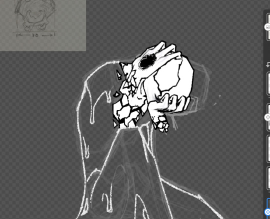
((after i finish doing the black prop outlines and coloring them, i turn the black back up to full opacity. i turn it down so that im not trying to see black lines on a black background.
((then i finish up with resizing, text, and whatever extra effects i decide to add.
((i dont do all of these steps every single ask, but i should because shortcuts fuck it all up fr. thats all hope this was cool and helpful.
#i use adobe fresco btw#gaster#wd gaster#dr gaster#wdg#undertale deltarune#ask blog#goop gaster#goop posting#asks open#undertale#deltarune#art process
55 notes
·
View notes
Note
i love your art so much, what does your process look like? how do you edit images to be saturated/glitchy & also cohesive w your art?
awww thanks so much!!
its a lot of playing around with layer settings (shine&shade and burn&dodge are favorites but screen, multiply, overlay, exclude, those are fun too) and turning up saturation & contrast (in whichever program im using at the time). most saturation sliders have an upper limit. you must. go beyond 😈😈
to get a glitchy look i'll either literally look up "free use glitch overlay" on google images (i have all AI sites filtered out on my browser), or a LOT of the time i'll take pictures of trees or clouds around me, and i'll mess with the saturation of those images until its SUPER crunchy and low quality. zooming in on a random part of the image also helps make it crunchier and lower the quality (you'd be surprised how cool and ""glitchy"" a SUUUUPER oversaturated and zoomed in img of a cloud can look. i <3 cumulonimbus and nimbostratus but it doesnt rain much here 🥺)
i'll add a random layer effect, duplicate the layer, add a different effect, overlay a color gradient or random assortment of scribbled colors, etc... just til it looks sufficiently microwaved and cluttered. i also have quite a few glitch brushes on SAI 2 for some additional clutter
then for the main focus of the art i'll usually draw a little critter on MS paint, zoom in so u can see the pixels, copy the image&cut out the whites around it with magic wand, then put it on the image. its fun to do this with a lot of tiny little colorful cats just to add more color to the bg XD
sorry if thats all over the place. i dont have much of a cohesive process since i just goof around until i like how it looks or i recreate whatever my brain wants. sometimes i'll just do everything on a 200x200 canvas and size it up after editing and it looks crunchy on its own (i do this a lot for gifs, like my most recent piece). integrating photography is very fun. mixed media is fun
i might make some speedpaints sometime if i can get over my anxiety of ppl watching me draw XD
but ty again for the very nice msg. sorry if my response is a tad bit incoherent lol
65 notes
·
View notes
Text
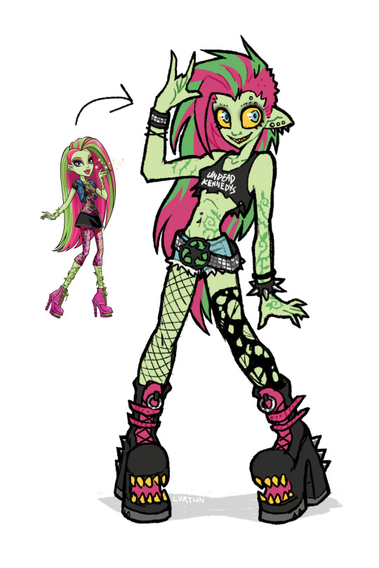
venus if she was awesome
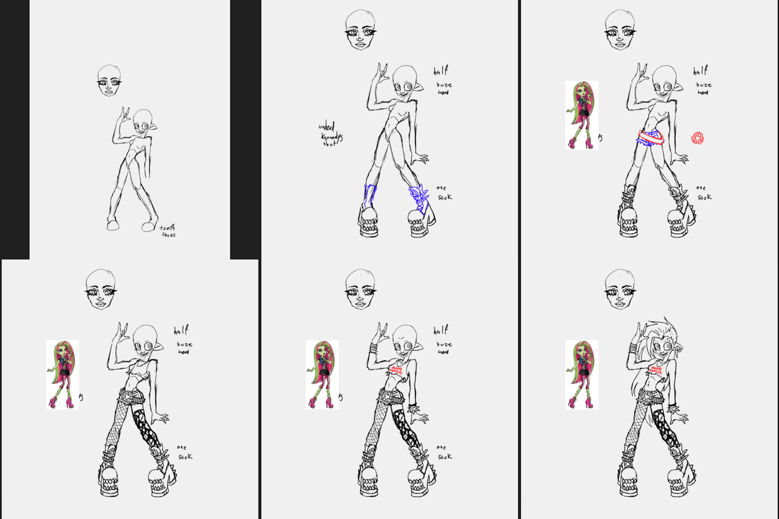
speedpaint and more thoughts under the cut
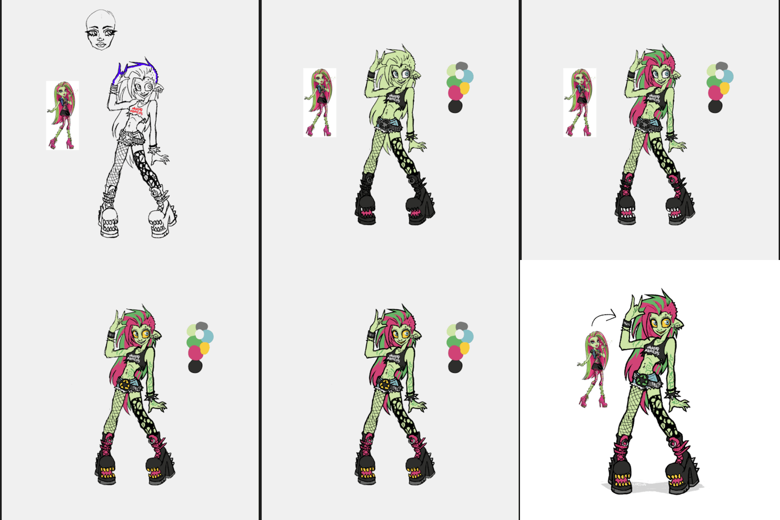
venus has always been one of my favorite characters, though i feel her design is pretty underwhelming with a lot of wasted potential. this is kind of a redesign, kind of my own personal headcannon, and kind of how i imagined venus in my head as a kid.
this is supposed to be my version of g1 venus, more similar in facial features and keeping the straight hair. i absolutely love her new hair and face in g3 but im hesitant to call the new outfit an improvement. both g1s outfit and g3s outfit are bad in their own ways. i dont want it to seem like im shitting on the new design. again i think the face sculpts, hair, and body types of g3 are so awesome. its great to see more diversity being included in the designs. i just decided to go with g1 venuses look because thats the venus i grew up with
i definitely took some inspiration from g3s outfit for this design. i like the idea of it but the execution is just not great, not to say her original outfit is any better. i feel like out of all of tge original monsters she was the one with the most waisted potential. i love her personality and the abilities she has but the way she was styled has always bothered me.
in the movies shes described as “eco-punk” which is SUCH a cool style to go with a plant monster character. i just feel like the “punk” in “eco-punk” was never really represented in her outfits. i personally love punk music and clothing; ive been an active member in my local diy scene for many years and i love seeing all the outfits people put together.
i thought i would give her an outfit that shows off a couple of my personal favorite staples of punk style. big chunky leather boots with lots of straps and buckles. kept the shoe mouths from the original because they cool as hell. lots of leather, studs, spikes. i gave her denim cutoff shorts inspired by her gen 3 outfit, same with the torn black top. punk style has a big focus on comfort, practicality, and making things yourself. i imagine she cut a pair of old pants into shorts, roughly cut her “undead kennedys”band shirt tank into a crop top, and probably repurposed the remaining fabric. i also totally didnt draw this whole thing as an excuse to use that pun. i included asymmetrical leg accessories, with one fishnet stocking and one torn up sock. i also feel like she repurposed these, continuing to wear her old torn up socks instead of just throwing them out. i gave her a big chunky studded belt matching one of her cuffs with a recycling symbol belt buckle. i feel like it communicates an important aspect of her personality just at a glance, plus i just love big belt buckles. lastly i added piercings because 1. theyre cool and 2. i for some reason remembered her having an eyebrow piercing but i guess she never had one.
i mostly kept her body and hair the same. changed her ears and hair color slightly but thats just personal preference. i decided to make the vines on her body look more like tattoos instead of being 3d. i imagine she can make them grow into real vines, but when shes not using her powers theyre just flat against her skin. gave her a facial expression that made her look a little more unhinged. she might only do things for the good of the earth but she can still mind control people at will.
i wish i leaned a little bit more into the plant theming but im overall still super happy with how this came out. maybe ill made more monster high redesigns in the future
203 notes
·
View notes
Text
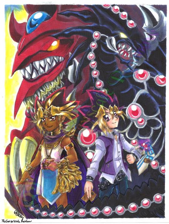
I got the opportunity to meet Dan Green at C2E2 2024 and I because I tend to get too nervous to say what's in my heart to people that have meant so much to me for so long, I say it with art. It took a solid week of work and this is the most ambitious illustration I've done in a very long time and I'm so happy with how it came out, even with a not so happy accident when I was in the final stretch. I was able to fix it though, so the original is now with him! <3
He is so nice and it means so much to me that I got to talk about art with him. I didn't know he's also an artist! His stuff is awesome and he did a little art trade with me and I will treasure it. I got lots of compliments on both my art and cosplay, it made my heart so full.
SPEEDPAINT TO FOLLOW
I think I might do a digital coloring of this too so that I can play around with some more special effects now that I'm not on a time crunch.
#yugioh dm#yugioh fanart#pharaoh atem#yugi muto#yuugi mutou#slifer the sky dragon#gandora dragon of destruction
110 notes
·
View notes
Text
the syndicate

i went through all of my old medibang files to see what was lurking there and found this old sketch i started doing back during techno's birthday stream. the group picture of the syndicate always stuck out to me, and im p sure its because of my own overfondness for group/family pictures in general lmao
anyways, it was a really nice sketch, so i redid the lines and slapped some colors/shading on it. all in all, i think this is one of my favorite things ive drawn this year. i didn't expect to do dsmp fanart, but i think it might always crop up every now and then, the same way i still draw warrior cats every now and then in my sketchbook
also, unless i finish a couple of other things in my drafts, i think this is gonna be the last thing i draw in 2023. so i hope you enjoy it! let the new year be like frozen yogurt in the good place; just okay.
edit: theres a speedpaint for this if youre curious
#art#artwork#digital artwork#digital art#digital drawing#drawing#dream smp#dream smp fanart#dsmp#dsmp fanart#dsmp art#ds#dsmp artwork#dsmp drawing#dsmp ranboo#dsmp philza#dsmp technoblade#dsmp nihachu#dsmp niki#the syndicate#dsmp syndicate
151 notes
·
View notes
Note
Hello! I saw you were taking asks about anything (with bonus pictures of Mr. Haku?? bless) so I was wondering if I could politely pick your brain about your illustrative process. I've been tearing my hair out over rendering practice lately and your studies always blow me away. I know you've had some training and I think we both use Procreate, so I'd love to hear about how you use layers and/or layer blend modes, but also general process, thoughts, tips, etc. hope you're well, have a nice day :-)
Thank you so much for the ask and kind words!
I don’t cross promote it as much as I should probably but I upload a lot of speedpaints to YouTube, such as this study that might be helpful. Depending on how complicated the piece is, I’ll either break it down by putting shapes down (typically darks first) or do a more formal sketch if I don’t think I can easily eyeball it. After the sketch, I do an under painting on a layer below the sketch, set the sketch to multiply and then I render everything on one layer. It really depends on the brushes you use, but I prefer to build opacity slowly with a brush that doesn’t blend, lowering and upping the brushes opacity as I see fit. This creates a more complicated, kind of glowy effect that I think works particularly well for skin rendering.

I’ve been exclusively using leatherwood under “artistic” in procreate recently. You have to use a pretty big canvas to make it work (I’m usually working on 8000px+ 300dpi) but I really enjoy some of the unpredictability of the brush, makes things feel more natural. Not sure if I altered the brush at all but if there was a multiply or stabilization on I turn those off always, basically.
As for layer modes, I don’t tend to use them a ton for paintings except maybe for maybe throwing a slight multiply layer to bring tones down if the key gets too high. I’m more likely to mess with curves and color balance to experiment with color. I do this especially for my lined illustrations, I use layer modes also for them too and just go to town trying a bunch of stuff. My tip for this is to duplicate your file, flatten everything, duplicate your flattened layer and just mess with it until it feels right. Color editing to this degree is kind of new to me, but since I’ve begun it’s really upped my game I think.
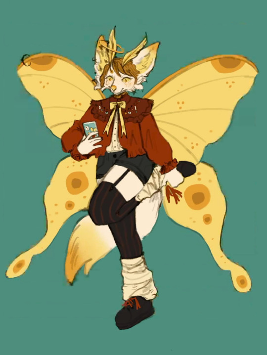
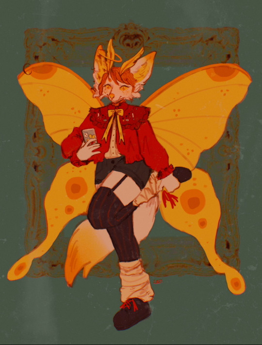
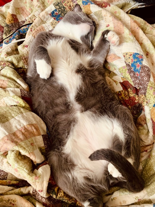
Before/after color editing. I know sometimes people think of this as a cheating tool in digital art but honestly that is a silly take to me.
I hope this answers some of your more specific questions. Thank you again!
This post is already long as shit so Mr. Haku under the cut
25 notes
·
View notes
Text
Eggtober 6th 2023

"Splat" or "Fun with Colors": Raw Egg.
(Clip Studio Paint, Gouache Brush, Pencil brush for details and highlights. 12 colors, I think? 1 Hour.) I actually really liked the rough version I made, so you're gonna get that one at the end as well, for anyone who also likes the rough one better than the smooth one.
But first... I finally discovered a feature of CSP, so now I am unstoppable and I will NEVER AGAIN have to ask myself "How the fuck did I do that?"
Because now I have EVIDENCE. Now curious friends, followers, and my forgetful ass, can watch the full process of how I made a thing. Including what references I used so it's clear how much is iterative and how much I am drawing directly from the visual reference. Today I had to do a lot from imagination because I couldn't find an exaggerated splashy egg, but sometimes I really am just making a study and trying to do a one-to-one recreation of a reference. So now y'all get to know all my filthy little secrets. I was intending to grab footage starting with Eggtober 1, 2023 but OBS needs a version of an NVIDIA driver that will absolutely wreck my computer with BSODs because I own a junker apparently. But it turns out CSP (or at least V2, IDK if it was in V1) has a way to capture a speedpaint natively when you create the file.
Now I am unstoppable, powerful. No more taking a break from art when life gets busy and coming back to pieces I drew 10 years ago and wondering "How the hell did I manage that?" I can just check. It's over for all of you. Once I practice anatomy again and start being able to draw shapes and volumes perfectly from imagination, I will become all-powerful. I will ascend. Hell, maybe someone might even pay me if I learn to draw anything that isn't an egg or a meme. XD Radical self-confidence, baby. I can art now, and I have evidence. My horizons are infinite!
And now, hopefully, any baby artists that are just starting out can get an idea of how I do it from this and future pieces so I can pull you all up with me in a bid of apotheosis. For the EGGsthetic! (Aesthetic.)
I wonder which version of this egg @lady-quen's breadbugs will snap up?
And I wonder which one @quezify will like best? My money's on the sketchy one.
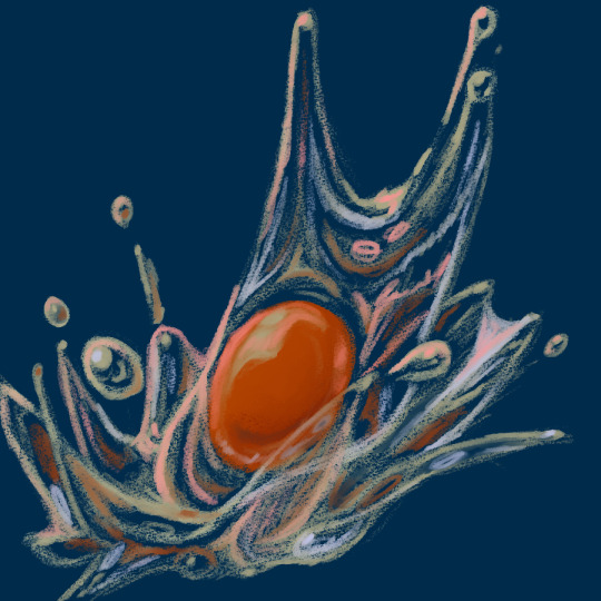
I can't tell which I like better honestly. The smooth one us much more "My aesthetic" because it matches how I render eggs but... The rough pencil-y gouache lines you get with light pressure really remind me of how the classic modern quezify eggs look, and I of course only started doing eggs because of the first Eggtober so, like. On the one hand, smooth and painterly look that goes with all but one of my previous eggs (Eggtober 1, 2023 was a study from memory of quezify's style, after all). But on the other hand... dramatic color changes! Textrure, shine! Colors that aren't in the actual references! EXPRESSIVENESS. Two different moods on the same egg art and I really dig both of them honestly.
164 notes
·
View notes
Text
Lengthy ramble for potential tier/restructure post! But if anyone has insight or feedback or advice, I'd be so grateful to hear it! Thank you for your time! 🥺🙏💕💕💖
*copy/pasted from my patrons post!
*Stressing potential again because I might just try to workshop maybe a couple of these tiers?? I'm editing this after a couple responses so far! So thank you everyone for reading and sending your insight in! It's SO helpful and valuable to hear, thank you!! 🙏💖💖
Hey lovely people! 🥳💖 So lengthy and candid post time, but I'm thinking about restructuring the tier prices (specifically the higher tiers, like the Sauce and Honeybear and maybe sketches too)? Currently I am making very little money, so while that is scary it is also sort of the perfect time to test out some change in how I structure things on here! So I'm sort of excited to potentially try something new! The tough thing with selling your own work is always how to price things - and it's the gentle balance of pricing for what you're worth, but also making a good price point that is accessible to more people! So while prices might be lower, the hope is that they bring forward more patrons and therefore I can make more money as well! SO! A Price Restructure of what I'm thinking (and a couple rewards movements from the $2 Tier to the $4 Tier, specifically) (Also the Sweet Pea Tier will be removed) :
✨ $2/month Tier (Buttercup : same rewards, updated here for clarity (bc I need to update them as well))
Access to ALL artwork and their process GIFs as I finish them! (currently only sharing crops on social media and select, older work)
Commission and Adoptables Priority (You get to access slots/designs first!)
Access to Fanart Friday Suggestions + Polls (we try to do them once a month!)
Access to Coloring Pages (as I make them! this is infrequent)
Access to the Patron-Only Discord (it's very chill and just for you and other patrons! And you can share art, music or just hang out if you want!)
✨ $4/month Tier (Cutie Pie : same rewards!)
Access to my sketchbook pages and the bundled pdfs! I post sketches in batches of 10 on here! When I have enough pages, I'll be uploading the pdf of the sketchbook for free for you to download (100 pages per Volume)!
Access to videos! (I'll do speedpaints/timelapses from time to time!)
15% off adoptable designs while they are posted on patreon! (before moving to ko-fi!)
Access to all Licensed Character Designs I make (under the LC tag!) (These are for Personal Use Only - intended for DnD and similar RPG situations! ^ w ^)
✨ Access to Archived Works (this is access to all previous work I've shared for the Buttercup tier that you would be able to see on my website all in one place! Goes back to 2019!)
✨ Early Access to Brushes
Plus all previous rewards!
✨ $6/month Tier (Honeybear : same rewards!)
Access to the Honeybear Discord! A creative motivational group for artists! (I will be active in this discord!)
Activities for personal motivation and fun! There will be blob doodle pages, monochromatic challenges throughout the month, along with a monthly design prompt and a selected study piece!
Channels for just sharing personal work/wips and a critique corner as well for anyone looking for feedback on their pieces!
Plus all previous rewards!
✨ $8/$10/$15/month Tier (Sauce : same rewards!)(edit: $10 maybe? Or even keeping at $15, based on some comments from patrons)
18+ ONLY!
Access to ALL NSFW pieces! Sketches and finished paintings alike!
20% off Store Discount! (For my Print Shop and INPRNT!)
Plus all previous rewards! (this includes the Honeybear Tier Discord and Activities access)!
--- So this an idea of what I'm thinking!
It's all still very much up in the air because part of me wonders if I just need to promo more as well? I also have had patrons tell me in the past that I make a lot of work (even if I panic and feel like I'm not making enough @ w @;;) and that the monthly subscription is reasonable for the rewards already? Ahhh it's just difficult figuring this stuff out, especially while stressing about things! So I appreciate feedback if you're feeling up to sharing! 🙏💖💖 Thank you all so much! 💖💖💖
#delete later?#text ramble post to follow up my last one!#thank you all so much for your kindness and time! ; w ; 🙏💕💕
14 notes
·
View notes