#make up obsession palette review
Explore tagged Tumblr posts
Visit Tumblr Blog
Explore Tumblr blogs with no restrictions, modern design and the best experience.
Last Seen Tumblr Blogs


Fun Fact
BuzzFeed published a report claiming that Tumblr was utilized as a distribution channel for Russian agents to influence American voting habits during the 2016 presidential election in Feb 2018.
Text


been havin fun with the alt palettes by also adding some alternate outfits along with it. and also being gay, of course
explanations of the references are below the cut
first pic: nathan's first design was immediately compared to markiplier so i just made the little description his classic intro
second pic: since annie's shrek-like palette is donkey it was only natural to make nate the dragon. and then the palette name is the "dragon my balls" meme, but i thought it'd be more snappy as dragma
third pic: remember when i said it took me ages to figure out nathan's palette? one palette i went through was purple and oranges and honestly i'm still partial to that one. maybe nathan's design will drastically change to be purple some day
fourth pic: made nathan mother brain mostly so i could draw annie chomping on his head. i don't know anything about metroid except that mother brain turns into a trex like beast at some point
fifth pic: so i was wracking my brain for a wario land character to associate with nathan but in the end i couldn't get the image of a waluigi nathan out of my head. so that's not so much the mother of antonblast and moreso mom's weird brother. the uncle. so the description (and i feel so fucking clever for this) is a little nod to the fact that while waluigi is always connected to wario, hes not a part of wario land at all, so that's cheating. and its also a reference to the fact that waluigi is obsessed with everyone except for him being a cheater
sixth pic: i just really wanted to recreate this screencap with annie and nathan because i feel in my heart they'd do this

seventh pic: personally, as someone who wasn't even born in the 90s but grew up on 90s gaming reviewers of a. certain modern reputation. when i think of annoying 90s platforming mascotts desperately trying to be sonic the hedgehog, i think of bubsy. so nathan got forced into that little horrific cosplay. also i just wanna say i fucking hate the pose and face he does on the title screen of his first game he looks like hes being held at gunpoint and silently blaming me for it
39 notes
·
View notes
Text
NikoBran & JerLan - “Can I have your son for the rest of my life?”
Brandon was having an exceptional day, one of those rare stretches of uninterrupted peace and focus. His latest canvas, an impressionist vision of Nikolai with that usual mix of shadowed wild charm, was coming together perfectly. He smiled to himself, dabbing a bit more paint to capture the angle of Nikolai’s jaw, a touch of light for the smirk that, to him, was pure art. His muse. His Heathen Peasant. Really, if he were to be honest, Nikolai was as good as a prince himself—but it was fun, calling him his Peasant. After all, didn’t Niko call him his Prince Charming?
Lost in his work, he barely noticed the sound of footsteps until the door slammed open behind him. He turned just as his twin, Landon, stormed in, his phone clutched in his hand, looking like he was about to deliver some dire news. Brandon raised a brow, unfazed, and continued to blend colors on his palette. What now?
“Have you seen Jeremy and Nikolai’s story?” Landon asked, his voice sharp with barely-contained annoyance.
Brandon shook his head, shrugging as he wiped his hands off. “Not yet. What’s so urgent?” he asked casually, though he snatched the phone from Landon with practiced ease.
The screen lit up with an image of Jeremy and Nikolai mid-soccer game, both flexing their arms with ridiculous grins, muscles on full display, jerseys clinging from the sweat. It was practically designed to be a thirst trap, and Brandon felt his eye twitch at the sight of them looking like they were on the cover of a sports magazine. Soccer? His mind reeled for a second as he thought aloud, “Why soccer of all things?”
He barely had a moment to process before Eli sauntered in, phone in hand, looking far too amused. “Ah, so you saw it too?” he said with a chuckle, nodding towards the story as Brandon continued staring, his annoyance only growing. “Guess I should explain. Last time I visited Killian, Jeremy and Nikolai were tagging along, as usual. I might have mentioned that Uncle Levi, was a bit of a soccer star in his prime. Thought it would be funny if they used that fact to ‘charm’ the future in-law,” Eli grinned, shrugging. “Didn’t think they’d actually take it this far.”
Landon crossed his arms, shaking his head. “You’re telling me that you planted this insane idea in their heads, and they just ran with it?”
Eli’s grin only widened as he shrugged. “What can I say? They seemed… interested. They said they wanted to get Uncle Levi’s approval.”
Brandon groaned, rubbing his temples, but he couldn’t help the smirk tugging at the corner of his mouth. “Of course, of course, they’re using my dad’s ancient soccer past as an excuse to post thirst traps. This is practically bait. As if Dad would be okay with anyone dating us..Dad thinks we are still kids.,” he muttered, exasperated but amused.
…………………………………………………………………………………….
Ilya grumbled under his breath, feeling like he’d been assigned to the most ridiculous mission of his life. He was a hardened mafia guard, for heaven's sake, not some influencer’s cameraman! Yet here he was, jogging across a grassy field with his phone clutched tightly, running after two self-obsessed troublemakers as they posed and flexed in front of the camera. It was like watching a pair of overgrown children, except that these overgrown children were supposed to be the “fearsome” leaders of their respective places in Bartva.
Jeremy struck another dramatic pose, arms flexed, grinning with a perfect smile. Meanwhile, Nikolai kicked an imaginary ball, trying to make the whole thing look at least a little authentic. “Ilya, angle it from lower!” Nikolai barked, pointing downwards with an exaggerated motion. “You’re making us look short!”
Ilya rolled his eyes, adjusting the phone reluctantly. Making them look short? He thought to himself.—how much lower did they need him to go?
Jeremy and Nikolai reviewed the picture and immediately groaned in unison. “Ugh, no. We look ridiculous. Try it again!” Jeremy declared, putting his hands on his hips. “We need to look like the type of future sons-in-law who could make a retired soccer player proud. What would Levi think of that one?”
Ilya sighed heavily, rolling his eyes. “Look, I can tell you what he’d think,” he muttered. “He’d think you’re both insane.”
But the two weren’t paying him any attention. Jeremy was too busy readjusting his hair, slicking back some stray strands that had come loose. Meanwhile, Nikolai tried a new pose, hands on his knees like he’d just scored a game-winning goal.
“Come on, Ilya! Capture the spirit, the intensity! Make it look like we’re professionals,” Jeremy insisted, gesturing with that trademark confidence of his that could either make a person feel like a million dollars or make them want to throttle him.
“Professional what?” Ilya muttered under his breath. “Professional pains in my—”
“Did you say something?” Nikolai asked, eyebrows raised.
“Nothing,” Ilya grumbled louder this time, raising the phone again. “Just hoping no one comes by to see this madness.”
The two posed dramatically, arms slung over each other’s shoulders, staring off into the distance as though contemplating their destiny. They were fully committed, completely unfazed by how utterly absurd they looked.
After a dozen more failed shots and several changes in angle, they finally settled on one they deemed acceptable. Ilya breathed a sigh of relief, ready to reclaim his dignity as a serious bodyguard—but, of course, his relief was short-lived.
“Alright, now off to the art studio,” Nikolai announced with a grin, completely unaware of the suffering he was causing. “If we’re gonna win over Brandon and Landon’s mom, we need her to know we’re more than just pretty faces and sports studs.” He winked at Jeremy, who smirked back.
Ilya groaned as the two trotted off toward the mansion’s art studio like it was some grand adventure. He trailed behind, reluctant but helpless, resigned to the fate that being their bodyguard—and, apparently, their personal photographer—was his life now.
When they got to the studio, Jeremy immediately went to the paint supplies and smeared a few colors on a palette. Nikolai changed to a spare hoodie like he was prepping for the biggest art show of his life, eyeing himself in the mirror and adjusting his hair.
“What are you doing?” Ilya finally asked, unable to hold back any longer. “This is getting embarrassing. No one’s going to take you seriously if word about this gets out, you know.”
Nikolai laughed, as if that was the most absurd thing he’d ever heard. “No one will know, Ilya. That’s the point of having a loyal, trustworthy guard.” He winked, entirely too cheeky for someone who had just spent the last hour meticulously arranging his poses for Instagram stories.
Jeremy was even worse. He dipped a brush into a bucket of dark red paint, flicking it around on the canvas with the dramatic flair of a true artist, clearly enjoying himself far too much. “Just a few more shots, Ilya,” he said, grinning as he smeared paint on his cheek with his thumb. “Make sure I look soulful, you know, like I’ve got depth.”
Depth? Ilya couldn’t help but wonder what depths these two had beyond the ridiculousness he’d been forced to endure all afternoon. Still, he raised the phone and clicked another photo, this time capturing Jeremy looking “deep and thoughtful” with his paint-smeared face and Nikolai gazing intensely at his “masterpiece” on the canvas.
The two reviewed the photo, nodding approvingly, clearly impressed with their own efforts. “Oh, this one is perfect,” Nikolai said with a proud smile, patting Ilya on the back as if he were some award-winning photographer.
Ilya muttered under his breath, casting a wary glance toward the studio entrance, just in case anyone came in. The last thing he needed was for someone else in the mafia to see him in this compromising position, photographing Jeremy and Nikolai pretending to be artists. He’d never hear the end of it.
Ilya clicked off the shot, shaking his head in disbelief. “This… this is a new low,” he said, but Nikolai just laughed, wrapping an arm around Jeremy’s shoulder as they reviewed the clip, fully satisfied.
“Well, we’re off to charm the in-laws,” Jeremy said with a grin, giving Ilya a thumbs up. “Thanks for all the hard work today, Ilya. You’re a real gem.”
Ilya groaned, fully intending to take the next two days off to recover from the utter humiliation of being their camera-wielding sidekick.
……………………………………………………………………………………….
Levi sat at his desk, his phone in hand, scrolling through the barrage of photos and videos sent by those two hooligans, Jeremy and Nikolai. Each shot was more ridiculous than the last—images of Jeremy flexing and grinning like a wolf, Nikolai attempting to look “soulful” while smearing paint on a canvas, and, of course, the final pièce de résistance: a slow-motion video of them “playing” soccer, all dramatic lighting and ridiculous poses.
He shook his head, muttering under his breath. “What am I looking at? Did they… did they even kick the ball once?” He squinted at one of the pictures, which featured Jeremy with his arm around Nikolai, both gazing dramatically into the distance .
“Who do they think they’re fooling?” Levi mumbled to himself, rolling his eyes. “They probably don’t know the first thing about soccer. They’re just trying to butter me up.” He rubbed a hand over his face, sighing as he came to grips with the fact that these two were very likely going to be his sons-in-law.
Astrid breezed by, catching a glimpse of the photos over his shoulder. She laughed, taking the phone from him to get a closer look. “Oh, that’s adorable! Look how hard they’re trying,” she said, scrolling to the picture where Jeremy was staring off into the horizon with paint smudged on his cheek. “They’re doing this to impress you, you know.”
“Impress me?” Levi huffed. “By making themselves look like fools? If they wanted to impress me, they’d stay out of trouble and keep their little mafia nonsense to themselves. But no, my sons have to fall for the most dangerous mafia boys.”
Astrid raised an eyebrow. “You’re just mad because they’re flaunting how much they adore our sons.”
Levi grumbled as she handed him back the phone. “I’m mad because they think this’ll win me over. Look at them—posing like a couple of overgrown schoolboys!.”
Astrid shook her head with a smile. “Oh, Levi. They’re in love. And those two hooligans will do whatever it takes to show you they’re serious about Brandon and Landon.”
Levi scrolled “What do Brandon and Landon even see in these idiots?” he muttered, though there was a hint of a smile pulling at his mouth.
Astrid smiled, amused. “Oh, you know exactly what they see. What I saw in you. Love. Protection and a bit of madness .”
playing pretend rather than have a serious conversation with me.”
Astrid shook her head, still smiling, as she went to pour herself a cup of tea. Levi watched her for a moment, then turned his attention back to his phone, smirking despite himself at the ridiculousness of the whole thing.
Levi let out a sigh of grudging acceptance. “Well, I suppose I could be stuck with worse. At least they’re entertaining.” He gave one last look at the ridiculous soccer photo, muttering with a half-smile, “But they’d better be ready to prove themselves, because winning over this father-in-law will take a hell of a lot more than paint and muscle flexing.”
......
Taglist:
@lanterns-and-daydreams
26 notes
·
View notes
Text
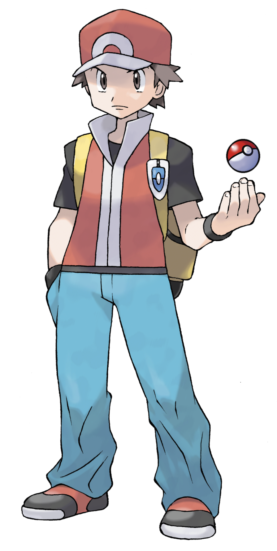
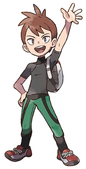
Time for more reviews nobody asked for, this time the gen 1 protagonists and rivals.
A little caveat: I'm only reviewing them as they appear in the games they are playable in, otherwise I'd have to make a few posts just to get through Red and Blue. We're also counting Let's Go for this.
We'll start with the GRBY era for this
Let's start from the beginning. Red himself. According to the game, he's 11, but most would assign whatever age they want to him since he's just pixels on a Gameboy at this point. That would also include gender, since there's no girl character to select in gen 1- unless you're the type that really gets bothered by that kind of thing, it probably didn't affect you and you just imagined yourself as a tomboy or something.
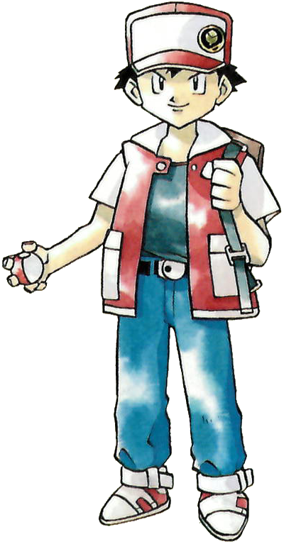
Ken Sugimori's early styling is iconi- a beautiful water color palette masterfully done, with an art style he himself claimed to be Akira Toriyama inspired. We don't have the corporate styling just yet, so it's a really charming, retro look with blocky styling and pretty simplistic clothing. The hat, t-shirt, and jeans are a pretty simplistic attire for any kid about to good off- the vest really adds about 80% to Red's individuality with fans probably recognizing it as being similar to gen 1 Ash- fitting since Ash is based on Red. The shoes are also kinda retro and cool, but that's not quite as important imo. Small thing, I do prefer when Red is depicted with black hair rather than his brown haired counterparts. I can't really fault the design much because it is pretty early on,except maybe I'd have made the shoes black instead of white and added gloves. Still, it's an outfit I'd probably wear as a kid. 9/10
Now I'm not going to give a full review on this, but I figure it's fair to bring up Green's prototype artwork before she would eventually become the playable girl character in frlg. Gen 1 games were held together by bubblegum and a dream, so adding a girl character was probably too hard for them in the 90s- it's a shame, Green isn't dressed for adventure, but she is cute, the white gloves and white belt are a nice touch on the black dress. I think Manga Green really pulls it together with white boots instead of black flats. Still, really cute for the time, although I feel that people probably would have been over critical of her design in this day and age had she been canon. 8/10
Ah Blue, the original asshole we all know and love. Always 5 steps ahead of you, somehow catching a lot of pokemon before able to, and 1 really inconvenient battle in Sylph Co marked him as an opportunistic rival hunting you outside of caves for some reason. A smug narcissistic bastard, perfectly fitting for an 11 year old grandson of THE pokemon authority. Weirdly obsessed with smelling you later.
Design wise, you gotta love the spiky hair. It's such a cool look that screams 90s, and really adds to his "cooler than you" attitude he has, which his cocktail expression further adds to. The clothes are pretty simple, a purple long sleeve, darker pants, and really cool brown boots- and also a necklace. It's not much, but the design is pretty reminiscent of cool kids you'd see on tv shows and such. As opposed to Red's bright and varied colors, Blue has darker colors, which is another nice contrast.
As a rival, he does a pretty good job setting the foundation for what fans should come to expect. Stronger pokemon to yours- as a proper petty rival should- with the exception of his Eevee in Yellow that evolves depending on your first two battles with him, if I remember correctly, with Vaporeon being the cocky evolution he chooses if he's beaten you- aka, he doesn't see you as a threat. Weird how he ditches it in gen 2 forward, but I guess he did ditch his Raticate. Anyway, his teams are touted to be geared to handle any type- at the time, this is certainly true, although certain teams will have certain glaring weaknesses, such as a triple electric weakness if you picked Bulbasaur. His Alakazam for sure was the stuff of nightmares, especially in gen 1 when Psychics were op as hell and had no weakness you could reasonably exploit. It's no wonder he became a champion and then gym leader- fun fact, in Japan he's called Green (for some reason, blue and green get swapped in translation between Japanese and English often), and the Earth Badge is called the Green badge in Japan- isn't that hilarious? He's so full of himself even after losing the champion title that he could've gotten a new badge or renamed it, but he kept it named after himself. Anyway, a solid rival. 9/10
Onto frlg
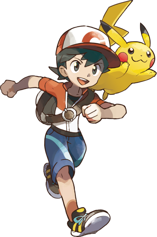
Frlg Red became the new standard Red going forward after being introduced in the gen 3 edition of the gen 1 games. Sugimori's artstyle has evolved by leaps and bounds at this point, and we now sort of have a more modern artstyle that a lot of people consider the True tm pokemon artstyle. It is a small shame we lost the pretty water colors, but at the same time, I feel like this does look a bit more agreeable.
I think the design is solid, and unlike og Red, frlg Red is a bit more age ambiguous, which makes him an even better blank slate for any player of any age. The outfit is a bit more modernized, now untucking his pants from his shoes, and zipping up his simpler vest over a black tshirt. The hat, too, is also a bit more characterized, being more unique to him. Rather than gloves, he opts for black wristbands, which is nice for helping fill empty space and give some oomph to his look. The yellow backpack kinda clashes imo, but also kind of works- I'd want it, anyway, and even comes with the Vs Seeker pinned to it. Lastly, we have a change to his hair color- brown. I have brown hair, but honestly I'd have preferred they keep it black. All in all, this is a nice outfit and I'd probably wear a variation of it if I could. The main thing I'd change is unzipping the vest and making his hair black again. I do also need to express my appreciation for having full length pants- this is a rarity for guy protagonists as we get to the more modern era gen 7 onwards. The outfit just looks comfortable overall, nice and roomy, breathable, and something that'd fit right in in the world of Pokemon. A 9/10.

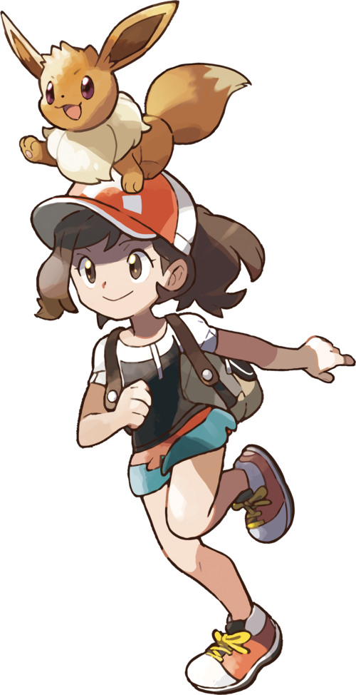
We finally have an official gen 1 girl character- 8 years later after gen 1, and also being mostly forgotten outside of Masters. "Leaf," as most people call her, would be the third girl mc added as of gen 3, and she's a nice addition imo. Like FRLG Red, her age is also left up to the player, and her design also somewhat reflects another blank slate to attach to.
The outfit is a pretty and simple one- although I will say, I probably wouldn't adventure through oceans and mountains in a mini skirt if I were a girl. Regardless of that, the red skirt and blue and black top are a cute combo and a flip of Red's colors, which is pretty creative imo. The loose socks are also a neat addition, and the white and red shoes match with her white and red pork pie hat. The black wrist bands- like Red's- help add just a little more to the design. The messenger bag is fine, again not really my favorite color, and personally speaking after using a few myself, probably not the most comfortable to lug around. The pink VS Seeker is an okay touch, but the pink does sort of clash and probably would have been better if it was either premiere ball colors, or red like her skirt. Lastly, her hair is a long and kinda frizzy brown- it's cute, I'll say that, although I think I'd have either covered it with a cap, make the hair shorter, or shortened some of the hair frizz. I wouldn't say the outfit is practical for adventuring- just a smidgen better than her gen 1 prototype- but who cares in a work of fiction as long as you look cute? I know plenty of girls that like the design- grown and young- and it is a satisfactory extension of the player. Although, some might still prefer Red for pants. Still, 9/10 on a personal note.
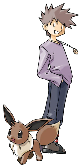
And now gaming's most famous douchebag returns in an updated look. Peak 2000s asshole fashion with the half popped collared shirt, choker, and smug expression. The colors for his pants and shirt flip and go darker for the top and lighter for the pants- which I like, this is an outfit I've probably worn similar to when I was a kid. The purple wristbands match with the pants and also fill empty space, the shoes are a simple black that also just work very well with the rest of the design, and- although probably not something I'd get caught dead wead wearing in public- I do like the silver and black hip bag. The outfit is trendy for the time, I appreciate the guy having pants with pockets that are also breathable and not skin tight, and it's just right amount of smug asshole. The one thing I dislike is how the art portrays Jim with orange hair rather than brown- in game, it's not so much an issue, but it does repeat over time. It'd be one thing if it was a similar hue to the brown in the og work, but this is NEON orange, not even ginger orange. Well, it at least made it accurate when I named him for my best friend and life long pokemon rival at the time.
Blue FRLG doesn't really change much personality wise other than a few lines of dialog, but his tactics do get smarter when using his revamped team and even smarter with his Johto'd up rematch team. How did he get back to the champion room? Well, when you're as strong as him, who can stop you other than the only guy to beat you before? 8/10, fix the hair and you're gold- wait, sorry, different guy.
Now, onto Let's Go, or essentially the "diet" versions of above
Let's start with the art style. The art style is completely different from any main series game while also having some gen 1 faux water colors. It's a charming art style that I think is fine for a game aimed towards younger kids instead of the traditional audience, but I'd just prefer gens 3-8 style. Art style aside, the mcs and rival for Let's Go are essentially just "diet" versions of the other MCs and rival, and tbh are inferior for the most part.
"Chase" is the replacement for Red, as Red is a standalone trainer now. He's a fine enough design with lots of great colors going for him, and his outfit definitely feels like a spring fit you'd wear. The color choices are mostly moot because you can change them, but the outfit is non changing. It's fine, gen 7 just kinda decided boys don't get full length pants anymore and we're still dealing with that 9 years later. I like the jacket, bag, and hat, and I do appreciate then giving him black hair again. But god, they made him so baby. That looks less "11" and more "7" imo, and makes me think of my nephew. It doesn't do the job previous gen mcs did by giving a blank slate to do or project how you want, instead pretty much forcing the role of baby on you. It's a 7 for me, not the worst, not the best, and again I do like the colors.
Elaine gives me vibes of my 8 year old niece by looks alone, which is spunky, energetic, and ready for whatever. Elaine sort of abandons most of what Green/Leaf had going in previous gens in favor of a more summery attire, while keeping and sort of remixing colors between Leaf and Let's Go Green. It's a cute look I could see kids wear, and I definitely dig the ponytail in the baseball cap more than Leaf's pork pie hat and messy hair. Again, a similar issue of not being able to project yourself onto the character, and appearing much younger than intended, but I think it's a nice design. Probably still prefer Leaf or Green though. 7/10
Ah Trace. The inferior Blue. I think this is the most "who?" rival of all time. I think he's a nice enough kid, but I really do not understand why we needed to replace Blue. Blue is the type of rival- RIVAL being the keyword here- that challenges you to actually do better. He irritates you just enough to give the satisfaction of beating him into the ground and taking his lunch money after he shit talks you. Trace? He's a ~~fRiEnD~~ a friendly friend that just congratulates you over the littlest thing and is more than happy to let you steam roll him. I think the best parts about him is that he took in the Cubone that Marowak left behind, abd that he has a mega Pidgeot on his champion team- otherwise he just feels like a overly sanitized Blue in an effort to appeal to WAY too sensitive audiences.
Design wise, he certainly is an all around downgrade. He does actually look 11, but those clothes are just way too sporty for a kid his age. Also, track pants in socks? Really? Come on man. The hair also just doesn't form as interesting of a silhouette as other rivals. He's just boring imo. 5/10.
Now if I were to have room to dissect later versions of the gen 1 gang- ranging from Gen 4, 7, the Let's Go variants, Masters, and any others I might be forgetting, I'd have to say that Gen 7 Red, Gen 4 Blue, and Let's Go Green are my favorite iterations of the characters. But as those aren't rivals or mcs, I will not count them towards the reviews.
Okay so the final roundup: these guys aren't quite as story heavy as some modern day counterparts, but they still for the most part lay the foundation for future gens- or as far as Trace goes, rides the coattails of his betters. Red and Blue becoming recurring trainers is still neat, and as much as I tire of the Kanto dick riding, I do love getting more chances to go toe to toe with them. Red practically trained me as a kid when I kept fighting him over and over to try and beat him. Blue has mellowed out a bit in his later years, I still love the opportunity to knock him down a few pegs. Maybe we'll see them again in their 30s in the 30th anniversary. I'd love to meet Green as her own entity again though. I didn't like lgpe, but I liked whatever tf was wrong with her there.
But as far as the designs, mcs are a decent 8/10. The two rivals... 7/10. Blue is cool, Trace is not.
Gen 2 next
#pokemon#dd reviews pokemon#pokemon trainer#trainer red#trainer blue#trainer leaf#pokemon gen 1#pokemon grby#pokemon rby#pokemon red#pokemon blue#pokemon yellow#pokemon frlg#pokemon leafgreen#pokemon firered#pokemon lgpe
9 notes
·
View notes
Text
Ok......So, the new HB episode is out, how unexpected for me. I apologize to my fellow readers for not reviewing the previous episode, but I was so tired and busy, having to deal with a lot of work. The cat must have got my tongue when I saw the dildo scene, I'm sorry. And what can I say......Actually, this episode is the best one in the 2 season at this moment. I mean, at least it wasn't that cringe and plot ruining as the other ones. ‼️TW‼️: Abuse, **cest
The animation looks pretty good in action scenes(and not so good in other, especially when some characters speak). The backgrounds look good, and I somewhat like the fact that the Sloth Ring is pink. Looks so sweet, bubblegum and cotton candy-like. But the floating pieces of ground are very cliche for a fantasy world. Also I think there were too many sound effects, when sometimes it feels like there's a lack of them. In principle, everything is as always. Stolas is a damsel in distress again, Moxxie and Millie are boring, Stella is evil(and extremely stupid for some reason), Blitzo is loud and annoying and spits cuss words every second because the authors think it's funny. Also Loona just...... didn't speak in this ep at all. No words. Don't know if it's good or not. The plotline of her going to doctor and being afraid of shots is pretty boring, tbh. I still have no idea why hellhounds are treated like some pets in this universe when they're competent and sensible beings. Also, I don't know if anyone told that or this is just me, but I absolutely hate the idea of putting fucking westerns in "Hell". I know Vivzie isn't so original and her universe is super bland and uninteresting, but shit, westerns just don't stick in the setting of Hell at all, it's not that vibe and it looks ridiculous. And that's not because I don't like westerns. Striker's song felt absolutely redundant, and Striker himself seems....unnatural? Seems like Vivzie made him that masculine bigot guy who's bigheaded and is obsessed with having a huge cock(because dicks are funny according to the writers). They have finally showed Andrealphus, Stella's brother, and there's nothing interesting about him to say. I'm just glad they didn't make him a stereotypical gay. Knowing Vivzie's "rep" and how feminine he looks, it would be predictable. As I've said before, he looks like a shameless Elsa ripoff, as his blue ice castle(covered with red fucking sky, god, these palette choices burn out my eyes). I've heard some controversial and suspicious stuff considering him and Stella(more precisely, someone says that originally they were going to have **cestuous relationship). Not sure if it's true, and I do hope that Vivzie won't go so far in making Stella an unredeemable villain.

I didn't see anything "weird" or vulgar in their conversation, it felt like puerility. I like to imagine that their relationship is like a niminy-piminy brother always cheering up and complimenting his little sis because he can. I've seen some cartoons with a similar character dynamic and a certain part of their fandoms found indecent connotation in this, and that's their problems in their depravity. And yeah, I know that my thoughts aren't true and they obviously have a manipulative relationship. Andre straight up insulted Stella and manipulated her, btw. If Viv really wanna do them having **cest – fine, another reason to quit watching this show. But something tells me that she won't dare to lose a bunch of fans and be yet again cancelled in social networks.
Summing up, this episode was pretty good by the standards of the season and bad by the standards of..... something qualitative I guess? Viv still hasn't learned how to separate drama from comedy, which makes it difficult, no, impossible to feel Stolas' sad shit. This character is one of my personal winners in the list of the most repulsive and annoying creatures and him always being sex-crazed about Blitzo pisses me off. How the hell are we supposed to take him seriously if all he wants is a dick? The rest of the time he whines about how unhappy he is and pretends to care about his daughter. Season 2 continues to look like terrible Wattpad fanfiction and it discourages from watching this series. It's not even fun to hate or criticize it anymore, it's just...... Ehh.
#anti vivziepop#spindlehorse critical#vivziepop critical#anti helluva boss#helluva boss critical#helluva boss criticism#helluva boss critique#helluva boss salt
71 notes
·
View notes
Text
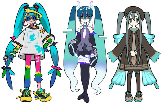
Reviewing and Ranking the Hatsune Miku x Pokemon Designs because I'm a procrastinator lol
(pictures from @hapuriainen)
Review:
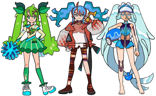
Grass: It seems like they were going for the Sword and Shield look with the jersey motif and I think it's smart to blend that with cheerleading. That being said, I wish it was... grassier? It feels a bit like wasted potential as the look is too focused on the region over the type. I like the elements of the design though.
Fire: I love the idea with the stockings but that's about it tbh. Her hair is supposed to look like fire but it doesn't come off that way and her bangs are disjointed from her pigtails. The colours are too muted and I feel like not enough effort was made to make her blue hair blend in with the rest of her colour pallet. The idea is there but it ended up being pretty underwhelming imo.
Water: definitely the best of the starter types! I love every part of the design and it all blends together perfectly! I especially love the design of the swimsuit! Simultaneously sporty and dainty!
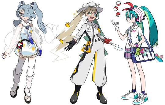
Flying: absolutely gorgeous and I can definitely see Articuno in her design! I love the light and silvery colour pallet so I'm a bit thrown off by that strong blue tone in the tie and glove. I think those should've been the same grey as her hair or maybe the hair ties (which I find a bit too dark but is alright).
Electric: a really cool and new idea that doesn't follow the expectation of a Hatsune Miku design! I really like the cartoony elements of her design but it does come across as a bit simplistic. The hat also feels too big and doesn't really look like she's wearing it? It also looks too feminine for the rest of her appearance imo.
Trainer: she blends right into the world of pokemon while still being Hatsune Miku! I especially love the signature trainer hat with headphones and the colours of her skirt being her actual colour palette. It's not too plain or overdone, it's just perfect!

Poison: Obsessed! It diverges from Miku's typical design expectations and creates a character that I'd actually love to see in pokemon! Her design is just so cool and exotic and the colours are so bright and fun. Those shoes are sickening!!
Ground: the concept of this design is a bit weak imo and the whole thing feels pretty flat. The clothes feel very basic that it comes across as a half-assed, generalized idea of a nomad. The shoes especially ruin the look for me..
Ice: really cool design (pun not intended)! I like the geometric shapes and the androgynous business attire. I'm not too sure how I feel about the green accents though (although the red on the bag makes it better but it's also weird that it's the only place with red so idk if that actually fixes it) and I wish the long pigtail bits weren't there and it was just the short hair. The pants could have more details too but overall, a really interesting design!
Normal: super cute, I especially love the glasses! It's a "normal" outfit which I assume was the intention so even though the saturated colours and simple outfit may keep it from being a favourite, I do think it's a strong design!
Ghost: it is a really cool design but to me, it doesn't give me "Pokemon". It feels like it's just a Hatsune Miku design that is ghosty and not enough innovation was put into actually merging the Pokemon aesthetics into this. Even as a stand alone Hatsune Miku design, there isn't actually a lot to it.
Bug: So precious! I love the simplicity and creativity put into this design. It's just perfect, head to toe!


Steel: love it! Every part of its execution is well done and I love the soft colours! It's simultaneously a cool and sweet design that I can just keep staring at!
Fairy: it's definitely cute and I like the idea of making her this gyaru school girl. It would've been cool to see something more extravagant for a fairy type look but it's still nice.
Rock: I love the princess design, she looks like she can be a gym leader or elite four member! It's so beautiful and the look is still great even without the dress and frills. I wouldn't understand how Miku can move with those things on her knees though lol. I also think the blue legging should've been black or have that blue present elsewhere in her outfit.

Dragon: I love a lot about the look but there are parts that also make it a bit disappointing. The shirt and pants in particular really wash out this look for me, they're so plain and bright (I hate that she's wearing a collared shirt). I feel like this should've gone all the way with its extravagance and medieval vibes, especially since it was the final revealed design and it's with a legendary Pokemon.
Dark: a stunning design that I didn't expect to be paired with Obstagoon! I love the slick shapes and the big fluffy hat and umbrella to contrast it (also the umbrella being a microphone is so clever)! The choker and shoulder straps make the look too modern but it's still overall really pleasant.
Fighting: Love the design and I'm obsessed with the colour palette! She looks so cool and I love the way sirfetch'd's leek was taken advantage of. My only nitpick is the shoes being a bit out of place from what's overall a slick design.
Ranking (lowest to highest):
18. Ground
17. Ghost
16. Dragon
15. Fire
14. Grass
13. Electric
12. Fairy
11. Flying
10. Ice
9. Rock
8. Fighting
7. Normal
6. Dark
5. Steel
4. Water
3. Bug
2. Poison
1. Trainer
21 notes
·
View notes
Text

splatoon 3: side order ~ ale's 2024 game reviews II
oooooh guess who finished side order (like, actually 100%)! me baby! and yes i've technically been playing splatoon 3 since 2022 and this is for games i finish this year BUT side order is a totally different game mode so it counts :p also it's my review i make the rules
spoilers ahead! although if you've paid any attention online there's no huge spoilers going on.
i finished the tower on my 4th run i think, i'm not that good at this game okay. but i did finish it on the day it released! i got a bit sad because i thought it was too short but then i realized you're supposed to replay this a bunch of times and the story keeps going! so it ended up lasting a couple weeks for me. it could've been faster if it wasn't bc i needed to finish my catalog before the season ended, but hey that's better i think!
i like that the game forces you to do a run with each weapon, cause otherwise i would've done only the shooter and MAYBE the roller. but it was fun! i hate chargers and splatlings, but once you learn how to use the chips and get a bunch of hacks, it becomes easier even with weapons you suck at. also i love overpowering Pearl, it's fun.
the game itself is absolutely gorgeous. i found myself staring at the ink before starting almost every level. i'm a sucker for glittery pastel ink are u kidding me!!!! the design of all the characters outside KILLS me like what the hell they're all SO adorable i want one of those jellies in real life. also cypher's design rules.
the world is so pretty too, i love all the backgrounds in the levels (and that they reused animal crossing fish ugh!!!!), the outside of the building, THE LOBBY????? i can't start a run without running around with the cool lights and music!
i LOVEEEE that we got so much Acht! i was already obsessed with them before the dlc, like their design and persona was such a cool concept for me, and now we get to hang out with them and learn about them before getting sanitized omg i love it so much. also we love an enby in a nintendo game
i also love Pearl and Marina so much, fight me all you want but they're truly the superior idols of splatoon. i love that nintendo let them be so incredibly fucking gay in this game. yeah yeah it's not said out loud but i've never seen two characters more in love than those two bitches. good for them
oh and i fucking love Smollusk wtf. why is it so adorable????????? specially at the end aaaaa him and small fry are my sons
the only things i didn't like about the dlc are that they kinda teased something going on with agent 4 but then there's nothing about them? we have a palette and the clone thing looks like them and then there are a couple mentions here and there but that's it? i would've preferred if they don't mention them at all instead of this. i also would have liked a little cut scene once you finish all the weapons. i was a bit disappointed once i finished eight's palette you're just done with it and well. that's all! smollusk is now friendly and nothing more :/
aaaanyways i really enjoyed myself with this dlc! i'd say i enjoyed it more than return of the mammalians which i still haven't 100%. i've seen people say octo expansion was better but idc cause i never played it! so side order gets 4.5/5⭐️ from me :D love u splatoon
5 notes
·
View notes
Text
More of, Ash reviews random shows/movies! Today's edition, Hazbin Hotel!
!!SPOILERS!!
(Disclaimer 1, Make sure you look up the trigger warnings for the series.)
(Disclaimer 2, I didn't know there was controversy surrounding the creator when I watched it. I'm not in the independent animation YouTube scene which is where the original pilot episode is, but I've decided to not let that affect my enjoyment of the series. If it will affect your enjoyment that's okay! Everyone has different opinions about separating the art from the artist.)
With that out of the way onto the review!
If you like adult shows, and musicals, then you'll like this show. I personally do like both so I LOVED it! I mean, with that cast alone the music was going to be amazing. There are arguably some of the best voices from Broadway in the cast!
The music is the thing that really stuck out to me me. Almost every single song was a banger. I've had the song More than Anything on repeat since the episode came out. The singing was top tier for the entirety of the show, and I could write an entire essay on just that.
I also loved the characters! I thought they were all really fun and unique. They felt very fleshed out and all had very distinct personalities. With a cast of characters that large, sometimes that's hard to do.
It was very fun to look at. The character designs were creative, and the animation was extremely smooth. Also I'm a sucker for things with bright colors. It's impressive they set a show in hell, and gave it such a bright color palette.
For me, I really enjoyed the humor, but that's incredibly subjective. Some of the jokes were a uncalled for and insensitive, but for all of the edgy jokes, they did make a tasteful asexual joke and I was happy about that.
Speaking of that, it has a canonical aro/ace character which is a bonus point for me! Also Alastor canonically being around/ace, but not knowing what that means is hysterical to me, and also me for most of my life.
My only complaint is it felt rushed. Six months takes place between the eight episodes, and off screen the characters are developing bonds with each other, but you as the audience don't really get to see that. I think the only one we did see was with Angel and Husk. Then later with Charlie and Lucifer. But it's clear all of these characters have developed bonds with each other, we just rarely see that happen and are just told it's happened. I think it could have benefitted from "filler" episodes that would serve the purpose of cementing the relationships between characters.
Overall I really enjoyed the series and I've already rewatched it...multiple times... Listen, I'm a sucker for musicals and it's probably my inner theater kid who never got to do theater. Also it's basically My Little Pony: Friendship is Magic for adults and I was obsessed with My Little Pony in my early teen years. So it was a given I was going to enjoy Hazbin Hotel.
2 notes
·
View notes
Text
Listed: M. Sage
Colorado musician, artist and educator Matthew Sage produces a unique form of ambient music, one that focuses on personal experience rather than obscure intellectual objectives or new age mysticism. Through both his own sounds and those he curates via his Cached Media imprint his goal is to unearth the beauty within the seemingly mundane. With Paradise Crick, his latest and most fully formed release, he casts his gaze on the great outdoors, envisaging a camping excursion. In his review, Bryon Hayes found that the record was “his most visceral work, as he ornaments his typically ambient palette with an assortment of palpable shapes, colors, and textures.” In addition to making music, Sage also enjoys seeking it out, often from non-traditional sources. For this edition of Listed, he runs down some of the more interesting records that he picked up on recent thrift store diving excursions.
10 recent thrift store finds in no particular order — I hit the flea markets and thrift stores once or twice a month and get weird CDs and cassettes. I like buying stuff that I would otherwise listen to on streaming… or never listen to from these local companies. We have CD players in our vehicles and I listen to CDs a lot driving. Cassettes mainly happen in my office when I am writing or drawing. So… a lot of what I look for is sort of “functional music” that I can do stuff to. I also snag up favorites from bands I love… I found 3 Wilco CDs at one shop last week!
Anyway, here are some recent favs.
Bonnie “Prince” Billy — Master and Everyone
youtube
Found in Longmont at the thrift store with the curated CD selection. Long time BPB fan, and I especially like how subdued this one is. Maybe not my all-time fav Oldham out there, but it’s great and the CD is in great shape.
The New American Orchestra — Blade Runner Soundtrack
youtube
Found at one of the flea markets in Fort Collins. Maybe the one with the lavender? This is an orchestral adaptation of the original Vangelis score, and it is about as smooth jazz as it gets. Incredible sweeping melodies. This version of “Blade Runner Blues” feels like something hiding on “In a Silent Way.” Ambient jazz for sure.
Chet Baker — Let’s Get Lost
youtube
Another one from the Longmont spot. Been obsessed with Chet Baker for a while now in that when I don’t know what I want to listen to, I just throw on any Chet’s greatest hits album and feel content. I love the arrangement on “My Ideal” with the toy piano and Chet’s voice and trumpet.
John Coltrane — The Gentle Side of John Coltrane
youtube
Also from the Longmont spot. I, of course, love wailing Coltrane. But I also think his sweet songs are some of his best. “After the Rain” is especially informing some of the arrangement choices I’ve been making on some new Fuubutsushi songs.
Shanghai Film Symphony Orchestra — An Dun (Calming the Emotions)
youtube
I buy a lot of random CDs like this, and I can’t remember where exactly this one came from. But yeah, foreign/new age/private press, etc. weird CDs… and most of the time they aren’t great… but this one is very good. When I find something like this that I like I google it later. When I did that with this CD, I found it on YouTube and this is my favorite comment about it: “Whenever I play this on a construction site, at first the guys complain. Then later they thank me for playing it. Saying they've never felt better.” My toddler seems to enjoy it in the car… I do too.
Claude Debussy — Images pour Orchestre. Preludes: La Fille aux Cheveaux de Lin
youtube
70 minutes of Debussy from Longmont ARC. Lots of solo piano from Peter Schmalfuss. I like that these recordings feel soft. Sometimes classical piano feels really hard, lots of attack, almost like microscopic. These recordings are more spacious. Chris from Fuubutsushi swears by Ravel, but I am team-Debussy.
Georgia Kelly — Seapeace: Music for Harp
youtube
Can’t remember where but found this in Colorado in a stash of pretty heady new age tapes. Later found out it’s a cult classic. It is a self-released one — the album was later reissued on other formats by new age labels — so I love knowing Ms. Kelly herself released this copy into the world and it has since ended up in my possession. The whole thing is on YouTube!
English Meadow: Environments — Environments 1, 4, 12: Slow Ocean, English Meadow, Intonation
youtube
I have all the Environments titles on LP and have since started collecting cassettes when I see them in the wild. These 3 are specifically my favorite Environments, so finding them all in one go felt like a thrifting triumph. I feel like English Meadow specifically sounds nice on cassette.
#dusted magazine#listed#m. sage#Bonnie “Prince” Billy#The New American Orchestra#blade runner#chet baker#john coltrane#Shanghai Film Symphony Orchestra#claude debussy#georgia kelly#environments#english meadow#Youtube
2 notes
·
View notes
Text
Bow Print Oversized Hoodie: Playful Elegance Meets Cozy Comfort
Step up your loungewear game with the Women's Bow Print Oversized Hoodie – a perfect marriage of whimsical charm and laidback luxury. Featuring an adorable oversized bow accent, this hoodie adds a touch of feminine flair to your casual wardrobe while keeping you snug all day. Whether you're working from home or meeting friends, it's the ideal mix of style and substance.
Why You'll Love This Hoodie
✅ Standout Feminine Design
Oversized bow detail for instant eye-catching appeal
Neutral color palette that pairs with everything
✅ Cloud-Like Comfort
Premium cotton blend (80% cotton, 20% polyester)
Brushed interior for ultra-soft wear
✅ Perfectly Oversized Fit
Relaxed silhouette that flatters all body types
Longer back hem for full coverage
✅ Thoughtful Details
Roomy front pocket for hands or essentials
Ribbed cuffs to keep sleeves in place
3 Ways to Style Your Bow Hoodie
🎀 Casual Chic
Pair with leggings and white sneakers for coffee runs
Add dainty gold jewelry to elevate the look
👖 Streetwear Twist
Layer over a graphic tee with distressed jeans
Complete with chunky boots for edge
👜 Dressed-Up Comfort
Tuck into pleated trousers with loafers
Top with a trench coat for transitional weather
What Makes This Special?
✔ Instagram-Worthy Design – That bow detail photographs beautifully ✔ Seasonless Wear – Light enough for spring, cozy for winter layering ✔ Confidence Boost – Playful yet polished aesthetic
Happy Customer Reviews
⭐ "The bow is even cuter in person! Gets compliments every time I wear it." – Mia T. ⭐ "Finally found a stylish hoodie that doesn't sacrifice comfort. Obsessed!" – Emma L. ⭐ *"Washed it 10+ times – the bow still looks perfect and color hasn't faded."* – Sophia K.
Final Thoughts: Your New Wardrobe Hero
More than just another hoodie, this Bow Print Oversized Hoodie is a conversation-starting piece that doesn't compromise on comfort. It's the effortless way to look put-together while feeling cozy.
🎀 Ready to fall in love with your new favorite hoodie? 👉 Shop Now & embrace cozy-chic style!
0 notes
Text
perfume diares #3
Today I wore the floral street chypre sublime. And, shocker, I love this perfume. I was hesitant at first to wear it out, because when it's first applied there is a very strong rosey/deep floral scent. It's almost overpowering and worried me a bit because the perfumes I really want to wear are ones with layers and depth and subtley mix with their top, middle and bottom notes. And this perfume, when I first applied it, didn't seem like that at all. However, after a few minutes of having it on my skin it settled into this warm, woody, gentle floral mix that I absolutely adore. It's a very sophisticated scent, definitely one to use for sophisticated occasions, like in class or at a candle lit dinner or late nights at the pub. It's classy and mature, with a touch of sweetness from the many floral igredients. Said floral ingredients are notably different from the perfume I tried previously, electric rhubarb. Electric rhubarb had white florals like jasmine, fragipani and gardenia, where chypre sublime contains dusky rose and gardenia.
It's interesting to note when you take away sweetness from a fragrance it's almost as if you add age to it, you make the audience older and more mature and more refined. Maybe that could apply to wines too, or sweet treats in general. What do I know.
The interesting this is, without taking my time with the perfumes like I have thus far, I probably wouldn't like it. It's complexity and depth and the lack of sweetness upon first application would have turned me away. But after the few weeks or so I have been obsessed with perfumes, and taking my time to savour and enjoy each one and appreciating the notes in each, I have refined my palette. Which is epic because now I can enter a Jo Malone boutique and know what it is I'm smelling, the vibe that it gives, the intended audiences, the intended occasions, et cetera.
A perfume I'm definitely looking foreward to trying is the Maison Margiela by the fireplace. It caught my interest on my first hunt for perfumes to try, with its warm, woody vanilla scent. Unfortunately it is more of an indoor, winter scent, and incredibly expensive. I think it would be very interesting to try something that has a sweet musky undertone, because most perfumes have sweet musky top notes. Overall it's very different to what I have tried so far, being a unisex scent that has been likened to a christmas candle.
Other things I'm pretty excited to try are cherry perfumes, because I simply have never smelled one before, and it seems fun and sultry and interesting. One of the most popular cherry fragrances is actually the brittany spears midnight fantasy. Also, I'd like to try the juliette has a gun perfumes line, like the vanilla vibes, juliette has a gun and ex veviter.
Anyway, to end, I have some advice I made up about gifting perfumes, and how it can be quite easy if you know the person. Firstly, if you have no idea whatsoever, look up the perfume they wear on fragrantica.com. Use the tools in fragrantica, read the reviews, look at the top notes, match it to another perfume that's similar or even slightly different. best of luck, happy smelling
0 notes
Text
Film Review #1: Late Night With The Devil
My first entry for my ‘Movies I’ve Watched in 2025' list: a supernatural horror film about the dangers of joining elite cults and selling your soul to the devil in exchange for fame. It was supposed to be a supernatural horror film about the dangers of signing divorce contracts written in an ancient language you cannot read and selling property to a centuries-old vampire in exchange for gold, but it was only after I had invited my unpaid therapist, Sushi, to a Google Meet session so we could watch Nosferatu together (because we are both cowards who do not dare to watch supernatural horror films alone) that I realized the 2024 remake of the 1922 illegal adaptation of Bram Stoker’s Dracula had not been officially released on digital sites yet. I was not going to watch the non-HD camera-recorded version, obviously, so I suggested to Sushi that we watch other films in the same genre instead. Somehow, we ended up choosing this one.
The concept seems quite interesting: a famous late-night talk show host desperate to revive his declining career features a literal demonic entity as his special guest and unwittingly unleashes infernal chaos on live television. It is a postmodern take on the classic demonic possession trope that simultaneously warns about the pitfalls of extreme clout-chasing and excessive TV screen time.
The film frames itself to be presenting a found footage of the final episode of the top-rated show “Nights Owls with Jack Delroy”, which premiered on the night of Halloween in 1977. Since the story was set in the 1970s, the visuals of the film reflected the aesthetic dominant at that time, down to the muted earthy color palette and the intentionally reduced video resolution. I personally love the 1970s obsession with warm autumnal shades, so the film’s visuals was a delight to behold. It felt like opening a time-capsule from the past, the sets and costumes perfectly retro in design.
Aside from the visually vintage vibes, the show feels almost authentic as it incorporates pop culture elements accurate to the time period. Situated between the late 1960s New Age spiritual revolution and the early 1980s Satanic Panic, the 1970s is notorious for producing the iconic punk counterculture, as well as breeding several religious groups led by charismatic narcissists that later revealed themselves as cults guilty of committing mass suicides and murder sprees for fun. The protagonist, Jack, unfortunately, associates himself more with the latter, which is not very punk of him.
Moreover, the jokes and commentaries made by the hosts to amuse the audience seemed corny and rather outdated, in the perspective of a 21st century zoomer at least. For a seasoned entertainer, Jack spoke in a manner so languid it was testing my fried brain’s patience to avoid clicking the 2x speed option. No wonder why his ratings were on the decline.
In addition, by taking a unique documentary approach, the film gives a bit of a realistic aspect to the story within the story, making the viewers not only suspend their disbelief, but also feel as if they are witnessing events that happened in real life, thus, urging them to question what is true and what is fiction.
Moving on to the plot itself, the film depicts how cutthroat the entertainment industry was back in the day. Growing up, I often heard of famous Western celebrities being accused of having ties to the Illuminati, an ancient secret society of wicked origins with enough power to achieve world domination (depending on who your sources were). According to these conspiracy theorists, to achieve that level of fame and wealth means you have probably signed a one-time deal with Satan himself and paid for it with your soul. Disregard the hard work, exploitation, and nepotism (optional) behind a celebrity’s rise to stardom; the Lord of Evil gets all the acknowledgement.
And that is approximately what happened with Jack: his wife being the inevitable sacrifice in exchange for the promise of a successful career. Unfair, really, that the devil can select an innocent individual as the settlement for someone else’s credit charges.
Due to his inability to foresee the horrible consequences of the bargain he entered into, Jack went on a months-long mass media detox to mourn and reflect on his life decisions. Upon his return, however, Jack fortuitously reunites with the same demonic entity who claimed the soul of his beloved wife. Now inhabiting the body of a poor teenage girl named Lilly, the devil, also known as Mr. Wriggles, taunts Jack and threatens to bring out the skeletons hiding in his closet in front of the whole world watching. Rather than taking this as a sign to cut the broadcast short and send the guests and crew on their way home, Jack proceeded with the show after learning the TV executives’ favorable opinions about the current segment.
It did not go well for them, of course. Moments later, the devil took complete possession of Lilly again even without being summoned and wreaked havoc in the studio, killing the sidekick, the skeptic, and the parapsychologist in the process. It was a total pandemonium, violating numerous TV rules and regulations. I highly doubt they will be getting a renewal for a next season after that unannounced display of R-rated content.
In the midst of the chaos, Jack hallucinated a distorted little trip down memory lane that revealed the truth about his connections with the mysterious demon-worshipping cult The Grove and how his greed was ultimately responsible for his wife’s illness and eventual death. The film concluded with Jack standing over Lilly’s corpse with a ceremonial knife, his hands now twice stained with blood.
When the credits started rolling, the first thing I blurted out to Sushi was, “Wait, that was it? What do you mean the runtime was barely 2 hours?”.
With the ending being vague and ambiguous (failing to explicitly state the true identity of the devil, the reason for the presence of the ghost of Jack’s deceased wife, and the role of the creepy skeleton-costume-wearing dude among the audience), I was left confused about what really transpired. Just as the skeptic tried to convince the audience that the demonic possession was a hoax, I find myself questioning whether Jack manipulated everyone’s perceptions and actually perpetrated the murders himself, considering he was able to survive the devil’s dramatic outburst despite being the primary target. And did he literally stab his wife on her deathbed or was that all metaphorical in the sense that he was able to set her soul free upon vanquishing the malevolent spirit in control of Lilly?
One could only speculate the real answers to those questions, but perhaps the fact that we will never know for certain is the underlying charm of it all.
Overall, I rate the film 3 out of 5 stars. It’s definitely one-of-a-kind in terms of the concept, and I think the whole thing was wonderfully executed, but the plot still left me rather dissatisfied and craving for more. Nothing serious to trade my non-existent lover’s soul to the devil, thankfully.
Watched: January 11, 2025 Published: February 7, 2025
1 note
·
View note
Text
Review: Plant Dad and Art Grad collaborate for shining indie-pop tune ‘That’s Right’, a groovy but vulnerable summer anthem
With names that slip off the tongue like Art Grad and Plant Dad, it’s no surprise these smooth-talking, groove-making musicians would come together for a collaboration that’s equally as easy on the ears. Between their Ohio-native and Baltimore-based sounds, the pair know how to make art with a song that’s utterly timeless, bringing out the best of what they both create separately and pouring it wholeheartedly into something for both their listeners to fall in love with - or fall in love to, while it plays.
From the start of ‘That’s Right’, the eclectic funky ambience is hard to ignore, dancing between scattered drum beats and pops, distorted synth notes and the duo’s united spoken-sung vocals, an instantly fluid sound with lyrics that are so chant-along that you wouldn’t dare not to join. This instant chorus is a daring but obvious choice, pulling you in with the ‘that’s right’ lyrical hooks and low-key but warm sound, the perfect kind of anthem for a low-energy day with the potential to pick you up, get you dancing and turn the rain into sunshine. The words are just as playful and carefree, humorously poking fun at self-perception with an attitude that’s infectious, making anyone feel like their confidence is through the roof.
This lighthearted energy only continues into the only verse, picked up by bright synth keys before settling into gentle keyboard notes, relaxed beats and a softer, sung vocal delivery, a smooth and charismatic performance that’s more relaxing than the opening’s desire to mindlessly groove. That more ease-filled atmosphere brings out an intimacy in it too, the gentleness of the sound allowing for lyrical vulnerabilities as the protagonist seems to overthink newfound feelings: ‘you promised you’d miss me, but you’re gonna treat me differently.’ With this potential lack of reciprocation their words spiral without any answer back, looping a constant train of thought while too afraid to speak up and know for sure.
As one final vibrant high sees things out, Plant Dad and Art Grad reflect as they sing ‘can’t believe I waited for you’, the colourful palette of sound matching this newfound revelation and new shift for their life moving forward. It’s hard not to be obsessed with such a short but sweet little tune, perfect for your summer playlists and new memories, just keep listening for yourself here.
Written by: Tatiana Whybrow
Photo Credits: Ceci Clark
// This coverage was supported and created via Musosoup, #SustainableCurator.
0 notes
Text
time for gen 4 on the starter review

the Sinnoh Starters are, to me, are probably the last truly amazing trio of starters where all three are purposely fantastic design wise- at least, by their final evolutions. At first glance, they don't really have much going for them in terms of cohesion other than a shared yellow in their color palette, and I'd say a slightly less saturated color palette if we compare to previous gens, and they may not appeal to everyone right away- but by the time they finish evolving? Good god, some of the best designs in the entire franchise. As for their base forms, each have their own level of being iconic for a variety of reasons that I'd say is only outmatched by the gen 1 starters themselves- at least, looking at how the fans perceives them. Each of the base forms has different types of obsessed fans, to the say the least.
easily a 9/10 if we look at their final evos alone.
now BREAK IT DOWN *starts sobbing uncontrollably*

First up, Turtwig, the second turtle starter. First off, lets get this boy a certified *friend* sticker, because that is a genuine little guy right there. Second, let's admire the little dude. His head is big and his jaw is chompin size, and look at those little feets of his. God. What a good little boy. Onto actual critiquing, the color palette used is an excellent mix of I'd call "earth tones," fitting for how its line is basically meant to embody the earth itself. I got nothing else for this guy except that I love him. 9/10, something is a little off but I can't touch on what.

Okay, despite what some poketubers might say, Grotle is not a bad design whatsoever imo. I think it's not as good as Turtwig or Torterra, but there's a unique charm to it at as well- so long as you're looking at it from the right angle, which as we've discussed before in previous posts, can make or break a Pokemon. Still, I dig that Grotle kind of dips into some dinosaur to help supplement it, I think I'm particularly seeing a little bit of an ankylosaurus in the face and body. The shrubs on the back are a nice touch and are connected to branches- sort of like with Ivysaur to Bulbasaur, so too does Grotle's back seem to blossom forth some type of plant life. I think it's a fine design, although I do think that perhaps the yellow would be better replaced by a darker brown. 7/10.

Followers from my other posts may remember a post I made regarding Torterra- how it has got to be one of the most HORRIFYING pokemon to be turned into if you're a PMD protagonist (basically imagine being a regular human and turned into a slow, heavy tortoise that is immortal, cannot die unless it is cold, and you can drown super easily and not be able to move very far while other Pokemon just... grow up on your back). That's not what this post is about- in fact, some misconstrued and thought I was hating on the guy. Absolutely not, in fact, Torterra is one of the COOLEST grass starters ever, and grass pokemon in general. Torterra is basically a better Venusaur imo, it just gets way less love and was done ABSOLUTELY DIRTY in the anime.
The colors are fantastic, with each color helping the other to stand out and pop in some way or another. The design is also just immaculate, it's dangerous looking in a very fun way, and doesn't sacrifice any of the edge or cool factor for something stupid like certain later gen pokemon do. Torterra's concept of representing the world- essentially being a "world turtle"- is executed excellently in the fact that its back has grown from bare soil, to sprouted saplings, and now a full on biome. Again, it pulls from more dinosaur elements into its design as well, which is always a welcome plus. An easy 9/10.
The Turtwig line in general is pretty easy to love and find cool, and you'd be very hard pressed to find a single schmuck brave enough to say they dislike Torterra. Gen 4 in general has really amazing Pokemon design and adds just the right amount of edge and coolness to most of its pokedex, and this line is certainly no exception. Sure, ice types absolutely cripple this line, it's a little slow, and there might be better choices for a grass or ground type from Sinnoh- but I don't really care about that. If you love Turtwig, Grotle, or Torterra, you can easily make it work with the rest of your team. Honestly, I just want a grass starter to look this cool again so badly. 9/10 overall.

MMMMM.... Monke....
Okay, so let's get it out of the way- This Pokemon line has had one of the BEST character arcs in the entire Pokemon anime. From trash to treasure, I tell you, even coming back to hog some spotlight in Journeys. The absolute GOAT of Ash's fire starters, for sure, with a story that pretty surpasses Charizard in terms of execution, although not in feats.
... *that being said*, on a design critique perspective... Not really my favorite. I really dislike how disproportionately big the head is for its tiny body, and the colors aren't really enough for me- maybe if they were to have brought in the blue eye-shadow and some gold or white a little sooner, I'd be more impressed. I think as a kid, I simply picked it purely because it was a fire type, and thankfully I was rewarded for my choice down the road. I guess it's not terrible, but I certainly prefer other monkeys. Maybe if they gave it a tail like its evolutions. 5/10. Ash's Chimchar gets bumped to an 8, though. We respect the little guy.

And respect we continue. Monferno fixes a lot of gripes I have with Chimchar, and thankfully he's a quick evolution away at level 14. I did think it was... lazy? I guess? That they made it a second fire/fighting type, but I reckon if Combusken and Blaziken leaned more towards the fire, Monferno and Infernape leaned more towards the fighting. Regardless, it's a fun design that really fixes up a lot of Chimchar's failings, like sizing up the body to its head size, adding in more colors and a tail, this is truly where the monke begins to start shining. The feet are... weird, sure, but overall a vast improvement, and probably my favorite middle evolution of the fire fighting trio and the sinnoh starters. 8/10.

MMMMMM MONKE!!!!! THAT'S WHY HE'S THE GOAT!!!!!
I'm gonna go ahead and spoil the fact that he's an easy 9/10 design, and arguably the last good fire starter (design wise) until Hisuian Typhlosion and Skeledirge. Just LOOK AT HIM! What an amazing blend of dark oranges, reds, golds, whites, blues, the flaming head also invokes serious protagonist energy- and definitely channels that Sun Wukong energy, really only missing a cloud to ride on. He's a bit on the short side- I was initially surprised by just how... short he is. Still, he is a short KING. This is arguably the best of the Sinnoh trio, the best of the fire/fighting trio, and the best fire type in Sinnoh (being fair, he only has Magmortar, Rotom, Heatran, and Arceus as competition). Close Combat, Flare Blitz- this bro is not here for a long time, he is here for a GOOD TIME.
And I think we all know that I'd be an idiot to not bring up Ash's. THE BLUE FLARE BLITZ! THE BLAZE! THE REVENGE AGAINST A SHIT TRAINER! THE FINAL FIGHT AGAINST ELECTIVIRE! That is how you glow up! He didn't need a special form for that, that was hard work and sheer, raw, badassery! That definitely contributes to why I love this pokemon lol. Like I said, 9/10.
Someone will probably see that I did not give Chimchar the friend status- that's because we give it to Infernape instead, and not just a friend, but a BRO status. That is someone we respect on a whole other level and love to see him get stronger.
The Chimchar line is a choice that will reward the trainer if you put the time in as far as the designs go. In terms of power, you really cannot go wrong with this guy either. This singular Pokemon line is beloved by fans for many reasons, but the anime certainly aids to it. 8/10 collectively.

Onto Piplup- I feel like most of the vocal internet side will say this is their favorite of the Sinnoh starters, but I do think a large portion of that comes from people who either only watched the anime or simply weren't looking at what it evolves into. I certainly didn't give it the time of day myself until a few years back, and I've come to appreciate it a bit more. The anime certainly helps sell it as a loveable little asshole, not even having mercy on a baby Cyndaquil. It's definitely a friend, but more specifically a nephew or niece you entertain a bit or a little brother you like to tease a little.
Design wise, I like it enough, not really my favorite but it's not bad either, the big head definitely detracts a little for me. The colors are a nice blend of blues and whites, although that... whatever that back thing is is kinda weird. I'd much rather it be a back flipper or tail feather or something. Still, it's got this undeniable cute factor that you can't really ignore. 7/10

Prinplup... I'm not gonna lie, it's a little worse and definitely my least favorite of the middle Sinnoh starters. It is definitely a better water bird than Quaxwell, in my opinion, but only slightly. The colors are certainly a nice palette, and I do like that the head is smaller- but its a little *too* small now in comparison to the rest of the body. I do appreciate it being more penguin shaped than Piplup, though. 6/10.

NOW we're getting to the best of the line, Empoleon. I didn't initially like it as a kid, but as I've gotten older, I really dig it for a lot of reasons, including its mostly black color scheme with blue as the accentuating color rather than the main one. Water/Steel is an interesting type combo that... I don't think has been repeated since, which is insane considering we're close to 20 years past its initial introduction. I used to wonder why it wasn't part ice- it's a penguin after all- but now I understand that it's steel type BECAUSE it lives in icy areas- or, as icy as Sinnoh and Hisui can be, I guess (it can be snowy, but polar?). Piplup was cute, Prinplup was dorky, and now we're at the regality and badassery of Empoleon, which rounds up the evolution chain nicely. I even appreciate how it's a little taller than expected- I'm still taller, as it's at 5'7, but as a kid that would definitely fit my mental image of an "emperor" penguin, which i thought were 6 feet tall lol. The inspirations for Infernape and Torterra are little more clear and mythical in nature, but Empoleon clearly has an emperor's vibe about it, while the head decoration could be a nod to Neptune's trident. Overall a fun design, and evidently the anime thinks so too since it keeps coming back so often, even to Kukui's team. 8/10.
The Piplup line is one of those lines that has its very rabid fans- but mostly by people that consume cute things and probably don't care for what comes next. That's not bad, mind you, but I do think Empoleon is the stronger design of the bunch, just speaking from my own perspective. I do feel that other water types are designed better, but it is also not the worst it could possibly be either and has a pretty banging move set as well, and recently got some love in a new hidden ability. The imagery of a spoiled prince becoming a regal ruler is also appreciated, all things said and done. A solid 8 for the potential alone.
Gen 5 next
#pokemon#pokemon gen 4#dd reviews pokemon#sinnoh starters#turtwig#chimchar#piplup#grotle#monferno#prinplup#torterra#infernape#empoleon
4 notes
·
View notes
Text
Fluttering into Action: A Step-By-Step Guide to Installing and Configuring Flutter SDK on macOS

Flutter has attained immense popularity in the software industry. Big tech corporations are investing large sums of money to hire a Flutter developers team. As a result, the developer community has become obsessed with mastering the skills necessary to harness the full potential of the platform. However, software developers face a steep learning curve when they select Flutter app development. This comprehensive guide will teach you how to install and configure Flutter on macOS and efficiently migrate your project onto the platform. Let’s go ahead and understand the installation process of Flutter on macOS.
Step-By-Step Guide For Flutter Installation On MacOS
Before you initiate the installation process, you must make sure that your current hardware and system fulfill the minimum requirement of Flutter.
SYSTEM REQUIREMENTS
Operating Systems: macOS (64-bit), version 10.14 (Mojave) or higher.
Disk Space: 2.8 GB (excluding space for IDE/tools).
Tools: Git for macOS or Xcode.
DOWNLOAD FLUTTER SDK
Now that you have verified that your hardware and system meet the basic requirements for the installation, you can proceed to the first step of the process.
Start by downloading the installation bundle from here — Flutter SDK for macOS.
The newest version of Flutter 3.16.3 for macOS was released on the stable channel on 12/06/2023.
If you are using the Apple Silicon processor, download the latest version from here — flutter_macos_arm64_3.13.7-stable.zip
Extract The Zip File
Extract the downloaded Zip file to a folder of your choice.
cd ~/development
$ unzip ~/Downloads/flutter_macos_3.13.7-stable.zip
Append Flutter Tool to your assigned path
export PATH="$PATH:`pwd`/flutter/bin"
To verify if the PATH is already set correctly, you must run the program once.

Using this command is vital because the installer appends the Flutter repository as the default PATH. This prevents Flutter from working in another terminal directory. Once you are done with this step, you can deploy Flutter commands successfully.
Run Flutter Doctor
If any dependencies are missing, Flutter won’t work. Most firms hire Flutter developers team after getting stuck on this step. However, you can use the following command to check for the missing dependencies-

This useful command runs a full diagnostic on the system environment and generates a full report on its findings. The report is supplied at the terminal window, and it tells the developer if he needs to download or update an existing dependency. You cannot skip over this step even if you downloaded Flutter through the Dart SDK. There might be some other software missing or additional tasks you need to perform to get the platform up and running.
For example, you may face the “Android license status unknown” message in case the sdkmanager shell script crashes in the $android_sdk/tools/bin directory.
Review PATH Environment Variable
A skilled Flutter developer from Flutter Agency will always validate that your system’s PATH environment variable incorporates the path to Android SDK’s bin directory. Look for this output –
export PATH=$PATH:/path/to/android-sdk/tools/bin
Install Flutter Plugin
IntelliJ, Android Studio, and VS Code each have their unique editor plugin. For our guide, we shall use the VS Code or Visual Studio Code.
Run VS Code.
Press Command+Shift+B buttons to activate View>Command Palette.
Type ‘install’ on the command palette, and when the ‘Extensions: Install Extension’ comes up on the screen, click on it.
Type ‘flutter’ on the search field and then click on the ‘Flutter’ option in the list.
Click on the Install button.
Reload VS Studio by clicking on the ‘Reload’ button.
Android Studio
Flutter Doctor often reports on two common issues associated with Android Studio. If you see ‘Flutter plugin not installed’ or ‘Dart plugin not installed’ flashing on the Flutter Doctor console, follow these steps to rectify the error –
Launch Android Studio
Click on ‘Preferences’, and from the drop-down, select ‘Plugins’.
Click on ‘Browse Repositories’, and then select the Flutter plugin and click ‘Install’.
Click on the ‘Yes’ button when prompted to start the Dart plugin installation process.
After the installation, a dialogue box will appear with the restart option. Click on the “Restart’ option.
Verify Your Setup
You must run Flutter Doctor again to validate your setup thus far. Most software development companies need to hire flutter developers team because they skip over this step and face issues in the later stages of the app development.
iOS Setup
To start this process, you must first download and configure Xcode. These are the steps involved –
Install Xcode
Download Xcode from the 9.0 version onwards from the Mac App Store to create Flutter applications for iOS.
Configure Xcode using sudo xcode-select –switch /Applications/Xcode.app/Contents/Developer command.
Use the command line to sign the Xcode license agreement by clicking on the ‘Agree’ button.
Configure The iOS Simulator
You need to test out your Flutter app on your iOS simulator first. Follow these steps — Use the open -a Simulator command to launch the simulator on your Mac.
Click on the Hardware option and then Device to check if your simulator is using a 64-bit device.
Select the Scale Menu on the Window option to set the app’s dimensions.
Launch A New Project In VS Code
Utilize the Flutter starter app template to initiate a new project.
Press Cmd+Shift+P.
Click on Flutter: New Project and then select ‘Enter’.
Set a Project name and location.
Execution and Debugging
When you run a Flutter project on VS Code for the first time, the status bar will show Flutter-specific entries. You might also see the ‘No Devices’ error message. We will share a secret tip to overcome this error that only a skilled Flutter developer from the Flutter agency knows.
Click on ‘No Devices’.
On the command palette, click on iOS Simulator.
Press F5 or click on the Debug menu on the IDE window to start debugging.
CONCLUSION
Now, you are ready to take advantage of Flutter, which has been instrumental in the success of other companies. Alternatively, you can also hire a Flutter developers team to take care of this massive undertaking.
Content Source: Complete Tutorial For Flutter Installation Guide on macOS
#hire a Flutter developers team#Flutter SDK for macOS#Android license status unknown#Flutter Doctor#Best Flutter App Development Company#Flutter App Development Company#Flutter Company#Flutter Development Company#Hire Flutter Agency#Top Flutter App Development Companies#Dedicated Flutter App Developers#Flutter App Developer#Flutter Mobile App Developer#Hire Flutter App Developers#Hire Flutter Application Developers#Hire Flutter Developer
0 notes
Text
James Charles Tries the Newest ELF Cosmetics X Chipotle’s Burrito Inspired Makeup [Review]
New Post has been published on https://eazybeauty.net/james-charles-tries-the-newest-elf-cosmetics-x-chipotles-burrito-inspired-makeup-review/
James Charles Tries the Newest ELF Cosmetics X Chipotle’s Burrito Inspired Makeup [Review]
(Photo : ELF Website)
James Charles gets honest as he reveals his thoughts about the newest collaboration with E.L.F. Cosmetics and Chipotle.
The beauty guru recently announced on his social media that he did a makeup review with the brand’s burrito-inspired collection.
A self-confessed Chipotle fan himself, the YouTuber shared that he hasn’t done makeup reviews for such a long time; hence, he vowed to give the viewers his honest opinion about E.L.F.’s latest collaboration.
“CHIPOTLE Launched A MAKEUP Line!? I’m a little bias because I love a burrito bowl, but… HONEST REVIEW is now LIVE on my channel!” James Charles’ Twitter reads.
RETWEET to be the next video’s sister shoutout!!
CHIPOTLE Launched A MAKEUP Line!? 🤯 I’m a little bias because I love a burrito bowl but… HONEST REVIEW is now LIVE on my channel! https://t.co/ywPao8dPsV pic.twitter.com/ysp67TgBvz
— James Charles (@jamescharles) March 9, 2021
READ MORE: Beauty Guru James Charles Reveals Reason Behind Controversial Bald Head
James Charles Makeup Review: E.L.F. Cosmetics X Chipotle
youtube
The 21-year-old internet celebrity shared that he was thrilled with the newest team-up of E.L.F. since he was a diehard fan of the Mexican food chain.
Moreover, he blurted out his obsession and mentioned that he had a phase where he used to eat Chipotle about four to five times a week.
Extra Guac Sponge Set, $10
(Photo : ElF Website)
James Charles started off his makeup review by blending his foundation using E.L.F. and Chipotle’s guac avocado sponge.
While gently beating his face with the sponge, he shared that it is softer than the usual blending sponge but preferred a more dense beauty tool.
He then followed up with a concealer and set it with a Laura Mercier translucent powder.
Chipotle Eyeshadow Palette, $16
(Photo : ELF Website)
After contouring his face, the beauty guru tested out Chipotle Eyeshadow Palette.
This limited-edition product comes in 12-piece eyeshadow shades that are inspired by Chipotle ingredients.
The 21-year-old makeup artist started off by applying the pinto beans shade, which has a medium brown tone and applied it along his crease for creating bold eye makeup.
He then mixed it up with a hot salsa which has a hint of a brown and orange tone. Blending the colors using a Morphe brush, James Charles added black beans shade, which features a deep brown tone.
Capping off his burrito-inspired makeup, which he described as the orange, mild salsa eye, he applied pinto beans shade along his lower lashline to create a smokey eye makeup effect.
Moving on to the next eye, he used a green eyeshadow in the shade of lettuce. As for his transition, he used guac, featuring a shimming shade of lime green.
For a pop of color, he then used a shade of gold called corn salsa at the middle part to brighten up the eye makeup. Finishing off the look, he popped on some eyelashes and mascara for his burrito-inspired makeup.
Make It Hot Lip Gloss, $8
However, let’s not forget the lips. James Charles used E.L.F.’s Make It Hot Lip Gloss that has a hint of red-hot color with a high-shine finish.
Moreover, this limited-edition gloss has a lip-plumping effect, making your lips fuller ala, Kylie Jenner.
Aside from the plumping effect, it also has a moisturizing and hydrating formula that will leave the lips feeling soft and nourished.
READ MORE: Top 3 Effortless Makeup Trends as Seen on Beauty Influencers
See Now: 100 Most Beautiful Women In The World
TagsJames Charles, elf cosmetics, Makeup Review
Get the Most Popular Beauty World News Stories in a Weekly Newsletter
© 2018 BeautyWorldNews.com All rights reserved. Do not reproduce without permission.
PHOTO GALLERIES
$(‘.m_gallery’).carouFredSel( items:4,prev:’#prev1′,next:’#next1′,width:119,height:155 );
BEAUTY IDEAS
HOW TO
Source
0 notes
Text
Makeup on my mind…
I want to talk about trends but I also just want to talk about my “makeup thoughts” … products that maybe aren’t the newest hot thing but should be
Gucci lip is my fave
Charlotte pillow talk is pretending to be one size fits all
What is the point of pink powder??
How do I feel about cream blush
Is beaming highlight old news or in again
“Bare” beauty trends- hailey Bieber, Kim k, skin care, rare beauty
What is your makeup mood? I feel like there are so many different expressions of beauty and the artistry or identity that goes into makeup, there are great products out there that turn into a viral sensation, but truly everyone has their own unique vibe and I love seeing it all come together. What makeup products make up your vibe or makeup identity the best?
Indie brands I’m obsessed with: highlighters in the cool packaging and the odens eye
Auric beauty
Transfer proof lip, transfer heat budge proof makeup water proof
I don’t like silicone primers
Can’t find a noncomedogenic sunscreen, help
Patrick Ta blushes don’t hype me up
Bobbi brown primer over hyped?
Drunk elephant overhyped?
Skin care favorites
I feel like makeup is all about feeling and sensation
Eyeshadow palettes that didn’t impress me
Rainbow by too faced, naked (I miss the old naked), lady gaga eye shadow, urban decay shadows, Clinique
Drug store blush???
Dior blush, overhyped or just right?
UK makeup trends….
Do lashes make you look prettier, or older?
Cutest brand ever: beauty bakerie, too faced, and baddie b lashes, Kylie, Huda, color pop, kaja, and
Marc jacobs coconut line was everything
Mac fix plus, overhyped? Urban decay… testing overhyped setting sprays and popular makeup gripping primers
Hyped skin care that’s worth it vs not worth it, essence, elemis, fresh toner, Michellar water, beauty makeup removers
Nikki tutorials glitters
Are Mac eyeshadows overhyped?
Orange packaging makeup, good or bad
Target beauty products I hate
Testing Revolution
Testing KKW testing Arianna beauty
KKW fragrance reviews
Jackie sims candles, jeffreee star, Jaclyn hill, influencer makeup James Charles, Tati, Nikki’s tutorials, beauty bay, mmmitchell,
Fave bath products: Kylie, tea tree oil
Fave candles with candle warmer
Are we steaming our bed sheets
Staying inspired with beauty and slow TLC and cleanse
The best brow products vs overhyped
0 notes