#dd reviews pokemon
Explore tagged Tumblr posts
Visit Tumblr Blog
Explore Tumblr blogs with no restrictions, modern design and the best experience.
Last Seen Tumblr Blogs


Fun Fact
There were a total of 171.5 billion posts on Tumblr in 2019.
Text
So, starting my starter reviews. Where else to start than from the start?

The gen 1 starters might feel a bit overdone by a lot of fans' perspectives- certainly myself included- but if we look at them for what they are and what they provide, they're essentially one of the gold standards for starter pokemon. All about as equally appealing, complementary colors and design philosophies, and they look and remain monstrous by nature- which is apparently a lot to ask for in the modern era.
When you think of "starter pokemon," most will immediately picture these guys. A great balance of design where you really don't miss if you pick one over the others, and quite honestly they warrant multiple playthroughs with different teams for each. Just really, really solid foundations for years to come- only to then be sort of ignored by the design team in favor of furries... for... some reason, despite the extreme marketing of these guys.
Overall, an 8/10, a point deducted for oversaturation and another simply because they all have something missing in each line.
Now individually- below the cut

Bulbasaur is number 1 for a reason. Look at him. That's a friend right there. Supposedly he's a frog, but I never saw it, personally speaking. Being a little monster is good enough imo, and he has a good balance of cute, cool, and spunk that makes him great. In the Kanto games, he's clearly the "easy mode" option because he's just that amazing, with a type advantage or resistance to over half the gyms there. And why not? He's a bro like that. I will say though, you're not unique for liking him over the others- thats just an "I think Velma is hotter than Daphne" tier opinion that someone says when they wanna be different, but not different enough imo. Still, a solid Pokemon and friend, and the hype is completely justified. 8/10, strictly because he's weirdly sized compared to his gen mates and has a pretty inconsistent color throughout the years.

Ivysaur I think is guilty of the "it just gets bigger" issue a lot of pokemon have, but at the same time, it looks cool while doing it. It doesn't change a lot of the main body, but it does simply make it look more aggressive and longer. Of course the bulb is blooming as the other difference- a neat transition from phase 1 to 2. Color wise I think I respect a little more for being more consistently bluer like it used to be. Just an overall good design, although I can't help but think something is missing from Bulbasaur. 8/10

Venusaur is where some people start jumping ship- I personally like it the least of its line, but I still like it. Even though it does have a flower blooming on its back, it's still a rather aggressively coded monstrous design that keeps squarely in a territory that isn't girly or overly masculine- that's saying something compared to modern starters. It's a big monster, what's not to love about it? Well, I will say that I dislike the warts or the abandoned body patterns for them- probably done so to keep it from looking too busy, considering how much is going on with the plant, although I think I'd prefer other options. I think it follows Ivysaur with color consistency, which I will say is probably an improvement over how blue it used to be in comparison. Power wise, it's not really much to write home about, it's a good starter pokemon that gets the job done and has bulk and attacks to help you get through the danger. Cool dude. Poor typing though, especially the gen it debuted in. But gen 1 leech seed + toxic a great combo that should REALLY come back. 7/10.

Overall this grass line is an 8/10 for remarkable consistency and design quality
Charmander I feel is a victim of oversaturation even among gen 1. It's entire line is fantastic by design and iconic for a reason- but one does get tired of eating the same meal over and over and over and over and over and over and over and over and over and over and over and over and over again. Charmander by itself is cute, simple, and charming (Char-ming, if you will), it's a fun design that has captured hearts quite easily for a reason. Look at him. That's a friend right there if I ever saw one. 8/10

If Charmander is a friend, Charmeleon is either the best bro that's always got your back, or the bully you owe lunch money to. Among it's line, it probably receives the least love- I personally like it least of the 3, but I do think it's a very solid design. I kind if understand the decision to make it red instead of orange like the other two, as it's mainly as a buffer between Mander and Zard. It's a bit odd, but I think it suits it fine. Personally I think it's missing something around the head (probably on purpose to prepare for Charizard), but a thing I like about this design is the bulk of it's arms, now much more fitted for fighting. I don't really have much else to say, I like it. 7/10, could use tiny wings.

But on a design stand point alone, you have probably the perfect poster boy for what a fire type starter- no, a starter in general SHOULD be: emblematic of their type, fierce, something you can see surviving in the wild, something beastial and monstrous, and something you WANT and won't regret picking. Who the hell WOULDN'T want a fire breathing dragon pokemon? Hurr hurr it's not a dragon IT IS BY DESIGN. the wings are jagged and big, it's tail longer, it's head has those spike things. And the color scheme- the greenish blue has changed a little over the years, but it is a fantastic addition to it's color palette and helps draw attention to them. This thing looks cool and tough, ideal for battle, and maybe ideal for getting around. 8/10, with a point taken away for oversaturation by marketing.
Man I really hate that Charizard is so overly saturated, but I get why. Contrary to popular belief, it ISN'T the most popular pokemon in the world (in fact, one year it was beaten by Greninja, Lucario, and Mimikyu), but it certainly is probably one of the most iconic pokemon designs besides Pikachu. I just hate how it gets so much preferential treatment because Ohmori happens to claim it is his favorite- I mean I'd probably do the same with my favs if I were directing, but at some point it really makes me feel guilty for liking him so much. By now it certainly feels cringe to claim as your favorite, and the people that do tend to think they are the protagonists or making a bold statement- you're not. You're just kinda normal.
Overall an ideal starter line. It's kind of unfair for fire types following it- they really NAILED IT with the concept right out the gate, and it really begs the odd question why some modern starters look so weird and humanoid when they KNOW and MARKET the popularity of Charizard like a religion. Its like a pizza joint that for some reason keeps trying to branch off into vapes nobody wants. 8/10

Now in my day, Squirtle was neck and neck with Charmander for favorite starters among my classmates, but these days it's more or less the least popular judging by the people that go crazy for Charizard shaped Cheetos or just Bulbasaur existing. Even Ash's in the anime gets treated very differently than Bulbs or Zard, not even joining back on Oak's ranch or having a meaningful reunion until over a decade past Battle Frontier, and then right towards the very end in Journeys. Shame, he's iconic! Iconic, I tell you! Those shades changed a generation!
The design is simple, yet cute and to the point. The colors are a great balance between each other, and once more- that. Is. A. friend. Right there. That's a buddy, a good one in fact. 9/10

Wartortle is a great design and pretty much an upgraded Squirtle, with the exception of the blush marks imo, which i dislike. It's weirdly unique with its ears and tail- it almost had a different beta evolution that would reuse this concept. I guess they just liked Wartortle too much to make a more sensible gap pokemon between Squirtle and Blastoise. Regardless of all of that, I love it, and the color choice of a darker blue is actually really nice- and I'm just noticing it's brown eyes. Wonderful. I just really like it tbh. 8/10.

Blastoise I feel deserves the Charizard treatment for a gen. I mean it, like it's a giant turtle with cannons- that's just bad ass. That's amazing. The official art... kinda sucks for focusing on its back like this, but the design is just PEAK kaiju. I will say, I think the stats don't really quite match it- it can be either a physical or special attacker despite having literal water spewing cannons on its shoulders- balancing be damned, it just makes more sense for it to go all in on special. Color wise it's decent- not quite as pleasing on the eye as it's previous evos, but it's certainly a water type turtle. I do hate that it's not steel type- it learns Flash Cannon by level up, it has metal cannons, there are worse justifications for it elsewhere in the dex. I think it loses the charm of its previous evos just a little by losing it's cute tail, but at the same time, it's fucking Blastoise. The respect is earned. And earned some more- have you seen how it swims in SV? God, they made it COOLER. I'm probably more partial to Charizard on a taste level, but Blastoise gets the benefit of not being as shilled as him or Bulbasaur- now mind you, the gen 1 starters still get a bit too much preferential treatment, but I stand by my word that Blastoise deserves a bit more love considering how much Charizard gets. 8/10, because I feel a bit less guilty using it compared to Charizard.
Overall this line does the job of water type starter. It's not my personal favorite ever, but I still think that's it's underrated when it comes to shilling by marketing and fans alike. It's a Pokemon I can easily understand the hype for and especially see living near my neck of the woods. Water types happen to be my favorite typing, and i do prefer to pick a water type starter ASAP to have one on my team- Blastoise is certainly a great Pokemon by design and moves, and easy to make teams with as well. 8/10, good job.
That's gen 1. Gen 2 will drop eventually.
#pokemon#pokemon gen 1#kanto starters#charmander#Bulbasaur#squirtle#charizard#blastoise#venusaur#charmeleon#ivysaur#wartortle#dd reviews pokemon
11 notes
·
View notes
Note
Could you review the Eyrie? They're one of my favorite Neopets.
(Note: I don't have any Pokemon review requests right now, so I'm doing one extra Neopet review to backlog through those a bit.)

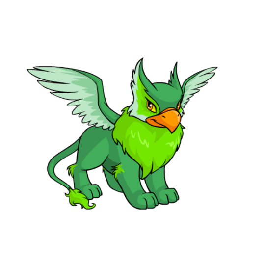
I always thought Eyries were really nice-looking pets. They're basically griffins, but with these really distinct owl-like feathery "ears" on their head that have edge markings dividing the front from the side. It gives them a really nice head shape when combined with the beak, and the overall anatomy is surprisingly realistic (wings are a bit off technically speaking, but that's okay). Like out of all the Neopets, Eyrie are one of a few that you could picture IRL without many changes.
In addition to the head markings, they also sport several lighter areas on their wings and tail, along with a thick fluffy mane that's usually darker but not always (even the base colors don't have this consistent). These break up the body in classic Neopets style and make it easy to read. Their beaks are traditionally orange, which is accented by their eyes so the color is carried through.
Eyries are one of a few species that benefited from customization. Their old art wasn't bad, but the wings were all wrong (they were going backwards against the body lengthwise for some reason, and were halfway down the torso instead of coming out of the mane) and elements like the mane shape and tail position look a lot better. Otherwise, the changes were minimal.
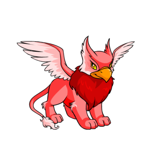
Favorite Colours:
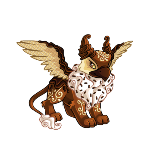
Chocolate: The chocolate Eyrie does everything you want it to do. Whipped cream for the areas with long fur, wafer wings, chocolate swirl ears, white chocolate accents, and some fancy decorative filigree markings. It is completely over-the-top and looks delicious. My only nitpick is that the waver texture is flat, when it should go back in space at an angle and have more of a bend to it.


Darigan: The Darigan Eyrie honestly doesn't event look that different than the regular Eyrie, but it does emphasize how well griffons work as vaguely demonic high-fantasy creatures. While subtle, changes include a different beak shape, more fur, extra-thick wings, a fluffier mane that goes behind the head, and giant claws.
Both the converted and UC/styled versions are fine, though they have their pros and cons. The converted version looks a bit too much like a normal Eyrie due to the change in pose, and the lose of the spearhead tail-tip and subtle feather wing textures is criminal. However, it is much better shaded than the UC version, and it fixes some of the janky anatomy like the weird fold in the wings and the screwed up haunch and foreleg.
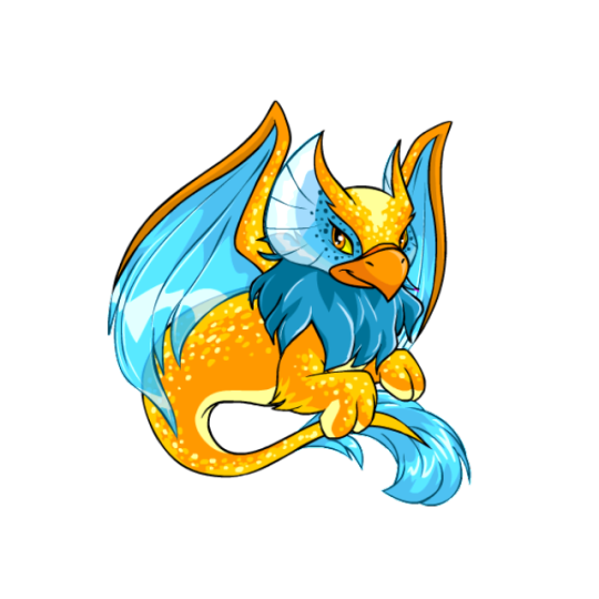
Maraquan: A lot of Maraquan pets nowadays tend to be based off of specific aquatic animals, and while that's fine, I really like it when they just take the base Neopet and adapt it to living underwater in a more abstract way. Such is the case of the Maraquan Eyrie, which has pretty fin-like wings, fins on the head instead of feathers, a swisy, extra furry tail, and a beautiful orange and blue color scheme. Little details, like the speckles and the lighter orange on the underbelly and paws, dd a lot to the design, and the whole thing flows beautifully.
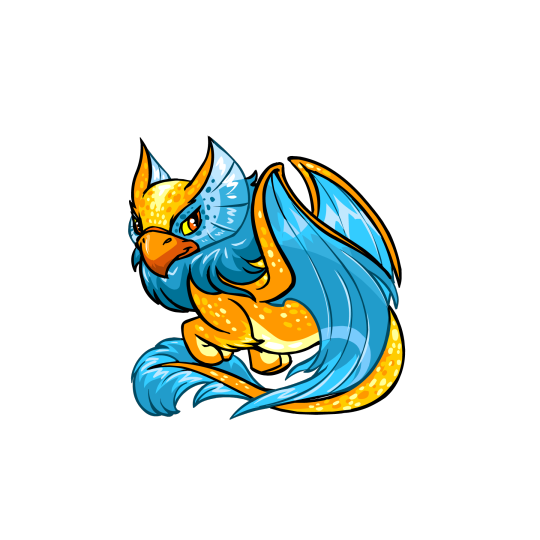
It has a UC/styled version, though the differences are fairly negligible. The UC version has a slightly better pose, high-contrast thick and thin lineart, a wavier mane, and a better head shape. However, the converted version is still pretty spot-on, and it fixes the wing anatomy by putting them on the shoulders where they belong (Neopets artists learn to draw wings challenge) (impossible). In other words, both are great.
37 notes
·
View notes
Text
hi my name is lind, i post weeb shit
i have a youtube channel where i post video essays, reviews, some voice acting, and general shitposting. link here
Art Blog: @lindleart
mod at @pokemonheritageposts
list of liveblogs:
Ace Attorney Investigations: Miles Edgeworth (replay)
Ace Attorney Investigations: Miles Edgeworth 2 - Prosecutor's Gambit (replay)
The Great Ace Attorney: Adventure
The Great Ace Attorney: Resolve
AI: The Somnium Files
AI: The Somnium Files - Nirvana Initiative
Danganronpa: Trigger Happy Havoc
Danganronpa 2: Goodbye Despair
Danganronpa the Animation
Danganronpa 3
Danganronpa Another Episode: Ultra Despair Girls
Danganronpa V3: Killing Harmony
Pokemon Moon
Pokemon Violet
World's End Club
my general edits are tagged as lind memes
selfies are tagged as lind.png
videos are tagged as lind videos
i use the following spoiler tags for your blacklisting convenience
ace attorney spoilers
apollo justice spoilers
dd spoilers
soj spoilers
aai spoilers
aai2 spoilers
dgs spoilers
dgs2 spoilers
aitsf spoilers
aini spoilers
zero escape spoilers
danganronpa spoilers
chainsaw man spoilers
i'm an adult and will occasionally post sexual/erotic content, images tagged nsfw, block the tag if you don't wanna see that
36 notes
·
View notes
Text
R4 DS - 4 Brief Ideas to Utilize R4 DS
Since my articles in regards to the R4 DS now appear online, I've received numerous emails asking me to describe just how the R4 DS works. And simply general thoughts from individuals who currently have their R4 DS Units. To help make an attempt to help everyone in particular, I've come up with 4 quick beginners tricks for the R4 DS and inform you of that you first of all set it up after you receive the R4 DS with you. This isn't meant whatsoever to become a comprehensive report on the R4 DS Flash card to the Ds lite. There are numerous online reviews on this item (some alone, and lots of by others) that can cover the innner workings and the full-featured pair of the device. This can be meant simply as a quickly, 5 step launch guide for those that have gotten their R4 DS, and even know, detail by detail, what they do next. 1. The vital thing you need to do would be to download the firmware for the R4 DS. You will find this on the official R4 DS website. Go for the website address listed on the back of your respective R4 DS Box and enter this website address in your browsers address bar, and you'll be taken up a state R4 DS Website. You might want the firmwar file simply because this could be the the first thing you are going to copy on the microSD Card that you're going to use using your R4 DS. In case you don't have it already, you can also have to go and download WinRar from rarlabs.com because files required are compressed with the WinRar software. It is a shareware program that you could download and rehearse without limitation - with the exception of the nag screen suggesting that you buy the program.

2. Once you have downloaded the file (and made likely to note in places you saved this files) you need to un-compress it with all the above mentioned WinRar software. It'll develop a new folder on your desktop plus that folder will be all of the files you'll need. Then you definately need to take these R4 DS firmware / menu system files and copy the complete items in that folder on the microSD card you will be using using your R4 DS. When you have copied these, make no mistake- that another files you put onto the micro sd card to use with all the R4 DS, shows up in a handy and simple to navigate menu system. 3. Now, the enjoyment part. You must go an download the games and applications you want to use with your R4 DS. I only say here is the fun part with there being literraly a large number of free homebrew games and applications available on the web. And, when i don't condone it, even commercial Ds lite Roms which might be the full games for Nintendo ds lite you could now copy to the MicroSD and play them in the R4 DS. Just do an instant Internet search for Nintendo ds lite homebrew or Nintendo DS Roms and you'll find that you have hundreds (if not thousands) of web sites that offer the latest and greates games and applications for the R4 DS. 4. The past and final step is to simply plug the sd card in the R4 DS and after that take it and place it into the nintendo ds lite consoles. Once you have each of the files for that menus system and the games about the card, then you definately only have to use it and turn in your nintendo ds or dd lite. The NDS will not load the R4 DS card equally as it might load a whole new card to the system memory. Once they have loaded it is going to display to suit your needs a menu system, using the GAME option is the very first option on that menu. You just need to press the A control button or tap about it along with your stylus and you will now go to a listing of the games and applications you have on your R4 DS. Find the one you would like to use / play and away you go. The R4 DS inside of just a couple second will bunch and take part in the file you have selected. That is certainly it. Just 4 fast and simple steps to go from receiving your R4 DS, to putting it in your Ds lite and playing anything and everything. More details about pokemon soul silver download go to see this web page.
2 notes
·
View notes
Text
Hey everyone, I’m opening up Commissions!
Hello everyone, my name is Jesus (aka Jesus20456 or The Brilliant Loser) and due to some recent events, I’ve had to quit my job. I need some money right now and have decided to open up commissions. I am an author specializing in young adult stories and combat stories. I’ve been writing and studying literature and storytelling for years. I’ve been published in my college’s literary magazine which I have also edited for a year and a half. If you’re interested feel free to message me on The-Brilliant-Loser.tumblr.com or at [email protected].
Commissions:
Prose: $10 per 500 words
Poetry: $5 per 10 lines
Play: $2 per page
Each will take 1-3 days per the length listed (so a 2k word story would take 4-12 days).
Will write:
Fanfiction
Poetry
Plays
Short Stories
Reviews for your writing
Stories about your OC (will require as much information on said OC as possible)
Though I will write NSFW stories, I refuse to write the following:
Toiletplay
Pedophilia
Bestiality
DD/LG
Rape
Raceplay
Vore
May reject other requests in the future
Fandoms I am knowledgable about:
Naruto
Pokemon
Battle Royale
Exalted
Animorphs
Zoids
World of Darkness (all the different types)
Comics
Heroscape
Dragonball Z
History’s strongest disciple: Kenichi
Death Note
Yu-Gi-Oh
One Punch Man
Lucha Underground
Forgotten Realms
Steven Universe
Most slasher movie series
Ask about other fandoms, I will write about them but price may vary on the research required for the piece to be completed
Things I am proficient in:
Characterization
Fight scenes (or duel scenes for yu-gi-oh/equivalent for any given universe)
Note: I am knowledgable about most martial arts styles and various weapons styles.
Tone setting
Setting up scenes
Writing Horror
Writing Young Adult stories
Links to previously written work:
Short story (published):
https://www.scribd.com/document/350881749/Kirby-Lee-s-School-for-the-Gifted
Poem:
https://www.scribd.com/document/350881752/What-Do-You-Want-to-Be
Play (written over a year ago, so it’s not a great example of recent skills):
https://www.scribd.com/document/350881748/Arthur
Fanfiction (current project):
https://www.scribd.com/document/350881750/Pugna-s-Journey
I maintain all rights to any and all stories I have written.
16 notes
·
View notes
Text
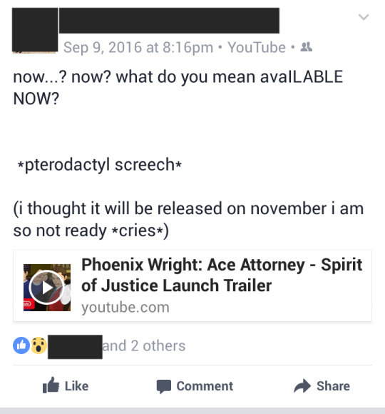
Phoenix Wright: Ace Attorney – Spirit of Justice
WARNING: I AM NOT A PROFESSIONAL GAME REVIEWER, GAME CRITIC, OR WRITER. The following is just purely my opinion and reaction to the game. Also, ENGLISH IS NOT MY FIRST LANGUAGE. So, yeah, I’m sure there will be a grammar mistake somewhere there. Please don’t be a grammar nazi. Lastly, THIS WILL NOT BE AN ENTIRELY SERIOUS REVIEW. Yay. *insert cute puppy face*
DISCLAIMER: I DO NOT OWN ANYTHING. The games I am reviewing belong to their respective owner(s). I DON’T GAIN ANY PROFIT FROM THIS, EITHER.
seeing your previous player character on the other side of the courtroom would make anyone scream
Okay, first, let me lay down some rationale for this game. The Ace Attorney franchise is really, really close to my heart. If Pokemon holds my past and my childhood, the Ace Attorney holds the key to my future – as dramatic as it sounds. The Ace Attorney is what pushed me to take the path of being a lawyer. Of course, it’s not the whole reason (I’m not too keen on putting my whole life and future over a single game, after all), the other is the desire to change all the stupid things that is happening around me. But still, it is what introduced me to the greatness of law, the importance of finding the truth, and the great feeling of satisfaction you get once you have found it.
note to self: don’t fangirl too much and read the important details. seriously.
CHARACTERS:
The Legend, Phoenix Wright
Let me say one thing, it’s really, really weird facing Phoenix in a courtroom battle. For five games, I’ve played as him, and then suddenly we’re battling against him as Apollo in a civil case!? I mean, we all anticipated it ever since we briefly controlled Edgeworth in Trials and Tribulations and acted as a Defense Attorney, but seeing the legendary Phoenix Wright on the other side of the courtroom is still surprising.
And scary. Definitely scary. Seeing Phoenix frown seriously, smirk and do a complete turnabout (which, normally is a good thing for us since we’re normally him) made Apollo (and us, the player) really quake in his boots. It’s like he’s getting back for all the abuse he received for being the butt monkey of the courtroom for the past 4 games!
Other than the very memorable Case 4, Phoenix goes back to being on our side again for the rest of the cases. I especially love the fact that even though 8 or so years has passed; Phoenix’s protectiveness over Maya has never failed. He went to another freaking country just because of a phone call for her! He fought on the wrong side of the truth (which is basically the opposite of his whole values) for her! He knowingly risked his life over her (though then again, this part’s nothing new)!
Every girl needs a Phoenix in her life, man. (NaruMayo ship: *sails*)

serious!Phoenix would make anyone tremble
Courtroom Revolutionaire, Apollo Justice
Okay, first of all, let me clarify; I KNOW THAT THIS TITLE BELONGS TO ATHENA. But it just fits, you know? (Also, I don’t know how to spell.)
I don’t care that the title of the game says Phoenix Wright: Ace Attorney; Apollo is the real star of this game (it’s like the reversed version of Apollo Justice: Ace Attorney, where the real conflict is about Phoenix.). I believe in the wandering fan theory that this last three games (Apollo Justice: AA, AA: Dual Destinies, and AA: Spirit of Justice) is about Apollo, similar to how the first three games (Phoenix Wright: AA, AA: Justice for All and AA: Trials and Tribulations) is about Phoenix.
And man, how those three games did a wonderful job building up Apollo into the brave little bird he is now. AJ shows how he starts as a rookie defense attorney, DD shows his high school-college past (aka Clay MY GOD *eternal crying*), and lastly, SoJ shows his childhood and ends in how he starts being a professional defense attorney (thus, making a complete, albeit reversed, circle).
Spirit of Justice shows a lot of tearjerker, heart-pulling and gasp-inducing scenes for Apollo that at this point in time I don’t know how he managed to not break down. Oh wait, he did break down, he even have a new, special animation for it. And my god that scene… I didn’t shed a single tear at that point, because I was just so horrified and overwhelmed and whatishappeningisthisreallyhappening. Yeah, that feeling. (I did cry, a lot, but at the later point of the game since it took time for my mind to acknowledge that ohmyggoditreallyhappenedhuuuHUHUHUHU-)
So yeah. Apollo really received his most-deserved characterization and development in this game.
The Funeral Prosecutor, Nahyuta Sahdmadhi
Nahyuta. Nahyuta… Is my baby. Because, really, he’s just so cute and naiive in some of the things! I mean sure, he’s really nasty, but so are the other prosecutors and you don’t see me hating on them (in fact Franziska is totally my role model). But we can’t all deny the fact that he’s really kind and gentle on other people, look at Ema for instance (it’s clear that he likes her btw, I just can’t decide if it’s platonic or romantic, since my KlEma heart’s really against it).
And just like any main prosecutors in any games, Nahyuta receives wonderful characterization and character development as the game progresses. Similar to Apollo, a lot of tearjerker scenes is about him, especially when you discover how much has he sacrificed for his family…
And Nahyuta’s totally an overprotective brother to Rayfa. I can’t wait to see the next game just to see their post-game interactions.

look at this two original assistant babies turning to mature babies
The Ace Assistant, Maya Fey
MAYA. SHE’S BACK. AAAAAAAAAAAAAAAAAAAAAA-
Ace Attorney fans have fully risen from the dead the moment the trailer showed Maya returning for this game. It’s what we have been wishing for in these past two games! Our beloved Ace Assistant is back! And partnered with Phoenix no less! Sarcastic conversations! Funny interactions! Ladders vs. Stepladders!
Our original Ace Attorney duo is back! AAAAAAAAA-
But still, of course 8 years have passed, so it’s inevitable for Maya to change. Even though most of the time she’s still childish and funny, there are still many scenes scattered all around the game that shows her all grown up that you can’t help but remember her older sister, Mia. The game shows Mature Maya, the Leader of the Kurain Village.
Also, the Spirit Channeling scene is very, very beautiful. I’m glad that we actually saw it for the first time.
lil’ princess is just so cute!
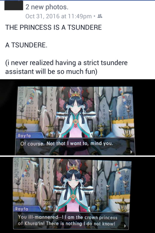
The Priestess, Rayfa Padma Khura’in
Princess Rayfa is a cinnamon roll. A tsundere cinnamon roll, and that what makes her a very cute and wonderful and funny assistant.
Serious talk though, Rayfa is the youngest (except for Ahlbi) character to be introduced in this game, and it shows. Although she acts all high-and-mighty and incredibly mature due to her status as a priestess, there are times that her childishness shows true. And I think it’s completely okay – and Phoenix and Maya does to. She tries too hard to immediately grow up , but what she doesn’t know is that being true to your age gives you wonders too.
And, oh god, the pressure given to her by her mother… I can totally relate.
That scene when she was asked to show her (adoptive) father’s death in a Divination Séance… it made me cry for Rayfa [seriously, this game made me cry a lot]. Sure, we’ve seen her faint a lot of the times, but it’s only for dramatics; to show how horrified she was that we beat her. But that scene… is the real deal. We actually saw Rayfa going pale, gasping for air, eyes wide… and faints. It’s – just – so heartbreaking…

can we all just cry
The Dragon, Dhurke Sahdmadhi
Oh my gosh, where do I even start.
*cries*
My first impression of Dhurke during the trailer was he’s the typical rebel antagonist in a game. And it continued on as we first got a glance on him at the end of the second trial.
Oh boy am I glad to be wrong.
I admit – Dhurke has not been a particularly good father to Apollo. Sure he’s got his reasons, being busy with the rebellion and all, but imagining a little Apollo hoping for his father to show up, pick him up and get him out of his misery – yet incredibly devastated as later, he will know that no one will show up, really broke my heart. Apollo did not deserve that. No child deserves that.
But oh man, he still loves Apollo. He loves Nahyuta. He loves Rayfa. He loves his children – anyone playing the game can see that. He just shows it in a different way, but every action he takes – it’s for the sake of his family. (Nahyuta really is similar to his father)
SPOILER
Too bad he’s not even alive. I can’t believe all the time we’ve spent with him as Apollo is… not exactly a lie, the interactions with him is the truth – he loves Apollo. But… you know.
Imagining his thought process while he was being spirit channeled by Maya and spending time with his son he had only seen now for the past two decades… is very depressing.
The Childhood Duo, Athena Cykes and Simon Blackquill
I admit, I am disappointed with these two. Well, not these two exactly, they’re perfect just the way they are (I MEAN CAN YOU BELIEVE IT SIMON AND ATHENA TEAMING UP. THE PSYCHOLOGY CHILDHOOD FRIENDS, DEFENSE-PROSECUTOR DUO IS TEAMING UP AAAAAA-), but I’m more sad in the roles they are given. More specifically, the wasted potential of their roles.
The theme of the whole game is inheritance. Inheritance from parent to child, and inheritance from teacher to student. And Athena and Simon’s ace – Psychology – is literally that, an inheritance from Metis Cykes!
They don’t need to create a whole batch of other characters. I’m not saying the Rakugo case sucks – it’s very new considering we have another Japanese culture-themed case; and the fact that a psychological disease (the multiple personalities stuff) is the main turning point of this case makes it a perfect case for Simon and Athena – but maybe they should have used it for the next game?
Athena and Simon were only introduced in the last game – so I’m definitely hungry for more backstory and deeper characterization for these two wonderful characters. And what better way for us to get to know more about theme more intimately than to get to know these two’s most important person, Metis Cykes, and her gift to them?
But hey – I’m complaining but I’m not particularly shunning these two and Case 3. As I said, Case 3 is a wonderful and genius case (but what would you expect from Ace Attorney, right?). It’s just that, the potential…
The Game
So far, this game has the largest amount of ‘gimmicks’ or ‘powers’ featured. Phoenix’s Magatama, Apollo’s bracelet, Athena’s Widget, Ema’s Forensic stuff, and the newly introduced Rayfa’s Divination Séance. I think the only missing power is Edgeworth’s Logic Chess, and we have the complete set!
Each of them is unique and special in their own way, and they definitely made the game much more exciting and enjoyable. OF course, the traditional courtroom battle is as hard, mysterious and exciting as ever! I cannot even predict who the culprit was in the start of the case, and if it was obvious who did it (like, it was showed in the initial cutscene or was directly implied), I can’t figure out how he/she did it without the help of the character I’m acting as. Which is a new thing for me, since in the past games, I already know who the real culprit is even before the player character knows. Well, most of the time, at least.
And the plot, oh the plot was absolutely complicated and mind blowing it’s wonderful. The family drama is as – if not more – dramatic than the T&T one. And that’s saying something, considering that the Fey clan’s story is really complicated too. And as I mentioned earlier, this game gave meat for the characterization of several characters.
Also, it made me cry probably around ten times.
FINAL REMARKS
DO I EVEN HAVE TO? GO PLAY IT. Though if you still haven’t play the previous games yet, do that first THEN PLAY THIS. THE STORY IS GOOD. THE GAMEPLAY IS AWESOME. THE CHARACTERS ARE WONDERFUL. *eternal scream*
FINAL NOTES: I’M SORRY IF I MISSED ANYTHING. What I wrote here are the things that really stood out to me. My aim is not to review everything about the game, but to write what I remember the most and what my reaction to it. If I did react to the whole game, it would take about 20 pages or so in MS word. (This is 4 pages, btw)
2 notes
·
View notes
Text
Reviewing Unova starters now

Unova got a lot of unjustified hate during its time, and now it gets a lot of love- and rightfully so imo. Not all Unova pokemon are good, but there are still a lot of absolute bangers.
Unfortunately, the starters start what I'd say is a steady decline in design quality that the franchise never quite recovered from. Their base forms are cute, but really only 1 is fantastic by the end, whereas the other two are mostly meh. The color palettes are at least pleasing to the eyes, and the starters have a very interesting and tangible theme of being representative of other cultures- perfect for a cultural melting pot like America, which Unova is based on the NYC area.
I'd say an overall 7/10 fits, despite one of these being one of my absolute favorite starters ever.
Breaking it down under the cut

Ah Smugleaf- sorry, Snivy, the French snake so far not seen in the French revisit. Anyway, Snivy is another pokemon best viewed in 2d mediums, but 3d treated it okay imo. The colors are a pretty nice blend of green, yellow, and tan- certainly reminiscent of shades of grass. The red eyes are a nice touch as well, making them easily noticeable. The body is mostly a series of curves and curved shapes- one could say banana shapes, save for the tail, which could probably fool most into thinking it is just more blades of tall grass. The collar is a nice touch as well. I do feel the arms and legs are a tad strange and imo would be better without them, but at least it is an interesting biology lesson- snakes used to have legs, even their skeletal structure shows that. I guess it's fitting that they sort of fade as it evolves. Anyway, I think Snivy is neat. 7/10- there are better grass starters, but this isn't the worst, certainly a friend.
youtube
Sorry, had to. Anyway, besides being voiced by Jason Griffith- one of my favorite Sonic VAs ever, there isn't really a lot to say about Servine. It's basically just a bigger Snivy with more frills, which I think is fine enough. The hands and legs are more and more... pointless, I guess? To indicate a steady loss of them, which I do think is neat on a design perspective. Yeah, 8/10.

Serperior is a rather interesting pokemon- another kinda victim of the transition to 3d, but I also wouldn't be able to tell you of ANY Serperior mains like I could for Emboar or Samurott. The move pool is one of the most shallow out of any starter I've ever played with, although Contrary is a pretty awesome ability for it... to only have 1 move it can really make a lot of use for. Yikes.
Design wise, I think it is pretty decent, but is another "right angle" kind of deal. Serperior now loses its legs and only has those dangly hands now, fully transitioning to a snake snake. The swirling patterns certainly invoke French design, with it entirely being a kind of living fleur-de-lis. The collar and head leaves definitely invoke a regal European vibe, with the ear?pieces certainly helping to break the design up. I do think that it would have been a little better had it kept the yellow colors rather than adding the white, but I understand they're going for a kind of white snake or molting vibe. All in all, a harmless design, kinda cool too, I just wish it was more fun to battle with. 8/10 for design, 7/10 with the loss of moves.
Overall, the Snivy line isn't quite the best you can get from a grass starter, but it's a fine addition to its ranks. The limited move pool only gives you a few options for how you fight, which isn't really ideal for me personally. Still, not horrendous. 7/10.

Tepig... oh Tepig. I had hope for you when I was a fire type only kid. And why not? Tepig is a very cute design that has a lot of great colors going for it, and is very friend shaped. I think I dislike the ear placement, but that is minor. I remember looking at this and thinking that my ideal quadruped fire/ground pig starter I made as a kid would finally be a thing, and certainly they'd complete the water and grass part ground trio with Torterra and Swampert- and CERTAINLY wouldn't be fire/fighting again. But... alas. Tepig loses points for wasted potential imo, despite having a great design. 7/10 for what could've been.

And Pignite ruins it. Okay, excellent color choices, and I do adore the golden swirls, but nobody asked for this. Nobody asked for a THIRD fire/fighting starter in a row, least of all one that isn't nearly as good as Blaziken or Infernape- who both got way better "Dream World" abilities at this point in time. I don't like how round and cartoony it looks, as it's more invocative of an egg than a pig. The mouth placement and style, plus the nose just kind of buttoned on? I think it would look better if both were part of an actual snout that it breathes fire from. As far as the anime is concerned, it's also wasted on Ash by trying to do Infernape again but changing their minds halfway through. I don't like it. 4/10, the colors are nice but that is it. Wasted potential. At least the ears are cute.

And now to finish out the wasted potential line, Emboar. Honestly, 80% of the design is pretty good, the color choice is fantastic, the swirls are fun- it's just the head where you lose me. They lost the ears for... whatever that is, and once more they just slap a mouth and nose onto a round orb instead of giving it a proper mouth- I also think it's wasted to not give it actual pig tusks instead of those tiny fangs. It's less of a pig pokemon and more like pokemon Ganon from the early Zelda games. Again though, 80% of the design is neat, the flames are bad ass especially and if you squint, you almost forget the muppetdorf face.
The design is definitely Chinese inspired, although I just really feel like it'd be better suited as a quadruped with a snout, a less round body, and not another fighting type. Play wise it's fine, I've used a couple and they get the job done. Still, just... God, wasted potential. 6/10.
The Tepig line, once more, is just wasted potential. Sure they make a little nod to Journey to the West with the Torchic and Chimchar lines, but nobody really wanted or asked for a trio- I think the concept is better reserved for a legendary trio or something. Yeah, this is the line that really brings down the Unova starters for me. Certainly not the worst, but they are towards the bottom and start a downward decline of at least one or two starters per gen. 6/10, fine for battle and almost decent, but a few details just kinda ruin it for me.

And there he is. There's my boy. THERE IS MY BABY BOY! That's not just a friend, that's my son! Some art depicts him better than others, and I do understand why some wouldn't like him at first glance- but Oshawott is a Pokemon that taught me the positive end of "don't judge a book by its cover." I still maintain to this day that Oshawott had no BUSINESS being done so fucking dirty in the anime. I think it's a victim of what would become a recurring problem of "too cute to evolve." And by god, was he a cutie.
From a design perspective, it's basically just an improved Piplup in my eyes. If I were to fix something, I'd take away the heckin schnozz and make it a smaller black, and maybe just tack some whiskers on those freckles. He is a little goofy looking, but he is a loveable little guy all the same. 9/10

Dewott is a cool design and basically an improved Oshawott, with better colors, better proportions, and now TWO Scalchops. That's just how you do it right, imo. 9/10

Now some people have strong opinions on Samurott. A lot of people think it diverges too much from the other Wotts into sea lion territory. I think those opinions are valid, believe it or not, but regardless I still believe Samurott is a severely underrated pokemon, and both versions are top tier water pokemon design. This variant is probably the more versatile of the Unova starters, with a nice and balanced/varied move pool and great stats to balance it. The ideal Unova starter in any playthrough by objectively just trying.
Design wise, it's fantastic in 2d and only suffers a little in 3d. It still has otter influence to me personally, and the sea lion influence kinda blends into a sort of dog like look to it, which I do love dogs. The shell helmet and armor are really cool, and sandy color goes really well with the darker blues. The facial hair certainly helps sell the Samurai motif as well. I will say, if I had to fix it, I'd probably add more flexibility to it's legs for maneuvering and sword play, or I'd at least have a proper bipedal mode it can engage in to weild it's swords properly. Speaking of, I do love that it has twin swords, that's just cool, it's just too bad it doesn't really get to use them much. Still though, an absolute banger water starter, and I just wish they'd make them like this again. 9/10
The Oshawott line has its haters and lovers, and its lovers more so divided. But I will say, if nothing else. It has a fan in me and has had a fan in me since I was 15. I literally can't play Unova without picking it, and when they brought it back for Legends Arceus? Bruh. It saved gen 8 for me. That's just how peak this line is. 9/10.
Gen 6 next
#pokemon#dd reviews pokemon#pokemon gen 5#unova starters#snivy#tepig#Oshawott#servine#pignite#dewott#serperior#emboar#samurott
8 notes
·
View notes
Text
Part 2 of the starter reviews. Gen 2, Johto
This was the first set of starters I chose from, but not the first I was exposed to, as i watched the anime and played Snap before i was given Silver, Gold, and RBY as a kid. Big shoes to fill certainly, and while they don't quite capture that same edge as gen 1, they are loveable and great designs in different ways. As opposed to gen 1, they feel a tad more natural and have a unified theme of type purity. It really says something that these guys were perfect as is for the longest time, until 2022 and later 2025 (this year). 8/10 collectively.
Now the individual break down
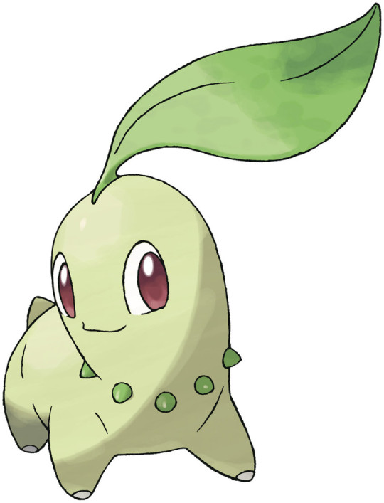
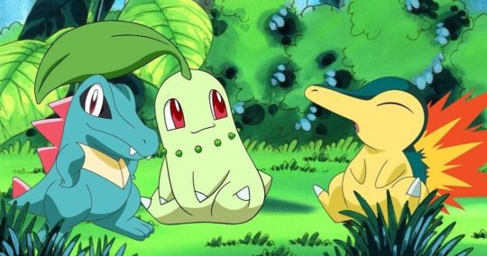
Chikorita is a cute design- probably not my first choice of grass starter, but it's still an enjoyable and simple design for other reasons. I think my main gripe is the flatness of the face, which just kind of feels like stickers on a radish. It's not exactly the best starter offensively and certainly has trouble in Johto, but honestly I've had better use of it in other places like Orre, Unova, or Alola as a caught party pokemon. Certainly a good friend, though. A decent 6/10
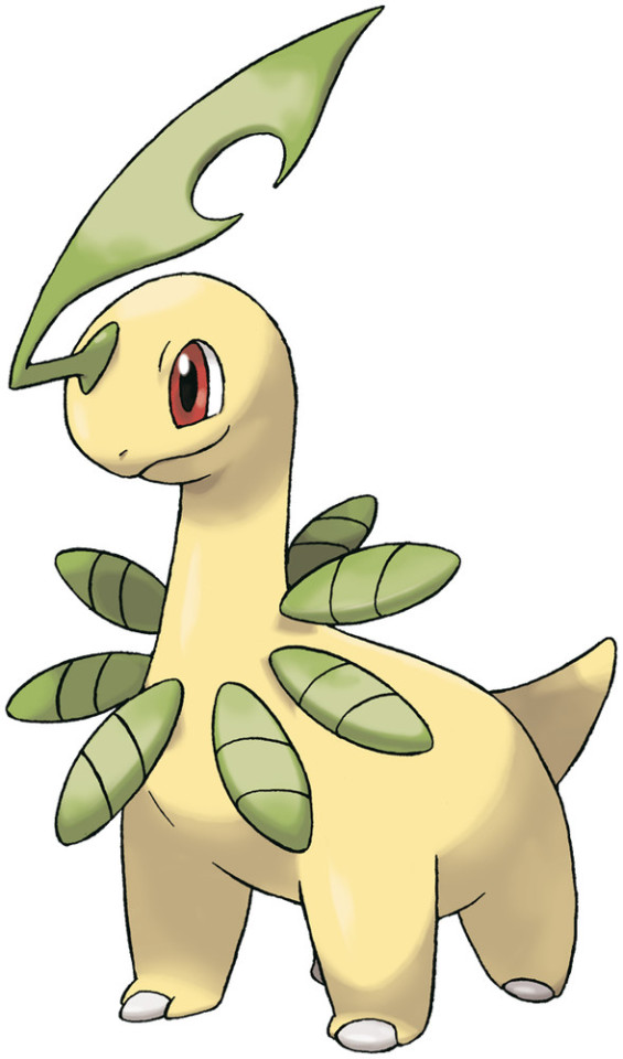
Bayleef is pretty much universally agreed to be the best of it's line. And why not? It's just a cool and spunky look that works no matter your tastes, and is just an overall improvement on Chikorita with a better face, color scheme, and leaves. The head leaf especially is super cool, looking ready for combat. Really cool 9/10.
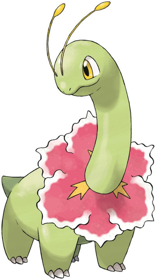
Now Meganium- most would probably consider it a downgrade from Bayleef and one of the first girly starters, if not a bad one. While Typhlosion and Feraligatr are better imo, Meganium is a nice looking Pokemon with a simple yet pleasing design and premise. It makes some sense as to why Batleef looks a little better, because Meganium's general vibe was decided early in production. Still, I think Meganium is a Pokemon better suited to not being a starter per se- I quite loved having it in Alola via island scan in my Moon playthrough, for instance. I think Tropius would have been a better fit in an AU tbh, because at least the leaves remain and it's a cooler option imo. Still, not a bad design, probably better than Chikorita design wise, and certainly cute. I think it really gets a nice place to shine in New Pokemon Snap. 7/10.
Overall this line isn't as bad as some people think. As stated with Meganium, it's probably better suited to not be a starter outright, as that's where it honestly gets a better chance to shine from the sidelines rather than the spotlight. It's somewhat a more "girly" line, but it doesn't quite cross the line to weirdly human like certain later gen starters, nor is it overly so in a way that the typical boy can't enjoy it either. A solid 7/10.
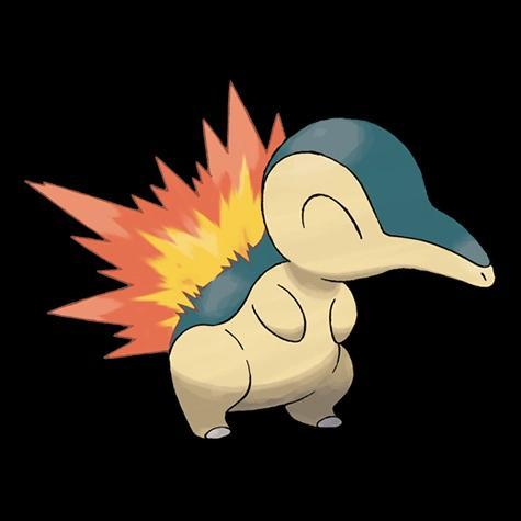
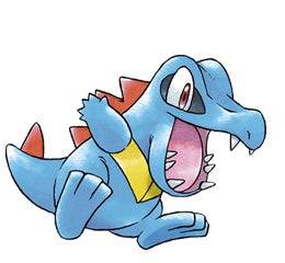
Oh. Oh there's the boy. THE. BOY. Or girl depending. My first Pokemon, and what a certified friend. It's entire line kind of hit a rough transition to 3d, but Cyndaquil is still a wonderful starter for anyone. I fully acknowledge a bit of bias when it comes to my favoritism towards this line, but Cyndaquil is still a pretty solid design between cute, cool, and absolute buddy. 9/10, missing ears.

Quilava is a neat design that admittedly relies strongly on the particular artwork or medium viewed, because in some (like this), it looks like one of the coolest guys ever. And that's good, considering just how long you have Quilava in gen 2 games (for me, from gym 1 to gym 7.5 usually). I think it's a better middle evolution than some later gen ones, but it definitely is more noodle like in later gens and would benefit from longer hind legs. The color scheme and fire placement is definitely fun, though. 8/10.
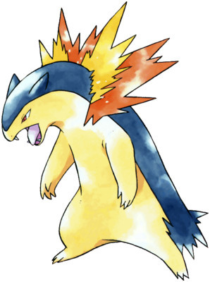
Now Typhlosion is another Pokemon that really needs help from a proper angle and artwork to truly appreciate it. I am definitely biased because Typhlosion remains one of my favorite Pokemon in general, all stemming from my level 99 female one that I had in Crystal, and didn't find out mine was a girl until right before Red, who we never could beat until Soul Silver. As if time traveling had happened, my Typhlosion in the virtual console ports was also a girl, and together we finally defeated him. I consider that one to be my first pokemon's reincarnation since game freak failed to find a way to transfer from my Gameboy cartridges to gba, and it holds a nice place in my imaginary Pokemon ranch as the equivalent of a gentle, retired farm dog that's family. Otherwise, Typhlosion is just great no matter what game it's in, from Johto to Orre to Hoenn to Sinnoh, etc, it just fits in and works really well- it literally is a simpler Charizard in a way, even sharing it's bst.
From a design standpoint, the color scheme is a bit loose and goose depending on the material, with anywhere from a blue and peach, green and yellow, or black and gold, but all are fantastic choices. Like the other 2, the 3d era wasn't exactly the kindest to Typhlosion's johto model, but when it's viewed right, you can see a natural threat that's just as cool as it is simple. A lot of later gen pokemon are a bit complex in design, which isn't necessarily bad or wrong, it's just that Typhlosion is great with LESS. It even loses a fire spout and still looks cool when the flames blaze to life. An overall 9/10
As stated previously, Typhlosion's line suffered a great deal from bad models in the 3d era until about Legends Arceus and SV. But it's a line I hold near and dear to my heart and will always have a soft spot for. Simplicity and natural qualities carry the designs very far in a way I feel let's them hold up even to this day. 9/10
Totodile is a fantastic little dude and a fan favorite for a reason. Look at him. Certified little fella. A buddy if ever there was one- sure he might bite your finger off, but what bestie can't? Totodile is a rather complex design for its time, yet it works great and it still is a fantastic pokemon by itself that, arguably, doesn't need to evolve at all to improve itself design wise (sadly there is no item that gives us the anime option to pit babies like Bulbasaur against Regis to win). The 3d era definitely removes a few more brain cells than necessary, but it still holds up imo. 9/10
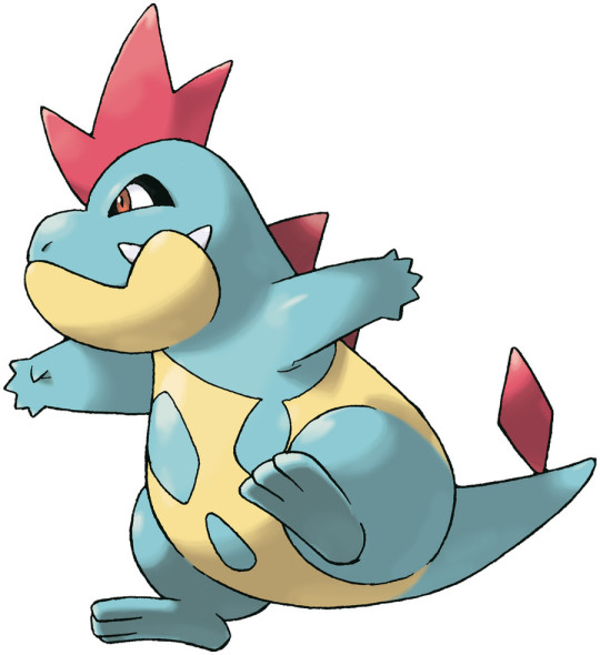
Crocanaw isn't exactly a terrible design- the caveman pattern is certainly... a choice... but as an awkward teen, it could have been worse. I think the rounding of the snout, excessive yellow, and retraction of black kind of take the design back a step- but looking at the jaw, that definitely speaks to a biting focused pokemon. I really don't have much else to say, 7/10.
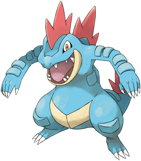
Finally, Feraligatr. For some reason as a kid, I didn't connect this guy as being related to Totodile at all- foolish, I know. I think it's definitely on the cool end of water type starters- something that becomes increasingly rare as time goes on for some reason. Regardless, I really dig it, although a small correction I'd make is to increase the eyeshadow? Or whatever the black is around the eyes. Otherwise, fantastic, a hulking MONSTER THAT LOOKS JUST AS DANGEROUS AS IT LOOKS like a bro you can chill with and fist bump. Hell yeah. It has these strange pads that don't really make much sense, but it is a cool addition, I think, to help add to the design. This is a Pokemon I feel like I could see being a neighbor's or a classmate's from the bayou, and it feels like a really great fold to Typhlosion in a way. 8/10.
Overall the Totodile line is a classic example of how to do a water type starter right in a fun way as far as design goes. Yeah it's a monster, yeah it can eat you for breakfast if it wants, but I feel like that's the point of what a starter SHOULD be- a pokeMONSTER you've befriended. It's only drawback I find is really the lack of an update for it, but maybe ZA will change that. Anyway, solid 8/10.
Gen 3 next
#pokemon#dd reviews pokemon#pokemon gen 2#johto#johto starters#chikorita#cyndaquil#totodile#bayleef#quilava#croconaw#feraligatr#typhlosion#meganium
7 notes
·
View notes
Text
Gen 3 is up for review

Gen 3 was the soft reboot that set Pokemon on the track it's currently on, and the starters sort of reflect that, while still having a lot of great design sensibilities and awesome creative liberties that really make them stand out among their peers. They're all phenomenal and can easily be worked with, and all deserve to be a "favorite" imo. 9/10, weirdly sporty and really matching the adventure vibes hoenn presents.
Time to break down... it, that is
Yes I did purposely go for Ash's. And why not? That stick takes an already great design and adds even more swagger to it. A classic little guy, and a classic friend- but the kind that you trust to keep it real with you. The color choices are really fun, the versatility is great, and all in all, Treecko is just great, but certain art helps it more than others. 8/10, with the stick becoming an easy 9.
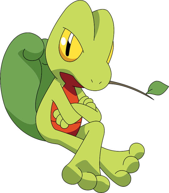
Oh yeah and yall weirdos will immediately see this as PMD Grovyle. The character Grovyle is one of the most dark and interesting characters within the entire franchise, and I do feel like that adds to a lot of people's love for it- myself included *somewhat.*
But for the normal Grovyle NOT from pmd, it's kind of a weird middle stage for me. Certainly not bad, but the lack of an actual tail definitely takes me out. Still, other than the leaf on its head and its tail, you can easily see the gap between Treecko and Sceptile brought together. A 6/10 by itself, whereas pmd grovyle is a 9.

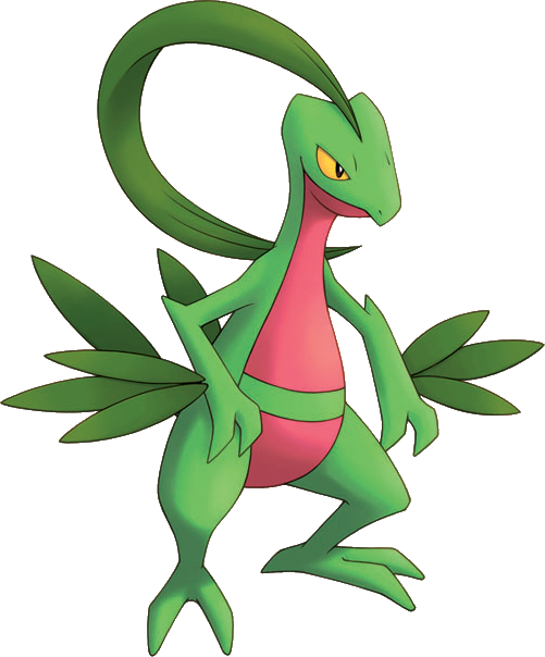
This is just an ordinary Sceptile, and I think that's probably the coolest you can get for it. Like there's "cool" like previous starters like Charizard, Blastoise, Typhlosion, and Feraligatr, and then there's "smack a jukebox" cool like Sceptile. I'd say this is the first actually cool grass starter. It's a confident design with great details that make it stand out, even the tree tail that is both a little out of place and cool at the same time. So what's the catch? Well, look at it's arms. Clearly this Pokemon was meant to use Leaf Blade as it's signature move, but for some forsaken reason, it's now a special attacker- it's still an incredibly cool one, but something was definitely lost with the transition from early gen to gen 4 type and stat mechanics. Otherwise though? Just a great design overall. 9/10, with Ash's almost being a 10 for beating that bitch ass Darkrai, but then it loses a point for it's weird cuck arc it had in the Battle Frontier anime when a Tropius stole the Meganium it liked.
This entire line is probably one of the best grass starters you can possibly get. 8/10

It's a cute chicken. It's kind of hard to find talking points about it, it's a cute chicken and definitely an early sign of what was to come from starter marketing, with a big head and tiny body. The colors are a nice blend and... yes, that's it. Its a friend. 8/10. I like it.

Now Combusken- I think this is the first middle stage evolution I truly dislike. It's not... bad? It's just... not good. I think it's design is decent at showing off it's new fighting type, for sure. But, the head and thighs, and certainly the tail feathers, just don't work for me. Cock and balls out of 10, aka like a 5.

Okay, I know I have a disdain for humanoid starters, but Blaziken was the first and the first to do it RIGHT. See this is the thing- there are no bad angles on this guy. No, he just aura farms no matter how he appears. This is a Pokemon that screams leg use, and the creative liberties taken to avoid a literal chicken while still looking serious and cool are not appreciated enough. Cool colors, cool design, I especially love how it's head wings just spread out while fighting. Brave Bird and Blaze Kick just feel CORRECT on Blaziken. 9/10.
The line isn't really consistent to say the least, and you're also stuck with Combusken for a weirdly long time for my tastes. The transition is kind of symbolic of humans, though. Cute as a kid, ugly as a teen, cool as an adult. 8/10, probably one of the best fire starters around.

Oh there he is. THERE HE IS! The kip himself! That's not just a friend, that's a BUDDY! I didn't come to appreciate him until my teen years, but god, he's just a perfect little boy. The colors are immaculate, the design is a creatively cute and cool blend of random amphibious animals and land critters, and it's a creative way to turn an animal you wouldn't begin to even THINK of being a starter and making it one, which I REALLY wish gf would do again. 9/10.

I'm gonna say it, the hate on Marshtomp is forced at best and 3d pilled at worst. Yes in 3d it looks like it forgot there was a test today, but in 2d and sprites? That's just a cool guy. Maybe not the most immediately identified as an animal, but as a monster? God, it works. The colors aren't as great as Mudkip or Swampert, but it's a fine enough pokemon as is and kinda sporty. I feel Marshtomp is a really good match for game May tbh. 8/10.

Swampert is a divisive pokemon- there are those who think it's cool af, and then there are those that are stupid, inept, and WRONG. It's a monster first and foremost, which I think is the best way to go about pokemon design. It's an overall fun and creative design that really matches the vibes of Hoenn itself: adventures on the land and sea. The pads and sails are just a great addition as well, especially the colors, which help accentuate some colors and make others pop. The typing is fantastic until you meet a single grass type, and it's movesets are fun as well. This used to be my favorite water type until Samurott rolled up. Yeah, 9/10.
The Mudkip line overall is what I feel is Pokemon's strongest suit: monsters. Not a furry oc or an avant garde art piece you need an art history masters degree to understand and "get," it's a monster that just gets cooler as it gets bigger, and honestly you don't need to know it's supposed to be based on axolotls to enjoy them. This is the kind of starter I really miss tbh. 9/10
Gen 4 will be next
#pokemon#pokemon gen 3#hoenn starters#dd reviews pokemon#treecko#torchic#mudkip#grovyle#combusken#marshtomp#sceptile#Blaziken#swampert
6 notes
·
View notes
Text
Alright, time to review the gen 8 Gmax starters. Only 6 this go around because GF held themselves back and only made 1 Charizard this time. I'll be honest, Dynamax was a stupid mechanic I'm glad is gone. "lets make pokemon biggerer!" like they just did that in Alola with totems. God. Even the gmaxes are just inferior megas- which they replaced btw. Whatever, critique time- As a whole the designs are pretty badass.

Lets get it out of the way: Charizard is overshilled and over marketed blah blah blah, I've said it all before. It leaves a guilty feeling and a bad taste in my mouth, especially when even though it only got one this time, it STILL stole the spotlight from its gen mates and the gen 8 starters by being the Unbeatable Ace Pokemon To the Unbeatable Number One Champion In the Entire World Tm trainer.
That being said, god I am a sucker for this asshole. Look at him. He has no business- no RIGHT looking that cool. I don't understand the patterns going on on its knees and belly, but damn if it ain't cool, and it's even cooler in the animated materials promo'd in. I mean, it's still a fire and flying type, so rocks will absolutely destroy it, but at least it gets to aura farm for all of... 3 turns lol. 8/10, with a point deducted for the same reasons as the last few points docks for Zard.

Gigantamax Venusaur isn't really a Pokemon form I've looked at for more than a few minutes, but damn if it ain't a monster- that's a good thing. The plant has pretty much overtaken him, and the foliage underneath is ragged and unkempt. I love the eyes especially- its tired, yet destructive and scary. Badass af. 8/10.

THE! BOY! Holy SHIT they made him cooler! This is probably my favorite of the Gmax forms for all of the starters. Look at all of those cannons! Blastoise has gone from a tank to an entire *fortress* on legs! In a better game, you'd see each of those cannons taking fire at opponents and just unleashing DELUGES of water at them. The introduction of red to the color schemes is also just fantastic. See, if GF had been *smart* and made Leon use a Kanto starter that would be depending on your starter, I feel like that would have been much better and also would have given us a bigger appreciation for something like this. Well, at least in my swsh au, it is. 9/10 in design, but only 8 considering I couldn't access it sooner before DLC.

Something interesting the Galar starters do when Gmax'd is that they themselves only grow a little, whereas their key pieces that define them grow- in this case, Rillaboom gets a full on gigantic drum kit. I said in my other review that it'd be better to ditch the drums, but I think they are vital in the Gmax form to truly appreciate the badassery at work here. Although, I will say, having the galar gmaxes be missable if you don't buy DLC is pretty scummy. 7/10, would've been an 8 otherwise.

I'm still not a fan of Cinderace, and in fact I think the gigantic ears could've improved the base design a little bit. Still, the giant flaming bunny ball is cute I guess, but that only helps so much with a bad Pokemon design that doesn't even look like a Pokemon. 6/10.


Okay, normally I only do 1 image per review, but for Inteleon I needed the help just to see what's going on up top. Inteleon is still the worst starter ever imo, but gmax kind of ups it a few points to almost kind of being neat. The sniper tail would have been fantastic to have in base form, and the glazed over eyes is a nice touch. Still, it's mainly just the same Inteleon I dislike, but now it has a big ass tail it uses as a sniper nest- which I'm honestly surprised TPC allowed them to do or reference to this degree, all things considered. It's admittedly a badass concept, but still, going from a 1 to a 6 is really pushing it, so 5 will do. Keep in mind you only get this for 3 turns.
Yeah that's about it. next post will be about the Hisuian starter variants, which I personally think saved gen 8.
#pokemon#dd reviews Pokemon#galar starters#kanto starters#pokemon gen 8#gigantamax#gmax#gmax charizard#gmax blastoise#gmax venusaur#gmax rillaboom#gmax cinderace#gmax inteleon
5 notes
·
View notes
Text
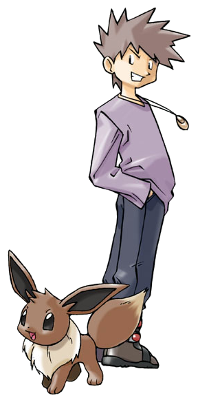
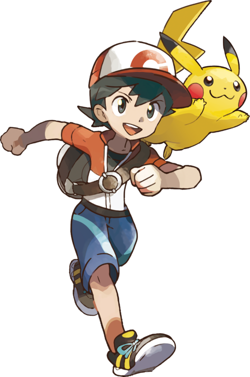
Time for more reviews nobody asked for, this time the gen 1 protagonists and rivals.
A little caveat: I'm only reviewing them as they appear in the games they are playable in, otherwise I'd have to make a few posts just to get through Red and Blue. We're also counting Let's Go for this.
We'll start with the GRBY era for this
Let's start from the beginning. Red himself. According to the game, he's 11, but most would assign whatever age they want to him since he's just pixels on a Gameboy at this point. That would also include gender, since there's no girl character to select in gen 1- unless you're the type that really gets bothered by that kind of thing, it probably didn't affect you and you just imagined yourself as a tomboy or something.
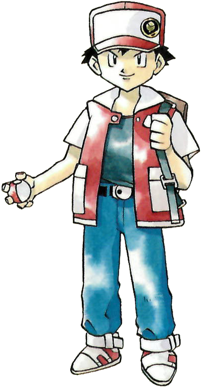
Ken Sugimori's early styling is iconi- a beautiful water color palette masterfully done, with an art style he himself claimed to be Akira Toriyama inspired. We don't have the corporate styling just yet, so it's a really charming, retro look with blocky styling and pretty simplistic clothing. The hat, t-shirt, and jeans are a pretty simplistic attire for any kid about to good off- the vest really adds about 80% to Red's individuality with fans probably recognizing it as being similar to gen 1 Ash- fitting since Ash is based on Red. The shoes are also kinda retro and cool, but that's not quite as important imo. Small thing, I do prefer when Red is depicted with black hair rather than his brown haired counterparts. I can't really fault the design much because it is pretty early on,except maybe I'd have made the shoes black instead of white and added gloves. Still, it's an outfit I'd probably wear as a kid. 9/10
Now I'm not going to give a full review on this, but I figure it's fair to bring up Green's prototype artwork before she would eventually become the playable girl character in frlg. Gen 1 games were held together by bubblegum and a dream, so adding a girl character was probably too hard for them in the 90s- it's a shame, Green isn't dressed for adventure, but she is cute, the white gloves and white belt are a nice touch on the black dress. I think Manga Green really pulls it together with white boots instead of black flats. Still, really cute for the time, although I feel that people probably would have been over critical of her design in this day and age had she been canon. 8/10
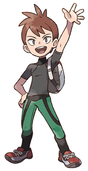
Ah Blue, the original asshole we all know and love. Always 5 steps ahead of you, somehow catching a lot of pokemon before able to, and 1 really inconvenient battle in Sylph Co marked him as an opportunistic rival hunting you outside of caves for some reason. A smug narcissistic bastard, perfectly fitting for an 11 year old grandson of THE pokemon authority. Weirdly obsessed with smelling you later.
Design wise, you gotta love the spiky hair. It's such a cool look that screams 90s, and really adds to his "cooler than you" attitude he has, which his cocktail expression further adds to. The clothes are pretty simple, a purple long sleeve, darker pants, and really cool brown boots- and also a necklace. It's not much, but the design is pretty reminiscent of cool kids you'd see on tv shows and such. As opposed to Red's bright and varied colors, Blue has darker colors, which is another nice contrast.
As a rival, he does a pretty good job setting the foundation for what fans should come to expect. Stronger pokemon to yours- as a proper petty rival should- with the exception of his Eevee in Yellow that evolves depending on your first two battles with him, if I remember correctly, with Vaporeon being the cocky evolution he chooses if he's beaten you- aka, he doesn't see you as a threat. Weird how he ditches it in gen 2 forward, but I guess he did ditch his Raticate. Anyway, his teams are touted to be geared to handle any type- at the time, this is certainly true, although certain teams will have certain glaring weaknesses, such as a triple electric weakness if you picked Bulbasaur. His Alakazam for sure was the stuff of nightmares, especially in gen 1 when Psychics were op as hell and had no weakness you could reasonably exploit. It's no wonder he became a champion and then gym leader- fun fact, in Japan he's called Green (for some reason, blue and green get swapped in translation between Japanese and English often), and the Earth Badge is called the Green badge in Japan- isn't that hilarious? He's so full of himself even after losing the champion title that he could've gotten a new badge or renamed it, but he kept it named after himself. Anyway, a solid rival. 9/10
Onto frlg
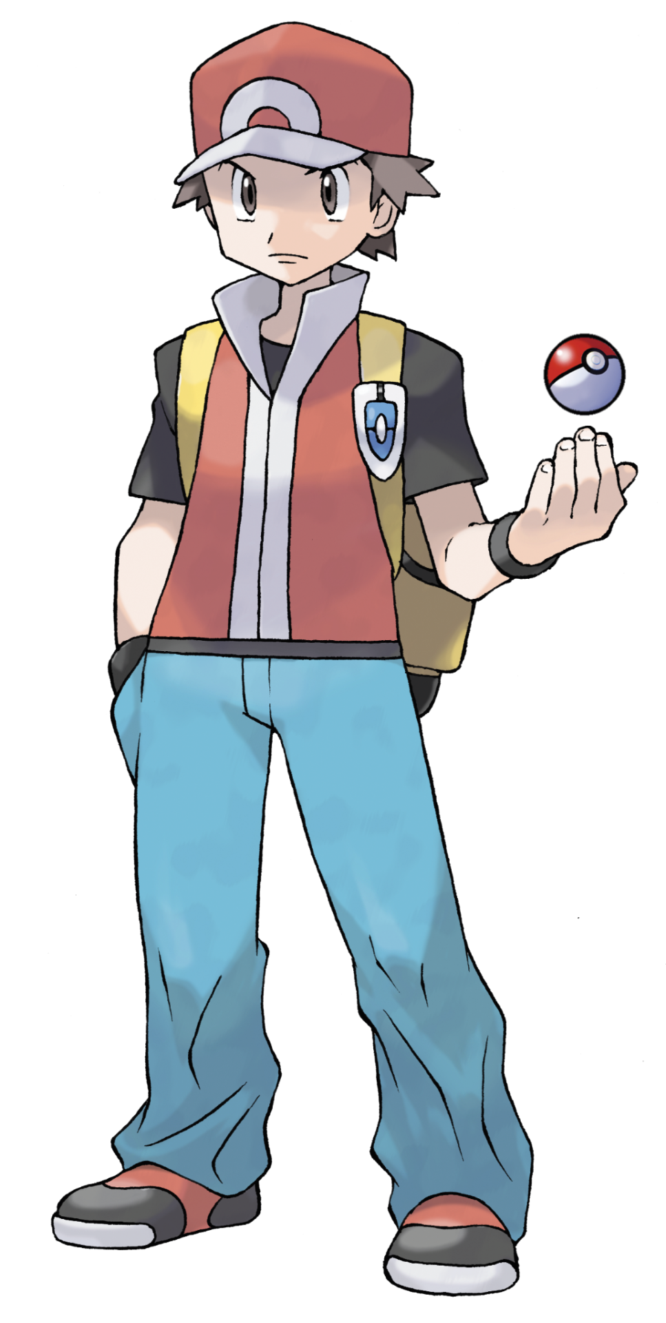
Frlg Red became the new standard Red going forward after being introduced in the gen 3 edition of the gen 1 games. Sugimori's artstyle has evolved by leaps and bounds at this point, and we now sort of have a more modern artstyle that a lot of people consider the True tm pokemon artstyle. It is a small shame we lost the pretty water colors, but at the same time, I feel like this does look a bit more agreeable.
I think the design is solid, and unlike og Red, frlg Red is a bit more age ambiguous, which makes him an even better blank slate for any player of any age. The outfit is a bit more modernized, now untucking his pants from his shoes, and zipping up his simpler vest over a black tshirt. The hat, too, is also a bit more characterized, being more unique to him. Rather than gloves, he opts for black wristbands, which is nice for helping fill empty space and give some oomph to his look. The yellow backpack kinda clashes imo, but also kind of works- I'd want it, anyway, and even comes with the Vs Seeker pinned to it. Lastly, we have a change to his hair color- brown. I have brown hair, but honestly I'd have preferred they keep it black. All in all, this is a nice outfit and I'd probably wear a variation of it if I could. The main thing I'd change is unzipping the vest and making his hair black again. I do also need to express my appreciation for having full length pants- this is a rarity for guy protagonists as we get to the more modern era gen 7 onwards. The outfit just looks comfortable overall, nice and roomy, breathable, and something that'd fit right in in the world of Pokemon. A 9/10.
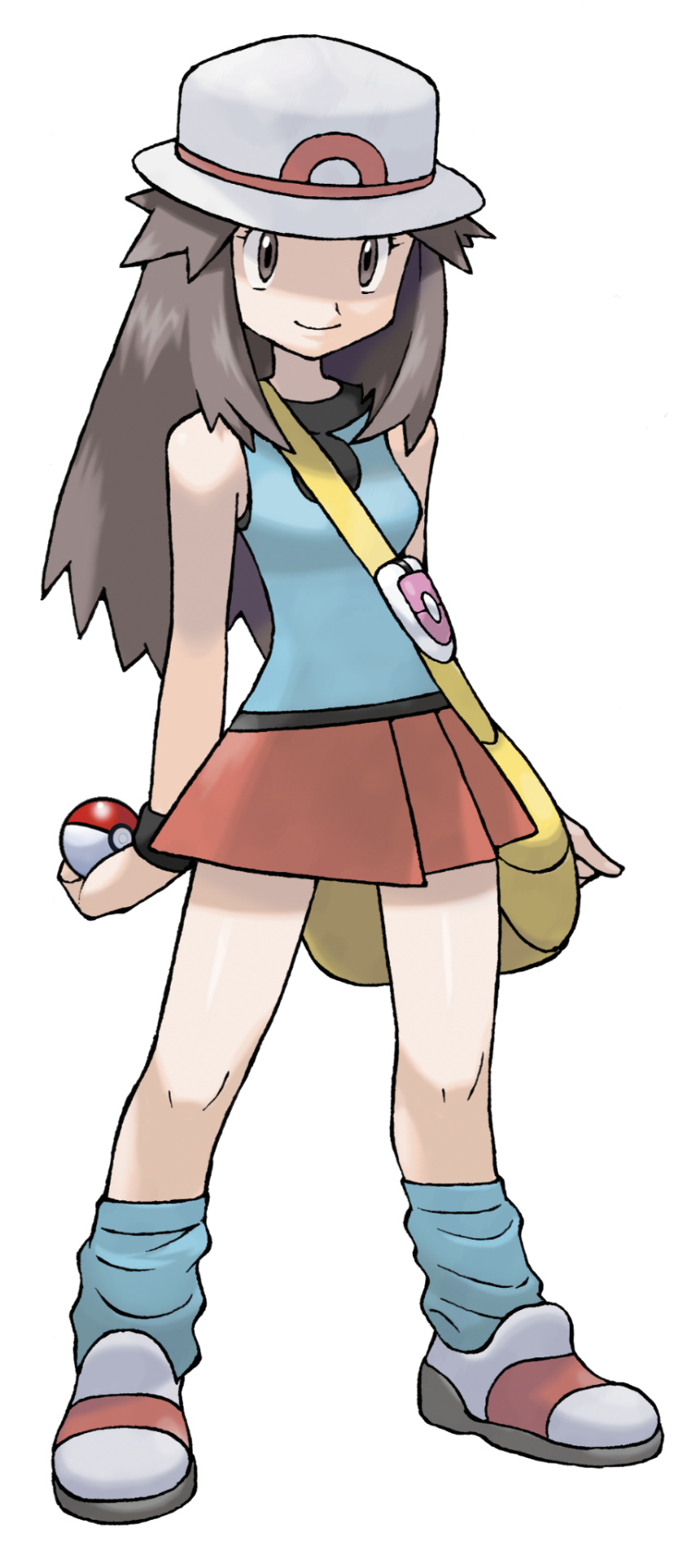
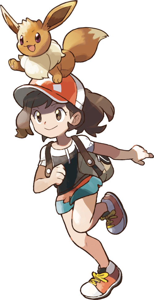
We finally have an official gen 1 girl character- 8 years later after gen 1, and also being mostly forgotten outside of Masters. "Leaf," as most people call her, would be the third girl mc added as of gen 3, and she's a nice addition imo. Like FRLG Red, her age is also left up to the player, and her design also somewhat reflects another blank slate to attach to.
The outfit is a pretty and simple one- although I will say, I probably wouldn't adventure through oceans and mountains in a mini skirt if I were a girl. Regardless of that, the red skirt and blue and black top are a cute combo and a flip of Red's colors, which is pretty creative imo. The loose socks are also a neat addition, and the white and red shoes match with her white and red pork pie hat. The black wrist bands- like Red's- help add just a little more to the design. The messenger bag is fine, again not really my favorite color, and personally speaking after using a few myself, probably not the most comfortable to lug around. The pink VS Seeker is an okay touch, but the pink does sort of clash and probably would have been better if it was either premiere ball colors, or red like her skirt. Lastly, her hair is a long and kinda frizzy brown- it's cute, I'll say that, although I think I'd have either covered it with a cap, make the hair shorter, or shortened some of the hair frizz. I wouldn't say the outfit is practical for adventuring- just a smidgen better than her gen 1 prototype- but who cares in a work of fiction as long as you look cute? I know plenty of girls that like the design- grown and young- and it is a satisfactory extension of the player. Although, some might still prefer Red for pants. Still, 9/10 on a personal note.
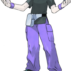
And now gaming's most famous douchebag returns in an updated look. Peak 2000s asshole fashion with the half popped collared shirt, choker, and smug expression. The colors for his pants and shirt flip and go darker for the top and lighter for the pants- which I like, this is an outfit I've probably worn similar to when I was a kid. The purple wristbands match with the pants and also fill empty space, the shoes are a simple black that also just work very well with the rest of the design, and- although probably not something I'd get caught dead wead wearing in public- I do like the silver and black hip bag. The outfit is trendy for the time, I appreciate the guy having pants with pockets that are also breathable and not skin tight, and it's just right amount of smug asshole. The one thing I dislike is how the art portrays Jim with orange hair rather than brown- in game, it's not so much an issue, but it does repeat over time. It'd be one thing if it was a similar hue to the brown in the og work, but this is NEON orange, not even ginger orange. Well, it at least made it accurate when I named him for my best friend and life long pokemon rival at the time.
Blue FRLG doesn't really change much personality wise other than a few lines of dialog, but his tactics do get smarter when using his revamped team and even smarter with his Johto'd up rematch team. How did he get back to the champion room? Well, when you're as strong as him, who can stop you other than the only guy to beat you before? 8/10, fix the hair and you're gold- wait, sorry, different guy.
Now, onto Let's Go, or essentially the "diet" versions of above
Let's start with the art style. The art style is completely different from any main series game while also having some gen 1 faux water colors. It's a charming art style that I think is fine for a game aimed towards younger kids instead of the traditional audience, but I'd just prefer gens 3-8 style. Art style aside, the mcs and rival for Let's Go are essentially just "diet" versions of the other MCs and rival, and tbh are inferior for the most part.
"Chase" is the replacement for Red, as Red is a standalone trainer now. He's a fine enough design with lots of great colors going for him, and his outfit definitely feels like a spring fit you'd wear. The color choices are mostly moot because you can change them, but the outfit is non changing. It's fine, gen 7 just kinda decided boys don't get full length pants anymore and we're still dealing with that 9 years later. I like the jacket, bag, and hat, and I do appreciate then giving him black hair again. But god, they made him so baby. That looks less "11" and more "7" imo, and makes me think of my nephew. It doesn't do the job previous gen mcs did by giving a blank slate to do or project how you want, instead pretty much forcing the role of baby on you. It's a 7 for me, not the worst, not the best, and again I do like the colors.
Elaine gives me vibes of my 8 year old niece by looks alone, which is spunky, energetic, and ready for whatever. Elaine sort of abandons most of what Green/Leaf had going in previous gens in favor of a more summery attire, while keeping and sort of remixing colors between Leaf and Let's Go Green. It's a cute look I could see kids wear, and I definitely dig the ponytail in the baseball cap more than Leaf's pork pie hat and messy hair. Again, a similar issue of not being able to project yourself onto the character, and appearing much younger than intended, but I think it's a nice design. Probably still prefer Leaf or Green though. 7/10
Ah Trace. The inferior Blue. I think this is the most "who?" rival of all time. I think he's a nice enough kid, but I really do not understand why we needed to replace Blue. Blue is the type of rival- RIVAL being the keyword here- that challenges you to actually do better. He irritates you just enough to give the satisfaction of beating him into the ground and taking his lunch money after he shit talks you. Trace? He's a ~~fRiEnD~~ a friendly friend that just congratulates you over the littlest thing and is more than happy to let you steam roll him. I think the best parts about him is that he took in the Cubone that Marowak left behind, abd that he has a mega Pidgeot on his champion team- otherwise he just feels like a overly sanitized Blue in an effort to appeal to WAY too sensitive audiences.
Design wise, he certainly is an all around downgrade. He does actually look 11, but those clothes are just way too sporty for a kid his age. Also, track pants in socks? Really? Come on man. The hair also just doesn't form as interesting of a silhouette as other rivals. He's just boring imo. 5/10.
Now if I were to have room to dissect later versions of the gen 1 gang- ranging from Gen 4, 7, the Let's Go variants, Masters, and any others I might be forgetting, I'd have to say that Gen 7 Red, Gen 4 Blue, and Let's Go Green are my favorite iterations of the characters. But as those aren't rivals or mcs, I will not count them towards the reviews.
Okay so the final roundup: these guys aren't quite as story heavy as some modern day counterparts, but they still for the most part lay the foundation for future gens- or as far as Trace goes, rides the coattails of his betters. Red and Blue becoming recurring trainers is still neat, and as much as I tire of the Kanto dick riding, I do love getting more chances to go toe to toe with them. Red practically trained me as a kid when I kept fighting him over and over to try and beat him. Blue has mellowed out a bit in his later years, I still love the opportunity to knock him down a few pegs. Maybe we'll see them again in their 30s in the 30th anniversary. I'd love to meet Green as her own entity again though. I didn't like lgpe, but I liked whatever tf was wrong with her there.
But as far as the designs, mcs are a decent 8/10. The two rivals... 7/10. Blue is cool, Trace is not.
Gen 2 next
#pokemon#dd reviews pokemon#pokemon trainer#trainer red#trainer blue#trainer leaf#pokemon gen 1#pokemon grby#pokemon rby#pokemon red#pokemon blue#pokemon yellow#pokemon frlg#pokemon leafgreen#pokemon firered#pokemon lgpe
3 notes
·
View notes
Text
Onto Hisui, the kinda gen 8, gen 4, almost gen 9, maybe gen 8.4.2.5.7 starters?

So I'm not going to do a full in depth review on each base starter again and their mid evolution- all you need to know that it is a sheer fucking coincidence that they picked all three of my favorite starters to be the starters for this gen. What a wild concept. Like Galar's starters sucked so bad, they had to call in back up from the previous gens just to keep the entire gen from becoming a trash fire- even Rowlet, who barely hung its hat up after gen 7 and Isle of Armor.
And saved they did. This crew is pretty strange and unique, but not unwelcome, and not unseen before- just mainly in fan games. The concept of taking 3 starters that normally have zero to do with each other and unifying them with a shared concept and variant evolutions is just... peak creativity. Something new out of something old without a gimmick that can be easily discarded, just brilliant.

I can do a group review of the final evolutions, because GOD that's such a fun idea and they look so cool. So how do you unify three random starters? You tie them together to the place they are roaming, aka the wilds of Hokaido circa 200 years ago. A ronin, a corrupted samurai, and what I think is either a priest or a yokai. Just brilliant stuff here. The colors invoke an timely view of the old world, and each sort of have their own level of mysticism about them, and have shared hues of red- almost like maple leaves, blood, or a blood moon. Or, more specifically, DEATH in various aspects, which Hisui isn't shy about touching. God, I love these guys. I really do. 9.5/10.
Individual reviews under the cut

Hisuian Decidueye isn't quite as cool as regular, but the only thing that's really throwing me off is the smaller wings in comparison to normal. Otherwise, this is a fantastic re-imagining of Decidueye that does something that hasn't been done with other grass starters: A *fall* color scheme. In the whole "Death" scenario, the leaves are dying, as is the age of Samurai, which would be somewhere around the same time period that Legends Arceus would take place in, and being a Ronin, Decidueye would essentially be a traveling *masterless* samurai. Ironically, considering the death motif, it leaves the ghost type behind and embraces the FIGHTING type- as if he's going down swinging while he's still got fight left in him, or he's fighting to survive the Hisuian wilderness. There's a lot that could be said to really amp up why I love this guy, and I'm still waiting for a good excuse to use him some day. 8/10.

Hisuian Typhlosion didn't immediately click with me until I saw it in action and I saw it in artwork. It's very similar to regular Typhlosion in which you need the proper angle to truly appreciate it, and appreciate it I do after using it as a transfer starter for my run in Kitakami. If the Hisuian starter trio are based around death, you can't get much more death related than being a ghost. Specifically, Hyphlosion could based on the "Night Parade of 100 Demons," particularly with its move "Infernal Parade," but also could have inspiration from old Japanese priests, particularly from the bead-like necklace of fire around its neck. Interestingly, as a ghost, it's particularly benevolent and purifies spirits with its flames before guiding them to the next world- according to the dex, anyway. Any way you look at it, it's a very different take to normal Typhlosion, but it's a pretty valid and cool one imo. The wispy flames are super unique and mesmerizing to watch. The overall purple coat and lighter tanned belly may in fact be a reference to Typhlosion's old shiny palette in GSC, which sported a similar coloration. I do with the ears were more perked up and that it was easier to see the cooler side of it, but honestly I just like this sleepy boy no matter what. 9/10, Typhlosion was my first Pokemon and it'll always have a spot in my heart no matter what it looks like, and Hyphlosion came just when it needed to to save fire starters.
Hisuian Samurott is probably my favorite starter of all time, now, because it basically just improves everything stylistically I love about OG Samurott and takes it even further. It is a little strange that Samurott, an already Japanese inspired Pokemon, gets a more Japnese form, but I'll take what I can get considering the state of starters at the time. This Samurott may be based on the *corrupt* Samurai, those that get drunk on power and demand others do as they say, or *die* in the streets- hence the dark type, and hence why red streaks line it's black armor- representative of blood shed by civilians that dare go against its rule, and further implicated by its signature move- Ceaseless Edge, an onslaught of slices without mercy. I think there could also be a further influence from the infamous Muramasa sword mythos- that is, swords forged so well by a single blacksmith that people claimed they were possessed or forged by *demons*, because of how well and how many they killed. Dark is the "evil" type in Japan, after all. Regardless of all of that, This is seriously such a cool Pokemon design and an ideal starter design overall, because it can move on land and in water quite decently. I think if I have a gripe, a singular one, it is simply that I would prefer black claws, but red is a fine enough color as it is. That, and maybe I'd wish it wasn't so slow. 9/10, my favorite starter at the moment, so much so I purposely bred for a shiny to use again in Blueberry Academy, and it came back just when needed to save water starters from being ugly.
God, I love these guys. I hope the ZA trio turns out as good as these guys.
Next and finally will be the SV starters... Unless anyone wants me to purposely do one for something like Pikachu, Eevee, and the Eeveelutions for Orre.
#pokemon#dd reviews pokemon#pokemon gen 8#hisui starters#cyndaquil#rowlet#oshawott#hisuian typhlosion#hisuian samurott#hisuian decidueye
6 notes
·
View notes
Text
Finally, we're at the gen 9 rivals and friends. Honestly some of the best in the series- Some call Arven or Penny Rivals, but that's wrong. Still, I feel weird not including them in the list. They even repeat some old tropes in the franchise, but still manage to pull it off in an enjoyable way.
Anyway, let's get to it

Lets start with the actual main rival, Pokemon Goku, Nemona. Nemona continues the trend of friendly rival with a weaker starter- but she finally does something to make that fun: She's already a champion. She's already a champion, and she's crazy enough to try and groom a complete noob into becoming her ultimate rival. She purposely restarts from the bottom to match us, because she's so battle crazy that she's scared off everyone else. Thus, when we beat her, the joy is JUSTIFIED, because we're another step closer to her ideal rival. She is pretty funny and crazy, a little autistic probably, but I love how she REFUSES to take no for an answer when she asks us to be rivals for life after we, too, become champions. The rush of battling us as two champion tier trainers overwhelms her with joy- because she finally, FINALLY has found someone that can handle her freak and won't run away when she challenges us. Literally, Goku training Uub.
As a trainer, her teams are very packed with hard hitters- and even though she picks the weaker starter, she does have the added benefit of the starters this go around having a reverse type triangle of strengths and resistances. Sure, that goes flying out the window when she terastilizes a Quaquaval against your Meowscarada, but at the same time, if she outspeeds? You're still in trouble. And her final Blueberry rematch team is something INCREDIBLE as well, stacking up with other starters like Infernape or Greninja to help make her already decent team even better. Literally a cut above most of the rivals since Barry, imo, maybe only being outdone by N in terms of struggle at the current level. As a character and rival, 9/10, she's fun, if not as deep as Arven.
As a design... Eh. Kinda middling. She does wear the same uniform as us with a cool little arm thing, so she's not getting *too* much special treatment compared to us, and I think we're all in agreement that the Scarlet version is more fitting for her. I'm not really a fan of the green in her hair or the forehead, and I think maybe it'd be pulled off better with a gold highlight instead on some bangs. I will say, the render looks fine, but she actually looks a bit better in game imo. 7/10 on design, there's more interesting looking rivals imo.

Now that our rival is done, lets take a look at our buddy (since he calls us "Little Buddy," Arven. And of course, he's gotta have Mabosstiff, it feels wrong to separate them. Arven starts off pretty rough, and I thought for a second *he* might be our asshole rival- but then he sends out a Skwovet he just caught. Some time passes, and we're literally traveling the countryside hunting down Titan pokemon, battling them side by side, all to find Herba Mystica- an herb that wasn't even confirmed to exist- just to save his best friend, Mabosstiff. It turns out, Arven is actually a pretty cool guy, even if he's rough around the edges to strangers. His backstory of being practically abandoned by his parents to study in Area Zero- or in the case of his other parent, LEAVE Area Zero without him- is a rather sad and complicated affair that actually intertwines with the legendary we are given, who he partially blames for his parents leaving him. Couple that with his "parent" suddenly contacting us to come to Area Zero to help stop the Time Machine? And then to find out that his real parent died? Bro has gone through a LOT on his own, and him being so good with cooking makes so much sense when you realize it's because nobody else would do it for him. So of COURSE it makes sense he's desperate to save his dog, that dog is the only family he has that hasn't abandoned him! And guess what? Arven is such a bro that he doesn't abandon US either! He knows he's not the hottest shit, but he's still fighting those titantic bastards right next to us, and STILL dives into Area Zero with us to keep us safe AND give his shit mom or dad a piece of his mind.
Now sure, towards the end, I think it's pretty bullshit that he suddenly decides his mom and dad are super interesting and he should learn more about the people who ABANDONED AND NEGLECTED HIM, but he's been through a lot. I do find it ridiculously charming, too, that he's protective enough of us from even Carmine and Kieran, claiming us as his best friend. He even joins the tournament and challenges us because he truly loves battling with us!
Arven is without a DOUBT the heart and soul of Scarlet and Violet's story, next only to our motorcycle-er, dragon. The game probably would not be nearly as tolerable without him in it, and I gotta say, I'm glad a character like him exists. I hope we get to meet him again in future games, healthy and happy. As a character, he is basically 9.5/10.
As a trainer, I think he's definitely not as strong as Nemona, and he's not worried about that kind of thing either. His team is literally the friends he made along the way to saving Mabosstiff, and for the most part are food themed. It's very fitting and another really charming detail about the kind of person he is. I don't sweat fighting him- at least, not until that Garganacl shows up- but I do have fun, and that's how you make a buddy trainer imo. 9/10 for the intention and detail.
As a design, his hair is a mess, being sort of a fusion of Sada and Turo, but again he does look better in game imo. He's both handsome and pretty otherwise, I can see the hype. He's definitely got that strong explorer look, and even though that backpack of his must be HEAVY AF carrying all of those picnic materials, it does fit him and fit the vibe of a desperate treasure hunter. The outfit goes together really well, with my favorite iteration being the violet colors- I want a uniform like this, but alas, ours is separate to spring and autumn. Appearance wise, he definitely reads as someone that probably should have graduated high school by now, being held back for bad grades or just not turning in assignments- he's got better things to do, tbh. On a design perspective, he's 9/10 as well. Just a fantastic character all around. The literal bestest best friend we've ever had.
Penny is...Okay. I think her twist of being the head of Team Star carries her farther than it should, but her plot to dismantle Team Star with you so that they'll start going to classes again is decent enough, and the reveal certainly is entertaining, plus the Eevee love is super relatable- would've been GREAT if we got a new Eeveelution to warrant it, but I digress.
I feel that a lot of her personality doesn't really start to form until AFTER the Team Star story... and tbh, I kind of see why she was bullied. She's a bitch. A funny bitch sometimes, certainly a smart one, but she is still pretty snooty with people for practically no reason, even just trying to have a conversation. I'm a victim of actual targeted and excessive bullying on a physical, mental, and verbal level, and that shit followed me home, too, because people at school knew where I lived. Under no circumstances do I ever condone bullying- but I do gotta say, if you act like a bitch, you're gonna get treated like a bitch. She does mellow out after befriending us, and I do dig the vibe she has a super talented hacker- also she called our mom hot, that's just the funniest shit ever. Otherwise, I think she's probably the weakest link among our friend group. 7/10 character.
BUT WAIT, She's Peony's daughter, and Peonia's sister! That bumps her back up to an 8. Wait til she finds out we're best friends with her dad lol. I explored the Crown Tundra with that man, and the two of us cleared the Galarian Star tournament together, so I can see her just being gobsmacked to see us being chummy together.
As a design, I think it definitely reads as intended: Outcast nerd with a special interest that doesn't fit in at school. I think the hair is a bit much, and the see through skirt with the shorts was probably only added so we wouldn't think she was a boy, because she does have that vibe. Idk, I know they were going for a vibe and it's counter intuitive to make her conventionally look like something or another, but I can't say it vibes with me 100%. But the eyes? Yeah, that's Peony's daughter. Very subtle, especially the name, so when it was officially revealed in game? That was a great connection.
BUT, I will say this: Why does SHE get to get away with dressing however she wants, but not us? I don't get it. I'm just saying, she should have at least HAD to put on the uniform after all was said and done, just like the rest of Team Star.
I will digress. Design for it's purpose is an 8/10. On a personal taste, probably 7, I really like her Eevee backpack and the color of her clothes, but I really dislike her hair.
Onto DLC characters:

Ah Carmine, probably my favorite of the two Kitakami siblings. "But she's abusiveeee!!!!!" You are an only child and it shows. OR, worse, you ARE Carmine and you don't wanna face it. Carmine is probably the most misunderstood character from the fan side, and I'm sick and tired of it. Why? She's not abusive, she's literally a big sister. Let me tell you, as someone that actually HAD an abusive big sister- I'm talking could ruin my life quite easily with just a little blackmail, has physically beaten me as kids, verbally abused me into my 20s, and much, MUCH worse- Carmine is NOT abusive. She is literally just a bitchy older sister, which is pretty common to see on tv or from my friends' older siblings. Does she need to be knocked down a few pegs and taught a lesson? Absolutely, and that's what happens with us and Kieran around. So chill.
So what is Carmine? A vane bitch, yes. She's fun to bully, a bit like Klara in that regard, but Carmine, I think, has a bit more of a satisfactory rebound to someone more likeable. She's still pretty full of herself, but she's actually very thoughtful of others- The only reason she doesn't want to tell Kieran about Ogerpon is because she knows her little brother is obsessed with it. Keep in mind, she's from a village that has indoctrinated its citizens into thinking that thing was dangerous and killed people unwarranted, and her thought process towards foreigners isn't all that uncommon or strange if you've ever heard or read about things like Logan Paul, or your average Hawaiian native dealing with asshole tourists. Plus, you know, she's from a small town in the boonies- it's not a good thing to be xenophobic, but it is an understandable trait for people from places like that to have, as it's very common around here. Plus, she does come around in the end.
In fact, she's so caring of others that she immediately wants to help Ogerpon upon learning she's perfectly innocent, and even when Kieran is off being emo somewhere, she doesn't hesitate for a moment to try and help US help Ogerpon get her masks back from the Lousy Trio. She asks us to help with Kieran, too, and personally recommended us to Blueberry Academy. She's excited to see Ogerpon in your party again when you battle in Blueberry, too, and is a lot more chill by then. I know, people's worst feared trait: CHARACTER DEVELOPMENT! What do you mean this asshole character becomes better? That can't be right!? Jerks are evil people forever and can never be redeemed!
Okay, sure, she could have handled some situations better, but I blame that more on shit writing, which tbh the writers were kind of giving up after the game released in it's shit state. I do hate that she progressively becomes more useless as time passes, and we don't battle her much in Indigo Disc, but I do love her character progression in Teal Mask and how we become closer friends over then. As a character, I'd rank her as an 8. I like her, and I hope we see her again.
As a trainer, and I guess rival? We fight her a few times in Teal Mask, I guess. Her team kinda sucks? But at the same time, she does employ some strategy you probably aren't used to seeing. I know my Hisuian Typhlosion was taken out by her Sinistcha after it survived a weakened Eruption. She could be better, and still has some weaker Pokemon when you first arrive to Kitakami, but that won't last for too long, and I have lost to her once when I wasn't paying attention with a brand new team. 7/10
As a design- I LOVE it. Her hair is really pretty, and it gives me Pike Queen Lucy vibes, who I severely miss. Her eyes are also RIDICULOUSLY pretty, especially in game. She's really tall, too, kinda rare for a girl character in the games- she definitely knows she's pretty, and she's correct. The uniform is the winter one, and it fits just right, and also can be viewed as a subtle description of her character: Cold. The red, black, and gold of her natural self blends in so well with the blue, white, and very subtle reds of the uniform as well. She reads as upper teens as well, maybe about to graduate soonish, which explains her attitude imo lol. 9/10 design
This is also the best render I could find of her Jinbei uniform as well, which is basically just as good as her base uniform all things considered. still a 9/10, wish she wore it more often in Kitakami.
Kieran is the soul of the SV DLC, by all accounts, and I certainly think he's an excellent rival throughout both Teal Mask and Indigo Disc with one of the best character developments in the franchise. Its the reverse of the douchebag rival: He STARTS as your friend and progressively loses his shit because he keeps losing to you, and especially because you take Ogerpon. It is only after surviving certain doom together and knocking off his pedestal that he finally realizes the error of his ways, and we become friends again. I think he gaslit the entire fandom into thinking he was this innocent little uwu shy bean, and while he is certainly empathetic, he's not entirely in the right.
Sure, he believed in Ogerpon before the others- be he liked it BECAUSE it was the monster first. From Ogerpon's perspective, he's just another villager that hates her and is snooping around her den without permission. Maybe we could have told him about Ogerpon sooner, but what good would that do? Need I remind you that we literally had just met him when this shit started happening? All we know is that he's obsessed with the ogre everyone else thinks will kill them. Maybe we shouldn't have lied (we didn't have a choice, shit writing remember?), but at the same time, he could have used critical thinking skills to realize WHY we were lying. When he finally found the truth, instead of immediately helping Ogerpon and forming a bond with her, he starts being mopey and steals the mask, or just avoids her. It's no wonder she sides with us- we actually bonded with it. We helped her fight the lousy trio while he was off being emo. And then when SHE chooses us, he STILL tried to battle us for the RIGHT to catch her.
And the thing is, him snapping and becoming a piece of shit in Blueberry academy is a result of built up resentment. He didn't have to become an asshole just because he hates US now, you know? Sure, maybe to his sister or Drayton, I understand, but he's an absolute dick to innocent people as well and not taking anyone's feelings into consideration, including his own Pokemon. Terrapagos was just curious and wanted to *see* us, not even join our party, and he tosses a Master Ball at it. He's a kid, definitely not in his right mind, but I feel like most of the fans think of him as a "do no wrong" kiddo that we turned into The Joker, when in reality, he's ALWAYS been the Joker, waiting for an excuse to lash out. In fact, Carmine is a bitch, but she cares a lot about others. Kieran is actually a lot more selfish in that regard as a balance- keep in mind that he's an anime teen, and anime teens aren't really the same as regular teens, so he's not innocent in any of this.
But that arc is still something incredible to see unfold. Kieran is a type of rival I've been asking for for years and finally got- crash out and all. He's not the main rival, which sucks, but at the same time, we finally got him! And then? When we make up? We finally have a beautiful friendship again. In Mochi Madness, we even get to team up to stop a psuedo zombie apocalypse. I know a lot of people think we fucked up a perfectly good bean, but the thing is, his flaws and anger MADE him a good character. Things didn't resolve as neatly as I'd like- I personally think the SV writers kinda gave up and just wanted the DLC to be done at some point- but that's a very important aspect about him I like.
Plus... Cmon... You're telling me you DIDN'T take a picture of him when you caught Ogerpon and when you took the championship from him?
As a character, I think he gets a 9. I certainly was hoping that maybe he was under the influence of some malevolent legendary, but it turns out he's the normal one and was just built that way.
Team wise, he starts out pretty weak, but it's a story in and of itself. He uses pretty cute Pokemon at first, mostly just randos you catch in Kitakami- but then he snaps trying to take Ogerpon from you. His first big boy team is a team of MONSTERS- stuff like Shiftry and Yanmega- both oger and oni coded and described- but then you also have some intense strategy with stuff like a Gliscor that has an ice type weakening berry and Hyper Cutter, Probopass with both Sturdy AND a special attack boosting berry, and his Poliwrath has both Belly Drum AND a sitrus berry. About the only thing that stands out is his little Dipplin.
Getting to Blueberry, when he's champion? Bro uses a competitive viable team- He an has a fucking Intimidating Incineroar, aka the scourge of VGC since Sun and Moon in 2016. Then he has a Grimmsnarl that sets up Reflect and Light Screen PLUS Sucker Punch. A Politoed with Drizzle AND Helping Hand that pairs excellently with his Dragonite that has both Hurricane AND Thunder- which does not miss in rain btw- and also holds an Expert Belt. Then he's also got a Life Orb (30% extra damage at the cost of hp) on his Porygon-Z with Adaptability (increases STAB to x2 instead of 1.5) and Hyper Beam, basically he OKO's everything that doesn't resist. Then to top all that off, his Hydrapple has an assault vest- increasing his special defense- but then he TERAS to fighting to avoid the obvious Ice type weakness, and this thing is a monster all on its own.
Now that is seriously a tough rival, and I think one of the hardest fights I ever had. If you wanna troll him, you can even bring out Ogerpon during the fight at BBA and he'll have a small melt down. Probably one of my favorite fights in all seriousness. That alone makes him a 9/10 for battling and rivalry.
As far as designs go, let's start with the basic look: Wet cat. He looks incredibly shy and innocent, and of course reads like a little kid you wanna befriend and protect. It's a trap though, as his eyes have a snake-like glow to really show off just how fucked up he is. Carmine's hair has scarlet undertones, and Kieren has violet, which makes for a nice tie in to the games. I don't really know what the deal with the headband is, but it's fine. I think it's a 7/10, I certainly like the hair better this way.
his Festival Jinbei isn't really much different, just loses all the blues and reds and goes all in on white. Its a fit that looks good and, again, I wish he got to wear it more. 8/10

Ah, and Joker Arc Kieran, probably my favorite look. Peak levels of DOUCHEBAG right here from design alone. He's got his hair pulled back into a man bun that kinda looks like an onion or a peach- and yet that damn peach had nothing to do with him. He's letting his jacket slide off and wearing looser socks- he no really cares about appearances, and to top all of that off? The red tank top underneath. This is peak asshole design, and I really dig it. It makes his breakdown all the better. I do wish we could somehow pair his regular hair with this outfit, but it's good enough. 8/10, I think he could've gone further with the douchebag look with some baggier, longer pants.
all in all, Kieran is a 9/10 for being the crashout rival I've been asking for for years. Still can't believe Nemona beat him.
And with that, we are caught up with protagonists, friends, and rivals up to gen 9, minus ZA, which I will do a more thorough review of once I get more info.
What should I review next? Or should I give it a break? Champions? Box mascots? Legendaries? Evil Teams?
#pokemon#dd reviews pokemon#pokemon scarlet and violet#indigo disc#indigo disk#teal mask#trainer nemona#trainer arven#trainer penny#trainer carmine#trainer kieran
3 notes
·
View notes
Text
Onto gen 7- an underrated cast of characters and gen imo. I feel like people just hate on this because of lack of gyms and more text- even though the island challenge is the best breath of fresh air we've had in years. The story is really good and the characters have so much depth- they walked so the SV cast could run and the SwSh cast could trip, cry, and pee a little

Let's start with Elio, our boy for Sun and Moon. Vanilla wise he is about as generic as you can get, looking pretty much any little boy on vacation, minus the pants- I have literally never seen pants like that in my life. They look like they'd fall down a lot. He's so generic, but thankfully there's a pretty decent character customization option- a little less than xy in some regards, but you CAN remove the hat, so that's a plus.
The sun and moon/ultra protags are confirmed to look about 11- I've seen some funny people get creative with Wicke and say "actually miss I'm in college," which is pretty fitting for the time period of release for the majority of players. This a simple callback to RBY, but I will say it's kinda sad that they took that little ambiguity away and makes it a bit harder to project yourself onto the character. Not impossible, mind you, but you gotta try a little harder vs XY or BW, especially with regular Elio here. 6/10, barely tries.

Meanwhile, his Ultra variant gets a massive improvement all around. You're still said to be around 11, but the right art can make him seem older

Like this INCREDIBLE piece done to show off Ultra Megalopolis. Elio looks anywhere between early to late teens here.
But enough about that- the in game customization doesn't see too many additions, but enough to be different. Vanilla wise, Elio looks so much more unique and fun to play as on his own. The pants and tights definitely look a bit like Nate's (and also are one of a kind last i remember, unfortunately), but Nate is a terrible design, so it's fine. The bucket hat i didn't initially get, but now that I'm older and losing hair, I've been wearing one myself, and I think it is pretty neat now. This actually looks a bit how I'd dress in the summer, and I think that's pretty great all around. 9/10 design, massive improvement on vanilla

Chicken-Chan, or Selene as people call her these days- which I think is bad right after Serena- is a hit or miss depending on your audience. I'll say, minus the hat, this design is similar to Hilda in that this is an outfit I've seen women wear often in the summer around where I grew up. The baggy shirt is really comfy looking, covers a lot while allowing a nice breeze to keep you cool. The bag- as it turns out- is supposed to be a watermelon slice, changed to avoid racial stereotyping when selected as someone with darker skin. That's kind of sad, I mean I get why, but it would have been a fun thing to have in an ideal world. As it is, it's fine. The colors definitely feel more inspired compared to Elio, very tropical and summery, looking even more like a tourist on vacation.
The design definitely reads as younger than the last few FemCs, and this is sort of the point where Game Freak really starts making the girls especially look younger and younger each gen (except Akari of course). That's not necessarily bad on its own and for those not online or aware of the skeevier side of the internet, just leads to some unfortunate "art" that gets shown everywhere that maybe wouldn't have been nearly as creepy if they left them as ambiguously aged blank slates like usual.
Weird rant aside, I think Selene is a fine enough design, and in my Moon playthrough, I had plenty of outfits to choose from- definitely more of a defined binary compared to XY, imo, but still plenty to work with. 8/10, cute, but I hate the hat

Selene's ultra variant imo is just another improvement, ditching that awful chicken hat and taking a nice sun hat instead. This is definitely something I can see worn on vacation, and the colors of a mostly orange and white just look so good- makes me think of a refreshing glass of fruit juice. The braids are also really cute, and the sandals are more or less what I think Shauna should've had instead. It's such peak tourist, I love it. 9/10, cutie, love the hat

Of course, we got Hau now, the first standalone friendly "chooses the weaker starter" rival that kind of... becomes another pattern. Actually, a lot of Gen 7 becomes a pattern for future games, including hoodlum teams with a white collar real bad guy using science for their own selfish goals, bigger pokemon than average, angrier pokemon than average, the rivals having a chip on their shoulder or being in someone's shadow, etc etc etc. That's another rant on its own.
Hau is fine, not really my favorite rival, but I do think he tries harder than people give him credit for. In SM, I especially like that he kind of has an unrequited crush on Lillie, and that drove him to be a little braver and do a couple of bigger things beyond his pay grade- it's weirdly relatable, especially the heartbreak when she leaves. Otherwise he's a chill dude, kind of unrealistic in how happy he always is, but honestly he's a peak buddy I could see myself being friends with as a kid. He's strong- maybe not scary like Blue or Silver, but you do need to actually lock in for a few fights if you aren't overleveled. Not my favorite rival, like 7 on that front, but as a friend? That's an 8.
As a design, I think it's a good one. Definitely not threatening, super safe and chill looking, even when serious. I guess that's why some people dislike him as a rival, along with his pretty laid-back and cheery personality, but as a buddy, he looks pretty zen. I'd definitely wear his fit, it's so comfy looking and perfect for the summer, minus the not-crocs. I think I'd just make those black or brown sandals instead. Colors are a nice and warm tropical feel, definitely someone who enjoys the sunlight and radiates joy like it, too. The hair, I think, should just be black, but that's not really a crime to have green hair that dark- in fact it's so minor, I forget often that it's that color. Idk man, I don't get the hate. 9/10 buddy design- as a rival, sure, maybe that's a 6 on design, but a 9 on design alone. I'd definitely want a rival that looks like they would stab me, though.

HEY, a rival that looks like he could stab me! Gladion is a very complex and edgy looking character at first glance... and second when he starts doing chuuni shit mid battle... and third when he tells you to get out of his hotel room and fourth when- you get it. But, underneath all of that, he's a guy that clearly wants to do good- he looks like he'd stab you, but a lot of the Pokemon he has on his team- both in game and anime- rely on friendship to evolve. Lucario, Crobat, especially his Silvally. You could even argue his Porygon Z is a mark of his character- not super integral to his team until the title bout, but it is the only pokemon that needs to be traded TWICE to evolve, which alone says that he's a trusting and trustworthy individual. To top it off, in the Ultra games, he even gets a (ugh) Kanto starter, which would imply that Prof Oak maybe met him and gave him one, and we know Oak is a decent judge of character.
The complexity doesn't stop there- he's mean and intimidating as a defense mechanism, out of necessity after stealing Type: Null from horrific experiments and running away from the Aether Foundation. In fact, the anime, Masters, and Ultra games really do their damn best to try and make you forget that Gladion and his sister are survivors of child abuse. Gladion especially struggles a bit with the thought that he abandoned his little sister. He knows his mother is crazy and dangerous, and yet he goes in guns blazing to rescue Nebby abd Lillie, and also is more than willing to lead the Aether Foundation in Lusamine's absence. He doesn't smile often, but it feels like a reward, knowing all the pain he's gone through for the sake of something bigger than himself.
His design even exemplifies that- the tears in his clothes are supposedly from Type: Null going out of controll and attacking him once, which he's clearly developed some sewinh skills to make look part of the vibe, as if on purpose to push others away and make people worry less about him. As a character and design, I'd give it a 9/10.
As a rival, I feel like we battle just enough to get there right at the end, but I will say that I think he should have appeared and battled more often. 7/10 on that front, because he's less of a rival and more like someone testing us constantly- which being fair, I see why.

I know what you're thinking. "Lillie isn't a rival! What's she doing here?" Well, I think any fan of gen 7 will tell you that she is just as integral to the story as you are, and thus I'd say that makes her a secondary Main Character alongside you. Plus, it'd feel weird not to include her, she's the fries to the bacon cheeseburger of the rest of the cast, and arguably the soul of the story.
Her character arc is definitely more impressive in SM than Ultra- a fellow survivor of abuse that actually wears a symbol of it: her first outfit is heavily based on Nihilego, who we know Lusamine has a very unhealthy obsession with. She's less like a little girl and more like a doll made to dress a part she didn't want. Still, her bravery is off the charts- stealing Nebby without a single other Pokemon to help her is very, very brave, especially considering she was in the heart of enemy territory.

It isn't really until she's brave enough to stand up to her own mother that she finally decides to try something new. "Z POWER" Lilly looks so much more confident and sure of herself. She's still in white with hues of baby blue, but that's her choice, and sort of paints her as a protagonist that's a blank canvas- her future finally being her own to decide. She has no Pokemon (other than Nebby and later a Clefairy), but she's still brave enough to jump into ultra space to try and rescue her mother AND tell her off. She didn't have to forgive her for anything, but she does acknowledge that her mother was under the poisonous influences of Nihilego and opts to travel and find a way to save her. Her decision to go to (ugh) Kanto on her own is such a massive step for her, and her maturity to leave Nebby in our care is something that actually made me cry the first go around.
...then ultra sm kinda... undid a lot of that, lol. Lusamine isn't regretful for a single thing she did, but gets to continue like nothing happened. It makes some sense as to why Lillie decides to just keep living with Kukui lol.
Anyways, her design is part of her story, and her story is very deep and engaging. 9/10.
Next up... oh God it's Galar again
#pokemon#dd reviews pokemon#pokemon gen 7#alola#trainer elio#trainer selene#pokemon elio#pokemon selene#rival hau#pokemon hau#rival gladion#pokemon gladion#pokemon lillie#pokemon sun and moon#pokemon ultra sun and ultra moon
6 notes
·
View notes
Text
Onto gen 6, aka XY. The art style at this point is sort of shifting into more unique silhouettes and towards the more modern style. It's a mixed bag, excellent when done right, bad when done wrong, but 3/5 of these guys are pretty good
It's also worth noting this is the first core game to introduce character customization- it does kind of become a trend of blander designs=character customization down the road, but for what it's worth, Calem and Serena are decent enough as vanilla designs.

Serena is probably the face of gen 6 for many, but that's also probably because they used her in the anime after skipping an mc as a traveling companion in gen 5. It should also be noted that while no exact ages are given in game or anime, both the two Serenas are of different ages- anime is closer to Ash, so like 10 or 11, and game is somewhere in her upper teens- she and Calem are possibly both at least 18 because of some dialog thay suggests they are a couple years older than Emma, who is apparently 16. That would potentially make them the oldest core series mcs, which imo is just really nice so that you can look better in the clothes you pick for your characters, and makes for high quality blank slates- especially considering that XY were, for a lot of people, a homecoming of sorts. Idk about yall, but the kids I know don't like to play pokemon games so much as buy cards and merch, especially at the time XY came out- everyone in college was suddenly into Pokémon again after acting too cool for it after gen 3- so I find that an older looking character fills out the design a little better and is truer to the more realistic adult audience that probably comprises most of the actual players.
On a design basis, Serena is probably the most feminine design for any femc, and is sort of a callback to Leaf in a few ways. The thigh high socks are a nice addition, the skirt is a look and is a nice break between the black of the top, socks, and shoes- about the only mishandled aspect I'd say is the different shade of reddish pink for her hat and purse, which I think should either just be the same shade of red or should just be white. The sunglasses are non functional, but they are a decent touch. She's also the first and so far ONLY blonde vanilla mc we've had. The design reads very much like your typical European girl that non Europeans probably fantasize about- kinda fitting considering Kalos is the first European region (and so far the most fashionable). The mega bracelet is also a good addition that blends in flawlessly. 9/10 design.

Behold, the last MaleC with covered ankles, circa 2013, prior to ZA anyway. Truly a sight to behold. Calem isn't really my favorite in the mc circles, and unfortunately most guys that played him will tell you that we got shafted for character customization while the girls got pretty much everything and more. In fact, you could arguably make a better looking guy character by customizing Serena if you don't mind a little femboy to your design. Likewise, you could make a pretty cozy looking tomboy or femboy with Calem. As a vanilla character, I think the better features are the hat, sunglasses, and boots, which I think are pretty cool and probably more practical among the mcs. The rest sort of reads like the typical European boy that non Europeans fantasize about, with a taller and slender figure- hey, that fits with Serena in a way, both being similar to the stereotypical tastes men and women project onto their desired foreign partner, if that makes sense, with Calem probably appealing more to people who like guys than ARE guys. But it's not a terrible look, in fact XY still has some of the best clothes you can wear for a guy in the series- my personal favorites being a black jacket, white shirt, brown pants, the default boots, and a white beanie with sunglasses because the game forces you to wear a hat. It's a 7/10 for me, definitely was a relief that you could customize him.
As for rivals, Calem and Serena leave a lot to be desired. They basically do the bare minimum of being a rival and aren't really that good at it, and they don't really have much personality beyond being a tad competitive with us. Mega Absol also comes out of nowhere as their ace when we all picked up the Mega Kanto starters from Sycamore. Imo, they should have just given them the stronger pokemon to the one you pick, and that'd fit more thematically- but they probably only went with Mega Absol to give it to SOMEONE, and also to avoid having to think too hard on what to do with their teams if you were to pick Fennekin AND Charmander. Regardless, I feel that more could and should have been done to make them more... memorable, because they're a severe downgrade from gen 5. 5/10, at least they did the bare minimum.
And now we move onto the "friends" who are technically considered rivals. Look, if we count Wally, we gotta count these guys.

Shauna is probably the most rival you get for the first half of the game, and is pretty much the glue holding together the friend group. She's got a lot of energy, is cheerful, super friendly- and now that I think about it, she and Bianca were probably GF's first steps towards doing away with the proper rival types we'd have before. As a character though, I like her, and I kind of find it a little sweet that she maybe kind of develops a small crush on the mc. She's not strong, but I do appreciate the balls to stay right in the thick of it against Team Flare- she knows she's weak, but she still tries, and that's a pretty admirable trait as a person. I wish you could do more with her when all is said and done, because after giving you a baby of her starter, all she does is hang out in front of *your* house for some reason. Definitely reads like she's hoping for a little more between the two of you, but is doomed to be in a romanceless Pokemon game. We'll always have the fireworks, I guess. 8/10 friend.
As a design, she feels like a combination of various other characters- the hair feels a bit like Rosa and the pants feel like Hilda, for instance. She definitely reads as a significantly younger character than Calem and Serena, although I do know full grown women that still look pretty young, so maybe that's the case. In 3d, she definitely looks more in our age group, so it might be Sugimori's art making her appear younger. She is very, very girly, if you couldn't tell by the pink and frills, but the black accents are a very nice touch. The shoes definitely seem very out of place on her as a design- a lot of people called them "hooker shoes" when she first was revealed in 2013. Idk if I'd go that far- I definitely can't see them as being practical for exploring a forest, let alone long hours of running across cities or Kalos's natural landscapes. Again, fiction, so impracticalities be damned, but I would have probably made them more like sandals or something more realistic for the age range. The design is very leggy, which i do like longer legs, and even though those shorts are TINY, she reminds me a lot of a friend of mine that also kind of dresses similarly and makes it work. 7/10, not the worst and certainly cute imo, could be a little better tho. Gives little sister energy.


Okay, Trevor and Tierno are probably the most forgettable characters if it weren't for them popping up so much in the story. I would definitely prefer Emma join the main cast instead, or for Tierno to give his whole thing to Shauna and Trevor to the rival. You only battle them a couple of times, and they're basically worthless beyond a swords dance scare from Tierno's Crawdaunt. For that matter, their starters make zero sense considering we're in Kalos and there are a second set of starters to pick from- I think the anime handled that a little better by giving these two the Kanto megas, although that might be wasted on them tbh. At any rate, Pikachu is weird when we have a Dedenne or Helioptile that would probably be more appropriate for Trevor, and I'd argue a Clauncher or a quiver dancing bug would fit Tierno better. Completing the pokedex only and being a dancer just doesn't really work for them, and again, I feel like they'd just be better suited being dissolved and incorporated into the other two. 4/10
As for designs, Trevor, like Shauna, also reads as younger, and I hate his fucking hair. We need more gingers, yes, but why is there SO. MUCH. The rest is a basic nerdy outfit with- god dammit GREEN AND ORANGE AGAIN. All in all, pretty forgettable and boring. 4/10
Tierno is... sigh. I'm a fat man. I've always been fat. Even when I get fit, I'm a fat man. Pokemon has only made a handful of fat characters. So why is it that they can't seem to make a fat male character that isn't purposely something to laugh at? Oh of course, give the fat guy an ice cream shirt, make his legs super tiny and make him a dancer, and let's give him the worst Tepig fade you can get. I get that Sugimori is a Japanese man from a different culture and time, but god, please, if you're going to design a fat guy, look and talk to actual fat guys. At least Google plus sized men's fashion or something. We are not all built like this and we are not this huge ball shape. At least he isn't given a "I wanna lose weight" character arc, and he seems comfortable with himself- that's great actually. But idk, just a more realistic and genuine take would have been appreciated. Maybe instead of dancing, he could be into photography for the beautiful sites, an artist, maybe he could have a plain black shirt or a mega Pokemon design on it, maybe he could just have styled hair and normal legs- i could go on. 5/10 on design, could be worse I guess and I understand he's meant to be a cute and cartoony guy, but it's not for me.
Gen 7 next
#pokemon#dd reviews pokemon#pokemon gen 6#pokemon xy#kalos#trainer calem#pokemon calem#trainer serena#pokemon serena#trainer shauna#pokemon shauna#pokemon trevor#trainer trevor#pokemon tierno#trainer tierno
3 notes
·
View notes
Text
Okay, onto gen 5 characters. I've said it before, but gen 5 is probably my favorite for a lot of reasons, and in this case, it's the most like home imo, and the characters are fantastic all around.

Starting with Hilbert, the male mc of BW1. Hilbert is basically a callback to Red in a few ways, but he's also the protagonist I have always found the easiest to project onto. Why? As a teen, that was probably the closest to me a Pokemon mc would get. The thick brown hair and brown eyes especially. The outfit is simultaneously a disaster and pretty cool, I'd maybe unzip the hoodie, perhaps untuck the shoes, and maybe I'd just have a regular backpack, but he's probably my favorite vanilla MaleC out of all the others. Hilbert and Hilda are supposed to be a little older than past protagonists, and their designs definitely have a broader range of age most could project onto imo- basically a Scooby Doo situation, where you can be anywhere from 15 to late 20s and kinda pull off whatever you're going for. 9/10, Samurott coded

And of course, the best vanilla MaleC is paired with the best vanilla FemC. I might be biased by the short shorts and ponytail, but when I was a teenager, Hilda came in around the same age I was and really NAILED that American girl look- other than the vest and wrist bands, this could literally be any number of girls I grew up with and had a crush on, my age, slightly younger, or older than I was. Hell, to this day, this is still how a lot of girls dress in the summer here, maybe subbing the boots for tennis shoes or sandals. To me, that's the PERFECT blank slate for those people, perfect for any age range really. Other FemCs tend to be more girly girl in design on a vanilla basis, but Hilda really is that tomboy girl friend you had growing up. 10/10 design.
We'll skip a little to the bw2 protagonists. There is a slight change of art style that I think is probably my favorite interpretation of the Pokemon art style by none other than Yusuke Ohmura. He has a pretty nice shading style that really works well with character design, and the Pokemon he designs are pretty top notch- Samurott and its family being some of them.

Oh GOD NO. NO NO NO. Not this one. Okay look, BW2 are my favorite games in the series, and I do like a decent chunk of the outfit- except the hair and hat. Some fan art manages to fix up the hair, but official art just makes it look awful as they can on every level. Nate is such a huge downgrade from Hilbert in so many ways that it's so hard to project onto. I know they're going for a sporty triathlete look, and from the neck down he has that covered- maybe a little TOO pasty, but it's passable. But with the head and hair, he reads like of those dorky aged 40 to 50 something people that are athletic, but wear the stupidest clothes possible- except Nate also looks like he's having that midlife crisis at the ripe old age of 14. 5/10 man, that hair and hat just ruin everything. Such a shame because it's literally my favorite game and my favorite gen.

Rosa on the other hand is definitely the standout protagonist of bw2. Other than the hair and hat, I've definitely seen women my age (at the time, so 17 or 18) or older wear a look like this. The hair is definitely stand out, but Princess Leia twin tails is such an iconic look that it just works really well for her. Maybe the short shorts a little frilly, but I have seen joggers wear dolphin shorts with leggings like this, and tbh I've seen people without the shorts going to Walmart. The shoes sort of combine the style and sensibility of Hilbert and Hilda and the top is honestly a nice choice for a sporty look- if I could ever find them in my size, I'd love to wear baseball shirts like this. I remember the bra? Bikini top? Whatever that pink thing is peaking- it caused some ruckus when she was first revealed, but honestly it's fine and I think it's a cute addition- plenty of people would expose more and be safe in a realistic setting. I wouldn't say she's as good as Hilda, but she manages to retain that neutral age range where you can sort imagine whatever you want, which to me she reads as 18 or so- although I do think it is harder to call her a blank slate with as much personality as she has. Still, a fantastic design, and proooobably when a lot of guys starting played as the girl simply because they tend to look better than the guys. 9/10, we can pretend Nate doesn't exist, right?
Now onto the rivals, starting with BW1, and probably my favorite cast of rivals given their stories

Cheren is a good mix of analytical and competitive in my mind, and certainly read like a character that would have gone Sasuke on the rest of us were it not for intervention from Alder. His team is also pretty unique and decent, and I personally just can't see him with anything other than Serperior as a starter. He's a decent challenge- not scary like Route 110 May or Azalea Town exit Silver, but he keeps you on your toes and is a decent friend to you- maybe not to Bianca at first, but I kinda ship em after a bit. An 8 for a really good story arc, I really thought he'd end up as another dragon chosen in the Pokemon Grey we never got.
Design wise? Oh God we stole ALL his rizz. It's definitely just shy of "um ackshualee" nerdy, the hair just... boy, who cuts your bangs? Fire them please. And also, I fucking hate pants with exposed ankles- nobody but hipsters wear pants like that. Nobody. No. "But I do" no you don't, you don't exist or you're a hipster. I think this is actually the start of the fad of exposing most male ankles in the series and it drives me up the wall. Get regular fit pants, the skinny jeans ruin it, and please fix your bangs, bro. 5/10 on design

Congrats on the transition, Barry- oh sorry, force of habit- Bianca. Jokes aside, again with the green and orange. Someone at game freak was craving carrots I stg. The outfit definitely read as someone that was sheltered by her daddy for a long time, an innocent and sweet type that's kinda clueless to the world- especially its fashion sensibilities (I headcanon Elesa helped her pick out better clothes eventually). Its definitely an outfit I might have seen on some of my church girl friends- in different colors mind you. Its fine, but it definitely isn't something you should reasonably be exploring with imo. 6/10, bw2 is just a better fit
On a character level, though, I really do admire her for at least trying to come out of her shell. She didn't land among the stars, but the decision to leave home against her father's wishes to *find herself* is such a relatable experience I've always felt I could have experienced had things gone only slightly different at home. She is such a sweetheart, and her heart is stupid big (like her forehead). I feel like she's actually more dangerous than other rivals in some cases, often ambushing you at really inopportune times. Technically, I think she might be stronger than most female rivals, too. I definitely feel like her character could have used a little more development in BW1, but BW2 finalizes it in a way that I can't help but just really enjoy her character. 8/10

Cheren BW2- not so much a rival anymore, but a mentor figure now and the first gym leader we fight, taking up the Normal type from Lenora. I definitely still abhor the bangs and the ankle exposing skinny jeans, but he does look better and more realized. He's nervous about his new job, but he's doing a fine job as a gym leader and teacher. He did lose the glasses for some reason- wonder where they went hmmmm? But honestly, I think he looks better without them.
I do love how he's still super gung-ho about stopping Team Plasma, even with his new job. He's still our bro in arms, and I gotta respect that- I will say, I do think being a normal type kinda comes from nowhere, unless maybe Bianca lent him her Stoutland or something- maybe in exchange for those glasses hmmmm? But all teasing aside, I guess starting as the first gym leader- a role meant to endure loss after loss- shows remarkable character growth from the previous game of being obsessed with strength. That, and I guess you gotta start from the bottom if you're going to become a gym leader. In my ideal BW3, I'd see him become a mix type final gym leader akin to Blue tbh.
Design is an improved 7/10. Character arc is an 8.
Oh honey, you look so much better and much more comfortable. Bianca looks so much more sure of herself, too, now acting as Professor Juniper's assistant, and imo should hopefully become a future professor. Her BW1 outfit felt super restrictive and tight in some places, but her BW2 outfit feels a bit looser, a bit more cozy, and honestly kind of a good representation of what happens when she finally follows her own path rather than her dad's wants or the gym path. The green and orange even look better here! And- HEY THERE'S CHEREN'S GLASSES! What a cutie lol.
I really love her character in BW2, going from a girl that's unsure of which foot to step with first to becoming a big-sister type mentor to us. She's a lot braver and even travels with us through Reversal Mountain in a mutual aid to each other- I've definitely grinded my ass off in there a few times with her to help heal my Pokemon. Honestly, probably one of the best character growths in all of Pokemon.
Design is an 8/10, character is a 9/10
Hugh, our rival from BW2. He definitely has Nate beat in terms of drip and hair. Probably one of my favorite rival designs in the entire series- ruined by ankle GOD DAMMIT WHO AT GAME FREAK IS FROTHING AT THE MOUTH TO SEE MALE ANKLES SO BADLY!? Well, in any case, he has that edgy look DOWN, with a really nice blend of navy and red that avoids being outright black- as evident from his gloves and shoe accents. The white also really helps his design stand out. The design really makes him seem like this super badass, and he kind of is on some level. 9/10 design
On a rival level, though, he's less of a rival and more of a bro, which is kind of surprising given the Adidas Sasuke vibe he's got going on. His little sister's Purloin was stolen by Team Plasma two years ago, and that's enough to send him on a revenge quest, recruiting us to help him in this endeavor and only testing our strength a few times in game to make sure we're still up to snuff. He is RIGHT in the thick of it, their down fall and the rescue of that cat being the only thing this guy cares about. It is kind of admirable and cool on some level, although he definitely isn't as good of a character or rival as Cheren and Bianca. In fact, once he gets the Liepard back, his character kinda halts into just testing your strength. Also, his team isn't really the most fleshed out- he does have some interesting picks like a starter he bred from an egg, a Bouffalant (probably what he's best known for), a FLYGON, an Eelektross- unfortunately, for most of the game, he only really uses his starter, Unfeasant, and a Simi-ape. It reads a bit like he's too tunnel visioned and single-minded to bother training too many Pokemon, being too busy taking out Team Plasma to find that Pokemon.
As a character, I'd give him an 8. As a rival, maybe a 7.

Finally, probably the most complex character from gen 5 and maybe the most complex rival of all time- because he's also a puppet evil team leader, champion, king, and chosen hero of a legendary. Unlike every other rival, N's teams are never the same, basically only being comprised of Pokemon he's locally captured and then released so that he can allow them to be free. As a character, he's the first in the franchise to really bring the question of whether Pokemon battles are even ETHICAL, and he's also the first evil team leader to be a champion, AND the first rival to use a legendary against you. He's a super complex character, believing Pokemon to be inherently abused and misused by humans strictly because his "adoptive" father (green hair adopts green hair? really?) basically manipulated him childhood into only being exposed to abused and neglected Pokemon. Given the information he's working with, it's honestly no surprise he's willing to go so far to save Pokemon, and is kind of admirable to see just how far that conviction takes him. The information fed to him is a lie, but his belief in doing the right thing is real, and that I think makes him one of the best "villains" of the entire series. I especially love that he mellows out after BW 1 and is dedicated to learning how to enjoy Pokemon battles- in BW2, he even has rotating WEATHER teams based on what season it is. He's clearly super smart, just mislead, and when given the opportunity to do right, he's quick to do so once he understands things. As a character, I think he's super cool. 9/10, I sincerely hope we reunite the BW1 protagonist with him canonically (and not in Masters).
Natural Harmonia Gropius, though? Man wha the- that's a fucking 1/10 name. I am so sorry your dad hated you, bro.
On a design level, I think it's a pretty clever one. In BW1, he wears an outfit that pairs pretty decently with the BW1 protagonists, and the hat is a very interesting choice- a call back to Red's in a way, much like how Hilbert and Hilda are gen 1 callbacks to a certain extent, but his hat is black and white- much like the games, and also to sort of flip the original script. The outfit is pretty clean, although I will say, it does not read much like a "king" or "evil team leader" by any means. It does read like someone purposely trying to blend in, though, so that does get points. The green feels like a call to nature in a way, yet his eyes are *empty*, as if lifeless- very unnerving, especially with his super fast text speed (fun fact, it is actually a little faster than the fastest text option, and will play that fast even on the slowest setting) and his ability to talk to Pokemon. It's all pretty evident of a character that's being manipulated or maybe a little insane. He literally is Black and White, a man of both Truth and Ideal. 9/10 on the character design.
Oof. And then next is gen 6.
#pokemon#dd reviews pokemon#pokemon gen 5#unova#pokemon black and white#bw1#bw2#pokemon black and white 2#trainer hilbert#trainer hilda#trainer nate#trainer rosa#trainer cheren#trainer bianca#trainer n#pokemon hilbert#pokemon hilda#pokemon nate#pokemon rosa#pokemon cheren#pokemon bianca#pokemon n#trainer hugh#pokemon hugh
4 notes
·
View notes