#make tutorial
Explore tagged Tumblr posts
Text
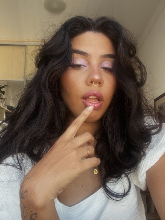

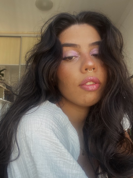
Pretty purple 💜✨
#girl#pictures#love#makeup#makeuptutorial#makeup tumblr#purple#purple makeup#strass#it girl#youtube#tiktok#make tutorial#pretty girl#pretty#aesthetic#Instagram
4 notes
·
View notes
Text

It's in the eye of the beholder
#comic#birds#my art#I've had this idea for a while#after a lecture that talked about how traits we consider cute are traits found in babies#I feel like birds would have a very different definition of cute from us#anyway after making the bird tutorial I feel the pressure to draw perfect bird anatomy#but tbh I still just wing it a lot of the time!!#hehe “wing it”
62K notes
·
View notes
Text
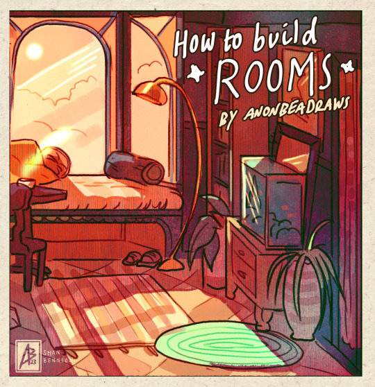
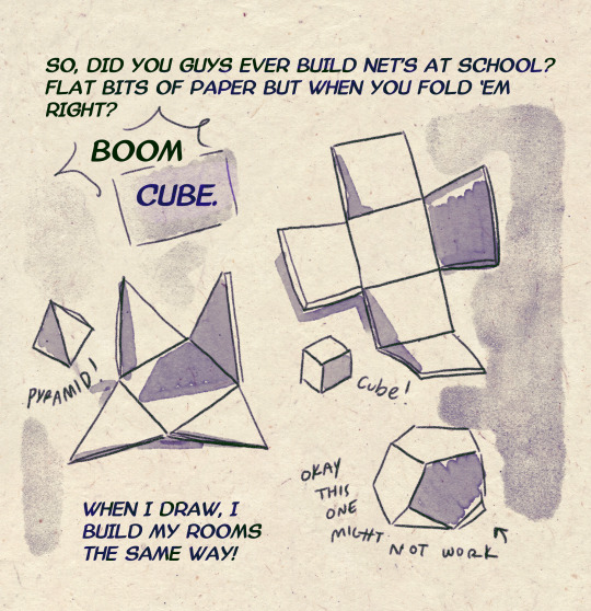
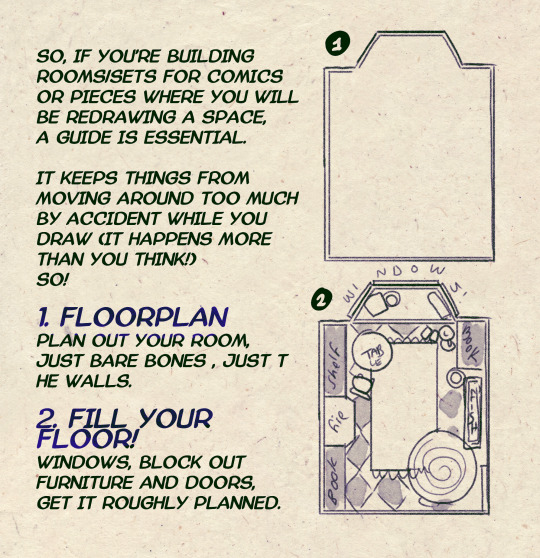
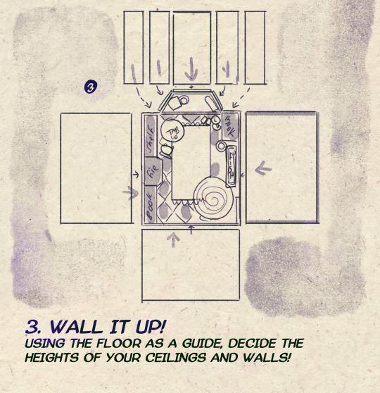
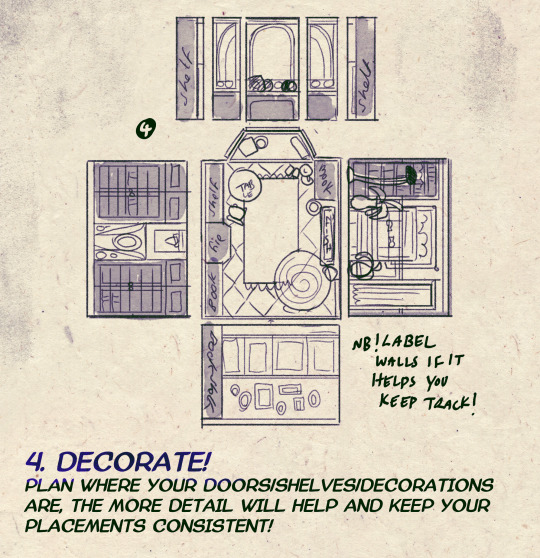
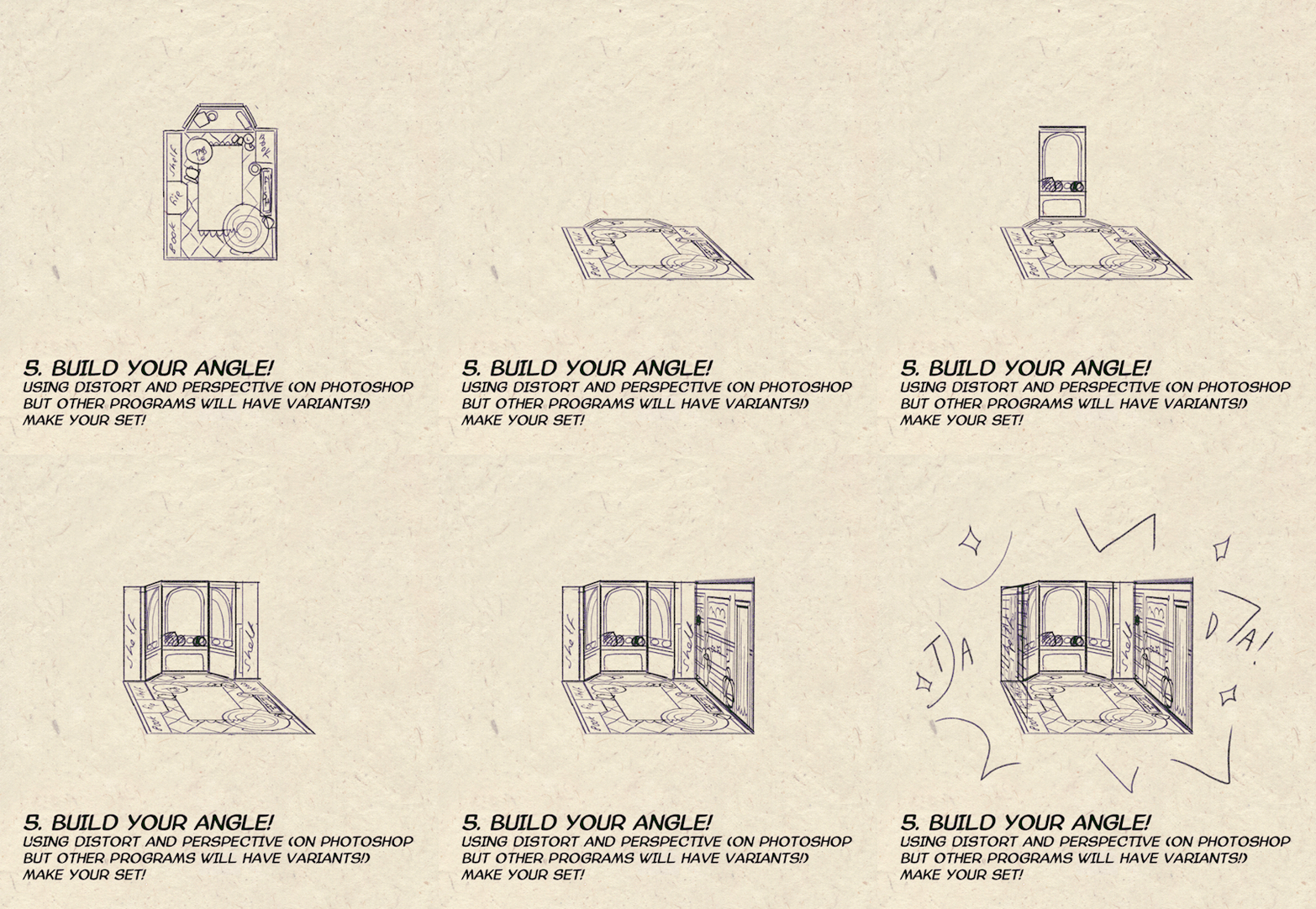
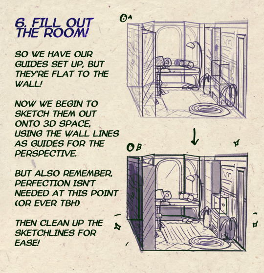

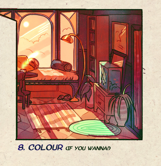
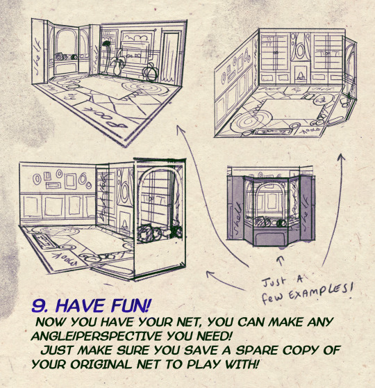
I made a Room Building tutorial! Lemme know if it helps! 🧡
Tip me here| Commission info here!
#anonbeadraws#digital#art tutorial#tutorial#room building#room design#illustration#gif#digital art#digital tutorial#art help#art resource#let me know if it helps!#tried to make it as simple as I could
40K notes
·
View notes
Note
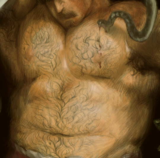
can you do a tutorial on how you draw body hair ,,, im just getting into it but i loveee how you do the wet/sweaty curls ohh fmy god
Tried my best to explain plainly how I do it, enjoy! (+cursed hairless Wreg)
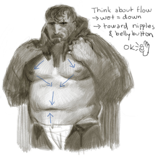
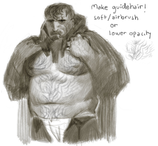
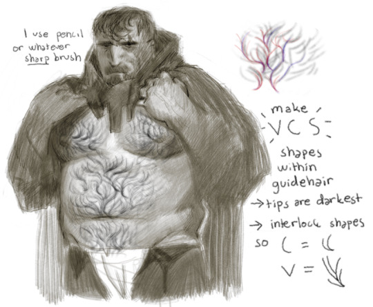
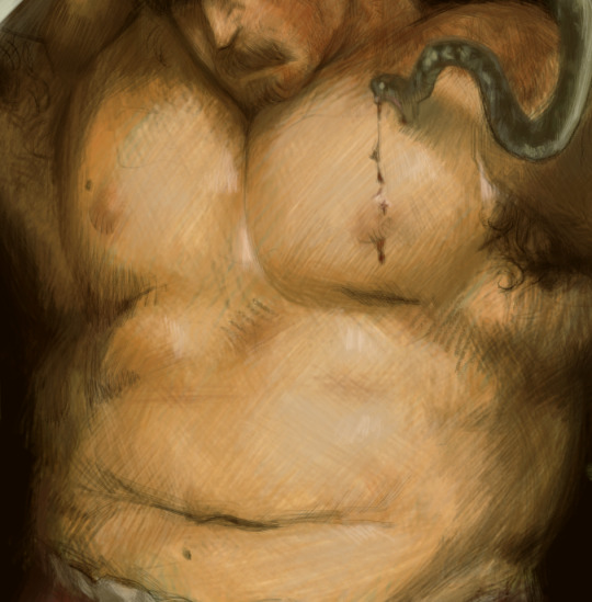
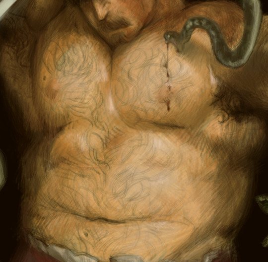
What does this look like in actual work? Something like this (+another cursed hairless Wreg)
5K notes
·
View notes
Text
On this day
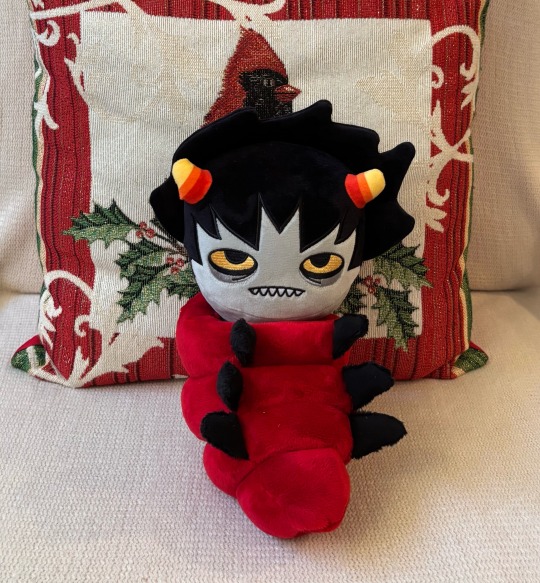
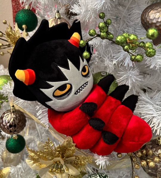
A Savior was Born
#I’m very pleased with the results#there’s just one little detail I’d wanted to add that didn’t turn out but otherwise he’s perfect#expect the full tutorial in the next week I need to make sure I explain every fuck up along the way lmao#homestuck#karkat#Christmas#karkat Vantas
4K notes
·
View notes
Text


How to make an animated video (tutorial) (2024)
3K notes
·
View notes
Text
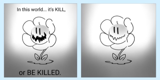
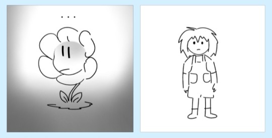
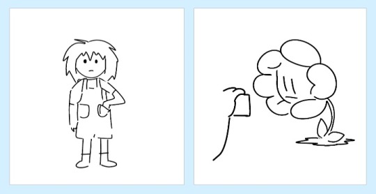
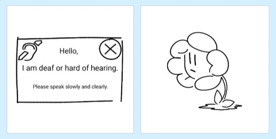
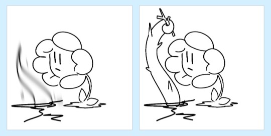
i think about this a lot. what if a deaf human fell down the mountain. would he make his threatening language accessible
#at least once a month i ponder#is he the type of guy to search for a language translator#or google “braille alphabet”#or look up “ASL easy tutorial fast”#to make sure his wrath is sent into the brains of everyone he stands before#undertale#flowey#charrator
47K notes
·
View notes
Note
How do you make your stamps? :0
Disclaimer: this is an obscenely long explanation, with pictures. Efficiency is stupid
So, for the static ones, I make a 99x56 px file on ibis paint x. Other programs are probably available online but I don't use them.
After that, I either upload an image I want to make into a stamp, or I draw one.
Then, I find a frame I want to use. Ill upload them here but let it be known I stole all of these right from deviantart


Most of them are from Lil-Devil-Melii on deviantart. The rest i have no idea. They're not all 99x56px but you can crop the canvas it's fine
Make sure to erase the edges of the picture , so they're transparent. It's not as cute otherwise
Upload those frames over your image in whatever art program you're using and viola, stamp.
For moving ones, it's a lot harder. Mostly because I refuse to download Photoshop.
There are a couple ways to do this. Some are simple animations, like with flashing text and whatnot. For these, you download the individual animation frames from your art program. Make sure it's transparent.
Then, upload each frame to ezgif.com under the option "GIF maker." You can play around with how fast each frame goes and whatnot but in the end, it'll be a stamp with some rad text that moves. This is easy, and doesn't make me want to shit my pants and cry. If you're new, do this. This is fun. This is good. This does not kill me inside
I made that↓ stamp with this method :)

this next one is how we turn gifs into stamps. This one makes me sad. It involves math and sucks. But we gotta do it. For the vibe
First, grab your gif. I'm using this cow gif because it's awesome

Then, I resize it using ezgif. Literally everything for this will be using ezgif. I am a simple man
At this point you should decide what frame to use. I'm using this one because its the first one I clicked

Figured out what size the inside of the frame is. That's what I resize the gif to, so the edges can be transparent. The inside of this one is 93x50 px, so those are the dimensions I'm making the gif.
Figure it out by putting the frame into ibis paint and realizing the canvas to fit just the inside of the frame, then seeing what the dimensions are. But there could be easier ways

Woah it's so small now
Then, still on ezgif, I go to the "crop" option.
Make sureeee to upload the smaller gif
press the button that says "extend canvas size", and then put the "width" and "height" as the dimensions for your FRAME. This'll put a bit of a transparent border around the gif. For this frame, I did 99px and 56px.
The "left" and "top" boxes show how many pixels the cropping happens from the edges of the canvas. The formula for finding that is
(width of gif / 2) - (difference between gif width and frame width / 2) = left box
For me it's (93 / 2) - (6 / 2) = 43.5
Then you do the same.for the height, which for me ends up being 22 from the top
This is reallyyy touchy and annoying though
Here's my result , with no visible difference

Okay so THEN you go to the "overlay" option, under "effects." And upload your frame. If the cropping was done right, you shouldn't have to move the frame at all and can just download it
Here's my result:

if you don't care about transparency, you can resize your gif to be the same size as the frame, and then put the frame over it. But I'm a slut for transparency
Anyways. I'm sorry if anything was unclear, it's two am. And I hope this was helpful :) these really are fun to make once you get it down
also if anyone has an easier way to make stamps from gifs, please god tell me
#web graphics#old web#neocities#custom#custom blinkies#stamps#page decor#web resources#da stamps#deviantart stamps#blinking gif#How to#tutorial#How to make stamps#Spacehey#deviantart#rentry graphics#old internet#early internet#stamp collecting#ezgif#stamp making#stamp template#Stamp frames#blinkies
5K notes
·
View notes
Text

"karasu search how 2 cheer human up"
"karasu search difference between sad human and zoning out human"
"karasu search how long is it safe for humans to zone out for?"
(+ a longer look at each scene:)

#art#gif#obey me#this was meant to be a quick test. it was not quick. i think this is was the longest i've spent on drawing something since rolling ik#for some reason procreate keeps fucking up the colours on export and i'm too tired to figure out how to make it stop#can you tell that satan and lucifer were animated first?#funnily enough satan showing ik his book was pretty simple but lucifer walking was like. impossible. he kept turning out fucked up#i was so worn out by the end of it that everyone else's animations are way simpler#(the walk still doesn't look right but i've made peace with that.... i should've done some tutorials or smth first)#(such is my hubris: when i try to do new art things it's mainly by brute-forcing my way through it and hoping it works)#jtta ik#obey me lucifer#obey me mammon#obey me leviathan#obey me satan#obey me asmodeus#obey me beelzebub#obey me belphegor#anyway i'd like to experiment more with trying to animate things in future so!! look forward to that?
6K notes
·
View notes
Text
Had a few folks interested in how I made the patches I posted for Solarpunk Aesthetic Week, so I thought I'd give y'all my step-by-step process for making hand-embroidered patches!
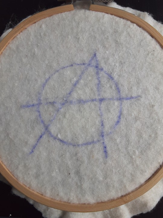
First, choose your fabric and draw on your design. You can use basically any fabric for this - for this project I'm using some felt I've had lying around in my stash for ages.
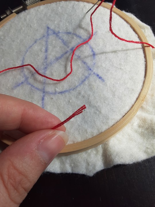
Next, choose your embroidery floss. For my patches I split my embroidery floss into two threads with 3 strands each, as pictured. You can use as many strands in your thread as you prefer, but for the main body of my patches I prefer 3 strands.
Next you're going to start filling your design using a back stitch.
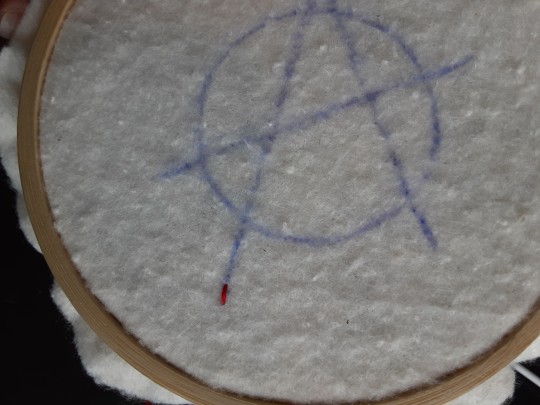
First, put in a single stitch where you want your row to start.
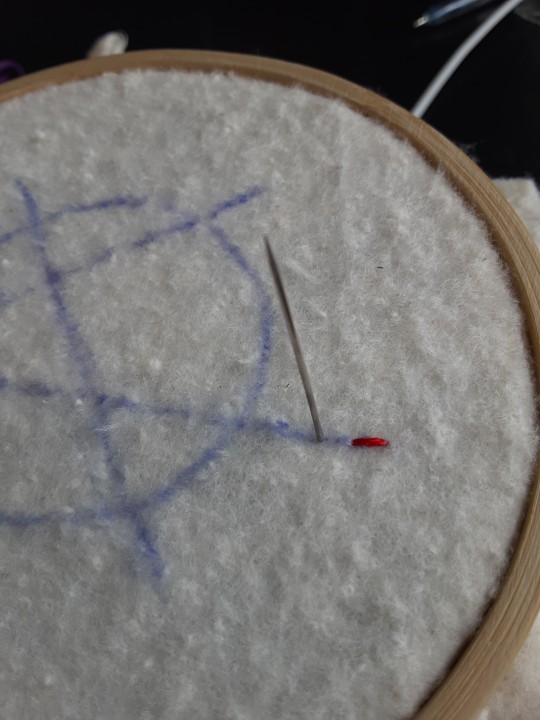
Poke your needle up through the fabric 1 stitch-length away from your first stitch.
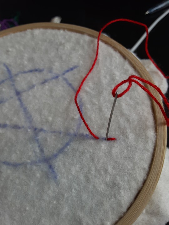
Poke your needle back down the same hole your last stitch went into so they line up end-to-end.
Repeat until you have a row of your desired length (usually the length of that colour section from one end to the other). Once you have your first row, you're going to do your next row slightly offset from your first row so that your stitches lay together in a brick pattern like this:
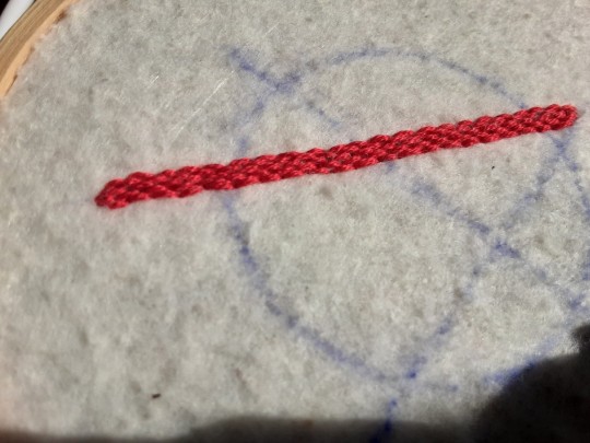
Make sure your rows of stitches are tight together, or you'll get gaps where the fabric shows through.
Rinse and repeat with rows of back stitch to fill in your patch design.
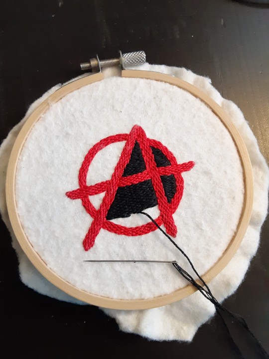
When you're almost to the end of your thread, poke your needle through to the back of the fabric and pull the thread under the back part of the stitching to tuck in the end. Don't worry if it looks messy - no one's gonna see the back anyway.
This next step is fully optional, but I think it makes the patch design really pop. Once your patch is filled in, you can use black embroidery floss to outline your design (or whatever colour you want to outline with - it's your patch, do what you want). I use the full thread (6 strands, not split) of embroidery floss to make a thicker outline.
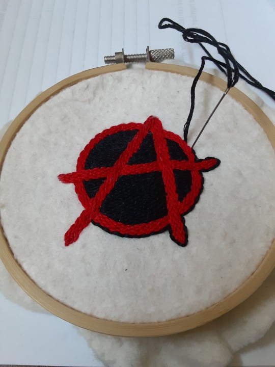
I use the same back stitch I used to fill the piece to make an outline that adds some separation and detail. You could use most any 'outlining' stitch for this, but I just use back stitch because it's just easier for me to do.
Once you're finished embroidering your patch, it's time to cut it out!
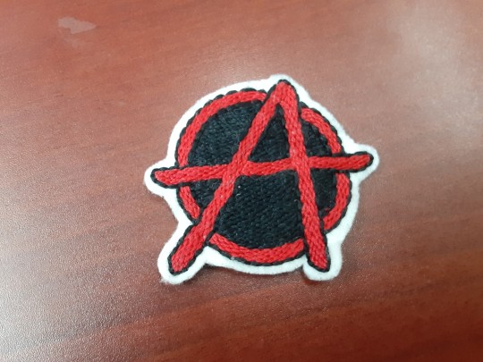
Make sure to leave a little border around the edge to use for sewing your patch on your jacket/bag/blanket/whatever, and be careful not to accidentally cut through the stitches on the back of the patch.
If you have a sturdy enough fabric that isn't going to fray, you can just leave it like this. If not, I recommend using a whip stitch/satin stitch to seal in the exposed edges (I find that splitting your embroidery floss into 3-strand threads works best for this).
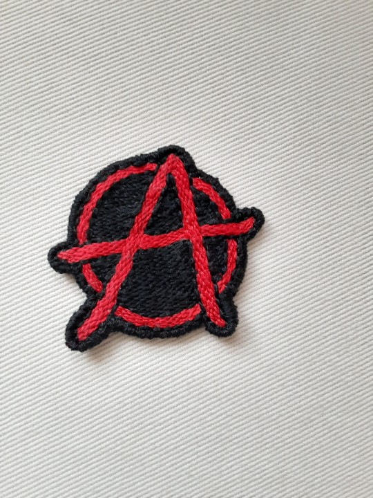
And then you're done! At this point you can put on iron-on backing if you want, or just sew it on whatever you wanna put it on. Making patches this way does take a long time, but I feel that the results are worth it.
Thanks for reading this tutorial! I hope it was helpful. If anyone makes patches using this method, I'd love to see them! 😁
#solarpunk aesthetic week#sewing#tutorial#sew on patch#punk diy#diy punk#punk aesthetic#handmade#solarpunk#handcrafted#embroidery#embroidered patch#how to#how to make a patch
18K notes
·
View notes
Text


i got it!
(og panels below!!)
HAPPY BIRTHDAY SIFFRIN!!! <- i say, scheduling this to post at midnight september 2nd. it’s his birthday somewhere!! and also loops birthday but look i had a deadline here. don’t ask why This of all things is their birthday art. i make normal choices!!!
also. somehow this entire thing only took 4 and a half hours??? insanity. i literally started this Today. thats how it Gets Me i suppose. anyways!!!! here’s the og panels!! no colored version this time, i didn’t think it’d fit the scene. also i didn’t want to render 3 colored panels.


#marshdoodles#isat#in stars and time#isat spoilers#shoutout to the 2 people on discord who immediately wished to be the tutorial sadness when i posted this#honestly . i get it.#we were out all day today and i STILL managed to get this done somehow#i dont think i can call myself a slow artist anymore#part of me wanted to make a happy birthday edit of this in the same vein as the merry christmas edit but#it is. 10pm. and i am sleepy#no cake for him
2K notes
·
View notes
Text

lazy comfreyplume & cobalttree sketches
1K notes
·
View notes
Text
DIY lace bobbins from dollar store supplies 🥳
#fiber art#artists on tumblr#bobbin lace#lace making#craft tutorial#diy#arts n crafts#tutorial#crafts
688 notes
·
View notes
Note
Hello! I was wondering what company you use for your sticker sheets? I bough one from your Ko-Fi shop and really like the quality, and the pricing you were able to sell at is waaaaaay more reasonable compared to any of the companies I've seen and used myself. Is it a POD company, or a mass purchase of them to sell on your own?
Thank you for your time if you're able to respond!
I'm really glad you like the quality, because I actually make them by hand at home! (Please forgive the lighting, my bedroom is my office lmao.)
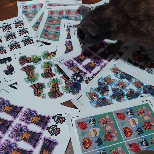
I don't use a company (and Idk what a POD company is sorry!) but making them at home gives a lot more freedom of stock, just be wary it can be very time consuming depending on how many you need to make.
I've had other people ask before, so here's a rundown of how I make my stickers at home: At most you'll need:
Printer
Sticker paper (this is the type that I use)
Laminator and lamination paper (the lamination paper that I use.) You can also use adhesive non-heat lamination paper if you don't have a laminator, gives you the same result, just be careful of bubbles. You will get double your worth out of a pack because we are splitting the pouches to cover two sticker sheets.
Your choice of a sticker cutting machine or just using scissors.
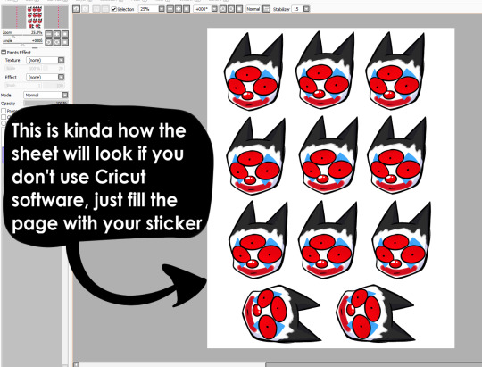
First, I use Cricut's software to print out the sticker sheet with the guidelines around the corners so the machine can read it. If you do NOT have a Cricut machine, open up your art program, make a canvas of 2550x3300 and fill it up with your sticker design with some cutting space between them. This the 8.5x11 size for the sticker page.
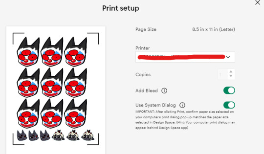
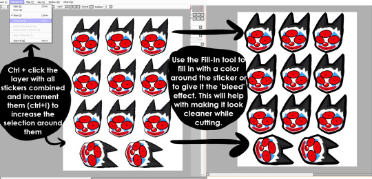
I usually have bleed selected so the cut comes out cleaner. Tip for non-Cricut users below: Increase the border around your sticker design to fake the 'bleed' effect for a cleaner cut.
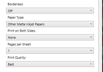
These are the print settings I use for my printer. I use the 'use system dialogue' to make sure I can adjust the settings otherwise it prints out low quality by default. Make sure if you're using the above paper that you have 'matte' selected, and 'best quality' selected, these aren't usually selected by default.
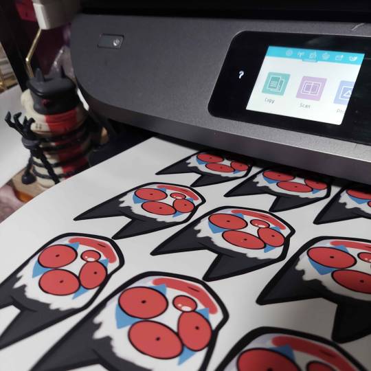
So you have your sticker sheet printed! Next is the lamination part. I use a hot laminator that was gifted to me, but there is no-heat types of lamination you can peel and stick on yourself if that's not an option.
(This is for protection and makes the colors pop, but if you prefer your stickers matte, you can skip to the cutting process.)
Important for Cricut users or those planning to get a Cricut: You're going to cut the lamination page to cover the stickers while also not covering the guidelines in the corners. First, take your lamination page and lay it over the sheet, take marker/pen and mark were the edges of your stickers are, and cut off the excess:
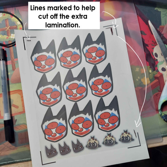
(I save the scrap to use for smaller stickers or bonuses later on)
After you've cut out your lamination rectangle, separate the two layers and lay one down on your sticker sheet over your stickers with matte side down, shiny side up. (Save the other sheet for another sticker page)
The gloss of the lamination will prevent the machine from reading the guidelines, so be careful not to lay it over them. It also helps to cut the corners afterwards to prevent accidentally interfering with the guidelines.
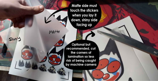
Now put that bad boy in the laminator! (Or self seal if you are using non-heat adhesive lamination)
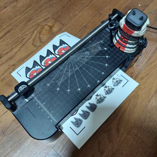
Congrats! You now have a laminated page full of stickers.
For non-cricut/folks cutting them out by hand: this is the part where you start going ham on the page with scisscors. Have fun~
Cutting machine: I put the page on a cutting mat and keep it aligned in the corner, and feed it into the machine. For laminated pages I go between 'cardstock' and 'poster board' so that it cuts all the way through without any issues, but for non-laminated pages or thinner pages, I stick for 'vinyl' and 'light card stock'. Kinda test around.
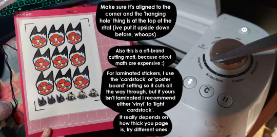
Now I smash that go button:

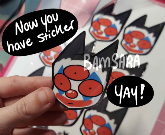
You have a sticker now!
The pros of making stickers at home is that you save some cost, and you have more control of your stock and how soon you can make new designs. (I can't really afford to factory produce my stickers anyway)
However, this can be a very time consuming, tedious process especially if you have to make a lot of them. There is also a LOT chance for some errors (misprints, miscuts, lamination bubbles, ect) that will leave you with B-grade or otherwise not-so-perfect or damaged stickers. (Little note, if you have page mess up in printing and can't be fed into the cricut machine, you can still laminate it and cut it out by hand too.)
I have to do a lot of sticker cutting by hand, so if you don't have a cricut don't stress too much about it. I have an entire drawer filled to the top of miscuts/misprints. I keep them because I don't want to be wasteful, so maybe one day they'll find another home. Sucks for my hand though.
But yeah! This is how I make my stickers at home! Hope this is helpful to anyone curious
1K notes
·
View notes
Text

(Just attack.)
#in stars and time#isat#isat spoilers#isat act 3 spoilers#isat siffrin#isat odile#isat bonnie#isat isabeau#isat mirabelle#i think about how the team feels about just attack#considering the tutorial event#like obviously it's not *that* violent#but siffrin gets scared of killing the sadness in one shot after that#i wonder how they feel when they eventually do so easily#i love the tutorial event though nyehehe one of my favorite parts of the game#ALSO i decided to whip this out on SCRAP PAPER like a MADWOMAN so there's pink markerbleed i had to do wizardry to get rid of#on the scan @_@#also man i never expected to make this much isat fanart lmao#isat act 4 spoilers
673 notes
·
View notes
Text
How I save time on backgrounds as a full-time webcomic artist
Hi! I make webcomics for a living, and I have to be able to draw a panel extremely fast to keep up with my deadlines. I draw about 50 panels a week, which gives me about 45 minutes per panel if I want any semblance of a healthy work-life balance.
Most webtoon artists save time on backgrounds by using 3d models, which works for them and is great! but personally I hate working in 3d... I went to school for it for a year and hated it so much I completely changed career paths and vowed never to do it again! So, this is how I save time without using any 3d, for those of you out there who don't like it either!
This tactic has also saved me money (3d models are expensive) and it has helped me converting my comic from scroll format into page format for print, because I have much more art to work with than what's actually in the panels. (I'll touch on this later)
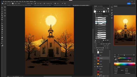

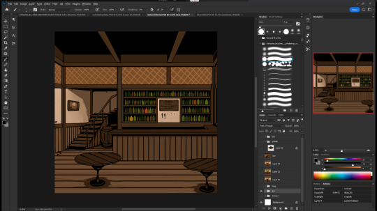
So, first, I make my backgrounds huge. my default starting size is 10,000 x 10,000 pixels. My panels are 2,500 pixels wide, so my backgrounds are 4x that, minimum. Because of this, I make them less detailed than I could or that you might expect so it doesn't look weird against my character art when I shrink portions of it down.
I personally find it much easier to add in detail than to make "removing" details look natural at smaller sizes, but you might have different preferences than I do.
I also make sure to keep all of my elements on separate layers so that I can easily remove or replace them, I can move them to simulate different camera angles more easily, and it's simple to adjust the lighting to imply different times of day.
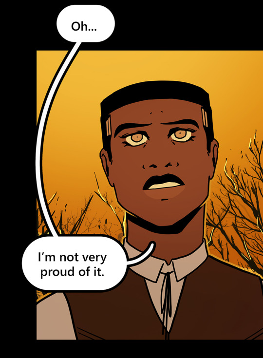

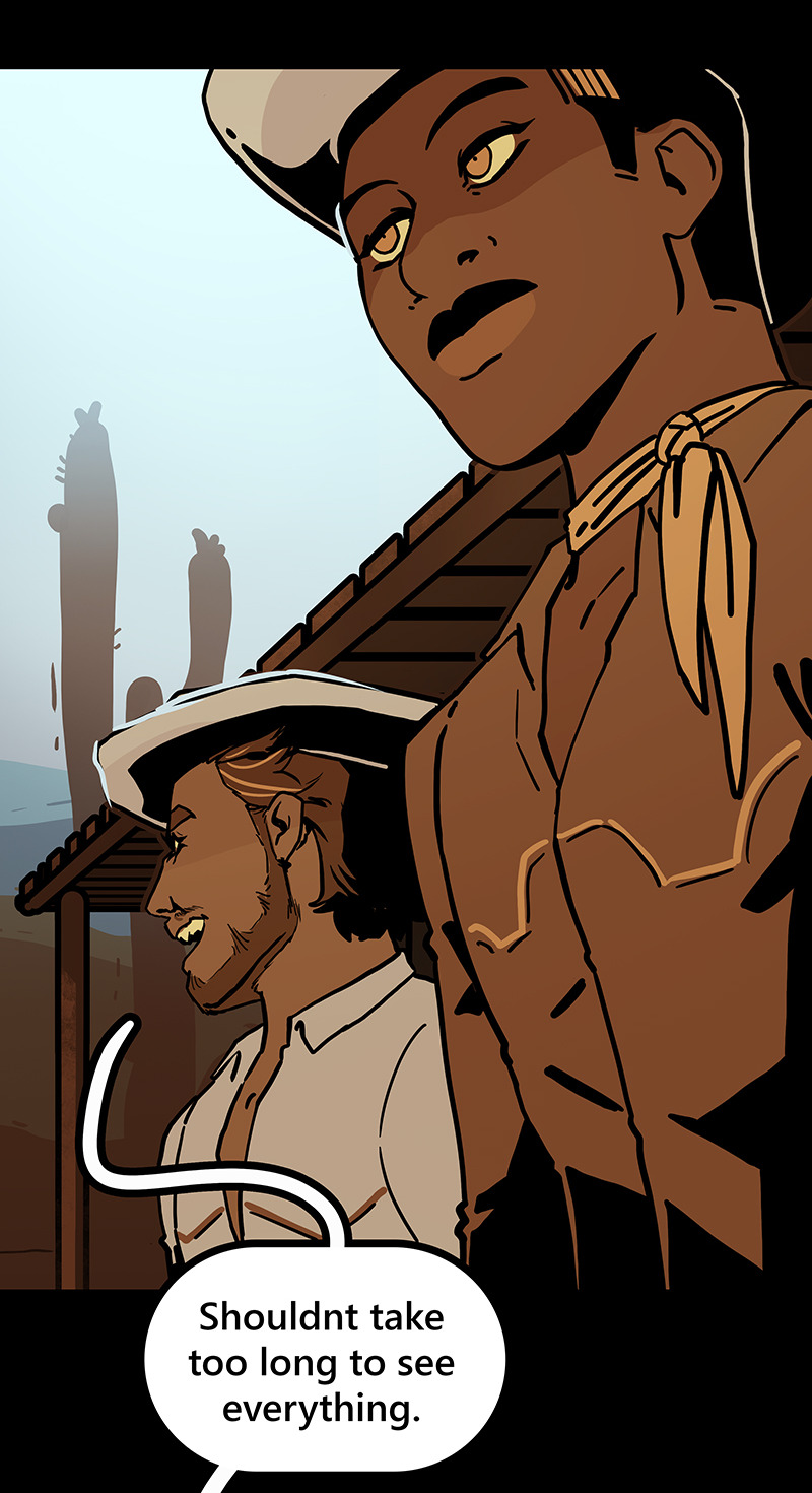
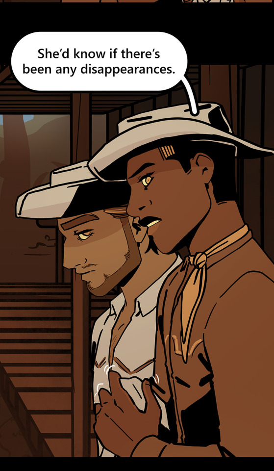

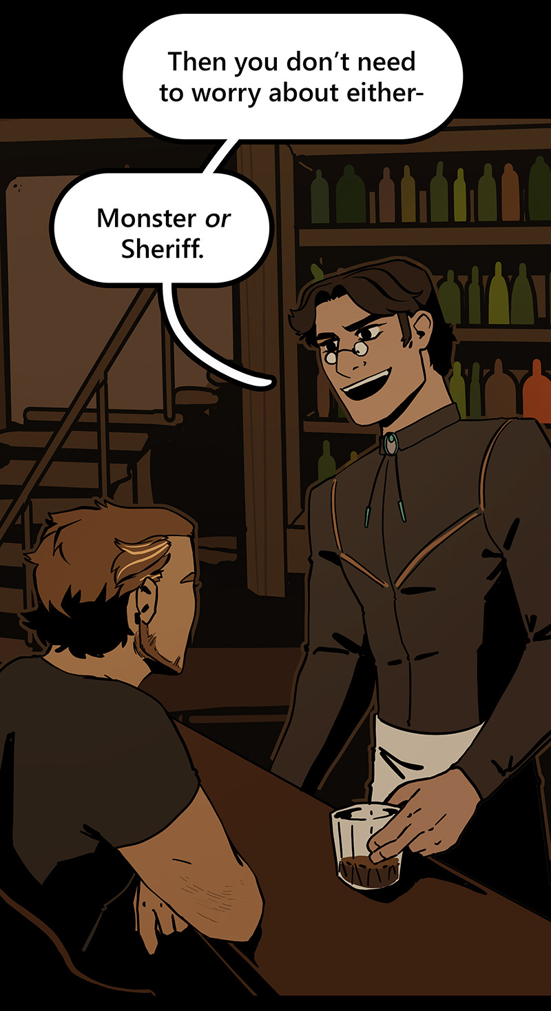
Then I can go ahead and copy/paste them into my episodes. I move the background around until it feels like it's properly fitting how I want.
Once I've done that in every panel, I'll go back through the episode and clean up anything that looks weird, and add in solid blacks (for my art style) Here's a quick before and after of what that looks like!

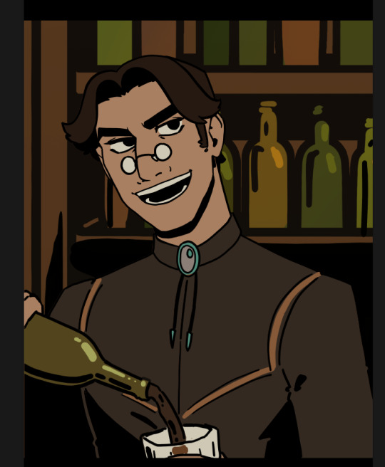
This makes 90% of my backgrounds take me just a few hours. This is my tactic when I'm working in an environment that an entire scene, or multiple scenes, will take place.
But many panels will inevitably have a location that's used exactly once, and it would waste time and effort to draw a massive background for those. So in 10% of cases, I just draw the single panel background in the episode. I save all of these, just in case I can re-use it later (this happens more often with outdoor locations, but I save them all nonetheless!)
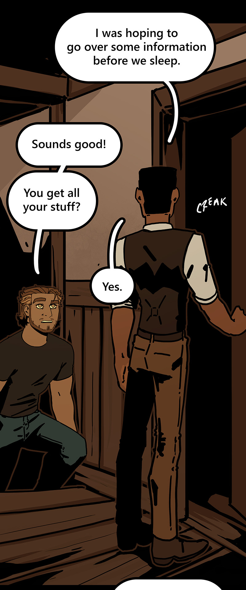
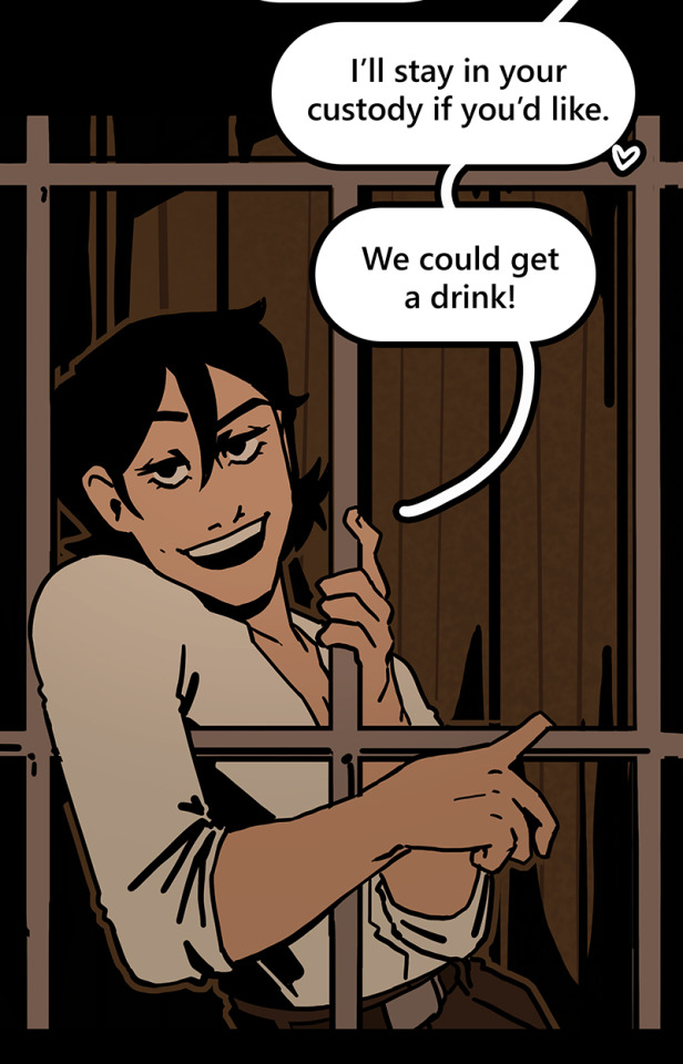
I generally have to draw about 2 big backgrounds per episode, and 3-5 single-panel backgrounds per episode! At the beginning of an arc/book the number is higher, but as the series is continuing and I'm building up an asset library of indoor and outdoor elements to re-use for the book, the number generally goes down and I save more time.
My series involves time travel and mysteries, so there's a lot of new locations in it and we're constantly moving around. If I were working on a series that was more consistent in this aspect, this process would save me even more time!
Like I said earlier, this also saves me a lot of pain and gives me a lot more options as I'm converting from scroll format to print format!
panels that look like this in scroll format...

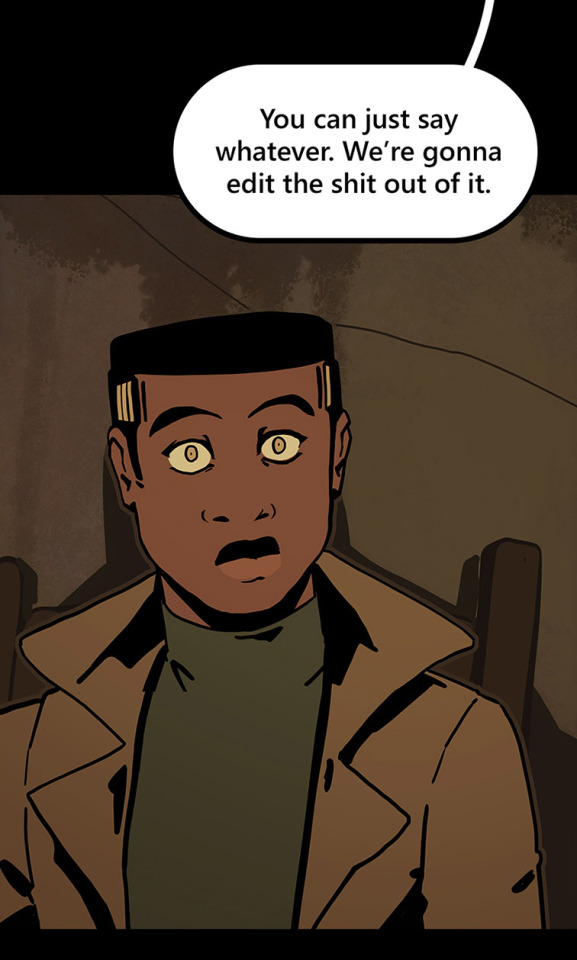
can look like this in print!

because I drew the background like this, so I didn't need to go through the additional effort to add in the extra detail to expand it outwards at all.
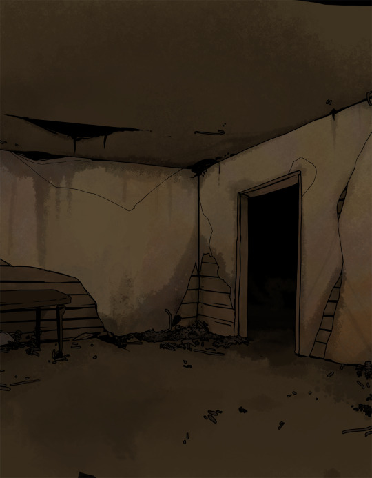
Anyways, I hope this helps someone! As always if it doesn't help, just go ahead and disregard. This is what I do and what works for me, and I feel like I only ever see time-saving tips for comics that involve 3d models and workflows, which don't work for me at all! I know there's more people like me out there, so this is for you!
Enjoy!
Also obligatory "my webcomic" if you want to see this in action or check it out!
#webcomic tips#webcomic making#comic tips#comic tutorial#art tutorial#art tips#time and time again#my ocs#digital art#ttawebcomic#hmmmm....#longpost#yeah it's a long post#I'll claim this one#lots of images#I hope this helps#I'm always worried when I make some kind of guide or tutorial people are gonna get mad at me lmao#I'm not saying 3d models are bad to use!!!#I just dont like them!#my brain doesnt work like that and it feels SO so so so tedious to me#TO ME PERSONALLY!!!#plenty of people see 3d models as a total lifesaver#and that's perfectly fine!#but yeah I don't see tutorials about saving time in comics that like... dont... mention 3d models...#like what about me and the other extremely particular girlies who hate 3d#anyways#yeah#just hoping this helps#nothing against 3d at all#I mean. ok personally yes against it cause it sucks for me to use
1K notes
·
View notes