#looking like a fucking renaissance painting
Explore tagged Tumblr posts
Text


Has Wut ever told you… that the old Joe's house was intruded?
MY STAND-IN (2024) | 1.08
#poom phuripan#up poompat#my stand in#my stand in the series#msiedit#usersasa#tobelle#usertoptaps#userbunn#tuseralexa#userrlana#rinblr#userzhaozi#userrlaura#msiep8#clairedgifs#looking like a fucking renaissance painting#i LOVE this frame
226 notes
·
View notes
Text


"just as I did, in 1983."
you'd never know my favourite parts of the show are the fucked up insane bits when my first instinct is to draw the cheesiest thing imaginable
#my art#interview with the vampire#iwtv amc#iwtv#armand iwtv#daniel molloy#armand#armandaniel#devils minion#drew this before the finale but idk maybe this is during the unspecified amount of time between armands divorce and daniels press tour#the titian painting doesnt fit at ALL with the timeline btw#i THOUGHT it did bc i assumed 1508 was when armand was turned into a vampire BUT upon reflection thats more likely the year he was born#and even then the painting was made in like 1510 so fuck me i guess. also im foggy on when armand was taken to rome#idk man i havent read the books and i failed art history on two separate occasions i cannot endeavor for accuracy#anyway as much as i love 70s/80s devils minion i have equal love for old man daniel#his cynicism has been tempered by time... refined like a diamond... he dont gaf and bullies his loser vampire and its hilarious#like ''sure yeah fine all these old italian renaissance guys saw ur ethereal otherworldly beauty but literally anybody can see that''#''IM the only mf who gets to experience the incandescent joy of seeing you be a messy idiot''#sidenote trying to make armand look unflattering is impossible u can blame the show for casting the worlds most beautiful man
12K notes
·
View notes
Text
i loooooove his hands :(


#im going to be sick#his hand belong in like a fucking renaissance painting they’re so pretty to me#his hands are so fucking big they make shit look miniscule#it makes me tweak out so much#the veiny and slender i’m actually freaking out#zach
56 notes
·
View notes
Text
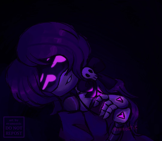
nori as that 'mary magdalene in a cave' painting by hugues merle (below the cut)

#do you have any idea how long it took me to adjust the colors. do you have any fucking idea#been wanting to draw her for a while but artblock was like 'nuh uh'#been looking at baroque/renaissance paintings for inspo lately :]#murder drones#murder drones fanart#nori doorman#nori murder drones#nori md#md nori#my art#i eated her hardhat
213 notes
·
View notes
Text
the way that daniel is like 'i'm sooooo normal unlike you insane freaks' and you can plainly see he's also a total freak
#iwtv#i was on the fence in s1 because it was a bit unclear if his perspective was also biased as part of the story or just given to the viewer t#identify with#but in s2 it's clear he's a freak and i hope will get that good d from armand by the end of it#(everyone's saying this but assad zaman truly looks like a renaissance painting come to life what the fuck i gasp every time i look at him)
24 notes
·
View notes
Text


does he not know i am!! so close!! to losing my mind!!
#he’s so fucking pretty omgggggggg#looking like a renaissance painting or something AH#g:shinee#i:ltm#shinee#shinee taemin#taemin#lee taemin#guilty era#guilty#t:posted
11 notes
·
View notes
Text
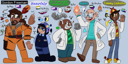

OKAY HERE WE GO.
3rd times the charm gdhjsdsfjhdjak
Also I FINALLY learned how to draw Gman! He looks so much better now omg.
Old refs below the cut for comparison's sake


what was i even doing omg. It becomes more obvious when you flip back and forth between them but. yeah.
#THEY ACTUALLY LOOK ALIVE NOW#i actually finished these a while ago but i just kinda. forgot to post them.#but yeah so allow me to explain myself rq#i've been trying to get better at drawing and thus made the horrible mistake of trying to be 'realistic'#but in my mind 'realism' was just. renaissance paintings.#and those paintings tend to be really washed out because- yknow- THEYRE OLD.#so yeah my bad gdfsh#i didn't even realize i was doing it like that. it just kinda... hit me.#and why the fuck am i trying to mimic an art style i don't even like that much? fuck that noise.#i'm doing this my way. and that means VIBRANT COLORS from here on out.#so yeah. sorry about that. will be doing better from here on out.#refs#ref sheet#character refs
13 notes
·
View notes
Text
still baffles me how so many turves have this weird combination 1950s/catholicism aesthetics going on like. yup both things were notoriously amazing for women
#how are you gonna be all girl power women's liberation smash patriarchy all men are pigs#and have your profile pic be one of them thin white housewife drawings from a fucking vintage jell-o ad or something#like it's either that or some obscure fucking renaissance painting of a sad looking woman#and first post is black and white artsy picture of an old church in the fog like#it's just how can you live like that and be dead convinced that you're not a conservative fdksjsks
3 notes
·
View notes
Text
i love you round faces i love you soft jaws i love you chubby cheeks i love you double chins i love you softness i love you i love you i love you
#out here looking like a renaissance painting and i love it#(or other eras of paintings too)#i love looking at old portraits and seeing reflections of myself#nyxtalks#feel free to add on to this if u have other ones in theme i jst ran out#idk im in my feelings today i guess. i didn't want to add any negatives because this isn't directly about whatever plastic surgery is hot r#but it does make me sad to think people dont love these things about themselves (or feel a pressure to change them)#round faces are so fucking beautiful
3 notes
·
View notes
Text
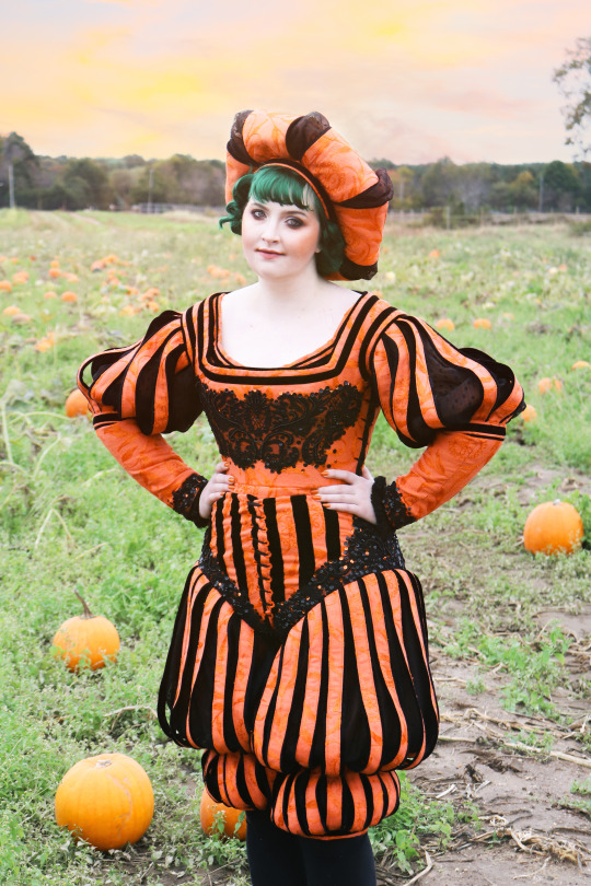

i'm so glad you guys like this costume! it is one of my favorites. but I put my absurd pumpkin pants on one leg at a time just like everyone else.
...literally
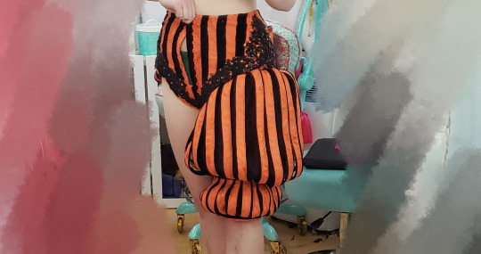
anyway, here are some construction/project notes/wip photos in case you don't have 50 minutes to spare for the full video about making it!
inspo wise, The First Book of Fashion: The Book of Clothes of Matthaeus and Veit Konrad Schwarz of Augsburg [this is an affiliate link] served as the major influence for this. the book is basically documentation of what this man and his son wore to major events in his life over a period of decades. he was getting ootd painted before it was cool.

the base pattern for the pantlegs came from another pair of ridiculous pants I made a few months earlier.
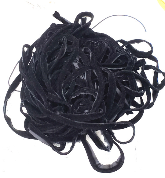
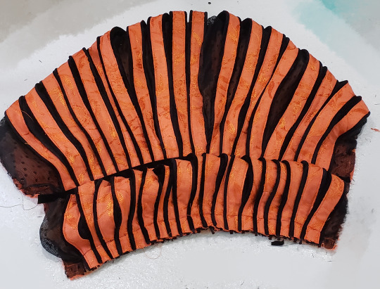
the paned portion is made from homemade piping sewn to strips of jacquard that are backed with twill tape to prevent fraying.
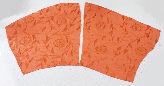
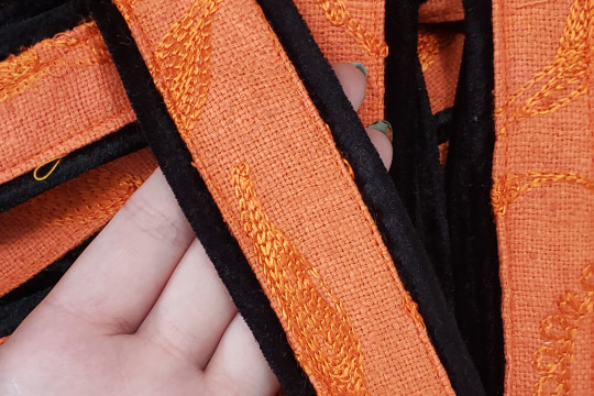
I made so much fucking piping for this oh my god. each of these strips was 20"+ long, both sides have piping, and these are the panes for ONE LEG. there were also sleeves. we're talking like 60+ yards of piping.
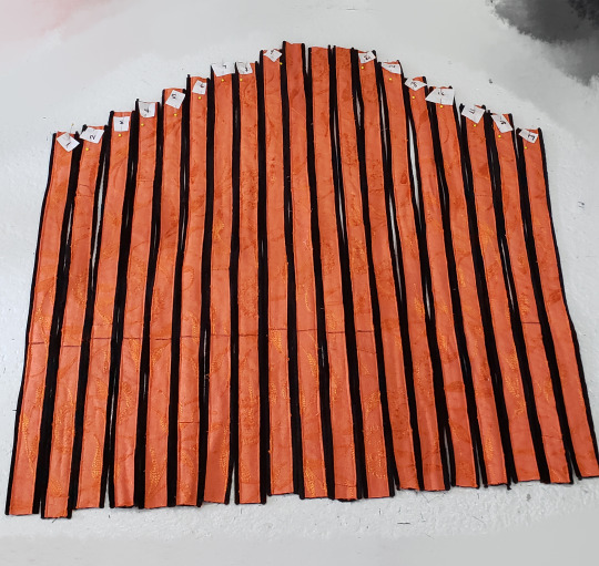
perhaps unsurprisingly, these strips were too thick to gather. so instead I had to overlap them to create the shaping over the leg. it looks OK but isn't ideal.
after this was done, velvet ribbon was sewn over the marked point to hold them in place.
oh! I also sewed a layer of mesh over the orange base fabric to dull it somewhat and provide contrast before sewing on the bands.
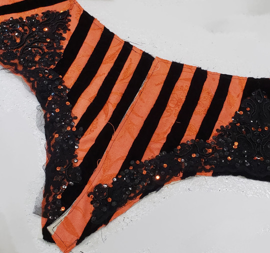
the upper portion of the pants was made from even strips of velvet and jacquard seamed together and fitted over a cotton base. the appliques were added to cover the fact the stripes meet at an angle at the side seam, and I sewed on orange sequins because I like sequins.
the happiness I felt when this fit was immense, I must say.
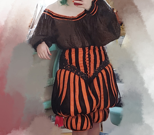
the bodice is two pieces, one for the front, one for the back. it laces up the sides with hand sewn eyelets. it wasn't very flattering as just an expanse of orange of the chest, so I added appliques to the front and back, too.
the black detailing around the top edge is made from varying widths of velvet ribbon.
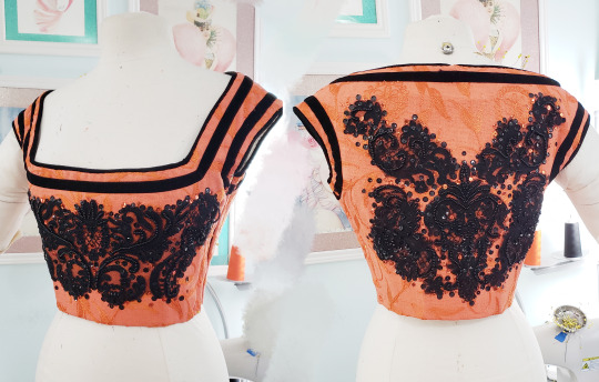
the sleeves have similar elements of everything shown above--a paned upper portion, velvet ribbon trim, and a bit of lace at the cuffs.
unlike most of my projects the sleeves have no lining forcing the shaping, what you see beneath/between the panes is the chemise worn beneath this. it's made from the mesh used as an overlay on the pants with a jacquard/velvet ribbon collar which you can see peaking out above the neckline of the bodice.
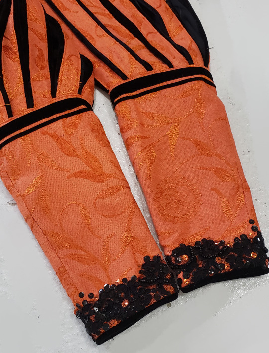
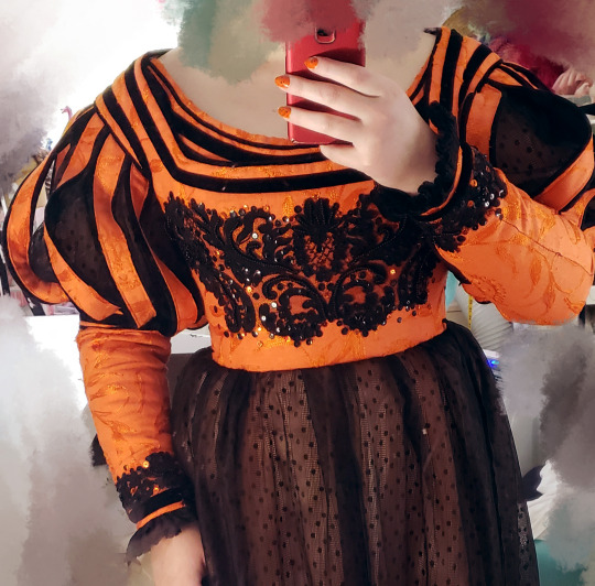
oh! and then there is the pumpkin hat! there is a video on patreon about making this somewhere, I think.
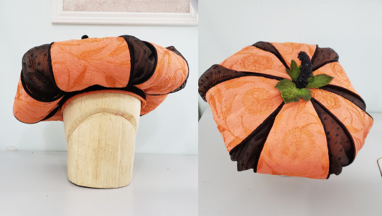
and it's just that easy to live out your renaissance pumpkin prince/ess dreams!
7K notes
·
View notes
Note
could the beach painting not be intended as a somewhat ~racy~ depiction (see: the topless woman), hence the short/tight clothes?
oh it 1000% is
that is his Fantasy Version of Combinations, I'm convinced
it's like that one artist nobody now realizes loved to depict women half-dressed, because corset-covers look like tank tops to us and petticoats look like normal (even old-fashioned and concealing!) skirts. what was that guy's name? with all the blue silk?
...TOULMOUCHE
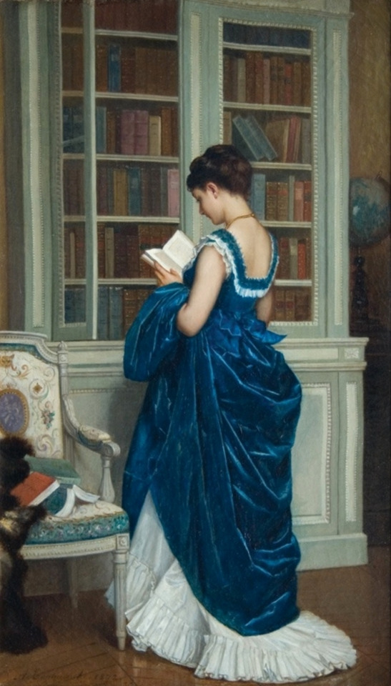
this woman is showing her underwear. a glimpse of petticoat might be fine, but Skirt Hiking To Reveal A Huge Amount? nope. that is a sexy painting.
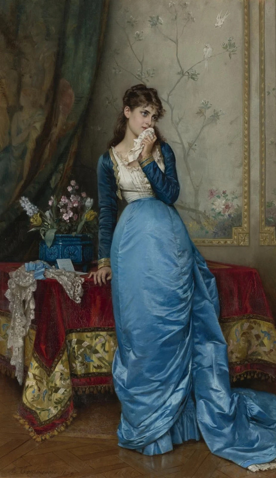
Lounging About With My Bodice Inexplicably Open is a popular Toulmouche theme. the white "tank top" is also underwear. note the half-up hair- that is also sexy!

damnit, Toulmouche why is this lady sexy? there's a kid in the painting! have some decency! but no, Mama is praying with her child while inexplicably having removed specifically her bodice but not her skirt. nor has she just changed into nightclothes before putting the kiddo to bed like a normal person. also that is clearly her chemise and her skirt would not close over it without her corset on; the fat distribution would be all different.

this one is just gay. Mlle. Red is clearly into Mlle. Nightwear/Lingerie and her sexy 1880s pixie cut (I think? either that or her hair is blending REALLY well with the shadows). I'm here for it
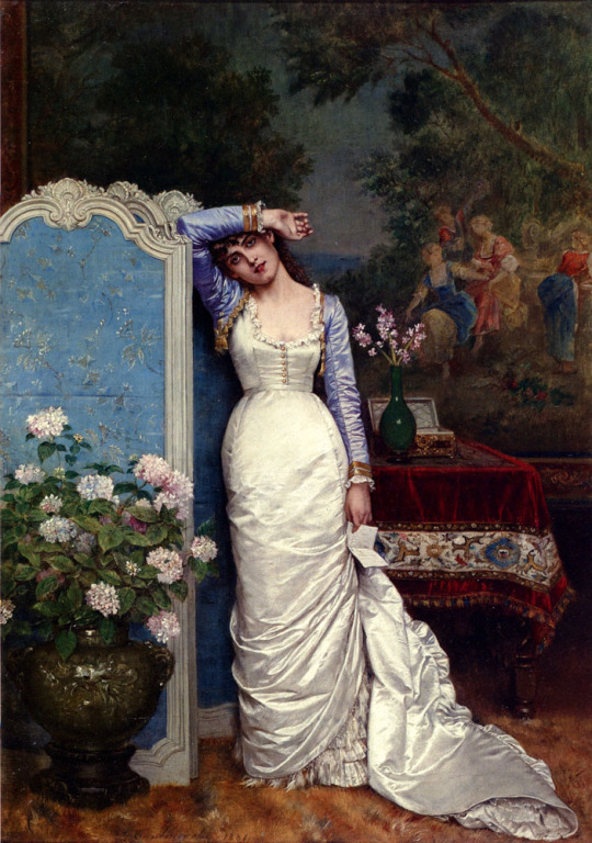
"this letter is so distressing that I had to stop midway through getting dressed and put on my Bolero of Sadness. and lounge seductively against the screen. sad-ductively, I mean"
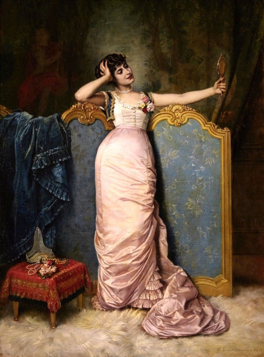
Get dressed to the point of putting bodice on
do not put bodice on
don Tiny Vest
pin roses to corset cover that would 100% negate purpose of corset cover if actually attached to it
???
Toulmouche(TM)

Once again, that's not even her corset-cover. It's the top part of her combinations. how is her skirt fitting without the corset it was fitted on top of? Seamstresses Hate Local Painter Of Specific Fetish For This One Weird Fitting Trick!
(also, "you wanted to paint a woman in this one very particular unlikely undress state you find hot, but you painted her making out with a mirror and called it Vanity etc." there's actually a version of this called Vanity, and she's fully dressed. this one is The Mirror.)

I've got nothing. Extremely obvious late Victorian undergarment on top normal late Victorian skirt on bottom, fucking Renaissance Revival pearl-encrusted sleeves. Why not. Why, indeed, the fuck not.

WHAT IS WITH THE LITTLE VEST
7K notes
·
View notes
Text
primavera (the painting from Hannibal) is also the cover art for the vampire Armand. Quite curious indeed
#and before any of you idiots says anything yes the primavera is a renaissance painting by Botticelli and wasn’t invented in Hannibal#I know. it’s called a joke#my mother will sometimes come to me and be like look at this stupid stupid person !!!!#and it’s someone my age pretending to be stupid as a joke#and I have to tell her. that person is fucking with you. of course she knows you can’t purchase boiling water#and my mom will go hmmm. I don’t know…..#so mom. this one’s for u
1 note
·
View note
Text
THE USE OF LACRIMOSA IN EP 52 !!!!!!!!!!!!!11!!!1!!111!1
#FUUUUUUUUUUUUUUUUUUUUCKCKKKKK FUCK OH MY GOOOOOOOOOD#AND THE FACT THAT THE WHOLE SCENE LOOKS LIKE A RENAISSANCE PAINTING. FUCK. FUUUUCK IF I COULD PAINT I'M JHUSFYFHSFHGSAHFSHAGdJHD#i legitimately keened over. bowed down. grimaced so HARD because it's such a punch in the gut I'M TELLING YOU#i cannot stress enough how much i love this showwww the editing the acting the score this is THE PEAK of Filipino television i swear to god#so normal about this showwww it's available on Viu btw w/eng subs!!!!!#ugh i can't believe i missed the premiere of this i would've actually passed out i wasn't as ready as i am rn#LMFASIHAJ the fact that i've posted twice about this show making me pass out#rambles#umh#unbreak my heart#THIS EP BETTER HAD TRENDED ON TWITTER OR SMTH
1 note
·
View note
Text
I’ve been seeing that couples paint each other challenge where couples will spend a night in with a canvas and some cheap paints and give each other 30 minutes to try and paint each other, and now I can’t stop thinking about armandaniel doing that one night and armand’s is yeah it’s good okay like it’s not great because of the whole vampire art struggles but he was around renaissance painters for a long time so he does a pretty good job of getting daniel’s minute features and shading and whatnot but daniel’s is just. lord it’s so bad. it’s like the most primal kindergarten painting you’ve ever seen but dammit all the right ingredients are there!! he got the orange eyes and the curls and he very proudly points out that he gave armand a little ipad in his painting like his fake rashid era which he cracks himself up with but he looks over and armand is in tears because not only is he looking at the first painting of himself in over 400 years but he’s also looking at the most non sexual artistic interpretation of him he’s ever seen. like it’s just. him. he’s just existing. he’s there. on the canvas. with literally no background. not a meadow or even a grassline or anything. all this blank white liminal space around his (horrendously drawn) likeness as if nothing else is needed. no body contortions, eyes too one dimensional to even hold all his pain. daniel is just kind of chuckling and bashfully being all “ah fuck it’s pretty bad isn’t it I mean there’s a reason I stick to words, I drew your nose all lopsided on that one side and—” cut to armand literally welling up and whispering like “no. it’s beautiful.” daniel doesn’t get it. this is a liberation.
#ok fuck I’m going to write THIS fic now#devil’s minion#armandiel#armandaniel#armand#armand de traumautism#daniel molloy#iwtv#amc iwtv#amc interview with the vampire#interview with the vampire
2K notes
·
View notes
Note
Don't mind me, just daydreaming about the boys tracing their fingers and tongues along their pregnant wife's stretch marks, making her blush and whine and just melt like putty
Who knew that an offhanded complaint about the little changes to their hips or lower tummy would turn into that hahahahah.....
You’ve inspired me
Weaknesses 12: is there a possibly that I’m pregrant?
AKA their favorite parts of your pregnancy
Gaz just stares and stares at you because you have the glow. He used to think people were exaggerating about pregnant women being so radiant and beautiful, but now he thinks it was understated. You look like a renaissance painting of the Virgin Mary to him. And you know his camera roll is FULL of pictures of you, like, more so than before.
Soap loves you getting crazy horny from your whacked out hormones. You’ve got a slip n slide pussy and brother? He’s at a backyard barbecue with his swim trunks on.
Ghost kinda loves that you’re moody. He thinks it’s really funny when you get angry as fuck for next to no reason. You’re his tiger mama. Rawr.
Price loves how it gets you in the mood for nesting. How you pick out things to go in the nursery, how long you spend at different stores and by window displays just looking at toys and blankets and everything a baby could need… he thinks it looks like the most natural thing in the world.
König loves your big, soft, aching, leaking tits. I’ve discussed this before. But he’s a tit man. He loves to grab and squeeze, and now they’re even bigger and more sensitive, and full of sweet milk…. Dream come true for this guy.
Nikolai loves how hormonal it’s gotten you. How you get sensitive, a little needy for attention, how easy it is for you to be pushed to tears… he just loves to be there for you. The man likes you weakened and needy.
#writing#cod fanfic#cod#cw pregnancy#simon ghost riley#john soap mactavish#simon riley x reader#könig#john soap mctavish x reader#john price#könig x reader#kyle gaz garrick x reader#gaz x reader#kyle gaz garrick#soap x reader#ghost x reader#Nikolai#Nikolai x reader#konig x you#konig x reader#konig#nikolai cod#cod nikolai#john price x reader#captain john price#simon riley x you#simon ghost riley x reader#weaknesses
1K notes
·
View notes
Text
LUTHER
m reader x lia // 4k words

It’s a silly rational thought, but common knowledge nonetheless:
You are madly in love with Choi Jisu.
Not even the strands of time could weave a better, clichè story of what’s already been set in stone; or the countless times Lia has made herself home in the throes of your hideaway from the world, every new story and encounter with it’s twist through each shared moment.
Sure, there’s a lot of instances that you and her can recall back on, so let’s gloss over a few:
The first time you invited her presence was for a study session. You insisted that the spaghetti tasted good until realizing that the pesto had expired by three weeks - where she had to stay over for the night unintentionally because you couldn’t even manage to get up to the bathroom. Though, one ice pack to the forehead and the magnetizing hug was more than enough for you to ignore the fact she snagged your lacrosse team hoodie as for her keepsake - hood drawn up and pooling her raven locks to the sides of her face, the hems covering her most of her hand but her fingers exposed - you can’t deny that she looked comfy.
Among the other times, you’re just in your apartment, serenading her with your okay-but-presentable piano skills of covers from her favorite movies. (She had to make you hers when you played La La Land but it sealed the deal.) Not long after that, some of her things start to make their way into your place: the violin case, the scent of cherry blossoms spreading from room to room, and the collection of vinyls hung up in the living room. You don’t complain. There wasn’t a point in saying anything. Lia would disappear from your peripheral for a few minutes and come back with her cropped black tee and your pair of oversized sweats that cover her toes. So yeah, there's no point in drawing up a complaint.
It’s all in the little moments; living within these four walls - filled with memories and moments that you don’t want the rest of the world to see, her on your lap while you’re dealing with deliverables and other times where she’s bringing food for you and her to share. That’s usually how this all goes. Some of the tasks get completed, then you tab out to see what else is left to do, and Lia waltzes in terrorizing the productivity bubble. She doesn’t care because she knows what the fuck she’s doing: cocoa butter hair in messy waves, fixing the watch on her wrist, talking about her schedule for the day. Doing her wasn’t on the to-do list, but was heavily implied, considering the fact you saw her up with nothing but your sweats while making breakfast.
Technically speaking from common knowledge:
This isn’t the first time you’ve seen Lia in your clothes.
You could conjure up all the thoughts in your mind as to why you liked seeing her that way.
–
If you’re being completely honest with yourself, it’s always a wonderful sight to see.
Morning sunlight beams through the curtains as she walks past the open doorway; the highlights alone are trapped in this mixture of honey gold and coffee brown, presenting itself like a Renaissance painting coming to life. One second your vision focuses on the blurry silhouette, the next your eyes are greeted with a fever dream, blessing and inviting all the same.
You’re pinching yourself mentally - just to check - and yes, it is most definitely not a dream. Her eyes stay on you, shifting yourself up until you’re against the headboard of your bed, soaking the image of her: perfectly colored with those dirt-colored eyes and rose-tinted cheeks, radiating so brightly that the worry of drying up your eyes comes as a second thought.
There’s nothing new about this: just the usual lazy Saturday mornings you’ve shared with her.
She sighs so beautifully, having no care in the world. The flutter of her eyelashes is so seamless when her arms are raised up over her head, stretching out the stiffness of those springy limbs and muscles.
You’ve spent countless days, hours, nights even, to piece it all together in everything that revolves around Lia. From the mannerisms and tone she uses with others the readable expressions just by the small quirk of her lip or flared nostrils. Lia proudly wore her heart on her sleeve. You learned right away: a bit overwhelming was the coined phrase you proclaimed. Building each other up where others fell a little behind in: always thinking ahead, taking all of the things into consideration; and Lia was in the same headspace as you, strategizing wherever she saw fit.
But it didn’t take much for you to conclude on the fact that confidence was a weakness.
She was flooding in it, wherever she went. Whatever she wanted, she would get. If things didn’t go her way, she accepted it fully. She’ll happily walk past the open door held by you - not as an expectation, but as one of the many things you’d put an effort into. When you take her out for a date, she’ll show up outside your workplace and return the favor. You snuggle your face deeper into the pillows on a lazy day; because you know that she’s not far, either close by or already up to start the day.
As if the heavens parted the clouds for you after a gloomy day riddled with darkness, you’re pretty sure the same effect is applied here.
She’s in your hoodie (as always). However that doesn’t stop the unveiling of skin little by little the more she does these morning stretches, the fabric at the waistline lifted up to where you see her hips, cast in the cotton of her underwear. You can picture yourself thumbing away at the surface, at the ends where the threads don’t meet, cup your palms shamelessly around the plush of her ass, or even watch her slip on a pair of your pajama pants with her backside blatantly pointed towards your direction.
Okay, she knows what she’s doing. You’ve been in this position for over three years, and you’re still finding out new things to discover.
She clears her throat once she turns around.
“What’s on your mind right now?”
You lean your head back when Lia starts to shuffle herself back onto the bed, hands and legs moving until she finally settles her bearings, straddling your hips.
“Not work, obviously,” you answer, feeling her palms on your face as she tips her head, studying. “I just don’t wanna get out of bed just yet.”
“Funny,” Lia laughs, slipping her fingers behind your neck, “I was just thinking the same thing.”
“Pretty weird, isn’t it? It’s like we share half of a brain.”
“Except when you were drooling over me a second ago.”
“How could I not?” you muse, darting your eyes away, feeling your face get warmer. “If anything, you bent your ass over for me to see on purpose.”
She tilts her head, and quirks her lips near a grin, she doesn’t need to give you an explanation.
You’re speaking your truth for her.
Her hips press down on your groin, curling her fingers into the ends of your hair, feeling you squirm in the slight change of pressure. “You don’t have to be shy,” voice low and gentle, “I know you, you’re enjoying this.” You see her hand pull the hem of the hoodie upwards, revealing more and more of her waist - ghosting your hands at the uncovered skin; amidst the grey, you’re fighting to urge to pierce the veil, get your palms full of skin and feel and touch up like she wants you to.
“What do you suggest I do, hm?” You ask Lia, tone flat. “Nothing?” Playing on the backfoot in this wasn’t the ideal scenario, but you’re doing what you can to be literal and indirect, “Because I was hoping that you wouldn’t notice.”
But you see: all of that could’ve been plausible if you didn’t sit up on the bed in the first place.
You’re mapping out her face in the back of your mind, imagining the hands wandering all over her legs and hips and waist - admiring the bodywork and fine planes of porcelain, all within arm's reach.
Her breath grazes your cheek, practically turning you to stone. Some thoughts are present in your mind; you’re not sure. The only thing filling your senses was the scent of wintergreen.
Her palm lightly presses into your cheekbone, leaning in for a kiss, but stopping herself by mere centimeters.
Fills the space between the mouths, saying: “I was hoping that you’d do something about it.”
Oh, she knows what the fuck she’s doing.
Lia has kissed you like- countless times. There’s the sweet ones, the ones where you’re both smiling into each other’s faces, the ones where you think time stands still for a few moments, the kinds where you’ve got a bubble entrapping you two, and so much more. All of them have their meanings behind them, but they make you melt all the same.
You could feel her hands roam around your body, legs pressing your hips on opposite ends; every smack and inhale is followed up with a low rumble at the throat, hands shifting up from her waist up to her chest; her forehead pressed against yours, clutching her shoulder blades, keeping her place - she has your full attention now.
A swipe of the thumb across her nipple, then a pinch. The hoodie rucks up higher on her body.
Her arms come into play, speeding up the process of cotton being discarded.
Lia is your block of marble - waiting to be molded and chiseled and chipped away - crafted by yours truly where you’ll get on your knees in adoration and give your reverence as you proffer your lips and tongue all over her body.
She’s so easy to gratify - the way that her sighs and moans mesh into one sound or another, feeling the heat rise in her body. You can tell she’s trying to hold back, murmuring in tongues. Like she’s showing but not telling: I need you baby. I need, I need, I need, I need, I need-
It’s like you - all of you - is oxygen to her, giving her life where she would die if she didn’t have enough. It’s never enough, and you know this. In the cosmos that lie behind those melted shades of sable, glassy, and an ever-growing pit of blackness, where you could see yourself falling into them time and time again because they were only exclusive to you. A forgotten light, an eternal flame, you catch yourself face to face with it once more.
The flush of light crimson makes its presence known across Lia’s face: a response to your touch, one that she simply can’t ignore.
You could feel the dampness of her panties lightly settle on the bulge of your underwear, hear her breath hitch just the slightest, all the while her hips grind against yours.
“Yeah,” she hushes, a sultry smile spread across her lips. “You prefer this over the usual caffeine.”
She laughs softly when you groan into her neck, her arms coiling around your neck and shoulders, tightening the noose. Your hand slithers past her lower back, fingers grazing the lace and sliding underneath the uncovered skin. “Always,” you tell her, looking up while she scratches the back of your head: your one of three weaknesses.
Lia then leans away, crosses her hands at her waist, gripping the hoodie.
When she lifts it- that image becomes your second weakness.
You keep looking without hesitation; the fine line of her shoulders, the blotches of red and pink across the canvas, deliciously sweet. Her breasts supple, but have a firmness to them (a guilty pleasure, you’ll admit); she runs her nails across those mounds because she knows that you’ll get your hands full of them soon, get greedy enough to forget about the rest.
“Aw, what’s the matter? Cat got your tongue?” she asks with a coo. Then, gets her thumb and index underneath your chin, tilting your gaze up. “You’ve gone quiet.”
“Were you always this cute?” you muse.
“You know me.”
“Allow me to rephrase,” you’re backtracking, because you just want to hear it yourself. “Were you always this sexy?”
That earns you a firm grind against your length.
And now, she’s laying it down for real: “I���ll make you shut up if that’s what you want.”
–
Here’s weakness number three:
Lia has your legs spread apart, laying on her stomach, tracing a finger along the grooves and veins of your cock, mesmerized at the mere taste of your balls across her tongue. You’ve got your deal in, grinding her sopping folds along your shaft just as a tease - a preamble. Her hair’s tied up in a loose ponytail as she makes her way up the length, pouting her lips at the tip - anticipating the image of your cockhead sealed around her pretty little mouth - how to suck the air out of your lungs with just one swift motion - she’ll relish the moment, savor it - make you forget all of your worries with one decent.
She has you wrapped around the palm of her hand, literally. And somehow, it feels like you were meant to be-
You could feel the graze of her teeth the more she takes you in, the subtle leitmotif of her humming the more you feel her mouth all over, creating a pantomime of dancing and singing along your length, bringing out all the things that make you speechless.
It’s when she has you like this, where everything just feels right.
“Good?” you could hear her say, but her cheek is bulging with your cock up inside where the sound comes less coherent, but those eyes implicate the message regardless.
“Fuck,” you rasp, feeling her teeth graze just right beneath the tip. She’s got you good. She always has.
You’ve got the rough schematic drawn up in your brain. Testing the waters with a gentle thrust of your hips, shoving her head down deeper where she can struggle just a bit. It won’t take you much to make you cum like this. You imagine her saying - all she needs is to soften you up and next thing you know her palms are sliding down from your chest to your thighs. The gentle cup of your balls in her other hand, puts your length in the prime position to fit you in her throat.
She purses her lips forward, trying to cover the base. It’s cute that she can try, but she makes up for it by flicking her tongue on the underside - at the seam - and yeah, your head hits the board behind you.
Lia is the only one who could practically kill you and give you a second chance at redemption.
Knowing that you’ll take that second chance to return the favor properly.
But this is her turn in the chess match. You actually can’t do anything about it.
She crosses her ankles up in the air, sinks her head between your legs again, maintaining tempo. Her hands come into play, doing all kinds of combinations with her mouth and tongue, lapping up the mix of spit and precum.
You are going to lay there and watch.
Her eyes flooded with determination.
Your cock in my mouth, my hands.
The slide of her mouth is addicting.
Try your hardest not to cum.
She’s fucking unreal.
And not even that-
“I want more spit.” Lia declares, both hands on you now, jerking shamelessly with the classic motion that makes you paralyzed from the waist down. Her knees dig deeper into the mattress, raising her body, head now hovering over your cock.
“Go ahead,” you grit, smiling. A moment of grace - to breathe; you know where she’s leading with this. “I’d love to see you try.”
That phrase alone would be your undoing.
Lia puts you right back into her mouth, with no regard for keeping it lighthearted and casual. The grip in her hair becomes a lot tighter, flexing your hips up while her tongue becomes flatter. You’re biting down a curse spilling from your lips, ears focusing on the unholy sounds coming from Lia instead.
She’s not playing around now - mouth slipping and sliding, humming and moving her head in the many ways where you’ve seen your vision turn white before.
You can’t keep this up for any longer.
The head down, head up, the shimmying of her head, puffing her cheeks, cock slathered and wetter by the second-
You pull yourself away, throbbing. The pop of her mouth and gasp is all that she’s left with.
“Hey,” she says, “you weren’t supposed to do that.”
Her ponytail comes undone while the tip of your tongue is caught between your teeth.
All you give her anyway is: “Oops.”
She throws herself onto you, hoping to catch you off guard, but you were ready. Her lips capture yours, wanting to clean up the mess she made over your cock just now, each lick and smack becoming more and more careless in every liplock.
Your hands find her waist while Lia also looks down at the action. “Need to do something about that, don’t we?” She tells you, grabbing your length and dipping your head into her cunt, making both of you groan in unison. “Fuck-”
“Lia, watch yourself,” you huff, jaw slacking when she slides herself in properly this time; the tightness and heat already washing over you while Lia shifts her panties more to the side. “Okay, holy shit girl.”
To keep your mind off of the unrelenting pressure of her cunt wrapped around your dick, you’re leaving chaste kisses across her chest yet again, feeling her fingers card through your hair and dig into your scalp, the shimmy of her pussy finally stopping once she bottoms you out.
She’s laying it out for you again: “You’re gonna fuck my brains out now, okay handsome?”
Your response is in tandem with her breathless state: “Oh, with pleasure.”
The girl just takes and takes and takes. You could feel her smile on top of your forehead when you feel up her breast, slide your hand down her waist, grip her petite ass while she slams her hips back down on your cock.
You’re gripping wherever you can: her waist, her hips, her ass. Any place where you can fuck around with the vice for as much as possible, fucking her senseless like she worked you up to be.
It’s in the forward-back, the up-down. Her ass isn’t kind to your balls when she’s riding along your length.
This was the best way to wake up in the morning.
Lia’s happily bouncing along on your lap - with you trying to keep up with the pulling of your neck, the tugs in your hair, holding her still where you got your cock at the angle to bring it to her cunt’s hottest, molten spot.
She’s so tight, you conclude, that evidence is pretty natural in itself. You love it so much when she’s not making any sense in her words, only plugging up her pussy in the only way you know how-
“Want it,” she whispers, a profession: “inside, please.”
You’re holding her so close, keeping her in place. It’s a one-way ticket to paradise that you’ll take no matter what; the unraveling - so lethal, and an absolute certainty. The bruises are starting to form along the crease of her legs and hips-
You’re laying it out for her now: “I’m cumming.”
Pumping her full, riding out her orgasm. Everything made sense for Lia in that instant.
Strings of cum painting along her slick walls, claiming the last threads for herself - because that’s how it all goes. You’re shuddering, live wire still reactive, hungry for more as the pulsing starts to die down; slowly, lethargically.
A few beats later-
“Fucking Christ, Lia-”
She laps your cock on the bathroom floor; face painted and splattered in ribbons of white, back against the door as the mat at your feet tries its hardest to not slide against the tile.
She licks up the mess while humming gleefully, looks up at you in sweet and treacherous innocence.
She looks down at the cum dripping down her chest, her waist, and even the spread of slick all over her inner thighs-
You don’t mind lazy mornings like these.
(To contradict yourself: they’re never lazy.)
–
The place gets filled up once again with Lia’s honey-saccharine voice, coming out of the hallway with a towel draped over her shoulders.
You give her a look: the same one where no words need to be said to describe the moment - because it’s a look that she’s seen multiple times - and she can easily read your mind.
The look of love. You have it. And so does she.
Lia later rambles on at the dining table about her recent outings and extravaganza's with Yeji or Yuna, fingers underneath her chin and swirling a spoon around her cup of tea. She looks at you with so much attention, eyes shimmering and nodding along while the morning light starts to creep through the window of your living room. You feed her an apple slice to make sure she’s not bored - she loves that.
In moments like these, you’re thankful that it’s shared with her. From her arms bracketing your hips while you clean the dishes, to piggybacking her back to your room, make her land on her back while she laughs and playfully whines like a kid. You shake your head because any response you say will always get brushed off by her.
It really doesn’t matter what’s being brought up, since things just flow that way so well you don’t even have a second thought after.
“You really went at it with me earlier,” she tells you. “Care to explain why?”
“Well,” you’re grinning cheekily, hand to the back of your head, “Didn’t have time to relieve myself in the past week so-”
“Uh-huh.”
“Guilty.” you finally amend.
Lia knows the best parts about you; knows exactly how and where to apply the pressure in the points you’re most vulnerable at. She’s got her fingers and knuckles in every little nook and cranny in your brain. It’s impossible to fight against.
You could say you’ve got the same regard for her too.
She’s sweet, witty, cocky when it counts, well knowledgeable, and has these sparkles in her eyes where you don’t mind stargazing for hours on end. The overall vibe she presents is so cozy, embracing you to a point where you’d be happy to settle and fall asleep in her arms because you can.
There's no place she would rather be than in your arms, feet on top of yours, slowly dancing even if there isn’t any music playing.
Another tender moment shared: you’ll take it for a keepsake, knowing more of those will come along the way.
Nothing more wholesome could ever be like this: the gentle nose bumps, shared smiles, the quick kisses in each others’ ears. It’s straight out of a classic romance novel or movie -or, even when you’re imagining it’s just the two of you center stage at a jazz club and the band’s playing a slow ballad.
Cheek to cheek you are with Choi Jisu - you’ll want to hold her close for eternity.
“Wanna stay inside for today?”
(Here, you’re probably laughing because Lia was already a homebody, so it’s pretty ironic.)
“We’re already here, so why not?”
#itzy smut#lia smut#kpop smut#male reader smut#kpop x male reader#itzy lia#itzy lia smut#kpop fanfic
633 notes
·
View notes