#logo redrawn
Explore tagged Tumblr posts
Visit Tumblr Blog
Explore Tumblr blogs with no restrictions, modern design and the best experience.
Last Seen Tumblr Blogs


Fun Fact
Premium Tumblr themes are available from anywhere between $9 to $49.
Text

My recreation of the 2004-2010 Cartoon Network logo.
#domono08#blogs#cartooning#artists on tumblr#hand drawn#black artist#animation#fan artist#furry fandom#anthro#Cartoon Network#2004#cartoon#2000s nostalgia#2000s aesthetic#cartoon network logo#logo#logo redrawn#logo redraw#cn logo#fanart#my art#art
13 notes
·
View notes
Text

A Redraw Of The “Cruel And Unusual Films “ Logo In My Art Style. I Hope You Enjoy My Art. ❤️🗡️❤️
#mymelodyoftheheart#worth sharing#artists on tumblr#proud of this one#digital artist#digital painting#cruelandusualfilms#logo design#logo#redraw#redrawn#artist
3 notes
·
View notes
Text

Submission by MakutaMorax (photos, editing) and dwayne "the pohatu" johnson (logo design)
Redrawing of advertisement 4 of BIONICLE Ignition Issue 2 from Bionicle Redrawn 2022.
Bionicle Redrawn needs help! Please contact me if you are interested in helping us achieve our goal of completing our redraw of BIONICLE Issue 20 in time for the Bionicle Day celebration on August tenth!

Based on art originally by Stuart Sayger and published by DC comics
#bionicle#art#redraw#comics#comic books#comic book art#drawing#photography#toy photography#logo design#illustration#collaboration#collab#bionicle day#810nicle day#810nicle#2022#bionicle redrawn#fanart#taquan#chadrax#brobro#ads#old ads#advertisement#advertisements#advertising#bonk#bonkle#bonkles
7 notes
·
View notes
Text

IskallMAN Rare card
Process below
I drafted 8 thumbnails for Iskall85 and 8 thumbnails for IskallMAN each focusing on something related to iskall/iskallman.
This one was a sort of scrapbook look.

I cleaned up the thumbnail to include more iskall related stuff but ended up hating it. I very much disliked the background and direction

So I began working on other concepts, one was the buffskall thumbnail, inspired by those comic book hero posters I played around with that concept


By then Iskall responded that he likes the direction but still loves the initial thumbnail, so we merged the two designs creating what is now the card art.
Including adding parts like the logos and sayings that were initially drafted with it.

Bonus: the background includes these Daily Iskall images redrawn and the buffskall that was drafted.


308 notes
·
View notes
Text
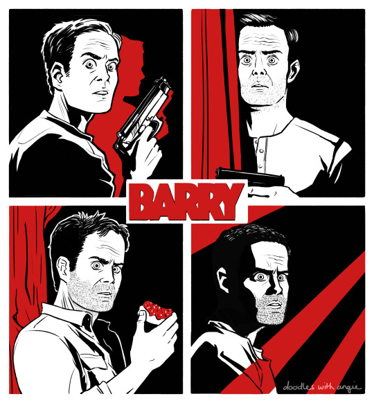
"Am I evil?" "Absolutely! Do I not tell you that enough?"
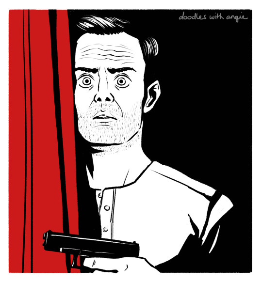
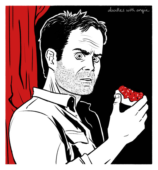
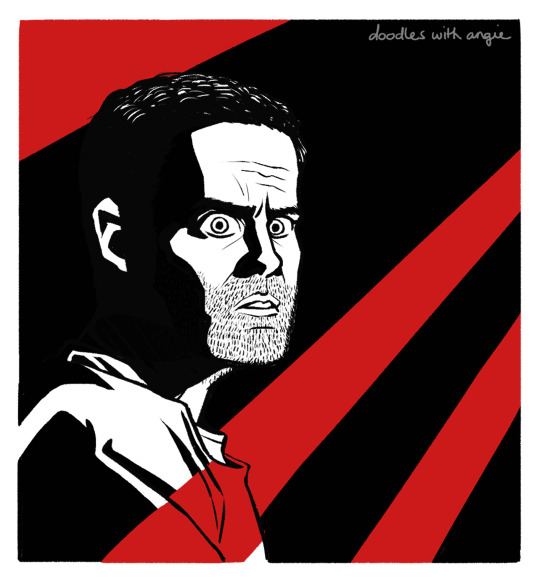
[Image Description: Four panels of Barry from the season posters, redrawn in black, white, and red limited palette. They are connected in the center by the show's logo, "BARRY." Images two through five are close-ups of each panel. Alt Text is provided and copied under the cut. End ID.]
Copied Alt Text.
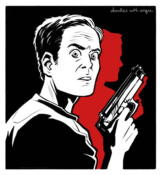
Image Two: Redraw of Barry in the season one poster in black, white, and red limited palette. Barry looks wide-eyed over his shoulder, gun in hand. His reflection is blocked in red behind him.
Image Three: Redraw of Barry in the season two poster in black, white, and red limited palette. Barry is half-hidden behind a red stage curtain and raises his gun.
Image Four: Redraw of Barry in the season three poster in black, white, and red limited palette. Barry leans back against a red tree and holds up a donut with red frosting.
Image Five: Redraw of Barry in the season four poster in black, white, and red limited palette. He is enveloped in shadows, broken up by one of three red beams that radiate from the top left corner.
End Alt Text.
#barry#barry hbo#barry berkman#bill hader#hbo#digital art#artists on tumblr#doodleswithangie#shoutout to bill hader for stressing me out every s3 and s4 ep thus far
317 notes
·
View notes
Text
I really want a Murder Drones boomer shooter
ok so I've mentioned before that I play Doom, and it's my hope to one day make a boomer shooter similar to modern Doom set in the Murder Drones universe. I started learning SFML for this purpose recently, but being a university student takes a lot of time and graphics programming is hard to learn (even OpenGL, which is the "easier" of the graphics APIs :3).
However, in an effort to "ghost of done" this one, I'm going to post some various thoughts I had about what I'd like to see in a Murder Drones boomer shooter. This was inspired by a post I saw that was the Doom cover but redrawn completely with various worker drones and disassembly drones populating the area around Doomguy, who was replaced by Khan. The word "Doom" was humorously replaced with the word "Door" and was stylized in the same way as the Doom logo typically is. I believe the art was made by Animate-a-thing
So, okay, I had two ideas, one of which is exceedingly far from canon and probably deserves its own post because it falls firmly into the realm of "fanfiction" rather than being a natural/reasonable continuation to the story that Liam told. So I'll talk about the other one here, which stems from an idea on Reddit that I had seen (that doesn't seem to exist anymore? I couldn't find it, at the least).
The actual idea lol
Okay, so, picture this: Some time post ep8, the Solver is reawakening in Uzi and is beginning to take control again. Not only that, it's begun to spread (somehow) to other Worker Drones. Now, the Solver has an incredibly powerful Uzi and an army of Worker Drones on its side. Moreover, N is in denial. He believes that there must be some way to free Uzi from the Solver, so, of his own free will, he chooses to defend and support Uzi even though he is capable of singlehandedly solving this conflict.
The only Worker Drone who can put an end to this madness is Khan Doorman. His engineering prowess gave him the ability to construct a number of guns, including an improved railgun that can shoot more than once before needing to recharge. He also created some personal equipment that allow him to jump much higher into the air and dash at incredible speeds. It's up to him to fight through the hordes of corrupted Worker Drones (and maybe even some Disassembly Drones?) that the Solver has set up.
I like this because Khan being an engineer makes this idea make a lot of sense flavorwise. I also think it could be interesting mechanically. For example, if you have to fight some Disassembly Drones, since, in the show, they have the ability to heal themselves (unless they get too damaged, in which case they Solver), that could be represented in game mechanically as "If a Disassembly Drone goes too long without taking damage, it will begin to heal over time. So, keep attacking it and don't take your attention away from it to ensure it can't heal, or use a railgun shot to defeat it instantly." I think this setting allows the story to compliment the gameplay really nicely.
9 notes
·
View notes
Note
One of my characters wears a T-shirt with a real football team logo, is it allowed since the logo is not part of the character itself? The logo in question was a Creative Commons .svg that I edited on to the outfit.
The logo would have to be redrawn for it to be allowed on-site!
27 notes
·
View notes
Text
Ideal belong to https://ficbook.net/authors/3868498
Comrade Raven
I really like his fanfic so I redrawn the logo based on his idea

24 notes
·
View notes
Text
Progress update
Edit: laptop broke (hard drive issue), so thing will either be delayed a week or A Lot depending if my shit is recoverable. Back up your files regularly yall
Realised I should probably update yall on how things are going! Things are almost ready, just need to stich the book together together and finish a couple things, then I can order a sample of the book. I don't want to start the kickstarter until I have a book sample in hand that I'm happy with.
Admittedly looking like my original timeline isn't quite going to fit but such is life. its a close enough timeline so im not too annoyed just not in time to advertise it this weekend
to thank yall for your patience with this, here a sneak peek of the stickersheets made because I'm very happy with them and also because I just approved the proofs the manu sent me for those samples:
disclaimer: colours may vary depending on how the samples turn out (converting rgb to cmyk, my beloathed).
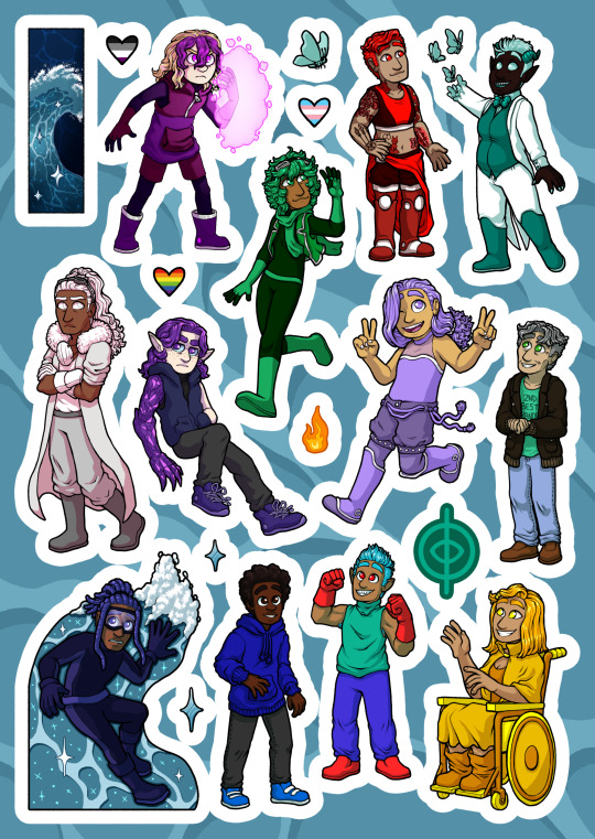
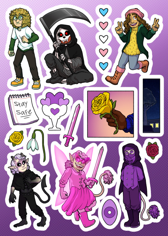
[id: two stickersheets, one of characters from chapter 1, and the other chapter two: chapter 1 sheets has: rami (civilian clothes), his whole team, tsunami, inkmaster, swarm, sound flood, and mori. as well as some smaller stickers: a sparkling wave, rami's logo, two diamond shaped sparkles, a small fireball, swarm's butterly, and three hearts with the ace, trans, and rainbow pride flags. chapter 2 sheet has: lewis and sound flood (both in civilian clothes), iris, faete, mindforce, and omen (super costumes). also several smaller stickers: mindforce's eye, a yellow and pink rose, a snowdrop, faete's sword, iris's notebook (with the words "stay safe"), a starry sky with city view, rami's hand holding a rose, and 5 blue pink and white hearts. end id]
also here's the cover (minus the blurb)
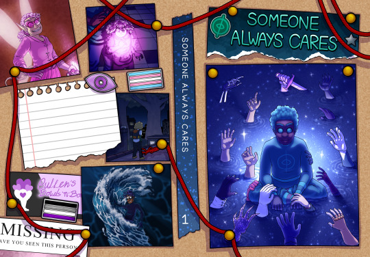
[id: image of the cover design, layed flat. aka the front cover is on the right side, back on the left, and the spin inbetween. designed to look like a corkboard with photos pinned to it, and red sring connecting things. on the back there are photos that are from various panels in chapter 1 and 2 (redrawn, specifically faete after transforming, cam readying her forcefield, lewis on the roof, and tsunami riding his wave. the back also contains enamel pins: a trans flag, an ace flag, and mindforce's eye. as well as the corner of a missing persons poster, a business card for "cullen's bowls 'n' bowls", and a blank sheet of notebook paper where the blurb should be. the spine has some starry washi tape with the title written on. the front has a piece of blue paper torn off at the end with the title on it, and stickers of a silver star and rami's logo. below is a large image of rami sitting in the water staring intestly at the viewer, light emerging behind him. around him, hands all strech out towards him, hands belonging to the significant character significant in chapters 1 and 2 of sac. end id]
so specifically what is left (no particular order):
spellchecking
adding page numbers to the bottom
finishing the rest of the not comic pages (aka the thank you note, about the author, deciation and the bit where im going to add names of people who pledged to the kickstarter) 75% done
character bios (admittedly optional i just want to do them)
bonus pages for art and sketches (i have collected all the art and sketches, its just deciding which ones to ue and which ones to save for next time because it makes more sense to put them with the more spoilery chapters 3-5 specific arts)
assembling these and sending a sample off to print
actually starting the kickstarter (once i have decived book sample back and am happy. i am not starting it without knowing 100% that i can fufill it right then and there)
(in the intrest of transperency: while these are all easy and mostly quick (aside from character bios. havent started that one yet), i also have some upcomign events that will have to take priority. that being a convention this weekend, next weekend, and my sisters wedding the weekend after (and the wedding gift, which is custom artwork of my sister and future brother in law. like a wedding painted but not on the day and also digital. so that will take up a bit of time after [another reason i wanted to get this done before then but ah well])
for real though one day i hope to be able to do art stuff full time because i am. so tired of doing a day job
also also there are versions of lewis and rami stickers in super outfits, they'll be seperate stickers
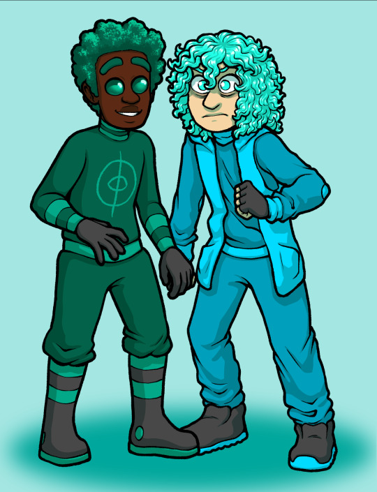
[id: drawings of lewis and rami, same as the stickers in the sheets, just seperate and in different outfits, the drawings have been placed close together, so it looks like thye're holding hands. end id]
you can make them hold hands :)
#also if you're already planning on going to london or bristol anime and gaming con#please feel free to say hi!#if you're not planning#best not to bother you don't want to give them your money#company sucks and i'm not going back#also you can just sneak into the bristol one this weekend its super easy apparently#oh yeah also theres versions of rami and lewis sticker in super outfit but those will be seperate stickers on their own#you can easily make the stickers hold hands
12 notes
·
View notes
Text

Originally released over forty years ago by the Judges Guild, this adventure has been updated with redrawn maps (Dyson Logos) and the artwork of Chris Huth. The adventure has stats for both Neoclassical Geek Revival and Old School Roleplaying games.
If you recognize the name Corey Cole on the cover, it is indeed the same Corey Cole who went on to co-design the Quest for Glory series. As fans of those games, I was glad to have been able to help return this classic gem to print. This thing even has its own Wikipedia article, that is how you know its good.
Get your copy (digital or physical) here: https://www.neoclassicalgames.com/product-page/tower-of-indomitable-circumstance
3 notes
·
View notes
Text
What Fonts does the Canis Canem Edit (BULLY) franchise use for its Logos and Menu Texts? (Gaming) (BULLY) (Canis Canem Edit) (Fonts Blog) (What Fonts)

Logo ©Rockstar Games
Article by @warrenwoodhouse #warrenwoodhouse
The font that is used for the franchise logo is called Narziss Regular by RMU
The font that is used for the franchise menu text is called Narziss Regular by RMU
#warrenwoodhouse#gaming#2024#canis canem edit#caniscanemedit#bullygame#bully game#bully scholarship edition#bully: scholarship edition#bully#fontsblog#whatfonts#what fonts#bully canis canem edit#bullyclass#blogger:bullyclass
8 notes
·
View notes
Text

What time is it in Chi-Town?
#domono08#blogs#cartooning#artists on tumblr#hand drawn#black artist#animation#fan artist#furry fandom#anthro#WGN#wgn 9#logo#logo redraw#art#my art#logo redrawn#chicago#channel 9
7 notes
·
View notes
Note
What is your current idea on the game logo?
Currently the game logo is just the icon I have for this blog (well, it's a redrawn version, essentially). I was thinking about making a new icon for the mac version since I really like making things more specialized. Not sure what it would be yet. Maybe another mini cg that I can convert into a logo.

The current icon for windows at least looks like this but transparent.
Also take a look at my logo for my games. Pretty nice right?
15 notes
·
View notes
Text
A Little Something Extra!
Since we just ended the last bracket, for real this time, I thought I'd share some of the files I made/edited in order to make the graphics for this whole thing. Free to use for whatever you see fit to.
This will be the first part of three. 1/2/3

Staring off, here's the VS logo I made, redrawn from One's Justice.


These are the blank bracket graphics, 16, 32, and 64 contenders respectively. The 64 bracket is a bit insane but I'd seen bigger brackets in the past that only listed people on the left and right and they're really hard to read since everything needs to be so small, so I tried taking advantage of the open space on the top and bottom.


These are the final results images I made. I can't find the original blank 32 image. The coloring was slightly different and I adjusted the colors to make the the last two for the 64 bracket. I based these on the ranking graphics from the sports festival.

Here's the blank podium I use for the final 3. The photoshop is a bit iffy but it hardly matters when you put other characters out there.


I also cut out the medals into crappy little jpegs.


One more thing from the podiums! Since Star and Rei didn't have anime design sheets at the time, I needed to crop screenshots instead. I was too lazy to edit out baby Shoto on Rei though.


These probably don't look familiar! I made these gifs as header images for the first four brackets. I debated making some for bracket 5 and the all star bracket but, frankly, these are a pain in the ass and it would've been very difficult to reformat.

I also made a much more simple gif to put up during significant breaks between brackets.
That's all the standard images, the second two posts will be the transparent edits I made for the character results pages. Take Monchan for now since I just barely can't fit them all in two posts.

9 notes
·
View notes
Text
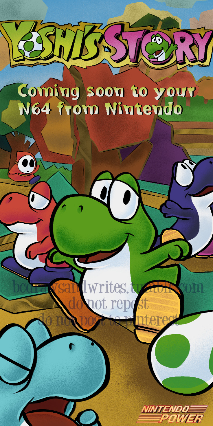
Please reblog if you want to, don't repost! PLEASE DO NOT POST TO PINTEREST.
[ID: The Yoshi's Story poster from Nintendo Power magazine, redrawn in the style of SNES-era Mario art, with the baby Yoshis looking like the classic style. The poster has the Yoshi's Story logo at the top (with the classic baby Yoshi waving from the "O" in "Story"), with the words "Coming soon to your N64 from Nintendo" beneath it and the Nintendo Power logo in the bottom corner. All the Yoshis on the poster are depicted in the classic SNES-era style. In the center is a baby green Yoshi hopping down near a green egg to his left (our right), while looking at the viewer and smiling. A light blue baby Yoshi is in the bottom left corner close to the viewer and throwing a tantrum. Behind the green Yoshi is a baby red Yoshi walking to the left, while to the right is a dark blue baby Yoshi looking upward and waving his arms. The Yoshis are wandering about a forest/field made of colored cardboard, with the grass, dirt, trees, sky, mountains, and even clouds depicted as cardboard. A red Shy Guy lurks in the top left under one of the trees. /end ID]
So the Yoshi's Story issue of Nintendo Power was the first one I ever got, and it of course came with a fold-out poster of the game. I took the poster and taped it to the door to my room when I was about... eight or so, and that poster has stayed there since.
However, as many folks who follow me know, I prefer the classic Yoshi design to... whatever is going on with the modern design, so I had the thought of "what if the baby Yoshis looked like they used to, rather than the weird modern redesign." So I made this!
AND YES, PARTS OF IT ARE TRACED. Since I was trying to imitate the original poster, I did trace the text and the background. There didn't really feel like any reason not to? But I did draw the baby Yoshis myself! I also tried to emulate the Super Mario World coloring style.
Anyway, uh, this took several hours and I'm pretty happy with it. Enjoy??
(...is it "Yoshis" or "Yoshies" I swear I keep seeing both.)
50 notes
·
View notes
Note
Will there be custom health bars and time bars for the D-Side Mod, if so, will they be based around the D-Side Logo stylization (Yellow light at the top and stylized shading)
honestly just a bunch of extra work we don't need to put the effort into when 3.5 is already a huge update, the health bar is staying the same. i will say that the fuck - cool ratings and the numbers from the ui will be redrawn though lol
3 notes
·
View notes