#like. i redesigned violet already and i just have to make a reference for them
Explore tagged Tumblr posts
Text
Local fan kid haver is once again faced with the reality that in order to show and talk about their fan kids, they must first draw and post them. 1 dead, hundreds injured
#also i literally have to redesign them AGAIN#like. i redesigned violet already and i just have to make a reference for them#but i gotta work on bramble i wanna redesign aster again i gotta bring a fan kid back from the shadow realm#hell on earth#skyes soapbox
6 notes
·
View notes
Photo
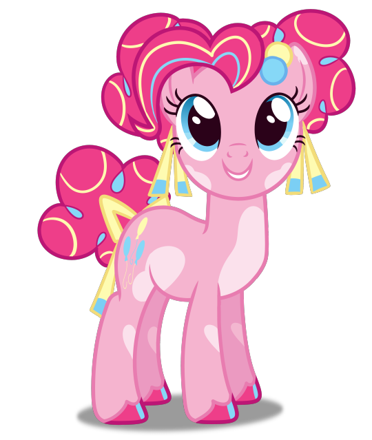


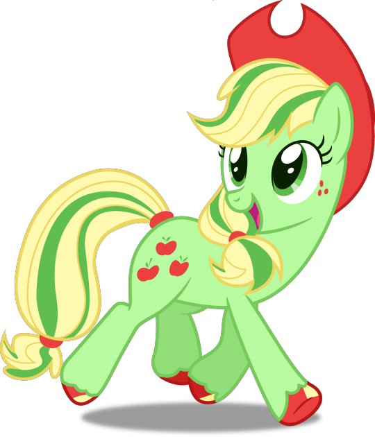

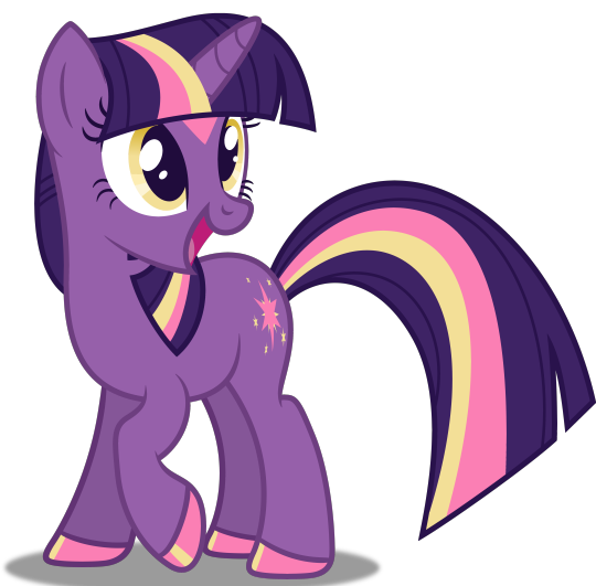
Okaaaaaay here they are!! My Mane 6 redesigns! I’m definitely happiest w/ Pinkie Pie!
Design notes and links to the images I edited under the cut!
If you like these designs, please consider reblogging this post! Likes really do nothing at all for me, but reblogs will allow more people to see my work! Thank you so much <3
General notes: First, I wanted to make them a rainbow! So each one of them represents one ROYGBV colour! Seemed like it would make more sense, that way. I also wanted to give them more noticeable hooves, since they ARE ponies!
Pinkie Pie: I really didn’t need to alter Pinkie Pie’s colour scheme at all! I thought it spoke for itself. That being said, it was still very, very plain compared to the entire rest of her personality. I wanted it to look busy, but the business comes from patterns so you really don’t need to look very hard! I also gave her symmetrical piebald spots, and symmetrical hair buns. I thought it might make more sense for her curls to be a lot tighter! All of that symmetry is supposed to represent the controlled chaos of her personality!
Rainbow Dash: I had a lot of issues with RD’s colour scheme. She’s a very show-off-y character, and the thing she tries to show of the most is her flying! So WHY did they make her THE SAME COLOUR AS THE SKY? I made her orange so that she would be bright and obvious! I also stole some inspiration from G3 Rarity with her mane and tail-- warm colours for her mane, and cold for her tail! When she’s flying really fast, it all comes together to look like a rainbow! And! What colour do you get when you mix every colour (pigment theory, not light theory)? It’s brown! Making her orange allowed me to outline her mane and tail in brown.
Then for her markings, I wanted to give her socks! They look like those long, athletic-wear socks (they’re supposed to, anyways)!
Finally, her earrings! Those are not just part of her design, but I like to picture that she takes them out when she’s about to go flying. Someone needs to hang on to them, though, because she can’t just leave them lying on the ground! Looks like she’s got an audience member for these craaaazy stunts she’s about to practise.
Rarity: I didn’t think there was anything wrong with Rarity, but hell, I was doing the other five, and there was an idea I wanted to try...
She was the last one I designed, and I knew she had to be yellow, but I didn’t want to throw away the royal violet mane and tail! That seemed crucial to Rarity’s design. I thought it would look interesting if they were maybe lined with violet, and boy!! That certainly turned out very well! Then, I eliminated the blue from her design, since it didn’t seem like it added anything, anymore. I’m not super clear on what her special talent actually is, but I figured she needed more references to her passion: sewing/dressmaking. The light gold strands in her hair are supposed to look like golden threads!
Applejack: I might not be the happiest with Applejack’s design-- in fact, I’ll probably redo it at some point! That being said, there are a few core ideas at play here:
First off, almost the entirety of the Apple family is green, or red, or some mixture of both; even those who are yellow/brown have green or red hair to balance them out! And sure, there are golden delicious apples! But Applejack is orange. Which bothered me.
I originally tried to make her red, but I couldn’t find something that didn’t end up with her just looking like Big Mac. Plus, Apple Bloom is already the inversion of Big Mac! Not that siblings can’t look alike, but it felt unoriginal to do something like that. Not to mention, I’m PRETTY sure AJ’s talent will be to take over the role of head of the Apple family after Granny Smith, so I wanted her to look a lot like Granny Smith!
I was originally going to have her lose the hat, because of all the ponies that were going to accessorize, Applejack seems like the least likely one (except for when it’s actually practical, like when she’s actually working the farm), but then there wasn’t enough red to tie it all together.
Fluttershy: The base idea around Fluttershy’s recolour was simple: give her colours to make her stand out less. As a pegasus, she’d probably benefit from blending in with the sky, in theory! So, blue. A green mane to tie together that more natural feeling.
The pink accents are there to soften her. Fun fact: the gradient on her legs was how I was going to originally do socks! It just didn’t look quite right on RD. I wanted to do gradients in her mane/tail, but it didn’t end up looking the way I wanted it to.
I didn’t want to lose the pastel vibes of her original design, otherwise I might have tried a more earthy palette!
Twilight Sparkle: Twilight was the first pony I redesigned! I am very happy with her!!
I wanted to make her seem more magical; it’s really not the darker colours that do this on their own, but the very bright secondary colours against them! Her yellow eyes also really add to this effect, I think! I also made her cutie mark match the new colour scheme.
Violet is already a colour associated with magic, so I knew I wanted to keep that! Blue is associated with wisdom, and while I didn’t get to keep any of it in this new design, I think her gala dress would still be blue! Something can be your favourite colour without it being part of your body! For example, mine is also blue, but I have brown eyes! Guess I’ve gotta stick to blue clothes!
Her diamond is very large, and stretches up and around her horn. I considered giving her glasses, but I have experience with being an avid reader with no friends! I myself do not have glasses. This is a classic case of projection and also not knowing how to draw glasses in this style.
If you read all that, please feel free to let me know what you think! If there’s anything you disagree with, or if you have any advice for future edits, let me know and I’ll keep it in mind for next time!
#My Little Pony#MLP#My Little Pony Friendship is Magic#My Little Pony: Friendship is Magic#MLP FIM#MLP:FIM#MLPFIM#Friendship is Magic#Pinkie Pie#Rainbow Dash#Rarity#Applejack#Fluttershy#Twilight Sparkle#Redesign#Recolour#MLP redesign#My Little Pony redesign#MLP recolour#My Little Pony recolour#Recolor#MLP recolor#My Little Pony recolor#Ponies
58 notes
·
View notes
Text
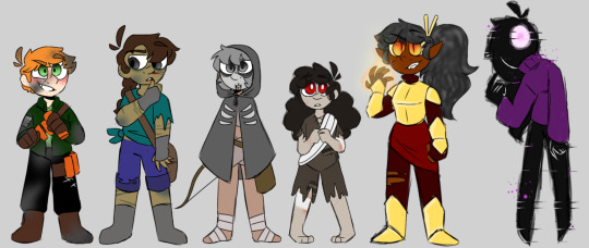
Hello friends and welcome to ☆Hateful Nostalgia☆. I was exposed to the mob talker mod WAY too young bc I was an unsupervised child on the internet watching mod showcases and SkyDoesMinecraft. Looking back these sucked, the stories were often bland and the designs were milk toast at best and tits out at worst. So for the sake of procrastinating on working on anything substantial I grabbed the main 6 I remembered and gussied em up. Redesigns, rewrites, better names, all that bullshit. If your interested in better photos, design notes, story details and rambling hit the basement, otherwise here's a line up you should click for better quality.
Also I wrote all this once before already but I deleted it like a dumb bitch. On the night Unus Annus was murdered in front of my eyes no less. Was a rough fuckin night.
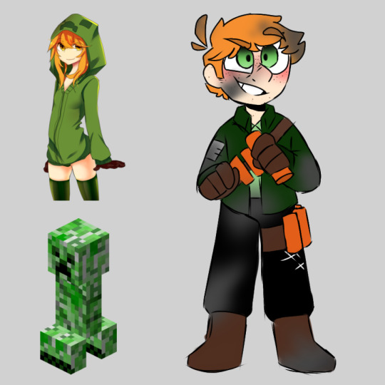
The Creeper- Kupa. An explosive pyromaniac with a habit of making empty threats and yelling. She protects what she believes to be her territory with a suicidal passion, but if you manage to get her to cool down and soften up she's pretty sick to hand out with. Hard of hearing, has at least one bout of head trauma at all times, and deathly allergic to cats.
Because the creeper is kinda the og I wanted to reference AT2's design more than the others, but I'm p sure the only thing I actually kept was the red hair and brown gloves. Otherwise I was doing whatever. I really wanted to lean into the explody bit of creepers, so I gave her some bite and dressed her in clothes referenced from Irish railroad workers. This may also be why I keep imaging her with a very heavy Irish or Scottish accent, whichever would be most incomprehensible when angry. Every color but her skin was color picked from one of the references, with some minor alterations for makes my eyes happy reasons.
With Kupa I imagine a story line with her would largely be about her as a character and her development than like an actual adventure narrative like everyone else. She starts off ready to blow up both you and herself in a misguided attempt to defend what she sees as her's and opens up and learns not everyone is out to get her. Lots of time taken to understand her childhood and how she ended up how she is. Very simple, probably the default or tutorial run people would go through.
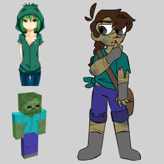
The Zombie- Bee. The ill husk of a missing explorer suffering from a less than conventional appetite. She wallows in her self imposed loneliness, believing herself to be an irredeemable monster doomed to hurt those around her. What she really needs is a buddy and some clue to who she used to be. Rough voiced, chronically fatigued, and prone to spontaneous combustion in sunlight.
I definitely consider this one the weakest for design sadly. I imagined Zombies as humans who went into strange caves and caverns and didn't come out for years, only to pop up as completely different people. I just tossed AT2's design. The first thing I did was make her a bit of a genderbent Steve and tinted her green bc Zombies in game are just Steve but green. Tore up her clothes, colored picked the darkest colors I could from the clothes on the in game and boom, Bee. I do vaguely regret not making her eyes pure black but I also still wanted her to be human enough to fit with the other overworld mods.
Ok so Bee actually has a basic story. When you meet her she's aggressive, but as a warning. She fears the possibility she may hurt somebody so heads for threats immediately. Going back and forth between her cave and village for a while you learn more about the situation with the missing folks who come back and Bee as a person. After a bit you pick her up off her depressed ass and start a nocturnal adventure of refinding your past, adapting to who your becoming, overcoming self destuction, and slow burn babey!!!
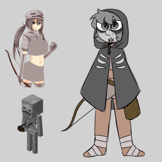
The Skeleton- Ulna. One of the few surviving warriors of a now destroyed kingdom and dead culture. She spends most of her time now traveling alone, hiding in trees and shooting anything see sees as a threat- which is everything- in the face with homemade arrows. Very much suffering from loss of her home and a bad case of lost purpose. A woman of few words, very antisocial, and naturally nocturnal.
I came in with the Skeleton wanting to make her seem mysterious, so my first thought was immediately a cloak and a mask, but I wanted her face to like be visible so I went with the face paint. I didn't actually know that I wanted to do under there so I went with wraps that are reminiscent of the original outfit but still not tits out bc it's so fucking easy! Gave her a quiver, color picked the cloak and face paint from the in game model and the wraps from AT2'S art. I did like. Subconsciously draw her eyes the way I do Asian characters but I didn't have anything specific in mind so like go nuts with what you think she is.
Ulna's deal is very much her lack of purpose or home and the entire thing is about finding that again. She's found sitting up in a tree during a storm pointing a bow and arrow into your face. She eventually let's you stick around until the storm is over and theres some bonding into deep night until the rain stops. You ask if she wants to come with on your little travelling sword for hire business, she says sure, sleep schedule shenanigans, backstory angst, and road trip bonding happens and she eventually decides that helping people is her new purpose and you're her new home
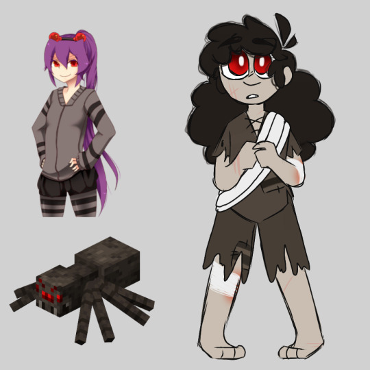
The Spider- Park. A young adult experiencing the world for the first time through her tribe's rite of passage. She's really just trying to figure out how to live life outside of the cave she's been stuck in her entire life and aggressively trying to be an independent adult despite not knowing anything about being an independent adult. Its projection. Blind in the daylight, naive and excitable, and taken to refusing help at her own risk.
Ok so. I don't know who looked at the spider and said "purple haired loli with puffy pants" so I once again yeeted the whole thing, only really keeping the kinda cutesy and childish bits. Spiders are a tribe of humans what live in caves unless they've broken off to live on the surface. Kids are kept inside until they hit a certain milestone, where they come up to explore at night. They're usually small and pale, but are pretty kickass when necessary. Again picked the colors off the in game model, played with the lightest gray for the skin, and bc I couldn't figure out anyway to use the stripes so they're on the patches lol.
Park's meeting is probably the funniest and most meet cute one here, in that she accidentally drops on top of you from a little cliff drop off. Cue loads of apologies and an explanation about the spider deal and being blind in light. She asks for some help getting around and bam babey friendship and emotional attachment! What follows is kinda a buddy of coming of age story with the obligatory goes home and is miserable scene. Generally it's just about being a scared young adult and having someone to fall back on and why that's important. Also crushes and young people being bad at that.
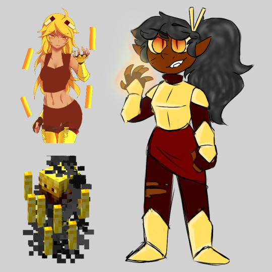
The Blaze- Amber. A demonic entity who would let the world burn and the sun die if it meant she'd get her soul back. She's known for being ruthless, taking souls through force instead of making deals like other Blazes. Keeps this forceful nature even once she's become friendly, makes you do dump shit. Territorial, eyes glow and dim with her life, and runs remarkably warm.
Amber here is the first one I actually did! I was just. Really tired that she was in a bikini. I decided early on I wanted overworld mobs to be human and everyone else was decidedly not, so Blazes are demons who gave up their souls under false pretenses to other Blazes. Because of how little clothes AT2's design wore I had essentially free reign and my thought was immediately to lean on golden knight bc of how Blazes are found protecting fortresses. The gold isn't picked from anything bc I was looser with the colors, but everything else is, and the hair is supposed to represent the smoke. Also the sticks in her hair are blaze rods bc I don't like them just floating around her.
Amber is found in the Nether obviously, protecting a fortress and immediately trying beat your ass and either incinerate you or make you give up your soul. During you prove yourself a p damn good fighter and she makes a deal to show you how Blazes exist and pursade you to give your soul up willingly. Bonding happens and she explains where the souls go and what happened to her. Insert line about how she dug in the sand for her soul until her fingers bleed bc I'm an Arcana freak lol. In general I'd just like her to learn to adapt to who she is now and learning to live life well instead of letting her anger burn her up from the inside out.
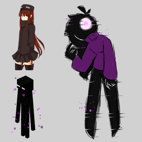
The Enderman- Violet. A confused but sweet young bit of void created by and connected to the Ender Dragon. Her relationship with reality is tenuous at best and abusive at worst, making stable existence rather difficult. She doesn't know a name, age, gender, anything about herself aside from that she likes sweaters. Communicates primarily through psychic connections, docile and sweet, and melts like a witch in water.
Violet was incredibly easy, so this may be way short. Endermen are decidedly human shaped void from the End with varying sentience. They're direct extensions of the Ender Dragon, and nobody knows how they're made or where they come from, not even they do. Adventurers who escaped The End say they seem scared of it though. Violet in particular is pretty damn new and extraordinary nonconforming, and I tried to show that with her sweater and ponytail. Once again, literally all colors picked. Definitely the simplest but one of my favs.
Violet is the sweetest meet up I think. As your traveling between villages you notice a strange enderman watching you and plant a little flower in front of her. She picks it and you hear a happy little trill come from you and a pretty voice say thank you in your head. Now you have a tall dark teleporting travel buddy! After a little bit of back and forth she tells you in some broken English that the Ender Dragon made her but she doesnt know how, and that it's bad and needs to be killed for the sake of Endermen and that's the new goal. Spoiler they're the corrupted souls of those that died fighting it, with it gone Endermen are free to exist as their own being and do whatever, hurray!
#cosmic entity's art#minecraft#mob talker mod#mc creeper#mc zombie#mc skeleton#mc spider#mc blaze#mc enderman#character design
16 notes
·
View notes
Photo
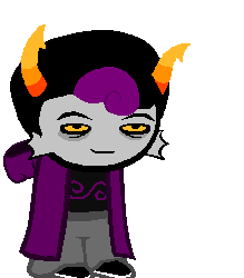
I hope TR is ok! Of all the things i expected as an intro that was the most concerning :[ Anyway with that out of the way, I’ve decided to rope this guy in lieu of Lutifi’s revision.
I’m doing okay-ish! I was dealing with repetitive stress injuries in both wrists and those are moooostly on the way out but now I have sprained my ankle because I am a comic relief character in a cartoon lmao.
World: Alternia
Name: Haneul: meaning “heaven/sky” in Korean. and Caeles surprisingly having no meaning when I looked it up but it it could be a variation of Caelestis, a late latin term which meant “of the sky, heavenly”.
Hmmmm. I find it really, really interesting that you have a sky-themed Blood player. Especially when so many other aspects of his character have to do with limiting freedoms.
If I may suggest a potential alternate name, perhaps Haneul Catena, the last name meaning “chain?”
Age: Possibly around 6-7 sweeps
Theme/Story: Originally, he had no real theme until I sent in Serena, the purple blooded mafia boss. That is when he became her brawn, getting things done that Serena herself can’t do. Then with Lutifi’s revamp, this gave him the perfect opportunity to act as a co-regent for Lutifi when he is out and about with his surfing. So now he is an agent for Serena as well as a consultant for ruling with Lutifi like how Louis XIII of France heavily relied on Cardinal Richelieu. In light of this co-regency, Haneul has also thwarted several assassination attempts on Lutifi during his surfing competitions. Later in his session, he would eventually snap and cause a bloodbath nearly wiping out the entire session, destroying the bonds of all the players. Yet the Seer of Time survives and goes back and warns the past Seer about that timeline.
I am curious: what does the Seer of Time do differently to ensure he doesn’t cause a TPK?
Goals: Mostly a check if everything fits together narratively and such. If a re-design is needed, then sure design away!
Specibus: I would go with Hookkind, like roadhog’s hook
Fetch Modus: Prison: Basically when you capchalogue something it is closed off by bars. To retrieve the item, you must captchalogue another item. Below the area labelled “Required”, either the item’s name is written or the item is pictured. When nothing appears, you have to give it money, which is why this modus is a complete ass sometimes.
Nice! So it’s a bribery system, almost? Perhaps you could have particular important items set “bail,” meaning they can leave if they provide the requested item and will give them back to you when the important item is recaptchalogued.
Blood: Violet, It was a bit brighter at one point, then I changed it to be closer to cannon.
Given the strong themes of imprisonment/freedom binaries I may possibly suggest making him teal.
Symbol: A bit swirly compared to the other violet signs…
Handle: thonicAcidaemia
Quirk: ᔕ SurroundS hiS SentenceS with theSe weird S thingS ᔕ
Ehhhh as far as I can tell that’s just a letter from the Canadian aboriginal alphabet and doesn’t seem to contribute to any kind of theme. How about he:
§ Open§ up hi§ §entence§ with §ection §symbols?
It’s frequently used to reference sections in legal code and T B H at this point I am very strongly advocating that you make him a tealblood.
Lusus: Possibly a Sea Snail of some kind
If you wanna keep him violet I’m not sure a snail would be appropriate unless he is very very slow. Given his need to be adaptable in situations, may I suggest maybe a ligerfish, with the spines of a lionfish and the teeth of a tigerfish? Beautiful, ethereal, fulla teef.
If you make him teal, I would suggest a flying squirrel! It works nicely with his dual grounding/freedom themes.
Interests: He keeps most of them a secret but has a soft spot for the equivalent of extreme sports are on Alternia. Every now and then he likes to build model hives but they always end up as if a hurricane swept through them due to his short temper outside of his work.
Personality: A Rough ‘n Tumble sort of guy. He mostly keeps a stoic “don’t give a fuck” sort of facade during his odd jobs.
Dream Planet: Derse; Honestly i’m not certain on the whole dichotomy on how the sways work.
If you’re looking for a guide, CD wrote an excellent one right here, but based on what you’ve given me I’m unsure, and I think it’s up to you! Does he resent having to babysit Lutifi, or is he delighted to have purchase on this kind of power? I think the latter would be a Dersite and the former a Prospitan.
Title: Bard of Blood
I agree that he’s a Blood player, but given what you’ve written in the bio I have no way of determining if he’s a Bard. If he invites destruction through bonds, is it because he enables poor ruling decisions through his friendship with Lutifi? Is it because he uses people’s bonds against them to rip his session apart?
Land: Land of Sulfur and Brimstone: Now that I look at this, it sounds like Hell II: Electric Bugaloo
I like it! I would kinda love it if you had a gag where he walks around his land with a clothespin on his nose.

So here’s a redesign for if you re-spec him to teal! If you wanna keep him violet I still gave design notes you could incorporate.
Horns - gave ‘em a little S-curve!
Hair - Hair in Alternia is rarely as neat as the one on the left, so I sprited it messier
Face - the face was looking a little ripped from canon sprites so I wanted to edit all of it to look more unique. Also I added teef because I like them.
Coat - I removed the hood because it looked awkward and didn’t really seem to add to the flow of his design?
Symbol - I just used the section symbol on its side since it already looked similar to the symbol you sprites
Shorts - Equius’s shorts, to show off the…
Boots - which are adapted from fan-troll, which I meanly wanted to use to again contrast the flowiness of the cloak to the groundedness of the shoe.
That’s about it! Thanks for your patience with the review.
-TR
#violetblood#seadweller#submission#nitrodax233#haneul#caeles#haneul caeles#catena#haneul catena#tealblood#tr review#review#redesign
3 notes
·
View notes
Text
The End
- This episode gave me too many emotions so just expect me to be rambling nonsensically and screaming, okay? Okay.
- BEATRICEEEEEEEE!!!!! I LOVE HER SHE’S SO CUTE I MUST HUG HER!!!!!!!
- I really love how they kept in the sheer utter amounts of DONE the Baudelaires were with Olaf. No fear anymore, just sheer annoyance. I’m so glad they kept that.
- They really were about to push Olaf off of the boat, huh? GOOD, I would’ve sued if they had messed that up.
- THE ISLAND IS SO FRICKIN BEAUTIFUL AAAAAAAAAAAA
- Friday is so cute aaaaaa I’m love her!!!
- Ishmael is just oPENLY WALKING???????
- That mysterious statue? Heh. Nice reference to ATWQ there sggffghh
- Olaf was really about to go haywire and start shooting everyone, huh? That sure is an Olaf thing to do.
- Olaf’s sudden realization about who Ishmael is was actually so scary, he looked genuinely terrified.
- No healing clay? No magic weather predicting?? Oh well, we still got raw fish!!
- Awwww, no scenes where the Baudelaires are just helping out on the island and being peaceful :((
- Klaus’s Beautiful Jokes TM were removed :((((
- The island is very much a cult
- Man, the Baudelaires are ROCKING those robes.
- And they’re also rocking the boat, if you get what I’m saying ;))
- Of course you do, I’ll just shut up now.
- Speaking of robes, I love the redesign with the pinkish colour!!! Looks like a sunset!!! So pretty!!!
- Olaf sitting all trapped in the birdcage is actually hilarious
- The screaming match of “Let me out first!” “Tell us first!” was literally so great agafsffh
- The Baudelaires just up and leaving, you GO guys!!
- The pathetic “can I at least have a blanket?” added 10 years to my life. Not quite enough years to regain all of the years Netflix stole from me, but ya know. Close enough.
- The tree house looks so cool!!! I want to live there!!!
- Ishmael literally just went and said “drink the cordial” as if this place wasn’t cultish enough.
- KITKITKITKITKIT KIT KIT KITTTTTTTTT!!!!!!!!
- THE BOOK RAFT!!!!!!!!
- WAIT. THE SUGAR BOWL. CONTAINED SUGAR. THIS WHOLE. FRICKIN. TIME.
- And since Daniel Handler’s an executive producer on the show, this means it’s canon...
- Don’t get me wrong I’m not mad!!!!!!! Not at all!!!! I’m frickin ECSTATIC!!!!!!!! We actually now KNOW WHAT’S IN THE SUGAR BOWL THIS IS HUGE NEWS!!!!!!!!!!!!!!!!
- I knew Olaf’s Kit outfit was horrendous, but HOLY CRAP does it look AWFUL!!! Netflix, you really outdid yourselves!
- Ishmael really just went haywire and shot Olaf, didn’t he?
- Well, uh, there goes the deadly fungus I guess.....oops...?
- The Baudelaires stumbling over to the tree whilst coughing their lungs out...
- The Baudelaires flipping through the book desperately, their breathing becoming more and more laboured....
- The Baudelaires standing up after finding the answer....before just collapsing on the ground.....
- The Baudelaires’ voices becoming more and more raspy and quiet, the coughs becoming louder, as they just lay on the floor, saying “this isn’t it, this isn’t it”...but physically incapable of getting up, only able to turn themselves so they’re facing upwards, their breathing becoming slower and slower and slower.......
- Right before Inky comes in and produces an apple. Giving it to Sunny, who in turn gives it to Violet. Violet’s hands are trembling and she can barely bring it to her mouth. She turns to give it to Klaus. Klaus is already almost unconscious, his eyes are closed and he’s barely breathing. Barely moving. Violet presses the apple to his mouth. Klaus manages to bite, gripping Violet’s hand desperately in the process, but barely having the strength to.
- They all sit up. Alive and well. There are tears in their eyes as the laugh and hug each other. All alive. All breathing.
- Netflix pulled off that scene so well. I was literally sobbing my eyes out at that point. I’m still crying just thinking about it. That scene held so much raw emotion that my eyes burned. I was SO EXTREMELY NERVOUS that Netflix would ruin it. But they didn’t. They did everything right. THANK YOU SO MUCH NETFLIX!!!!!!!
- Heh uh....sorry for getting so dramatic there....I just have a lot of feelings.....
- KIT REFUSING TO TAKE THE APPLE NOOOOOO
- I knew it was coming. In fact, I was hoping it would happen, because it adds that extra layer of emotion. But my heart still stopped and I felt a strong feeling I cannot describe when I saw Olaf’s bleeding torso with a harpoon sticking out.
- Olaf’s tone change when Kit is mentioned though.
- That scene with Olaf carrying Kit through the water was so dramatic I’m love
- Olaf and Kit kissing and then Sunny immediately going “Yuck” added about, I’d say 7, maybe 8, years to my lifespan. Sunny, you queen.
- Olaf and Kit talking to each other. Reciting poetry. Laying on the beach side by side. Both of them gasping for air. I don’t know how to describe how I felt, it was an ethereal experience. It was not joy, though.
- Olaf’s death. His death shouldn’t make me sad. It shouldn’t make me cry. I feel no mercy for him. But still. It always makes me cry. It never fails. And the show made me cry too. Thank you Netflix, for confusing me emotionally (which is what the book did too so thank you for keeping that)
- Kit’s message before her death had me sobbing. There’s so much emotion in that scene. As Kit doubles over coughing. As Klaus holds on to Bea. As all 3 children are crying. And the cherry on frickin top is when Kit falls still, and the shot cuts to a silhouette of them as Violet cries out “Kit? Kit?!?”, her voice becoming increasingly distressed. So much raw emotion....they really pulled it off.....
- Now, onto a different note: BEATRICE’S FIRST BIRTHDAY, YAAAAAAAAY!!!!!!!!!!!
- I WAS SO HAPPY SEEING THE BAUDELAIRES ACTUALLY BE A HAPPY FAMILY AAAAAAAAAA MY HEART WAS ACTUALLY LEAPING AND MY CHEEKS WERE (AND STILL ARE) WARM!!!!!!!
- Also we finally got to see Bertrand!!!
- The Baudelaires sailing off at the end on the Beatrice, all of them smiling and sitting close together like a family. Netflix really just went and made my whole month, didn’t they???
- FERNALD AND FIONA!!!!!!!!!! AND THEY MEET UP WITH WIDDERSHINS AGAIN!!!!!! AND THEY’RE EATING CHEF’S SALAD!!!!!!! AAAAAAAA I’M LOVE THEM!!!!!!!!!!
- Olaf’s past associates being all successful as actors really made my heart swell dang...
- And they were all REALLY rocking those outfits!!
- Just like how Inky came and rocked that outrigger, am I right? ;)))
- Ok, I’ll actually stop now...
- Lemony’s face when he realized the note was from Beatrice aaaaaaaaa!!!
- LEMONY AND BEA!!!!! LEMONY AND BEA!!!!!!!!!! THEY’RE SITTING IN THE TEA PLACE AND HAVNG A NICE OL CHAT I’M SO HAPPYYYYYYYYYYYYY!!!!!!!!!!!!!!!!!!!!!!
ANYWAYS, I suppose that wraps up all of my reviews!! I can’t believe it’s.....over........no that can’t be right. I REFUSE TO BELIEVE IT’S RIGHT!!!!!! Anywayyyyyyyyy, I’M SO HAPPY WITH HOW THIS TURNED OUT!!!!!! I was SO scared they were gonna ruin it, but they DIDN’T!!!!!!!!!!!!!! Sure, I would’ve liked to see some things different, like I really wanted to see some flashbacks with the Baudelaires and Beatrice and/or Bertrand while they were still alive, but this is still AMAZING!!!!!! This has been the most emotional season yet!!! THANK YOU SO MUCH NETFLIX!!!! I literally cannot convey the amount of emotion and love pouring out of my system right now, so take this screaming and rambling to answer that! Anyways, as always, thank you for reading, and I hope you all have a good day/night!!!! <333
(I feel so empty now......)
#asoue#asoue season 3#asoue season three#the end#netflix asoue#asoue spoilers#asoue season 3 spoilers#asoue season three spoilers#asoue opinions#I have so many emotions swirling around in my system right now....#and yet#I feel so empty now....
16 notes
·
View notes
Text
Portfolio Breakdown: Recycling
Water Bottle: Original version:
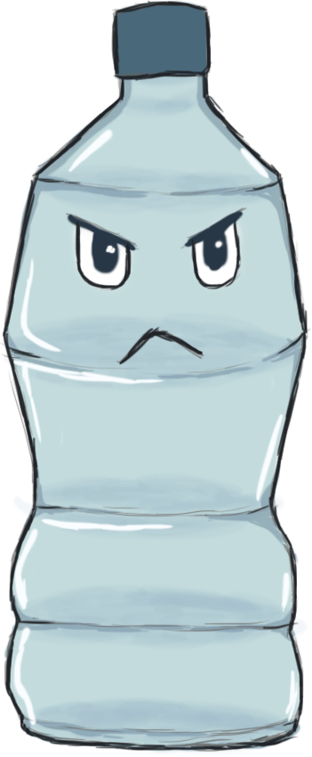
This was my original first rough design for the water bottle. I wasn’t super pleased with it as it was a bit rushed. We felt that an empty water bottle fit well with the recycling theme.
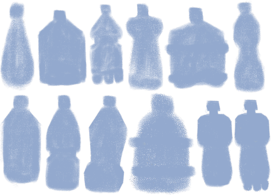
To redesign the original, I made a bunch of silhouette shapes of bottles to see which people liked the most. I especially liked the bottom right one, as it is shaped in a somewhat human-like way, with a neck, large shoulders and the bits on the bottom look like feet (albeit three of them, so not so human). This one became my initial base for the final designs. Final Variations:

Blue bottle, angular eyes.

Pink bottle, large angry eyes.
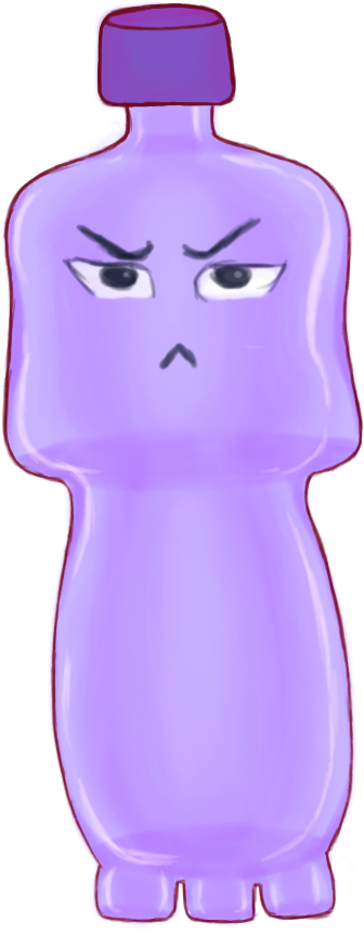
Purple bottle, smaller squinty eyes.
Out of these, the blue version was my favourite. I provided a variety of eyes for the character here to vary their personality through their expression a little, but different eyes could be combined with a different from colour from that which I gave. I am fairly happy with how the design came out, although I would now redesign it to be more symmetrical and use a proper reference for the ‘feet’ on the bottom as I improvised those, although they are supposed to be exaggerated anyway. I would also clean up the outline a bit.
Progress: I used Hue/Saturation layers to provide the different colour options and set the eye sets all on their different layers in groups.
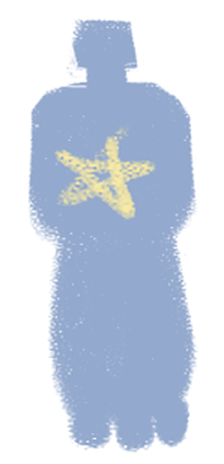
When I sent over silhouette bases to the modellers, those they liked they sent back to me with stars marked on them, as seen above, so we all agreed on the design. I took the base above into Photoshop and used it to set the general shape of the bottle.

I cleaned up the shape in another layer. This was one of my very first designs for the game so I had not set the outline very cleanly like I learned to with my later designs. The outline I added later disguised the mess of it.

I added another layer and used a Soft Brush with a lavender shade. I wanted to give the bottle depth, to show it was transparent.

I added some soft shading in the middle sections.
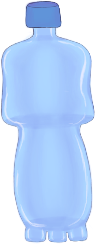
I added some lighting on another layer to show the bottle is shiny.

I added the first light outline and the first set of eyes in another layer.

I duplicated the outline layers to darken them, and then later used the Hue/Sat layers and eye sets for the other versions of the bottle.
References:

(Staples, N/A) It was a while back, but I believe I took my reference for the bottle shape from a bottle similar to this and squared it out myself to look more human-like.
Soap Bottle:

This was another early design which only has one version, as the modellers had not considered adding it to the game after viewing it. If they had, I would have created alternatives and a better design. This type of object was chosen as a character as it was not super clear what kind of things we would be having for the recycling level early on. It turned out to be mostly food related, with bottles, drink cups, wrappers etc. However, I still feel something like this could have added some variety into that theme. I shaped it to appear a little like a bird, with the top of the bottle being like a ‘beak’ with where I positioned the eyes. If I were to redesign it, I wouldn’t set the eyes on the ‘top’ of the bottle as I have here, it is incorrect. I would thicken the top section and put them on the side just below, so that the top isn’t pointed downward as if it were bent. However, I am pleased with the vibe the character has.
Progress:

I started off with a roughly shaped out bottle. As with the water bottle, it was an early concept and so wasn’t blocked out as neatly as later concepts.

I added some basic shading to show the depth of the bottle and transparency with a soft brush in a new layer.
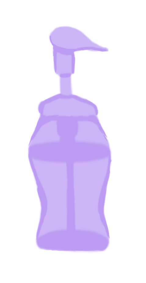
I added more shaded in the centre to show the centre pump.

I added some violet shade to add some colour depth in a new layer. I also added in the eye in its own set of layers for the pupil, iris, shade and outline.
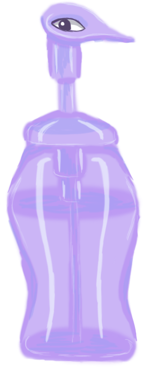
I added a new layer for shine, also adding some shine to the eye it.

I lastly added an outline, which helped to disguise the rough outline.
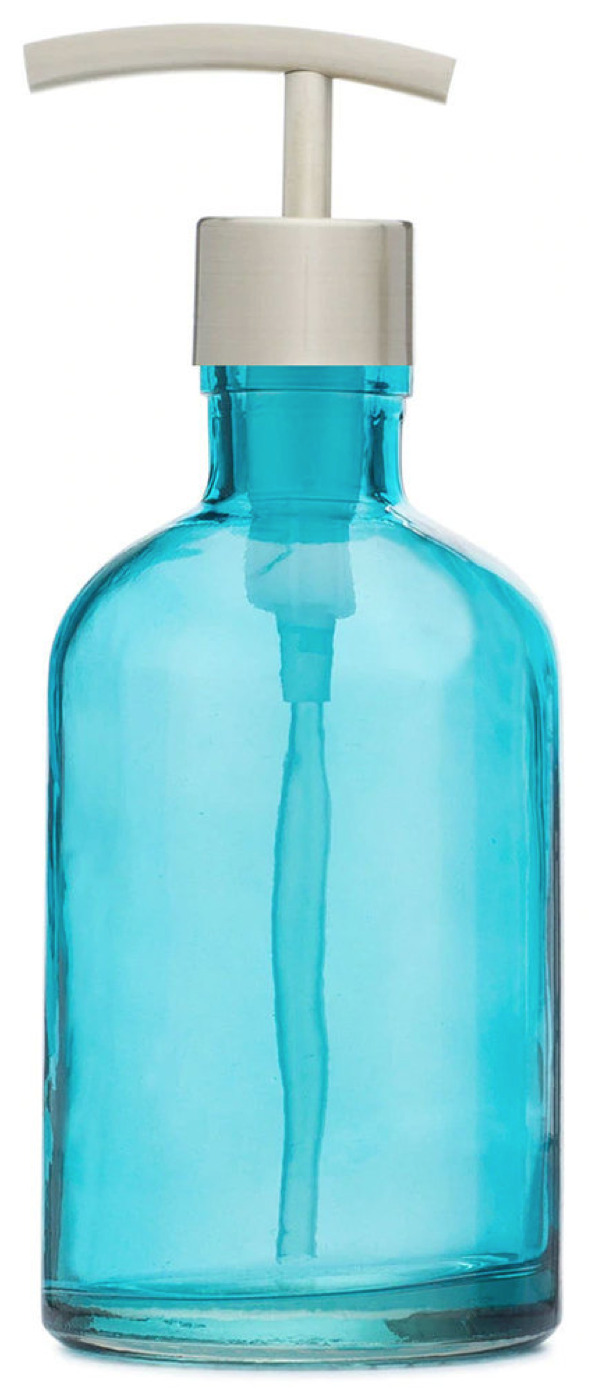
(Rail19, N/A) I did not use many references for the bottle design, but it was such as the above which gave me the reference for how to draw the pump down the centre and the cap. I gave the bottle a curvier body as a design choice.
Candy Wrapper:

Being made of plastic and food-related, this was chosen as a good idea for the recycling level. This was another of my first designs, as I designed the majority of the Recycling designs before the Deforestation ones, as we had not yet set which level we would have first. I only designed one version of this, but had plans to design it in different ‘flavours’ as this is meant to be raspberry - as seen by the bottom left berry - and I wanted to create orange and blueberry, perhaps grape. This was my favourite design out of those I created, as I like how the candy rip appears like a scar across the left eye. However, I had plans to change the shape from less square to more rectangular, because it may only be my view, but the way the rip goes with the shape also reminds me a bit too much of a condom. This is the main reason I added a berry in the bottom left, to make it clear it is food packaging. I would also clean up the outline a bit if I redesigned it.
Progress:

Originally, I had blocked out the outline of the wrapper in one uniform block but I later in the same layer added on the jaggedy bits on the top and bottom and the erased parts for eye hole and scar slashes.

In here, I added a new layer in a lighter colour to add some shine depth.

I added another layer of shine and some lines on the top and bottom, as many food packages have this detail. I also added lines to show the plumpness of the package and a red iris to the eye.

I added a flat colour layer for the berry design.
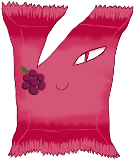
I added shading and a green leaf to the berry and outlines to the package.
References:

(Birdman, 2017)
It was actually difficult to find any good references for a ripped/used candy wrapper which looked aesthetic enough. This is why the rip in my design is pretty stylised.
With the above, I used it as a reference for the spiky bits on either end of the wrapper and the little lines there also.
Plastic Cup:
This idea was another very early enemy concept idea, back before I was set as the concept artist.

The above was the initial sketch done by Carolina.
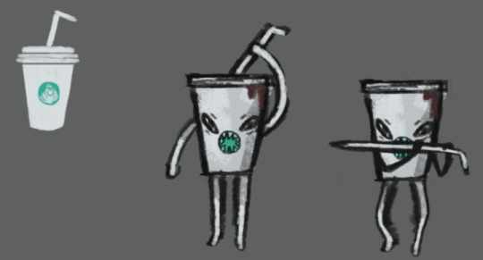
This was a little later design which she made of it also, where the logo in the centre turned into a mouth and the straw turned into a type of sword. Although it was not super necessary for me to do so, I designed a couple of alternative cup lids for this design below, as the facial features/straw/limbs were already something set in stone. So this is more of a shared concept where I offered small alternative tweaks. I believe this is one of, if not the first concepts which were modelled, which was why I was behind in doing the full design all by myself. It was very early on and Carolina was already attached to her initial design.
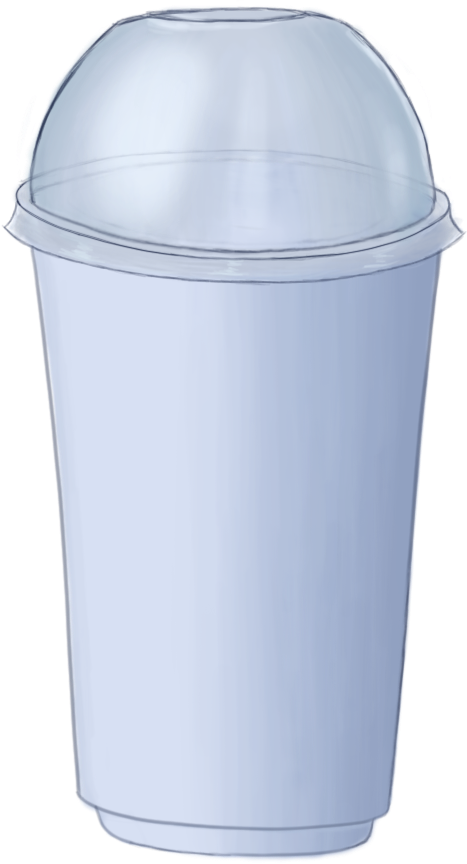
This was an alternative lid design, where it could be more like a bubble tea type of cup, rather than a coffee cup. I also added the little ‘platform’ detail at the bottom which it could have instead of just a straight bottom.
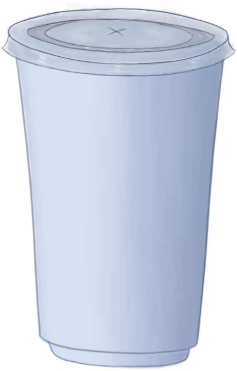
This is very similar to what you may find on a Starbucks cup, which was what she was modelling hers after initially, but the very top is more akin to a McDonald's cup in a sense, such as with the little x in the centre and the very centre circle pops up a little, rather than laying flat. It is transparent, rather than white, which makes it more akin to a fast food drinks cup. I am quite happy with how the design turned out. The outline could be neater, but I am pleased how the shading came out, particularly on the plastic bubble lid. If I were to redesign it, I would add slightly more blue hues in the lid as it is too grey and flat.
Progress:

I initially started out by blocking out the silhouette in one layer with a soft brush.

I used layer constraints in a second layer to shade over the cup with a soft brush and add in some base lines around the lid and bottom to draw over later. I shaded this section as an open cup, as the lids would be transparent and placed over them, so that the transparency would be more accurate.
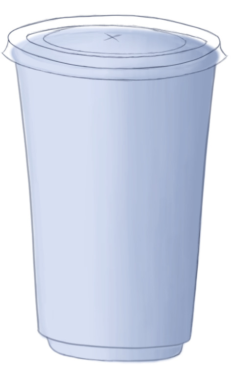
I drew in the outline of the cup and the first flatter lid in more layers.

I used layer constraints in another layer to shade the plastic colouration of the lid and add lighting with a soft brush.
Lid #2:

I used the first flat lid as a base when drawing in the bubble lid, as you can see from the outer rim. To do this, I duplicated the first lid layers and erased the centre colouration and lineart.
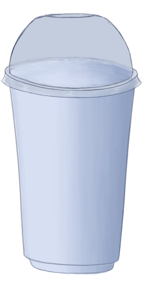
In here, I partly erased the lineart on the other side of the bubble lid, so that they are still slightly visible but only to give a transparency effect. I also added the base colour for the lid in another layer.
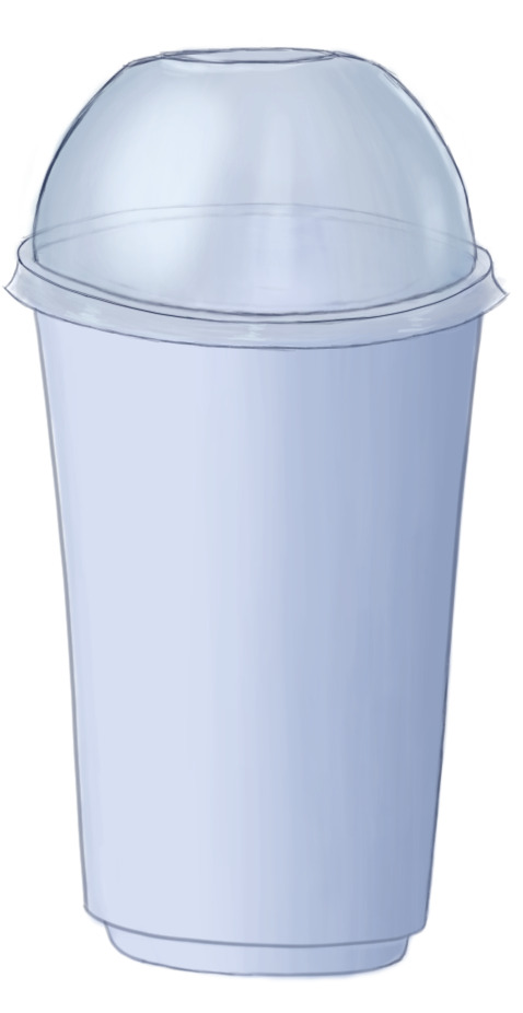
I created another layer and used a soft white brush to add a shine effect.
References:
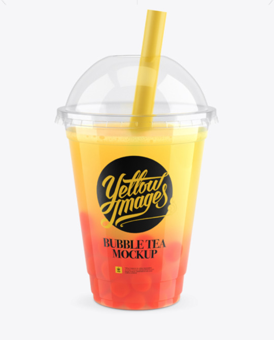
(Lukianov, N/A) This was one of the main references I had for the bubble tea lid. As seen, it has the top gap for the straw and basically the same bubble shape.
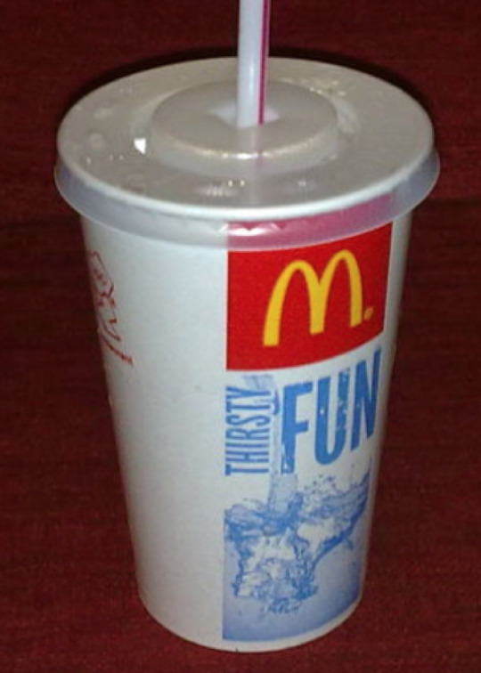
(Glowe997, N/A) This was a reference I used for the flatter lid. As seen, it has an inner section which pops up a little and, although not seen, the entrance for the straw is the same. The rest of the lid arrangement was improvised.
Batteries:
These were another design based off of an initial sketch by Carolina before I was set as the enemy concept artist.
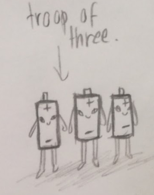
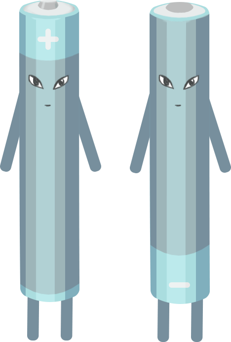
This was the sketch which Carolina created. My updated version of the design was the final design I created for the Envirovaders project. There was some conflict within the group over creating this design. As the 3D modellers are supposed to create the designs I give them as the concept artist, and I had given them a bunch of finalised concepts which had not been created yet, Carolina decided to ignore that fact and go back and create her own, this design, instead. I felt this was incredibly rude, as she had not told me to update the sketch to a final concept, as is my job, she merely told me she would be modelling her own design here, ignoring all the concepts which I had designed which she had not made yet and removing my input from my own role. There were several designs for her to work on. I felt she was stepping out of her place here as the concepts are my job and we already had this issue at the beginning, back when solidifying my role as the concept artist. I decided that if we were to be using this design, that is fine, but I would be turning it into a finalised concept, as I am meant to do, and so I did. I only got around to creating the one colour version, but I changed the set of batteries from a troupe of three into two, as this made more sense, as batteries tend to work in pairs. I also made one positive and one negative, so their designs are opposites, rather than all one of the same. I did not have time to create more versions, as I had already been running around creating my original concepts when Carolina threw this at me. I had to create a finalised design before she finished the modelling she had already begun. This is also why the shading is blocky, as I used shape layers instead of painting the shading, so that I could complete the design faster. If I were to redo it, I would soften the shading, paint it organically, and give more colour options. However, I am happy with the plus/negative flip to the design.
Progress:

I created the basic shape by creating a rectangle using the preset Photoshop shapes and then using the Warp tool on both ends to get the rounded shape.
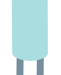
I made the legs and arms in duplicates from one rounded rectangle shape. I made the base for the top of the battery from a warped oval shape.

I added some shade to the battery top using layer constraints and added detail.

I added a middle stripe section to the battery by duplicating the body layer, changing its colour and warping the top of it down into the opposite curve. I created the plus sign from rounded rectangle shapes.
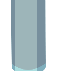
I added blocky shading to the sides using rectangle shapes. I constrained these shapes to the main body layer, so that the sides of them would constrain to the main shape and not go over the lines. I warped the top end of them to fit around the top rim.
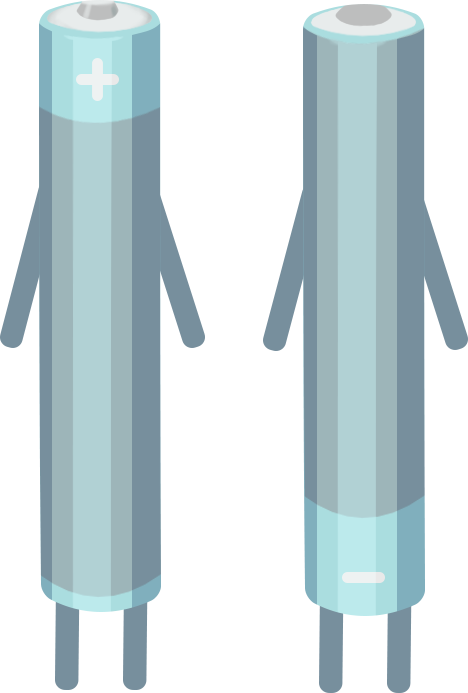
I duplicated the battery layers and flipped its design for a negative battery twin, changing its sign to minus by turning off the layer for the horizontal plus sign in the duplicate layer.

Lastly, I added the same set of eyes to each, as I wanted them to be twins.
References:

(Petovarga, N/A) This was my main reference for the batteries, in particular for I shaded them in blocks.

(Schututman, 2014) This was a reference for the colours I used. I felt that the blue/grey colouration looked pretty, although mine is not precisely the same. I did of course plan on providing different versions if I had had the time, such as orange/black similar to Duracell batteries. The top part was also a reference for me on how to set the top of the negative battery, as their tops tend to be flatter than positives.
Works Cited:
Birdman, 2017. Sustainability. [Online] Available at: https://sustainability.stackexchange.com/questions/6320/what-is-this-candy-wrapper-made-of-solely-plastic-or-mixed-with-something-else [Accessed 5 May 2019]. Lukianov, A., N/A. [Online] Available at: https://yellowimages.com/stock/orange-bubble-tea-cup-mockup-high-angle-view-13821/ [Accessed 5 May 2019]. Petovarga, N/A. [Online] Available at: https://www.123rf.com/photo_50386389_stock-vector-vector-illustration-of-isolated-cylinder-batteries-in-cartoon-style-.html [Accessed 5 May 2019]. Rail19, N/A. Rail19. [Online] Available at: https://rail19.com/beach-blue-glass-lotion-soap-dispenser-with-metal-pump/ [Accessed 5 May 2019]. Schututman, D., 2014. Alamy. [Online] Available at: https://www.alamy.com/stock-photo-cartoon-illustration-of-two-batteries-fighting-for-energy-111634524.html [Accessed 5 May 2019]. Staples, N/A. Staples. [Online] Available at: https://www.staples.co.uk/water/cbs/223326415.html [Accessed 5 May 2019].
0 notes
Text
@chrisjoshington
Okay before we start: CD I first saw this submission through my mobile browser and therefore had no idea that you sent it and was gonna message you to BEG you to hold it for me. I love them so much holy shit. And I have some ideas.
Alternia, Beforus, or AU: Alternia
Themes/Story: Corday is nb and uses he/they/she interchangeably. He’s basically Theater Kid taken to its logical extreme. They’re a master of the art of disguise and utilize this skill to aid the rebellion. And also do some assassinations. So there’s her themes; theater, disguise, assassination.
Thank you for giving this offering to me, an Adjacent to Theater Kid. I am planning a murder mystery party for my birthday. My birthday was three months ago. Corday is invited.
Name: Corday Nopper
Corday is a reference to Charlotte Corday, Marat’s assassin. Nopper references Noppera-bō, a mythical creature that disguises itself as human and can wipe off its face like a chalkboard.
I…I never knew about Charlotte Corady before I read this holy shit.
Age: 9 sweeps,19.5 human years
Strife Specibus: Knifekind
I wanted to keep it simple and discrete for him. It’s also just subtly, just a little bit a reference to the assassination of Julius Caesar.
I think you could also maybe get away with Staffkind if he’s into musical theater because of the pun.
Fetch Modus: Monologue Modus. They have to monologue for a minute about an object without saying the name of the object and their modus has to guess which item he’s talking about.
My main concern with this modus is that it doesn’t seem like Corday would use this one because it would require too much noise if they were sneaking around. Maybe a CHARADES MODUS? It plays into the acting without them needing to speak, and it lends itself to comedy when they need to retrieve, for example, a Perfectly Generic Object.
Blood Color: Indigo
They’re described as the enthusiasts of the spectrum and I thought that fit well for the level of Passion she brings to her job.
Special Abilities: Nothing aside from the usual blueblood strength.
Symbol and Meaning: I’ve been split between Sagio and Sagirius. I’m leaning Sagirius though since it’s called “the Bardic.”
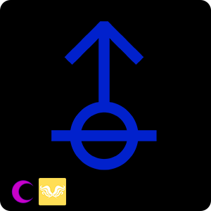
I can see either one working for her tbh, but I LOVE Hope players so I side very strongly with Sagirius.
Trolltag: zealousDeathspian. Zealous references their enthusiasm, Deathspian is a portmanteau of Death and Thespian.
DEATHSPIAN IS SO GOOD. What about dramaticMurd–I’m kidding I’m kidding. If you wanna go even harder on the theme maybe Deathspion to include “espion” in the title?
Quirk: As neutral as they can possibly make it. Outside of their acts, they like to project a relatively neutral image to make them harder to pin down. They are partial to (~: emojis, though. Their one identifying marker.
Ex: Just as normal as can be. Definitely not a fun assassin or anything. (~:
They change the quirk up between disguises, though!
Lusus: Probably a big raccoon with many faces. As a reference to shapeshifting racoons in Japanese mythology.
Personality: Have you ever met a method actor? He buys into roles with all the enthusiasm possible. If you have any question about her disguises’ lives or personalities or likes or dislikes, she has a thorough answer. If she has a long mission playing a character with a broken arm, she will Break Her Arm.
They’re committed to this because they thoroughly believe in the good of the cause and that if everyone just works hard enough, they’ll succeed, and succeed Soon. They’re definitely an optimist to a somewhat critical degree. They expect most things to go right simply because they believe in it.
He also has a tendency towards the ruthless. When he’s got a mark, the mark will die. He’ll do anything to accomplish his goal. He has a strict moral sense, but that moral sense includes Never Fail To Follow Through On A Promise.
She’s predisposed to drama and acting over the top when hanging out with friends, but can actually be a very serious and competent person when she needs to be. Dedicated and focused and responsive and passionate.
Interests: Theater, Musicals, Costumes, Makeup, Sculpting, Glassblowing, Jewelry Making- Basically anything to do with costume making. Soap Operas, Trashy Dramatic Tabloid Magazines, A Good Knife.
Title: Witch of Hope
Hope seems to fit her because of her strong convictions and optimism as well as her willingness to do anything to reach her goal. He has a strong personality, so an active class makes sense. But the Witch comes in in the active change, the need to shape and mold the nature of all that potential and optimism that he holds into a usable form.
Land: Land of Drapes and Pinion
Dream Planet: Derse
Design party…:

Leftmost: Their True Appearance/how they dress in front of friends. They hacked off their horns so they could put fakes in their place because they’re just that hardcore. And he also designed a new symbol to do a little more anonymity preservation. The shoes are from fan-troll.
Blue: This is what she wears if she wants to walk around discretely. The goal is to be as generic as possible. The shoes are John’s!
Purple: He disguises himself as a Bartender/Candy Vendor and runs in highblood circles to get Intel. The symbol is meant to look a bit like a lollipop. There’s sopor candies stuck in his hair. And I couldn’t decide on a good makeup so I did like… paint that looks like drool and a black eye. The suit and pants are both from fan-troll.
Violet: Her most recent disguise, she assassinated a violet Career Adviser and took on her role. And uses this as a way to meet people she can convince to join the rebellion.
Listen…I love him so so much my redesign is the MOST minimal thank you for this joy. I especially love that you kept visual continuity with the eyes without compromising your vision for him as a master of disguise.
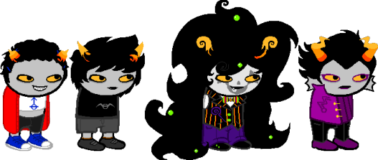
Okay SO. Minimal minimal changes idk if I’d even go top to bottom. Let’s go left to right?
True Self
I liked how you gave Corday’s casual duds this very “hanging out backstage before curtain call” vibe so I pinned their hair back the way one might if they were gonna wear a wig over it.
I also figured like. Breaking her horns its badass and all but it may be difficult to fit a prosthetic horn over that? So I gave her slightly shaved down horns (she could even do this with her knife!) that could potentially fit a prosthetic over them.
For his mouth I really liked the look of his teeth but I figured if they stuck out too much then they would difficult to conceal when he was undercover so I colored their outline in grey to keep the definition while visually implying that they’re set further back from his gums.
For their shirt, I gave them their real symbol. If we’re gonna push that this is how they are with their friends then that’s them at their messiest and most relaxed, which would include aspects of their True Self.
Other than that just a few outline changed but all in all it’s a real good look.
Generic
So I edited the symbol you originally gave to her true self and shifted it over, mostly so it could feasibly comply with multiple sign languages? I also edited the horns so they’re just pointy and not so arrowlike.
For their disguise, I wanna explain my reasoning. So we know that hemoanonymity is effective in that people genuinely can’t tell what your blood color is, but that it’s also see as childish and immaturely rebellious, so doing so may bring you attention in a way that simply wearing a shirt with a blood colored symbol may not.
BUT
A really, really effective disguise makes the onlooker draw their own conclusions and feel much smarter than you are. So, fine! Let his symbol be hemonanon! Deck him out in grey-colored clothing that’s indistinguishable from others’ fashion choices.
but
If you look closely you’ll see that they’re wearing bronze ankle socks. They’re very small! Barely noticeable! Almost like something they’d worn them by mistake.
Someone speaking to her would obviously roll their eyes at her greyed-out sign and cast about for hints of her “real” blood color and see the socks. Aha, they’d think, she’s slipped up. Forgot to leave those at home, huh? And now that they think of it, it’s obvious she’s a bronzeblood. It’s not just the circle in her sign either; she may not be dressed to the nines, but look at the touch of mascara around her lower lashes! The slight gleam of her lip gloss. Typical bronzebloods. They can try to hide their blood color all they want, but their desire for creature comforts will always give them away.
Barvendor/Candytender
Once again, not much to change here. Made the white threads in their suit yellow for that little pop, and swapped out the tie for a loud bow tie for the whimsy. I also adjusted a few stands of hair that felt like they were laying oddly.
For the face paint, between the candy association and the single sharp snaggletooth, he’s already halfway to being a jack-o-lantern, so that’s what I used for his makeup! Other than that he was perfect.
Career Advisor
I lengthened her jacket collar and her sideburns to more deliberately cover up the space where there would be a line between her face and her fin; we don’t really know how far practical makeup can take us in this instance. Aside from that though I really didn’t have any fixes and tbh that was more because I felt like I had to futz with the sprite a little bit.
I LOVE THIS TROLL SO MUCH LONG LIVE CORDAY.
-TR
#chrisjoshington#corday nopper#corday#nopper#indigoblood#purpleblood#(sorta)#violetblood#(kinda)#review#redesign#tr review#submission
10 notes
·
View notes
Text
Hello mods, I hope you’re all doing wonderful! I’ve been a long time fan of this blog, and I’ve just made a troll based off of Ursula from the Little Mermaid films. I hope I’m doing this right!!
I LOVE URSULA WITH MY WHOLE BIG FAT GAY HEART THANK YOU FOR THIS GIFT
Your name is MURANA VANTIA and you ARE A TEENAGE WITCH.
FIRST: Alternia or Beforus or some type of AU? Alternia
Name (preferably include how you came up with it and why): Murana Vantia. Murana comes from Muraenidae, the family of Moray eels. Vantia is from Vanitas, Latin for vanity, emptiness, and worthlessness.
Man the reasoning for all this is so tight. Given that Ursula has not once, but TWICE gone undercover, you may want to also give her a go-to alias besides her FLARP name. Perhaps based on Divine and just as shamelessly transparent? Maybe EIVIND?
Age: 6 sweeps (about 14 years)
Strife Specibus: tomekind? I’m kind of stumped, maybe she just whacks people around with her tomes, and her ancestor’s journal.
I think 2x3tridentkind works fine here since she does get ahold of it from time to time. A large part of her quest could actually be the pursuit of the weapon just to fill her specibus. As a backup…hmmm. We’ve seen Void players with fistkind before, representing an absence of weaponry. Given Murana’s theme, how about screechkind? Can easily be “upgraded” using others’ voices and accessories such as megaphones, but stands well on its own.
Fetch Modus: Cauldron Modus. Murana can easily captchalogue items, it seperates them into their basic components and places them in bottles on a'shelf’. Murana has to pour the right bottles into a cauldron, making a potion. It can take a bit of time to find all the required ingredients, and is a bit of guesswork most of the time.
I love it! It’s basically a more complex version of Jane’s recipe modus. It would also be interesting to see how the cauldron modus might break up the component parts of, for example, a voice.
Blood color: Violet #7C0072 (in reference to Vanessa’s eye colour in the movies, and also because sea witch & not ruler of the sea)
Also her skin is literally purple! I love it!
Symbol and meaning: A Trident, Ursula pursues Triton’s trident in the film, and is ultimately killed by it
Trolltag: charmedGibbet
Quirk: 3- Doesn’t change much, speaks properly and clearly. Calls trolls ‘sweetcakes’ and other nicknames like that. Ends all her sentences with 3-. Her laugh is like AHAHAHAHA!
Special Abilities (if any): None, except for her highblood strength
I mean I think the nature of Murana’s character is such that she inherently *does* have abilities that exceed that of a normal seadweller. You could even convincingly argue that that’s why she’s exiled; a wary empress would have to get Gl’bgolyb to kill off a significant amount of the population before her screech reached the psychic anomaly, so it would be more expedient to get her out of the way via exile than to kill her off.
Lusus: Two headed moray eel. Murana and her lusus get along brilliantly. The two heads are meant to represent both flotsam and jetsam, Ursula’s lackeys, and her two-faced nature. Murana cares for her lusus, and witnessing her death sends her into a rage unlike any other.
Hive: Murana lives within the bones of a dead creature known as a leviathan. Her room is built into a massive bone. The only point of entry is a large hole in the floor.
I know that this is pulled from canon but given her lusus lemme spin this for you: Murana is living in her lusus’s massive corpse after its death. This gives her both a creepy lair AND a visual symbol for her unwillingness to move on from the trauma of her lusus’s demise.
Personality: Murana is a cunning and merciless woman, she fears nothing! Her lusus taught her all the essentials of survival, and how to get a good deal. Anything she wants she can get. Murana has a burning desire to be heiress, she thinks it was her rightful place to usurp the empress. She sees herself as merciful, generous to poor lowbloods.
Sounds great! A good touchstone is Pat Carrol’s own perception of Ursula, which is “part Shakespearean actress, with all the flair, flamboyance and theatricality, and part used-car salesman with a touch of con artist.”
Interests: Dark magic, FLARPing(as her witchy character Arsulu), Troll Sabrina the Teenage Witch (she owns a box set, she’s not messing around), Tending to her potted coral. Murana posesses a crystal ball and cauldron. She also possesses a book from her ancestor, which she reads religiously, and a necklace which she refuses to wear. She also likes to do her makeup, she has to look very good for her guests.
Hmmm. Why does Murana refuse to wear the necklace?
Title: Thief of Hope
…I mean I can DEFINITELY see how it works but after hint upon hint upon hint you’re not gonna make her a Witch? Witch of Hope still fits very, very well with what she does.
I think you could go a step further and maybe have her be a thief of hope PRETENDING to be a witch of hope? Using her magic to disguise herself after realizing her true nature. -CD
Land: The Land of Castles and Changes, LOCAC. Murana’s quest is simple, she must become the Queen of the yellow ladder snake consorts by defeating Aite, the denizen, and restore hope.
Hmmm. SBURB generally likes to challenge and even antagonize its players rather than feed their existing personality. This is almost too heroic a quest for Murana, I feel. Até also means the hubristic action taken by the hero that ultimately leads to their death. This is a troll who believes herself to be great, and one that SBURB would likely want to bring down a peg! Consider: Land of Uprisings and Downfalls (LOUAD), which is meant to lead Murana to believe that her quest is to overthrow Aite, uncomprehending of the fact that the planet requires her own downfall for the denizen to restore hope. Despite being an active class, this is a quest that would demand an inward change to advance the narrative.
Dream Planet: Derse
Ancestor: The Faustian Overseer. (FUCK I love this name!) A beautiful witch to help those poor unfortunate souls. Her primary target was those on land, as their blood was so low they surely had little luck. Notably, she could make it possible to walk if you couldn’t, see if you were blind. But she always expected pay, and not in the way one expected. The Overseer left behind three objects. Her crystal ball, her journal, and her necklace.
Dancestor: Morcan Vantia Based off of Ursula’s sister Morgana. She was never quite good with magic…
thank you to whoever reviews this!! <3 i hope you have a wonderful rest of the day
I am already having a wonderful freaking day for seeing this submission. Boy howdy! Let’s go to the fucking redesign!!!!

Horns – aside from the note that she doesn’t wear her necklace, there really weren’t a lot of nods to what’s considered Ursula’s most iconic accessory, so I resprited her horns to resemble the nautilus shape. With that said, I do like her original horns since there’s a fan theory that the ordinary, curved horns we see on robots and movie posted are the societal ideal.
Hair – it’s not that you have to have the same hair as a character after which they’re themed but with this character??? With that iconíque widow’s peak??? It’s just got so much personality.
Face – I mostly kept it the same but I made her lipstick a little duller to match the rustblood range, which is presumably the class with which she professes solidarity to lure them into Faustian bargains.
Body – I noticed that you stuck a couple of fan-troll’s outfits together to create a sweetheart neckline, so I went one step further and used fan-troll’s more chesty lingerie template to really emphasize her curves. I feel like this is a character where her weight is exceptionally important, so I also tried to give her a bit of a belly.
Skirt – I always feel like this particular fan-troll template looks a little awkward because you can’t see how the skirt falls. This is edited from dixieko’s fancy Prospit/Derse dress, though I edited it so much that it maybe doesn’t even resemble the original product anymore? Whatever. Credit where credit is due.
Shoes – I could easily make up (pun intended) a reason for the lipstick color that was canon compliant, but not so much for the blue shoes. Since you put such an emphasis on her being fancy, I decided to just go with heels in her blood color. It also contributes to her imposing figure.
So that’s about it! All in all, I really feel like you did your research and made a troll that did justice to my favorite, favorite, FAVORITE villain.
-TR
2 notes
·
View notes