#kpi dashboard
Explore tagged Tumblr posts
Visit Tumblr Blog
Explore Tumblr blogs with no restrictions, modern design and the best experience.
Last Seen Tumblr Blogs


Fun Fact
Tumblr is used by 21% of adults online aged 18-29 years.
Text
Deal-Breaker KPI's to Measure Success of your Influencer Marketing Campaign

A consumer got inspired by an outfit of a renowned fashion brand all because of the unique content created by an influencer. On the other hand, an influencer got hardly 1000 views and no comments on her recent reel after collaborating with a food brand. This is where KPI’s come under observation to analyze audience’s behavior towards the content created by the influencers. Measuring Key Performance Indicators (KPIs) in influencer marketing becomes essential to evaluate a campaign’s impact. They ensure that the campaign aligns with business goals, whether they be increasing brand awareness, driving sales, or enhancing customer engagement.
Notably, KPIs play a pivotal role in calculating Return on Investment (ROI), shedding light on the financial effectiveness of influencer marketing efforts. Beyond financial metrics, KPIs empower data-driven decision-making and facilitate comprehensive reporting to key stakeholders. Now that the value of KPI's is clear, let's discuss some essential Key Performance Indicators every business must look into to measure the success of an Influencer Marketing Campaign.
Goal Alignment: KPIs are directly tied to campaign goals. For instance- A brand collaborates with a popular beauty influencer to create engaging content showcasing their new product line. Their specific campaign goal is to create buzz around the new product. Thus the influencer's content is designed to introduce the new products to the influencer's millennial audience, aligning with the brand's goal of increasing awareness among this demographic.
Top KPI's to look for while measuring success of influencer marketing campaigns
Conversion Metrics: While a business has multiple campaign objectives to achieve, the major goal that drives a business towards success is sales and conversion. A brand becomes popular not just with its marketing strategies but also with how many leads it can generate in a period of time.
An easy way to monitor conversions from the influencer marketing campaign is to track sales prior to, during, and post-campaign, and analyze any fluctuations in sales that coincide with the campaign period. For a more advanced approach, giving promo codes to the influencers can be an easy strategy to track the sources of traffic for customers who converted during the campaign.
Follower Growth: Tracking the number of new followers gained during or after a campaign provides a clear indication of its impact on expanding the influencer's audience. Positive follower growth suggests that the influencer's content and the associated campaign are compelling and attracting new followers to the brand.
Let’s say for instance while scrolling through your Instagram, you found an amazing dress. You clicked their page to get hands on an outfit that best matches your needs according to the occasion and your budget. Unfortunately, the hefty amounts didn’t let you move forward and you decided to step back by not making any action again.
On the flip side, you found your favorite and budget-friendly dress at another brand and decided to purchase and even follow their official IG page for future updates and needs. This is a real conversion! When a user decided to follow your page in a hope that he/she will find a product suiting their need. KPI here played its part by painting a real picture of the success. Remember, you aren't just trying to reach as many people as possible: you're also trying to convert them into and loyal customers and fans.
This factor is often labelled as CTR or Click-Through Rate. CTR measures the percentage of users who clicked on a link within the influencer's content, indicating the effectiveness of the call-to-action. A higher CTR suggests that the audience is not only engaging with the content but also taking the desired next steps, such as visiting a website or making a purchase.
Reach and Engagement Likes, comments, and shares are vital engagement metrics in influencer marketing. A good engagement is emblematic of how well your audience engages with your content. Likes indicate the popularity of the content, comments reflect direct interaction and feedback, while shares amplify the content's reach.
Higher engagement rates suggest that the influencer's content is going well with the audience and generating interest and conversation. Your count of loyal customers will depend on how well your engagement is. Reach on the other hand symbolizes how many users have come and viewed the influencers’ content.
Our influencer marketing platform simplifies the entire campaign process from onboarding influencers to measuring the success of your campaign. To know more about us, visit our website- https://www.marqeting.in/
#entrepreneur#startup#marketing#sales#business#ecommerce#influencers#influencer marketing#influencer marketing platform#kpi metrics#kpi#kpi dashboard#social media#instagram
2 notes
·
View notes
Text
0 notes
Text
#kpi metrics#kpi stands for#kpi vs okr#kpi dashboard#kpi solutions#smart kpi#kpi analysis#kpi and okr#kpi benchmarks#key performance indicators#key performance indicators (kpis)#key performance indicators for employees#key performance indicators vs metrics#key performance indicators for project management#kpi key performance indicator#key performance indicator and dashboard#key performance indicators advantages and disadvantages#key performance indicators articles#key performance indicators and critical success factors#key performance indicators benefits#blog on key performance indicator#key performance indicator calculator#criteria for key performance indicator#difference between objective and key performance indicator
0 notes
Text
Unlock Your Business Potential with KPI Dashboards: Get Started with Free Templates
KPI dashboards are like the navigational compass for organizations, honing in on the metrics that matter most. They're the go-to tool for managers, supervisors, and other key stakeholders to keep a close eye on how well the organization is doing and where it can do even better. Think of them as the "show-and-tell" of data, where you'll find sales figures, production metrics, inventory levels, employee performance, customer service metrics, etc. These dashboards are your personalized cheat sheet for business success. #KPIdashboards are different from other types of #dashboards, such as operational, strategic, or analytical dashboards, as they focus on specific key performance indicators and on tracking progress toward specific goals.
This dashboard is available as a free template. You can use it to visualize your sales data automatically in just a few minutes.
Grab these free sales KPI dashboard templates:
Hubspot Sales KPI Dashboard Template
Pipedrive Sales KPI Dashboard Template
Salesforce Dashboard Template
KPI dashboards play a pivotal role in ensuring that organizations stay on course toward their objectives. By focusing on critical metrics and goal tracking, these tools empower leaders to make informed decisions and drive continuous improvement. Their distinctiveness lies in their commitment to quantifiable success, making them indispensable in the modern business landscape. Click here to find other dashboard examples that can ease your daily efforts.
#digital marketing#dashboards#data analytics#data visualization#marketing dashboards#sales data#sales dashboards#kpi dashboard#kpi metrics#kpi#dashboard templates
0 notes
Text
Using SMART KPI for Actionable Results: Advanced Strategies
Businesses must identify and measure the most relevant metrics to guide decision-making as they aim to improve their performance. Key performance indicators (KPIs) are used in this context.
KPIs provide a framework for measuring and analyzing performance against specific goals, but their effectiveness depends on how well they are defined, refined, and analyzed. In this guide, we will explore advanced strategies for using SMART KPI to drive actionable results in businesses.
Refining KPIs for Actionable Results
To ensure that KPIs are effective in driving actionable results, businesses need to evaluate their relevance and alignment with their objectives. This involves setting achievable targets using benchmarks and identifying potential data sources for measuring and analyzing KPIs. Businesses should also ensure that their KPIs are Specific, Measurable, Achievable, Relevant, and Time-bound (SMART), as this framework helps to ensure that KPIs are relevant, actionable, and focused on outcomes that matter.
A KPI dashboard provides a real-time visual representation of an organization's key performance indicators to help monitor progress and drive informed decision-making.
Advanced Data Analysis Strategies for Using SMART KPIs
Data analysis is a critical aspect of using SMART KPI for actionable results. Once KPI data is collected, businesses must analyze it to gain insights and make data-driven decisions. Here are some advanced data analysis techniques that companies can use to get the most out of their KPI data:
Correlation analysis
To determine the nature of the connection between two variables, statisticians employ correlation analysis. By analyzing the correlation between KPI metrics and other variables, businesses can gain insights into the drivers of performance and identify areas for improvement. For example, a business might find a strong correlation between customer satisfaction and repeat business, indicating that improving customer satisfaction is key to driving business growth.
Regression analysis
Regression analysis is a statistical technique used to identify the relationship between a dependent variable and one or more independent variables. By analyzing the regression between KPIs and other variables, businesses can identify the factors most predictive of performance and use this information to make data-driven decisions. For example, a company might use regression analysis to identify the factors most predictive of employee turnover, such as compensation or job satisfaction.
Predictive modeling
Predictive modeling is a technique used to predict future outcomes based on historical data. Predictive modeling allows businesses to forecast future performance and identify potential risks or opportunities. For example, a company might use predictive modeling to predict future sales based on historical sales data and market trends, allowing them to make informed inventory management and production planning decisions.
Text analytics
Text analytics is a technique used to analyze unstructured data, such as customer feedback or social media posts. By analyzing text data, businesses can gain insights into customer sentiment and identify areas for improvement. For example, a company might use text analytics to analyze customer feedback and identify common complaints or issues, allowing them to make targeted improvements to their products or services.
These advanced data analysis techniques allow businesses to gain deeper insights into their KPI data and make more informed, data-driven decisions. To help businesses leverage these techniques, Grow's SMART KPI dashboard software includes advanced analytics tools, including correlation and regression analysis, predictive modeling, and text analytics. Businesses can stay ahead of their rivals and make strategic moves to outperform them with the leading Grow analytics platform.
Communicating KPI Results for Actionable Insights
Once businesses have analyzed their KPI data, they must effectively communicate the results to stakeholders. This involves developing a KPI dashboard and reports that showcase KPI performance, using data visualization tools to make it more engaging and easy to understand. Businesses should also ensure that the KPI insights are communicated in an actionable way so that stakeholders can use the insights to drive strategic decision-making and continuous improvement.
Leveraging Technology for KPI Success
Technology plays a critical role in making KPI metrics more effective. Businesses can use technology tools to streamline KPI data collection, analysis, and reporting. This includes using tools such as business intelligence software, data analytics tools, and machine learning algorithms. In addition, businesses should integrate KPIs into existing technology systems, such as enterprise resource planning (ERP) systems, customer relationship management (CRM) systems, and marketing automation tools.
Try Grow dashboard today and see the difference it can make in streamlining your KPI integration process.
Conclusion
Using SMART KPIs for actionable results requires businesses to refine their KPIs, analyze KPI data using advanced techniques, communicate KPI insights effectively, and leverage technology for KPI success. By implementing these strategies, businesses can better understand their performance, drive continuous improvement, and achieve their strategic objectives.
To help businesses implement SMART KPI effectively, we recommend trying Grow's SMART KPI dashboard. Our software offers a comprehensive suite of tools for setting, measuring, and analyzing KPIs, as well as data visualization and reporting tools for communicating KPI insights to stakeholders.
Ready to take control of your business performance? Discover the power of a KPI dashboard with Grow's innovative software. Find out more about What is KPI dashboardand experience the difference Grow can make for your business. Get started today and see on Capterra grow.com how easy tracking and monitoring your critical real-time performance indicators are.
Try it now to see how SMART KPIs can transform your business performance.
0 notes
Text
https://www.bloglovin.com/@vastedge/kpi-dashboards-a-visual-guide-to-business
Unlock the power of KPI dashboards with this visual guide. This blog post provides insights into how KPI dashboards can enhance business performance by offering clear, actionable data visualizations. Learn how to design and utilize these dashboards to monitor key metrics, make informed decisions, and drive strategic growth.
#KPI Dashboards#Business Performance#Data Visualization#Key Metrics#Dashboard Design#Performance Tracking#Business Intelligence#Strategic Growth#Data Analytics#Visual Analytics
0 notes
Text
Cómo Crear Dashboards para Restaurantes Efectivos: Guía Completa 2024
En el competitivo mundo de la restauración, tomar decisiones informadas es crucial para el éxito. Como chef consultor con más de 20 años de experiencia, he descubierto cómo los dashboards con métricas válidas y en tiempo real, diarias pueden transformar la gestión de un restaurante. ¿Tienes poco tiempo? Aquí tienes todo lo que necesitas saber para crear dashboards efectivos para…
#Administración de restaurantes#Control de costos en restaurantes#dashboard#KPIs#métricas#restaurante
0 notes
Text
Field Sales Analytics Solutions: Your key to smarter business decisions. Harness data to optimize sales strategies and achieve better results. Connect us Today.
#Filed sales Analytics#sales analytics#sales dashboard#track sales performance#field analytics#retail store performance analysis#kpi in retail#retail store performance dashboard#performance optimization analytics retail outlet#route optimization analytics#retail outlet performance#retail outlet performance analytics#performance optimization anlytics#field sales analytics#secondary sales analytics
0 notes
Text

Quer saber como o tratamento de dados na logística está revolucionando as operações de e-commerce? Então, acesse o link acima e confira.
#dados#business intelligence#ebook#logistica#dashboards#indicadores de desempenho#kpi#operações#suply chain management#e-commerce#delivery
0 notes
Text
Identifying the Alarming Signs: Your Legal Team Needs Professional Operational Support!
For any organization, the legal team is its backbone. Every single decision and every single action has certain legal limitations and consequences, which need to be efficiently identified before the due course of the process takes place. However, amidst the tons of documentation and complex legal framework, your in-house legal team may face certain challenges regarding operational support.
You could ask them to work extra hours and manage it all on their own, but do you think that is the right approach? Wouldn’t you want them to be working on the strategies and fixing problems while you can outsource the basic operation work to specialized firms? You might have missed out on the party, but leading organizations have started outsourcing legal operations KPI reporting to the firms that offer specialized operational support.
Drowned in paperwork
Ask any legal professional what their nightmare is, and most of them would tell you that it is the documentation. Going through hundreds of papers just to find that one thing that makes sense can be nothing less than a daunting task, but that’s also essential to be done. You can argue as much as you want, but you also know that it would be better to have your legal minds focus their intellect on things that actually matter and not the tiring documentation.
Constant miscommunication
Manual handling of documentation and verbally exchanging the crucial elements of it can often turn problematic. We’re humans, and we can miss out on certain things quite frequently, but that doesn’t justify the inefficiency created because of ineffective methods. If you see your legal team struggling to strike a balance and maintain proper communication, maybe it is time for you to make it a little easier for them. Do you know what would work in such cases? A dynamic dashboard report design framework.
Missing deadlines
We told you! Drowning your legal team in paperwork can cost you dearly, especially if you start missing out on deadlines because you’re too stubborn to hire a professional legal operational support service. Suppose you want to ensure that all your work gets done before the deadline and is absolutely errorless. In that case, we suggest you resort to professional legal support services that guarantee enhanced efficiency.
Try it out by outsourcing your bill review services and see if it works for you?
For more information, turn to https://mosaiclegalops.com/.
Original Source: https://bit.ly/3RBBLJ0
0 notes
Text
Creating an Effective Power BI Dashboard: A Comprehensive Guide

Introduction to Power BI Power BI is a suite of business analytics tools that allows you to connect to multiple data sources, transform data into actionable insights, and share those insights across your organization. With Power BI, you can create interactive dashboards and reports that provide a 360-degree view of your business.
Step-by-Step Guide to Creating a Power BI Dashboard
1. Data Import and Transformation The first step in creating a Power BI dashboard is importing your data. Power BI supports various data sources, including Excel, SQL Server, Azure, and more.
Steps to Import Data:
Open Power BI Desktop.
Click on Get Data in the Home ribbon.
Select your data source (e.g., Excel, SQL Server, etc.).
Load the data into Power BI.
Once the data is loaded, you may need to transform it to suit your reporting needs. Power BI provides Power Query Editor for data transformation.
Data Transformation:
Open Power Query Editor.
Apply necessary transformations such as filtering rows, adding columns, merging tables, etc.
Close and apply the changes.
2. Designing the Dashboard After preparing your data, the next step is to design your dashboard. Start by adding a new report and selecting the type of visualization you want to use.
Types of Visualizations:
Charts: Bar, Line, Pie, Area, etc.
Tables and Matrices: For detailed data representation.
Maps: Geographic data visualization.
Cards and Gauges: For key metrics and KPIs.
Slicers: For interactive data filtering.
Adding Visualizations:
Drag and drop fields from the Fields pane to the canvas.
Choose the appropriate visualization type from the Visualizations pane.
Customize the visual by adjusting properties such as colors, labels, and titles.
3. Enhancing the Dashboard with Interactivity Interactivity is one of the key features of Power BI dashboards. You can add slicers, drill-throughs, and bookmarks to make your dashboard more interactive and user-friendly.
Using Slicers:
Add a slicer visual to the canvas.
Drag a field to the slicer to allow users to filter data dynamically.
Drill-throughs:
Enable drill-through on visuals to allow users to navigate to detailed reports.
Set up drill-through pages by defining the fields that will trigger the drill-through.
Bookmarks:
Create bookmarks to capture the state of a report page.
Use bookmarks to toggle between different views of the data.
Different Styles of Power BI Dashboards Power BI dashboards can be styled to meet various business needs. Here are a few examples:
1. Executive Dashboard An executive dashboard provides a high-level overview of key business metrics. It typically includes:
KPI visuals for critical metrics.
Line charts for trend analysis.
Bar charts for categorical comparison.
Maps for geographic insights.
Example:
KPI cards for revenue, profit margin, and customer satisfaction.
A line chart showing monthly sales trends.
A bar chart comparing sales by region.
A map highlighting sales distribution across different states.
2. Sales Performance Dashboard A sales performance dashboard focuses on sales data, providing insights into sales trends, product performance, and sales team effectiveness.
Example:
A funnel chart showing the sales pipeline stages.
A bar chart displaying sales by product category.
A scatter plot highlighting the performance of sales representatives.
A table showing detailed sales transactions.
3. Financial Dashboard A financial dashboard offers a comprehensive view of the financial health of an organization. It includes:
Financial KPIs such as revenue, expenses, and profit.
Financial statements like income statement and balance sheet.
Trend charts for revenue and expenses.
Pie charts for expense distribution.
Example:
KPI cards for net income, operating expenses, and gross margin.
A line chart showing monthly revenue and expense trends.
A pie chart illustrating the breakdown of expenses.
A matrix displaying the income statement.
Best Practices for Designing Power BI Dashboards To ensure your Power BI dashboard is effective and user-friendly, follow these best practices:
Keep it Simple:
Avoid cluttering the dashboard with too many visuals.
Focus on the most important metrics and insights.
2. Use Consistent Design:
Maintain a consistent color scheme and font style.
Align visuals properly for a clean layout.
3. Ensure Data Accuracy:
Validate your data to ensure accuracy.
Regularly update the data to reflect the latest information.
4. Enhance Interactivity:
Use slicers and drill-throughs to provide a dynamic user experience.
Add tooltips to provide additional context.
5. Optimize Performance:
Use aggregations and data reduction techniques to improve performance.
Avoid using too many complex calculations.
Conclusion Creating a Power BI dashboard involves importing and transforming data, designing interactive visuals, and applying best practices to ensure clarity and effectiveness. By following the steps outlined in this guide, you can build dashboards that provide valuable insights and support data-driven decision-making in your organization. Power BI’s flexibility and range of visualizations make it an essential tool for any business looking to leverage its data effectively.
#Dynamic Data Visualization#Business Analytics#Interactive Dashboards#Data Insights#Data Transformation#KPI Metrics#Real-time Reporting#Data Connectivity#Trend Analysis#Visual Analytics#Performance Metrics#Data Modeling#Executive Dashboards#Sales Performance#Financial Reporting#Data Interactivity#Data-driven Decisions#Power Query#Custom Visuals#Data Integration
0 notes
Text
Versatile Software Solution for Efficient Organization Management
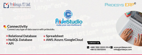
PrideStudio is a versatile software solution designed for various organizations, boasting a user-friendly interface and robust data recovery tools. With over 20,000 global users across 100+ industries, it offers strategic KPI visualization dashboards and real-time data access. Key features include automation of departmental activities, enhanced workflow transparency, and electronic data security. The software's customization options, integration capabilities, and notification systems make it a reliable choice for businesses seeking efficiency and accountability.
For more Information visit: PrideStudio (pridesys.com)
Contact us:
E-mail: [email protected];
Phone: +8801550000003-8, 01550000035
#Versatile software solution#User-friendly interface#Data recovery tools#KPI visualization dashboards#Real-time data access#Departmental activities automation#Workflow transparency#Electronic data security#Customization options#Integration capabilities
0 notes
Text
KPI Tracking Dashboard | Report Garden

ReportGarden offers an intuitive KPI Tracking Dashboard to streamline data analysis and reporting processes. With its user-friendly interface, the dashboard empowers businesses to monitor key performance indicators (KPIs) effortlessly. The dashboard compiles data from various sources into actionable insights from website traffic metrics to social media engagement rates.
ReportGarden's KPI Tracking Dashboard enables you to customize widgets and metrics according to your specific requirements, allowing for tailored reporting that aligns with your business objectives. Whether you're tracking conversion rates, customer acquisition costs, or campaign performance, the dashboard provides real-time updates and visualizations for quick decision-making.
Moreover, ReportGarden ensures data accuracy and consistency, helping you make informed decisions based on reliable information. With its comprehensive reporting features, you can easily share insights with stakeholders and team members, fostering collaboration and driving business growth. Say goodbye to manual data gathering and tedious reporting processes – streamline your analytics with ReportGarden's KPI Tracking Dashboard.
#reportgarden#report automation#client reporting#free seo report#social media dashboards#marketing analytics dashboard#b2b marketing analytics dashboards#ppc dashboard#social media analytics dashboard#automate social media reporting#KPI Tracking Dashboard
0 notes
Text
Lead Generation vs. Brand Building: Aligning KPI Metrics for Comprehensive Marketing Success
Lead Generation and Its Metrics
Lead generation is the engine that drives potential customers into the sales funnel. It is quantifiable and often prioritized in short-term marketing strategies due to its direct impact on revenue. However, the effectiveness of lead generation relies on identifying and utilizing the right KPI metrics.
Common KPIs in this domain include conversion rates, which measure the percentage of targets who have taken a desired action, and cost per lead, which gauges the cost-effectiveness of acquisition strategies. These metrics provide actionable insights that can refine targeting strategies, optimize campaigns, and ultimately, enhance ROI.

Brand Building and Its Metrics
Unlike lead generation, brand building is an expansive strategy aimed at establishing and nurturing long-term relationships with customers. It encompasses creating brand awareness and loyalty through consistent and meaningful engagement. The KPI metrics for brand building often focus on long-term value such as brand equity and customer lifetime value. These KPIs assess the strength of a brand’s presence in the market and the long-term benefits it derives through customer retention and loyalty.

Key Performance Indicators for Lead Generation
Lead generation is a fundamental aspect of a company’s marketing strategy, aimed at initiating consumer interest or inquiry into products or services. In today’s data-driven environment, understanding the effectiveness of these efforts is crucial.
1. Conversion Rates: The Quintessential Metric
Conversion rate is the percentage of visitors who complete a desired action on a digital platform, turning from casual browsers into potential leads. This KPI is crucial as it directly correlates to the effectiveness of lead generation campaigns. High conversion rates often indicate that marketing messages are well-aligned with customer expectations and the campaign is effective at engaging potential leads.

2. Cost Per Lead: Balancing Quality and Cost
Cost Per Lead measures the cost-effectiveness of marketing campaigns in generating leads. It’s vital for budget allocation and ensuring that the investment in lead generation provides a reasonable return.
To optimize spending, it’s crucial to analyze which channels and tactics yield the highest quality leads at the lowest cost. Dashboard KPIs can track performance across various channels, enabling businesses to reallocate budgets effectively and reduce overall acquisition costs.
3. Lead to Close Ratio: From Prospects to Customers
This KPI tracks the number of leads that convert into paying customers. It’s an essential metric for understanding the sales funnel’s efficiency and pinpointing stages where prospects might be lost.
Improving this ratio often involves refining the sales process, better qualifying leads, and ensuring that the sales team is effectively nurtured. Common KPIs to monitor include follow-up times and the number of touchpoints before conversion.
4. Lead Response Time: Speed Equals Success
The lead response time KPI measures how quickly a company responds to a lead after their initial contact. Faster response times can significantly increase conversion rates, as timely responses keep potential customers engaged and demonstrate excellent customer service.
Implementing automated tools for immediate acknowledgments and setting internal benchmarks for response times are effective strategies. Monitoring these practices through real-time dashboard KPIs helps maintain the standards required for optimal performance.
5. B2C Marketing KPIs: Consumer-Focused Metrics
Social Media Engagement: Engagement rates on social media platforms are critical B2C marketing KPIs. They provide insights into how well content resonates with the target audience and fosters interactions that could lead to conversions.
Website Traffic Metrics: Common KPIs like page views, unique visits, and bounce rates on a business’s website give a clear picture of consumer behavior and the effectiveness of online lead-generation strategies.
Key Performance Indicators for Brand Building
Brand building is an integral part of modern business strategy, focusing on creating a lasting image and relationship with customers that transcends product and service offerings. It’s not just about visibility; it’s about fostering loyalty and trust. In this exploration, we will delve into the crucial Key Performance Indicators (KPIs) that help measure and enhance brand-building efforts.
1. Brand Awareness and Recall
Brand awareness assesses consumers’ familiarity with a brand’s features or image. High brand awareness is a sign that marketing efforts are cutting through the noise and reaching consumers. Brand recall, a subset of awareness, refers to the ability of consumers to recognize a brand under different conditions, reflecting spontaneous remembrance of the brand name.
Common KPIs include survey-based metrics where customers report their recognition of a brand, and direct traffic measurements to a website, which indicate brand recall strength. Increasing these metrics can directly correlate with enhanced market share and consumer preference.
2. Customer Engagement and Interaction
Engagement involves the interactions that occur between a brand and its customers across various platforms, especially digital. This KPI is vital as engaged customers typically exhibit higher loyalty and contribute to word-of-mouth marketing.
Key metrics include social media interaction rates (likes, shares, comments), email open and response rates, and on-site interactions such as time spent on the website or number of pages visited. Dashboard KPIs that track these interactions can help businesses understand the effectiveness of content and communication strategies.
3. Net Promoter Score (NPS)
NPS measures customer loyalty to a brand based on their likelihood to recommend the brand to others. It’s an important indicator of brand perception and customer satisfaction, often correlating with future growth.
Regular NPS surveys provide critical data that can be displayed on dashboards, allowing businesses to gauge customer sentiment and loyalty trends over time. Improving NPS often involves enhancing product quality, customer service, and overall customer experience.
4. Customer Satisfaction Index (CSI)
This index measures how products and services supplied by a company meet or surpass customer expectations. A high CSI is indicative of a brand that delivers on its promises, fostering trust and customer retention.
Common KPIs include survey responses about various aspects of customer experience, including service interaction, product satisfaction, and overall value. Dashboard KPIs can visualize these responses to help identify strengths and areas for improvement.
5. Brand Equity
Brand equity refers to the value a brand adds to its products or services. This can be seen in consumer’s willingness to pay a premium for a brand compared to a generic equivalent. High brand equity enhances market positioning and profitability.
Metrics to evaluate brand equity include market share, price premium compared to competitors, and revenue generated from brand-loyal customers. Tracking these through comprehensive BI tools on dashboards helps in understanding the financial value driven by brand strength.
Strategies to Integrate Lead Generation and Brand Building Metrics
Integrating lead generation and brand-building metrics is essential for businesses aiming to create a cohesive marketing strategy that effectively balances short-term sales targets with long-term brand value. This integration enables a holistic view of marketing efforts, allowing for strategic decisions that drive both immediate results and sustainable growth.
1. Unified Marketing Framework
Creating a Cohesive Strategy: Develop a unified marketing strategy that incorporates both lead generation and brand building. This involves setting shared goals and objectives that acknowledge the contributions of both elements to overall business success. For example, aligning the campaign themes across lead generation and brand awareness efforts can ensure consistent messaging.
Integrating KPI Metrics: Use common KPIs to establish a baseline that measures both lead generation efficiency and brand impact. Metrics such as customer lifetime value (CLV) and engagement rates can bridge the gap between immediate conversions and long-term brand loyalty.
2. Data-Driven Decision Making
Leveraging Dashboard KPIs: Utilize a centralized BI dashboard that displays both lead generation and brand-building metrics in real-time. This dashboard should highlight how lead sources are contributing to brand engagement and vice versa, facilitating quick adjustments and strategic pivots based on performance data.
Predictive Analytics for Forecasting: Apply predictive analytics to assess the future impact of current campaigns on both leads and brand metrics. For instance, analyzing trends in B2C marketing KPIs can help predict shifts in consumer behavior, allowing for proactive strategy adjustments.
3. Cross-Functional Alignment
Collaborative Teams: Foster an environment where marketing, sales, and brand management teams work in a coordinated manner. Regular cross-departmental meetings to discuss KPI metrics and dashboard findings can ensure that all teams are aligned with the dual objectives of lead generation and brand building.
Shared Tools and Resources: Implement common tools and platforms for monitoring and managing both sets of KPIs. This approach ensures that all stakeholders have access to the same data, enhancing consistency in strategy implementation and performance monitoring.
4. Customer Journey Mapping
Integrating Touchpoints: Map out the customer journey to identify where lead-generation efforts overlap with brand-building activities. This mapping should detail each touchpoint’s role in converting leads and enhancing brand perception, providing a clear framework for integrating KPIs related to each stage of the customer lifecycle.
Optimizing Touchpoints: Use insights from dashboard KPIs to optimize touchpoints across the journey. For example, improving content quality on lead-generation platforms can enhance brand perception, while increased brand awareness efforts might lead to higher lead conversions.
5. Continuous Learning and Adaptation
Feedback Loops: Establish feedback loops that use data from KPI metrics to continuously refine marketing strategies. Regular analysis of dashboard KPIs should inform ongoing adjustments to tactics in both lead generation and brand building, ensuring they remain effective and aligned with market conditions.
A/B Testing: Conduct A/B testing to experiment with how different approaches to integrating these metrics affect both lead generation and brand recognition. This iterative testing can uncover valuable insights that drive more nuanced strategy refinements.
Conclusion
In the evolving landscape of digital marketing, striking the perfect balance between lead generation and brand building can seem like navigating a complex maze. However, when KPI metrics for both strategies are skillfully aligned, businesses can unlock unparalleled marketing synergy, propelling both immediate sales and sustained brand loyalty to new heights.
Utilizing a data-driven approach with tools like Grow, companies can seamlessly merge the analytics of lead generation with the qualitative nuances of brand building. This integration enables marketers to craft strategies that not only attract immediate interest but also foster long-term connections with their audience, ensuring a dual pathway to success.
To truly harness the potential of your marketing efforts, consider implementing Grow’s advanced BI tools. Grow’s platform provides a comprehensive suite of analytics that makes it simpler to monitor, compare, and optimize the KPIs critical to both generating leads and enhancing brand perception. With the ability to visualize these metrics in a unified dashboard, decision-makers can make agile, informed adjustments that drive growth across all fronts.
Embark on your journey to refined marketing excellence with Grow’s 14-day free trial. This opportunity allows you to explore firsthand how integrated KPIs can transform your marketing outcomes. Additionally, for more user experiences and detailed success stories, visit Grow’s comprehensive reviews on “Capterra grow.com.” Here, you’ll find a wealth of information from businesses that have leveraged Grow to surpass their marketing goals.
Take this step towards transforming your marketing strategy into an engine of comprehensive success — where every campaign is not just seen, but felt, driving both action and allegiance. With Grow, your path to achieving holistic marketing success is clearer and more attainable than ever.
Original Source: https://bit.ly/3XhQ6O0
0 notes
Text
Startup Finance Dashboard

In the highly competitive business landscape, startups face numerous challenges, and one of the crucial aspects of their success lies in effectively managing their finances.
Financial KPIs provide startups with valuable insights into their financial performance and enable them to make informed decisions regarding their business strategies. By measuring key financial metrics, startups can assess their profitability, cash flow, and overall financial health. This helps them identify areas of improvement, capitalize on opportunities, and mitigate potential risks.
Herm.io is a cutting-edge financial data management tool that empowers startups to streamline their financial processes and optimize their performance. It offers a user-friendly interface and features that enable startups to track and analyze their financial KPIs effortlessly.
With Herm.io, startups can easily generate comprehensive financial reports, visualizations, and dashboards that provide a clear overview of their financial status. These real-time insights enable startups to make data-driven decisions, identify trends, and proactively respond to market changes.
In conclusion, financial kpis for startups, allowing them to measure and manage their financial performance effectively. By leveraging tools like Herm.io, startups can gain a competitive edge, enhance financial decision-making, and pave the way for long-term success.
Startup Financial Benchmarking
Startup financial benchmarking is a key practice that can greatly benefit your startup's financial performance. By comparing your financial metrics against industry standards, you can gain valuable insights into how your startup is performing and identify areas for improvement.
With the help of Herm.io, a powerful financial data management tool, you can easily benchmark your startup's financial performance against industry standards. Herm.io provides a comprehensive set of financial key performance indicators (KPIs) that you can track and analyze, allowing you to gain a clear understanding of how your startup stacks up against its peers.
By using Herm.io's benchmarking feature, you can compare important financial metrics such as revenue growth, profitability, and cash flow with industry averages. This allows you to identify any gaps or areas where your startup may be underperforming, giving you the opportunity to make necessary adjustments and improvements.
Benchmarking your startup's financial performance can also help you set realistic goals and targets for your business. By understanding how other successful startups in your industry are performing, you can establish benchmarks for your own financial performance and strive to meet or exceed them.
In summary, startup financial benchmarking is a powerful tool that can help you measure your startup's financial performance against industry standards and identify areas for improvement. With the help of Herm.io, you can easily track and analyze your startup's financial KPIs, allowing you to make data-driven decisions and drive growth for your business.
Startup Finance Dashboard
As a startup founder or entrepreneur, it is crucial to have a clear understanding of your company's financial health. A startup finance dashboard can be an invaluable tool in helping you track and monitor key financial indicators, allowing you to make data-driven decisions that drive the growth of your business.
One of the main benefits of using a startup finance dashboard is the access to real-time financial data. This means that you can easily track your company's revenue, expenses, cash flow, and other important financial metrics at any given moment. By having this information readily available, you can quickly identify trends and take proactive measures to address any financial challenges or opportunities.
A startup finance dashboard also offers visualizations that make complex financial data easier to understand. With visual charts and graphs, you can easily spot trends, patterns, and outliers in your company's financial performance. This visual representation allows you to grasp the big picture and make informed decisions based on the insights gained from the data.
Furthermore, a startup finance dashboard allows for customizable reporting. You can tailor the dashboard to display the specific financial metrics that are most relevant to your business. This flexibility enables you to focus on the metrics that matter the most to your company's growth strategy and goals. Whether it's monitoring sales performance, analyzing profitability, or tracking customer acquisition costs, a startup finance dashboard can provide you with the relevant information needed to make informed decisions.
In conclusion, a startup finance dashboard is an essential tool for tracking and monitoring your company's financial health. With real-time data, visualizations, and customizable reporting, you can gain valuable insights into your business's financial performance and make informed decisions to drive its growth and success.
Startup Financial Benchmarking
Startup financial benchmarking is a crucial practice that allows you to measure your company's financial performance against industry standards. By comparing your key financial metrics with those of similar startups, you can gain valuable insights into how well your business is doing and identify areas where improvements can be made.
But how can you effectively carry out startup financial benchmarking? That's where Herm.io comes into play. Herm.io is a powerful financial data management tool that simplifies the process of collecting, analyzing, and interpreting financial data. With its user-friendly interface and advanced features, Herm.io enables startups to streamline their benchmarking efforts and make informed financial decisions.
By using Herm.io, you can easily gather data on key financial performance indicators such as revenue growth, profitability, cash flow, and operating expenses. These metrics provide a comprehensive picture of your company's financial health and allow you to assess how well your startup is performing compared to industry standards.
Furthermore, Herm.io offers customizable reporting options, allowing you to generate detailed reports and visualizations of your financial data. These reports can be easily shared with stakeholders, investors, and other relevant parties, providing them with a clear understanding of your startup's financial performance.
1 note
·
View note
Text
Evaluating the Impact of Performance Dashboards on Business ROI

In today’s fast-changing business world, achieving growth and success relies on using data effectively. But there’s a lot of data out there, and it can be hard to find the important stuff that helps us make smart decisions. That’s where performance dashboards come in – they’re like super helpful tools that cut through all the data noise and show us what really matters. They’re like guiding lights that make things clear when everything else seems confusing.
Whether you’re a CEO steering the company’s strategic course, a manager optimizing departmental workflows, or an analyst tracking campaign effectiveness, a performance dashboard empowers you to make informed decisions with confidence.
What Is a Performance Dashboard in Business?
A performance dashboard in business is a digital tool that displays important information about how a company is doing. It gathers data from different parts of the business and presents it in easy-to-understand charts and graphs. This helps business owners and managers see key details quickly, like sales numbers, customer satisfaction, website visits, and more – all in one place.
What makes these dashboards cool is that they’re not just static images. They’re interactive and can show real-time updates. So, if something changes, you can see it right away. It’s like having a special window that gives you insights into how your business is performing, helping you make better decisions.
Key Elements of a Performance Dashboard
Different types of dashboards have their own rules for what works best. So, when creating a performance dashboard for top-level people like executives, CEOs, and project managers, what things should you put in to help them easily keep track of how things are going?

Metrics and KPIs (Key Performance Indicators):
These are the core data points that reflect the health and progress of your business. They include metrics like sales, revenue, customer satisfaction scores, and other vital performance indicators specific to your industry and goals.
Data Visualization:
Visual representations such as charts, graphs, and gauges help translate complex data into easily understandable formats. These visuals allow users to quickly grasp trends, patterns, and anomalies.
Real-Time Updates:
Dynamic data updates ensure that the dashboard provides the most current insights. Real-time updates allow you to respond promptly to changes and make informed decisions.
Customization and Personalization:
Dashboards should cater to the unique needs of different users. Customization features allow users to choose the specific metrics they want to see and tailor the dashboard to their preferences.
Comparative Analysis:
This involves analyzing data over time or against benchmarks to identify trends, anomalies, and areas for improvement. Comparative analysis helps contextualize data and supports decision-making.
Interactivity and Drill-Down Capabilities:
Interactive features enable users to explore data further by drilling down into specific data points. This feature helps users uncover deeper insights and answers to specific questions.
Data Source Integration:
Dashboards aggregate data from various sources across the organization, providing a unified view. Integration ensures data accuracy and reduces the need for manual data gathering.
Mobile Responsiveness:
As work becomes more adaptable and mobile, it’s important that dashboards can be easily used on different mobile devices. This lets users stay updated even while they’re on the move.
Alerts and Notifications:
Dashboards can provide alerts or notifications based on predefined conditions or thresholds. This keeps users informed about significant changes or deviations in real time.
User-Friendly Interface:
The dashboard should have an intuitive and user-friendly design that requires minimal training for users to navigate and interpret the displayed information.
Benefits of Performance Dashboard Templates
Performance dashboard templates are pre-designed layouts that help you create informative data visualization tools quickly and easily. These templates provide a structured framework for presenting key metrics, making it simpler to track business performance and make informed decisions. Here are five benefits of using performance dashboard templates:
Time Efficiency: Templates save time by providing a pre-designed structure. You can focus on adding your specific data rather than building the dashboard from scratch.
Consistency: Templates ensure a consistent look and feel across dashboards, promoting a cohesive and professional appearance for all your performance tracking.
Ease of Use: Templates often come with intuitive designs and pre-configured elements, making it easier for users to input their data and create informative dashboards.
Best Practices: Many templates incorporate industry best practices for data visualization and layout, enhancing the effectiveness of your dashboard in conveying insights.
Customization: While templates offer a starting point, they can be tailored to your unique needs. You can customize colors, fonts, and other elements to align with your branding and preferences.
Business Performance Dashboard Examples
Sales Performance Dashboard:
This dashboard could include metrics like total revenue, sales growth, top-selling products, customer acquisition rates, and conversion rates. Visualizations could include line charts showing revenue trends, bar graphs displaying product performance, and a map indicating the geographical distribution of customers.

Marketing Campaign Dashboard:
This dashboard might feature metrics such as website traffic, click-through rates, social media engagement, and lead generation. Visualizations could include pie charts showing traffic sources, line charts for tracking campaign performance over time, and bar graphs illustrating social media engagement metrics.

Financial Performance Dashboard:
For this dashboard, you could incorporate metrics like profit margins, cash flow, expenses breakdown, and return on investment (ROI). Visualizations could include a stacked bar chart for expense distribution, a line chart for cash flow trends, and a doughnut chart to highlight profit distribution.

Employee Performance Dashboard:
This dashboard could display metrics such as employee turnover rates, productivity metrics, training completion rates, and engagement scores. Visualizations might include line charts showing turnover trends, bar graphs illustrating productivity metrics, and a gauge indicating employee satisfaction levels.
Supply Chain Dashboard:
This dashboard might include metrics like inventory levels, supplier performance, lead times, and order fulfillment rates. Visualizations could include a heat map showing inventory levels, line charts tracking supplier performance, and a bar graph indicating order fulfillment rates.

Customer Satisfaction Dashboard:
For this dashboard, you could include metrics like Net Promoter Score (NPS), customer feedback sentiment analysis, and customer support response times. Visualizations could include a radial gauge for NPS, a sentiment analysis word cloud, and a bar graph showcasing response time averages.
Healthcare Performance Dashboard:
This dashboard could include metrics like patient satisfaction scores, appointment wait times, patient outcomes, and healthcare provider performance. Visualizations might include a bar chart for patient satisfaction scores, line charts tracking wait times, and a scatter plot for provider performance based on various criteria.

Manufacturing Efficiency Dashboard:
For this dashboard, you could incorporate metrics like production output, defect rates, equipment downtime, and operational efficiency. Visualizations might include a line chart for production trends, a heatmap for defect occurrence, and a bar graph showing equipment downtime by category.

Conclusion
Performance dashboards are like special maps for businesses. They show important information in easy-to-understand pictures, helping big bosses and managers know how well things are going. These dashboards can change and update in real time, making them super helpful for making quick decisions. So, just like a map guides travelers, performance dashboards guide businesses toward success by showing the right paths to take.
#performance dashboard in business intelligence#performance dashboard template#performance dashboard#kpi dashboard examples#what is a performance dashboard
0 notes