#just a+ all 'round
Explore tagged Tumblr posts
Text


Thinking about Kobayashi's bag in the drama.
#paripi koumei#ya boy kongming!#ya boy kongming#owner kobayashi#edit: hotwaterandmilk#that bag is incredible#the dragon motif#the way it works with his more colourful outfits for the drama#just a+ all 'round#i might try and do real content tomorrow#i'll see how i'm feeling#it is extremely hot here#and my body and brain are like 'nope' to doing anything
11 notes
·
View notes
Text
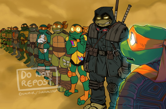
When you meet your past lives but they're all ignoring you and freaking out over this one guy?
I've seen a few versions of this floating around with the different Leos and I wanted to have a go at doing one for Mikey. They're all collectively realising what a bus sized bullet they dodged by not ending up as messed up as Ronin
#art#artists on tumblr#Just realised the fucking nightmare I'm about to have tagging all these guys. Fml#tmnt#The Last Ronin#TMNT Mutant Mayhem#rottmnt#tmnt 2012#mikey#MM Mikey#Ronin Mikey#rottmnt mikey#2012 mikey#tmnt idw#idw mikey#tmnt crossover#I'm not tagging the others I don't wanna clutter up any more tags than I already have#I like to imagine Ronin is just telling MM Mike the most horrific shit and everyone else looks round like What The Fuck#Also if you're wondering where Bayverse Mikey is: I didn't include him because I hate him so goddamn much ^^#He's in interdimensional turtle jail for 6 million years#the last ronin spoilers#I GUESS LMAO
18K notes
·
View notes
Text
People call Heaven Official’s Blessing / TGCF a slow burn but Hua Cheng is literally courting Xie Lian like they are DATING. Slow burn who??? They’re sleeping next to each other on straw mats and Xie Lian’s offering to cook him dinner and they’re bantering across THE HOME THEY SHARE like a bunch of desperate hussys
San Lang LEAVES XL WITH A KEEPSAKE OF THEIR TIME TOGETHER SLOW BURN WHOMST
They have A DATE in HC’s armoury where they HOLD HANDS and XL pets San Lang’s quivering sword I-
Hua Cheng basically throws himself at this man he’s like you want a sword?? All of them ?? You want ALL THE SWORDS?? Fuck it take the whole room THE WHOLE ROOM JUST COME VISIT I WILL CLEAN THEM FOR YOU
Like he isn’t the king of a whole realm with shit to do
And this is just the first half of the first book—again I ask the world SLOW BURN WHOMST
#this is half in jest#but#I know some people don’t count it as “real until they kiss but THIS is honestly so gay of them#it’s in the subtext it’s in everything THAT ISNT a kiss#it’s so queer#Hua Cheng is ALL IN XL is just too innocent to Grasp It#XL is saying “come round to my tiny shack whenever sleep on my mat with me BEST FRIEND I will be your home” and HC is SUFFERING#the armoury scene is favourite of the entire thing#I was like my brother in Christ HAVE YOU NO SHAME#and knew immediately I would love him forever#tgcf#heaven official's blessing#mxtx tgcf#hua cheng#xie lian#hualian#she’s being unhinged again
6K notes
·
View notes
Text

corvidae
#my art#jujutsu kaisen#jjk#jjk fanart#jujutsu kaisen fanart#yuji itadori#itadori yuuji#blood/#yuuji#im not tagging this as spoilers idc sue me . iykyk but i dont think it's obvious enough at all 2 warrant the tag#idrk what this is sorry ive been having a hard time drawing n feeling inspired lately :'>>> so it goes#i find i tend to default to drawing birds when that happens ???#did it with gojo did it with shiro and now it's yuuji's turn ig#sometimes it's helpful to just . mess around with a whole bunch of brushes until something looks ok#and birds and feathers lean soooo well 2 playing around w brushes theyre very forgiving#flowers also kind of so i threw in some camellias bc i figured why not add More Red#i think they mean something that's probably relevant but i was more looking fr the shape of the petals#th rounded tops blend rly seamlessly with the way i rendered th feathers so i am like!!!! nice#just checked also apparently red camellias just mean love and devotion lmao should have guessed#'perishing with grace' also hm hm hm that's kind of wild with th crows#anyway i didn't put too much thought in2 this one so i won't talk fr ages about the symbolism it's all pretty much right there#anyway ty fr being patient with me im sorry draws have been slow :<#ill come out of it ill bounce back!
2K notes
·
View notes
Text
*merlins magic gets exposed in front of the knights*
merlin, magic user: oh fuck
arthur, finally taking this opportunity to pretend as if he just found out merlin has magic after agonizing for the past month on how to bring it up: you have magic?
lancelot, merlin defender, already knew of merlin’s magic: no! i have magic
gwaine, merlin defender, already knew of merlin’s magic, lover of chaos, ride or die: no, i have magic!
mordred, desperate for his hero’s approval bc no matter what he’s done emrys just stares at him with distrust and the poor boy is tired and so close to tears: no…i have magic.
percival, raised by druids and bonded strongly with mordred over that and does Not agree with the persecution of magic in camelot, had an inkling that merlin had magic but no proof: no. i have magic.
*leon and elyan exchange a look, elyan, amused and leon, exhausted, elyan shrugs*
elyan, knows how much gwen adores merlin and completely understands her stance bc merlin…is merlin, down to clown and put on a show, really playing up the dramatics: no! i have magic.
leon, exhausted, has known of merlin’s magic since he stepped foot in camelot, knows of his feelings for arthur and arthur’s feelings for him, knows arthur knows of merlin’s magic and wouldn’t harm him, thinks everyone is being absolutely ridiculous:
*the knights stare hard at leon and even merlin looks slightly offended at leon not jumping to his defense with the rest of the knights, arthur hasn’t said anything and is staring at leon expectantly*
leon, sighing: …no. i have magic.
#radio rebel reveal#>>>#idk if the idea that percival was raised by druids is either canon or a big fandom hc or just something i saw once that stuck with me#but i love it#anyways they’re all idiots#merlin bbc#merlin emrys#arthur pendragon#sir lancelot#sir gwaine#sir mordred#sir percival#sir elyan#sir leon (the long suffering)#(he’s trying to be a brave knight of the realm as he always dreamed to be as a kid. too bad all his friends and king are complete fools)#merthur#idiots of the round table#look me in the eye and tell me i’m wrong#incorrect merlin quotes
7K notes
·
View notes
Text
You can just make up Knights of the Round Table by the way. People used to do it all the time.
#Arthuriana#Knights of the Round Table#Lancelot is just some guy they made up.#All the Knights of the Round Table are OCs.
2K notes
·
View notes
Text
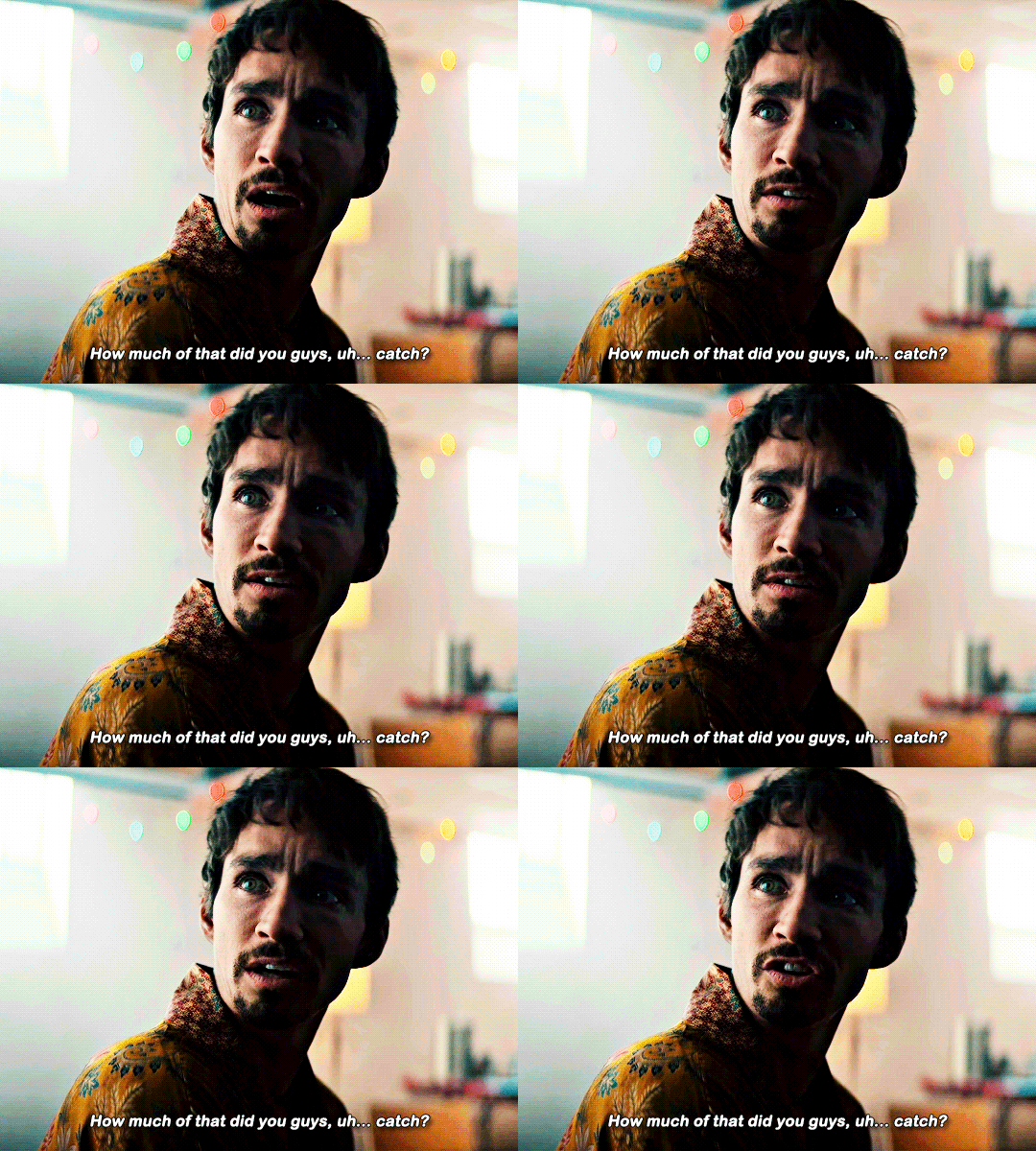


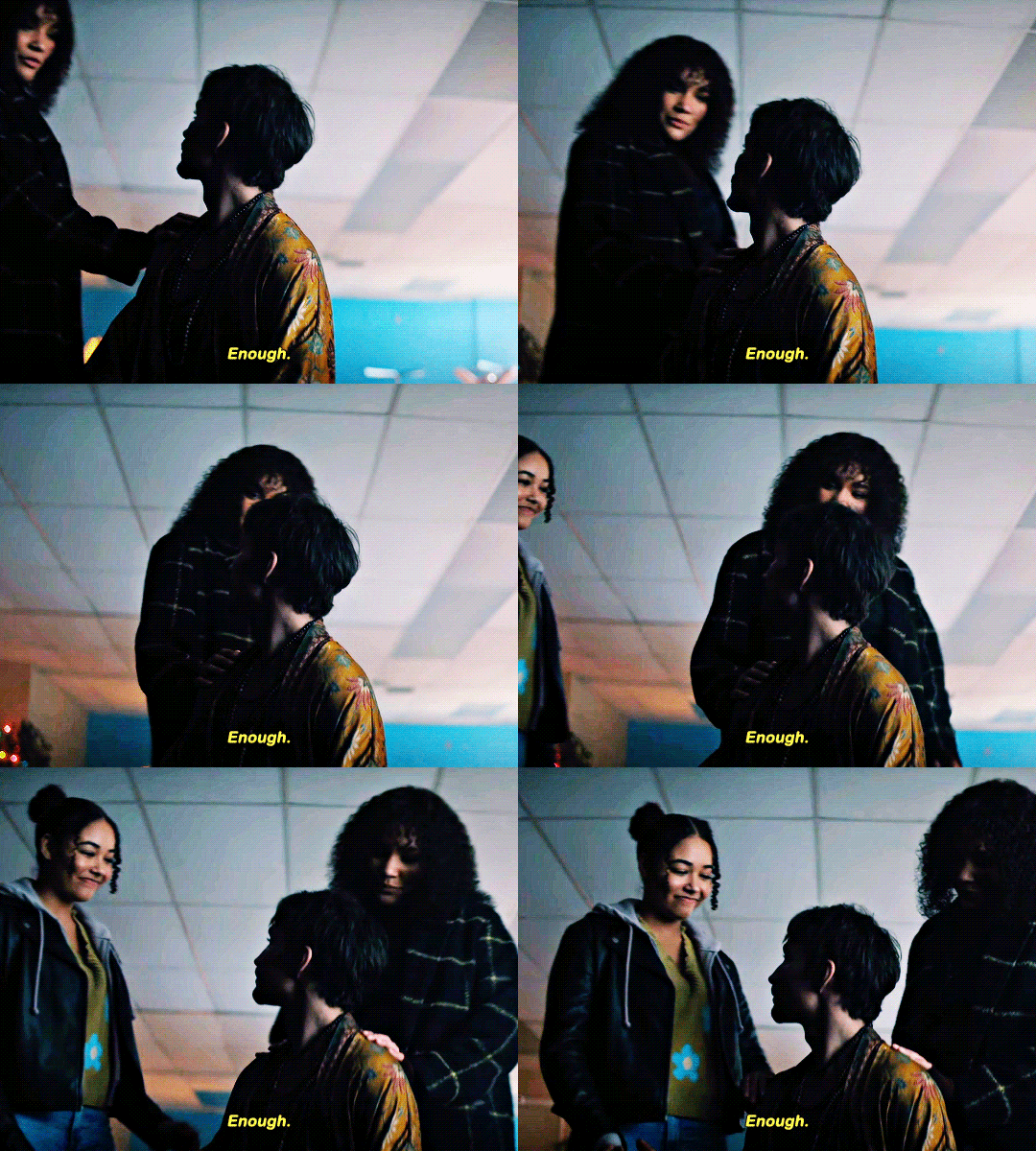

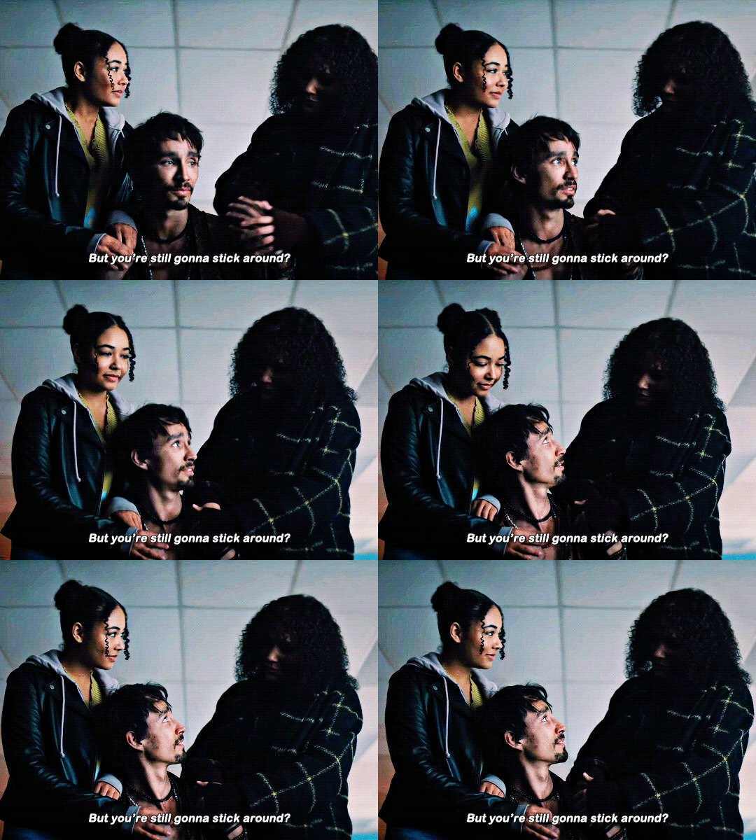


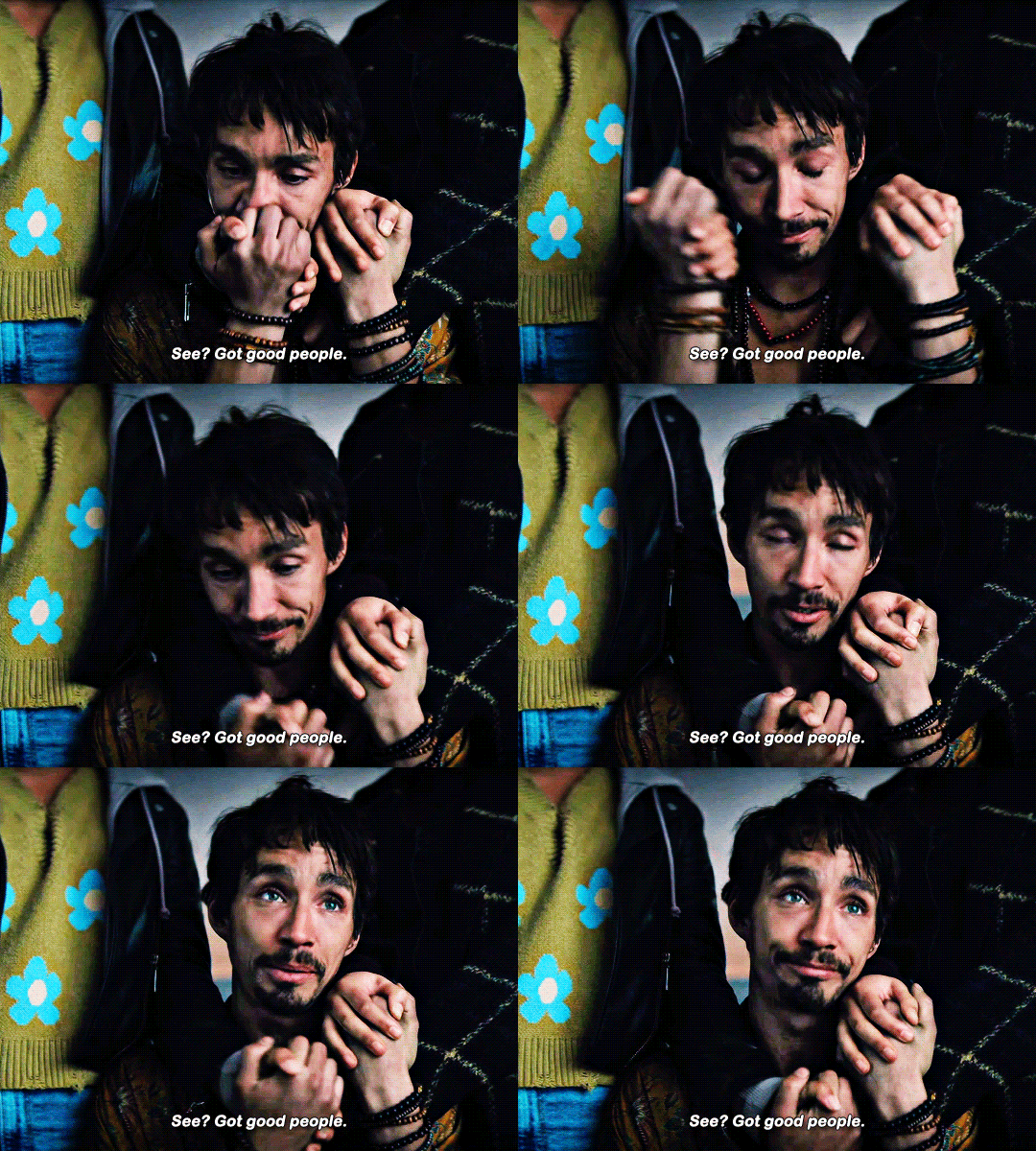
"Before all that, I'd had three years clean. Three whole years. But the problem was, I was trying to do it all by myself. Staying all closeted in my safe little bubble, scared of death, scared of life. And taking it out on the people who love me the most. Who are sitting outside by the way. So, I just wanna say for the first time in my entire life, without irony, that my name is Klaus, and I am an alcoholic. And I am a complete drug addict. And, while we're at it, I'm probably addicted to love, and sex, and tweezing all the little tiny body hairs..." THE UMBRELLA ACADEMY | Season 4: Deleted Scene
#*gifs#1k#the umbrella academy#umbrella academy#tuaedit#umbrellacademyedit#klaus hargreeves#allison hargreeves#claire hargreeves#allisonhargreevesedit#klaushargreevesedit#clairehargreevesedit#dailynetflix#userbbelcher#dailyflicks#cinemapix#tusermyra#tusercj#userzaynab#userpolaris#tuserlana#feeling soooo upset they deleted this like why!!!#it rounds off klaus' plot so well and shows that it wasn't just a random all for nothing sidequest
1K notes
·
View notes
Text
now i've watched a fair amount of d&d i've started to pick up on the differences between dm style i think
like brennan IS all the bad guys. every game he dms is brennan vs the players. he makes npcs and battles that make his friends throw things at him and he smirks the whole time. he makes them tell him their worst fears and then he makes them do it. and it's awful and amazing and really funny
matt IS exandria. his characters and battles never feel written or constructed, they just feel like things that already existed in the world. it's all about verisimilitude with him, and he's amazing at it. he tends to fade into the background and let the players react to the story and it makes everything he does incredibly cinematic
aabria dms like she's just another player at the table reacting to the story, right up until someone gets lulled into a false sense of security and tries to fool around and THEN she throws a curveball by making them deal with the consequences of their choices. she's like oh you think that's funny?? then i'm about to be hilarious, bitch. and she keeps getting away with it bc she's just that good!
basically, brennan's an evil bastard, matt's the world, and aabria's the queen of consequences
or:
brennan - fuck
matt - around
aabria - find out
#brennan lee mulligan#matt mercer#aabria iyengar#sorry but this made me laugh agdjgsjsgs#petition for a d20 series dmed by brennan w aabria as a pc where a couple eps in her pc kills brennan's bbeg and they swap seats#revealing she was the dm all along#i also really want a round robin series. all dms at the table and they take turns controlling the narrative#whether it's in order or just like. every time one of them kills the dm's npc they become the dm or smth#it'd be really fun i'd love to see what kind of mangled mess of a story we'd get#i haven't listened to that much taz but griffin seems to be a mix of brennan and aabria where he does things for the bit#and then eventually he's like oh btw the bit is immense emotional trauma. whoops!
2K notes
·
View notes
Text
shout out to people with spatial awareness issues. wishing you a "didn't bump into any table corners or walls" day today!
#dogpost#when i get my own place all my stuff is gonna have no corners. round tables ftw#autism#spatial awareness#spatial reasoning#dyspraxia#developmental coordination disorder#ehlers danlos syndrome#proprioception#balance disorder#edit: why did this go off so intensely!!#nearly 1.5k notes in less than 10 days. i have like 300 followers MAYBE if that#damn people really out here bemoaning their shin bruises huh#edit 2: i just checked i have 150 followers. where did these notes come from
15K notes
·
View notes
Text
So y'all have seen the Williams F1 Logo before, yeah?
well get ready, becaues I am about to ruin your day!
where does one even begin with this. i am sorry in advance. -just a poor learning graphic design student, who simply tried to enjoy their saturday evening
The Logo
For anyone that doesn't know, here's the Williams F1 Logo. Entirely unedited, copied straight from Wikipedia:

Now like many fans, I actually quite enjoy this logo. I like the modern, sharp edges of it and it's simple yet intriguiging design. It's memorable, while also easily recognizable as a W. I also really enjoy the colour choice (this, however, is entirely a personal preference.)
(entire rant under the cut. please keep reading this took years off my life span.)
How did we even get here?
Let's start at the beginning. How did we even get here? Well I, a poor poor learning graphic designer, was watching this lovely video from Mr. V's Garage about bad F1 Logo's over the past 35 or so seasons. Very interesting, I can only recommend it (but you don't need to watch the video to understand this post)!
Now, to cleanse the palette at the end of the video, Mr. V included a top 10 GOOD logos from this time span, it was very kind of him.
On P4 of this "Good List," Mr. V placed the current Williams F1 Logo, as pictured above. At first I vaguely agreed with this, believing that he probably simply hadn't noticed one of the things that's been bothering me about that Logo since the first time I saw it up close.
The first sign of Trouble
So, what is this mystery issue, you might ask?
It's simple really. You don't necessarily notice it at a first glance, but something about that logo seems off. Taking a second longer, you may notice it yourself.
No, I mean it, take a minute and go look at the logo. It looks wonky as hell, doesn't it?
Well I can tell you the first thing that I personally noticed. The arms of the W aren't in line with the bottom half, see:

(Graphic by @girlrussell who was so kind to let me use it, as it is way prettier than the one I made)
It's a crooked W. There is no good explanation for this. The rest of the font is perfectly fine, geometrical shapes.

Anyway, the good person that I am I went to point this out to my partner ( @leftneb ) who proceeded to inform me that he, infact, was not aware about this and was, quote, "never going to unsee that."
Now, the good FRIEND that I am, I, of course, proceeded to rush into our broader F1 friendgroup to make them suffer for eternity.
What's the logical next step to take? Of course, fix the logo in Adobe Photoshop, you know, as a joke.
(Disclaimer at this point, I am not necessarily the biggest fan of Williams Management Team. I enjoy ALL their drivers this season. I do NOT enjoy James Vowels. Be warned.)(Also I am aware that he probably did not have an influence on the logo)
Trying to fix it. Oh god, I was so innocent back then
Trying to fix the logo in Photoshop is the worst mistake I could've made. THE worst path to take. I could've just giggled about making my friends suffer (which I succeeded in, by the way) and moved on. Instead I ruined a perfectly good Saturday evening, and for what? I don't know anymore.
Anyway, how was I gonna go about fixing the logo in the simplest way possible? Simplest way I could come up with: slap the thing in Photoshop and put two, mirrored boxes at each side to make the sides line up. Small issue, how do I make the thing actually even? Fix: line them up at the intersecting point with the bottom tips of the W.
Here's the result:

Hey, anyone care to explain to me why in THE LORDS NAME the arms are different sized? I mean, surely they weren't before. Surely, certainly, I must've messed up.
I double, I tripple checked. I made sure everything was lined up and made sense. But no.
It just couldn't be. Something was uneven in this logo, something even deeper. Something I could not have predicted when first taking a closer look. It was at this point I realized I had messed up. What rabbit hole had I stumbled across? Certainly, it couldn't get much worse.
And that's when I noticed.

(pictured above; my genuine reaction)
There's MORE? (oh god, the top isn't lined up)

I couldn't believe my eyes. This is the PINNACLE of the sport, and THIS was the logo of one of the competing teams? I mean, yeah, we have a Visa Cash App RB or a Kick Sauber or even a MoneyGram Haas which are all terrible logos, but at least they're CLEAN. (this has not been checked. If anyone wishes to ruin a nice Saturday evening, feel free to check them and tell me how wrong I was in the previous statement!)
But you can see that there is no end in sight for this post. I'm sure you're as scared as I was at this point. By now we were sitting in VC, discussing the horribleness of this logo. I had long informed my irl's about this, who take said design classes with me. And it was one of them who pointed out the next thing that had been bothering me, but I had not been able to put a finger on up to this point.
thE DISTANCE, HOW DID THEY FUCK IT?

I'm afraid I have to confirm your fears.
Yes, those lines are the same length. According to Photoshop, they're on the same level as well, so no flunking with angles.
The gaps of the arms to the main W are not the same. They're differently sized gaps.
It was clear to us, this logo is inherintely flawed. They're subtle issues, but once you pay attention you start to notice things. It all looks slightly wonky and off centre. And eventually, you get paranoid, and start comparing other angles and sizes. And you will keep finding things. This has ruined my life.
HOOOOOW

Honestly, I don't even know what to say. Yes, yes sadly those lines, too, are the same length. Just copied over from one side to the other and layed over on the same height. I admit, they're not layed over perfectly. I was honestly holding back tears at this point. But the point still stands, you can clearly see a difference in width.
Honestly, the only way I can explain it is that at some point there was a mess up of distance or proportions and whoever was designing the logo couldn't pin it down and tried to restore the visual balance by making manual adjustments. And in all honesty? They kinda did a good job, if that's what's happened. I mean, you notice the crookedness of the arms, and then maybe the difference in height, but the rest you probably will not notice if you don't spend too much time staring at it. (like some of us) And even those issues clearly aren't noticeable to the vast majority, considering I had to go point it out to a group chat for my friends at least to notice.
what the fuck is THAT?
Now, the thing about doing this investigative work of prooving a team you dislike is worse in more aspects than you previously thought, is that you do a lot of zooming in. And zooming in means you might notice bits that yours eyes simply overlooked before, because they were too small.

Here you can witness the top of the middle point, that, for whatever reason, really wants to touch the top border of the Logo. I'm relatively certain that's the highest few pixel in the entire graphic, considering earlier chapter "There's MORE?" I have no idea why it looks like that or why they thought it was necessary for it to not end in a clean point.

I just actually have no idea how to even describe what is going on on the top of the left arm. That left hand side, again, touches the side and is therefore the most-left-pixel in the graphic. I, once again, have no idea the purpose of this. However the RIGHT hand side also makes no sense, as it is the most prominent corner in the whole logo. There's pointed corners, and rounded OF corners, but nothing that is trying to form it's own colony in a distant land that hopefully isn't this god awful logo. I hope that blob gets away. I really do. You go king.
i'm loosing my mind
Anyway, the only reason I could come UP with those weird "reachy-outy-bits" was to establish the dimensions of the logo? But if that was the case, I don't understand why they managed to keep all the other potentially border touching corners clean?


Like, look. Those are clean, sharp corners with some clearance off the borders. I have no clue why they managed it here but not with the others.
guys. please.
Backtrackig a little bit, going back to the positioning of the arms.

Do I need to mention that those lines are both the same length and the same (mirrored) angle? I really hope I don't, because I don't think I could be making this shit up. Like, once you roughly know what you need to look for it just kinda becomes easy to find.
As said before, I genuinely do think that most of these issues happened in a chain-reaction. For example, the distances between the main part and the W wouldn't be as noticeable (and they do get noticeable once you start looking at it) if the angle wasn't fucked. And guess what, there's more fucked angles here! Which ALSO influence this specific area of the logo!
this is just embarrasing for you.

something something same line copied over and mirrored etc etc
It's not as visible but the angles defintely don't line up here as well. As mentioned before, these issues for the most part all influence each other. It doesn't really excuse the issues, in my opinion as a designer, because a big company like this shouldn't have these sort of issues in their logo.
So let's review;
to sum it up,

i cannot even BEGIN to explain to you how big of a fucking JOKE this FUCKING logo is. because, i thought to myself, to round the post out, hey, why not show ALL the issues i pointed out in one picture? that would round it out quite nicely, wouldn't it?
Yeah well, this logo sent STRAIGHT FROM HELL just could NOT let me rest. I had only done the lines visualizing the crooked arms in PAINT up until this point, i.e. I had only pulled both up individually. To make a nice "rounding out" picture I still had to add them into PHOTOSHOP. so i did. i pulled up the line. i mirrored the line.
THE ANGLE IS FUCKING DIFFERENT
none. and i mean NONE of my friends had noticed this before. i need you to understand that we looked at this thing with FIVE pair of eyes, and NONE of us noticed that until i thought to myself "Oh I still need to add these specific lines to have ALL the issues I pointed out in my SILLY TUMBLR POST in ONE image" and i get THAT FUCKING SURPRISE
I was PLANNING to round the post out with a statement on how obviously this isn't a serious post. Here, I even had it all written out already because I accidentally started writing it in the last paragraph:
Of course, this is nitpicking, and it's not that serious. I'm aware of that. AS MENTIONED most of these would not be noticeable if we hadn't gone specifically looking for them.
yeah, well, fuck that. i just spent two hours seething about this logo. i'm ending the post on this instead.

#i am ENRAGED#i managed to actually calm down about it#yk. just typing away#and then i just try to ROUND OUT THE POST#for fucks sake#anyway i know i'm posting this at an hourrendous hour#if you read all the way. reblog? maybe#pretty please#williams f1#williams formula 1#williams racing#formula 1#f1#also apologies for any spelling mistakes i do NOT have the nerve to go back and proofread this
921 notes
·
View notes
Text
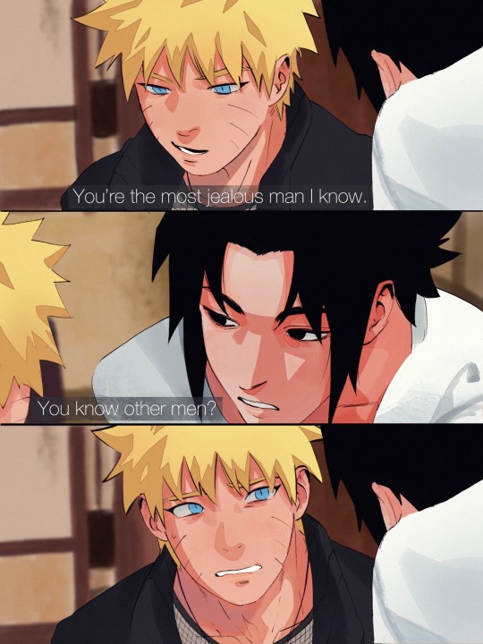
had to be done 🤷
#sasunaru#naruto#sasuke#sns#my art#comic#is it bc idk#meme redraw????? idk????#round fox baby#naruto’s boyfriend#HAHAHAHAH#i couldnt rly#fuckin do sasuke’s coloring im just glad my friend#helped me out bc like i was gonna scrap all the#work i did on naruto just to accommodate sasuke#dkfhdkdkd as always this is my art#my own interpretation#leave if u dont agree with this please#no more tags abt what u expect who to be who#this is what i wanted#i made this for ME bc im gay
16K notes
·
View notes
Text


jay for daydream track video
#flashing tw#enhypenet#enhypenedit#kpopedit#enhypen#enha#enhypen jay#tgjelly#userzaynab#forparker#userbibs#userbloomingwarrior#usergyu#jay's teeth are so good like.. just incredible teeth honestly aspirational shit.. incredible stuff all round 10s across the board and all#that.. love this guy#z.enhypen#z.gif#z.jay
536 notes
·
View notes
Text

welcome back to my accidental newfound journey to redraw every frame from this movie i GUESS
#mcu#xmen movies#xmen first class#erik lehnsherr#magneto#snap sketches#hello chat. i started watching a new miniseries and i decided i needed to draw something while i did so#series was edge of sleep. if Y'CARE. i thought it was solid .... surely gon be thinkin of the endin for a bit me thinks ..#but yeah NATURALLY. since twitter was putting the screenshot on my timeline ANYWAY.#can we tell i just wanted to draw this fuckass pose because TRULY i was not drwaing All That in the background#i can draw planes/machines but thats when i plan(e) to alright im not free styling that after renderin the bloke#unfortunately i couldnt just leave him in the white void so. we Kinda Try round here i guess#anyway next time i draw movieverse it gon be another scene redraw look at that !!!!!!#ive got silly non-redraws in mind too i swear ...... for now i just have shapes and scenes to appreciate#because the shapes of michael fassbender fascinate me in ways i must draw#ok im sleeping now im talkin nonsense !!!! i have a test in the morning </3 the world is so cruel .....#goodnight everyone :]]]]
513 notes
·
View notes
Text
I love Raph and haven’t said that enough so to be more specific I love that Raph is a soft boy who loves bear plushies, a gross boy who eats an assortment of things that are definitely better left alone, a smart boy who is more than capable of taking down villains through planning and fortitude alike, a strong boy who is dedicated to training his muscles and fighting prowess, a teenage boy who loves his brothers but is more than happy to tease and roughhouse with them, an angry boy who sometimes lets his anger take a hold of him to cover the fear, a gentle boy who is generous with hugs and affirmations to those he loves, a capable boy who takes on more than should ever be expected of a teenager, a good boy who just wants to be a hero and slowly comes to realize the cost of that duty, a good boy who has no reservations about putting himself in the way of harm coming to his family, a good boy who’s a great brother and son and person and deserves only the best the world has to offer.
#rottmnt#rise of the teenage mutant ninja turtles#rottmnt raph#rise raph#he’s so wonderful frfr#my poor boy is traumatized but still so proud of what they accomplished because they’re HEROES#what started as something fun - Saturday morning cartoon-like heroes vs villains esque - soon becomes his calling#and he loses himself a little along the way#because the world is TERRIFYING now#if they don’t do something about the bad things in the world then worse things will come#and Raph CARES too much to let it happen#even at the expense of his own happiness and youth#and he luckily reigns back that fear - knowing his family is there to keep an eye out with him#and he finally lets himself be a kid again#he’s very well rounded and his flaws are so good because (like the others) they are ALSO his strengths#I like how it’s softly implied that bears are his fav animal too bc that’s cute af#headcanon that he likes them so much because a stuffed bear was the first toy splinter managed to get Raph#but yeah one of my favorite things about tmnt is that the characters are well rounded and rottmnt exemplifies that immensely#with raph being no exception!!#amazing big brother and character#there’s a REASON in my tmnt main character tierlist he’s S tier!!!!#hot take but in terms of who should be leader I think it should be less who’s the better leader-#-and more who’s the better leader FOR THIS SPECIFIC MISSION#bc all four can be great leaders fight me on that#APRIL can as well 100%#doesn’t need a designated leader for them to succeed#they just need ~communication~#one of my favorite things tying Raph and Leo together is that they both *hide*#I’ve talked about Leo’s many masks a lot but Raph has one too#and it’s the mask of a hero - the mask of the protector
1K notes
·
View notes
Text
just imagining the knights who have grown used to treating merlin like arthur’s consort, letting him get away with all these things, and introducing new knights to the unspoken rules - merlin may not be the consort in title but you better treat him like he is - and carrying that into arthur’s reign as king only for one (1) feast to go horribly, horribly wrong and the knights of the round table are trying to put out these all these fires and calm all these lords and ladies feelings and trying to talk arthur down from waging war and trying to get merlin to talk to the king dammit i don’t care that you’re upset, arthur is drafting up a literal declaration of war please slap talk some sense into him all the while drafting up new rules that HEY actually let’s treat merlin like the queen instead
#(a foreign nobleman groped merlin)#(arthur challenged him to a duel)#(when arthur wins and kills the nobleman then his kingdom will wage war)#(they tried to warn arthur by telling him all this but it just infuriated him further bc merlin didnt wake him this morning so hes crabby)#(thats why he jumped the gun and decided he’d wage war first)#(leon is on the verge of quitting his job and moving to the continent)#theyre so silly#bbc merlin#merlin emrys#arthur pendragon#merthur#knights of the round table#queen merlin#fanfiction#fanfic#fic ideas#prompts
600 notes
·
View notes
Text
the one for all soap gf cum for lube idea would go craaaaazy with the somno. esp since soap is his usual desperate self who can't wait to wake you up properly whenever he comes back home to tuck himself between your thighs like-
you don't bother waking up fully anymore. just widen your legs, let him stuff a pillow below your hips and he can go to town and leave you alone. you don't lose too much sleep cuz he's quick to come. it'll be multiple rounds but it's fast.
until it isn't. he's lasting much longer, enough to leave you feeling tender. good for him for working on his stamina. (not that it was necessary.)
it must've been quite a while that he's last been in you because this time around the usual dull ache you feel at first is more of a white hot sting that dissipates the drowsy haze you're in.
soap also goes through wild weight changes. suppose it's fitting, considering when he's gone for longer he comes back slimmer. much slimmer. you'll make him a hearty breakfast to fatten him up again. he can invite the boys too, they must also be too thin.
#can't try to kiss him whenever you're not all that sleepy cuz he's pushing your face into the mattress#like damn can i get some love first or am i just gonna get you pounded til dawn breaks#the multiple rounds are now suddenly tripled#good thing he's bought some epsom salt for you to soak in later 🥲#hard life of a military wife
482 notes
·
View notes