#just a lil doodle tbh lol
Explore tagged Tumblr posts
Text
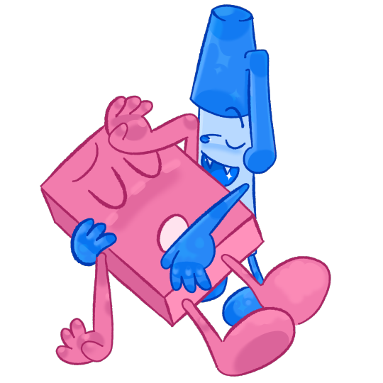
classic pen!
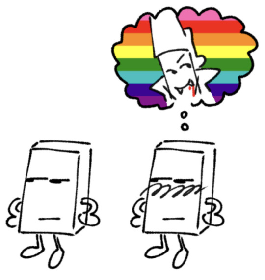
#penraser#eraser bfb#eraser bfdi#eraser tpot#pen bfb#pen bfdi#pen tpot#bfdi#bfb#tpot#ermm... haiiii#i was blessed with a vision of this one seconds after hearing that line#i KNOWWW eraser daydreams of vampire pen come on now#i like how i did pen here#just a lil doodle tbh lol#ive been doing so much project focused art or learning focused art...... so im indulging myself#and i just made some classic object shipping art tee hee
730 notes
·
View notes
Text


The sillies <3
all done by @/kami_kakari on Twitter!
#commission#my silly lil poly ship#I just wanted all three of them together#obey me#obey me mammon#obey me solomon#obey me mc#obey me oc#my mc#mammon#solomon#mammon x solomon x mc#mammon x mc#solomon x mc#obey me mammon x solomon#mammon x solomon#crazy how it was only ever gonna be the first one and then I was like “wellllll”#i can't remember if it was solomon middle or mc middle that I bolted upright in bed because the pose idea came to me#my doodles look so silly tbh#cc has seen them lol#mc paula
438 notes
·
View notes
Note
Hello! hi, you seem like an expert in this so I was wondering if you knew what was up with the 1634 glove doodles this year? It seemed like only Mitch was doing them and now we get an Auston heart? Is that a new thing for him? And Mitch seems like he is mixing his up this year too? Like is he drawing a moustache smiley? Do we think that correlates to when he has his own scruff OR when he’s maybe missing a certain someone? Maybe I’m totally off base but I would love to hear your thoughts on what you think is happening here
i'm actually in the middle of compiling a document over the course of their careers showing their glove doodles month-to-month so i'd consider myself an expert (of wasting time) too 😭😭😭😭 auston's been doing it most of the season!!! there were a couple games to start the season where certain pairs of gloves didn't have anything, but he's had way more pairs with them than without them this year. players cycle through multiple pairs of gloves in a game bc some of them are finicky and don't like to play w wet gloves so they take turns going on driers. and you don't always get pics where they're noticeable too but i'd say most of the year he's been doodling hearts or stars on them!! here are pics from october, november, and december respectively!


mitch has always done sillier stuff in general, but he is getting ambitious with the drawing of a dog, a ghost, a mustache, etc lately. he USUALLY sticks to different smileys like tongues out, grin, :O, stuff like that along with the z.
i don't think anything out of the norm is happening beyond the tradition just continuing and morphing over time like normal. mitch started as a way to remind himself hockey's supposed to be fun with the smiley and auston transitioned from his usual blocky 34 from his youth (like he started doing it as a teenager) to that at the same time. sometimes he did different symbols (sides of a dice, playing card symbols, smileys himself etc), which makes me think he had something to do with the starting of that ritual too bc mitch never drew on his gloves in juniors or before. but anyway, both of them are still routinely doing it!! i just get a little emo every time it's prominent in photos no matter how many times i've thought about it :')
#easks#1634#gloves#glove doodles#i always forget my tags for shitjfeldks#personally i am saying the mustached smiley is auston bc idgaf and no one on our team has had the audacity to trry a a lil twirl but auston#so i think theyve talked abt it#i dont think mitch has any illusions abt his own so LOL but.#i was wrong abt the a but i think im RIGHT AB THIS IDC ILL MAKE IT ABT THEM#THIS WHOLE RITUAL HAS ALWAYS BEEN ABT THEM ANYWAY#saw someone trry to make it abt willyy too at one point bc i think willy drew smiles sporadically when he was younger but. like.#mitch has that shit tattooed on him... and both still do it to this day#and auston started w the more sentimental shit at the same time mitch did. so. its their thing to me tbh lol#its just clearly an important part of the routine in terms of what they do in the locker room pregame#auston matthews#mitch marner
30 notes
·
View notes
Text

Those who have followed me for a long time should not be surprised by this - of *course* I had to make a Hazbin OC! ToT Funny story is I wanted to make one because the show and other peoples OCs with the colours and everything are so fun so I really liked the idea of playing with colour again! But...Alas, my brain gave me the idea of making a gal based on the Silent Movie era. As much as I wanted to make a super bright colourful OC...I loved this idea too much and just had to run with it, so here she is :'D (Just goes to show characters really have a mind of their own-)
#Hazbin Hotel#Hazbin Hotel OC#hazbin oc#fancharacter#fanoc#doodle#I may have accidentally made her a shortstack here but im not really sure how tall she is yet tbh so it may just stick lol#kinda ran with a lil bit of that betty boop sorta look
27 notes
·
View notes
Text
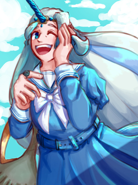
Blue!
I love @pokemonlolitaproject 's co-ords a lot, so i wanted to draw one---
Melony + Lapras co-ord :]
(I'll reblog this with the link to the original co-ord post--)
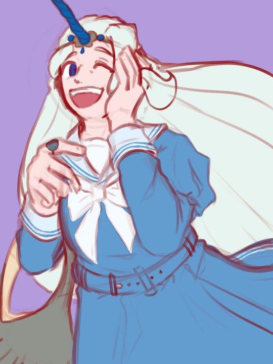

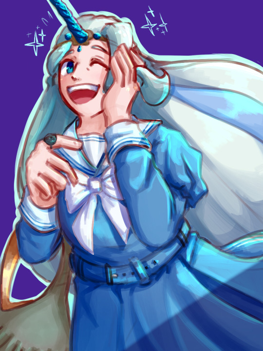
some wips ^^^^
#pokemon swsh#pokemon sword and shield#pkmn swsh#pkmn sword and shield#poke's doodles#art#gym leader melony#uhhhh#I feel kinda nervous lol#dunno why-#anyways--- im sorry i didnt draw the wig from the co-ord :[[[[#i just. like drawing melony's hair too much lol#i was going to draw a lil doodle of a full body picture to fully show off the cool outfit but................#i forgot :']#i still need to get the hang of drawing melony tbh......... so im sorry if anything looks off lol - I'm working hard to improve!!! promise!#oh and if you're wondering why im not adding the link to the post---#-- if i do my post just. doesnt show up anywhere for some reason :[
49 notes
·
View notes
Text
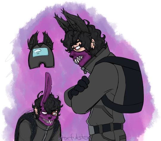
eaouuugh
#corpse husband#amongus#I guess#help me pls#I've forgotten how to draw people that aren't fnf shaped#iiidk brainron not wanting to leave me alone#I know it's just 2 unfinished things plus a weird bean thingamajig but eh#maybe I'm worried if I don't upload I'll procastinate and won't end up producing anything cause I know I won't finish these doodles#and I started to not like the previous corpse attempt much I guess bc the teeth were so lame#so more teeth for better or worse yeehaw#idk if there'll be more corpse art or not tbh maybe I should just doodle more beans cause then I can draw his cute lil friends aswell#like a green sykkuno bean and a red rae bean and the rest aswell maybe ahh the possibilities lol#cause I probably won't draw anyone else otherwise bc learning how to draw more actual people is too much dang effort tbh ha ah well#k will stop rambling about nothing now ok cool#so enjoy more amongus ish corpse attempts or do not it's whatever#among us#I draw what I want#feel free to ignore nws ha#more bombeep and regular stuff soon hopefully fingers crossed#stream 'Never Satisfied' on spotify bc idk good music and also yelling ha#anyways laters k bye
118 notes
·
View notes
Text
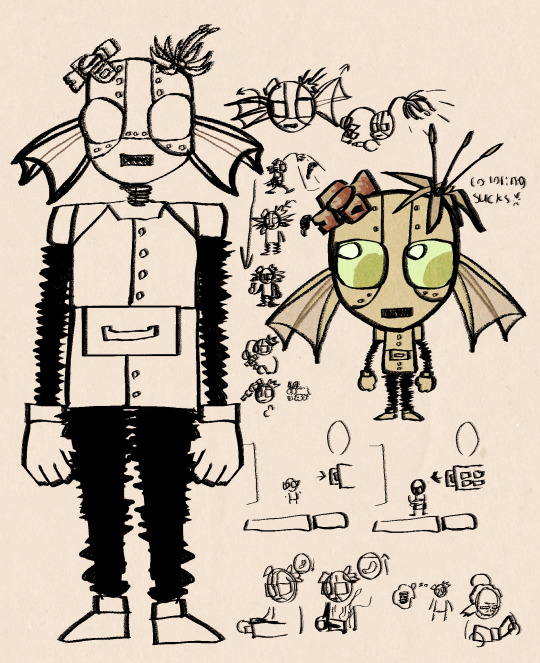
Some very lazy concept doodles for my swap au Wendy
#keese draws#don’t starve together#dst#dst Wendy#wendy carter#I need to make a tag for this au but I’m lazy#anyways sorry if the scribbles are incomprehensive idk what I was on abt either tbh#well ok most of it is just mechanics I’ve talked abt before but yknow#oh and the bottom right doodle is abt how wickerbottom’s wereghost form performs the haunt action on hauntable objects with higher chances#of whatever effects meaning that given enough trees technically you could use her for living log farming#and due to wendy’s fuel mechanic living logs are quite valuable since they’re one of the few things that effect sanity when burned#they also slow sanity drain significantly when burned which is nice for the guy who doesn’t have a lot of sanity options#wurts are also a good living log soruce but I didn’t want to design her rn so rip wurt#she’s a lil baby tree guard sorta#well she basically just Is a tree guard but with a irredecent gem in her head#webber created her because he was lonely rip#he also was the one who accidentally got wendy killed and then made wendy robot body#wendy predictably has a lot of angsting to do abt that especially since it came with significant memory loss#and abby doesn’t die in this au so she’s also there and is deep in denial lol
37 notes
·
View notes
Photo
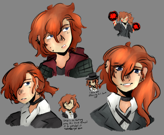
types of expressions to give to your (ex) partner throughout the years
#bungou stray dogs#bsd#chuuya nakahara#my art#dont worry about the lil notes theyre just kinda random thoughts i noted down#and the corruption doodle was the last thing i did in this lol hes just vibing#personally my favorite is the 22yro expression idk it looks really nice#so#but yeah tbh i just got really sad so i doodled a bunch of chuuya to be . less sad.#i am rotatin him in my head like a rotisserie chicken
83 notes
·
View notes
Text

Scrimbly Jacqueline 49/52: T-Posing to assert your dominance is definitely NOT how Jacqueline was envisioning taking down the Clifton Society.
Charlie heard the metal clicks again as something came shooting down from the opposite side of the room. He lunged, covering Jacqueline’s back as the strips came flying towards him. They hit his chest. He let out a whoosh of air from the impact, watching as they fell to the ground with a clatter. Surprised, Charlie pat his entire torso. "They don't work on me?" Two more hit his forearms, promptly falling to the ground. He shoved back his sleeves as best as he could. No shiny marks. “Oh!” Throwing his weight, he shoved Jacqueline to the side, switching places with her. “Charlie, don’t—” “It’s cool! They don’t work on me!” He stuck his arm out for emphasis, another one of the strips bouncing right off him. Jacqueline looked surprised. “Well, shit! That's handy." Colin sneered, the baton tip tap tapping several more spots around him. “You can’t hide behind your human friend forever!” The pair of Legates heard the metal clanking fill the room as Lady knows WHAT armed all around them. Trying to make himself as big as possible, Charlie stood in front of Jacqueline, arms wide. "Yes she can!" Behind him, Jacqueline looked perplexed. She rolled her eyes with a huff, moving closer to Charlie. “We literally do not have time for this. Hang tight, Charles." And before Charlie could even form a reply, he felt himself be yanked down, snow blasting all around them as they fell towards the couch.
(You can read Part 2 of the Clifton Society Incident HERE and HERE)
Upon editing that behemoth, the MOMENT I realized Charlie was T-POSING IN THAT SCENE?!?!?!?1 I had to make it a scrimbly. I just. HAD to.
This was LAST WEEK'S! This week's is coming to you probably Saturday :)
[Husbando and I are going on an evening adventure to check out the geminid meteor shower outside of the city, so I'll probably get to posting it Saturday depending on how late we stay out--and if we can see anything given we're going in and out of cloud cover around here today! Also, uh, I was a wee bit bad, hehe. I doodled it at work today bc it's about that time chaps (i.e., exam season is waning and there is nobody on the floor but me and my coworker lmao) and they look SO CUTE 🥹🥹🥹]
This week's was ORIGINALLY going to be ANOTHER redraw, this time of THIS scrimbly, but man, Charlie and Jacqueline's shenanigans somehow managed to yeet Jacquie ogling Dite to the curb. WILDIN. Good thing this week's scrimble was a planned diteline, LOL.
Charlie LOOKED good in the sketch, but somehow the hair ended up "late 00s, early 2010s hat hair boy" and I am. Unamused. I've drawn WAY better Charlies, UGH. Gonna have to rewatch the movies, I guess 🤷🏻♀️ oh nooooooooooooo 😼
#dani speaks#and probably also pick a ding dang fit for him!!#i like when he wears a red hat/toque it makes me laugh#it's just. he wears the boringest clothes alive!!#which is funny bc I hc that when he does become santa. he's hot santa. fashion santa. google it. the latter tbh not the former#ANYWAY#dani doodles#scrimbly jacquelines#cs posting#tsc#tsc2#not full tagging it bc that is a SHAMEFUL charlie! FUCK#but jacqueline's left hand is looking GOOOOOD#i still can't get consistent sizes/shapes with hands and arms but i am having FUN posing those bad boys#and moving the hands around lol#LOOK AT HER FINGIES DOING A LIL CLAW! AMAZING!#i would like to thank the academy for this improvement#aka my v inspiring artist friends on here who are sups supportive and whose personal improvement in art journeys have been SO INSPIRING#y'all make me feel like anything is possible! INCLUDING DRAWING HANDS APPARENTLY LOL#i'm going mad guys. next year i'm really gonna go through the to draw tag AND do silly little comicy things monthly#WILDIN
3 notes
·
View notes
Note
hello! (Totally don't know if u will even remember but im that one person who dropped my phone and sent you something on pinterest lol) i just wanted to say, or well- ask.. totally actually unrelated to VSAU, Its actually abt ur s9 grian design! (Its rlly rlly cool btw!!) Is there any specific inspiration behind it? Ik that the entity is a clear main inspiration lol,, but what else was an inspiration? (Honestly i just love hearing inspiration behind designs :3)

oh my goooooood i havrnt thought about this goober in sO LONG its been 2/3 years so so??
Honest to god a lot of deseign elements came from Genshin! I had just gotten into the game at the time so quite a few design elements have carried over from that! the diamond shapes on the cape, the layering of fabric, they're all genshin ajecent, and the tail has Zhongli vibes tbh
I just wanted to make Grian a non-human lil guy, and I was SOOOO excited over the Entitiy, I remember doodling potential Grian designs instead of paying attention in DND lol
65 notes
·
View notes
Note
Cabi! Big fan Joffrey here!
I wanted to ask, every time I see your art not only am I stunned by the quality, but also by the sheer uniqueness in style and character design. I've never seen a lamb designed quite like yours, it's so perfectly yours. What went into the inspiration behind the characters design, especially facially? Did you try and mimick a real lamb, or was there a more fantasy-element that you veered toward?
I can't specifically put my finger on it, but it gives me vague Warframe vibes. It's such a beautifully odd design and I can't get enough.
Love your work, love everything you do, can't wait to see what's next!
Hope you're well, stay safe, take care!
First of all, your ask is one of the biggest compliments I ever had in my life, I will keep it forever. You're an absolute chad! Second of all, those are very interesting questions, and I will be very happy to answer to them!
It started more or less with this drawing I made *look at the date* 2 years ago apparently. Way before I even thought of an AU- I didn't had much in mind, beside doing something that looked cool tbh.
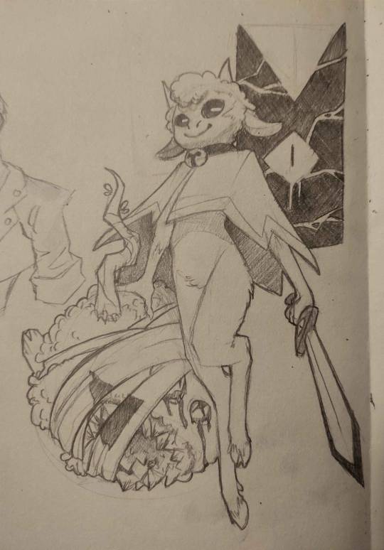
I was very happy with the flow of it, and how it came out. And when I drew the Lamb again, I would try to nail THIS design.
The thing is, with time, I had a really big problem: Lamb looked way too young when I thought of them more as an adult. I had too much of the original game design guiding me, making a Lamb that was too cute and childlike for what I wanted. (And also, the head did not go well with the rest of the body holy shi-)

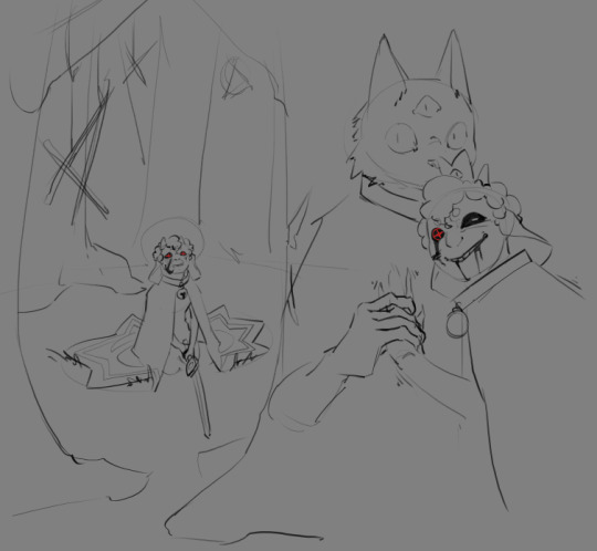
Came those drawings! I was happier with the look, Lamb was older! And I found the colored design quit nice! (I used a sheep picture as reference, but I don't think I used it well, compared to now. I used the reference for details, when I should have gone for overall shape first.) I still wanted something simpler to draw tho. The colored design was nice for an illustration, a one time gig, but I got pretty annoyed pretty fast at trying to nail the face every time. And from those attempt, you get the sketches on the right. (I also wanted to get away from other artiste's interpretation of Lamb, and at the time of those drawing, I didn't felt like I was away enough)
From those previous sketches, the idea for THaB started to emerge. I also still had problem with Lamb's design. Especially the hair. I was inspired by black hair, which is usually not a problem, but I was never happy with how it looked on Lamb specifically. I can draw black hair, I can draw black characters, but this mother-fucker would never feel satisfying to draw or finish 👀
And one day, as THaB was solidifying in my mind, I made a series of sketches that I posted! And one of them was the most important in Lamb's final design. This lil guy! (this design didn't came out of nowhere tho, Lamb was evolving into this as I kept trying. But I wont show those sketches, because those are spoilers =3)
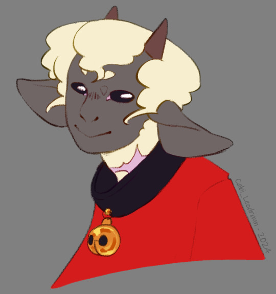
And soon after, I made a comic that was supposed to only be a one shot, just a POV of Lamb and there reaction to Nari' telling them to die for him. But you know, things got out of hand lol
As I continued the comic and doodles on the side, I finally made myself a reference board, with real life images that were close to the vibe of this head drawing. (And I cannot stress enough how those references solidified Lamb's design as a whole. Draw with references, it is life changing. The more reference you get, the more your visual library will get diverse, and the more interesting detail and shape you will add to your art in general.) (I'd also add this: understand what you are drawing, make research and stay curious for every bit of info on everything. You never know when these nuggets of knowledge will help you as you create)
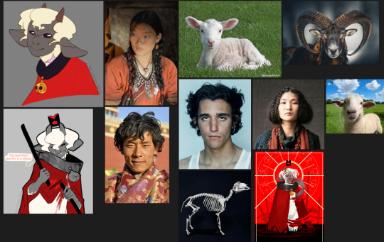
As I kept drawing the Lamb, they evolved! Things changed, slowly, like the shape of the nose, the shape of the eyes, how the hair flowed. You see those change at the face, but also on the body! As the idea of THaB's Lamb got clearer, the design got more specific. (I also got better at drawing! This comic make me draw way more often then before, and it shows)

Something before I finish: the other Cult of the Lamb character's design are way more inspired by their animals, when Lamb is more in the human spectrum. I thought of changing Lamb at some point, to make it fair/coherent, but I loved the design too much to change it again. This AU is something I do for fun, and even if it would have been more logical to change them... I don't want to-
As for the vague Warframe vibes: I play the game! And I found the character design absolutely stunning. So I am definitely influenced by the game without knowing it lol
Thank you very much, again, for your kind words! I also wish you the best, and see you next post =D
TL;DR: Lamb design, at first, wasn't inspired by much, beside the game and my style at the time. But as I retried to make them, added more intent, they got more refined. What really nailed the idea was to have real life references on the side.
#cabi ask#long post#cotl lamb#this took a lot of time to write holy shit#but it made me take a look at older drawing and made me realise how much I got better in 2 years#so it was worth it#and again Thank you Thank you Thank you Thank you
69 notes
·
View notes
Text
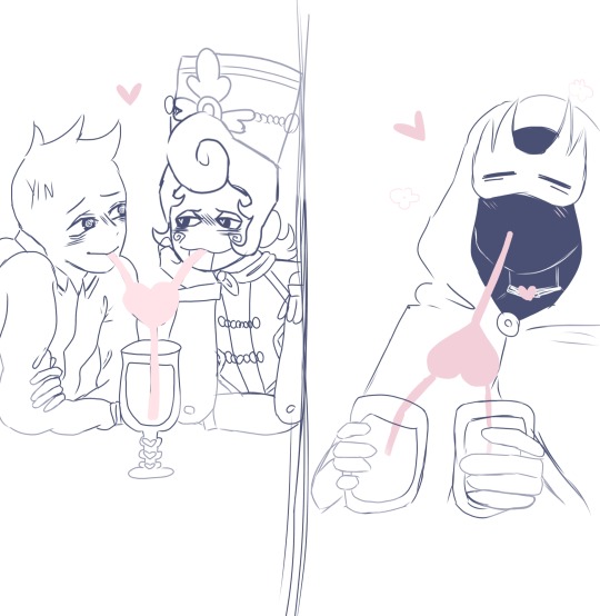
heyo guys! Sorry my edit video takes so long (to be honest I only did now like... 9 drawing and 8 sketches haha) here’s a little silly drawing that I laugh quite a bit tbh I think while y/n and Wally enjoy being lovey dovey in the movie zipora will just enjoy their love and don’t feel bad to be side character lol Bc plus! 2 drinks! for herself hehe 😆
Fanart lil doodle for @sketchquill (nutcracker wally au)
I hope you still waiting y’all! Haha
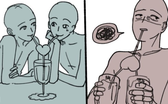
(The drawing idea from this)
#my art#welcome home#fanart#wally darling#wally darling x y/n#welcome home au#nutcracker wally au#art
506 notes
·
View notes
Text


various doodles for @alexthebordercollie's papa Ford au! mostly i just wanted to draw Stan being a good uncle. mullet Stan is surprisingly fun to draw tbh. he's a goober
got to bring back my baby Tate design, so that was fun. he's just a lil guy <33
2. it cracks me up whenever the stan brothers scruff Dipper like a kitten. it's so goofy. also, just had to include Nick puffing up his cheeks like Ford lol
3. Stan turned out a bit wonky in this one, but it's still cute. i like to think he's doing a pirate voice :]
bonus Ford!:

Ford's attempt at bonding with Tate over fishing went... less well lmao. they ended up running into the island head. both fortunately and unfortunately for Ford, he lives in gravity falls, and tends to encounter the supernatural. at least he'll get a journal entry out of it
fun fact! the island head is actually my fav gf monster! it's just so cool and creepy! plus, that short has some of Tate's only lines in the the entire series. it just felt fitting to go with here hjkkjhjk
45 notes
·
View notes
Note
Can we know more about Ghost with Raven? For those of us who are new here. 👉👈 I'm especially curious if Price is involved when those two are together, or how his dynamic is with the both of them if not. OT3? Do we throw Nik in there somewhere? Get all the poly going on? Or is it just Ghost and Raven against the world? 🤍
Hello!! Welcome to my lil ramble spot :3
I like to mix up my OC with the other characters for fun 😂 (imagine me holding them like dolls and smashing their faces together) and make things up along the way. So my uhhh explanations are gonna be wonkey
Rambles below! Kinda messy sorry!
GhostRaven started off as a separate thing, the idea was to explore something different like “these two are always fighting and cursing each other out but you mess with either one of them they will make sure you regret” or “I hate you so much vs You want to kiss me so bad it makes you look stupid” vibe, yk. I just like to make them bud their heads together. The other part of it was just wanting to see what two people who have fucked upbringing would behave in a relationship since Raven’s lore is based off of Ghost (well kinda)
I do have like, a whole backstory for GhostRaven like PriceRaven but I just never really compiled it or make it official because my brain could only get organized for one pair at the moment 😂 This itself can be a whole post which I’ll share next time if you are interested about it!
Tbh, I started off with GhostRaven first when I decided to make a cod oc, but because OC x Ghost stuff usually get targeted for no reason (on anywhere really, but tumblr is the safest among all the platforms I see) so I didn’t post much about them until much much later xD I got nervous doing PriceRaven back then too but eventually I kind of just went on and ramble about them once I felt comfortable enough :3 so for the longest time it was just PriceRaven or GhostRaven
Then I decided to spice it up with Price in it (PriceGhostRaven is thus born) (and also, Im projecting to Raven cuz I want Price and Ghost both HFHSHSHSH) There’s no real answer to the way their dynamic works but I did had a few stories? Or ideas? As to how the three of them became a thing? xD
I like to imagine Price and Ghost had a thing going on, and then Price went on ahead with Raven and Ghost was just kinda chilling, and then Raven found out their history and went “so what if”, Ghost goes “huh” and then Price went “yeah so are you in or not” and Ghost went “sure fuck it why not”— yeah HAHA Price is the one calling the shot in their relationship, Ghost and Raven follows (tho Raven can be a tiny bit of a brat sometimes)
The other part is GhostRavenPrice where it’s mostly Ghost and Raven ganging up and spoiling Price…imagine two grumpy growling wolf(GhostRaven) surrounding their owner(Price) - that’s the vibe 😂 I like to draw em in a way that both Ghost and Raven are possessive and insane with their way of “loving” another, and Price just went “ayt bet”
I haven’t consider throwing Nik into the party because I still donno how to feel about NikRaven yet :3 also because so far I’ve only ever done ot3 and never explored beyond 3 peeps. I did consider PriceGhostRavenJelly? (Jelly is another OC of mine shipped primarily with Ghost and Rudy) it might be fun to dabble on it sometime
I had, and will not consider ghoapraven xD but perhaps will consider ghoapjelly, but nothing’s for certain, entirely based on my mood LOL
But basically, the main ships that I do here are PriceRaven, GhostRaven and GhostJelly, and three of these ships have their own separate stories and they exist on different timelines. However, I like to mix them sometimes just for the fun of it (eg: PriceRaven that becomes GhostRaven and eventually PriceGhostRaven or PriceRaven double date GhostJelly)
Then I do other poly ships sometimes for fun, without any backstory or anything, just doodles
#yk sometimes it alr feels [wrong] doing anything beyond 3 characters in a ship#hear me out HFHSHS#because I view them from their main ships first - ykwim like#PriceGhost dynamic firstly…then PriceGhostRaven for example#PriceGhostRaven had no issues for me bcuz I can fee it happening but with the other one like#NikGhostPrice for example…it’s like I definitely can and am feral over this dynamic#and to imagine putting Raven inside that dynamic feels…kinda wrong? xD or forced? yk#idk its a funny feeling bcuz i love that ship as it on alr#and like Raven’s been more of Price’s girl anyways so idk#maybe its just sum im not used to#hell im not used to poly at all since idk what it’s like 😂#i hope uhhhh this is coherent#its hard for me to explain fjsjdjajjfje#🤣enjoy your stay tho#ask response#my oc#cod oc#[oc]Raven
24 notes
·
View notes
Text
my heart design!! (and a lil doodle as a treat)


tbh i love drawing him, ive just been focusing more on making designs for mind and soul recently lol
#chonnys charming chaos compendium#chonny jash#cccc fanart#chonny jash heart#cccc heart#cj heart#heart chonny jash#heart cccc#heart cj#cccc#digital art#doodles#magma art#art#my art#ethan's romanceless art
66 notes
·
View notes
Text
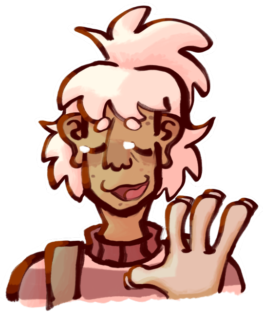

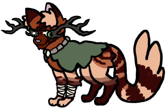
Some stuff I've drawn semi recently
#keese draws#oc art#oc#ocs#furry#furry oc#furry art#Ive been going thru it recently but Ill survive#on the bright side the pet sitting job for my aunt is coming up soon#so Ill have a house to myself for a bit at least#Im probably still gonna be fairly offline for the foreseeable future unless I somehow manage to fix my sleep schedule anytime soon#not to say I will be on any sorta complete hiatus or anything just that Im not getting any more active most likely#not that I think anyone rly cares at this point since its been the norm for a while now but yknow#Ill still be around to answer asks and stuff just dont freak out if I take a lil bit to see it 👍#anyways enough of being a downer Im actually pretty happy with these even if theyre mostly just doodles#also I havent posted any art of these guys in a While but say hi to them while you can cause theyre back into the void of my brain now#first is keese (the oc™) second is toon and third is clyve#all from different stories but toon and clyve are both from the magic cat universe#their paths never meet tho the closest connection they have has to go through like 4 characters first#you can also tell theyre from different stories because one is anthro and the other isnt lol#generally speaking I consider anthro designs slightly more canon but both are canon depending on the story#not in a shapeshifting way just in a me being an inconsistent bitch sorta way#but yeah keese the oc is much older than either of those two I just dont talk abt them or their story ever#but hey if any of yall remember suckerz those two are besties#suckerz is sort of younger than the other two and sort of much older than all three#shes a sort of updated version of a reallyyyy old sona sort of character I had in like 6th grade I think#back during my lilo and stitch experiment oc era where I had one that was music themed#I also had a digimon variant of her she was called like beatramon or smth like that#she was basically a hypothetical music mascot and shes kind of still that tbh#if I ever get enough into making music that I start posting shit it will be my music mascot
5 notes
·
View notes