#johnston sans typeface
Explore tagged Tumblr posts
Text
Fucked up that foundries actually sell Futura and Akzidenz-Grotesk. Nice looking sans serif typefaces should be a human right like medicine or education. My taxpayer dollars should go towards getting children in remote communities licenses to use Johnston in commercial projects.
3 notes
·
View notes
Photo

Arazatí font is inspired by Edward Johnston's typefaces, with 48 variants and 422 glyphs each, including two monospaced options, paying homage to Johnston's birthplace in San José, Uruguay.
Link: https://l.dailyfont.com/KdNw0
#aff#typography#design#fonts#socialmedia#creativity#inspiration#art#style#graphics#illustrations#layout#composition#textdesign#fontlover#typophile#creativeprocess
0 notes
Text
Typeface - first response
Futura
curvy, soft, simple, basic
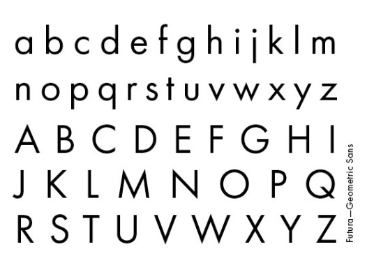
Futura is a geometric sans-serif typeface designed by Paul Renner and released in 1927. It was designed as a contribution on the New Frankfurt-project. It is based on geometric shapes, especially the circle, similar in spirit to the Bauhaus design style of the period.
Gillsans
A little more detail, like 'a' and 'g'
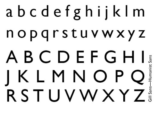
Gill Sans was released in 1928 by Monotype, initially as a set of titling capitals that was quickly followed by a lower-case. Gill's aim was to blend the influences of Johnston, classic serif typefaces and Roman inscriptions to create a design that looked both cleanly modern and classical at the same time.
Hightower
a lot more detail and personality
more advanced version of gillsans
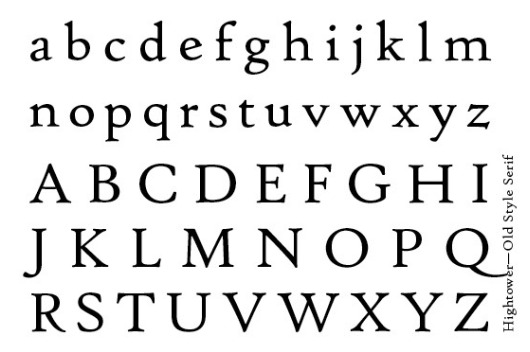
Hightower Text is a serif typeface designed by Tobias Frere-Jones. It is loosely based on the printing of Nicolas Jenson in Venice in the 1470s, in what is now called the "old style" of serif fonts.
Diolot
interesting as the thicknesses change
more modern as there are straight lines or (extended)
has a similar vibe to Hightower but more modern
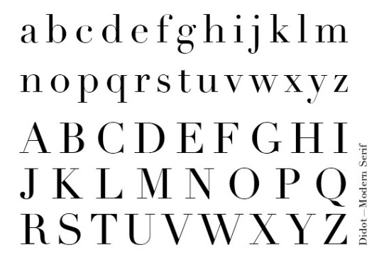
The most famous Didot typefaces were developed in the period 1784–1811. Firmin Didot (1764–1836) cut the letters, and cast them as type in Paris. His brother, Pierre Didot (1760–1853) used the types in printing
0 notes
Photo

https://www.studiojohnston.com.au
#Studio Johnston#architecture#interiors#studio#Australia#portfolio#typography#type#typeface#font#Untitled Sans#ABC Arizona#2021#Week 50#website#web design#inspire#inspiration#happywebdesign
1 note
·
View note
Photo
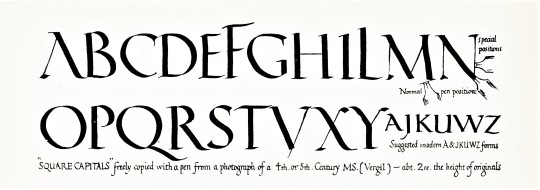

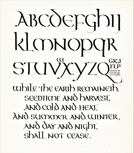
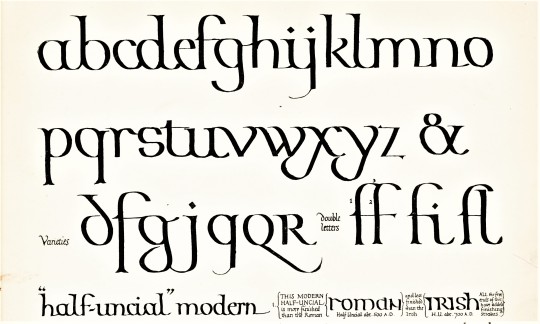


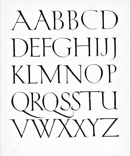


Typography Tuesday
This week we present a few plates from the portfolio Manuscript & Inscription Letters for Schools & Classes & for the Use of Craftsmen by Edward Johnston (1872-1944) and Eric Gill (1882-1940), two of the most celebrated and influential calligraphers and type designers of the early 20th century. Originally published in 1909, our copy is the fifth printing of 1922 published in London by John Hogg. It was intended as a working supplement to Johnston's highly influential 1906 work Writing & Illuminating & Lettering, also published by John Hogg.
Gill is the English sculptor, stonecutter, type designer, and printmaker most noted for his Gill Sans typeface and the proprietary typeface he designed for the Golden Cockerel Press. This publication appears to be Gill’s first. Johnston, remembered most popularly for his type design for the London Underground, is arguably the most influential calligrapher of the 20th century. Among his students who later became well-known in their own right were Anna Simons, Graily Hewitt, T. J. Cobden-Sanderson, Percy Smith, Florence Kingsford, Dorothy Bishop Mahoney, and of course, Eric Gill. Johnston taught at the Royal College of Art in London from 1901 until his death. Johnston’s student Irene Wellington succeeded him at the Royal College of Art in 1944, and through that position she in turn influenced another generation of calligraphers and illuminators.
Click or tap on the images for captions.
View more of our posts on Edward Johnston.
View more of our posts on Eric Gill.
View more Typography Tuesday posts.
#Typography Tuesday#typetuesday#Typography Tuesday#Edward Johnston#Eric Gill#calligraphy#calligraphers#John Hogg#letter design#type designers#20th century type#instructional books#Manuscript & Inscription Letters for Schools & Classes & for the Use of Craftsmen
74 notes
·
View notes
Text
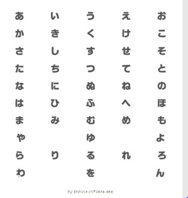
Wonderful Japanese fonts
japanese font
Regardless if you’re a stylish working for Japanese purchasers or just want to fantastic your Japanese ex girlfriend or boyfriend using your Photoshop skills, you’ll soon become tired of the very limited personal choice of Japanese typefaces that accompany your operating system, whether it be Windows, OSX, or simply Linux.
japanese font
Minchō
Mincho typeface, also known as Ming or Song, will be the most used font style in print designed for Chinese and Nippon. It’s main attributes are the presence associated with small serifs usable stroke width (vertical strokes are generally narrower than horizontal strokes).
TB Mincho is an effective Mincho font through the famous Japanese TypeBank foundry. It’s fairly expensive, but a good idea the money if you are your designer in need of a competent Japanese font.
Medieval
Gothic type, also referred to as Kaku Gothic, is practically as popular like Ming. It is seen as a plain rectangular shots with equal girth and no serifs and the main benefit is incredible legibility at modest sizes.
Meiryo (Free) is my favorite cost-free Japanese font. Inside preparations for Home windows Vista release, Ms realized that their particular current Japanese fonts (mainly MS Old and MS Mincho) are incompatible making use of their ClearType subpixel manifestation technology and thought i would create a new 1.
Meiryo is one of the earliest Japanese fonts established on and for ones computer screen and required two years to create along with engineer. The Japanese heroes were designed by Eiichi Kono who specially designed the New Johnston font used by London Subterranean. The Latin character types were designed by Matthew Carter, creator within the great Verdana font. The font can be incredibly readable from small sizes and is particularly one of the few fonts at which Latin and Japanese people characters look effectively together. Maru Medieval
Maru Gothic is essentially Gothic with circular corners. If the initial two styles may just be considered as equivalents from Western serif together with sans-serif fonts, Maru Gothic could be when compared to rounded sans-serif typefaces such as Arial Circular.
TB Maru Old is a nice Maru Gothic font from the famous Japanese TypeBank foundry. It’s quite expensive, but worthy of the money if you are a good designer in need of a pro Japanese font.
Yokobuto Minchō
Yokobuto Mincho can be described as a combination of Minchō and Gothic typefaces. It adopted similar width strokes nonetheless retained the serifs.
TB Yokobuto Mincho is one of the only Yokobuto Minchō fonts that you can buy but this actuality doesn’t make it any kind of less beautiful. It’s rather expensive, however , well worth the money in case you are a designer wanting a professional and genuine Japanese font. Open & Handwritten
Completely new Japanese font type resembling characters tempted with a marker compose. It’s mainly come with shop signs and additionally leaflets. Some of these fonts try to imitate real-life handwritten text in addition to transpose it upon the computer screen.
Anzumoji (Free) is a kawaii font with a kawaii name (あんず methods apricot, もじ implies letter/character). It’s fairly amazing how certainly this handwritten Japoneses font looks to the screen, especially inside longer paragraphs which can be problematic for comparable fonts.
KF Himaji (Free) - one other cute Japanese handwritten font, with an right name (ひま signifies spare time/leisure). I actually especially like round of golf shapes which are certainly visible in the 日 and 語 kanji.
Sakura (Free) is about the many great fonts by Flop Model with some pleasant touches like a sakura petals in place of shorter strokes.
Shirousagi along with Relax (Free) are simply just two of the many wonderful Pop style Japan fonts by gau+.
I hope that this catalog contains at least one Nippon font that very hot your heart.
5 notes
·
View notes
Text
Typography 1 / Seminar notes
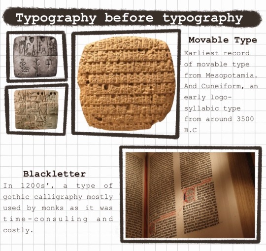

Early Typography
Nicolas Jenson, Jenson (1470), earliest Old Style typefaces, low contrast between thick and thin strokes
William Caslon the first, Caslon (1692–1766) Old Style, serif typefaces
John Baskerville, Baskerville (1750s) the first Transitional typeface, serif, transitional serif, thinner serifs and moderately higher contrast between thick and thin strokes, often used in books.
the Didot family, Didot (1784-1811), a group of typefaces, one of the first Modern serifs, elegant and chic
Typography and the Industrial Revolution
Compared to the fast evolution in mechanics and work industry, typography suffered.
Type was condensed, stretched, mix match of styles, eccentric look.
Many ‘vintage’ fonts today take inspiration from this time period.
Modernism
Paul Renner, Futura (1927), early sans serif, inspired by geometric shapes, the Geometric Sans typefaces
Eric Gill, Gill Sans (1626), inspired by Edward Johnston's Underground Alphabet (1916), typefaces are now known as Humanist Sans typefaces.
Max Miedinger and Eduard Hoffmann, Helvetica (1957), sans-serif typeface.
Digital Age
Typography creation more accessible but still in limitations of screen technology.
Pixel Type
Why is Typography important?
It is how we communicate
Labels, signs, information
Typography is everywhere
3 notes
·
View notes
Text
Graphics Design
Graphic design is a profession whose business is the act of designing, programming, and create visual communications, generally produced by industrial means and intended to convey specific messages to specific social groups, with a clear purpose. This is the activity that enables graphically communicate ideas, facts and values processed and synthesized in terms of form and communication, social, cultural, economic, aesthetic and technological. Also known as visual communication design, because some associate the word figure only to the printing industry, and understand that visual messages are channeled through many media, not just print.
Given the massive and rapid growth in the exchange of information, the demand for graphic designers is greater than ever, particularly because of the development of new technologies and the need to pay attention to the human factors that are beyond the competence of engineers who develop them.
Some classifications are widely used graphic design: advertising design, editorial design, corporate identity design, web design, packaging design, typographic design, signage design, multimedia design, among others.
Graphic Design History
The definition of the graphic design profession is rather recent, in what concerns their preparation, their activities and goals. Although there is no consensus on the exact date of the birth of graphic design, some dating during the interwar period. Others understand that begins to identify as such to the late nineteenth century.
Arguably specific graphic communications purposes have their origin in Paleolithic cave paintings and the birth of written language in the third millennium BC. C. But the differences in working methods and training required auxiliary sciences are such that it is not possible to clearly identify the current graphic designer with prehistoric man, with xylograph fifteenth century or the lithographer 1890.
The diversity of opinion reflects the fact that some see as a product of graphic design and all other graphical demonstration only those that arise as a result of the application of a model of industrial production, those visual manifestations that have been "projected" contemplating needs of different types: productive symbolic ergonomic contextual etc.
Background
A page from the Book of Kells: Folio 114, with decorated text contains the Tunc dicit illis. An example of art and page layout of the Middle Ages.
The Book of Kells - A Bible handwritten richly illustrated by Irish monks in the ninth century CE-is for some a very beautiful and early example of graphic design concept. It is a graphic demonstration of great artistic value, high quality, and that even a model for learning to design-for even surpasses in quality to many of the current-editorial productions, and also from a functional point of view contemporary This graphic piece responds to all needs presented the team of people who made it, however others believe that it would be graphic design product, because they understand that their design is not adjusted to the idea of current graphic design project.
The history of typography-and by transitive, also the history of the book-is closely linked to graphic design, this may be because there are virtually no graphics designs that do not include such items graphics. Hence, when talking about the history of graphic design, typography also cited the Trajan column, medieval miniatures, Johannes Gutenberg's printing press, the evolution of the book industry, the posters Parisian Arts Movement and Crafts (Arts and Crafts), William Morris, Bauhaus, etc.. "
The introduction of movable type by Johannes Gutenberg made books cheaper to produce, and facilitate their dissemination. The first printed books (incunabula) scored the role model to the twentieth century. Graphic design of this era has become known as Old Style (especially the typefaces which these early typographers used), or Humanist, due to the predominant philosophical school of the time.
After Gutenberg, no significant changes were seen until the late nineteenth century, particularly in Britain, there was an effort to create a clear division between the fine and applied arts.
In the 19th Century
First page of the book "The Nature of Gothic" by John Ruskin, published by the Kelmscott Press. The Arts and Crafts intended to revive the medieval art, inspiration in nature and manual labor.
During the nineteenth century visual message design was entrusted alternately two professionals: the artist or the publisher. The first was formed as an artist and the second as a craftsman, often both in the same schools of arts and crafts. For the printer as art was the use of ornaments and selecting fonts printed in his compositions. The artist saw typography as a child and paying more attention to ornamental and illustrative elements.
Between 1891 and 1896, the William Morris Kelmscott Press published some of the most significant graphic products Arts and Crafts Movement (Arts and Crafts), and established a lucrative business based on the design of books of great stylistic refinement and selling them to the upper classes as luxury items. Morris proved that a market existed for works of graphic design, establishing the separation of design from production and the fine arts. The work of the Kelmscott Press is characterized by its recreation of historic styles, especially medieval.
First Vanguards
Poster for the Moulin Rouge in Paris. Made by Henri de Toulouse-Lautrec with color lithography in 1891. Thanks to Art Nouveau, graphic design and visual clarity gained by the composition.
Isotype of the Bauhaus. Founded in 1919 by Walter Gropius, is considered the birthplace of the graphic design profession.
Given Poster for Matinée. Made by Theo van Doesburg in January 1923. The free font organization, expresses the spirit of the Dada movement, irrationality, for freedom and oppose the status quo and visual expressions of the time.
Corporate identity design for Lufthansa, by the Development Group 5 of the HFG Ulm. Ulm School was an inflection point in the history of design, since there is outlined the design profession through scientific methodology.
Current pictograms design for the National Park Service of the United States. The idea to simplify the symbols forms developed during the 1950s.
The design of the early twentieth century, as well as the fine arts of the same period, was a reaction against the decadence of typography and design of the late nineteenth century.
The interest in ornamentation and the proliferation of measurement changes and typographical style one piece design, synonymous with good design, it was an idea that was maintained until the late nineteenth century. The Art Nouveau, with its clear desire stylistic was a movement that contributed to higher order visual composition. While maintaining a high level of formal complexity, did so within a strong visual consistency, discarding the variation of typographic styles in one graphic piece.
Art movements of the second decade of the twentieth century and the political turmoil that accompanied them, generated dramatic changes in graphic design. The Dada, De Stijl, Suprematism, Cubism, Constructivism, Futurism, the Bauhaus and created a new vision that influenced all branches of the visual arts and design. All these movements opposed to the decorative arts and popular, as well as the Art Nouveau, which under the influence of the new interest in geometry evolved into the Art Deco. All these movements were a revisionist and transgressive spirit in all arts of the time. This period also publications and manifestos proliferated through which artists and educators expressed their opinions.
During the 1930s developed for the composition interesting aspects of graphic design. The graphic style change was significant because it shows a reaction against eclecticism ornamentalist organicism and the time and proposes a more stripped and geometric. This style, connected with Constructivism, Suprematism, Neoplasticism, De Stijl and Bauhaus exerted a lasting influence and inescapable in the development of twentieth century graphic design. Another important element in relation to professional practice, was the increasing use of visual form as communication element. This item appeared mostly in the designs produced by the Dada and De Stijl.
The symbol of modern typography is the sans serif font or serif, inspired by industrial types of the late nineteenth century. Highlights include Edward Johnston, author of the font for the London Underground, and Eric Gill.
Design Schools
Jan Tschichold embodied the principles of modern typography in his 1928 book, New Typography. He later repudiated the philosophy presented in this book, calling it fascist, but remained very influential. Herbert Bayer, who dirigó from 1925-1928 the typography and advertising workshop at the Bauhaus, created the conditions for a new profession: the graphic designer. He put the subject "Advertising" in the education program including, among other things, the analysis of advertising media and the psychology of advertising. Notably, the first to define the term Graphic Design was the designer and typographer William Addison Dwiggins in 1922.
Thus Tschichold, Herbert Bayer, László Moholy-Nagy, and El Lissitzky became parents of graphic design as we know it today. They pioneered production techniques and styles that have been using later. Today, computers have dramatically altered production systems, but the approach that contributed to experimental design is more relevant than ever dynamism, experimentation and even very specific things like choosing fonts (Helvetica is a revival, originally a Typography design based on the nineteenth-century industrial) and orthogonal compositions.
In the years following the modern style gained acceptance, while stagnated. Notable names in modern design midcentury are Adrian Frutiger, designer of the typefaces Univers and Frutiger, and Josef Müller-Brockmann, large poster of the fifties and sixties.
The Hochschule für Gestaltung (HFG) in Ulm was another key institution in the development of the graphic design profession. Since its founding, the HFG distanced himself from a possible affiliation with advertising. At the beginning, the department concerned was called Visual Design, but it quickly became clear that his current goal was to solve design problems in the area of mass communication in the academic year 1956-1957 the name was changed to Department of Visual Communication, modeled Visual Communication Department at the New Bauhaus in Chicago.2 3 In the HFG Ulm, decided to work primarily in the area of persuasive communication in the fields such as traffic sign systems, plans for technical equipment, or visual translation of scientific content. Until that time were not systematically taught these areas in any other European school. In the early '70s, members of the Bund Deutscher Grafik-Designer (Association of German graphic designers), unveiled several features of their professional identity, as in the case of Anton Stankowski among others. While in 1962 the official definition of the profession was directed almost exclusively to the advertising, now extended to include areas located under the rubric of communication visual.4 corporate images produced by the Development Group 5 of the HFG Ulm such as those created for the firm Braun or airline Lufthansa were also critical to this new professional identity.
Gui Bonsiepe and Tomas Maldonado were two of the first people who tried to apply the design ideas from semantics. In a seminar held at the HFG Ulm in 1956, Maldonado proposed modernizing rhetoric, classical art of persuasion. Maldonado Bonsiepe and then wrote several articles on semiotics and rhetoric for Uppercase English publication and Ulm magazine that would be an important resource for designers to that area. Bonsiepe suggested that it was necessary to have a modern system of rhetoric, semiotics updated as a tool to describe and analyze the phenomena of advertising. Using this terminology, could expose the "ubiquitous structure" of a message publicitario.5
The idea of simplicity and good design feature continued this for many years, not only in the design of alphabets but also in other areas. The tendency to simplify influenced all means at the forefront of design in the 1950s. At that time, developed a consensus that simple, not only was the equivalent of good, but was also more readable equivalent. One of the hardest hit areas was the design of symbols. The designers raised the question of how they could be simplified without destroying its informative function. However, recent investigations have shown that the shape simplification only one symbol does not necessarily increase readability.
Second Vanguards
Reaction to the sobriety growing graphic design was slow but inexorable. The origins of postmodern fonts back to the humanist movement of the fifties. In this group highlights Hermann Zapf, who designed two typefaces today ubiquitous Palatino (1948) and Best (1952). Blurring the line between serif fonts and sans serif and reintroducing organic lines in the lyrics, these designs served more to ratify the modern movement to rebel against him.
An important milestone was the publication of the Manifesto, first things first (1964), which was a call for a more radical form of graphic design, criticizing the idea of design in series worthless. He had a massive influence on a new generation of graphic designers, contributing to the emergence of publications such as Emigre magazine.
Another notable designer of the late twentieth century is Milton Glaser, who designed the unmistakable I Love NY campaign (1973), and a famous Bob Dylan poster (1968). Glaser took elements of the popular culture of the sixties and seventies.
The advances of the early twentieth century were strongly inspired by technological advances in photography and printing. In the last decade of the century, technology played a similar role, but this time it was computers. At first it was a step back. Zuzana Licko began using computers to compositions soon, when computer memory was measured in kilobytes and typefaces were created by dots. She and her husband, Rudy VanderLans, founded the pioneering Emigre magazine and type foundry of the same name. They played with the extraordinary limitations of computers, releasing a great creative power. Emigre magazine became the bible of digital design.
David Carson is the culmination of the movement against contrition sobriety and modern design. Some of his designs for Raygun magazine are intentionally illegible, designed to be more visual than literary experiences.
Present Times
Today, much of the work of graphic designers is assisted by digital tools. The graphic design has changed enormously because of computers. From 1984, with the appearance of the first desktop publishing systems, personal computers gradually replaced all analog in nature technical procedures for digital systems. Thus computers have become indispensable tools and, with the advent of hypertext and the web, its functions have been extended as a means of communication. In addition, the technology also has been noted with the rise of telecommuting and special crowd sourcing has begun to intervene in work arrangements. This change has increased the need to reflect on time, motion and interactivity. Even so, the professional practice of design has not been essential changes. While the forms of production have changed and communication channels have been extended, the fundamental concepts that allow us to understand human communication remain the same.
Job performance and skills
The ability to design is not innate, but acquired through practice and reflection. Still, it remains an option, one thing potentially. To exploit this power is necessary continuing education and practice, as it is very difficult to acquire by intuition. Creativity, innovation and lateral thinking are key skills for graphic designer job performance. Creativity in design exists within established frames of reference, but more than anything, is a cultivated skill to find unexpected solutions to seemingly intractable problems. This translates into design work of the highest level and quality. The creative act is the core of the design process manager but creativity itself is not an act of design. However, creativity is not exclusive graphics performance and no profession, although it is absolutely necessary for the proper performance of the design work.
The role that the graphic designer in the process of communication is the encoder or interpreter works in the interpretation, organization and presentation of visual messages. His sensitivity to the form must be parallel to its sensitivity to the content. This work deals with the planning and structuring of communications, with its production and evaluation. The design work is always based on customer demand, demand which eventually established linguistically, either orally or in writing. This means that the graphic design transforms a linguistic message in a visual demonstration.
The professional graphic design rarely works with nonverbal messages. At times the word appears briefly, and in other texts appears as complex. The editor is in many cases an essential member of the communications team.
The design activity often requires the participation of a team of professionals, such as photographers, illustrators, technical illustrators, including professionals with less related to visual message. The designer is often a coordinator of various disciplines that contribute to the production of the visual message. Thus, coordinates its research, design and production, making use of information or specialists in accordance with the requirements of different projects.
Graphic design is interdisciplinary and therefore the designer needs to have knowledge of other activities such as photography, freehand drawing, technical drawing, descriptive geometry, psychology of perception, Gestalt psychology, semiology, typography, technology and communication.
The professional graphic design is a visual communications specialist and his work is related to all steps of the communication process, in which context, the action of creating a visual object is only one aspect of that process. This process includes the following:
Defining the problem.
Targeting.
Conception of communication strategy.
Display.
Schedule Production.
Monitoring Production.
Evaluation.
This process requires the designer to possess an intimate knowledge of the areas of:
Visual communication.
Communication.
Visual Perception.
Management of financial and human resources.
Technology.
Media.
Assessment techniques.
The four guiding principles of graphic design are variables that graphic design professional should consider when facing a project, these are:
The Individual: conceived as ethical and aesthetic unit that integrates society which is part and to whom the visual space is uniform, continuous and connected.
The advantage: because it responds to a need for information and this is communication.
The atmosphere: because it requires knowledge of physical reality to contribute to the harmony of the habitat, and the reality of other contexts for understanding the structure and meaning of the human environment.
The economy: it encompasses all aspects related to the study of the cost and streamlining of processes and materials for the implementation of the elements.
For graphic design services visit here.
2 notes
·
View notes
Text
Contemporary Typographic Design
The past year of design study has shown me that everything from the past has its place in influencing the present and the future. Multiple names have shone through in previous research pieces, all of them important and influential in their own fields. With specific regard to typography I’ll re-reference Jonathan Hoefler (Abstract, 2019) who spoke about the creation of a typeface being seen as “designing oxygen”: it’s something that is just everywhere, and to the untrained eye is a fact of life.
Like air, text at its base structure, is functional and common. But in the hands of typographers and designers it is a medium to expressive diversity and, over time, show the progression of how we can get information across through not only the words, but through their appearance as well.
Wim Crouwel – structure
��A message that should be explained on paper to other people should be as straightforward as possible without coming in between my personal ideas and thinking. I am the one who is structuring the message and not mixing it with my personal feelings.” - Crouwel, 2015
A Dutch-born designer who worked through the middle of the 20th Century to bring identity to multiple public venues – from museums, to post offices to airports. Known for his creation of New Alphabet, a self-proclaimed experimental yet unusable font (online), it allowed him to start the consideration of design changing to meet the developing technology of the 1960s. Crouwel has works in various collections and museums for his artistic spin on what had been such a functional part of art until this time period. A follower of Josef Müller Brockmann, Max Bill, Karlt Gerstner he worked with a grid system to perfect his typefaces. Through the 1950s he met and worked with many of these influencers, translating their styles into his own interpretation. When struggling to find the typefaces his Swiss colleagues were using, he would cut it out of magazines imported from Germany and Switzerland, and when Univers came on the scene in 1958 it represented a new way of thinking to Crouwel (2015). It was during this period, from 1958-1963 that he found himself experimenting with typography: using sans-serif fonts, more straightforward designs, considering the aesthetics and combating this against the function of the text. The function was always the driving force, but he worked to find out how much of his own opinion or style should come across in his work.
GAIL ANDERSON – diversity
“It’s time to embrace what are no longer just grey roots.” - Anderson, 2018
Known for her work at Rolling Stone, with the US Postal Service and for the multiple books she has co-authored, Gail Anderson is a pre-eminent black designer who, despite winning multiple awards in the genre, sees herself as a “master type obsessive more than a master typographer” (2018). In looking through many of her works, a theme I’m noticing is her tendency to mix typefaces. Her partner in design, Stephen Heller, goes into great detail describing her eclectic styles utilising “old and new forms” to create something “which is neither modernist nor post-modernist” (2008), to me allowing her work to seem utterly timeless. Posters for modern Broadways shows that wouldn’t look out place in a wild West saloon, Rolling Stone covers that look as enticing today as they did when they were created 25 years ago. Another thing that strikes me in almost every interview I read from her, is her desire to pay it forward. This is a phrase that’s overused as a term for people pushing others to be better than themselves, but Anderson seems to mention is as a justification for what she does naturally. As a female African-American designer she has won awards and immediately used the platform to push the mentality that “It’s all about talent and your ability to communicate effectively” (Rawsthorn, 2011), something she credits the creative industries as understanding already.
HAMISH MUIR – progression
“It is a fact that typography is rarely noticed and of little interest to most people, including some graphic designers: perhaps the raw material, the type forms, are too familiar.” - Muir et al, 1986b
In reading the typography journals Octavo curated by Muir between 1986 and 1992, the progression element of his work was clear. Solid, clear columns delivered information in the early editions, by 1990 the text was being rotated and played with, and by the final edition in 1992 huge letters were being utilised to make huge statements. A quick wander down the ‘Selected Work’ on 8vo’s website shows how his style developed with the time, showing work from the late 90s and early 2000s that now feels stereotypically late 1990s and early 2000s. Rounded, computerised letters represent the blossoming digital age that the world was coming into, bringing life to the concept that “typography is the point where content and form meet” (Muir et al, 1986a). His work seems to push forward at all points, he talks of having a set structure and intentionally seeing how far it can be pushed before you see some potential in what it is at its limit (2017). His posters and type-uses seem to have a very futuristic edge, many of the fonts created by MuirMcNeil in the past eleven years are clearly based in grid-systems influenced by Wim Crouwel and Karl Gerstner (2017), but have a very futuristic edge. Using geometric shapes or glyphs to represent the “too familiar” letter shapes Muir and McNeil show their willingness to push type into the 21st Century, not seeing themselves as “type designers so much as designers making type” (2014). This partnership is another massive part of Muir’s success, he feels that working along as a hindrance to the creative process – with collaboration comes challenge, freedom and a force that helps you to adapt.
966 words. I’m as surprised as you are.
REFERENCE
Hoefler, J. Netflix.com. (2017). Abstract: The Art of Design. [online] Available at: https://www.netflix.com/title/80057883
www.designculture.it. (n.d.). Designculture • Wim Crouwel. [online] Available at: http://www.designculture.it/interview/wim-crouwel.html.
www.youtube.com. (n.d.). Wim Crouwel interview: Wim Crouwel – A Graphic Design Odyssey exhibition | Design | Dezeen. [online] Available at: https://www.youtube.com/watch?v=ZYGRAAgYhpM [Accessed 9 Apr. 2021].
Talking About Swiss Style: Wim Crouwel. (2015). YouTube. Available at: https://www.youtube.com/watch?v=eQCZuN1khPk.
PrintMag (2018). Gail Anderson Receives National Design Award for Lifetime Achievement. [online] PRINT. Available at: https://www.printmag.com/post/gail-anderson-national-design-award-lifetime-achievement [Accessed 11 Apr. 2021].
gailycurl.com. (n.d.). About / Contact - Gail Anderson. [online] Available at: https://gailycurl.com/About-Contact [Accessed 11 Apr. 2021].
Heller, Stephen (2008) AIGA | the professional association for design. (n.d.). 2008 AIGA Medalist: Gail Anderson. [online] Available at: https://www.aiga.org/medalist-gailanderson/.
Rawsthorn, A. (2011). Design Gets More Diverse. The New York Times. [online] 20 Mar. Available at: https://www.nytimes.com/2011/03/21/arts/21iht-DESIGN21.html?pagewanted=all [Accessed 11 Apr. 2021].
Muir, H., Johnstone, S., Holt, M. and Burke, M. (1986a). Hamish Muir | Octavo 86.1. [online] Available at: http://hamishmuir.com/8vo/work/octavo-86-1 [Accessed 12 Apr. 2021].
Muir, H., Johnstone, S., Holt, M. and Burke, M. (1986b). Hamish Muir | Octavo 86.2. [online] Available at: http://hamishmuir.com/8vo/work/octavo-86-2 [Accessed 12 Apr. 2021].
Muir, H (2014) interviewed by Andy Butler at Architecture & Design magazine. (2014). interview with hamish muir and paul mcneil (muirmcneil). [online] Available at: https://www.designboom.com/design/interview-with-designers-hamish-muir-and-paul-mcneil-muirmcneil-12-17-2014/.
Muir, H (2017). Interview: Hamish Muir, Graphic Designer | Big Conference. [online] Available at: http://bigconference.co.uk/2017/04/hamish-muir-graphic-designer/ [Accessed 12 Apr. 2021].
muirmcneil.com. (n.d.). Two Type System «MuirMcNeil. [online] Available at: https://muirmcneil.com/project/two-type-system/ [Accessed 12 Apr. 2021].
3 notes
·
View notes
Photo

Keep Calm and Carry On was conceived and produced by British Government Ministry of Information officials in summer 1939, intended to raise public morale under threat of air attacks as the nation prepared for war.
Ernest Wallcousins, an illustrator and artist (who had created posters for the London Underground in the 1920s and later painted Winston Churchill’s victory portrait in 1945) was tasked with the poster design. The lettering (similar to typefaces Johnston and Gill Sans used on the Underground) was hand-drawn by Wallcousins.
Almost 2.5 million copies were printed but the poster was not sanctioned for public display. Instead stocks were placed in storage for use after serious air raids and retained until April 1940 when, following criticism, they were pulped was part of a paper salvage campaign. Only a few unauthorised posters ever appeared. The message was considered patronising and viewed as a misjudgement of the mood of the people by upper-class civil servants.
Very little was known of its existence and story until a copy was discovered in 2000 at Barter Books, a second-hand bookshop in Alnwick, Northumberland
https://www.youtube.com/watch?v=FrHkKXFRbCI
3 notes
·
View notes
Photo


Sherlock TV Series 2010-2017
Sherlock is a British television crime drama that presents a contemporary adaptation of Sir Arthur Conan Doyle’s Sherlock Holmes detective stories.
Typography
The Sherlock show logo features the “SHERLOCK” text in all capital letters in a distressed sans serif. The typography differs a lot from the other two Sherlock type faces. The design is probably based on P22 Johnston Underground. As the name suggests, the typeface was developed for the London Underground system in 1916. As you can see from this title compared to others, the ‘Holmes’ was left out just leaving it as ‘SHERLOCK’. The capitalisation makes it much bolder and eye-catching for the audience.
Throughout the Sherlock series different text is used in episodes, to show text messages, thoughts which annotate the story. These fonts used aren’t as striking as the title of Sherlock and also aren’t in capitals I feel this makes it easier to read on screen.

Colours
The colours used in a movie can effect us a lot without us even knowing, therefore choosing the correct colour palette can be very important for getting the audience to relate to the story.
Throughout the series and on the movie poster cold tones of colour are mainly used. This gives the show a dark and gloomy feel which helps set the mood of the series. The darkness can come across sinister making some aspects of the show more dramatic and intense.
4 notes
·
View notes
Photo

the view
charles, speaking as narrator, puts us in the picture—excerpted from evelyn waugh’s Brideshead Revisited [chapman & hall, london, 1945].
set in digital reissue of gill sans [english monotype 262]. originally released in 1928, gill sans is the well known sans serif design by consummate letter-artist eric gill. gill’s typographical aesthetic evolved from calligraphical studies with edward johnston, honed through numerous cuts both lapidary & on wood. gill drew his sans at the behest of stanley morison, monotype’s then typographical advisor: morison wanted a a truly modern design by a living artist for the monotype catalogue. gill sans was the first truly humanist sans serif typeface commercially issued. for more on gill vide ‹gill on typography›, ‹life drawing›, & ‹belle sauvage›.
#literature#evelyn waugh#brideshead revisited#typesetting#gill-sans#eric gill#stanley morison#humanism
1 note
·
View note
Text
Katherine Ao: Type Report - Gill Sans

This type is created in 1926 by Eric Gill from the foundry Monotype. It was released in 1928. This is a humanist sans serif. It was designed based on Edward Johnston's 1916 "Underground Alphabet". I think it is such an classic typeface that is really good for title.
0 notes
Photo


Typography Tuesday
THE GROTESKS
San-serif typefaces, that is, letter forms that do not have serif extensions at the end of strokes, go by a variety of alternate names, but the most common is Grotesque, or in German, as we prefer, Grotesk. There seems to be some difference of opinion about the origin of the term, but the moniker was established in the 19th century, and the majority opinion seems to be because san serifs appeared so unseemly and poorly formed compared to the serif letter forms that Europeans had been used to reading for nearly two millennia. Wikipedia, citing Monotype Corporation, says that the term originates from the “Italian grottesco, meaning ‘belonging to the cave’ due to their simple geometric appearance,” which makes little sense to us.
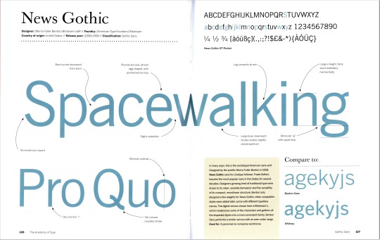
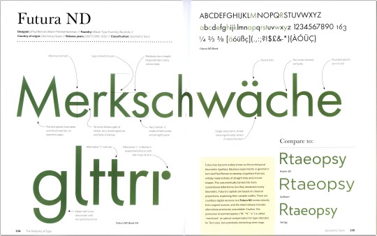
While serif typefaces remain predominant for most printed material, san-serifs have become most prevalent for digital display and public signage. San-serifs or Grotesks were used sparingly and for specific usages and effects for a century, but the second half of the 20th century saw a huge expansion in design and application. This week we feature some of the most recognized Grotesks designed before 1960, from the prolific, Milwaukee-born designer Morris Fuller Benton’s 1908 News Gothic, through the ultra-ubiquitous Helvetica designed by Max Miedinger in 1957, to our own favorite san serif, Hermann Zapf’s 1958 Optima. These specimens are drawn from our copy of American type designer, historian, and theorist Stephen Coles’s The Anatomy of Type, published in 2012 by Harper Design. From top to bottom they are:
1.) News Gothic, designed by Morris Fuller Benton, released 1908. Originally designed for American Type Founders (ATF), Coles notes that "this is the archetypal American sans serif" and "became the most popular sans in the States for several decades." The version shown here is Bitstream's updated design. 2.) Futura, designed by German designer Paul Renner and released by the Bauer Type Foundry in 1927. Influenced by Bauhaus design experiments, Renner began with straight lines and circular shapes, modifying it to the classic typeface we know today. The version shown here is one of many redesigns, this one by Marie-Thérèse Koreman. 3.) Gill Sans, designed by English artist and designer Eric Gill and released by Monotype from 1928-1932. This much utilized san serif is itself beholden to Edward Johnston's type for the London Underground. The lower-case g is distinctive, and Gill himself described it as "a pair of spectacles." 4.) Helvetica, conceived by Eduard Hoffmann and designed by Max Miedinger, released by the Haas Type Foundry as Neue Haas Grotesk in 1957, and renamed Helvetica in 1960 by the Stempel Type Foundry. Since its release, Helvetica has become the most widely known typeface because of its commanding ubiquity, and is both heralded and reviled for its universal utility. The version shown here is a 1980s redesign called Neue Helvetica designed for Linotype. 5.) Univers, designed by Adrian Frutiger and released by Deberny & Peignot in 1957, the same year as Helvetica. Much like Helvetica, Univers embodies Beatrice Warde's imperative that "type should be invisible." The design is spare and neutral, "delivering readable text while drawing very little attention to itself." 6.) Optima, designed by Hermann Zapf and released by D. Stempel AG in 1958. This is our favorite because the flares that Zapf utilizes create a san serif with the character of a serif font. Coles calls it "elegant serenity" and "tranquil beauty" but also "the stuff of the establishment."
View our post on Edward Johnston’s London Underground type.
View our post on Helvetica.
View our other Typography Tuesday posts.
#Typography Tuesday#typetuesday#san serif type#Grotesque type#Grotesk type#Stephen Coles#Harper Design#Typography Tuesday#News Gothic#Morris Fuller Benton#American Type Founders#Bitstream#Futura#Paul Renner#Bauer Type Foundry#Marie-Thérèse Koreman#Gill Sans#Eric Gill#Monotype#Helvetica#Eduard Hoffmann#Max Miedinger#Haas Type Foundry#Neue Helvetica#univers#Adrian Frutiger#Deberny & Peignot#Optima#Hermann Zapf#Stempel Type Foundry
81 notes
·
View notes
Text
Measuring The Performance Of Typefaces For Users

Measuring and comparing typefaces is not a simple task. Testing it (subjectively or objectively) also depends on the context — which can be very tricky. We saw how important it is to keep the typographic design parameters and variables the same to get a more accurate result while testing different typefaces. Did you miss out on it? Don’t worry! Take a look at the first part of this article here so you can get all the context you need to fully enjoy it. Measuring, comparing, and testing typefaces may guide your project decisions towards a more accessible and highly legible typeface. Let’s dive into the specifics of typeface aspects so you can get the best out of your tests. So what aspects of typefaces could we measure? Aspects Specific To The Typeface Itself For Extended Reading Typefaces Ascender And Descender Height In Relation To X-height - Validation: There seems to be some truth in a larger x-height and medium-length ascenders and descenders being ideal. - Description: The most efficient typefaces with the best ratio of x-height and cap height seem to be Wayfinding Sans Pro and Johnston Underground with an x-height between 67% to 69% of the cap height. Learn more about it in Ralf Hermann’s (director of Typography.Guru paper, “Does A Large X-Height Make Fonts More Legible?.” - Measurement: Millimeters. - Measure quality type: Strong (objective). Aesthetic Quality In Relation To Other Similar Typefaces - Validation: There would probably be other typefaces that the typeface would be similar to or would fit with, so how well does it compare? - Description: Expert review or opinion. - Measurement: Not good, okay, very good. - Measure quality type: Weak (subjective). Aesthetic Quality In Relation To Historical Revival Or Similarity - Validation: There would probably be other typefaces that the typeface would be similar to or fit with. Therefore, how well does it perform when compared to other typefaces that are considered to be historically well done or have been revived well? - Description: Expert review or opinion. - Measurement: Not good, okay, very good. - Measure quality type: Weak (subjective). Character, Symbol, And Language Support - Validation: To find out how usable the typeface is, for different characters, symbols, languages, and information types. - Description: We know character and symbol support, like for maths and different languages, is desirable and needed. - Measurement: Numerical score or tick list against features and languages. - Measure quality type: Strong (objective). Kerning - Validation: To find out how well the typeface has been kerned — because kerning leads to better and more legible typography. - Description: A kerning test based on the example below, from Veronika Burian and José Scaglione’s — directors of the font foundry TypeTogether — article “Quality type: How to spot fonts worth your money.” - Measurement: Not good, okay, very good. Percentage value, maybe. Precise numerical score based on a standard test. - Measure quality type: Strong (objective). Accessibility (Children) - Validation: We know that accessible characters and symbols lead to better, more legible, and easier-to-read typography. - Description: Infant characters as in my paper “Letter and symbol misrecognition in highly legible typefaces for general, children, dyslexic, visually impaired and aging readers — 2019 fourth edition.”

- Measurement: Numerical score based on the number of characters and symbols. Research and design effort based on not good, okay, very good. - Measure quality type: Strong (objective). Accessibility (Dyslexia) - Validation: Dyslexic characters as in my paper “Letter and symbol misrecognition in highly legible typefaces for general, children, dyslexic, visually impaired and aging readers — 2019 fourth edition”, and Chris Maley(developer), and Robert Hillier’s (typeface designer and academic) PhD “A typeface for the adult dyslexic reader.”

- Description: Numerical score based on the number of characters and symbols. - Measurement: Research and design effort based on not good, okay, very good. - Measure quality type: Strong (objective). Accessibility (Vision Impairment) - Validation: Visually impaired characters as in my paper “Letter and symbol misrecognition in highly legible typefaces for general, children, dyslexic, visually impaired and aging readers — 2019 fourth edition.”

- Measurement: Numerical score based on the number of characters and symbols. - Description: Research and design effort based on not good, okay, very good. - Measure quality type: Strong (objective). Aspects Specific To The Reader/User For Extended Reading Typefaces Comprehension - Validation: To find out how much and how well information is absorbed, retained, and recalled from a typeface or different typefaces. - Description: This is a very difficult area to measure, and I would like to explain why: - Not everyone will be able to recall accurately everything they know or do not know in an exam or in test questions; - What people say they know, fail to communicate, and what they actually do in the real world are very different things. Just because some cannot recall something or write it in an exam paper, it does not mean they do not know it. “Many previous reading studies investigated the effect of typography on reading speed. But we know that faster speed does not always equate to better comprehension. In fact, better comprehension is often associated with slower reading speed.”— Sofie Beier (legibility expert), “Bringing together science and typography” - Measurement: A paragraph of text, or pages of text and information, followed by questions or set the users tasks to do based on the information. - Measure quality type: Weak (subjective). Speed - Validation: To find out how much, or how much more, they can read compared to what is considered normal/average from a typical typeface. - Description: This is another very difficult area to measure, let me explain why. I could quickly scan a single page of a book and, in theory, have read all the content in about 6 seconds (because I have scanned my eyes across all the text quickly). Although, just because I have, in theory, read (or scanned) the text, it does not necessarily mean I have understood or absorbed it. However, the result would be taken into consideration — and there would probably exist clear and strong differences in performance between comparing a script typeface (like Snell Roundhand) against a highly legible typeface (like the Unit typeface). So the Unit typeface would be much easier and quicker to read than Snell Roundhand. - Measurement: Eye-tracking (time, speed, and behavior) recording and data collection. - Measure quality type: Strong (objective). Facial Muscle Activation - Validation: The zygomatic muscle activity (which controls smiling) is positively associated with positive emotional stimuli and a positive mood state. - Description: By placing tiny sensors over certain facial muscles, one can measure the minute changes in the muscles’ electrical activity, which reflects changes in muscle tension. Facial EMG (electromyography) studies have found that activity of the corrugator muscle (which lowers the eyebrow and is involved in producing frowns) varies inversely with the emotional valence of the presented stimuli and reports of mood state. You can see in the academics John Cacioppo, Lauren Bush, and Louis Tassinary’ paper “Microexpressive facial actions as a function of affective stimuli: Replication and extension” and in the academic Ulf Dimberg’s writing “Facial electromyography and emotional reactions.” - Measurement: Use an electromyography (EMG) sensor placed on top of a muscle to measure the amount of electrical current in the muscle. You get frequency readings. - Measure quality type: Weak (subjective) and maybe strong (objective). Character, Symbol, Or Word-finding Test - Validation: To find out how quickly they can find information. - Description: The participants were asked to locate a specific character in a text with a color pen. The specific character was shown at the bottom of the sheet for easy referral. The response times were recorded. Find out more about this method in the academic Brian Sze-Hang Kwok’s paper “Legibility of medicine labels.” - Measurement: A numerical score of correct and incorrect. - Measure quality type: Strong (objective). Searching a Phrase Test - Validation: To find out how quickly readers can find information. - Description: The participants were required to locate a phrase in the context of a medicine label. The specific phrase was shown at the bottom of the sheet for easy referral. The response times were recorded. Find more about this method in the academic Brian Sze-Hang Kwok’s paper “Legibility of medicine labels, and Chris Maley(developer). - Measurement: A numerical score of correct and incorrect. - Measure quality type: Strong (objective). Read-aloud - Validation: To find out if there are any issues or obvious difficulties between different typefaces, or different classifications of typefaces, and maybe weights (like thin, extra bold, italic or condensed). - Description: The subject producing a reader protocol is requested to read the text aloud and to immediately express any thoughts about the document. More about this method can be seen in the academics Leo Lentz’s and Henk Pander Maat’s paper “Reading aloud and the delay of feedback.” - Measurement: Notes and recordings based on not good, okay, very good, and notes of specific problems. - Measure quality type: Weak (subjective). Think-aloud - Validation: To find out if there are any issues and if any issues can be highlighted or discovered. - Description: Get people to perform certain specific tasks while using the document to vocalize the person’s thinking. From academics, Leo Lentz’s and Henk Pandar Maat’s paper “Reading aloud and the delay of feedback.” - Measurement: Notes and recording based on not good, okay, very good, and notes of specific problems. - Measure quality type: Weak (subjective). At-a-glance - Validation: To find out if they can correctly identify a word, letter, or symbol and not misread it as another word, letter, or symbol in a quick response environment. - Description: Typefaces were individually sized to a height of 4?mm using the letter “H” as the reference. Participants viewed the monitor at a distance of approximately 70?cm. Participants’ distance to the screen was measured at the start of the session using a tape measure. Each individual trial followed the same sequence of presentation: a large fixation rectangle signifying the start of the new trial (400?ms), a masking stimulus composed of non-letter characters (200?ms), the stimulus of interest (variable timing, according to staircase rules as described above), a second masking stimulus of non-letter characters (200?ms), and then a response prompt (up to 5000ms). You can see more about this method in the paper “The great typography bake-off: comparing legibility at-a-glance,” by Ben Sawyer’s (academic), Jonathan Dobres (academic), Nadine Chahine (typeface designer), and academic Bryan Reimer’s, and Chris Maley(developer). - Measurement: A numerical score based on the number of characters or symbols. The time measure is also checked. - Measure quality type: Strong (objective). Questionnaire - Validation: People’s opinions, preferences, thoughts, concerns, views, likes, and dislikes. - Description: Question asking, interviews, and real-time observations. - Measurement: Notes and recordings. - Measure quality type: Weak (subjective). The Radner Reading Charts - Validation: Test the person’s vision accuracy and acuity with a typeface. - Description: The Radner reading chart is a highly standardized multilingual reading test system. The result of the collaboration is a standardized, valid, and reliable reading test system available in numerous languages. The reading chart consists of sentence optotypes, which are optimized reading test items (standardized by construction), and statistical selection. Sentence optotypes consist of short sentences that are highly comparable in terms of the number of words (14 words), the word length, the position of words, the lexical difficulty, and the syntactic complexity. Language-specific characteristics were considered, as were the number of letters and syllables per word, line, and sentence. Get to know more from the legibility experts Sofie Beier and Kevin Larson’s paper “How does typeface familiarity affect reading performance and reader preference?”

- Measurement: Correct or incorrect response. Note the point of failure or incapability to proceed anymore. - Measure quality type: Strong (objective). Legibility (Misrecognition) - Validation: To find out if they can correctly identify a letter, number, word, or symbol and not misread it as another letter, word, or symbol. - Description: As in my paper, “Letter and symbol misrecognition in highly legible typefaces for general, children, dyslexic, visually impaired and aging readers — 2019 fourth edition.” - Measurement: Score for correct or incorrect identification. Time measure check also. - Measure quality type: Strong (objective). Legibility (At a Very Small Typeface Size) - Validation: To push a person’s eyesight to the maximum and see what happens at a very small size. - Description: At small sizes, less than 8pt, for instance. - Measurement: x-height size measurement preferred over pt size. Also, maybe a rating of difficulty and time to read like: easy, reasonable, and hard. - Measure quality type: Strong (objective). Legibility (Distance) - Validation: To see when a letter, symbol, or a word becomes unreadable and how far away it can be read or not recognized anymore. - Description: In Robert Waller’s (information designer) article “Comparing typefaces for airport signs” he says that you could use a screen, physical sign, or printed paper to display a word, letter, or symbol. A person needs to stand far away and then get closer to the display until they can correctly identify the word, letter, or symbol. Read the full article
0 notes
Text
Article option 2
I had found two articles which I considered using in my publication, I decided against using this one as I felt it was too long and I wouldn't be able to fit all the information in without compromising readability or the design.
If one event persuaded him to switch careers from painting to design, it may have been his attendance in 1907 at a meeting in Munich of the newly formed Deutscher Werkbund, a coalition of artists, craftsmen, manufacturers, and industrialists who, influenced by the British Arts and Crafts Movement, promoted both art and technology in the manufacture of everyday objects.
That year, Renner began to supplement his income by designing handcrafted leather book bindings. Inspired by the example of William Morris, and no doubt by the interest in the concept of Gesamtkunstwerk (total work of art) among end of the century architects and designers, he soon became dissatisfied with designing merely the bindings, and, unlike most "book decorators" of the time, insisted on being responsible for nearly all design-related aspects of a volume, both inside and out, including choice and arrangement of type.
As a result, Renner developed a profound interest in the relationship between form and function. In 1922, he wrote a pioneering book called Typographie als Kunst (Typography as Art), published with a strictly traditional design, in a Gothic typeface. Eventually, Renner's concern for readability led him to question the usefulness of Gothic (also called Blackletter or Fraktur) letterforms, then considered standard appropriate forms for German literature. Like lederhosen, Renner said, Gothic typefaces were a nostalgic leftover, the displaced remains of an earlier age.
Because uppercase Gothic letters are excessively ornate, and because the German language capitalizes all nouns, Renner concluded that modern designers should use roman typefaces (and, even better, sans serif geometric fonts like Futura, which he described in a late-1920s article as "the typeface of our age"). "In the national interest," he argued in 1928, "and in the interest of our wonderful German language, we should finally renounce [Gothic typefaces]."
Renner made the first drawings for Futura in 1924, but three years went by before it became available. During this period, other designers were addressing the same issues and developing comparable Modernist fonts. In 1916, Edward Johnston devised a geometric face for use on station nameplates in the London Underground; in 1926, at the Dessau Bauhaus, Herbert Bayer released his own geometric sans serif typeface, Universal, which eliminated all uppercase letters; in 1928, Eric Gill developed Gill Sans, derived explicitly from Johnston's Underground face.
Of further consequence was the 1928 publication of Die Neue Typographie (The New Typography) by Jan Tschichold, whom Renner had hired three years earlier to teach typography at the Münich Meisterschule für Deutschlands Buchdrucker (Master School for German Printers). Die Neue Typographie dogmatically called for the use of sans serif typefaces, asymmetrical layouts, and grid-based geometric shapes.
While never a Communist, Tschichold had openly sympathized with the Bolshevik Revolution. In March 1933, only a few months after Hitler became chancellor of Germany, Tschichold was arrested by the Nazis and held for four weeks in what was called "protective custody." Protesting Tschichold's arrest, Renner served only to focus attention on his own activities-particularly his outspoken essay on Kultur-bolschewismus (cultural Bolshevism), published a year earlier, in which he had inveighed against the anti-Semitic and anti-Communist propaganda of the National Socialists.
Less than a month after Tschichold's arrest and only seven days before the Bauhaus was raided, Renner was also taken into custody (and then released the following day after the intervention of Hitler's deputy Rudolf Hess, a friend of Renner's family). Soon after, the Nazis denounced Renner as "nationally untrustworthy." At 55, he was dismissed from his teaching post and forbidden to work at a regular job for the rest of his life. Renner survived this humiliation by resorting to what an acquaintance described as an "inner emigration." He turned his attention to graphic design, and in 1939 he published an influential book, Die Kunst der Typographie (The Art of Typography). Ironically, two years later, the Nazis reversed their policy on typography, condemning Gothic typefaces as abominations promoted by Jewish printers, and proclaiming roman fonts to be the state-sanctioned letterform.
Unlike Tschichold, Bayer, and other prominent designers who fled their homeland, Renner chose to remain in Germany, though he was understandably bitter at being "an exile in his own country." Renner died in 1956. In the last years of his life, until he suffered a heart attack, he was still designing books and typefaces, writing, painting, and attempting to traverse the boundaries between art and craft, form and function, tradition and innovation.
0 notes