#its just poorly designed
Explore tagged Tumblr posts
Text
FUCK NIDHOG
ALL MY HOMIES HATE NIDHOG
I WOULDVE HAD A PERFECT S IF NOT FOR NIDHOG.
#devil may cry#dmc#dmc 5#genuinely hate that boss though#its just poorly designed#the arena for starters#the camera is fixed at the front#so your depth perception is all out of wack when fighting him#not fun when you have to deal with 4 seperate entities all attacking agressively#its even less fun as V i play as Vergil.#and the boss itself is a showcase of the age old problem in DMC#the lock-on system#granted its a lot better in dmc 5 than it has ever been#but with Nidhog... not so much#my lock-on keeps flitting between everything and its so fucking annoying#fuck nidhog man id rather fight malphas twice in a row and shes equally as annoying
9 notes
·
View notes
Text

Director of the False Last Act
#orv#omniscient reader's viewpoint#orv spoilers#han sooyoung#art i made#another of the drawings i fished out of my drafts that i completely forgot id started#if the face doesnt look like how i usually draw hsy uh. i apparently did the lineart like 4 months ago#and the way i used to draw her was WAY different#like i had to redo the face cuz i was like man this aint my girl wtf#oh yeah the sort of. watsonian reason why the title of the book shes holding is scrubbed out is bc it could either be twsa or orv i guess#the doylist reason is i couldnt decide between twsa or orv so now its neither LOL#side note but like. intellectually i know the thousand hand guan yin is like an actual thing in buddhism but my familiarity with it is#mostly from the dance move#so like as i was colouring this i was just imagining hsy like creating this pose in universe w the avatars which. one hell of an image#only two of the hands are supposed to represent like specific points in the story the rest are just. symbolic...?#the lemon candy one is obvious and the knife one is meant to be from when she stabs 49!kdj in the epilogue#also holy god im so bad at coming up with backgrounds for this kind of art#the original background i had i think i was trying to make it look like some kind of. book cover...? hence the borders#whatever it was it wasnt working#now i have no idea what its supposed to be 👍 like its giving. poorly designed tarot card
355 notes
·
View notes
Text
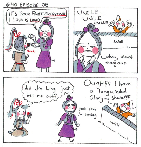
He dies if you don't pay attention to him, its a very urgent situation for an uncle to attend to.
[First] Prev <–-> Next
#poorly drawn mdzs#mdzs#wei wuxian#jiang cheng#jin ling#In the audio drama he's banging on the door and it cracks me up#i really wanted to draw jin ling banging on a window but I could not make it look right B*(#he exhibits such strong needy little dog vibes in this scene#scratching and banging at the door because its *Closed*!!!! how could you do this!!! aughhh!!!#i called him jiang cheng’s designer depression puppy before but this really proves it#this is the perfect and ideal form of a spoiled character. when he gets away beeing needy because he’s loved#JC’s threats are *so* empty. He’s the uncle who says ‘no more candy for today’ and caves after looking at JL’s wet eyes#‘hey op are you going to talk about the clown nose?’ okay sure. it was tucked into the fluff of the dog from the last comic#or maybe wwx just grows them every once in a while when he’s being a clowned on
1K notes
·
View notes
Text
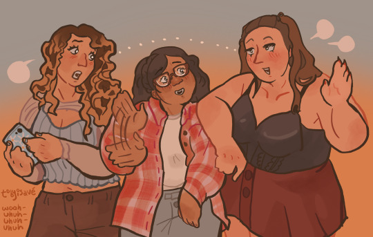
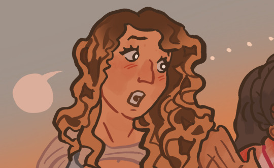
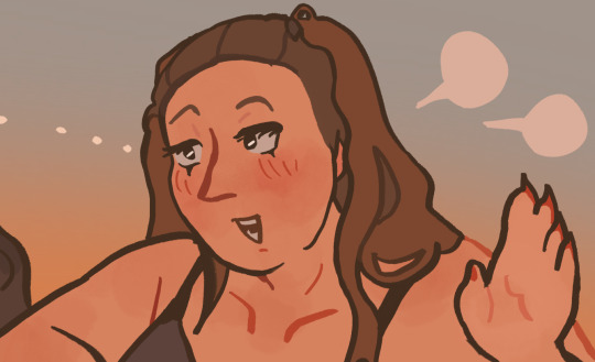
middleborough girls
we're undeniable
fine, fresh, fierce
we got it on lock
#ok i lied about waiting til after midterms heres the part 2!!#im thiiiis close to letting their bac designs just be my headcanon designs 👌 this close#ESPECIALLY jenna#be more chill#bmc#chloe valentine#brooke lohst#jenna rolan#my art#my posts#art#jenna#chloe#brooke#bac#bac bmc#baccp#pinkberry#<- for tagging purposes but also its truuuuuuue#i picked the background color poorly and now it looks like chloe has no legs#its fine djflksf#did not mean to make this so much cleaner than the first one but you know what they deserve it#posts
89 notes
·
View notes
Text
i want to make a guide to drawing gen 1 style sprites but my vocabulary is so limited that its hard to think of something coherent past "well dont make it look bad but dont worry about it looking good either"
#bababababa gen 1 sprites arent “poorly drawn” on purpose or even noticeably low effort#theyre weird varying sprite styles that are still decently “clean” pixel art#but not only are the art styles theyre drawn in stemmed from working within limitations#to still make a coherent monster design#theyre also technically the original designs and not the sugimori/anime ones we're most familiar with#theyre still recognizable! but theyre very strange early versions like developing newborns#theyre off-model in the sense that the model was refined later#so when you think gen 1 dont think like oh its sillt and drawn in paint in like a minute#but more oh its some kind of familiar thing thats just slightly off and compressed#insane insane. insane
181 notes
·
View notes
Text
Genuine question, is there any country that doesn't feel like it was purposely designed to be as violent as possible towards disabled people?

#like this city? is SHIT just my block would already be impossible to navigate blind or with a wheelchair. its wild how poorly designed it is#pluto the series
11 notes
·
View notes
Text
hi please bear with me while i go insane about the colours in Hilda (aka I'm looking at the trio's season 3 designs and losing my mind)
SO in most visual media, quite a bit of thought goes into the colours they use and how those colours interact with one another - not in a "the curtains are blue bc [character] is sad" kind of way but in terms of which colours stand out and which are harmonious, and even if the viewer doesn't know any colour theory (like me, lol) and isn't paying attention to it, I think it still helps reinforce what we know about the characters, and influence what we take away from the show. visual design is a language and colour is one of the key aspects of it and if you want to hear about how Hilda uses colour in so many clever ways, to guide the viewer's eye or distinguish important characters, there's a really excellent video on that made by someone who actually does know what they're talking about, but one thing I wanna talk about based on my own limited knowledge is how it tells us about the characters -
FOR EXAMPLE Johanna - so you have Hilda, who is dressed in bright primary colours, especially her signature blue hair which makes her stand out as different even more - and then there's her mother, who has, by contrast, a much more toned down colour palette. she broadly shares the colour red with her daughter, but a less-saturated shade and her standard outfit consists of that, brown trousers and sometimes her yellow coat. Hilda's signature blue is completely absent from her design (and even if the creators didn't want to give Johanna the same hair colour as her daughter, they could have added some small blue accent of clothing if they'd wanted to, but chose not to), leaving her with purely warm, harmonious colours. she has an almost completely different palette to her daughter, but still just enough similarity (particularly with her yellow coat) to reinforce that the two are related in some way. (I'm not saying that Hilda is related to everyone who wears yellow in the show, just that the fact they share a colour helps tie them together on screen)
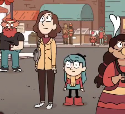
(yep, this is the screencap i'm choosing to illustrate this point it's fantastic)
most importantly (to me, anyway), Johanna's colours are warm. they're safe. to me, the dominance of warm colours and absence of Hilda's blue signify that Johanna is a safe person to Hilda, someone who is supposed to be a respite from her adventures rather than someone who dives into them with her (which, y'know, ties in quite nicely to Hilda's line in Stone Forest about preferring to adventure on her own and then come home to her mum, and how in the show she generally likes to keep her adventures and home life separate... (I could probably write an essay on how Hilda and Johanna's issues in season 2 were kind of a commentary on how Johanna has been coded as the safe stable bg character and how she is actively trying to go beyond that role but I shouldn't tbh)). the point is, they are connected, but Johanna doesn't have the same adventurous streak that Hilda does, so they have some of their warmer colours in common, but not Hilda's unusual, stand-out blue.
(I could also talk about Kaisa here and her copyright claim on the colour purple, but truthfully all I would be doing is paraphrasing the excellent video I linked earlier, so I won't. however I do think its fun to compare her to Johanna, in the sense that here are two adults who Hilda often comes to for guidance, and one is all warm gentle colours that match the home decor and the other all monochrome with two little hints of a colour we rarely see elsewhere in the show, suggesting that this is a character of particular interest.. it kind of hammers in how one is meant to embody the safety and comfort of Hilda's home life and the other is literally there to point hilda at things that might kill her lmao)
that was supposed to be a quick example and it got away from me so uh ANYWAY what I'm getting at here is that in Hilda's friend group, I believe their colour palettes were constructed in a similar way - they work together to tell you about the group
I feel like Hilda as a show is known for making excellent use of a limited colour palette - a lot of the characters have at least one black or brown item of clothing and just one or two stand-out colours, particularly the main trio. you can easily look at Hilda, David and Frida come away with one particular colour associated with them - blue or red for Hilda, orange for David, and...blue again for Frida, which doesn't sound great on paper but works well in the show because Hilda's palette also has a lot of red, so when the two characters are put together it doesn't seem like blue is dominating the colours. I also find Frida's colour palette (basically just her hoodie, lol) super interesting because it used to be different.
now, I haven't spoken to anyone who worked on the show about this, this is purely conjecture, but if you've ever googled the characters you've probably seen an official-looking turnaround page of Frida in a purple hoodie.
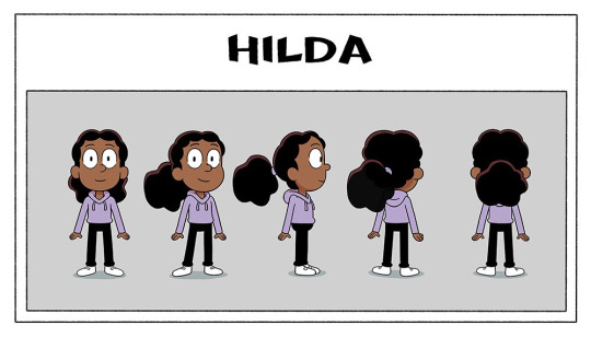
this is real pre-prod show art, and considering the purple hoodie made it all the way through the design pipeline to be included in the turnaround (generally the last stage of character design, as this is what would be given to the riggers to make the character rig)....and was even posted on twitter months before the show aired -
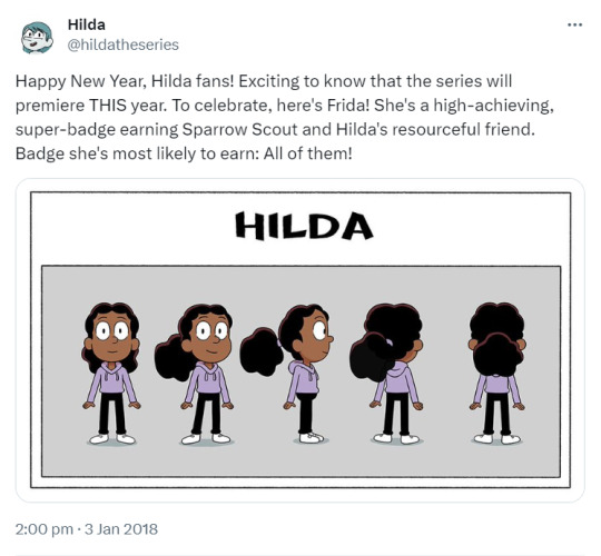
then I think it's safe to say that her hoodie was changed after the fact (2 or 3 episodes into production, by my vague guess looking at the date of this tweet) - not too hard to do, if your show is 2D rig animation, luckily - but if you're me and like reading into things way too hard, this begs the question of why. having purple as Frida's signature colour is perfectly serviceable and sets her apart from Hilda and David nicely. but what her new hoodie colour does is the opposite - it ties them all together
(the other possible explanation is that maybe Kaisa's design was finalised later in production than this turnaround was made (speaking purely from my own experience, secondary characters who appear in later episodes are often finalised later than the main characters, just ahead of the episode they're needed for, and Kaisa wasn't needed until halfway through the first season) and someone noticed that her and Frida sharing the colour purple made them look a little too similar...(I'm sure ppl who like the idea of Frida and Kaisa being witch sisters are yelling through the screen rn that this would've been a good thing and maybe lightly foreshadowed Frida becoming a witch, like Kaisa, but this was all set at the start of season 1, probably a bit too early to start hinting at the witch stuff :') we will come back to this tho)
anyway I love the trio's designs bc if you put Hilda and David next to eachother, they don't visually have much in common, but if you put Frida there then suddenly they're a unit. they got rid of her signature colour and gave her her friends' ones. she quite literally ties the group together so that they look cohesive as a whole
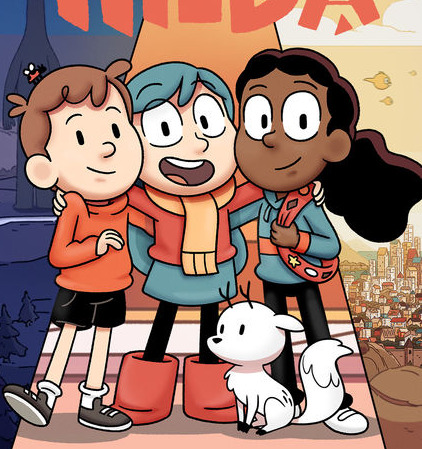
and this is absolutely me digging too deep in things here but her being the one to bring the group's colour palette together also lends itself thematically to their falling out at the end of season 1, and how Frida leaving also caused Hilda and David's friendship to struggle. they are a set and it doesn't work the same if they're not all there. Frida sharing Hilda's signature blue could also lend itself to the idea that Frida shares her love of adventures to a greater extent than David does (though maybe that's closer to 'blue curtains' territory tbh). anyway I love the design of this show so much
SO (if you actually made it this far down I'm so impressed) the thing that sparked all of this was...if this is what the trio's designs are doing in seasons 1-2.....what are the season 3 designs doing
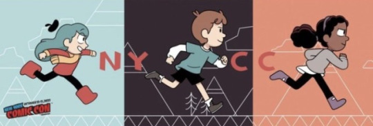
no but this is super interesting to me, Hilda essentially just traded her skirt for leggings and left her colour palette intact, but David and Frida changed theirs entirely and I'm fascinated. both their signature colours are GONE. is it to imply that they've grown and changed in the duration of the time skip? is it David's turn on the 'having a colour in common with Hilda'?? but particularly I want to draw attention to Frida bc now that her hoodie is gone her original purple is BACK and (if there is any weight to my theory that she was changed bc she looked too similar to Kaisa) what's even more interesting is that they doubled down on the witch vibes. she literally has Kaisa's exact colour palette minus the dark purple cape lining. Kaisa's design reflected her personality as this unknowable person with a hint of mystery to her - all monochrome with that pop of an unusual colour - are we to expect the same of Frida? is this a sign that she's leaning further into witchcraft than before? does her contrast to Hilda and David signify that she's come more into her own and has a stronger sense of her own identity (something something closure for her issues in season 1)? or do we take things way too literally and assume that season 3 has her breaking off on her own from the group? or maybe it means absolutely nothing and someone on the design team just thought grey/purple was a neat combo. I know I've talked in this post as if I know things but here I truly don't and I'm obsessed w the possibilities. what does it mean what does it all mean
anyway that's all for this delusional fever dream post, hope you enjoyed and if you made it this far down you deserve some kind of prize
#yeah this is a long post#why did i do this. dear god its midnight i DIDNT MEAN TO MAKE THIS#im so normal about this show as you can see#colour design is my passion#hilda the series#post tag#im sorry if any of this is poorly explained and sounds like nonsense. it is but also im sleepy so blame it on that#alsoo like i said a million years ago im really not a colour expert please dont cite me on anything :'))#i kinda just wrote this to get the thoughts Out of my brain
40 notes
·
View notes
Text
organic who just finished another "humans are horribly designed" rant after examining a machine's insides: " . . . who in gods name built you?"
#writing prompts#writing ideas#humans are poorly designed#transformers inspired#the idea of cybertrons having what are objectively bad design choices or flaws in their coding tickles me silly for all the shittalking som#of them do regarding humans and other organics#its implied the machine is also poorly designed like humans#but its just an implication#go crazy go stupid with this prompt lol
3 notes
·
View notes
Text
real talk seeing human characters being depicted in sonic media again is so nice. sure it's characters we've already known about for years but man...seeing modern day maria and gerald renders at the ripe age of almost 24 years old is like such a wonderful treat. GRAAHH i'm so excited!!
this game could be ass for all i know and i'd still find something to love. man, i love sonic media dude.
#i need them to stop fucking around and give elise the same treatment at some point#her design is so cute and fun and it is such a shame that its bogged down by terribly rendered and poorly aged graphics#plus being in one of the most infamous games in the series obviously does not help#when that one sonic channel illustration came out with her figure skating with silver at the festival of the sun#bro the amount of support and joy people found when they saw her in a style that highlighted the fun aspects of her design#was just so incredibly heartwarming to see#i have such bias for elise's design and backstory idc i'll fight and die on this hill alone if i have to#anyway maria is looking so cute and precious these days i can't wait to watch her kick the bucket in shadow's arms ok BYEEEE#sonic the hedgehog#update: typo i can't spell names right lmao
4 notes
·
View notes
Text

crimson has help running the shade district, wanted to doodle concepts of the people who help him
specifically because i wanted to make this meme and i needed bodies to do it for


#ukureticence#ichor's blessing#the prince of ichor#random character concept#only the goetia did i have in mind beforehand. they're based off a kingfisher :) otherwise nothing else#the auctioneer has a bag of dice altho i drew it very poorly and it looks like drugs heck. its meant to be like d6s and d20s and stuff#the angelic symbolism on the expedition leader is due to my insatiable urge to draw feathered wings#what is the shade district? idk some funny underground territory ruled by my funky overlord that's invitation only thing#i would go into detail but another one of those embarrassing to share things yknow#i spent so long designing them that i didnt have any energy left over for the meme i made them for ahahaha#honestly i just feel strong satisfaction that i managed to get it done tho before pride month ended >:) (least for me as filthy american)
2 notes
·
View notes
Text
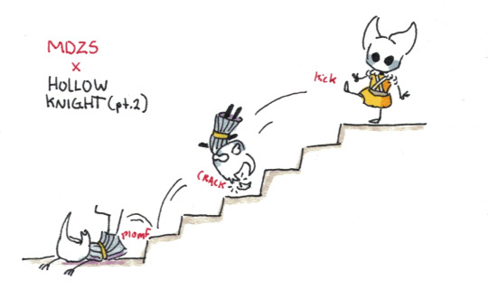
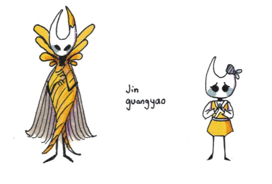
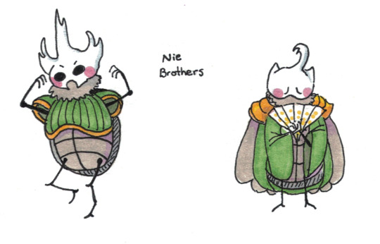
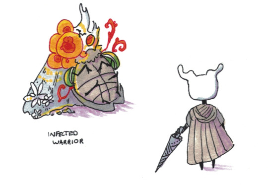
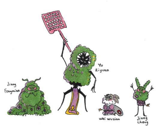
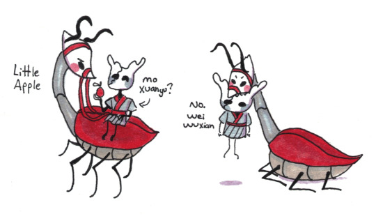
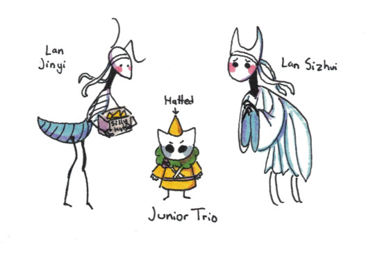
More MDZS and Hollow Knight! The cool bugs I found in my backyard have started to unionize.
Part 1 - Part 3
#poorly drawn mdzs#mdzs#hollow knight#mdzs au#mdzs hollow knight au#Once again not tagging all the characters due to sheer volume#Thanks for the warm and lovely reception on the first part of this crossover!#even people who haven't heard of hollow knight were very sweet and excited.#I redrew and redesigned some of the characters that people were asking to see#and while I still think I could play around with them a little more I'm pretty happy with the results B*)#JGY getting kicked down the stairs is part of his personality at this point. Of course I had to introduce him as such#Im pretty sure its not JZX who kicks him the first time but birthday boy on birthday boy violence is too funny to pass up#Madam yu being mosskin-like but distinctly not from the same clan was pretty important to me when designing her. But I was at such a loss!#By *chance* I saw The Hunter's design and thought 'YEAH THATS THE ONE'. Let milfs be terrifying.#Little apple originally was gonna be 'the girl who's backyard this all takes place in' but ....little bug steed....#In case you are wondering whether the Lan juniors are suspicious of the fact LSZ has twice as many legs: No. He's 'just like that' to them.#Part three will be in less than a week! Time to see the other side of the crossover!#I am so happy that I can draw silly crossovers and have people cheering me on! Yippee!
788 notes
·
View notes
Text
Cried at dinner time because my kids were Too Much(tm) - achievement unlocked.
#life#rl#just too much this evening#just started crying in front of my dad#my mum asked what was wrong and dad just said to gimme a minute (which i was glad he said)#gonna get youngest ready for bed then brush eldest's hair (its suuuuper thick) then maybe have a bath myself?#dunno yet#rather have a shower but its such a pain in the arse after showering to mop up that its not worth it#we have a wet room#its poorly designed istg#barely any dip towards the drain#and the drain doesn't drain quickly enough imo#but this is my first wet room so what do i know?#mama post
2 notes
·
View notes
Text
bakudeku is just reguri for abled, low support needs, and no media literacy people
#thats not to say its bad no matter my opinions on it. its just every time i see reguri i cringe at the bkdk parallels and then have to stop#myself and go ''no. theyre fundamentally different. children vs teens. disability acceptance vs 'cured' disability. antagonism vs bullying'#plus greens underlying cause behind his behavior vs bakugo being bakugo. like.#actual rivals vs being called rivals but actually starting out as bully and victim#childhood friends vs friends in their earliest memories only#finding your dream from chasing a boy vs having your lifelong dream crushed by the boy you chase#hurtful words vs violent actions etc etc etc#likeeeeee. friends to rivals to friends to lovers is SO GOOD but bkdk wants to be reguri and misses by so many miles.#bi rambles#oh & not to mention being invited to create the system youre part of to your own design v encouraging each other to join the same broken on#thats a big part of it for me#off-screen apology in the sequel that theyre both happier after vs badly written on-screen apology#also with reguri they both fucked up!! they both were kids poorly adjusting to their struggles and hurt each other!!! bkdk was one-side-only
1 note
·
View note
Text
anyone else think this puzzle was really really bad

#not even poorly designed just sucks to do#ive replayed this game like 6 times and i still dont fully understand it i know its just arithmetic#but im used to layton puzzles havingn a fun twist that rewards abstract thinking not straight up just math
7 notes
·
View notes
Text
One of these days I'm gonna rant about the idea that the thieves' outfits represent "their idea of rebellion" and how I like interesting that concept is.
#idk i have like a lot of notes on this#its done well and not so well tbh depends on the character#overall it makes sense as an idea like i get it#but i hate the way they just say it once and then never bring it up again#also like if their idea of rebellion changes does that mean their appearance would change#is the outfit tied to the persona (example: akechi)#how tf does this work for morgana or is he just here#would this work for other persona users who enter the metaverse? what if the shadow ops rocked up would their look change?#for my own au i just went with yes because yippee more character designs but in canon would it work?#is their idea of rebellion tied to a specific palace? (i think yes for two characters in particular)#why tf did they execute ann's concept so poorly? (w*ifu wars thats why LMAO)#<- censored the word for self protection#idk i just remember morgana saying this once and then it was like yeah so this is how it is thats all :]#like damn thats a cool af concept can u perhaps EXPLAIN#this stuff makes me crazy because i love character design and also well im sure people know why
8 notes
·
View notes
Text

im actually gonna try and finish it this time
#img#ironically shes the only sketch i think i like first try#the other two i either gave an ugly design to begin with (bubs) or i just sketched poorly (bcup)#but its ok. bc i can redo them. nothing is permanent were all gonna live forever
7 notes
·
View notes