#it's very tedious when you're taking lots of screenshots
Explore tagged Tumblr posts
Visit Tumblr Blog
Explore Tumblr blogs with no restrictions, modern design and the best experience.
Last Seen Tumblr Blogs


Fun Fact
China blocked Tumblr because of pornography and censorship problems in 2013.
Text


~Embracing Erin~
Spooky group date 🎃
Just vibes, amazing costumes & Mara keeping an eye on Erin (being a good sister and all)
#tried using relight can you tell#i wanted to get better shots of what everyone was up to but the lot was so glitchy everyone was basically jumping around#it's very tedious when you're taking lots of screenshots#embracingerinbc#ts4 bachelorette challenge#ts4 gameplay#ts4#sims 4#simblr#sims 4 challenge#ts4 challenge#erin bunny#sasha by bakersimmer#janet by kissalopa#cherry by minty-plumbob#jules by devotedsims#clyde by moonfromearth
104 notes
·
View notes
Note
how r you so good at drawing (halo) armor. You’re literally one of the best I’ve ever seen. Tips please if possible? (specifically for the shapes of the armor)
Oh god heLLO; I'm super bad at explaining my process of drawing RvB armor, as it's been multiple years since I've done it up until recently, so I'm super rusty but I will do my best to explain myself!!!
I've never made any sort of tip guide or tutorial, so please bear with me!
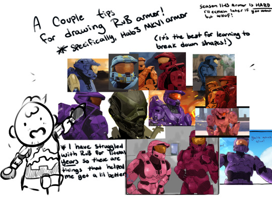
USE REFERENCES!!! This can go for renders from the Halo games directly (ArtStation was a great place to start, I'm not sure how things are post AI ""art"" surge, though) but at the very least, screenshot the heCK out of the series from whatever season you want to draw. There are a lot of different angles, and after they started to animate, it made it easier to get references with arms up or splayed out to the sides, or legs bent and hand motions!! Depends on what you're looking for!!
For this Reference, I used a Halo 3 render, as well as the Caboose-isms poster render. There are more clear renders out there, I'm sure!
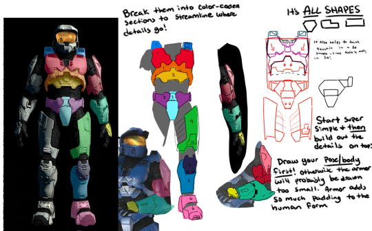
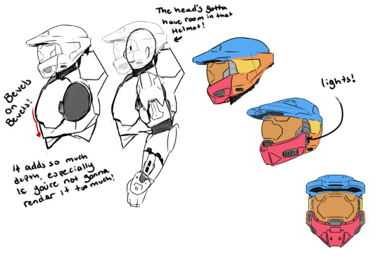
First step that I take in learning to draw a new set of armor is color coding the sections that I'm going to draw, and then labeling them with points of interest that make me remember the detail later; Like grooves, or a bevel that looks weird or silly. Color coding and labelling the parts made it easier for me to break it down into smaller bits to draw piece by piece, bc let's face it; Armor can be super tedious and daunting, especially if you're just starting out.
Remember It's ALL SHAPES!!! IT'S JUST SHAPES!!!! Break them down into more simple shapes to find what works best for you! Keep it loose in the sketch stage, so you don't get lost in the pesky details
Remember that the armor goes on TOP of a body, and isn't a part of their body! Halo Infinite dOES have prosthetics that are a bit smaller than the armor, which adds depth and flavor to your armor though!
When in doubt, draw it larger than you mean to, and size it down to fit your other pieces!
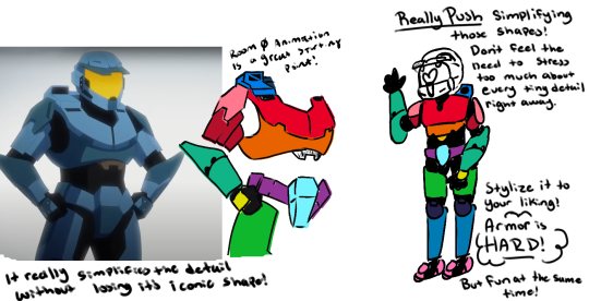
SIMPLIFY IT!!! TRACE TO LEARN!!!! Really just figure out where the pieces go and put them together like a puzzle! Armor is simply just, hard, and there's no easy way to learn quickly how to do it efficiently and well; It really does take a lot of practice and trying and sketching and watching clips and staring at other's art to maybe notice shortcuts or even details you didn't notice before!!
But the biggest tip that I can give you is just, don't be afraid to make "bad art" don't be afraid to draw "bad armor" !!! It doesn't have to be perfect, the details don't all have to align on model 100% of the time! All of my art, paintings and all, have things that I fudged or missed, or messed up on and didn't notice, but I still have fun painting and drawing because I like making people laugh with my comics and I like having them feel stuff about my paintings!
Sorry if this wasn't what you were looking for, but I hope this helps even just a little bit!!
#tony's art tag#rvb#sorry again for the long post I'm rEALLY bad at explaining things and I've never made one of these before hfkjhadfsh
119 notes
·
View notes
Text
So I just went on a long comparison between gsc Silver and Hgss silver, as well as gsc Lance and Hgss Lance. I know there's differences between the two but I was unsure of what that was. To keep a long amount of screenshots short here's my main take away( long post below):
GSC Silver has this childishness and angry that isn't super present in HGSS. A quick example is in the burned tower.


Left is HGSS, Right is GSC. You can kinda see the difference between the two, yeah? Hgss is like " yeah, it suits me better, so you're not gonna get it" vs GSC silver who's like "i'm going to get it! Me! Not you! You suck!" Bonus in crystal the guy straight up blames the player for no legendary pokemon being present. To me, it honestly shows how. Kiddy. Silver really is. He's still a bully, but when you read his lines in gsc it's like "yeah that's a child", though tbf 1) I still get that with hgss silver and 2) it may be bc I'm an adult not lmao. No longer a child who would get rilled up by these things. It was effective though, I hated silver when I first played Crystal. Anyway! The point being that GSC Silver has a bit more spunk to me!
Victory Road is actually pretty 1 to 1 in both versions, except for Silver in hgss calling the lack of trainers who aren't there spinless, which I found entertaining ( it may be implied he beaten them all?). That being said!
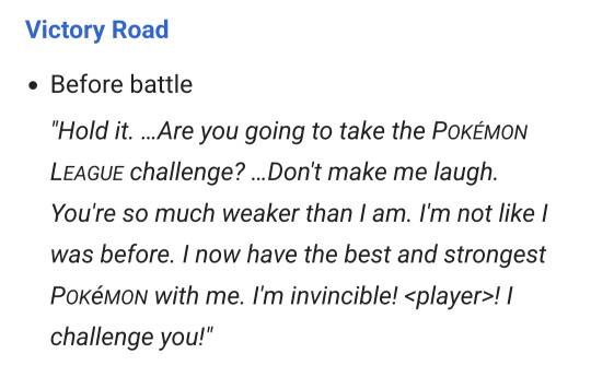

Left gsc, right hgss. Again, I just feel we get more from Silver in gsc. " I'm invincible!". The insistence that the player is weak despite losing so many times. It feels like Silver's just near his breaking point. Just on the cusp of getting it and he's trying to grasp at straws to what he already knows. To me, anyway. The hgss dialogue is still fun! But something I've noticed with hgss silver is that he kinda accidentally compliments the player in some ways? "All of these trainers are spineless but if you're here that means you're not" and it's like aw, thanks buddy. I honestly think that this is very funny. If someone pointed that out to him, I think he'd explode and shout about it. But in comparison to his gsc dialogue, Silver here doesn't feel. Desperate? If that's the right word? Doesn't have that same edge to me as gsc. Though, ironically, that edge kinda comes back in the battle quotes:

^ that's a hard ass line and kinda leans into GSC silver a bit more, imo. Very very fun.
One last thing before heading onto Lance: the actual shift in Silver's character. Aka, the moment he realizes he should treat his pokemon better. To my surprise, victory road in gsc was not the moment that this change happened. It was at Mt. Moon. So! In gsc, silver is first seen at the Dragon's Den, training. We already see the shift in character as he talks: saying that he can't push his pokemon too hard. That's growth!!! And it's only then after you find him in mt. Moon, where you really get to see his change in character:
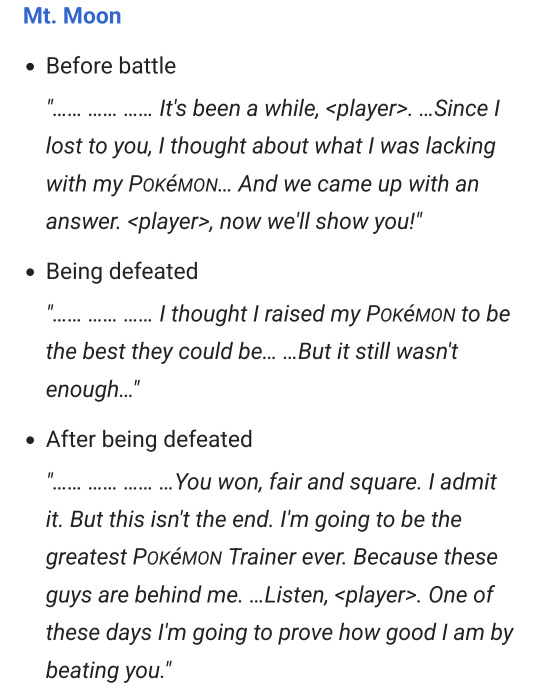
He's a lot more considerate here. He literally says he's gonna be the greatest trainer ever "because these guys behind me" ...it's so sweet. Really helps Silver come full circle,imo. It's important to note here: the mt. Moon dialogue comes after seeing him in the Dragon's Den. Hgss doesn't do this for some reason. Instead, at least, according to the Bulbapedia ordering of the quotes ( so you can take this with a grain of salt), you meet him at mt.moon before meeting him at the dragon's den. And I feel like that's important bc, at Mt. Moon in hgss, Silver still doesn't....get it. He's still calling his pokemon weak. He's still kinda acting like how he was in the main game. And while it makes sense - Silver is like. Unlearning years of what Giovanni has instilled into him, so it's not shocking to me that even after everything he doesn't fully get it. But at the same time, from a story perspective, it kinda feels tedious don't it? Both gsc and Hgss silver at victory road still don't get the lesson but you can tell gsc Silver really thought about it. It's why he's at the dragon's den. This part is hc but it kinda goes into my lance stuff later, but I would not be surprised if Lance invited him there. And it's after his time at the dragon's den where he feels a new. He gets it now. Or at least, is starting to get it. Which I think is a more fulfilling character arc. Swapping the dragon's den and mt. Moon encounter so mt. Moon happens first makes Silver's arc feels a bit more tedious than it needs to be. Again, I get it, change doesn't happen over night, especially after a pokemon battle, but it doesn't feel as clean to me as gsc does it.
Okay! Lance time! Hopefully this will be shorter. Much like Silver, hgss really kinda shaved him down a bit. But unlike Silver, I think both versions fit him well enough, except there's one thing that I think gsc does better in comparison to hgss. First the small things. Lance seems more playful in gsc. Instead of saying " What took you so long" he says " What took you?" When battling Ariana, in hgss he says that a 2 v 1 is sneaky and typical for Rocket ( paraphrasing), but in Gsc? " Hey! Don't be selfish! Spread the fun around" Hello? That's so fun??? This excitement, and kinda cockiness of whooping in and battling. GSC feels so much more playful compared to his HGSS counterpart. And honestly you can see it in the designs too!


GSC Lance with the smirk, and him covering himself with the cape all cool like. Hgss is more imposing, commanding, and has a more stern presence to him. And again! I like both of these! But I would be lying if I slightly reminisce that slight playfulness GSC Lance had. That's the small stuff. The big thing that gets me, and what edges out GSC for me, is this:
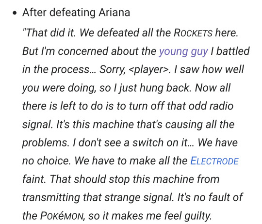
" But i'm concerned about the young guy I battled in the process" That line isn't there in hgss at all, which I feel makes a huge difference in how the connection between Silver and Lance are portrayed. Lance is worried over Silver. Even if it's just a small, passing concern, it honestly reflects on Lance's character a lot more? It makes him look better is what I'm saying. We know that Silver ends up going to the dragon's den to train after the main game. We don't know why he's there specifically, but if I had to guess it was probably Lance. Again, I know, hc, but I feel like I can say that if Lance has pretty much said he's worried for the guy. Why wouldn't he offer up the idea of training at the Dragon's Den. I know, again, hc but still. It shows their connection. In hgss, Lance never says he's concerned over Silver, making their whole dynamic feel so one sided. Like silver tails the player at the golden rod underground, just to see if Lance was there to battle him. But when Lance shows up in the post game he's like " oh hey, it's you. Nice". Like. That's it? The whole thing between Lance and Silver in gsc was that 1) Lance said that Silver didn't trust or care for his pokemon and was concerned over him for that and 2) Silver taking those words to heart more than he wants to, and he still ends up training at the dragon's den. I just feel like that makes their dynamic feel more whole compared to how one sided it feels in hgss ( I could argue a lot of things feel one sided about Silver but I digress). To me this is beyond the whole Dad Lance, Uncle Lance or whatever, it's just a matter of how their dynamic is portrayed and how it affects the writing. To me, I think that single line of dialogue for Lance brings it all together, while also just making Lance look better as a character. He's said to be a guy who wears his heart on his sleeve, so like. I dunno. Why not have him be concerned for a troubled kid. Let's ignore the fact he hyper beamed a man a point blank in front of another child.
Anyway! I hope all of this makes sense lol.
24 notes
·
View notes
Text
Game Review: Factorio: Space Age (pt 1)
Factorio is my favorite game of all time. I played it very early on, then periodically after that. When I started, the graphics were much uglier, there was no nuclear power, biters dropped little purple orbs you needed to use in science, ninety percent of the current QoL was missing, and it was still one of my favorite games.
Before the Space Age expansion, I had ~1200 hours in the game, partly because it was my go-to game when I was a stay-at-home dad and my son was napping beside me on the couch. I've played not only vanilla Factorio, but a lot of overhaul and other mods. These are the overhaul mods that I've finished:
Bobs
Bobs + Angels
128k
Krastorio 2
Space Exploration
Exotic Industries
Freight Forwarding
Additionally, I made it to the terraforming stage of Nullius and py science 2 of Pyanodon's, but didn't finish either of them. This is all for context, where I'm coming from in this review. I have no idea what it's like for a new player, but my guess is that it feels complex as all hell.
The Space Age expansion expands the game by adding in 4.5 new planets (Vulcanus, Fulgora, Gleba, Aquilo, and space itself) as well as a major-but-optional mechanic, quality. I'm dividing up this review along those lines, which is the natural way to do it, but in theory all these things are meant to work in harmony with each other, so I'll be trying to take that into consideration. Spoilers will follow in each section, but the Factoriopedia has everything right from the start, and the devs consider it a game that does not actually have spoilers, so take that as you will.
In my opinion, the real spoilers are the designs for things you build along the way, but there will also be some screenshots of those.
The Same Old Early Game
You start on Nauvis with a crashed ship, a pickaxe, and abundant mineral deposits. If you're new to the game, red science and green science can easily take 20 hours to figure out, particularly if you're playing with biters on. For me, it was about two hours to build designs that I have built maybe dozens of times before. The basic furnace stack that handles incoming iron, copper, and stone has not changed, and will not change.

If I consider the basic gameplay of Factorio to be the design and decision process, then there's no gameplay here. Each entity needs to be placed by hand, and you can make rows of things by running up and down, but still ... it felt like a slog to me, and this is the first ~4 hours of Space Age, assuming you're going moderately fast and making a beeline to bots.
Once you have bots, it gets much less tedious, and you can start slapping down blueprints, expanding the base as rapidly as the machines can turn raw materials into finished buildings. There are a few differences from the base game, including terrain generation, some stuff with trains, science checkpointing ... but it'll all be well familiar to veterans, and in my opinion, is pretty skippable. I set up walls to keep the biters out, trains to supply the variety of turrets on the wall, solar and nuclear, and outposts for as much resources as I would need for the next few dozen hours, then made my first space platform and began the actual expansion stuff.
Space!
Space platforms are created by launching a starter pack up, which you can then send materials to. Bots aren't allowed in space, and your character isn't either, and it seems to me that a lot of the game design was built around wanting the player to grab resources from out of space and do some complicated belting to keep everything organized and prevent it from locking up. There are no chests allowed in space, and the only thing that acts as a container is the central hub of the platform, of which you can have only one. This means that if you want storage, you have to route everything through this big warehouse, and it gets complicated the more you have items going in and out.
I would say that generally I think this works from a gameplay perspective, but there are a few things that are needlessly obtuse or unfriendly, getting in the way of the platform design stuff that's supposed to be the star of the show. One of them is definitely "automatically request materials for construction", which will send up an entire stack of something you only need one of. This is an issue in the early game, assuming you didn't overprepare on Nauvis to have a base with ~20 rockets per minute. Frontloading this difficulty, which becomes less serious later, is bad design, and you end up having to manually go through rocket loading to not waste enormous amounts of resources.
(The easiest way I've found to do this is to make a blueprint of the ship, click "add section" on logistics to make it a logistics group, set a requester chest to that logistics group, then unselect that logistics group once everything is there, then use an inserter to feed that stuff into a rocket and manually launch it every time it's full, and even that sort of sucks, because the blueprint makes a logistics group that will have the hub and extra platform in it, and holy hell is none of this intuitive or friendly, why could they not just have coded it so that rockets would auto-combine things into groups?)
Going slightly out of sequence here, but I'll talk about the space stuff all at once here. Over the course of normal play, I think the intent is that you design approximately five ships:
A space science ship that sits in orbit, collecting materials from asteroids and doing bare minimum processing on them to turn them into space science, which gets sent back down to the labs. I made one very early on and then didn't ever have much cause to touch it again, except to send up some better assemblers and slightly expand it with no major changes.
An inner planets ship with chemical plants, engines, furnaces, and an ammo assembler that feeds turrets to shoot down asteroids, which the grabber arms then take chunks of for the materials to run the chemical plants and be made into ammo. (I dubbed this the Dart-class, pictured below is the SS Christopher Wren.)

An Aquilo ship with rocket turrets to shoot down the larger asteroids that the normal turrets have problems with. This requires advanced asteroid processing to get sulfur and coal synthesis to make coal, which gets made into explosives to make rockets. Probably at the same time you're switching over to advanced fuel processing with calcite. (I dubbed this the Jacknape-class, pictured below is the SS John Napier.)

An outside the system ship with rail guns to shoot down the largest asteroids. This requires making rail gun ammo, which needs steel and copper wire, and to power all that you're probably not going to use solar, which gets much worse out at the edge, so likely you'll be doing nuclear or fusion. (I used a lightly modified Jacknape-class for this, though it would have been better to do a full redesign.)
A shattered planet ship that is capable of harvesting promethium, which I have not actually made yet, but requires scaling up even more.
Overall, I found the increasing complexity of designs to be very pleasing, even if it sometimes felt a little bit forced. Not having bots I can maybe understand, but not having chests felt like a very blatant design decision rather than something that came about naturally from considering space and what it means, especially since the belts still work. Designing the SS John Napier was one of my favorite parts of the entirety of Space Age, partly because it was so constrained, and I knew that my individual decisions were creating individual problems of my own making.
I will say that space is where Factorio shows its limitations far more than elsewhere. In programming terms, Factorio uses something called a "surface", and each planet is its own surface, as is each ship. Surfaces cannot interact with each other, and in the mods I've tried where they do (more than just hooking up inputs and outputs) it's always been a bit jank. Still, this means that there are a lot of things that cannot be done:
Docking one ship to another
Having a ship land on a planet
Having a ship have any verticality to it
The ships also look a little ... well, bad. They look like a bunch of things have been placed on a flat slab, especially when they get larger. This can be helped a little bit by adding walls around the ship, but it doesn't help much, and there's no aerodynamic consideration, so the ideal design is probably a big box of some kind, and the space platform that everything is built on looks even less ship-like than everything else. The exception is the engines, which look awesome, but I don't think having one element look really cool makes up for the rest looking a bit weird.
Funny enough, the Space Exploration mod actually does do some of the things that these ships don't do, like docking, landing on a planet, etc. It was a bit jank there too, but it did kind of sort of work. And those ships needed to take aerodynamics into consideration, though I can't remember what the formula was like, and it was pretty opaque.
I do not need to have the entirety of Kerbal Space Program inside of Factorio, but I do think there are a lot of things that are neat about space that they just decided not to touch. The planets are in static positions, always the same distance from each other, and there's no need to worry about launch windows or delta-V or gravity slingshots or light-speed communication delays any of the other cool rocketry things. Some of that would be a nightmare to implement, other things would probably not be very fun, but it feels like there was a lot left on the floor.
It's interesting that spaceships in this game are self-sufficient by nature, gathering materials from asteroids and never needing resupply. It's also interesting that there are two basic modes for ships, in-flight and in-orbit, with different considerations for defense and production, though I don't think they ended up doing all that much with this distinction. If spaceships could land on planets, you could have three distinctions, and if they could be flying through interstellar asteroid-less space you could have four, and I think that would be cool, but the focus of Space Age is mostly on the new planets, not on the spaceships.
It's at this point that I've realized that this review is going to be very long, so I'm splitting it into parts. The four planets will be the next part, but before I wrap this up, I can talk about one of the other things that came with the expansion: quality.
What Quality is Quality?
I would say that of the 140 hours that Space Age took me, about 30 hours were spent messing around with the "quality" mechanic, and of those, most were "wasted" in the sense that they did not meaningfully make a better factory, even if I enjoyed the process.
Quality divides almost everything in the game into tiers, with higher tiers having better features, which depend on the specific building or product. Resource extractors do less resource drain. Production buildings get better crafting speed. Weapons get better range. Some things get faster and require more power for that speed, while others get speed without needing more power.
There are a few sticking points with quality.
One of them is that machines cannot use a quality product if they're not set for a recipe that requires it, meaning that an "uncommon" gear cannot take the place of a common gear. I assume that this was either an engine limitation or a deliberate challenge for the players, but either way, I don't like it. Quality does kind of make sense, since it's something that exists within real world manufacturing, where parts need to be within certain tolerances, but it wouldn't be the case that a gear that's inside a narrower band couldn't be used for purpose that's in a wider band. Factorio is the wrong game to be making real world comparisons for, but the argument is that an uncommon gear shouldn't be enough to gum up the works.
One of my plans for quality was to "skim" quality parts. The last machines in a stack of assemblers would be given quality modules, and of the thousands that they made, a few would be high enough quality that they could go into a chest, and that chest would be used for making personal equipment and spaceship parts, where they potentially make the most difference. At a certain point, I misconfigured one of these setups, and some quality gears got on the belt, which gummed up the entire factory and required me to clean several lines and restart a bunch of processing. This is a skill issue, yes, but it's an unpleasant complication of quality generally.
Quality comes from quality modules, and in general, the modules are a matter of trade-offs, whether you want more speed, more efficiency, or to make the most of materials. Quality ... well, quality is an enormous complication. You can't simply put in machines. You need entirely new setups for it, and even skimming feels like kind of a weird and gross way of doing things.
Here's how I wish it worked: You put quality modules into machines, and they can make quality things at a set chance. Those products can go down the line and be used in any recipe that requires lower or equal quality. Uncommon gears and chips would get consumed by machines that make normal quality engines or whatever. This would instantly solve at least half of my frustrations, but it would also be simpler, and not so much of a challenge.
How it works now is that you either silo away all qualities from each other, or you engage some kind of recyclotron that attempts a craft and instantly junks it if it's not quality. This is one of my tileabale parameterized recyclotrons:

Blue chests request normal quality materials, machines make the base product, anything not at the desired quality gets recycled, materials go on the belt to be made into more of the desired thing. There are some circuit conditions set up, one to shut down the machines if the desired number of quality machines have been made, and another to set the inserters to only pull from the chest if there are no materials on the sushi belt.
I think this is interesting, but if this is all quality is, then the juice isn't worth the squeeze.
Before building my final ship, I set up full quality on Fulgora, at a place isolated from the main base. It separated out every item at every tier, then used roboports to put things together. It was more interesting than the recyclotron, with better/faster/cheaper results, but still kind of meh, and I kept wondering why I was spending all this time trying to make a chemical plant that was twice as good when I could have built a second chemical plant for half the cost.
My other major gripe with quality is that it makes blueprinting a pain in the butt. First, because the speeds of machines are different, which throws off ratios, but second, because if I want my machines to be of the best quality available, there's no way to easily do that. What I want is to have a tool where I drag across a bunch of machines and say "upgrade these in accordance with the highest quality in the logistics network", but what I have to do instead is count the number of each type of machine, then manually go through and replace them, and if I do this, then I have to manually go upgrade machines as more become available, and this means that I can't just copy sections of the factory to duplicate them, because they'll be at a mishmash of quality on buildings. I spent a lot of time fiddling with the upgrade planner, which I didn't enjoy.
The Fulgora setup, at endgame, is currently making the legendary quality modules necessary to make the legendary quality modules necessary to make legendary quality buildings of all kinds. I think pouring enormous resources into that makes for a megabase, but mixed quality faces lots of usability concerns, and I think of all the approaches (skimming, recyclotron, mass sorting) the recyclotron is the one that I'm most likely to end up actually using in future playthroughs.
Which is to say that I think quality as a mechanic is one or two steps away from being good, as much as the rewards do often feel worthwhile. The puzzle of quality has not, for me, been a highlight.
In the next part of the review: the four planets.
13 notes
·
View notes
Text
I've been working on the Bomb Rush Cyberfunk Wiki, and it's now in a completed state! (Kinda? For now at least)
I've been meaning to make this post for a while, but kept putting it off out of nervousness. ^^; Posted this to the game's Reddit already, so a lot of this is copy-pasted from that.
I've been working a lot on the BRC Wiki over on Fandom for a bunch of months now, since it was left pretty barren when I first found it. A lot of missing articles for stuff that should have its own page, plus a lot of unfinished articles. Now it has a lot more info for just about everything for the game!
Though, if you'd prefer to view the Fandom wiki without any Fandom nonsense, you can try to BreezeWiki version! Basically just a mirror that simplifies things, you can do this with any Fandom wiki by replacing the "fandom.com" part of the URL with "breezewiki.com". Kinda works like Nitter.net did for Xitter, if anyone remembers that.
So back on the main topic, the Fandom wiki is now at a point where I can call it complete! Well for the most part. The only thing that really still needs work imo is the Outfits page. It has images of most of the characters in their different outfits, front and back, but there's still a bunch of missing images needed for the rest.
@fauxridium helped create the images used on that particular page, and I wanted to format the rest in a similar way. I have all the characters and outfits, but the problem is just the time it would take for me to put everything together, nevermind just taking good screenshots. If anyone wants to volunteer to handle those images, feel free! Otherwise I'll probably get to it in a few months from now. I'm a bit sick of working on this wiki for so long, hopefully people understand, lol
Anyways, feel free to check out the wiki! I tried to make sure as much info as possible is covered, including sources to tweets and stuff for info that isn't mentioned in the game itself. Please let me know if anything's inaccurate or off, there's only some much fact-checking I can do by myself, so any help no matter how small is appreciated! :>
(Also, if you're wondering about any weird/quirky image captions on some of the pages... wiki work can be very tedious sometimes, to say the least. Then I try to have a little fun so I don't go completely mad from it, lmao. Hopefully nobody minds it too much.)
19 notes
·
View notes
Note
final thoughts on zapper?
1st world isn't as bad as I remember, 2nd world is rough, 3rd world feels actively mean, 4th world is mostly kind of boring. If child-me had played past world 2 I think I would actively hate video games today.
Sound design is consistently real weird and unpleasant but sometimes that wraps around to being funny
Level design doesn't usually feel very interesting & if you're trying to get all collectibles it sometimes feels tedious. The best bits are the little self-contained bonus rooms & the levels where things are more puzzle-focused. I don't think it really needed a boss fight at the end but I'm glad there was only one, rather than one for each world / each level.
Individual art assets are okay, but sometimes levels are a little hard to parse visually & paths you are allowed to take aren't very clear. Issues with depth perception. Fixed perspective makes it hard to see details on the models I thought were cute. (At least we have Dolphin free camera...)
Visual theming of levels feels really, really incongruent, outside of the first world. I still don't know if I like this or don't. But it sure is noticeable!
The jump button snaps you in weird directions sometimes & every time it makes me scared for my life. It straight up killed me in some of the moving platform segments. Sometimes the jump lets you get to very high platforms and sometimes it makes you jump over them and go into a pit.
Camera's weird. Zoomed in too close, very easy for things to just get you from off-screen. When you have to deal with moving platforms it feels straight up nauseating (& I basically never get motion sick!! This game got me!!)
Music is good.
This Did Not Need A Lives Mechanic. Getting knocked back to a checkpoint feels fine. Having to redo entire levels from the start because of bullshit getting me made me feel like a ghoul.
A lot of hazards have weird hitboxes. Spikes can kill you after retracting. An object can be fully moved past your location but if you move parallel to its trajectory it'll sometimes kill you anyway. Slow-moving enemies in front of you need the world's widest berth. Moving platforms in combination with hazards is a special hell. A couple times I was killed by a seeming act of god.
Mercifully short.
Zapper as a character is like if someone went "what if Gex didn't talk" and that's real funny to me. Also very funny that they gave a cricket lightning powers instead of, like... sonic / music powers. I guess "a wall of noise so loud it kills slugs and explodes bricks" wasn't cool enough for a radical, sardonic wise-guy.(??)
lol the bird has tits
This is just a Frogger game. It's kind of blatant. You can very clearly see the bones of "Frogger 2: Swampy's Revenge" in all of it. (The four screenshots I have seen of that game make it seem like its level design was much more easily readable at a glance, though. Four screenshots do not paint the picture of an entire game, but...) Honestly, I can respect the "we have Frogger at home" angle to it. They clearly wanted to make a game like this again, and good(?) on 'em for doing it, I think.
Didn't like it very much. Had a laugh, at least.
It's no "Claymates". (Future scholars will debate what she meant by this for decades.)
111 notes
·
View notes
Note
Do you have any tips and tricks for someone (me) starting a sims story to post on Tumblr? Asking for a friend (it's me. I'm the friend)
omggg you're askin me? 🥺

I'm not sure I'm the best simblr to ask because I'm not in it for the trends or popularity; I'm all about the interaction and finding others to talk to at length about my delusional fictional universe that's been going on for over a decade now lol. But let me try:
*puts on my mother glasses* There are two ways to go about it; depending on your goals. There are plenty of exceptions, but simblr sorta has a formula you can follow. Get ready for some contradictions haha
if you aim to appease the simblr community:
reshade/gshade mixed with photo-editing is generally a must. Simblr users will gravitate to pretty pictures, so even if you're an excellent writer, people usually won't give it a second look unless something attracts them to it. The sims is pretty ugly without filters and such, and it will enhance the experience as well. Bonus if you crank up the mxao and depth of field but I prefer to take it a little easy on those lol
CC. Not necessarily a must, but simblr in particular usually hates vanilla sims. same explanation as above, slather those suckers in skin details!!
poses poses poses. readers love reading stories with poses and they spit on screenshots with only game animations! (tbh those game animations do get pretty repetitive after a while so I kinda get it)
Read stories. I'm not much of a reader personally, but there's a huge imbalance in the reader-writer ratio on simblr, and lots of simblrs will return the favor if you read theirs too. Be careful, though; getting stuck in a transactional mutualship can lead to tricky dynamics. Only reach out to other stories if you're genuinely interested in following more stories, not just to gain readers.
BUT, with all that being said, as an "elder" of the simblr community, please consider this as permission to say screw any and all of those above tips if they don't align with your goals.
If your goal is to just have fun and relax:
reshade/gshade. Because let's be real the game's graphics are very depressing. It's not actually a must if you're just enjoying yourself, but if you find the right settings and just play, so you can spend minimal or even no time editing your photos. There are lots of tutorials that explain how to set it up. If you can't figure it out or don't feel like it, that's also not a big deal.
I can be a controlling sim god when it comes to my stories, and I have most things planned out. HOWEVER sometimes it's a little fun to let the sims drive their own storylines. If something is just not working, I consider that a sign to let the story flow in a slightly different direction. IF you're planning on writing gameplay stories/writing as you go, as I do. (which has its own challenges lol)
Sometimes it can be tempting to let readers sway the way the story is going. Sometimes that is a strategy that works. But if you have a storyline that you're confident in, own it and let it play out. Even if the whole community (and your spouse) wants that alien character to go die, you have him there for a reason, trust in the power of your storytelling 😜
Despite being a pose creator, I find using poses kinda tedious and sucks the life and immersion out of the story and gameplay personally, if used too much. Trust me, I do use my fair share of them, but I do try to use the game animations whenever possible. When I do use poses, I personally prefer to keep the expressions very maxis-y.
Don't try to be like any one particular simblr. With a community where we all pull from the same CC and game pack pools, there's bound to be overlap in aesthetics, storylines, and concepts. Definitely find inspiration in all your faves but do what works best for you but don't feel some sort of way if your screenshots don't look exactly like PastelPlumbobPixelLlama's game, despite you downloading all the content and presets from their resource page! You have your own style babe and it's way more unique ♥
Post a "New Story/New simblr" post to get the word out about your story.
PLEASE don't ever get discouraged by notes because you are perfect and creative and if others don't understand your genius that's them problem ok <3
sorry it's so long ;-; there's probably more but that's what came to my mind off the bat.
#ts4#ask#bananzer#I hope this helps#best of luck my dear!#PastelPlumbobPixelLlama is an entirely fictitious simblr if there are any similarities they are purely coincidental ty ty#gif
19 notes
·
View notes
Note
as a writer, when you put in all that hard effort into creating this massive story with so much thought and research, it just gets swept away and with people more inclined towards reading one shots and Tumblr's own interface designed for blog posts and not longform fiction like say, in ao3, it is unsurprising to find people gravitate towards fluff and stuff that gets wrapped up in 1k-2k words.
There isn't really a lot of interest in people wanting to read something that gravitates away from romance in the slightest. People want the engagement stories, the days leading up to it, they want the cute dates and that's perfectly fine too, but there really isn't any point complaining about engagement anymore because the fandom has just shrunk exponentially and it only makes sense to support each other's work because you like the author and you hope they keep writing time after time.
I don't know if I'm making sense lol, this is just my two cents on the situation and many random shovels of thoughts.
I do hope we get a fandom renaissance or something but that would require people to share, reblog and actively be a patron for people's works and not everyone has the time for that in this post-covid era, which is totally understandable too. I just hope we find a middle ground so people of all niches can be accepted and they can reach their audience.
While fandom events do encourage people to create; as a catalyst, the readers always play the primary part in making sure that encouragement sustains enough for authors to create. After a while it gets pointless to just shout out things into the void and you're left wondering if the stuff you create really matters or not; even if you think you're writing for yourself and you matter, it gets tedious 😭😭
OMG THIS. THIS. THIS. THIS. THIS!!!!!!
THIS!!!!!
Not going to lie… there are days lately I am like “It is time to just hang it up”, bit it still brings me some joy in a world that isn’t always so great. So I do it. But the desire to produce isn’t always there, and when it is, it is more likely to be short, simple, and like you said, that’s fine too. But I miss delving into deeper, more substantial content. But who is going to take the time to do it if … as you said… you are screamed into a void.
We always talked of “silent readers”. Well, I think a lot of them are even gone now, but I am sure some remain. But at this point if we don’t encourage one another, I think we will have very little outside of occasional shared screenshots within a year.
A year ago, the fandom was smaller, but I couldn’t have imagined hanging it up. Now, I think, “after I tell this… chances are I have nothing left to give.” And thats from someone who always has a new idea. Hey, that hyperactive mind fucks me enough, I am grateful for the good things it gives me too! lol But even for my Tobias and Casey, which are truly my heart, I can see an end. Today, it is all day by day.
Thank you for this… this post says it ALL.
#choices fandom#choices fanfic#playchoices#open heart#ethan ramsey#tobias carrick#crimes of passion#just tagging random shit i write for to get other readers and writers talking#choices open heart#asks answered#open heart choices
27 notes
·
View notes
Text
Midnight Gaming: Lovely day for it..
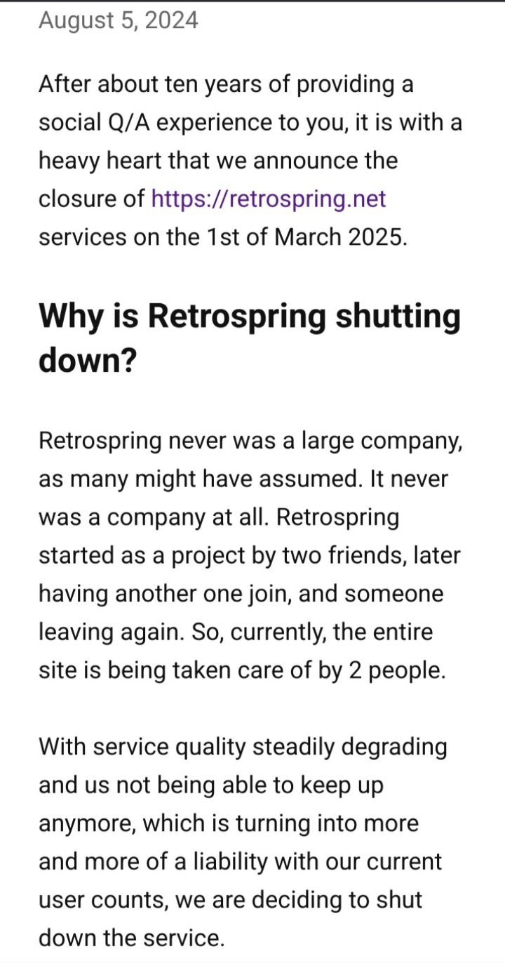
So last night I played We Happy Few, checked socials and found... Retrospring will shut down in 2025.
So retrosprings a sort of a q/a social media site and they've announced they will be shutting down next year. Screenshots taken from the site.
So We Happy Few, the game that can be summarised as modern britain simulator. Before launch, the game was garnering some attention with a lot of folks being fascinated with what looked like 1984 meets bioshock. Of course when the game did launch... it was a buggy, tedious mess of a game and wasnt great to play.
Now, the idea of a survival game were you need to play along and conform to societys quirks in order to blend in is an incredible idea that I feel isnt explored very much in games and holds some relevance in todays climate. Joy is the drug that made the town of Wellington Wells the way it is, people stoned off their minds and forgetting the terrible past, living in ignorant bliss. And if you didnt take your joy, you're labelled a downer and will be attacked until you conform or get chased out. And theres lot of effort in wellington wells, mainly within the town itself to detect downers, all to make sure everyone stays happy. And you'd assume there'd be some pressure to play along just enough to stay alive right? Well not really.
Truth is that We Happy Fews "survival" mechanics are rather toothless. In the games story you only need to occasionally eat, drink and sleep as you walk miles along grasslands and cobblestones street to reach the next cutscene, and in the early game you get introduced to the garden district were berries and clean water are abundant. Heck theres plenty of rose of giliead bushes that can be turned into healing balm, making most fights trivial since you're stacked with healing items. By the way, i said clean water because in the town and parade districts, the water is spiked with joy but only the water, the food isnt spiked so any pies, sandwiches, stews and cans of v-meat you find are joyfree. Even tea, grapefruit juice and coffee are safe for some reason. Actually there is quite a bit of food in the village, edible too despite the fact that the games story states that theres currently a famine going on. Where mass starvation is a looming threat that everyone is too overjoyed to care.
The opening had a bunch of wellies eat a dead rat thinking it was candy from a smashed pinata but you never get anything like that in game. Joy does make things look pretty but outside of getting past a detector, there isnt much of a reason for a player to decide to chase the joyful bulldog. No circumstance in the game made you weigh the pros and cons of taking joy either to get past a detector or even just making rotten food edible for a lil bit, dealing with the consequences of withdrawal and memory loss later, which tbh all they did was made the visuals more morbid and made you more noticeable to wellies. You know, I actually recall that taking joy had a more dire effect that once you take enough, the games over. Your not a downer anymore after all are you?
Apparently in its earlier concepts the game was planned as a roguelike kind of game where the joy and survival mechanics wouldve been fleshed out more. But I suppose as the game gained traction and attention, especially after the xbox presentation at e3, the expectations for the game to be a bioshock-esque kind of game may have caused development to change direction in order to realise that expectation, yet they end up keeping a lot of the now abandoned elements for the rougelike, incorporating some of it like the procedural generation, into a mashed together game that couldnt make its mind up. And thats a real downer.
You cannot accuse this game of being lazily made, far from it. The enviroments and writing is fascinating, the story and characters are interesting and voice acted tremendously well. Behind the mask of a game thats mostly running to one place to the next, theres a small glimpse of something truly great. This isnt just a bad game, this is a bad game that couldve been a great game which is a worse than just a any bad game because now im sitting here mad, typing on a touchscreen about the pontential this game had and couldve realised had the leadership of this game made their bloody minds up. The story, the world, the characters and general style. The game had the talent and resources to make something great and at times, you can see that quality. But the direction behind this game was flawed, the ones leading the project could not figure out what kind of game they were making and all we got was a rushed, buggy, confused mess.
Im just writing a blog post, paraphrasing my thoughts here. But if you're interested in delving into this further, theres a couple of videos that are worth watching. First off is the The Cost of Joy which is a documentary by the developers that details the development of the game itself.
youtube
The second is a video by Abbsynthe titled We Happy Few: An amazing story weighed down by a bad game, which covers a lot of the aspects of the game and its story and goes into more detail.
youtube
I recommend giving these videos a watch if you're interested.
Thats all for today, see you all tomorrow. Feedback is appreciated, anons are currently on.
#midnight gaming#we happy few#retrospring#gaming#also one of the characters in game.name nick lightbearer...#is voiced by astarion im not joking#Youtube
2 notes
·
View notes
Note
20, 3, and 4 uwu
20 – part of canon you find tedious or boring
TWST: Honestly? Not much. It's not tedious or boring, it's either good or very frustrating. If the actual writers are on the writing job, I don't think I can get bored even if the canon concerns characters I couldn't care less about. If it's the US team, then they so far always broke the world and characters and made an absolute clownshow of very interesting concepts and ideas.
AFK: I don't care how many more "Lucretia is the victim" comics they make, she's not. She's a stalker who went on to kill dozens of children because she couldn't protect her own child and couldn't communicate with her husband. Is Zaph completely innocent? No, he has his issues too. But Lucretia is way more responsible for this whole mess and only getting a pass because she has a vagina.
Makai ouji: Nothing. I am 100% biased, yes. I love Makai ouji to bits and every scene is important.
3 – screenshot or description of the worst take you've seen on Tumblr
Hoo boy, there's a LOT of these. Let's see.
Mental abuse isn't real, only physical abuse counts
If you're not willing to share intimate details about your abuse, you aren't allowed to point out behavioral patterns of abuse you went through
Having any criticism or simply disliking a non-white character is racist
Having any criticism or simply disliking a female character is sexist
Having any criticism or simply disliking a character someone else hcs as neurodivergent is ableist
Whatever you enjoy in fiction, you 100% always condone in reality
All siblings hate each other and positive sibling relationships are unrealistic
TwstEN is a good localization
4 – what was the last straw that made you finally block that annoying person?
I have a weird relationship with blocking where I either block very liberally or don't block until it gets way beyond annoying. I'm guessing one would be roping me into a paid project for a big company with an insanely short deadline (one week for five separate videos) without consulting me first, then bailing on our meeting time about it and getting pissy when I called him out.
3 notes
·
View notes
Text
Devlog 8: The thing they say about being slow and steady

And so, we're getting there: asset hell part 2, CGs edition. This March a LOT has been accomplished. As of recently, I feel like I've taken care most of the bugs regarding variable counts and while more manwork is still needed within the game (ie. asset/CG work, etc.), I'm glad to say that the game is functional -- no softlocks and all. As always, more detail below the cut. Surprisingly, this devlog was longer than I anticipated. This time, with more screenshots because I was too lazy to do so last month.
Bug fixing 2/3/playtesters
Around the midway point of March, I've finally done my second round of bug fixing for any loose strands I didn't notice the first time around after getting enough free time to do so. Unlike angel care, I wasn't dealing with fixing past me's code because I had more experience on my belt and thankfully, it went smoother than last time. While there were some variable issues I (and my playtesters) ran into, those were easily taken care of. Luckily, it was just one instance and the bug wasn't that far into the game, so less text skipping for them! It also gives them the assurance that the latter portions of the game will go much more smoothly because those portions don't have as much problems with them. Albeit, I wasn't that aware of how long I take to gamedev in the weekends, but recently, I found out that I roughly take around 5 hours per session just bug fixing. Suffice to say, maybe I should be scared of myself.
Regarding the 3rd bug testing label -- yes you're not seeing things. That was done recently, actually. By recently I mean this afternoon, so I assure you that I'm not bluffing on how bug-free the late game section is for Dt-z. With this game, I've gotten more friends to playtest so there's this sort of pressure imposed on myself, by myself, to give them the best experience of the game (even though that at its state, it isn't quite polished in my mind to call it finished; placeholders and all).
Though, other than that self-imposed standard after releasing Dt-z's build to them, it's honestly pretty rewarding to see their reactions to Rexosh's shenanigans and to the game currently despite it not reaching my standard set for it. Quite a refresher. When you work on a game too hard and look at it too much, you start to see it from a lens that's too critical of its flaws and slowly forget of the things you are proud of. Makes me think about the things I feel about gamedevving as a whole; it's hard as hell and you *will* lose your mind a bit, but it's worth it in the end.
All things asset (UI, BGM, etc.)

With the implication of me sending out Dt-z's build to people other than me comes with the information that, indeed, I've finished making most (as in, the ones that the player will stumble onto without collecting certain items, etc.) of the maps' overlay lighting! It was tedious, a bit boring, but it was done; currently sitting at 98 files in the graphic's folder itself. And yes, that also includes the fancy sprites. While I did have to wrestle a bit with VX Ace's placement of them on the map itself (since on the editor itself, the event placement lies to you), I imported them on the editor and got most of the basic and fancy cutscene directing checked off my list. Got to say, me not using any overlay plugins for angel care's lighting made that part easier because with pictures, they do not go under the filter and stick out like a sore thumb. While it's the easier method, the visual dissonance doesn't stick to me.
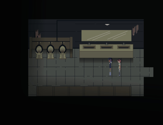
Speaking of, the CGs are also on their way being polished. While I focused a lot this month on the core gameplay itself, this part will probably take up most of my time in April. Despite having one CG I liked in game, I have a feeling I'd have to resize the canvas a bit because I don't like how the other CG looks in-game. Anyway, here are previews of some of them in the early game:

Very small, but rest assured, they'll be resized once everything's set with them. I also realized along the way that VX Ace's screen size was just not compatible with how I tend to do my CG work now (small canvas, then resize) because the resizing percent isn't a whole number, so I've started to come up with a compromise to not ruin the pixels I placed down. A couple of special face portraits/in-world sprites have also been completed this month.
Thankfully, I figured out how to remove the status bars along with the face portrait elements whenever you pull up the menu to save/what have you this month, so the save screen looks less ugly than it was months ago. UI sounds have also been implemented within the game.

Anyway, suffice to say, I think this month marks the end of my BGM hunt. Now the game has a whole lot of atmosphere to it. Got to say, I really love Japanese sites for getting creative commons music. While Dt-z doesn't really have that much original tracks like angel care, I'll still upload them on here for the sake of archiving things.
Lore/puzzles
I think I forgot to say this last devlog because I was too focused on documenting my asset making, but, yes, there were some lore changes for the story to have more impact + the element of parallelism to be more evident. Thanks to talking through with this with my friend in vague terms (a very useful tactic), we figured out a way to deal with something that was bugging me in the story itself. Puzzles to get certain items for endings have been adjusted and coded in too.
For the old lore, I was thinking of including it in an artbook or a retrospective blog entry on here because I love talking about drafts + to compromise with making Dt-z free to play w/o any donations due to the license of some tracks used there.
What now?
Okay, so. From what we have here, these are the tell-tale signs of us reaching the latter half of asset making hell -- just a couple more fancy sprites and the rest of the CGs to go. April will be a veeery busy month for me both IRL and regarding this project. It'll be difficult because I have (of course) my wrist to worry about and my mental state regarding dealing with a handful people (lol). But, yes. At the latest, I could see May being the month where this releases, but realistically speaking, it could be June instead. I am... Both very excited and scared of those months for completely different reasons; I'd be closing a chapter in my life and beginning a new one. Looking back at where I was during AC/Dt-z now, it's kinda jarring and makes me feel sentimental in an odd way. But, for now, I'll be beating the heat and resting for a bit.
2 notes
·
View notes
Text
Director's Commentary (CONTAINS MSQ SPOILERS):
01 - Water
This one was quickly improvised at the southern Limsa pier in a bit of a panic the night before, but it came out well. I like the way the pier and ocean contrast against each other, both hue and value-wise, and I also like the way the pose and narrow FoV/high zoom make Petra look like a toy.

02 - Mount Not a fan of this one, it was rushed the night before and the lighting looks bad. Way too purple. The pose is also awkward as hell.

03 - Ice This is another rushed and shitty one, though the lighting isn't as bad. I believe this one is natural lighting only.

04 - Light
Big fan of this one. It's a re-take of my earlier work

05 - Job This one turned out pretty good! I like how I was able to angle the No Entry sign. I believe I had to use some extra lighting to make the natural daylight work.

06 - Sea This one made use of my recently developed "taking a rest" glam that convincingly portrays Petra as if she has just taken off the top half of her plate armour to cool off and have a rest. The Uraeus Armour chest makes for an excellent under-layer, complete with thick leather where the Cuirass plate doesn't cover and attachment points for pauldrons.

07 - Day Off This one was tricky to compose. The Quicksand is a fairly cluttered space, with a lot of railings and tables and other garbage getting in the way of long-distance shots, so I had to compromise with a high angle that avoided most of the eye-level obstructions. I also updated Petra's "day off" glam with a better weapon (

08 - Hobby This one was a bit lazy. I was struggling to find a good workshop in time for the 8th, as the Halloween event was still running and most guild workshops were still festooned with pumpkins, so i eventually had to quickly slap a compromise together before the deadline passed.

09 - Spring This was one of the first shots I did. I'm very happy with it, particularly with how Petra's sinister expression and lighting contrasts with the happy little garden bed. Resting bitch face makes you look like you're gonna kill someone at any moment.

10 - Strength In the vein of the eighth major arcana, this shot shows Petra overcoming her own capacity for violence and controlling her own suppressed Id by coming to terms with it. The beast is muzzled.

11 - Machine Nice and simple, to try and get more days done. I really liked how the shot came out, particularly the david vs. goliath imagery, but waiting for the cutscene to re-play for each attempt was tedious.

12 - Dream Another super simple shot. This one took a couple tries, because I wanted to get Petra's armour correct for this point in the timeline.

13 - Monster This one's a little stiff-looking and not terribly original, but I feel like it still really encapsulates the idea that Petra is a monster from the outside. Those she conquers are ground to dust by an unstoppable juggernaut.

14 - Laughter Another one I rushed and fucked up, particularly on the lighting. I had to turn Petra to face head-on, as her tabard physics make it look atrocious from the side. I don't like the end result at all.

15 - Morning The very first finished screenshot I took for Roevember, and one I'm extremely proud of. The highlight lighting is all-natural, though if I remember right this is actually the evening sunset at Rhalgur's Reach. Also, it's difficult to see due to the way it blends in with the background, but Petra's hand is hovering away from her hip.

16 - Friend This ended up being really cute, though I really had to finagle the head positions. It was super creepy when every single NPC in the Forgotten Knight turned to look at me. I also decided that this means Petra helped Tataru with her odd jobs sometimes, to earn extra operating funds while they were hiding out in Ishgard.

17 - Night Final Fantasy XIV's skyboxes are gorgeous. I had to add some extra lighting on this one to properly highlight Petra's silhouette, and I don't think I did a very good job of doing so.

18 - Sin Eater Unfortunately, I'm on Free Trial, so I can't take any screenshots of the horrible things that are scheduled to happen to Petra in Shadowbringers. I figured out a good "bleached hair" look for her in preparation for the future, though.

19 - Voidsent This was really annoying to get. The whole cutscene has to replay each time you attempt to take a screenshot of this extremely brief shot, and few frames are usable. That's Thancred's foot poking out of the top.

20 - Discovery The fight with Ifrit is a turning point for Petra, and the start of her role as the Warrior Of Light. It's when she first becomes fully aware of her karmic inheritance as 8 shards of Azem, surviving normally-fatal injuries and resisting tempering. A literal baptism by fire. Shame that the cutscene is so visually noisy, especially with the blurry floor texture and long shadows everywhere.

21 - Gods Petra doesn't think much of her non-practicing worship of Halone, a holdover from growing up in her hometown, until she reaches Ishgard and sees the kind of institutional nightmare that the Ishgardians have perpetrated in

22 - Memory Petra's resting bitchface gets even worse when she's busy receiving another message from god or seeing into the past.

23 - Loss Proud of how this one came out. I lucked out in that one of the sit poses (of which most are shitty) helped make Petra look small and isolated in the empty Waking Sands mess hall.

24 - Weapon A stark showcase of Petra's trademark post-HW weapon, an expensive Ishgardian longsword custom-made for her needs and measurements. It was given to her by Aymeric as A Gift From The Grateful People Of Ishgard, along with a suit of armour that didn't last as long and had to be put in storage sooner. As excellent as it was, it's shattered during Petra's first fight with Zenos in Rhalgr's Reach.

25 - Primal I really liked how the colours came out in this one - it's a cutscene, so the lighting is all natural. I had to take a couple versions, because having a shield on her back blocked too much of her body.

26 - Spirit

27 - Love From whence comes true strength to protect the meek? The DRK quests up to level 60 are also extremely important to Petra's character development, and this moment was incredible. I love the writing so much.

28 - Vacation This is probably the one I'm most proud of out of all thirty screenshots. It's got it all - simplistic background dominated by geometric lines, an earthen halo,

29 - Food & Drink This was incredibly aggravating to take. Not only was the Bismarck's kitchen covered in idiotic pumpkins for half the month due to the Halloween event, but none of the stoves were the right height for Petra to pose at. I eventually had to settle for something that looked vaguely like she was stoking the fire.

30 - Future

@beyond-mortal-limits ROEVEMBER 2023 DIRECTORY

01 - Water 02 - Mount 03 - Ice 04 - Light 05 - Job 06 - Sea 07 - Day Off 08 - Hobby 09 - Spring 10 - Strength 11 - Machine 12 - Dream 13 - Monster 14 - Laughter 15 - Morning 16 - Friend 17 - Night 18 - Sin Eater 19 - Voidsent 20 - Discovery 21 - Gods 22 - Memory 23 - Loss 24 - Weapon 25 - Primal 26 - Spirit 27 - Love 28 - Vacation 29 - Food & Drink 30 - Future
5 notes
·
View notes
Note
What steps do you usually have for creating each page, and how long does each one usually take you? Do you do stuff like thumbnail entire chapters in advance, etc?
I don't know how big your page buffer is, but you seem to get pages done at a really impressive rate, especially considering every page is clean and colored, so I'd love to know how you manage it :)
// this is a long ask, so buckle up!
all of my pages start with an outline, which is then fleshed out into a script- over time I've found that having an entire chapter done before starting any other step cuts out unnecessary fat that comes with editing. if there's one thing I learned from preboot OBT, trying to figure out what exactly happens on a page as you're drawing it can lead to a lot of heartbreak if you decide to change it (a lot of preboot OBT's chapter 4 was subject to this- I have a million drafts of rune and fienne in the market because I didn't know what I wanted them to do there). my scripting program is actually the beta version of a program one of my classmates in college made, and if it ever goes public I'd be happy to pop a link since I believe they want to make it open source eventually. on average my scripts are about 5000-6000 words long, and are written (casually) like film scripts since that's the format I was trained on as a film student.
my outlines are a bit sloppy because it's just like a stream of consciousness flowing out while I try getting ideas slapped down as quickly as possible. I try not to worry too much about details unless I have a clear vision in mind because I think writing the plot out in one go flows the most smoothly.
and then from there, I expand that outline into a script.
after the script is completed, and assuming I have enough buffer, I thumbnail the entire next chapter- or at least as much as I can stand in one go. I'll usually either be working on rendering the previous chapter during this step, or I'll have the previous chapter completed so I can devote my attention to it. either way, I try and give myself room to do a variety of tasks depending on my mood. thumbnails are easy to work on while on-the-go for example, but they require a lot of thought to put together. coloring can be tedious, but it's great to do while multitasking of on lunch at one of my jobs.
part of the thumbnailing process for me includes putting down text bubbles. surprisingly, this is a very tedious task, so I try to get it all done in one go so I don't have to agonize over it. and this is where my process gets a bit convoluted, so bear with me.
to do this, I take a look at my script and break all the dialogue into different text bubbles. I've gotten to the point where I think I do pretty well naturally finding breaks in pages, and I just go in chronological order putting text down. for this step I have page templates prepped, which show the safety margins that I need to follow to prevent text from getting stuck in the binding when printing into books. I make sure all the text is safe, and then move onto the next step.
after that, I copy the page with text bubbles, and then shrink it really small into thumbnail size. on a layer above this screenshot I trace the text bubbles, and then treat those bubbles as "dead zones" to draw around while working on the thumbnails. this might be an unnecessary step if you have a good grasp on how much text takes up a panel, but I am historically awful at judging that so knowing the exact text bubble size when thumbnailing helps prevent my bubbles from getting in the way after the art is already rendered. then, rinse and repeat for the rest of the chapter!
some chapters I'm quicker at thumbing than others- on the low end we've got chapter 5, which I wrapped up in 2 months (I did roughly 1 thumb per day)
and then chapter 6 which I dragged my feet on a little bit, at around 6 months
(and chapter 7, which is twice the length of a normal chapter for me, took 4 months!)
after that is sketching, the part I dread most when working on a chapter. it's the part that requires the most thinking on my part, and I did away with sketching completely for most of chapter 3- but I've been trying to make my lines thinner lately, and until I build up the confidence to work without sketches, I'm afraid I'm stuck with them. I try to do 1-2 pages of sketches per day, but some days I just don't do them if I'm not feeling up to it.
(I'm actually avoiding sketching while I work on this ask)
while most of OBT is done in CSP, the one thing I don't do there is lines- for that I use a free program called Sketchbook. Sketchbook has a pretty incredible predictive stroke tool that adjusts your strokes after you make them. it takes a bit of time to get used to, but with it I can draw much faster than any other program or with any other stabilization tool. I gave CSP an honest shot with lining by trying to use it for 6 months, but sketchbook was just too powerful so I live the multiprogram life. I try my best to keep all my lines closed during this process because it'll make coloring WAY easier. like I think coloring used to take me an hour, now it takes me 20 minutes tops.
then I flip off the visibility on all layers except the lineart layer, save as a PNG (saving a working file as well if I'm feeling spicy), and then import to CSP! where the most fun part begins.
to start, to do that colored lineart thing where the lines on my characters are darker on the outside than the inside, I start by coloring characters their inside color first (using the "lock transparent pixels" layer option). for comics this is reduced to a simple "warm palette" color and "cool palette" color, which are brown and blue respectively. it's subtle, but you can see it in action with rune and eilwyn here.

then I use the magic wand tool, my best friend. I select the negative space around the characters, invert it, and then with the dark color selected in my palette (for me it's a dark brown approaching black) and the transparent pixels still locked, I use the "outline selection" option to outline the characters. I usually outline them by 6 px, but it'll depend on what looks best.
then for coloring, with the characters still selected, I use the "shrink selection" option to shrink it by 1 pixel. this helps prevent aliasing when I use the fill bucket to fill characters in with a base color! after that I pick them out by character and manually add their main color by hand, so they look something like this.
and here's the part where I impart upon ye, dear reader, with the forbidden knowledge I learned while doing the Monster House Marathon this month. see, I really like doing these daily events because they push me to my limit. a page a day is the most comfortable fast pace I can work on the comic, but it can still be a bit of a strain to get a page done before my bedtime, so I'm much more willing to learn shortcuts in order to get a nice juicy 6 hours of sleep instead of 4.
if you do a closed lineart method like me for most of your character's markings, the "Set Reference Layer" tool is going to become your new best friend. using this, I set the lineart layer as the reference layer (and only the lineart layer), move over to my coloring layer, grab my fill bucket tool, and then I can just start literally filling in characters within seconds. some characters have unclosed markings that I'll have to do by hand, but this is extremely quick and I love it so much.
finally I add a multiply layer where I do some light shading. this step used to be full cel shading, though over time I've found that my art reads a little more clearly without it. and shading also used to be miserable because it was another 30 minutes to an hour of rendering that kept me from completing a page.
and finally, I add backgrounds and lighting effects. I have a pretty decent library of pre-rendered backgrounds I've made that I can just plop in a scene, but sometimes for new or one-time locations I'll make a new one by hand.
and that's a completed page! it's a bit hard to calculate how long a singular page takes start to finish since I try doing everything before the lineart in batch style, but I'd say it all roughly evens out to 2-4 hours. breaking it down, it looks something like:
Thumbnail - 10-20 minutes Sketch - 30 minutes - 1 hour Lineart - 30 minutes - 1 hour Coloring - 10-20 minutes Rendering - 10-20 minutes Background - 20 minutes - 1 hour
so pages are pretty quick for me to make! this helps me build a pretty sizeable buffer, I think my previous record was somewhere around 40 pages? maybe 70 if I included dielle's wish. though I will admit during this Monster House Marathon, I actually ran out of buffer on day 7, and I'd been laying the tracks in front of the train until, uh, checks watch, the 27th! as of writing this I finished the buffer through the MHM, so I can rest easy. this ask probably won't queue until after the MHM has ended so this probably sounds a little comedic. the main reason I was able to manage these daily updates without a buffer was because of an art high I was experiencing this month, which is also why I did a marathon in the first place.
though usually, I really am an advocate for buffers. having a buffer of at least 3 months means I can hop around with different processes as my interest in them flips around. my brain usually likes to focus on one task at a time, and a lot of it, so having that freedom is great for me. and sometimes, I just wanna take a month off to play a new game or hyperfixate on stardew valley once again! it all comes down to practice and developing a workflow and schedule that works for you.
31 notes
·
View notes
Text
1.19 - the Wild Update
This is a post detailing my various ramblings and thoughts on Minecraft's recent 1.19 Wild Update. Overall, this update is a bit of a mixed bag. What we did get was pretty good, but there is a very distinct gap where something else ought to have been.
[i haven't actually played the update proper, but I did try out some of the snapshots, so take all of these with a bucket and a half of sodium chloride. I also didn't take any of the screenshots here]
What We Did Get
Ancient Cities and the Deep Dark
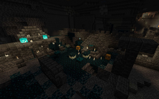
wow, holy fuck, these are amazing. If you've only experienced the Ancient Cities and Deep Dark through Youtube videos in creative mode with night vision, go play it in survival because it is incredible. The team have really nailed the atmosphere in the Ancient Cities, that of isolation and pure terror. I adore the structure design, the sprawling builds, and the puzzle aspect of trying not to activate skulk shriekers and summon the Warden. I like the idea of not having any mobs spawn in the Deep Dark as it sets up possibilites for huge moody cave bases, and honestly, having mobs spawn in the Ancient City would ruin it. Ancient cities themselves are incredible and loneyl structures, and they encapsulate Minecraft as a whole - enormous, and can be tackled in a variety of creative ways.
The only let-down here is the loot. Honestly the thing that is most attractive about the cities to me is the gray wool lying around everywhere which I can use for building. Echo shards really should have more of a use than a fairly useless compass that you don't need by the time you get it because you'll already be in the endgame. The new music disk is cool but after you've gotten all 9 fragments there's not much incentive to return (although I would like the idea of having all the music discs be obtained through exploration and other challenges instead of the weird creeper and skeleton thing we do now). Same with Swift Sneak: after getting a few books there's no need to return. Personally though the kinda eh loot isn't a turn-down for me - the cities are more about the experience, and plus the wool, skulk, and other new blocks are enough incentive for me anyway. When we finally know what the portal is supposed to be, they may see more use, but what we have now is still incredible.
The Warden
A lot of people have criticized the Warden for being "too overpowered", and in some aspects I agree - it's essentially completely invulnerable. But to start off, it's still amazing. The sound design, animation, and pure fear it elicits is something that we've never seen before in Minecraft, and it's a properly challenging opponent. But it's not meant to be one - you're meant to avoid summoning the Warden, and the Warden is a lot more like a punishment than a boss mob, and it is punishing. As for the sonic boom attack, when it was first added I really liked it and thought it was a clever way to prevent cheesing, but the fact it bypasses protection is a bit dumb, plus not being super intuitive to new players.
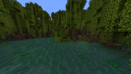
Mangrove Swamps
Aestheticaly, quite nice. I wish fireflies were here (more on that later) but what we have is good. Mud is interesting, and the mangrove wood and mud-related blocks seem very fun to build with. I like how the tree grows with the roots, and navigating the swamps is pretty fun the first time (altho it does get more tedious later on). The mangrove swamps are kinda just there, they're really cool first time you see them, but asides from the special wood type and mud, there isn't much too special about them - I think having some structures or other unique feature that doesn't involve deforestation and destroying the fun of the biome would be well appreciated.
As for frogs, they're fun. I like their animations, unique breeding patterns, and froglights seem like a huge pain to get but the fact that they can eat magma cubes is hilarious.
Allays
A really cool idea in theory - a little fairy that helps you carry stuff and solve inventory clutter. It's a creative and fun way to do that.... but there are a lot of problems with the Allay.
To begin, the Allay is found in pillager outposts and woodland mansions, which is fine (and ties into some lore relating to the vex), but it also means that you need to transport them, and asides from using a lead or relying on their follow mechanic there isn't an easy way to do so. Additionally, the Allay cannot be bred or reproduced in any way, so it means it's harder to create everyone's dream of huge farms with Allays flying around.
I haven't played around with the Allay, but judging from how it works and everyone talking about it, it doesn't seem terribly useful for redstone purposes. It looks like a pain having to transport them and deal with their AI with what could be done with a simple hopper sorter - not to mention it's not exactly the fastest method of sorting. It will probably see the most use with new players who don't know how to build hopper sorters.
It seems most useful in manual grind work such as strip mining, clearing out beacon holes, or villager trading where you have to deal with inventory clutter. Overall, a fun and creative way to tackle inventory clutter, and I can definitely see a lot of potential in the future, but as of right now it seems like a bit more of a forgettable feature.
Sculk Sensors
Not a redstone guy but these seem great for things like traps and secret entrances (which isn't super useful for singleplayer players). I like how they can detect specific sounds using signal strength, but good luck working out what's what without consulting the Wiki. I'm sure we'll see lots of incredible devices making use of them.
What We Did Not Get
The Wild Update is about the Wild, heck it's in the name. When it was promised at Minecon, the devs said that they aimed to breathe life and give ambience to Minecraft.
We did not get that. But first...
It's Called Concept Art for a Reason

Okay at the very least give us fallen logs.
One thing people got worked up on was the Birch Forest concept art. How dare, Mojang, claim that they would revamp birch forests and give us 16x the detail, and ended up doing nothing!
They never said that. It's concept art. One thing people don't realize is that game development is hard, and plans change often. They might have realized that birch forests didn't work out well, or they simply wanted to do something different. Things change all the time in design, and at the time they may have been really confident that they wanted to revamp the forests but ended up scrapping it after announcement. Maybe they put in a lot of hours into working on it, then realized it didn't work out well. There are a plethora of reasons why they could've decided to not do this.
But Mojang is not completely innocent. The phrasing and the framing made it seem like birch forests will get a revamp (heck, even I was convinced, and I looked forward to it). We'll look at this more later.
The Firefly in the Room
Fireflies were another ambient feature that everyone wanted. A lot of people make fun of the people who are angry that fireflies aren't here - they're just two pixels after all. I disagree. The loss of fireflies is emblematic of the wider problem with the Wild Update.
Mojang's official reason as to why fireflies were scrapped was "they are poisonous to frogs". I'm going to ignore the fact that frogs can eat magma cubes, literal blocks of pure fucking fire, and just say that,
"why don't you just not have frogs eat fireflies?"
Fireflies weren't about the frogs - they were about the ambience. Seeing fireflies at night would breathe a lot of life into swamps and mangroves. They could also have legitimate purposes such as being put into bottles as a new light source, or captured to be used in a new potion. Even if fireflies were just little specks of particles in the night, it would go a long way to improving the ambience of Minecraft, which is the entire point of 1.19, and them not being here is a gaping hole in what is essentially Caves and Cliffs Part III. I'm not mad we don't have birch forests - they were never promised - but I am a bit pissed that this feature, which shouldn't be a huge challenge to put into the game, is lacking. This isn't to say that Mojang changed their plans - they might've, but clearer communication is needed.
Actually, about that:
Mojang really sucks at talking
The now infamous Ask Mojang episode that riled up the community did an exceptionally bad job at explaining why Fireflies and the Birch Forest aren't here. Instead of actually giving us a detailed description of the reasons why, they sounded almost dismissive in their reply, saying that concept art isn't final (which is valid) and that frogs were removed because of the frog eating them poison thing.
For a lot of members of this community, it wasn't enough. Additionally, at Minecon they really did a poor job of making it clear that none of the stuff they mentioned was final. I also think they are overestimating their own abilities - they're announcing too much and building too much hype, and if the update flops then people would feel they've been cheated. On the other hand if they said little, and released stuff by surprise, it could give them more leeway with their schedule and build hype. Take Basalt Deltas as a great example (which are the best looking nether biome but also the worst to navigate), or netherite. Can you imagine if Netherite was announced beforehand?
While I'm not chalking this update's lukewarm reception entirely to Mojang's subpar response, it certainly did not help.
Caves and Cliffs Part III
This update's problems lie in that Mojang has missed the mangrove swamp for the frogs (am I using that expression right?). They have made a lot of promises and failed to deliver on some of them, and they've completely missed the point of the update. Throughout the dev cycle, it was clear they worked a ton on the Ancient Cities, but didn't do a lot for the swamps and surface. The update, meant to be about ambience, ended up being "warden + some other stuff". And you know what's sad? We did get ambience - just in the wrong place.
The Ancient Cities have amazing ambience. They set the mood perfectly and are immersive and atmospheric. Too bad they put it there instead of the surface like everyone else wanted. Everyone's getting worked up about no fireflies and no birch forest, but not everyone's angry for the right reason - 1.19 has missed the point. It's like if the Nether Update focused only on bastions and neglected the rest of the Nether, and never gave us warped forests, netherite, or targets.
What We Could Have Gotten
Here is me going full on rambling and just talking about various fun ideas.
I'd like to mention an amazing mod: Dynamic Surroundings. It's a mod that injects pure ambience into Minecraft through sound and particles. It adds no new features, but playing the game with this mod is so much more immersive and ambient.
So, even without adding any new gameplay features, we could already go a long way just by adding in new sound design and particles. What if:
sounds echoed in caves?
there were cricket and owl hooting noises at night in the forest?
deserts could have shifting sands?
leaves could lightly fall off of leaves?
ghoulish wailing in the End?
waves and seafoam in the water?
we had birds chirping?
water dripping noises echoing through dripstone caves?
light breezes shaking tree leaves?
steam coming out of the intersection between water and lava?
morning dew?
comets and other celestial phenomena like auroras at night?
stars twinkled?
So many possibilities without needing to add a single new game mechanic. But what if we stepped it up a notch?
cattails in rivers
new flower types that could be used to get dye colours that are now mostly obtained with mixing
fallen logs in forests
wells and abandoned cabins
abandoned campsites
fireflies, or other insects?
surface fossils in deserts?
There are an endless amount of possibilities that can go a long way when it comes to these. The fact that Mojang did not even add a single ambience feature, not even a new particle effect or sound effect, is quite the blunder.
Conclusion
The Wild Update was ultimately, an incredible update that was murdered by the weight of expectations, poor communication, and missing the point. It's a shame, because many aspects of this update are spectacular. Hopefully Mojang would correct this in the future, give us the full 1.19 experience we so desperately want, and not set themselves up for failure by setting the bar too high.
18 notes
·
View notes
Text
When a strange aircraft totals itself near the Treverton residence, Casey and Lauren are quick to take it into hiding so that nobody may learn of their discovery. Once Casey is finally allowed a moment alone at bedtime, Lauren sneaks through his patio door and up to his room at his request to inspect their find with him.
At first, there's no telling what it might be...

... but something deep in Casey's heart tells him that it shouldn't be here.
(Check underneath the cut for extensive insight on this piece, including an alternate version of Casey's room with the lights on!)
What you just saw above may very well be a sprite piece two years in the making. ... well, it didn't actually take two years to sprite this, but there's quite a history behind this Override screenshot, and if you know anything about me, you can bet that you're going to hear all about it! With that said, let's dive into the making of Casey's bedroom!
To start, I've been wanting to make faux screenshots for Override since mid-2020, and one such scene I wanted to give a go at spriting was something involving Casey's bedroom. At that time, I had a few ideas on what I wanted his humble abodes to look like— blue walls, a desk, a really neat space poster someplace— it was such a cool vision that I had to attempt spriting it all right away!

I didn't get very far.
Keep in mind that at the time making this first draft, I had only begun practicing my skills in spriting, and while I was able to make small-scale sprites such as the Override squad, spriting an entire bedroom was practically an impossibility in 2020. So, for a little while, I put Casey's bedroom on the backburner, opting to return to it when I had a bit more practice.
Here we are two years later, and I think it's more than obvious that I was more than ready to tackle spriting it in its entirety! When I made the decision to give spriting Casey's bedroom another go, there were two specific goals I wanted to achieve by its completion: for its general look and feel to stay true to the 1990s and for it to have its own personality.
Now, I know what you're thinking— "Star, what do you mean give Casey's bedroom its own personality?". Well, by that I mean I wanted Casey's bedroom to look like it actually belonged to a nine year old boy with clear interests, like art and all things space.
I say this because the bedrooms of the Mother series protagonists are a teensy bit... how do I put it... barren. I mean, Ness's bedroom in Earthbound isn't too empty, but it could have at least benefitted from some baseball-themed memorabilia, given that he's a baseball superfan in canon.
At least Ness has his own bedroom. Lucas shares his bedroom with his entire family in Mother 3, so there's not a lot of room (Unintentional pun + 100) for personalization in Lucas's case, plus it's less of a bedroom and more of 'a corner of the house'— there's not even a wall between it and the main area. And don't even get me started on Ninten's room.

Taking a look at what I managed to come up with for Casey's room, however, I was able to fill every single square inch of it with oodles of personality. It would be tedious to acknowledge every single object in Casey's room�� even by my standards— so I'll stick with some of my more favorite details!
First and foremost, you'll notice that Casey has quite an affinity for the interstellar. From his star-patterned blankets to his toy rocket atop his toybox, it's very clear that Casey someday wishes to travel beyond the stars. I even brought back the space poster I wanted to include since the very beginning!
Fun fact: The large focus of space theming in Casey's room is a reference to the original, early 2020 version of Override's (Then known as Mother: Into the Unknown) story, which had a space setting be integral to its plot. I figured basing Casey's interests on space would be a nice nod to Override's prototype story arc!
Secondly, to make Casey's bedroom look a bit like one belonging to a child, there are a good deal of toys strewn about his room. But perhaps his most prized possession of all sits nicely atop his bed... a small tiger plush named Stripes, of which Casey is prone to taking with him everywhere he goes à la Linus and his blanket.
Lastly, while being a detail I added just before posting this, near the bottom left corner of Casey's bedroom is a cardboard box fashioned into a spaceman helmet with a sci-fi blaster toy a few inches from it. I included these because of the aforementioned space theming, but also because Casey and Lauren playing pretend is absolutely canon, so it's no wonder most of their make-believe adventures happen here!
On the topic of Casey and Lauren...

Here is a better look of the duo in their nighttime sleepwear, as well as a better look at Stripes and the busted SGN-DRN unit I sprited just for this screenshot! I still can't believe how much of an improvement this particular version of the SGN-DRN's sprite is compared to the version of it from the very first faux screenshot; it's not often I'll sprite something at a bizarre angle and have it look good!
Having this iconic moment in the story of Override finally visualized is just beyond satisfying, and I hope that you're as impressed as I am on how nicely I was able to make it look— this is certainly one of my best sprite pieces yet!
#Override#Casey Treverton#Lauren Henley#SGN-DRN#Stripes#(Yes Stripes is getting his own tag. Stripes is best boy)#Sprite Art#Scene Design#Mockup#Bedroom Design#Coolness#I'm just as surprised as you might be on how much I've outdone myself with this one.#I've had this particular scene in my mind since the start of Override so this was a LONG time coming#The research that went into this was something else too#I combed through SO many photos of 90s kid's rooms just to really nail the aesthetic#Suffice to say... I think I succeeded!#There are just so many details that I'm STILL geeking out over even after finishing it#Like how there's crumpled up papers in the wastebasket and the taped corners of the poster#Another detail that started as a placeholder is Casey's shoes at the base of his bed#I ended up keeping it in because it's both cute and absolutely something he would do#I know I've said it already but I am just S U P E R proud of this#It's proof enough that I'm able to sprite scenes like this more often!
14 notes
·
View notes
Note
hello! to be honest, i just want to make sure you're doing alright. it might feel tedious at times, but it's important to take care of yourself. that being said, i sincerely hope you're being as kind to your soul as your circumstances would let you, since everybody deserves to feel whole. usually i'd try to come up with a question for you, but right now i truly cannot think of one, so if you want to share anything, i'd love to read it. if not, that's okay, too. i wish you peace of the mind, which will hopefully free you from your worries, even if just for a second. have a lovely day!
Hi! Thank you very much for sending this, it really means a whole lot. Negative emotions have been sort of on and off for me, but I've been dealing with them pretty well.
My most consistent issue is probably insecurity over various things that I know arent reasonable (like believing I'm bad at things if I don't get the highest complement or blow someone's mind by doing it, or even if it's just something I'm not bad at at all). But I've been able to identify what's at the root of these and am accepting that I'm just learning things and I'm just human, and it's not good for myself to try to be more to others.
Essentially, I'm slowly learning to be good to myself, and I'm starting to learn how. I think you should know I've screenshotted this for when I need it, because this really was kind of you to send. I hope that you're being good to yourself, too, and if there's anything that's on your mind feel free to talk to me anytime (you could come off anon or stay on, it's up to you :)). I really really appreciate this. Thank you <3
2 notes
·
View notes