#it's all a bit weird and visually cluttered
Explore tagged Tumblr posts
Visit Tumblr Blog
Explore Tumblr blogs with no restrictions, modern design and the best experience.
Last Seen Tumblr Blogs


Fun Fact
12.7% of mobile users access Tumblr.
Text
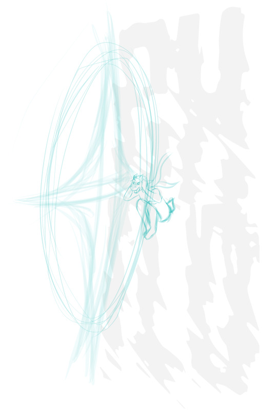
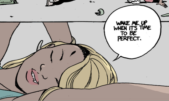
Can I be vulnerable with you guys for a second? I don't like Morrigan's new look 😔
#text post#it's all a bit weird and visually cluttered#and facially she doesnt really look like herself#maybe thats just the angle tho#well either way happy she's here :3#dragon age the veilguard#veilguard spoilers
19 notes
·
View notes
Note
I adore the way you draw Kris. They look like an actual teenager instead of way older or younger than I see most people do. <3
I don't know much about people drawing them younger, but I HAVE seen people drawing them older. Like pretty much at the end of puberty. Which is not a bad thing mind you. Everyone has their own headcanon of how old Kris is in Deltarune.
I personally always saw them smack-dab in the middle of puberty. So that really awkward phase where your body is all weird and gross and you are fighting all of these weird new hormones that are constantly sending you on a rollercoaster ride of emotions.
Of course, people can look really mature at that age. But I think it's a bit more relatable to make that teen character look like the awkward kind. I mean... as best as visually possible. I could draw them with acne and all that stuff to REALLY hit that home. There ARE plenty of people who lean into that direction by giving them stubble and acne and piercings... And that works really well with the more detailed styles!
But with how the Twin Runes works, the there is already bunch of detail going on their face with the braces. So it's hard to strike that balance and not go completely overboard. I basically try to avoid clutter as much as possibe.
162 notes
·
View notes
Note
could you please review steampunk pets? thank you!


It's kind of surprising that it took TNT so long to make a steampunk colour; it came out in 2018 but Moltara, a steampunk-based land, was released in 2009, leaving almost a ten-year gap between the two. Conceptually, it's a good idea; the clothing items are super unique and the base colors (primarily shades of brown) are also useful in and of themselves.
However, I tend to find the execution lacking from a conceptual standpoint, as most steampunk pets aren't really... steampunk-y (unlike Moltara, which feels like it does a decent job at the genre). I don't claim to be a steampunk expert, but I listen to enough steampunk music to get the idea: Victorian (sometimes frontier) aesthetic crossed with hypothetical steam-based mechanical technology, with focus on gears/mechanical workings and copper coloring.

Most steampunk pets, meanwhile, don't have enough of the normal Victorian-ish aesthetic and lean way too hard into the mechanical aspects, basically creating robot 2.0. For example, the steampunk Gelert, the first Steampunk pet released, looks super dystopian—no bright colors and a mostly robotic body with only a few tacked-on gears. And honestly, I wouldn't mind the aesthetics being off if the colour looked good, but a lot of the time steampunk pets are unnecessarily cluttered and very visually noisy for no good reason. Once in a while we get something good, but I'd say it's more misses than hits.
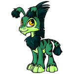
Favorite Species:


Kougra: Hey, this one's actually pretty decent! The conductor-ish outfit feels right for the genre and the mechanical aspects, such as the monocle, tail coverings, etc. aren't taken over the entire design. I do think it's a little more busy than it needed to be—things like the detailing in the boosts, wire coming off the monocle, all the watches, etc. could have been dropped—but it's pretty good overall. The sepia-toned base color is also good.


Hissi: Another pretty good one. Once again, the Victorian aspects are there and the mechanical ones are prominent without taking over the entire design. I don't know what that thing on its back is, but it looks cool and works well with the mask. There's maybe a few too many straps on the clothing and the pressure gauge by the face is a bit weird, but it's otherwise really good. The only issue is the base colour, which includes a truly stupid little...thing on the head. Why?? Now it's useless unless you manage to find a different hat to cover it up.


Techo: The Techo really nails the copper bits with some impressive shading. The overall clothing design is on point and it has goggles, which is a steampunk staple that I'm surprised more of these pets don't have. The colors are also nice, using blacks and browns in contrast with lighter cream areas. Once again, outfit's a smidge to busy and the base is ruined by the weird bolts on the neck and strange shading, but otherwise it's pretty solid.
Least Favorite Species:


Shoyru: I don't know what this is, but it's not steampunk, that's for sure. The wings sort of get there with a da Vinci-ish stitched look, but the outfit is... I don't know, almost viking-ish? It's also 200% too cluttered, and the clothing is shaded in such a way that the face looks completely out of place. At least the base is decent?
37 notes
·
View notes
Text
WoT Musing: Bits and Bobs from a book nerd
A few unsorted/random thoughts from a book mega nerd about various things in the show-
It's interesting to me that they changed Logain's innate talent from being able to see ta'veren to being able to see when a man can channel or not. This is practically probably because Mat was also in that scene, but I've also noticed that they've dialed back on the use of the term 'ta'veren' as a whole this season. Probably to avoid over cluttering all the concepts their having to introduce.
Elayne's desire to work with her hands/fascination with craftsmanship showing itself in her 'sparker trick' being a weave to make alcohol is very funny and on brand.
The show is continuing to walk out the small shifts in it's dynamics born of re-ordering things in a smart way. Everyone being slightly older was felt sharply in season 1: Mat's mischief and gambling is a whole lot less cute and a whole lot more worrying since he's no longer a teen, Perrin is married (like always intended to be) and settled as the most 'responsible' of the boys, etc. In season 2 Egwene arrived first instead of Elayne, and is the more experienced/knowing Novice, to Elayne's naive newcomer. As a result we get to see the slightly spoiled sweet girl she was before the Tower started to bust down her pride and teach her more about the world. She's a little more unsure, and a little more eager to make friends- both of which work in favor of showing off her strengths as a character, endearing her to both Egwene and the audience.
The choice to give Perrin the ability to see visions of the past with his wolf brother powers is interesting. I get that they need a visual way to express Perrin's wolf senses, and this is probably the most direct, since their's not a non-weird way to visually depict smell, but I hope we at least get a TAR related explanation from Elyas.
I find the use of the Crimson Thorn as a symbol of the Red Ajah and the cruel mercy that they grant to be fascinating. More over, I find Nynaeve's being pulled between the Red and Yellow Ajahs (something I suspect we are going to get more of) to be smartly done: Nynaeve has never been afraid of doing what needs to be done, but that doesn't make it easy, and Liandrin is right: to an extent that their always been a little bit of Red in her, a belief that the world would be better if everyone just followed her rules. And yet it is her compassion that defines her, that fuels her rage most of the time. Compassion for those hurt and sick and dying turns to rage against what caused it: a cruel world or a war or a sickness. Compassion for those she cares most for fuels her rage at those that would threaten, hurt, or control them. She left the Two Rivers to protect the EF5 and that remains her goal all the way to the series's end, her character arc is largely about accepting what that will mean, and learning not to be afraid to claim the power to do that.
I've said this in various other forms but it bares repeating: Lanfear really is winning right out the gate. She's got the hot new hardware LTT as her naive sugar baby, their is no one in sight to threaten her control over him with things like 'morals' and 'duty', and he's slowly succumbing to her influence. More then worth the price of having to run a small business in a slum I'm sure.
That said I want a 50k word fic that is just Lanfear's Adventures in Small Business Ownership. We know those drinks where over priced, but where they watered down? Did she have to pay a mortgage? Deal with uppity suppliers? Was their a Darkfriend Company Discount as Selene's Totally Normal And Not At All Evil Bed and Breakfast?
I have two nitpicks that are so minor they barely warrant discussion, and one is not even the show's fault. The first is that everyone keeps saying things like 'your powers' rather then 'strength in the power'. Jordan goes to so much trouble to make the point that people and objects don't have the power, they use it and strong in the power, and then Sanderson changed it to 'my powers' and 'how powerful he is' and *gargles*. This is like the peaches all over again.
The second is that as much as they nail the arches scene/ceremony, I wish they had gone the final mile and said 'Be steadfast'. It wasn't necessary exactly, but it's exclusion made me whisper under my breath, like a rhyme I just HAD to finish.
(This is completely normal and sane person behavior, stop looking at me like that internet stranger).
I don't have to much to say about Mat's story line beyond being VERY interested in where they are going tying him and Min together. I still needs to get off the ground for me to have more Thoughts.
Adeleas being Cringefail re: Lan is so funny to me in ways I can't quite explain.
I reiterate the point that since Rand's can't be Warder trained, giving him an old veteran blade master who is suffering from PTSD/Dementia was a VERY smart move that fits the feel of the books.
RIP Joshua's soft boy curls. You where a casualty of this war.
125 notes
·
View notes
Text
MAJOR Shadow of the Erdtree Spoilers!!!
Alright I need to get this out, so here goes.
Promised Consort might be the single most conflicting boss in Fromsoft for me, and I need to talk about it. Firstly, I want to say in full honesty that I don't really mind it from a narrative standpoint. As much as I would have loved to see Godwyn get his time to shine, seeing Radahn in his prime, especially after he got beaten out quite hard by 4 other bosses in base game when he used to be my favorite after some consideration, is very cool and I don't personally think it assassinates either of the 2 characters involved, as it doesn't contradict or invalidate Miquella's previous actions nor does anything point strongly towards Radahn willingly being involved in this. However, one complaint I do have is that Mohg's involvement feels quite irrelevant and ignored by both the fanbase (aside from the dedicated Mohg club) and the game. Promised Consort has a couple horns slapped onto his arms and a SINGLE move that is reminiscent of Mohg, that's it. No shared weakness, no cool wings or scales or anything, hell, why not make Mohg's shackle work to make this difficult fight a little bit less over the top. On that note, I would like to address the fight. Aside from a wonky hitbox or two, I think, on paper, Promised Consort has a very solid and fair moveset in Phase 1 that's fun to learn and exploit, even if the openings do feel aggressively tight. Phase 2 on the other hand...Why? Why, instead of giving this conceptually sound and interesting boss an actually new moveset do you just slap frankly annoying AoEs and weird Dragon Ball bullshit ass afterimage attacks and the ability to fucking toast your CPU on what could have easily been the best final boss fight in Souls thus far if you had just TRIED. Many people have expressed they feel as though Promised Consort doesn't "try" narratively, that he's just a cheap, shoehorned attempt at fanservice like Soul of Cinder What who said that instead of providing an actual final boss to cap off the narrative, and I don't fully agree with this even if I did find the ending cutscene a bit underwhelming. But I do feel as though Promised Consort isn't trying to actually be challenging in a fair and fun way. Just kinda, overtuned. Aggressive. Unfair. I had my fun with the boss, no doubt, but I didn't feel good about beating it, especially not after the only way out I saw was summoning a tanky spirit who drew all the aggro while I tried to do literally anything in Phase 2, when no other boss in the DLC or in the game at all has ever made me that desperate (Note that i don't mind summons in general but don't personally enjoy using them as it takes the excitement and rewarding feeling out of a boss fight for me) (Also note that while i am fairly good at this game, I am extremely easily overwhelmed by too many bright visual stimuli as part of my ADHD/Autism, which is part of the reason I struggle with Fortissax and Bayle every now and then, now imagine that but tenfold for Promised Consort). This boss needs some sort of nerf. Not one that completely neuters it, Radahn has had enough of that already, it just needs to be towned down. The speed, the damage, I don't know, hell, toning down the visual clutter of phase 2 would probably be enough, so you could actually SEE what the boss is doing half the time, just do something to not make this fight as unfair as it is now. I don't know if I'll have the same experience I've had with this boss as I did Malenia, where after several attempts that ended in a mere , underwhelming, unrewarding "Glad that's over", to thinking its the worst thing ever to it being my favorite boss, I kinda hope it will, but for the time I can't say I'm excited to fight this boss again.
Stan Metyr and Romina instead everyone, we love weird nasty girlies <3
24 notes
·
View notes
Text
Book bannings and schools mishandling books rant:
Book bannings, particulary school book bannings are weird and arbitrary and that's how they look to kids too.
I went to a number of different schools in Nassau County Long Island as a child. One school banned Goosebumps books as "too scary." And the teacher didn't consider them "Real reading" anyway.
That same school had banned Where's Waldo? (Wally to you UK readers). And "I spy" / "Eye Spy" books (where you search for the objects in cluttered picture, similar to Where's Waldo. They claimed it wasn't really reading.
Well, here's something the "clever" people running that school didn't realize. I'm visually impaired. Optic nerve damage since birth. And "Eye Spy" books were a good form of exercise in helping me focus my eyes. I can't control my own eye movements and those books helped a little but SOMEONE deemed them "not educational."
And my family was pretty poor. And didn't have a car. Trips to the public library weren't as often as I liked and my mother had a bit habit of not returning things to the library so that was also a factor on if we could take anything out.
In another school I went to comic books and graphic novels (Novels in comic book format) were not allowed. I strongly suspect there were parents who thought "graphic" meant sexual content as that's what I came across when asking people who were pro-banning Maus (the graphic novel about a mouse in the holocaust). The English teacher claimed comics are "not really reading." One kid made a great argument about how Shakespeare and classic literature has been adapted in graphic novel form but she argued that it is like a very abridged version since they put pictures instead of written descriptions. I had the impression she hadn't physically seen these graphic novels but assumed.
When I entered Junior High school the school library had a great book on Hebrew folklore that I liked and another book about beliefs in the occult. I tried to take them out and got a lecture from the librarian that those are "reference books only" and cannot be borrowed from the library. umm... Why? And what's the point of a Junior high school "reference only" book? How often do Junior High school kids get to sit down in the library for long stretches at a time.
In seventh grade a teacher from BOCES assessed my reading level. (I was skipped around a lot so I was only eleven). She determined that I had a third or fourth grade reading level at the time. I said "Well, that can improve, right?" (because I loved to read). She replied with "Usually at this age your reading level becomes stationary." I was ELEVEN! Who does that? It was like a deliberate effort to sabotage and discourage my love of books. And ironically, somehow, in English class we were reading The White Mountains, which was a great Scifi novel. And I was not struggling, I was enjoying it.
In my nineth grade English literature class we were handed text books. I always loved these because they were essentially anthology collections of great short stories. The teacher NEVER used the text book. She never assigned any story in it. I saw Harrison Bergeron listed and I had just seen the TV movie version so I wanted to read the original story. I asked the teacher about it and her "words of encouragement" were "That's not going to be assigned. You don't have to read that. Don't bother." I read it on my own.
This same teacher had ordered me to stop reading ahead when we were assigned chapters of Ray Bradbury's Fahrenheit 451. I loved that book. When I asked why she said "Because you'll forget what you've read."
Well, here it is, almost thirty-years-later and I haven't forgotten at all. Thanks for "Encouraging" me to read.
Another "Encouragement" was when I was in a programming for visually impaired students and the teacher had a book case full of the classics. And "You can read them but only if you write a book report for me after each one."
Well, I just wanted to read them. She wasn't my English teacher. Why should I write her a report? It wasn't going to impact my grade, just slow down my ability to read the next one. So I started to pretend I hadn't finished one book and would discretely move on to another. I did this several times.
One teacher's assistant didn't believe me when I came back from summer break having discovered a love of Anne Rice novels. She started to quiz me on The Queen of the damned to prove to her I read it. (This was before there was even a movie version, mind you). Why do these things? You're going to discourage kids from reading.
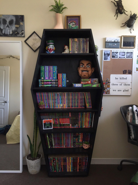
In yet another school I went to I was surprised that not only were all of these things allowed and encouraged but the school library even had a coffin shaped book case full of Goosebumps books.
To me this was surreal as I had it engrained into me that Goosebumps was "Not real reading." And "didn't belong in school." I guess that particular school was being reactionary to the books being fashionable among kids (the way Harry Potter would later be). And since kids liked them "Something must be wrong."
But thirteen-year-old me still had the mentality of "Wow, I can't believe this. I wonder how long before they decide they made a mistake and that these should be banned." The below image is similar to the book case the school had.
Combine all this with schools obnoxiously always assigning grim and depressing stories about "coming to terms with loss and death" and it's a wonder any kid likes to read.
I've met grown adults who think all books are about coming to terms with death because that was literally ALL They were assigned as kids. Old Yeller, Charlotte's Web, On my Honor, Bridge to Terabithia... "But kids should learn about death and loss." Yes, but not when it's literally EVERY book they've ever been assigned! It's a wonder anyone grew up loving books.
3 notes
·
View notes
Text

Looking Glasses Development Art 1
Next ==>
This was the first bit of concept art I did for Looking Glasses. The scene where Ralsei is first confronted by the titan was incredibly clear in my head from the beginning, so when I sat down to start working on the comic, it was the first scene I started messing with. This drawing was mostly about experimenting with fonts and effects, so the art itself is pretty rough. My development process tends to start with visual design stuff, so I often spend hours looking at fonts before I get into sketching actual art. I'm really glad that I went in a different direction with this page in the final product, this is pretty visually cluttered.
Going over my old artwork has me thinking about the craft behind that sequence a bit, so I'm going to throw some more thoughts under the cut. It's a two for one.
Let's start with the final pages for this sequence, just to remind you how it turned out


You can see how that initial sketch got divided up into the second and third pages here. This served some practical purposes. To start, I realized I wanted you to be able to see Ralsei's face on the second page, to show how the loud titan voice is hurting him. But I wanted to keep Ralsei silhouetted in front of the titan eye for scale, so I pushed that into the next page.
Let's look at my initial sketches for this sequence.

You might notice some pretty major differences between these sketches and the finished product. Most notably, panel 3 on page 1 and all of page 2 are flipped. That's because I realized I had broken the 180 rule on page one, and it made a scene without any visual landmarks kind of confusing. Of course, I didn't realize this until super late in the process on that page. You can see this in the difference between my flats and the final base colors.

(I also fixed some weirdness at this stage, like Ralsei's head in the first panel was kinda wonky). But flipping this one panel also meant I had to flip the entire next page to keep continuity.
A few more details I think are kinda fun.
On the left, I had added a bunch of eyes to the smoke, a design detail I later dropped because I couldn't quite get it to look good in the colors, and I figured the titan eye showing up on his top worked well enough. He's also crying in this panel, which I also must of dropped.
On the right I really had to work through a bunch of expressions for him before settling on squeezing his eyes closed. At one point he was really angry!
But that didn't fit the vibe. Ralsei isn't exactly angry here, even if he is shouting on this page. I really liked him closing his eyes tightly though, it let me do this across the page-turn:


Which I thought was a cool way to transition out of one scene (and visual style) and into another. Now, is he waking up here because he wills himself to wake up, or because Susie healed him? I'll leave that one up to interpretation.
I'm also kind of referencing Issue 17 of The Wicked and The Divine here, where the POV character closes her eyes at the end of every scene to mark scene transitions (and when she's dissociating).

Anyway, that's the really long winded development of this sequence, from initial concept art to final product.
#looking glasses#looking glasses development#ferrouscomicscraft#I love to ramble about craft#it's a bit self indulgent but I don't really care#let me know if it's too much though#maybe y'all don't care about these granular details#eyestrain
21 notes
·
View notes
Text
Good parts of Dragon's Dogma (in my opinion)
- Character customization, both in terms of cosmetics and playstyle. The choice of vocation, then choice of skills and augments on top of that
- The options you have in combat are incredibly fun and flashy, you feel incredibly powerful by the end
- Climbing large monsters is a really cool idea and feels great to pull off
- Variety in movement options depending in vocation makes exploration enjoyable
- Exploring the dungeons in the game for loot is fun
- Great music. Electric guitars.
- Grigori is a cool and interesting character
- Higher difficulty and new game + being separate is good. I keep playing with one character over and over, which I wouldn't really do in other games because of the difficulty scaling upwards
- Portcrystals and ferrystones are a neat way of doing fast travel, and are perfectly serviceable given the size of the world
- It has just about the perfect amount and placement of equipment slots. Any more and things get cluttered, any less and yiu don't have as much room to have fun customizing
- Gold is really really fun to pick up
- The way boss health bars are presented is just about perfect. Bosses can have high health while still showing progress to the player
- There are three incredible fights in the game, in my opinion. Daimon is the big "hard but fair" final boss that Grigori kinda failed to be, with varried moveset and usually fair mechanics, aside from hitbox issues. Kinda reminds me of a Dark Souls boss, just slowed down and a bit less aggressive. Wyrms are the best dragons, with a more varried moveset granted by their spells. Fighting them kinda becomes a bullet hell. Lastly, hydras feel more dynamic than most other large monsters
Bad parts of Dragon's Dogma:
- Aside from the three bosses I had just mentioned, the enemy design is kinda lacking, especially when compared to the player's abilities. Either overly predictable or the complete opposite, with attacks that you just won't have the tools to deal with as certain vocations. Difficulty almost exclusively comes from numbers, especially the bloated enemy defense, rather than a fight being complex
- Weapons and armour getting completely outclassed by other options just sucks when there's so much visual variety
- Inventory weight is kind of just obnoxious to deal with all the time
- Everything between Cassardis and Gran Soren is way too scripted, especially for NG+
- Curatives make healing magic look like a complete joke. At any time you can pause the game and get back to full health, while anodyne can't heal past a certain threshold, takes forever to cast, and heals over time
- Pawns are just awful to deal with. On my most recent playthrough, I just got fed up and stopped using them completely, and it feels like the weight of carrying the worst NPC AI ever has been lifted and I can finally breathe. I can't think of a single thing I like about them over regukar companions in RPGs, except that I can make my own pawn look like one of those companions from one of those games
- Variety is incredibly limited. There are nowhere near enough enemy types (and those that are there are kinda mediocre), locals include forest, pine forest, dead forest, and plains, and although I liked the dungeons, they're too small and there's too few
- Aside from Grigori, I find the game's writing to be kinda boring
- Spells are too slow. I'm not just talking about for the player, most enemies that aren't dragons or Daimon take way too long to cast spells and it makes fighting them a joke
- Player animations for walking and running feel kinda weird
- The camera is atrocious. It swings around randomly when you attack in different directions, it zooms in way too close when you sheathe your weapon, and it gets stuck awkwardly on large monsters. No lock on is the least of the game's worries
- The game is balanced weird. Melee vocations have a shit time dealing with flying enemies, mages and sorcerers basically need pawns to function at all, some enemies are flat out immune to either magic or physical damage. This could all be argued to be fine, but not when strider, ranger, and magic archer exist. They're so much more self sufficient and it bugs me
- Grabs suck, and with ogres will break the game's own rules by ignoring invincibility frames. Honestly, the speed you break out with egression should be the default
4 notes
·
View notes
Text
why i love Honkai Star Rail as a visually impaired gamer
Yeah, that new game. So, SPOILERS!
I have quite the visual impairment. Quick movement? SUdden changes in lighting? Badly-marked stairs? Heck no! But I'm still an avid gamer, and I"ve played both Genshin and Star Rail. And I can say I enjoy Star Rail much more. Not because of the lore- well, okay. I'm here because of the cool space train. But I like the lore for both. It's more....of other things. So I'll cover that here, and if you're also a handicapped gamer (or even if you aren't) LMK your thoughts.
Also, I"m a PC gamer. I use a mouse and keyboard. Both with too many buttons.
(totally not self-promo but I'm planning to stream it sometime on my Twitch, "Fintastica", if anyone's interested-)
anyway here we go !
Navigation is clear. I never liked how Genshin Impact had like. A whole giant map. Like, I know it was way mroe open-world, but it was kinda annoying trying to find myself sometimes. My friends can attest to how horrible I was at navigation. With Star Rail, the locations are split into zones and there's even teleportation points that you don't have to do a whole thing to unlock literally everywhere. Places you need to go for missions are marked on the map too, though I think that was also a thing in Genshin? You can also see if you collected all the treasure chests in a zon, by type no less. The maps are vague enough that you still have to explore to find stuff, like the Among Us maps, but I think that works out really rwell, less cluttered. There's a few different maps too. I'll give it a 10/10.
Battling. In Genshin Impact, you kind of...just have to know what moves you're doing and have faith the characters are doign them as planned. While real-time strategy is great and all, it doesn't really work if you often can't tell what the characters are doing (fast movements, again.). In Star Rail, the battling is turn-based. It's a bit of a switch at first, but it's actually really great especially if you've already had experience with that kind of thing. You can see everything, from the enemy's stats to your own, and see when a character is about to be targeted for a loit of damage or what buffs/debuffs they're getting. THere's autobattle and douglespeed modes, too, for faster gameplay. I will say that the moves can be a bit bright, like with the Ultimates (I usually have to close my eeyes for those) but overall I'd say it's been a very easy experience. And no weird button combos- it's all done with a mouse! 8/10 but that might change since the company said they're workign on a fix for the bright lights.
Character leveling / enhancing. Might be because I've played Genshin, but it was very easy to figure out. Character has battle experience level, like with most RPGs, character has item that enhances their abilities that in turn can be upgraded with items and the in-game currency, character has two different "skill trees" (that''s what I'm calling them) that can give boosts to their skills and stuff, and items used from inventory can help give buffs of certain kinds. I haven't gotten to relics yet though, so we'll see what happens with that. So 9/10
Overall game screen. One I actually figured out where stuff was, it was really smooth sailing. Phone, mission board, and tutorial tips in one corner. Stuff to collect mission/daily/whatever rewards, the inventory, character and team selection, and wapr (how you get more new items and characters, Genshin's WIshes equivalant) on the other side with character switches/team lineup not far below. The phone has everything from friends to game settings, and you can also change game some settings in battle. I much prefer pressing a key to activate my mouse and then go around clicking things then having to remember which button on my keyboard opens the Paimon menu. I haven't played Genshin in a while, so I don't remember exactly where everythign was, but I definitely remember having the wiki page open with the list of controls. Probably 8/10, because for a little while I was abit confused on where things were but that's probably just me not realizing that a phone icon means....the phone.
Overall world exploration. Part 2 of the navigation from earlier. Controls make sense (WASD to move, right click to sprint), left click to attack or you can press alt and click some buttons). Items you can take have a tiny icon over them to indicate, be it a hand or a marking when you get close. I definitely like interacting with the closets and trashcans. You can see characters talking (speech bubbles) and then get closer to listen in furthur. Just like with Genshin, everything feels so pretty and awesome, so that's a bonus. But I do miss being able to jump. 9/10.
Lore. According to the TV Troopes page, there's a mention of there not being an option to fastforward dialogue. It's nto too much of a deal though since a lot of the time you'll get invested and want to know more about the world. THere's stuff you can read, and if you need to skip a cutscreen after having to redo a storyline battle you can just fast-forward over it! Very handy. The lore is so cool, and I also love this little feature that lets you hear the voicelines for the characters in this databank on the Express. And you can still explore around, so while you do have to follow more of a storyline it retains the Genshin freedom of exploration.
And that's all I really have for now. A lot of stuff is taken from Genshin, so if you're familiar with that, it'll be a breeze! Might not be as easy if you're new to miHoyo games but it seems pretty intuitive. I really like it so far, my only real complaints would be the ultrabright ultimate moves and the fact that Arlan is the only dark-skinned character (and most of the girl have short skirts, but let's be honest, that was expected wasn't it?). And there's Pom-Pom who's basicaly Paimon, but doesn't hold the entire menu or whatever in their (he? The characters used they for them so I will too-) paws.
oh also warning: your cahracter is naturally a little horny and definitely cracked their head while doing one of the early boss battles. It's the Traveler from Genshin, but slightly more chaotic.
anyways that's my take on it, hope that helps if you're considering getting the game :) aight I'm back to grinding calyxes and debating if I should pull some more characters.
(might update later. Also please remember this is ALL my personal opinion)
part two
#honkai impact star rail#star rail#honkai#opinion#reaction#analysis#overview#honkai star rail reaction#disabled#visually impaired#pc games#games#gaming#handicapped#disability#actually disabled#mihoyo#hoyoverse
26 notes
·
View notes
Text
Pseudo Harem Reviews: Episode 1

I don't want to clutter my art blog with 12+ nerding out posts, so I'll be posting episode reviews here every week instead!
Animation
It’s a bit on the cheaper side, but that’s okay since the art style is very faithful and nice, even down to the slightly crooked mouths in some scenes- which I personally find a bit charming! Another change I like is adding a blue-grey tint to Rin’s hair to stop it from blending too much into other dark objects like her blouse!
I do wish that the animation got to be a bit higher quality at points. To list a similar show for comparison like Tomo, it at least had some dynamic animation for action shots and better lighting in the night scenes. At least showing some visual or audio cue for Rin’s switch in personas would help. Also I'm not sure I like how the personas are listed as stuff like "spoiled girl" instead of "Spoiled-Chan", "Spoiled Rin", "Sweet-girl" or anything to solidify their identities more. I can only hope a potential dub is able to figure out how to make it work!
Voice Acting
I’m not a longtime fan of Saori Hayami like some of the people who follow her in Spy X Family, Oregairu, and more, but I like the work she does here as Rin! I agree with the few people who say her voice is a biiiit too adult for a high schooler, but I at least like her voices for Cool-chan and Spoiled-chan. Her takes on Cheeky and Tsundere could be a bit more on the high-pitched side though. Still excited to hear more though!
Nobuhiko Omamoto as Eiji is nice too in one of the more subdued roles I’ve seen him in- he does a great job of capturing Eiji’s straightforward and goofy sides and you can feel why Rin likes him early on!
And I’m still crossing my fingers for a phenomenal dub too, which should hopefully get more new viewers onboard with this show! (PLEASE don’t be a bad dub…)
Music - OP and ED
So far nothing major to note in the soundtrack- just your standard highschool romcom style score. I will say I love both the OP and ED as songs- they’re great and I’ve already added what I can to my playlists! And I do hope we get the Rin and Eiji version of the opening down the line too (and maybe some extra surprises hopefully?)
It’s just a shame when the opening suffers from some of the cheapest animation in the whole show- it’s supposed to be the thing that hooks viewers into watching, but over half of it is just a bunch of still PNGs, barely showing the actual Pseudo Harem gimmick until the chorus.
At least the ED has cooler and more creative visuals with the anime-to-manga hybrid beginning, the rap verse from Rin, and better showing off all her personas (I find it a bit funny they’re trying to showcase every single one rather than the main 4-5 to entice new viewers more and maybe provide more contrast haha)
Pacing
And here we have the elephant in the room. I was so hyped for this series I didn’t even consider that the short disconnected nature of the series’ early chapters would lead to a very disjointed first few episodes.
If the show wanted to spend more effort on animation, they could have either rearranged the chapters so that the similar ones in the same settings got paired up into bigger scenes like how Squid Girl did it. If I could have everything my way, I would just extend the episodes with lots of original content, but I know that’s unrealistic.
If not, then short connecting scenes or establishing shots could help, or even interlude cards if you really want to save on budget. From what I’ve heard new viewers say, they all really liked the series concept, the characters, and their dynamic, but they were really put off by the pacing, assuming it would be this way for the whole show. And sadly, I can’t blame them for being disappointed since they don’t know the series will go into longer arcs and better-paced episodes as it goes on.
The choice to move their first meeting to the first scene was also very odd, as it shows why Eiji likes Rin, but creates a weird and unclear timeskip where she likes him by the Ch1 gym scene immediately after, and also kind of diffuses a bit of the tension on whether Eiji actually likes Rin or just the Pseudo Harem for the first 40 chapters or so.
I can only hope the show better arranges the scenes to keep the viewers’ attention from Episode 2 onwards!
Extras/Overall
I still had tons of fun with this pilot though! I do hope it shapes up a bit more in the animation and pacing departments, and I hope new viewers will give this show the usual 3-episodes chance at the very least! This is still my most anticipated anime of 2024 and I can’t wait for more!
4 notes
·
View notes
Note
curious if you have seen (and if so what are your thoughts on) across the spider-verse what with it being such a love letter to illo/animation?
I have... a complicated relationship with that movie
Here are my thoughts on it straight out the cinema. It was all very heat-of-the-moment and I softened up a fair bit up since then, but I still have the same fundamental gripes with its story sense and tenacious excess in visual fidelity.
I know how dumb it sounds but it feels how it feels to me. Like watching it felt like playing a triple-A videogame. It was less intentional artistry and more kitchen sink clutter that had crunch written all over it. Definitely partially a me-problem but also the reports that followed kinda confirmed those suspicions and that sucked?
I know feature animation in hollywood pretty much universally sucks for every ground-level artist involved rn, but I definitely became privy to too much concrete bs to keep viewing this specific project as something championing the medium. The incessant fiddling from lord and miller, the firings and uncredited workers, the fact that much of their visual identity stems from alberto mielgo's work whom I just cannot stand. A lot of this is personal, and I can't ignore that.
But beyond all of my baggage, objectively speaking, I did love everything in the film that had to do with Gwen. Art direction included. That was a real flex both in audio-visual cues and a strong, dramatic character arc. But everything else felt like a mess. I said it before but walking out of this movie confused and bummed out was the first telltale sign for me, whereas ITSV left me elated and humming with joy. And it felt intentional. Question is, why?
And it's all tied up in taste and tone of course and I'm not here to police anyone's preferences in dramatic clarity or storytelling styles. But this type of half-a-movie that is all setups and cliffhangers pointing excitedly at a nebulous sequel is not my cup of tea at all. And I guess knowing how messy it was behind the scenes simply exacerbated that feeling.
ITSV had so much catharsis. So much progression of drama and payoff and big, sweeping moments that were visual, musical, and meaningful on a story level all at once. It was pure storytelling. ATSV had good stuff for Gwen, but otherwise was mostly just. Plot, it felt like. One thing after another and after another, leading to this weird, confusing, emotional rugpull of an ending that certainly had. Spice to it, but I wouldn't call it fulfilling.
Multiverse stuff is weird, right? but ITSV used that as just another tool in its storytelling bag. The other spiders came in with satellite arcs and enriched Miles' story in a very organic way. A story about fear and great expectations, executed to a T, ending with a triumph. Yet here we see ATSV using the multiverse as an entire framing device that its story optics are now beholden to. It feels wrong, somehow, and makes it harder to parse what all of this is about.
Bringing the concept of canon into the text, creating a story about storytelling itself, is always very very very tricky and difficult to pull off, and often even meaningless writ large. It makes the story they're telling here infinitely less interesting to me. and hey, I am curious to see what they do with Beyond, I'm not pretending to know more than I do here. I welcome being wrong! But it is what it is for now.
Thankfully Nimona came out soon after and was beautiful and elegant and meaningful and wholesome in all the ways I love, to the point that I decided everything was going to be okay after all :D Anyway I hope this answers your question and sorry I get so wordy!!!
12 notes
·
View notes
Text

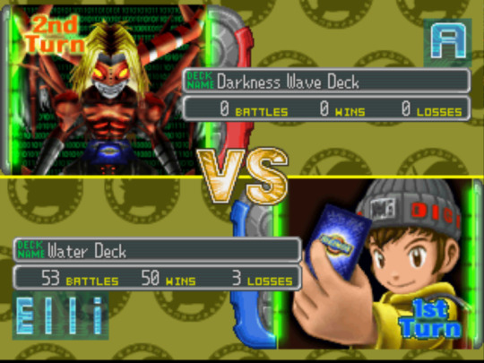
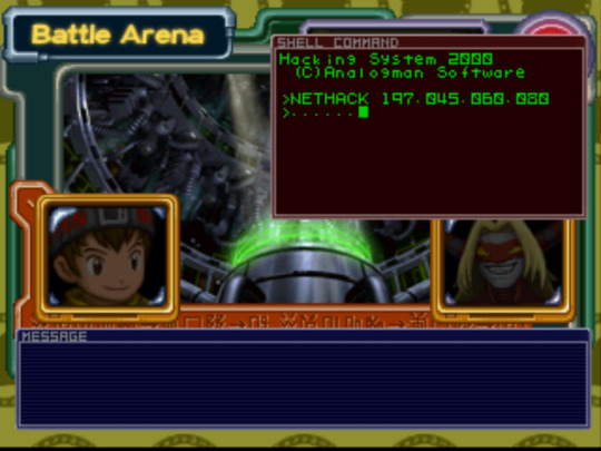


Digimon: Digital Card Battle (2000) - End game thoughts
Whelp, I've beaten the main game, but there's a ton of post-game content to do, so it doesn't feel much like a victory. This game was pretty middle-of-the-road. I stand by my criticisms in my previous post when I said it lost a lot of the heart of the first game. It felt more focused on JUST card games over and over again, with nothing to spice things up. It very much reminds me of the dip in quality between Digimon World 1 and 2, where the second game is simplified and super repetitive. The one thing that I think they improved upon is that the battle system got more sophisticated, so at least the repetitive matches got interesting. They added the partner system, EXP, armor digivolving, and extra quality of life features. I eventually got over the cluttered UI. Miscellaneous thoughts below.
Notes:
-I'm glad they brought back Analogman. Not because he's a great character or anything (lol), I just like continuity. The bit where his face flashed on screen subliminally was creepy.
-We get the weird reveal that Rosemon was a security program all along and doesn't actually have a physical form. Okaaay...so the digital world has sentient anti-virus programs now?
-The final tower was fun because it required a lot of focus and strategy. The final boss only took me two tries though, so it wasn't all that hard. It was cool that a yellow deck proved to be the best option in the end (since that was my starter deck).
-Kinda sad that Veemon is the first thing they show in the credits considering I didn't use him once. Wish that bit could have been more custom. (I actually barely used my partner cards at all haha).
-Stupidest thing about this game is all the busy work they make you do! Sometimes they make you repeat entire arenas...just cause. Also, there are apparently side quests where you need to battle the same person 9 times...Not sure how far all be getting into the post game content, we'll see.
So yeah, this game was pretty unremarkable, but a good "braindead after work" kinda chill experience (except when they made me redo stuff). The story was blah and the visuals/ambience/world forgettable. I did get really good at the card game, so at least that gave me an ego boost lol.
7 notes
·
View notes
Text
Part 6 (because I said so) of redesigning Eeveelutions.
This time, it's design 2 for Flareon!

Flareon is one of the few that is giving me the most trouble, but I'm slowly settling on something I like. (More info under cut).
First Back Next (will be added in a bit)
So, what changed, what didnt?
First of all, the fire looks way better, that was bothering me so much last time.
I made some small changes, like removing the ear fluff (which was visually just a bit too much) and changing the 'boot' design on the legs (which as of writing this, have kinda changed again. They're still a work in progress).
However, the biggest change is probably the mane and tail. I changed the mane from a random ball of fluff to a slight star shape. It still looks fluffy, but isn't as cluttered and all over the place. The tail also changed from a sort of lion tail to a non-specific tail shape. It works a lot better with the fire idea I had. The lion tail also just wasnt working with the design.
Generally, this Flareon looks a lot sleeker but scruffier than the previous one, and I like that.
As for the fire, I wanted to make the mane look more like a fireball when set ablaze. Like OG Flareons tail. As for this Flareons tail, it's now a blazing rod of fire instead of this weird 'candle' look the previous one had.
Lore/Pokedex entries are still in the works.
#That's all I think?#I'm writing this pretty early#Also I like this design a lot more!#Something about the previous one was seriously bothering me#flareon#pokemon flareon#flareon redesign#pokemon redesign#pokemon art#eeveelution redesign#eeveelution#Sammy redesigns Eeveelutions#my art#Sammy's pkmn art
2 notes
·
View notes
Note
I'm loving all the neopets posts, would you ever consider reviewing my not very popular favorite the ogrin?


Ogrin have a reputation for being an "ugly" Neopet, but in all honesty I don't really get why. I can get why they're not super popular, as they're not overly cute nor elegant, and they don't really have a distinct visual hook compared to some Neopets—but ugly? Not so much. There are a few things that could be tweaked, but I still like Ogrins as a whole.
Visually, they're kind of like an okapi of sorts, in that they're ungulate-like and have stripes only on the back part of their bodies. However, they also have a few unique features, such as having paws instead of hooves. I like this, as it makes for a more interesting creature design.
The body is broken up pretty well into three shades of the same color—darker accents for the fur, the base color, and tints for the face, underbelly, and paws. This helps with contrast and readability. I also feel like the stripes could've been the same color as the fur.
As a whole, the stripes are the one issue I have with the design—they feel a little cluttered in such a small space and they already have a lot going on with the rest of their bodies. They're interesting, but I feel like they would've looked a little stronger without them.
Ogrins were released not too terribly long before customization, so they look about the same other than the markings not quite reaching the tuft of fur on their cheeks in the customized version and a wider stance.
Favorite Colours:

Robot: Robot Ogrins have a really neat look, giving them an incredibly intense expression and some really slick plating over their bodies. I do think they're a smidge too detailed—the weird blades on their forearms, extra lights on the tail and haunch, and head light could've all been dropped—but it's still neat looking. I do wish it had a mane-like structure on it though, as it doesn't read much like an Ogrin without it.
The uncased version is also interesting, with fun spring-like horns and a neat looking jaw. However, it doesn't really look like it goes under the cased version at all, and between the two, the cased is the stronger design.

Tyrannian: Ogrins already have a pretty prehistoric look to them in a sense, so the Tyrannian Ogrin works out well. I like how the stripes have been increased to be longer and cover more of the leg (once again, very okapi-like), and details like the spots on the fur, claws, and a longer beard. However, I do take a bit of issue with the head—the mohawk should've also been spotted for consistency, and the face needed a far more grumpy, more caveman-like look to it.
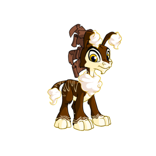
Chocolate: My favorite part of this design are the little chocolate shavings that form the mane, which is a fun concept that works really well. It also sports a nice white chocolate drizzle for the stripes, whipped cream fur, and has a nice drippy look around the base of the paws. It's cohesive and looks really good (and delicious).

BONUS: Unsurprisingly, I also have to give a shout-out to the giraffe design with the spotted Ogrin. It's super simple but looks very nice, and the spots feel a bit more cohesive than the stripes did on the original design.
31 notes
·
View notes
Text
So my friend let us come over to try the XVI demo on their PS5.
Overall I’d give it a 6/10. Not something I’d immediately rush to buy a PS5 for. But if I did own a PS5 already, I wouldn’t object to buying the game.
Here’s my thoughts included below. Forewarning this point forwards is spoiler territory:
So played the demo and there are some things I liked and some things that’d prob be better the more I’d get to play. But from just the Demo, it just didn’t really hype me up as much as it did for others. I’m not really into medieval type games, which prob is a major factor. But, I didn’t want this to deter me so tried to give this a fighting chance by going in with an open mind.
For those who may not know, I’ve played many FF. Not every single one out there but to give some info on what I have if it means anything for you: VI, VII series, VIII, IX, X series, XII partly, XIII series, XIV slightly, XV
The first Eikon fight, reminded me of Panzer Dragoon so thought that was kind of neat. Starting the game off with fighting Ifrit just had me thinking of how XV had started with an Ifrit as well. I figured after this fight it would move back to the past afterword, but it didn’t do it as quickly. I did like the whole fight, found it interesting. ^^
The UI is nice and simple. I like how it’s all formatted, easy to pick up and learn. Nothing cluttered.
For gameplay, this is probably the strongest point it has. It feels like an enhanced gameplay of XV, making it much better. I like all the different skills you can acquire (based on what I saw for the Eikon challenge mode I played after.) I honestly like the most how the dodging is in the game. It’s such a simple thing, but idk it just moved so smoothly, I liked it.
Not having to hit any buttons to pick up items was probably the best thing to! Biggest grievance with XV with the pick up/interact and jump being same button was so annoying.
I know everyone said it was super lax but the scene with Bernadictka and Titan dude still made me uncomfortable as hell 😂
I do find the ‘oh we must go and do this important task but first do this random side quest’ so you can learn further fight mechanics, felt a bit wonky and could have flown more seamlessly a different way. Just kinda took me out. I liked Wade he amused me. The marlboro fight was interesting, fairly simple, I liked how they did the QTE events but I felt it dragged on longer than needed to be, like health a little too high. So sometimes the fighting got boring.
I wish the environments were less dull looking. Everything is so grey. I hope this is not so much the further in you go. The only times it looked visually very pretty were the Eikon fights.
As for the characters, I’m not really feeling anyone. honestly a lot just def give generic NPC vibes. None really made me care about them a whole lot. Except Torgal. I loved the furry baby. Clive not really anything omg about him. He’s typical duty bound character. He’s just ok. The dad tho lookin nice 👀👀 well till they killed him off right in front of poor Joshua, poor kid gonna have major trauma. I was sad they killed him off already. This whole scene just like XV. betrayal and killing the dad part. Uhm the wife is an asshole, scumbag I forget her name. Joshua is alright. He’s just trying his best. His voices sounds weird to me sometimes when it gets all cracky, but I can tolerate it. This other dude I forget the name of just looks like Clive with a slight different hair cut. Also wtf my sis wasn’t kidding with her issues with there being no diversity to the designs. Everyone looking like generic white dudes lmao.
The map looks so much like how Stranger of Paradise is. Which made me a little eh. Hope we’ll be able to manually travel more than what was given.
Poor Joshua for getting all beat up by Ifrit like that was so not okay 😤 Poor kid. If anything with Joshua, I just feel bad for the mess this kid has had to go through already.
When I got to the thanks for playing, I was all ‘that’s it?’ So it was engaging enough I wanted to continue playing despite some of the issues I had. Hoping that a lot of what I was meh of will be improved upon later as you’ll get to know characters more and move to new places.
Uhm those were main things I remember. So some good and bad but a lot of things left me lackluster. It is pretty much what I expected I’d feel based on my thoughts from the trailers, they didn’t change much. My main thought was that like Stranger of Paradise, the gameplay would be more engaging than story, which it is too for XVI for me. I personally wouldn’t call this game the pinnacle of Final Fantasy. It doesn’t scream the best of the best, at least just from demo standpoint. Thoughts could change the more that is played beyond.
I’m not super hooked. If I had a PS5 I’d buy the game. It’s not a game that I’d be all “I need to buy a PS5 stat” I can wait it out. It’s overall just an OK game. Of course, these are just my opinions. Everyone else is clearly ok to like it lmao.
#ffxvi spoilers#FFXVI Demo Spoilers#FFXVI#FFXVI Demo#Final Fantasy#Final Fantasy XVI#Spoilers#UltySo Talks#Long post
5 notes
·
View notes
Text
Memoir of a Snail (2024) review

Oh how f****ing lovely.
Plot: Grace Pudel is a book-loving, snail-collecting misfit that falls into a series of misfortunes after being separated from her twin brother Gilbert. Despite her hardships, inspiration and hope arise when Grace begins a friendship with an eccentric elderly woman named Pinky. From Academy Award-winning writer and director Adam Elliot, Memoir of a Snail is a heartfelt and hilarious chronicle of the life of an outsider finding her confidence and silver linings amongst the clutter of everyday life.
Watching this straight after Flow was a really jarring experience. Flow is a delightful and cosy immersive journey about a bunch of animals coming together during a flood disaster, and working together to survive and become a weird dysfunctional family. Speaking of said flood disaster, it’s never portrayed as a scary or horrifying catastrophe, but more so a purpose to allow the animals to showcase their true skills. Now onto Memoir of a Snail, another animated movie, only this one devours any sense of hope and instead hits you with a non-stop waterfall of bleakness and depression. Everything is crap, life sucks, there’s no hope, I should just go kill myself. Genuinely, should have watched these two films the other way around. Kind of like Barbenheimer.
To be honest I’m not too sure what else I was expecting. Memoir of a Snail sees the return of Adam Elliot to animation, who’s last movie was was the 2009 stop motion Mary and Max, which, let’s just say is about the theme of the burden of living, no matter how many chocolate hot dogs you eat. Definitely worth a watch, as it has a very game Phillip Seymour Hoffman voicing Max, but again, that movie really makes one depressed long after the credits finish rolling. Memoir of a Snail might as well be a spiritual sequel, as the stop motion style is back, now with 100% more claymation nudity and sex, and the bleak tale of a girl who’s life is an endless charade of bad occurrences where she can’t catch a break. Though things felt even darker - three family member characters are killed off within the first 20 minutes; a character being force-fed to obesity and then shamed for it; someone is electrocuted and then burned alive in a fire, a lovely old lady gets dementia…. for an animation this all felt too real. Makes me wonder if anyone has recently checked up on Adam Elliot? Seriously, the guy has some real messed up demons in his mind.
I do think there is a bit of a clash of genres in Memoir of a Snail. On one hand it’s this epic dark drama about the real struggles of life, and on the other it tries to be a wink-to-the-camera comedy with dick jokes and vulgarities being thrown at you. Mind you aside from a couple of amusing moments (a character talking about how she made love to John Denver in a helicopter really got me for some odd reason), the jokes didn’t really land for me. As for the drama, I get that this movie is trying to underline the difficulty of living, but personally I feel with movies of this kind you need glimmers of hope to be sprinkled throughout, as if it really is trying to reflect the horror of life, then you must be realistic and acknowledge that in life bad and good things happen. But no, Memoir of a Snail really goes for the “worst case scenario” and it does become exhausting by the end.
Nevertheless I really do admire what Adam Elliot is doing with these movies. The clay animation is ace, even if at times it feels as if he’s intentionally going for the visually hideous aesthetic, and though I didn’t enjoy being mentally and existentially ruined, I admire this movie for staying true to its dark ambitions. Seriously though, someone needs to give Mr Elliot a hug.
Overall score: 6/10

#memoir of a snail#movie#movie reviews#film#film reviews#cinema#drama#animated#animation#snail#bleak#adam elliot#mary and max#stop motion#stop motion animation#adult animation#2024 in film#2024 films#2024#sarah snook#eric bana#kodi smit mcphee#jacki weaver#magda szubanski#memoir of a snail review
0 notes