#it’s also good character design practice for me
Explore tagged Tumblr posts
Text
So I've been looking to read some books about living in nature, written by women, to get an idea of how it goes in practice, and the first book I found was 'The Great Alone' by Hannah Kirstin. It was about a family who decided to move to Alaska and live self-sufficiently, and it was written from the point of view of the daughter, Leni. I did not realize right away that this was a piece of fiction! However I do want to tell you about this book because something very specific happened in it that made me have.. ideas.
Right on the first page, it was spelled out to me clearly that this is a story about domestic violence. The father was drinking, had ptsd from war, sometimes 'blew up', and I was like, oh, I know what that is. Okay, let's see what happens then.
The father decided to move them all to Alaska because a buddy who died in the war left him a cabin there, and he wasn't earning money to pay rent, so Alaska it is. He talked his wife into it, promising that he will 'be better over there', and I'm like yeah sure you will.
I have to say, at the beginning this book was just heavily enabling me. They went over to Alaska and everyone was saying 'you need to prepare for winter immediately', even though it was spring, and they were bewildered. People were coming to help them to build a garden and homesteading infrastructure. And I'm looking at that like hell yeah I'm already 100% introduced to this, I am prepairing my garden from January, as soon as spring hits I am looking for food to can, dry, cure, I'm filling my stash from the moment cherries arrive. I'm certified to live in nature. (I'm not, I'm just entertaining myself with this fiction).
Alaskan winter is long and dangerous, and somehow these folks were already at the end of their food stash by the end of January, which is so early. They were in trouble, had no money, it was cold, Alaskan winter also brings 18 hours of darkness a day, so everyone was bummed and anxious. As you can imagine, the father found himself some alt-right conspiracy theorists to hang out there and drink with, every day they were talking about the government or minorities 'coming for their land' and prepairing to shoot people at the moment's notice, so it's no wonder he became more violent, aggressive and dangerous to his wife and child. He would end up beating his wife, and she would forgive him, and the daughter watching all this felt insane and desperate to save her mother. But there was no help, no police, nobody could even reach them in the deep winter, they had no food, they relied on him to catch something in the forest.
This is where the story got interesting.
He breaks her nose, and the daughter decides that's enough, takes her mother into the car, and they escape. They crash. Daughter seeks help. They end up in a hospital. Father finds them and cries and promises to never do it again. Mother forgives him, seemingly out of fear that he's going to start killing people if she leaves him. Alaskan folk now know that she is being abused, because of her bruises and broken nose. And something unexpected happens.
One of the first Alaskan characters introduced in the story is Large Marge, a big woman owning a shop where she trades food and other survival goods. She is strong, resourceful, down to earth, incredible, helpful in every possible way. She is our star. Because once the word is out about the abuse, and the domestic violence family is back in the cabin, she comes over. She tells them all to sit the hell down, like she's a parent sorting out her unruly children. She then tells this story:
'I used to be a lawyer. Big city prosecutor. High heels and designer suits. I loved it. And I loved my sister, who married the man of her dreams. Only he turned out to have a few problems. A few quirks. Turned out he drank too much and liked to use my baby sis as a punching bag. I tried everything to get her to leave him, but she refused. Maybe she was scared, maybe she loved him, maybe she was as sick and broken as he was. I know that when I called the police it was worse for her and she begged me not to do it again. I backed off. Biggest mistake of my life. He went after her with a hammer. We had to have a closet-casket funeral. He claimed he'd taken the hammer from her to protect himself. The law isn't kind to battered women. He's still out there. Free. I came up here to get away from all that.“ She looked at the abuser. ''And here you are.''
The tension was insane. Everyone tried to get a word in, but she shut then down, and then she looked at the abuser again. ''We've talked about your situation here, we have a few solutions, but really, our favourite one is where we take you out and kill you.''
And I am reading this like oh my god. That's the freaking solution. It doesn't need to be that complicated. We just need someone who is 100% done with this shit who takes him out and shoots him. Problem solved. You hit your wife? Out and shot. Bye loser. Nobody losing sleep over you anymore.
I would love to tell you that she did take him out and shoot him, of how would I love to tell you that. I prayed it would happen as soon as the option was presented to me. However she told him he is either being taken out and shot, or he is leaving, getting a job and then providing money for his wife and daughter, and not returning until the spring comes again, which, he agreed to, since the alternative was to be taken out and shot. But I was still saying we should shoot him. She then decided to stay with the mother and daughter to keep them safe and fed during the winter. Like the hero she fucking is.
So, I haven't read this entire book yet, this is the middle of it, I have to go back and read the other half in order to know what happened next, but, I love this, I love the author, I love the representation of domestic violence and cycle of abuse, and how it is to be a female child in this situation, I love Large Marge, I love the resolution she provides, we need her, someone please, put her in reality. I want to be her, I want to barge into people's home and make death threats to abusers. To randomly stumble on a book like this is incredible to me. Thank you women for writing books. I love you all.
#book review#the great alone#hannah kirstin#domestic violence in fiction#domestic abuse in fiction#male violence#misogyny resolved#abusive situation resolved in fiction#what a book
69 notes
·
View notes
Text

And this here is today’s attempts at drawing Transformers, specifically TF One
I had this idea when I started today, since I knew the faces and noses were giving me trouble yesterday, to try this paintbrush style. The logic in my brain was that the movie was made in 3D, so logistically a more lineless style should work better, right?
I do admit, I think that the lineless style works far better in terms of the eyes and noses being the right shape, but I also admit my lines are probably a bit too soft and I may need to darken them. As well as get something good for the actual thin lines, since the paint brush on its own feels too thick, even at the lowest size
And you know what, since we’re here, does anyone have any Procreate brushes they can suggest for this sort of style? Right now I’m just using Flat Brush, but I wonder if I should use something else
Anyways, so this canvas was supposed to be more D-16, but partway through I figured I should try someone else to draw as well, so I decided Orion, so we could have the yaoi
Honestly my big problem with Pax here is that I don’t have a good comprehensive reference for him, while I can get by just fine with D-16. These were about the best I could get, and that last one I only got because these other two weren’t cutting it
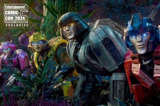
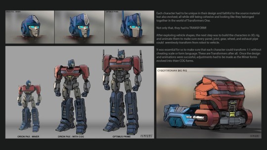
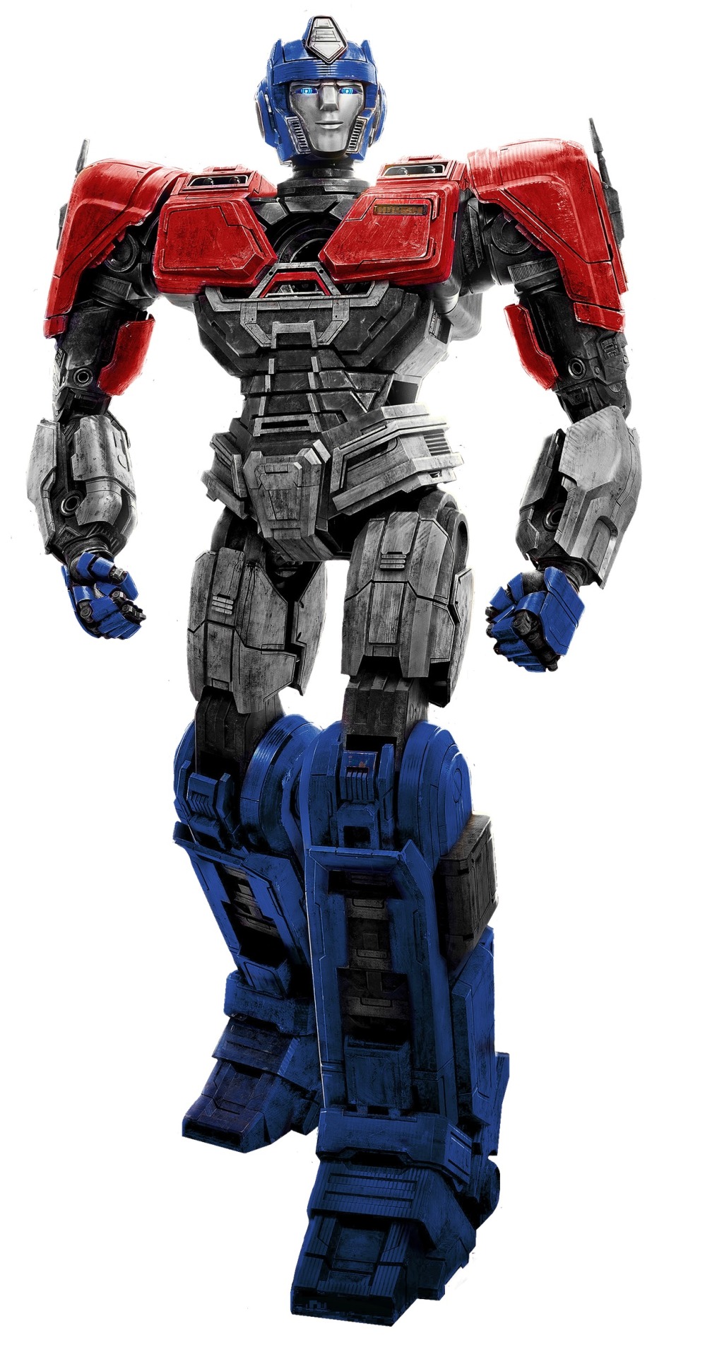
I need high quality references of these characters, or at least specifically their faces. And I’m gonna need even more if I plan to draw Megatron and Optimus as well
But yeah, Orion’s here, and I was also having trouble getting the correct colors for him, because I’m stupid and used to flat colors. D was pretty easy considering he’s just greys, and a yellow tinted grey works just fine there as a grey (though I do admit I’m struggling with his eye color), but I feel like blue tinted Orion looks too blue by comparison. But I don’t know how to give him his proper face coloring without it being the same shade as D-16
I feel like my words aren’t making sense. But just get that Orion colors are a struggle. And still are, because I still don’t think that other grey is the right color
Also Orion has a significantly more complicated helmet than D, so that’s fun
I really wasn’t planning on Orion taking up so much of the space, but I needed to actually practice how he looked so that I could draw him easier. I had numerous attempts at D-16 prior, I could sort of understand his look, but I was flailing in the dark on Orion and needed the practice
I think another problem is that I don’t make him wide enough. But sue me, my character designs usually don’t have their bodies that wide/their heads that small. I’m working on it
I capped off this canvas by just deciding to make a small doodle of Orion kissing D, since why not and also I was too lazy to think of anything else to add
Where do we go from here? I have no clue, but hopefully it’ll go good
#for some reason I have a soft spot for the top left D-16#I think it’s because it reminds me of a game sprite icon#you know the square you’d see when a character’s speaking#I don’t need to explain talk sprites here why am I doing that#anyways yeah#progress but it’s still not quite there yet#transformers#transformers one#my art#d 16#orion pax#megop#I mean technically#art practice
63 notes
·
View notes
Text
More House MD furry doodles,, I'm actually obsessed with them like I REALLY wanna make more of these (they're also helping me practice expressions again) but I especially want to design the rest of the characters! I have ideas for Cuddy, Cameron, Chase, Foreman, and Taub, but I still have to come up with what I wanna do for Thirteen, Kutner, Amber, etc, etc. Anyway!
This one I wanted to do bc I wanted to do some angsty art and also I thought it'd be a good way to explore some anger in his expression. I also just love the last ep despite how painful it is lol

For this one I REALLY wanted to see if I could get that patented Wilson kicked-puppy-dog-stare and I think I did that pretty well here actually ngl.

Anyway! Those are my fun little doodles for the day, I will probably be making a few more as I go because I've been really loving doing these! I rlly wanna see what I can do here :)
Again pls be nice I'm mostly experimenting with these tyvm!! ♡
#cicadagraveyardhousemd#house md#house md fanart#house fanart#more mouse bites#mouse bites#dr greg house#greg house#dr house md#dr house#dr gregory house#gregory house#james wilson house md#james wilson#wilson house md#house md wilson#dr wilson
30 notes
·
View notes
Text
Can't stop thinking about fnv ocs so I'm gonna ramble about them alllll

Jasper: He's my courier who's yes man aligned. He tries to be extremely upbeat and cheerful (think, useless ray of sunshine). He always tries to see the best in people's which means he's very good at getting scammed. If someone were to overcharge him for some medicine he would go "aw must have taken them so much time and effort to produce, and they're offering it to me, worth every cap :)" He also will see actual horrors unfolding and still try to see the good in a person. Like in Nipton seeing Vulpes. Whilst horrified at the crimes, he looks at him and goes "oh :( what made you this way. You can be better. I'm sorry they made you like this" despite the fact that the whole town is actively on fire. He believes in peace and diplomacy but can be a huge pushover. However he is extremely good at bandaging wounds. If he didn't get shot in the head and demand answers, he'd be a doctor.
August: My legion frumentarii who hates the legion! He got taken by the legion when his village was invaded. He's not violent by nature. But he knew that being peaceful would lead to his death. He did what he could to survive and discovered his knack for spying. Allowing him to become a frumentarii, he was pleased, hoping he wouldn't have to kill anymore. He was extremely devastated when he found out this wasn't always the case. A skilled actor. He uses this to his advantage, if he had his way, he would be performing on stage in many shows. Has a habit of taking notes on everything he sees. This has a tendency to wind up the other people around him.
Noah: Originally a joke character between me and a friend who became his own decently serious character. He works for the NCR designing propaganda for them. He likes being left alone and drawing hunched over. Has a strange relationship with the legion, as he knows he should despise them, but he has friends and family who are surviving in there. So he believes there must still be good people in there somewhere, despite the atrocities. In his propaganda, he will draw people who loosely resemble those who got taken by the legion so that on the off chance those people see the posters, they know he's still thinking of them.
Claire: Noah's older sister and dedicated NCR soldier. She takes extreme pride in serving the NCR and is passionate about following all orders to a T. She attacks most tasks with a frightening zeal and many are pleased she's on their side. Unlike her brother, she holds nothing but disgust for the legion for taking her family and friends, and vows to crush the legion to prevent anyone else going through the same fate as her loved ones. Every time there is a potential chance for a NCR and Legion clash. She is the first to volunteer to step in.
Ferox: My horrible horrible centurion, he holds the legion in high regards and vehemently believes in their ideals. Ruthless and bloodthirsty, he has little in the way of friends in the legion due to his offputting and intimidating air. He doesn't mind. As he believes that he is the most loyal person in the legion and everyone else is below him, he refuses to talk to anyone he believes is "lesser" than him. His violent nature and arrogance make him highly detested and feared in and out of the legion. From the same village as August, he fought hard to survive, but came to appreciate the legion over time, losing sight of how he even got there in the first place. Claire later defeats him. (Which is good because I hate him and he's only a character so I can practice writing awful people)
#shroom says things#fallout new vegas#fnv#fnv ocs#sorry for the rambling#it will happen again#oc: jasper#oc: august (augustus)#oc: Claire#oc: Noah#oc: Ferox
16 notes
·
View notes
Text
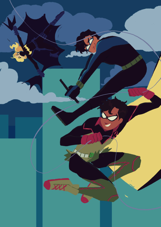
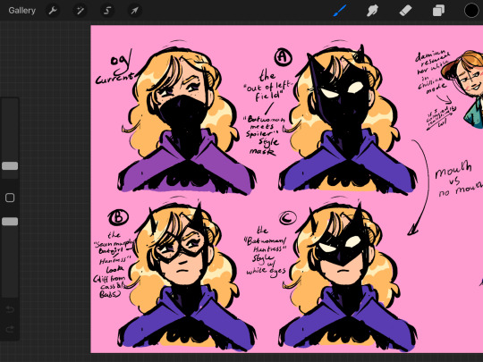

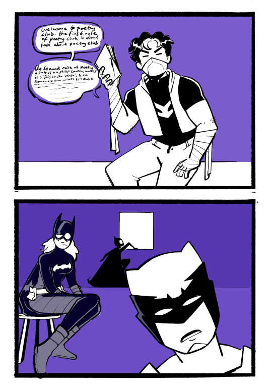
ANOTHER SKETCH DUMP! Featuring more of me playing with lineless art. Batman reborn era trio (dick, damian and steph) I miss you...when will you return from war. Also featuring Steph designs bc I've seen ppl dissatisfied w/ her current look, some good mom Talia, and Jason Todd poetry club. Duke is confused not that Jason would start a poetry club but that he'd have such mid poetry opinions. (ID in Alt)
#dc comics#batfamily#damian wayne#stephanie brown#dick grayson#talia al ghul#duke thomas#cassandra cain#mine#woo new art tag. please god let me keep this up all year#uhh anyway yeah! still a big backlog of sketches but i got burnt out which means i had time to collect some#i feel like my art looks. extremely different w/o lines compared to with? idk i worry that's it weird/off-putting#but hey at the end of the day I'm hardly worrying about my brand integrity on tumblr dot com#duke and cass being at poetry club is based on them canonically being into poetry and for a good while duke and jason got along well#Steph is there for both jason and cass' emotional support (unfortunately there's a design flaw. she can't do both simultaneously)#(which is fine bc cass is fleeing the scene at the idea of having to casually hang out with jason)#(they're the exact amount of similar and more importantly different that it's like putting two firecrackers together. bad)#i really like the steph mask designs... it'd be fun to do something with them but idk what y'know?#I'm just like. if we're assuming that her mask has to be different from both babs and cass then this is what I've got as alternatives#i mostly wanted to practice character interaction with the talia and damian one... and also i love them#looking at james gunns batman movie proposal. you keep your hands OFF HER MR GUNN#please if shes evil in a movie they're never gonna let her be good in the comics again 😭#dc when you inevitably cave and do your next big reboot let the ppl finally have the son of the demon origin (w/ tweaks of course)#idk it's canon in my heart. heartcanon if you will <3#anyway yeah uhhhhhh enjoy?
2K notes
·
View notes
Text
Posting these here to just tell you guys that I am still very much alive ^-^
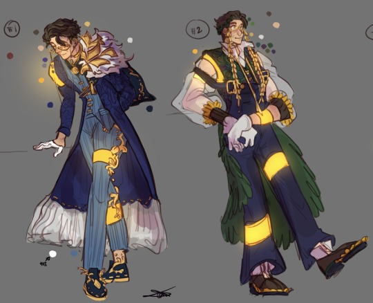
They’re for an upcoming illustration (maybe plural if I feel like it)
Oh and of course here’s some very messily drawn Narry Brothers content because I can’t function without thinking about them every once and a while…..
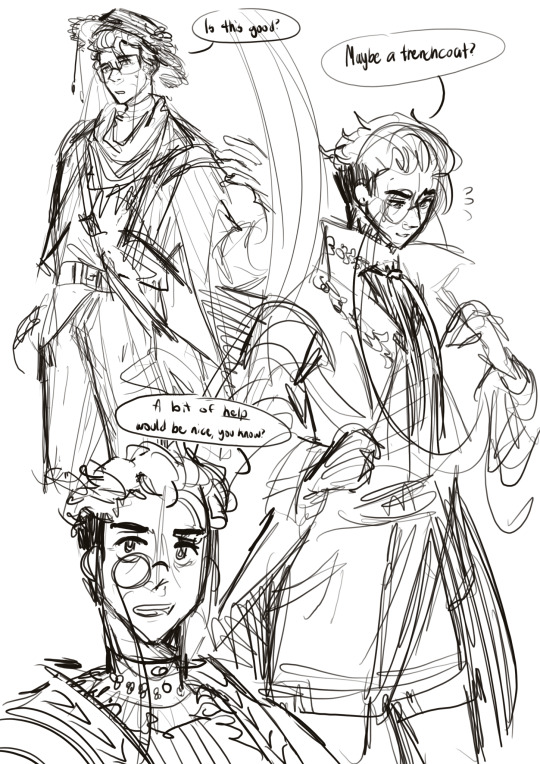

(Ft. @braisedhoney’s and @beartitled’s Narrys [as usual 😅])
#I like to think that all three of them have GREAT taste in fashion#but because their preferences are so diverse they can never agree on anything when one is asking for help XDD#This is also just a little practice for me in designing clothes#or just designing in general#I hope I’m doing good ;-;#tsp stanley#narratorverse#the stanley parable ultra deluxe#tsp fandom#the stanley parable fanart#the stanley parable narrator#tsp narrator#paraverse#sketch#character designs#clothing designs#InSomniphic’s Art#InSomniphic’s Art for Others
169 notes
·
View notes
Text
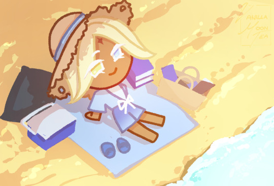
Awhile ago @vanillaverses asked for some summer themed Pure Vanilla costume so... I tried to make a more beach themed one!
Sprite doodle + og humanized concepts under cut!
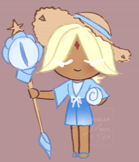
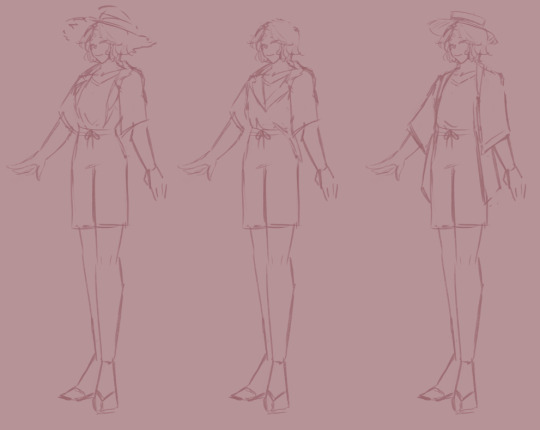
i started with the humanized doodles as I had a general idea before settling on an idea! Also his staff's base back is a sea shell! I really tried to concept a kinda beach vibe so!!
#✁ | freshly decorated | ✃#cookie run#cookie run kingdom#pure vanilla cookie#This was my first time trying to make smth more cookie + inspired by the costume illusts so I hope this cool 😭#THIS TOOK ME LIKE MORE THAN A MONTH MY GOODNESS#I did the original concepts and then had artist block because I didnt like it + couldnt draw cookie forms that well#so I practiced cookie forms + changed things around in my concepts to see if I liked other things more#added him his staff because... how will he see without it (proceeds to draw him without his staff in the illust)#ITS SO FUNNY TO ME CUZ LIKE#I have only really designed more like villains#edgy... darkness... idk whatever the Cookies of Darkness have going on#working on my like villain vanilla au and making designs for the other characters and its all like ohohoh villains#and with this i was like time to make smth lighthearted!#this was HARD because it had to be simple cuz cookie and also free of all things bad 🥹🙏#wholesome vibes ONLY#originally he had like a more ice cream vibe but then CN cookie run released the new pv costume and i was like time to redesign!! 😭😭#sorry for the ramble in the tags I have A LOT TO SAY APPARENTLY
125 notes
·
View notes
Text
i neeeeed to draw my group of idiots at a diner. i need it
#what if i... attempted to draw something wildly Beyond my skill level...#haha jk! unless...#i love diners i love characters at diners#they need to be exhuasted and its night outside and PUT THEM IN THERE#a bunch of morons crammed into a booth together... yeah...#Im So Tired and yet i Cannot Sleep#absolutely unprompted#i also think... i want to draw more Objects?#i need to practice backgrounds#the other day i was scrolling through art blogs#and Pining after the environments they were creating#oh man oh man.... me when#Why Cant I Be Good At It Now? Huh? I Need It Now#I Want To Put Dragons In Environments Now.#I WANT TO DESIGN ROOMS AND LIVING SPACES AND AUSGSHSBFJSNDKS#man. man man man. i need to improve again#im stagnating once more. i need ta get funky w it
30 notes
·
View notes
Text


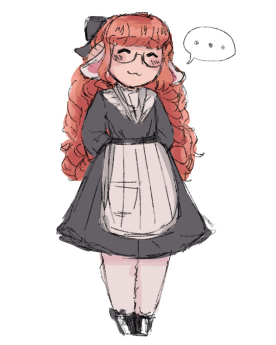
(edited bc i forgot something jfdsjkd sorry if the notif gets messed up)
@degrees-of-fuck 's ocs clara and lettie !!!
cute ocs... their outfits are always so detailed (!!! like your outfits are always so good!!) i love your art of them haha. their rp blogs are interesting too, i keep lurking on them... so i'm glad i got to draw a few ! :3
#dol pc#1am-yan#degrees of lewdity#clara was like speedy 4 me but lettie... idk the combo of colors im unused to and long styled hair.. i was unprepared. good practice tho!!#i keep doing these headshots bc i'm trying to practice getting more consistency in style & like trying coloring styles... also cuz its fun#i love getting to explore character designs by drawing them and thats why i like the Little Guy versions too cuz full outfit...#this goes for anyone i've drawn stuff for 2 but tumblr sometimes messes up the quality i can send the better versions on discord btw jic#ocs#endo.art();
42 notes
·
View notes
Text
*squeezes aine this time*
Read my Yandere! Dottore fics first (⁎⁍̴̆Ɛ⁍̴̆⁎)
Chemistry ๑ Magnum Opus

So @ainescribe decided to surprise me with more Darling fan art, this time of Dottore’s Assistant!! *sobs* I love it so much 。゚(゚´ω`゚)゚。
Once again, feedback will be in the tags. Thank you so much for enjoying my writing, Aine <3
#feedback#fan art#ainescribe#AIIIIIIIIIIIIIIIIIIIINE ( ;∀;)#THE FACT THAT YOU DREW THIS?? AND SO SOON?? give me a moment. i need to cry happily#fun fact aine has made jokes about assistant and 'dead-eyed desi trauma' so my first thought when seeing this fan art was#'wow you can rlly see the desi trauma in her eyes' xD i say this both jokingly and seriously cuz AHH HER EXPRESSION!!#it's hard for me to describe visual art + techniques but you did such a good job at depicting assistant's emotions#is it bc of the thicker line art used for the eyes + eyebrows?? the lil eyebags/ creases under her eyes?? the uneven shading for her irises#all of that combined with her jaded facial expression and body language?? idk but just know that i love this depiction of assistant#especially since her emotions are an important aspect of her character design (to me at least)#moving on i love your original design for her. once again it's always interesting to see how my readers imagine and depict my darlings#and the way you drew her including the pose and design....she looks like a character from an animated show or visual novel!!#just put her name. caption. and dialogue on the side then she's ready to be romanced. 100% the fan-favorite character <3#i rlly like how you drew her hair!! it looks very fluffy and voluminous (sorry idk many terms for haircare either)#the scar is an interesting detail. makes me wonder if she got it before. during. or after the akademiya?? from an expedition/ experiment??#either way. ohohoho the potential....i imagine the scar serving as a lifelong reminder to assistant of what she has sacrificed for her#scientific curiosity and career. not to mention that the scar is located on her FACE which is 1) the body part most crucial to a person's#identity 2) makes the scar difficult to ignore. to the point that some people may recognize assistant's face mainly bc of her scar#poor assistant. at least dottore is one to appreciate such traits. i can see him administering first aid or lovingly tracing the scar......#moving on to her uniform. i love that it's practical but also stylish in its own way. a perfect balance methinks uwu#the patterned lapels. the lil brooch. the leather armbands. the fatui symbol. the tucked shirt and high-waist pants.....aaaahhhh i just#love these small details!! and it does look like smth which a fatuus would wear on the job~#i think that's all i have to say on assistant!! once again. thank you thank you THANK YOU FOR EXPRESSING YOUR LOVE FOR MY WRITING AND MY#DARLINGS!! it means the world to me and i'll always cherish our rambles and brainrot <3#dottore x reader#yandere dottore x reader#yandere fatui harbingers#fatui x reader#genshin x reader
13 notes
·
View notes
Text
Improvement :3
#turns out practice does work....who would have thought .. apparently not me...#im very proud I've stayed with it#me??? actually liking ny art??? and seeing myself improve more than i have in a year within a couple months??????????#what a good hyperfixation/special interest does to you/silly#alas i need to keep branching out to the other ieytd characters because i wanna work on my fabby design#i have a hard time with costume and um she is literally THE fashion girlie so. i gotta work on that#because she DESERVES IT DAMNIT#also still working on a mental image for zor...sigh#im really into the vitti as zor theory and that 'zor' is a role/title that's kinna passed on....idk...i have thoughts.....#but yeah zor is so painfully human to me but also is trying to not be drives me up the WALL#THAT'S ANOTHER POSTS RANT how did i get here#alas#ieytd#[agent moose's art]#THAT'S IT not individually tagging these doodles? drawings? are not good enough for that#i don't have. the urge to draw in full colour rn <- so so so so busy <- leaves secondary education in less than 2 months#alas. I'm surviving. and very excited about next steps. just gotta get through. via ieytd. it's becoming my mantra#i keep saying i should make designs for solaris and redo my fabby so i can have triple threat explaining science to me on my flashcards#im. coping in my own special way
18 notes
·
View notes
Note
U know especially for someone who hasn't consumed JJK in awhile, that's really accurate. I'd really love more details if u want but not only is that super accurate but man what a fucking fun character that would be. Idk even know who I'd want to see them interact with the most because I want to see them interact with everybody. The stuff like doing insane things to win arguments and caring so much about how they look is such a perfect way to combine their traits too
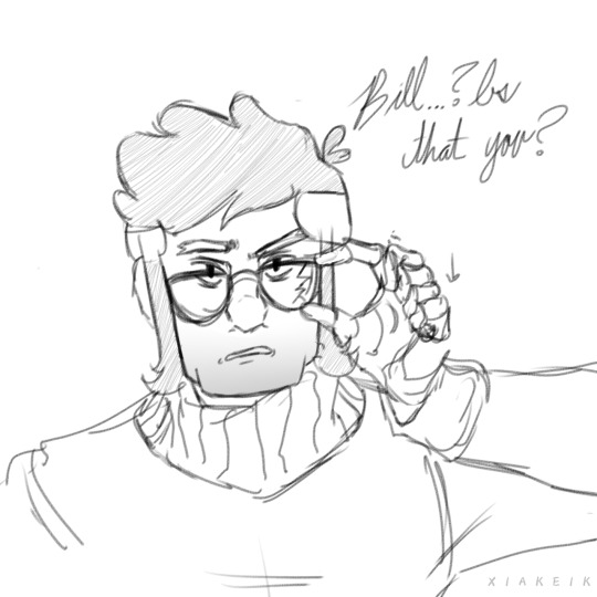
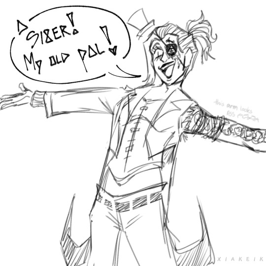
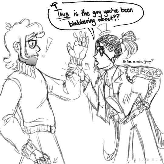
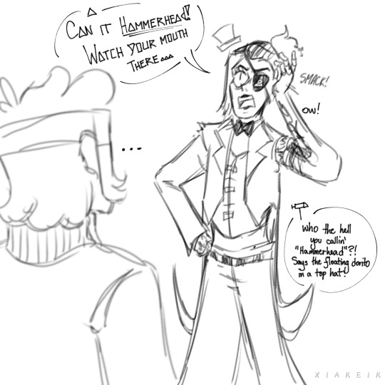
Little rushed comic I thought I could do of their interaction with Mr. Stanford Pines himself!
Further explaination under the cut :]
Some other fun things I thought of regarding Nopher that aren't specifically related to Ford/anyone:
Nopher (which I'll say is the fusion name), definitely will have a hard time getting used to the body first. If you think about it, it's just Sukuna & Itadori in Season 1 (which btw, IF my art block doesn't attack me, i MIGHT draw an interaction btwn them). Simply not pleasant LMAO. Ford doesn't really know what to do with it because Nopher isn't much of a threat for the moment. Another thing to note is that Nopher kinda just showed up to to Ford's doorstep (thanks Bill) and while Ford DOES immediately recognize Bill in Nopher, he does not recognize the physical body he inhabits. Ford doesn't know Nobara, and Nobara doesn't know Ford. Only connection they really have with each other is Bill. I feel like Ford would be VERY intrigued by how Nobara, who likely doesn't have much knowledge on Bill, is able to withstand brief periods of possession per say? I'd like to think that although Ford really doesn't want to do anything with Cipher At All, he can't really ignore the fact that he got a "random" person involved. Obviously Nopher's capable of pretty much the entire arsenal that Nobara & Bill have (except Bill's powers might be a teensy bit limited but they don't know that).
Don't ask me where they get the money from but they do enjoy clothes shopping/shopping in general for the trendy stuff. One of the very few things they "enjoy"/have in common.
Nobara within the mindspace once in awhile will get excited to see the things they have around Oregon, same with Bill when they meet the JJK gang in Tokyo.
Bill ABSOLUTELY gets really confused over the idea of being able to see Curses. The creatures released during Weirdmageddon couldn't leave the confinements of the town, so it's a shocker for Bill to find that there are actually other worldly beings residing in a place outside of Gravity Falls. Freely too! (If they aren't killed)
On the contrary though, Nobara will always see the weird stuff happening in Gravity Falls as a threat. She's been trained that way to never let her guard down and she's BRUTAL with it. I think during these times, Nopher's general "crazy" really starts to come out.
Regarding the past 2 bullet points, it's a just whole new struggle for Nopher: Nobara needs to continue protecting people from Curses that normal people can't even see, whereas Bill always wants to try and make allies with them. It's tough.
That's probably all I'm gonna come up with for now!! I do have a semi-large project I'd like to get started on & finish before the end of the week so story-building Nopher may not be prioritized for now. I do hope you enjoyed my ramble though, anon!
#gravity falls#jujutsu kaisen#oc#oc art#<- this is practically an oc of mine now... just not one thats fully developed at all LMAO#pigkiku#can we also disregard the fact how much “detail” i put in the first 2 panels like cmon it wasnt my intention to make ford look THAT good LO#btw anon if you do read these tags i need you to know that my OC making brain is covered in spider webs and dust#its been such a long time since ive ever attempted to even develop a backstory for an originally made character cuz all i do is design then#move on LMAO im tellin you now i got too many ocs with nice designs but almost NO story behind them#even more so ocs that are related to fandoms like Nopher might be my first one that's deeply connected to 2 fandoms at that#btw someone PLEASE for the love of god tell me why side profiles are so damn hard#i mean yeah okay i can draw hands. faces. clothes. blah blab but SIDEEESSS is where i draw the line#*ahem* looks like i have smth i need to work on later :]#im gonna kiss myself goodnight i just realized i put 4 fingers on the 3rd panel okok
7 notes
·
View notes
Text
if you draw enough monster ocs, when you go back to drawing a human character, it feels like "sameface syndrome" everytime, by virtue of their face being. human.
#toy txt post#or maybe i am just sameface syndrome#but also different face syndrome#two characters will have the same face but then the next time i draw those characters its a different face than they had last time!#i know part of it is being out of practice but also there is definitely an element of feeling constrained by human facial structure lmao#the monsters have Their Own Problems but like. no one has a face like bokrae no matter how inconsistent i am about drawing her#her features are iconic enough to her that you can tell everytime#birdie???? i faceclaimed eartha kitt for her and im still struggling cos i feel weird about faceclaiming as a concept#but even then 😭 one time i was trying to give headloose a face and someone was like wow he looks like birdie!#me 😭😭😭😭😭 what!!!!!! hes not supposed to!!!!!!!!!!!!!#i need to practice. features#you know the worst part about coming up w a bunch of fuckin Scenarios in my brain for ocs is that i have even fucking Drawn them yet#to give them like. iconic staple features and figure out what their faces look like. which feels like it would really help to have that#knowledge and muscle memory before i jump into trying to draw intense scenes with difficult poses!!#not to mention. listen. i can do the monster faces. somewhat. the bodies??????????? well for one. theyre too big everytime#im convinced i could be trying to draw bokrae on like a full ass wall size paper like a mural thing and run out of room. it just keeps#happening. i have no sense of scale for them either. by which i mean i struggle w scale already and also cant decide what i want it to be#and ive tried to handwave it away by being like ohhh uh. birdie casts spells on them to change their sizes for convenience but also#no. perhaps that explanation works for other ppl. @ myself tho its not good enough i Know Better!!!!!!#agh!!!!!!! i really need to figure out bokrae's Teeth also. like i dont. i coukd get away with it. but i should. and i want to.#anyway all this to say that i need to give these characters faces and body designs (actually the body designs for humanoid ocs is the easy#part. the faces are whats stumping me? well. i need more practice w all the body types again but like i Know what im Going For at least.#for the most part anyway. havent fully figured out heights. struggling w characters that i want to make short but give imposing tall energy#on occasion? birdie can be short all day long no problem. I want Alasdair to be short enough that he has a bunch of short boyfriends that#feel tall around him? bytte was going to be like 6ft max but then i thought about making her taller and like. what if i made her taller#headloose is not that /short/ but he is Not Tall and prolly pretty lean? twink build for sure#and of course all these short /tall distinctions come with a bias of relativity to my own height which i categorize as medium height#but short ppl call me tall and insist its not average and tall ppl call me short. (5'6) and then i have to factor in how the gender changes#the dynamic of a height like my height is Short For A Man but medium to tall for a Woman. which id argue is medium height bc mens heights#are socially held to high standards (hehe) and also i know ethnicity/race is also a factor? but im out of tags. rip. bye
17 notes
·
View notes
Text

And then she used the bad outfits to wipe out half the universe
#ok i will try to stop being mean about TWN i swear#it's just that i can't get these godawful costumes out of my head#like ok i don't get book accuracy i don't get yennefer treated fairly i don't get a good edge of the world i don't even get good aguaras#can i AT LEAST get good costumes????#then lucinda broke into my house spat in my face and said no#and i know i'm being mean but it just sucks that the direction of the costumes and the style of the designer is one that i ABSOLUTELY HATE#and to top it all off there's no real cohesion with the outfits and the world#or even the outfits and the characters themselves#lucinda's interpretations and justifications behind the costumes is just one that i don't particularly like#like if there was good reasoning behind them but they weren't executed well then i wouldn't be as disappointed#or if the reasoning was stupid but the costumes actually looked good (or good enough to not completely break my immersion)#that would be at least something#but I get NEITHER#also shout out to two outfits that didn't make the cut:#the stupid fucking bright purple cloak while yennefer is on the run (does not fit in with the practicality of the narrative or character)#and the leaf/constellation (?) dress in 203 that looks like it's five seconds away from slipping off and flashing us all#it's a nice dress in isolation but for me at least really doesn't work with what's happening in the scene narratively or for yen's characte#anti twn#twn critique#twn critical#twn negativity#anti witcher netflix
61 notes
·
View notes
Text
I don't know if this is a hot take, but what do you guys think about Stelle's design? Cus I think that mini skirt just ain't it, it doesn't really pair well with the rest of the outfit in my opinion
Be prepared to read a lot btw

It looks good in 2D, but almost every single official art I can find of her has a flow to it, like in this image with the jacket blowing out in the wind, it gives her a cool and mysterious silhouette, and then this is her in-game model

It's like they got two halfs of different designs and glued them together, the intricacy of the jacket, the contrast of the white shirt and splashes of gold say she has a top heavy design, but her legs bring a color that is not seen as much at the top, alongside the blue thigh strap with a unique color bring your attention to the bottom half, please decide where you want me to look!
Let's not forget that the only reason Stelle hasn't flashed us yet is because Hoyo has fan service, but not to that extent, like how is home girl fighting and jumping around in that thing 😭 Clearly, the person responsible for this design has never worn a mini skirt before.
Now, you reached this part and are probably wondering if I'm just gonna complain without adding anything, well lucky for us I happen to know a thing or two about character design, I'm not professional or anything but hear me out: pants.

This is the closest image I could find on Pinterest on how Stelle's design could look with pants, this is a more baggy style but tighter pants would work too, she could still have her thigh strap on top of the pants, just in a different color like grey or gold so it doesn't take attention away from the jacket.
"But what if I like the mini skirt?", you ask, and I give you:

Crop that jacket down! The way the jacket completely swallows the mini skirt in the silhouette just makes the og design look wonky in my opinion, so maybe shortening the length of the jacket should help keep your attention at the top part.
If you want to add more texture to the design, giving Stelle a puffer jacket might work too if that's your preference:

Here's another image I found, the puffiness of the jacket brings attention to the top and gives a fun twist to the overall design, although I would prefer to keep the cool jacket Stelle has lmao
Anyway, these are my two cents lol, this is a shower thought and I had to make a post about it since one of the main reasons I chose Caelus over Stelle, aside from thinking he's cute, was the fact that I despised her skirt, which is a shame since she's a really cool MC. There's a lot more stuff I left out, like which changes should be made to the design if any of my changes were to be made etc, but it's been an hour and I haven't eaten yet so I'll leave it at that lmao
#honkai star rail#hsr#hsr stelle#redisign?#I know that hsr has a lot of characters with non practical outfits but at least they look good yk?#also! It's completely fine if you like her design!#this is just my opinion and you're free to disagree with me#i would actually like to hear your thoughts about it too!
7 notes
·
View notes
Text
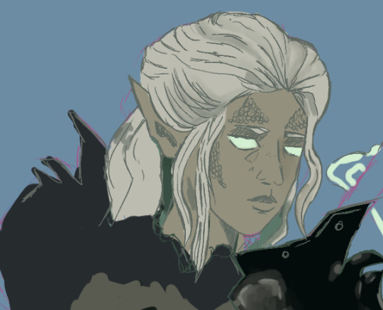
wip of @haarleps beautiful OC, Mnemosyne.
#i fear i may not be able to do this stunning lady justice but i am trying#thank you for letting me use your ocs so i could get your practice in#i really like the mods you use#also i saw draconic sorceror drow romancing minthara and got brainworms#truly a great character#art wip#trying to get back into drawing i am so rusty smh#haarleps you have a really good eye for character design i hope you know that#you made me want to draw armour and that shit is hard af#other's ocs#bg3#*drops and runs*#posting this so i willcommit to finishing it#sketch wp
9 notes
·
View notes