#it was so colourful and gorgeous
Explore tagged Tumblr posts
Text


Ibiza, June 2024
#just a few snaps from my recent trip!#it was so colourful and gorgeous#and I promised to share some#so here we go <33#my photos#minnie talks#photography#ibiza
45 notes
·
View notes
Text
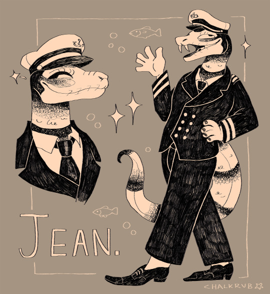
attack for @plaiesancier !
#my art#art fight#artfight#artfight 2024#furry#anthro#scalie#snake#illustration#xallith's characters are all so gorgeous but jean is a personal fav - sea snakes are super cool and she has a lot of their charm#had a LOT of fun with this one! lots of textures to work with and b/w contrast in the character so i thought a monochrome image would work#i.e my specialty. i think. though people seem to like my colour work nowadays too which is encouraging#once again - i looove art fight thank you art fight for my life. july would be just another month if you didn't exist#gonna try to pace myself more from this point so i don't completely burn out. i've got more free time this year though#so hopefully can do more than last year
951 notes
·
View notes
Text
So I accidentally almost got into an argument on Twitter, and now I'm thinking about bad historical costuming tropes. Specifically, Action Hero Leather Pants.
See, I was light-heartedly pointing out the inaccuracies of the costumes in Black Sails, and someone came out of the woodwork to defend the show. The misunderstanding was that they thought I was dismissing the show just for its costumes, which I wasn't - I was simply pointing out that it can't entirely care about material history (meaning specifically physical objects/culture) if it treats its clothes like that.
But this person was slightly offended on behalf of their show - especially, quote, "And from a fan of OFMD, no less!" Which got me thinking - it's true! I can abide a lot more historical costuming inaccuracy from Our Flag than I can Black Sails or Vikings. And I don't think it's just because one has my blorbos in it. But really, when it comes down to it...
What is the difference between this and this?
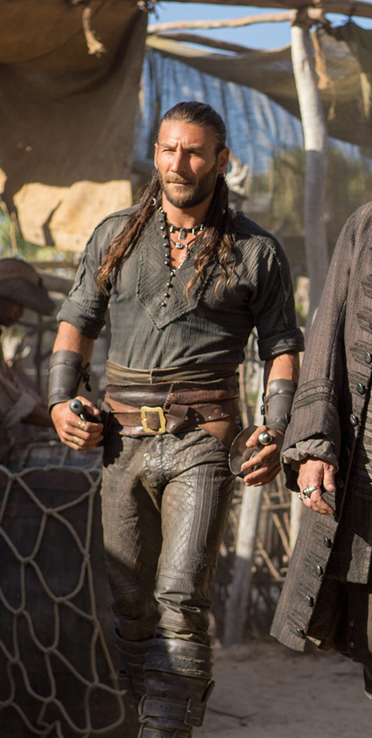
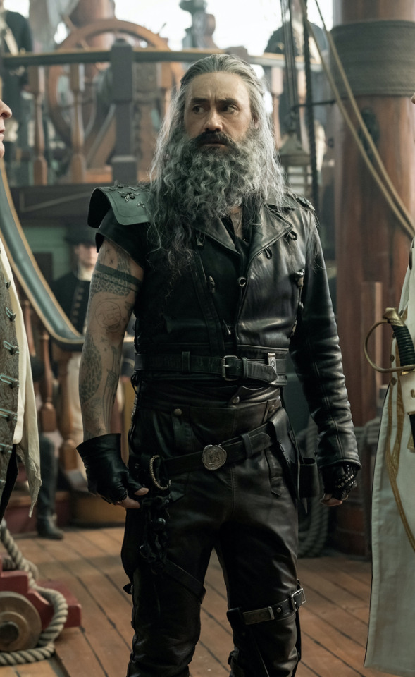
Here's the thing. Leather pants in period dramas isn't new. You've got your Vikings, Tudors, Outlander, Pirates of the Caribbean, Once Upon a Time, Will, The Musketeers, even Shakespeare in Love - they love to shove people in leather and call it a day. But where does this come from?
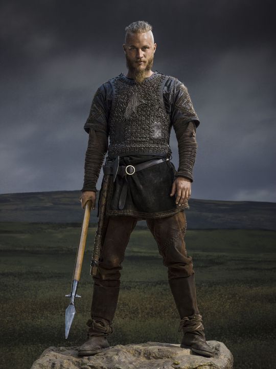
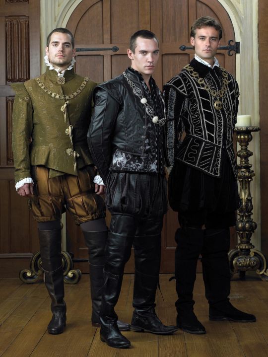
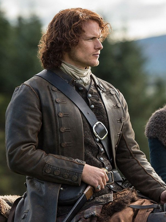

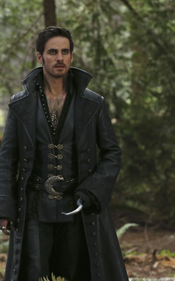
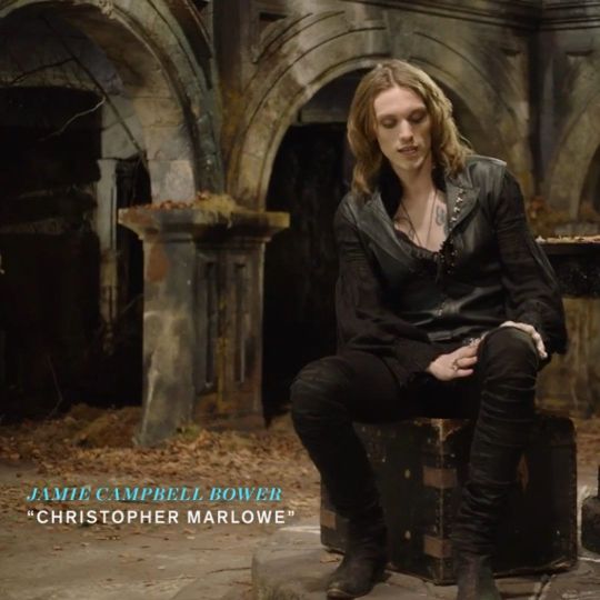
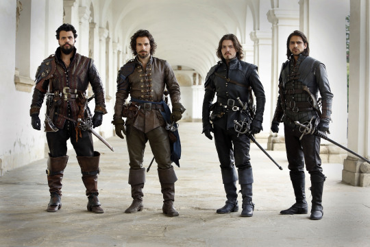
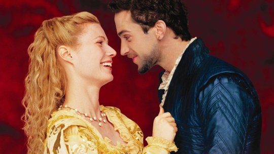
Obviously we have the modern connotations. Modern leather clothes developed in a few subcultures: cowboys drew on Native American clothing. (Allegedly. This is a little beyond my purview, I haven't seen any solid evidence, and it sounds like the kind of fact that people repeat a lot but is based on an assumption. I wouldn't know, though.) Leather was used in some WWI and II uniforms.
But the big boom came in the mid-C20th in motorcycle, punk/goth, and gay subcultures, all intertwined with each other and the above. Motorcyclists wear leather as practical protective gear, and it gets picked up by rock and punk artists as a symbol of counterculture, and transferred to movie designs. It gets wrapped up in gay and kink communities, with even more countercultural and taboo meanings. By the late C20th, leather has entered mainstream fashion, but it still carries those references to goths, punks, BDSM, and motorbike gangs, to James Dean, Marlon Brando, and Mick Jagger. This is whence we get our Spikes and Dave Listers in 1980s/90s media, bad boys and working-class punks.
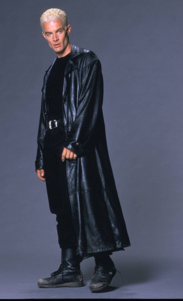
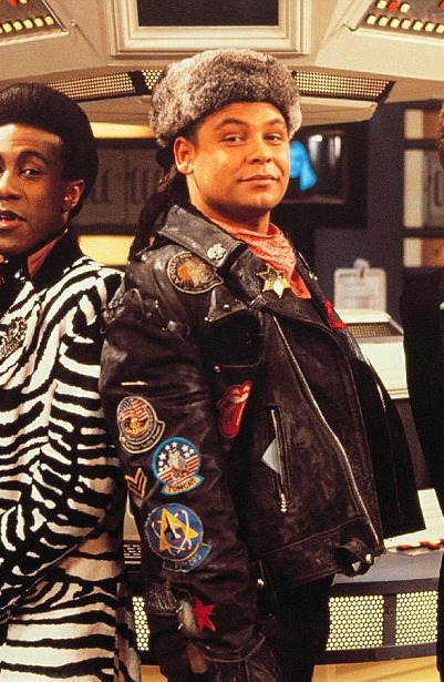
And some of the above "historical" design choices clearly build on these meanings. William Shakespeare is dressed in a black leather doublet to evoke the swaggering bad boy artist heartthrob, probably down on his luck. So is Kit Marlowe.
But the associations get a little fuzzier after that. Hook, with his eyeliner and jewellery, sure. King Henry, yeah, I see it. It's hideously ahistorical, but sure. But what about Jamie and Will and Ragnar, in their browns and shabby, battle-ready chic? Well, here we get the other strain of Bad Period Drama Leather.
See, designers like to point to history, but it's just not true. Leather armour, especially in the western/European world, is very, very rare, and not just because it decays faster than metal. (Yes, even in ancient Greece/Rome, despite many articles claiming that as the start of the leather armour trend!) It simply wasn't used a lot, because it's frankly useless at defending the body compared to metal. Leather was used as a backing for some splint armour pieces, and for belts, sheathes, and buckles, but it simply wasn't worn like the costumes above. It's heavy, uncomfortable, and hard to repair - it's simply not practical for a garment when you have perfectly comfortable, insulating, and widely available linen, wool, and cotton!
As far as I can see, the real influence on leather in period dramas is fantasy. Fantasy media has proliferated the idea of leather armour as the lightweight choice for rangers, elves, and rogues, a natural, quiet, flexible material, less flashy or restrictive than metal. And it is cheaper for a costume department to make, and easier for an actor to wear on set. It's in Dungeons and Dragons and Lord of the Rings, King Arthur, Runescape, and World of Warcraft.
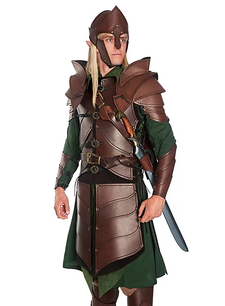
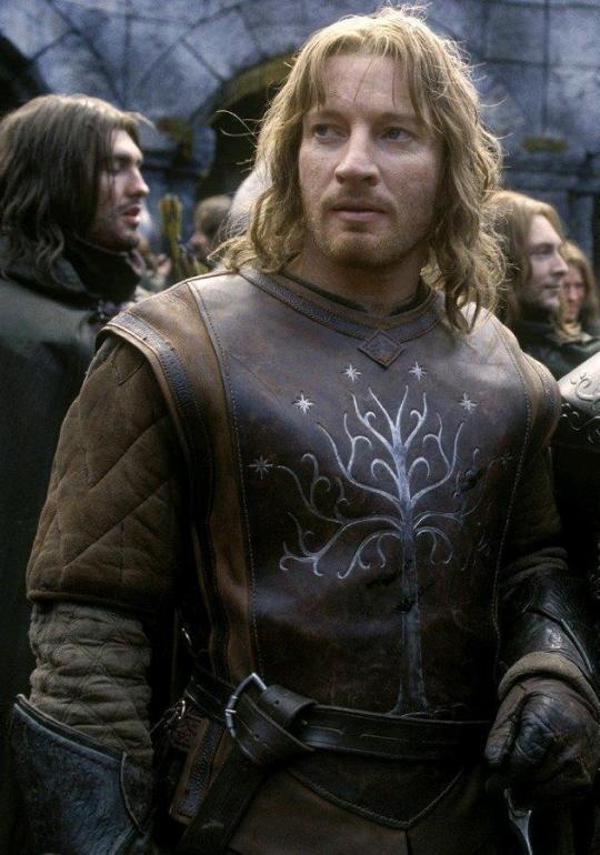
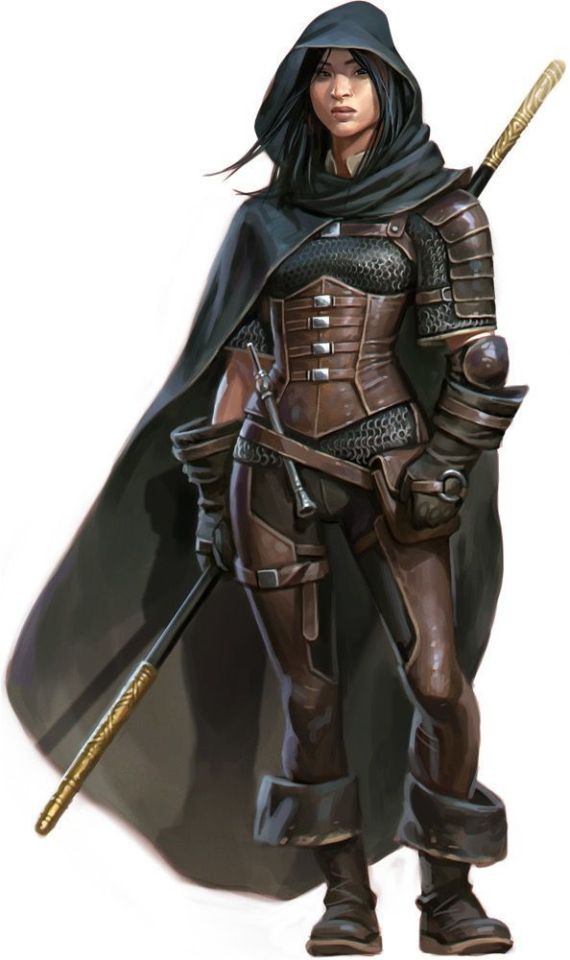
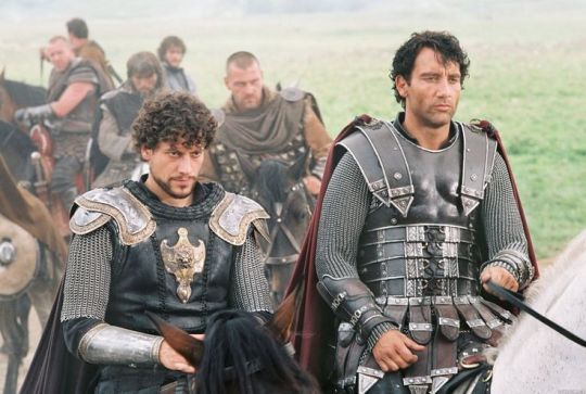

And I think this is how we get to characters like Ragnar and Vane. This idea of leather as practical gear and light armour, it's fantasy, but it has this lineage, behind which sits cowboy chaps and bomber/flight jackets. It's usually brown compared to the punk bad boy's black, less shiny, and more often piecemeal or decorated. In fact, there's a great distinction between the two Period Leather Modes within the same piece of media: Robin Hood (2006)! Compare the brooding, fascist-coded villain Guy of Gisborne with the shabby, bow-wielding, forest-dwelling Robin:
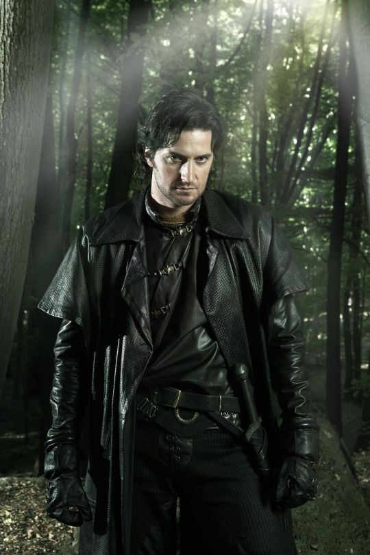
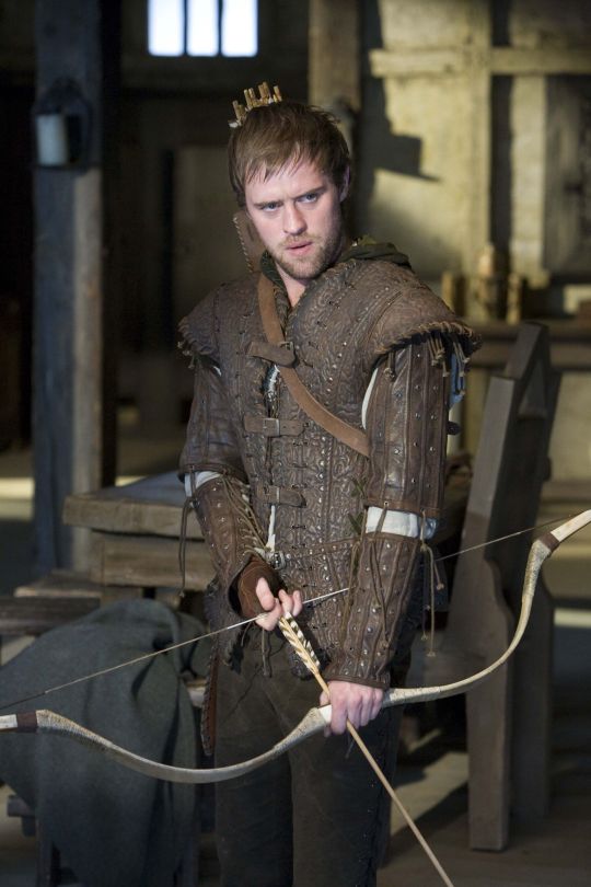
So, back to the original question: What's the difference between Charles Vane in Black Sails, and Edward Teach in Our Flag Means Death?
Simply put, it's intention. There is nothing intentional about Vane's leather in Black Sails. It's not the only leather in the show, and it only says what all shabby period leather says, relying on the same tropes as fantasy armour: he's a bad boy and a fighter in workaday leather, poor, flexible, and practical. None of these connotations are based in reality or history, and they've been done countless times before. It's boring design, neither historically accurate nor particularly creative, but much the same as all the other shabby chic fighters on our screens. He has a broad lineage in Lord of the Rings and Pirates of the Caribbean and such, but that's it.
In Our Flag, however, the lineage is much, much more intentional. Ed is a direct homage to Mad Max, the costuming in which is both practical (Max is an ex-cop and road warrior), and draws on punk and kink designs to evoke a counterculture gone mad to the point of social breakdown, exploiting the thrill of the taboo to frighten and titillate the audience.
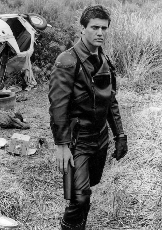
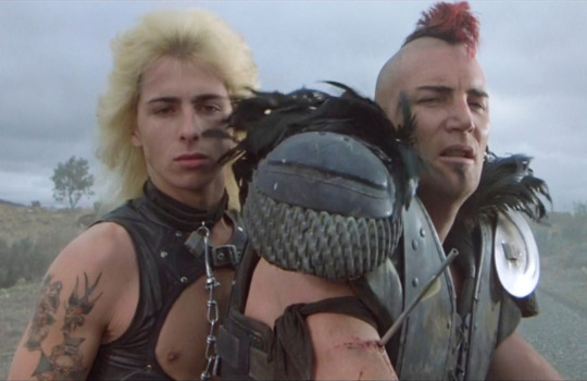
In particular, Ed is styled after Max in the second movie, having lost his family, been badly injured, and watched the world turn into an apocalypse. He's a broken man, withdrawn, violent, and deliberately cutting himself off from others to avoid getting hurt again. The plot of Mad Max 2 is him learning to open up and help others, making himself vulnerable to more loss, but more human in the process.
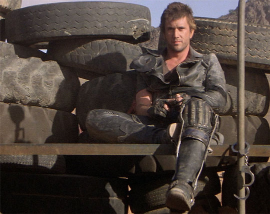
This ties directly into the themes of Our Flag - it's a deliberate intertext. Ed's emotional journey is also one from isolation and pain to vulnerability, community, and love. Mad Max (intentionally and unintentionally) explores themes of masculinity, violence, and power, while Max has become simplified in the popular imagination as a stoic, badass action hero rather than the more complex character he is, struggling with loss and humanity. Similarly, Our Flag explores masculinity, both textually (Stede is trying to build a less abusive pirate culture) and metatextually (the show champions complex, banal, and tender masculinities, especially when we're used to only seeing pirates in either gritty action movies or childish comedies).
Our Flag also draws on the specific countercultures of motorcycles, rockers, and gay/BDSM culture in its design and themes. Naturally, in such a queer show, one can't help but make the connection between leather pirates and leather daddies, and the design certainly nods at this, with its vests and studs. I always think about this guy, with his flat cap so reminiscient of gay leather fashions.
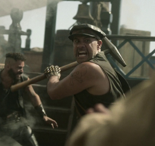
More overtly, though, Blackbeard and his crew are styled as both violent gangsters and countercultural rockstars. They rove the seas like a bikie gang, free and violent, and are seen as icons, bad boys and celebrities. Other pirates revere Blackbeard and wish they could be on his crew, while civilians are awed by his reputation, desperate for juicy, gory details.
This isn't all of why I like the costuming in Our Flag Means Death (especially season 1). Stede's outfits are by no means accurate, but they're a lot more accurate than most pirate media, and they're bright and colourful, with accurate and delightful silks, lace, velvets, and brocades, and lovely, puffy skirts on his jackets. Many of the Revenge crew wear recognisable sailor's trousers, and practical but bright, varied gear that easily conveys personality and flair. There is a surprising dedication to little details, like changing Ed's trousers to fall-fronts for a historical feel, Izzy's puffy sleeves, the handmade fringe on Lucius's red jacket, or the increasing absurdity of navy uniform cuffs between Nigel and Chauncey.
A really big one is the fact that they don't shy away from historical footwear! In almost every example above, we see the period drama's obsession with putting men in skinny jeans and bucket-top boots, but not only does Stede wear his little red-heeled shoes with stockings, but most of his crew, and the ordinary people of Barbados, wear low boots or pumps, and even rough, masculine characters like Pete wear knee breeches and bright colours. It's inaccurate, but at least it's a new kind of inaccuracy, that builds much more on actual historical fashions, and eschews the shortcuts of other, grittier period dramas in favour of colour and personality.
But also. At least it fucking says something with its leather.
#everyone say 'thank you togas' for not including a long tangent about evil rimmer in red dwarf 5x05#Our Flag Means Death#Togas does meta#and yes these principles DO fall apart slightly in s2 and i DON'T like those costumes as much#don't get me wrong they're fun and gorgeous - but generally a bit less deep and more inaccurate. so. :(#I'm not sure this really says anything new about Our Flag but I just needed to get my thoughts out#i hate hate hate Gritty Period Drama costumes they're so boring and so ugly and so wrong#god bless OFMD for using more than 3 muted colours and actually putting men in heels (and not as a shorthand for rich/foppish villainy) <3#looking at that Tudors still is insane like they really will go to any lengths to not make men feel like they've got bare legs XD#image descriptions in alt text#and yes i DID just sink about two hours into those so you'd better appreciate them
1K notes
·
View notes
Text


pissed off & pretty

#gifs by polinsated#bridgerton#bridgerton 3x04#bridgertonedit#penelope featherington#penelope bridgerton#nicola coughlan#polin carriage scene#colouring by polinsated#userjamiec#...#idek why i captioned it that lmao#but she's so gorgeous
361 notes
·
View notes
Text
I think we as a community need to talk about how pleasing both Top Gun '86 and Maverick were to look at.
All the blues,
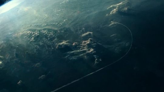


Golds,


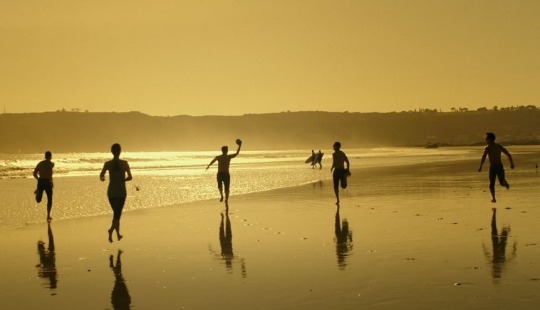
And mixes of reds, oranges, and various other colours.
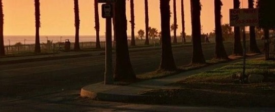


It's all so unbelievable gorgeous to look at just from the cinematography, how all the colours envoke different emotions especially when you pair them with the the specific scores from the soundtrack.
Please someone tell me what makes it feel so comforting and almost like nostalgic??? But I've never been there personally with all these pictures???
#top gun#top gun 1986#top gun maverick#cinemetography#photography#WHY IS IT ALL SO PRETTY#JUST LOOK AT ALL THE COLOURS#it's gorgeous
778 notes
·
View notes
Text


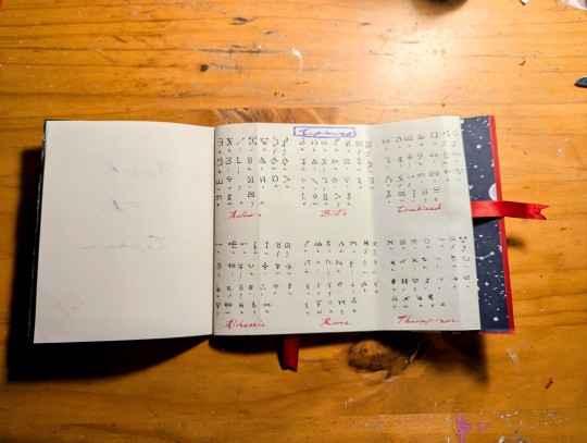


In singular deranged days work (where I was supposed to be getting OTHER things done) I made a cipher journal for decoding the ciphers in Gravity Falls, specifically for Journal 3, the Book of Bill and thisisnotawebsite.com. This included (ultimately) three pages of common ciphers used in the Gravity Falls fandom; originally I was only going to do two, but then got to the Blendin page in Journal 3, sighed deeply and made an extra page on the Vignére cipher. The clasps I made myself by hand, and the little white toggle is a raccoon tooth, which I may change out depending on what becomes available. The purple ink, although unable to be seen within the photos, actually glitters and looks rather cosmic to my delight.
Considering I made the most of it within a day, it meant I used the paper I had at hand, which wasn't good paper for actual ink as it bleeds through slightly (and is thus unbecoming), but as a fancy schm-ancy idiot who insists on using actual ink with dip pens for the 'breadth of the experience', this means I'm ultimately only using one side of the paper (to my chagrin) and the letters aren't as clear as they could be when I write on the paper. Nevertheless, I am rather happy about the result; young me from about a decade ago, who began to make a similar journal only to abandon the project would have been immensely excited that I actually made one and am currently using it to decipher things within Journal 3. There is something rather satisfying about it, I do confess.
#rose serpent press#gravity falls#journal 3#the book of bill#thisisnotawebsitedotcom#ciphers#bookbinding#jesus why is blendins letter so fucking long and a vignere cipher like i get it but yeesh#also yes im aware if i Google i would get all the things deciphered. but where the ENJOYMENT IN THAT HUH???#also immensely delighted to be able to do pull out pages for the cipher pages fuck YEAH tactile gorgeous AND useful#was i obsessed with the description of the Book Dragon Riders map by cornelia funke? yes and what about it. i still LOVE the concept#after i added the vignere cipher page i wasnt gonna reshoot the book so theres no second ribbon horizontally. so u just gotta imagine it#btw i mixed the colours myself for the colour cipher. in watercolour. because i like to torment myself#which reminds me i do need to finish whitening the raccoon skull that hangs out under my desk. like its been there for ages.
150 notes
·
View notes
Text

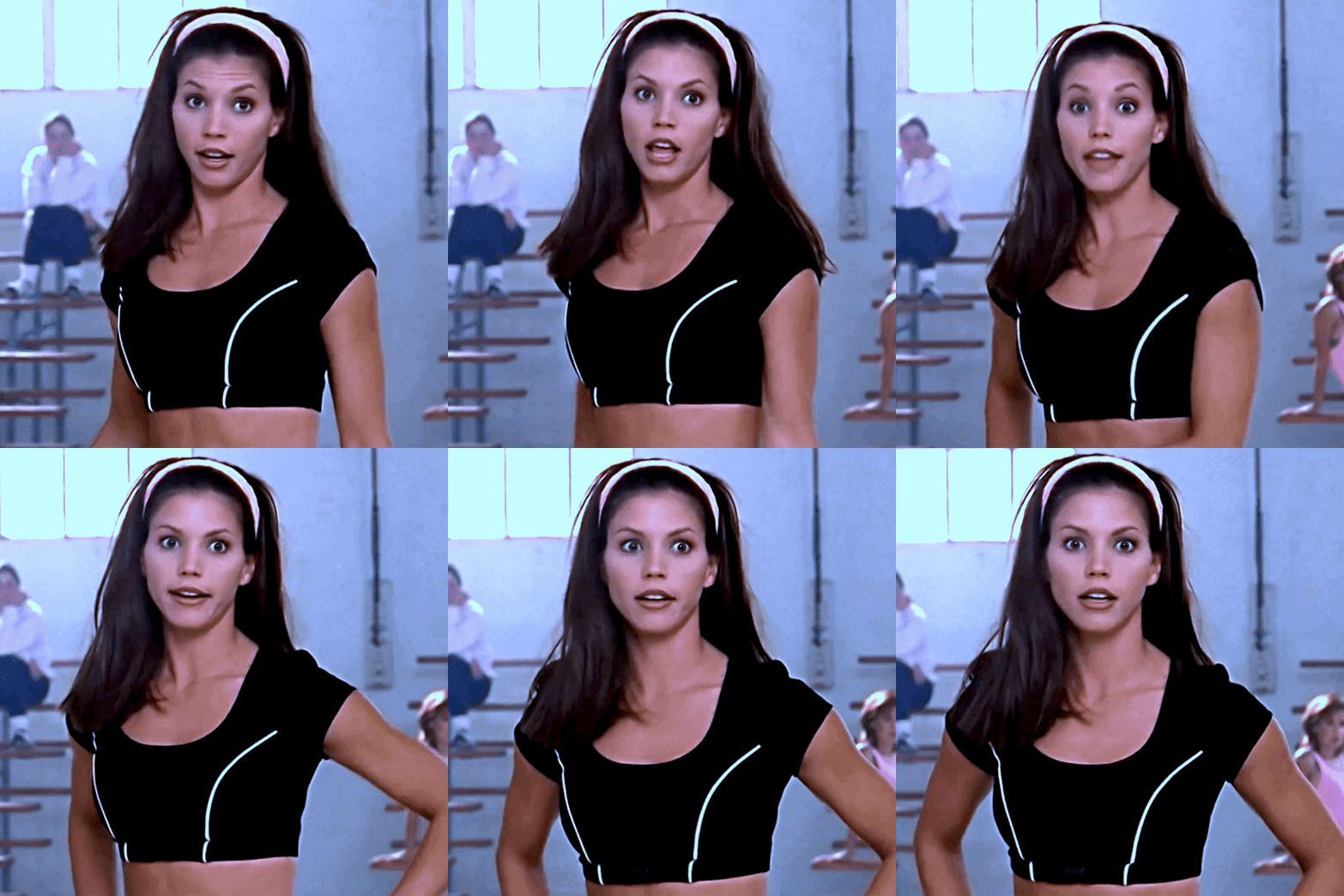

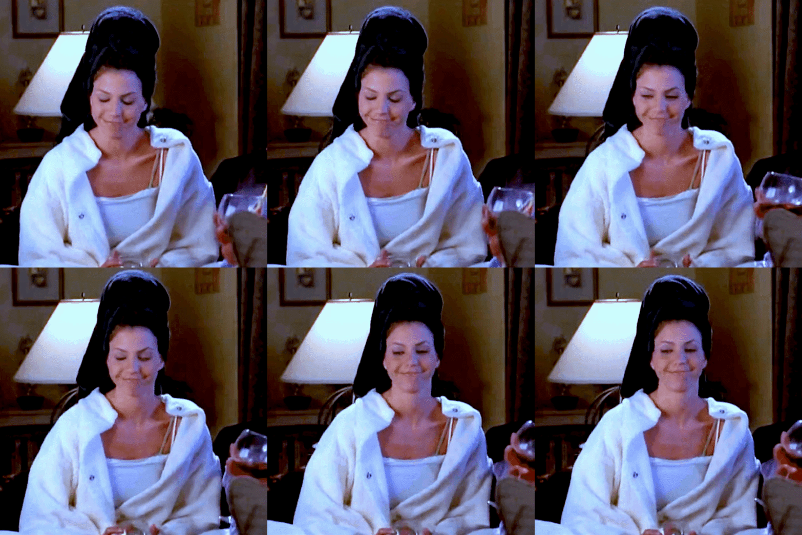

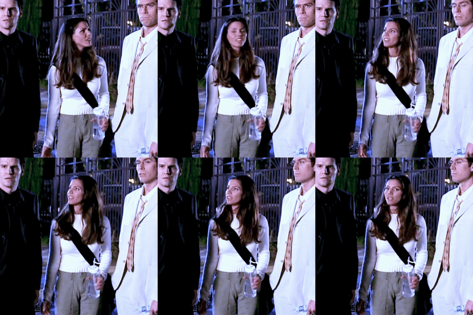
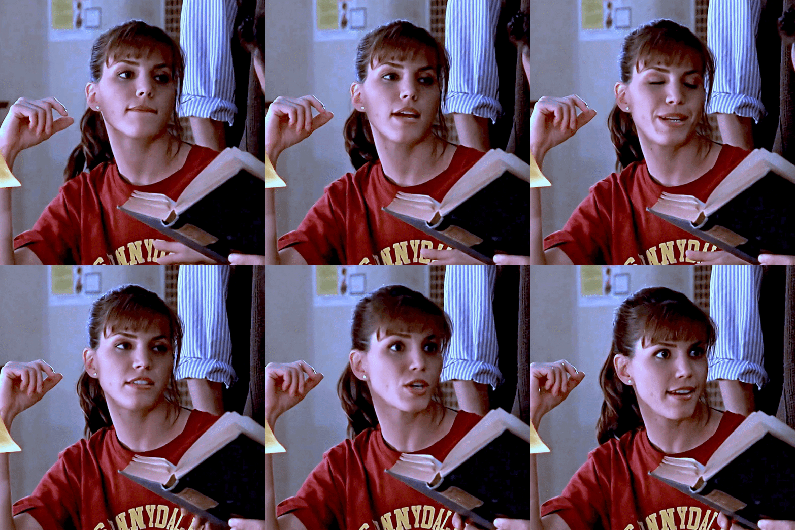
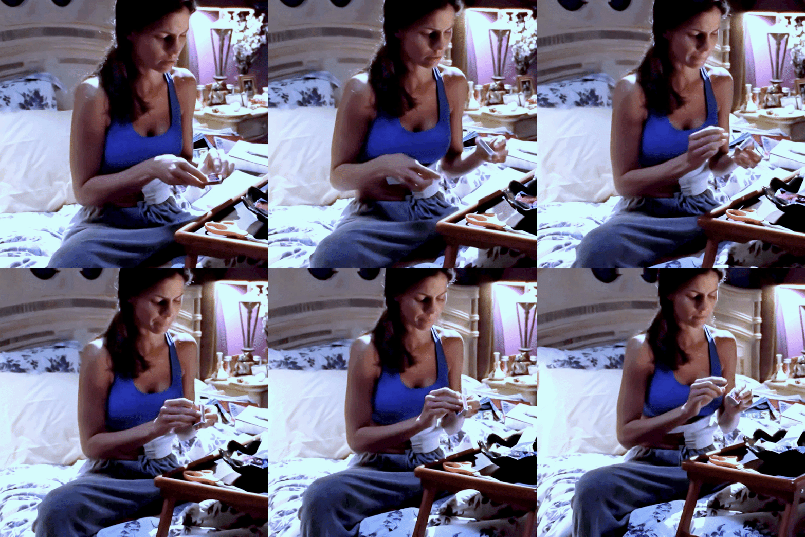
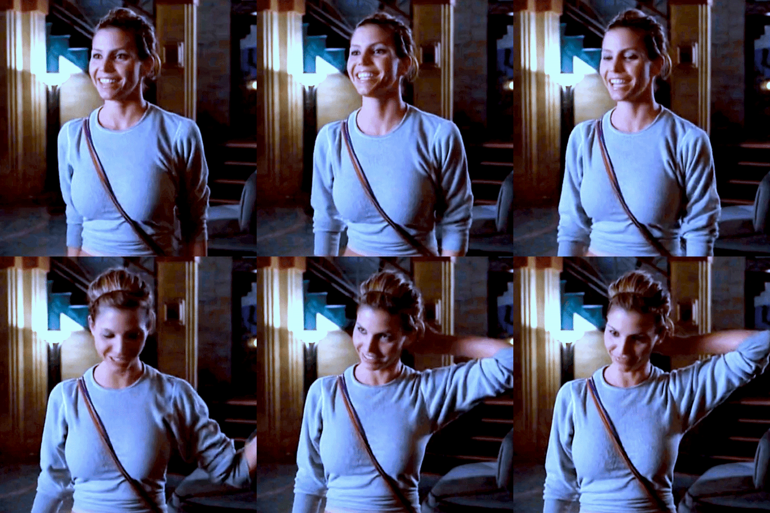
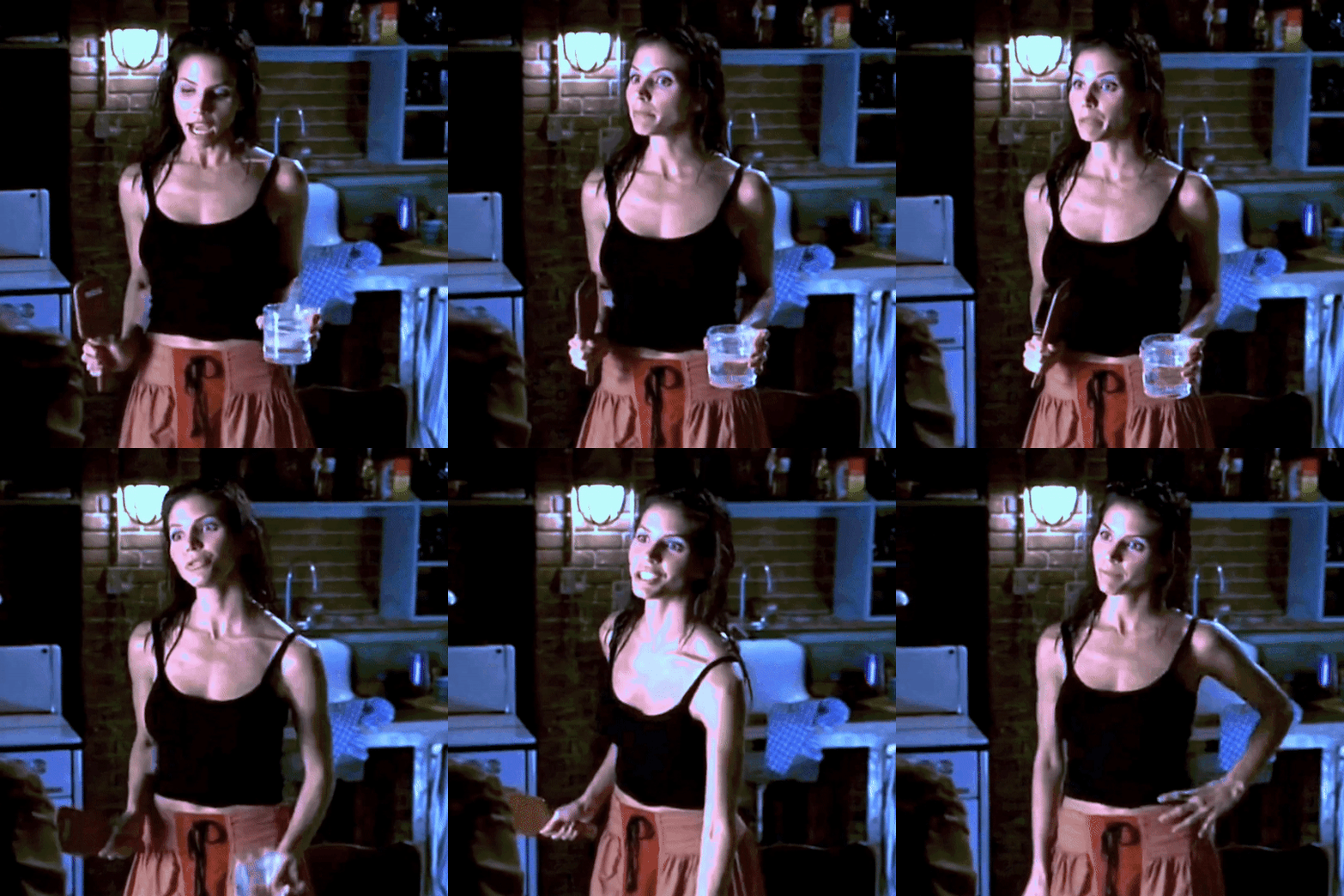


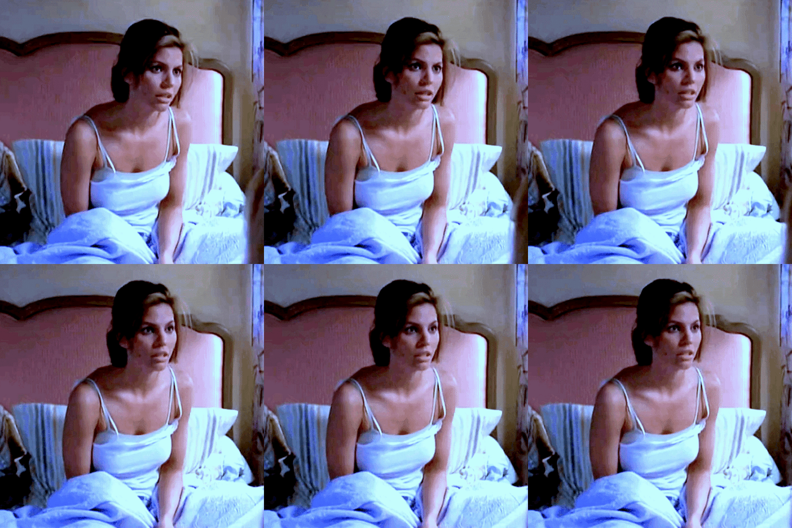


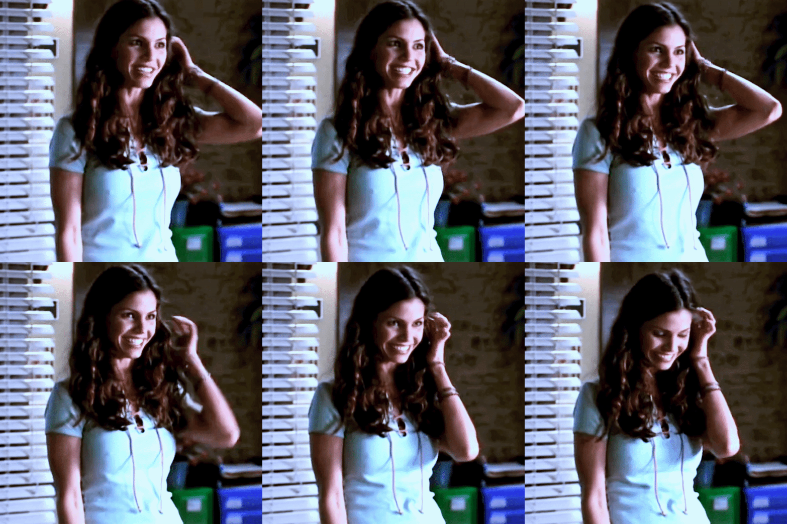

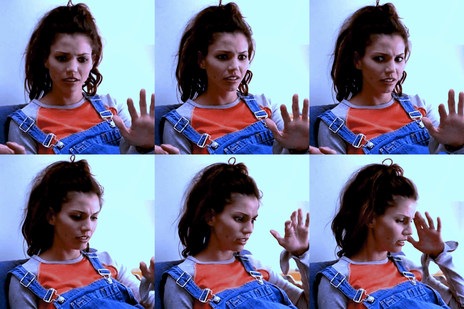

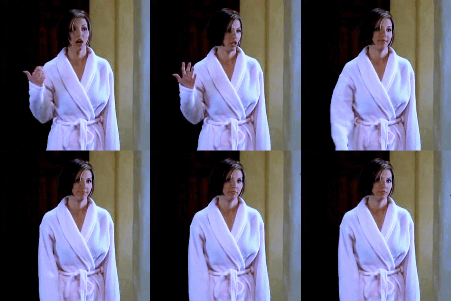

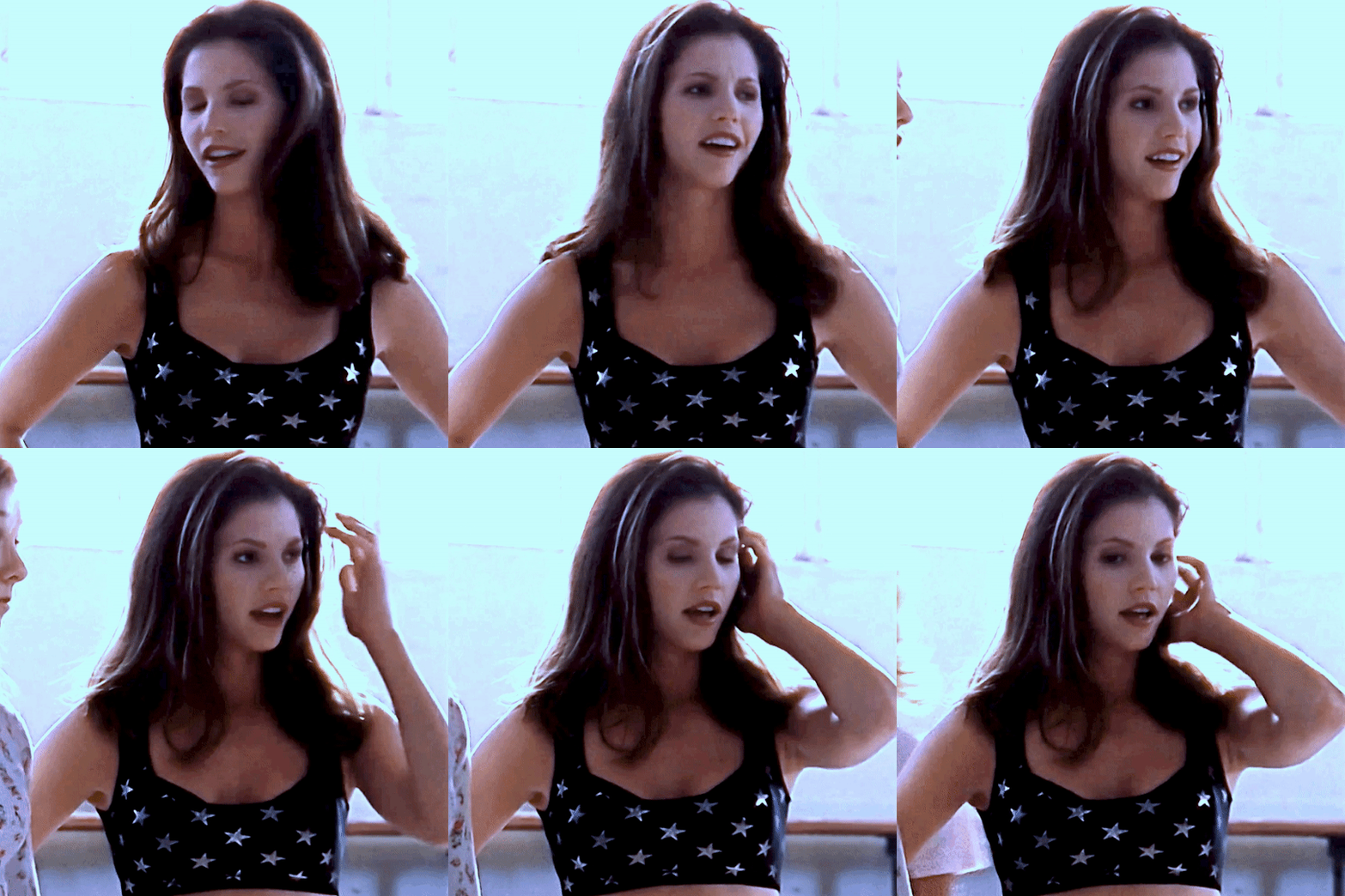

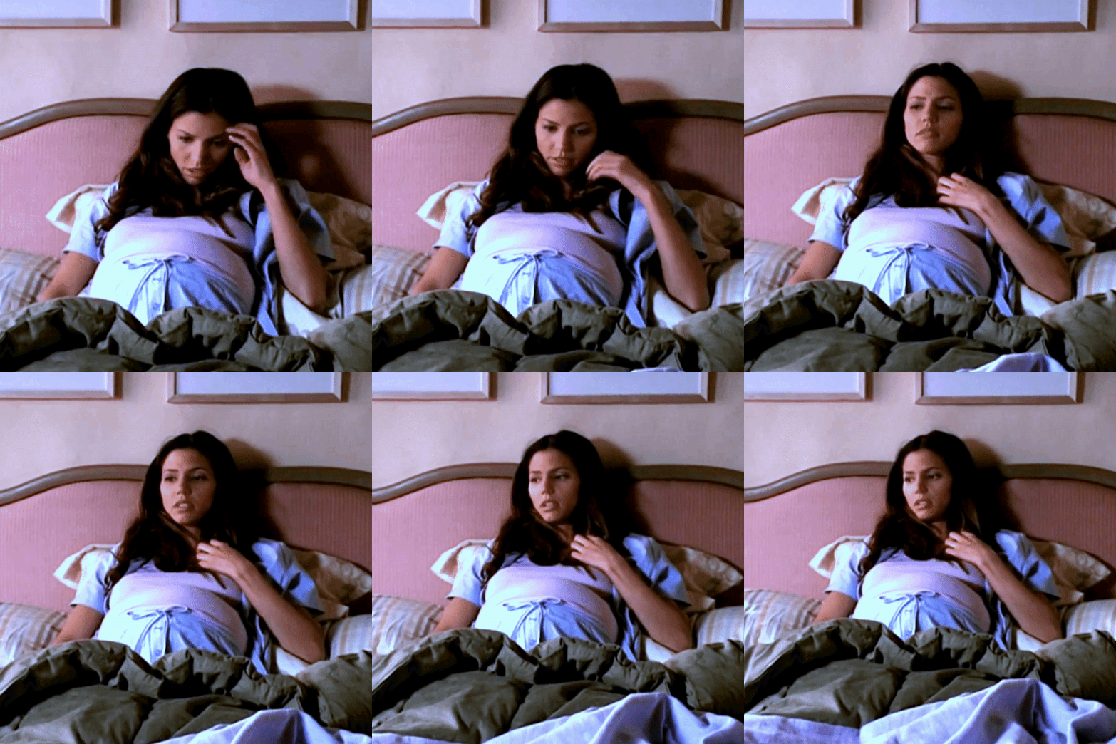
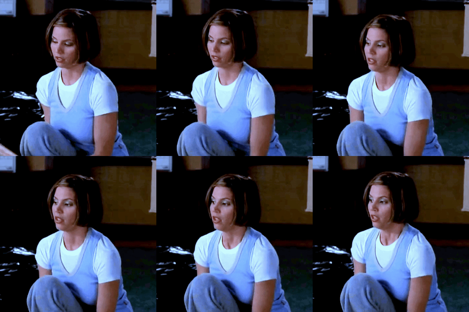
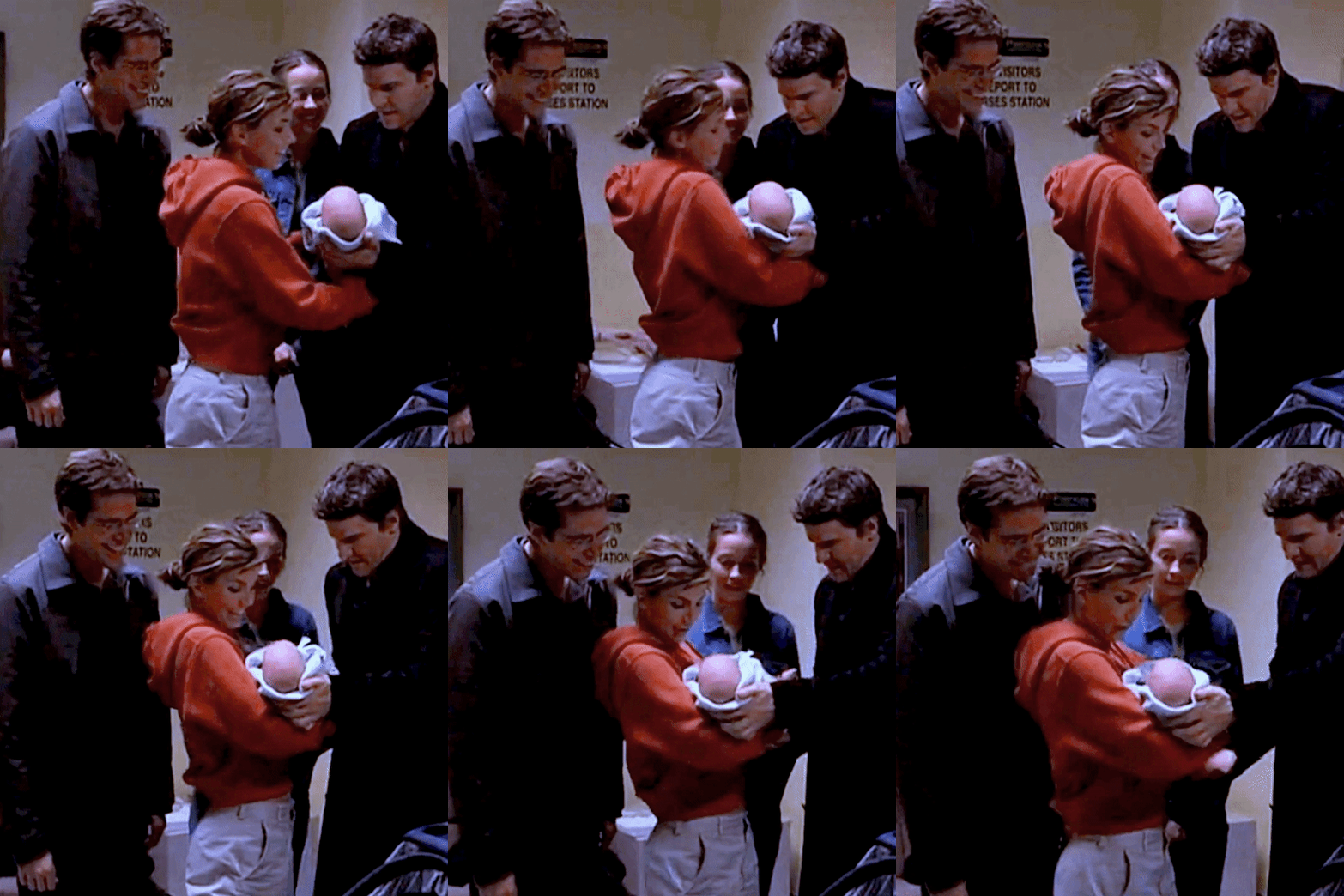


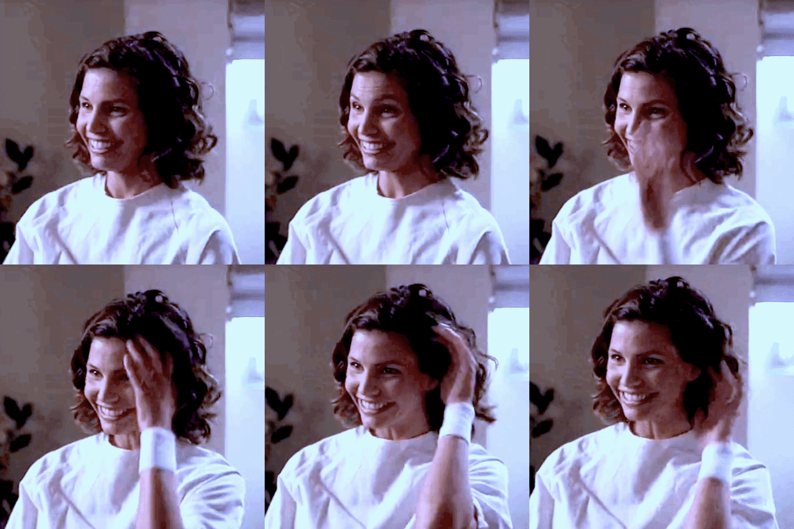
↳ cordelia chase + comfy / casual
#cordelia chase#cordy looks#gif#gifs#gifset#my gifs#btvs gifs#btvs#buffy the vampire slayer#ats#angel the series#she’s just so girlfriend yk??#like ik she’s an actress and she still went into hair and makeup and whatever but also you are literally wearing a top. and some jeans.#and yet you are the most gorgeous person I’ve ever seen in my life like??? CHARISMA YOU ARE SO!!!!#also I think my colouring is getting better no?? I literally just use capcut and a basic gif maker so it’s pretty hard lmao#but I think this looks pretty good#oh also inspired by the wonderful @slayerdaily :) obsessed with their buffy outfits sets
476 notes
·
View notes
Text

Happy birthday Nihachu!!💖🌹 Niki is honestly so fun to draw w her outfits and varying hairstyles. Absolute queen✨
#casart#mcyt#niki nihachu#nihachu#niki nihachu fanart#nihachu fanart#fr Niki’s content is so real and chill it’s a comfort for me#she hasn’t had this hair since like 2021 but it’s one of my favourites I coloured I just added her newest piercings coz she is gorgeous#I think I posted this piece before fully rendered so some might be familiar
116 notes
·
View notes
Text

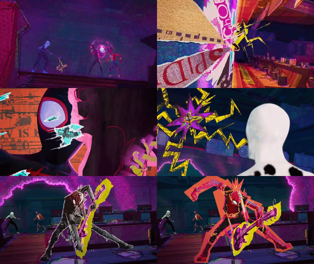
Miguel and Hobie making their entrances (I love that they both get a slow-motion reaction shot from another spider-person as they enter)
#someone with more media knowledge than me could probably go into the symbolism of Gwen and Miles-#both getting a slow mo reaction shot as Miguel and Hobie appear#and something about Hobie and Miguel being the only spider-people to get this reaction from someone as they enter#also if you thought I was done making Hobie GIFs you're dead wrong! I'll never stop!!#I've got a few more ideas for some GIFs I wanna make but as always I'm open to suggestions <3#I've just been focusing more on my fic lately so I haven't made that many GIFs but I'm not done yet!#also I just love the reaction shot of Gwen! It's just gorgeous! Love the colours! The contrast between the reds and blues! <3#miguel o'hara#spider man 2099#gwen stacy#spider gwen#hobie brown#spider punk#miles morales#spider man#across the spider verse#across the spiderverse#spider man across the spider verse#atsv#my post#my gif#my gifs
475 notes
·
View notes
Text
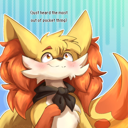

go read PMD: The Rogue Team by @teeterarting now
textless edits here!


erin is so wonderful and tabor is such a cheeky bastard your honour they are awesome i love them both so much
Reading this comic is like watching an anime; it's so wonderfully drawn and put together AND we get super engaging characters and a fantastically crafted world? Loving seeing this comic come to be, and ever-excited to see where it'll go! Check it out if you haven't!
#pokemon#pkmn#art#pokemon mystery dungeon#pmd#fennekin#treecko#pmd the rogue team#OKAY BUT THE WAY TABOR USES SEEDS IS SO COOL TOO BTW#LIKE I WAS THINKING man i haven't really seen anyone use seeds orbs or wands and the such as like their main thing#THIS IS JUST COOL MAN#and everyone is so EXPRESSIVE and every panel is GORGEOUS#sometimes i need to reread a page because my brain gets hooked on all the pretty colours
440 notes
·
View notes
Text


183 notes
·
View notes
Text
beautiful bb
#he’s so actually gorgeous#i love his colouring#dat dark hair w his light eyes#the way black looks on him hhhhhh#his lil look n nod he gives#the hat n the hair#i love this clip he so pretty#i need him to devour me#chris sturniolo#matt sturniolo#nick sturniolo#sturniolo triplets
126 notes
·
View notes
Text
Victoria’s Secret runways in the 2000’s will never be topped


#victoria’s secret#runway#modeling#2000s#lingiere#fyp#tumblr fyp#fashion model#brazilian bombshell#vs#tyra banks#candice swanepoel#adriana lima#alessandra ambrosio#gisele bundchen#heidi klum#karolina kurkova#aesthetic#xoxoxo#2000s fashion#so me#time travel#colourful#pretty#skinnnyy#perfection#gorgeous#wish it was me#2000s aesthetic
104 notes
·
View notes
Text
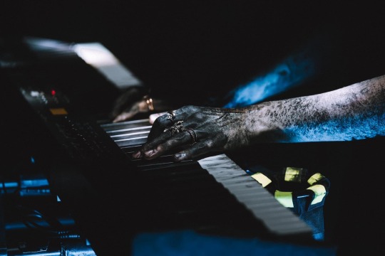
i am not seeing enough of this photo going around and just want to bring it to the dash because it might be one of my most favourite photos ever :)
source
#sleep token#sleep token vessel#the composition of this photo is gorgeous#i cannot get over the colour#especially the contrast between vessel’s skin and the paint. he looks so pale and the paint is so dark it’s beautiful#also completely hung up on the fact that the rings on his left hand are all ocean themed#the streaks of paint on the keys oh my god#it’s really not fair that a set of hands should be so devastatingly beautiful#ramble on exie
431 notes
·
View notes
Photo


Wally Darling from @partycoffin’s Welcome Home project!
I’m enamoured with this artist’s designs, they’re so comforting and wonderful. I couldn’t resist drawing this little neighbour a few times! ʕノ•ᴥ•ʔノ
#welcome home#wally darling#partycoffin#josie's art#the horror aspect is also cool and super interesting but the ART is just so amazing!!! the warm retro style is gorgeous#all the patterns and colours make my lil heart go doki#and heart eyes for this weird lil man
739 notes
·
View notes
Note
hjello. gabriel. in a dress. of your choosing. perhaps. :3
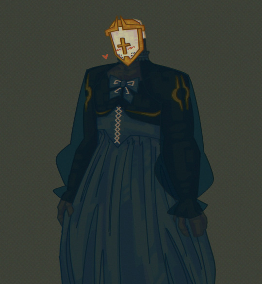
voted heaven's prettiest boy five thousand years in a row
#ultrakill#gabriel#creations of raptor#the dress i used as reference was a much lighter blue but i fucked with the values and he just looked SO good with these colours#i couldn't bring myself to change it back#he's so gorgeous i love him so so much
230 notes
·
View notes