#is this subtitle font better help
Explore tagged Tumblr posts
Text

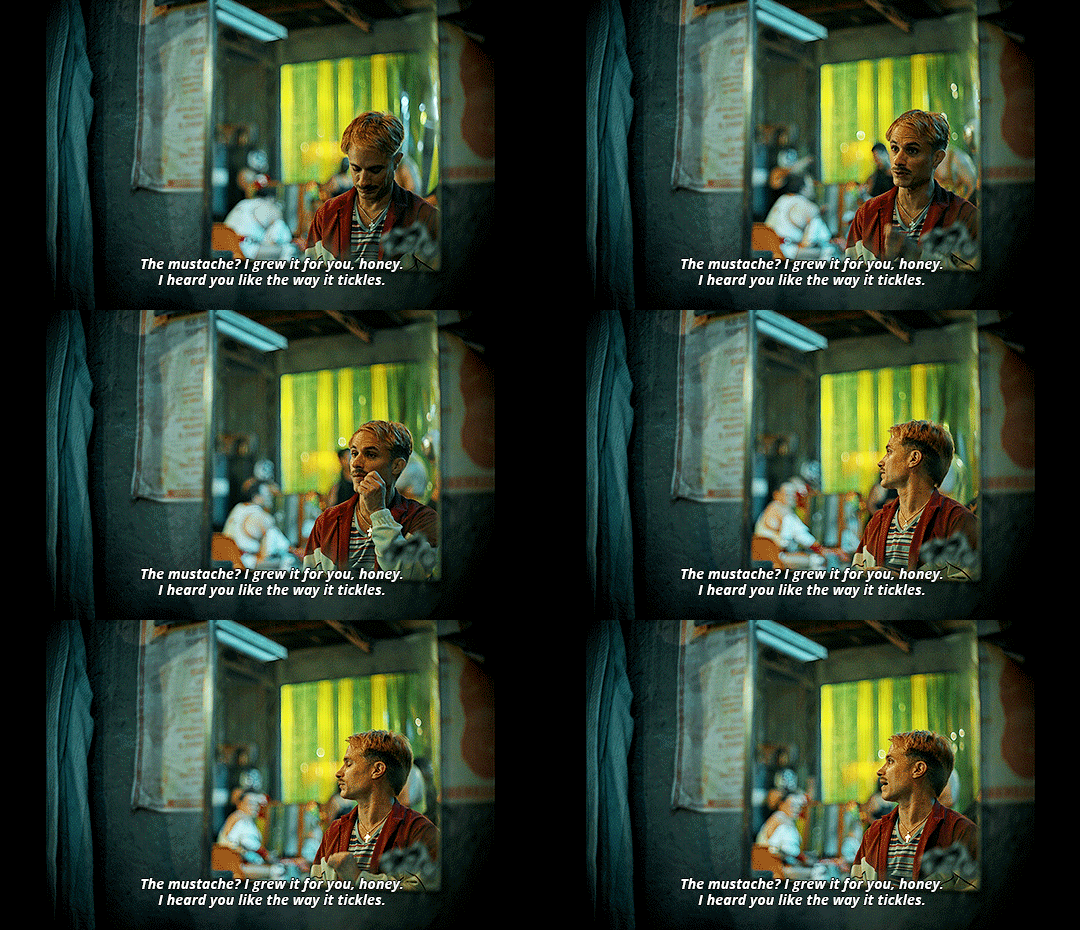
Cassandro (2023, Roger Ross Williams)
#cassandro#cassandro 2023#roger ross williams#gael garcia bernal#murder clown#filmtag#filmedit#filmgifs#ggbedit#is this subtitle font better help#gifs#usertennant#userlyudmilla#electricdreamachine#bluemoonperegrine#always publishing when 2 people are here sjdhf#matias penachino#bc lookkk#jc molina#too!
156 notes
·
View notes
Text
what I think your relationship would be like with the family if you were dating gideon
pairing: gideon gemstone x fem!reader
shamlessly going to mention that this is kinda self insert, oops
jesse: oh i think he'd love you, but in a weird way that boosts his own ego. i feel like he'd pick on you a little bit (quickly chastised by amber, gideon or eli "leave gideon's poor girlfriend alone"), but he would 100% love being able to say my son's got a girlfriend and he's definitely marrying up. i think he'd cry if he thinks about you two settling down. he’s also the king of accidentally bonding with you over things like conspiracy documentaries and then refusing to admit it. I never said I liked that Flat Earth one, I was just watchin’ it to prove ‘em wrong. don't twist my words.
amber: based off of season 1, i feel like she definitely has a soft spot for gideon. once she realizes that you're really sticking around, i think she'd really like having a daughter-in-law and get all the things she missed out on with her boys. im talking shop 'til you drop, frozen yogurt, spa days, etc. you mention offhand that you like a candle she’s burning? she buys you three and a new sweater. you'd also be able to count on her to knock some sense into gideon if he's being stubborn.
eli: he's the one that gideon really wants to impress, so you're nervous the first time you meet him, afraid that you'll upset him, but he's so nice. the one time you end up sitting at a table alone, gideon and amber come back to find you and eli in literal tears from laughing so hard. he absolutely adores you because you make Gideon better. he’ll quietly pull you aside and tell you, I’m glad he found someone who really sees him. it reminds him of aimee-leigh taking a chance on him.
judy: gives you shit for a week and one day she stalks up, shoulders square and asks if you really love gideon. when you say yes, she tones down the insults and jabs. if you're the kind of person who can dish it back, you help her come up with complicated insults for her brothers. suddenly you’re bonding over iced coffee and she lets you borrow her clothes (I can't have you looking a mess next to me). she lets no one borrow her clothes.
bj: totally has no idea how to talk to you. he knows you're young, and kids like memes, right? he asks you about grumpy cat and impact font. you think he’s kidding until he shows you his meme folder, and it’s just Bad Luck Brian and he's in literal tears. after that, you have weekly internet lessons, vine comp watch parties, celeb gossip sessions, and a notebook full of modern slang. he hasn't quite made it to skibidi, but he loves "wtf is up kyle" and as an optometrist, iridociclytis. he also manages to use rizz in every context but the right one (he'd once said: who wants dessert? I’ve got rizz crispies!)
kelvin: ally. similar to BJ, i fear you'd keep him up to date and help him out with prism. kelvin is your ride or die. he calls you “babygirl” platonically and FaceTimes you from Sephora for opinions on moisturizer. he’s forever asking for help putting together his little fits for Sunday services, asking both you and keefe is this too much glitter or just enough Jesus?
keefe: ever the oddball, you walk away confused from every conversation with that man. in the moment you think you get it and you're nodding along, but the moment you're more than ten feet away from him, you're just absolutely lost. that being said, he knows the best indie films. he shows you one that changed his life. it's in nepali. you watch it without subtitles. you've never been the same.
pontious: that boy couldn't give less of a shit if he took one right then and there. you're the only person who he can beat in that racing game he and his brothers play. he acts like he doesn’t know your name even after a year of knowing you, but not in a mean way—in a “he literally doesn’t care enough to store the info” kind of way. you’ll walk past him and hear, Ay, Gideon’s lady… girl… woman. You want the rest of this Red Bull? he’s been drinking it for an hour. it’s warm. you politely decline.
abraham: the littlest of the gemstones is a tough nut to crack. he just stares at you at first. no words. no expression. just intense eye contact from across the room, like a little FBI profiler in a Minecraft hoodie. until you give him a share size pack of skittles and buy him mcdonalds when amber asked you to pick him up from practice on your way to the compound
baby billy: he immediately tries to ask if you have funds to help him get his christian based leisureware off the ground. i feel like you'd be one of the only people he would be able to take critiques from without an outburst. that being said, he did make you cry twice
aunt tiffany: you call her aunt tiffany right off the bat and she loves you immediately. she once helped you curl your hair before an event and you constantly have to set aside time when she comes to town to let her do some hairstyle on you.
#gideon gemstone#gideon gemstone x you#the righteous gemstone#gideon gemstone x fem reader#gideon gemstone fanfic#gideon gemstone x reader#the righteous gemstones x reader#the righteous gemstones x you
160 notes
·
View notes
Text
(Link leads to download links, script file, and translation notes)
Here’s some context for why we did this: the official English subtitles for this movie are dubtitles, or in other words, the English dub script with names and terms swapped out and pasted on as subtitles. There are a few lines changed here and there, but almost all of the lines are a dub transcript in practice. Dubs are a very different form of adaptation that have their own unique requirements, so doing something like this is really bad translation praxis, and to be honest, it’s disappointing to see yet another major piece of Digimon media be stuck with subpar translation standards, again.
Since I figured that it would be helpful to have a more precisely done translation out there, if at least for reference, I went ahead and retranslated the entire thing from scratch.
As far as casual viewing goes, I’ll fully admit that there are a lot of places where the official version is punchier and has better flow than mine, since they had license to adapt things more freely than a fan translator like me would. But once you go beyond that, the official subs have the following issues:
Since they’re actually dubtitles, there is a substantial mismatch between what’s written in the subtitles and what’s actually being said in Japanese to an extent far beyond what should be acceptable for subtitling. As I said earlier, I personally believe they’re still decent enough for casual viewing purposes, but there are enough differences in details and nuance that would matter for people who want to analyze the movie more thoroughly.
The official translation has a number of issues that affect consistency with Adventure series themes, timeline, and lore in places where there were no such issues in the original Japanese dialogue. (This is a problem that also affected LAST EVOLUTION Kizuna‘s official translation.) This is something that can be a huge deal for a lot of Digimon fans, so while it’s not something that would have led to this decision by itself, it was a huge factor.
Originally, I was only planning to release a script file to be used with Blu-ray footage, but it seems that all of the official English subbed/dubbed releases have animation errors that were corrected only in the Japanese Blu-ray, so I went ahead and put together my own encode based on the latter. I’ll take the encode down if they somehow decide to put out an updated release that fixes all of these problems, but…seriously? In 2024? And after the disaster that was LAST EVOLUTION Kizuna‘s official release, too? Come on.
37 notes
·
View notes
Text
some people were asking about the font settings on my gifs so if anyone's curious:
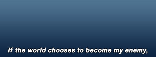
i haven't really felt the need to change the font i use in years; it's Ariel Rounded MT Bold. i usually keep it Strong but you can experiment with that if you like the other styles

for the other settings i just use a bit of stroke and drop shadow:
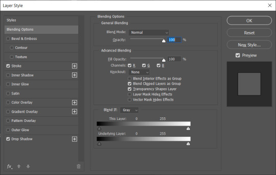
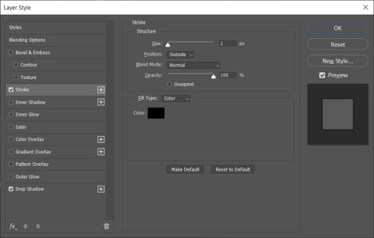
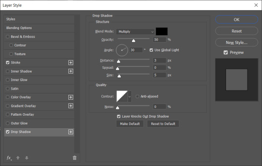
one different thing i do which i don't think most people do is i duplicate the subtitles on top of each other - mainly to make the drop shadow deeper and make the text stand out in front of the background better
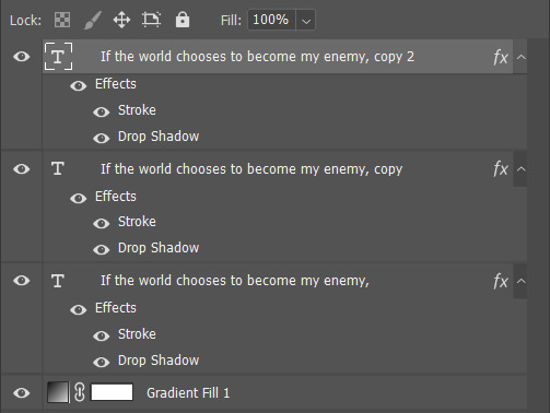
that's pretty much it! like i said, i'm pretty happy with these settings so i haven't felt the need to change them in ages. the only change i make is how big the font is depending on how big the gif itself is. i hope this helps!
#gif tutorial#font tutorial#subtitles tutorial#yeah i remember i was never perfectly happy with the text on my gifs back in the day#so i couldn't have been happier when i worked out this combination and i've stuck with it since
95 notes
·
View notes
Text
On Online Accessibility
I painstakingly wrote this (or similar) out for a long, slightly ranty thread on BlueSky (which I had to restart several times as the app kept wiping it), so here it is in slightly expanded format with the points in the right order:
The Rant
I am literally BEGGING organisations, ESPECIALLY ones that are apparently supporting disabled people, to stop sending badly formatted, image-only mailouts.
This advice post is brought to you by a recent terrible email to a list of disabled people that was an Inaccessibility 101. (To their credit, they did respond fairly quickly with "Oh no! It was not supposed to do that!" and sent out a plain text one shortly afterwards. They didn't get all of the things below wrong, but this is a general "Here's how you can start to do better" list based on my - and others' - experience, including of personally getting it wrong.)
The List
If you feel that your formatting dream can only be fulfilled by a single large image, at least provide the means to access a plain text version of the relevant information. You've already had to type it, you can just copy-and-paste it elsewhere (alt-text or linked transcript, preferably both).
If you must use coloured text, please check that the contrast between it and the background is sufficient for people to access. You want to be able to ensure that they can read your message. There are plenty of sites that will check your Web Accessibility Standards, including this one, top of the Google search: https://accessibleweb.com/color-contrast-checker/
Unless accessibility standards have changed recently (and I'm happy to learn if they have), please avoid serifed fonts. Plain doesn't have to mean unpretty. Verdana and Tahoma are your friends, for example.
Plain backgrounds. But if you absolutely insist on having your text in front of an image, create a clear barrier between the words and the background (plain, thick outline or a box around the text like old-school subtitles). You want to minimise distractions.
Talking of which: paragraph formatting. Justified paragraphs will create distracting "rivers of white" that will make text processing difficult for e.g. folk with dyslexia or certain flavours of ADHD. Likewise, don't cram your lines too close together and distinguish clearly between paragraphs.
Don't make use of tiny images if people can't click through and see them in more clarity. And please try to describe your images, especially if they have relevant information in them. People who cannot process them will lose out, and you'll lose that connection. There are professionals who will describe for you (I'm one of them), or increasingly sophisticated apps.
Standard text emoji will be read aloud by screenreaders, so you don't need to supply descriptions for them, but do try to avoid long strings of them. Similarly, don't use a string of asterisks to divide sections. Imagine a robot voice saying asterisk asterisk asterisk asterisk asterisk each time. No. Use a line divider or even just a single *.
Please don't highlight text using underlining (too distracting), especially for text mid-paragraph. Use bold instead. Similarly, use italics sparingly, and certainly not for full paragraphs of text. If you want to highlight using colour, see point 2. above re: checking contrast.
If your hashtags are several strung-together words, make the beginning of each new word a capital letter e.g. #BetterAccessibilityNow to help both the screenreaders and folk who find it difficult to parse text generally distinguish between the words.
Some more thoughts:
"Why should I bother with all this? Surely it's only a handful of people who can't access stuff like this!"
a) Ugh. Bad attitude, friend.
b) But let's talk numbers of people not getting your message. Recent worldwide estimates: 49.1 million blind people. 224.1 million with moderate and 33.6 million people with severe visual impairment. 300 million people with colourblindness. 780 million (10% of the population) people are believed to be dyslexic.
It just makes business sense to not miss out on reaching so many folk. Let alone learning how to exercise empathy and thereby how to communicate with people who literally don't see the world as you do. And I know there's a spoons cost to making stuff more accessible - trust me, I know! But more and more platforms make it incredibly easy to add alt-text to your images, but there are always ways around it if they don't, and practising makes things easier.
And, while we're at it: subtitle your videos and provide transcripts for longer ones. Again: if you've already written a script, what's stopping you pasting it into another place for people to access as a bare minimum? And there are loads of reasonably priced transcription services out there (or do what I do and edit the auto-transcription)!
Anything to add (or correct me on)? Let me know!
#fay speaks#accessibility#visual impairment#dyslexia#adhd#blindness#colour blindness#color blindness#advice#know better do better#transcription
27 notes
·
View notes
Text
Assault Lily New Chapter: At the Seeds' Frontier / When the Bugle Blooms

Yurigaoka Fan Club is proud to present our English fansub of the stage play "Assault Lily New Chapter: At the Seeds' Frontier / When the Bugle Blooms."
Synopsis:
Yurigaoka Girls' Academy is preparing to take back Koshu from the Huge when four new Nests suddenly appear in the waters near Izu Oshima. The Garden dispatches Legions Alfheimr and Sanngrithr to remove the immediate threat. Tasked with the double duty of performing reconnaissance, Sanngrithr are the first to land on Oshima. On that island, Kondo Misaka—the captain of Legion Sanngrithr—encounters someone from her past that she thought she would never meet again. Izu Oshima is under the jurisdiction of the Gardens in Tokyo, and they suspect that the sudden appearance of these Nests is related to the unusual outbreaks of Huge that have happened in the city. The Inter-Garden Conduct Board sends the "Oshima Nest Survey Team", composed of selected Lilies from a variety of Gardens, to respond to the situation. But in addition to helping destroy the Nests, the Survey Team has a secret mission: that of investigating GEHENA's defunct laboratories on the island. Sanngrithr and the Survey Team find themselves fighting side by side on Izu Oshima, neither of them realizing that this battle is just the opening act of a much greater conflict…
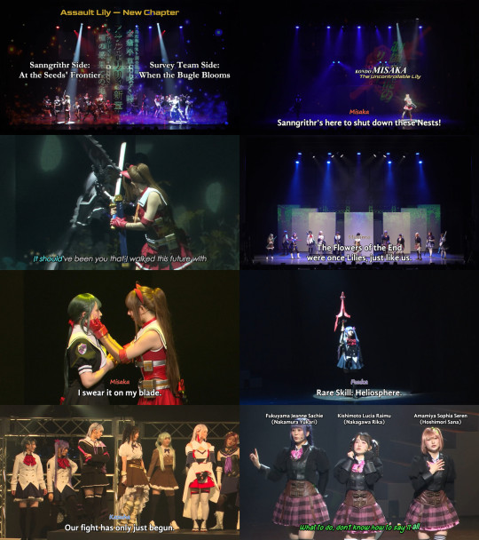
Download the subtitle files and other extras here
You will need the Blu-ray disc of the stage play to watch these subtitles. You can buy it from Pius's online shop.
Before watching, install all of the fonts in the Assault Lily New Chapter Font Pack for the best experience.
"[Yurigaoka] Assault Lily New Chapter - At the Seeds' Frontier - When the Bugle Blooms.ass" is the recommended subtitle file.
"[Yurigaoka] Assault Lily New Chapter - At the Seeds' Frontier - When the Bugle Blooms [No Names+FX].ass" is an alternate subtitle file that does not have character names above the dialogue, nor the fancy karaoke effects. This file may work better for watching on low-spec devices.
"Assault Lily Setting Materials featuring Legion Sanngrithr.pdf" is a full English translation of an informational booklet released by acus (the creators of Assault Lily) around the same time as this stage play. It can be read either before or after watching it, but we do recommend that you read it for the best experience.
"Translation Notes.pdf" includes notes on our fansub translation and on some elements of the Assault Lily setting that the play itself doesn't explain. Read it after watching the stage play.
Enjoy the play!
#assault lily#assault lily stage plays#asslily#fansub#fan translation#stage play#stage plays#butai#yuri
12 notes
·
View notes
Text


Hamtaro the Movie 3: Miracle in Aurora Village (Revamped)
This post is being released the same day as in Patreon, as a special occasion.
Today is a special day for kids all around the world, excited to unwrap their gifts from Santa.
But Santa does not only care for the kids, and you are all in the good list too!
Your gift is... A revamp of the third hamtaro movie!
This revamp is massive. Just like with the second movie, we got hold of a subtitle file with hiragana for the whole movie, and that helped us offer a way better translation than we could have dream of.
Pretty much every sentence of this movie has been revamped in some way or another, a good chunk of them has been changed completely. Since the first revamp of this movie was made 10 years ago (the first version of the movie dates from July 2011 to celebrate Bijou's birthday, and the first revamp was released on New Year's Eve 2013), we can only encourage you to watch it again because it's a completely new experience!
For the team this movie is very special, specially for André, as it was the main motivation fueling him to devote to Hamtaro and search for the, back then, rare movies... which led to all of these years of Ham Ham Paradise and Paradise Hamsubs existence. Going back to the movie, as we mentioned, the changes are so big it makes us a little embarassed that we even dared to release the previous versions, as they're terrible. Back then we were amateurs and frankly, the movie does have a lot of sentences that are incredibly hard to grasp, we had trouble even with the hiragana on our hands!
But the results now are something that make us proud.
Due to time constraints, we have not updated the old karaoke effects (albeit they're not terrible, they could have been improved a little with new effects), but we have fixed a few karaoke lines, made the font more readable, and overall improved the timing. Luckily, back then we already did our best and created really cool effects for most songs, so that was a time-saver!
This year has flown by and we have little Hamtaro left to work on, but we can still revisit some of the old stuff that can use an improvement like this movie, and we hope you enjoy it.
Merry Christmas and happy holidays to all of you! Enjoy this time with your family and friends and enjoy a little by yourself with Hamtaro and friends too.
Please enjoy!
You can watch online or download the movie here: Watch Hamtaro Movie 3 - Miracle in Aurora Village.
Please consider supporting us on Patreon or Ko-Fi!
30 notes
·
View notes
Text
📝 Blog 7 – Feedback & Iteration: Improving Through Critique
After sharing my initial concept and media drafts with classmates and my tutor, I received several insightful pieces of feedback that helped me refine both the messaging and the visual elements of my project.
🔹 Key Feedback:
The text on Poster 2 (“Fridge of the Forgotten”) was hard to read in low light.
Poster 3 had strong information, but visually felt crowded.
The tone of Poster 1 was striking but needed clearer context to fully convey irony.
🔁 My Responses:
I adjusted the lighting and added a subtle glow around the text on Poster 2 for better legibility.
On Poster 3, I reduced the number of elements on the right side and added breathing space between statistics.
For Poster 1, I added a small subtitle and adjusted the font weight to better guide viewer interpretation.
This process made me realize how essential audience testing is—even if the idea seems “clear” in your head, the message can be interpreted differently without proper visual direction.
2 notes
·
View notes
Note
special interest special interest
(share! I wanna hear the special interest about accessibility features!)
:D
Okay so first here is a playlist about this that I watch all the time
So basically all of my hyperfixation on this started with me playing games and sometimes having trouble. I have a slow reaction time and a lot of games needed me to think quickly. Or I would use the only controller we had and it was small and hurt my thumbs.
Eventually I found the accessibility settings for a lot of games and became curious as to how they differed between games. It is also nice to check if there are things that make your gaming experience a little bit more fun. Because playing games is meant to be fun.
It is wild to see what games can come up with. Some games have nothing or very little in terms of accessibility, but others have so many features that can be turned on and off to help with any problems.
Anyways I also like to think of what I would do if I made a game, or anything for that matter, to make it more accessible. The features also are not just made for disabled people. I know I use some accessibility features in a lot of games I play. Technically adhd is a disability but that should not really affect how I play games.
It is just fun to look at stuff that 90% of people won't see and will never think about. Stuff like pressing a button once instead of holding it. Or being able to change the font. Or having subtitles in a game you would not expect (I play Minecraft with subtitles)
There are just so many things that are done per game. It is just interesting to see. I highly recommend people check the accessibility features of the games they play, sometimes you find a setting that makes the whole game that much better.
#answers#hmmm so much more to say but i would need to be prompted on specifics since i am unsure how to say them here#i wake up and i am able to ramble about the funny stuff i love
5 notes
·
View notes
Text
How to Add Subtitles and Captions to Videos (Step-by-Step Guide)
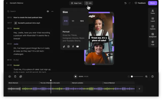
In today’s fast-paced, scroll-happy world, videos need to grab attention immediately. But beyond eye-catching visuals, one of the most overlooked ways to improve engagement and accessibility is by adding subtitles and captions.
Subtitles not only make your content more inclusive (especially for viewers who are deaf or hard of hearing), but they also boost your video’s reach on social media since many users watch without sound. Plus, they improve SEO by making your content more searchable.
In this guide, I’ll walk you through exactly how to add subtitles and captions to your videos — even if you’re not a tech wizard.
Step 1: Write a Transcript
Start by writing out everything that’s said in your video. You can do this manually by listening and typing, or use automatic transcription tools like Otter.ai or Descript.
Double-check your transcript for accuracy — small errors can confuse your viewers and make your brand look careless.
Step 2: Choose Your Subtitle Tool
There are plenty of tools to add captions. Some popular (and beginner-friendly) options include:
YouTube’s built-in subtitle editor: Great for YouTube videos. Upload your transcript or type it directly in their editor.
CapCut: Perfect for TikTok, Instagram Reels, and short-form videos. Offers auto-captioning with easy customization.
Adobe Premiere Pro: Professional choice for more control and styling.
VEED.io: Simple, web-based tool for fast captioning.
Step 3: Sync Your Text with Video
Once you import your transcript, the tool will ask you to sync it with the video’s audio. Automatic tools can help, but always watch your video to fine-tune the timing.
Make sure each caption appears long enough to read, but not so long that it covers important visuals.
Step 4: Customize the Style
Captions don’t have to be boring white text. Adjust the font, size, color, and background to match your brand style.
A good tip: Use high-contrast colors so that text is easy to read on any background.
Step 5: Export and Upload
After syncing and styling, export your video with the embedded captions, or export an SRT file (a separate caption file) to upload alongside your video.
Most social media platforms support SRT files, making it easy to add captions even after the video is uploaded.
Bonus: Improve Your Video’s Reach and SEO
Adding subtitles isn’t just for accessibility — it helps algorithms understand your video content better. More understanding = more reach.
Want to save time and ensure professional-quality subtitles? Our team at Branding Hosts can handle everything for you, from transcription to styling and syncing.
Final Thoughts
Adding captions and subtitles to your videos isn’t just a nice extra — it’s essential in today’s digital world. You’ll make your content more inclusive, boost watch time, and potentially reach thousands of new viewers who might otherwise scroll past.
If you’d rather focus on creating amazing content and leave the editing to experts, check out our video editing services at Branding Hosts. We’ll help your videos stand out and make an impact.
0 notes
Text
How To Write A How-To Article*
Since the dawn of humanity, how-to articles instructing people on what to do to accomplish varying tasks have been ubiquitous. Even before the advent of recorded writing, these lovely pieces have magically fallen out of the sky to guide confused civilians on daily work.
With that being said, you might be wondering how to write a how-to article. After all, you are reading this on a website dedicated to posting the writings of others, Tumblr - perhaps as a current or aspiring writer as well.
Whatever the case, this piece will tell you how to write a how-to piece. I can fully guarantee that you will be a successful author making billions of dollars if you follow my advice.
Avoid Research Like The Plague
So there’s this fascinating topic you want to write about, like spaceships or the psychology of goldfish. Sounds great, right? There’s just one tiny little, albeit somewhat glaring, problem: you have next to no clue about what your subject of choice actually entails.
Conventional wisdom says this means you should go and research your chosen topic to help make your article more accurate. Scour the Internet for reliable sources, maybe even check out a library if you’re into books. To that I say: they’re spewing nonsense.
Why would you waste your time actively researching your subject matter when you can just use the power of your imagination? Creativity is good for your brain and your heart. Shouldn’t you use that instead of relying on those pesky facts from other people?
And if your article turns out hilariously inaccurate, who cares? Your goal isn’t to educate people, ever. It’s only to entertain. Whoever disagrees with that notion needs to take an ice pack cooled chill pill.
Don’t Cite Your Sources
You know what’s even better than not doing any research? Plagiarism!
Yep, that’s right. Contrary to what just about every sane person in your life has probably told you - from your teachers and professors to, perhaps, even your own parents - plagiarism is actually a very useful tool for published work. There are just so many reasons why.
Citing your sources, whether through fancy academic formats like MLA or APA stylization or just simple links, is a dreadfully arduous task. It’s just so much work to have to copy and paste a website link into an article or heaven forbid, have to look up how to cite it more formally. And looking at a book’s title and author? Pffft, who would want to do that?
The point I’m trying to make here is that plagiarizing others is a lovely thing. Contrary to what I said in another article of mine which I totally no longer stand by, I now believe in its multiple useful benefits. Just try it for yourself! [1]
Disorganization
Finally, you can forget about organizing your article in any readable way!
Make your paragraphs so long people with 20/20 vision will need glasses to see them. Write your steps in media res without ever making it clear in any way that you did not place them in the order people should follow. Also, stay away from subtitles as much as possible. We all know that no one likes subtitles.
As for your font…go with the most fancily styled calligraphy in half of your piece before switching to a more robotic one in the other section for no reason! And while you’re at it, typos which absolutely butcher both grammar and orthography are your best friend!
Nothing could possibly go wrong.
…
To conclude, writing a how-to article is one of the easiest things a writer can do. Just don’t question my tips. Ever.
Any other thoughts on this? Let me know in the comments!
*This article is satire. Please do not take it seriously.
Sourcing
1: https://medium.com/@SnarkyLisa/dealing-with-being-plagiarized-online-and-other-similar-things-cc5312a531d6
Other Socials
Twitter/X: https://x.com/snarkylisa
Main Tumblr: https://snarkylisa.tumblr.com/
Medium version: https://medium.com/@SnarkyLisa/how-to-write-a-how-to-article-31745d0a5e79
#article#writing#medium#essay#tumblr#tumblr stuff#rant#ranting#analysis#life#medium.com#satire#humour#humor
0 notes
Text
ClipsMateAI Review: 3D Viral Videos in 3 Clicks!
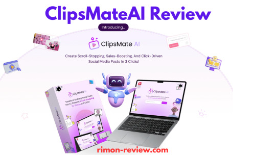
Introduction
Hey, Welcome to my ClipsMateAI Review! Are your videos getting lost in a flood of posts? You’re not the only one. Social media is crowded. It’s tough to get noticed, earn clicks, or make sales.
But don’t worry — there’s a better way.
Meet ClipsMateAI. It’s a smart 3D video tool made to grab attention fast. It helps you stand out, boost views, and grow your income.
No tech skills needed. No learning curve. Just fast, eye-catching videos in a few clicks.
Whether you’re just starting or already creating content, ClipsMateAI makes it simple and fun.
What Is ClipsMateAI?
ClipsMate AI is the world’s easiest and smartest 3D video maker. It transforms text, images, chats, tweets, or more into powerful 3D videos.
With its drag-and-drop interface, you can create videos that grab attention and quickly increase sales. Without any technical skills and hours of work.
Perfect for those who want to stand out in a busy social feed and grow their sales, audience quickly. That means it’s 100% suitable for social media marketers, content creators, businesses, and agencies.
How Does ClipsMateAI Work?
Step#1: Find eye-catching templates instantly Just type in your industry, topic, or style. In seconds, ClipsMateAI will search its vast library and find the perfect 3D video templates — just for you.
Step#2: Customize and Enhance Use advanced customization options to add your brand colors, text, images, and music. Instantly add 3D elements, animations, and effects to make your content pop.
Step#3: Export and Monetize Let the AI do the hard work. Your video is rendered and optimized in real time. Download it in the perfect size for any platform. Post, engage, and watch your traffic grow.
ClipsMateAI Standout Features (What’s Inside?)
Pattern Interrupt Animations — Grab attention fast with cool scroll-stopping effects.
AI Script-to-Video Builder — Turn your ideas into videos instantly. Just type, and let AI do the rest!
Chat, Tweet & Image to Video — Convert anything into engaging videos in seconds.
1000+ 3D Animated Objects — Spice up your videos with dynamic elements.
Smart Captions & Auto Branding — Add captions, subtitles, and your brand style automatically.
AI Video Performance Insights — Get tips to make your videos perform better.
Cloud Storage & HD Export — Save videos safely and export in crisp HD.
1000+ Music Tracks — No copyright worries — pick the perfect sound from our library.
Full Customization — Change fonts, colors, logos, and layouts to match your vibe.
Monthly Template Club — Fresh, trendy templates every month (upgrade needed).
Done-For-You Video Services — Too busy? Let our experts handle it (premium add-on).
Get More Info>>>
#ClipsMateAIReview#ClipsMateAI#ClipsMateAIFeatures#ClipsMateAIOverview#ClipsMateAIDemo#ClipsMateAIPricing#ClipsMateAIOTOs#ClipsMateAIBonus#ClipsMateAIBonuses#ClipsMateAIHonestReview#ClipsMateAIUpsells#ClipsMateAICoupon#ClipsMateAIApp#ClipsMateAISoftware#WhatIsClipsMateAI
0 notes
Text
5 Golden Rules of Video Editing for Social Media
In today’s digital world, your brand is only as strong as your content — and video editing is what separates average from outstanding. Especially on social media, where attention spans are shrinking and competition is fierce, you need video content that’s fast, polished, and emotionally engaging.
Whether you’re a small business owner, content creator, or marketing strategist, following these five golden rules of social media video editing will help you stand out, grow your reach, and drive more results.
Let’s dive into the best practices trusted by Canada’s leading video experts — Influx Media.
1. Hook Viewers in the First 3 Seconds
Why It Matters:
On platforms like Instagram, TikTok, and Facebook, you have just 3 seconds to catch someone’s attention.
How to Hook Them:
Begin with motion: quick cuts, bold text, or fast visuals
Use a provocative question or statement
Incorporate sound bites or trending audio (with licensing where needed)
At Influx Media, we design every frame to keep the viewer watching beyond the scroll.
2. Edit for Each Platform
Each social media platform has its own video specs and audience behavior.
Format Guide:
Instagram Reels/TikTok: Vertical (9:16), fast-paced, under 60 seconds
YouTube Shorts: Vertical, story-focused, with subtitles
LinkedIn: Square or landscape, clear captions, slightly slower pacing
Facebook: Horizontal or square, thumbnail-driven
LSI Keywords: vertical videos, short-form content, video specs for platforms, social content optimization
3. Design for Silent Viewing
Up to 85% of users watch videos on social media with the sound off.
Silent-Optimized Editing Tips:
Always include captions or subtitles
Use text overlays for key takeaways
Focus on visual storytelling and clear sequences
This silent-first mindset is part of every video strategy we implement at Influx Media for clients across Canada.
4. Keep Your Branding Consistent
Your videos should always reflect your brand identity.
Branding Essentials:
Use your brand colors and fonts
Incorporate a logo watermark
Maintain a consistent tone and style
Videos should not only look good — they should feel like you.
LSI Keywords: brand video design, visual identity, branded content, motion branding
5. Keep It Tight and Purpose-Driven
Every second in a video should earn its place.
Smart Editing Techniques:
Trim all unnecessary footage
Use jump cuts to maintain momentum
Insert a strong call-to-action (CTA) at the end
Remember: a 30-second video with a clear message is more powerful than a 2-minute video that meanders.
Why Choose Influx Media?
Influx Media is Canada’s premier studio for video editing for social media. We help businesses craft content that doesn't just look good — it performs. Whether you're targeting TikTok, LinkedIn, or YouTube, our editing team ensures your videos hit the mark.
From strategic cuts to full post-production, we’re here to elevate your brand through every frame.
Frequently Asked Questions (FAQ)
1. Why is video editing important for social media?
Video editing brings structure, clarity, and engagement to your content. On social media, attention spans are short — editing ensures your message hits fast and hard, increasing shares, likes, and conversions.
2. What’s the best video format for social media platforms?
Instagram & TikTok: Vertical (9:16)
LinkedIn & Facebook: Square (1:1) or Horizontal (16:9)
YouTube Shorts: Vertical (9:16)
Editing videos specifically for each platform ensures maximum reach and engagement.
3. Can I edit videos myself or should I hire a professional?
You can edit on your own using apps like CapCut or iMovie. However, professional editors like Influx Media offer creative insight, faster turnaround, and content optimized for results.
4. How long should a social media video be?
Instagram/TikTok: 15–30 seconds
LinkedIn/Facebook: 30–90 seconds
YouTube: 1–3 minutes
Shorter videos tend to perform better, especially when edited for retention and CTA.
5. How can I get my video blog to rank on Google?
Use semantic SEO and LSI keywords
Optimize metadata and titles for keywords like video editing for social media
Submit URLs via Google Search Console
Share on social platforms like LinkedIn to drive engagement quickly
Ready to Boost Your Video Strategy?
If you're ready to elevate your brand with powerful, scroll-stopping content, reach out to Influx Media today. We offer full-service video editing for social media, crafted specifically for Canadian businesses looking to stand out.
👉 Visit InfluxMedia.Studio to get started.
0 notes
Note
hi! do you have any recommendations on how to make an aesthetic blog? like how to choose colors? where do you get the dividers from? or which style to choose? thank you!!!
hi anon! this is how i personally style my blogs ♡
there’s a few different ways i choose colors…
the first is collecting images (usually from pinterest) that have a certain aesthetic/vibe i want my blog to embody. i usually start with finding a header—as that tends to be the most difficult image for me to find the right size for—and design the rest of my blog to match.
from there, i find a profile pic that compliments my theme, and sometimes i play around with filters and edits until i have one that matches better. (unfortunately, i don’t really have any editing tips because i literally have no idea what i’m doing; i tend to just play around with settings until i like how it looks lol)
as for your color scheme, i recommend choosing a palette of three different colors: one for your font, one for your background, and one for your accent. i find it looks better if you choose either one dark shade for your background and two lighter shades for your font and accent OR one lighter shade for your background and two darker shades for your font and accent. it makes your blog easier to read when your font and accent colors contrast your background!
there’s two ways i find my color scheme: either i match my header and pfp by using an app like “color picker” which allows me to upload a photo and determine the different colors (and their hex codes) within a specific image, or i search pinterest for a color scheme, using their hex codes on my blog and matching my pfp and header to it that way!
to get font colors tumblr doesn’t provide, you can use an html code which this post explains quite well.
to get fonts tumblr doesn’t have, you can you a website like font changer to copy and paste text. (i recommend only using this for headers and subtitles though, because these fonts aren’t easy to read in long blocks of text!!)
lastly, if you want cute little symbols you can search a website like this and paste your favorites into your posts!
as for dividers, there’s lots around tumblr for anyone to use, so you’ll likely be able to find ones similar to your color scheme simply by searching “dividers” and scrolling until you find something you like.
anyway, i hope this helped!! i really enjoy designing blogs, so if you have any more questions, let me know.
0 notes
Text
Why Zoom Live Captioning Services Are a Game-Changer for Virtual Events
Discover how Zoom live captioning services boost accessibility, engagement, and SEO—making your online meetings more inclusive and impactful.
In today’s virtual-first world, online meetings, webinars, and classes are the norm. But how do you ensure everyone stays engaged and included—regardless of their abilities or environment? Enter Zoom live captioning services, the unsung hero of virtual communication.
Whether you’re hosting a global conference or a small internal meeting, adding live captions can drastically improve how your audience interacts with your content.
1. Accessibility for All
Zoom live captioning services provide real-time subtitles, making your meetings accessible to people who are deaf or hard of hearing. This isn’t just a nice-to-have—it’s essential for ensuring equal participation. By enabling captions, you're making your content inclusive and compliant with accessibility standards.
2. Increased Engagement and Retention
Captions aren’t just for those with hearing challenges—they help everyone stay focused. People absorb information better when it's presented both visually and audibly. With Zoom live captioning services, attendees are more likely to stay engaged, retain information, and participate meaningfully.
3. Perfect for Multilingual Audiences
Going global? Zoom’s captioning tools support multiple languages. Whether you're training a remote team across time zones or hosting an international webinar, captions bridge language gaps and create a smoother experience for non-native English speakers.
4. SEO Benefits You Can’t Ignore
Here’s a bonus you might not expect—Zoom live captioning services help improve your content’s SEO. Transcripts generated from live captions can be indexed by search engines, making your webinars and recorded sessions more discoverable online. That means more visibility, more traffic, and better reach.
5. Professionalism That Sets You Apart
Using live captions shows your audience that you care. It tells clients, customers, and employees that you value inclusivity and communication. That kind of thoughtfulness boosts your brand’s reputation and builds trust.
How to Get Started with Zoom Live Captioning Services
Enable Zoom’s built-in captions: Zoom now offers auto-generated captions in real-time, right within the platform.
Use third-party providers: For higher accuracy or support for specific industries, professional captioning services can integrate directly with Zoom.
Customize the experience: Adjust font, size, and positioning so captions fit your brand and are easy to follow.
Promote caption usage: Let your participants know that captions are available—and encourage them to use them.
Final Thoughts
Incorporating Zoom live captioning services isn’t just about checking an accessibility box—it’s a smart, strategic move to elevate your virtual events. From increasing engagement to improving SEO and demonstrating inclusivity, captioning is a simple tool with powerful results.
Ready to make your next Zoom meeting unforgettable? Start with captions.
0 notes
Text
Overcoming Arabic Gaming Localization Challenges
Bringing a game to Arabic-speaking audiences is more than just translating the words. It requires thoughtful adaptation to ensure the game feels natural and enjoyable. However, developers face several Arabic gaming localization challenges along the way.
Right-to-Left Language Layout
One of the biggest technical challenges is the Arabic script’s right-to-left direction. Game menus, dialogue boxes, and on-screen text often need a complete redesign to fit this layout properly. It’s not just about flipping the text — the whole user interface may need to be mirrored, which affects everything from button placements to animations.
Dialects and Language Style
Arabic isn’t a one-size-fits-all language. Modern Standard Arabic works for most situations, but it can feel formal or stiff for casual, fast-paced games. On the other hand, regional dialects like Egyptian or Levantine sound more conversational but may alienate players from other regions. Striking the right balance between accessibility and authenticity is a tricky decision for developers.
Cultural Adaptation
Cultural references, jokes, and symbols that make sense in one region might confuse or offend players in another. For example, games with themes or imagery that clash with local values might need alternative designs or rewritten dialogue. Even character names can require adjustments to ensure they resonate with an Arabic-speaking audience.
Voice Acting and Subtitles
High-quality voiceovers bring games to life, but finding talented voice actors fluent in Arabic — especially for specific dialects — can be challenging. Poor voice acting or awkward phrasing can pull players out of the experience. Subtitles need to match the pacing of the game too, ensuring they appear and disappear in sync with the action.
Technical Limitations
Arabic script requires specific fonts and text handling to display properly. Some game engines struggle with this, leading to broken letters or poor formatting. Developers may need to invest extra time and resources to ensure the text looks clean and is easy to read.
Arabic gaming localization challenges can be tough, but getting it right means creating a better, more immersive experience for players. When done well, localization helps games feel like they were made specifically for the Arabic audience — and that’s what keeps players coming back.
0 notes