#is great for golf
Explore tagged Tumblr posts
Text
everything is about golf for this man. that's a disease if you ask me
#shinee#minho#talking about how if he could never live in SK again he'd move to Japan bc at least he can speak the language and the weather#is great for golf#i raise him the obvious perk of TVXQ! having more frequent Japan tours than domestic ones and therefore he can see his f*cking bf#Changmin whenever they come over
2 notes
·
View notes
Text


Juicy golf babe Paige Spiranac!
#paige spiranac#rocking body#great legs#great thighs#great rack#legs for days#legendary legs#great body#great hips#dancer body#power thighs#bikini#golf babe
1K notes
·
View notes
Text

Can you hold my wood
#so hot 🔥🔥🔥#so hot and sexy#sexy and beautiful#gorgeous#absolutely amazing#female beauty#great body#stunninglybeautiful#absolutely perfect#amazing beauty#smokin hot#beautiful women#gorgeous legs#beauty legs#smooth legs#female legs#legs#lovely legs#amazing body#beauttiful girls#legs and heels#crossed legs#great legs#short skirt#golf course#golf babe#stunningly gorgeous#stunningly sexy#hot and sexy#so hot
422 notes
·
View notes
Text
I bet that Bruce Wayne and Tim Drake, as the Batfamily’s resident corporate America breadwinners, have to occasionally go play a round of golf to keep up appearances with WE shareholders. The only problem is that they’re both fucking terrible at golf.
And when I say they’re bad, like, holy shit, they are really bad. For two people who often have to save the universe with their intelligence, concentration, and ability to effectuate incredibly complex, precision-reliant plans, they are both somehow really, really fucking awful at golf of all things.
Bruce, at least, has the Brucie Wayne disguise to hide how absolutely awful he is at golf. Which totally works for him, because he hates the reminder that he is inherently terrible at something. So, whenever he’s dragged out for a round with Lucius and the WE board members, he just pretends to get super drunk, act a little more clumsy then normal, and hits on the caddy until everyone just writes him off as too much of an ditz to put any effort into his golf swing. It drives Lucius nuts, because he actually likes golf and he thinks Bruce is just pretending to be bad as part of his cover for Batman—there is at least one occasion where he asks Bruce to show a little more decorum on the course and actually try to play, and Bruce just… blue screens. Because in reality he is actually horrible at golf and he needs the excuse of “dumbass Brucie Wayne” or his ego will implode.
Tim, however. Poor Tim.
Tim, unfortunately does not get to play the idiot to cover up his absolute shit golf game. (There is only so much room in the family for idiots and he has to keep up appearances as Jack and Janet Drake’s son.) As such, he avoids any and all golf courses as much as possible—but everyone once in a while there’s a potential merger or business deal he needs to discuss with someone important, and the best way to get the deal done is on a golf course. So Tim has to spend the next three and a half hours of his life torturing himself through a round of golf. (He ends up losing twelve balls, taking seven swings on a Par 3, somehow broke his putter, and tripped into a bunker.) The only upside is that his pure determination to actually finish the round, despite how godawful he is, is usually what actually convinces the investors/partner/board members agree to work out a deal with him.
But it’s best (or worse) when Bruce and Tim play golf together. It isn’t often—stories of their infamously terrible golf games means that most people will only invite one of them at a time—but inevitably they do end up on a course together at one point, and holy fuck, it is a miracle they don’t burn the place down.
#as someone who’s dad works in corporate america and plays a shit ton of golf I can confirm that there are people out there who are THIS BAD#I mean my golf game isn’t great but it’s better then some people’s ngl#anyway I bet Tim and Bruce both have like a lifetime ban from the Augusta National#some of their fails have also definitely featured on ESPN#Conner (who is forced to play golf with Lex on occasion) is actually pretty good at golf but will never EVER play with Tim bc its painful#dc#dc comics#bruce wayne#batman#batfamily#batfamily headcannons#justice league#chaotic tim drake#tim drake#red robin#tim drake is a menace#tim drake is red robin#this is so stupid#golf course#golf#FOUR
384 notes
·
View notes
Text


This is so cute 🥰 - Wandee Goodday cast and crew members for the Pride march/month
Source: P’Golf Twitter
03/06/2024
#podd and his outfit 😊#fluke looks adorable as usual#thor thinnaphan#golf tanwarin#inn sarin#great sapol#fluke nattanon#podd suphakorn#yokee#Wandee Goodday#so so cute
741 notes
·
View notes
Text
I've Caught Up With Wandee Goodday, and here are some cons and pros (aka, am I ever burnt out on GMMTV)
HELLO. I'm back temporarily from my summer travels (before I travel again!). I was in Thailand! I should have brought a box of chappals to chuck at the GMMTV building for where Wandee Goodday has gone. Anyway, I need to process my thoughts on this show, so here we go. (And I apologize, I have NOT looked at the tag for this show, so I don't know if I'm repeating what other people are saying here.)
PROS

CONS
1) This show had so much brainrot potential! Remember the first, like, four episodes? Potential homophobia in multiple workplaces? Delicious bisexuality? Ace storylines??? Wandee's PUTZ deception and manipulation? Yak going along with it, why?? There was a lot going on here, a lot we could have chewed on.
I've been sitting on my historical review of Golf Tanwarin's The Eclipse for my Old GMMTV Challenge for about two months now because I can't get over how pissed I was that that show took some unnecessary, and frankly insensible, turns in part to showcase the damn center ship of First and Khao. I don't think Golf's WG has taken similar turns specifically to center the GreatInn ship, per se -- I just think the writing got messy and lazy right before WG's midpoint in general, and punched a lot of the excitement I had about the show right before I paused around episode 8.
Wandee Goodday is an EXCELLENT example of how Thailand's hourlong QL dramas could be made INCREDIBLY more impactful, by way of forced editing and clarity, if Thailand could follow Japan's suit by making 10- to 12-episode series with 30-minute episodes.
The Dr. Ter storyline was over before it actually, really ended, in, what episode was that, 9 or 10. It was over! Why drag it out? In Japan, that storyline would have been two episodes, mayyybe three, MAX. Shirasu Jin was barely in Kieta Hatsukoi for an episode before he was banished. Takeda Kouhei barely made it through two episodes of Minato's Laundromat 2 before he went bye bye! We don't need these middling dudes. There was enough happening with Dee and Yak to not need this Ter shit! Sorry, LOVE YOU PODD, but Ter was made irrelevant so early on, and then they actually had to work together on a huge case?! And NOW HE'S CHEESING ON TAEM? Like, no. We don't need this.
2) There's still a lot of confusion and conflict between Dee and Yak by last week's episode 11. Dee's got issues receiving love! This is big.
(By the way. Showing Dee ONE video of his parents cheesing on him as a newborn is NOT THE WAY to explain away future parental neglect as an older child. YIKES.)
I love that Yak wants to invest in Dee, and we do see Dee doing a lot of reciprocating there to Yak, but this parental neglect reveal, along with still not knowing enough about the back story of Dee's parents dying, is out of order and not helpful to me getting enough knowledge about Dee for me to feel a holistic sympathy towards him. This makes me wonder if romance is really Golf Tanwarin's bag: if Golf didn't have to focus so much on the DeeYak/YakDee romance, could we have gotten better emotional representations of these guys, gotten a better picture of WHO THEY ARE, before they got into each other? Maybe? I dunno.
3) Considering that homophobia in systems seems to be a theme that Golf is interested in, why did the show drop Yak's concern about being out vis à vis his boxing career? Showing up at the hospital early on, in front of Ter's people, was already a big risk that wasn't given consideration; and now Dee's gone ahead and put the big pre-match smooch on full display by episode 11! I know Yak's gone full tilt for Dee, but I think we needed to put a bow on Yak's early macro-level concerns about being out for that loop to be closed.
[I feel like I have similar concerns here about 23.5 as well, so I'd like GMMTV to know (REMEMBER BAD BUDDY????) that you can have romance and big social commentary in a show at the same time without sacrificing lovely, intimate moments. Neither 23.5 nor Wandee Goodday needed to scrap heavy emotional moments for social media memeable clickbait.]
TL;DR this show, this script, could have been so good, there was so much there by way of storylines.
ANY FUCKING WAY.
PROS
1)

I CANNOT BELIEVE THIS SHOW WENT HERE WITH THOR. THIS IS DISSONANCE, THIS IS CONFUSING! THIS IS MAGNIFICENT.
And the follow-up scene with the FABULOUS Fluke Nattanon. Fucking Thor. He's so good. They're so wasted in this show!
2) Great Sapol and Inn Sarin. There's a con here: the elephant pants do nothing for Great's butt. But otherwise, Great, and Inn as well, are DELIGHTS. THEY ARE GOOD ACTORS. They are wasted on this script. I hope they never work together on a GMMTV show again. If they're ever paired again (which I hope they're NOT, down with the ships), I hope they can get cast in a big ol' queer lakorn, à la JamFilm, and escape the need for the meme moments.
The thing is, about Wandee Goodday, is that if you admit you're into the show FOR THE DUDES, then I get why this show is watchable (AND IT'S WHY I'M FINISHING IT, GODDAMNIT), because the actual intimate moments ARE lovely. They're just not coherent with everything that we should know about these guys by the end of a series, and that makes me sad.
Anyway, this show ends this week, and that's it! I wish GMMTV's shop had had the WG items in stock when I was there in person; fuck these shipping fees, I want the Phadetseuk shirt so bad! If I had known this would be a kind of light and fluffy watch, I would have set my expectations WAAAYYY differently, and I would have likely had a better time watching this. As it stands now, I'm better suited to enjoy the finale, so I'm glad I got these complaints out of my system, and I'll say sayonara to all these dudes in full ogle mode later this week.
#wandee goodday#wandee goodday the series#greatinn#great sapol#inn sarin#yak x dee#dee x yak#yakdee#deeyak#thorfluke#thor thinnaphan#fluke nattanon#golf tanwarin
88 notes
·
View notes
Text


Zara and Mike Tindall 🩷 Belfry charity golf day
#look at them 😍#may has been a great month 😭#zara tindall#british royal family#british royalty#zara phillips#royal family#royalty#brf#royal#mike tindall#golf#charity#princess anne#king charles
109 notes
·
View notes
Text


Paige Spiranac
#paige spiranac#rocking body#great legs#great thighs#great rack#legs for days#legendary legs#great body#great hips#dancer body#power thighs#golf babe
197 notes
·
View notes
Text
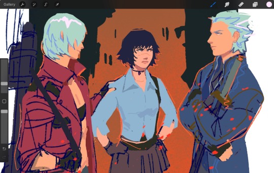
I wanted to doodle the temen-ni-gru crew before my arm gave out lmao I clapped like a toddler with an iPad when they teamed up together against the hell clown
#dmc3#the original literal clown patrol#love them#dmc3 is such a silly silly game but with a shockingly good plot#loved lady’s development#she was such a pleasure to watch change as a person#and the reason why I wanted to break Vergil’s face with a golf club is cuz he is actually a great character as well#catch me screaming when the final boss teams up with u to curb stomp an abomination of bullshit#anyway haha I’m crawling awaaayyyyy
134 notes
·
View notes
Text

#photo of the day#great egret#heron#photography#todays bird#bird#birds#bird lovers#birdwatching#bird photography#birds in flight#nature photography#wildlife photography#wild nj#Bayonne Golf Course Walkway#spring 2024
80 notes
·
View notes
Text
These shots ! The double entendre ! THE DIRTY FRAMING ! WANDEE’s RAINBOW WINGS !


#wandee goodday the series#wandee goodday#wandeeyak#yakdee#greatinn#inn sarin#great sapol#pride flag#dirty framing#golf tanwarin
74 notes
·
View notes
Text

#golf#fit girls#fitgirl#fit woman#fit women#fit girl#fitbody#fit beauty#fitnessgirl#paige spiranac#amazing body#great body#stunning#gorgeous women#gorgeous#beautiful women
50 notes
·
View notes
Text
Man I love Wandee Goodday - this is a grown up bl that's managing to be funny, sexy and informative without becoming preachy. They are repping for everything from mental health and vaccines to communication, consent and fun sex. There's a femme guy who's managing a gym, an ace psychiatrist who's designing sex aids, sensitive boxers, and no evil female character. All this and a villain we all want to the boxer to punch. It's glorious.
Anyway our 'fake' boyfriends continue to be incredibly supportive of each other but NO! DOC! You got that pic of you and Ter out of the bin and saved it. Poor Yak - he looked so content poking around your shelves. Gah. Now he thinks you're still into Ter. Please tell me you're not still into Ter Dee - he's just a toxic habit you've given up surely?*
Kao channelling the viewers in this convo with Dee, and throwing truth bombs as usual. Once again proving he is the true MVP of this series - now give him someone to cuddle dammit.
I'm not sure how Yak resisted punching Ter just now but I loved Cher's little mother moment.
Holy arms Batman.

Aaand I'm back.
Every now and again I forget that there's nearly a decade's age difference between Dee and Yak - Dee might be smart but, as Kao knows, he's a little immature emotionally.
I'm more shocked by the fact that Dee wore his Teeny Tiger gear to Ter's place than that he left the candles burning. What are you doing Dee? Why did you stay? That smug bastard is complimenting your tiger costume - the tiger costume you should be keeping for Yak.


Honestly I don't blame Yak one little bit - he waits for ages then finds Dee in his sexy tiger getup with a half naked Ter. Do we think Ter deliberately sabotaged his bathroom tap? Yes, yes we do.
Loved Kao here.

Noooo - the inevitable break up. Sometimes I hate the narrative arc - I'd be happy just watching another 5 eps of Dee and Yak just being boyfriends and snuggly and domestic.
And now we have the crying. You silly men, both thinking it's the other who doesn't really care. The reach for the comfort of the necklace that's no longer there? Gutted. Literally gutted.
And now I feel sorry for Taem as well - I thought she liked Mr Student Council. Ter, not so much - even if I believed the manipulative fucker. And of course he passed out so we didn't get to see if Dee would have given him his first kiss while we did see Yak decide not to kiss Taem.
Cher, my sassy little queen, I love you so much. Please give your big boyfriend a smack for us. He is an idiot.
And this is not how I wanted the first kiss - I wanted it to be joyful. It was a good kiss - a great kiss - but neither of them were wearing their colour and they weren't lit by them either. That's what I want to see - them dressed in their yellow and purple, bathed in their light and declaring undying love. Give it to me now!
Wandee Goodday has been a happy counterbalance to the sheer stress and tension of My Stand In. Except this week. Ter and Tong are cut from the same cloth and they both deserve to have the snot slapped out of them.
But because Wandee Goodday has been so delightful so far, this episode has hit me hard - I need to go and watch something tooth achingly sweet and cuddle my cat.
*much like me and cigarettes - I gave up years ago but every now and again I still REALLY want one.
NB the interviews, bts etc are excellent - I don't usually watch these but Great and Inn are so good in them. They're both older than other GMMtv newbies and haven't grown up with the company so are just brilliantly relaxed and playful with each other. It looks like some of the dialogue and action is developed and/or improvised by these two as well - they're very naughty and Golf just lets them go for it.
#wandee goodday#wandee goodday ep 7#DeeYak#YakDee#poor babies#YeiCher#Great Sapol#Inn Sarin#thai bl#asianlgbtqdramas#bl drama#GMMtv#Golf Tanwarin
54 notes
·
View notes
Text
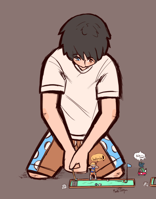
Mini Giant Golf
Owen tries mini golf. He good. Despite what people might think.
132 notes
·
View notes
Note
hey silly question maybe. do you know why cars are so boring now? like im on the wikipedia page for the cadillac eldorado for Reasons and it's a really visually interesting car through all the generations up until like. the tenth in 1979 when it just kinda looks like. every other car (if a bit more square) is this just like, the Capitalism Thing of shit getting more and more boring and samey over the years? or is there like a reason. idk much about cars but this has always annoyed and confused me, i miss interesting looking cars :(
Well, it should be noted that the tenth generation Eldorado's case is a peculiar one. As I've gone over, old American cars tended to be refreshed every other year, and the Eldorado, meant to represent the top of the top of that uniquely American idea of opulence, was perhaps the car most supposed to do so. Hence, as you'll have found, its ninth generation launched in 1971, just 18 years after the first - thats' how long the only generation of Italy's best selling car at the time, the Fiat 500, was sold for.

You wouldn't have expected that generation to stick around for more than four years - no other generation did, and almost all lasted half that. However, 1973 had other plans. Namely, the fuel crisis that completely eviscerated demand for mastodonic fuel guzzlers.
Sales would decline the following years, with little tweaks here and there but no major update, which would have been money down the drain as existing owners could barely afford to fill up the damn things, let alone upgrade, and what were potential customers before couldn't afford to fill up the damn things full stop. So when the new model finally came, this big aspirational car was shrunken down to get on with times of shrinking aspirations.

Nigh on 5.20 meters (for yankees, that's roughly 4/207ths of a Titanic) will hardly seem short to European sensibilities, but let's remember, that's coming from 5.70. You could walk between two walls that far apart. The width, too, decreased by a whole 20cm (for yankees, that's roughly half a rabbit), which in car width terms is massive - like, it's the difference between a Mini and a Mustang.

This to say, the tenth generation Eldorado is oft maligned as a fall from grace, one of the most popular examples of why the malaise moniker stuck to this era of American cars - so not exactly the fairest assessment of how cars changed with time. How about, then, we start our analysis by looking at a car with a much better received update, shall we?

Of course, the Mk1 Volkswagen Golf (for yankees, that's roughly a Rabbit) was a smash hit the world over, so much so that in Mexico it remained on sale as the Citi Golf as recently as 2009(!), and if I didn't think it the best looking Golf that ever was I probably wouldn't own one...

...but unless the only kink you're into is the Hofmeister, I don't see how the second generation's styling is such a downgrade as to bemoan the state of things. And frankly...


...maybe it's just the boiled frog syndrome, but I can't spot a point in which anything 'went wrong', so to speak. Which leads to the all-important question:
You say you miss interesting looking cars, but I do have to ask - when did they ever leave?
Have a browse of my pride post (no, really, go read it, I think it's one of my best ever) and point me to the boring cars within it, because me, I don't see any. And I suspect the reasons are similar to why you see older cars as more interesting.
For one, given the point of the post, all the cars shown are some flashy color, and each is different from every other. This, however, is increasingly becoming an anomaly as greyscale gobbles up an ever increasing share of the market, meaning on average, modern cars are less colorful, and thus less visually interesting. I've written about cause and effect of the greyscalification of cars, and suffice to say I'm not a fan of it - but I feel like that is a discussion separate from car design itself.
Then, of course, there's that those in the post are all cars that I like, so that selection was curated (albeit only by my personal taste). But that is also the case when we look back at older cars: what you see around and what you hear about is what people cared enough about to preserve and to discuss - not just in terms of models but of versions, specs and even colors. If you look at car shows like Radwood or Oblivion, which celebrate 80s and 90s cars, the very time period you referred to as the beginning of the end for interesting design looks like its heyday!
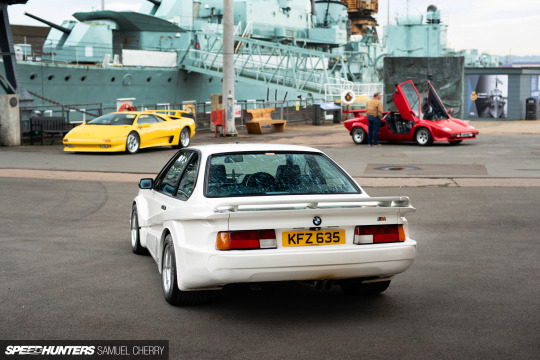
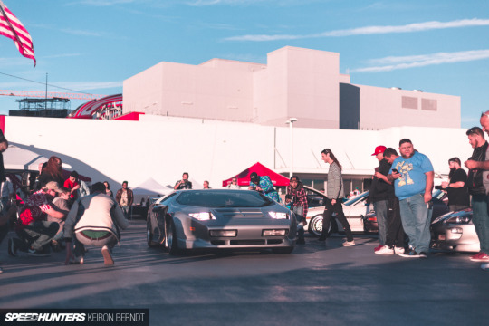

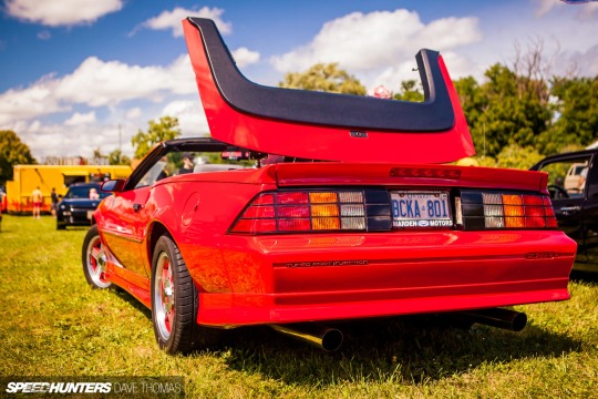

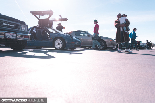
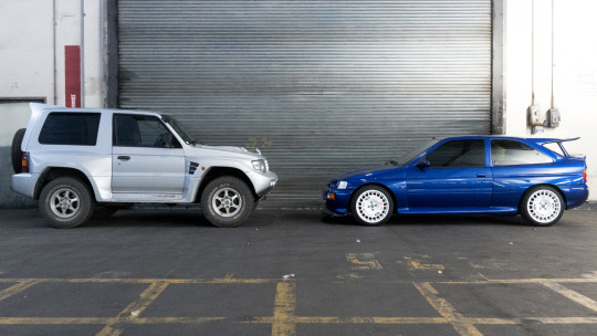


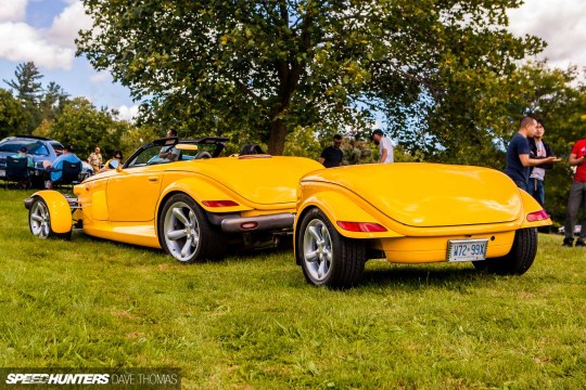
Yes, that trailer is factory.
Unfortunately, it must be said that unique and interesting cars have become fewer and fewer, as the ever increasing regulations make it even more expensive than it already was for smaller brands to emerge and the economic status of things makes it increasingly harder to justify a funky, daring picks for the biggest purchase of the average person's life - let alone the purchase of a second car, which tends to be what more extreme offerings were bought as. A brighter future seems to be ahead, though, with Toyota's incredible GR Corolla/Yaris and 86 apparently about to be joined by yet more spicy goodness and Mazda teasing a return of the rotary engined sportscar. For the twentieth time, sure, but after having seen the Motocompo revival actually happen, I am ready to kick that football.

(because you knew about the new electric Motocompacto, right?)
But there's another thing that post's selection had going for it: variety. Pretty much every car in it was in a wholly different category from all the others, and that is bound to make each car within it seem a lot more interesting than if it had been surrounded by cars of its same segment.
The survivorship bias outlined above also results in far more variety than you would find in normal traffic: even setting aside the halo car dynamic whereby the most special -and therefore most interesting- cars are usually niche offerings with very low sales figures, people tend to remember, discuss and seek out cars that represent some extreme - be it the fastest, the most expensive, the greatest, but also the slowest, the cheapest, the worst... and the tallest, the lowest, the biggest, the smallest, and so on. In short, the cars you'll find the least interest for are the everyday, quietly competent cars that make up the bulk of vehicles on the road.
Although, going far enough back in time, even those appear interesting to us, because their context's norm was so different from ours that even the cars that most adhered to it seem exotic to our sensibilities.
But when actually viewed in their own context...


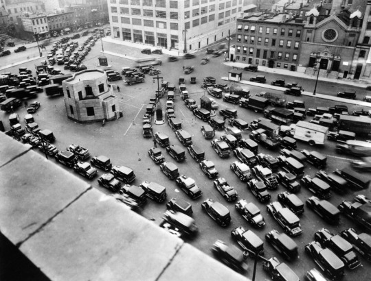
...that impression tends to be stifled.
Unfortunately, it seems to me as though variety is also being stifled nowadays, with a growing share of body styles on sale becoming SUV/crossovers, and the increase in platform sharing reducing automotive outliers (for better and for worse).
And I should note: as for the other industry shifts I mentioned, the driving force isn't Big Capital or The Evil Economic System or what have you. It's the consumers. Sure, we can blame manufacturers for turning every model into a more profitable SUV, but they couldn't do this if they didn't sell, and they wouldn't do this if people didn't see them as more prestigious vehicles worth paying more for. We can blame manufacturers for killing weird car projects, but usually they get axed because people don't buy the things. Dealerships still order grey cars because no one digs their heels about having theirs yellow. So on.
So in short, old cars have always looked more interesting, because time alters our perception of them in ways that make them seem as much - and it also happens that lately the car industry has gone in the opposite direction to those alterations, causing new cars to seem less interesting. So, in short, the problem is the comparison just isn't apples to apples.
I think this is why that Golf evolution does not show any trend towards boring or away from interesting in my eyes - because it mostly strips those factors away. Here's a bunch of generations of the same car, all silver, all presented with no context bar the version before or after, all in the same body style which, for its entire history, was a common sight pretty much anywhere. (Also helps, of course, that the Golf's evolution had no wacky twists and always nailed the zeitgeist.)
This not to say that I can't complain about modern car designs - but for that, don't compare apple to apple... compare it to Microsoft.
See, I can think of many modern designs I find bland and devoid of personality, not because of a lack of styling effort but precisely due to an overabundance of it: so keen were the designers to put a crease here and a fold there and a kink somewhere to make the brand's seventh SUV set itself apart from the other six that the design became too overburdened with details to have a clear message - like a story with too many events for them to express a cohesive point.
Or, indeed, like this parody of Microsoft packaging in which their design principles are applied to the iconic, nay, legendary packaging of the original iPod.
youtube
This is an actual Microsoft video btw. This was made internally by Microsoft's marketing department.
Links in blue are posts of mine about the topic in question: if you liked this post, you might like those - or the blog’s Discord server, linked in the pinned post!
#hope this answers the question to a satisfactory degree#as per usual excuse the large delay#and as per usual this was meant to be 4x shorter than it eventually ended up being and isn't even longer only thanks to great self-restrain#car design#cadillac eldorado#fiat 500#mini cooper#ford mustang#volkswagen golf#honda motocompo#honda motocompacto#also GOD ACTUAL FUCKING DAMMIT SCREW YOU SLIDING READ MORE ANNGHGHGHGH#(when you edit posts on desktop the Read More slides down a block and if you forget to move it back as I did your post will look idiotic)
37 notes
·
View notes
Text


Juicy golf babe Paige Spiranac!
#paige spiranac#rocking body#great legs#great thighs#great rack#legs for days#legendary legs#great body#great hips#dancer body#power thighs#golf babe
263 notes
·
View notes