#interior design cartoon
Explore tagged Tumblr posts
Text
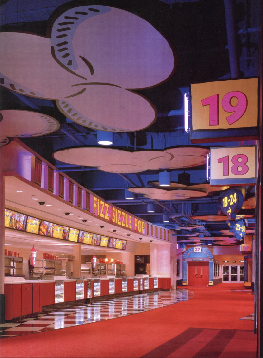

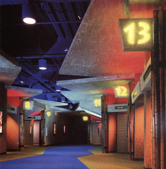


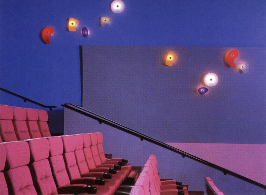

AMC Studio 30 Theatre - Houston, TX (1997)
"What the design attempts to do in the 110,000 sq. ft. space is simulate a movie studio backlot and the soundstage where guests become part of the action, and the experience "rekindles the magic and memory of movie going."
Elements from sound stages and studio road cases make up the central lobby space along with a guest service desk. Images of Hollywood's glamorous stars of the past add enchantment to the balcony walls. The space is divided into three themed areas that "transport guests into fantastic worlds of Animation, Action/Adventure and Cyberspace." The food concession stands within each area carries through the theme; "Fizz, Sizzle, Pop"; Wildebeest Feast"; and "Quantum Bits." The 30 auditoria are located off the soundstage lobby and within the various themed areas.
The architecture seems to come alive in the Animation area. The space is designed to resemble an animation cel: "flat, two-dimensional, cartoon-like graphics are outlined with black lines, filled with color and applied on an exaggerated scale." The Fizz, Sizzle, Pop concession's identity and blimp directional signs seem to float in a blue sky with flat, cut-out clouds. The setting for Action/ Adventure recalls a rainforest with heavy hanging leaves, bamboo and rock "carved" directional signs. The custom wall covering features petroglyphs of cave people carrying popcorn, megaphones and movie cameras. The fiber optic eyes peering from behind the leaves in the Wildebeest Feast stand change color. They also appear above rock outcroppings down the corridor. Patrons are invited to explore an abstract, futuristic world in Cyberspace where the floor and ceiling are the same color and brushed aluminum columns rise partway to the ceiling. To create the illusion of "endless space." custom light fixtures project beams of light along the walls and backlit graphic images have neon edges. Various colored lights and a high-tech fluorescent green/orange acrylic sign help to define the Quantum Bits concession area in Cyberspace."
Designed by Kiku Obata & Co.
Scanned from the book, Entertainment Destinations by Martin Pegler (2000)
#design#90s#interior design#interiors#architecture#1990s#colorful#movie theater#houston#texas#themed spaces#multiplex#pop art#y2k#factory pomo#rainforest#cyber#cartoon#wacky pomo
1K notes
·
View notes
Text

RiNa (Remix Cartoon Non AI) - good morning..
#rinacartoonnonAI#rinaremixcartoonnonAI#bluelongshirt#bedroom cartoon#bedroom designs cartoon#bluelongshirtcartoon#interior design cartoon#rina cartoon#rina remix cartoon#blue long shirt cartoon#cartoon#cartoon fx#cartoon effects#AI enhanced
0 notes
Text


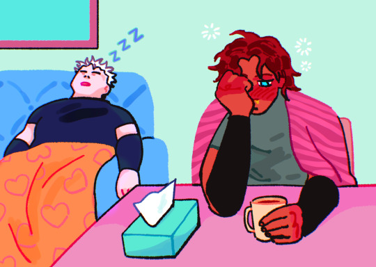
Ugh I am very sick so the meow meows must suffer with me
#sorry for making their interior design so cutesy every time.. but they are cartoons to me#m#aftg#tfc
764 notes
·
View notes
Text

More Carol and the End of the World pre-vis: here's the final look as well as the development of colour and lighting of the office bullpen. Our goal was to find a balance between something ethereal while also still being recognizably an office, and it was important to get the look locked down early because thematically it was a big part of the show... plus characters spend a LOT of time here, ha ha!


I always had a certain fondness for the first colour key above , but I think it leaned a bit too "ethereal" and might've ended up feeling too disconnected from the other, more grounded environments.


I think the direction we finally went best suits the needs of the show, which is what's most important in animation where you're not just creating a standalone illustration, but a show that has to work as a whole. Thanks for looking, and watch Carol & the End of the World on Netflix if you somehow haven't already!! Showrunner: @dan-guterman BG design lead (images 5~6): Alex Myung BG design (image 1): Lam Hoang Art director: @ellemichalka
#day#daytime#office#work#office design#business#interior#corporate#office space#desk#computer#bullpen#open office#workday#lead#leadership#background paint lead#supervisor#background painting#background#carol#carol and the end of the world#cateotw#adult animation#animation#cartoon#Netflix#netflix animation#allisonperryart#allison perry
27 notes
·
View notes
Text

Isometric view of my character Buckaroo’s house :]
#my art#art#illustration#digital illustration#digital art#isometric#house art#interiors#interior design#interior art#interior decorating#cute art style#cute art#cartoonist#cartoon art#illustrators on tumblr#artists on tumblr#illustrator
14 notes
·
View notes
Text


Hanna-Barbera store - Los Angeles || 1990 - 1992
"The two Southern California stores, located in the Westside Pavilion in Los Angeles and the Del Amo Fashion Center in Torrance, were... closed in the wake of Turner's $320 million acquisition of Los Angeles- based Hanna-Barbera Productions... Hanna-Barbera, which has a cartoon lineup including the Flintstones, the Jetsons, Yogi Bear, the Smurfs and Scooby Doo, opened the stores in 1990 following the success of Walt Disney Co. in opening a chain of cartoon-based retail stores." - United International Press, 1992
78 notes
·
View notes
Text
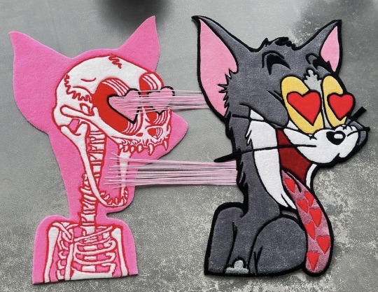
by ruggy_waggy on ig
#tom and jerry#tom & jerry#animation#cartoon#rug#rugs#design#interior design#interior decor#handmade#tuft#tufting#tufting rug#tufted rug#tufted#decor#home decor#house decor#custom#custom made#art
32 notes
·
View notes
Text
Hayfields: Twigs - Bedroom

This is twigs bedroom, it's super cozy <3 and it has a guitar!
#digital art#digital illustration#artists on tumblr#art#drawing#my art#digital painting#illustration#concept art#interior design#interiors#home#staircase#decoration#cozycore#cozy#cozy aesthetic#cozy cottage#cozy games#hayfields#bedroom#home decor#environment art#environment#environment design#background art#cartoon background#colorful#vibrant#digital
13 notes
·
View notes
Text


Lil's room
#god this took forever#my fyp#rugrats#all grown up#2000s cartoons#lil deville#room art#bedroom#interior design
24 notes
·
View notes
Text

I love this Jem Misfits pillow!
13 notes
·
View notes
Text
I think back on my own “talent” as an artist & it’s like. never seen such a complete lack of design sense or visual aesthetic in a kid so good at capturing forms
#the complete lack of ability to do fashion or interior design or etc etc any sort of visual aesthetic is really WEIRD vs. the rest of my#artist friends who tend to care much more about these things. I have an academic understanding of aesthetics#Skill at art is a trained thing for sure but usually ppl will have lopsided abilities when they begin and that is what I’d call ‘talent’#even when it’s often transferable skills from previous interests#what I drew reflected heavily what I was interested in which is true for most artists I think but it was such an#overwhelming quantity of work for someone who didn’t end up going into art. So much life drawing for no real reason except that I#loved drawing people and cartoons and the objects around me.#and so much joy and love for colour…#my work improved at a breakneck pace as soon as I got the ability to lay down colour very quickly (got a tablet)#[blue period voice] I loved art because it was made by people for people#bytebun rambles#if I drew cars or buildings instead they might’ve given me the autism label real fast huh
10 notes
·
View notes
Text


Warner Bros. Studio Store - Times Square, NYC (1990's)
"To create an exciting retail environment for Warner Bros.' new store on the Great White Way, designers incorporated bright colors, excitement and entertainment that mimics Times Square itself. A dramatic glass window wall soars six stories above the street, providing unbroken views of the shopping floors within. Separate red, blue and green color environments are visible through the building's glass-and-steel facade. Hard-to-miss 3D neon signs featuring popular Looney Tune characters are placed on the wall by the escalator, and vintage neon and accent lighting highlight the "New York New York" shop."
Designed by JGA Inc., Southfield MI
Scanned from the Visual Merchandising 2 (2000)
#90s#design#interior design#interiors#architecture#1990s#colorful#my scans#looney tunes#warner brothers#warner bros#wb#cartoons#times square#nyc#retail design#store#nineties#2000#acme#bugs bunny#daffy duck
424 notes
·
View notes
Text

RiNa (Remix Cartoon+AI) - Jom Kita Tidur..
#rinacartoonAI#rinaremixcartoonAI#bluelongshirt#bedroom cartoon#bluelongshirtcartoon#interior design cartoon#bedrom cartoon#bedroom designs cartoon#rina cartoon#rina remix cartoon#blue long shirt cartoon#cartoon#cartoon fx#cartoon effects#AI enhanced
0 notes
Text
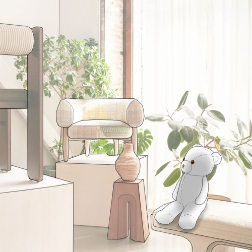
#colony#colony design#jean lin#gallery#design#furniture design#interior design#nyc#american#contemporary#cartoon#teddy bear#illustration#dailybehbeh#behbeh#cute#stuffed animal#art#funny#daily#daily bear
16 notes
·
View notes
Text
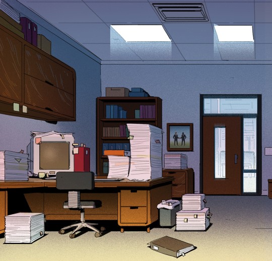
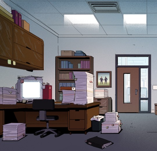
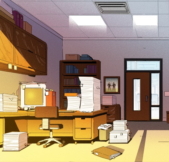
Told ya' I'd get back to posting more Carol and the End of the World eventually! Here's some colour keys of the boss' office: something we discussed early on was how the closed blinds in his office were representative of his mental state and feelings towards the end of the world - literally blocking Keppler out of his view, and we wanted that to be clearly reflected in the lighting of the space even when they weren't on-screen, which is what we were exploring here.
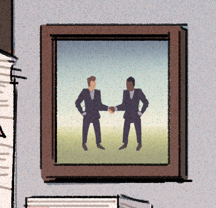
One of my favourite silly little details: a framed photo of Business Men Doing Business Things! Since the lineart I was provided was just a rough, it didn't have a design in the frame, so I just improvised, ha ha - pretty sure we changed it in the final design, though, so enjoy this little peek behind the curtains! Thanks for looking, and watch Carol & the End of the World on Netflix if you haven't already:
Showrunner: Dan Guterman BG design: Alex Myung Art direction: @ellemichalka
#office#interior#company#computer#desk#workspace#work#interior design#business#office design#office space#corporate#office life#boss#lead#leadership#background paint lead#supervisor#background painting#background#carol#carol and the end of the world#cateotw#adult animation#animation#cartoon#netflix#netflix animation#allisonperryart#allison perry
36 notes
·
View notes
Text

tulip fairy’s living room🧚🏻♀️🌷🪵🛋️
#fairycore#fairy aesthetic#original art#digital art#adobe illustrator#cartoon#drawing#aesthetic#cute#pink aesthetic#fairy art#living room#interior design#faerie#woodland#nature
3 notes
·
View notes