#wacky pomo
Explore tagged Tumblr posts
Text
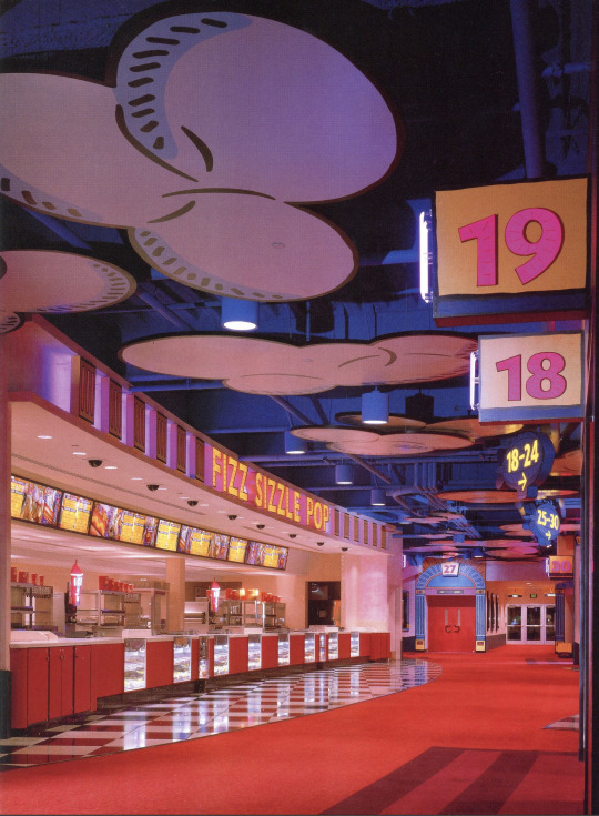

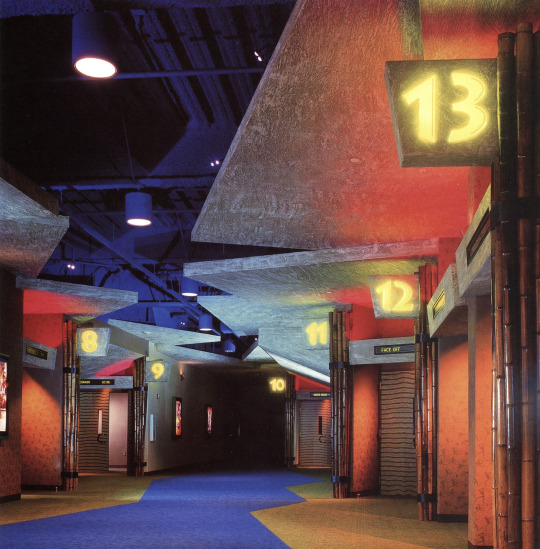


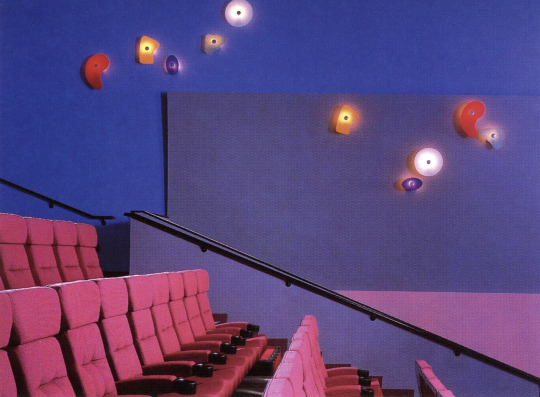

AMC Studio 30 Theatre - Houston, TX (1997)
"What the design attempts to do in the 110,000 sq. ft. space is simulate a movie studio backlot and the soundstage where guests become part of the action, and the experience "rekindles the magic and memory of movie going."
Elements from sound stages and studio road cases make up the central lobby space along with a guest service desk. Images of Hollywood's glamorous stars of the past add enchantment to the balcony walls. The space is divided into three themed areas that "transport guests into fantastic worlds of Animation, Action/Adventure and Cyberspace." The food concession stands within each area carries through the theme; "Fizz, Sizzle, Pop"; Wildebeest Feast"; and "Quantum Bits." The 30 auditoria are located off the soundstage lobby and within the various themed areas.
The architecture seems to come alive in the Animation area. The space is designed to resemble an animation cel: "flat, two-dimensional, cartoon-like graphics are outlined with black lines, filled with color and applied on an exaggerated scale." The Fizz, Sizzle, Pop concession's identity and blimp directional signs seem to float in a blue sky with flat, cut-out clouds. The setting for Action/ Adventure recalls a rainforest with heavy hanging leaves, bamboo and rock "carved" directional signs. The custom wall covering features petroglyphs of cave people carrying popcorn, megaphones and movie cameras. The fiber optic eyes peering from behind the leaves in the Wildebeest Feast stand change color. They also appear above rock outcroppings down the corridor. Patrons are invited to explore an abstract, futuristic world in Cyberspace where the floor and ceiling are the same color and brushed aluminum columns rise partway to the ceiling. To create the illusion of "endless space." custom light fixtures project beams of light along the walls and backlit graphic images have neon edges. Various colored lights and a high-tech fluorescent green/orange acrylic sign help to define the Quantum Bits concession area in Cyberspace."
Designed by Kiku Obata & Co.
Scanned from the book, Entertainment Destinations by Martin Pegler (2000)
#design#90s#interior design#interiors#architecture#1990s#colorful#movie theater#houston#texas#themed spaces#multiplex#pop art#y2k#factory pomo#rainforest#cyber#cartoon#wacky pomo
1K notes
·
View notes
Text

#wacky pomo#kidcore#dreamcore#dereality#unreality#nostalgiacore#liminal#liminal aesthetic#liminal spaces
246 notes
·
View notes
Text


How it feels to randomly obsess over the apartment of an OC you never talk about
I was going for something between beetlejuice house and wacky pomo
#oc#architecture#anthro#traditional drawing#sketchbook#vintage architecture#80s#90s#wacky pomo#contemporary architecture#environment design#concept art
65 notes
·
View notes
Text
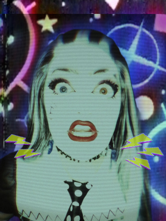
FRANKENPHOTOS TIME



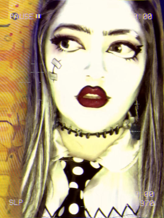
#monster high#frankie stein#monster high costume#monster high cosplay#mh cosplay#cosplay#frankie stein cosplay#frankie stein costume#monster high edit#mh edit#mh frankie stein#frankie mh#mh frankie#frankie monster high#mh#monster high frankie#costume#makeup#edit#photo dump#zimulacrum#they them#frankie stein monster high#wacky pomo#y2k#vintage horror
54 notes
·
View notes
Text


some digital drawings i made in 2023 | these are heavily inspired by the memphis milano/wacky pomp aesthetics from the late 80s and early 90s.
(my art)
#m#my art#digital drawing#postmodernism#abstract art#drawing#wacky pomo#90s aesthetic#80s aesthetic#artists on tumblr
17 notes
·
View notes
Text
rocko moodboard

11 notes
·
View notes
Text

『 🇳🇴🇼 🇵🇱🇦🇾🇮🇳🇬 . . . . 』
╰┈➤ 🕪 🇫🇱🇾 - 🇸🇺🇬🇦🇷 🇷🇦🇾 🕪
#Aesthetic#AES#moodboard#a e s t h e t i c#wacky pomo#old nickelodeon#old internet#old tv#nostaligiacore#nostalgic#nostalgia#nostaliga#y2k aesthetic#y2kcore#y2k#y2k moodboard#y2k nostalgia#2000s aesthetic#early 2000s#2000s nostalgia#chaotic moodboard
10 notes
·
View notes
Text


color tests, material tests….and other shennaniganry
the fact that the beaker doodle is on the higher res canvas
truly, there is no plan.
12 notes
·
View notes
Text

its name is €§[€^…¥\€ very goofy very funny
14 notes
·
View notes
Text
what if....
I posted my reels about unpopular aesthetics here too?? I can't seem to find a public no matter the social media I post these on ;_;
3 notes
·
View notes
Text
I’d like to add something else: For anyone under the age of 12, anything ever had to have the mark of WACKY POMO.


Wacky PoMo, otherwise known as Wonka PoMo, was the de facto “kiddie” aesthetic of the 90s. Take the loudness and geometric nature of Memphis, the wacky nature of Looney Tunes-esque cartoons, a bit of grossout, and a whole lot of LSD. Color schemes were bright, saturated, and bold- to put it gently. Straight lines were rare, and parallel lines were rarer. Everything was skewed, stretched, and exaggerated. Airbrushing. Airbrushing everywhere. Subtlety has no place here.


Backgrounds were simple, but never bland. They typically had some sort of pattern, usually warped or distorted in some way. One of two patterns were usually used- a hypnotic spiral, or a checkerboard (with the second color not usually contrasing too much with the first, though exceptions could be made).


Also prevalent were kids, of course- the target market. They were usually either real kids with a 60% chance of fish-eye distortion, or otherwise realistic paintings of kids with a 100% chance of fish-eye distortion to the Nth degree.


Occasionally, however, you would get an illustrated character or two, just as geometric and exaggerated as the design.
If you’ve paid attention to the text, major typefaces follow the same exaggerated, zany, no-parallel-lines-allowed approach as the rest of the design, with common choices being an exaggeration of a slab serif or a geometric style following Wacky PoMo rules of geometry. As for colors, while all colors of the rainbow could be and were used, the most common focal colors were yellow and bright shades of green for “brighter” colors, and purple and dark blue for “darker” colors.


Nickelodeon might as well be considered the inventor of this style, taking their Memphis adoption of the 80s, drenching it in slime, and photographing it through a funhouse mirror. And here’s further kids channel brandings with this aesthetic, because I’m autistic like that.


Both Kids’ WB! logos are standout examples of logos using Wacky PoMo. The latter is a legendary holdout, lasting until 2008 in the states, and 2019 in Australia. (Yes, Kids’ WB! lasted until 2019 in Australia.)

Cartoon Network took the checkerboard motif and ran with it.

CITV proved that this style of design wasn’t limited to the states.
But by far, the most legendary applicant of this style would have to be YTV.


I rest my case.
Everyone gets “The 90s” look wrong so let’s fix it
If you weren’t here for part one, lemme sum it up real fast:

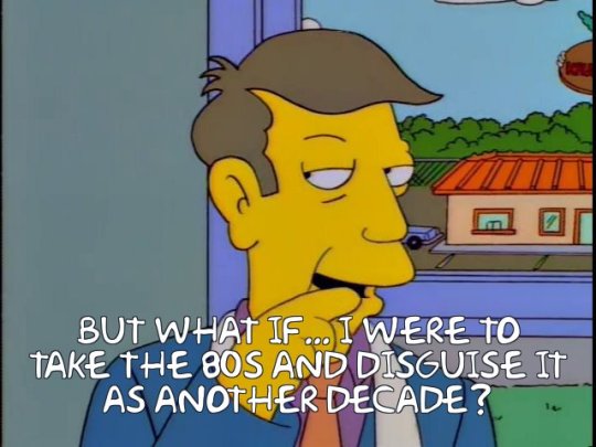
Okay, all up to speed? We’re being served 80s throwback stuff with the serial numbers scratched off, re-labeled as yo totally 90s. What we’ve got now isn’t completely wrong, but I’m telling you, there’s so much gold left unmined.
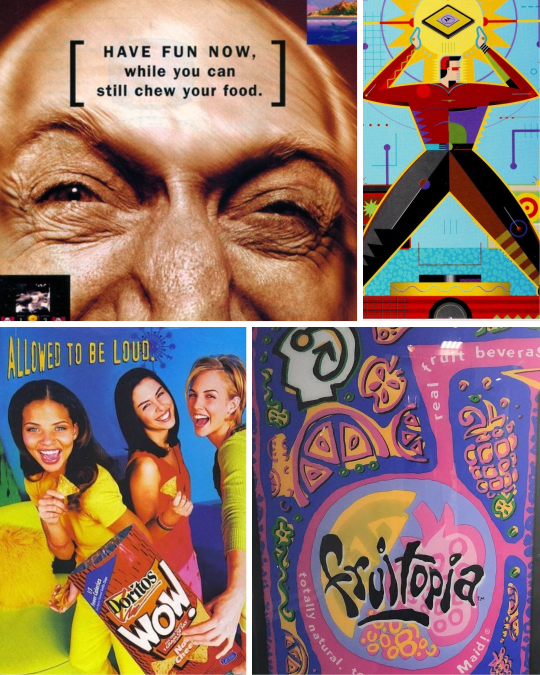
As we saw in part one with Memphis Milano, these things get messy. Trends don’t start and end neatly every ten years. The first wave of 90s throwback attempts focused on the early part of the decade, and nobody since really pushed to represent the other seven years. Well, if you really wanna do something, I guess you gotta do it yourself.
I have suggestions. Get your flannel ready, we’ve got a lot of ground to cover.
Keep reading
48K notes
·
View notes
Text

Nickelodeon reception desk & entry inside the overall Viacom New York City headquarters (late 1980s) - designed by Patricia Conway and J. Woodson Rainey, Jr.
Mix of the Wacky PoMo and Memphis Jr. design styles, love the aquarium and car/reception desk hybrid
Scanned from 'Women of Design - Contemporary American Interiors' (1992)
#design#interior design#90s#interiors#architecture#80s#1990s#colorful#1980s#my scans#nickelodeon#nick#viacom#office design#reception desk#memphis jr.#wacky pomo
235 notes
·
View notes
Text

#wacky pomo#kidcore#dreamcore#dereality#unreality#nostalgiacore#liminal#liminal aesthetic#liminal spaces
104 notes
·
View notes
Text

Show some love! [Based on this post]
#pig does art#I TOLD YOU I WOULD TRY FACTORY POMO AGAIN. AND I DID! LET'S GET IT#ummm what else#objectum#tech art#computer art#haha hey girl (blushing)(clearly looking at a pc)#this is supposed to emulate like. idk like some sort of 80s advertisement . they always have huge ass tect with wacky phrases#and a picture of a pc on there . its so cool i love looking at design. anyways here it is my beautiful attempt at art again#biggest hits#objectum art#pigs personal faves
12K notes
·
View notes
Note
Who’s Octo Nick and why does he look like
He dressed himself in the dark?
Nick is not a part of the comic/story in general, he’s just a sona? Mascot? Guy? Idk. He’s one of my favorite ocs.
As for the second question: Yes
Bonus crossover


#ask#splatoon#he's the wacky pomo aesthetic but as octopus#Also he was an animal jam character too before lmao
24 notes
·
View notes
Text
Oh no. Not again.
Bolts4Brains update 10/8/24:
(I'm logging these by date instead of number so I don't lose count like last time.)
I don't have anything major for SL's anniversary this year, other than I finished the instrumental rework of Bolts4Brains, (the vocals still need work,) and the first clip has been animated.
I had like a little of it done before I was like hey wait a minute, Fnaf's 10 year anniversary only happens once. And then shifted my focus to Paranormal Powerhouse.
Visually, the goal is to make this as 2016-early 2017 SL as possible. I don't know how else to describe the type of synesthesia I get for this game, other than it's like when you watch the Brave Toaster movie as a kid because it's a cartoon, get traumatized, and then years later find out that movie was actually intended for like college students in animation. That, combined with classic 2014/15 fnaf, and futuristic wacky-pomo.
So like a spectrum of this:


The magenta-deep blue color scheme is also significant. Any time the Funtimes are preforming, they're in a pink spotlight. Otherwise, it's very cold and blue.
(I have no clue where the last image comes from, but it's suspiciously SL elevator shaped.)
78 notes
·
View notes