#im looking for good brushes for lining & rendering
Explore tagged Tumblr posts
Text

tiger lily
#my art#jujutsu kaisen#jjk#jjk fanart#jujutsu kaisen fanart#yuji itadori#itadori yuuji#sukuna#ryomen sukuna#jjk sukuna#sorry for disappearing for a week this was why#tbh if i ever disappear Ever it usually means one of 2 things#either im having a mental breakdown and will not be back for like 3+ months (unlikely but Has Happened)#or (more likely) i started a painting and i'm in rendering hell#this was a bit of an experiment in Shapes and colour blocking#id kind of been dabbling in harsh lines and layered block shapes but i wanted to find a way to combine tht look with my usual oil paint#and i figured a piece tht focused on ??? dappled light ??? foliage??? idk??? would b a good test subject#i benched my rake brush for this and everything :'> she's on break after months of carrying every1 say thank u#anyway i had the vision of sukuna/yuuji and tigers but then i rly rly didnt want to draw tigers#so i thought aha! tiger LILY!!!!!! checkmate#turned th colours real Tropical real jungle-y i am a big fan of the divide layer on the lily i thought tht looked very neat#dont come fr me abt the accuracy of their traditional wear i was referecing cosplays and prsk cards ok we r not after authenticity here#vibes only <3 thank u for your time <3
3K notes
·
View notes
Text
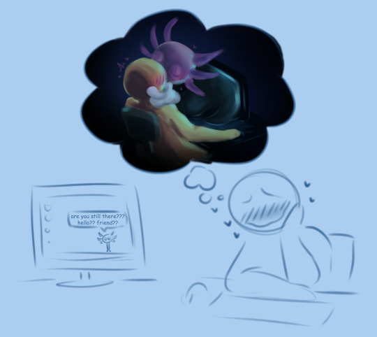
why is there so much art of kinito coming out of the screen is this y'all while playing?
#kinito#kinitopet#kinito x y/n#my art#shitpost#im looking for good brushes for lining & rendering#so um. worst brush test ever /silly
2K notes
·
View notes
Text
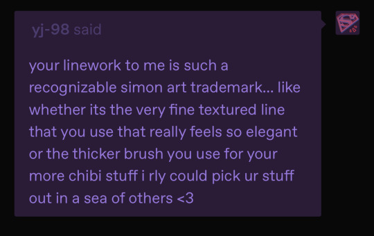
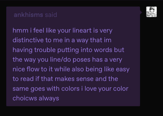
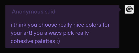
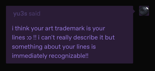
@ankhisms @yj-98 @yu3s
sorry for not replying individually this is just easier but !!! ty so much aaaa im happy to hear my lines are recognisable as Me :') i always spend more time on them than any other part of my art process by a LOOOT but usually feel like they end of making my art look really like.. flat. like going from my coloured sketches -> lines + flats always makes me go "oh......i made it boring now :(" SO !! this made me feel better abt that !!
and for colours too i always looove doing colours. like i sorta mentioned i usually plan out my colours before i do my lines so theyre always smthn i think very hard about 🫶 thank you guys so much again !! 🤍🤍
#and ty to you too anon !!#current thing im working on im deviating from my usual line brushes. smooth brush no texture#+ im trying to like.. see if i can keep it looking Good w just flats. so if the next thing i post is rendered then you know i failed mgshjf#very intimidating but i hope it works out bc it's taking me even longer than normal 😭 smooth brushes arent as forgiving as textured ones#(which is why i stopped using them mgdjnfh but they felt right for this one)#anyway yeah ty all again !! ^__^#ankhisms#yj-98#yu3s#ask#simon says
3 notes
·
View notes
Text
@cannimochi @mbirnsings-71 i feel the universe telling me that u BOTH need 2 see this RN OR THE EARTH WILL EXPLODE
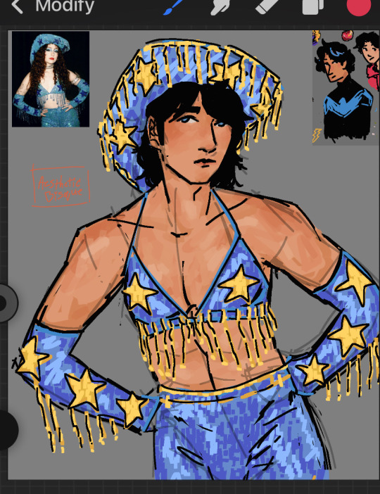
God, what have you done? You're a pink pony girl (wip)
#holy shit aiokhsfaaalwuuuhfa#WOAHHHHHHHHHHHHHHHHHHHHHHHHHHHHHHHHHHHHHH#this looks so good alr..........omg........#LOOK @ THE DETAIL WTFFFFFFFFF EVERY LIL ZIPPY LINE MAN WAAAAAAAAAAAAAAAAA#eats the hair#eats the ahir eats the ahir#i loove square brush soooooooooooooooooooooooooooooooooooooooooo muhc#i love square brush tttthhhhiiiiiiiiiiiiiiiiiiiiiiiiiiiiiiiiiiiiiiiiiiiiiiiiiiiiiiiiiiiiiiiiiiiiiiiiiiiiiiiiiiiiiiiiiiiiiiiiiiiiiiiis much!#LOOK @ THE SKIN RENDERING RAAAAAAAAAAAAAAAAAAAHHHHHHHHHHHHHHHHHH#EATS IT#STARS STARTS STARS#EVERYTIME I SEE STARS IM LIKE “damn dick?” then every1 looks @ me funny BUT LIKE ITS TRUE HERE#ugh he needs 2 strike more poses#UGHHHHHHHHHHHHHHHHHHH#i think dick grayson should wear a cowboy hat mroe foten & this drawing proves it!!!!!!!!!!!!!!!#op op i love ur art sm........... ty 4 sharing it omg nomnomnomnomn#EVEN THE WIPS#NONMNOMNOMONMNM#dick grayson#dc#reblog#anotomyy <333333#the#ok this is going 2 sound weird IM NOT THAT WEIRD I SWEAR#but the area where the arm connects 2 the torso? MWAH DELICIOUS AMAZING#like head shoulders knees & toes knees & toes knees & toes#LOOK @ THE ARMSSSSSSS THE SHOUDLERS I LOVE THEM??????? THE CURVE IS SO GOOD ITS SUCH A NICE FLOWWWWWWW#ugh i need 2 stfu oasjfll
85 notes
·
View notes
Note
What brushes do you use?? I love the one you use to sketch
the pastel/charcoal brush yes? it's #1 on here but here's all the other i tend to use lately
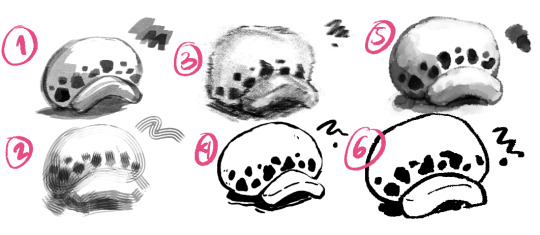
Blockaded Chalk Brush - (10 clippy points) im a one brush to rule them all kinda person so i use this for everything from sketch to rendering. you need good pressure and layer control to use it for blending and to carve out different values just using one color

YN Stripes - (20 clippy points) i like comb brush blending, its a remnant of dragon age artstyle days. basically for soft transitions and to give texture

Intoxicate Pencil Set - (free) very natural looking pencil brush, just as messy as the real thing

Smooth Liner - (free) usual lineart brush. i can use this to mimic traditionally inked lines for digital corrections and additions

Bear watercolor brush - (10 clippy) realistic watercolor brush and new bestfriend

Line drawing pen - (thank you for finding the asset moonpaw my light and savior) basically its a feathery but sharp edged hard pen. i combine this with the watercolor brush to make it look like a messy gouache

#sadly most of these are paid apparently#edited to add brush application samples#csp#clip studio paint#art resources
482 notes
·
View notes
Note
Hii, I saw your latest post and your art style is so pretty?? What?? I have a question though. How do you do the paint one? Or rendering in general. Like genuinely, I have a problem with rendering and I can't seem to quite understand it on my own. Do you just start with flat colors? Do you do lineart or colors right after the sketch? Is the "lineart" just added later? Painted over? Erased to give thinner and thicker lines?? I'm really curious!!
hi! im not the best painter tbh! though i do have a background in painting but ill try my best to explain
diff artists have different approaches to how they paint but generally yes, you would start out with big shapes first and then go into the details - work big picture first. like, if you squint and the drawing makes sense in terms of value and colour and shape, youre on the right path.
i can kinda show this with a warmup in-class speedpaint exercise we did a couple weeks ago where we were tasked with painting an eye in about 30 minutes (i was late and only had 20 lol)

luckily ive got the layers for this. i start of with a base layer, kind of like a underpaint layer since that's how i personally learned to paint traditionally. i did have a sketch before laying down this base layer under it but i ended up using it for final rendering details lol
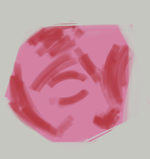
after that i started laying down the big blocks of colour. i wasn't necessarily aiming for complete colour accuracy here, i just wanted to match the value. i chose a pink underlayer to influence my colour choices because the underlayer will peak through the blocks of colour i paint over it
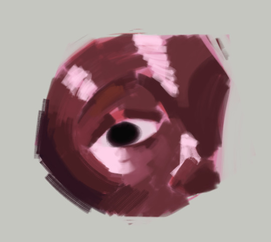
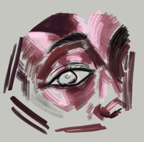
and then (forgive me if this seems like "draw the rest of the owl" in terms of progression) but this is where i started going in with finer detail. i did the rest of the render on the sketch layer i had so you can see some of the lines from the sketch here
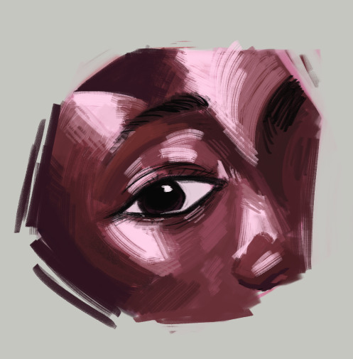
here's the layers completely seperate from each other


even for the flat colour version of my character, i had an underpaint layer! i used yellow and orange since i wanted her colours to be warm and used a semi-opaque brush to put her colours in rather than using a completely opaque brush
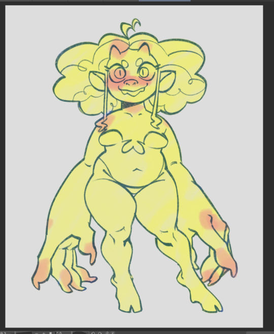
when i wanted to do the painted version, i put the lineart on multiply and reduced the opacity and brushed in some some quick shadows on seperate layer on hard light mode to give me a good base to start painting with

and then i did all the rendering and details on a new layer ontop of everything. i keep the lineart light so i can paint over it easily and also colour pick from it when i want a more distinct line to seperate certain shapes. i unfortunately dont know how to explain this part because a lot of this is intuitive to me and i'm still learning. but you gotta make use of different types of "edges" in painting, and you would generally have more contrast in the focal point of your painting than in other places to draw the eye to that point. i suggest researching the use of edges in painting if you really wanna learn more - because im a terrible teacher haha
for fun here's what the rendering layer for this one looks like on its own and the finished thing for comparison

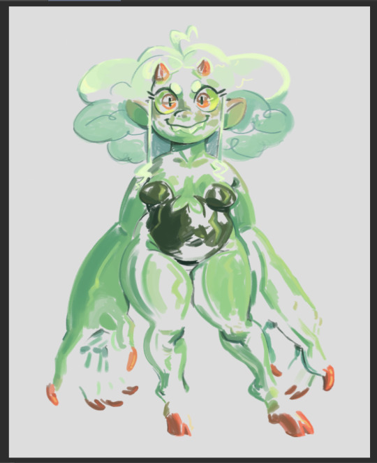
there's other things you need to learn too, like bounce light, atmospheric perspective, ambient occlusion... and colour theory is always important! i could go on for a long time. there's a lot of pieces to the puzzle and it may seem overwhelming but there's tons of resources online and it will all become second nature to you as you keep practicing
uhh hope that helps!
62 notes
·
View notes
Text
-FAQ-
Hello! I've gained a whole bunch of followers lately and I've been getting a lot of questions about commissions, what my setup is, what brushes I use, etc, so I thought I'd make a post about it to answer everyone's questions at once !
Putting them under the cut <3
Commissions:
Commission prices are listed in my pinned post. You can send me a private message about your commission idea and we can get to talking :) It is helpful to have enough references handy (character, outfit, descriptions etc)
I am generally a fast drawer but I also have a job and a physical disability so there might be moments I can't work on your commission. But that is never longer than a few days at most.
Payment is upfront, the full amount and via paypal only. I know this might seem a bit scary but unfortunately there are a lot of people who end up not paying for commissions and I want to avoid that.
During the process I will send you frequent updates and will ask for input, to see if it is going in the direction you want. You can ask for changes during the sketching progress but once I've started on line-art and coloring, no big changes will happen. (You can for example ask for a different color for a shirt etc, but not for a different prop or pose or expression)
When it is completed, I will send the drawing to you via email. The drawing will remain mine and it is not to be sold or profited of by the person who commissioned me. If the commission is for something commercial/for selling, that needs to be discussed. I prefer to do drawings only for personal use!
For more questions, my dms/asks are open :)
How long have I been doing digital art:
I've been drawing digitally for about 5 years now i think? But before that I've been drawing and painting traditionally literally since the moment I could pick up a pencil.
Set-up:
It's just me and my ipad and apple pencil laying on my bed. I wouldn't even know where to begin for those whole multi-monitor/screen setups ;-; I draw only with Procreate
Brushes:
I tend to play with different brushes from time to time to get different textures, but generally i use the same few for most of my drawings/styles. My favorite one is the Peppermint Brush, for sketching. I use it in every drawing i make! I always sketch with it, and often do the line-art with it as well! And it makes for a nice textured brush for rendering as well! (i used it for a lot of rendering of the armor in this drawing)
The (procreate) brushes i use a lot are
for medieval style: inking - Ink Bleed (for line-art) artistic - Quoll (for coloring)
for general style: calligraphy - Chalk (coloring/rendering) sketching - Peppermint (line-art/sketching)
for realism: calligraphy - Shale Brush (full rendering) Also using the shale brush for smudging and erasing when drawing realistic
for lineart: smooth pencil from this pack by Heygiudi
How/why do you choose a base color:
I tend to look at a few different things when deciding on a base color/color palette.
the overall color of the reference pic
the color i associate with who or what i am drawing
the feeling/vibe i want to give off with that drawing
color has a BIG impact on the vibe of a drawing, so it is something i keep in mind when im drawing.
Using a color as a base to start, helps a lot with my drawing process. It helps me pick out other colors so they match better. It helps me get light/dark values right. And the chalk brush i use, has gaps between the strokes, so the base color will always come through a little. Having the same color come through in the entire drawing, helps pull all the colors together if that makes sense? I always start with a solid base color when i am painting traditionally as well!
Advice:
PRACTICE!!! just keep drawing and practice. I know this is such generic advice but truly practice is The Way. Learn from other artists but don't compare yourself to them. Everyone's artistic journey is different and there's no "good" or "bad". And most importantly make sure that you have fun when you're making stuff :3
I also learn a lot by studying art I admire and love. Figuring out what it is I like about it. (for example, the line thickness or the shapes or texture etc), and try to incorporate that in my own style in a way that is not directly copying or stealing.
#my art#FAQ#frequently asked questions#art process#art tips#drawing process#procreate#brushes#commission info
782 notes
·
View notes
Note
have u ever talked anywhere about your coloring or composition processes? u are honestly one of my favorite artists and i would love to hear any insight on how you make pieces 💓
wahh thank you TTT !!! I did sorta give a very simplistic answer here but it was more of my simpler sketchy style so lemme redo that, ill try to be consise and make this understandable ?? its a bit hard cuz it honest to god depends on what Kind of piece im even drawing, cuz for some i go the whole length of doing lineart flats and all that, others i just just fuck around untill it looks right?
i do usually start with a rough sketch or colour draft, especially with more compley pieces this helps with figuring out the feel, honestly i should spend more time drafting properly, figuring out poses and such but im so lazy i just go w the first thing that looks good
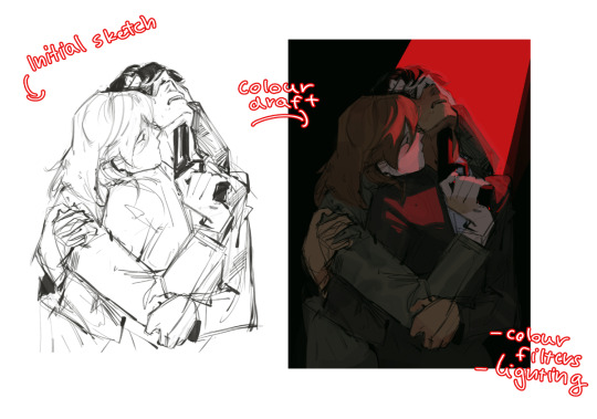
then just lines over the colour draft, fixing lots of anatomy and proportion stuff, and depending on how i wanna do the colours ill either keep the colour layers or merge them together and have the edited colours as the base colour (this might not even make sense help)
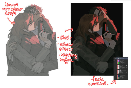
see this piece at the time gave me an insane ammount of trouble with lighting and colours, so after trying to render i ended up merging everything together....which i dont USUALLY do but the rendering is pretty similar except usually i have colours be seperated by layer,
ANYWAYS sadly i dont have a process on how it got from flats to this specific render for this piece...but i still followed my initial drafts/plans with vibe and colours and just painted over it, its why i make it after all!
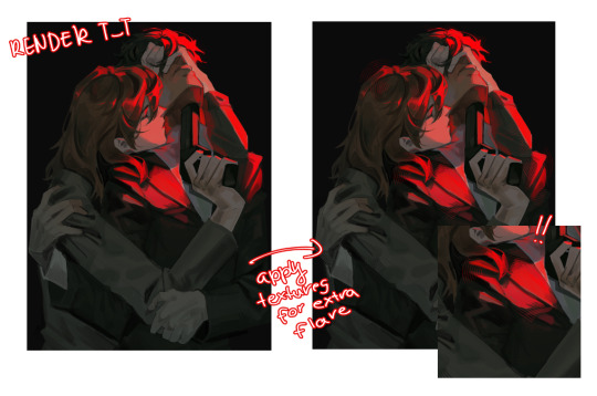
but honestly a lot of times its just very simple colours and just trying to mainting good contrast and values !!!! and THEN fucking around with colours and rextures, for other pieces i kinda just paint as i go? i have this timelapse of my justice piece that may be a bit more help!
it includes the initial colour draft, the cleanup/lining process, flats, rendering, and all that so its probs the most accurate timelapse of my morecomplex work processes, with stuff that doesnt include heavier backgrounds, which is a whole OTHER topic honestly
im sorry if i cant explain it more cohesively, i genuinely barely know what im doing most times and go by muscle memory and stuff i Know but cant. Explain? like i know how light and folds work since i observed and studied them but i cannot put it into words at all )--)0
my brushes also contribute a lot to how i render and colour, depending on what i use, you can find the swatches for them here !
152 notes
·
View notes
Note

Hey Jewel your art is so good and I just wanna ask you, HOW THE FUDGE DID YOU BALANCE ALL OF THIS?! THE SHADING, LIGHTING, COLOR, CURVY OUTLINES, EVERYTHING. I NEED TO KNOW CUZ I SUCK AT COLORING!
honestly im gonna be so for real i had no idea how i did any of the eepytale comics. i have no cluse what i was eating that week LMAOOO
but, i can tell you what i do currently a lot for rendering and coloring in general :D use textured brushes!!! they really add some dept into ur art! that and always try out different layer modes :3
for curvy lines i just recommend practicing a lot, that or use whatever tools you have for shapes and making curvy lines!
just- look at references, study different art styles and always try to learn new things :D
84 notes
·
View notes
Note
Im so so so so sorry for the dm but I gotta do, how did you do the lighting for these two??
https://twitter.com/Licollis_a/status/1657703869068234754 https://twitter.com/Licollis_a/status/1657631596198125569
(dm wouldnt send on twitter so I'll send it here!)
Be not afraid, for I will reveal my secrets in rendering step by step.
1. After I'm finished with lineart, I added the base color. It's faint, but putting in gradient will make it pop.
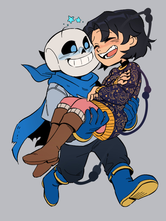
2. In order for the whole thing to look harmonious with each other, on top of the base color I added a multiply and overlay layer. The color I use for multiply is usually desaturated, kinda pastel-y. The overlay one is more saturated (see alternative colors below).

3. The result should be kind of dark. Which is what I'm after, because what you're seeing is already shadowed. So instead of adding the shadow to the base color, I'm adding the light.
On top of the multiply layer, I added an overlay layer. I keep in mind where the light source is coming from (see the blue arrows). The color of the overlay can be whatever -- it depends on the vibe you're trying to make (e.g if they're in waterfall, I'd use light cyan).
Also, see that normal layer clipped onto my overlay? It's how I added my "fringe" (aka subsurface scattering). I often use pink. Just line it on the edges of the light.

4. Now I added a multiply layer again, just to give the piece more depth and details (like the skin)

5. Now I'm adding what's called reflective light (google to see examples irl). Basically, I covered the darkest parts of the drawing with something lighter. For this one I just added pastel purple in the normal layer, but there are other layer types to lighten it up!
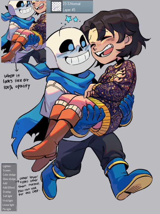
6. Now, I colored the lineart through clipping. I usually just matched the surrounding colors by adding a darker one (e.g dark red for skin).
Optional: I like to make 2 copies of the lineart, make one red and another cyan, and respectively slide it to left and to right. Sometimes it doesn't even look good tho....

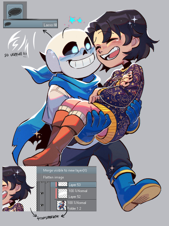
7. Highlights time! To do this I disable the background so it's transparent, click right and choose 'merge visible to new layer'. Which flattens the visible image onto a new layer. Now I can add in these white lights by clipping on top of it!
(It's a lil tricky to do this right with a brush, so I used the lasso fill tool.)
To top it off, I add some sparkes. My simp art is done <33
Edit: I forgot!! By the end of it all you can add a texture by setting said texture into overlay with low opacity (on top of the finished art). In CSP you can add a perlin noise, one of these:
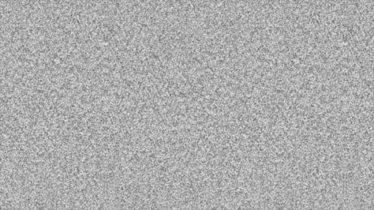
You can use other kinds of textures for ur artwork, like watercolor etc.
#by the way the other art you linked also use similar steps. just simpler.#(multiply over base color. overlay for the light and fringe. low opacity for scattered light. done.)#i hope this helps you and other artists too!!!#happy rendering!!!#art tutorial#lico arting
718 notes
·
View notes
Note
seeing your clowns made me go feral since my fixation is cringe and clown flavored
Who let you cook like that who let you cook AUTHHFFH UR ART IS SO COOL IM BEING DRAGGED AWAY
You’re hatching is so fucking inspiring since it’s soMETHING I try to do in my own work I LOVE UR ART
would it be fine to ask what brushes you use? I love ur values also, you’re so so good at shapes and form WAAAA I LOVE UR STUFF. I did dig up an old ask you made iirc, but I’m not sure if it’s changed
Hey! Thank you very much. I'll go through the brushes I use for each program: Drawpile
From what I understand most of these are MyPaint brushes... but I only know them as drawpile brushes because that's what I use. Main ones I've used lately is Irregular Ink and a default brush for coloring


I don't really change the size of irregular ink much and the pressure doesn't matter that much. It has high stabilization which I haven't changed, but I'm sure you could get away with lowering it. For the other brush I'm pretty sure it's a default one that I slightly tweaked (drawpile is a bit bad about communicating what brush exactly you are using to you.) I quite like it because it feels like playing with clay, makes it easy to map out the volume. I use it for those lineless pieces I do from time to time too. I change its size a lot while drawing. I've also used these two, one of the pencil brushes and a second one I stole from Jokioro that I have no idea what is called
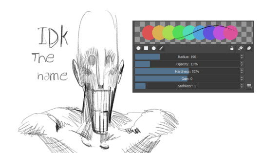

I used the first one for the D'arce I did a while ago and the recent VTMB piece. It's great at emulating sketchy graphite pencils, I like layering it to do multi-colored hatching rendering. The second one I don't know how to use super well yet but it's probably my fourth most used as of late. It works very weirdly so if you wanna figure out how to make it work I recommend looking at how Jokioro draws. Clip Studio I bounce around a lot with all the brushes, but I use a loooot of stuff from the Frenden pack. Mainly Meeko Leako for lining and even coloring, it has a great texture to it, very fun

This has been my most used brush for years. It's great for super straight lines and produces a great difference in value between quick lines and thick lines. I haven't used it as much since I picked up drawpile more recently, but it's amazing! Other than that I use the default G-pen when I just want simple lines without much texture
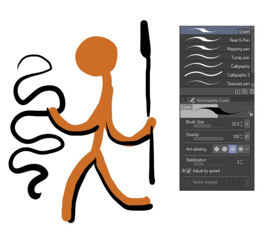
It's a bit ugly at a glance but I think if you lock in it's great for super clean lines, just trying to get the point across without much noise. I also like coloring with it at times, when I'm going lineless. SAI Binary pen. Use the binary pen. It's the best brush ever made
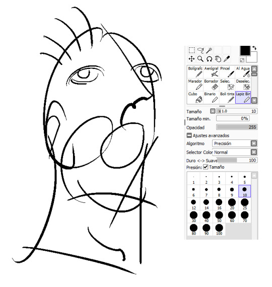
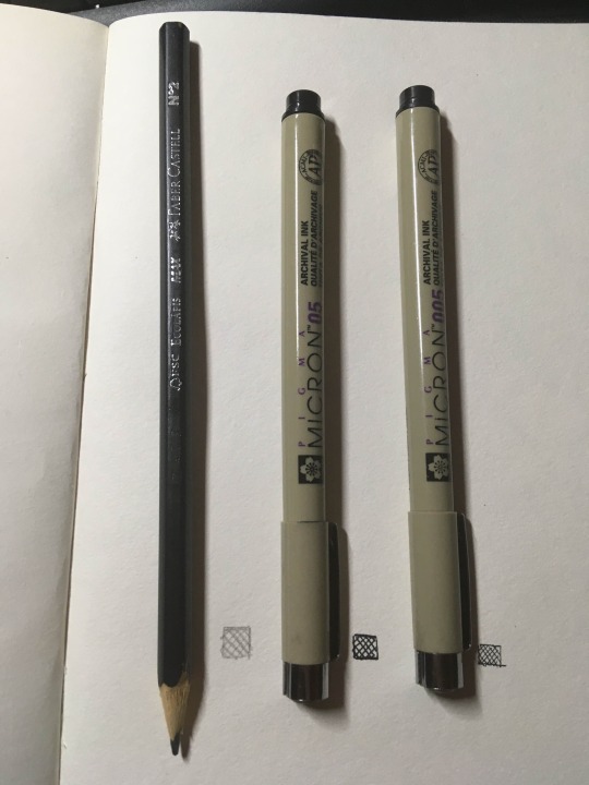
It just feels super right to draw with it, it's so simple but it makes your lines look super slick, and it's just a binary pen. I guess they just got the behavior down perfect for it. But yeah, love this brush. IRL I've always used these archival ink pens in different sizes for basically everything I've done traditionally, and of course just a simple number 2 pencil for sketching and such. I've used a bit of charcoal recently, and been wanting to deep into darker pencils for detail, but this is still the default. I also will probably try out dip pens sometime
That's all I can think of immediately, but I always like to mess around to try and find another great brush, and you should do the same even if you end up using these a lot.
53 notes
·
View notes
Note
Yo! Do you have any notes/tips for your coloring process? I've always had trouble with that part of drawings looking good lmao and I really like yours! If not for your specific style, do you have any tips with that in general?
Iv gotten a few asks about how I color but iv always avoided answering because
A) I am absolutely awful at explaining things, and
B) I am a very Very lazy artist you should probably Not do the things that I do
BUT i feel bad gatekeeping(?) my horrible technique if it helps anybody ig ill try and explain so
✨✨✨Welcome to Reegis’ Probably Not Reputable (But Very Long Winded) Art Advice✨✨✨✨


line art of a random character for the example, just pic whatever colors you have in mind for your base colors, you can try using palette generators or basing it off of existing palettes/characters/whatever I have absolutely no idea how color theory works (& this is why you shouldnt listen to me) so im solely going off of vibes. but it is Rough so onto step 2 & 3
(edit to add i usually start off with the skin hair & clothes on separate clipping layers and merge them together towards the end.. i think i forgot to say that at all here oops)
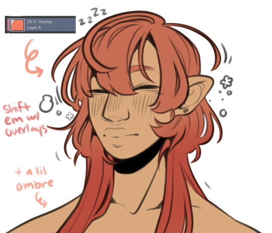

I abuse the hellll out of layer blending modes. overlay, saturation & multiply mainly, but also difference, brightness & screen. (just doodle something & try all of em out to get a feel for them honestly ik theres a Lot and they can be intimidating) for this i just wanted a more cohesive warmer tone to start with so i added a peachy overlay & a slight ombré to the hair to add a bit more interest to the character.
then just the most basic of rendering, some blush & highlights just wherever i think theyd go.


Another thing they tell you Not to do, my next step is to block out all my shading in a vaguely purpleish multiply layer!!! i cant be assed to do it any other way im sorry…. once i have the basic shading down, i lock the layer & go in with air brush eraser & also airbrush in other colors wherever I think the purple is maybe too harsh/clashing
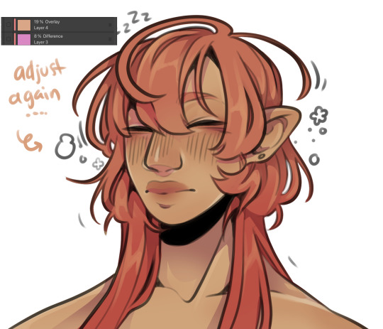
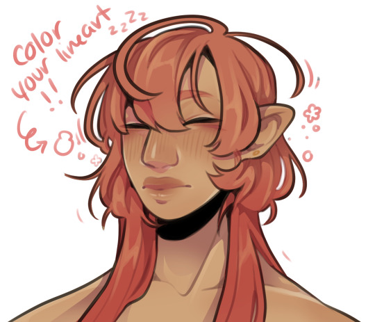
still wasnt 100% happy with the colors so messed around with some more layer filter/modes/whatever you call them then colored in my line art! i think this is honestly the saving grace for all of my art shshsdhhf color your lines people. doesnt have to be all (i dont, i like the contrast) but it usually helps to make some at least a little less harsh
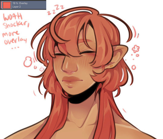
then with a little more color tweaking im done! one random sleepy dude, fully colored (by my standards)
and then if a piece needs more dramatic lighting you justttt
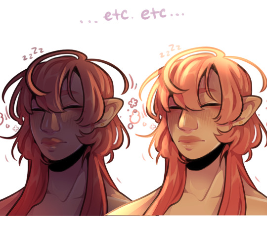
im so serious play around with layer settings! these are just basic multiply & add(glow), there as so many others you can abuse the shit out of & nobody will know or care in your finished piece.
was this?? in any way helpful???? I hope so.
#THIS IS A BELATED ANSWER FOR ALL OF U MY B#scrolled back to find the earliest one i could bc i mean… you asked first#if this was in Any way helpful…. im glad#and also sorry. probably dont do these things#hmu if youd like me to clarify anything ill… do my best#asks#my art
118 notes
·
View notes
Note
Ello! ʕっ•ᴥ•ʔっ♥️ Im secretly a big fan of your art work and was wondering if you'll do a tutorial on how you make your art work, I love them all very much 💞
Oh, thank you. 🙇🙇 I’m so glad to hear that! And sure, I can make a tutorial real quick. :))
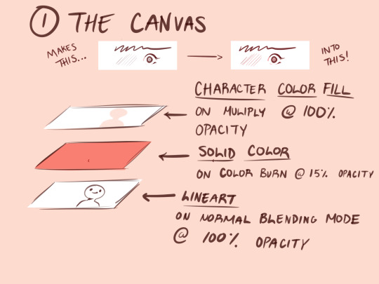
1.) Before I start doing any art, I do this to my canvas. Having a solid fill layer on color burn with low opacity gives a nice outline effect on your pen. As someone who sucks at putting lineweight at the right spots this is a life saver (or if you want to make your linework better, that works too.lol) All color bases and renderings stay above the lineart layer on multiply (I also use clipping mask a lot for rendering.)

2.) I give myself some time to research for poses on Pinterest. If I can’t find anything, I use Magic Poser on my iPad to make all of the poses.
This is a link for the web version.
Here is also the link to the brushes I always use for my drawings.
I’m going to use this old sketch of Ava with his hair short. For this example, I didn’t find a pose. I only referenced the hair style.
Generally I create the basic shapes for everything- the head, wings, body, etc (hair is kinda the exception to this). I don’t go too deep with adding line weight just yet.
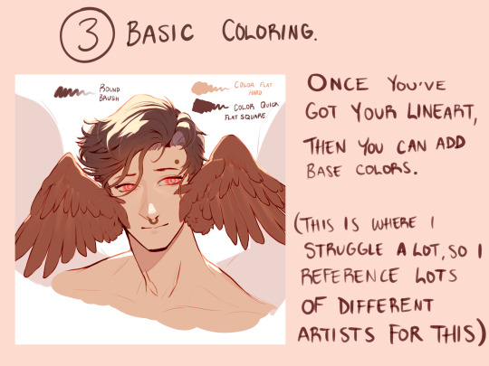
3.) I add the base colors in this step. Sometimes I’ll stop here with my drawings, but with my personal art I continue. I tend to explore a lot of color schemes, so I like seeing how other artists approach this. I can take the longest on this cuz I get so indecisive of what I want. 😅😅
Sometimes if I don’t like my colors overall, I’ll add a solid color layer on Hue at around 30-40% opacity to harmonize every color. This layer stays above all other layers.
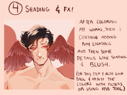
4.) Step 4 is a bit of a continuation from 3. Here I start adding more detail with the coloring, and putting those FX that I want. If I want to, like in this example, I also extend the drawing to show other elements, if I feel like the composition is a bit empty.
After this, I take a step back from my iPad and come back to my drawing the next day. Sometimes doing that helps me find obvious mistakes that I wouldn’t have noticed immediately.
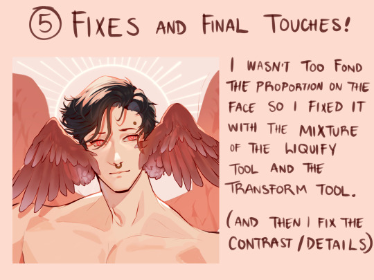
5.) Sure enough, I saw the the mistakes on his face, so I fixed them. I prefer using the liquify over the transform tool when I need to retouch some things; it prevents the linework or coloring from looking “choppy” or torn apart with its resolution.
Once I got the final touches done, I send it off !
Don’t know if this is actually considered a tutorial but maybe seeing this process step by step can help a bit. 👏 good luck, and have fun with what you create!
73 notes
·
View notes
Note
Hello! I am a beginner artist and I love ur art!! Super pretty and the colors are very tasty. Do you have some tips? I'd love to see your art process!
HELLO ANON!! first of all i am very honoured that u would ask me this because 90% of the time i feel like i have no idea what i am doing and like im still a beginner artist myself DSDSJDF. i would love to share some stuff i learnt and some stuff about my process (regardless of how messy it is sdfhsj)
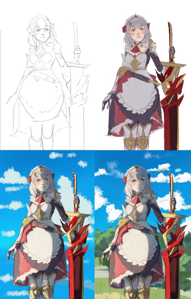
(final piece)
here's an old example of my process i found! while the steps sometimes look different for other pieces, i feel like this is a good demonstration of how the basic structure looks.
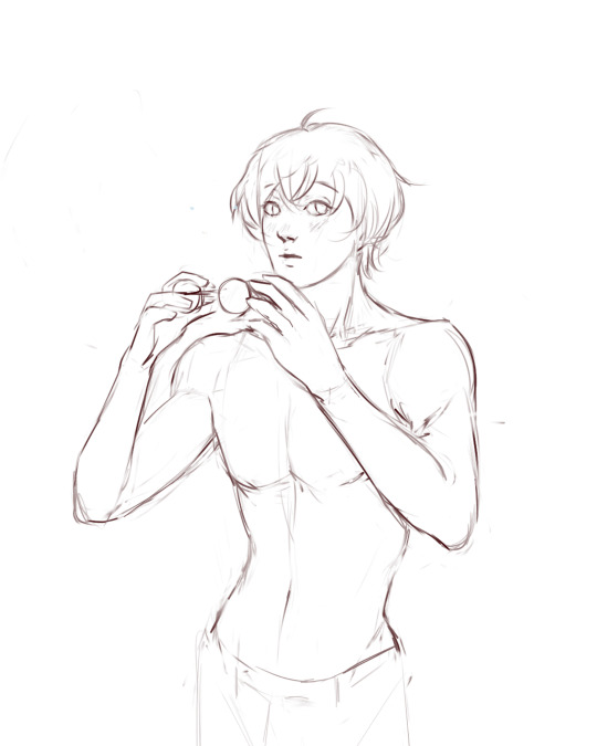
1. the sketch - this is where i'm mainly figuring out how i want the piece to look. i was redrawing a screenshot for this piece so it looks a LOT neater than what a lot of my other sketches look like, for example, here's the process of me figuring out my recent drawing of haise:


(final piece)
in the first two steps, i was mainly working with showing myself what the piece was going to be. the last one was where i used references/technical knowledge to try and show whoever will be looking at it what the piece was
2. cleaning up the sketch + base colours. these two usually occur simultaneously because i will get bored cleaning up the sketch midway through and want to start adding colour LMAO. on a more practical note, sometimes putting down the base colours and having a better idea of what the finished product will look like might make it easier to refine things.
a note: cleaning up for me doesn't mean doing lineart. it mostly means erasing any overly messy lines on the sketch and redrawing small parts to make it look tidier where needed. i often leave it 'messy' at this stage, too. like here:

(final piece)
3. light/shadow. this is my FAVOURITE part because it's where the piece starts pulling together. the method i used in the current piece was putting a multiply layer over the colours folder and filling in where light would be obstructed. after that, i used a luminosity layer to put in some bright sunlight. marc brunet has a great way of explaining it by advising to pretend that the light is the camera and you're behind the lens. this is such a good way to block in average light/shadow values! sometimes this looks a bit crazy because everything is still so messy but that is why we have...
4. rendering. this is where i fit all the remaining pieces of the puzzle together. i'll refine the colours a bit more -- e.g. colouring in the eyes, -- and fiddle a bit with the shadows to add some more variation to the hues/value. this is where i think a lot about light and shadow theory and try and make it look more realistic. marco bucci saved my LIFE with his videos about ambient occlusion and ambient light (part 1 / part 2) -- essentially, what i keep in mind the most is that if a plane in shadow is facing the sky (or is open to any other form of light that isn't the direct light source) it will contain ambient light. it is SUCH a game changer when you add it to your pieces, trust me, even if youre lazy about it. if needed i'll pull up some references to make everything look good!
5. rendering... part 2? honestly this step kind of blends with the last one as i tend to do it simultaneously. i basically clean up all the messy lines from before by painting over them! with the majority of the colours i need put down, i can just eyedrop them and paint over anything that's needed. this also comes in with the light/shadow, where, if i need a more subtle hue for either/or, i will eyedrop it and brush it in.
some further notes:
i very rarely use references during the first stages of my sketch. i think it tends to look quite stiff and unnatural if i rely too hard on the. and i personally prefer the creative room when the idea is still being conceived. references come in when i can look at what i have down on the canvas and have a fairly decent idea of what i want, including pose, composition, etc. it's essentially a first draft to guide me to where i want to go with the piece. it's when i'm done with this that i bring out references, and even then, they don't necessarily have to be the exact pose -- i'll usually get a couple of pics which show what i need to double check and keep them up as a guide. by the end of the 'sketch', i usually have a basic construction of what i need to continue, even if it's messy.
i use very soft brushes when putting down colour because it allows for more hue variation. like i said, i enjoy eyedropping and brushing in colours afterwards, so this really helps!
layer modes are ur friend! i try not to rely on them too hard during rendering because i like the freedom of painting over but they're very useful when you're blocking in your initial colours
sometimes, when i feel like i want to try something new with my art, i'll keep pieces that inspire me up in front of me. i have two of sui ishida's art books and sometimes i'll just flick to a page that oils the Art Gears in my brain and keep it open while i draw. i don't necessarily reference it, but i like having it there so i can glance over every once in a while. i don't usually make a conscious choice where i'm like "ok i want to render skin the way he does" but it's more like. my brain knows what it likes in his art and it'll try and push that part of my art in a similar direction.
honestly the best advice i have is that art is very much based on vibes. everytime i've tried to think too much about it, to do things 'correctly', to rigidly stick to art theory, my art has not come out nicely. i think the technical parts of art are important to know and understand but i also think it's important to let your knowledge come through naturally when it is needed instead of pressuring yourself to do things 'right'. tbh you probably already know that but it's something i forget a lot so maybe it serves as a helpful reminder?? sedsfhsl
ANYWAY SORRY THIS WAS SO LONG! i hope i covered what you needed and if you need anything else/want me to expand on anything feel free to drop me another ask ! <3
make sure to look after yourself and trust yourself and ENJOY!!! art is about having fun!
81 notes
·
View notes
Note
hi! I saw your post about critiquing another persons art work and it made me realize i dont like my current drawing process
Mostly because I have shaky hands and don’t really like line art because it takes me too long and i still dont like how it looks so im trying to switch to a more painterly style
Do you have any advice? Particularly on defining 3d forms?
P.S.
(I love your art style! You draw so beautifully and I love how you stylize anatomy and hair particularly)
yeah i feel you, i think everyone starts digital art with a lineart heavy style in mind and then gradually drop it as it is pretty hard to master
i'm not sure i'm the best person to ask about defining 3D forms as i myself struggle with that, but i thing that i noticed is that if you don't have a stable base or foundation to paint over then the process will become exponentially harder. So what i do is i make sure i have a cohesive sketch. Not a clean one, not a pretty one, but one where i am sure where everything goes and one that helps me predict and better visualize how things will end up once i get there. If the sketch is so messy to the point where i can't tell a leg apart or i don't know the general form of the fabric then i'll have a much, much harder time rendering later on.. So i think making sure the "skeleton" of your art is set in place. Again it's not about it looking good or clean it's about knowing what you'll be doing with it in the later stages.
But let's say you do have a clean sketch, or even lineart. I think the easiest way to give form to your subject is by choosing a light source ( it doesn't have to be dramatic, it can just be ambient light ) and then paint shadows in the areas where light can't reach. It depends on your style really, but for me i use a darker (but still saturated) color under the chin, under the eyes, where the bangs/hair meets the face and for the nose area i kinda just make a blob (i don't paint noses that much as you might have noticed bdshj but you know,, check out other artists you like and examine how they handle shading). Just try to think of everything as oversimplified shapes. limbs are cylinders, the torso is like a parallelipiped or a box or a sack of beans or whatever you see fit, the head another box etc... just keep it simple, Less is more
Oh and also, for a painterly style, i suggest avoiding overkilling it with the rendering. Let the brush strokes speak for themselves and keep it vague/ abstract. Our brains are smart and they loove filling in blanks for us if they're given some general information so let the viewer do the hard work, don't explain everything.. this is also a good way to practice developing an artstyle but i'm getting off topic if i wasn't blabbering enough already. A painterly style is imperfect and messy and vague at times and you should let it be that way, don't force perfection onto it as you'll deprive it of humanity these are my two cents on the matter hope it made sense and helped in any way? if not you can always watch yt videos or listen to more qualified people than me
#sinix marco bucci ahmed aldoori#i think that's the holy trinity#they explain stuff pretty well#also don't forget to analyze other's work and see what They do#no need to reinvent the wheel u know#ask iztea
22 notes
·
View notes
Note
I’ve been peeking in your art for a bit and it’s absolutely lovely ! Specially your hades fanart? It’s so so good, I wanted to ask what brush you use for your lineart? It gives such a nice touch to your art I’m curious haha, so sorry if you’ve answered this already
thanks a lot! and i don't think i've said what brushes i use before so i might as well give a full rundown. i use CSP with a mix of default and downloaded brushes
i'm assuming you're talking about my chaos drawing? for the lineart here i used the default milli pen with anti-aliasing set to minimum. this is basically just a round pixelated brush with no pressure sensitivity so i think you should be able to get a similar effect on other software pretty easily. (this specific illustration also used the technique of copying the lineart layer, setting it to a strong saturated color (eg bright pink or purple), blurring it a little and setting the layer to reduced opacity. this adds to the crunchyness and might be the effect youre looking for!)

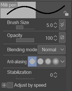
this pixelated effect is one i find really fun personally. the optimal brush size in my experience has been 5-9 with this brush, with occasionally 3-4 for detail lines
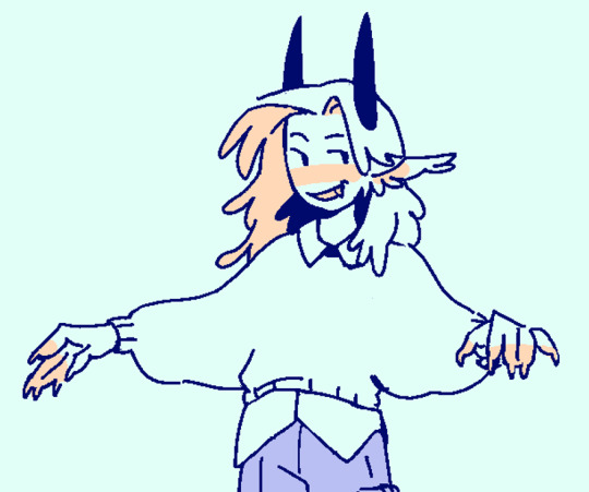
as for other art, sometimes when i'm not feeling the pixel effect i used the same milly pen brush but with the second anti-aliasing setting. it keeps the lines crisp but not pixelated (example)

although recently i found the wiggly brush on the asset store that can work as an inbetween alternative. still in progress with the drawing im testing it on and while i think i'll stick to the milli pen it adds an interesting texture

you didn't ask about rendering brushes but i'll say anyways. my other three main brushes come from the arubrush set i saw someone mention on tumblr i believe? theyre by knight zhang the link is in the faq section. i downloaded a the motherboard set and experimented until i found a few i liked, though there's a lot of stuff worth checking out in there!

i used the painterly and alector brush for any painting and rendering. the chaos piece was done using a mix of both (mostly the alector brush) for the shading.
this oc painting was done almost exclusively with the alector brush, while this melinoe piece was done with the painterly brush, if you want to compare the textural differences.


and i use the last one for sketches occasionally! its more textured than i prefer for finished works but its really nice to draw with

that's about it! hopefully this helps
7 notes
·
View notes