#illustrator blend tool
Explore tagged Tumblr posts
Text

vector available here
3 notes
·
View notes
Text
strawpage doodlin feels different (limited) compared to clip stu paint.... but it does help me with burnout in a way- 👁️👁️✨
no eraser? no problem; white paint does the trick-
#just balemoon thoughts#put ur strawpages here and i'll check 'em out!!#all it needs now are blur/blend/etc tools and#okay it's not the same as my usually illustrative style but it'll be cute-#balemoon rambles
5 notes
·
View notes
Text
youtube
#cover designer#how to create b&w letters#how to create block letters#how to create a font logo#how to create letter logo#s optical illusion tutorial adobe illustrator#adobe illustrator optical illusion tutorial#optical illusion adobe illustrator#how to create an optical illusion in adobe illustrator#op art tutorial illustrator#how to create optical illusions in illustrator#optical illusion in illustrator#how to make optical illusions in illustrator#s#blend tool tutorial#adobe illustrator#blend tool in illustrator#how to use blend tool in illustrator#3d type in adobe illustrator#Youtube
2 notes
·
View notes
Text


Icon Design
#adobe #adobeillustrator #illustrator #illustration #vector #vectorart #Ai #graphicdesign #graphicdesigner #creative #creativegraphicdesigner #creativegraphic #creativedesigner #sahdevvala #valasahdev #kshitijvivan #kshitij_vivan #educationvala #educationcala.com #drawingandillustrations #vectorart #art #illustartiondrawing #blendtool #usingblendtool #illustratorblendtool #blendtoolillustrator
#adobe#kshitijvivan#sahdevvala#Adobe illustrator#illustrator#illustrations#blend tool illustrator#using blend tool#blend tool#blend tool icon
0 notes
Text

#kashitij vivan institute#photoshop#image#googel#large images#background change#illustrator#text#blend tool#gradient colour tool#shadow effect#reffrence
0 notes
Link
0 notes
Text
Imbolc Altar Ideas & Correspondences

Imbolc, also known as Candlemas or Brigid's Day, marks the halfway point between the winter solstice and the spring equinox. It's a time to celebrate the returning light and the awakening of the Earth.
Altar Decorations:
Candles: Imbolc is strongly associated with the element of fire. Decorate your altar with candles in shades of white, yellow, and light blue to represent the increasing daylight.
Brigid's Cross: Craft or purchase a Brigid's Cross, a traditional symbol associated with the Celtic goddess Brigid. Hang it on your altar as a protective charm.
Seasonal Flowers: Place early spring flowers like snowdrops, crocuses, and daffodils on your altar. These symbolize the first signs of life returning to the land.
Herbs: Incorporate herbs such as rosemary, thyme, and cinnamon for their purifying and invigorating properties. Bundle them together with a red or white ribbon.
Seeds: Represent the potential for growth by adding a dish of seeds to your altar. Consider seeds associated with early spring crops like wheat or herbs.
Imbolc Symbols: Include symbols like lambs, ewes, and the sun to capture the essence of this seasonal transition.
Candle Holders: Choose unique candle holders or lanterns to enhance the ambiance. Consider using candle holders in the shape of suns, stars, or nature-inspired designs.
Divination Tools: Add divination tools like tarot cards or runes to your altar for seeking guidance during this transitional period.
Symbolic Stones: Integrate crystals such as citrine for abundance, aquamarine for clarity, and moonstone for intuition. Arrange them aesthetically around your altar.
Feathers: Symbolizing air and spirituality, feathers can be incorporated to invoke the energy of the season. Choose feathers from birds associated with the goddess Brigid, like swans or owls.
Artwork: Display artwork or illustrations that resonate with the themes of Imbolc. This could include depictions of Brigid, snow-covered landscapes, or symbols of growth and renewal.
Imbolc Incense: Craft or purchase incense blends with scents like frankincense, myrrh, and chamomile to fill your sacred space with a soothing and purifying aroma.
Correspondences
Goddess Brigid: Imbolc is sacred to Brigid, the Celtic goddess of hearth, home, and inspiration. Invoke her energy for healing, creativity, and protection.
Colors: White, yellow, light green, and light blue are associated with Imbolc. Use these colors in candles, altar cloths, and decorations to align with the festival's energy.
Stones: Crystals such as amethyst, garnet, and clear quartz resonate with Imbolc's energies.
Foods: Dairy products, especially cheese, and foods made with seeds like bread or muffins are fitting for Imbolc. Set offerings on your altar or incorporate them into your celebration feast.
Water: Imbolc is also associated with the element of water. Include a small bowl of water on your altar to symbolize purification.
Creativity Symbols: Imbolc is a time for inspiration and creative endeavors. Include symbols of your creative pursuits, such as a paintbrush, musical instrument, or writing quill.
Anointing Oils: Create or purchase anointing oils infused with herbs like lavender, rosemary, and frankincense. Use them to anoint candles, tools, or yourself during Imbolc rituals.
Animal Representations: Incorporate figurines or images of animals associated with Brigid, such as lambs, cows, or swans, to honor her connection to the animal kingdom.
Wheat or Corn Dolls: Craft small dolls from wheat or corn husks, symbolizing the harvest to come. Place them on your altar as a representation of the Earth's fertility.
Bell or Chimes: Hang a bell or wind chimes near your altar to symbolize the awakening of nature and the stirring of life. Ring it during your Imbolc rituals to mark significant moments.
Decorative Cloth: Choose an altar cloth with intricate patterns or symbols related to Imbolc, such as suns, wheels, or Brigid's crosses, to add a touch of magic to your sacred space.
May you find warmth in the returning light. <3
#pagan#witchcraft#paganism#witch#occult#wicca#dark#magick#neopagan#wiccan#imbolc#february#witchblr#imbolg#brigid of kildare#goddess brigid#st brigid
973 notes
·
View notes
Note
Love your art, the canvas textures you add, could you make a mini tutorial or something? Thanks for reading

thank you !!!! i realized i use the Same texture from this pack in everything LOL. as for the blending mode, i just click through each of them until i find one that Looks Good
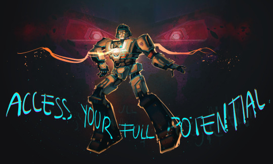
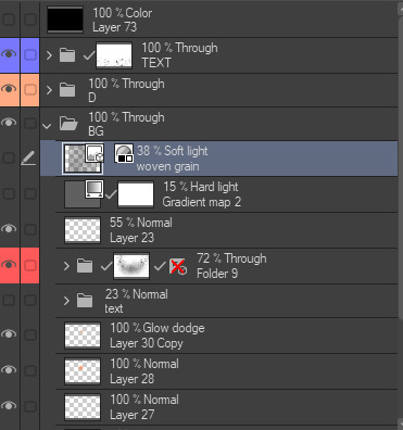

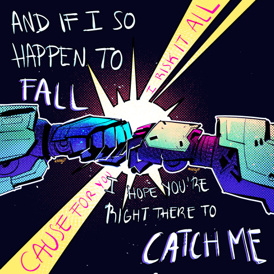
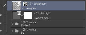


here's some of my stuff without The Texture and After The Texture
175 notes
·
View notes
Note
I love love LOVE your watercolour work! Are you still using the strathmore paper in your faq or have you switched to something else? (I’m shopping for new paper rn - trying to work out what’s a tool problem & what’s a me problem!). And would you every consider doing a little walkthrough of your process? Do you work in lots of thin layers? Your illustrations really evoke lovely stories so I’m always happy to see them. Have a great day!
hello!! Sorry It took so long to reply anon! To start, Thank you so much! Alright now about my matierial, Not much has changed but I am not using Hot press paper (Saunder Waterford Hot press 300g/140lb) the most nowadays!
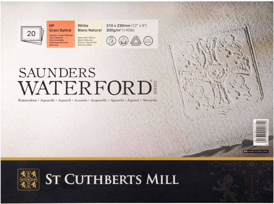
Its very similar to the Hot press from Strathmore I liked so either are not a bad choice! (And cold press from both brand are still a perfectly good choice! especially if you want more texture in your paper!)
Now for my process! I normally start with colored pencils lines for all my art. You can choose one color or many! I try not to choose too dark of a colour so that it blends in better.

Then its paint time! Watercolour is all about layers! (Like Onions, Like an Ogre) Patience is key with watercolours! Believe me I still to this day add way to much water/paint because I am excited to do a certain effect or want to get that wash right. But there is always a way to make it work! Half watercolours for me is to work with the little accidents water or paint caused. So I start with a pale color (often a soft yellow or orange or a blue but Go wild!)
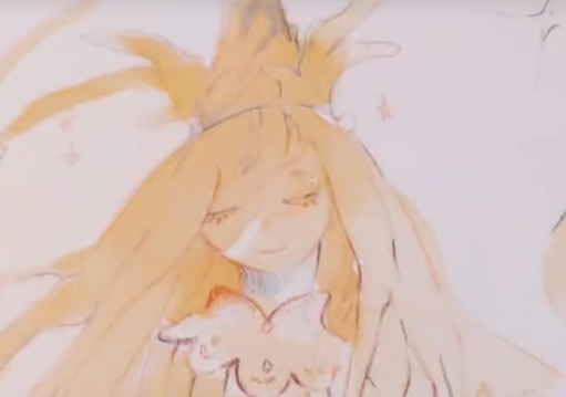
and then I build on it!
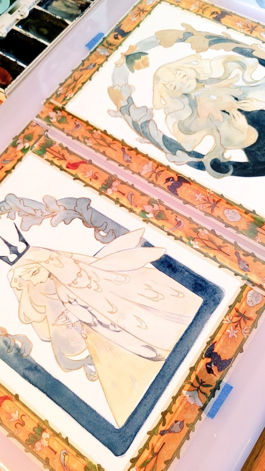
and you just continue to do that, waiting in between paint layers for them to dry (Or almost dry depending of the effect) . You can work on another section during that time, or (My favourite thing) just sit back and watch a long 4 hours video essay.:) Then once the paint is done I normally define and add some details with Colored pencils again! Then I scan the art and will adjust a bit or go full on mix media in procreate! It depends on the piece! And then you have the full piece! Hope this helps!
265 notes
·
View notes
Text

Art commission for "badgerwarrior" this time I experimented a bit with the custom blend tool in CSP, so this illustration has almost no flat shading.
There is still a lot to practice, but I am satisfied with the result so far.😊
https://www.deviantart.com/systemst91/art/Futuristic-Girl-preview-1153402161
#commissionopens#commission_art#commissionsopen#commissions#commissionart#commission_open#90s#aesthetic#cybernetic#cybercore#retro futurism#retro futuristic#futuristic#90s anime#manga girl#y2k#sexy#hot#digitalartwork
62 notes
·
View notes
Text

GREYDIENT.5 · vector available
#kloroform#gradient#vector#abstract#branding#design elements#grey#illustrator blend tool#gradient blend#line art
1 note
·
View note
Text
Tutorial: How-To Create Striking Gradient Shapes & Waves for Adobe Illustrator for iPad

In this tutorial, we will explore step-by-step instructions and tips to create striking gradient waves and shapes that can enhance any project, from digital illustration to web design and marketing materials.

Starting off you'll want to open Adobe Illustrator on your iPad, and select 'custom size'.

Create a canvas that measures at 3000 x 3000 points.

Set the colour mode as 'RGB'.

Select the 'Pencil' tool, and then select 'Paint Brush'.

Select 'Calligraphic' brushes, and scroll down until you find the 15 pt. 'Round' brush and select it.

Select the 'Fill' option and set the colour value to none.

Select the 'Stroke' option and set the colour value to a colour of your choosing.

Select the 'Smoothness' option and set it to the maximum value (10).

Draw a wavy line.

Select the 'Stroke' tool and choose a new colour.

Draw another wavy line over the top of the previous.

Select the 'Stroke' tool and choose another new colour.

Draw another wavy line over the top of the previous two.

Select the 'Selection' tool.

Select all of the shapes.

Select the 'Repeat' tool.

Within the 'Repeat' tool, select the 'Blend' option.
Tip: If you have a keyboard connected to your iPad, you can use the keyboard shortcut 'Command+Alt+B' when objects are selected to blend them.

Now our gradient wave shape has been created!

Once the shapes have been blended, you can manipulate the spacing of each shape with the three dots in the middle, each one represents each of the lines.

Move each point around until you feel comfortable with their spacing.

We may want to make some alterations to our shape such as changing the rotation, shape, size, order of lines. Here’s how we can do that.

Select the 'Selection' tool.

Drag and select the shape.

Select the 'Object' tool.

Select the 'Release' option.

Now the objects are unblended they can be altered or manipulated to our liking.

To put our gradient wave back in place, first select the 'Repeat' tool.

Then select the 'Blend' option.
Congratulations on completing the tutorial on creating striking gradient waves and shapes in Adobe Illustrator for iPad! You've taken significant steps in enhancing your design skills, learning how to apply gradients effectively, and bringing your digital artwork to life with vibrant colours and dynamic forms.
Keep Practicing - As with any creative skill, practice is key to mastery. Continue experimenting with different gradient combinations, wave patterns, and shapes. Find new ways to enhance your designs.
The more you practice, the more confident and proficient you will become.
If you're interested in supporting me, or checking out some free eBooks, Wallpapers, and more. Please consider checking out my Ko-Fi page: https://ko-fi.com/spikeeager
#freebies#guides#guide#how to#howto#how-to#how-to's#how-tos#art guide#art#design#illustration#art help#art tip#art advice#art tutorial#drawing tips#graphic design#creative#unique#marketing#tips#artwork#art process#digital painting#drawing#illustrators on tumblr#illustrator#illustrative art
136 notes
·
View notes
Text
speaking of line rider, I decided to poke my head back into the Line Rider Review channel, which you may remember for going viral in 2017 with Rabid Squirrel's review of the top 10 tracks of the previous year on artistic grounds...
youtube
at the time, Line Rider was around ten years old; the baroque jargon and the complexity of the techniques really got people (in much the same way as pannenkoek's half a press video), so Squirrel ended up making a followup video on the jargon, a charming slice of "this person was definitely gonna transition" which serves as a good intro to what the scene was about back then...
youtube
since then there have been many developments: more complex musical sync, elaborate animation techniques, etc etc.; it's only grown. so what does line rider fandom look like in 2024?
youtube
well... everyone is trans now of course. it's gotten a lot more interested in political and emotional themes, too. the top video is an hour long feature about the author's partner's experience of figuring out they're plural, learning Japanese, as well as the grief of friends they've lost along the way, through the lens of line rider tracks they grew up with - and that's not just one person's thing either, a whooole lot of the tracks on this list are painfully sincere short film dioramas about trauma, dysphoria, abuse and similar topics. Not all of them mind - you've also got experiments that blend between line rider and stop motion, and a recreation of a classic Touhou video from the Chinese line rider scene on bilibili (there's a Chinese line rider scene on bilibili now), but it's very clear how much the taste of this subculture has shifted. I don't mean this to be too cynical - while it's easy to be a bit 'ehh' at the activist-speak of the channel, these videos are incredibly sincere and (sigh, yes, i know it's a cliche) heartfelt expressions.
i think the fascinating thing to me is that all that technical stuff in Line Rider hasn't gone away - you're still doing crazy complicated shit to fling Bosh around the screen, stop and start them, take them on and off the sled, interact with other riders, stage frame by frame animation, etc. Everything is still meticulously synced to music. But now this passes without comment for the most part! That's just the toolbox! Just as reviews of music rarely go into the specific music theory tools - chords, scales, etc. - unless they're aimed at teaching or analysing it for musicians. Line Rider videos have in a sense matured into a whole medium.
It's definitely a fascinating illustration of the ways Being Very Autistic On The Internet is changing. godspeed you guys.
100 notes
·
View notes
Note
Do you still use Flash/Animate as your main drawing software? Flash was the program I learned to draw in, and I remember some of your process videos really helped me figure out how to make use of some of its tools. I remember there was a shark mermaid illustration you did, and I really loved how the underwater lighting effects looked in that one.

To this day, I still use this version of Flash from 2008. Newer versions have a quirk where it takes longer to save a document the larger it gets, so CS4 is where I've been for the past 16 years.
There's also this funny bug in it that will sometimes make Graphic symbols draw with the Add blend mode, which is normally exclusive to Movie Clips. This is great for exporting and it's what I did in my kyu-kurarin cover for the chromatic aberration effect.

102 notes
·
View notes
Text


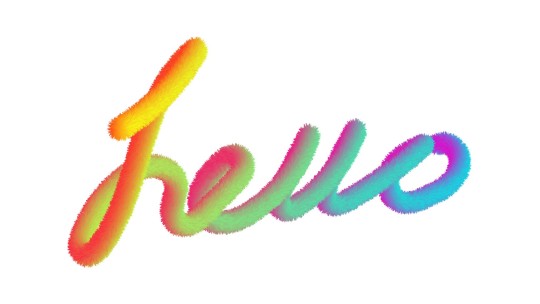
Blend Tool
#adobe #adobeillustrator #illustrator #illustration #vector #vectorart #Ai #graphicdesign #graphicdesigner #creative #creativegraphicdesigner #creativegraphic #creativedesigner #sahdevvala #valasahdev #kshitijvivan #kshitij_vivan #educationvala #educationcala.com #drawingandillustrations #vectorart #art #illustartiondrawing #blendtool #usingblendtool #illustratorblendtool #blendtoolillustrator
#adobe#kshitijvivan#sahdevvala#adobe illustrator#illustrator#illustrations#blend tool#using blend tool#blend tool illustrator#fur effect#text gradient effect#text fur effect
0 notes

