#all it needs now are blur/blend/etc tools and
Explore tagged Tumblr posts
Text
strawpage doodlin feels different (limited) compared to clip stu paint.... but it does help me with burnout in a way- 👁️👁️✨
no eraser? no problem; white paint does the trick-
#just balemoon thoughts#put ur strawpages here and i'll check 'em out!!#all it needs now are blur/blend/etc tools and#okay it's not the same as my usually illustrative style but it'll be cute-#balemoon rambles
5 notes
·
View notes
Note
How do you nail that movie screencap effect thingamajig?? I'm a sucker for VHS-animation looking stuff but sometimes fiddling with blending modes, gaussian blur, noise, ntscQT etc. just doesn't feel right.
For me, I love experimenting with a mix of using blending modes and using ntscQT, but I definitely get the feeling of it still not feeling right despite using those methods!
I'll do my best with explaining how I go about achieving the look! The art software I use is Paint Tool Sai 2 (but any art software with blending modes + layers will do!). Apologies in advance if this is too wordy haha
1.) I draw the usual setup- a background with a character or so. I usually flatten all the layers into one but, for this case, I just only flattened the layer the character's on:

2.) I duplicate the character layer, blur it, set its blending mode to "Lighten", and adjust the opacity as needed before merging the two layers together. I duplicate again, blur again, set the mode to "Darken", adjust opacity, and merge again!

3.) (1st pic) Once I do that, I duplicate & blur the character layer again, then move it a bit to the side (any direction is fine; for this I moved it to the right). Then I set the moved layer's mode to "Color"! After that, I add a drop shadow behind the character layer to give it the look of a traditional animation cel being used.
(2nd pic) Next, I flatten ALL the layers now into one layer, duplicate it and blur it greatly + set blurred layer mode to "Saturation" & move it in any direction before merging all layers again!! lots of duplicating and merging LOL!!!
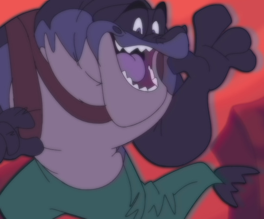
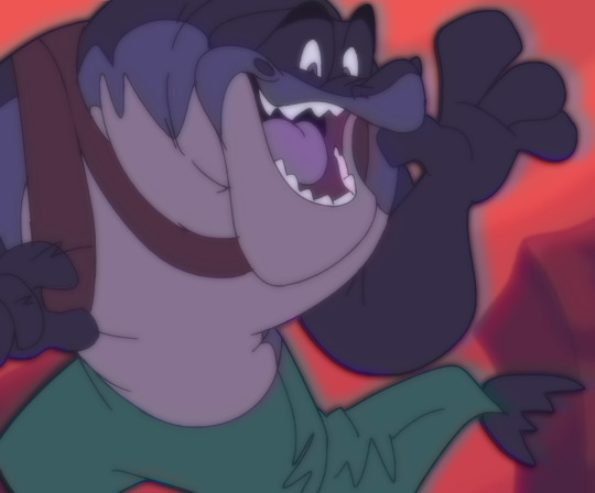
4.) OK THE LAYER DUPLICATION + MERGING PROCESS IS FINISHED FINALLY! Now we just adjust the colors!
I like to lower the Contrast and raise the Depth, though the adjustments can vary with each piece, depending on how much of a effect you want! Image on right includes the settings I used for this. (I also added a noise layer, but that's optional)

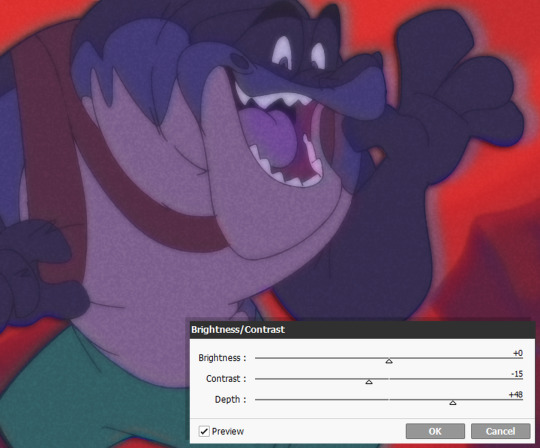
5.) And for the final step.... make the image a smaller size and save as a JPEG/JPG file!!! This should somewhat achieve the low-quality crunch look!
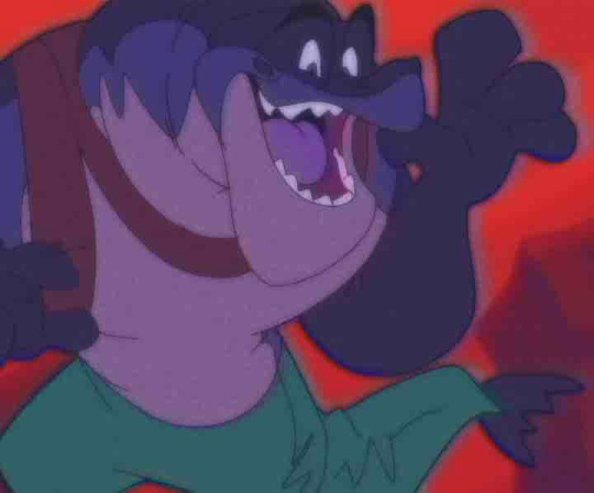
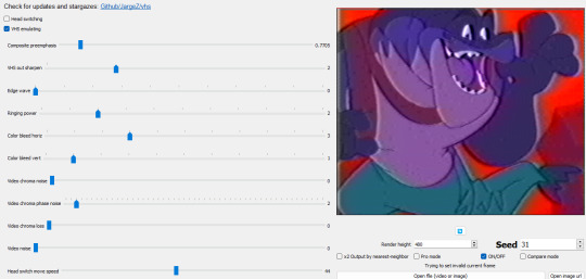
This step is entirely optional, but you can take the JPEG image and add it to ntscQT to mess around with different settings! Here's one I put together:
61 notes
·
View notes
Text
So I got this ask in my inbox, and though I was going to answer it in my asks, I think a little, actual post-tutorial would be best. But first, a disclaimer, as I like to cover my bases:
By no means am I an artist; my process is very much a case-by-case basis, and I edit as I need to for each picture that I do end up editing. My method is far from perfect but it is one that works for me for -my character-, so you may have to experiment on your own using these tips to find a method that suits your wants.
This little guide is using ClipStudio Paint, but you can get the same/similar results with really any photo editing program you choose that has brushes (GIMP, PaintTool Sai, Photoshop, Photopea (which is free), etc)
I'm going to use a painted over face texture as an example (basically a face diffuse I just painted over with it's base skintone), versus a full-on gpose shot (this way I can get a good swatch/an approximate measure of what skintone I'm used to working on).
Big Tip: ALWAYS WORK IN LAYERS, this way you can adjust everything accordingly without going back a million steps.

Use a basic soft-spray brush for your base, and pick a color a few shades lighter than the skintone you're working on (use your color-picking tool, it is your best friend). Set your first work layer to "add (glow), and make a little splotch like this. You can either leave it as is or blur it out/adjust the layer opacity if you desire, but again, it all depends on the state of your gpose/where you're adding it. I often blur out the edges to help blend it into the skin more naturally, on a low setting as to not erase it completely.
Before & after adjusting blur/opacity:


Next, you'll want a basic shimmer brush; there are dozens of free ones out there, so look around and experiment! Just like before, you're gonna want to make another layer, but this time, set it to white (or gold/copper if your character has medium/darker skintones, as it flatters them more and doesn't wash them out where as white is more for fair skintones).
Unfortunately, I can't seem to find the source of the shimmer brush I use, but what works for me may not work for you so it would be best to look at what's available and what suits your tastes more.
Now, working in layers using the "add (glow)" effect, slowly build up the shimmer, first, adding a quick couple swipes, then build it up. Once you're satisfied, focus more on the center
TIP: If you want to make it look more natural, when building your layers, blur out the edges a small bit to hide any possible lines and creases.


And that's pretty much it! Adding shimmer effects is all about trial and error, and just simply adding shimmer where your character catches the light.
I'd post examples but a lot of my shimmer examples are on very much lewd gposes and I'm not trying to get tumblr staff mad at me.
And again, another disclaimer: this is not a one-size-fits-all-guide, I seriously cannot emphasize enough that the best thing for you to do is just EXPERIMENT, this is merely a guideline to give you a lil push in the right direction. Editing gposes is supposed to be fun, and the best way to get experience is to simply practice and learn your tools with your own hands.
I hope this helps, and have fun gposing!
#OOC#ffxiv gpose#Gpose Tips & Guides#Whew I am sincerely sorry for the lengthy guide#But I do hope this helps take some of the intimidating factors out of editing#Also remember I am not an artist#I am just a goth dumbass who someone trusted with a tablet and CSP#Now go and do a crime my children
46 notes
·
View notes
Text
The Changing Humanity: Figurative Art from Antiquity to AI
Figurative art has dominated the canvas of creation from time immemorial – from the earliest cave paintings in Lascaux to the AI-generated figures of today. There have been subtle changes in the form and techniques over the years but the human figure has still remained one of the most enduring and expressive subjects in art.
Through figurative paintings, human form is represented in a way that is recognizable, symbolic, or emotional, sometimes depicted as abstract figurative art, that tells the story of our evolving identity, beliefs, and social structures.
The visions of humanity were portrayed through classical realism or through the bold expressions of figurative abstract art, where the human body has always served as a mirror of experiences.
This blog zeroes in on the transition of figurative artwork as a genre as we step onto this new machine-made era of digital tools, facing a radical transformation. We need to look through the layers of time to know where we are headed, tracing how figures have been interpreted across ages, cultures, and art movements.
From Where it All Started: The Dawn of Figurative Expression
The origins of figurative paintings can be traced to prehistoric times, and we have proof of earlier painted figures onto rock surfaces by the cave dwellers to communicate stories, rituals, or spiritual beliefs. Those are the primal depictions, such as the famous Venus of Willendorf or the running hunters in the caves of Algeria, that made it very clear that the human body is not only an entity but a sacred symbol.
With civilization, the language of figurative form became much more complex. Egyptian civilization frescos and murals showcased highly stylized human forms aligned with religious symbols and social hierarchies. In Greece and Rome, the figures were idealized in sculpture and frescos, which made much room for beauty, proportion, and divinity.
Medieval Symbolism to Renaissance Realism
The figurative art form took a new height in the Middle Ages as a tool for religious storytelling. Giotto bridged symbolic medieval forms with more naturalistic human postures that pointed to the birth of Renaissance.
With the Renaissance, the art of figurative took to a new high – artists like Michelangelo, Da Vinci, Rapheal who studied anatomy to bring precision in their figurative drawings also added emotional depth and drama to their compositions. They portrayed figurative divinity and finer details.
The Modern Shift: The Dawn of Abstract Figurative Art
With the advent of industrial revolution and photography in the nineteenth & twentieth century, artists started to think differently of the form and figures. The representation exceeded the limits of realism, as artists began to explore psychological and emotional depth through abstraction.
That is how the concept of figurative abstract art came into play — they were a blend of hybrid realities, where human form was present but stylized, distorted, or fragmented. Major artists from this modern era of figurative were Francis Bacon, Egon Schiele, etc. and later Jean-Michel Basquiat started experimenting with raw, expressive brushstrokes and unconventional anatomy to make the unconscious also take part in figurative. Now the fine line between figures and feeling got blurred, suggesting that abstraction can comprehend the depth of human truths.
Abstract figurative art challenged the notion of traditional paintings, and included concepts like identity, trauma, politics with the subject of portrayal. Pablo Picasso’s cubist works show a great deal of human shapes and physicality along with abstraction.
The Digital Age of AI-Generated Figurative
Contemporary figurative paintings are no longer confined to canvas. There are mind-boggling digital tools like Photoshop and Procreate to aid gen-x figurative artists who blend classical techniques with contemporary stylizations. Moreover, Artificial Intelligence has taken it a step further to suggest its own interpretations of human form.
Through AI-generated figurative artwork, artists can conjure pieces in a jiffy, with surreal and often uncanny representations of bodies, faces, and gestures. If you see the works of Sofia Crespo and Refik Anadol, you can explore how machines ‘see’ the human body – though the questions of authorship, originality, and the future of creativity remain unanswered!
As far as the new avatar of figurative abstract art is concerned, these visuals look neither fully human nor completely artificial — like a symbol for our own evolving identity in the tech-savvy world.
Figurative Art Still Matters in the Age of Instagram and Reels
No matter how deeply we are embedded in the digital reality and social media hypes, the appeal of figurative art is still there. As the human body makes the first connection with the world, it becomes the embodiment of love, hope, pain, and vulnerability. Figurative paintings allow us to revisit the connection of human and the world in ways that words cannot.
In a shifting paradigm of values and social norms, figurative abstraction offers a rich, flexible medium to explore hyper-real portraiture to silhouettes in abstract figurative form – as artists try to reimagine bodies as a space for healing and transformation.
The Future of Figure: Human, Machine, or Hybrid?
The future of figurative artwork throws light on a collaboration between social and cultural changes in connection with humans and technology. With more experimentation with Artificial Intelligence, motion capture, and virtual reality, the art of figure has a long way to go – no matter if it’s a work of brushstrokes, stylus, or algorithm. In the 21st century, modern figurative art embraces urban landscapes with figures.
Closing Words:
The story of humanity is echoed from the ancient cave paintings to modern day AI artworks in all its complexity. It has never been static, but something that goes on adapting and reinventing itself.
If you feel intrigued, join a figurative art competition organized by contemporary galleries like TERAVARNA to showcase your outlook towards the changing human form in the face of cultural, political, or technological advancements.
As long as artists love to explore human experiences in all figures & forms, figurative paintings will evolve as a significant language of connection.
#figurative paintings#figurative art#figurative abstract art#abstract figurative art#figurative artwork
0 notes
Note
hii i was wondering how you blend gifs such as this one? it’s something i wanna start doing but haven’t got the slightest clue how🥹
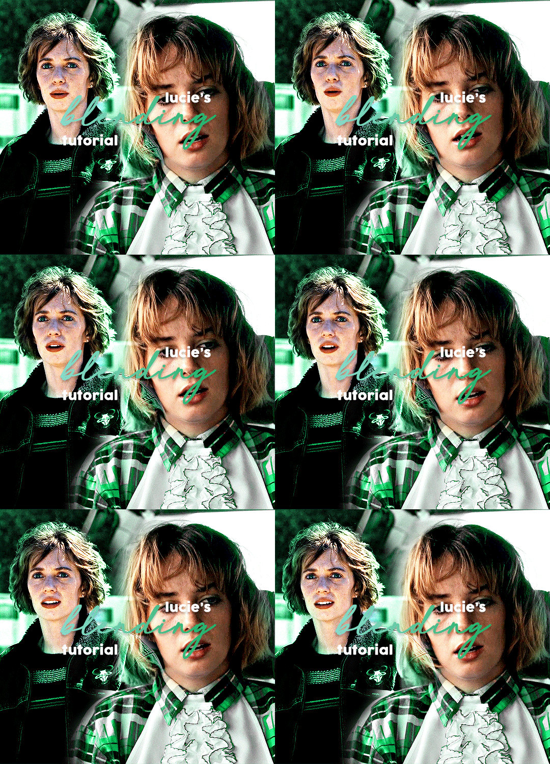
hi there !! blending is definitely one of the more fiddly aspects of gifmaking, but i'm happy to help !! before i start, here's some tutorials that really helped me out/look really helpful:
difficulty: low (by morningstr) difficulty: intermediate (more tailored to colourful gif blending) (by lamberts) difficulty: intermediate (by yenvengerberg) difficulty: low (by jackarthurdavenport) difficulty: intermediate (by nelsonnicks)
before you start, you should have a basic knowledge in how to colour your gifs, sharpen, etc etc. if you want any information on that, feel free to send me another ask for that.
i use photoshop 2022 for all my creations. and big disclaimer my process is VERY different to to others, but i don’t think it should change too much of your result.
1. create two gifs.
you’re going to start by creating two entirely separate gifs. when you’re blending, i find that it is typically easier if you can get two types of shots (mid, far, close up, that kind of thing) because it makes it easier to blend later on.
here we can see robin is kind of more of a mid shot on the right, but the left shot is zoomed in on her face to make it the focus.
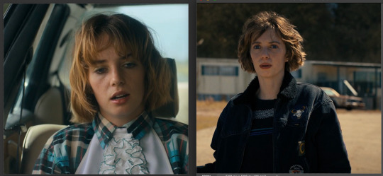
from here, ensure your gifs have the same amount of frames and layers. you can delete the excess frames + layers to get them at the same amount. (eg. one gif had 42 frames, and the other 15, so i selected every layer + frame past 15 and deleted them.)
2. combining your gifs.
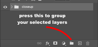
this is where it can all get a little hairy quick !! start by selecting all your layers, and putting them in a group. you can then rename that group so you can tell them apart when you duplicate them. then, select all your frames, change the frame delay to 0.05 and go from there.
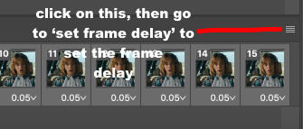
now, pay attention to this bit. you’re going to take ONE gif over to the other. to do that, click on the four lines i highlighted up ^^ and go to copy frames. make sure all your frames are still selected. then, go to the gif we’re going to place the other gif on, and go to those same four lines but press ‘paste frames’ this time. this menu will come up:
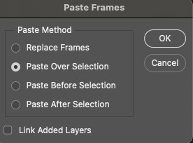
click the exact same one i have highlighted, then press ‘okay’. now, your frames and layers have copied over. you should have two folders, and the gif you were copying will probably be the only one you see, but don’t worry ! your other gif is just underneath.
3. blending your gifs.
this part differs for each creator, but here’s how i do it. select the top layer that you want to blend in, and open this dropdown menu:
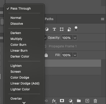
you’ll want to select either ‘lighten’ or ‘screen’. choose whichever looks better. your gif will now look like this:
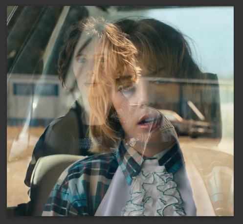
so now we’re going to blend !
because of the negative space behind robin in the gif underneath, i’m going to try and move the top gif into it. how you blend and where is kind of down to just a visual thing. so, i’ll move my layers into that space and then i’ll properly begin blending.
now that i moved both of my gifs it leaves these pesky lines behind:

to blend them out, do the following:
select the folder itself. go down to this bottom bar, and select the circled icon (it’s a layer mask):
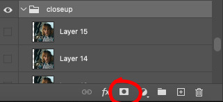
now, you have a layer mask. to use it, go over to your brush colours on the side bar (pictured below)
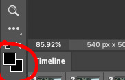
and make sure it’s on black. if it isn’t, you won’t be able to blend. after this, go to the gradient tool (in between the rubber and the blur tool on that same sidebar) and make sure your gradient looks similar to this:

if you need to change it, click on that gradient, go to basics, go the one with the checkers and change the colours to black. now, go back to your layer mask, making sure that your gradient tool is selected and create little increments going across that line. make sure you work horizontally, otherwise it’ll blend your gif away.
then, just keep doing that until you’re getting results you’re happy with. i’ve done a layer mask on both layers, and i’ll show you a tip in case you need to do that as well. but for now, do a rough blend with the gradient tool.
after that, go to the brush tool, and change your brush to a soft round brush, probably on 75-100. you can brush over spots you want to blend, as it allows you to be more particular.
this is what my gif looks like now:
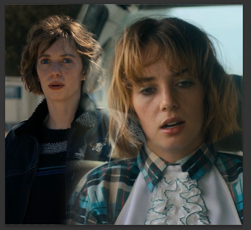
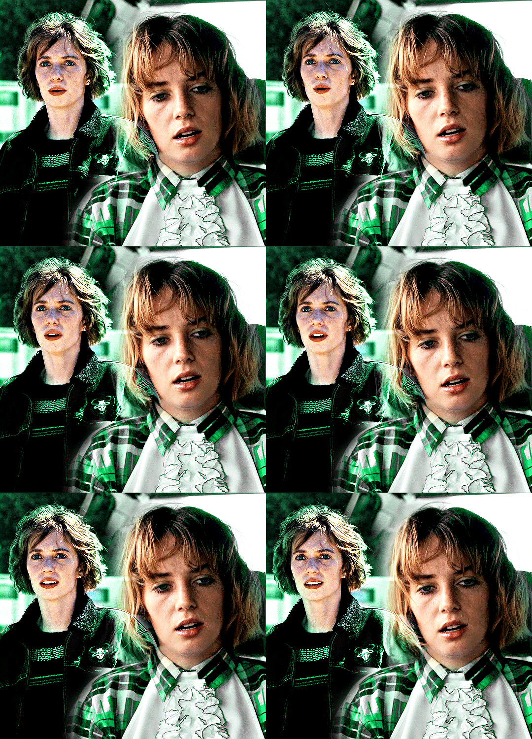
from here, you colour each gif in their respective folders, convert to timeline -> convert to smart object, sharpen and save !! this is my final result:
#*tutorials#completeresources#gif tutorial#blending tutorial#useranne#tuserkay#usernorah#tuserrex#userrsun
148 notes
·
View notes
Note
Do you use pose/face references when drawing? Maybe some recurring color palettes? Or just. Anything about your art in general i want to know more so bad
Sorry I took so long to get to this, I wanted to give a detailed reply! (you have no idea how long this has been sitting in my drafts) Thank you for the ask, Anon!
Now, for the, short answer to your inquiry— sometimes!
(Very) long answer— it really really depends. While I don’t have a direct reference most of the time, occasionally I do need guidance!
For example, I completely drew from reference for this picture of Fiddleford
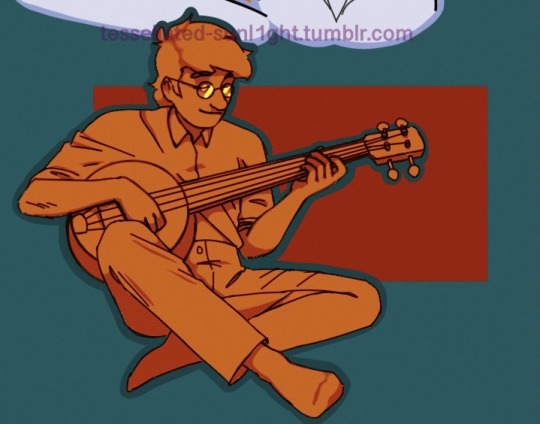
Using this
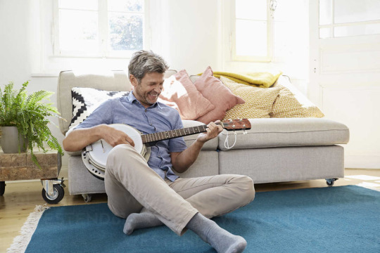
But for my portraits I either go by memory or look at different screencaps of the characters I’m drawing. I’m pretty sure my example of Fiddleford and some of my crutches!Ford drawings are the only ones for which I used a direct reference—
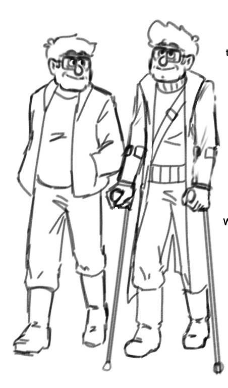
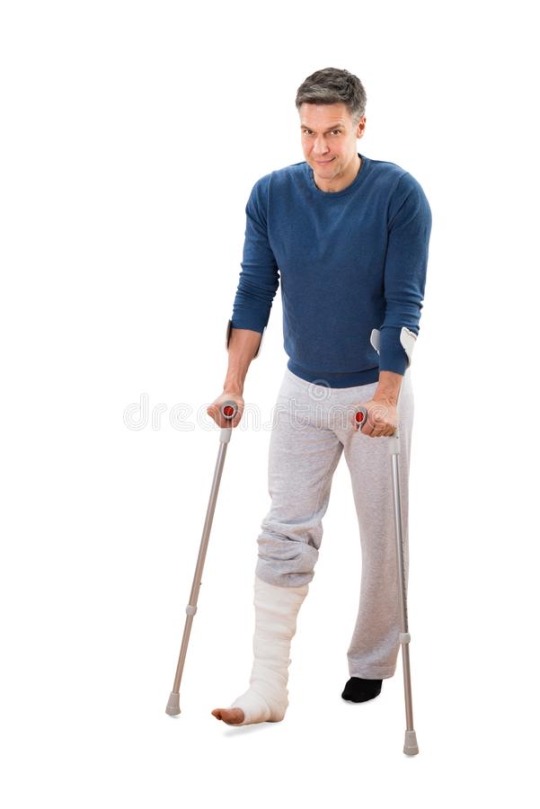
Because I wanted their bodies to look right.
But for stuff like these—
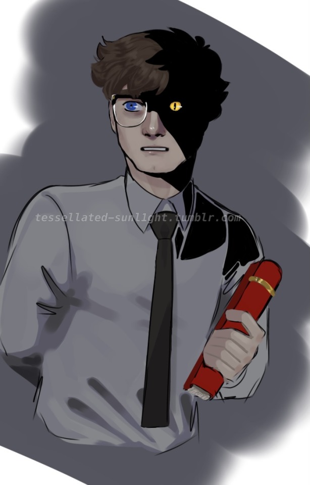
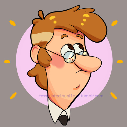
I had no reference at all!
In terms of color palettes, despite having done hours of research on color theory, and studying various screencaps of stuff like Arcane, The Grand Budapest Hotel, Spider-Man: Into The SpiderVerse, etc. I’m… really bad at implementing it. So I rarely use actual color palettes. Instead, I use layer settings gratuitously. Take my Blind Faith drawing for example—
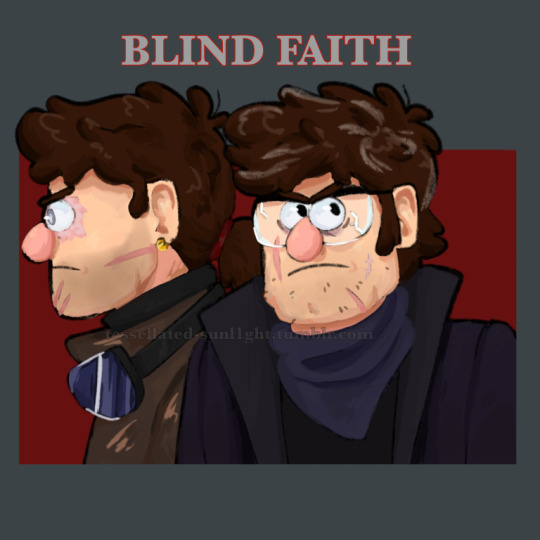
Here it is without all the extra color layers on top— not bad, but a bit flat.
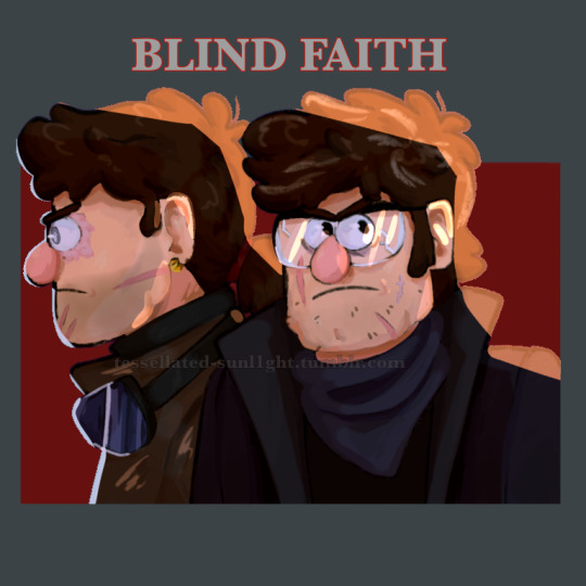
This is the version I posted, which is a lot more cohesive and the colors pop better because I added a subtract layer, a screen layer, a linear dodge layer, and an add layer for the harsh light. For a majority of my works, however, in order to bring everything together I just add a warmly-colored color/linear burn layer (or a cooly-colored subtract layer) over the entire thing and turn the opacity low:
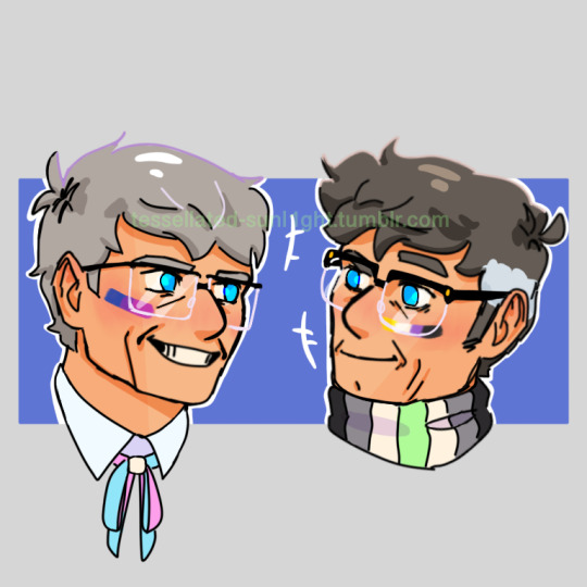
When it comes to shading, even though shading with cool colors is the norm, I tend to gravitate towards shifting to a warmer, deeper hue, like so—
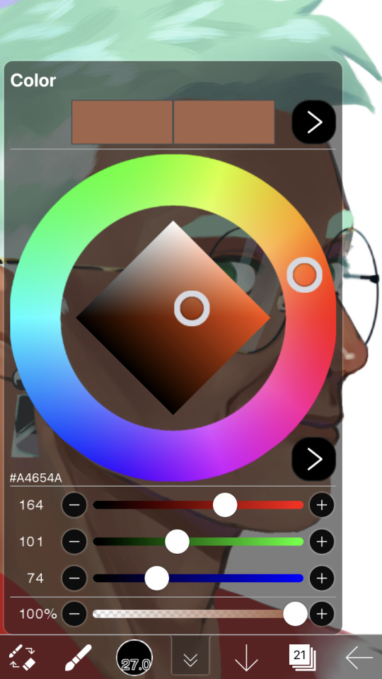
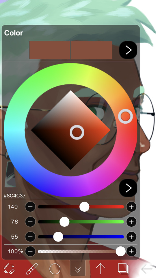
Although I sometimes either shift to something cooler for deeper shadows or use purple on a low-opacity multiply layer. Then, for blending, I use a fading pen to find the midtones that go between the shaded and lighter parts, or I use a blending pen. The blur tool and I are very dubious friends and I only use it to show a fading shadow.
For my traditional art, the only things I used a reference for are the Joel Miller sketches and the Doctor Who screencap redraw I’m pretty sure.
Umm I can’t think of anything else but I hope this was satisfactory (and not too boring)! If you have or anyone else has more questions or didn’t understand the rambling I did here feel free to send them in, I don’t mind!
8 notes
·
View notes
Text
How to repair eyes generated by AI with Photoshop and PainTool SAI
....the tygerlyla way (complicated and tedious) 😅😅😅😅😅
Ai art is astounding! Still, it can't compare to the hard work and beauty of art created by the artist, not to mention the time, sweat, tears, and -maybe some- blood. And Ai art also requires human touch and patience- training the program to come up with the character you want it to replicate... and then it generates those weird eyes, misshapen hands, and speckles that have no right to be there.
So here are my procedures... Be warned: the post is lengthy!
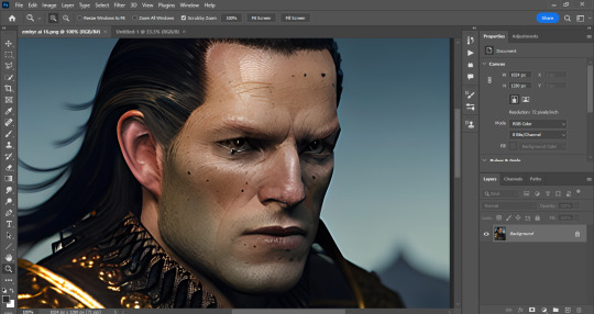
Choose the image and open with photoshop. Brace yourself for the task of fixing that (gorgeous) face.
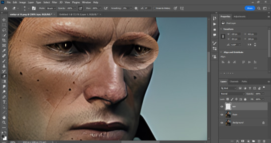
Fortunately the eye on the left has the correct shape, so lasso that baby, copy paste, and flip it. Then use the perspective warp and fit it to the other side.
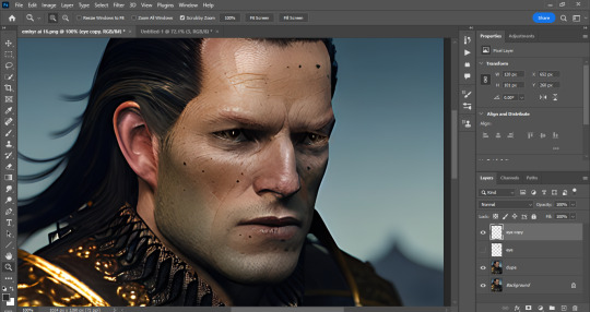
Erase the stuff you don't need until the other eye is a close match and looks better size wise. Flatten the image and create a new save.
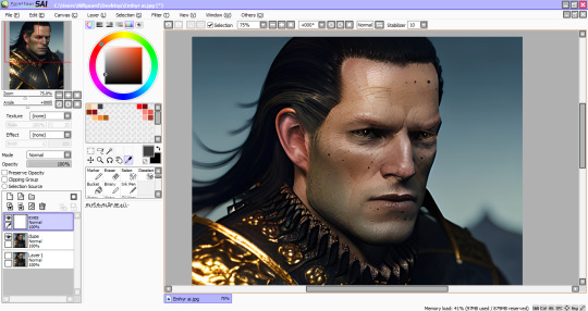
Now boot the new save with the new eye on PainTool SAI. This is where I do my main repairs.
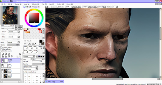
Create layers for the sclera, iris and pupils. Then start painting over the weird eyes with dark flats first.
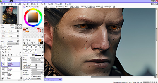
For his warm amber peepers, clip a new layer, change the layer mode to Overlay and airbrush the orange at low density (flow)- about 30-40, and do a crescent shape brush strokes on the pupils. Blur the ends and repeat. Then clip another layer (Luminosity or Linear Dodge on PS) use a yellow orange color and create a lighter crescent.
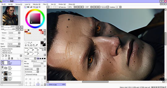
I actually work with my canvas at this angle, easier for me to add details. Create another layer for fixing around the eyes. Eye dropper tool helps matching the colors of the fixed eyes and the ai image. Lots of blurring and shadows going on here. Once satisfied with the repairs, save the image and return to PS.
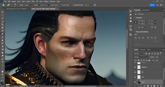
Now we fix the rest of him with a healing brush or spot brush tool, and zap those excessive moles. I also use a body hairbrush to create those thick eyebrows (after making em, change the layer to soft light to blend with the image's colors)
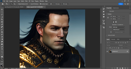
And this is where I use all available photo enhancement tricks at my disposal (skin smoothing plugins, 3LUTS, Liquify, etc.)
And it's done!
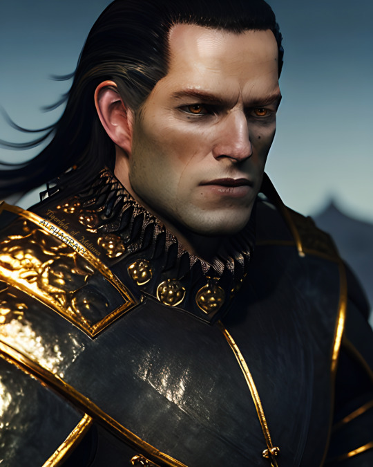
Thank you for making this far! Hope this helps fellow artist dabbling in ai programs.
#emhyr var emreis#ai art#stable diffusion#wip#witcher 3#photo edit#photoshop#paintool sai#artist on tumblr#art tutorial#art help#art tips#photoshop tutorial#paintool sai tutorial
36 notes
·
View notes
Note
hi! i love the snowy landscape process video you posted!! i was wondering if you could talk about about the brushes/textures (??) you used during painting the landscape? I've been trying to paint more but i find myself overapplying the blur tool too much instead of blending manually, but i found your process to use it really well.
Sure! I'm putting this under the cut though, because it got a bit long. 😂
So specific tools and software doesn't actually really matter, but for the record, what I used there is *checks video* Clip Studio Paint's gouache brush, the big textured brush I believe came from Ahmed's brush pack, (which was made for photoshop but can be imported into CSP) it's one of the oil brushes with the texture scale turned down, I believe. Then the lasso tool, an airbrush tool for some softness and color overlays and such, and CSP's "gauze cloud" as the textured brush for the snowy fog around the top of the mountains. I briefly used a blending tool on the sky, but tbh.. I don't really like blending tools. But my main goal there was to just soften that back into a gradient. Oh and a little bit of the finger smudge tool in the water. Which is actually way more tools than I'd normally use. Usually best to stick to only a few, tbh. You want your render to be at least somewhat consistent.. Not that it's a Rule. I mean use however many a piece demands, it doesn't really matter. The point is you don't want to over-complicate the process unnecessarily, or let playing with brushes distract from focusing on the piece itself. Anyway. To get to the point.
Beginners are commonly warned against using blur/blending tools and airbrushes, because overblending is a very tempting and common tendency when you start out. You can lose form and texture. And when everything is really soft, even the slightest hard edge stands out simply by contrast, which can encourage more overblending. So it's common to be kinda scared of hard edges lol.
But hard/firm edges are super important! They're important for composition, defining form, creating visual interest, etc. And even in areas of softness and rest you can create interest with texture and brushstrokes and color vibration and all that good stuff, which is why manual blending is usually preferred. But it is partly a matter of style. The best area for blur specifically would probably be if you wanted that out-of-focus effect. (but in such a case I think using smth like gaussian blur on an entire layer, rather than a blur tool, would be best... but I digress.)
If you find yourself overblending, my advice would be to confiscate your blur/blending/airbrush tools for a while lol. It's actually only just recently that I started using them at all. And even then I mainly use airbrushes, and rarely touch blending tools. But I feel more comfortable with it now, because I'm not using them to blend away my problems lol. I use them more deliberately now, rather than using them as a crutch to make something look smooth and pretty to compensate for my lack of fundamentals or something. Not that I'm totally free of that, though lol. My fundamentals are still not very strong, and I still think I overblend too much. General rule of thumb: If you're still learning the basics, it's best to stick to the basics. Tools are tools, there's no shame in any of them, but some you have to be a bit careful with. So when it comes to blending tools and airbrushing, I'd recommend trying to limit your use of them, especially at the start. Learning to blend manually is important, and it also gives you far more control.
Pay attention to your reference. The main places I'd use soft brushes and/or blending tools are things like soft gradients in the sky or water, or to establish some base color gradients over which you can do more textured detail work, or ambient occlusion. And try to stick to the principle of contrast. Soft edge, hard edge, soft edge, hard edge. Simplicity, complexity. That constant back and forth rhythm creates visual interest.
Okay idk if any of that answered your question, but I'll stop here. Feel free to let me know if I need to clarify something. And sorry if you were hoping for brevity 😂
I hope it helped, though?
I'm going to leave you with Marco Bucci's video on edges. I'd also highly recommend checking out his other videos, they are all very very well done. Seriously quality information. https://www.youtube.com/watch?v=nnhj5efzN_w
13 notes
·
View notes
Text
detailed giffing + basic coloring tutorial for beginners
so a lot of gif/coloring tutorials are pretty outdated or not that detailed & i wanted to put my own out there! in this:
how to get the screencaps for your gifs
how to make a general gif
basic coloring (no psds here, it just gives you a basic idea for making colors pop and look nice. you can look up how to use psds, but i prefer making my own for every gif as it’s much more personal, gratifying, and creative. there’s nothing wrong with using psds as long as you don’t claim them as your own, it’s just not my personal thing)
how to save a gif
we’ll be going from this:
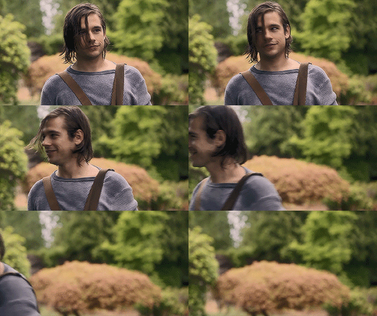
to this
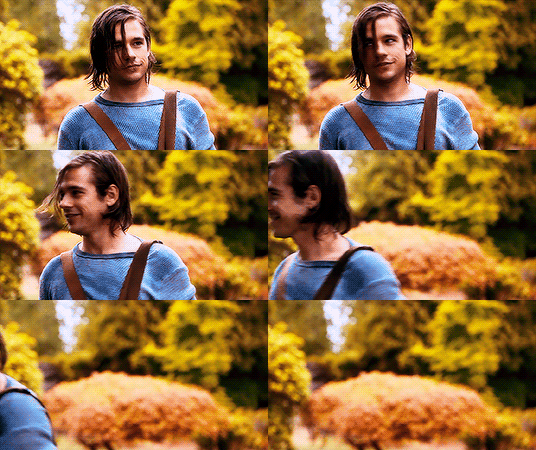
what you need:
photoshop (cc 2019 is what i’m using, but this works with any version of photoshop really as long as you download a version with the timeline feature) i won’t add download links here since i don’t want this deleted, but you can look some up on tumblr or use the pirate bay (current url is pirateproxy.blue as of 4/29/2020) & follow the instructions there.
for windows: potplayer/kmplayer (both use literally the exact same instructions) this tutorial uses potplayer but kmplayer uses like literally the same instructions, it just doesnt work right on my computer
for mac: mplayer. this tutorial does NOT cover this so find a tutorial on tumblr on how to take screencaps with mplayer & then skip to the “how to make a general gif” section. though, again, i’m on a pc so i have no idea if this is entirely accurate for mac.
if you’re downloading from youtube: clipconverter
if you’re Definitely Legaly torrenting: utorrent + the pirate bay (again, current url is pirateproxy.blue as of 4/29/2020) or another torrent site + you should really consider getting a VPN when torrenting (i use privateinternetaccess but you can find one that suits you)
note: download an adblock of some kind, disable automatic downloads on your computer, & download an antivirus program if you want because some sites are sketchier than others! this is ESPECIALLY crucial on sites like piratebay. keep your computer safe babes.
1. screencapping
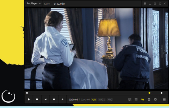
there’s several ways to get screencaps on photoshop, but this is the easiest imo and i’ve never done the whole convert video frames to layers thing. like i said, you’ll need potplayer or kmplayer. i’m using potplayer. important note: don’t accidentally download viruses here! read each screen carefully & make sure you’re not hitting accept to download any secondary programs.
1. download your .mp4/.mkv. you can go to youtube & find a clip/scene/whatever and use clipconverter to download it. just make sure you download it at 720 (or higher) as anything lower than that will give you a poor quality gif. you can also download using somewhere like the pirate bay, but for this you need utorrent & i would HIGHLY recommend using a vpn if you live in a country where torrenting copyrighted content is illegal, as your internet provider may flag your ip address if you don’t & you torrent too often.
2. download potplayer/kmplayer & get it set up
3. create a screencaps folder. i always put mine on my desktop. in your screencaps folder, make a folder for however many gifs you want in your set. i just have one for mine so:
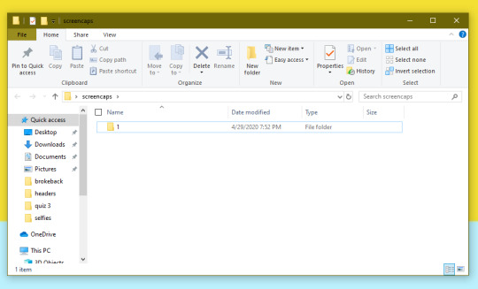
4. open up your .mp4/.mkv
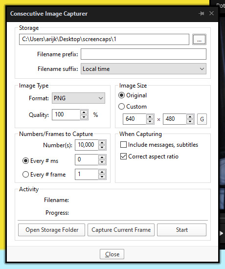
5. hit ctrl + g to bring up the screen capture pop-up & set your settings to these. click the button w/the three dots next to the storage option & select the folder you created for your first gif
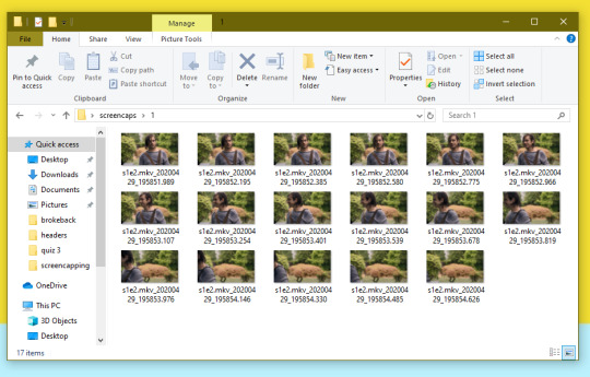
6. navigate to the scene you want to gif. when you’re there, pause it and hit the start button on the consecutive image capture screen, then play the video. how many screencaps you need depends on the size of your gif. for larger gifs (so like 540px wide gifs), you’re probably going to want to keep it below 30 frames. for smaller gifs (268px wide or less) you can maybe stretch it to 60, depending on how much coloring you add. you can always delete screencaps later though in photoshop, so don’t worry about it too much. for this gif, i only had 17 frames because the scene was really short lmao
7. go to your screencap folder you made & delete any unnecessary frames. it’ll look like this:
8. repeat the process for any other gifs, making new folders in your “screencaps” folder, numbered for however many gifs you’re making. make sure to change the folder you’re loading the images into on the image capture pop up though so they don’t all go into folder 1.
2. making a simple gif (+sharpening)
1. first, you need to load your screencaps. when you open up photoshop, go to file > scripts > load files into stack
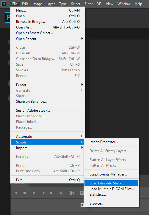
2. when the window pops up, switch the “file” option to “folder”
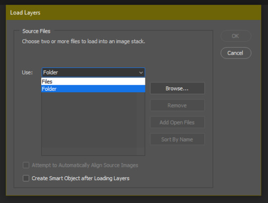
3. click browse and find your screencap folder for your first gif (in my case, desktop > screencaps > 1) once it’s all loaded, click “OK”
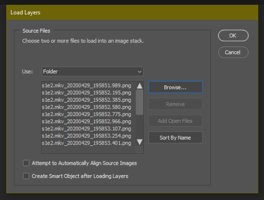
4. it’ll take a minute to load all your screencaps into photoshop. when they do, go to the upper bar on photoshop > windows > timeline
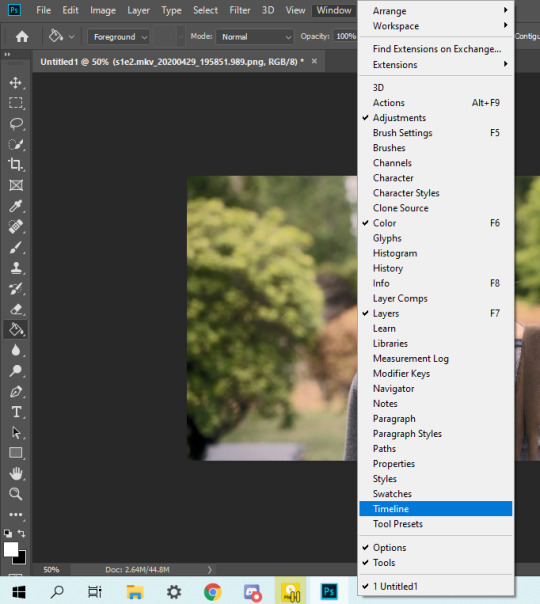
5. when the timeline bar shows up, click “create frame animation”

6. hit this button and click “make frames from layers”

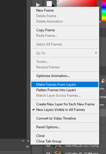
7. hit the button again and click “reverse frames”
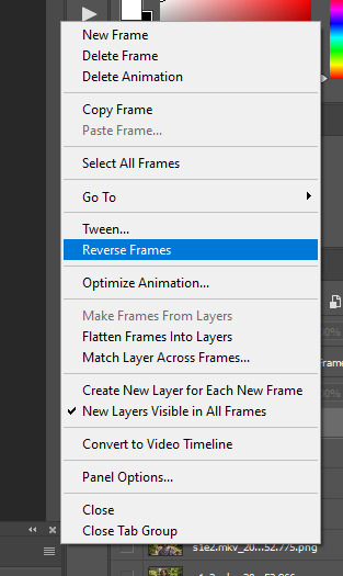
8. click back onto your first gif. then select the rectangular marquee tool and set it to whatever gif size you want. the width for 2 small gifs next to each other is 268px, the width for full size gifs is 540px. most people use 268x150 px for gifsets of 4+


9. use the marquee tool to select what area you want for your gif, like this. it’s up to you how to crop it! get creative!
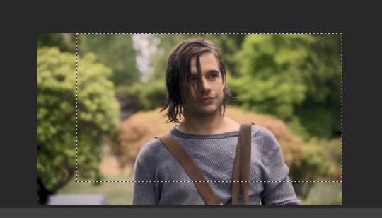
10. go to image > crop
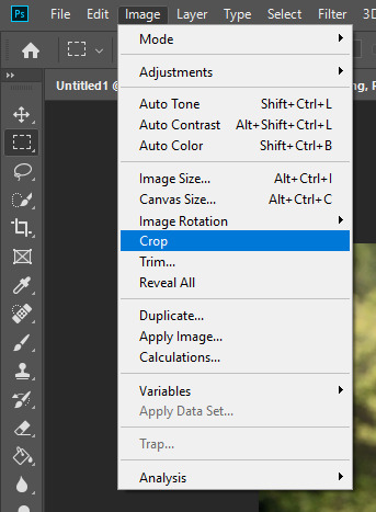
11. now that your image is cropped, go to image > image size. change the size to your desired gif size (in this case 268x150). hit “OK”. then make sure it’s zoomed in to 100%
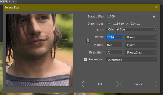
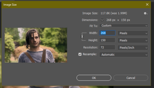

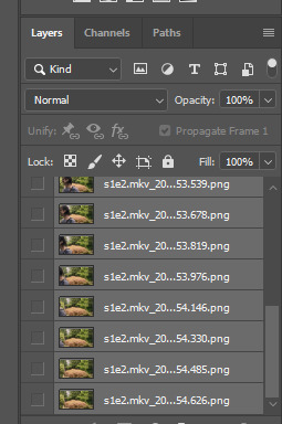
12. now, you COULD just save this gif, but they look way better sharpened. so you need to convert this to a smart object. to do so, first select all your layers in the righthand layer window. to select all the layers, click on your top layer, hold shift, and scroll down to your bottom layer & click on it as well while still holding shift
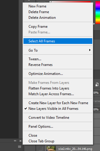
13. next, you need to select all your frames. go back to the options button from part 6 > select all frames
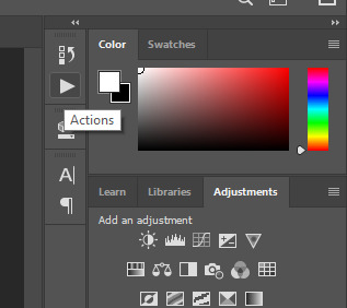
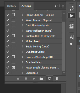
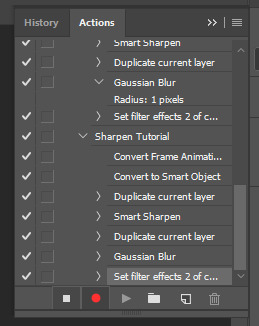
14. next, we’re going to create an action to make your life 100x easier when it comes to sharpening gifs in the future. to do so, go to the actions icon (may look different on different versions of photoshop, but basically just find the actions window)
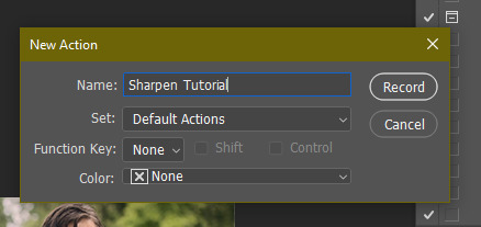
15. create a new action with this button. name it something. i named this one “sharpen tutorial” and hit “record”
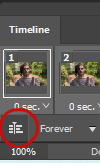
16. click this button to convert to video timeline
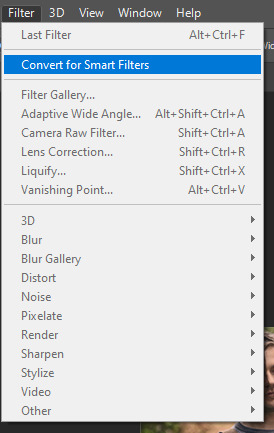
17. go to filter > convert for smart objects
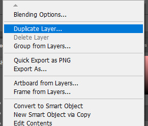
18. go to your single created layer and right click and click duplicate layer. this helps get rid of the transparent border around the gif.
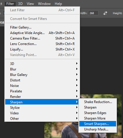
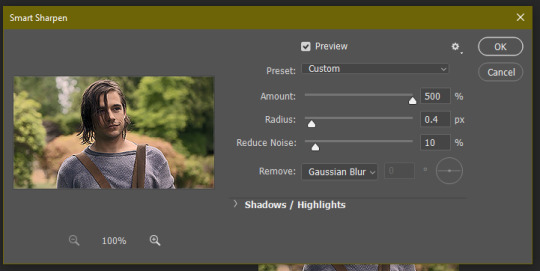
19. go to filter > sharpen > smart sharpen & use these settings
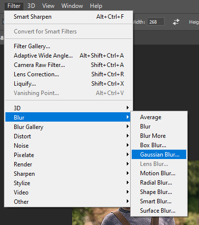
20. go to filter > blur > gaussian blur. set it to these settings.
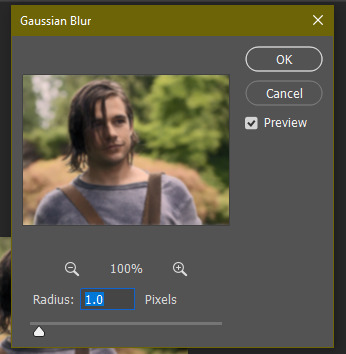
21. go to your second layer with the filters on it & right click on the gaussian blur filter to select “edit smart filter blending options” and set the opacity to 50%. you can mess around with this for different levels of sharpness. the closer to 0%, the sharper your gif will be.
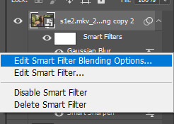
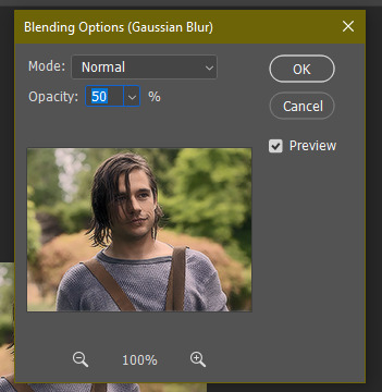
22. hit the stop recording button on your sharpen action. now you’ll have an action to use next time you make a gif! after you’ve followed all the steps 1-13 you simply go to actions, click on your saved sharpening action, and hit play instead & it’ll do steps 14-21 in a few seconds. here’s a pic of the stop button on the actions window
23. our gif is now sharpened! you can end with this & skip to the saving a gif section, or you can continue to coloring. here’s what we have so far.

3. coloring
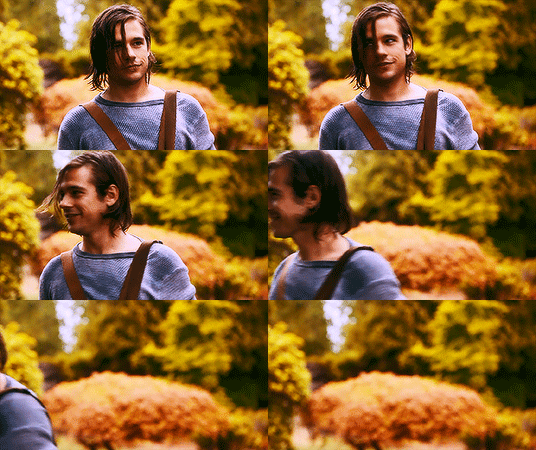
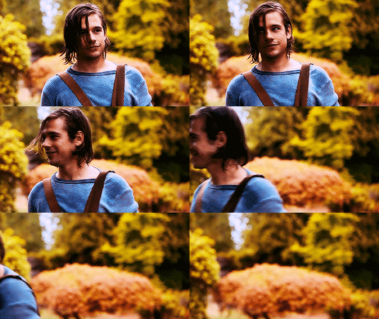
now on to coloring. this is pretty basic coloring and it probably won’t work if you follow my numbers exactly, as every single scene is different color + lighting wise. but this is just an example of the kind of thing you could do. basically, if you’re making vibrant gifs, you want to up the brightness + contrast + vibrance and make the colors already present pop. if you want anything more complicated (pale gifs, changing the colors to make, say, quentin’s shirt in these gifs red instead of blue), you’ll have to find other tutorials or experiment on your own. learning how to color & finding your style takes time! you can download psds if you want, but imo those kinda take the fun out of making gifs? that’s just me though.
after each step, i’ll show you what the gif looks like.
1. i usually start with a curves layer. i usually don’t mess with the color curve options, just this one:
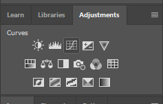
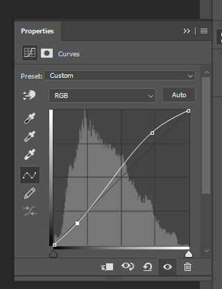
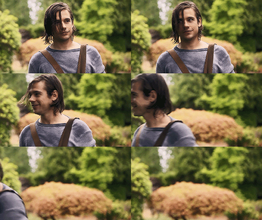
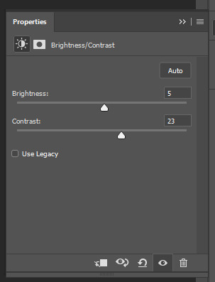
2. next, i do a brightness/contrast layer
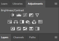

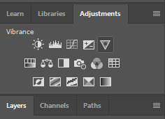
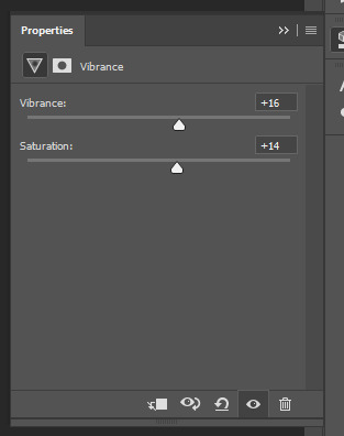
3. next, i do a vibrance layer. make sure not to make it TOO saturated or it’ll look bad.
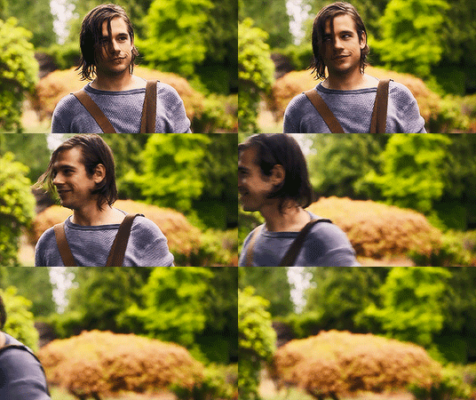
4. next i do a color balance layer. this is where it really starts differing depending on what color you want your gif to be.
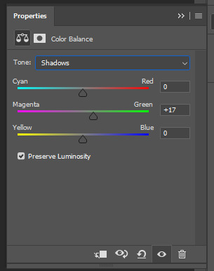
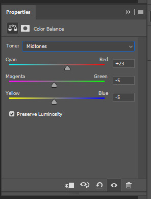
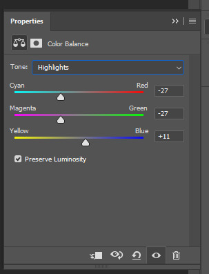
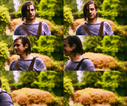
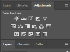
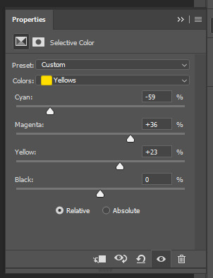
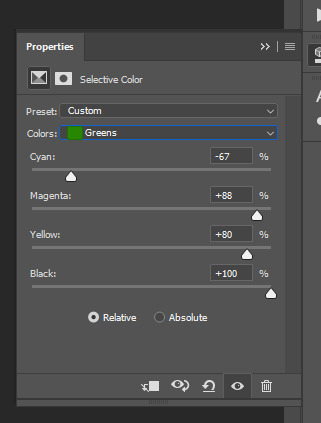
5. next we move to the selective color layers, which are arguably the most powerful. here you can make colors pop, change colors, etc. it’ll take lots of practice & messing around with, but here’s what i did with this gif. this one is making yellow + blue pop
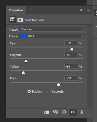
6. next, i did two more selective color layers editing the blue tab to make the blue pop even more
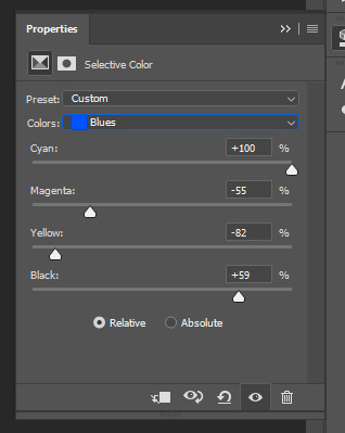

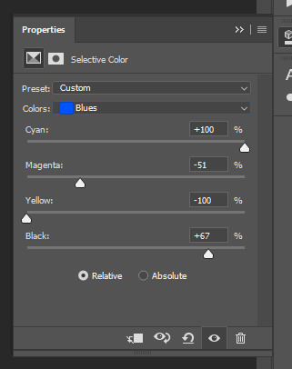

7. i still wasn’t quite happy with it, so i added another selective color layer to edit the blacks + neutrals + greens
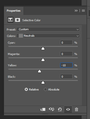
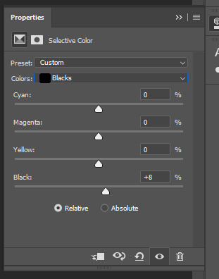
8. for good measure, i added one more brightness/contrast layer
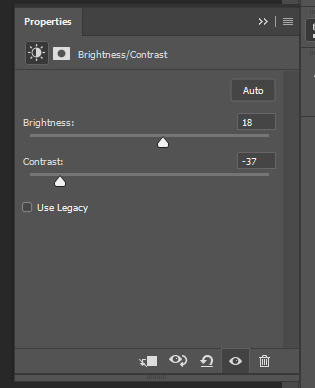

9. and the gif is done! however, you can play around with various adjustment layers until you’re happy. again, this is just an example of how to do basic coloring. it’s a skill like any other & takes practice. to keep consistent coloring in a gifset,
9b. you may want to make a psd of this coloring. to do so, you need to put all your adjustment layers in a folder, delete your frame layers, and click file > save as. save it as a .psd. then you can open it and drag it onto any other gifs you make, adjusting the coloring accordingly but still with the same vibes. you don’t have to do this, but it makes life easier. here’s how to use your saved psd, though obviously you’re using your own in this case and not a downloaded one.
4. saving your gif
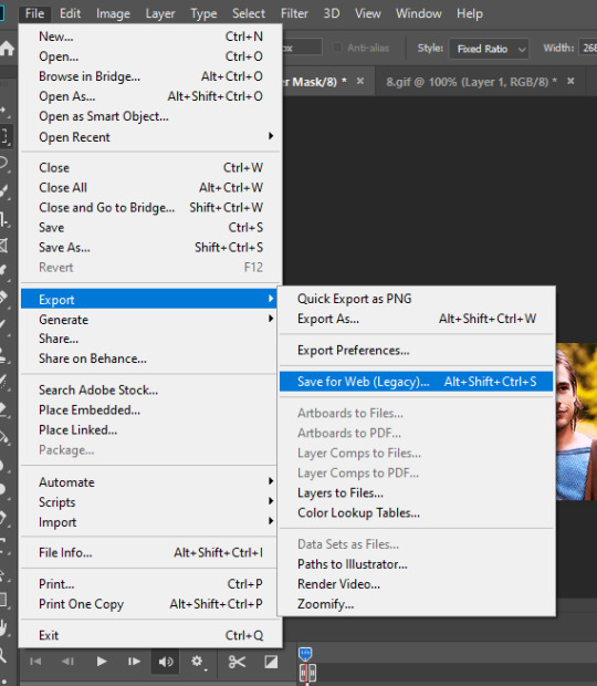
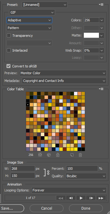
1. on photoshop cc 2019, you go to file > export > save for web (legacy). for other versions, you can just go to file > save for web. use these settings. the gif size limit is 3mb per gif, so make sure your file size is under that. if it’s not, you’ll need to delete some frames or some adjustment layers.
2. now, photoshop is a bit of a pain & this gif timing will not be right. so you need to open your newly saved gif. then you hit this button + select all frames


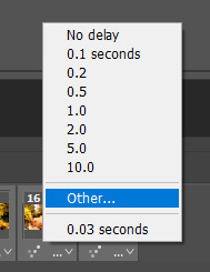
3. click this button & select “other”. tumblr gifs are typically .05-.08. my photoshop is glitchy and i have to set mine to .1-.15 or they’re WAY too fast. but usually, go with .05-.08 unless yours ends up glitching too.

4. save it like you did the first time and ta-da! you’ve made a gif!
#gif tutorial#photoshop tutorial#edit tutorial#coloring tutorial#yes im using the magicians its my hyperfixation and i get to choose the gifs
164 notes
·
View notes
Photo
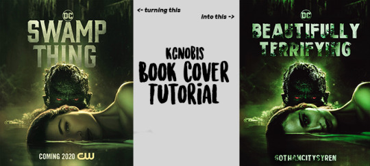
BOOK COVER TUTORIAL (MANIPS)
this tutorial will focus on manip covers like the one shown above.
time to edit: 3+ hours
please like/reblog if you found this helpful if you have any questions/comments, my ask is always open NO QUESTION IS TOO ‘DUMB’ TO ASK!
note: this tutorial is to show you how I made the edit above and explain how/why I did these things to get this result. it will not apply to every manip edit, which is why i encourage contacting me if you run into a snag.
now, let’s get started!
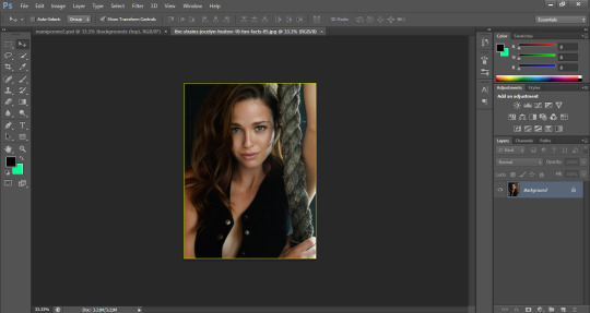
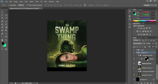
first, you need something you want to manip (re: banner) and a picture to replace whatever you’re going for. you want to make sure the colors/tones/angles of the two photos are as similar as possible. also, photo quality should be as high as possible for the highest quality results. for the manip pictured above, I used the poster on the left and this photo:
align the photos as best as you can. try lowering opacity or setting the top photo to ‘screen’ to better place and adjust the angles/size. once you have it where you need it, it’s time to erase. for making seamless skin transitions, I lower opacity on the eraser, make it a little large, and erase slowly. don’t be afraid to take your time with this, but remember you can always come back to it and adjust as needed later. you can also adjust the original background photo if needed as well, as I did to make the face better align with the neck and torso.
my image looked like this:
I added brightness, vibrance, hue/saturation, and exposure layers to adjust the coloring and shading of the face so it better matched the original:
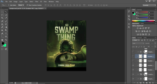
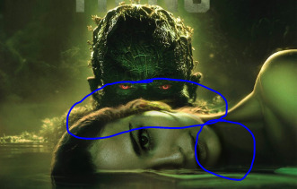
next, i added gradients to the space below the chin for a shadow effect, using a black gradient with a low opacity adjusted with a low opacity eraser. then i added a yellowish gradient and erased the excess to keep the color along the top line of her face and added two brightness layers to give it a glow effect to match the original.
with layers:
without:
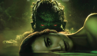
the next part is one of my favorites! i’ve never been very good at using the blur tools and such for changing backgrounds, so I started duplicating background layers and erasing them down/stretching them to cover things I wanted out of the picture. it’s patch work and can be stressful at times, but i’ve found it’s the best way for me to get the background I want.
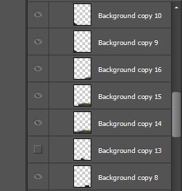
the patch work layers look like this:
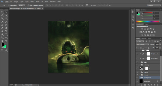
the end result looks like this:
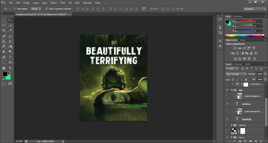
i left the DC symbol there so i could add my text beneath it, like this:
for text, i recommend using textures even when you wish to keep it white. it can help it blend a bit better with the background and not look so edited. here, i added a photo of a white wall with vines growing on it as a texture and then a green gradient to give it a glow effect that would blend it with the glow around the top of his head.
example:
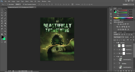
i did the same with my author name at the bottom so they looked similar and blended in with the edit. after that, I added some psd’s and a texture for color depth and a grainy effect like on all my edits.
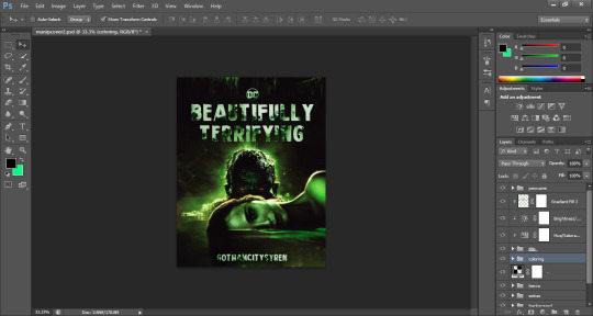
the coloring phase is the most taxing, stressful part of this kind of cover edit. any psd or layers you add to change the colors will heavily depend on the shading/coloring of each photo of the manip and it may take several different psd’s and/or layers to get it ‘right’ (ie. to your liking). this is also the phase where you make adjustment edits to your manip like erasing pieces that don’t fit color/placement wise, etc. don’t be afraid to add dark gradients on a lower opacity for shadows to cover smaller blemishes you can’t figure out how to edit out.
my end result:
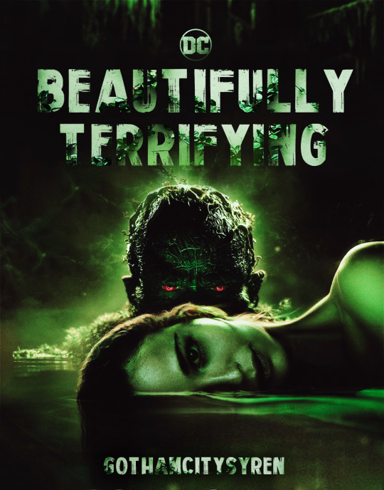
I hope this helps you & happy editing! xo
53 notes
·
View notes
Photo
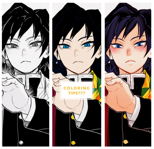
Here are few tips to color manga panels. This is not a tutorial bc I’m a loser but I hope it helps someone in someway~
FIRST: You need to now the basics regarding cleaning manga, once you get your manga cap ready we can start.
1) I prefer to get ride of all the gray scales because this way your coloring look less messy. When you leave the grayscale the outcome isn’t bad per se but you can see it throught the coloring you know?
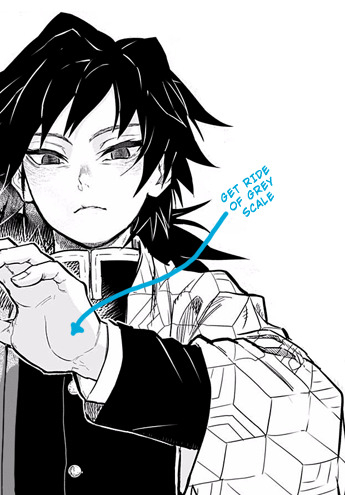
2) Once your manga cap is ready select your layer > go to channels > load channel as selection > supr
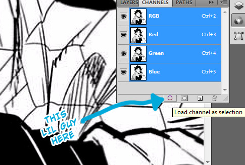
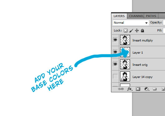
3) Duplicate your original layer, set the layer blend in multiply and then you can add your base colors between the orig layer and the duplicated one!
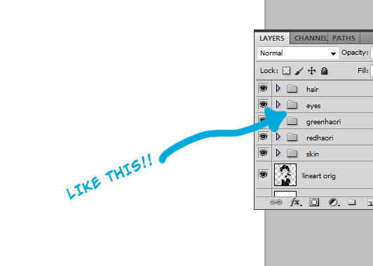
4) To make your workspace more friendly separate each color into groups and name them!
5) Once you’re done putting the base colors you can start adding shadows. I tend to choose a color slightly darker than the one I use for the base
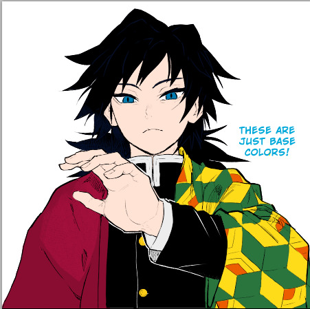
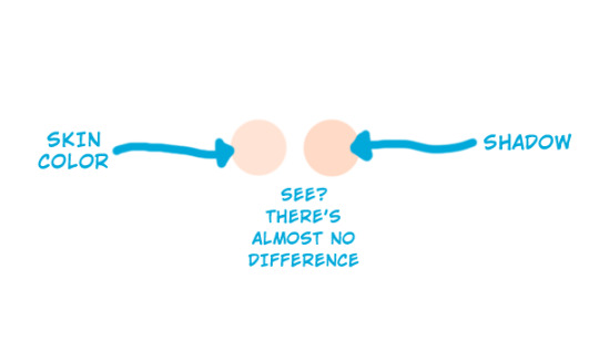
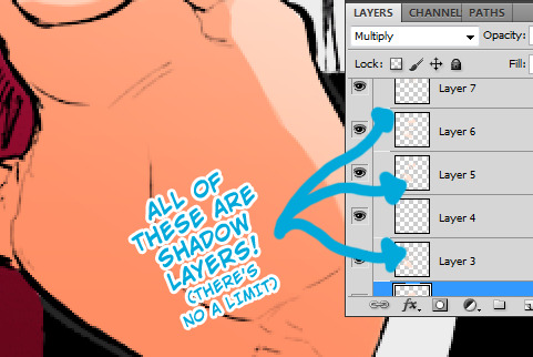
6) add a new layer > set it in multiply > add the shadows here. You can add as many shadow layers as you want.
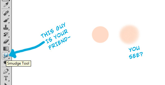
6) Smudge tool is your friend when woking with shadows, I use it a lot bc it helps to blend the colors / make your shadows look more smoth (or if you’re super lazy you can select your layer > filter > blur > gaussian blur)
A FEW NOTES
I put all the base colors before I start shading AND I don’t care about the amount of layers I use to add shadows
When it comes to add highlights I always add them when the shadows are done. Usually white > soft light blend mode
I redraw most of my manga caps bcs I don’t like sfx sounds, to redraw certain patterns/lines clone stamp tool is your fried.
When it comes to coloring eyes I usually redraw them again so I can color them properly:
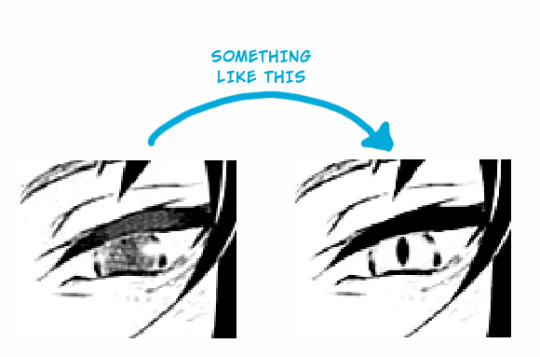
here’s a lil tutorial on how coloring eyes:
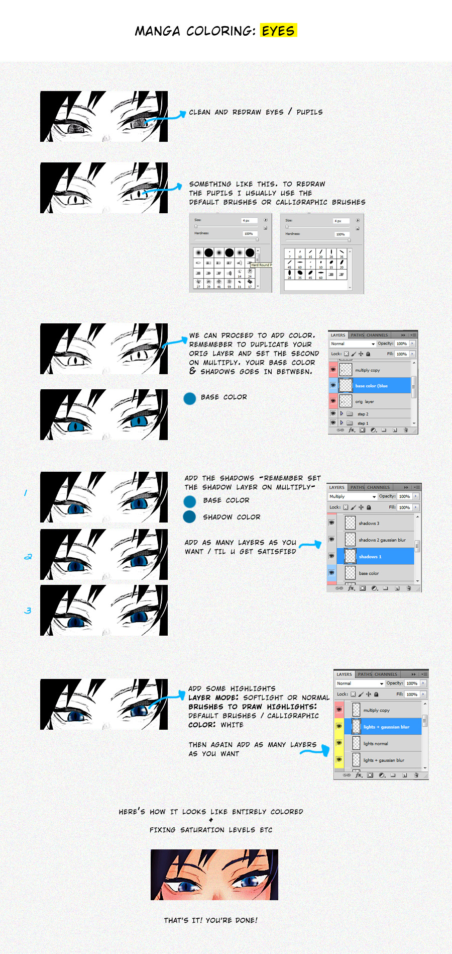
Once your entire coloring is done you can start to play with saturation, levels, curves etc. I tend to do this procces in a new document, to do it so I save the colored page as png and then I open it again to add some effects/textures/etc.
I can’t think in anything else to add, so if yall wanna know something and I can help just let me know and I’ll add here asap~
#I'm sorry if this isn't /that/ helpful tbh#these are just basics but if it helps someone then GOOD.#bc as i said im a loser who is still improving#but i repeat if you wanna know something specific just reply here and i'll try to add it~#gfx asks
498 notes
·
View notes
Text
Editing tips, I guess?
Hey uhhhhh, so I've gotten lots of new followers over the past few weeks and wanted to do some kind of thank you?? Also, I have seen a fair share of "omg HOW" in the tags on my edits (which??? always make my day?? my week??? my life????)
Anyway, I thought I'd share some of my ~techniques with y'all? So here goes:
(lmao this got really fuckin long so cuuuuuut)
1. Make EVERYTHING a Smart Object
Okay, maybe not EVERYTHING, but seriously. Do it. It will save ur editing life. You ever shrink something down and then an hour later change your mind and decide you want it bigger? If you're not using a smart object, it’ll get blurry when you scale it back up and you’ll be fuCKED!
To make a layer/group a smart object, just right click on it in the layers panel and select "convert to smart object". This makes Photoshop store the layer's original data in a separate space for safe keeping (an embedded .psb file, to be exact) -- so you can shrink it and enlarge it as many times as you want without any lossiness.
As soon as I paste/place a screencap, texture, or whatever into my document, the first thing I always, ALWAYS do is convert it to a smart object!!
Why, you might ask?? Continue to item No.2 :)))
2. Harness the POWER of Smart Objects!!
The reason I am obsessed with Smart Objects is because I am obsessed with making any edits as non-destructive as possible. If you use “Image > Adjustments > Levels/Selective Color/etc” on a regular layer, that’s a destructive edit. Same goes for any Filters (such as blur/sharpen) and transforms (Warp, distort, perspective). You lose the original data that was there and the only way it can be undone is with ctrl+z. Might not seem like a huge deal at first, but if you keep chugging along for an hour and decide, “hmm, maybe i went too hard on that levels adjustment after all...” your only options are deleting the layer and starting over, or uh... hoping it’s still in your history panel.
However, it's really easy to avoid destructive edits when you use smart objects!! Because all those adjustments, filters, and transforms become “Smart Filters”. Smart Filters have all the non-destructive advantages of performing these adjustments via adjustment layers, but have the added bonus of ONLY effecting the layer they’ve been applied to, instead of cascading down and effecting all the layers beneath. (Which can be a good thing sometimes, but that’s a whole other topic)
Smart filters are attached to their ‘parent layers’, and can be hidden, deleted, or modified (by double-clicking their names) at any time:

Can I hear a wahoo???
Other cool things about Smart Objects:
You can copy a Smart Filter with all its settings to another layer by alt+click+dragging it over
You can change the order in which Smart Filters are applied by clicking and dragging them around
You can edit a smart object independently/in a sort of 'isolated' mode by double-clicking on its thumbnail!! I like to use this for edits that are specific to a given screencap-- like cutting out the background and any initial adjustments, like levels and selective coloring. Once you’re done editing the contents of the smart object, hit ctrl+s and it will automatically update in the main document!
But really, the biggest thing for me here is psychological. I know I’m much more willing to try things and experiment when I know that I can easily go back and tweaks things at any time. Otherwise, I’d stick with adjustments I don’t really like all that much simply because it would take too much time/effort to redo them.
3. Don't even THINK ABOUT using the eraser tool or I will STOMP YOU to death with my hooves!!
Use a layer mask instead. Please I am begging you. It all comes back to making your edits as non-destructive as possible. If you erase something, it's gone forever. When you mask something, you can make changes to which parts are visible/not visible as often as you want.
For the newbies or the otherwise unacquainted, a mask is a greyscale ‘map’ attached to a layer (or layer group) that controls its opacity. Black areas give the layer 0% opacity, white areas will give it 100% opacity, and you can use shades of grey to achieve partial transparency. You ‘draw’ on these layers with the your trusty brush and paint bucket tools.
You can create a mask by selecting a layer and then clicking the little mask icon at the bottom of the layers panel (it’s the one with the little circle inside the box). Draw black on the parts you want to hide, and if you erase too much on accident? Just paint back over it with white!
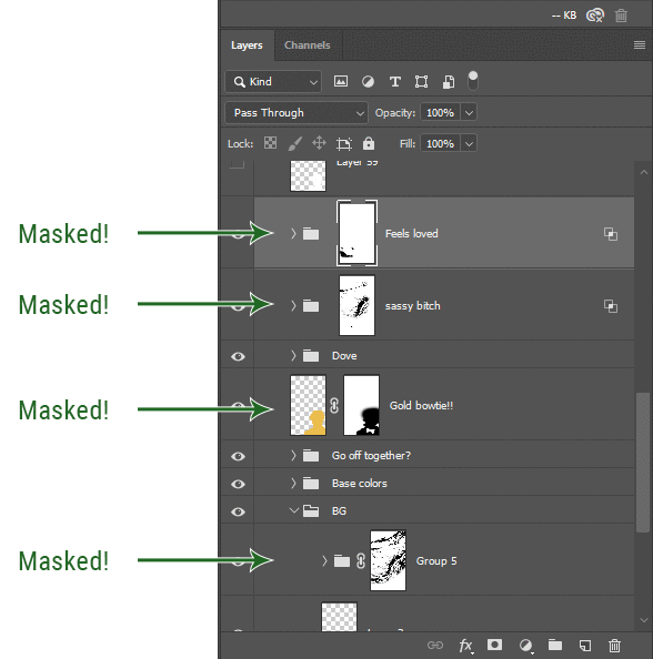
I love masks, and sometimes i will throw an already masked layer inside a layer group and apply a second mask to said group. This way I have two masks that can be edited independently from each other. Like layer mask-ception.
So anyway, yes. Eraser tool? Don’t know her.
4. Try using channels to create masks!
This is a technique that works REALLY well for cutting out complex shapes, such as wispy hair (or feathers!) -- provided there's strong contrast between the subject and the background, and the background isn't too busy.
This is also a fantastic method for capturing alpha transparency. For example: If you have a neato paint stroke/splatter/watercolor texture you want to use as a mask, but has a solid background that’s getting in the way of things. This method will capture all the semi-opaque areas flawlessly!!
While editing your image (which you had better have made into a Smart Object!!!) do the following:
Switch from the "layers" panel to the "Channels" panel.
Toggle through the R, G, and B channels, and decide which one has the most contrast for the areas you are trying to mask.
Ctrl+Click that channel's thumbnail. This will create a selection marquee.
Switch back to the layers panel
Click on the target layer/group (the one you are trying to mask)
Click the mask icon at the bottom of the panel (the one with the circle inside a box)
Release the selection and invert the mask if necessary
If you're using this method to cut out a subject from its background, you probably won't want alpha transparency. In this case, select the mask thumbnail and use a levels adjustment on the mask itself to bump the contrast until you have more of a cutout effect!
It sounds like a lot of steps, but it’s really simple! So I made this handy GIF: (click to view from beginning)
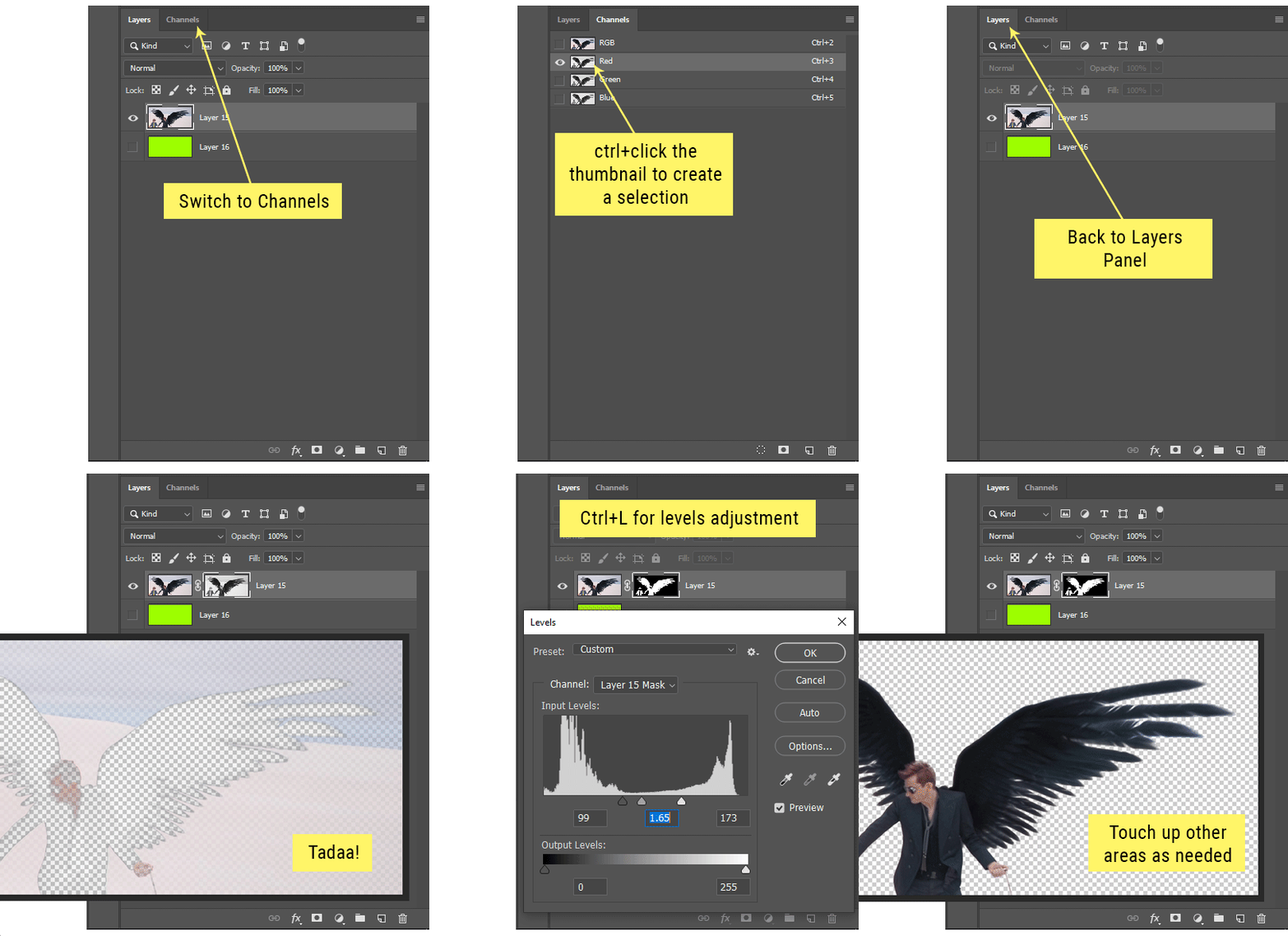
Sometimes you won’t want to use this method for the entire image, but just a specific part. For example, if you’ve cut out a character with some other method (magic wand, manual brushwork), but are having a hard time with their hair in particular. Use this method to create the selection, but instead of converting the whole selection into a mask, use the brush tool to apply the mask only where you need it! You can invert the selection itself with shift+ctrl+i.
5. Outlining text
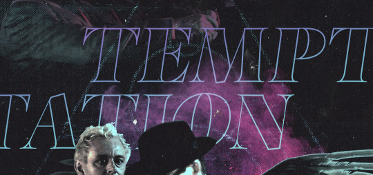
The font I used here is Salomé, which is actually a solid typeface with no outlined version. But you can make virtually any font into an outlined version if you so desire!
There's two possible methods here, actually:
The Easy Way:
Add a stroke layer effect to the text layer (by selecting the layer, clicking the little “fx” button at the bottom of the layers panel, and choosing “Stroke...”)
As far as settings go, aligning the stroke to the inside usually yields the best result/maintains the integrity of the letterforms.
Make the color of the text itself match the background.
If necessary, use the lighten/darken blend modes to create the illusion of transparency.
If you need true transparency (which I didn't until I decided I wanted to apply a gradient over the text), you'll have to try something else-- The Also Easy But Less Than Ideal Way:
Right click the text layer in the layers panel and select "convert to shape".
Now you can edit the fill/stroke the same way you would any other vector shape.
Again, you’ll want to set the stroke alignment to ‘inside’. For vector shapes, those settings are a little hidden. You’ll wanna open up that little dropdown in the toolbar with the line in it, and click “More Options”.
This is semi-destructive, so if you're working with a lot of text you might have to edit later, consider duplicating and hiding those text layers first so you'll have a 'backup' of it.
And while I’m on the topic of text...
6. Try breaking up your text layers!
I know a lot of people like to draw a neat little text box to put their text in, and then they center it all nice and neat and probably use a small font size to make it subtle and stuff... and that’s cool. Everyone’s got their different styles and things they like to emphasize in their edits and there’s absolutely merit to that sort of thing (case and point: the bulk of my dear @herzdieb’s work), but. Listen.
I love typography. I love a good typeface. The stroke widths, the letterforms, the ligatures, the serifs... I get like, horny on main for a good typeface. I like to make the text on my edits BIG, so that those details can shine. I also like doing interesting things with the text. Jumbling words/letters around, distorting them, deconstructing them and just... letting the text really ~interact with the rest of the composition instead of just kinda politely floating on top of it.
I’m not saying you have to do that kinda stuff. Or that I think neat little floaty text boxes are boring, or lazy, or whatever. It’s just... personally, I get really inspired by type. Fun type treatments are one of those things I LIVE FOR, something of a ~signature of mine, and I encourage everyone to just... try it? To use text as more of an integral Design Element and less of a... idk. A caption?
So if you have a quote, or even just a word... put each word (or letter) on its own text layer. And then: make ‘em different sizes. Make the words so big they don’t fit on the canvas. Rotate each one at a fun angle. Scatter them around. Go nuts. Use masks to chop parts of the letterforms off. Make ‘em overlap. Just have at it. Or, as the kids these days are saying: go absolutely fuckin feral.
If that really just isn’t your style, or doesn’t work/make sense for the edit you’re doing, fine. Delete all the layers and just do a text box or whatever. But. I’m tellin u.
Give it a try.
At least once.
Just... a lil taste.
7. Understand the difference between lighten/darken vs screen/multiply
For a while in my photoshoppin' youth, my understanding of these blend modes basically amounted to "darken makes things darker, and multiply makes things really darker", and vice versa for lighten/screen. But there's an important difference between how these blend modes work, and if you understand them, you can use them more... strategically? I guess?
Darken and Lighten are kinda misnomers tbh, because they technically don't really darken or lighten anything. What they actually do is make it so that only the areas of the layer that are darker or lighter than the content of the layers beneath them are visible. This produces some pretty nifty layering effects that you can't achieve with screen and multiply.
Here’s an example: (if you’re reading this on a phone with the brightness dimmed down you probably won’t be able to see the differences)
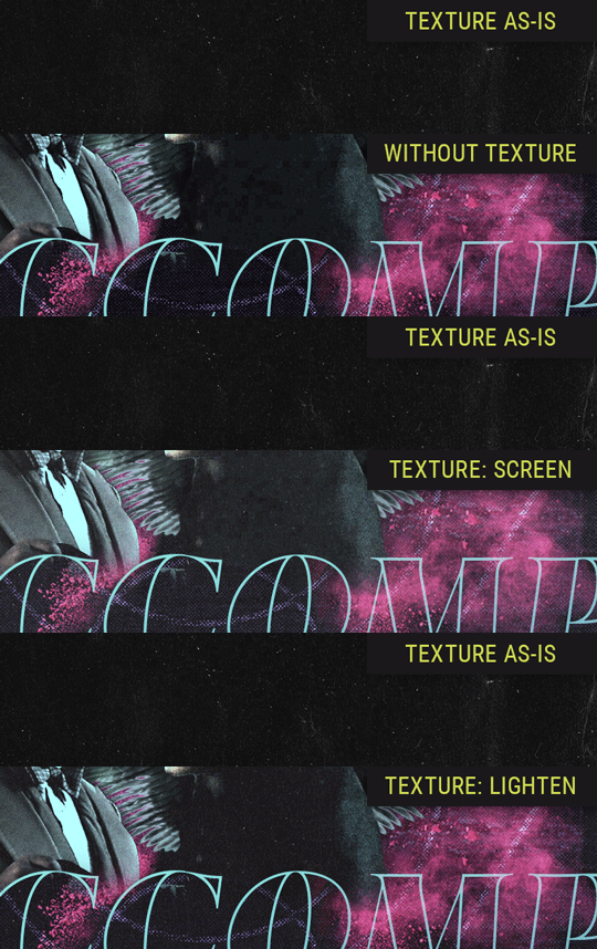
Without any the texture applied, you can really see the noise/graininess of Crowley’s jacket in the screencap. You can also see the ‘seam’ where Crowley fades into the background-- the jacket is a green-ish black, while the background it’s fading into is more of a purple-black.
With the texture set to ‘Screen’, the whole image becomes lighter across the board. Crowley’s jacket gets lighter, and so does Aziraphale’s jacket and the pink cloud thing. This does little to nothing to obscure the poor image quality and disguise that ‘seam’.
But with the ‘Lighten’ blend mode, ONLY the dark parts of the image appear lightened, and not only do they appear lightened, but they get kinda equalized. Notice how the patchy jpeg artifacts on Crowley’s jacket disappear, how that color seam smooths out, and how the brightness of Aziraphale’s jacket and the pink cloud doesn’t change at all.
This isn’t to say that lighten/darken are better and that you shouldn’t use screen/multiply. They each have their uses. But most often, I find myself using lighten/darken because the way they work is honestly really helpful? And just cool af?
8. Masking individual frames on gifs
If you ever feel like torturing yourself by making a gif that has frame-by-frame masking, my advice is don't try to mask each frame from scratch. You'll get patchy/wobbly results from the masks being slightly different on each frame.
Instead, mask the first frame, then alt+click and drag that mask onto the next frame. Make any minor adjustments to the new mask as needed, and repeat for each frame. This saves time and more importantly, keeps the masking consistent on areas with little to no movement, which makes a HUGE difference in how smooth the final product will be.

If you look at the edges of the animation, they’re nice and steady and consistent. It’s only the parts that have a lot of movement (like the back of his neck) where you can see any ‘ghosting’/wobbly-ness happening.
Sometimes the mask will move when I copy it to the next frame. Like, for the whole document. It gets nudged 20 pixels down or to the left or s/t every time. I have yet to figure out why, but I’m betting it has something to do with shooting myself in the foot with the frame 1 propagation settings at some point during editing?? ANYWAY, when this happens, just unlock the mask from its layer (click the little chain icon between their thumbnails) and move it back into place.
In these cases, I also like to pick a spot with a hard edge (such as the shoulder in the above gif) as a reference point of where it needs to be moved to. It kinda sucks having to do this for every frame, but you already signed up for some suckage when u decided to mask every frame of a gif, so I mean... 👀
9. Don't be afraid/too intimidated to do manips as needed!
Manips can be tricky if you're really striving for realism. There's light sources and color grading and perspectives to reconcile!! But when you're doing an artsy Edit with a capital E, odds are those kinds of discrepancies will be thoroughly camouflaged by all the levels, black and white, etc adjustments you're doing!
Something I run into often is, "I like this screencap, but the top of their head/hair is chopped off :(" But if I go back through all the screencaps from the scene, there's usually another frame where the camera is planned/zoomed out enough that I can steal the rest of their head/limb from it! And since it's from the same scene/shot, the lighting and color grading should already be a perfect match!
A super simple example:
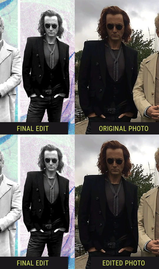
So I wanted to use this picture of David and Michael for this edit, but 1) They’re standing on the wrong sides for their characters, and 2) part of David’s arm is covered up by Michael’s.
Of course, the easiest course of action would be to just mirror the photo so they’re on the correct sides, but 1) mirroring faces tends to yield wonky results, and 2) that still wouldn’t give me a perfect, free-standing cutout of Crowley to place wherever I want in my composition (as opposed to being forced to awkwardly position him off the edge of the canvas to hide the fact that the other arm is missing)
Fortunately, it only took all of like, two (2) minutes to draw a crude selection around his good arm, copy and paste it into a new layer, flip it around, and add any necessary masking to get the shape right.
My point here isn’t to teach y’all how to do manips, or to pass this off as an impressive example of one. Because it’s really, REALLY not. My point here is to demonstrate that even something as tiny and simple as this can really open up your options for what you can actually do with an edit/composition.
So next time you’re feeling limited/inconvenienced by the crop of a screencap, just... you know. Consider whether or not it’s worth attempting a quick and dirty manip to fix it.
Another Example:

Sometimes you’re torn between two screencaps. You like one element from Screencap A but also want some other element from Screencap B. What to do? Just frankenstein ‘em together. Layer one on top of the other, get them lined up, and mask out the necessary parts.
It’s easy to get hung up on stuff like “Uh... should Crowley’s shoulder be doing that?” but let me assure you that like... the people looking at the final product are none the wiser to your butcherwork and will not notice. Especially if you’re going to add a bunch of contrast and color adjustments later on. (in fact, sometimes I’ll apply those adjustments first so I’m not distracted by any discrepancies that are going to come out in the wash anyway)
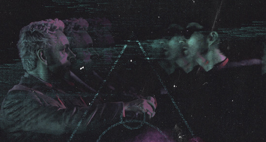
“I dunno... 🤔🤔 doesn’t seem anatomically correct... 🤔🤔🤔🤔” thought no one.
Point is... point is... dolphins you can get away with a LOT more than you think you can. Don’t let the desire to make these kinds of manips perfect get in the way of just... making them good enough. The bar isn’t that high, I promise.
10. Know what inspires you
What types of edits get you EXCITED? What kind of work do you see on your dash and go, "oh, I'm reblobbin' THAT!!1!"
I know for herzdieb, she's all about emotional pieces. She likes matching words/lyrics/poetry to on-screen moments and punching you in the feels with both. She hears a song, or reads a poem, and the lightbulbs go off for her, and she does her thing.
As for myself, I just live for the aesthetics of an edit. The colors, the fonts, the composition. I almost never know what text/screencaps I'm going to use when I start an edit. I just see a font I like, or a color palette, or a texture, and think, "I wanna use that!"
And once you know what inspires you, collect that inspo! I hoard textures and fonts. I have them organized into neat lil folders. When I wanna make an edit, that’s where I start. I just browse through them all until one or two start calling my name. Herzdieb collects songs and quotes and poems. Maybe your thing is color palettes, or aesthetic-y photos. Or whatever.
The point here is make the kinda stuff you like/want to see. Not the kinda stuff everyone else is making or the kinda stuff you notice gets the most notes.
11. Be able to let go of things that aren't working
I often begin an edit with a rough idea of the style, colors, or layout I'm going for. And I almost always end up doing... something totally different.
So don't get too fixated on what your initial ideas are. Be open to experimenting and just let the edit be what it wants to be. If something looks nice, do it. If it doesn't, don't try to force it just because, "well, I was inspired by this piece that did xyz and I wanna try it too".
When you see a certain effect that inspires you, just keep it in mind as a possible solution for the next time you make something-- don't make it into a benchmark, or some imaginary 'goal' you have to meet for This Edit You Are Working On Right This Moment. In fact, sometimes the elements I end up ditching are the very ones I started with, that initially sparked my inspiration. And that's okay. Inspiration can be a moving target, and if your vision for something changes, let it.
You wanna know what inspo reference I was looking at when I started that “Temptation Accomplished” edit?
Fucking this: https://search.muz.li/YTdiNjkwN2Rh
You might be thinking, “how the fUCK was that the inspiration??!! Your edit looks nothing like that at all!” ...and you would be 100% correct, and that is 100% my point. I spent a good hour or two trying to incorporate that cutout text layering effect before finally accepting the fact that it just wasn’t working for the edit I was making. And it wasn’t until then that it actually started to come together.
12. Be patient, and take the time to explore all your options!
I’m not gonna lie, y’all. I spend hours on my edits. I usually complete them over the course of 2-3 days/sittings. I rarely have a plan. 99% of the time I'm just throwing things at the wall and seeing what sticks. When I get stuck (when, not if), it helps to step away from it and come back later with a fresh perspective/set of eyes.
Every single edit I've posted, I have at some point felt like giving up on because I thought it looked like garbage (and not just because I was being self-deprecating/doubting myself, but because at those points, they simply weren't finished/something about the composition just wasn't working for me)
Work through those moments, and if necessary, take a break/sleep on it. It's always after I've exhausted my early ideas that the really good ones start to come to mind!
Here’s how the character poster edits I did progressed:

In Classic Me™ Fashion, I literally started off with just... textures I liked, and a font that I liked. Now, there were obviously a lot more ‘steps’ involved in both designs, but hopefully at the very least this gives a sense of how things get from point A to point B.
So uh... thanks 4 comin 2 my TED talk. I hope u learned at least one (1) cool new thing or maybe just feel vaguely inspired by this rambling mess?
157 notes
·
View notes
Text
Colouring/ Shading/ Lighting for Digital art
HI! Hello~ I’m here and I have a teeny tiny tutorial for you today (courtesy of dear Melito who actually wants my help??? I’m??? Blessed??? I realise that there’s a lot of you who have no clue who the fuck this person I’m referring to is, oh well, not my problem — ur missing out on hella great cake.)
So I have a timelapse of everything (below, duh, in case you can’t scroll) and I’m also gonna make comments on it cus ya know, these vids are only a minute long and thirty fucking megabytes like Jesus Christ.
So without further ado-do!
Should I have added music? Probably??? Ehhh the deathly silence can comfort you. (Wow what a mood.)
The Run Down:
Is rundown one word or two??
When colouring, I break it up into three main steps: base, line and “Hiding All My Fuck Ups”
(First) Base
I’ve never made it to first base... or any base
When colouring, use a non translucent brush to colour in everything. As in, so it’s completely solid??? Where’s my English today?
For every different colour, put it on another layer! I tend to do the skin colour first. You can go over lines that will be covered with another colour... did that make sense?
That’s it, I just felt the need to have three steps at least.
Line
As in... line art.
What I do is I lock my layer — that means when I try to add colour, colour will only be applied to the area that’s been drawn on.
I usually colour pick the colour I used for the base, and the line looks very pale when done (I do this with a non translucent brush too)
I then adjust the layer with lineart so the colour looks darker and more saturated. For my program (Medibang) I go Filter > Hue > Max out the saturation and lower the brightness > save. Sometimes I may do it again if it’s not dark enough.
If you can’t edit the colour then there’s another way! Duplicate your lineart > select the layer on top > change blending/ layer type to “Multiply” (it multiples the colour... duh)
If THAT doesn’t work I have one last suggestion before I sadly admit idk — duplicate line art > select top layer > colour the entire think a dark colour or black > lower the opacity
Line art done! (This time I wanted six steps — 6 is my fav number)
“Hiding All My Fuck Ups”
I rely on this too much okay?
I can actually further split this into two; shading and “I’m Kidding Myself” — let’s begin!
Shading
To shade, I work from bottom layer up!
What you’re gonna do, is select your bottom colour, (or any really but ORDER HELPS) and lock the layer.
Why? That way it’s easier to colour without going over the lines! (Your building on the foundation you set essentially)
With a semi translucent brush (FYI, translucent brushes are thinks like “blur” or “smudge” that purely affect what’s there and do not add anything) I use the watercolour brush set at 15-20% opacity.
I’ll eyedrop the base colour that I’m shading, and with the colour wheel, tru and find a darker version of that. NOTE: when looking for a darker colour, I don’t go to the black, I try and find a more saturated colour OR a darker HUE — black is a curse, I don’t ever use pure black or pure white — give your work the colour it deserves UwU
With the watercolour brush, I literally run the darker colour over all lines that indicate a shade (imagine a light somewhere and what that light touches is what you mainly focus on)
For clothes, I follow the creases I’ve drawn
For hair, I tru to imagine the hair in three main shapes and run the colour over the perimeters of those
Then it’s time to blend! I usually just eye drop the base colour again for this, and trace (lightly, our tablets have pressure sensitivity — same going for steps 1-8) the line that divides the light from the dark, adding a middle ground since the watercolour brush is only semi transparent.
For adding blush to skin: create new layer above skin layer > set to multiply, again, if you can’t do this then you follow same steps as before with line art) > using an Airbrush like brush (soft, no sharp edges, kind blurred), colour the skin areas that need blush.
Skin areas that need blush; areas with LOTS of blood vessels (head... the OTHER head...) areas with thinner skin (elbows, knuckles, knees)
If your skin layer was on the bottom, your blush will only appear on top of the skin and not the other layers!
Just be careful about the areas outside the drawing — you may need to do some tiny erasing
Finally, merge all the colours together. Sometimes different layer types don’t like to merge together without screwing up your other layers, to avoid simply merge them one at a time from bottom up.
As in, second last one and last one merged together, then the one above that merged with the last one — merge everything with the last one... AM I MAKING SENSE?!
I’ll usually merge the lineart with the colour too — I just didn’t here for some reason
“I’m Kidding Myself”
Here we add stuff that hides flaws and merges the character with a background if you have one!
I use three types of layers for this, if your program doesn’t use these then see if they have similar functioning ones (I’m always experimenting so this isn’t set in stone) if your program has nothing then... this will be a little harder, you’re gonna have to do this by hand somehow.
I use these kinds of blending layers; Multiply, Overlay and Add
First I prevent getting the colour on anything BUT the character; magic wand tool > select the empty space > hold ctrl/shift and keep tapping to add or remove areas > invert if you need in order for the art piece to be selected
You can see this when my background when blue, I’m basically highlighting my art of Yuri
Colour this entire space on a new layer. The colour I use doesn’t change here on out (except in the video I do cus I lose the colour but that’s aside the point). When choosing a colour, consider the colour of light — I use human colours??? Colours you find on a person essentially.
As a general rule of thumb; for every new thing, new layer, it gets a little harder here. I also use a semi translucent (watercolour) brush again for everything!
Now we have a silhouette of Yuri — I set this to multiply, it’s essentially like a highlighter marker pen but darker?? This is so that I may adjust the entire colour to fit the lighting colour
New layer (NL), I set to Overlay. Overlay is like multiply except bright! Remember what I did when shading? Yep, rinse and repeat! Afterwards, adjust the layer’s opacity setting so that it fits better with the image.
I’ll also make the brush really tiny and go over hey areas to highlight such as the edge of the nose, chin and jaw — I’ll also add shine to the eyes.
NL, set to Add. I only ever use this layer if I want to achieve “blinding lights” sort of looks. So when the lighting is immense, I have a white background, or the background is incredibly bright.
I use add layer scarcely, to blemish any lines and make it look more refined. I’ll also adjust opacity if need be.
NL, I’ll use the airbrush set too REALLY BIG (1000 usually) and if I have a background, will try and add light to it by making this layer multiply too. I’ll add darkness in the side or corner of the background etc.
NL do the same thing with Add except also make a point for where the light is coming from.
NL, I’ll use a mix of Add and Overlay to add sparkles, fragments, light spots etc depending on image type of need be
Using a Fluffy pastel brush (it’s textured) I also use pure white. This is the only time I ever do.
I’ll add reflection to eyes, jaw and nose. For hair, I’ll pick out a few strands of hair where it’s darker and throw in some loose lines. Clothes are rarely outlined and only where light touch. I use this limitedly.
Ctrl + D ;) to deselect the lasso tool — I don’t usually merge the layers after this because it’s usually too messy and I’m done anyway so I save it, however you CAN put them all in a FOLDER if need be. (I have a few in my vid, the entire thing is in a folder tbh)
Voila! That’s it!
I hope this has been of some help or use! And that this makes SOME sense... I’m absolute shit at explaining everything...
This was incredibly fun to do tho and I spent two hours typing this all! Wow!
Okay thanks for reading! (Hope this helped Melitooooooo, don’t forget the wedding cake ~ v/ important part of marriage you know)
#art#digital art#yoi#yuri plisetsky#art tutorial#tutorial#colouring tutorial#how to colour#colour and shading#how to draw
47 notes
·
View notes
Note
Hey! Can you do a tutorial how to make headers?😘
Hey there, sweetie! I’m so sorry for answering late. I don’t really have much time to make a tutorial right now (y’know, school, exams bla bla) so I’m just gonna give you tips. It’s just basically a bunch of textures, gradients, coloring and that’s all. (also i’m not good at explaining myself so pls excuse me) First of all, I usually choose a HQ picture. It really works. Then I apply some coloring layers like curves, brightness, color balance, vibrance, etc. Also I make some layers and color the skin, clothes, hair, eyes of my character. So first make one, for example; the skin. Pick a color for the skin, paint it and then set that layer to color and lower the opacity to 20%. Then duplicate the same layer and set it to soft light blending mode with an opacity between 25 to 50%, just like this:
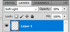
And repeat the same process with the clothes, hair, eyes (for the eyes you will need to color them white, set that layer to color and then again duplicate it and set it to soft light; and then make another layer and color the iris and repeat the same process) lips, etc... at the end it should be looking like this (I made this as an example just so you can check the difference when it’s colored and when it’s not):
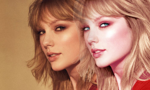
and then I cut out the person of the background, you can use any method. I personally love to do it with this little thing called pen tool:

and so once you’ve cut out the background, you will need to make a new canvas, the sizes i use for headers are 800px x 430px. then go to layer > new fill layer > solid color. pick the color you want, drag your other pic to this new canvas and then put the textures you want to use. you can check textures on deviantart and yeahps (there’s a lot of sites i use to download textures but tbh it’s almost 3am so i can’t remember all of them, if you want send me another ask and i’ll send you the complete list)
so basically you will just need to play with the blending mode of those textures and that’s all! i also recommend you to use gradients, the b&w mode or just black and set it as soft light. and that’s all, color again if you want to and just sharpen the image, not the whole header, duplicate the layer and then use gaussian blur and lower the opacity (just to make it smoother) and you’re basically done!
and these are my saving settings:
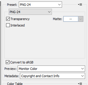
and that’s all. i’m sorry if some things weren’t well explained, i’m literally running lmao but if you have any questions pls send me an ask or dm me so i can explain you better:)
4 notes
·
View notes
Text
Voltron Editing Tutorial
Aight so someone asked, and now I’m here. I have made YouTube tutorial videos before here, but I’ll go into more depth on what to do, how to get started, and what I do personally.
For this, I will be showing you how to make a simple color edit (A request I received of Black Paladin Lance) but I will still describe briefly how you can do Altean/Galra edits (which implies to other edits like outfit changes and more!)
So let’s get started
So lemme get this out of the way - my program is called Clip Studio Paint EX, a $100+ art program with many features, including manga, 3D models, animation, and more. Of course, you can use other programs like Clip Studio Paint Pro and SAI (I have used both before) but this tutorial will follow with EX.
First thing you need to do is figure out what to edit, then get a screenshot. Now, you can either go to Netflix and clip out a screenshot, or find an image on Tumblr/Instagram/other (Note: For the best edit, make sure the image is as clear as possible)
I use Netflix, but I also sometimes go to @voltronreference who posted quite a lot of Voltron screenshots.
Once you find your image, something you’ll want to do is put the image on a completely new image with the size 1600x900 (or 1600x1000)
Now this part can be tricky. If you use @voltronreference ‘s screenshots, transporting it to another image is easy, as seen below. (To copy and paste, all you need to do is press Ctrl+c then Ctrl+v like usual)

However, if you get a screenshot from Netflix, the image size is probably somewhere in the two hundred. What you’ll need to do is shrink the image before you copy and paste it as seen below.

Once you have the image how you want, you can start editing!
Now, this next part is completely up to you! When editing, you have a choice to either only edit what you want to change or the entire thing (Not including Background). I personally edit the entire character so that everything blends together smoothly, but some editors only edit what they change, and that’s completely okay (just make sure everything blends together well).
For edits including changes like Altean/Galra ears or outfit changes, you’ll need to create a new layer above the image.

If it’s just a color edit, you can completely skip the sketch and jump straight to outlining.
For Voltron edits, the best tool to use is the Line Tool between 2-4 thickness (3 is the perfect thickness for me almost every time, but sometimes you need thicker/thinner lines)

Now all you have to do is outline the character as seen below.

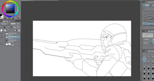
Once you have completely outlined your edit, you can begin coloring. (Note: make sure your colors match your background) If you don’t change the background at all, you keep the same colors except for the ones you’re changing. For the ones you are changing, you can either find another scene with the same background and colors you need (Ex. You need black for Lance’s armor, so find Shiro wearing his armor in the training deck)
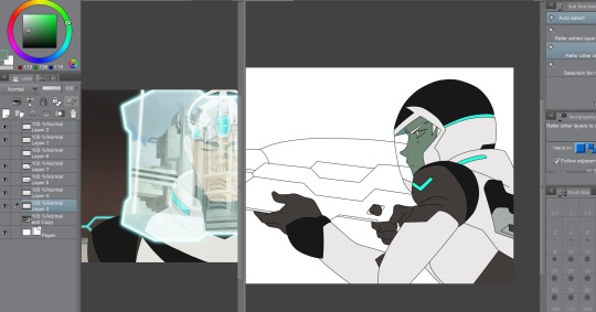
You can either color by hand or use the Select and Fill Tool, as seen below.
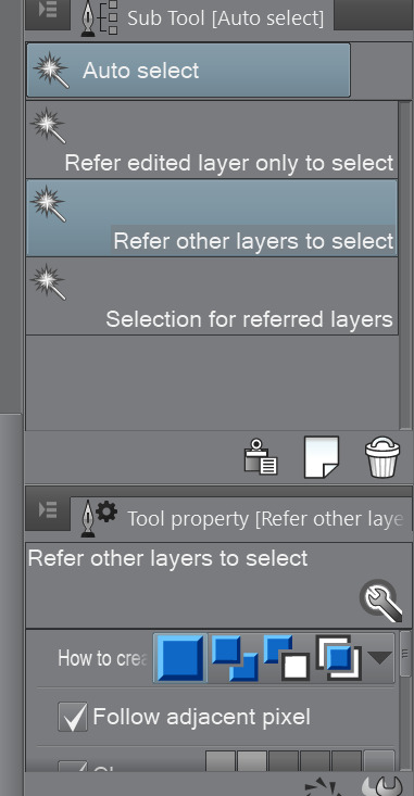
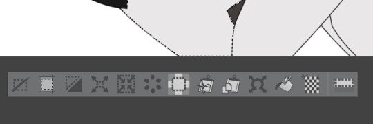
If you use this tool, you’ll need to go back and color in the little nooks the Select Tool couldn’t reach. (Note: Best way to color is by setting each group of colors in different layers (Ex. One layer for hair and eyelashes, another layer for clothes (or three to four layers for clothes, your choice), and a layer for skin) as to avoid constant coloring over and needing to recolor certain areas. My order of layers if Hair, Clothing, then Skin.)
A little fun token for you: Make a separate image for colors for individual characters - the basic colors, as seen below.
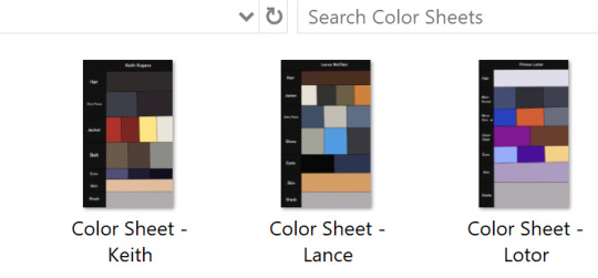
Once you got everything colored, you can move onto shading. What you do here is create a completely new layer above all except the outline, and turn it to Multiply. This setting makes the colors darker and colorful depending on the shade color you use. I always use this shade of grey below.
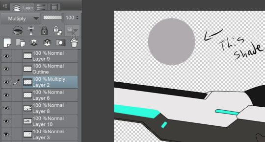
All you do here is take your Line Tool and outline the shaded areas of your image (Note: You can add your own shades to make it look better, for sometimes Voltron didn’t shade at all/enough) Then use your Select Tool and Fill in your shaded areas (of course go back and fill in the nooks)
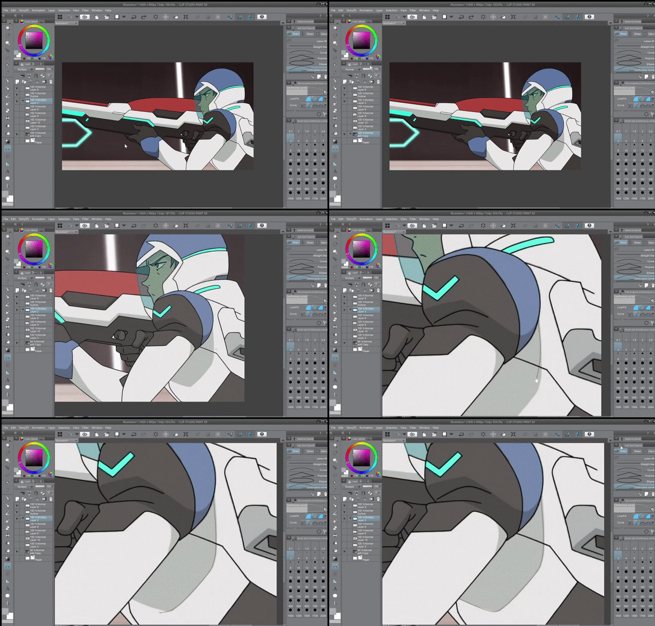
Step back and take a look at your edit so far. Does it need a color fix? Any more shading? Once you have everything you like, here comes the fun part (not really)
Sometimes, the background will still have traces of the character you just colored over, as seen below.

Going back to the original image layer, all you do it color over the patches with the same color behind it and blur it together to make everything blend better. Once you checked around the entire character for those patches, you’re almost done!
Going to your Filter Tab: Blur for your shading layer, you will select one of the two options - You will select the first options, which is just Blur, to blur your shading in with the colors better. Or, you will go down to Gaussian Blur and take the strength all the way down to 2.00 - as this gives the least amount of blur, which is the best option in a lot of far away characters.
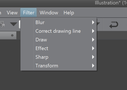
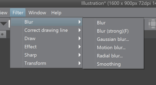
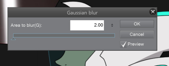
Now, keeping the same Blur choices above in mind, you can do one of those with the outline, or not blur it at all. Just go by what you think is the best option to achieve the closest Voltron style as possible.
And Bingo!! Your edit is complete!
Now y’all know how to make a Voltron edit (at least how I do it), and even though it looks difficult, if you keeping working on this you’ll be dishing out edits in thirty minutes!
I hope this helped. If you have any questions or want more details or want to know how to make other edits (Altean/Galra, outfits, character changes, etc.), send in an ask and I’ll explain further. Good luck!
59 notes
·
View notes
Note
if you dont mind could you please make a tutorial on how you make your backgrounds? theyre always very creative and i wanna make my own!!
First of all, thank you for your kind words, anon. :) I’m happy that you like my works.
Secondly, I’m rather bad at explaining, and I own a Russian version of Photoshop, so it’s rather hard to give an actual step by step description. So, if you don’t mind reading my messy explanation, please follow the cut. =)
When I want to make a background for an edit, I usually use several textures downloaded from internet. Here’s one of my most favorite sets: link. When you search for your stock images, make sure that they are free to use.
Here is a random set of images that I’ve chosen for my explanation:

After I’ve made up my mind on the images to use, I create a new file and copy them into it, layer by layer. Now it’s time to play with blending options. There are several ways to access them. You can double-click the layer icon, or click on a small arrow next to the word “normal” above the layer titles.
Here is an example of how blending options look like if you access them by double-clicking the layer icon:

(image credit: link)
As you can see, there is a large drop-down menu with different options. Another way to access it is clicking on the arrow, like I’ve said before:
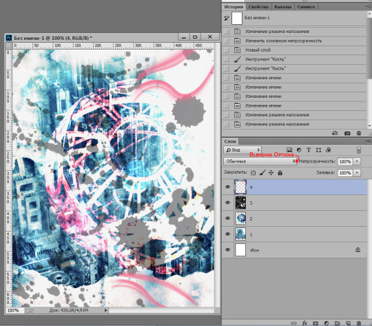
The default blending option is “normal”. You can change it to any other option, just play around and find out what you like. :) In my example, layer 1 is set as “normal”, layer 2 is set as “divide”, layer 3 is set as “subtract”.The 3d layer’s opacity is also changed and is set as 43%. I used layer 4 to put some random brushes on it (also downloaded in internet). You can see them in the right upper corner and the right lower corner of the image. Their borders looked cropped, so I erased them with a soft eraser tool.
Sometimes letters/words also look nice as a part of a background, so you can try to use them too. All you need is experiment and combine different textures, brushes and letters until you are pleased with the result. =)
Other tools to consider: filters, adjustment layers (brightness/contrast, levels, photo filters, etc), blur tool, custom shape tool and others. Just make sure that all the parts of your image blend well and don’t look like a mess. And don’t be afraid to experiment, try different options, add/remove new layers, etc. :)
Here is the same image, but now with levels and a photo filter applied:

I hope this messy explanation is more or less helpful. ^__^ And I am sorry that my “sample” background image looks very messy as well. ^_^”
7 notes
·
View notes