#if you want to do something digital you can always make your pages on procreate or canvas or something
Explore tagged Tumblr posts
Text
anyone can make a zine, regardless of skill level or access to materials or design programs. all you need is paper, scissors and drawing utensils (although many people enjoy collaging!) web search "8 page 1 sheet zine how to".
everyone SHOULD make a zine too, you will feel so good about it ♡ it's about putting the power of production into the hands of the people! also you don't have to sell it or anything, you can just make one for yourself or trade/give some to friends!
i really love julia grofrer's guide to analogue self publishing aka making zines on 8.5x11 paper
and jaydragon/jdragsky's thread on staple's self serve print centres (if you're area does not have a local print shop, they probably have a staples or fedex print centre)
if you can't draw, here is twitter thread for public domain art and also a mini summary of when thing enter creative commons (generally 70 years after artist death in the US and CAD)
i also have a DIY zine page on my art blog that i am dedicated to updating as i find more resources! (not accessible through tumblr mobile app, mobile friendly, just open the link in a browser)
go make some zines!!!
#if you want to do something digital you can always make your pages on procreate or canvas or something#i changed the emoji because it was showing up weird in my browser!#you can also print at your local library <- great addition from the tags!#zines#ok FINE I'll pin this#also i am drier skin type and it is NOT bad to wash your face twice a day... it's necessary otherwise the dirt and sweat make you itchy#like i don't want my skin flakes building up and making my skin uncomfortable...#p
6K notes
·
View notes
Note
Hi! I made an account just so I could follow your work. Your art is brilliant and honestly and inspiration to where I want to be. I’m an older artist who has all the anxiety when it comes to improving my process. I’m trying to get into digital portraits and I have so many ideas in my head, but it’s frustrating because I’m not where I want to be to make this happen. What are some tricks that help you/software do you use? Of course, you don’t have to share anything that makes you uncomfortable. I currently have procreate and an iPad, but I feel a little lost. Wondering if I need a different writing tablet and photoshop. Not sure. I just eventually want to find that 3D, but also artistic look you are able to achieve.
hey there! thank you so much!!
ultimately, I will sound like a broken record but I always recommend you sign up for local figure drawing or painting classes. have people pose for you at home and sketch with charcoal and paper. go to the zoo and sit down in front on an exhibit for an hour and try to draw the animals in front of you as fast as you can and fill a couple of pages, move on to a new exhibit and do it again!
nothing is more powerful of a tool to learn than whatever writing utensil you have in your purse and the back of a napkin when you see something you'd like to capture. I've spent quite frankly my entire rememberable life doing this. I used to spend every single day in middle school/high school/my brief failed stint in community college with a pack of cheap sharpies and a beat up binder full of old worksheets and homework to draw on the backs of.
drawing/painting from life will teach you better than anything.
I use a very outdated version of Photoshop, and only got a "nice" tablet in the past 7 months.
Also, a huge tip to you and anyone else reading this: do NOT get too focused on a "style" that you want. Obsessing over that just ruined me for years and years. I wanted so, so, so badly to be the next Matsuri Hino when I was a kid. I copied her work religiously and it NEVER looked right. Frustrated me to no end. And you know why my stuff never looked like hers? Because I'm not her! You can't force your art to come out any way that isn't natural, and the sooner you can accept the art your hand wants to create, the happier you'll be and the easier art will get for you.
The past couple of years before I started diving into this more realism based work, I was just shoving myself through trying to make what art I envied of others. Very stylized/textured watercolor comic book style stuff. And I just was NOT getting any better at it. I have always been more inclined toward realism work, but I've hated it and yearned for stylized work. Yoshitaka Amano? God, I just drooled over that artstyle and beat myself up for never being able to capture it in studies or otherwise.
I finally essentially restructured my entire career around making the art that makes me happy instead of what I "wanted" it to look like. I was extremely depressed, my life was falling apart, and I still needed to make art to survive but I couldn't "art" if I was depressed and hated doing it, so I just had to step back and stop worrying so much about what I thought I wanted to make, and started making what felt most natural.
there's no easy way, and art can be a soul destroying path at times, truly. your software and hardware should come very last place compared to practicing from life (it doesn't matter if you want to paint cartoony stuff of realistic stuff, always start from life). naturally you will find what makes your heart sing the most.
I get a lot of messages from people telling me similar stuff "oh your art is EXACTLY what I want to do!" but I promise you that kind of thought process is chasing a dragon that is likely to harm or drag your creative process down. art style is such a deeply personal thing, so of COURSE it's important to find inspiration, but the second looking at someone else's artwork stops inspiring you and starts frustrating you, put it away.
There are some artists who I love, that I do not check up on often because their artwork ignites, like, serious bitter jealousy in me. It's the truth. I get so mad at myself for not being more like them, and it's such a poison. I think more artists should be transparent about this feeling because I KNOW the art community has a lot of jealousy and ugliness in it.
A fact of being an artist is that you will never be completely happy with a piece you make. You are always going to see the flaws, and that doesn't change whether you'd been drawing for 2 months or 20 years. Occasionally, you will get one piece that you are like "how did I make that???" and then get frustrated that you can't recreate it lol! It's a tough beast.
It's just really important to step back and work on yourself and where you are at, because at the end of the day, the way your soul wants to express artwork might be WILDLY different from what your brain wants, and it can be really detrimental to let those two go to war.
I hope this helps. I'm very passionate about this, and when I started out I ALWAYS ignored the artists who gave the same exact tips as above. I thought they were so annoying and unhelpful, but now I /get it/.
72 notes
·
View notes
Text
Tools of the Trade
Hello hello!
I'm *hoping* this'll be a pretty quick blog today because I have a lot of ideas kicking around my head and want to focus on trying to write some of 'em! But inspired by the new Creator's Guide to Comics Devices (we'll get to that in a sec), I want to talk about some resources that I've accumulated over the years that can help with everything from the fundamentals of comics storytelling to good reference to software and fonts and printers and distribution platforms and more!
As a disclaimer right up top, some of these resources I have not personally used--I haven't done a lot of crowdfunding, I haven't worked with some of these smaller printers, etc--though I will say that these are things that're coming recommended to me and I'm passing along that recommendation. If you've had a really bad experience with one of these, or know some dirt, let me know! I'm always happy to stand corrected on this sort of thing.
Lastly, a number of these things I'll point out specifically as an alternative to other software or expected resources. Alright, let's boogie!
Making Art Not being an artist, I can't speak exactly to what tools will work best for you! The good news is, as an artist, you probably already know that and don't need me to tell you what sort of pencils, pens, brushes, inks, etc work best for your style. However, I will say, I've seen some glowing recs for Eon paper. If you're working traditionally in any way (I know some people work hybrid), good paper is important.
If you are working digitally, I think the two sort of biggest contenders outside of Photoshop right now are Procreate and Clipstudio. Becca uses Procreate and really likes it. The downsides are that I believe it is Apple exclusive (and not on desktop) and while I've seen plenty of pages come out just fine that were in part or fully produced in Procreate, it does sometimes lack some of the functionalities for what you might need--I know folks who've had trouble doing clean flats, for example. I know a lot of folks use Clipstudio with great success, but I also know there's a bit of controversy around some of their 2.0+ updates including only working on a subscription fee if you want to use it on a tablet or non-desktop device (and/or want the updates they release) and something about like, it not working if you aren't on wifi?
I personally have had good experience with Affinity's Designer and Photo. But I am not an artist, so while I think they're good for doing some of the production side of art--I've used them for lettering and prepping files and making little social graphics and stuff--I can't speak to how helpful they are as a full art tool. I will also say, as long as I'm talking about Affinity, their Publisher tool is pretty good too and with the Affinity suite, you can get a lot of what you would want out of the Adobe suite.
Art Reference
Look, you're smart. You don't need me telling you where and how to find reference. It's all over. There are hundreds of books and websites and resources for artist reference. You can go find some live models or pose one of those weird little wooden dolls or turn around a toy or whatever.
But! With that said, here're a couple big ones. Blender is itself an art tool! It's a lot less common for comic art to be fully produced in Blender than, say, animation, but Blender can be a really helpful way to put together thumbnails or consistent backgrounds. You can build a room and move it around for what you'd need to see in a panel and have that as a base when doing your art. You can use it for lighting studies. Lotta possibilities!
If you can be cool, you can maybe get access to Fat Photo Ref. It's what the name says, an archive of photo reference by and of fat people, who unfortunately are often not included in your standard art reference collections and books. I'll also plug that the Morpho art book series has a very well regarded Fat and Skin Folds volume. Linking specifically to that one, but you can find the whole series from the link and get it from an indie bookstore!
And as someone who has long pointed people to things like Wally Wood's 22 Panels that Always Work and Steve Lieber's 12 point portfolio critique without even looking (which I riffed on for writers here and also talk about like... finding agents) and all the thoughtful analysis on the craft and creation of the medium from Scott McCloud (I'm not linking Understanding Comics... you probably already have it), I think that the aforementioned Creator's Guide to Comics Devices is the logical progression of all of that. It is a free collaborative resource about the way comics storytelling works.
Writing, Lettering, and Additional Craft
I believe I've shared this before, and have said it's not my actual preferred format when I write, but Steenz and Camilla Zhang created a standard script template for comics. I think this is very helpful for people who don't know what a script looks like and, obviously, if you find yourself wanting to modify it to better suit your needs, you can! But this gives a really clear picture of what the general form will look like for maximum sharability with your collaborators.
Comicraft and Blambot are two of my favorite font houses (and lettering houses)! They have fonts that you see in your favorite comics for reasonable prices, including often big discounts or fonts that are free for indie use (though obvs read the terms and conditions). They have packs including like premade balloons that can help ya get started easier. Both of their books on comic lettering, Comic Book Lettering the Comicraft Way and The Essential Guide to Comic Book Lettering, are excellent and should be considered the tomes they are. Sara Linsley's fonts are also great, particularly if you're doing more manga or webcomics inspired books. And if you don't want to be a person who has to spend a lot of time thinking about fonts and getting MainType or another font management software (I don't do a lot of it, but I've gotten really into teaching myself lettering and I do think it's pretty fun), do us both a favor and just hire a letterer.
But if you want to learn more about lettering, Todd Klein also has a really amazing blog!
Printing
There are a lot of professional printers that print comics. Many of them that are printing for publishers have a very high threshold for minimum orders. If you aren't printing 2K copies, they aren't going to print your book at all because that's how they have to ration their paper and run their business.
But I know of a couple of printers that do smaller print runs for indie comics. I've heard really good things about RA Direct and about Comix Well Spring. Something I'll flag right here and now is that whether it's one of these or another printer, early in the process--before you pay for anything--you should take some time to email the printer about any potential issues you might have. This can be anything from confirming your specs are correct and you've got the right overprint on your blacks to checking if the printer has any sort of issue printing 18+ sexual material or dismemberment or if you have anything that might be on the line of fair use. Like, it'll help you both out to get that sorted early and easily.
As a brief detour, I've also heard good things about both Alibaba and have used Vograce with Becca, if you're looking for merch for shows--y'know, keychains and pillow covers and pens and pins and whatever else you may want to create with your art that is not strictly comics themselves.
Distribution - Subscriptions
I'm talking specifically digital subscription platforms that are not webcomics hosting sites and that are subscription sites of any sort, not just stores/places your art lives. So no like Webtoon or Artstation or Shopify or whatever. Basically, your Patreons (you know Patreon, but you could sub to mine) and uhh... Substacks. But maybe better than those options...
I host this blog on Patreon, that's true. I also have it on Tumblr and on my website. And I sent it out as a newsletter through Buttondown! They are super friendly and concerned with making the service work! It's awesome and I highly recommend it over Substack which, as you may recall, I have some issues with. My Buttondown is free, but you can have paid subscriptions. I've also heard some folks say good things about Ghost as a similar sort of alternative. I can't speak to that the same as I can Buttondown, which, again, I really like, but I know some people who use Ghost.
In terms of Patreon alts, options are not great, TBH. Kofi has memberships (plugging mine which is membership-less). But I believe Kofi is also a lot stricter about what sort of content you can post and host--similar to the sorts of questions I was suggesting you ask a printer about earlier. Fanbox through Pixiv is something I see some folks use. I think it's largely international folks. I also, again, think it has some content restrictions though I'm not entirely sure how enforced they are. I feel guilty enough using Patreon (lol this being posted there), but I really can't recommend Subscribestar. I've heard good things about them as an alternative--like, I hear they're maybe the closest in practical functionality and are a lot more adult material friendly than some competitors, but I have a lot of the same problems I have with Substack and Patreon with them. Like, Patreon isn't perfect, but some of the more horrific elements of humanity that cannot operate on Patreon have found a home there and that stinks.
The one non-subscription option I will highlight is, and again, I don't think it's perfect, but I know people who have had good experiences with itch.io. If you're looking for a place to sell some digital comics outside of your own website, there are far worse options.
Crowdfunding
I think we've all ceded IndieGogo to the worst parts of comics. Obviously, Kickstarter is still the big one that people really think of and like many of these prominent versions of the service, it has its good and bad. There is name recognition and a track record of projects getting funded and paid and completed, and there are criticisms. But that's true of lots of things.
There are also a few options that're a bit newer in the space. Backerkit has been a part of a lot of fulfilment of Kickstarter campaigns for a long time and now operate their own crowdfunding platform. I know Iron Circus uses them. I've heard a little bit about Crowdfundr and am pretty sure I know some folks who've given that a shot. And I know one of the co-founders of Zoop and they've been helping get a lot of really cool projects made recently.
Final Recs
BLEH! This ended up taking a lot longer than I expected! Oh well. You don't know. You're reading this and it is not happening in the realtime it took to write it. So, final resources I'm going to throw your way as jumping off points for more!
1. Cartoonist Cooperative! Guess what, for basically everything I just said, they have EVEN MORE RESOURCES! They also do mutual promotions and support and are a really great community based initiative!
2. Creator Resource! Similarly, they also have even more resources! Their database/articles include a lot of stuff like more about finding agents and publishers and page rates and marketing and this that and the other thing. Between the two of those, you're going to have a lot of whatever you would need to get started and have not just a rounded out knowledge, but access to a knowledgeable community.
3. Curiosity's Corner from Wildstar Press! Wildstar's mission is really cool. They're an indie publisher that focuses on helping new creators get their first publishing credits and work they can share to get more jobs. And they've recently started a guide that's not dissimilar to this blog on how to get started on having a comics career.
4. This is just a general reminder. Make a website that has a way to contact you. Make an email that maybe can be public facing but that you're comfortable using for work and dedicate it to that. If you're going any place where you think you might make industry contacts, bring business cards. We live in the future and you can put your portfolio or samples on a QR code on your card. Find or make communities. I'm not great about it myself, TBH (and that's a little intentional because being an editor, working at a publisher, there are reasons on both sides to create this distance), but like... I dunno. Get on Discord or something. Have a group text. Like, have a way to reach out to your peers.
Like I said earlier, if you have corrections to be like "nah, this thing sucks, don't recommend it" or if you have additional recommendations, please share them! Don't DM me because I've been very bad about answering those because I am going to be shuttering Twitter soon, but y'know, if it's something you can share publicly, reply on post where you saw it or on the website (comments in a rare move are open on this unless something happens). If you want to share anonymously (or like... invite me to a Discord or something), there's always my contact page.
Okay, I'm off to write fiction now! And should probably reach out to some folks to draw it soon.
L8rs!
What I enjoyed this week: Blank Check (Podcast), Solve This Murder (Podcast), One Piece (Manga), Sonic Superstars (Video game), The Archive Undying by Emma Mieko Candon (Book), Reverse 1999 (Video Game), Yu-Gi-Oh: Duel Links (Video game), Last Week Tonight (TV show), The Simpsons (TV show), I said Thirsty last week, but I meant Steamy, the last book in the trilogy from Space Between, but it did make me go back and read Thirsty and Cheeky again too (Comics - Adults only), Five Nights at Freddy's was fine but like... I don't think I'm the target audience and we only saw it because we pay for Peacock and didn't give additional money to the bad man creator (Movie), Phantom of the Paradise (Movie), Scream 3 & 4 (Movies), Batman: The Brave and the Bold (Cartoon), Joe Pera Talks with You (TV show), Witch Watch (Manga), Halloween, Godzilla Day, Spooky's Jump Scare Mansion (Video game... well, until I got too spooked), wanting to write.
New Releases this week (11/1/2023): No new books from me this week. Don't worry, next week makes up for it.
Final Order Cut-Off next week (11/6/2023): Godzilla Rivals: Jet Jaguar vs. Megalon (Editor)
New Releases next week (11/8/2023): Godzilla Rivals: Round Two (Editor on most of it) Sonic the Hedgehog #66 (Editor) Sonic the Hedgehog: Knuckles' Greatest Hits (Editor) Sonic the Hedgehog: The IDW Art Collection (Editor)
Announcements: I might be done for the year? If you'd like to have me on your podcast, Twitch stream, at your convention, signing at your store, talking to your students, whatever, feel free to hit me up, but I don't think I have anything else public for the rest of the year, though knowing us, Becca and I will probably a local market or something.
Wanna support me? Visit my webstore, the previously linked Patreon or Kofi, or my eBay. And you can always visit Becca's portfolio/shop/Patreon/Twitch streams too. Streams will be returning soon. Been having technical difficulties of late.
And of course, things are bad. Call for a ceasefire and urge your reps to stop the Palestinian genocide. Fight back against whatever terrible policies are currently up in your local or national area--from trying to ban books to criminalizing transness to further criminalizing homelessness to whatever. Support SAG-AFTRA as they're still on strike, and support all the other strikes and union actions happening across the country and across the world. Just be kind to people.
Pic of the Week: It's my favorite green heroes, the Warrior Mans!

#comics#making comics#comic tools#comics editorial#warrior man#tmnt bootlegs#art programs#art reference#lettering#comic printing#comic subscriptions
6 notes
·
View notes
Note
HI ok I love ur stuff and ur stories and ur style of making comics and im looking to start making comics in the near future, do you have any advice or tips???? I hope u have a good day :] !!
!!! Ooo!! Get ready this is gonna be a lot! Maybe I'll put in random art???? to separate it????
So for advice:
Before you draw any pages or anything, have the story written! It doesn't have to be a book it can even just be a word doc w/ bullet points of what you want to happen. For CoD I have a general 5 point story thing (beginning, rising action, climax, falling action, and ending) with big things I want to happen under them that I end up building the chapters around.
Have your characters fully fleshed out too. Maybe your story doesn't have anyone get ice cream, but we all need to know what their favorite flavor is and why.
Find a style you like that's fast and easy and ideally doesn't do too much damage to your hands/wrists cause with comics you're gonna be drawing A LOT. Remember to take breaks to stretch your wrists/fingers/shoulders and to not look at a screen for a bit. And mental health breaks, they say "Comics will Break your Heart" and they mean it.
Lots of people say to start with short projects first and I think that's a good idea!!! you can always build on short stories if your heart desires, but also if you have a giant magnum opus idea that you think is perfect, just start it now! ALSO, also, if something happens and you gotta end it early its okay too, you can always reboot it! IF CARTOONS CAN HAVE A BILLION REBOOTS so can your comics.

Vintage 2013 Conner (technically CoD is a reboot of a comic I started in hs/early college that I had to end because a character I had based on a real person died in the comic and a few weeks after that page went up the real person died irl and I got SCARED.)
For Tips:
I love using all mediums. Sometimes its fun to experiment and use mediums specific to your story. Maybe you wanna do a mermaid comic, maybe try it in a watercolor style??? I normally use like a heavy ink style, but with CoD I wanted something sharper so I've been trying that.
Usually the flow with comics is Script, Thumbnails, Pencils at page size, inks, colors, and finally lettering. But after Scripting and Thumbnailing It can go in whatever order.
For lettering font choice is important! You want it to be legible and fit well with the tone of the story/dialogue. There's lots of good lettering info and free fonts for personal/self publishing use here: https://blambot.com/ They also have a scripting guide but there's been a newer guide floating around too that's trying to standardize scripts (cause if you start working with writers you'll find that EVERYONE is so different when they send you a script) https://www.oheysteenz.com/scs-template
I am inhumanly fast at comics usually, and that's because I like to cheat. I don't always do pencils. on digitally drawn comics I'll take a photo of the thumbnail and draw over it cause its just a general idea of where things need to go. On traditionally inked ones I do the same thing but I end up printing the thumbnail onto the Bristol paper.
Following sample is from apoppy chapter 2 and features traditional penciling which allows you to make fun notes like "less dick shapes" very accurate inks and to flesh out any drawing problems you might have.
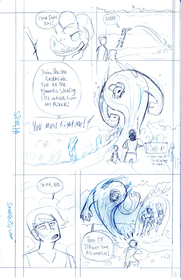
For Drawing Print Comics:
In Clip Studio/photoshop/procreate, You want a canvas that's 300 DPI or higher sized appropriately for what size book you want to make. Regular size comics I make at 11x17 inches and size down for books to like 10 something by 6 something. Different printers have slightly different requirements and they all should have templates available. If you're coloring it export your image in CMYK, its gonna look weird on the webpage but don't worry.
For traditional drawing: 11x17 Bristol Board and ink. Some people swear by certain brands, I'm cheap and use a giant bottle of Speedball Ink and a brush or a set of fine tip pens like Faber Castell Pitt Pens or Microns. I like those because they're waterproof and I like to paint at random. Scanning should be done in full color at 300+ DPI but, that size is a challenge, I've had to scan in sections and piece it together digitally. It Sucks, but large flatbed scanners are hard to find. I haven't tried one of those kind that feeds the paper through tho.
I don't know much about the mobile format comics as far as pacing goes. I'm in the grandpa zone and think mobile format is making you do more work for nothin cause if a "normal" episode has like 60 panels you could equate that to print comics and say that it's 10, 6 panel pages or 6, 10 panel pages (which is a lot of panels you sorta don't wanna go over 10 if you don't have to but that's all up to you) and over the course of history webcomics have only ever posted like 1 page a week or more. anyone posting a page every day is wildin.
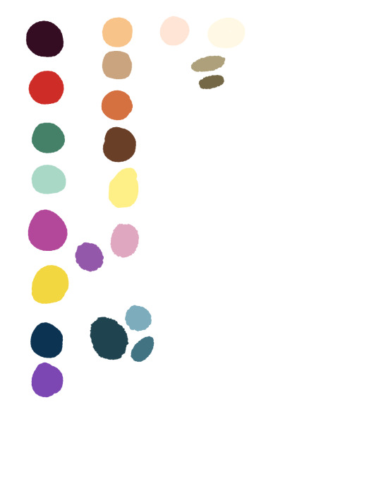
Oh oh oh also! Coloring!! everyone colors differently but i swear by making your own color palette. CoD started with a limited color palette and has been building over the years, and Apoppytheosis has a very very limited color palette and a rule for that comic was to not use any other colors. (any other colors seen were from another palette color doing something weird over the top of that layer) (This is the apoppytheosis color palette. Apoppy 2 is similar but more vibrant.)
Anyway I'm going rambly!! feel free to reach out if you got specific questions on pages or approaches to stuff!! I went to college for comics and I could talk about this all night.
8 notes
·
View notes
Text
Meet the Creator!
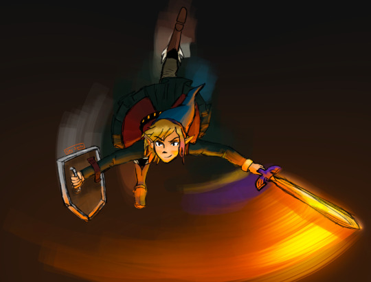
Introducing: Squido!
Commission: I haven't and don't really intend to. I don't want to take anyone's hard-earned money. Just ask me to draw things and there's a good chance I will.
Social Media: Tumblr: @sky-squido AO3: https://archiveofourown.org/users/sky_squido/pseuds/sky_squido
Tell us a little bit about yourself!
Call me Squido! I love to draw and write but I'm also super extraverted and I love interacting with humans so always feel free to chat with me! Aside from drawing and writing, I just love being outside and have a tumblr sideblog dedicated exclusively to nature photos I take. I love mountains, the ocean, the sky, and just about everything else in this beautiful world of ours! If you ever feel like having an internet stranger give you a thousand word rant, ask me why my favorite color is blue and you will not be disappointed!
What got you into creating? what inspires you to keep creating?
I've been drawing for as long as I can remember and can't seem to stop, though I take long breaks sometimes I always seem to come back to it again. I try not to have anything in mind when I draw, but to start sketching and let the drawing happen. Sometimes I find that what I'm trying to draw is not what my drawing wants to be (if that makes any sense) and change what I'm making halfway through. It makes drawing a really relaxing and carefree therapeutic experience! Writing is different. I've always enjoyed writing, but I didn't write much and never shared my writing with anyone because I thought it was super pretentious. It wasn't until entering High School and joining the literature club and making a deal with a friend that we'd share our writing with each other that I actually gained any sort of confidence in my ability and sought to improve it. Being in that club and sharing my pieces at the open mics was a really encouraging experience! I invite everyone to share their writing, even if it's with some random internet stranger (I'm open anytime!) if they're unsure of their abilities. A little encouragement goes a long way! Now that I'm on Discord, ao3, and tumblr, I receive so much more feedback than I ever have before! It's been super encouraging! What inspires me most is definitely nature. Even if my ideas aren't directly related to the outdoors, I get my best ideas there. Fandoms are also a great idea generator. The sheer volume of headcanons and prompts is enough to make me dizzy with ideas!
What's your creative process like?
I love sketching. My favorite thing about drawing digitally is that I can sketch as much as I like and never worry about wasting materials! Often times my sketches turn themselves into drawings without permission and other times they stubbornly remain sketches for all eternity. I always dive right in because I have no patience and the idea I started out with generally isn't that great but in the process of pursuing it, it spirals out of control and sometimes the idea gets better and sometimes it gets worse but I just kinda roll with it. Creating is a really chill process for me and while I regularly scream stuff like "I'M DRAWING ON THE WRONG LAYER NONONONONONO" or "NO HECK FRICK SHOOT IT SMUDGED HECK HECK GET THE ERASER QUICK," the creative process is a great way for me to unwind. I'm the same way about writing. I never plan or outline and just kind of roll with things. I mean I generally have the basic jist in mind, but I try to not have a plan so I can keep the story driven by the characters and not force them into acting the way I wanted them to in the outline I made hours or even days ago. Creating is my opportunity to break free so I don't really see what good a plan or outline does me. I'm a pretty spontaneous person!
What kind of mediums do you like to use?
I like to take pictures, but it's not really my main focus. I've been mostly digitally drawing—I use my iPad Pro and Procreate—but lately I've been pencil sketching with just your average everyday mechanical pencil (I'd forgotten how nice the texture of paper was! Clearly I spent too much time drawing on my iPad!). I have these Stabilio chalk pastels I love to pieces, but have also spent a great deal of time with watercolors. Digital is my primary medium currently, though.
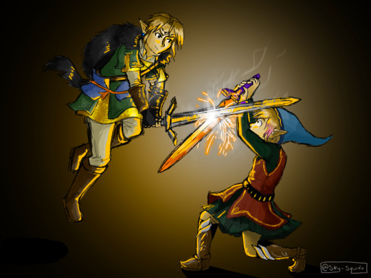
Is there a specific scene wrote that you are particularly proud of?
"Sky’s golden scales are glowing with reflected light from the sun while beneath them, the same pulsing blue in her mane runs like a river as her very skin is alive with electricity. The sun’s beginning to dip, fading through the color wheel from yellow to deep orange to scarlet and the world is bathed in watercolor and hue shifted through the rainbow until all that was blue becomes red. This new alien world begins to darken as red fades to deep purple-pink, the clouds catching last vestiges of gold in their pillowy folds, yet Sky continues rippling with lighting, the bright blue flowing like blood through her veins and the gold shimmering in the eerie azure glow. We weave through the winds and zephyrs and I close my eyes and let the breeze caress my hair and when I reopen them, I’m standing back on the ground again in a world long since darkened by night. I place my hand over my beating heart where Sky is still laughing with joy and smile because once you’ve awakened your dragon, you don’t need wings to fly anymore."
Is there someone who inspires you and your writing or art?
Every fanartist and fanfic writer that posts their stuff online is an inspiration to me. Even if their stuff isn't very good—especially if it isn't very good—it's a huge testament to the courage of the creator and their bravery in expressing themself! I sat on fanfic and fanart for years and never shared it and here were kids half my age putting out art that was their first experiment in a new medium and a little shaky but it was still out there and they were still being supported by the community and that really inspired me to reach out and stop lurking in fandom and actually get involved!
is there something that you struggled with that made you grow as a creator?
I feel like everyone has these periods where they were just gaining confidence in their artistic ability but suddenly everything they make is trash and they're not happy with any of it and they feel so down and worthless and "where did all of my hard-earned ability go? Will I ever get it back?" I think this is a pretty common experience and when I find myself there, I find it most helpful to share what I make anyway, even if I hate it, with someone who I know will give it to me straight because they'll point out the deeper problems—the root of the issue—that I hadn't even noticed and I can use that information to grow as an artist. Bad pieces are just as valuable as good ones. There was also a time where I had a lot of trouble developing a style. I did a lot of experimenting and never found anything I liked. What happened is I just kept drawing and whatever popped out eventually evolved into my style. I used to get frustrated that I couldn't draw anything without a reference, but after years and years of using references and drawing some of the same things over and over again, you won't need the references anymore. I mean, they're great and you should always feel free to use them, but over time, you won't need to look up a picture of every little thing you try to doodle.
What got you into writing or art?
My silly twitchy fingers can't ever seem to stop drawing! Same with writing. Words and ideas follow me around, little plot bunnies pestering me until they get written down somewhere. I was greatly inspired by the works of C.S. Lewis in my writing, especially his Cosmic Trilogy. My art style was aided by Hiromu Arakawa's Fullmetal Alchemist, which was a valuable stepping stone in developing my own style. Other than that, it was my own insatiable desire to MAKE THINGS that spurred me onwards. I don't think I could stop if I tried!
What's your favorite part of the creative process?
After you've got that first paragraph and you've found a flow and you've got a topic and you just GO. I get into the zone and the story starts happening on its own and I'm not an author anymore, I'm just a channel between the world of the piece and the page. That's my favorite. I love watching things take shape. I love shading a sketch for these same reasons. The whole drawing comes together and becomes A Thing and it's the most exciting time to be a creator. Something else inside you has taken over and you're just along for the ride. I have no idea if my experiences are common at all but this is what it's like for me!
What's your least favorite part of the creative process?
EDITING. I HAVE ZERO PATIENCE. THE THING IS DONE. WHY DO I HAVE TO KEEP LOOKING AT IT. CAN I POST IT YET. This leaves me with a lot of holes in what I make and I can't do a very clean, super detailed drawing unless it's for an art class and I'm forced to keep working on it. I have a terrible habit of never proofreading my things!
What's your favorite type of scene to write?
AAH hard question! I love writing description and places where I can really let my inner 19th century romantic be unleashed but I also love a good emotional moment between two characters. Something tense. I like fight scenes, but I try to keep them brief and interesting. Sometimes I find scenes where I have no idea what's going on and I try to avoid that, but it's really hard sometimes.
What's the hardest for you to create?
I have so much trouble with endings. I can generally figure something out, but there's always a moment of panic before the end like "heck I wrote everything I wanted how do I wrap this up????" That's probably a byproduct of me planning nothing XD I sometimes have trouble with characterization and making sure everyone acts the way they actually would. The hardest part is continuing after you have an "oh heck what do I do now" moment that breaks you out of your zone and all of your ideas and plot threads turn invisible or evaporate or go wherever it is they go when you're looking for them.
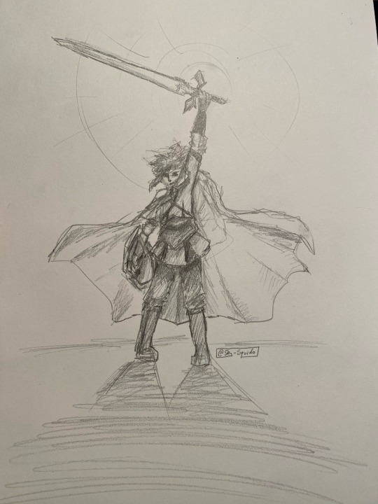
What's your favorite genre to write?
ANGST ANGST ANGST ANGST. Wellll... scratch that. I love something adventure-y and plot driven with a lot of really meaningful character interactions. I've always had trouble putting my writing into genres, but I guess that kind of speaks for itself in a way.
What fandoms do you enjoy creating for?
Linked Universe is the fandom I have created and posted the most for by a LONG SHOT. I found LU shortly after making my tumblr and I joined the Discord shortly thereafter. Since then, it has been nonstop inspiration and creativity for me! I tend to get sucked into one fandom and it consumes me for a few months before I silently drift out of it and never think about it again. LU is the fandom I've been the most active in EVER though—and it's still going—so there's a good chance I'm never getting off this ride.
What's the work you are most proud of?
AAAAAAAAAAH MY BABIES. okay um here's the first and only fanfic I've ever posted anywhere but I'm really happy with: https://sky-squido.tumblr.com/post/618964544219463680/turn-back-time-a-linked-universe-fanfic I have a lot of other pieces kicking about, but they're not fandom so I haven't shared them yet. I probably will after I touch them up a bit.
Do you have any fics inspired by real life stories?
Not really? I don't really know where my ideas come from to be honest!
Where do you post your finished works?
my tumblr. I tag stuff #squido writes and #squido draws so you can find them easily. I also put them on the discord but they get lost in the stream of other works pretty quickly so stick to my tumblr. I also have an ao3 now! https://archiveofourown.org/users/sky_squido
If you have any fun stories about the pieces you made, please do share!
Turn Back Time was actually live written in the Discord, but entirely unplanned and in the #angst channel! It was just a headcanon but then I started describing it and like 2 hours and 5k words later I'm sitting in the Discord like "what just happened??"
33 notes
·
View notes
Note
Hi! You are literally my favourite artist i really really love your style so much! I just started my art journey and was wondering if you would mind sharing yours? How long ago did you start? What's your advice for someone just starting out? Please and thank you!
HI! OH WOW OMG I AM SO HONORED AFJDLS THANK YOU SO MUCH THAT IS SO SWEET! ;__; I really appreciate it! ♥️🥰♥️🥰♥️
As for my art journey... oh gosh where to start. I think I’ll make a short list of my advice and then under the cut the long story for those who are interested.
Use sketchbooks / sketch a lot
Take inspiration from other artists
Use references (from the internet, real life, other artists as long as you don't steal, any other media, or take photos yourself)
Social Media
Don’t get discouraged and don’t compare yourself to others, draw because it makes you happy and because you want to share your ideas and interests
Alright art journey under the cut:
Ok I don’t think there’s a strict point where I can say my art journey began, I’ve always been drawing as a child ever since I could hold a pencil. I would draw in school and at home and often I would even meet up with my neighbour to draw together, so it’s always been a part of me. Of course I only drew animals (especially wolves lol) and dragons because drawing people was the worst for me. Yes I had a wolf phase and not an anime girl phase. Sadly I couldn’t find most of my really old stuff :/
Well as I got more involved on the internet I decided to get a drawing tablet in 2014 and also bought my first sketchbook at the end of the year. So that’s when I got serious about it I would say. It‘s also the start of me drawing people :o I think though that my digital art journey is a bit different so I’ll ignore that for now. With that sketchbook I started filling up pages and pages with original stuff and some studies to learn how to draw humans, and occasionally there was some fanart and animals. But I was still just drawing whatever.

And those pictures are all my sketchbooks I could find from 2014 - 2019 and the art is just a fraction of all the stuff I drew. As I got more into certain fandoms my art shifted mostly to fanart and some sketchbooks are dedicated to certain shows (yes I have an Undertale sketchbook don’t judge me 👀) and I would draw every minute I could whether it was at home or in class. In between I also tried to do some studies from references and develop my OCs!


That’s why I think sketchbooks are so important. It’s to develop ideas, quickly sketch some ideas you have and later want to develop more, or just for fun and self-indulgence. And at the same time, the more you draw and practice the more you improve! I have some big style differences even within one sketchbook when I tried something new. I also did quite a bit of studies (last picture) while I was trying to get into art college.
I would say ever since I started posting my art here on tumblr (which was after watching FMA and looking for a community), I was getting more and more involved in the art community and tried to improve as much as possible. I think if you have other artists that enjoy the same stuff as you is incredibly helpful. And I drew digitally as well but that’s around the time where I was really passionate about getting better at that. Looking at other peoples art and watching YouTube videos and all that stuff.
And from there on out you can basically look up all my old art I posted on here :) I of course drew the majority in my sketchbooks but you get the picture.
As for my digital art. Ever since buying the iPad with Procreate I have to admit I haven’t been sketching in my sketchbooks much ^^’ I mostly draw straight digital and do commissions etc. But you can improve there a lot as well. Especially when looking for other artists as inspiration because there is so much more you can develop like different shading, line art, colouring, lighting etc. Here's some old digital stuff which was all over the place

But I think that’s it. Of course it’s difficult to put it in a post here because it’s over the span of years, but at it’s least a glimpse of my art journey. So again, my advice would be to just draw a lot, find things you like to draw and maybe find communities like here where there are other people you can look up to for advice and inspiration :) And I know it’s hard not to compare yourself to others, and I still struggle with it. BUT DRAW BECAUSE YOU LIKE TO!! Don’t let others get you down.
31 notes
·
View notes
Text
June 13th-June 19th, 2020 Creator Babble Archive
The archive for the Creator Babble chat that occurred from June 13th, 2020 to June 19th, 2020. The chat focused on the following question:
What is your physical and digital workspace like when you’re working on your story?
🌈ERROR404 🌈
LOL it really depends on what stage I'm in of the process - My storyboarding space is at home, as comfortable as I can be, a beer and some food at the ready and pure silence. The cats have to be freshly fed, otherwise I'll be harassed and lose my headspace entirely LOL. I usually work on my story boards digitally, just at a very small scale, with my script/outline on my computer and working on my ipad! The double screen helps a LOT, although i would just print out the script if I had access to a printer, haha. When I'm working on the actual page itself, it's a very different story. I usually just try and work on it in tiny little batches during the day when I'm stuck at home, and usually work around the animals as best i can, lmao. Truthfully, I really prefer to be in a coffee shop when I'm working on finishing pages, it makes me so much more productive than i am in this house with so many things to take care of right in front of me, but, obviously, that's a bit difficult to do these days. ;; I usually reserve food and drink until after I pass a milestone in inking/sketching to help motivate me to keep going for as much as I can before taking a break, and I need some kind of music or video playing in the background to keep myself from being absolutely bored out of my mind. My shading process, since it's in black and white, is very easy and i can finish it in one setting, easy, no matter what I'm working with. I also work digitally for my pages, of course, although I don't need more than my ipad and clip studio for it!
DaeofthePast
freshly fed cats
🌈ERROR404 🌈
They are BEASTS when hungry, the little bastards (love them)
I may only work in peace when they're post-food napping lmao
DaeofthePast
we only have one, but same
LadyLazuli (Phantomarine)
I work almost entirely in the corner of my IKEA couch at home I used to work at a proper desk with a Cintiq, but when I switched to Procreate on an iPad, I migrated to the couch and surrounded myself with a nest of clothes and blankets and books and... here I am, bein' cozy. With terrible posture But when I was between jobs last year, I did rent a little coworking space down the street so I could get out of my pajamas and go get comic stuff done there. It was a godsend. I like drawing at my favorite coffee shop every so often too, but I tend to hide my work while I draw, and there, everyone can look over my shoulder The coworking space had a tall artist desk that was rarely used, so I often grabbed that one. Not cheap, but to stave off cabin fever, heck yes, worth it.
🌈ERROR404 🌈
Ahhh I've been really thinking about getting a studio space one of these days I really shouldn't rn, with my finances as they are, but I could REALLY make use of one recently
LadyLazuli (Phantomarine)
I loved the space I used last year. They recently had to close for... current-event reasons... and are going to reopen with all sorts of plexiglass barriers between the desks I feel so bad for them. Good studio spaces are wonderful, I would support them again if I ever was out of a job!
🌈ERROR404 🌈
it's good they've found ways to make it safer, though!
carcarchu
My old workspace was in the basement of my home in canada and it was always perpetually freezing even in the summer and i was frequently visited by spiders so my current workspace is a huge improvement in that regard. I do miss my old ergonomic desk chair though. I'm definitely not the kind of person who can draw in bed or on the couch. I need to be in workmode and having a designated space just for that is necessary for me to get in the right headspace for that.
DaeofthePast
my workspace rn is just my desk with my laptop and my drawing tablet. my laptop is stacked on top of a pile of books so i can see the screen (otherwise my tablet blocks my line of sight). it's kinda simple
chalcara [Nyx+Nyssa]
Depends. I have a Cintiq Mobile Studio, so I can draw pretty much every where and sometimes in the oddest position, but most of the time I am on my desk with the cintiq hooked up to a second monitor so I don't have to look down so much.(edited)
Holmeaa - working on WAYFINDERS
For Wayfinders: Thumbnails are somewhere cozy and the only physical work. Me and Q sit and plan them out together. The rest of wayfinders are made on Photoshop, and flat colors in clip paint studio. In the world I would love a nice studio place in an office with others. During corentine I have been working from home, and I am not that good at it, being quite the extrovert. Before corentine I was in a artist residency where I worked on Wayfinders which had a workstation and all the programs we could need. It is so nice and me and Q are going to return there when it opens up again!
Miranda
I have an iPad so usually on the couch, cozied up with coffee and pillows and blankets. But sometimes at the table. But usually on the couch like the gremlin I am
FeatherNotes(Krispy)
I have a large drafting table, a mini drafting table, and a lapdesk in my papasan when we ink/draw! Toning and letters are all done on the desktop in its own space
Miranda
I need to get a good lap desk. But that sounds like a grand setup!
Eightfish (Puppeteer)
My first time hearing about a lapdesk
Omg I need one
FeatherNotes(Krispy)
They are the best things ever Mine has just the pencil holder !(some come with cup holders and its a waste of space imo)
Joichi [Hybrid Dolls]
Wow I like your setup of the drafting tables
FeatherNotes(Krispy)
I wanna show pics of them....if im allowed in this chat?
Joichi [Hybrid Dolls]
I hope so, I'm not sure which channel we can post studio photos at? I did see some did before?
FeatherNotes(Krispy)
Ill post in shop talk since creator babble gets archived
Tuyetnhi (Only In Your Dreams!)
my current space is uh.... a bit better than my last one. I used to work on an old writers desk for a decade and I did most of my comic work sitting there cramped up with my desktop taking most of the space. Now I have an L shaped desk where I have my desktop on the shorter end. The longer end it's my pen, pencils, and watercolor stuff. my display tablet occupy the space at times so switching from digital and traditional without worrying about setup hassle is a lot better than what I dealt with before lol.
I'm glad the days I had to curl up and draw with no privacy are long gone now
kayotics
I’ve got a little drafting table where I draw all my comic pages. I’m messy with my pens so they’re kind of strewn about until I start to lose them. Then I put them back. I’m not particularly neat. I spend most of the comic process off the computer, so most of my digital work is just on an iPad where I can sit anywhere. I try to keep good lighting around my drafting table and there’s always loose eraser shavings all over.
Natasha Berlin (Pot of Gold)
I got myself a lil corner desk by the dining table. Not as well-lit as I'd like, but it's decently ergonomic and I started putting posters on my wall Plus I can leave work mindset easily by turning off my computer and forgetting about the dark corner in the dining room XD(edited)
sssfrs (JOE IS DEAD)
My desk is really sloppy and covered in all kinds of junk. I have a harmonica, a ball of yarn, a bunch of ink bottles, etc on my desk. I have my sketchbook under my tablet and usually a notebook somewhere for writing. My tablet sits to the right of my laptop (on top of sketchbook) while I'm not using it and when I'm using it it goes over my computer keyboard. I sometimes have a glass of water or some food sitting to the lefthand side
Eightfish (Puppeteer)
The only thing I wanna share about my workspace is this
once i spent over three hours looking for that damned pen
never again
🌈ERROR404 🌈
Ajkdhfkjs the models for hte magazine im crying
Cronaj (Whispers of the Past)
Oh my God
shadowhood (SunnyxRain)
mad giggling
Deo101 [Millennium]
youre gonna manage to lose the string
Tuyetnhi (Only In Your Dreams!)
omg
Eightfish (Puppeteer)
i know in my heart deo is right but still i hope
Cronaj (Whispers of the Past)
You should weld a metal chain to it
Eightfish (Puppeteer)
Watch me lose the whole tablet
Cronaj (Whispers of the Past)
Oh nooo
I believe in you!
TaliePlume
My workspace is a black table with a white, yellow, blue and green tablecloth with 3 black chairs. It's next to the kitchen. On it, is my laptop and the left side is my clipboard, 3 blue folders full of writing. Then above it, is 3 sketchbooks and another blue folder from a class that I took in community college.
June 16, 2020
sagaholmgaard
I have one long desk at almost three meters. On the left side is all my coffee and tea supplies, in the middle is my work space and on the right is my dining table xD I get everything done from there, despite having a mobilestudio so I COULD sit anywhere and work, lol. It's a blessing during holiday seasons to be able to bring it everywhere, but at some I like my designated working space. Although I am moving in a few weeks, so who knows what my new workspace will be
Moral_Gutpunch
My workspace is anywhere I can draw or write. It's more of a "Will I be interrupted over something petty or stupid" issue than space. Not that I don't want more space.
Mitzi (Trophallaxis)
My workspace is a big, broken corner desk I managed to lug out of an old apartment when it was gonna be trashed. Before then, I'd just draw in bed. I don't remember, but I'm pretty sure the folding chair I sit at is a similar affair. It's got a Dollar General throw pillow on it so I can at least say I'm trying to save my back. The top of the desk is a mess of mostly old bottles and cans, pencils, incense ash, and my old tarot deck. I love this setup dearly. This is the first time I've ever had my own desk space, much less a space I can decorate or leave as messy as I want. Got my own art up on the walls with sticky tack and all! Also the cat's scratching post is directly behind me, because we've learned the cat won't use it unless it's as in the way as possible. What can ya do, lol.
Cronaj (Whispers of the Past)
Oh cats...
Desnik
I got spoiled with an adjustable desk. It is six feet long, and has a whiteboard top for noodling with dry erase markers
my main computer is set up on an adjustable stand so it floats over the desk, and then I have my cintiq, which we tried to mount on a similar stand but then it was just too heavy
I keep my dice collection nearby because fidgeting helps think things through sometimes
and rolling to make odd decisions never hurts
lately during the quarantine I've been sharing the office with my spouse so we've had to establish rules over when it's okay to bug each other(edited)
oh yeah and we also have a whiteboard installed in the office, and it rules!(edited)
Shizamura 🌟 O Sarilho
Mine is pretty simple: I have a laptop that's long stopped being portable and is now mostly just sitting at my desk at all times and a 19 inch Ugee as my display. I usually keep a lot of stuff on top of my desk, but it's mostly just a mess because I have been using it for work too for a while now
Cronaj (Whispers of the Past)
I suppose I'll talk about my setup too :) My main setup is where I do digital art. I share an office with my SO, so we both have workspaces on opposite walls from each other. I work on a corner desk that holds my beefy computer, two monitors, and a Huion Kamvas GT-191. That's where I draw my comic and pretty much everything else done digitally. Ngl, it's a mess right now. I have comic notes and location floor plans in sketchbooks and DnD character sheets spread out all over the surface, and random pens and sticky notes. In the corner of the room, we have a nice large-format printer where I produce prints for conventions. I actually sketch my pages on an iPad pro in Procreate, so during the sketch phase, sometimes I'll just bundle up on my couch and do it, or before quarantine, sometimes I'd sketch on the go. My other workspace (which hasn't gotten much love as of late tbh) is a drafting table in the corner of our living room. I keep a tabletop easel on it and my Copic markers, as well as whatever I'm working on at the moment. (RN it's some ink washes.) The drawers hold all my ink, pencils, erasers, etc. Next to the drafting table is where I keep all my large charcoal, graphite, and oil pastel drawings (mostly school projects), and my large paintings. Other than that, I have a nifty little cart where I keep painting supplies :) I will say, this setup is by far an enormous improvement from my previous setups.
#ctparchive#comics#webcomics#indie comics#comic chat#comic discussion#comic tea party#ctp#creator interview#comic creator interview#creator babble
1 note
·
View note
Note
I've looked through your art and it is so pretty! It makes me want to try my hand at digital art since I tend to be a bit messy with traditional (ugh charcoal). I was wondering what program you use and maybe some beginner tips?
Nawww, thank you so much! It makes me happy to hear I’ve inspired you
Paint Tool SAI (my program of choice, but it costs $)
FREE PROGRAMS:
Fire Alpaca (my top recommendation for a free program, but I don’t have it on this computer unfortunately)
Gimp (great because it also has the ability to create .gifs)
Paint.NET
(Please have your virus protection on however; these sites should be safe/they are the official websites, but always be safe than sorry!)
It’ll also be easier if you have a graphics tablet to draw with (I’d recommend the Wacom brand; I bought myself a Pen and Touch Small as my first, but there’s definitely some cheaper options out there too! Just do your research on graphics tablets and check the reviews), but people have done amazing artwork with just a mouse (they are gods).
You really don’t have to get a tablet right away (it’s something you get when you become invested, really, since they’re not cheap). I didn’t have one when I first started digital art on computer, so what I actually did was that I sketched my drawing on paper, scanned it/took a good picture of it, and then imported it into my drawing program and painted over it that way. Here’s an example using the GIMP program:


(Creating a new layer is great. It’s like a transparent “page” separate from the others, and whatever you draw on that layer does not affect what you have on other layers. It’s neat-o.)


So that’s one way you can start off digitally without a tablet! :D
Another method to creating digital art though:
Use an iPad or tablet device.
When I first started drawing digitally, I actually did it on my iPad on an app called Procreate (really good!). So if you have a tablet or even mobile device, you could also look up some art apps like Procreate or Sketchbook Pro and have a play around with them, see how you feel. It was really fun and definitely helped me to transition into digital art from traditional!
Final words:
It can get a little overwhelming the first time you open up a digital art program, but worry not!! With practice, you will get the hang of it and you will manage to navigate yourself around it! Just take your time with it, be patient with it and with yourself, explore it. Here are some final tips to keep in mind:
- Layers are amazing. Don’t be afraid to create as much as you want!
- Play around with the “modes” – there’s so many cool effects that you can experiment with!
- See if your program has a lineart vector tool, which will make it a lot easier to create lineart without a drawing tablet.
- Watch tutorial videos on your chosen drawing program! Explore the different features of it as well!
Have fun my friend!! Hope this helped a little
349 notes
·
View notes
Text
Interview with Gillytin

Today we interview Gillytin! One of our contributors in THE FIRST FLAME.

Q: How did you get into making art and for how long have you been doing it?
True to the prophecy, my art career began when I started drawing dragons and tigers at the age of five. I also really wanted to make my own Pokemon-esque card series except with dinosaurs, but I sucked. A couple decades later, still no dinosaur cards, but I guess I'm okay.
Q: What traditional media or digital program do you prefer to use and why?
I prefer watercolor, colored pencil, acrylics, oil painting, traditional printmaking and working with about any digital art program just to get a hang of it. So far, my favorite digital mediums seem to be Procreate, Photoshop and PaintTool SAI.
Q: Do you mostly make fan art or are there original works you are also passionate about?
Original works are what I have been more comfortable with over the past few years. Fan art and such are just plain ol' fun and it's nice to work with something that I like.
Q: Is there any artist or art movement that inspires you? Which ones?
I draw inspiration from music and all sorts of other mediums. As for art, some of my favorite artists include Lee Bontecou, Virgil Finlay, and Michael Whelan.
Q: What would you say to someone who is willing to dedicate their life to art, but doesn’t take that step because of the risks?
Chase your bliss.
Q: What do you like about being an artist?
The knowledge that I would fail so hard on a sanity roll if I were in the Lovecraft universe.
Q: Show us some of your favorite artworks that you made and tell us why.

I like making pieces that deal with my own personal characters I've written about for years and having them interact with each other in different ways. They don't always get along, but when they do, it feeds my soul.
Q: Where can we find more of your work? Are there any personal projects you would like to share?
ArtStation and a mostly inactive Tumblr are my only other outposts on the web. I fly by the seat of my pants to make whatever comes to mind.
Q: What order did you play the soulsborne games in? Which is your favorite?
I played the series in this order: Bloodborne, Dark Souls 3, Dark Souls 1. Bloodborne is my baby.
Q: When you got eaten by a mimic for the first time, what did you yell out loud?
Swear words and the Lord’s name in vain.
Q: Any memorable Dark Souls gaming moments you'd like to share?
Successfully sitting at a bonfire and yet still having an enemy, in the same exact moment, whack me in the face. After the fog resets, the enemy disappears, but the massive chip off my health remains as a monument for my shame.

Get the zine at: 🔥 [ THE FIRST FLAME ] 🔥 info page
𝐅𝐨𝐥𝐥𝐨𝐰 𝐮𝐬 𝐟𝐨𝐫 𝐮𝐩𝐝𝐚𝐭𝐞𝐬 𝐨𝐧 𝐩𝐫𝐞-𝐨𝐫𝐝𝐞𝐫𝐬 & 𝐫𝐞𝐥𝐞𝐚𝐬𝐞:
on tumblr @darksoulszine
on insta @DarkSoulsFanZine
on twitter @SoulsFanZine
#thefirstflamezine#interview#gillytin#darksouls#dark souls#fanzine#dark souls fanzine#art#artists on tumblr#illustrators on tumblr#gaming
8 notes
·
View notes
Text
My first zine pages
Subhumans page
My starting idea for the page i'm going to show you, was to use an existing album cover and make it my own, a lot of the process for this one was simply me playing around with photoshop and procreate, and trying to make it look fun and bright, as well as being able to improve my skills on photoshop.
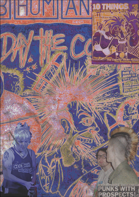

As at first I wasn't completely sure if I wanted to use this page in my actual zine I didn't photograph the process of the journey as well as I would of wanted to, if I knew how much I would love the final outcome. So the top photo is before pro create and the bottom photograph was in the second stage of making the collage. First I will explain the first steps I took on photoshop with actually laying out the images and figuring out how I wanted it to look. As I said before the basis of this idea was to use an album cover as the background, and one of my favourite punk bands were Subhumans, who I have already mentioned in my previous research as they were a very politically driven punk bands, and I always thought their cover of the album The Day the Country Died was really cool, and I really wanted to use this.

But I really wanted it to be bright so I decided to test out colour ways on the gradient map, where I decided to choose noise, which makes the colours al to more in your face and have an almost grainy effect on it. I then went to adding the photographs I wanted to use for it, with the bottom left one being one of my friends at a gig, after putting the photo in, and using the select and mask tool to get rid of the background I realised that she also had mohawk style hair just like the photo, so I decided to build the rest of the photos around this. The bottom photo I got from my friends art account called Cr0sspxtch, where she provided me with a folder of photos she had used at a gig, and seeing a photo of our friend Liam who has a mohawk I thought it would fir perfectly. However I didn't only want to use photos, I was interested in the idea of using a zine page, so I again looked through the Fanzines book by Teal Triggs which has so far being really helping me in this project for research and inspiration for my own work, here I found the perfect zine called '10 things Jesus wants you to know'.

Where the man had a mohawk, and the woman also had a spikey type hair cut, so I felt like this fit in really well. I was definitely happy with the progress so far but I still wanted to add something more. I wanted to link the fact that Subhumans were a very politically driven band so I thought a nice contrast would be to use a punk headline, and one of the most famous punk headlines of the 70's titled 'Punks with prospects', I thought this was a really nice bottom touch and as I knew I was going to add quite a bit on procreate I decided this would be a good time to move it to there.

This is the first time I had really started to experiment with procreate, I knew that I loved doing digital work but I also wanted to use my own handwriting and stick to the old zine style as well, and I knew that with procreate you can use many different types of pen and pencil styles using an apple pen which gives it a more physical feel than it does when using a font on photoshop. I'd already decided that I wanted to have fun with this piece, so I just started drawing whatever I could think of onto the page as this felt like the most authentic way to do it. From this I started to draw a black line around the mohawk in the album cover and add little bits of text like 'riots in the city' and 'subhumans', I did this by using a pencil type pen, I then coloured in the newspaper headline and the t-shirt in the bottom left corner, and as I did that in red I thought it would look cool to add some devil horns and tail, keeping the whole page quite sketchy. I loved the sketchy look of the whole page so far and while testing pens I drew a smiley face, and actually ended up really liking it so kept it in. One of the last things I did to that page was colour in the teeth green and yellow and from this I thought I gave the man quite a grim look, so I decided to extend this, as on the original album cover there is spit and also snot coming out of his mouth and nose, so I chose to extend this by drawing some of my own in green and while onto the photo below of Liam, I thought this looked quite humorous and on top of this is brought in the two elements of the cover and the photo well, so I decided to keep it. The one reason i was really like ring this page is because of how sketchy and authentic it felt to me.
This page was by far my favourite so far and I felt like the most evolved piece I had done showing my progress in using photoshop and also decided i certainly wanted to use pro create again, so I felt like it really set me off on the right track for the rest of my zine and gave me confidence to start making more pages. On the other hand I knew I didn't want to get too comfortable in my digital work and show what else I could do with my physical work.
Gig blood page
My baseline idea for this page came from a photo I took at a gig, that I has already shown in my digital sketchbook.
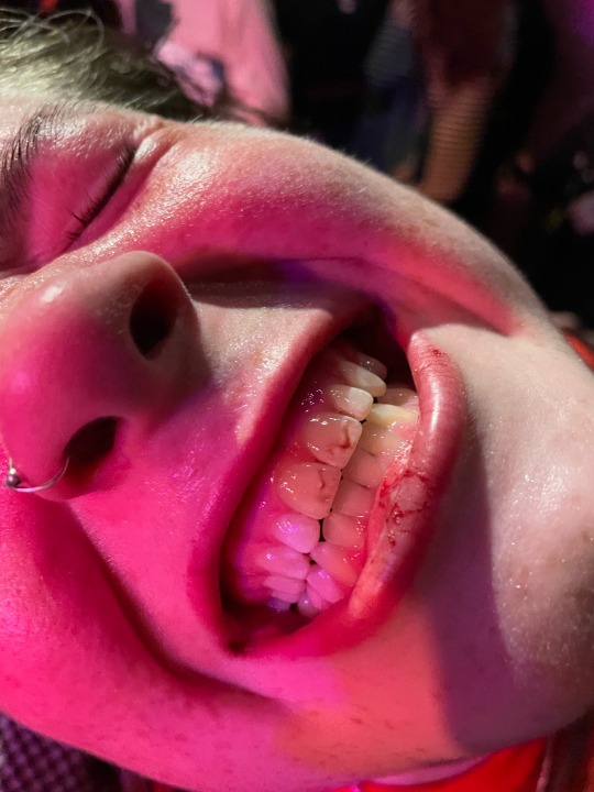
I thought it would be fun to name the page gig blood, as I took this photon at a gig when one of my friends got a busted lip from being in the mosh pit. Throughout the years punk gigs are notoriously known to be quite violent, Vim Renault writes about this for punkgirldiaries.com 'When the punk movement took off, the violence came on board. Bands like the West Ham supporting ‘Cockney Rejects’ took part in what has been described as ‘the most violent ever punk gig’...there were riots all the time at punk gigs.' A difference now however is that punk gigs aren't violent in the way of rioting and actual fights going on but in the most pits it's not uncommon to be hit or hurt, as the whole premise it to push each other around. On top of this there is a real sense of friendship inside the scene, most people know everyone there as the same crowd go to the gigs so no one hold anything personal if they get hit by one of their friends, and I really wanted to develop this idea into a page.
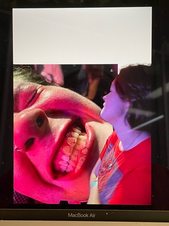
This is the work I did on photoshop for this page, I pre planned to do most of the work on photoshop for this so I wanted to keep it simple and just use photo shop as a way to display my images in the best quality I could. I added another photo I took of her in that night at the same gig and use the select and mask tool to get rid of background, and lay it on top of the other photo, and make sure I left an intentional gap so I could write gig blood at the top like a headline.


Here was my outcome, my first step was to fill in the white gap that I had left, for this I used to eyedropper tool on procreate to get the purple colour out of the photo itself and used a textured pen to start to fill in the gap, however I thought this looked quite flat and wanted to include more of the colours, so I used the eyedropper tool again to get the red out of the photos and the same pen to fill it in. I was happy with this, and it was really cohesive with the images, so I moved on to writing gig blood. Im usually not the best with handwriting but the one I used really helped me to write it quite quickly, I wanted the letters to be different sizes so as I wrote one letter too another I was changing he size as I went along, which I thought gave it a really interesting effect, it didn't really take me long at all to write it out and I was happy with the final outcome. To add more elements to the page used a pencil tool to draw round the photo of her and the top of the other photo in the same red and also black, which is only a small addition but I felt like it needed it just to bring kore colour into it with the black instead of moving just red and purple, this is why I also outlined gig blood with black pen as well.
This page possibly took me the fastest although it didn't feel rushed, I just had quite a developed idea of what I wanted it to look like before I did it so it wasn't too hard to actually translate that to the page. On top of this I also don't really have any negative feedback for this page as I think its quite simple, which isn't usually my style as I like to have really busy, in your face work, but it was nice to go more out of my comfort zone for this one to be happy with it without loads of elements onto it, and i really feel that this is because the images are quite interesting, and large on the page, and I wanted them to be the main focus.
I decided to put these two pages together as a double page spread, as they both have music links with the album and gig factors, and in addition to this I felt as though the colours worked quite well together. Lastly because the subhuman page is quite loud it could of been too much to put another loud page next to it, which gig blood is not.
0 notes
Photo
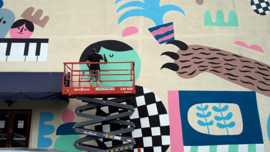
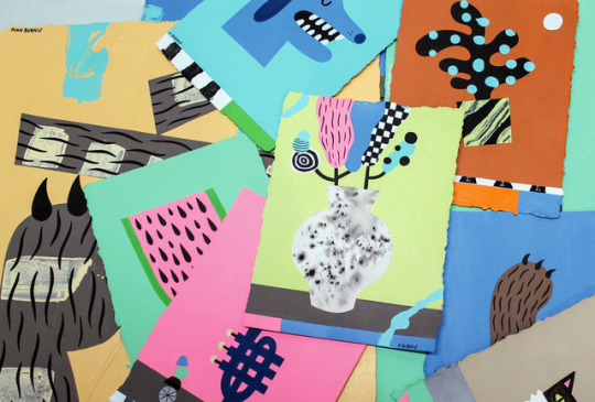
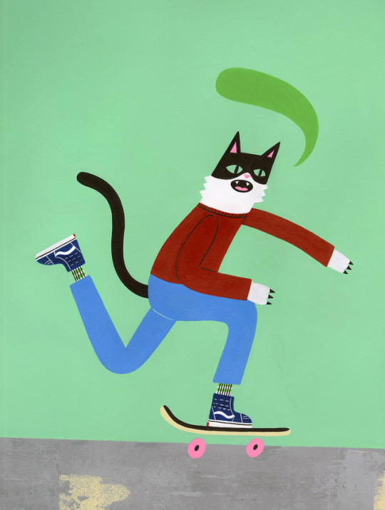
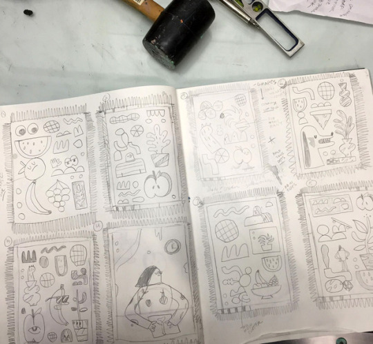
ART SCHOOL | Q&A with RYAN BUBNIS
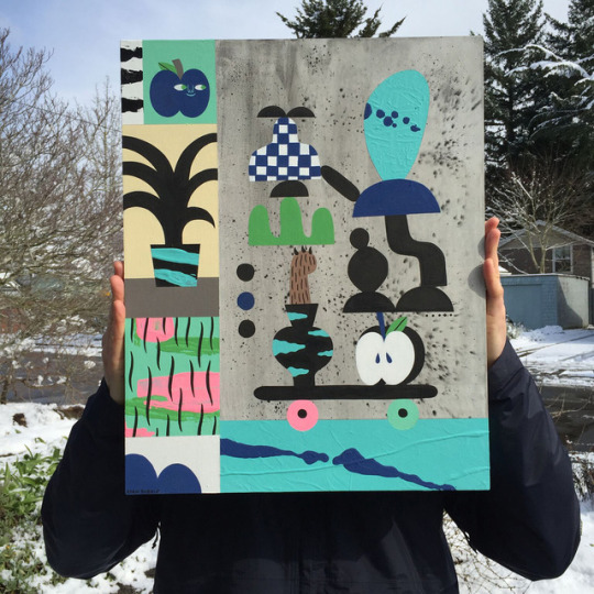
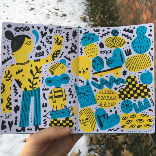
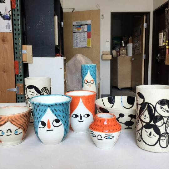
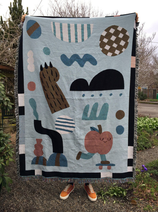
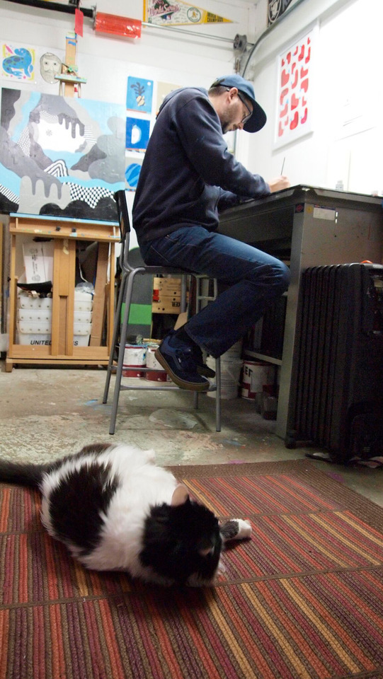
We have been following the good vibes art of Portland based multidisciplinary artist Ryan Bubnis whose fun work focuses on the simplification of color, shape and form. We caught up with Ryan as he is preparing for his solo show, From The Ground Up, which opens at the Stephanie Chefas Projects on Friday, April 6th. Find out more about Ryan, his early artistic influences, and his Art School art tip below!
Photographs courtesy of the artist.
Introduce yourself? I’m Ryan Bubnis and I’m an artist, illustrator, and educator based in Portland, Oregon.
When did you first get into drawing? Was it a hobby turned career or something you knew from the start? I always knew I wanted to make art from the very beginning. I’ve pretty much done whatever I could to make it a career. It was basically all or nothing. Still is.
Who were some of your early artistic influences? Cartoons, comics, kid’s books, and skateboarding were all major influences. Scooby-Doo, Cartoon Network, Garfield, The Simpsons, Richard Scarry, Golden Books and Jim Philipps. I think that’s why I split my practice between fine art and commercial illustration. I’ve always loved work that was accessible and imagery that made me want to make things myself.
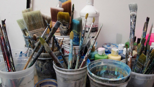
What mediums do you love to work with? What are your essential art tools? Working with traditional mediums such as drawing and painting will always be my favorites. That being said, I definitely include my computers, scanner, and tablet as essential art tools. It’s a balanced mix of traditional and digital tools.
Do you keep a sketchbook or work your ideas as you go along? What type of sketchbook do you keep – disorganized chaos or neat and clean? I keep a bunch of different sketchbooks for the home studio and bring along smaller versions when I travel. Some pages are cleaner finished drawings while other pages are filled with chicken scratch, notes, and project ideation. I recently got an IPad and have been drawing with Procreate as well. I try to draw and doodle every chance I get.
What was the first show you ever exhibited in? What was your last show? My first exhibition was a group show at Gallery Bink here in Portland way back in 2001. It was with Bwana Spoons, Ren Sakurai and a few other people.
From The Ground Up is a solo show that is about to open at Stephanie Chefas Projects on Friday, April 6th. The title is from an ongoing zine I’ve made on and off since 2009. I’m really excited about all the work I made for it and can’t wait to share it. I’ll be releasing a new issue of the zine at the opening.
Where did you learn your knowledge of art or making art? It was a little bit of both. I still consider myself mostly self-taught even though I went through a BFA program for illustration. It’s weird but I feel like I’m learning so much more now that I’m a teacher than I ever did as a student.
Art School or Self taught. What’s something you can pass along art tip wise? Always allow more time than you think. Use matte medium to seal your masking edges and your shapes will come out crispy.
Describe your artistic process for us. The order sometimes varies but I start by reading, drawing, and doodling. Once I’ve done that I’ll start executing a painting or a piece. I always leave room for improvisation otherwise the work can feel too rigid. I like the unexpected possibilities of using traditional materials. You can’t always tell what paint is going to do until you actually try it. It’s a similar process for digital work but I can always Command Z if I screw something up or if I need to adjust a composition.
What makes you smile when viewing art? What is it you’re looking at – composition, color, line? Humor. David Shrigley’s work consistently makes me laugh. I’ll always smile when seeing a well-executed piece. Color, line, shape, and form. I love it all.
What’s a common misconception about artists? That art making is all fun and games and that artists should be thankful to work for free or for exposure. We have to value our work and fight for it.
How do you overcome drawer’s block? Either keep drawing or take a break. Go for a walk, run, skate and come back with a different perspective. Experimenting with different mediums or changing up the scale of my work has always been helpful.
What type of music do you listen to when creating? Do you find it helps motivate you or just allows for background noise? Music is usually always on no matter what I’m doing. It definitely motivates me. I like so many different artists it would be tough to list them all. Lately, I’ve been listening to Ray Barbee, Tommy Guerrero, Amenta Abiota, Earthgang, J.I.D, Chances With Wolves, Tiffany Gouche, Old Rolling Stones, Depeche Mode, and The Beatles.
What would be your ideal collaboration? Doing something with Vans!
Do you have a favorite artist(s) that does a completely different medium than yourself? My friend Meredith Dittmar creates these amazing, detailed sculptures and installations using paper and polymer clay. Her work is consistently progressing and it always blows my mind. http://neverborn.org
What do you think you’d be doing if you weren’t an artist? I would probably do something involving food. I do most of the cooking in the household and I’m always searching out new recipes to try out. I’ve always thought it would be fun to make some sort of illustrated cookbook. We’ll see.
What are your favorite Vans? My old stand by’s are the Authentics, Old Skools, and Half Cabs. Lately, I’ve been really digging the Kyle Walkers and I’ve got a few pairs of the MTE’s that have treated me really well during the cold winter months.
What advice would you give someone thinking about art as a career? Be patient. Cherish the small successes. Don’t consume yourself with get rich quick schemes or the allure of going viral. You always appreciate things more if you have to work for them.
What’s on the horizon for 2018? Finish up work for the show with Stephanie Chefas Projects, work on some new client collaborations and hopefully do some more murals.
FOLLOW RYAN | Website | Instagram | Twitter | Facebook
14 notes
·
View notes
Text
EVALUATION !
This project is called MULTIVERSE, and my task was to create a zine using a collection of words linking to this topic that was given to use on google classroom. With these words, I were asked to pick out a minimum of 12 words and did so, but I only dedicate my zine to four words out the 12, and those four words were PARALLEL, REALITY, TIME AND ELEMENT, all the work I create during this project was created using the programs of adobe photoshop, illustrator, Lightroom, InDesign and procreate.
A zine is a small looking magazine that norThis project is called MULTIVERSE, and my task was to create a zine using a collection of words linking to this topic that was given to use on google classroom. With these words, I were asked to pick out a minimum of 12 words and did so, but I only dedicate my zine to four words out the 12, and those four words were PARALLEL, REALITY, TIME AND ELEMENT, all the work I create during this project was created using the programs of adobe photoshop, illustrator, Lightroom, InDesign and procreate.
A zine is a small looking magazine that normally is used for advertisement or to spread the word about something, In my case, it was to show artwork that portrays word that I have chosen.
A big part of this project was researching because I need to first research about zines as I didn't really know what they were I also need to research how to make one and how they work so I was able to create mockups and outcome that are the right size after doing this it helped me a lot to understand zine, and I was able to get on with creating, but then I knew it was time to create the outcome to go in my zine so I had to research and look up a lot of artist and designers for inspiration the pain website I used for inspiration was Pinterest due to me being able to create a board that I could go back to and inspire me.
The artist that I research that helped me a lot would probably be Ranganath krishnamani because he enables me to find a style that I like and help me open my mind to think or outcomes that I create this artist help me with the topic of reality as he a series of outcomes called a shift in the playing field and before I found him I knew I wanted to use social media and technology in my outcome, but didn't know how to do it so when I found his work it inspired me and I was able to think of loads of different ideas.
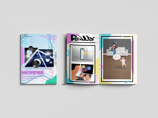
Each page in my zine is dedicated to a topic of my choice and the target was to show that word through artwork, for example, the word PARALLEL I used images such a building and shapes line and by doing this I put art together that represented parallel another page in my zine was about time so I used a lot of clocks to show that topic, the big part of this project is the MARS side or it MATHS ART RELIGION AND SCIENCES so another thing I had to have it mind was making sure I was showing this throughout the project and in my outcomes.
With me creating my zine I thought they would be a load of different problems doing it but in fact, there wasn't that many the main problem that I came across was one finding artist that had focused on the word time as I was really struggling with inspiration I need someone to inspire me but after a lot of searching on Pinterest and Google I finally came across outcomes that inspired me but was still unable to find an artist that focused on the topic time another struggle and I think the last struggle I had was trying to keep a team throughout my project and in my case, it was a colour pallet I wanted to use my colour pallet through but sometimes it would fit with the aesthetic so I have to think and think until I come you with and outcome using the colour pallet that I choose but overall the journey of my project had many ups as i was creating consatly but had some down fulls exspesaly went I have a brain block on ideas but came over quickly due to looking at pintrest the that got the ball rolling so a smooth journey i would say with this project.
As this project had a task that was very different from the other projects that I have done there was a lot of learning involved and learning new skills and techniques including different programs to learn such as in design and new techniques on photoshop the main skill that I learn that I’m really pleased with was the dissolve effect/liquefy effect on photoshop that is used in my time poster in my zine another new technique that I approached was a log print/rubbing this was another technique that I used on my time pages for my zine and it was interesting to learn a new skill and in the future, I may want to learn about wood printing similar to linocuts and screenprinting but using wood. Are used a lot of old skills that I have collected over my time at college including collage thing halftoning and just my way of laying out my artwork and also a big part of graphics and getting my topic out there was using typography and I learnt a lot about how important typography is and I learn every day when creating new outcomes.
My favourite skill overall that I have learnt would be the liquefying effect on photoshop and also photography. I knew a lot about photography as I have grown up in a photographers household but I learn a lot more about capturing the topic of something through a photograph and I also learn a lot about Lightroom as that is where I edited the photos. With photoshop I watched many videos on how to do the liquefying effect and now I have that skill which I’m really happy about. I mentioned in my blog that I wanted to learn the program in design and I’m learning as I go along and I’m still figuring out the program watching videos but hopefully, I will be able to use that throughout my time at college and after and hopefully mastering it similar to illustrator and photoshop.
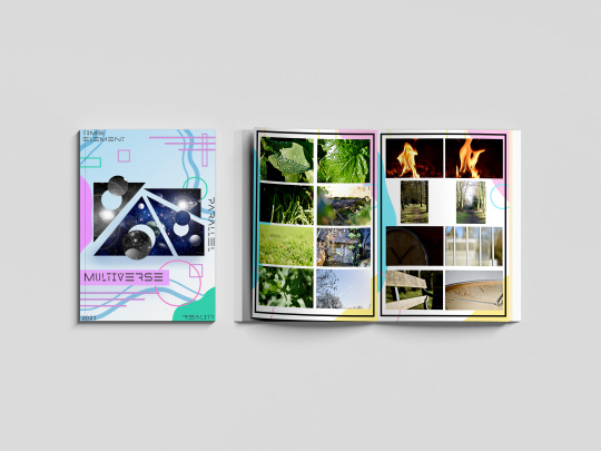
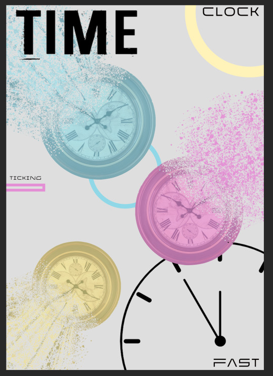
Due to us being a national lockdown the college isn’t open so we have been having to work from home and to present our work we have been using the website Tumblr I created account name is multi-verse and was adding all my outcomes and journey throughout this project onto my blog I really do prefer doing it a digital way rather than writing in a journal and sticking stuff in a sketchbook as one it gives you better quality pictures and it also allows you to choose statics and have a theme of your whole website page. Are used different ways to show my work and the journey of here the most common way was doing screenshots of how I got to an outcome and explaining step-by-step how I did it I also uploaded videos on my blog for me drawing on my iPad which is a cool way of seeing the development of an outcome. By doing all this work in this type of way I feel that I have displayed multi-verse and the project brief well on my blog and I feel that if someone was to look at it they would get an understanding of what it’s about and know what it’s about. Because especially at the beginning of my blog by explains a lot about space the multi-verse and theories delving into the more science and maths side of it and then as you go along through my blog you see research in me developing outcomes and by doing this I was able to develop outcomes to the best of my ability and be pleased with the outcome is at the end and then look well done.
With my blog I started off with a brain block I didn’t know what to do so the first thing I did to plan for this project was create spider diagrams that I could put all different connotations of my chosen word onto and search pictures on Pinterest and add them to the board by doing this I was able to refer back to them when I had another brain block further into the project. I also created a layout of how I wanted my zine to look and this helped me have a strict approach onto the scene as I knew that I wanted it to look like that so I stuck with that and as it was on my blog I knew that that’s what I showed that I wanted to be like so I wanted my outcome to show that I had followed my planning. And there are many different ways once I finish my outcomes that I evaluated them but normally I would just put my outcome on my blog and explain what my intentions were and what context I wanted to show and talk a little about the piece of artwork. One thing that I find it’s really important with any project is you try and see your work from someone else if you and try and give yourself critical feedback so you can push yourself and work harder I always do this on every topic are normally I get my family members to look at my artwork and say things about them and things that I need to change and things that are good so I work on it until I’m happy and pleased with everything on the page.
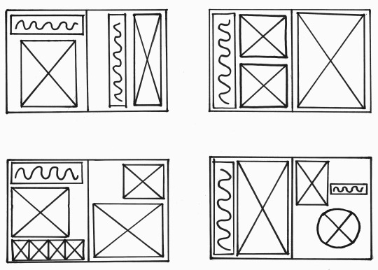

With this project a big part to me was the context as I wanted to show the words well through using artwork I feel the best piece of our that does show context is my reality pieces because you can see many different feelings and emotions through that piece of artwork and people can link personally to it where is with the other ones they do show context but not as deeply as the reality pages. But overall this project has worked really well and I’m really happy with how my final mock ups came out each page portrays a word in a good way and you know what the theme of the pages I’ve used many different skills and techniques including digital drawings typography log prints etc, but there are weaknesses to my outcomes and I would like to work on them in the future if I had the time and that would be maybe changing the theme of the background within the project as that was one thing that I was wary about and was concerned but the reason I chose are quite bold and colourful background with me looking at the word multi-verse and focusing on the word multi and thinking of loads of different colours so I had different approaches to the topic and they link back to everything which I think is a good thing to have but I play to my strengths which is always a good thing as you know that there will be a good outcome at the end by also worked on my weaknesses and learn new skills which I will use in further projects.
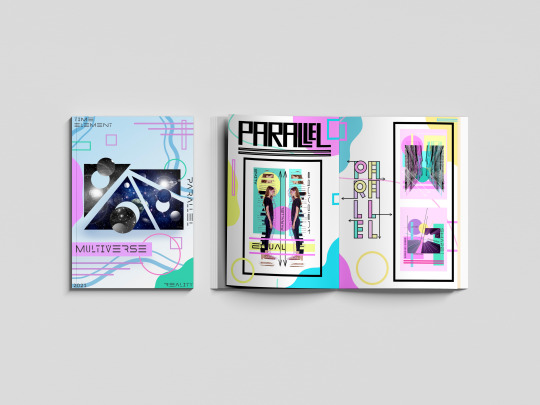
#MULTIVERSE#END#OF#PROJECT#EVALUATION#HAPPY#ZINE#PARALLEL#TIME#REALITY#ELEMENT#SKILLS#LEARNT#PHOTGRAPHS
0 notes
Text
Evaluation !
Since September, I have been working on the first project of my year two graphics communications course which was titled PAGE TO SCREEN. This project was about famous books that have been turned into a movie and creating artwork from them. I had to create alternative book covers and film posters for my selected theme, which was The Jungle Book.
I was pleased with my selected book/film as I knew I was going to be focusing on the audience of children. This would mean many different colours were going to be incorporated into my project and also an element of education was going to be brought in my artwork as well.
For a lot of my outcomes, I used Pinterest for inspiration as I wanted to see what had been done before so I could create unique results that would stand out.
When you look at my outcome, there are elements of the jungle throughout all of them as one of my goals was to focus on grabbing my audience's attention. A fair amount of the features were animals. The reason for this was because my target audience being children I wanted my artwork to educate them on animals that would be found in the jungle.
There was a lot of trial and error within the project as I was experimenting with different styles such as thresholding, halftoning, extra. One of the processes that helped me get over mistakes was having the pieces of artwork up on my desktop and then create the same thing again on photoshop but changing the bit that didn't look right. Still, by doing this, it allowed me to have better outcomes than the first and also made me learn a lot more, and by learning, I was able to broaden my skill base. Alongside this, there was a lot of research. Not just artist research I was researching the author of the book Rudyard Kipling and also researching about the jungle, the jungle book originated from. By doing this, it allowed me to look at colours and animals for inspiration, and by doing this, my artwork came out well.
Within my project, I created five book cover designs, and 11 movie poster designs within all these designs I was making illustrations to use on them including digital images drawn on photoshop and procreate and also hand-drawn work using pens, paint and pencils.
When I was given the jungle book, I was excited to start creating artwork. As I got into the project, I began to find it hard as I had problems that I didn't think of such as showing expressions through an animal's face and being able to create cartoon looking animals to represent the 1968 animation film but soon realized it was hard so, during my project, I decided to focus more on the real-life jungle book that was made in 2016. This made it slightly more manageable as I was able to use an image of real animals to work from and not having to create my animal from scratch.
Other issues that I had to approach was the colour pallet at the beginning of my project. I was focusing on the colours of the jungle as I wanted the colours to represent it, but then all my work started merging into one, so I decide to use a website called coolers.Co this was a colour generation site, and by using this, I was able to use unique colour pallets that made my outcomes stand out. First, I started adding different colours in slowly then completely didn't use green, and the results came out well. My final book cover design had no green on it at all, which can show progress has happened, and I have worked on targets.
The journey of the project had a high at the beginning due to my interest and excitement to create but then went downhill but soon lifted again after I had the problem solved and come up with solutions this made it run more smoothly.
With having been doing the concept and topic of page to screen the jungle book I knew it was going to be children based as I said at the beginning, I knew my aim was to make fun, unique, educational pieces of artwork. Nowadays I feel like children are more into movies as technology is overriding the classics such as books that is why I have made many different movie posters as that is what I feel children would be more drawn too now. However, there are still children who love books hence why I always focused on creating book cover but just not as many as the posters, I was still focusing on the educational bit for both of them, But mainly the book as that is something you pick up and really absorb whereas with a movie poster it is something that you look at to get an a fell of the movie and get a feel for what's to come and with my outcome, I think you can see that being portrayed.
This whole project opened my skill base hugely as I was learning new skills every day and not just the skill I was being taught. I also learnt skills about organization preparation but mainly understanding of my target audience. I feel that out of the skills I learnt from college understanding my audience and how important it is to understand and get on the same wavelength as your audience. This will give you the best outcomes as you are putting your self in there shoe's. It works well and makes you want to do more artwork as it gives you a lot of inspiration. But overall, it also helped me with this project.
Page to screen project was a project that consisted mainly of computer-based work. This included the materials of photoshop and illustrator and in my case also procreate there was also the element of practical workshops such as typography, collagraphy, screenprinting and illustrations(continuous line drawings), my favourite media that I used was probable the digital art as I like the effects and texture I was able to create, and how I was able to bring a piece of artwork alive, the only thing that wasn't as enjoyable about the digital art was having to constantly create layers, so you were able to move them around even though it helps a lot when you want to manipulate the outcome, its frustrating when you get to the end and realize its all on one layer but when that has happened, I have always been able to sort it out eventually. My favourite part of the practical workshop was probably the illustration workshop as it was a challenge having to keep the pen on the paper the whole time to create the illustrations were hard but what I drew was terrific illustrations.
With each book cover and movie poster design I had to select the right size for both of them so throughout the project this became a prosses I had to do every time I wanted to create an outcome. With the book cover, I have to prepare an a4 horizontal white page on photoshop making a 2cm gap in the middle for the spine of the book with the rulers and then with the movie poster I had to create an a3 white page on photoshop.
Another process I had to use throughout the project was looking and planning my design to do this, I went on to Pinterest and had a browsed at different book cover/posters for inspiration.
A technique that appeared in this project was animating. I had done this technique in another project before last year; this benefited me as I was able to crack on with it. The only thing that was different was the animation have a different topic/concept. Animating was an old skill to me, but I managed to learn a new skill within it which was another way of animation I learnt that you were able to create an animation without having to do the process of moving and saving this helped as it was an easier but effective way of animating.
With the current situation of COVID19, we were asked to create a blog on Tumblr this was to ensure us that our lecturers were able to see our work in case of other national lockdown and also minimizing cross-contamination of passing our journals back and forth. I really have enjoyed having tumbler as our alternative sketchbook and journal as to me look a lot nearer than my previous projects, and with my specialism being graphics communication, I can present my work in a high-quality way compared to last year, and with Tumblr, I was able to look at my blog as a whole project. I was also learning about aesthetic as you could transform your blog to link to your topic. My blog contains a lot of work, including research. The research was a big part of this project as I needed to learn about The jungle book but not just the storyline, but about the background of the jungle book, this helped me a lot as I was able to plan colour pallets layouts and general inspiration and overall enjoyable to me. It helped me with my target audience a lot. As I am on the topic of research there was research on my blog about the artist that inspired me the main artist that inspired me to do my final book cover design was Coralie Bickford smith she is an amazing illustrator for book cover designs, and I just fell in love with her work and I was able to create outcomes using inspiration from another artist that help me more with digital illustration, his name is Roy Lichtenstein he inspired me with my halftone work, and I can happily say it some of the favourite work I have created.
One of my the pieces of primary research I did was creating my own mood board using objects to help me understand the topic of the jungle book, and I used Jordan Bolton as my artist inspiration for this as I wanted to link to back to an artist.
I have really enjoyed this project of the page to screen and can happily say I am pleased with my outcome.
My outcomes are very strong and show planning, and the main thing is catered to my target audience I feel like they could be a genuine poster and book cover, but there are also some weaknesses, but the weaknesses were not with my outcome because I am happy with them it more about my blog side to the project if I was to work on something it would be delving into more artist research and even though it was hard to find an artist that inspired me I still feel like I could have done some more but still happy with what I have achieved.
With this project, I feel like was to be harsh on myself, and I did this as it made me work harder what I mean by this is when I looked at my work I reviewed it as two people one of them was saying the good thing and the other picking up on things I wanted to change, and this helped me and was an effective way of self reviewing and help me at the end with outcomes.
To me my outcome show progress as from the start of the project from the 16th of September to now you can see my work has grown and this is down to workshops such as halftone, typography workshops and these were only in the first couple of weeks on the project, and there were many more, but you can see it has helped me grown as a designer and learn, I feel the workshop that has to help me the most was the typography because it made me understand how much can be conveyed through typeface and also helped me understand how important it is.
Overall my outcome has worked well there have been displayed on my blog along with my research, other outcomes and problem-solving. The way my work has been displayed is in a unique way I have placed my book cover design onto a book, so it looks more realistic as with my poster I have made sure I have a high quilty picture and has been put onto a mock-up on to different billboards in different areas.
My whole project shows the progress of my skill and how my outcomes have been created and that is what I wanted for my blog to portray and I am excited to use the skills that I have learnt in my future project as they are very useful and I know I have a lot more knowledge on the audience and that will help me plan and create better and significant outcomes in the future.
0 notes
Text
speakers
Al Murphy
Website Instagram Tumblr
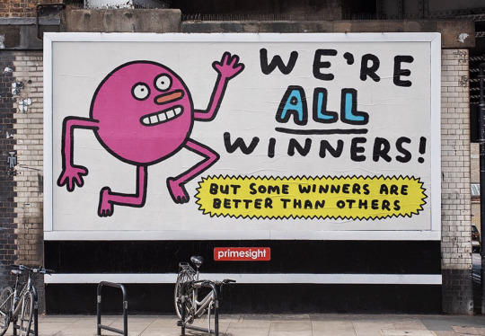
The main point of his talk, Al said, was to reassure those who are nearly graduating, were nervous or worried about our degrees or life as an illustrator, as well as how to make the jump between having graduated and having a job. He shared that he was very scared in his final year, “freaking out” and wondering how or when he would get a job or be employed. Al said he now has an agent, that gets him jobs, and this is the best route to go down. Jobs take all sorts of different forms (such as the one below!). Many of his jobs now are editorial, promotional or for advertising, and he mentioned he would love to do more animation but so far his career hasn't taken that turn.
His work, self-described, is usually character-based and humorous. Every aspect of his brand is bright, colourful and humorous too, including his website and his various social media. One quote from his solo show reads he’s been “described as the Ipswich Town FC of illustration”, in that “he’s been around for a long time but it’s hard to recall any of his major successes”, just an example of the kind of self-deprecating humour he uses in his work and his advertising. Another that also made me laugh was: “having spent ten years living in Berlin and New York he has recently returned to London where he spends his time telling disinterested others that he just spent the last ten years living in Berlin and New York”, which is relevant to our talk, and also funny.
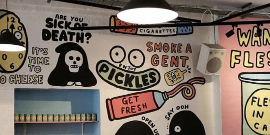
My own work rarely ever includes humour. It’s often character-based, however. I have never really thought about including humour in my work as it’s always been based on aesthetics for me, but it’s obvious that humour has a big hand in Al’s projects and how he gets employed for advertising. It could be worth trying this in future; seeing how humour can incorporate itself into my work.
Similar to Al’s work above, painted on a wall, is that of Sha’an D’Anthes. Although probably less about humour and focused more on ‘cute’ and aesthetically pleasing small illustrations, her work is similarly used below.
I have loved Sha’an’s work for years. I love the colourful nature of it - although the below illustrations on the glass are only in white, most of her work is bright and happy, like the first image. Personally I would love for my work to jump off the page in the same way, however the watercolours I mostly work with don't always allow this. I would like to work in more bright, colourful traditional ways and see how it translates.


Sha’an posts vlogs on her YouTube channel and documents her process, talking about life as an illustrator. It’s a fascinating insight into her career and I would love to do the same with my practice eventually.
Al spoke about his influences and how growing up, you don't always realise that something influences you as its happening. I thought this was an interesting reflection as I always find it quite funny to look back on my work from when I was younger and see how very similar it looked to a Disney Princess film! We collect plenty of influences over the years, all of which have an effect on our work.
Murphy’s work itself is very visually appealing; it’s easy to see why companies want to use it for advertising and promotions. It jumps out at you and is expressive and attention-grabbing.
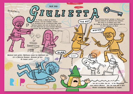
He described a few times about working with companies, big and small. Seeing as much of his work is advertising and promotions for companies, he has lots of experience with this. It’s always interesting to hear about working with brands and how the exchange works, especially as it’s likely I’ll experience this for myself after I graduate. I imagine it’s something you get better at through experiencing it for yourself, and you only really learn through doing, but it’s very useful to hear what companies expect from artists and the different ways they communicate it.
Although not from the talk, an article about Murphy in Creative Boom reads “on the one hand, [advertising] has fed and clothed his family and led to award-winning success, while on the other, it has made him question his own morals as he takes the money to help sell brain-melting products to children”. I thought this was a very interesting point as it is always relevant to discuss what we want from our careers and how we feel our talents are best used to affect the world around us. It’s not necessarily something that’s brought up often, especially as commercial illustration is a very popular road to go down and can be the source of quite a lot of money and success. There’s many other paths in illustration, however, and it’s always worth considering which options make you happiest, which ones you can get the most out of, or which ones you can contribute the most to. At the end of the day, I think creating for a living is a great privilege, and if you don’t love what you’re doing, it’s going to be very difficult to do it.

Simon Spilsbury
Website Instagram
A freelance illustrator, Simon Spilsbury’s philosophy is that drawing, and ideas, are central to process. His website says that his work is “spontaneous, energetic, quirky, inherently humorous, adaptable and elegant”. At first, he said that every day there will be a new image, one that’s never been seen before. I thought this was a wonderful thing to start the talk with - a comment on creativity, and how it’s never the same twice.
He asked us, what sets you apart? In order to be creative, you must make collisions, and take your brain out of its comfort zone. I rarely do this; I’ve always stuck to what I know, especially as everyone says to be successful you need a specific style that people can recognise you by. In Simon’s words, however: “you never know where you're going to end up. If you do, you're not being creative.”

He stressed that your reaction to a brief only happens once. You should make a starting point, and the rest will follow. Personally this is something I struggle with; I find it really hard to bring myself to start something, as often the size of the task scares me. Usually once I’ve broken it down, it’s not so difficult.
Simon also had some specific illustration advice, a lot of it on emotion and expression. He advised that if you want to draw someone performing a specific action, you should do it first. The action also informs the rest of the image. If you're drawing somebody pick up a rock, for example, you draw the rock first.
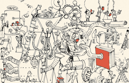
Simon’s practice is centred on drawing. Most of his work is sketchy and illustrative in a way only achieved through pen on paper, or digital pen on digital paper. It kind of captures the way that many artists sit down and absently doodle on a page, a bit like a stream of creativity.
I do most of my work through painting, or through digital software like Procreate. It’s very easy to capture the magic of drawing to Procreate now with very advanced software and plenty of traditional-style brushes. I don't think the emergence of this software changes the creativity that comes alongside drawing and art. Personally, in my head I separate quick, simple sketches on pieces of scrap paper from digital work or painted work as it might take less effort or time. Listening to Simon’s talk reminded me that maybe I shouldn't, seeing as both use lots of creativity. Arguably, quick sketches use more, seeing as they are thought up on the spot and require no planning, brainstorming or practice.
You must understand what you’re drawing, Simon says, with no preconceived ideas. I liked his approach to illustration - it was inspiring to hear about his version of creativity, especially as I haven't felt that creative in a while. My process has become sort of robotic, always the same, often on a screen and through a computer and rarely just for myself. Although Simon didn't address this directly, his ideas about creativity and leaving your comfort zone really struck home with me. I left wanting to do it much more often.
Neil Sheakey
Website Instagram

Neil is a design director at Uniform, in Liverpool, established in 1998, which he described as one of the few companies outside London with a wide variety of creatives. He completed his degree in graphic design at the University of Derby in 2004. He showed us work his company had done with brands like Mitre, Ideal Standard, Innocent and Encona.
His personal creative process was broken down into stages: empathy, perspective, direction, creative and action. It’s always interesting to see or hear about other people’s creative processes, seeing how they differ to our own. Neil also introduced something else interesting, his idea of a 360 experience, also in stages. These were to see, hear, touch and feel, his way of trying out whether and how a brand connects to customers.
Most of Neil’s work is digital and for advertising. He placed a big focus on process, which I’ve not thought about for years. My A-Level Fine Art teacher drilled it into us that process is the most important part of a project. You need plenty of ideas and research to back up your work. I do this a lot for university projects, but not very often for personal projects. I would really like to try this for a personal project and are if it makes any difference to how much I like the finished product.
Neil gave us some useful advice about presenting. If your audience is frowning, it means they are concentrating, which is not a negative reaction. Presenting, he said, means talking about yourself and your ideas comfortably. However, if your idea bombs or does badly, ask questions: why? What can be fixed? How can it be better? I think these questions apply themselves very well to presenting but also to personal work, especially when I have produced something I don’t like (which happens a lot more than I’d prefer).
Most useful was Neil’s 10 tips. He didn't specify them as such, but they certainly are useful tips.
1. Explore - being creative is all about exploration. 2. Find your voice - something that is always talked about in the community. 3. Collaborate - I’ve learnt a lot about collaborating with others this year; people on my course, my friends, etc. It makes me more creative! 4. Think, do, reflect - always look back on your work and see what you liked, what you didn’t, what you can take forward from it. 5. Craft your portfolio - something I forget about! Having one online means people can always look at it, or stumble upon it. 6. Give 100% - I’ve got worse at this. I find it very difficult to motivate myself, but I’m trying harder, because this is something I love to do! 7. Value your time - I’m bad at time management, but my time is also precious, and it does well to remember that. 8. Look after yourself - one of the most important things, if not the most important one. Being creative for a living can be draining and also a lot of pressure. Looking after yourself is essential. 9. Be yourself - your creativity is what can get you jobs, commissions, etc. It’s important that it’s your own! 10. Enjoy it! - of course. Being creative for a living is fun! I’m not as good at this any more, as my whole life is creative now - when I was still doing exams, it used to be my escape rather than my degree, my hobby and my dream career. Hopefully I can get better at enjoying it and appreciating it.
Other Speakers
Due to illness, I unfortunately missed a couple of the speakers we had visit the university, and another was cancelled to to the COVID-19 pandemic. To fill in the gaps, found and listened to some more talks online.

Maria Kalman: The Illustrated Woman This talk was wonderfully random and eccentric. Kalman seemed to really run with the idea of thinking outside the box and almost trusting your first thoughts. She talks of being a dreamy child and dreaming her way though life, all the way until college. Interestingly, Kalman didn’t start drawing until after university. I often worry about where I’m at professionally but I often forget that in the grand scheme of things, I’m still very young. The landscape of illustration is different now than in the 80s, but I still have a lot of my life ahead of me.
An interesting concept she mentioned was “if you know too much, you’re stymied”. This is the second talk this concept has appeared in: Simon Spilsbury also spoke about not knowing where you're going to end up, as if you do, it isn't creativity. Like I mentioned in his talk, this is something I am very bad at. I prefer knowing which direction I’m headed in and I’m often too nervous about a project and how it will turn out to even start it. This talk, and this point, was a brilliant reminder that you can’t plan everything, and sometimes your first thoughts are your best thoughts.
Janet Echelman: Taking Imagination Seriously This was one of those talks where you think it might have changed your life, or at least your outlook. Janet Echelman went to India for an art show and her paints got lost in shipping. As I was listening to this story my heart dropped - I couldn't even imagine what I’d have done in this situation - but Echelman took it in her stride. On a walk, she saw the natives weaving nets on the beaches and sat with them to learn how to do it. Since then, this way of working has become her best and favourite way of working.
I was fascinated by this. As someone that is sometimes too intimidated to try a new type of paint, or to paint or draw a more difficult perspective of something, I found Echelman’s willingness to open herself up to new ideas inspiring. There have been plenty of obstacles in her creative life, but when those arise she simply found ways to solve them. There are often times when I find a challenge too hard, or too intimidating, to even start it. Deep down I know that if I attempt it, even if I fail, I will have learnt something from the experience, and you can only get better through trial and error. Even so, sometimes the nerves I feel about a new project or challenge can overwhelm this logic.
Echelman has carried out briefs for very important clients but despite this, her talk is still filled with the wonder and joy that sparked her creativity in the first place. She places great importance on how art should make you feel, and how you should strive to create things that make other people feel something too. It even made me tear up at the end.
Alexa Meade: Your Body is my Canvas A reoccurring theme with these talks for me is how good these creatives are at simply new ideas. I think the idea of creativity has taken a back seat for me over the years, and I know at A Level and GCSE there was a big focus on technical precision and talent instead of just having a good idea, and running with it. Although my degree places importance on elements of this, in my work it seems to have disappeared. Maybe creativity comes quite easily to me, in that I’m given a brief and instantly have ideas to put down, or maybe I've forgotten about it altogether, and I’ve managed so far to work without much of it. It might be that creativity is different for all of us. This talk still serves as a reminder that we should always be trying to access our creativity in everything we do.
Meade seems to have creativity down pat, however; if you could describe it, it would be this. Her work is fascinating in that she doesn't paint on canvas, but she actually paints on the subject she is painting. What comes from this is what looks like two dimensional paintings, but is all 3D. These talks are all inspiring, but Meade has taken an idea from the past and made it into a career that nobody else had done before.
Jarrett J. Krosoczka: How a Boy Became an Artist There is something so inspiring about holding art and creativity so close all your life, and Krosoczka’s story is this exactly. It places huge importance on using your imagination: “writing is using your imagination on paper”. It was another wake-up call to be reminded that at the basis of what we do as creatives, we’re always using our imaginations.
“Celebrate your own style” is among the wisdom in this talk. Krosoczka had a turbulent life but recognises and passes on the importance of good stories, for children specifically. There is a confidence that is threaded throughout his talk and his life, almost like willing something into existence. Again, it’s inspiring to see someone with the confidence to know that whatever happens, it’s always possible to meet your goals and fulfil your dreams. In a creative career it’s easy to let adversity get you down, but it’s also amazing to look back on your life so far and celebrate the achievements you've made.
What I took away from this talk is a reminder that even if I feel down about my art or my abilities, I always have the tools to get better and develop. I think this is something always worth remembering.
A few other links to interesting talks/podcasts I found by artists:
Anthony Gormley in Conversation with Iwona Blazwick
Tracey Emin RA on her largest-ever text piece
Building a successful career as an illustrator with Furry Little Peach
RCA Talk with Subject Matter: Women Artists & A Brave New Art World
Béatrice Coron: Stories Cut From Paper
In Summary
All in all I enjoyed the talks. It was inspiring to get a fresh perspective on art, illustration and creativity, especially as we often seek out ideas similar to our own and flock to people that share them. Naturally it was useful and equally as interesting to hear from people established in their fields, how this came to be, and even how they felt - and now feel - about it.
It was also a bit of a wake up call as I know plenty of people, me included, tend to stay focused on the present and the work they're involved in right now, instead of making plans for the future and looking ahead. I don't think it’s advisable to plan out every aspect of my future, but I rarely think about it. It was interesting, fun and quite daunting to sit on the train on the way home from some of the talks and imagine a career that spans as long as some of our speakers. Maybe one day I’ll give a talk of my own!
One criticism I have with the talks is the lack of diversity. I understand it is difficult to get people in to give talks, but one thing I noticed as soon as we got a list of who was visiting was the lack of women on it. I was hoping to get more of an insight into women in the industry. Instead, this was something I sought out myself; the extra talks I needed were mostly by women. Of course the women giving these talks were equally fascinating and knowledgable.
This concerns other aspects too, not only gender, as it would have been interesting to hear from people from different backgrounds and different ethnicities, as all of the speakers we had visit were very similar in that respect. It’s interesting to hear from anyone in the field, but I’m sure people from different walks of life would have something extra interesting to add to their talk or something different in their story to share. Not only for me, for my own curiosity, but also for other students that come from somewhere different to me, somebody that might appreciate a different insight that they can relate to. It would be easy to feature this in a range of visiting artists.
I felt there could have also bee variety in types of illustration, as the talks I heard were mostly from those in advertising and promotions (of course, the two I missed due to illness may have been different). I know Louise Lockhart, the final talk that was cancelled, is a children’s book illustrator, and gives me all the more reason to be disappointed about missing it! There are so many different ways to use skills and experience in illustration and although advertising is a very common one, it would have been useful to have more variety in this aspect.
Of course, it’s always encouraging and refreshing to hear from established artists and to take away something from a talk. There’s always something you can learn. Even with the extra talks I needed, I felt more and more interested with every one I listened to, and felt encouraged to find and learn more. It strikes me that with platforms like YouTube and Instagram, where we follow and subscribe to fellow artists and creatives, we are doing the same, always wanting to find out more and learn from people around us and people we admire.
0 notes
Text
Weekly Studio Spotlight

*fanfare* This week’s artist of the week is Sam Green
Sam is an extremely talented graphic artist and illustrator based in London, UK. He creates incredible art based on movie posters, comic books and other pop culture references.

Credit: Sam Green
We love getting to know the artists we see in the studio, so we got in touch with Sam for a short Q&A from his biggest inspirations, to what superpower he would most like to have...
What inspired you growing up?
So, I’ve always been into superheroes, particularly Batman. I was obsessed with anything Batman as a kid and would draw him constantly. My mum has always been really encouraging and supportive of my art - she would keep scrapbooks of all of my drawings from a really young age. Most of them are filled with Batman.
I’ve always loved movies. Just characters in general I think. I really enjoy drawing interesting people and it’s almost like embodying characters through my artwork. I think that’s probably what inspired me as a kid - and still does really.
How did you start your art career?
After school I did a year-long art foundation course in Cardiff, which is where I’m from. I don’t think this course is around anymore (at least not at the place I did it), which is a real shame because it’s probably the most artistically invigorated I ever felt throughout my education. My final project was a big 64-page graphic novel about a cowboy/samurai hero. It was really over the top and gory. Very 70’s B-Movie. It was great.
From here I went on to De Montfort University in Leicester – initially to study Game Art Design which I’d had in mind for years. When I got there, I realised it wasn’t quite what I wanted to be doing and decided to switch course. I went over to Fine Art, thinking I could practice and learn about a broader spectrum of art and inform my work. Turns out they hated basically everything I did, and I ended up doing photography as my final project which is about as far away from illustration as you can get.
I kept up doing my own thing regardless and after university I moved to London to work at a clothing company as a designer. This was around the time I started developing my freelance work and making that into a career. After working there, I went to work as an illustrator at a children’s book publisher also based in London, where I now head up the Design Department - working on my freelance illustration stuff alongside that work.
What’s your favourite piece you have created?
My favourite piece would probably have to be the poster I made of The Last of Us Part II. It was the biggest and most detailed piece I’d made up until that point and I felt very satisfied with the result. I’m usually quite critical of my own work, but I feel like I really nailed what I set out to do with this one.
It ended up getting a fair bit of recognition from some of the main cast of the game, as well as the director Neil Druckman. The developers Naughty Dog also shared it on their social channels which was quite exciting. It was really rewarding seeing that recognition and having my work shared with such a huge audience.
It’s probably my most popular artwork. I do have some other pieces due to be unveiled later this year through different things that I’m quite proud of, but I can’t share too much about them just yet.
Another one would probably be my Stranger Things poster. I did it fairly early on in my foray into making poster art, but it seems to be one that people find me through quite often. I can definitely see things I’d change if I did it today but I’m really happy with how that one came out.

Credit: Sam Green
What art tools could you not live without?
My iPad. It’s likely the art tool I use more than anything. I’m from a traditional background, predominantly pencil and ink – but the versatility in digital is unparalleled. I’m not really into Apple stuff but the iPad is fantastic, I take it everywhere and it’s at the point where drawing in Procreate on the iPad is a key part of my workflow.
What is your biggest challenge when working on your art?
There are 2 things that immediately come to mind. The first is coming up with the concept of a piece. Some stuff just comes naturally, but if you’re setting out to say, create a poster artwork for a movie, then coming up with an interesting concept can sometimes be really difficult. It’s that first big hill to climb – staring at a blank canvas and trying to come up with how to fill it in the most interesting way.
The second big challenge then comes from persevering with the work. There’s usually a point somewhere in the middle where you’re doubting the work or second guessing some things. Getting through that patch is a bit of a mental test, but it does usually come together in the end.
If you could have a superhero power, what would you want to have?
I’ve thought about this before, and it would have to be the ability to freeze time. It would just be so versatile. You could use it to get out of sticky situations - but what I’d probably use it for most is to stop everything around me, go somewhere really scenic and just make art. I’d love to have unlimited time to just push myself to learn more and get better as an artist.
There’s a thing in Dragon Ball Z called the Hyperbolic Time Chamber. Characters would basically go in there and do a years’ worth of training, but it would only equate to one day on the outside. I’ve always loved that idea and wished I had access to it in real life. I know that probably sounds really lame.
If you could bring a fictional character to life, who would you pick?
I mean, I’ve already mentioned how I’m a big Batman fan – but I don’t know how much I’d actually want to bring him to life. I don’t think he’d be very fun to hang out with.
Michael Scott from The Office would probably be a good one. I feel like you’d always have an eventful time hanging out with him.
If you could travel, or live anywhere, where would you go?
My girlfriend and I love travelling. We’ve been planning to go to South East Asia, Japan, Australia and New Zealand for a while now. So, I’m really looking forward to when we can actually go off and do that, once the world hopefully returns to something a bit more normal. I’m a big foodie – both cooking and eating. I’m a big fan of Asian food in particular. I’d love to go all over Asia and experience all of the delicious and varied food.
Really, I’d just love to go everywhere. I love going to new places.

Credit: Sam Green
Huge thanks to Sam for taking part and giving some great answers! We hope you enjoyed this week’s artist and don’t forget you can check out more of Sam’s work on all of his socials and website (all linked below)!
Sam Green - Instagram
Sam Green - Twitter
Sam Green - Website
#artistoftheweek#artist#artwok#pop culture#batman#joker#lastofus#digitalart#DStudio#dstudiouk#artists
1 note
·
View note
Text
"Together we rise: a Q&A with Libby VanderPloeg"
Women Techmakers is Google’s global program to build visibility, community and resources for women in technology. For Women’s History Month, we’re recognizing the inner qualities that make women stand out—their very own superpowers. To do this, we teamed up with Libby VanderPloeg, whose superpower is the art she creates. She’s the mastermind behind multiple viral gifs emphasizing the power of women, collaboration and civic engagement.
We sat down with her to talk about the evolution of her craft, her work with the Women Techmakers team, and her illustrations that encourage women to rise up together.
Google Women Techmakers superheroes
Google Women Techmakers super hero - valiant visionary
Google Women Techmakers super hero - conscious connector
Google Women Techmakers super hero - empathetic entrepreneur
You’ve created art that resonates with many people and movements. Which of your designs makes you the most proud? It’s definitely “Lift Each Other Up,” first shared in 2016 on International Women’s Day. It’s been shared for the past four years, especially lighting up the internet on its birthday, March 8. It’s given people hope and inspired women to work together and help each other out when they can. I’m proud of how much it communicates in just a few seconds, and how that message has resonated so deeply all over the world.
How would you describe your design style? Colorful, relatable, energizing, funny and hopeful.
A lot of your art is digital. Has that always been the case? I never liked computers, growing up into my early twenties, because I didn’t know how to use them as part of my art practice. I was a painter, period. But once I started playing around with technology, I started to fall in love with it. First I got the wacom tablet, which took some time to master. And then I started doing most of my drawing in Illustrator, learning more about how to bring a natural touch to vector art. Now I use a mix of Procreate, Illustrator, and Photoshop. It’s so fun to work digitally because you can play with your artwork in infinite ways, like changing the color palette or adding a little bit of animation, a skill that I’ve been working on for about ten years. I’m not a master animator, but excited to always learn new tricks. I just started learning how to use After Effects and it’s so much fun!
What advice do you have for women starting out in their careers? Know that you are capable of more than you can imagine. Sometimes it’s just a matter of being asked to do something you don’t know how to do. When you accept new challenges, it can be very nerve wracking, but the payoff of growth makes it so worthwhile.
What does it mean to you to have your work highlighted by Women Techmakers? It's really exciting that, through my artwork, I can be a part of the effort to get more women into tech. For a long time, I thought of myself as simply an artist, and took for granted the other strengths that I was honing along the way. I’m my own IT and production department, and am constantly communicating with my clients to help them achieve their goals through art, yes—but art with a technological edge. So on top of being visually creative, I’m technologically creative, and whenever I can solve problems, I feel like somewhat of a superhero! So these Women Techmakers are an ode to all of the women out there who have the vision to make the world more connected and empathetic. I want them to know what inspiring superheroes they all are.
Know that you are capable of more than you can imagine.
What’s your superpower? This is one that fellow designers will appreciate: I can deliver designs in multiple sizes and file formats without batting an eye or breaking a sweat :)
Who are the superwomen who have inspired you? My mom has been a huge source of inspiration, her superpower being relentless hope. She’s an incredibly hard worker with a positive outlook, and has always inspired me to chase after my dreams. And my dear friend, Marisa Ponitch, whose superpower is making doing the right thing look cool. She is one of the most creative people I know, using her voice and vision to teach people about waste in the textile industry and give them fun and engaging ways to reduce their consumption.
Don’t miss Libby’s work featured on the Women Techmakers page. If you’re interested in learning more and getting involved with Women Techmakers, check out our website and sign up to become a member.
Photo credit for headshot of Libby: Leigh Ann Cobb Photography
Source : The Official Google Blog via Source information
0 notes