#idk but YEET
Explore tagged Tumblr posts
Text

That sassy little scientist and the disaster he chose as his partner
#not one thought went into this. Just had to draw SOMETHING. Can't believe I went neutral into Arcane and now I'm actively losing my mind#Arcane#jayce talis#jayvik#art#fanart#Viktor#my art#krisart#i finally yeeted photoshop. Idk what to do with my PS wips yet but CSP is alright. Idk what I'm doing though
2K notes
·
View notes
Text
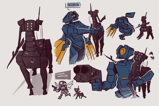

V1 finds a weird looking dog in hell
#idk man what if there were teacup earthmovers#tiny shiba sized war machines#that can railcannon you#yeah consider this thing hissing and yeeting its thor lightning at anything that moves#and v1 has to +chargeback to deflect the shot#i see anything remotely animal like and im just#its just a lil guy#ultrakill#ultrakill spoilers#v1#ultrakill v1#v1 ultrakill#earthmover#earthmover ultrakill#krita#my art#lyss art
7K notes
·
View notes
Text
Her Astrophel and Sterling
hmmm
Hmmmmmmmm
You know what.
You know those AU's where the Batfam finds or learns about either hidden or thought to be dead Al Ghul Danny! with a deaged/daughter Dani (Ellie) (I should know, I created a few of those storylines) but what if, now hear me out, what if instead of them finding Danny first its Talia.
Do I want Talia discovering her thought to be dead son to be alive? Yes. Do I want her to find him while investigating Amity Park when the League gets reports of 'Lazarus creatures/water'? Yes.
DO I WANT HER TO KNOCK ON THE FENTON'S DOOR, fully ready to pretend/honey talk her way into the house to uncover what the Fenton's know, ONLY TO MEET A LITTLE ELLIE?!
YES.
Ellie whose eyes and hair look like a copy of her Beloved but she can see bits and pieces of herself as well. Talia knows the child in front of her was not fully her's though but everything makes sense when she hears a voice, a voice she hasn't heard in ages but as a mother just knows, speak out.
"Ellie! I thought I said do not answer the door my Sterling."
"But Daddy, yous was busy fighting the hotdoggys!"
Talia's eyes widen when she finally catches sight of familiar black hair and blue eyes.
and she could only lightly whisper a old nickname she hasn't dared uttered in ages, a name she secretly gave her son due to his love of the stars "Astrophel..."
#danny phantom#danny fenton#crossover#dp x dc#blue rambles#danny phantom dc#writing ideas#random idea#dpxdc#good mom Talia?#Good mom Talia. Yes#Astrophel means Star Lover btw#Sterling means Little Star or Excellent#Deaged Ellie#Deaged Dani#Danny either faked his death or got yeet from the Pits to Amity#does he remember? Idk leaving it open ended#if he does remember he chose not to return cause he knew he'd be punished#Talia comes to Amity after so many years because the League finally got reports of 'Lazarus' like creatures/waters being used/seen#Is she League leader now? Idk again leaving it open ended for anyone to play with#does she kept it a secret when talks to Danny about everything? I think so if he asks her not to say anything#Talia is happy to see her son again after so long. She isnt happy about how Ellie came into his life but is happy to have a granddaughter#she totally holds Ellie everytime she visits and promises to teach her how to make the world fall into her chubby little hands#Ellie loves her Granmama Talia cause she tells stories of all the places she's been#Eventually though I can see someone. Maybe Damian or Bruce. Needing to speak with Talia about something#and they track her down when she's on a visit to Danny and Ellie. And well the secret is out.#dani phantom#danielle phantom#Dani is Ellie
2K notes
·
View notes
Text
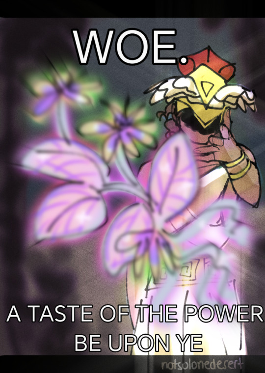
I might actually draw epic fanart more often than expected, I thought it'd be just a short phase but apparently not. Not that I mind, haha

Here's the original
#This is how it went#Right?#epic the musical#epic the musical fanart#epic the circe saga#hermes#epic hermes#Gramps knows best#I saw the meme and then idk haha#my art#I actually have one version of Ody yeeting the infant but I am afraid that it might be too much to post
415 notes
·
View notes
Text
We need to start questioning the conflation of "maturity" with "increased stakes."
It's not to say higher stakes is always a bad choice. The first half of the How to Train Your Dragon book series has an endearingly whimsical, child-like feel. Hiccup's issues in the first half of book one are an obnoxious, cat-sized Toothless pooping in his helmet. The movie adaptation might have made the book and its counterpart distant cousins, but it was a thoughtful move to alter concepts to the appropriately theatrical: books and movies aren't the same medium. Hiccup riding alone on Toothless, exchanging fire blasts with a mountain-sized dragon, and losing his leg came off as well-done storytelling.
Hiccup staring at a prosthetic never happened in the book. He didn't lose his leg in his encounter with the Green Death. It was, as the creative powers behind the movie said, a result of the increased stakes. They didn't do this just to be more dramatic; they did it because it seemed that, based on how their narrative was going, this made sense. And this was a soft, quiet, shocking, breath-taking scene that instilled how good the movie handled its stakes. It gave us a reflective reaction to consequences that audiences might not have expected. This movie understood timing, pauses, quietness, narrative arc, poignance, reflection, emotion, love, and heart.
We know about the conflation of live action as "more mature" than animation. But a medium doesn't change maturity levels. We all know that's bogus, and many analyses have been given on that. Disney live actions add extraneous gunk, down to Gaston having a past relationship with war (so I've heard, from the people who actually watched the movie), and Disney giving us the sad scoop on why Belle's mom isn't around. Furthermore, lots of times, when I see the conversion of animation to live action, I notice creators feel a need to "raise the stakes" -- in line with the erroneous view of "giving maturity."
But "higher stakes" often means inserting action in place of mindful interaction. I feel today's Hollywood movies, in their treatment of "action," don't let movies pause and breathe anymore - ergo, they don't let us think. Isn't it more juvenile to actively avoid thought in favor of "hey look I made the building go boom"? There may be less "stakes" in introspection and mindful dialogue, but that's what gives it its maturity. That's how we went from Iron Man 1, with its grounded treatment of war and abuse, to the mindless high spectacle MCU is today.
Snappy one-liners or moments that clap at contemporary issues don't substitute for maturity. What can make a story mature is characters grappling with issues in a natural narrative through-line. A snappy one-liner is its own form of speedy spectacle.
We know about the conflation of "gore and sex" with "mature audiences." I believe they're right that graphic sex and gore is designed for adults. But that doesn't make it mature, and that doesn't make it the only way to target a medium for adults.
"Realisticness" isn't maturity. Per above regarding animation: realistic visuals are nothing. And if you think that putting more Debbie Downer material into your adaptation makes it more adult, you have to ask yourself why the themes that spoke to people's souls got muddled in its midst. We weren't mature enough to interact with the most subtle, nuanced, and impacting voice of the story. But hey! Look! There's more corpses, I guess!
It's not the visuals, it's not the events. It's not the "things." It's not the basic insertion of the external. Get past the superficial, get past the top layer of presentation. It's the mind. It's the ability to think. It's the ability to be still. It's the ability to be interested and attentive when something is slow or quotidian, because we can understand why that is important for narrative growth or arcs or themes or commentary on the human condition. It's the ability to know when and when not to include something. It's the ability to make resonant impact. It's the ability to be deep with your emotions or your themes. It's the ability to take what you have and grow it in a way by which we can derive something deeper.
Maturity is critical thought and well-conducted, appropriate responses to content of any kind.
As DeBlois tells Empire, the move to live-action brings a different emphasis to How To Train Your Dragon; a new heft, both physically and emotionally. “It’s so dialed-up in terms of stakes — having a fully credible, photo-real dragon stomping around trying to kill him,” the director says.
And maybe that DeBlois quote is taken out of context. Maybe there's more going on than that one sentence conveys. Maybe Empire is making their own erroneous assumptions. But "so dialed-up in terms of stakes," isn't, on its own, a good appeal. The animated movie already dialed things up - and knew when to include or not include something. A live-action that imitates the visuals of the animated movie exactly, as if no independent thought has been done to its unique adaptation, to the pros and cons of the medium, to what a independently-presented story needs and doesn't need... It has to make you wonder: how many conflations of "maturity" are going on?
How long are we going to keep making our own conflations?
#long post#analysis#my analysis#httyd#How to Train Your Dragon#Dean DeBlois#why not tag him idk haha#MCU#Marvel#Marvel Cinematic Universe#tagging the shit I talk about for categorization purposes yeet#httyd books#Cressida Cowell
270 notes
·
View notes
Text


Submission from moss boss
#submission#thrifting#shiftythrifting#shoes#ballista#yeet#lol not the artichoke keds#hops#idk man I am going blind from this blog
246 notes
·
View notes
Text
so like, do you ever think about the similarities between Gwaine and Will (from Ealdor)? And their respective friendship with Merlin? Because, dude, I’ve been thinking about it all week.
These two would've been friends, I'm sure of it.
Gwaine makes the most iconic character introduction of the series, gets stabbed, continues to be a menace, and then he and Merlin bond over their fathers, and lack thereof.
Gwaine is cynical about nobility, especially Kings. As we know, his father was a knight who died in battle in Carleon’s name, and the King repaid his family with nothing.

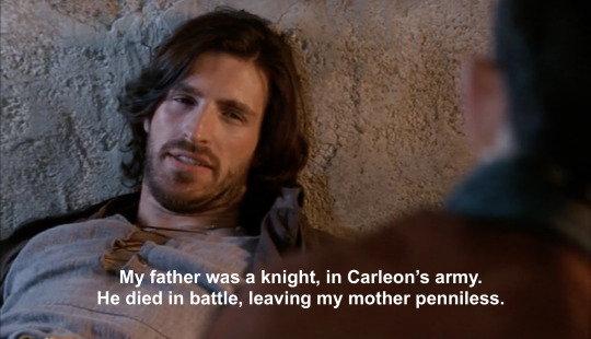
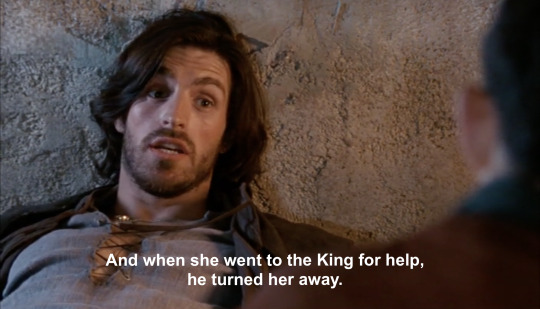
Then you’ve got Will. Will - the most iconic man from Ealdor, which is a tall order when your mate’s Merlin, Mr “Greatest Sorcerer To Have Ever Walked The Earth” who is also from Ealdor. He greets Merlin like “your kind ain’t welcome here….. lol jk bring it in”, and then immediately squares up with Arthur, who’s kind - as far as Will is concerned - is definitely not welcome here.
Merlin reveals that Will’s issues with Arthur run deeper than how they first appear. Will, too, had a father that died in battle in service to, most likely, a King. The majority of it is inferred to the audience and we’re encouraged to make our own conclusions.
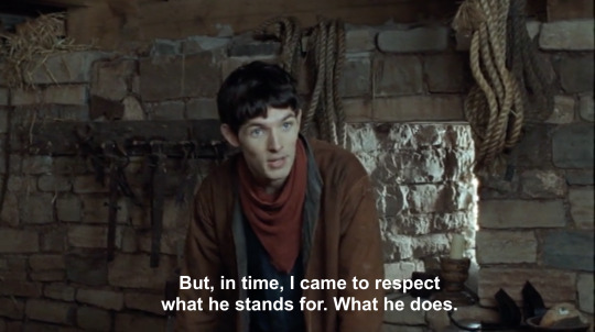

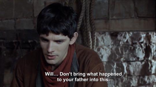
It’s very likely that Will and Gwaine share very similar backgrounds. I’m not sure that Will’s father was a knight, it’s more probable that he was a soldier of some kind and not of noble birth. Regardless of whatever rank he held, there’s overlap: a father was in service to a king, died in service to that king, that king left the family with nothing as thanks, and the son is left a cynic with no trust for people with fancy titles.
Another parallel is that in both 1x10 and 3x04, Will and Gwaine leave. For different reasons, of course. Will leaves because he refuses to fight for Arthur, a noble, and Gwaine leaves because he stood up to “nobles” bullying Merlin and was banished by Uther for it.
And then they both come back, to Merlin’s delight. Will comes back, risking his life, because it’s not about fighting for Arthur; it’s about fighting for Ealdor, his village, and to fight beside Merlin. Gwaine comes back, risking the consequences of his banishment, because he knew Arthur was in danger and Merlin likely would need some help.
But like, do you think Merlin, after Will’s death and since meeting Gwaine, sees these similarities between his two friends? Not just in experiences but personality? We only got one episode with Will, and we met him during a really desperate time, so the guy was probably stressed to the roots of his hair; and it was also after Merlin returned after moving away. So, Will - though happy to see him - was still cross after feeling abandoned. We didn’t get to see more of Will’s personality outside of that, but we know he was fiercely loyal, cynical, considered people’s lives worth more than material wealth or glory, outspoken and unafraid to tell a prince to fuck off, and one for banter (i.e. how he welcomed Merlin home).
Do you think Merlin saw Gwaine’s joking nature, his fierce loyalty, his criticisms of nobility and how he considered titles unimportant compared to who a person was on the inside, and thought of Will?
And, what if Merlin, late at night and lying in bed, thought that - if they’d ever gotten the chance to meet - Gwaine and Will would’ve been good friends.
…. anyway, that’s what’s plagued me for 6 days.
#idk anyway have this *yeet*#bbc merlin#merlin#merlin meta#meta#will of ealdor#gwaine#sir gwaine#bbc gwaine#ren rambles#scheduled
245 notes
·
View notes
Text
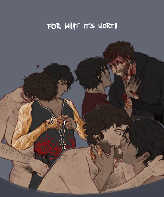

But this is how it must be.
#as you can see patch 6 left me feeling very sane#im doing SO well#this took me 3 days btw#behold the world's slowest artist#the dark urge#enver gortash#bg3 spoilers#durge spoilers#baldur's gate 3#bg3#durgetash#blood#blood tw#blood cw#gore#death#idk how to tag this without it getting yeeted into oblivion#durgetash is its own warning isn't it?#my art#bg3:Ezra
536 notes
·
View notes
Text
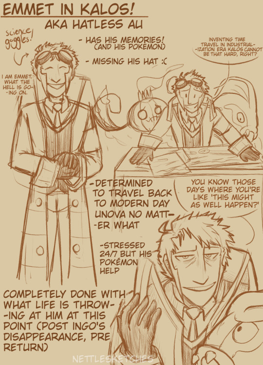
more 'emmet in france' musings from this post :>
some notes:
- woke up in kalos after falling asleep in his chair doing paperwork
- wants to return to Gear Station ASAP, working on inventing a time machine with the help of his pokemon. Emmet considers this a 'slight delay'
- ingo has been a missing person for 3 years
#idk what era za is going to be yet but emmet gets yeeted back 200 years for this one#also emmet has no idea about hisui or anything. ingo just went missing and the case went cold immediately#submas fanart#myart#submas#pokemon#subway boss emmet#pokemon fanart#eelektross#chandelure#submas au#hatless au#pokemon legends za#pokemon spoilers#if the setting is a spoiler
473 notes
·
View notes
Text

Demon King of Salvation
#my art#kdj#kim dokja#orv#omniscient reader's viewpoint#orv fanart#quick doodles again#idk im just yeeting things at the wall atm
129 notes
·
View notes
Text
vunerable - sylus x mc!reader

sypnosis: sylus has never been one to give up control, so you try and help him.
a/n: inspired by @yes-no-maybe-soo i legit just read your sylus hc's today and my brain scrambles to write this because althoug i love sylus bing a sub, you made some excellent points of it being hard for him to give up control because of what he went through in his past life (still haven't recovered, anyone else?).
contains: sylus being scared to give up control and not liking these feelings, mc (you) being so gentle with him. there's a slight mention of attmepted murder from sylus' enemies in the past. sylus crying (of that ever happens in game i swear to god-). angst & comfort.
word count: 1381
you straddle him with your hands resting at his hips, his chest is bare that allows you to see his breathing clearer. he's watching you with those ruby eyes you love so much, but you can see a bit of fear in them, unsurprising at the vulnerable position he's in.
it was your idea to do this, to give him the attention he gives you - the warmth, safety and consent. he knows you would never hurt him, but the image of losing all his control reminds him of his past life, as the dragon who has been beaten and chained for thousands of years. when the past you finally freed him he was determined to take control of his life, to never go back to the scared dragon.
he adores you, and you know that, he would do anything for you...but to give up all control, even if it is just you who takes it away...fear creeps back into him.
you lift a hand and reach up to caress his cheek which he immediately nuzzles into to, and he kisses the palm before releasing a sigh,
"it's only me," your voice is so soft, just louder than a whisper, like it was coaxing an animal out of it's shelter. you lean up and cup his face, thumbs brushing against his cheeks. "i'm the only one that's here."
you take one on your hands to gently run through his hair, an action that has him close his eyes to enjoy the feeling, and it makes your heart swell. "we can stop anytime you like, ok?"
a hum comes from his lips as he opens his eyes, and you see that small amount of fear has been replaced by something else.
he hates that you have to him like this, like he's weak, like he's a scared child who needs comforting - he doesn't like that he's showing this side to you, because how can you depend on him if he doesn't stay strong in front of you?
you kiss his forehead and you can feel some of the tension leave his body. a part of you wants to do this fats, you show sylus that yes of course, he can be like this with you, there's no shame and it and you'll always ben there for him , but you need to take it slow. you will show him all these things by listening to him, both words and body. you don't care how long it will take, because it's what he deserves.
you start to leave kisses all over his face, his cheeks, nose, even his chin that makes a small amused huff leave his lips. you're still gentle when you finally place your lips over his own, his hands coming to hold your waist. at any other moment it would be intense, fingers digging into clothing as your tongues fight each other.
but right now it's soft, like a perfect fluffy cushion you relax in. sylus groans at your mouth and you feel good knowing he does too. you see it in his eyes when you pull away, and the slight pink on his cheeks and the tip of his ears.
you giggle. "do you know how cute you look when you blush?"
he sucks in a breath, clearly surprised by your compliment. "cute?" he looks almost amused. "that not a word people associate with me."
"well they don't know you like i do." you give his lips a quick peck to his lips before your hands descend lower to his shoulders, a lot looser than before. "i kinda like it that way."
"and you call me possessive." he chuckles. the air around you two has become easier, the tension slowly fading away.
for some reason your eyes go to his neck, such a strong thing that often aches because of how much he has to look down at you. you move your hands towards his neck, his sharp intake making you freeze.
"oh..." how could you forget a lot of his enemies go for his neck? a common way to end someones life. you felt stupid. "sorry...i was going to massage it. it aches because of how much you have look down on me, doesn't it?"
he doesn't answer you, his eyes cast aside as he continues to breath heavily. your heart aches at the sight and you retract your hands, placing one back on his cheek. "hey, remember, your still in control. stay stop and i will."
his breath shudders and his shoulders tense up once more, his hands now gripping your waist. he sucks through gritted teeth and turns his head away, as if he was ashamed of himself.
your heart sings with distress at the sight and you want to feel anger of the people that have made sylus this way, but what good will that do here?
sylus…” you lean your head to meet him and see something shine from his eyes, falling down his cheek.
a tear.
“oh…” you couldn’t hold back at your reach to brush it away, but when your skin makes contact he flinches, and it makes you want to cry yourself. “it’s me, my love. only me. i’m here.” you brush the tear away, fingers gently thumbing in his cheek to help calm him.
a strangled noise comes from his throat. “i don’t…i didn’t want you to see me like this…” his voice is in a tone you’ve never heard before, one of pain and distress.
“like what?” you reply softly.
he doesn’t answer straight away and you wait patiently, rubbing soothing circles on his shoulders like he had done to yours in times like this.
“like i am weak, scared…vulnerable.”
you swallow the lump in your throat at his words, each piercing you harshly through the heart. “sylus…there’s nothing with you feeling any of those things.”
“i need to be strong for you.”
“do the strong always require to be strong?”
repeating his own words to him hit him like bricks, his eyes widening and lips parted in shock. ever so gently you cradle his face, his eyes still looking away from you. “wasn’t it you who said that?”
“...it’s not the same.”
“how isn’t it?” you ask, but he doesn’t reply, so you keep talking. “i don’t need you to be strong for me sylus. don’t you think there’s a strongness in being those things? weak, scared and vulnerable?...to me there is.”
your words make him finally look at you, his eyes still holding surprise. “...there is?”
you nod. “even plants and animals have those types of feelings, so you having them is normal. showing them to me is…letting yourself be loved by me even more than you do now. it shows that you trust me to see you this way, and trust me that i won’t turn you away.”
you lean forward and turn his face to you before grabbing one of his hands and placing it on your chest, your heart beating loudly underneath. “trust me that i will always be patient with you, that i will never rush you and listen to what you say,”
you grab his other hand and bring it to your lips, softly kissing his knuckles and palm before placing it over your cheek. “and trust me that i will always love you, no matter what.”
he hears your love, your utter devotion to him that makes his heart sing. he stares at you with such loving eyes one might say they never knew it existed, but it’s right here, right in this room and in each other's arms.
he kisses you with such intensity, with such love that it almost makes you fall. with your hands on his shoulders you meet his passion, his devotion, his affection and so much more. he cradles your face as your lips part, heavy breaths falling from both.
“i love you too, my beloved, so so much.”
he holds you tightly with his head buried in your neck, your arms around his neck and brushing through his hair.
you don’t care how many times this needs to happen, to assure him of your love and devotion, of your patient and his consent.
because you will never, ever hurt him - he deserves better.
#mine#my writing#love and deepspace#sylus#sylus x mc#sylus x reader#have sylus crying *YEET*#there is comfort so don't worry#idk how to feel now...
91 notes
·
View notes
Text
why Aurora's art is genius
It's break for me, and I've been meaning to sit down and read the Aurora webcomic (https://comicaurora.com/, @comicaurora on Tumblr) for quite a bit. So I did that over the last few days.
And… y'know. I can't actually say "I should've read this earlier," because otherwise I would've been up at 2:30-3am when I had responsibilities in the morning and I couldn't have properly enjoyed it, but. Holy shit guys THIS COMIC.
I intended to just do a generalized "hello this is all the things I love about this story," and I wrote a paragraph or two about art style. …and then another. And another. And I realized I needed to actually reference things so I would stop being too vague. I was reading the comic on my tablet or phone, because I wanted to stay curled up in my chair, but I type at a big monitor and so I saw more details… aaaaaand it turned into its own giant-ass post.
SO. Enjoy a few thousand words of me nerding out about this insanely cool art style and how fucking gorgeous this comic is? (There are screenshots, I promise it isn't just a wall of text.) In my defense, I just spent two semesters in graphic design classes focusing on the Adobe Suite, so… I get to be a nerd about pretty things…???
All positive feedback btw! No downers here. <3
---
I cannot emphasize enough how much I love the beautiful, simple stylistic method of drawing characters and figures. It is absolutely stunning and effortless and utterly graceful—it is so hard to capture the sheer beauty and fluidity of the human form in such a fashion. Even a simple outline of a character feels dynamic! It's gorgeous!
Though I do have a love-hate relationship with this, because my artistic side looks at that lovely simplicity, goes "I CAN DO THAT!" and then I sit down and go to the paper and realize that no, in fact, I cannot do that yet, because that simplicity is born of a hell of a lot of practice and understanding of bodies and actually is really hard to do. It's a very developed style that only looks simple because the artist knows what they're doing. The human body is hard to pull off, and this comic does so beautifully and makes it look effortless.
Also: line weight line weight line weight. It's especially important in simplified shapes and figures like this, and hoo boy is it used excellently. It's especially apparent the newer the pages get—I love watching that improvement over time—but with simpler figures and lines, you get nice light lines to emphasize both smaller details, like in the draping of clothing and the curls of hair—which, hello, yes—and thicker lines to emphasize bigger and more important details and silhouettes. It's the sort of thing that's essential to most illustrations, but I wanted to make a note of it because it's so vital to this art style.
THE USE OF LAYER BLENDING MODES OH MY GODS. (...uhhh, apologies to the people who don't know what that means, it's a digital art program thing? This article explains it for beginners.)
Bear with me, I just finished my second Photoshop course, I spent months and months working on projects with this shit so I see the genius use of Screen and/or its siblings (of which there are many—if I say "Screen" here, assume I mean the entire umbrella of Screen blending modes and possibly Overlay) and go nuts, but seriously it's so clever and also fucking gorgeous:
Firstly: the use of screened-on sound effect words over an action? A "CRACK" written over a branch and then put on Screen in glowy green so that it's subtle enough that it doesn't disrupt the visual flow, but still sticks out enough to make itself heard? Little "scritches" that are transparent where they're laid on without outlines to emphasize the sound without disrupting the underlying image? FUCK YES. I haven't seen this done literally anywhere else—granted, I haven't read a massive amount of comics, but I've read enough—and it is so clever and I adore it. Examples:


Secondly: The beautiful lighting effects. The curling leaves, all the magic, the various glowing eyes, the fog, the way it's all so vividly colored but doesn't burn your eyeballs out—a balance that's way harder to achieve than you'd think—and the soft glows around them, eeeee it's so pretty so pretty SO PRETTY. Not sure if some of these are Outer/Inner Glow/Shadow layer effects or if it's entirely hand-drawn, but major kudos either way; I can see the beautiful use of blending modes and I SALUTE YOUR GENIUS.
I keep looking at some of this stuff and go "is that a layer effect or is it done by hand?" Because you can make some similar things with the Satin layer effect in Photoshop (I don't know if other programs have this? I'm gonna have to find out since I won't have access to PS for much longer ;-;) that resembles some of the swirly inner bits on some of the lit effects, but I'm not sure if it is that or not. Or you could mask over textures? There's... many ways to do it.
If done by hand: oh my gods the patience, how. If done with layer effects: really clever work that knows how to stop said effects from looking wonky, because ugh those things get temperamental. If done with a layer of texture that's been masked over: very, very good masking work. No matter the method, pretty shimmers and swirly bits inside the bigger pretty swirls!
Next: The way color contrast is used! I will never be over the glowy green-on-black Primordial Life vibes when Alinua gets dropped into that… unconscious space?? with Life, for example, and the sharp contrast of vines and crack and branches and leaves against pitch black is just visually stunning. The way the roots sink into the ground and the three-dimensional sensation of it is particularly badass here:

Friggin. How does this imply depth like that. HOW. IT'S SO FREAKING COOL.
A huge point here is also color language and use! Everybody has their own particular shade, generally matching their eyes, magic, and personality, and I adore how this is used to make it clear who's talking or who's doing an action. That was especially apparent to me with Dainix and Falst in the caves—their colors are both fairly warm, but quite distinct, and I love how this clarifies who's doing what in panels with a lot of action from both of them. There is a particular bit that stuck out to me, so I dug up the panels (see this page and the following one https://comicaurora.com/aurora/1-20-30/):

(Gods it looks even prettier now that I put it against a plain background. Also, appreciation to Falst for managing a bridal-carry midair, damn.)
The way that their colors MERGE here! And the immense attention to detail in doing so—Dainix is higher up than Falst is in the first panel, so Dainix's orange fades into Falst's orange at the base. The next panel has gold up top and orange on bottom; we can't really tell in that panel where each of them are, but that's carried over to the next panel—
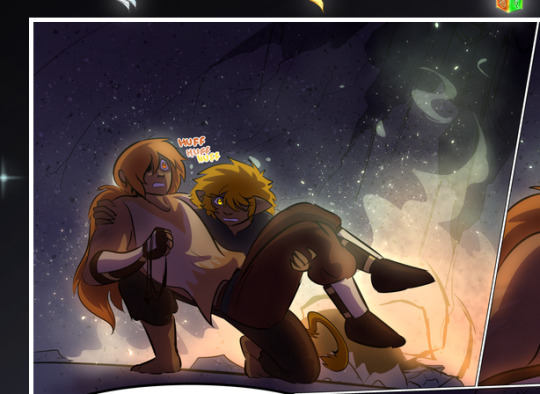
—where we now see that Falst's position is raised above Dainix's due to the way he's carrying him. (Points for continuity!) And, of course, we see the little "huffs" flowing from orange to yellow over their heads (where Dainix's head is higher than Falst's) to merge the sound of their breathing, which is absurdly clever because it emphasizes to the viewer how we hear two sets of huffing overlaying each other, not one. Absolutely brilliant.
(A few other notes of appreciation to that panel: beautiful glows around them, the sparks, the jagged silhouette of the spider legs, the lovely colors that have no right to make the area around a spider corpse that pretty, the excellent texturing on the cave walls plus perspective, the way Falst's movements imply Dainix's hefty weight, the natural posing of the characters, their on-point expressions that convey exactly how fuckin terrifying everything is right now, the slight glows to their eyes, and also they're just handsome boys <3)
Next up: Rain!!!! So well done! It's subtle enough that it never ever disrupts the impact of the focal point, but evident enough you can tell! And more importantly: THE MIST OFF THE CHARACTERS. Rain does this irl, it has that little vapor that comes off you and makes that little misty effect that plays with lighting, it's so cool-looking and here it's used to such pretty effect!
One of the panel captions says something about it blurring out all the injuries on the characters but like THAT AIN'T TOO BIG OF A PROBLEM when it gets across the environmental vibes, and also that'd be how it would look in real life too so like… outside viewer's angle is the same as the characters', mostly? my point is: that's the environment!!! that's the vibes, that's the feel! It gets it across and it does so in the most pretty way possible!
And another thing re: rain, the use of it to establish perspective, particularly in panels like this—

—where we can tell we're looking down at Tynan due to the perspective on the rain and where it's pointing. Excellent. (Also, kudos for looking down and emphasizing how Tynan's losing his advantage—lovely use of visual storytelling.)
Additionally, the misting here:
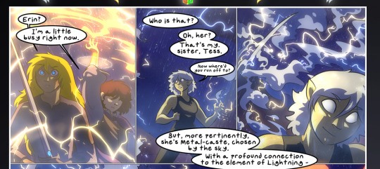
We see it most heavily in the leftmost panel, where it's quite foggy as you would expect in a rainstorm, especially in an environment with a lot of heat, but it's also lightly powdered on in the following two panels and tends to follow light sources, which makes complete sense given how light bounces off particles in the air.
A major point of strength in these too is a thorough understanding of lighting, like rim lighting, the various hues and shades, and an intricate understanding of how light bounces off surfaces even when they're in shadow (we'll see a faint glow in spots where characters are half in shadow, but that's how it would work in real life, because of how light bounces around).
Bringing some of these points together: the fluidity of the lines in magic, and the way simple glowing lines are used to emphasize motion and the magic itself, is deeply clever. I'm basically pulling at random from panels and there's definitely even better examples, but here's one (see this page https://comicaurora.com/aurora/1-16-33/):

First panel, listed in numbers because these build on each other:
The tension of the lines in Tess's magic here. This works on a couple levels: first, the way she's holding her fists, as if she's pulling a rope taut.
The way there's one primary line, emphasizing the rope feeling, accompanied by smaller ones.
The additional lines starbursting around her hands, to indicate the energy crackling in her hands and how she's doing a good bit more than just holding it. (That combined with the fists suggests some tension to the magic, too.) Also the variations in brightness, a feature you'll find in actual lightning. :D Additional kudos for how the lightning sparks and breaks off the metal of the sword.
A handful of miscellaneous notes on the second panel:
The reflection of the flames in Erin's typically dark blue eyes (which bears a remarkable resemblance to Dainix, incidentally—almost a thematic sort of parallel given Erin's using the same magic Dainix specializes in?)
The flowing of fabric in the wind and associated variation in the lineart
The way Erin's tattoos interact with the fire he's pulling to his hand
The way the rain overlays some of the fainter areas of fire (attention! to! detail! hell yeah!)
I could go on. I won't because this is a lot of writing already.
Third panel gets paragraphs, not bullets:
Erin's giant-ass "FWOOM" of fire there, and the way the outline of the word is puffy-edged and gradated to feel almost three-dimensional, plus once again using Screen or a variation on it so that the stars show up in the background. All this against that stunning plume of fire, which ripples and sparks so gorgeously, and the ending "om" of the onomatopoeia is emphasized incredibly brightly against that, adding to the punch of it and making the plume feel even brighter.
Also, once again, rain helping establish perspective, especially in how it's very angular in the left side of the panel and then slowly becomes more like a point to the right to indicate it's falling directly down on the viewer. Add in the bright, beautiful glow effects, fainter but no less important black lines beneath them to emphasize the sky and smoke and the like, and the stunningly beautiful lighting and gradated glows surrounding Erin plus the lightning jagging up at him from below, and you get one hell of an impactful panel right there. (And there is definitely more in there I could break down, this is just a lot already.)
And in general: The colors in this? Incredible. The blues and purples and oranges and golds compliment so well, and it's all so rich.
Like, seriously, just throughout the whole comic, the use of gradients, blending modes, color balance and hues, all the things, all the things, it makes for the most beautiful effects and glows and such a rich environment. There's a very distinct style to this comic in its simplified backgrounds (which I recognize are done partly because it's way easier and also backgrounds are so time-consuming dear gods but lemme say this) and vivid, smoothly drawn characters; the simplicity lets them come to the front and gives room for those beautiful, richly saturated focal points, letting the stylized designs of the magic and characters shine. The use of distinct silhouettes is insanely good. Honestly, complex backgrounds might run the risk of making everything too visually busy in this case. It's just, augh, so GORGEOUS.
Another bit, take a look at this page (https://comicaurora.com/aurora/1-15-28/):
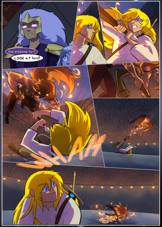
It's not quite as evident here as it is in the next page, but this one does some other fun things so I'm grabbing it. Points:
Once again, using different colors to represent different character actions. The "WHAM" of Kendal hitting the ground is caused by Dainix's force, so it's orange (and kudos for doubling the word over to add a shake effect). But we see blue layered underneath, which could be an environmental choice, but might also be because it's Kendal, whose color is blue.
And speaking off, take a look at the right-most panel on top, where Kendal grabs the spear: his motion is, again, illustrated in bright blue, versus the atmospheric screened-on orange lines that point toward him around the whole panel (I'm sure these have a name, I think they might be more of a manga thing though and the only experience I have in manga is reading a bit of Fullmetal Alchemist). Those lines emphasize the weight of the spear being shoved at him, and their color tells us Dainix is responsible for it.
One of my all-time favorite effects in this comic is the way cracks manifest across Dainix's body to represent when he starts to lose control; it is utterly gorgeous and wonderfully thematic. These are more evident in the page before and after this one, but you get a decent idea here. I love the way they glow softly, the way the fire juuuust flickers through at the start and then becomes more evident over time, and the cracks feel so realistic, like his skin is made of pottery. Additional points for how fire begins to creep into his hair.
A small detail that's generally consistent across the comic, but which I want to make note of here because you can see it pretty well: Kendal's eyes glow about the same as the jewel in his sword, mirroring his connection to said sword and calling back to how the jewel became Vash's eye temporarily and thus was once Kendal's eye. You can always see this connection (though there might be some spots where this also changes in a symbolic manner; I went through it quickly on the first time around, so I'll pay more attention when I inevitably reread this), where Kendal's always got that little shine of blue in his eyes the same as the jewel. It's a beautiful visual parallel that encourages the reader to subconsciously link them together, especially since the lines used to illustrate character movements typically mirror their eye color. It's an extension of Kendal.
Did I mention how ABSOLUTELY BEAUTIFUL the colors in this are?
Also, the mythological/legend-type scenes are illustrated in familiar style often used for that type of story, a simple and heavily symbolic two-dimensional cave-painting-like look. They are absolutely beautiful on many levels, employing simple, lovely gradients, slightly rougher and thicker lineart that is nonetheless smoothly beautiful, and working with clear silhouettes (a major strength of this art style, but also a strength in the comic overall). But in particular, I wanted to call attention to a particular thing (see this page https://comicaurora.com/aurora/1-12-4/):
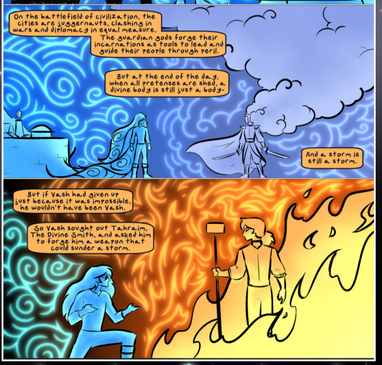
The flowing symbolic lineart surrounding each character. This is actually quite consistent across characters—see also Life's typical lines and how they curl:
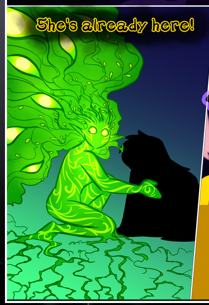
What's particularly interesting here is how these symbols are often similar, but not the same. Vash's lines are always smooth, clean curls, often playing off each other and echoing one another like ripples in a pond. You'd think they'd look too similar to Life's—but they don't. Life's curl like vines, and they remain connected; where one curve might echo another but exist entirely detached from each other in Vash's, Life's lines still remain wound together, because vines are continuous and don't float around. :P
Tahraim's are less continuous, often breaking up with significantly smaller bits and pieces floating around like—of course—sparks, and come to sharper points. These are also constants: we see the vines repeated over and over in Alinua's dreams of Life, and the echoing ripples of Vash are consistent wherever we encounter him. Kendal's dream of the ghost citizens of the city of Vash in the last few chapters is filled with these rippling, echoing patterns, to beautiful effect (https://comicaurora.com/aurora/1-20-14/):
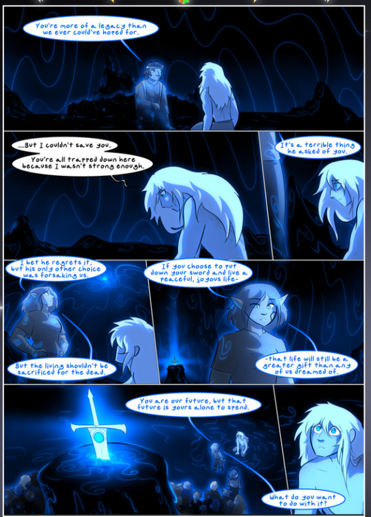
They ripple and spiral, often in long, sinuous curves, with smooth elegance. It reminds me a great deal of images of space and sine waves and the like. This establishes a definite feel to these different characters and their magic. And the thing is, that's not something that had to be done—the colors are good at emphasizing who's who. But it was done, and it adds a whole other dimension to the story. Whenever you're in a deity's domain, you know whose it is no matter the color.
Regarding that shape language, I wanted to make another note, too—Vash is sometimes described as chaotic and doing what he likes, which is interesting to me, because smooth, elegant curves and the color blue aren't generally associated with chaos. So while Vash might behave like that on the surface, I'm guessing he's got a lot more going on underneath; he's probably much more intentional in his actions than you'd think at a glance, and he is certainly quite caring with his city. The other thing is that this suits Kendal perfectly. He's a paragon character; he is kind, virtuous, and self-sacrificing, and often we see him aiming to calm others and keep them safe. Blue is such a good color for him. There is… probably more to this, but I'm not deep enough in yet to say.
And here's the thing: I'm only scratching the surface. There is so much more here I'm not covering (color palettes! outfits! character design! environment! the deities! so much more!) and a lot more I can't cover, because I don't have the experience; this is me as a hobbyist artist who happened to take a couple design classes because I wanted to. The art style to this comic is so clever and creative and beautiful, though, I just had to go off about it. <3
...brownie points for getting all the way down here? Have a cookie.
#aurora comic#aurora webcomic#comicaurora#art analysis#...I hope those are the right tags???#new fandom new tagging practices to learn ig#much thanks for something to read while I try to rest my wrists. carpal tunnel BAD. (ignore that I wrote this I've got braces ok it's fine)#anyway! I HAVE. MANY MORE THOUGHTS. ON THE STORY ITSELF. THIS LOVELY STORY#also a collection of reactions to a chunk of the comic before I hit the point where I was too busy reading to write anything down#idk how to format those tho#...yeet them into one post...???#eh I usually don't go off this much these days but this seems like a smaller tight-knit fandom so... might as well help build it?#and I have a little more time thanks to break so#oh yes also shoutout to my insanely awesome professor for teaching me all the technical stuff from this he is LOVELY#made an incredibly complex program into something comprehensible <3#synapse talks
786 notes
·
View notes
Text
had a dream dan got cancelled so he and phil hard launched in his apology video for damage control
#i’m not even on hard launch hill idk how much harder they can launch and frankly i don’t want to find out#i already know too much i wish i knew way less about them#we should all know less about each other#but the idea of dan getting cancelled and#phil going “maybe we can just distract them by acknowledging we’re a couple really casually while you’re apologising” is so good#phil so would he is damage control king#dnp#dan and phil#phan#dan howell#daniel howell#amazingphil#phil lester#danisnotonfire#yeet my deenp#yeet my deet#d&p#danandphilgames#schrödinger’s hard launch#phannie dreams#hbdnell#tmogar
281 notes
·
View notes
Text

Silly little Pitcher Chibi I doodled during a break from uni work ~
[love them and their MF DOOM mask]
[my chibis have animal crossing hands :>]
[fuck shoes]
#outlast#the outlast trials#murkoff corporation#ex-pop#idk how to tag them#yeet#I love my pyromaniacs#omg idea#atla fire nation x Pyromaniac & Pitcher & Coyle#ooooooh shiiiiiet#lightning bending coyle#and he’s part of a military state?#cursed au but I kinda need it#bro bloodbending Eddie? I mean he’s got the water nation haircut#air nomad marta#metal bending Chris#it’s all coming together ever so nicely#my art
93 notes
·
View notes
Text

I’ve read some people that took this to mean that Damian is blaming his father for how Gotham turned out. If it were this scene alone, then that would be correct and would be out of character for him. However, the meaning of this scene is followed by this scene from the previous issue…


First, we need to understand the subject being talked about, which is this scene right here. Damian skipped school and his responsibilities as Robin to volunteer at the Gotham Hospital. Batman is teaching Robin he can’t drop off his responsibilities to do what he wants. Damian isn’t just dropping his Robin responsibilities, but his responsibilities at school as well. The problem comes that from Damian’s perspective, his father thinks it’s justified for him to do the same at his age for similar reasons and at a less extreme level (he’s not taking a plane to London to train). Bruce had Alfred, so it isn’t as if he had to live the life of Billy Batson. It’s pride that keeps Bruce from admitting that his son is doing exactly what he did at his age.

The second bit of context to keep in mind is Damian’s inner conflict. The reason he’s volunteering at the Hospital is because of the little girl he was mean to at the Gala that got injured. He feels guilty and places blame on himself if anyone gets hurt on his watch. This is why he’s being told to open up to his father about this. Batman understands Damian has these feelings and we see this in Detective Comics as well.


However, unlike in Detective Comics 1092, Batman isn’t aware his son is battling guilt. He never saw his son being mean to the little girl at the Gala or was there when Damian and everyone was trapped inside the Gala. Not to mention one of Batman’s flaws is that he will become so attached to a case that he’ll miss if any of his kids are hurting unless they tell him. Damian told Batman in Detective Comics 1092, but not in Batman and Robin with Momento.
Something I admire about Johnson is that while he is dialing Damian’s maturity back to when he was younger, he is tackling subjects that had been neglected or poorly executed between Rebirth and the events of Robin by Williamson. While Tom Taylor barely scratches Damian’s guilt driving him as Robin, Phillip Kennedy Johnson is willing to dive into Damian’s guilt and see where it takes him in this story. Does that mean Damian will quit being Robin and pursue being a Doctor? I’ll let Robin answer that question with this and three simple words:


Someone has to. Someone has to look out for his father, his injuries, his care, make sure someone is by his side and be willing to take the mantle and company if Bruce cannot be Batman anymore. If not Damian, who else will? He might be volunteering at the local hospitals or drawing comics, but his future is dead set on being Batman after his father because… someone has to.
#dc comics#dcu#dc universe#dc#batman and robin#batman#Robin#damian wayne#bruce wayne#personally Idk why anyone would translate Damian calling out on his dad’s hypocrisy to mean he blames his dad for Gotham being a hellhole#Damian didn’t pull his badge out and give it to his dad. He just decided to volunteer at a hospital#He still drove his dad to the Bat Cave; still cared for his wounds; still took his bike and yeeted to the signal. He can do both
76 notes
·
View notes
Note
can you infodump about the au pairs in your fairly normal parents au because I’m love them :>
Sure thing! Guessing u meant devs weird robo dads specifically, apologies if not lmao-
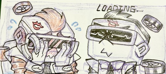
(I had…. WAY more to say about these dudes and thier role in the AU than I thought I would… 😳)
The two au-pairs (or au-fairs lol) assigned to raise and protect Dev from birth are named #C0C0C0 and #FDD700 (spoken out loud like serial numbers) or, as baby Dev nicknamed them for ease of pronunciation- “Silver” and “Gold”!
(He even started to change thier appearances to make them easier to identify and tell apart, but Dale would restore the two to their “default” color scheme whenever he noticed- a silent stand-off he and Dev had for years)
Though their robotic and monotone nature has always made it difficult for them to reciprocate affection, Dev gets to know them well enough that he can pick up subtle changes in thier voices and expressions (even through the big-aaa visors lol) as well as subtle diffences in thier personalities that are invisible to most people (silver is slightly stricter, while gold is more lenient, and emotes more frequently than his partner)
At first, these two pixie-esque little robo-servants are completely blindsided by thier new directive- NO ONE in fairy world knows how to take care of a baby, and all the data available on it is thousands of years old- but they are nothing if not loyal, so they do as Dale asks and keep the baby fed, clean, and most importantly, quiet.
(They do great with the first two, but fairy babies gonna fairy baby, so Dev is still prone to hyper-destructive magical outbursts)
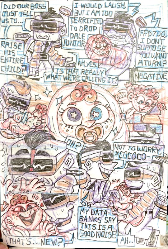
(Due to Devs ability to glimpse into the future, even as an infant, the moment Dev first saw his new caretakers, he was granted a vision of the two Pixies caring for him and playing with him, so Baby Dev was quick to show them affection, much to Silver and Golds surprise and confusion. )
ENTIRE ass backstory and more doodles under the cut lmfao 😂
The first few months of raising Dev were ROUGH, and mostly just involved these two poor incompetent pixies getting thrown around by whatever magical outburst the newborn had for them that day. When first assigned, the two of them gave serious consideration to taking shifts, but Dev quickly made it clear both of them were necessary- and when Dale finally DID get fed up with the CONSTANT interruptions to his work and threaten to replace Sliver and Gold with different Au Pairs, the two pixies BEGGED for another chance, though neither of them was sure why they did so, since they had been given- objectively -the most difficult assignment of any au pairs in history.
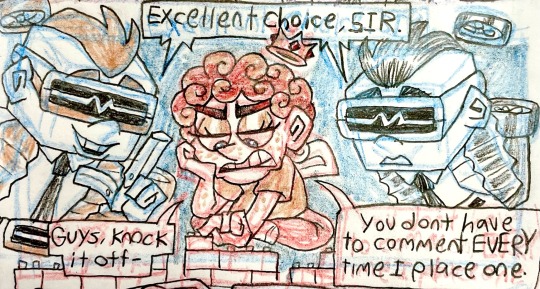
As dev got older, he became increasingly attached to his au pairs, and as much as they tried to stay professional, Silver and Gold couldn’t help but grow incredibly attached to their little curly-haired not-son as well. The older dev got, the more honed his magic became, and the more offended he started to get by his fathers constant absence- meaning it became much more difficult for the AU pairs to keep him away from Dale (thier main purpose by this time)
Starting magic/ clairvoyance lessons helped keep dev occupied, and the AU pairs did their best to entertain him, but kid Dev became increasingly demanding of his fathers time and attention, two things Dale gave him as little of as possible.
The first time Dev disappears without a trace, Silver and Gold are MORTIFIED- they rally every other AU pair they can to help find him (I think they’re a pseudo-hivemind? Like can transfer data and frequently speak in unison but it’s more akin to a Bluetooth link than an actual single shared consciousness lmao)
Ooooonly to find out it was just the other fairy kids “abducting” him to hang out and get popsicles.
Embarrassed that they had made such a fuss and gotten the well-meaning fairy kids in trouble, the next times silver and Gold sense the children attempting to “kidnap” their friend, they develop a tendency to politely look the other way- tho of course they trail Dev in secret bc they’re still worried- eventually Hazel insists that devs “robo dads” should come hang out with them too, and neither AU pair had ever experienced “bitter-sweetness” until being called that sobs
Even into his early adulthood, silver and gold remained loyal to Dev, though he did request they do more “checking in” than “constant hovering”, as they did when he was a child. By this time, however, silver and gold’s personalities and mannerisms were NOTICEABLY unique when compared to the other AU pairs, sort of messing up the whole “perfect unison” thing the rest of thier species prides themselves on, and ostracizing them both, however mildly.
Sooo After Dev had his huge falling out with his dad and left in a huff after magically (only SORT OF accidentally) trashing his fathers office, silver and gold INSIST on being the only Au-pairs sent to retrieve him, despite Dale initially wanting to send every single one out to search and bring divination home.
When they find him, Dev has already moved into the guest bed at the wells house, and is talking to Hazel about going with her to godprenting school (something dev is not actually INTERESTED in bc he’s terrible with kids, but he HAS to get away from his dad, and Hazel had been begging him to quit his shitty fortune telling job and come with her for YEARS)
Instead of taking Dev back to his Dad as they’d been instructed, the three of them have the most difficult, honest conversation they’ve ever shared, Dev’s REAL dads finally accepted that thier little boy was all grown up, and needed to be set free.
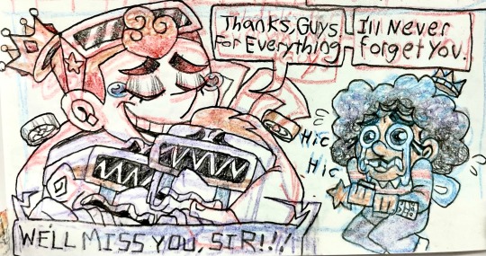
(Hazel is how I looked drawing this tbfh)
CURRENTLY, Silver and Gold are Happily retired! Figuring they would be fired for “failing” to find and return Dev anyway, they both mutually decide to resign from servitude to the Dimmadome corporation. As the first two au pairs to EVER do so, Dale wasn’t really sure what to do w them, but with hundreds of other au pairs still serving him, he saw no reason to refuse, simply opting to strip them of thier mechanical upgrades so they weren’t at risk to “sell off the company’s tech secrets” or whatever-
Thier new forms took some serious getting used to, but modern gold and silver more or less look like regular fairies, save for their big silly cube heads and still-robotic voices lol. After the two of them learned how to love a child, the next logical step was learning to love each other. Currently, this universes equivalent of au pair 1 and 2 spend their days happily married (for tax purposes) balancing check books, doing paperwork for fun, checking in on thier son the agreed upon number of times per month, and gambling with thier retirement money (tho they frequently have to switch casinos once the staff notice the two of them are little square computers that can easily count cards lmao)
In the fairyworld equivalent of Florida, At sunset, it’s not uncommon to hear identical, robotic laughter echoing along the beach 🩶💛
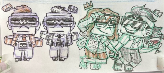
To anyone who made it down here, Ty for reading! Hope u enjoyed my feral babbling 🥰
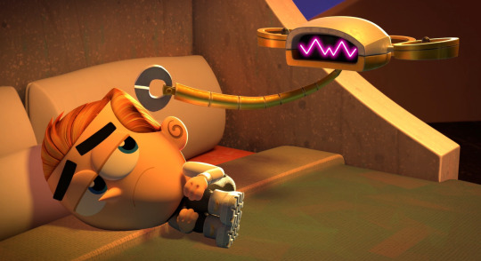
Sidenote: I can’t Beilive THESE THINGS made me fuckin well up at WORK lmaooooo, we really in the autism Hyperfocus trenches now, huh 😂😂
#fairly normal parents au#drabbles#fop au#divination Dimmadome#dev dimmadome#fop AU pairs#o pairs#idk what else to tag this#yeeting it into the wind so that it leaves my gd skull lmao
69 notes
·
View notes