#i work in squares and rectangles exclusively
Explore tagged Tumblr posts
Text
HSH House Floor Plans
So I was trying to write something and I was having a hard time visualizing it. So I decided to sketch out what I thought the HSH house looked like to make it easier. Originally it was just a doodle for myself but then I got carried away and ended up with way more detail than I set out to do. So I’m just gonna post it here just for fun!
Starting out on the bottom floor:
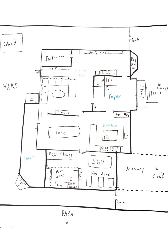
(I know these lines aren't straight. I know things look wonkey. Yes, it bothers me too. But i'm lazy and I'm not going to do it neater. I didn't have any graph paper, okay?)
This is what I envision when I write out the house (second one, not the original townhouse).
Starting on the sidewalk I have you walk up a few steps to get to the front door. The foyer is where the staircase goes all the way up so you can see the top floor, so it’s open ceiling there. Aside from that tiny alcove where the front door is. A little closet under the stairs for your shoes and coats is about the only real ‘feature’ aside from high ceilings (and poor murdered thermostat).
Moving up, we go into the living room and come across the bay window. Or as I like to call it - Sky’s sleepy spot! It gets a lot of light and it makes him feel like a happy remlit to sleep there. There’s a big bookcase and a small sofa for the anti-social too.
There's a bathroom (because it’d be weird for there to be no bathroom on the first floor) but I was too lazy to map it out so use your imagination there.
Then we hit the main area of the living room - the TV spot! The TV is mounted above the fireplace and there’s a shit ton of space to chill thanks to a very nice sectional sofa. Coffee table to hold your drinks and snacks. There’s a shelf unit behind the couch for all their games and movies and a door that leads outside.
Into the Kitchen/Dining Area!
The Kitchen is huge and has a shit ton of counterspace and cabinets. There's what's almost an industrial sized fridge/freezer and two stovetops and ovens. And of course what kitchen would be complete without an island and a breakfast counter.
The dining area probably has, like, fine china in cabinets or something but I was too lazy to draw it in so just imagine that it's very classy. All I could muster was drawing that huge table. No chairs tho lol
There’s a door into the garage. Take a few steps down to make it more even with the street and there’s space for the cars and the bikes to the right. To the left there’s a huge pile of miscellaneous shit Time brought from the old townhouse and things that Legend can’t store in his room. The lower left of the garage is sectioned off by an invisible line that Four draws by glaring at you when you cross it. Enter at your own risk. But he does permit people to come in to wash their clothes in the laundry machines/dryers behind his space.
Out back there's the porch and shed. I didn’t draw the furniture, grill or tree (or treehouse) but rest assured it’s there. The yard is fenced in but any assassin worth their salt can jump it, so Time has garden lights out on the perimeter to keep it from being too dark to see at night.
The Second Floor:
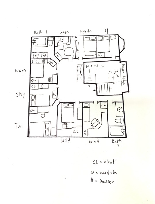
The second floor is basically all bedrooms. So. many. Bedrooms. I almost didn’t fit them all because holy sheet there are a lot of boys in the house and they all have to live on the second floor. Even Wind because I’m pretty sure he’s on the second floor with the others in the new place.
Going clockwise from bottom right;
The small bathroom. Not as big, not as nice, but still coveted. Time made sure to have more than one bathroom in the new place because the boys threatened mutiny if they all had to keep sharing one. And to be fair, it was a rather big oversight the first time. If Time had gotten the ten kids he’d wanted he would have had a lot of unhappy campers.
Wind’s bedroom is a mess. He chose this bedroom because it shared a room with only one of the others and it was close to a bathroom. He opted for a single bed to have more room for his computer set up, since he’d downgraded from the townhouse in terms of bedroom size (and he wasn’t going to need a double anytime soon). He’s got a big honking chair because he spends so much time in it and mounds of junk on the floor because he doesn't have a dresser. The X is the forbidden zone where his clothes go to die and feed the colony of bacteria and teenage boy germs.
Wild’s bedroom isn’t really optimized. A random dresser on the wall leaves a lot of dead space around. He has a lot of stuff and not enough places to store it so a lot of it ends up between his bed and the wall. It smells nicer than Wind’s pile though. Instead of a desk he has a vanity, but due to disorganization it houses his mixing board now.
Twilight ended up with a corner room because he likes having a lot of light. His bed faces the windows because it helps him wake up in the morning to have the sun beam its light directly into his retinas. He’s got a desk and a closet that he keeps pretty clean. He didn’t know what to do with the space behind or in front of his bed so he got a thin shelf and shoved it in. He’s not super satisfied because it feels like he’s wasting space but he’s got other things to think about these days.
Sky’s room is neat and cozy. Thanks to the weird corner he had a hard to optimizing his space but he figured it out. His bed faces the door because unlike some people he actually doesn’t appreciate the sun trying to burn his eyes in the morning. His desk is on wheels so he tossed his chair away and just drags it to the edge of his bed when he actually needs to use it. It saves space and Sky gets extra time in his bed. Yes, he is a master of his craft.
Warriors opted for a very small desk so he could better fit in another wardrobe for his clothes. The room is smaller than he’d like but it’s close to the nice bathroom and that’s what’s important to him. (not pictured it the full sized mirror that hangs on the wall in front of his closet). Being a social creature, Wars doesn’t spend much time in his room so he doesn’t need it to be big. And after living in the barracks he’s more than used to living in small spaces. The biggest challenge for him was finding enough room for his clothes. Thankfully he cycles through Time’s wardrobe so it’s a non-issue.
The bigger bathroom is bigger and better and almost always has a line in front of it in the mornings. (That's what the couch out in the hallway is for. Waiting.)
The rooms on this side of the house are actually smaller than the ones on the other side and don’t have closets, which was a big thing to consider when the boys were picking rooms. Despite the smaller space, eventually Legend and Hyrule chose these two because they are adjoining, which makes it easier for them. Legend's room is mostly storage aside from his signature rug where he performs his work rituals and his altar, which he keeps pristine among the clutter.
They both sleep in Hyrule's room. Legend respects Hyrule's space and keeps his clutter to his own room, only using the bed. The chest at the foot of the bed holds most of Hyrule's things but it has to be either dragged out to be opened because it’s so close to the wall, or you have to smush yourself against the wall. Usually Hyrule smushes because he’s too tired to go digging around. But he doesn’t have to go into it often because his day-to-day things are kept in the thin dresser along his wall. It’s very small but Hyrule lives frugally and doesn’t own a lot aside from his work clothes, which he hangs behind his door to keep them from wrinkling.
Four won the corner room from Sky in a rock-paper-scissors dispute because of the window. It's an impossibly cozy nook that Four loves to read at when the weather is gray and a bit dreary. It really sets the mood. But truthfully he hadn’t really wanted the room because of the window. He likes it because it puts him as far from everyone else as possible. Not that he doesn’t love the guys but Four is private and he doesn’t want to deal with people walking past his door and peering in randomly. All the spaces above, below and around are as quiet as he can get so the corner room was worth fighting for. The privacy is extra nice when he has a guest staying over. The lack of space isn’t bad either since he doesn’t have much to begin with and anything he actually needs he can just store in the garage.
The Danger Ledge is a small space between the banister and the large window at the front of the house that lets in a lot of natural light. It's called the Danger Ledge because you have to climb around to get to it. Many a boy was bruised in their constant endeavor to climb the Danger Ledge, thus it earned it's name.
The Third Floor:
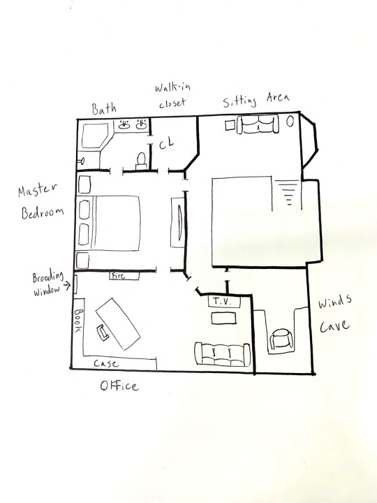
Upon hitting the top of the stairs you can find a little seating area. It’s just a quiet place to sit that doesn’t belong to anyone else and also is away from everyone else. For the occasional need to decompress without another presence.
Then there’s the master bedroom. And god, is it big. The bed is basically the size of one of the bedrooms downstairs. There is a dresser with a big TV there for when Malon visits or for when Time needs to watch his soaps without judgment (joking. Maybe).
And of course he has a huge walk-in closet and private bathroom. It’s got the biggest, nicest tub and no one else is allowed to use it. Everyone else is very bitter about it.
His office is opposite that. Big desk and a huge bookcase to hold his old cases, a fireplace and brooding window for ambiance. And another seating area, this time just for in case any of the boys pay him a visit. There’s also an armchair next to the couch so he can sit there and discuss things on the couch that I forgot to draw in. Oops lol
Then the last room is the newest. Originally it was another storage room but since Winds been helping so much and his newest rig needs a lot of space, Time gave it up so he could have his own space. With the stipulation that he keeps it neater than his bedroom
#hsh au#townhouse au#this is just my interpretation#probably not truly accurate but it was fun to draw out#the bedrooms were my favorite part of this#they were a real challenge because despite the size of the house having NINE bedrooms on one floor was killer#I tried incorporating hallways but i couldnt do it#i work in squares and rectangles exclusively#also those maybe unidentifiable things in some of the bedrooms are chairs#sorry i cant draw
11 notes
·
View notes
Note
Hi I hope you're doing well! :)
I just got myself a SFTH Patreon subscription as an early Christmas present (yay!) and am still figuring out how it works. Since you're Tumblr's resident expert on such things, I wondered if you could explain how one might find the exclusive plays and DnD streams?
Thanks so much! (Though you don't at all have to answer)
Hello!! I’m so happy to hear you got patreon :D Congrats!! it’s very fun
The exclusive longforms, dnd and more are linked in sfth’s pinned post on patreon :D
When you open the app, you’re taken to a general “all creators page” with recent posts from any subscriptions you have.
To get to sfth’s actual patreon page you click on the square at the top with their logo on it, and then the square becomes a rectangle that says “shoot from the hip” - click on that and you’ll be taken to their page :)
(I’m pretty sure if you have multiple subscriptions you see them all listed at the top but I’m not sure- but that’s why I think it’s like this :))
When you’re taken to their page their pinned post is the top one, and it’s got up coming streams and the links to most things (including the exclusive longforms and dnd!)
If you need any more help or this didn’t make sense just ask!! I hope this helps <3
have fun!!
#shoot from the hip#Sfthpatreon#sfth patreon#sfth asks#sfth faq’s#thank you for the ask!#I feel so honoured that you’d ask me (/gen)#very happy to help :)#<33
23 notes
·
View notes
Text
Computers in Flatland
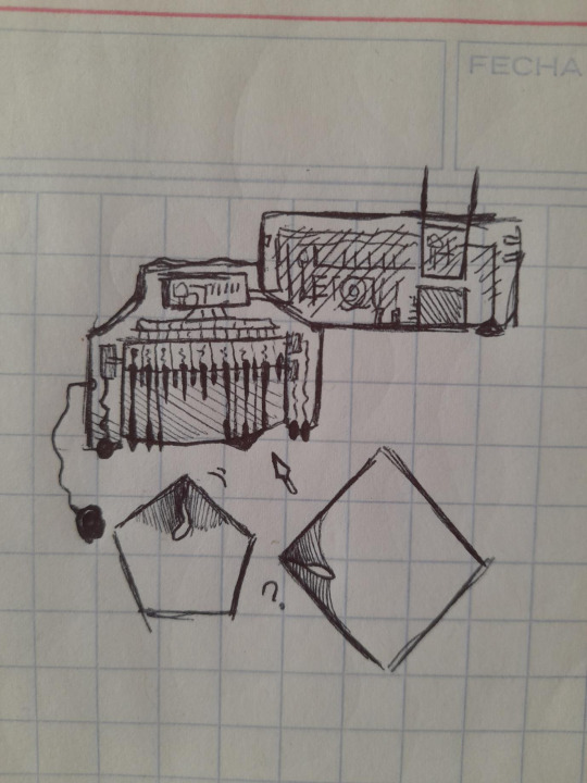
A confused Square man watching his Pentagon son use a computer. [descriptive id soon i still cant figure out how to word this]
I'm going to say some very brief things about modern Flatland computers, because I don't even understand how Planiturth computers work. [I'm learning programming, NOT electronics]
The computer itself is a rectangle [in this case actually an irregular pentagon to fit with the screen] with some holes for additional devices' cables like printers, microphone, speakers and anglephones, and a square shaped pocket for storage devices like chips and peridisks [their equivalent of USBs, the chips are older and square shaped, and the peridisks are polygonal]
The computer has one or two antenna and a connection to electricity. And a good thing about artificial things is that they can have plenty of holes.
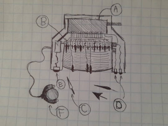
The interesting part of the computer is the screen. This is connected to the computer itself through wire attached to the screen chip.
[A: Screen chip]
This is the large rectangle at the back or north of the screen monitor. It reads the information that the computer sends to it [messages from the internet, for example] and releases the keys needed to write the message on the screen. It also reads the input given by the user [for example, writing a reply] translates it into computer-language and sends it to the computer to do whatever it needs to do with it.
[B: Screen keys]
These are the needles directly below/south of the chip. They have springs underneath. They write words and rudimentary images [example in first image where on the right side of the screen there seems to be a Square's angle] for the user to see, by extending the springs in such a way that the needles poke the screen [which is not completely rigid but a somewhat malleable material] creating a certain relief or bump along with a brightness depending on how hard the key presses against the screen [harder or more vertically expanded= brighter] or extends its tip [extends it horizontally, creating bigger angles the more it expands]
This is usually used as output only, but in some cases such as in a menu, the user may press the bumps to select an option.
The first computers had less thick screens because they didn't need keys. They were exclusively designed for Circles and employed only Brightness. It appears that this new model is not only more accessible for those who do not have Sight Recognition, but also cheaper.
[C: Stylus]
Also known as cursor. This is used to write on the screen. Some people with acute angles may be able to write with their own angle, but for the wider-angled this is easier to use.
The screen is able to pick up on the indentation made on it and read it as text.
[D: Enter and Delete]
These two buttons can have different functions depending on context. In reading mode they can be used as arrows to scroll through long text that doesn't fit on the screen. In newer computers that come with a Scroller, these can take different functions such as copying text. In writing mode they can be Enter [to signal you're done writing] or Delete [to erase the last letter]
[E: Mode button]
The mode button allows the computer screen to change modes- usually between Input or 'writing' mode [where you can use your stylus to write text or give orders to the computer] and Output or 'reading' mode [where the computer displays what you need].
Usually the change is immediate and automatic, like if you just ordered the computer to open tumblr it will switch into Reading mode instantly. But it can be useful if you're in a messaging app and want to switch between reading your friend's message and writing a new reply, etc.
[F: Scroller]
The Scroller is a new addition to Flatland computers, and similar to a computer mouse in Planiturth. It is connected to the screen by a cable and consists of a circle with more than half of it enclosed in a shell with 2 buttons. The circle can't pop out of its shell. The circle is the scroller itself, rolling it will scroll through the screen's output text if it's very long. It has the Enter and Delete buttons on it.
46 notes
·
View notes
Note
dearest creator of a comic that includes a lot of ships. how draw sailing vessel???? (do you have any advice beyond Look At Reference Picture And Cry. because that is my current strategy)
thanks sorry
I'm afraid the best way to learn how to draw something is Look At Reference (and hopefully not cry too much!)
I'm not sure what kind of vessel you're interested in--an ocean liner is different from a man o war is different from a caravel is different from all the whaleships I draw, but whatever sort you're interested in, get a lot of references.
Tracing is a really good learning tool! Take your refs and just trace the basic shapes. Ultimately ships are...basically cylinders/rectangles with various edges shaved off or flared in certain ways. But tracing the basic shape can help you internalize an understanding of the Bones of the thing. And can also help with drawing them in different perspectives if you're thinking 'it's just a rectangle with some edges shaved off and some pointy bits'.


Sailing, as an activity, also has a lot of diagrams that can be referred to. The information on them can be overwhelming, but it's good to be able to identify basic parts of the ship (such as the different masts, different sailing rigs, the names and locations of the sails themselves)


Not every ship is going to carry that much sail nor all at once, and it'll change depending on weather conditions, sailing objectives, etc. I'd also say that if you were planning on including all of those lines in the first diagram in your own art that would probably be...excessive. But it's helpful again to have something broken down to better understand your own references / how you want to draw the ship in various conditions. Books like the Young Officer's Sheet Anchor by Darcy Lever are good too--it has really nice diagrams of a lot of different components of a vessel, if you wanna get granular.
This isn't the most accessible piece of advice, but if you have the opportunity to dabble in actually sailing, try it! I don't sail professionally; I am the most seasonal of hobbyists and I'm feeling particularly rusty right about now, but I found that when I started sailing I gained an understanding of how things worked when otherwise just reading about it or looking at images was pretty inscrutable to me. Being able to actually see how something works and feel it and handle it was enlightening. In lieu of that, while it's harder to find video tutorials for tall ships compared to sailboats, those exist too! Here's one.
Granted my sailing experience is exclusively on schooners and I still have no idea how square riggers really work. If I ever get the chance to learn on one and look back at my comic I'm sure SO many things will be wrong. There are absolutely issues with my ships in that comic. Sometimes I forget what sails I set from one page to the next. Yadda yadda yadda. That's why I'm always whispering 'don't look too closely at my ships' @ any sailor-inclined person who's reading said comic.
Which ultimately brings me tooooo--I don't know what your aims are in drawing sailing vessels, but my aims are not to draw a perfectly accurate depiction of a ship. I'm not making diagrams. I'm trying to get the spirit of the thing, and hopefully in a way that looks......not completely incorrect. Sometimes photo references or sailing diagrams can be really challenging to parse. What's helpful to me is identifying what's Most Essential to getting my point across. And one way to find out what's most essential is through a sailor's simplification of a ship.
I love model ships for instance! I love being able to see and handle something in a three dimensional space, and look at how things connect even if it's not an exact replica. Here's mine that I pull out sometimes when I'm trying to figure out how to lead rigging:

I also like collaborating with my deceased whalers of whom I am so fond. They have a lot to teach me, including--with those who were more artistically inclined--how to condense the visual information of a ship. If you can find the historical art done by sailors (such as in logbooks or diaries), especially amateur art, it gets to the heart of the thing without being too much. These men were intimately familiar with the ship and how it functioned, so I look to them to better get a sense of what they felt was most important to include. Here's a couple from 19th century whaler journals that have absolutely been helpful to me.


I hope some part of this was helpful! Good luck drawin boats!
28 notes
·
View notes
Note
you’re right. research is awesome.
the article you cited refers exclusively to committed patients, who absolutely should not be engaging in sex acts during their time in hospital. i think we can all agree on that (although even then, it does list masturbation as a common regressive behavior).
there are other kinds of age regression. the definition you provided is one example, but it is not universal. citing freud is wildly outdated.
according to clinical psychologist Joshua Klapow: age regression can be both involuntary and voluntary. For those who involuntarily regress, Klapow says this often occurs as a result of a trigger, such as “stressful or traumatic environments or experiences that position a person in an uncertain, unfamiliar or perceived unsafe situation.” He defines voluntary age regression as the “willful release of age-appropriate behaviour to escape present reality”.
according to WebMd: Age regression is a form of therapy that encourages you to access and relive your memories by reverting to a younger state of mind.
according to VeryWellHealth: Age regression can be unconscious (involuntary) or conscious (voluntary) behavior […] For some, age regression is a deliberate choice used as a coping mechanism for past trauma, anxiety, or depression. Others voluntarily adopt childlike behaviors because it’s a way to deal with stress.
it’s almost like i know what i’m talking about. and maybe have studied it in a clinical setting. and may even be speaking from personal experience as an age regressor.
thank you for correcting my language in reference to being (in)voluntary, but coping mechanisms are coping mechanisms and are tied to trauma responses. rectangles and squares people.
when a child masturbates it is just a bodily function with no sexual undertones at all as they are figuring out how there bodies work as a child naturally does as they develop. so what are you trying to say? that children are sexual? because that's what u seem to be insinuating. also studying inpatients are the norm bcz its infinitely easier to monitor them versus outpatients? and if ur not studying patients at all that is just unethical bcz there needs to be consent there too.
and WebMD and verywellheath? those are not credible sources especially for a clinical student.
try again later ! 🎱
0 notes
Text
How Much Is It To Rent?
We hope that Alexander Zhidkov owns some of these homes that he designs. Squares, rectangles, and sharp corners have always seemed to represent robust modernism, and display a certain type of almost exclusivity in the works of design that they are used in. Not to boil it down to be as simplistic as “I am pointy bro, therefore, I am expensive.”… But essentially that’s what the human mind seems to…

View On WordPress
#Air Bnb#Alexander Zhidkov#Beach#Billionare#Buy#Coast#Design#Destination#Home#House#housing#Location#Luxury#Millionare#Ocean#Oceanic#Price#Rent#weather
0 notes
Text
LGBTQ Manga Review — I'm in Love with the Villainess Vol. 1 (Manga)
A New Look on a Compelling and Innovative Series

A manga adaptation of one of the best and queerest Yuri light novels I have ever seen, what is not to love! As a massive proponent of the light novels, I eagerly followed I'm in Love with the Villainess began serialization in Comic Yuri Hime last year. I am thrilled to get my hands on the first English volume, and now that it is finally out (digitally at the time of writing), I am equally delighted to read over the start of Rae and Claire's journey once again. Getting to see my favorite isekai protagonist and her bratty noble crush in full illustrations is terrific. However, it does not make for a completely flawless work.

I'm in Love with the Villainess follows Rei Ohashi, an avid otome gamer who dies and is reincarnated as Rae Taylor in her favorite game, "Revolution." Rather than chase any of the game's handsome bachelors, all students at the Royal Academy in the European-inspired fantasy world, Rae heads straight for her favorite character, the game's villainess! Rae begins to relentlessly tease the bratty and elitist Claire, much to the latter's frustration. Soon a rivalry forms between the two girls, but despite Claire's taunts and coldness, Rae is determined to stay by her side and protect her.
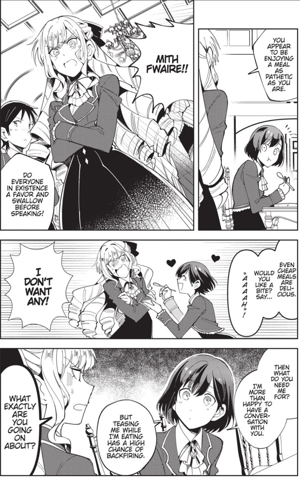
The increased focus provided to Claire and Rae's early relationship will be noticeable to light novel readers. While Inori's writing focuses mainly on world-building in the first several chapters, the manga makes the wise choice to condense much of this information for the sake of reading. Blocks of exposition work poorly in the manga compared to prose. However, establishing a setting is not completely thrown out the window. There are several small conversations and explanations of key aspects of the world. After quickly setting the story, the characters are left with room to explore.
Claire and Rae are the most enjoyable part of this manga. Rae is eager and doting, with a touch of masochistic. On the other hand, Claire is more arrogant, often looking down on peasants like Rae, and is continuously infuriated by her affection. A hilarious rivalry starts to spring up between the two, with Claire pranking or mocking Rae and then getting outraged when she revels in the attention and teases Claire by expressing her undying affection.

These interactions also further the story. They establish the dynamic between our two heroines and add more detail to the political situation and tensions between the commoners and nobility, the series’ main plotline. Interestingly, while Claire may believe commoners inferior, she also sees it as her responsibility to protect and instruct them in her very elitist way. Noticeably none of the torments she subjects Rea could ever cause permanent harm or damage. It is a fascinating insight into this character's mental state, and even in the first volume seeing her start to change and become more aware slowly is fascinating.
Much of the rivalry is comedy and often plays out as such. However, some readers may find it slightly off-putting and understandably see the dynamic as Rae sexually harassing Claire. I strongly encourage you to give this series a chance. This book will undoubtedly be the worst volume of an incredible series. Once I'm in Love with the Villainess breaks into its stride of exploring queer and socioeconomic issues, some point in the next volume based on reading the serialized chapters, I promise it will become a quick favorite. If you know you may not be able to overlook its immediate faults during the wait, consider holding off on the mage until after the second book is out and get them together.
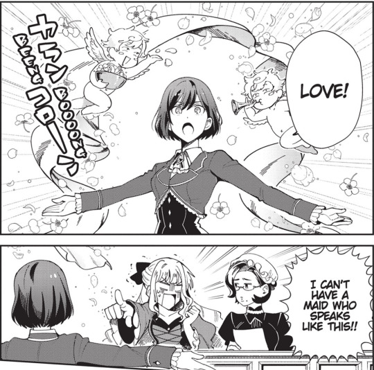
Much of the previously mentioned content is the same or strongly similar to the light novels, perhaps a touch more emphasis on Claire's early hostilities; however, there are some significant points unique to the manga to consider. For one, Aonoshimo's artwork is fantastic! The characters and backgrounds are distinct, with only slight adjustments for the more comedic or dramatic stylistic choices. No matter the panel's tone, though, it is always easy to read without oversimplification. Aonoshimo also relies on very standard square or rectangle panels during most of the manga, but occasionally produces more dynamic boundaries and layouts for action and service scenes. Lastly, all the characters are on full display. It suddenly becomes a lot easier for light novel readers to picture their favorite moments. It is a lovely treat for returning readers as the visuals aid the characters, allowing us to clearly see Rod as the strong-willed if slightly aloof prince and understand how Maximillion Pegasus-cosplayer Thane is the most unpopular character in the fictional otome game when they are displayed visually.

There are some other vital factors to consider when reading the manga. For one, every character's personality was dialed up a few points, with Rae being a touch more physically affectionate and masochistic and Claire more easily exacerbated. However, the manga and the English translation takes many quirks and exaggerates them further, reducing the series’ performance. For example, while Claire's actions show the complicated relationship to commoners described above, her dialogue contains a surprising amount of vitriol and vulgarity that stands out notably.
Additionally, while Rod is usually the perfect if slightly detached prince acting as the occasional voice of reason in early chapters, his dialogue here appears laughable indifferent and meanspirited. As I'm in Love with the Villainess is one of a very few series that I follow the monthly serializations of in magazines, I was surprised to see this dialogue, as it did not stand out to me in the Japanese version (admittedly, the manga did overblow everyone's personality to some extent for comedic effect). I feel it changes the characters for the worse — do not get me wrong here, calls for "literal translation" are as unfavorable as they are uninformed. Still, the work feels careless at times.

Finally, there is the service. While the first volume contains virtually no romantic caresses or sweeping panels of scenery we associate with Yuri, there is a fair amount of salacious content. Of course, there are Rae's desperate and overblown expressions of admiration for Claire and her slight case of masochism. However, towards the end of the volume, Aonoshimo shows some skin. In one scene, Rae helps Claire get dressed and very openly admires her body, accompanied by some close-up panels of her back, stomach, and butt. There is also a very exposed bathing scene, although light covers the most explicate bits. It is obviously garish, though it tonally fits with Inori and Aonoshimo's more comedic manga interpritation and even includes some wholesome interactions with Claire and Rae alongside the sexualized comedy. Reader's millage will vary here, but I enjoyed it.

This first outing of Aonoshimo's I'm in Love with the Villainess manga adaptation is very likely to be the weakest entry in a phenomenal series to follow. The manga does a fantastic job of bringing the original light novels to life in a new visual format. The artwork is excellent, and the story condensed with a slightly different focus that maintains the feel of the original while providing manga audiences with entertainment that does not feel constrained or lacking. However, the gradual pacing of the plot and the main characters' relationship means that the volume leaves off before showcasing the meat of the series and most of its best features. There is a little bit of the stumble out of the gate, and both the publisher and the manga will likely have to course correct in future volumes or else risk destroying the development and voice of the series remarkable characters. I still recommend the series, but unless you are a diehard fan of the original like you, you might wait a year or so until we have the second volume and can enjoy a more complete vision of Inori's intricate and groundbreaking story.

Ratings: Story – 8 Characters – 7 Art – 9 LGBTQ – 9 Sexual Content – 6 Final – 8
Check out I'm in Love with the Villainess (Manga) Vol. 1 today: https://amzn.to/3wTSJ9R
Thanks to Joshua Hardy, Courtney Williams, Peter Adrian Behravesh, and the rest of the team at Seven Seas for their hard work.
Help support future Yuri news and reviews, and get access to exclusive content by subscribing to the YuriMother Patreon
#yuri#lgbt#reviews#lgbtq#lgbtq+#queer#gay#romance#art#manga#anime#i favor the villainess#i'm in love with the villainess#wlw#girls love#gl
212 notes
·
View notes
Note
i would die for a "how to use html and css to format ao3" lesson from you 👀 no pressure but i'm genuinely in awe :)
Hello! So sorry it’s taken me ages to get to this.
It's no pressure at all! I have tried to cover the basics of HTML/CSS on AO3 here, and instead of writing very extensively about the syntax which is very Google-able, I have tried to include little tips and tricks that have come in handy for me.
This, by no means, is a complete guide but I hope it can get you started with HTML and CSS on AO3!
It got pretty long, so the answer’s below the cut.
Okay, so let’s start at the very beginning, shall we?
What is HTML and CSS?
Well, HTML is Hyper Text Markup Language and CSS is Cascading Style Sheets.
But that is something that probably doesn’t help a lot, so to put it very simply, HTML provides the structure of a webpage while CSS does the styling, that is, fixing how and where the elements should exist, how to shape them, how to space them, all so that the webpage looks great.
Something to keep in mind is that all web pages can run only on HTML but the end result is not going to be something that’s nice to look at. In fact, without CSS, the page might not even make a lot of sense. Here, take a look at Tumblr itself with all CSS disabled (there’s a very useful extension called Web Developer that allows you to do this):


Not very nice to look at, but all the elements of the page are here only with the help of HTML.
And look, this is what the above section looks like with CSS enabled:
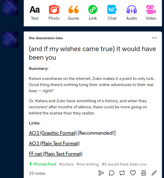
This was just a brief visual walkthrough to show what HTML and CSS really do, but let’s move on to HTML and CSS in the world of AO3.
Where does the HTML and CSS go on AO3?
The HTML part of the code is put into the text box when you post a new story/new chapter. You must have noticed the two options — Rich Text and HTML — and it’s important to have HTML selected for AO3 to identify the HTML tags that you’ll be using.
All your content goes into this textbox. Whatever text you may be writing, whatever images you may be hosting, whatever links you might want to add— everything goes here.
Now, for styling all the content that you’ve put into the textbox, you need CSS, and that happens through work skins. It’s super simple, and all you have to do is go to Skins on your AO3 panel and then to My Work Skins, and then create a new work skin where you can dump all of your CSS code.
Okay, so onward we go.
How to HTML and CSS?
I’m no expert in web design and my knowledge mostly comes from Coursera, one summer internship, one class in college, and extensive online searching. And, I’ll tell you this, the most I have learnt is from extensive online searching.
Because at the very heart of it, web design is not so much about understanding and applying concepts (as with other coding languages) but more about visualizing elements and testing them out. I must add that this is completely my opinion as a person who rather enjoys data structures and algorithms as compared to web dev, and I’m certain that seasoned web developers will disagree with my views here.
Right, so the online searching. The best in the business when it comes to explaining HTML/CSS is www.w3schools.com. They have sample code, short and sweet explanations, and an online IDE to test your code. Really, it’s a win-win situation.
Alrighty, so now you know where to look for your HTML tags and CSS properties but how do you figure out which ones to use?
HTML Tags
I’ll talk about the HTML that’s required for coding on AO3 exclusively.
But before that— every HTML document has two main parts: the <head> and the <body>. But here on AO3, we only code the <body> which, as its name suggests, holds the content that’s going to appear on the browser. The <head> part is not required for AO3 work skins at all.
Okay, so how to code HTML on AO3? Well, your best friends are going to be the container tags such as <div> and <span>, and the paragraph tag <p>. What these tags do is they create areas on your browser — you can imagine them as small rectangles and squares — where you can put in your content via HTML, and then later style using CSS.

See this? The entire shaded area belongs to a <div> which is styled by a CSS class called “tumblr” (to keep things simple, we’ll only focus on CSS classes, and not id’s. It won’t really hamper developing a workskin in any way.)

This above belongs to a <p> that is styled by a CSS class “tumblrbody”. And, this <p> exists within the <div> mentioned above.
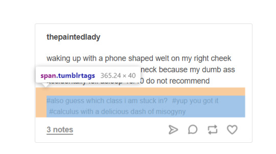
Here’s a <span> styled using the CSS class “tumblrtags”, which comes within the <div> and <p> we just discussed.
Basically, the idea is that the entire page will have to be divided into all these subsections, nested within each other if required, so that they can then be styled using CSS.
Other HTML tags that come in handy are the <a> and <img> tags.
The <a> or anchor tag is used to embed links. Want your reader to be led to a separate page while they’re reading your story? This is it. (This one’s quite common, and authors use them quite frequently in their notes to link to their Twitter/Tumblr etc.)
The <img> tag is used to embed images as the name suggests.
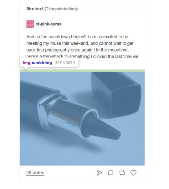
See how the picture is within an <img> tag styled by a CSS class “tumblrimg”?
Again, I’m not talking about the syntax of these tags or how they have to be written because that’s something which can very easily be found on w3schools or any other web dev tutorial website.
So, that’s pretty much about HTML. Now, CSS.
CSS Properties
So, when I talk about how most of my web dev happens through thorough internet searching, I’m mostly talking about CSS. Because HTML tags aren’t difficult to remember, they stay in memory when you keep designing web pages, but CSS properties... ugh.
But before we begin, a short note on CSS classes. To simplify matters you can look at them as labels given to your HTML container tags (<div> for example). Once you assign the label to your HTML element, you can then style that label in your CSS, and introduce properties to it which you want to see in your HTML. It basically forms the link between your HTML and CSS.
Say, I have a <div> that I want to style, then I’ll give it a label like this: <div class=”mongoosesurprise”>Your code</div>. The class name is mongoosesurprise, and when I have to style that particular <div>, I’ll have CSS code that looks like this:
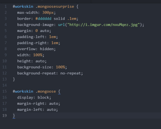
Now, about CSS properties.
You see all the words in white followed by a colon? max-width? border? background-image? That’s it— CSS properties. I can never remember if it is maxwidth or max-width, whether it’s margin-right or right-margin, whether it’s padding-right or right-padding, and that’s where the Googling comes in.
Again, like with HTML, I’ll only talk about CSS on AO3. Unlike regular CSS, CSS here always has to start with #workskin. And then, #workskin can be followed by our class name. (The class name must be preceded by a fullstop though, like in the picture above.)
My CSS design procedure is all over the place. I entirely work on the basis of trial and error. I keep adjusting properties like max-width and padding and margin to see how the elements fit best. (It doesn’t take me as long as it did four-five years ago to estimate these values and I’d attribute that to practice and inspecting a lot of web pages. On a related note, it’s great to learn web design by inspecting other pages.)
I realize this isn’t great advice but like I said, it’s always been about trial and error when it comes to CSS. What I can say conclusively is that with properties width, height, display, position, padding, and margin most of your HTML tags will be placed properly. But when it comes to styling, the list is really quite endless. From a number of font-related properties to border, there’s a lot— and, thus, Google.
And, finally, what you must know for HTML/CSS on AO3 is how to host images.
Hosting Images
If you want your work to contain images, it’s best to host them somewhere online. Imgur is a great option; it’s free and really simple to use. Once the image is uploaded, you can get the share links and put it in your HTML <img> tag (under the src attribute— again, very syntactical so I’m not getting into that), or if you want you can put it in your CSS as an attribute for the property “background-image” (like in the code above).
You’ll have to make minor changes to the share link though, that is, add the image extension (.png or .jpg) to the end of the link. Also, sometimes the image doesn’t render if there’s no ‘i’ preceding ‘imgur.com’. Here’s a sample link that works perfectly: http://i.imgur.com/aSMSztl.png.
And, I think that’s pretty much it.
This covers the absolute basics of how to code HTML/CSS on AO3. But I’d like to repeat that by no means is this everything. If there’s a particular area you’d want me to explain, please feel to drop in an ask!
Happy coding!
#antarcticasx#html/css#ao3#workskins#i'll tag this as#zutara#in case anyone else reading 'it would have been you' wants to know
419 notes
·
View notes
Photo

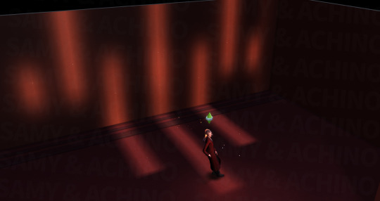

STP - Light Intensifier SA-WL screenshot + text, no other edit
+ 1 size + wall light + work well with wall, can be used for floor too + bb.moveobjects
Yup, another square-area light. SA-WL brings tall and thin luminous rectangles to the wall.
It cannot be used for sim and furniture, that is to say, you can add SA-WL wherever you like and don't need to worry about whether it will affect the lighting you've set for the sim or furniture.
Now on Patreon (Exclusive)
It takes time to get used to PL-hard I guess, so I’ll try my best to finish the posters and publish the SA-SL in this week. Then publish PL-hard on Sunday hopefully.
Also, many thanks to all the cc creators ^ ^
#the sims#the sims 4#the sims4#sims4#sims4 cc#sims 4 lighting#sims 4 photography#sims 4 screenshots#sims 4 decor#sims 4 furniture#TS4#ts4cc#ts4 lighting#ts4 decor#ts4 photography#ts4 screenshots#ts4 furniture#s4cc#s4 lighting#s4 screenshots#s4 furniture#s4 decor#STP
23 notes
·
View notes
Text
Been seeing a lot of rude and degrading fanfiction discourse these past few weeks and I’m tired of it. Guess what:
You can read real books and read fanfiction, they’re not mutually exclusive. But if you don’t wanna, well hey, that’s your life, have at it.
Fanfiction is NOT just smut and coffee shop AUs, and anyone with such a narrowminded knowledge of it shouldn’t be speaking on the subject at all. Most people pour their heart and soul and time into it just like any other art form. They write epics and novels and explore conflicts and consequences the original writers never dreamed of. There’s originality even among the unoriginality, with unique writing, unique concepts, unique details created out of love for a world they wanted more of. But even if it were just the former, who cares? People read and write this for fun. And no one is actually unironically out there saying their slash fiction or whatever is equal to Dante’s Inferno. You know how a square is technically a rectangle but a rectangle is not a square? Maybe Dante’s Inferno = fanfiction, but that doesn’t mean people are saying all fanfiction = Dante’s Inferno. They’re saying there’s more to fanfiction than you give it credit for and there is a place for fanfiction in history and in the future and in humanity in general.
But even if it’s not some big world changing epic? So what? It can still be important. Not every piece of writing has to change your entire world view. Simple consumable entertainment is not necessarily a lower form. Sometimes you just want to read something familiar: familiar characters with new plots, new styles, or old plots, old styles, but either way, it’s something free and accessible and easy to filter to fit exact tags, warnings and tastes. Hurt/comfort? Check. Romance? Okay. Short fic? Long fic? Super specific tag that’s ridiculously niche? They got you covered. Sometimes you don’t want to get to know new characters or worlds when you have perfectly good old characters right there, and when you want to continue the journey with them even if their original media has ended. Sometimes bite sized fics are a lot easier to consume and focus on than a whole book. Or sometimes, you know, it’s just none of your business what other people read or do in their free time and you can’t dictate that.
Is there a lot of bad fanfiction out there? Hell yeah, I’m not going to deny it. But there’s a lot of bad original fiction out there too, as there is with anything. It’s a sliding scale for both. But we don’t judge the entire art form of novel writing just because hur de dur Twilight bad. Not every published book is the level of Dante’s Inferno either, not every published book changed the world. And I’ve read plenty of fics with better writing than popular novels. Maybe none have reached a level of recognizable scale yet, but that doesn’t mean anything. With so much writing and reading material readily available at your fingertips, with the internet giving everyone the chance to put their work out there, to put their own spin on things, to do whatever, no, you’re not going to hear about them as much as you would with the limited travel/tech and resource in 1492.
And finally, this is a big one: FANFICTION IS NOT A DIRTY WORD. People are out here acting like calling Dante’s Inferno (that’s the one I saw most often so that’s the one I keep mentioning) or whatever else ‘fanfiction’ is some grave insult. But it literally just means something that was written by a fan, featuring pre-existing characters?? Like, pretty sure Ole Dante there did not, in fact, invent the poet Virgil, who he was a fan of!!, or go on a journey to Hell with him. That, my friends, is fanfiction, albeit on a large, large scale, and that’s okay.
Don’t @ me, I can’t hear you over the sounds of all these ghosts as I walk through the afterlife in 1200 years with my good friend Elvis Presley. Like yeah, read books too. Yeah, maybe that coffeeshop AU is not the same as Dante’s Inferno or Gilgamesh or whatever the heck else, (who said it was?), but why are you out here punishing people for creating? For consuming? For loving to the point of creation? And for finding amusement and interest in the fact that humans have always been the same, for 500 years, for 2000 years, writing about each other, writing about their favourite characters, their favourite people who are worlds apart, meeting against the impossible, going on adventures, changing how people view aspects of the world, etc. And if you truly believe people writing or reading such things have no influence, no power, why do you care so much in the first place?
342 notes
·
View notes
Note
Apart from the trashy medium article, there’s actually a decent article by heckinunicorn (they also sell pretty cute products, including a bi-cycle and pan-cake enamel pin; haven’t bought anything but I’m considering):
https://heckinunicorn.com/blogs/heckin-unicorn-blog/bisexuality-vs-pansexuality-the-war-within-the-lgbtq-community-explained?currency=USD
I mean it got one part of bisexual history a bit off, but they were still very inclusive and try their best to stop the feud. I definitely recommend checking it out!
(I just hope they aren’t exclusionists in disguise or scam artists lol. All this discourse has made me paranoid.)
okay no disrespect to you anon, but that article is awful. and i'm lowkey mad i even read it lmao
it was going okay until the section on the bi manifesto. there are so many examples of the bi community being inclusive and not binary in the 1990s that i cannot fathom why the manifesto is what people use as an example. the only good part in that section is the note about how the manifesto is more accurately the manifesto of atm than it is the bi community.
then we get to the pan history section. i found it interesting that the part on bi history had a section for before it was a sexuality, two sections on the 1990s, and then a section on the prefix, and each one had multiple paragraphs. but the part on pan history had three sentences on pansexualism and four sentences on "1970s and beyond". like.............tell me you don't know anything about pansexual history without telling me you don't anything about pansexual history.
THEN. we have the tired fucking rectangles/squares bullshit. i really need to stop fucking seeing that. i am so tired of hearing "all pan people are/can be considered bi, but not all bi people are/can be considered pan" THAT'S NOT HOW PERSONAL IDENTITY LABELS WORK. PEOPLE ARE WHAT THEY SAY THEY ARE AND THAT'S FUCKING THAT. and it basically amounts to "saying pan and bi are the same is wrong because even though all pan people are in fact bi, not all bi people are pan" so it's like....fuck pan people amiright?
then the section about the lie that pan was created out of misconceptions about bi, that the person already previously said was not true, basically just says "idk it's hard to find out if this it true and does it really matter?" and they also contradict themselves. previously they said gender inclusive definitions of bi emerged in the 1990s, but then in this section they say "between the 1970s and 1990s it's hard to ascertain whether bi was defined in exclusive terms" so which is it?
(there also isn't really an acknowledgement of there being many different bi communities all over the world. one group having inclusive definitions does not mean they all did and does not cancel out those that didn't. and this section basically just says that it's a fact that pan was built to be more inclusive than bi, but what we don't know is whether that exclusive definition was actually used at the time or if it was outdated. which is some bullshit.)
then they claim that other mspec labels that are broad and inclusive (not to say bi isn't also those things) aren't the cause of the misconception that bi is binary, but a side effect. and that as long as the root issues aren't addressed, the problem will reoccur. which is basically saying that other mspec labels are born out of that misconception and are a "problem" that won't go away until the actual cause of the misconception is taken care of.
and then their solution to this whole "war" is to contact dictionaries who incorrectly define bi. literally nothing on how to quell the misconceptions and hatred about pansexuality. not even a mention of battleaxe bis. and they mentioned that the aggression got so bad on instagram that the pan hashtag was banned, without even condemning that "solution" to the aggression as being panphobic.
the only things i appreciated about the article is the note about the manifesto (mentioned above) and the acknowledgement of needing to focus on the actual root cause of the misconception and more mainstream, influential sources of it instead of scapegoating pansexuality/pan people for it.
but that's it. it's clearly well intentioned, but good intentions are not a substitute for actually having knowledge on the topic you're discussing.
#asks#anonymous#pan antagonism#bi manifesto#battleaxe bi#also idk what medium article you're referring to or how it relates to this article#long post
35 notes
·
View notes
Text
Adsly Review & Bonuses 2021
Adsly Review By Beta Tester + Exclusive Bonuses Worth $30k For FREE!
Hello folks! Welcome to my Adsly review and reward page. On the off chance that you are searching for a fair and inside and out Adsly Review, you are the best spot you could be.
In my Adsly review I will inform you concerning it's components, working interaction, cost and otos, advantages and disadvantages and my own experience utilizing Adsly as a beta analyzer.
I have additionally got a crazy reward bundle worth $30k for you, should you choose to buy this item.
Adsly is the world's #1 all online media and google advertisements creation suite. In addition it additionally incorporates every one of the assets you need to run productive advertisements on the web.
Presently we should move to the following segment of my Adsly Review where we will discuss item's outline and components.
Reshu Singhal is the originator of Adsly.
Pleased is additionally Co-Founder of Proyah Sales Videos and different high performing programming.
Reshu is a transformation master. She is known for making great changing over recordings, contacting 5 figures transformations on different occasions through her recordings for her customers generally speaking producing a joined income of more than $5m for her through her business recordings.
She has been dispatching acceptable and exceptionally beneficial items since 2018. Her items have produced colossal outcomes for her clients and have welcomed incredible worth on the table.
Adsly Review – What Kinds Of Ads Can I Create?
Here are various kinds of advertisements you can make:
Google promotions measurements:
Squares
Square shapes
Triple Widescreen
Inline Rectangle
Netboard
Pennant
Leaderboard
Announcement
Display
High rise
Wide Skyscraper
Half page
Picture
Versatile Banner
Facebook:
Facebook News Feed Ads
Facebook Right Column Ads
Facebook Instant Articles Ads
Facebook Marketplace Ads
Facebook Story Ads
Facebook Collection Ads
Facebook Messenger Ads
Facebook Audience Network: Native, Banner, Interstitial Ads
Facebook Canvas Ads
Facebook Carousel Ad
Instagram:
Instagram Landscape (flat) Image Ads
Instagram Square Image promotions
Instagram Vertical Image Ads
Instagram Story Ads
Instagram Carousel Ads
SnapChat:
SnapAds – The Basics
Snapchat Collection Ads
Snapchat Web View Ads
Snapchat App Install Ads
YouTube:
Youtube Display Ads
Youtube Overlay Ads
Youtube Bumper Ads
Youtube True View In transfer Ads
Pinterest:
Pinterest Promoted Pins Ads
Pinterest Promoted App Pins Ads
Pinterest Carousel Ad Specs Ads
TikTok:
TikTok News Feed Ads
TikTok Vigo Image Ads
LinkedIN:
LinkedIn Sponsored Content Ads
LinkedIn Sponsored InMail Ads
LinkedIn Dynamic Ads
LinkedIn Spotlight Ads
LinkedIn Spotlight Ads – Custom Background Image
LinkedIn Display Ads (Medium Rectangle)
LinkedIn Display Ads (Sky Scraper)
LinkedIn Display Ads (LeaderBoard)
LinkedIn Text Display Ads
Twitter:
Twitter Website Card Ads
Twitter Image App Card Ads
Twitter Single-Image Tweets Ads (Mobile)
Twitter Single-Image Tweets Ads (Desktop)
Twitter Multi-Image Tweets Ads (Mobile)
Twitter Multi-Image Tweets Ads (Desktop)
Twitter Conversational Ads
Twitter Direct Message Card Ads
Adsly Review – Price and OTO
Front End – Adsly Commercial ($47)
Adsly is a superior programming which allows you to make excellent changing over picture Ads for 9 social stages and 50+ various situations. Aside from this the product gives you every one of the assets which is needed to run a beneficial advertisement. From Ad duplicate generator, designated crowd of 50 distinct specialties, Detailed digital books on every stages on the most proficient method to run advertisements, promotion agenda, all things considered, to 100+ profoundly changing over promotion plans assortment. The entirety of this with business permit to sell the advertisements you make to likely customers.
With Adsly make Ads for Google, Facebook , Instagram, Snapchat, Twitter, LinkedIn, YouTube, Pinterest and TikTok
Here is the thing that is remembered for the Front End!
Premium Ad Design Software
Make Converting Ads
50 Niches Targeting Audience
2000+ Converting pre made Templates
Preparing how to burn through $5 to arrive at 1000s of likely purchasers
Live Workshop to show you how to make changing over advertisements plans utilizing Adsly
9 Social Media
50+ Placements (alongside preparing)
Limitless Ads (No cutoff points)
Demonstrated Converting Ad Copies – specialty explicit
Most elite 100+ Ads Screenshot
Facebook Ads Checklist
Deals Page and VSL Copies of 2 Products that have on the whole done more than $450,000 in deals
Accomplished For You Freelancing Gig Template
9 Ebooks – bit by bit promotion creation for all stages
Business License
OTO 1 – Adsly Platinum ($67)
With the platinum open more provisions like capacity to make Facebook covers, traffic combination, 10 million stock pictures, Ad duplicate generator programming and substantially more.
Here is the rundown of provisions that is remembered for the OTO1
Facebook Cover Images
100 changing over Facebook Cover Templates
1 Click Unlimited Traffic Integration
LockerKosh Affiliate Link Cloaker – Unlimited Profits
10 Million+ HD Stock Images Integration
Progressed Client Acquisition Module
9*9 Ninja Remarketing Training
Promotion Copy Generator Software
Facebook 20% Rule Checker
Programmed Content Creator
Mental Conversion Triggers
Limitless Commercial License for OTO1
OTO 2 – Adsly Professional ($67)
With the expert rendition one turns into an individual from the format club and gets 20 layouts each month for a year. Proficient permit likewise incorporates more formats, import and fare provisions and capacity to offer activities to other Adsly clients alongside an uncommon admittance to private FB bunch.
Here is the rundown of elements included with the OTO2.
Layout Club at a One Time Cost
20 Templates each month FOR 12 MONTHS
275 DFY layouts
Layout demand alternative (5 formats)
Import and Export Adsly Templates
Offer Projects To Other Users
20+ Premium Fonts
PRIVATE FB GROUP ACCESS
OTO 3 – Adsly Ultimate ($67)
With Adsly Ultimate one can without much of a stretch deal with numerous ventures for customers and appoint individuals from their group to chip away at these undertakings. It has a review framework through which customers can review and share their remarks. It likewise has some work locater, proposition formats and changing over profile gigs.
Here is the rundown of elements included with the OTO3.
Auto occupation Finder
Pre made exceptionally changing over Proposal Template
Pre made exceptionally changing over Profile Gigs
Choice of Highlighting and saving your favored work
Venture Management System
Venture Review System
OTO 4 – Adsly permit ($97)
Exchange Adsly Premium Ad plan programming with choices of 50 or 500 licenses.
100% commissions toward the front and half commissions on the overhaul.
Affiliate License
20 licenses for $67
50 licenses for $97
500 licenses for $127
100% commission on Front End and
half Commission on OTOs
2 notes
·
View notes
Text
Two Eleven Super
“London is very human-scale,” I am quick to pitch for one of my favorite cities in the world.
Her eyes widen and her face lights up. She nods her head vigorously and points her finger at me, in complete agreement. This is the moment in a conversation when one person articulates perfectly what the other person was thinking but couldn’t quite put into words. B and I have been explaining to each other how both of us are more comfortable living in cities where we can walk or take public transport.
“Oh gosh London, yes! Seeing a London trip on my schedule always fills me with immense warmth. Imagine being able to walk around a city slowly absorbing all that it has to offer, the sights, the sounds, the traditions.”
They say never meet your celebrity heroes because you’ll inevitably find something disappointing. I think the same applies to some of the great cities of the world. But both of us conclude hands down that London does not fall in this category.
“Actually London is not even a celebrity. London is a reliable old friend. A friend that has not lost their sense of culture and tradition. The monuments, the churches ...”
“.....and the bridges across the Thames - each one steeped in history.” We are finishing each other's sentences now. “The railway stations. The tube - a subterranean metropolis beneath a metropolis. The Mind the Gap jokes.”
“And what about the black cabs and then … and then the red double decker buses. Oh the red buses - what an icon! They say tourists take the tube but real Londoners take the bus.”
“Aha! You’re probably right. Flocks of pigeons on Trafalgar square, the shops on Oxford Street.”
“And you can’t forget the ever present murky skies, steady rain, rippled puddles, umbrella bearing pedestrians.”
“Of course you just had to mention the Great British weather!” A disapproving look is thrown. The entire body of humor surrounding the British weather is a road we agree not to go down.
---
I continue to quiz B on some of the other cities that she thought would fit the human-scale bill. New York inevitably comes up as a place she has not only travelled to but lived in. I am glad she brought up New York. Now New York is not an old friend. New York is a person you know you shouldn’t fall for, but you do anyway. There is something about the pace and the madness that sets New York apart from the rest of the US. Something about the people, coming from all corners of the world. To make a living, or even half a living. American dream and all that.
In New York you are acutely aware of the class divide that exists in society. New York is dirty. The subway is full of creaking old trains. New York has JFK and LaGuardia both of which are dismal at best and soul destroying at worst. Oh and Penn Station. Never has there been a more classic case of the mighty having fallen. A complete and utter hell hole out of some post apocalyptic world.
But somehow it all works. Barely. And that is where New York absolutely has you. As you walk around the city, you peel back the layers and beneath all the flaws and scars, you will find a genuinely captivating person. A person that knows how to push your buttons and make you forget the pandemonium, if only for a split second. Through the dollar pizzas on the street corners. Through the sheer magic of Central Park and the museums. Through the Manhattan skyline; hands down the best skyline in the world. Standing next to the Hudson, under the Brooklyn Bridge, with Lady Liberty keeping a quiet watch from a distance, you will be powerless as New York sucks you in. One glittering high rise at a time. Dreamy eyed, you cannot help but stare in wonderment. Hundreds of floors, thousands of windows. What goes on inside? And the lights! Yes so many lights. What could be a better tribute to Tesla, Faraday and the like?
“In general, the east coast of the United States is on a much more human-scale. Relatively small states with trains taking you across borders within a couple of hours at the most.”
“Going west of maybe Illinois, they started drawing great big rectangles for states.”
“And then there’s Texas. Vast open skies in an almost revolting shade of blue. Just as vast are the expanses of highway, further than the eye could see, or care to see. Wide, long and monotonous. Not a single human-scale building in sight”
“And who the hell builds highways passing through the center of a city!? Makes going to get some milk feel like a great expedition to the other side of the world.”
More chuckles.
Then a brief silence, during which I am suddenly reminded of where I am - in a lounge on the upper deck of an A380. A massive ship hurtling through the ether, pushing the speed of sound. A big TV screen near where I am standing silently glares back at me indicating that -50 degrees is but a mere 10 meters from where I am standing. Yet here we are, B and I, chatting like two friends catching up over coffee.
But of course, we are not friends. Not even acquaintances. She is on the Emirates cabin crew. And I am just a passenger.
---
Back at my seat, halfway through an episode of Chernobyl, I pause to stare out of the window. Beyond the wing, which seems to stretch out to eternity, a smudge of orange is forcing its way through the royal blue of the sky. I can hear the muffled yet reassuring boom from the four Rolls Royce engines. It is then that I realize that there is nothing about the A380 that is human-scale. There is nothing about the skies which she inhabits that is human-scale. I've travelled on the beloved Super dozens of times. Yet I continue to be amazed at the size and scale with which she operates. Devouring continents and swallowing oceans. Bringing the other side of the world just a little closer to home.
A friend of mine often describes journeys on the A380 as the closest we can get to the long sea voyages on gigantic ocean liners in the 1930s. And he is right. Two decks with so much space to stretch out. Bars, lounges, showers - no expense spared in ensuring luxury. Imagine peering out of the window from your first class cabin on the Queen Mary and seeing nothing but vast open sea. Right now I am doing exactly the same. Only from 36000 feet above the Earth, and all I can see is the vast open sky. Far below, Moscow and St Petersburg slip behind us. Scandinavia and the Atlantic Ocean lie ahead. As we burn more fuel, over North America, we will eventually settle in the exclusive airspace of flight level 410.
The Boeing 747 is a work of art. Sheer poetry. The Airbus A380 however, is a lesson in outsmarting the laws of Physics. It is an absolute whale of a plane that looks like it should never leave the surface of the Earth in the first place. But somehow it does, through the most languid and sluggish of take offs. Once up at cruising altitude though, it is steady ship all the way to your destination. The ability to punch through the sky without even the faintest of trembles is simply unmatched. I continue to stare wistfully out of the window, thinking about how much I’ll miss the A380 when she’s gone. She’s right up there with the Concorde in that nothing like this will ever be built in my lifetime.
---
Resting my head on one of the fluffiest pillows ever to have taken flight, I gaze at the roof of the cabin - tiny twinkling stars gently coaxing me to drift off into a deep sleep. And frankly, it is not hard to. The bed is completely flat and the mattress is more comfortable than the one I have at home. The blanket is ever so soft. The fake gold and wood around the windows is not something I’d furnish my home with, yet up here in the sky, it somehow adds to the coziness. From my own little cocoon, I can see neither the aisle nor other TV screens. Not a single window shade in the cabin is raised. I don’t remember the last time I fell asleep on a plane without an eye mask. All I can hear are the engines whirling away, and the hushed sound of the air beating against the fuselage - no more than a relaxing white noise.
In the moments between lying down and falling asleep, I am thinking about the countless journeys I’ve made with Emirates over the last two decades. Leaving home as often as I’ve had to, I’ve come to really treasure the sense of familiarity that an Emirates flight brings to me. I’ve never stopped to think about it before but there is a certain warmth and tenderness you feel when you have an old faithful travel companion to share your journeys with. And Emirates has been that companion for me, helping me wipe away the homesickness. Slowly at first, then all at once. The boarding music that says “Hello Tomorrow”. The inflight announcements that say “Tayaran Al Emarat”. The reassuring voice of Sir Tim Clark answering questions on the default podcast channel. The wavy curves on the cabin wallpaper. The cabin crew with their brown blazers and their red hats. When choosing an airline to fly, it is hard to look past this comfort of familiarity resulting from a bond first formed unwittingly, many years ago. And strengthened over numerous journeys from one side of the planet to the other, including this one. Before I can process any more thoughts, I slip into a happy and peaceful sleep. We are probably somewhere over the North Atlantic. But in this moment, it hardly matters.
---
Six hours have passed. B is on hand to wake me for dinner. It seems the crew has saved the best meal till the very end. Three courses this evening, starting with a chick-pea salad that doesn’t make you hate your life with its dreariness. I politely refuse the alcohol but ask for a piece of garlic bread on the side. Which is brought to me, warm, from a basket lined with cloth. The main course is served with the Jeera rice cooked in just the right amount of butter. The ratio of jeera to rice - perfect. The Rajma has the power to rival any dhaba in North India and along with it is a second curry made with melt-in-your-mouth soft paneer. Actual phulkas to go on the side, instead of pita.
And if you're going to go full North Indian with your meal, you need some achaar. Which obviously is on my tray as well. Emirates just knows how to serve Indian food. If I had any doubts about this, they are well and truly shattered when B brings the dessert. Four of the finest pieces of Rasgulla. Sometimes you have a meal so sublime that you are moved to shedding a tear or two. This AVML has been one such.
I call B over one last time to thank her for everything. She passes me a brownie, one very similar to those I’d been wolfing down earlier while talking to her in the lounge. This of course, brings the widest of smiles to my face. Not because I like brownies. But most certainly because of the fact that she had noticed. And remembered. The crew has been absolutely stellar on this flight.
---
Business class. A crew that knows how to pronounce your ridiculously long last name. A crew that has time to engage in conversations with you. Meals served on crisp white table cloths. Meals that come in courses. Flat beds to stretch your legs. Flat beds to rest your weary soul. On a grueling ultra long haul flight across 10 time zones, almost anything that seeks to make you feel more earthly is highly appreciated.
This has been Emirates Two Eleven Super - Dubai to Houston in just under seventeen hours, albeit the best seventeen hours of my life.
1 note
·
View note
Link
Motorola
The new Moto Razr.
The box is pretty wild looking.
When open, you get a 6.2-inch foldable display.
When closed, you get a smaller 2.7-inch display for notifications and music control.
The display inside is big.
In this live image from Verizon, you can see a bit of a ripple in the display.
The display in real life. Still a bit ripple-y.
Let's talk about the front display. Here it's showing the time and notifications.
Here is selfie mode, which actually uses the main camera, because it's a flip phone.
The front display in music mode.
Google Assistant on the front display.
The inside. You can see the navigation bar is huge, since it needs to be a rectangle and avoid the bottom curve in the display. Verizon
The bottom has a USB-C port and a speaker grill.
The folded mode is going to be thick, but compact.
When open, the non-chin part of the phone is 6.9mm thick.
All the in-box accessories.
It's Moto Razr day today. The phone stopped by the FCC earlier in the day, and after sending out an event invite for November 13, Motorola just barely made it in time, with an official announcement at 11pm ET. The rumors were true: the Moto Razr is a reboot of one of the most iconic flip phones of all time, updated for 2019. Instead of a tiny screen and a physical keypad on the inside, you get a giant folding OLED display that puts the new Moto Razr in the same category as other futuristic foldables like the Samsung Galaxy Fold and Huawei Mate X. The price is also in the same stratosphere as those super-expensive devices: the new Razr is $1,500. It's also a Verizon exclusive in the US. The hinge design of the Moto Razr is probably the most interesting thing about it. The best Samsung can currently do in the foldables space is the Galaxy Fold, which, thanks to folding the display nearly completely flat, develops a permanent crease in the display after the first fold. Motorola's display doesn't fold completely flat, though—there is a large void space around the display hinge, so when the phone folds in half, the display has room to move around. Since it's not being sandwiched between two solid plates, the display collapses into a gentle curve instead of a hard crease. Imagine bending a piece of paper in half just by pinching the top and bottom together versus pressing the fold into a crease. Motorola described how a hinge like this could work in a 2018 patent. Instead of having the hinge mechanism behind the display, like on the Galaxy Fold, Motorola has the hinge on the left and right side of the display, giving the display room to sink into the phone body and bend into a gentle curve. For support Motorola says the hinge "includes moveable support plates that rigidly support the display when the phone is open, but collapse out of the way when the phone is closed." These two design elements allow the phone to have a "zero gap" hinge while also not smashing the display into a crease. Since the display only ever forms a loop, rather than a crease, it never gains a distracting, light-distorting crease down the middle the way the Galaxy Fold does. This design should be easier on the display as well, since it causes less stress to the pixels around the bendy part. We've already seen (pre-release) Galaxy Fold displays die along the display crease, thanks to all the stress. A 2018 Motorola patent showing the display inside a folded phone. Notice how the display is a big loop, and not a hard crease. There's room for the display inside the phone because the hinge mechanism (502 and 506) lives on the left and right side of the display, rather than behind it. Motorola's official shot of the closed display. It's a loop! As it opens, the display supports swing into place. All flattened out. You can see how that translates to a real design here. The hinge mechanism is next to—not behind—the display, so it sticks out from the phone body a bit. The back of the phone also looks very simple, since it's an empty shell holding the display. The display of the new Razr also looks pretty special. The top and bottom edges of the 6.2-inch, 2142x876 display curve into an arch, which is a perfect throwback to the interior of the old Razr design. The notch at the top houses not just the camera but the earpiece, too. The FCC basically posted a full teardown of the device, and seeing the display outside of the Razr body is really something. Where did Motorola source a display like this for its foldable smartphone? Samsung is the leader in foldable displays, but after having spent six years and $130 million dollars to develop the technology, Samsung seems to want to keep the technology to itself. Early release info pegged China's up-and-coming OLED display manufacturer BOE as the supplier, which also supplies the displays for the Huawei Mate X. Motorola also might be dual-sourcing the displays from TCL, the same company that makes zombie phones branded as "Palm" and "Blackberry." Just like the old-school Razr, there's also a secondary display on the front: a 2.7-inch 800x600 panel. Also just like the old Razr, it seems this is primarily for checking notifications. You can see your incoming messages, control music, take selfies, and even use the Google Assistant, all without opening the phone. The UI for this seems totally new. Instead of showing something like a tiny Android notification panel, you get a full screen UI for each action, and apparently you can swipe between them. It's unclear if this is a new Android feature, or a Motorola Razr feature. The Moto Razr was popular as a fashion phone, thanks to the ultra-thin profile and good looks. It's hard to tell just from looking at pictures, but is that same appeal still present in this device? The pictures and dimensions make it clear this is a super-sized version of the original Razr. The most popular model of the old Razr, the V3, measured 98mm x 53mm and 13.9mm thick. The new Razr is listed at 172mm × 72mm × 14mm. So the new Razr's namesake thinness is near-identical to the old Razr, but a lot wider and taller. These numbers reduce both devices to simplified rectangles based on their widest sections, but in terms of overall volume, the new Razr is 138% bigger—yes, over double the volume—of the old Razr. Our expectations for "thin" have definitely changed since 2004, too. iPhone thinness peaked with the iPhone 6, at 6.9mm, and the thinnest Android phone ever is the Vivo X5 Max, which slimmed down to a ridiculous 4.75mm (and it still had a headphone jack!). That 14mm thickness on the new Razr is ever-present thanks to the chin at the bottom, and since the Razr unfolds, that puts each unfolded section of the phone at around 7mm. A standard smartphone is around 7.8mm thick nowadays, so the Razr's thinness is nothing special. When open, it's about the thickness of a smartphone. When closed, it's about the thickness of two smartphones stacked on top of each other. The FCC's Moto Razr photos. Even on third-party images, this phone has no display crease. Be sure to zoom in! Another photo of the pristine display. A photo of the back. The FCC has a full teardown of this device already! Here our lovely government is just popping the shells off. Here's the display out in the open. It's a pretty crazy design, with arched top and bottom edges plus a notch at the top. The motherboard! Here you can make out the Qualcomm Snapdragon 710 SoC at the heart of the device. The other side of the motherboard is nearly blank. Here's one of the two batteries in the device, a scant 1245mAh. As for the width and height, I don't think you can call the Razr a compact phone anymore, either. Width is what makes a smartphone feel small in your hands, but at 72mm wide, the Razr is firmly a "medium" size smartphone, sitting between the width of a Galaxy S10 (70mm) and S10+ (74mm). The width also works against the phone's positioning as an update to the old Razr: the proportions compared to the old phone are all wrong, and this "Razr" is a shorter, wider distortion of the original. At 172mm tall while open, the Razr is the tallest phone on the market, dwarfing even monster devices like the Galaxy Note 10+ and OnePlus 7T Pro (both ~162mm). So what are you looking for from a foldable smartphone? The standard answer with devices like the Galaxy Fold and Huawei Mate X has been "a phone that opens up into a tablet," but that clearly isn't the goal of the Moto Razr. This also isn't a return to some kind of compact form factor, given that the device is more than twice the size of the old Razr. The new Razr is more like "a smartphone that folds in half." The standard smartphone design puts a tall, thin rectangle in your pocket; Motorola is arguing it's better to pocket a thicker square shape instead. As far as running Android on this device goes, the display's arched top and bottom edges and a notch at the top mean there is a lot of unusable space for apps. Android apps need to be presented with a rectangle by default, so those arches at the top and bottom need to be squared off by the system software. There also needs to be room for the navigation buttons and status icons, which also need to be in a straight line. The result is a lot of space at the top and bottom of the phone that is dedicated to system-level Android UI. The new Razr only runs Android 9, by the way, not the newer Android 10. As for the specs, the Razr has a mid-range—not flagship—SoC: the Snapdragon 710. This features eight Kryo 360 CPU cores, with two high-performance cores running at 2.2Ghz, and six lower-power cores running at 1.7GHz. This is a 10nm SoC that's over a year old now, putting it a generation behind the 7nm flagship SoC, the Snapdragon 855. It seems like we're now making budgetary compromises in a $1,500 smartphone. The Galaxy Fold has a Snapdragon 855, but that costs $2,000. The base model has 6GB of RAM and 128GB of storage.The battery is split between the top and bottom sections, with the two parts combining for 2510mAh of power. Tech reviewers have spent the past few weeks dogging Google for the tiny 2,800mAh battery in the Pixel 4, and to see a new smartphone announced with an even bigger display and a smaller battery than the maligned Pixel 4 is a cause for concern. Retro Razr mode. Finally, if the retro hardware design isn't enough for you, how about a retro software mode? The Verge detailed a fun "Retro Razr" mode that emulates a T9 keypad at the bottom of the display and puts the old-school Razr dumbphone UI up top. The old UI actually works. You navigate with the virtual D-Pad, and it can be used as a home-screen launcher of sorts, allowing you to do things like launch the modern Android messaging app when you tap "enter" on the old-school messaging icon. Worldwide, the new Razr will be available in "markets across Europe, Latin America, Asia and Australia." In the US, the new Razr is exclusive to Verizon and launches January 9, 2020, with pre orders starting December 26. Yes the day after Christmas. Apologies to Santa Claus.
1 note
·
View note
Text
Long Island City of Glass
There are a lot of changes flying into Long Island City: rising real estate prices, tech invasion- I mean, investment- and countless attempts at rezoning from the DCP. Not all of these changes are landing smoothly, rather they are crashing into communities with little to no concern for what they burn up on the way. Headlines and reports boast an explosive period of growth for this little pocket of Queens. For the past two decades, these changes have paved the way for a staggering amount of glass structures that line the waterfront of LIC, Queens. This view can be seen not only from Manhattan, but also from Roosevelt Island [where residents are currently welcoming CornellTech’s new campus and co-working companies] and Greenpoint, Brooklyn. More importantly these looming, glass commercial cylinders and boxes are obstructing any view from the rest of Queens towards Manhattan. At what price point are the views of Manhattan for upper middle class (looking to cut a few hundred bucks off rent) worth it to shroud the rest of Queens in shadow?
There are countless developer’s blog posts screaming into the Google void about “Why millennials love LIC”. Not to mention reddit threads of gentrifiers comparing which newly constructed high rises have the best sound isolation, implying these very newcomers to LIC are not likely hosting potlucks or contributing to their immediate community anytime soon. Architecturally, it’s hard to pinpoint the start of when things go wrong. The beginning of the end is as murky and filled with mud as the Hudson River. However, LIC has a very succinct starting point of the path that led to the construction of the Glass City: the 2001 rezoning of it which was approved 31 to 0. Lame attempts to preserve manufacturing jobs and incentivize affordable housing were slapped on top of the bill, the sickly sweet cherry only an afterthought. In reality, this bill was passed to prevent commercial developers from moving to New Jersey and to encourage more commercial activity in a manufacturing neighborhood.
2001 was the catalyst when the waterfront of LIC changed from an industrial landscape to the residential, glass “skyscraper” mecca. I wouldn’t even go so far as to grace these residential hunkers by calling them skyscrapers. The term skyscraper inspires dignity, modernity, pioneering feats of mechanical engineering success; of which very little exists when looking across the water to the glass city.

What makes a building notable or memorable by communities at many scales? This becomes a question of place versus space. For many New Yorkers, passing mention of LIC could recall memories of exploring the Noguchi Museum, the iconic Pepsi Cola sign, or attending a concert at MoMa PS1. Maybe even standing within the shadow of the Citigroup building in Court Square while looking for directions to the nearest subway line. However, when you zoom out and try to consider a scaled-up context, the picture becomes...more reflective. Countless glass rectangles with randomly extruded points that litter Jackson Avenue are the first things that come to mind when attempting to materialize the waterfront skyline.
There is always something unfinished about this neighborhood. There is nothing quite so blatantly like it, where countless of the same projects are constantly going up. Looking at Long Island City is only equatable to trying to kill a hydra: while you’re busy railing on one glass megastructure, 7 more pop up before you even finish a sentence.
While this expansive rate of construction can be attributed to the rezoning of the neighborhood, it’s hard to attribute just one cause to the aesthetic mimicry that plagues this area along the East River waterfront bound by the Queens East River to its Brooklyn border at Newtown Creek. There are a couple promising projects that offer hope toward more regional architecture, such as Steven Holl’s unveiling of the new Hunter’s Point Public Library. But most new construction consists exclusively of projects such as the Hero, Skyline Tower, Star Tower, or Queen’s Plaza Park ...the list of mega-tall glass boxes are endless. There are three qualities that nearly all of these new buildings share: blue-green tinted glass, graph paper window grids in place of facades, and large cereal box bulk.
While this expansive rate of construction can be attributed to the rezoning of the neighborhood, it’s hard to attribute just one cause to the aesthetic mimicry that plagues this area along the East River waterfront bound by the Queens East River to its Brooklyn border at Newtown Creek. There are a couple promising projects that offer hope toward more regional architecture, such as Steven Holl’s unveiling of the new Hunter’s Point Public Library. But most new construction consists exclusively of projects such as the Hero, Skyline Tower, Star Tower, or Queen’s Plaza Park ...the list of megatall glass boxes are endless. There are three qualities that nearly all of these new buildings share: blue-green tinted glass, graph paper window grids in place of facades, and large cereal box bulk.
The developers of these cereal boxes make sure to bring appealing amenities by leasing trendy tenants such as H-mart and Equinox on the ground floor. However, I am a strong believer that it is the architecture and not tenant that breathes life into the streetscape of a neighborhood. Spend one evening looking for a hot dinner spot, and it will become clear very quickly the streets of Long Island City are dead. Streetscape and concepts of neighborhood exist on a very human scale. If Jane Jacobs called the moves of the sidewalk a “symphony”, the streets of LIC could be considered white noise. These glass residential boxes are extremely out of scale and have rushed to replace manufacturing landscape with residential means while forgetting the commercial heart all together that makes or breaks any neighborhood.
A 2019 report released by NY State Comptroller Thomas DiNapoli states that 44% of all structural components of Queens subway stations were either damaged or worn out. Instead of putting money toward these critical veins, the city has provided developers with decades of tax breaks to build bigger, big shinier. Long Island City has come to symbolize developer spectacle without any consideration of an existing community. A mid-70’s Corbusier looked down at New York because he thought the buildings were “all trying to outdo one another”. Long Island City reveals this crude truth to a tee as developer’s rush to upload promotional videos to their sites of partially completed renderings claiming the tallest mega-tall. These glass boxes only evoke a developer's rush to out build one another, an endless conversation echoing above the streets that leave the very tenants, old and new, behind in the dust.
1 note
·
View note
Text
this is very long and not really edited godspeed [f18 wrap-up]
__The more I think about 2018 the less I want to dive in. People post when they’re happy, when they have something to share and show off, so naturally I’ve been inundated w square after square of “the happiest year of my life!” and “2018 was so sweet!” We’re taught that every year should be better than the last because that’s progress. Life is a charge against entropy and if you’re the sad ones that get caught in the current- you’re losing. (1/1/19 )
__It’s almost funny how triumphantly I set off for 2018. Sophomore spring was fresh but so perfectly well-worn and I sank freely into that tempurpedic mattress of campaign affirmations and idealistic friendship dynamics. Not to say I’m finishing the year, or more accurately starting 2019, in a sad place- there’s just less of the surety I felt prior which I’ve always told myself was weakness, but now that I’ve been transported here to this blank post that’s a diagnosis I don’t think I can stand by. All this rambling to say: I’m learning to question myself in the micro as I choose to zoom out and reckon with all dust filled corners to present a me I’m proud of. I’m rerouting.
But that’s not exactly what this is about. This is for Fall 2018 because heck yEaH I’m a student and my life is dictated by the academic calendar!! I’m introspective as fuck but this semester took a distinctly reclusive (comparatively) and ~berkeley~ turn. (1/9/19)
__I have never before moved with such bone-deep tiredness. I have never before cancelled meetings or meetups to stay home and sleep. I have never before relied so solely on chemical energy. I have never before cried quite like that. I have never before shaken with anger quite like that. But this is all internal, in-my-own-head concerns. Though i lived dictated by color-coded rectangles on a phone screen I was never buried below and I count that as a win.
Headspace is conditioned by context and a week ago I wouldn’t have been able to look back this comparably chipper. It wasn’t a good semester and it wasn’t bad- all circumstances withstanding it was possibly the best it could’ve been. I went in cocooned in mantras of “you’re going to die” and “please drop something” but commitments aren’t necessarily always our own choice and i quite plainly refuse to acquiesce to someone else’s estimate of my own capacity. I can drive myself mad but ultimately i know my own limits. I know what’s worth it and what’s not and if my mental calculation has landed me at square wtf then so be it.
There are different energies at play- maybe this is what kept me afloat. The weariness i feel from overstudying is far removed from that which burns the rubber in my soles running to put out fires. I view myself from a distance in variations of lists, linear pathways, and interval meters and in my mind’s eye these energies float steadily at the bottom of my mental screen. A dip in one is offset by a rise in another and though I may put aside sleep my body screams for in favor of a conversation with a friend- ultimately my meters balance. Maybe i’m mental for computerizing my physicality but it’s been survival successful. A late night studying is oddly rejuvenating against the foil of drama and one well timed call fills me to max with magic wrought from hard earned familiarity.
I made an effort to schedule alone time so i could pursue the things that are tied to no other aspect in my life that hold an untainted peace. Goodwill and embroidery satisfied that and more, and to me it’s a precious thing. There’s no long term goal but it feels like an investment in just me and god damn it i’ll be selfish here. Solitude was never something i desired in the past but fall forced a mental switch for sake of sanity and though it felt like i relinquished control to some deep subconscious i’m thankful now.
It really is true that people are the most important determinant of one’s joy. I’m fucking lucky, i know, to have the friends i do both here and in irvine. Home is a funky concept but i breathe deeper in comfort and there’s nothing quite as wonderful as comfortable silence with others. All those prior “have never before”s made fall foggy but peaks above are indeed there and zoomed in are the manifestation of the feeling of being held. Closeness and trust are something i think we all hope for in our relationships with others and to me there’s no greater reassurance than knowing you are held despite whatever wild emotions or crises like to scream your faults.
Though i’ve been actively combating it, sharing often still blares weakness in the hollow of my head. My mind runs tests and scenarios no one needs to know of and sprints both too far in front and behind so really what’s the purpose of opening it a crack for it just to be beat down in the stampede? All abstractions aside one of my goals for the semester was to learn how to share in media res and not purely after it’s perfectly packed, wrapped, and slapped with a bow.
Of course this touches nothing of my on paper responsibilities and asuc, stacks, school ran circles around me, but hey i got through with initial goals semi-achieved and though my cynicism may have grown it’s all conditional in the end.
This isn’t a psychoanalysis of all existing connections but far more me-driven. This is me trying to progress and as much as the people i’ve been blessed with mold that I aim to be satisfied with the steel frame that is within and frankly forever stuck. To sum things up and purely because i have a raging crush on lists, have the following:
I like to theme my semesters and fall was a mission in three parts:
Staying genuine
Sharing struggles in media res
Personal branding
A few things I told myself throughout:
I would allow more time for hobbies whether such time existed or not
I would spend time with the people I care about no matter how inconvenient (hello postgrads ily)
I would fulfill all my responsibilities as presently as possible and hold myself to my own standards
Yeah I like creative outlets but that’s not my future job
I’m one person and as much as I love compartmentalizing it’s time to consider cohesiveness
Major shifts, good or bad:
You don’t love Berkeley any less, but you no longer want to stay forever.
Your tolerance for people that you find annoying is nearing zero.
You love to be alone and to just lie on your rug doing nothing, not even thinking.
You’re addicted to thrifting.
You acquired a newfound love for exclusion yikes.
Art!! A lot!!
You’re still more closed off, but mostly by convenience and no longer by a profound sense of unease. (For example: sharing all this doesn’t scare you shitless! a concept!)
Things to work on in 2019:
Not apologizing for things I’m not actually sorry about just to seem polite
Write more thought essays
Not immediately writing off things I disagree with + productive confrontation / don’t fester
Spend less
Hone in on what you want- career mostly but also choose an art to grow
Church attendance
Doing things because you feel convicted to not just because you think you should
Call mom and dad more
Good job on:
Staying committed to friendships
Finally getting that tattoo
Not compromising your values w drama
Finding better music
Finally looking externally how you feel internally
Grateful for:
Friends that pour into you and hold you even when you make it hard.
Rough situations that allowed for much needed conversations and adapting
Facetime even with shitty wifi
Newfound breadth of friends and thus learned experience of others
Collab playlists
Surprise epiphanies born from unexpected discussions
Escape
Big love to:
Robin
Grace
Jess
Camille
Katie
Audrey
Karlo
Jeremiah
Angie
There’s no moral or lesson learned- I guess this is just me fighting against myself so really it’s all just perspective in the end.
xx
#will i regret this later tbh probably#a lot of potentially nonsensical abstractions and internal musings#me#fight me#sharing is not caring it's weird but o well#f18#fall#2018#if u actually read it i'm impressed
1 note
·
View note