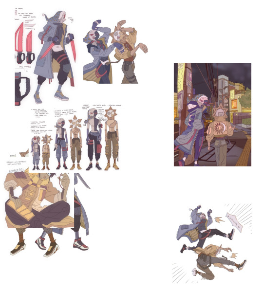
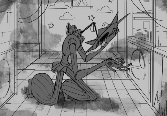
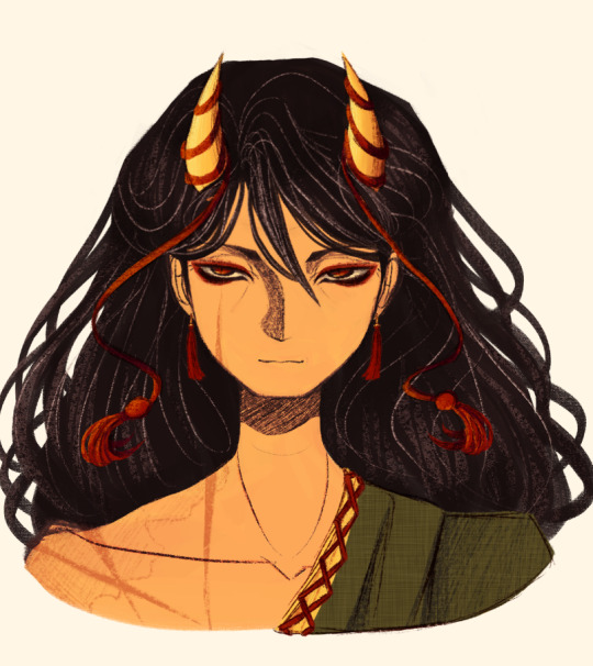
#i was gonna make these digital but i like them better as sketches
Explore tagged Tumblr posts
Visit Tumblr Blog
Explore Tumblr blogs with no restrictions, modern design and the best experience.
Last Seen Tumblr Blogs


Fun Fact
Tumblr Inc. has $15.1M in annual revenue.
Text
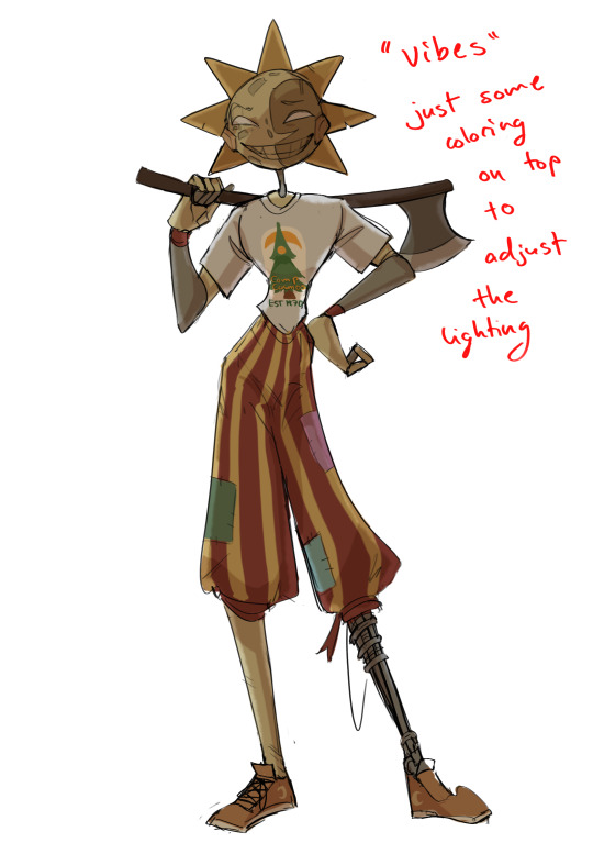
Jayce and Viktor
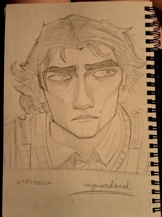
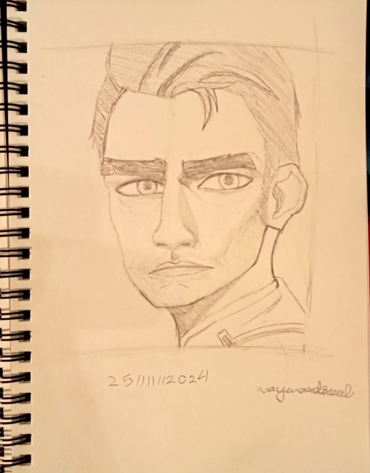
Studying Arcane has wildly improved my artistic abilities and I have no idea how
But here are the boys in all their glory. I cried whilst drawing both of them but am somehow mostly happy with the final products
#wayward rambles#wayward rants#shit post#art#drawing#characters#character art#my art#arcane#arcane jayce#arcane Viktor#viktor#jayce#jayce tallis#arcane art#fanart#arcane fan art#screenshot redraw#gay#jayvik#jayce x viktor#artists#artist#artists on tumblr#art journal#artwork#i take commission btw#i was gonna make these digital but i like them better as sketches
27 notes
·
View notes
Text


heeyyy gaaanggg
the pose and the background of the album version (left) are based on oingo boingos only a lad album art. not cause i think he has anything to do with it but just cause ive been wantin to draw that pose for like. weeks and i didnt know who to put there. so why not my latest bug man.
#my art#digital art#digital painting#fanart#resident evil 7#ethan winters#goddd PLEAAASEEEE#i havent known if i was gonna post this or not multiple times in the process of drawin this. but ultimately i spent too much time on it to#NOT post it. embarrassment be damned#but at the same time what am i even doin yknow. what is this what is goin on pleaaseee PLEASEEEEE#I DONT KNOW ANYTHING ABOUT RESIDENT EVIL!!! I DONT KNOW N O T H I NG I KNOW LESS THAN NOTHING#HOW?? HOW DID I GET HERE??? WHY DID THIS HAPPEN???? i know exactly the answer to all those questions but it still boggles me how fast this#happened. usually it takes WEEKS if not MONTHS for me to start makin fanart. this was faaasttttt TOO FAST and im like. genuinely constantly#thinkin about this game. im ALWAYS thinkin about this game. part of why this took me so long to do is cause i always wanna play re7 or thin#about re7 in a strange and deranged way. ive actually genuinely been SICK WHAT HAPPENEDDDDDD#im losing it!! anyways this took me a looonggg ass time and i redrew it soo many timmmessss#i did like. 3 lineart passes. the album version i did 3 shading passes. i really struggled!! and ultimately i dont know how i feel about it#like i kinda resent it. for takin so long and makin me suffer so much#never again. never again will i spend that much time on a drawing. i HATE when drawins take a long time. i HATE that. it makes me madddd#ive been insane. ive been so insane. and im not gettin better like i cant sleep sometimes cause im thinkin about this game and this guy and#that gal like i think about them!! so! so much!! oh my god!!#in the time it took me to finish this ive done like 10 sketches for other pieces like. and ive had like 3 ideas ive written down.#and like 50 that i havent written or sketched.#IVE WRITTEN POETRY!! P O E T R Y !!!#i write the occasional poem when im feelin some kinda profound emotion but i NEVER write poetry about media SOBBING#anyways thats the post i think this is the beginnin of the end so lets hold hands and pray. ugh sorry if i get sick. im shakin.
161 notes
·
View notes
Text
i got a few asks about my process :0 so yea i took some screenshots mid-process of my recent cliff-skk thing just for that
m gonna preface everything by saying that i did have a ref for the environment!! i avoid color dropping from the image and tracing cuz i do want to hone some digital skills. also saying i'm doing an "environment study" when i'm really just drawing skk makes me feel better abt myself
when i don't have a reference, i tend to do some thumbnail sketches in my sketchbook. here's some random stuff of past work, where i rawdogged everything:
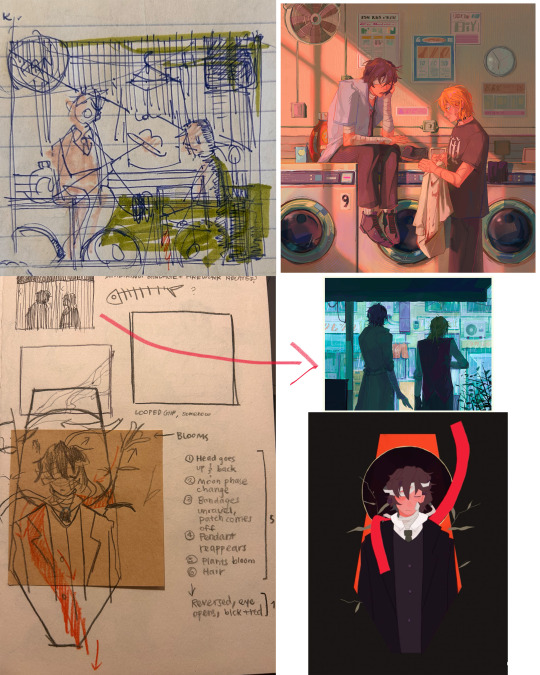
but whatever, back to the cliff-skk. i'll also post a timelapse of it for easy ref, but detailed stuff is under the cut :)
first i did some rough sketches on an orangeish background (underpainting etiquette, i find it helps things feel brighter and keep a stable tone when choosing colors to lay on top), and I quickly lined skk :)


then I laid down some flats for the background, again really eyeballing the reference for hues. afterwards i thought it was a bit bright, and i wanted a more sepia/nostalgia feel to it, so i hue adjusted everything to something more uniform


then i lay down flats for skk + the ocean, which i both had to color adjust a lot (you might see that in the timelapse), and then i jump straight into rendering the background. when i render, i always prefer to do it over something lineless, so i turn the sketch layer off. i rarely do lineart for backgrounds.
i also used to render the characters first, but i've found that it's just not a great approach—especially for art where characters and background are interacting, knowing the hues and shades of the environment is crucial to effective rendering on the character that doesn't make them look out of place.
when i'm rendering, i really try to keep in mind tenants of contrast, perspective, form, and light/shadow. ex, stuff "closer" to us has more detail; the hill in the back is minimalist (in comparison); the shadows lean cool-green while the light leans gray-yellow. rake brushes really carried me here idk... my fav brushstyle forever


eventually i reach a point where i'm satisfied (or bored) with the background. for the last stages i usually have the subjects hidden so i can really perfect the details—but then for super duper final details, like the little leaf specks and grass strands, i unhid skk so the poppy details could work around skk. then i get to rendering the characters :)
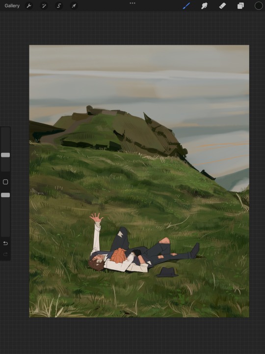
i forgot to take ss of all the stages when i rendered skk, but here's something from... about the middle of the process? i tend to render characters with the lineart hidden as well, sometimes bringing it back just to clarify things, but ultimately i prefer to define things by form than by line. that's just me tho idk, idt it makes or breaks anything, just a preference
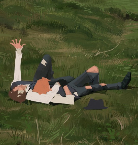
again rlly just thinking about cool/warm, reflective tones (the greenish shadow on chuuya's left inner leg, sky-gray blue on dazai's vest), really just slotting the subject into the environment. after i finish rendering the characters, i usually return to the background and add some stuff—in this one i defined the waves a bit and put some grass around skk
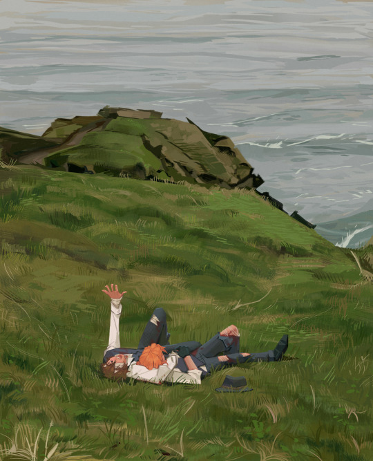
and yeah then we're done idk LOL. sometimes i run the file through camera raw (photoshop) to do some color adjustments—i find that my iPad displays colors super differently, usually making things a lot lighter than they are (u can see how dark the timelapse is...), so i find myself lightening my work a lot. i also sharpen and add noise as needed :)
i think my process has changed a lotttt even in this past year. it's kinda crazy!! it's always fun to do these and just reflect a bit on how i work. mostly just mindless insanity until it kinda works.
thanks for sending in an ask. and if u read all that, thanks to u too lolol
152 notes
·
View notes
Note
Oh uh forgot to ask in the previous ask (the one with the digital piece of candy and scurrying and stuff)
How do you draw art so good
Like
Is there a method you use or is that just the style you've gotten over time?
you've activated my trap card
I'm just gonna preface that this tutorial is from someone who was not professionally trained and didn't have a lot of free time for art, so a lot of the tips I have is short cuts I use to get the best results quickly
If you genuinely want to get better at art then please look at references and practice that is always the best
However if you are like me and only really do art for fun but want to go faster then these are for you pfppt
Overall I'd say my style is influenced by speedpaints I would watch when I was younger, I like analyzing how people do things and what makes something look "good" to me
I always recommend watching them because they will often have techniques you've never seen before or do things a certain way that you can try out yourself
I consume good art, it feeds me
but seriously it can be super helpful when developing your own methodology, or just generally trying something new
Usually it starts with me pulling some references from artists I really admire and sort of sketching out how they do the things I like
For example 8um8le has like super good anatomy and poses so I focused on trying to replicate how they do that
venemous-qwille is super good at color and pulling focus so that's what I focused on in my study of them
In general I'd say my process is sketch -> silhouette -> color -> shading -> render
I really don't like doing lineart lol

I'd say for the sketch the most important part is using references and just kind of fudging it until it looks correct anatomically/physically
General rule of thumb is spend time on areas of interest, and keep non important areas light (like the stitching on his pants)
I don't do lineart because I think its unnecessary for most paintings I do
I naturally tend to put more time and focus on areas of interest (like hands and feet) and if you use a brush with opacity for the sketch, those areas are naturally going to be darker in the final sketch
Of course this is gonna be different for everyone but it's what works for me
Sometimes I do a really really sketchy layer underneath my sketch/lineart, just so I know where everything is going
Use thumbnails! They are great to help figure out the general layout of things and what pose I wanna do
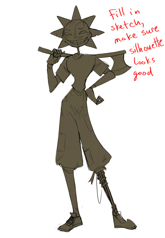
Next is what I call the "silhouette" layer
This is super important for me cause it helps me refine the figure and make sure the pose/anatomy looks correct, also depending on what color I choose for the silhouette helps guide what colors I'm going to use on top
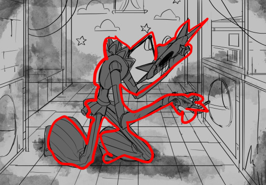
This piece is a good example of how it works. The silhouette shows me how the figure interacts with the background, how the pose looks and if its any good
The silhouette layer doesn't have to be super clean, as long as it follows the sketch decently well and shows where the figure is then its fine
I also sometimes make the silhouette layer multiple colors to help guide shading and vibe
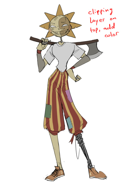
Next is the coloring layer. I usually make this a clipping layer on top of the silhouette layer, or I change the silhouette layer to alpha lock, either way it saves me time on coloring everything in

Sometimes I am super rough with the coloring too, using like an airbrush or my fav watercolor brush just to generically block in color where I want it
Works out cause most objects have like a bounce light to them from surrounding objects, so this is sort of a cheat I use to get that effect without all the work lol
Also don't be afraid to have the lower silhouette layer shining through, having multiple colors sort of subtly shining through the piece helps lots
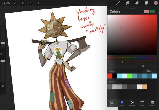
Next is the shading layer, this is usually another clipping layer, usually set to "multiply"
The colors I pick here is usually within this range, any color works, just depends on the piece and vibes.
Since this piece is set in a sunset forest I choose a more desaturated orange for the shading layer
I know there's a whole thing about multiply layer being a crutch (and it kind of it) but it is a useful tool when you just want some darker values across the piece but don't want to go through the process of color picking every single darker shade
Also in my opinion it looks better than picking a darker color and setting it to a lower opacity, idk I just think the color has more "depth"
Next is the hardest to explain, sort of the vibes layer
Usually its just a layer of more concentrated color on top of the normal color and I fudge with the settings and values until I get a result I like
Next is the longest step, is the "extra" or the render stage.
Usually I add a background before this step so that if I need to merge the figure better with the background I can
If I render with a white background but he's supposed to be in a dark forest, its going to mess with the lighting severely
Also this is when I add more "vibe" layers on top to get the figure to match the background better
Backgrounds in general I recommend checking out @/derekdomnicdsouza on instagram he's got lots of great tutorials for breaking down backgrounds simply

I'd say general rule for the rendering layer is to focus on the areas of interest and spend less time on areas you don't care about
I even blur stuff out on the edges I don't want people to see, partially to save time on fixing mistakes in areas I dont care about (oop), but mainly to help draw the eye to the areas I do want people to focus on

Theoretically parts of the background should like mesh with the characters, parrallel lines are a no no unless they are directing a viewer to look somewhere, things that are perpendicular help bring things together
tbh I'm still not the best at layout and probably need more practice, but overall this is what I like doing
Overall this is what my layer set up ends up being
Sort of a sandwich with the lineart/sketch as the "meat" lol
Color and basic shading below the sketch, clean-up and rendering on top
I like this method cause it's super flexible if I ever want to try something different or try to replicate someone's style
I can make each step less or more messy depending on the end result and can add a lineart layer if need be. Also if there's a part that is straight up not working or needs to be removed its super easy to do cause I can just paint over it on the "extras" layer, color picking from the surrounding area to get the same vibe
Generally rule of thumb for my style is: get the initial layout of colors, form and shading to look good, then the rendering should be smooth sailing
Really the best advice I can give to get better at art is to enjoy what you're doing and become very very obsessed with drawing a silly little guy
You'll eventually get very good at drawing them pfptpf
#sundrop#moondrop#long post#art tutorial#fnaf sun#fnaf moon#I draw them way too much holy guac#ask#this is for you asker#idk if anyone else is interested in this kind of stuff#i apologize for ranting lol#also me struggling to spell silhouette like 15 times
116 notes
·
View notes
Text
Here's a digital sketch dump of some pose/anatomy practices and some 2hu doodles, I think from now on if I don't have any big final piece to post, I'll just post sketches I liked that I did digitally (might also reblog some drawings of mine that I want more people to see, maybe idk).
Artist's Notes:
Ok so after the recent Hifuu fanart I did, I've been hoping to experiment more with how I draw faces, how I render, as well as how I stylize things. In some of the earlier sketches I did, I had an idea for a pose that I wanted to try drawing, so I took a ref pic of myself doing said pose (the leaning one btw) and then did a sketch over top of it just to get an idea for the shapes, negative space, and silhouette. After that, I wanted to do some simpler breakdowns of the shapes so I can get better at simplifying the body (these ended up being the bottom right sketches in the post). I also did some experimenting with how to push certain parts of said sketches to create a different body type (via liquify and then a more refined version based on that sketch), as well as figuring out what makes a pose feel natural and not stiff. This was also a bit of a foreshortening practice just so I can get more confident with it, and I ended up using the arms from the liquified version for the coloured Zanmu sketch I did since I liked them so much (dw I'll get to that).
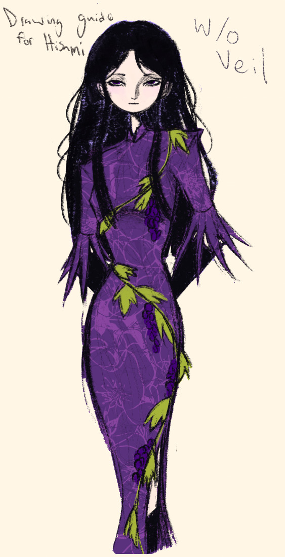
The next thing I wanted to try and draw was Hisami, mainly because.... I am very bad at drawing her in my style. Last time I drew her I made her look really creepy and spindly, and it is my headcanon now that she can switch between a more human, and more creepy look whenever she wants. I'm liking where the face is going a lot, might have to refine a few things about it in the future, but it's cute (I also made the blush purple which I think is what I'm gonna do with her face from now on). I also like how her hair in the sketch turned out a lot, but the outfit..... not as much... Ever since I started changing my style to something less cartoony, I've had a hard time drawing her outfit in my style. Especially the flower veil thing she has on, which, I did try to find a way to draw, but I ended up deleting that sketch because I didn't like it. I'm also not a fan of using the colour purple, like, pure purple, magentas are fine, indigos are fine, but not strict purple. I also have a hard time with drawing all the little pattern details on her dress. I also need to find a way to draw the flower veil in a way that looks good because everytime I try it ends up just looking off (very similar to whenever I try to draw Zanmu's blue spears). I think the only solution to this problem is to do what I normally do and make my own version of the outfit, but with adjustments to suit my style while still trying to keep core elements from the original design intact (like I do with Zanmu and Keiki, and yes I am going to get to that Zanmu drawing just gimme a minute).
Ok next up is Keiki, my favourite Touhou character who I haven't drawn since the beginning of the year. Since my style has changed a lot, I wanted to just do a face sketch of her to get a hang of drawing her again, and I..... really really like how it turned out! When I drew her eyes, I realized that a good way of keeping faces too same facey can be via varying the sizes of their pupils, so that's an idea I'm gonna keep in mind from now on. I had a lot of fun with her hair, I initially was gonna do it like how it is in the official art, but I ended up not liking it, so now I'm gonna draw Keiki with wavy heir like this because it's fun and it looks nice. I also included my base sketch for Keiki's face since I was initially struggling with drawing her bandanna, and in the coloured sketch I added some more detail into her hair.
Now to finally talk about the sketches for Zanmu. Good lord was I having a tough time with her face. I also did this sketch before I figured out how I wanted to draw hair, so that's why the rendering on her hair is different (I did this soon after the Hisami sketch actually). Since I changed my art style a lot, I had to find a way to translate her face from my more cartoony style to my more detailed style, so while the face shape, nose shape and mouth was fine, I was really struggling with the eyes. I did get somewhere eventually though, and I am super happy with how it turned out. I wanted to lean more towards the androgynous side of the gender presentation spectrum, mainly because I think that makes sense for her character. Also made sure to include the silver hairs and some wrinkles just to bring some signs of her aging into her face because those are just staple features of how I draw Zanmu at this point lol. You will also notice that I gave her some scars on the right side of her face, and that's because I am a Zanmu-with-scars truther, I fucking love it whenever I see someone give Zanmu visible scars like that it just adds so much omg (I also tried to put a wolf bite mark on her arm in the full body drawing but idk if it reads well). While you can argue that her not having scars sells the idea of her being this "powerful, untouchable mastermind who is impossible to defeat," I'd say that instead of those scars representing times she got injured, they represent everyone who has failed to defeat her.
As I was drawing Zanmu's face, I referenced my sketch of to help with contrasting their features since I made Keiki's face more traditionally feminine. I also didn't mention this in my commentary on Keiki's face because I wanted to save it for here, but giving Zanmu scars also plays into the fact that she used to be human, wheras Keiki doesn't have any scars because she's a god who doesn't follow the rules of normal human biology. Plus I'm thinking about the two of them interacting again (return of Zan/Keik??? (I'm a multishipper btw) maybe???) so drawing their faces together will definitely help me in the future if I wanna draw them together (again, maybe as a ship? I've kinda been ironing out the kinks in their potential interactions (romantic and non-romantic) for a while now so idk maybe expect that in the future lol).
And now for the full body drawing, when I was doing the face sketch I did this little snippet of an outfit, had a vision, and the made it into a reality. I'll admit, part of me was worried that it would end up looking too much like Yuugi's outfits in the spinoffs and mangas, but I feel like I made enough changes to differentiate them. I tried to keep a few of the major details in Zanmu's design (i.e. the red tassles and yellow lining on her shirt) while putting a new spin on it. I also dialed up the scars to 11 since without them the whole thing kinda looked incomplete. Also, while I could say that the leaves on her kimono are "a nod to the fact that technically she should be a tengu because back then people belived that corrupt monks would turn into tengu but no Zanmu is an oni and they're maple leaves because...tengu...ahahahaha" what really ended up happening was that I looked up clothing patterns from Sengoku era Japan, liked the leaves the most because the red picked up on the red from the rest of her design and just ran with it. I also always had the idea to put Zanmu in men's clothing from Sengoku era Japan and while the accurate thing to do would be to put her in a Buddhist's clothes from that era.... from a character standpoint, I don't think Zanmu is pious enough to strictly wear the proper monk uniform, and also since she's basically the king of Hell, she would probably dress herself like royalty from that era. TBH, I probably could've been a bit more historically accurate, but again, this was mainly for conceptual purposes because I had a vision and I needed to see it through.
If I were to draw her in this sort of outfit again, I should probably try and use more references, although now that I look at it, if she were to wear it properly this would maybe, probably look a bit closer to a Kyūtai sugata (a very huge stretch, but it just kinda reminds me of that) just without the layers under and over the main piece of clothing (In the website that I searched up to try and compare the outfit in my sketch to, they name the outfit pieces but don't label them on the image, so I don't know 100% what everything is called) so I will definitely have to use that style of clothing as a reference going forward.
Also, I was kind of inspired by the ToTK design for Ganondorf since I have finished the game a while ago and I absolutely love what they did with his design (it's just so fucking cool omg) and I thought that sort of look would look good on Zanmu, so yeah got some inspo from that.
And those were all the notes for each of the sketches, I'm motivated to draw rn but kinda art blocked, so doing these little coloured sketches helps a lot.
#touhou project#art#fanart#sketches#sketch dump#zanmu nippaku#keiki haniyasushin#hisami yomotsu#touhou 19#touhou 17#unfinished dream of all living ghost#wily beast and weakest creature
344 notes
·
View notes
Text
24 Asks! Thank you! :}} 🐷

I don't think I'm understanding.. I cant turn my FNAF AU designs into full on OCs, (Original Characters) because.. well Freddy Fazbear and the gang are NOT my original characters. I just made my own AU (Alternate Universe) for them and redesigned them.
Unless that's not what you meant..? I'm sorry for misunderstanding you if that's the case <:(

(In response to this post)
I'm keeping it in mind.. I gotta get to the root of the problem and figure out what needs to be replaced. Once I can figure that out I'll probably set one up 🥹🙏🙏

Well imagine if you were in his shoes. You are transported to some kind of unknown world. And absolutely no one arounds you speaks the same language as you.
Sneep has no way of knowing this is a digital plane. He has no idea if the people around him are real or not, he cant remember his name and no one can explain to him why that is. His body looks different, he feels different, no one around him looks to be a human.. just imagine how scary that is. Not having the comfort of things being explained to you in this situation. Not having the comfort of someone telling you "everything will be okay".
Yeah, I'd lose my mind pretty quick too 💀

@ardent-38
XD No worries! And yeah I started playing Warframe for the first time these past few days. Its been fun so far, Mag being my favorite. (She's the only frame I have <XDD)
I have my eyes out for Titania Prime, Trinity Prime, Mag prime and Mirage Prime. I'm thinking Titania might be my new favorite if I can snag one!
This game is fun, but the longer I play it? The more I miss OG Overwatch 😅 I tried playing TF2 again today and it just isn't the same 😔💔

@chromchill
I am new, but my favorite frame so far is Mag, because she's the only one I have <XDD
But I've got my eyes out for Titania Prime.. and judging by her abilities, she might just become my new favorite 👀👀

@chickenmilk120
What I really would like is just more interactions and comments with my artwork <:( I get bummed when I put a lot of effort into something only to get 3 comments in the end...

I have not <:(( but I've heard many good things about those games! :00

AAAAA THANK YOU SO MUCH!! :DDD That's all very kind of you to say! :}}
And as for Cici and Gerald, you can find their origin comic here! :00

@lordvonbunnyv
Yes please 🥺🥺🙏🙏🙏

@quillsinkwell
Awe! :DD Thank you! They did have a certain charm to them didn't they? :}}


They would have been much better off drawing that mattress character I swear XDD

@neo-metalscottic (Referencing this post)
Hello! So far my tablet is still alive. Although I'm looking into getting my laptop checked out and maybe replacing somethings... 😔
And it was fun to draw Bibi again! I should really draw the fam more often <XD
Not sure what resolutions they'd have.. but one of mine is to be cured of this condition. Or at least get to a point where I can actually function normally again. There's a lot of things planned for 2025 and if I don't get better soon? I'm gonna miss out on all of it. 💔

Yeah, my head just used to be a normal scribble. But now its become a full on blob hasn't it? <XD
There's 2 reasons for this. 1 being that I have been battling some very limiting health conditions for about 8 months now. So drawing my sona all goopy and sickly is to represent how I've felt through this trial 🥲🥲
But the second reason isn't so bad. That being that its just fun to draw my sona like that XD

@bored-animator
Indeed I have! Deltarune too! Just search up "undertale or "deltarune" in my blogs search bar and you're sure to find a lot of it! :))

Thank you so much!! :DD And sure! Send me any game recommendations you'd like! :}}}

@ramiel-hourglass
Thank you so much! :DD But no need to go to the dumpster! <:(( I'll make you something to eat instead, yeah? :)

I use FireAlpaca. And I used to use the pencil brush for line art and the pen for coloring. But lately I've been using the little pixel brush for sketching and line art :00
(This thingy 👇)


I saw it, and I don't really know how to feel about the blue shelled Koopa.. it feels kinda weird to see a Mario kart item brought to life suddenly 😅

I gotta think of stuff to do wither her... 😓😓

First thing that came to mind was Roxanne from FNAF: Security Breach <XDD

@howaboutsomeketchul
Idk how they would celebrate Christmas, since they might not have a good way to gauge the passage of time..

Just search "team fortress 2" in my blogs search bar and you're sure to find most of it! :)

While I see what you're cooking, I don't think my Caine would create a Momigoo NPC for the fast food adventure <:/
The thing that upsets Gummigoo isn't just that his mom isn't real necessarily, its that his memories of her aren't real too. He remembers all these experiences with this person but the memories aren't real...
And the whole reason why Caine let the brothers stay was because he hoped it would help Pomni adjust to the circus. Just like Bella did for Gangle. Bringing up NPCs or things from the Gators adventure could upset or confuse them so Caine wouldn't want to risk it. <:(


@wolfie-777
Merry Christmas and a Happy new year! :DD Sorry for the late reply <XD

@cartoon-fan
Oh I get a lot stolen from those other fandoms too. Octonauts has just been the most frustrating. Constant tracings, theft, copycats, disrespect, its was nuts.
I don't think I'll post Octonauts again anytime soon. I've just had enough of the constant pushing of my boundaries and the boat loads of all kinds of theft.
71 notes
·
View notes
Text
Gonna rant a bit. I saw one set of beautiful anthro arts on another website. Sadly they were done in AI. I did left a comment, complimenting how beautiful these arts were but how sad it made me that they were AI arts.
The artist themselves was kind and polite, telling they use AI because they want to learn and be able to make game arts one day (but they too, apparently, with AI so...)
But then there was another user, AI "artist" too who replied to me that there's absolutely NO ARTIST who can draw anthros with detailed fur, goat like arm, lights, colors etc without editing or photoshopping. On the whole planet, absolutely none! This person clearly don't believe in people's skills when it comes on arts. Heck, I followed one artist on DA who drew ALL her arts traditionally and she drew, and still does, SUPER DETAILED FURRY ANTHROS! No photoshop, editing, nothing digital. Just her hands, paper and a set of color pencils.
Also, if people's art skills wouldn't had been amazing back in the days through mankind, we wouldn't have cave paintings, old amazing paintings or sculptures, ALL DONE BY HANDS IN TRADITIONAL WAY. NO AI, NO PHOTOSHOP OR EDITING.
Humans can learn amazing skills if they only want to. AI artists, maybe not all, just wants to take the easiest way / be lazy (and get lots of likes - like that other person who straight forward said it. That he uses AI to create furry arts to get hundreds of likes).
They also mocked my style / arts, saying they are not good enough to be used in AI arts - yet.
Like what the actual fuck?! I am pissed! I don't even want my arts to be used in AI arts by some lazy idiot (or at all). At least I draw EVERYTHING in my arts, from first sketch line to the last shade / light. Surely my skills are not as good as they could be. After all I'm self-taught, not gone in art school like some have. Not to mention I draw for fun, I draw to bring joy to my watchers, I draw therapy arts to myself, I like to keep my style easy and simple. My arts are a hobby, not professional thing or to fish a lot of likes. If my arts can make someone's day a bit better, then I've done my job! I never haven't taken my arts or skills too seriously, trying to improve them to the top.
Is there times when I wish I would put more effort to my arts, learn and study more, becoming better? Absolutely! But do I bother? Not really. Like I said, this is a hobby. I know I would burnout myself if I would start to force and pressure myself to do better, to learn more, to improve my skills. I mean I struggle to draw even now!
I do have some saved tutorials on Pinterest what I would like to try, yes, but still not in a way like if I would have a fire under my ass.
#Text#rant#AI#AI art#I'm honestly so fucking pissed right now#Been feeling pissed overall the last few days#And now this to fuel that anger#I need to calm down and do something#Because I don't want to bake my birthday cake for tomorrow while feeling like smashing someone's skull with a hammer#Sorry for the rant guys but I honestly need to let out some steam#Not to mention you guys are my friends#Only ones who I can talk to#Delete later
570 notes
·
View notes
Note
hihi not a creature au ask sorry but do u have any tips to improving art skills? /gen, second question how did u get into digital art?
dont be sorry the asks are for anything really
my biggest tip is pretty boring and has been said a billion times probably but you u fortunately need to do the boring basics. you can go anywhere you want from there and its gonna be much easier. ex. - drawing alot of boring 3d shapes in dofferent types of perspective. boom now you can draw backgrounds. drawing from models in realism (live ones are better but photos are great too). boom now you have the skill and knowledge on how the human body works and can play around with it to develop ur own art style. greyscale form practice (like shading cubes or drapery or still life). boom u understand how light and shadow works. the hardest thing really (imo) is learning colour. me personally, traditional painting (acrylic, oil, guache, tempera) helped the most (again ALOT of still life). but learning colour theory, or just fucking around with whatever colour medium you like until it looks good is also very helpful. so again basics are really important.
next thing is, use resources. theres so many free art resources out there and theyre very helpful. my personal fav lately are quickposes and david finch on youtube. use refs, if needed take ur own.
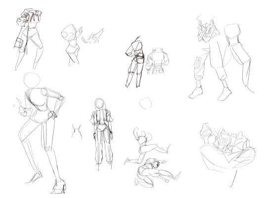
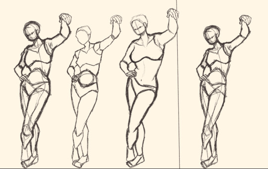
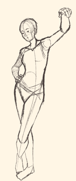
also mindset stuff like being okay with making "bad" drawings. shitty sketches, wierd colour xombinations, wonky perspective. making art is not abt not making mistakes, but abt making them and learning from them cuz if u dont try ull never get it right, even if its bad at first. also always go from overall to detail. make 5 minute sketches, that forces u to focus on form and translatinf the overall idea more than hyperfocusing on detail. and ofc alot of consistent practice. draw every day, whether its a 5 min aketch or something more polished. (im gonna attach some of my oractice sketches so u get the idea of what im talking abt cuz i feel like im not the best at explainin)
as for digital art, i was first drawing on a regular ass samsung tablet with a pen wrapped in tin foil (it makes it work like a stylus fun fact) on ibis paint which is free and honestly it was great. on thing is if ur starting digital get some free simple program cuz if u try to start with something thats "industry standard" its just making ur life harder cuz on top of learning how to draw oj a tablet, you have to learn the software, and u dont need that when u start. i got my actual drawing tablwt after like two years and i was working in krita (also free and really good). now i work in csp and its amazing but theres alot going on and it is pricey (but well worth it imo) digital is easier in alot of ways but i still recommand learning traditionally
sorry for the shitty photo quality im bad at posting traditional art. but thats what im talking abt these are like 10-15 min each, focusing on form and the overall and not going into much detail
41 notes
·
View notes
Note
how did you get started making music, tools-wise?
I've talked about this a bit before and I don't necessarily recommend doing this, so skip the following two paragraphs and go right to the one under the break if you actually want the method I recommend
I lied to a girl I liked from my school and told her that, because I could play guitar I could also play piano, so I could teach her to play piano. both of these statements were lies.
I had to panic and learn both guitar and piano one week ahead of the lessons I was giving her as an excuse to hang out. so I self-taught in a haze of panic and "maybe she'll like me" (she did not) (but she kind of did) (but she was bicurious) (but she was wishy-washy on if she wanted to get together and her parents didn't like me) (and her parents were homophobic) (I think she might have texted me at one point years down the line to tell me she had a girlfriend but it was after I deleted our text history and I'm chronically unable to remember to put people's names into my contacts so who knows)
but that's all an aside. that's a bad method.
anyway if you want to start making music in earnest, doing what I did when I got serious about making songs instead of trying to impress girls whose parents wanted to destroy me with their minds here's a better answer
go acquire FL Studio. it's apparently really easy to do this because people have been acquiring it for years, or so I've heard. FL is good for learning because you've got 20 years worth of free tutorials available to you on youtube to dig through and plenty of stock vsts to play with out of the box
FL Studio is, realistically, the only tool you actually need to start making music. you could get away with less, but it's what I used, and as long as you don't pick up Specific Bad Habits, your experience with it will transfer to other DAWs if you decide to switch it later
that's all, really
if you go this route, the golden rule I'm going to impart on you right now is that you need to have a limiter on your songs. the default FL studio song templates have one, so you should keep it until you know enough to know why you might adjust something like that
it doesn't matter if it sounds fine in the editor without a limiter. everyone thinks it's not a big deal at the time, but as you get more experienced, there's literally nothing short of getting in legal trouble that you'll regret more than realising that your old work is almost entirely unsalvageable because you didn't put a limiter on it and now half of the audio is just lost data to clipping
I'm gonna put a few more recommendations for things I've used, just so you can consider them if you need something else to chew on. everything past this point is entirely optional and you'll do just fine with FL Studio alone. in fact, probably don't worry about everything below the line
-=-
items marked with [F] are free.
DIGITAL AUDIO WORKSTATIONS THAT AREN'T FL
for tracker-based editing and chiptunes, use Renoise. you'll either love or hate trackers, and while they have a steeper learning curve than piano roll DAWs, they might come more naturally to you. I personally think that Renoise is a lot of fun to use. it kinda has an "addictive" quality to it, as funny as that is to say
for quickly sketching songs, use [F]Jummbox. it's an html workstation (multiplatform!) that writes your sketches to a url, meaning it's pretty easy to collaborate on musical sketches. Jummbox is good for making chiptune style instrumentals, but what makes it especially accessible is the fact that it works on a piano roll system, which will be familiar to you if you're working in FL
for writing sheet music, I recommend starting with [F]Musescore. I'll warn you right now that there aren't really any good notation editors and you're making lesser-of-evils decisions when you pick any of them, but it's probably the best compromise out there right now. it's the one I use when I need to hand something to a physical musician. you can also export pieces as midi, although there's better ways to do that lol
-
VSTs
if you can acquire Pianoteq, do that. if you feel uncomfortable with acquiring it, [F]Keyzone Classic is free and can sound pretty nice with a bit of work, but you really have to learn to work with it
if your workstation can handle it performance-wise, go pick up [F]Vital - Spectral Warping Wavetable Synth. there's tons of free presets for this out there and it sounds good. cool synth. Serum: Advanced Wavetable Synthesizer is also good and has plenty of presets, but it's on the pricy side, so consider how comfortable you are with [finding a friend to buy it for you]
[F]Decent Sampler doesn't do much out of the box, because it's just a tool for playing sample banks, but if you go to [F]Pianobook, you can find tons of weird and fun sample packs of just about everything you can imagine. sounds derived from folk instruments, industrial equipment, lego sets, stylophones, choirs, whatever. incredibly useful.
Valhalla VintageVerb. this is the reverb plugin. you want this one. [F]Valhalla Super Massive is also good but it's more focused on alien-sounding reverb effects and enormous spaces, so it's kind of got a niche use case and you should be a little careful with it
if you've heard a lo-fi hip hop song on youtube, it probably used [F]iZotope Vinyl. this one can save you a lot of time if you're going for that sound because it comes with all the little vinyl flourishes outside of compression (like dust crackling) that you'd otherwise have to add yourself
[F]Genny VST is advertised as giving a genesis/megadrive sound, but what actually makes it shine is that it's an actual synth emulating the YM2612 and SN76489 sound chips. this means you can create your own sounds that work within those specs, which is a lot of fun! definitely beats just using samples, if you ask me
-
HARSH VSTS THAT I PERSONALLY LIKE BUT WHICH ALSO MIGHT !!HURT!! YOU. SO BE VERY CAREFUL USING THESE.
[F]Tritik Krush is a bitcrushing plugin. it does a good job of bitcrushing and downsampling. I use it a lot in my songs, but you've really gotta know how to keep this one under control, because it's fully capable of making painful sounds on accident and can completely devour your mix
[F]FSA Latcher is a gorgeous noisebox. it screams in horrible ways and makes dying machine noises in various colours. this is the musical equivalent of working with radioactive material, so be extremely careful using this in anything you don't want to hurt the listener's ears
girlfriend just told me I have to recommend [F]Noise Engineering Ruina to you if I'm making a category with this heading. I don't personally use it, but she likes it (she's better at music than I am) and it's free, so you should go pick it up. "it annihilates sounds very deliciously" (maybe I should use it)
-
hope that helps a bit!
186 notes
·
View notes
Note
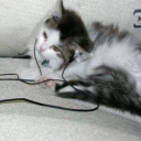
Hi! How would you draw a tool-evolved cat paw?
Aeons ago I wrote some speculative biology thoughts on what a tool-focused cat would begin to look like, and mentioned the way that a caw's paw might evolve. I can try to draw it out as a sketch; but fair warning that I put my art style points into cartoony anime stuff SO you're not gonna get a realistic drawing lmao
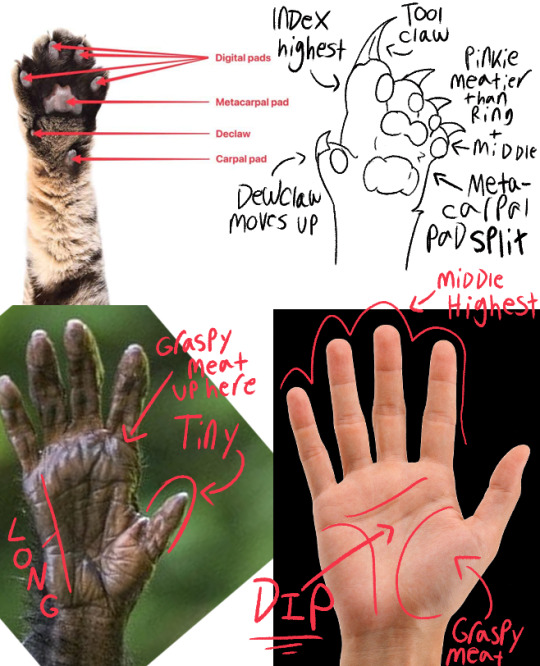
Evolution doesn't "think." It's many changes over generations that snowball into bigger ones. So I tried to look at WHAT exactly is happening between an animal with less sophisticated tool use (chimp) and one that COMPLETELY relies on tools (human) to predict where the cat's paw would end up in a few thousand generations.
Please note! My paw would still be a "link" between the ancestor, and something even more reliant on tool use. This proposed species would still be 100% capable of doing what the cats in-canon do, like hunt alone. It's for a feline species that is tool-ADAPTED, not tool-RELIANT.
(In that way, it's more comparable to, say, a lemur and a chimp. But lemur palm refs were hard to find and I did this quick because I've already thought about it.)
This paw would exist in-tandem with a "tool tooth;" A V-shaped gap in the jawline that a single fang would nestle into. Early tool-using felines would likely use their mouth to "break" or "shear" their crafts, leading to broken teeth that would make them less successful. So there would be a lot of evolutionary pressure to have better, stronger teeth.
Evolution doesn't do "one thing at a time," so if you happened to port yourself into a group of these cats and watch them craft stuff, you'd see them using their mouths as well as their paws!
Finger Size + Tool Claw
When you see real cats batting stuff around and manipulating things, and when you look at canon where they like to "hook things on a claw," it's usually the index "finger" they favor. In fact, they do a LOT of "poking," even when a cat bats at something they seem to mostly explore with the tip of their paw.
So I figure that would actually be a big difference between this species and humans.
Unlike us, who usually have our middle finger as the longest (though there are exceptions) so we can "stabilize" the things we grab, I'd give these guys a "Tool Claw" which is not involved in grappling at all. It's longer, more deeply grooved, but also more fragile than the "hunting" claws.
When at rest, the Tool Claw would stick out from the rest of the foot, straight upwards. The fur is able to "sheathe" the other three, but the index's would be too long to be fully hidden.
Because one of those fingers is now mostly taken out of combat, the pinkie would probably thicken up to compensate. Another difference from the human hand. I can imagine that if the trend continues, they might end up supporting their full frontal weight on the pinkie pad to free up the other fingers for tool use.
(But evolution's not always predictable! They might end up becoming more "back heavy" like raccoons, or rely on the invention of shoe/gloves, or just abandon silent hunting all together to become tool-reliant.)
Paw Pad Changes
Cats use the pads on their paws to move silently. As long as the species is relying on silently stalking prey, they will need to have these pads in contact with the ground to be good hunters.
So instead of the digital pads sliding down to create the "top" of the palm, I figured the metacarpal pad would split in two. So now there's a snug, dipped "shape" with which they could nestle an object into as they work with it, but also there is ALWAYS still pad in contact with the ground.
The amount of fur in-between the bottom (metacarpal) and top (supercarpal) pads probably just depends on culture and genetics. It wouldn't really have enough of an impact on the paw to be selected for to be furry or hairless.
I can imagine some groups being weird about it and thinking it should be shaved or braided or something, lmao. Or cats who live in muddy environments clipping it for hygiene reasons.
#Speculative Biology#bone babble#but btw no i dont use these in my bb drawings.#this is just for fun.#BB isn't really a spec bio project.#And also YES this is free to use for anything go nuts
200 notes
·
View notes
Note
What advice would you give beginner artists?
it's fine to want to do more stylized art, but nothing will help you improve quickly like studying from life. even if you want to draw very stylized figures, life drawing is still going to help you understand how the human body works and then you can build your stylization off of that understanding. I also recommend studying specifically things you're looking to improve--if you feel like your poses aren't dynamic, ask your model to do some quick (1-2 min) dynamic poses and work on getting the gesture down. if you're looking for anatomy, ask for longer, more static poses and really study the contours of the body. this also applies for portraiture and character art--my expressions and facial structure improved like CRAZY when i started doing portrait studies from life! (note: i know live model sessions aren't accessible for everyone. i'm a huge advocate for nude models, if you can find a studio nearby that's affordable to you that offers sessions, that's the best you're gonna get. however, there are sites that will give you photos of nude models to draw from, too, or you can even just ask friends or family to pose for you when they aren't busy, that's what i did before i started getting model sessions from my school!)
materials are not everything but sometimes a good material can make a difference. it's important to know what's worth it and what isn't for your skill level. invest in some decent-quality supplies or a good art program, but understand that you're still going to need to work to understand your materials and use them to their fullest potential. (if you're a digital artist buy csp. trust me on this. get it on sale. it will change your life. also do not fucking use photoshop)
tracing is ok. listen to me. TRACING. IS. OK. tracing is how you learn. don't trace other people's art and pass it off as your own, obviously, but there is literally no problem with tracing real-life reference photos. I routinely trace references for backgrounds and the like. there is no reason for you to kill yourself trying to make complex perspective and shit up from your head when you can very easily just overlay a photo and get what you need.
in that same vein, USE REFERENCE PHOTOS. find pics online or take pics of yourself and USE THEM to see how your poses work. it makes it SO SO SO much easier. the understanding that you need to create a pose out of nowhere will come with time but you're not going to get that skill unless you have a foundation of understanding how the real human body works, and the easiest way to get that understanding is by copying photos of real people.
last but not least, there's generally a sort of 'rulebook' that new artists are expected to go by, especially online, when it comes to digital art. when i was first learning, it was all about lineart and cell shading, two things that I didn't really like. Nowadays it seems to be all about rendering. the single most important thing i can tell you is if it sucks you don't have to do it. if you hate lineart just color your sketches. if you hate shading don't shade, or find a different way to shade that you enjoy more. if rendering is annoying or difficult for you DON'T BOTHER!! art is supposed to be fun. if part of your process is annoying or upsetting to you, cut it the fuck out. don't torture yourself just to do art the "right" way. i guarantee your art will look better when you're having fun making it anyway!
#asks#ALSO don't go in expecting to monetize your social media presence/go viral as an artist. make art for YOU and make what you want to make.#if your art has passion behind it then attention will come naturally!
331 notes
·
View notes
Note
I absolutely adore your art style! Do you have any tips? Specifically for the fairies cause I am struggling to draw them.
thank you so much! well, this is gonna be a long post.
Im gonna be real, the best art advise anyone can give you is to use references and to break complicated stuff down into easier shapes. for example:
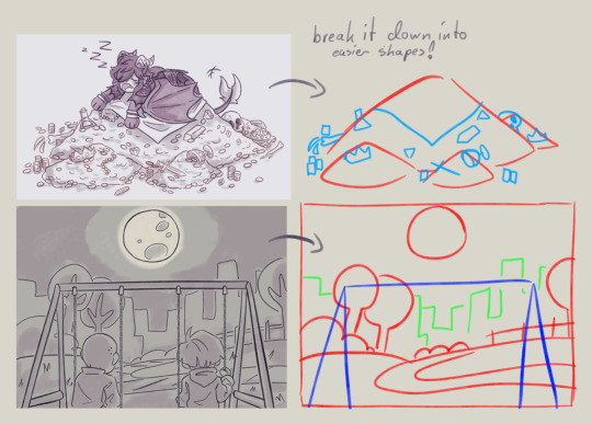
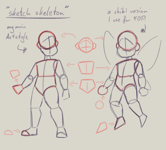
this is my basic body skeleton! i always start with the circle of the head and work my way down to the feet. i have highlighted some part of the body which are actually just simple shapes.
the center line down the middle of the torso also helps me draw on collars, bra cups, ties, or any other more difficult clothing more accurate!
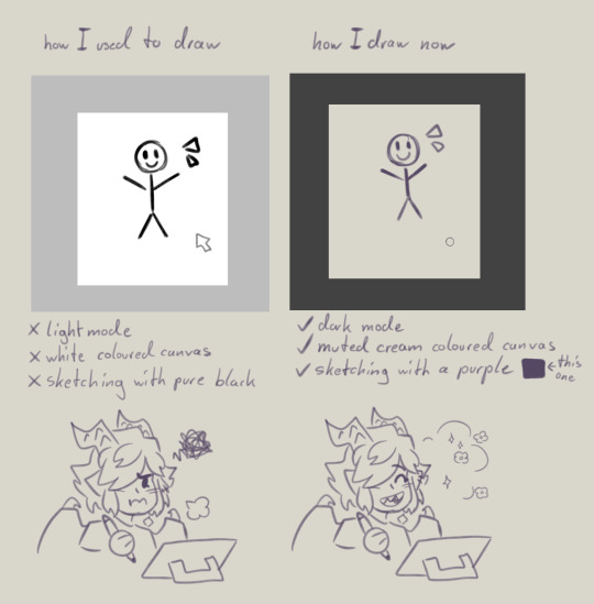
However i have to ask you, are you comfortable while you draw?
I remember when I first started drawing digital, i was really uncomfortable with the basic set up of my program. The white canvas and the light setting of the program was really bright and irritated my eyes. And the contrast of the pure black I used for drawing wasn't really helping. sketching and doing line art was my least favorite part of drawing because of this.
you don't have to draw on a white canvas, you can also use multiple colours for sketching if you wanted. Once I stoppend using a pure white canvas I noticed i stopped staring at a empty canvas not knowing what i wanted to draw anymore!
also sometimes when a drawing doesn't want to look right, i switch back to traditional. idk why but when my brain sometimes struggles with a specific pose or character design, it comes to me a lot more easier when I switch back onto paper. i guess the change of scenery opens up the creativity again haha.
don't be afraid to simplify stuff, you don't have to draw everything! As long as it still translates to the thing, it should be fine.
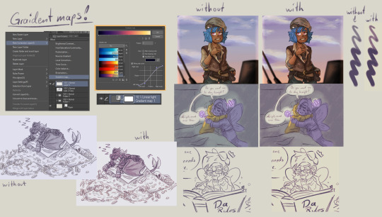
these two are a bit clip studio exclusive,
but Gradient maps! god how I love my gradient maps, it just makes the colours pop! I never draw without it anymore. I always pick the sunset gradient, put it in Linear light mode and put it on 10% (cus its really saturated on 100%)
usually i have it on while i sketch and line, and turn it off so i can properly colour and shade. i turn it back on at the end again
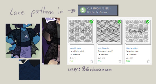
the clip studio assets has a lot of beautiful stuff in there created from other users. (a good amount for free too) for example I got the lace pattern of my shawl from there. and its really easy to import the downloaded stuff into the program.
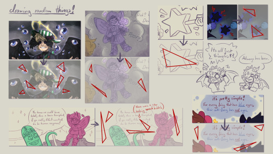
now this is a drawing hack that blew my mind when I first saw it! i use it all the time and I just have to share this!
whenever you want to draw something random like sparkles, stars, bubbles, feathers, falling leaves, or anything that you want to float around your characters, position them in the form of a triangle.
its even better if you put two points of the triangle closer together and then the third further away. this makes it look random but still looking appealing to the eye, and not oddly placed.
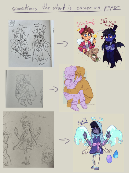
now that thats out of the way! Fairies! The one thing i struggled with when drawing them first is their hair. I suggest looking through the fop tag to see how other people have drawn them and take inspiration from your favorites and make up your own. (do not trace tho! that should be obvious!)
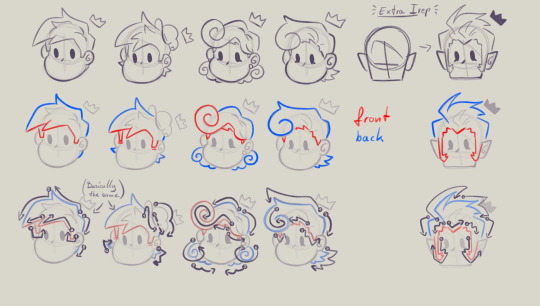
when I draw hair I think of it separated in two parts, the front and the back. I usually start with the front hair pieces, then draw in the jaw, ears and rest of the head, then continue with the back section of the hair.
the only outliers of this are Timmy and Peri. when I draw Timmy (Ymmit as well) I start with his hat, before drawing his hair. Since I draw Peris hair-swirl over his hairline, i start drawing his upper back hair style first before drawing his head and then his mullet.
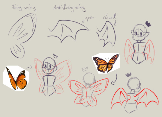
wings can also be tricky. the fairy wings i have given then have a more butterfly look. if you also want to base off the wings to real life animals or bugs you can use them flying as references to. Or you could even cut out the wing shape out of paper, fold it in the middle and take pictures in the angle you desire.
I hope this somehow helped, I thought about what could have helped me if I had known it sooner. even if most of these were for generic drawing.
#my art#asks#art tips#drawing advice#clip studio paint#fop#if anyone has more questions about how i draw#once i open up the ask boy again feel free to do so
49 notes
·
View notes
Text
Day 27, 105 hours

It took me. 105. hours. To finish this piece :0
I hope yall's weeks have been better than mine TwT. No air conditioning in either of our cars, the mechanics have been blowing us off about, AND we got sick with fevers/colds, it was miserable. I was practically withering away in bed cuz I got hit the hardest ;v;
But anyways, it's them. The boys! They're on a pier. Cuz I love the beach <3
This piece wasn't supposed to take this long! It was a digital sketch that I was gonna polish up a bit, but I ended up adding more to it as I continued.

I was loosely inspired by those dramatic "catching the love interest when they trip/fall" trope in manhwa cuz it makes me so unreasonably happy. I think its soo cute!
Anyways, I should've mentioned this before but I won't be able to do an everyday upload, more like an every other day thing. But I was wondering if yall have any Kuzusouda requests? They wouldn't be full pieces, more like detailed sketches, but I'd like to hear yall's ideas. I dunno, I think it'd be nice to do a little collaboration with you guys. (o3o)/ Inbox? Ask box? DMs? ...they're open, send me ideas and I'll interpret them :3
BONUS ART: xSplatoon

Squid kids. Man, this game had me obsessed for almost an entire year. I was there the moment Splatoon 3 released. Dunno what weapons they'd main specifically but Fuyuhiko might do well with Dualies, especially if paired with Peko and a Splatana. Kazuichi would prolly mesh the best with a Charger.
I think this was the second digital art piece I did since the beginning of my lil challenge. A fun and little journey to understanding and finding a painting style with Ibis, my main art program.
64 notes
·
View notes
Text
A3! Miyoshi Kazunari - Translation [SR] Bright Star of Blooming (1/2)

*Please read disclaimer on blog; default name set as Izumi
---
Izumi: …Hm? (It sounds pretty rowdy in the lounge…)

-pause-
Kazunari: Ah, Director-chan!
Izumi: What are all you guys doing?
Kumon: Summer troupe’s playing pictionary relay!*
Kazunari: We were just about to match the pictures with the answers, so come join us!

Izumi: What the hell, sure...
Kazunari: The whole chain started off with “ri”… And Mukkun was the one who drew it, right?
Muku: Yes! This is… a squirrel!
Misumi: That’s a good one, Muku~!
Tenma: You can tell at a glance.
Yuki: There’s no doubt about it.
Kumon: That’s Muku for you!

Kazunari: And next was Yukki.
Yuki: I drew… a watermelon.

Misumi: Wow~. It’s a watermelon~!
Izumi: You can totally tell.
Kumon: Yep! He nailed it!
Kazunari: Then next up was yours truly. I drew… a crab!

Muku: You can see Kazu-kun’s drawing skills at work!
Misumi: You’re amazing~!
Tenma: There’s no need to worry there.
Yuki: He’s on another level. That’s his day job though, so I guess that’s to be expected.
Kazunari: And so… Tenten, what do we have here?
Tenma: …A pacific herring.

Yuki: A what?
Kumon: Uh, I can vaguely tell it’s a fish from the outline, but…
Yuki: There’s no way anyone can tell exactly what type it is.
Izumi: Wait, hold on. The word chain will come to an end if you use that word…
Tenma: AH…!

Misumi: Stay strong, Tenma~!
Kazunari: Ahaha! There’s never a dull moment with Tenten~. This was a fun break from work~!
Muku: Come to think of it, the screening party for “Sky Gallery” is just around the corner.
Kazunari: Yep! This would make a great topic to chat about, wouldn't it?
Tenma: We don’t have to talk about this!
-pause-
Kazunari: It’s been a hot minute since we’ve worn these costumes. I am SO locked in~!
Muku: Fufu. It brings back memories already.

Izumi: All of you look great.
Kazunari: You know, you could wear these costumes out as regular outfits. Don’tcha think?
Yuki: They’ll get dirty, so you better not.

Kazunari: You’re not wrong. But I totes feel Aomi’s energy when I put this costume on!
Yuki: We may be wearing the costumes, but we’re not acting as the characters today.
Kazunari: I know, I know~. I, Kazunari Miyoshi, will do my very best to entertain the audience today!
Tenma: He’s not supposed to be in character, but it’s confusing when he acts so excited with his Aomi outfit on…

Izumi: Ahaha…
-pause-
Kazunari: Heya~! We’re the members who were selected from MANKAI Company’s Summer troupe ✰
Tenma: He sure went from 0 to 100 from the very start.
Yuki: Agreed.

Muku: I love it. That's just like Kazu-kun.
Kazunari: Exactamundo! I bet everyone’s still basking in the afterglow of the screening, but we’re gonna keep it moving forward with our same energy as usual!
Muku: Let’s go ahead with the talk show! Alright, shall we jump into answering the questions we’ve received from the audience members?
Tenma: Sounds good to me.
-pause-
Kazunari: …’Kay, onto the next question!
Muku: Let me see… it says, “please tell us a memorable story you have from the performance.”

Kazunari: Ooh boy, I’ve got tons~!
Tenma: Since we're here, I think you should talk about your memories from being the lead.
Kazunari: Mm~, it’s hard to choose from so many… But I guess I’d say the time all of us drew pictures of the sky left a big impression on me.

Muku: All of us in Summer troupe were on a digital detox, so we weren’t allowed to use our phones. That’s when we decided to hold a sketching contest.
Kazunari: Yep, exactly! Even though they were drawings of the same sky, everyone’s individuality popped out. It was super duper fun to look at~.
Yuki: By the way, are you still storing those drawings?
Kazunari: Of course I am! Okay, hear me out. At times like this, like a screening party—we should place them all out on display, one-by-one, at the MANKAI Theatre. Wouldn’t it be hella fun making it like an exhibition where everyone can come take a peek at them?
Yuki: That doesn’t sound half bad.
Muku: I agree!
Tenma: …

Muku: What’s the matter, Tenma-kun?
Tenma: No, it’s just… I drew that picture not thinking anyone else would see it.
Kazunari: Huh! Your sky drawing was a real work of art though!
Yuki: Well, that one was good… our pictionary relay? Not so much.
Tenma: Hey, Yuki—!

Kazunari: Ah, should we talk about that after all? Tenten’s sense when it comes to pictionary relay sure is interesting!
Muku: I’d love to play pictionary relay in front of the audience next time.
Yuki: It'd descend into chaos for sure.
Guest A: Summer troupe’s pictionary relay…!
Guest B: I wanna see it so bad!
Kazunari: Aw, look. The audience members are totes dying to see it!
Tenma: —I swear I’m not doing it!
---
*They’re playing “絵しりとり” (e shiritori). It's basically shiritori (word chain game), but with drawings. The game starts off with a Japanese syllable, i.e. “ri” in this case. The first person has to draw a picture of something that starts with “ri”. The next person has to draw something that starts with the last syllable of the item in the previous picture. And it goes on from there.
The chain here was: リス (risu: squirrel) > スイカ (suika: watermelon) > カニ (kani: crab) > ニシン (nishin: pacific herring).
In Japanese, no word starts with the syllable ん (“n”), so if anyone says or uses a word that ends in “n”, the game is over.
| next
21 notes
·
View notes
Text

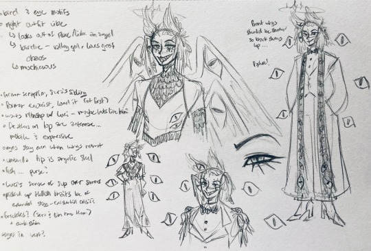
So about those redesigns. Here's some concepts I threw together. I'll push out some finalized sketches with colors eventually but I couldn't sleep so I did some quick doodles.
Some changes I made to fairies were making them less tinkerbell /human looking. Antenna instead of noses, four digits instead of five for hands. I kept the dimorphism but I'd like to note that it's magic+personality based. A fairy's appearance is in direct correlation to how they feel. Marianne's appearance (hair color that kind of thing) changes being related to how she feels after Roland for example.
Colors are going to be a big thing for fairies. So when I get a finalized design down I'll share.
Also I accidentally made Marianne left handed because I forgot I had flipped the canvas so... Now she's left handed and I kinda like that for her.
I made Dawn's hair look more like a flower bud, because ya know, sweet lil innocent Dawn.
Bog's more dragon-y. But since he's still part fairy, I gave him some moth-like fur inspired by @skarjinx / @ezerain 's AU Bog. Also gave him a less humanoid face because of the changes I made to the fairies in general. Also earrings because idfk they looked cute. I don't have any other reason for them. They'd be tactically dangerous but I don't think anyone would get close enough to Bog to grab his jewelry in a fight. I also gave him a tail because... Uh... Fluffy. And ofc digitigrade instead of plantigrade seemed to fit better. Bog cannot change his appearance (glamour) like a fairy can in this AU, his magic is not fairy based but he is a fire fae so he's got fire magic (keeping that from my other AU).
O3O;; also... I'll be changing the goblins a bit and elves too. Adding gnomes and dwarves to the universe so uh, Sunny is gonna be different.
Think I'll refer to this AU as the Fae AU maybe? Once I know for sure I'll give it its own blog.
22 notes
·
View notes
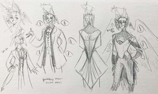
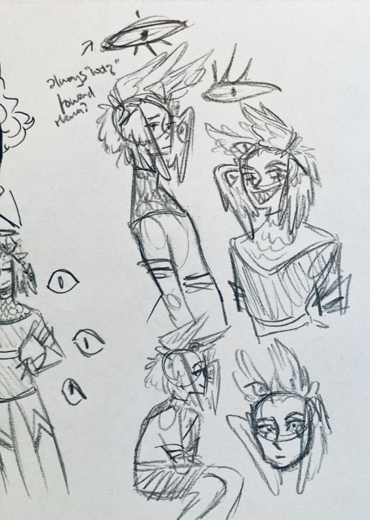
Text
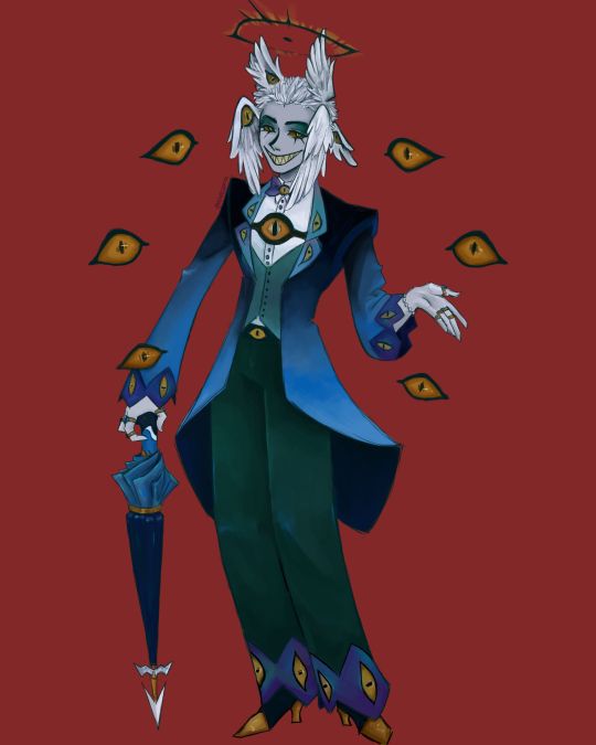
I finally finished the piece for @prince-liest's OC, Tzafael! this really reminded me of how fun character design is (and also that I've completely forgotten how to make digital art, but that's besides the point...) <3
credit to @hogbogglerspirits for the umbrella design! I kind of butchered it so please look at the original and throw lots of love at them
LOTS of notes, draft sketches, brainstorming, etc. below the cut. enjoy!
(note: a lot of what I'm talking about is based on posts prince made under their #tzafael tag, so take a look at those if you haven't yet!)
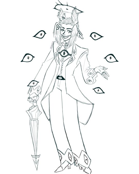
thanks for joining me below the cut! here's the sketch without the colors as a treat (in case you want to color it yourself or something, idk).
notes about making the digital drawing:
holy shit this took me forever -- I was not kidding about forgetting how to make digital art lmao. I forgot how much less forgiving digital lines are and genuinely lost the spoons to even attempt lineart, hence just a sketch below the colors.
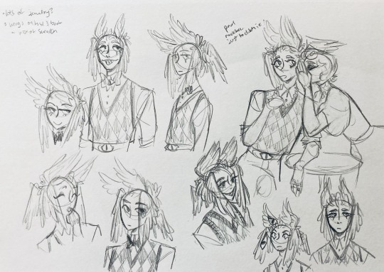
some of you might've seen the original sketch I sent to prince, which the digital version diverges from just a little. it's mostly the halo which I'll explain later, and I finally caved and drew the sixth eye (you can tell I drew and erased it multiple times in the sketch lmao -- still don't know if I prefer it with or without)
here's the original color ref by the lovely @gendermeh! my color scheme ended up looking really different, so some notes about that:
I was looking at references for magpies like this
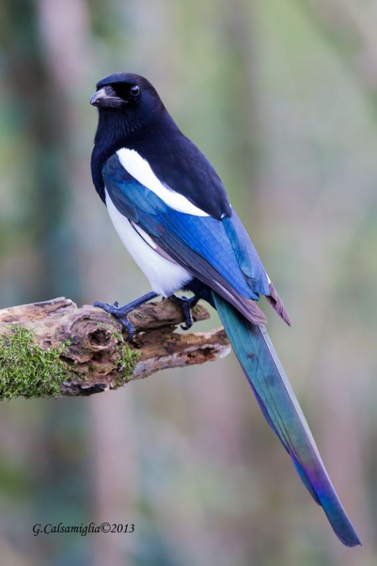
and I wanted to basically follow that color scheme while also being somewhat similar to the original -- dark head/shoulders --> dark top of the jacket, bright blue wings --> bright blue bottom of the jacket, greenish tailfeathers --> green pants, hints of purple --> purplish sleeve and pant ends
I also tried (and mostly failed, let's be real) to capture the iridescence of the feathers -- they look like oil spilled on the pavement or iridescent hematite to me! I think the key ended up being adding bright greens/purples and roughly blending them into the blues or vice versa but I didn't really figure that out until I got to the pants lol.
I'm gonna be honest; I don't remember why I went with this shape for the tailcoat. I just remember being unhappy with the sketch and then trying a bunch of different shapes that mostly looked worse lol -- I think I landed on this because a split tail kind of looks like wings?
KEPT the shoes -- absolutely magnifique. I wish I knew how to color gold better.
added lots of jewelry! they like shiny things :)
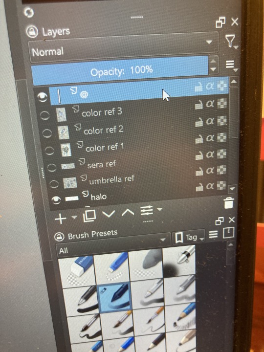
ALSO PLEASE LOOK AND APPLAUD ME. I FINALLY REMEMBERED TO LABEL MY LAYERS!! NO I DON'T REMEMBER WHY THE HALO HAS ITS OWN LAYER.
alright, time for some more design notes/explanations + draft sketches!
but first, a couple disclaimers:
I want to make it very clear that I LOVE everything about the original design. I made a lot of changes based on personal preference/the way I interpreted the character. I was actually planning on making a digital piece that was more faithful to the original design too, but I was just out of spoons for it cause of life stuff.
you probably shouldn't try to read the notes I made in the sketches I'm about to show you unless I say otherwise. most of it is incoherent brain vomit in illegible artist handwriting and I'll transcribe/explain the stuff I think is important :) (the stuff in quotes are direct transcriptions of my notes)
I know my sketches are very messy lol. I only draw for fun, so I usually don't force myself to make stuff any neater than necessary unless it's supposed to be a formal piece. try to bear with me.
1:
my first few sketches of them! (I think?) this was before I sent prince a laundry list of questions so I was still trying to get a vibe
"magpie -- beak lips?" -- you'll see this in a few sketches; I considered giving them the lipstick design that velvette has since it looks like a beak. I still kind of think it's cute, but 1) I'm pretty sure velvette is the only character that has them, so I didn't want to make it seem like they were related somehow and 2) I thought it might be distracting with how much other crazy stuff I ended up including in their head/face
also, sidenote since it's relevant to what I said about vel: something I realized was important is how one character's design relates to the designs of the rest of the cast. I wasn't sure how much I should've gone for what looked good in a vacuum, how much should be based on what other characters looked like canonically, or what other characters would look like if I also designed them. it ended up being mostly the second option, but it was honestly still a struggle. should I take away some of the tumblr-sexyman-ness (no shade to tumblr sexymen; I love them) because there are other characters that already have it? should I relate their design to sera's and emily's in the show or should I think about how I would've designed sera and emily? should I follow some of the design philosophy of the original show and just throw stuff on there because it looks cool (the answer is yes btw)? decisions, decisions ...
I don't think this showed up really well in most of the drawings, but they actually have a black line down their nose! let's take a look at sera:
since they're siblings, I wanted to include some similar facial markings. the nose line ended up being the only thing I kept though -- I was going to include freckles, but I have a compulsive need to give every character giant bottom lashes so there ended up being no room T.T I like that the magpie's hints of purple kind of match hers tho!
the wingification of the hair begins! I was still unsure of it at this point, but it was an idea I had since I was kind of struggling with how straight the feathers were in the original.
"maybe the ones on their head count as wings (so only one main pair)" -- I originally just had the 2 pairs of wings on their head, so I was thinking of just giving them 1 pair on their back so there would be still be 6 total. also this middle drawing of them is meant to be their exorcist outfit (I wanted it to be a cross between what the other exorcists wear and sera's outfit)
at this stage, I was thinking of giving them more magpie-like characteristics, so I looked at some references and tried to emulate them in a more human design. this ended up being really awkward so I scrapped it, but I still like the idea that their exorcist mask looks like a bird (kind of like a plague doctor's)
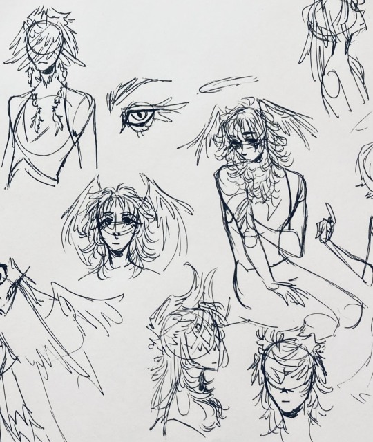
2:
peekaboo! I love the idea of them using the wing hair to cover their eyes lol. (ended up using that idea for my own seraph OC since that's their biblically accurate purpose: to cover their eyes/faces in reverence/humility -- doesn't really fit with tzafael tho lol, so they show their face most of the time)
an eyeball in the bowtie -- pretty self-explanatory. the eyeball motif is important.
the one in the middle is just me practicing drawing the original design, and the one on the right is another exorcist outfit I think. I wanted to include the diamond motif/points that sera has on her dress (the diamonds on the bottom turn into eyeballs, which is why the final design also has eyeballs on tzafael's sleeves/pants)

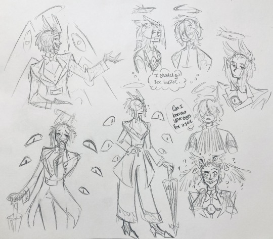
3:
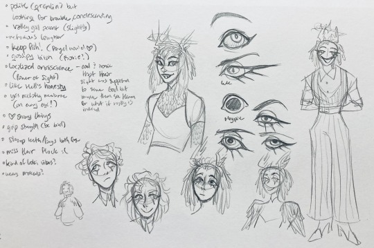
lots of notes on the side based on what prince said in response to my ask
"localized omniscience (power of sight) -- cool + ironic that their sight was supposed to serve God but made them see Heaven for what it really is instead"
another exorcist outfit, this time including the feathers
I was also experimenting with the halo; I was trying to make it look sort of like sera's crown, but that didn't feel right ...
some practice with eyes -- my style is pretty flexible with eye shapes, so I try to make them suit the character. I drew lute's eye and also an actual magpie's as references -- lute's because of the exorcist background and also because they looked appropriately sharp, magpie's for obvious reasons. once again, my compulsive need for giant bottom lashes strikes
there was honestly a lot to balance with the eyes -- I wanted them to look condescending/bored (lowered top lid) but also amused (raised bottom lid) and like a magpie (round) but also harsh/mischievous (sharp, maybe slit pupils like a snake) and similar to sera's (but not too decorated -- also does it make sense for them to look like sera's if emily's don't even look like sera's?)
considered having wings on the shoulders -- the magpie pattern is super cool, so it would've been nice to have that somewhere more explicitly in the design. I still think that might fit in an outfit they would wear in heaven (maybe for formal occasions)
the introduction of the sweatervest! honestly I kind of love this for the way it captures more of the preppy, spoiled old-money upper-class vibe some heaven residents have, but it was scrapped since I couldn't imagine them wearing that while trying to scare the denizens of hell. maybe something they wear casually though.
"yes nictating membrane (on every eye!)" -- AHH I'm so sad I didn't end up putting this to use. I just feel like the whole effect is based on actually seeing them blink, and I don't animate lol.
4:
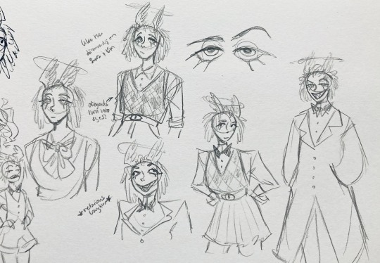
ugh, the nefarious laughter one ... don't worry I tried harder on a sketch later on lol.
"like the diamonds on Sera + Em" + "diamonds turn into eyes?" -- I draw the diamonds on the sweatervest turning into eyes later.
tried an actual bow instead of a bowtie -- very cute but didn't fit the vibe.
a skirt! I think they would wear a skirt sometimes.
5:
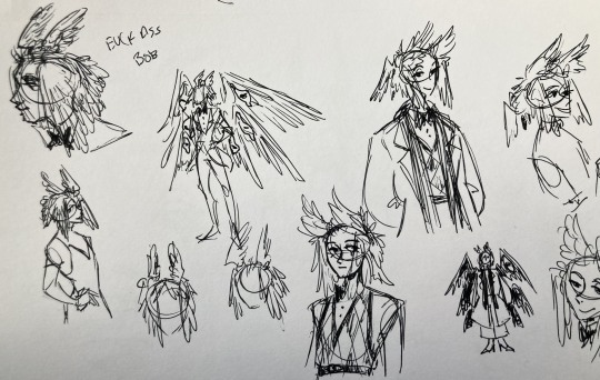
"FUCK ASS BOB" -- asghdk the wingification of the hair continues. unfortunately, I'm realizing at this point that the silhouette of the hair is starting to look a lot like alastor's. I gave a very half-hearted attempt at mitigating this, but it goes back to the thing of how much I am obligated to the original show's designs and what looks cool to me -- I think the wing hair fits them and I didn't want to change it because of alastor, plus my alastor design actually has completely different hair anyway. I did add a third pair to the back to look like a ponytail though.
introduction of the scarf! I was actually going to include this in the final design but uh,,, I forgor. are you starting to see a pattern.
the reason for the scarf is that the "tzafael going to places they know they'll draw attention/can incite chaos" reminded me of that scene in avengers where loki walks into a fancy building looking pretentious af and just casually stabs a guy's eye out. not really the same thing but I felt like the vibe matched. hence, loki's funny little scarf fit.

6:
uaoughdfjh it was SO FUN to draw the wing hair, and it was at this point that I realized they had to stay even though I wasn't sure if it was too different from the original.
gossiping with rosie cause that's the first person I thought of -- tzafael also summoned a pearl necklace to clutch because of the sheer drama of it all (your ex-husband did what??)
also started drawing the rings on their hands. magpie like shiny.
7:
lots of notes cause I was trying to compile the things I still needed to think about/incorporate into the final (I thought this was gonna be the last draft ... haha)
trying to include more bird/eye motifs
"fish ... purse?" -- ha! I forgot I was gonna give them a fish purse. I think I drew that in a later sketch, but not them wearing it.
"picked up Hellish traits bc of extended stay -- existential crisis?" -- I asked prince about the sharp teeth, and their answer implied that they became sharp as they stayed in hell longer, which got me thinking ... I feel like that's actually a great body horror concept. lucifer falling and looking like a normal angel at first, eventually waking up to more and more devilish features and feeling more and more like he's lost his home and his past self ... spooky.
another exorcist outfit -- I actually really like the eyes on the ribs! I never made a final draft for the exorcist uniform, but it would probably look close to what I drew here.
the one on the bottom was meant to be similar to the feathered shoulder pad idea, but this time with the whole magpie (with giant eyes). tried putting the "freckles" (really just dots in this case) over their brows, but that ended up looking kinda weird.
the eye is pretty close to the final design
the one on the right was supposed to be the full final design, but I was totally off lol -- the long trench coat really doesn't give off the right vibe at all
8:
playing around more with the loki vibes of the scarf, also added an eyeball to the chest
I never got happy with the design of the back of the coat -- I think it should probably just be blank at this point. but the sketch here is meant to look like wings/tailfeathers.
yet another exorcist outfit, this time with more magpie motifs. I actually like this one a lot, but I probably should've added the eyes on the ribs from the last sketch. I think I also considered giving them actual tailfeathers at this point.
9:
thanks for sticking with me! I promise we're almost done. have a trans dinosaur I saw while I was travelling as a treat <3
10:
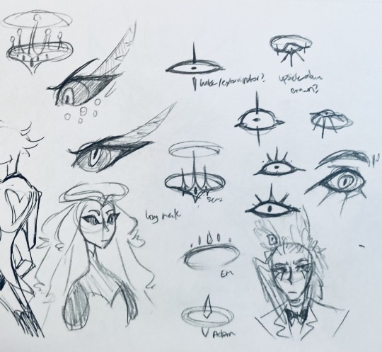
this is after I finished the sketch for the final piece and realized I didn't like the halo design. I drew lute's, sera's, em's, and adam's as refs. (honestly I love the show's idea that each person/people of each rank have a different kind of halo -- I wonder if they can switch them out?)
my main inspiration ended up being the exorcist halo, but I made it look more like an eyeball -- since it always points toward heaven, we can say it's always "looking" at heaven.
(also sera's feather lashes! they're so cute)
11:
EVEN MORE EXORCIST DOODLES
12:
tzafael shooing away my fox demon OC
13:
these are actually sketches for my own seraph OC (raguel), but I wanted to include it since it has even more wing/feather hair variations. I also think the idea of the eyelashes being feather-like could've been cool for tzafael.
14:
some more OG design doodles
tzafael and raguel together because self-indulgence is the name of the game babey (also wanted to draw tzafael freaked out with their wings flared)
(raguel's blind btw, hence asking for eyes -- tzafael has so many!)
you can probably read the dialogue here so give it a shot. I believe in you.
15:
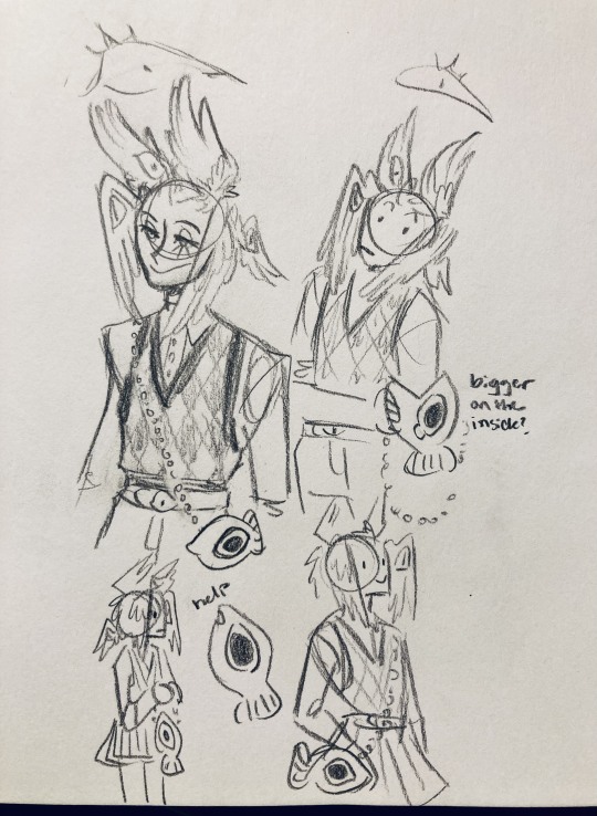
you know what? the fish purse deserves some doodles
16:
putting them in Situations! I was reading over prince's posts again and I realized there were some funny things I could draw them doing/saying
again you can probably read the words here
angel dust also loves fish (but is apparently bad at taking care of them, hence the suffocating blobfish), so tzafael shows him their aquarium (complete with live fish and flora ofc)
I thought alastor was 8 ft but apparently he's 7.3 ft? so tzafael is enjoying the .2 ft they have on him
trying and failing again to come up with a design for the back of the jacket lol
THE crowley quote
apparently the halo still sends signals from the exorcists -- thought their reaction to the battle at the hotel would be funny
the nefarious laughter (take 2) that I promised -- based on a doodle of alastor viv did that I found
them being sad and curling up in a pile of shiny things like a dragon
OKAY I'M DONE. huge, huge thank you to prince for sharing their OC! this was a lot of fun and clearly inspired me a lot haha. please check out their writing; it's literally so good that I can't read anything else these days. I am chewing on their thoughts constantly.
this was an absolute monster of a post, so if you're still reading, I am both impressed and bewildered at your patience. I hope you enjoyed! (I certainly did!)
#prince (because they are very sweet): I'm excited to see your thoughts!#my thoughts: magpie like shiny hehe#hazbin hotel oc#prince-liest#hazbin hotel#my art#character design#sera hazbin hotel#em hazbin hotel
55 notes
·
View notes