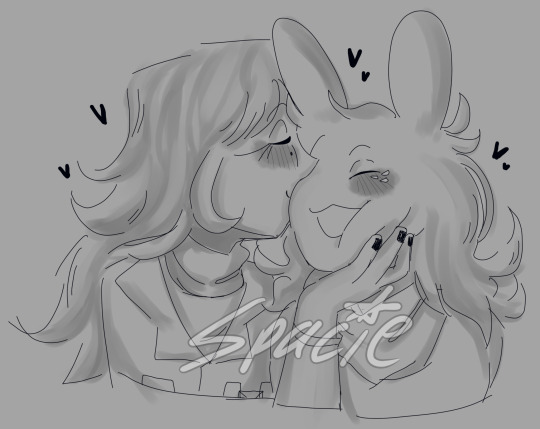
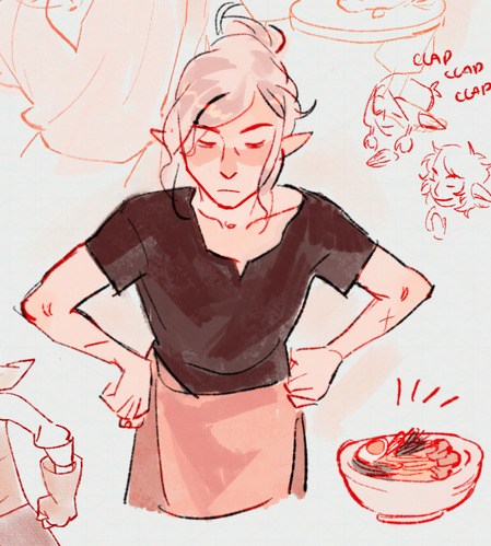
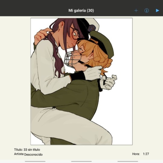
#i wanted to try something new with the lineart and shading i think it turned out pp nice
Explore tagged Tumblr posts
Visit Tumblr Blog
Explore Tumblr blogs with no restrictions, modern design and the best experience.
Last Seen Tumblr Blogs


Fun Fact
70% of Tumblr users say the Dashboard is their favorite place to spend time online.
Text
The Strike timeline
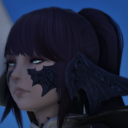
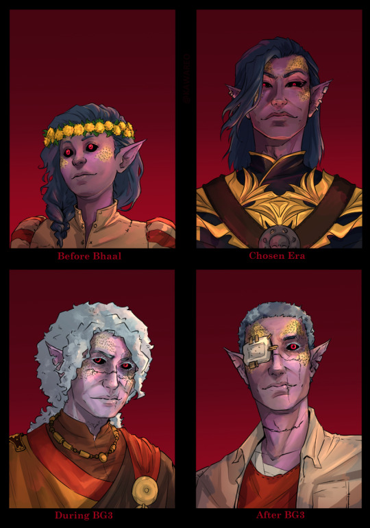
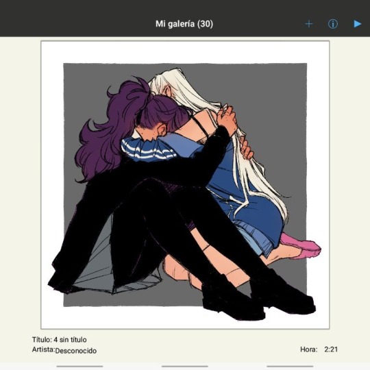
At the first one (and when he joins the cult) he's about nine and in events of bg3 he's thirty seven, he met Gortash at twenty two
#i wanted to try something new with the lineart and shading i think it turned out pp nice#bg3#the dark urge#oc strike#strike lore#durge#baldur's gate 3#bg3 durge#durgetash
600 notes
·
View notes
Text
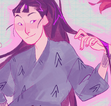
I really want a dandadan wallpaper for myself!

Sketch - lineart - base color + planning
Some thoughts below.
The progress is really slow because i work on it during breaks, and it helped me stay motivated. They’re sitting on grass so maybe it’ll be finished just in time for spring? Maybe? I just know it’s going to be pretty.
I’m abandoning my usual steps for coloring. Usually it went something like… rough sketch, base color, straight to rendering in as few layers as possible. Only for me to fumble because then I start to notice inconsistencies, odd shapes, janky proportions, things that occur because my sketch wasn’t clean enough for me. Or, it would start off great, only for me to spend too much time on layer properties because now the lighting got weird. I first learned coloring with colored pencils and paint - and I think my brain got hardwired that way, so digital solutions, like cut-and-pasting already rendered pieces, or using 20 layer effects, weren’t doing me a favor. Digital and traditional colors work differently. Sometimes it turned out great, many other times it didn’t. It frustrated me and I was too stubborn to take a slower approach, which would be… to simply shade things.
So that’s what I am trying to do now! Working with things I already know I’m good at. I like to learn new stuff, but I think it’s about time I pick my lessons and polish what I have. I know, at least, that my eyes are good at color matching. Doing that will frustrate me less than using a multiply layer for everything. (I still use it, but, you know)
At any rate, I love these kids so damn much. It’s been my weekly dopamine hit ever since… the 6th chapter got published… I think. I remember vividly starting Dandadan when Aira’s story just concluded and she’s fighting with Mr. Shrimp and I was like, this is weird! With good art! HECKING GOOD ART! Great storytelling and clever characters! Oh, Momo is a badass. Wait, Okarun is one too. Wait, now Aira’s a badass. Wait, Jiji (Et cetera, et cetera. My favorites so far are Okarun, Aira, and Vamola.) What, Science Saru is going to animate? Oh, this going to be a hit. And I’m glad it did.
Adding this just in case - it’s not without issues. But i still love it. It got me through some depressing moments... I hope the hype continues until the end.
20 notes
·
View notes
Note
any advice 4 when u want to keep drawing 2 improve but u cant get over perfectionism ? like when u just dont care how its gonna turn out, if its bad its bad yknow?
ahh yes lowkey ive struggled with this a lot. not as much now as in the past tho, and honestly its beecuz ive developed a more neutral view on myself/my art in general. its going to take time to get to this state of mind, so dont be too hard on yourself when you find yourself falling into bad habits.
advice under the cut (kind of long winded) ⬇️⬇️⬇️
the first thing ive done to overcome perfectionism is focus less on details and more about overall shape and form. when i sketch im trying to get roughly what i want, and i limit the strokes i do in certain parts of my sketch to like 1-3 depending on what im drawing (im ngl i also am very impatient and have created a workflow that makes it so i am able to start and finish pieces as fast as possible LOLOLOL. shrugs. i just like drawing fast).
a good example would be this thing i just drew:
in all of my sketches i tend to use as few strokes as possible and just get the basic idea down. good for not overly focusing on teeny tiny details and worrying about them later (i also use the same technique for lineart, but just end up connecting the lines. thats another tip i have, if you like your sketches more than your fully lined pieces, just line the same way you sketch! or you could also use your sketch as your lineart :P)
another tip i have is to draw from references, and once again, focus mostly on shape/form/the big picture of your subject before going into details (do you know how many planes there are on the human face....i still dont know howta draw faces properly but im not mad at myself anymore about it, i just open up a reference and try to learn). i also recommend having a drawing session where the goal is to draw awfully. draw something you want to draw, but that you're not sure if you'll draw it right, and draw it. dont try to correct it, acknowledge that what you made isnt perfect, and then draw something else. you're learning! of course its not gonna be perfect. but inevitably, you're going to get frustrated. just remember if its something you really want to go back to, you will be able to revisit it in the future. feel your anger and frustration, but do your best to not direct it inward.
small side tangent about shading- I AM SO SHIT AT SHADING SKFHSAFDJHS. people dont tend to notice (surprising), since ig my shading style is considered "beautiful" or something, but if you looked at it on a technical level, there are mistakes everywhere. i havent really tried to improve it. i dont really care most of the time b/c i just like shading for fun. and especially when im shading my sketches, i already have it in my mind that its not supposed to be perfect. its a sketch. this is where im supposed to make all of my mistakes. once i start making my way to the final product is when i start worrying more about if i did the lighting correctly (even then ik im not good at it im not trying to be a god im just trying to draw things that make me happy).
additionally, i really rec u dont try and fudge a sketch until its better if you're deep in a Perfectionist moment. keep the old sketch and start over on a new sketch taking bits and pieces you liked from the original, and improving on those that you dont (shitty thumbnails are also good if you have a vague idea in mind but need ta figure out howta place subjects in your scene). honestly drawing the same thing/idea over and over gets me a better understanding of my subject each time, so naturally each iteration looks better. it doesnt take me that long to sketch tho, so if sketching takes you forever (sometimes if sketching takes you forever its b/c you're a perfectionist skjfskdjf) just think about how much time you're willing to spend on something. remember☝️ its okay to give up/take a break on something and try again later. sometimes you just needta stop looking at your art and like. look at a tree or something lmfao.
i will also say that im not looking to go into a career in art, im more of a hobbyist. ik school environments dont exactly.....help with perfectionism lol. there are certain expectations put on people who go into the art field that are inescapable. if this is the case for you, i still think what ive discussed before can help you, but i also think that you may need to lean more on the mental tips i have also provided below.
alright! mental health tips in regard to art:
so, i have c-ptsd, and with that comes a lot of self image issues that ive had to work on. my feelings about myself extended to the way i felt about my art. it was shit, it was awful, i cant draw like this other person can so why bother, if its not perfect i shouldnt draw at all, etc. and honestly, something thats helped is affirmations. my affirmations are c-ptsd related, but ive noticed a shift in the way i view myself, and by extent, my art since ive started repeating them to myself daily. and honestly, i think a requirement of overcoming perfectionism is telling yourself that your art doesnt hafta be perfect, A LOT. LOL. LIKE YOU ACTUALLY HAFTA ACTIVELY TELL YOURSELF YOU'RE NOT AWFUL LMAOOOO. its funny, we dont think much about how we naturally are self critical about ourselves, and we dont realize that we are basically repeating negative affirmations about ourselves over and over and thats why we're not improving (mentally).
even when you're not drawing, i think it would benefit some people to have some kind of notification on their phone to remind them to tell themselves that their art doesnt hafta be perfect daily/however often you feel you might need it. and then with that affirmation, practice Shitty Drawing. one of the best tips ive ever gotten for this was from one of my friends monnie. get out your sketchbook or some printer paper, take out a shitty pen, and DRAW. and then any mistakes you make are permanent and you cant just endlessly try and fix them. it forces you ta sit with this uncomfortable feeling that something you made isnt perfect. eventually your brain will realize that when your art isnt perfect, you can still draw and you're ALLOWED to continue to draw even if what you make isnt spectacular. if you dont want to repeat an affirmation daily, try to remember to at least repeat it before you sit down to draw. something along the lines of "my art doesnt hafta be perfect in order for me to want to draw. im allowed to draw even if its not perfect" or something else. it depends on what you most struggle with in regards to your perfectionism. im ngl its probably going to feel cringe at first, but i promise you, it really works if you put it into practice longterm.
shoot for neutrality instead of positivity first. let me tell you thats where i am now and its so much less exhausting drawing lmfaooo. i make something that looks like shit and im just like. i dont fucking careee i dont give a fuccckkkkk
those are my tips :] i hope this was helpful!
#spacie spoinks#art tips#kind of?#art advice#i would have added more art but i dont have my art saved on this device KSHFSKJDFH#i copy and pasted my art above from my tumblr post 💀💀💀💀💀💀#anyway#have a great day anon!!
10 notes
·
View notes
Text
Current digital art process!
Acting on @shkika 's request because making my redraw for this post actually ended up giving me more confidence in my digital art process! As such, I'm gonna use it as a reference. And if this walkthrough of sorts turns out nice, I might do it again as my process evolves!
I started off with a quick sketch of sorts, trying to focus both on movement and volume, and get the general idea of where each element is located. I edit the image dimensions and placement of things a lot in this phase, as my ideas often tend to change once I actually begin drawing them. In this case, as I got it down, I decided I wanted it to look like some cheesy animal motivational poster, so that influenced where the text was.
From there, I began to clean and sometimes edit the sketch, mainly by thickening the lines to make the shapes more definite, and erasing what wasn't necessary and interfered with other parts. Volume is one of my biggest focuses in my drawings, so I try my best to get the volume of each character at least hinted at with the lines. This is something that will probably remain in my process for a while, as I quite dislike doing separate lineart and like the messy, sketchy feel anyway.

I also wanna mention, in addition to having references and such in other windows, I've recently begun having a second mini window of my current drawing off to the side so I can see what it looks like overall more easily, regardless of how much I zoom in on and flip the main window. It's quite helpful!
For reference, this is what the final sketch looked like:
Then, I went on to add the flat colors. Another tip: I almost always set my sketch layer to "Lumi & Shade" because I think it makes the line colors a lot richer, but since it's based on what colors are underneath, it colors the lines a lot more individually than changing the sketch color as a whole. Here's some comparison to a version without the effect (left):

Then, I add some shading using a (really nice) marker brush. This is honestly one of my favorite parts of the process, just trying to carve out all the volumes, especially since I usually use a pretty blue color for shadows!
Sometimes, I honestly just leave drawings finished at this step, because I adore the sketchy look so much, and because I really don't like the tediousness of more realistic rendering in the painting process; from what I've seen/experienced, it often involves having to basically paint the entire image over again, which I've realized I find REALLY boring (and is also why I clean the sketch instead of making a new lineart layer). As such, one of my hopes is to reach a point where I could almost completely avoid having to clean up the image in a traditional painting method, instead being able to lay down lines and colors so well that they convey nearly all the volume necessary on their own, still have that sketchy appeal, yet also look finished and professional.
Alas, I did do a bit of clean up on this image, but I think it still turned out alright!

Here's the finished drawing! I'll have to practice with this process a bit more to truly solidify it as my digital go-to, but nonetheless, I think this came out adorable! Thanks again shkika for the ask, and thanks to @mintscampi for the sweet prompt! I hope you guys like it!
#art#artwork#artists on tumbr#digital#digital art#digital artwork#painting#digital painting#process#painting process#art process#tutorial#fanart#rain world#slugcat#rw slugcat#slugpup#artificer#rw artificer#quetzalli draws#quetzalli's notes
100 notes
·
View notes
Note
(If you're comfortable with this) could you make a tutorial on how you make your creations??? It'd okay if not, thank you for making them :D
WAA i can try!! baby's first tutorial ft. this guy

🐾 first, a picture of your blorbo
i use waifu2x to up the quality, not always neccessary but it makes everything a bit easier and prettier. i use firealpaca to edit but you can use whatever you like, im not your mom
🐾 probably get a reference
yeah i dont always do this. but you should! i should! so google whatever creature you want to turn blorbo into and maybe scroll for a bit to get a feel for what they look like :3
try to find one at a similar angle to your blorbo picture and paste it/open as a layer. look this is close enough ↓
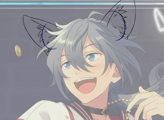
🐾 onto the actual editing! human ear surgery
in case you prefer just one pair of ears. you have to understand the style so you can imitate it.... so look at their hair, maybe theres more colors or gradients than you can see at a glance or something ! i colorpick a bunch of them and put them over their ears, then blend them together with a low opacity watercolor brush
ALSO, notice the.. lighter glowy aura thing around his ear in the og? i try to imitate details like that too, used watercolor for this again
now maybe you wanna make it look like theres something covering that spot, since theres kinda nothing there now. soo if that looks weird to you, (open a new layer and) put some hair over it. i cant tell u how to imitate Any style so just. study it and keep trying
with enstars here the lines are pretty soft, so i go over it with watercolor brush after doing the general shape. with a higher opacity you could probably just use a softer brush from the start, i just like starting with the basic pen
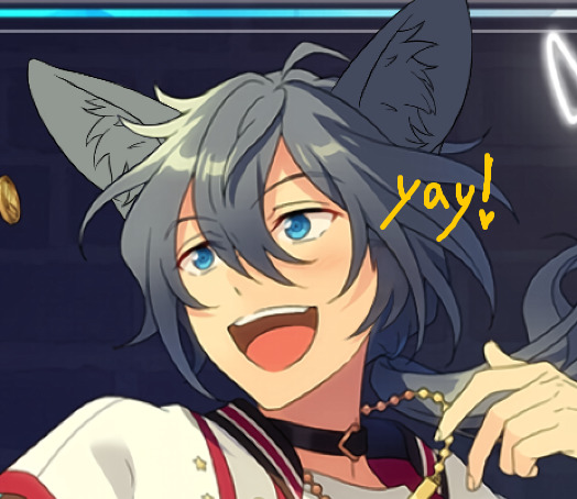
🐾 the lines!!!
nowww i lower the blorbos opacity to around 50%, bring the reference somewhere i can see and just kinda... start sketching. lot of redrawing and transform tooling here sometimes
TIPS 1. you can clean the lines up at the end so dont stress
2. think of your blorbos new ears as a real tangible part of their body and how they fit on their head since you dont wanna make it look too flat !
3. and for the placement i always end up at roughly one human ear length above their og ears if that makes sense. tried to visualize it
as for inner ear fluffs phew i dont know either. draw a circle and start from there? maybe there are actual animal ears in blorbo artstyle out there you could reference
🐾 coloring 🏳️🌈
finally some progress huh. i color the lines in a contrasting color first so i see the lines properly and dont miss anything, then fill it in with the actual color :3 OH and for gradients i just use the airbrush at the ear tips or sides
noww shading! new layer, basic pen brush and try to follow the shapes in the og art. it's best if you pick the colors from the actual picture!!! take notes mentally and just do your best i dont know how to explain this more
taking this as an example, the shading is mostly in pretty simple wider areas, so not a lot of seperate strands in there. and its again pretty soft around the edges of shades and highlights, so i'll go over it with my beloved watercolor. keep things like that in mind so the creaturing blends in well :3
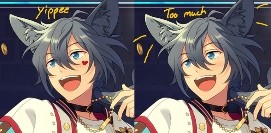
if you like more detail better you can still go with that. or less detail on a complex artstyle. the world is your oyster
🐾 and the rest
what else could there be???? making the lineart more cohesive for example ★ oftentimes it's not one solid color, thicker or thinner than yours, things like that.
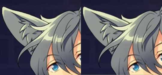
for things like piercings or fangs you can just draw them on top i believe in you <3 if its like an intricate earring use the lasso? magic wand? the one that lets you select an area to copy and move on top of your ear layers
+ remember details like shadows, if you put a tail on top of say blorbos leg there's gonna be a shadow under it! put a layer under the tail ones and freehand draw the shadow, OR copy the tail layer, put the copy under the og one and change color/opacity until it fits
31 notes
·
View notes
Note
how do you get your colors to look so nice and your lineart so red and vibrant? i love it
omg anon thank you!! 😭 im going 2 be honest I am Not Great with color theory... but i like having my sketch pages look cohesive to me...
BUCKLE UP this is going to need a readmore bc i like talking.
I always sketch in neon colors it's a habit i picked up from an old teacher but I'll think of a color usually on a whim and draw with that. and then if i want to draw something else ill pick another color that i think goes well with the page. usually most of my color schemes r analogous (colors right next to each other on the wheel)

yanked this from recent dunmesh post; i kept most of my colors within the pink/red/orange range.
i wouldn't recommend doing everything in monochrome or analogous palettes though because it's sort of a guilty crutch of mine XD.
sometimes when im coloring ill change the layer mode of the sketch. color burn gets you either very very bright or very very deep colors depending on the color of the flats underneath. multiply and linear burn do the same thing but they're a lot tamer and generally always return darker colors. im sure there's some technical bits behind this though. ill either color my lineart afterward to compliment the color of the flats, leave it as is, or mess with layer modes if i feel like it. my favorite trick is color burn + linear burn + some combination of two lineart layers and just fiddling until i get a nice burn effect.
mithrun was done with crimson red on color burn.
coloring... like 999% of this is relative color which is like. kind of the idea that colors look different when placed next to each other. if you eyeball it a bit it's pretty noticeable.

what i used to do a bit ago was i would fill in the area i wanted to color with one big mask of color, make a new layer that has a clipping mask down to the flat layer of color, and then draw my actual flat colors. the color of the mask helped me pick my flat colors bc if I picked a color i think stood out too much next to the mask i could kind of just adjust it until it looked a little more cohesive.

old ish drawing next 2 a canon reference. i ignore local color a lot...mea culpa....but my overall color palette here was a light pink, so the shirt here is actually a desaturated pink? or violet i believe. if you shift sort of that purple color far enough into the gray area of your color wheel it can take on a blueish or even greenish hue. it being next to a lot of warm pinks/fuschias helps.
a neat thing that kind of helps is that if you desaturate or saturate certain colors they can kind of take on a certain hue? not sure if this makes sense. sort of how orange here turns tealish blue the grayer it gets. so if im drawing something that's predominantly orange and i have a blue color i can just take an orange color and desaturate it until i get a color that sort of looks like blue. and that way it kind of looks more harmonious? at least to me XD
shading. i don't apply serious lighting to a lot of my drawings, but a helpful bit is that the shadows tend to be the opposite of whatever color the lighting is? i try to think first about the "mood" or the main color i want to go for in the drawing and then i pick a shadow color opposite of that. so for here, i wanted the lighting to be a coolish magenta so the shadows r lime green. if there's anything off i fiddle around until i get something i like. the shadows on the skin here were too green initially so i shifted them a little more orange.
there's a "band" of color going on between the transition of the shadows to the light. generally this could be for a lot of reasons and i tend to use it differently (core shadow? overexposure? etc etc). but this is a color post so ill try not to go too off track.
but generally digital doesn't "mix" colors the same way traditional colors do if you use RGB (cmyk is a bit better with this but is kind of a pain to get used to), so to make blending a little less muddy, i sometimes add an intermediate color to smooth things out a little. for example, mixing digitally blue n yellow tends to get you gray, but generally, blue + yellow makes green, so if im making a blue->yellow transition ill slap some green color in the middle so it flows a little better.
I do a lot more cel shading nowadays. if you've been on here for a while earlier this year i have another style of coloring but it's not really accurate to how shadows really work so i wouldn't recommend looking at it. it's mostly to add zest and texture to the underlying flat colors.
coloring your lineart does a TON to helping your colors look vibrant, though its like the garnish on a dish to me (same with shadows). i think it's good to try and play with your flat colors and try to make sure those look in order first before adding flourishes. usually ill leave it a dark, saturated color that again matches my overall palette but sometimes i go in and color them by alpha locking my lineart layer and picking a color that matches the flat colors underneath? not sure how to explain it properly.

i used a darkish purple for shuro's ponytail to match the dull red of the flat colors (more relative color! trying to simulate a black/brown while keeping the pink palette there) but a lighter crimson for laios's blond. the light was this super intense like blush pink so i thought it might be cool to add this neon salmon red in the areas of that light to really give off that vibe of a very bright intense rim light.
sometimes you could also tweak with gradient maps or color balance, which adjusts hue based on how light or dark a color is. these r fun to mess with as a final touch but i need to watch using them because they can become crutches real fast XD but those are also just tools to help you. in the end just developing a good sense of how color works and how you want to use it is the best place to start.
LONGASS ramble but yeah. tldr just kind of train ur eye for color and look at what you like best. which is unhelpful and a little sucky but it really is just observation and practice and maybe some personal zest.
happy drawing!
#SORRY THIS IS THE SIZE OF CANADA I YAP A LOT#i like being thorough when explaining myself a lot XD but i think the easiest way to get good with this is just repeat practice n observing#and figuring out how stuff behaves in certain situations and what you like to do and blahblahblah#if you have artists u like that do this well looking at how they use color might be cool#...i feel this entire post is just putting my entire thought process on blast LOLLL.#“eyeball it out” -> study some actual fundamental stuff and or intake new info or art -> apply it back to just eyeballing it out#i dont think i have a natural sense for some basics#but i dont think im naturally one of those people who grind out studies all the time and breakdowns either#i guess i just kind of like knowing the mechanations behind why to do a certain thing or how stuff works and then figuring out#how that translates into what i know nerd emoji#james gurney has a good book on color and light#if you like reading. but its very informative!#quirinahscreams#ask#anon#this is mostly just me talking about how i draw i dont think this is meant to be educational or informative XD um
13 notes
·
View notes
Note
Hi hi, hope you're doing well!! Wanted to ask if you could explain how you pick colours! They're always so appealing to look at... (If you could also explain how you pick blush colours it'd be great! I never manage to pick good ones, no matter how hard I try :'))
hi anon, i'm doing fine!! it's summer right now where i live and that's healing all my problems (◡ ω ◡)
i have recorded the process of some of my drawings and everything is posted in my youtube channel (in twitter too), so i'll drop the link here and try my best to explain the coloring part to you. the short answer is that none of the colors you see in my drawings are similar to those i initially picked.
i try to keep my lineart loose but i pay attention to the outlines so i can quickly select the outer parts, invert the selection and fill it with the bucket tool. my base colors are all 100% opaque and i don't use any fancy brushes here.
as to how i pick colors, i never use the color picker tool, i eyeball everything. that's important for me because i tend to make all of them warmer: the greens are dark yellows, the pinks are light reds, and everything that's close to blue is very desaturated. i do this even for drawings that turn out much different later, unless i have a very specific vibe in mind from the beginning. i also never use pure whites for anything, and if something is black i make it part of the lineart.
then i always color my lineart!! there's no trick to that, the layer is in normal mode and i just paint it with a darker color than what's below it. i usually add the shadows and highlights at this stage of the drawing too. you're going to kill me for this but shade with gray set in color burn or linear burn (never multiply). i just don't want to think about color variety at this stage because it makes things more difficult for later. sometimes i add textures and some basic color correction here (curves, color balance, layers set in overlay, etc.) but i mostly leave that for the next part.
as to how i choose blush colors, i usually pick the base color and move it towards the saturated end of the color wheel, and a bit more pink. sometimes i add a multiply layer and airbrush hot red over the base colors at low opacity. coloring the lineart with hot colors surrounding the blush areas helps a lot too :)
i also almost always duplicate the lineart, blur it and set it in linear burn (i paint this layer in a light gray). this adds a lot of depth to the drawing, especially if later combined with the bloom effect.
the key to why the colors in my art pop so much is that i don't enjoy drawing as much as i enjoy postprocessing pictures 😂🤣😅👌✌️👍 once i'm satisfied with the "base" colors i merge everything except the background, open a new canvas and go crazy with filters and textures. that's why i use ibispaint X even if i do the lineart elsewhere (krita), and even if it works a bit wonky with big canvases.
i do something different for each drawing here, so first i'm going to explain my reasoning so that you understand my process: i used to have a problem of using very strong colors that overshadowed my beloved lineart into which i had put a lot of effort, so my goal nowadays is to make everything look less contrasted without losing the visual impact of saturated colors. that way the lineart remains a strong point and not just a way to separate one color from another.
what i usually do is duplicate the new merged layer, set it to exclusion mode, add a gradient map and play with the opacity. then i duplicate that and do the same thing with another gradient or another blending mode. i tend to add like 3-6 layers of bullshit over my drawings, including textures and other filters like "bloom" or "sharpen". i understand everything that's going on there but i don't think too deeply about it, i just pick whatever looks best.
for the final touches i always pull up the saturation and contrast (since a lot of it gets lost in the process), and i usually have to manually change some colors (ibispaint X has a filter to do that) or tweak the curves. then i add chromatic aberration, noise set to overlay and little polka dots set to linear dodge.
here are some comparisons of the before and after of recent drawings. the 1st one is very subtle, but you can clearly see how much warmth and depth it gains it gets after all the postprocessing. the 2nd one is so different that i understand why you're curious about how i pick colors. i don't think i can replicate that look just from picking nice colors, there's a lot more going on!! the 3rd one personally feels like it had potential lost (i liked the yellow highlights), but the colors were too strong and all over the place, so the finished result looks more intimate and calm and i like it a lot more.

thank you for the interest anon, i'm very happy that you like the way i color things and i hope i have explained myself. good luck with your own journey!!
24 notes
·
View notes
Note
4, 9, 21, 24!
So many of them wow thank you!
4. Fav character/subject that's a bitch to draw Ohhh my god idk if this counts but I love HANDS I think they're so sexy and I've dedicated SO much study to them, probably more than anything else. I'm always trying to hone in on a stylization and rhythm that feels good for them but I just asdkfjs aim high I guess so it never feels quiet where I want it to be. I know hands are infamously hard to get right so I try to cut myself some slack... one day I'll get there...!!
9. What are your file name conventions So, I'm pretty anal about my file organization, I go by folder moreso than file name, but usually I try to name an image with at least the name of the character and one other descriptor. But where I'm EVIL is that in my usual process every few days I make a new file called "doodles mm-dd-yyyy" and stick it in a big "doodles" folder. And I do all my warmups and ideating in there, and half the time I just finish a piece in it's entirety inside that doodle document??? Which is bad for resolution/aspect ration purposes, but what's the WORSE is that half the time I don't even crop and export the image?? Especially if it's just a sketch or a WIP. I just. take a screen grab of it so I can send it to my main discord server??? Like so many drawings of mine are only found in these tiny crunchy images hosted on discord which is soooooo diabolical I have to get better about it asdlkfjs
21. Art styles nothing like your own but you like anyways Ahh I always admire people who can do really tight/polished cell shaded styles with very clean lines, but I don't think it's something I'd love doing for myself. The type that you typically see in comics or like, fanmerch. I have a tendency to get veryyyy lost in the details and will spend way too long on lineart, and half the time I just turn my sketch into my lines anyway because I tend to overwork it lsdkfjs
24. Do your references include stock images Mmm it depends on what I'm looking for! I actually take a lot of my own ref images for poses cause often what I need is pretty specific sdlkfsj there's so many awkward and unflattering images of me in my camera roll because of it :P For bigger pieces for clients, espc when I'm doing design work, I often make reference boards with pureref and if I'm grabbing stock images that's where they'll go. Usually they're of specific lighting scenarios or refs for costumes or props! I like to have lots of refs together in those cases so that I'm getting more of an amalgamation instead of pulling from one specifically.
2 notes
·
View notes
Note
hi majora! your art is really cute, and I hope you don't mind if I ask about your process? I'm new to art and yours is an inspiration! I wanted to ask how you learned? and your process, because you seem to draw near daily! also any tips you might have for me? thank you!
HI ANON!!! ur very sweet thank u so much WAHH <33!!! idm being asked abt that at all!!
in terms of how i learnt; i've kinda always been drawing for as long as i can remember? been posting art online since around 2013-ish so i got a big big catalogue of stuff to look back on
but learning in specifics of like, how i learned to shade n draw bodies etc etc. i studied! theres a lot of resources out there that'll break down a lot of the 'basics', i dont have any i can name off the top of my head except for morpho; whole bunch of books about body types and anatomy.
im not really good at providing tips for how to learn (bad memory </3) but studying, drawing things over and over (i do with reference and then without, and try to draw in different angles/perspectives) is very useful!
ALSO VERY IMPORTANT: literally do not worry at all if what you draw the first time around looks wonky or "ugly". being negative towards yourself about your art only serves to stunt ur growth!! shakes you (and anyone reading this) by the shoulders. it can be very easy to slip into hating your art and not enjoying anything ur drawing. this is me telling u to try and draw something youve never drawn before. experiment. it may not look perfect or even "good" but it will refresh ur brain!!!!!
MY PROCESS...... oh man i really have been drawing pretty much daily huh? i do draw every day but its been a hot minute since ive been doing finished pieces haha
but basically what i do is; start with a few warm-up doodles! just anything to get me in the groove
then over the course of the day i slowly chip away at whatever pieces im working on (lined stuff will usually take me a few hours, rendered stuff takes a day or a few....)
i cannot really assist in like "so how do you draw?" because i honestly just go Lights Off Its Drawin Time! but i always do a rough sketch of an idea i have, refine the sketch, refine that sketch, and then if its rendered i'll make a palette for myself somewhere, but if its lined i'll start on the lineart and then fiddle around with colours.
i draw for fun, so if i dont like how somethings turning out, i'll stop drawing it. no use frustrating myself over a piece to the point of hating it!!
(this ones just forfun and just for me) i keep a small little doc full of notes about my own pieces! i like analysing stuff, and also enjoy talking about why i draw something in a specific way, so this is just a nice little thing for me to have fun with. also helps me avoid potentially slipping into "hate this. bad" mindset bc im specifically noting things that i Liked (i do obviously have a bit of chatter like "hmm i think i couldve drawn this better, i should keep that in mind" but its only when its helping myself. the jora does not talk bad about its art)
aaand then i do some cool-downs to get any last little doodles outta my head so i can relax in bed
in terms of tips? do stretches, walk around, TAKE BREAKS! draw at your own pace, and also Have Fun With It. experiment with different colours, limited palettes, different styles!
seriously though do make sure you take breaks and stretch im lookin you in the eye okay?
I HOPE THIS MADE SENSE AND IS HELPFUL IN A WAY i ramble. far too much. and im not the best at articulating my thoughts!! but i hope u have lots of fun drawing very cool stuff <333
#asks#very long ramble my baddddd i love yapping#also i am Entirely self taught so i might do things in a weird way#but to me its important to have fun with drawing#i avoid burning out by experimenting with new stuff and swapping my art program btw i think thats a nice lil thing to tack on#jora art explaining
1 note
·
View note
Text
I wanna share my story about Krita pencilbrushes.
To clarify: in default setup Krita, among the brushes, there are three pencil-like brushes next to each other. Those ones.
It's a mixed thing in art posts I usually see: part of them say that brushes don't matter, that what does is technique/practice; part of them are ecstatic about trying new ones. My take's on the side of brush positivity here, and maybe it also helps someone.
A short disclaimer: I am not a trained artist. I didn't have any sort of art classes if you exclude primary school, and didn't have a lot of mixed medium training. I, however, took a biology course where you were supposed to depict a lot of samples and schemes, and you had to adhere to illustration rules. This lands me into being much more confident with pencils and liner pens than anything else.
Digital drawings were a big hurdle for me for a while, because while there are so many pens and effects, I often found myself struggling with them. Mostly - because digital doesn't Feel like traditional. Lineart was a big issue for a long time, but it was circumvented with lining in trad, scanning, setting the scan layer to Multiply and coloring like that. (Bonus papery texture for your art, too!)
But coloring was something that I'd want to do in digital (mostly for hues and editing) and kept struggling with. The cool effects I hoped for fell flat.
At some point I was trying different brushes and stumbled upon the pencil ones. I used them before couple times, for "fuzzy" lines, but this time I was just on short schedule and afraid to color. The lineart was scanned, of course, and I thought "maybe pencilbrush could look good with trad?"
First, it was, and it fit well.
Second, even though pencilbrush wasn't real pencil, I could achieve very similar feel with lower pen pressure. And it really boosted my confidence. At this point, I was brave enough to try and shade it without layer properties, just using different colors like in trad, and it suddenly soothed a lot of nerves.
Third, which I discovered a bit later, was that I could edit the trad lineart with those. The erased part gets patched with texture from another part of the sheet, the exact shade gets color picked from lineart, the texture of digital line is close enough. I'm pretty sure no one else is looking close enough to spot where I did it, and it fixes the biggest drawback of trad lineart.
Turns out, the biggest issue was accurately translating my existing experience, and finding That One Brush helped. I don't use it exclusively right now, but a lot of other brushes got designated to specific jobs of sparkling up the pencilbrush job.
I'm not saying that this specific one is the best one, go-to for everyone. But the idea of finding something the most familiar/giving out the most familiar feel is important for art drive, I think, and if you're a pencil artist like me, it could be something to try out.
1 note
·
View note
Photo

this took FOREVER but i!! finally did a draw for @hydrachea‘s adorable takeritsu AU (in which they are in love and also married)
#sophie draws#mp100#takeritsu#AUs#as u can probably tell i. tried new stuff#mostly.. actually looking at and using a color palette#also attempted to use a pose reference but that went downhill fast#also used a different lineart brush i think it looks cuter#i wanted something with like.. a vintage warm look??#but boy i. was not prepared for trying to color ritsu in warm tones#that boy is all purples and blues#i tried my best tho!! and i like how this turned out!!#i know the hands are terrible asdasndk but at least i drew the hands and didn't. hide them#also idk how the HECK to shade clothes i just . made some Probably Assumptions
51 notes
·
View notes
Note
you.
Y O U .
about your post (link below), about the art style of the characters,
YO IVE BEEN WANTING TO TALK ABOUT THAT BUT SO FAR YOU ARE THE ONLY ONE IVE SEEN NOTICE IT. After reading the last few chapters, I did notice the art style of the series has been changing. At first I thought it was a different illustrator or a new assistant or something but I didn’t have a recent book to check. Maybe the guy is stressed with deadlines but he BUTCHERED a couple of the characters. Kimizuki I noticed the most since I uh- pay attention to him a lot, but the pictures you added really sealed the deal for me. I do hope it can “go back to normal”, since the art was part of what made me check out the series. I just feel like it doesn’t look as refined as it used to, and I definitely missed Yu’s old expressions. The eyes drew me to the characters. Maybe they’re using a different way of drawing things, like switching from traditional to digital, which could explain why the eyes aren’t as detailed anymore. I’d like to know which chapter you think this started in, as I’m looking though my physical copy of book 15 to see if it’s different around then. hopefully it gets turned around, but there’s obviously no guarantee. I really appreciate you posting about this.
https://distinguished-slacker.tumblr.com/post/650704413986521088/dont-you-miss-those-old-days-when
Hi :3
First things first, I just want to tell you that the artist, Yamato Yamamoto sensei, is not a ‘he’😅 Their gender is unknown but it’s most likely that they are a woman.
Now, onto your question, I think you are looking through the exact volume where I think the art style started to change. Volume 15 contains chapters 56 to 59. Chapters 56, 57 and 58 possess the same art style as those of the previous volumes and it’s right at the end of this volume, in chapter 59, where I notice that the faces and eye shapes started to become rounder.
However, you would barely notice this very subtle change unless you are looking through the chapter with the intention of dissecting the art😭 The panel where I go like “Yes. The art style is definitely starting to change.” is this one right at the end of chapter 62⬇️
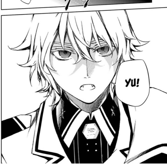
I can notice it since usually Mika would have sharper features. Artstyle started to change since the early chapter 60s but it wasn’t until the 80s that the quality started to downgrade and especially the recent ones suffered a more severe blow.
I really don’t want to break your hopes but I am still going to speak and say that it’s highly unlikely that the art style will go back to what it was once :(
There is a difference between art style and art quality. Art quality is dependent on the choice of the brushes, the level of shading and of course, tiredness. If you compare these recent chapters with the ones from years ago, you can notice that the brush Yamamoto is currently using for drawing the lineart seems blurrier and so less defined. It seems like, as you say, Yamamoto changed their method of doing art to digital, and this problem can be easily changed if they try another platform or a different method. Then, level of shading can be improved if more time is given to focus on shading (therefore less tiredness).
However, art style is not something that can significantly improve with more free time. Art style is like handwriting; it either changes over time at a very very slow pace or it doesn’t change but it never abruptly changes to something different (it requires a lot of time to change your handwriting and get used to do it like that all the time). The artstyle has been changing since the early 60s, which were written like 4 years ago. Those are 4 years of Yamamoto getting used to drawing like this, with stiff positions, lack of body curves, excess of eye brushes lashes and more which has been getting worse as the manga progresses… It’s hard to expect them to draw like how they used to 5 years ago.
Still, the current artstyle is much better than many shonen mangas out there and I know the artist works very hard but when the plot narrative is being executed so poorly, you at least want to rely on the beautiful art of the manga…but…you know… ;-;
Anyways, I am glad that you liked my post (I really chose some good pictures right?😋) and even if the possibility is low let’s hope that at the very least Yamamoto realises that this is not how Yuu’s face looks like😂💔⬇️
#I get it; Yuu’s smiles don’t feel genuine anymore#No sparkling eyes or blushes#And I am happy that someone notices Kimizuki :3#I hate seeing my favourite characters being butchered up#I’m so picky about artstyle I know💅#owari no seraph#seraph of the end#ons asks
23 notes
·
View notes
Text
THE A.T.O.M. CREATE A KAIJU CONTEST 3-D!!!
YOU THOUGHT YOU WERE SAFE! YOU THOUGHT THAT THE TIME OF MONSTERS WAS AT AN END! BUT YOU WERE WRONG, FOR NOW YOU MUST WITNESS…
THE A.T.O.M. CREATE A KAIJU CONTEST 3-D!!!
That’s right, it’s back! Celebrating the publication of The Atomic Time of Monsters Volume 2: Tyrantis Roams the Earth! (which in turn completes The Ballad of Tyrantis arc for this series), I’m holding another monster design jam. The third of such jams, in fact!
Like the first A.T.O.M. Create a Kaiju Contest, the aim of this contest is to create kaiju that would fit within the setting of my big kaiju story series, The Atomic Time of Monsters. Think of it as me letting you into my sandbox to play with my toys for a bit, or like you’re being put in the director’s chair of a new ATOM-verse kaiju movie. That means your entry does have to fit into ATOM’s world, which in turn means that yes, there are limitations to your creativity here. But limitations can be good sometimes - they can make us explore options we wouldn’t consider when given completely free rein to do what we want!
(also you don’t have to make a three dimensional image or anything, the title’s just a pun on how the third movie in a monster movie franchise will often be a 3-D film)
Read below the cut to learn the rules and whatnot:
THE RULES:
1. You are limited to one entry per person. Work hard and make your entry count!
2. Your kaiju must have some sort of description of its physical appearance and its personality - you can submit a drawing or a written description (or both!) for the physical appearance depending on what you’re most comfortable with. Using the same template/format as my official ATOM Kaiju Files (https://horrorflora.com/monster-menageries/atom-kaiju-files/) isn’t required, but it was cool when people did it in the last contest, so feel free to do so this time too!
3. The kaiju you create must specifically be created for this contest - no repurposing characters you made for other, wildly different stories. This is not “trick TT into drawing/canonizing my main OC” time.
4. The kaiju must fit the setting and aesthetics of ATOM. I’ll explain this in more detail down below.
5. The kaiju should add something meaningful to the world of ATOM. The more unique and interesting your kaiju is, the more likely you will win the contest.
6. Don’t make your kaiju too dependent on pre-existing ATOM characters - no “Tyrantis’s long lost evil brother who’s the strongest kaiju in the world.” These should be to Tyrantis’s story what War of the Gargantuas is to Godzilla’s movies – heroes (well, monsters) of another story in the same world.
THE REWARDS:
I will make pencil sketches of the top 5 entries in the contest.
I will then make fully rendered illustrations (lineart, colors, & shading) of the top three entries.
The winning entry will be made into a model ala the ones I’ve been making for ATOM’s core 50 monsters, which can then be shipped to the person who created it (should they be able to cover the shipping costs). That’s right, your kaiju could be brought to life in THREE GLORIOUS TECHNICOLOR DIMENSIONS! (Hey, we worked the gag title in to the prizes!)
THE DEADLINE: All entries must be submitted by July 3rd, 2021. You can submit it here on tumblr, via the horror flora e-mail, or any other channel you know how to reach me through. I’m in a lot of places.
THE GUIDELINES (TO HELP YOUR ENTRY FIT THE RULES AND WIN):
The smartest thing you could do if you want to win this contest is familiarize yourself with the world of ATOM by, y’know, reading all the material I’ve published on the subject. In addition to the many kaiju files that are free to read on horrorflora.com, there are now TWO, count ‘em, TWO novels in this series for you to peruse, both of which establish many of the rules of the setting as well as its general themes and tone! You can get them in either paperback or e-book formatting (I’d recommend the former over the latter since I lack the technology to make a really nice ebook, but if money is an object, the kindle version is only $1). Here’s the links again if you missed them:
Vol. 1: Tyrantis Walks Among Us!
Vol. 2: Tyrantis Roams the Earth!
However, since I know reading a bunch of stuff is, y’know, not something everyone is inclined to do, I’ll jot some good bullet points for you in an attempt to outline how ATOM works in a brief, easily digested way:
ATOM is an homage to the monster fiction of the 1950’s and 60’s (i.e. the Atomic Age), and is set in those two decades, albeit an alternate universe version of them where, y’know, monsters and space aliens exist. If you aren’t familiar with the monster fiction I’m referring to, there will be some reference material provided at the end of this post along with some recommendations for further research.
Kaiju/giant monsters in ATOM work under very specific rules. There’s a full description of those rules at this link, but here’s the jist:
ATOM Kaiju are created created by the radiation of a mineral called Yamaneon, which naturally converts harmful radiation into its own unique energy. In natural circumstances, it takes hundreds of years of exposure to Yamaneon radiation for a creature to become fully transform into a kaiju (luckily, Yamaneon radiation slows the aging process while speeding up the healing process). However, an explosive burst of energy - such as the geothermal and kinetic energy released by an earthquake, or the blast of a nuclear weapon - can speed up the process, turning a normal animal into a kaiju within a matter of seconds.
All ATOM kaiju can heal grievous wounds within minutes or even seconds, are supernaturally strong and durable, and can convert harmful radiation to harmless energy that they then feed off of. Kaiju do not have an equivalent of old age, and can theoretically live forever (though their violent lifestyle means that few do).
ATOM Kaiju generally don’t need to eat unless they are severely injured, getting most of the energy they need from solar or geothermal radiation - but many still have instincts that drive them to seek out food from time to time.
Most ATOM kaiju stand roughly 100 feet tall (depending on their body shape), i.e. smaller than the original 1954 Godzilla. There are exceptions to this rule - younger kaiju can be smaller, while exceedingly old kaiju can be significantly larger, but these are rare.
In general, ATOM kaiju are significantly more intelligent and emotionally complex than people expect animals to be, though most are incapable of speech or complex tool use. There’s a reason ATOM Kaiju Files have a “personality” section.
Most ATOM Kaiju are tooth and claw fighters - ranged weapons are a rarity in this setting.
While the terrestrial monsters in ATOM look strange, they are intended to fit within the taxonomy of animals in reality - reptiles, mammals, fish, arthropods, molluscs, etc.
ATOM’s mesozoic era was dominated by a fictional clade of crocodile-relatives called retrosaurs, which are based on the outdated paleoart that one would find in the 1950’s/60’s fiction - i.e. when dinosaurs were viewed as trail dragging lizards instead of strange birds. You can learn more about retrosaurs here (https://horrorflora.com/2016/11/15/atom-kaiju-file-bonus-a-guide-to-retrosaurs/).
Kaiju appear on every continent in ATOM, but certain areas tend to be dominated by different types.
North America is mainly besieged by retrosaur kaiju and giant arthropods.
East Asia is technically also mainly plagued by retrosaurs and big arthropods, though they tend to look more fantastical and mythic - and, often, oddly well suited to being portrayed by a person wearing a monster suit.
Russia is beset by prehistoric monsters that seem to come from the Cenozoic, particularly the Ice Age.
Western Europe is plagued by creatures that vaguely resemble creatures from myth, if they were also prehistoric. Dragon-y lizards, fiery birds, etc.
Towards the mid-way point of ATOM’s timeline, earth is invaded by a coalition of aliens from different solar systems called the Beyonder Alliance, and as a result a bunch of alien monsters can be found on earth.
Mars and Venus both host (or hosted in Mars’s case) animal life. The surviving Martians colonized Venus, and sent some of their kaiju guardians to earth to help us fend off the Beyonders (who are responsible for the destruction of Mars’s ecosystem). Martian and Venusian kaiju have specific anatomical quirks, which you can see by looking at these kaiju files:
Venusians:
https://horrorflora.com/2017/01/03/atom-kaiju-file-29-karamtor/
Martians:
https://horrorflora.com/2017/01/17/atom-kaiju-file-39-kemlasulla/
https://horrorflora.com/2017/01/17/atom-kaiju-file-40-podritak/
https://horrorflora.com/2017/01/17/atom-kaiju-file-41-sombarvot/
https://horrorflora.com/2017/01/17/atom-kaiju-file-38-ullawdra/
Giant robots exist in ATOM, but are big, bulky, and incredibly expensive. Fancy beam weapons also exist, but are similarly clunky - there are no sleek, elegant machines in ATOM.
Since the fiction ATOM takes inspiration from was made at a time when interplanetary travel was only just beginning to be possible, its scope is significantly smaller than modern sci-fi. Alternate universes/dimensions were pretty uncommon because the idea of alien planets still held a lot of wonder to it. So, as a general rule, don’t try to go farther than the one galaxy.
ATOM is a setting for stories that are focused on humanity learning to coexist with monsters, rather than humanity destroying them. A certain level of sympathy is put into almost every creature of its canon, even the ones that are meant to be villains.
REFERENCE MATERIAL
Here is a playlist of 1950′s monster movie trailers.
Here is some reference material from various monster comics of the 50′s and 60′s.
Good movies to track down to understand ATOM’s inspiration and tone include Ghidorah the 3 Headed Monster, Son of Godzilla, Destroy All Monsters, Them!, The Black Scorpion, 20 Million Miles to Earth, Gamera, The Giant Claw, and The Lost Skeleton of Cadavra.
And here’s the intro cutscenes for all the different giant monsters in the PS2 videogame War of the Monsters.
55 notes
·
View notes
Text
The thing is you kinda need to get the fundamentals down at some point whatever style you're looking to do, which means realistic shading and life drawing. But the good news is you can still draw in your own style in between, both are good practice! I got into actually *trying* to learn how to draw pretty late and I did it with the help of free internet tutorials for the most part, the main issue with starting late is less the resources available (there's plenty of good ones if you can find them) and more that as you get older you get better at spotting what looks wrong/you have more of an idea of what you're looking to do instead of drawing randomly for fun.
My suggestion is:
Try to separate practice drawing from when you want to do a finished piece - pick a time when you only practice, say 15-30 mins and decide something like: i'm going to practice anatomy or shading or lineart. Make it small, focus on one thing during that time.
When you want to make an actual finished piece of art, try to be open-minded when looking for refs. If you try to search for something too specific you are as you said likely to search endlessly and have no more time/interest in drawing. Try to look instead for something that inspires you, even if it doesn't fit the exact picture you might have in your head, it might be something that has cool lighting, or an interesting outfit, or a pose that makes you feel something. The rest: the character, the scene, etc. will often come along later as you work, you'll think "oh this outfit is perfect for that scene, I should make this a night-time scene" and boom you've got your colours decided.
There are tons of artists out there who do tutorials, it's hard to recommend one you kinda have to sift through for one whose style you like, sometimes you have to pick a little bit from a few different ones before you can use it for your own style. I will recommend Drawfee's drawclasses however, because there you get four different artists in one place, with different styles and a different focus. You can pick for yourself what seems interesting, but I think Nathan and Jacob's videos on how to practice might be the best to start with. If you want to look around for more condensed tutorials I suggest searching for something very specific, because "drawing tutorial" will often get very general results. Maybe try something with "artstyle" or "drawing poses" or "simple shading", depends on what you're looking for. And that's the problem, a lot of the time you don't! Sometimes you just have to try something new and see how you do it and then that turns into your style.
I hope any of this is at all useful, also remember that no art advice is ever something you have to follow, just pick out what seems useful to you
I don't...really know how to learn how to draw better. Every time I try to look up tutorials on youtube its like heres how to draw realistically shaded cubes or heres how to draw the most bland cutesy easiest to sell cartoon style or would you like to learn how to draw one hyper realistic eye but not the rest of the face??
I need simple stylized basics I can work into my own style, I need anatomy practice that doesn't lean too far into realism or look like their spines are broken. Tracing over real people helps with practice, but I want to be able to draw from scratch eventually. And endlessly searching for the perfect ref kinda kills the mood to draw.
I know a lot of people start drawing as a kid and they have art classes or even the infamous how to draw manga books, ect. but how do you start as an adult?
20 notes
·
View notes
Note
damn your art style is so pleasing to the eye :0
do you use any particular art software, brushes or technique? I'm a beginner at digital art, so I'll take all the advice I can. thank you for your time!
Hi anon!! Thank you so much, it really means the world to me <3
There’s so many tangents I can go on to give different advice for you, I think because we often think there’s a concrete formula to improve. I hope the advice I give here will help down the road, and that I don’t sound too all over the place here! (lol)
As for programs and such, I use Clip Studio Paint EX. I used to be a PRO user for quite some time but upgraded for the extra features (mostly for webtoon creators/animators), it isn’t a necessary switch at all if you only want to focus on illustration.
Paint tool SAI is also a good lightweight alternative! Before I got a better laptop, my old HP couldn’t really handle CSP; it lagged a whole bunch.
---
I tend to jump around a LOT between brushes to toy around with effects and stuff, so it’s hard to give a specific set, however I use these the most:
https://assets.clip-studio.com/en-us/detail?id=1697201
https://graphixly.com/products/theonewithbear-sumi-brush-pack-for-clip-studio-paint
Along with the darker pencil (default brush in CSP)
and a few brushes from the DAUB brush pack.
I don’t use every single brush in every set all the time either though! Usually when it comes to picking brushes for yourself, it 100% relies on how comfortable you are with using them. You'll definitely know what feels good for you, and what doesn't when you try them out!
Some people (like me) enjoy more textured brushes, and others are comfy with clean brushes for lineart, and others like soft watercolor brushes or oil brushes.
Don’t be afraid to tweak brushes either! It takes some time to learn how to do this, but there are lots of tutorials out there.
---
I think the most important thing is to first find something that you enjoy drawing/painting a lot, and experimenting a bunch on that. Don’t be afraid to try new things!! You don’t always have to follow the basic workflow of sketch > lineart > color > shading. Mix it up a bit! Include colors in your sketches, paint over your sketches if you don’t like doing lineart! If you do like making super clean lineart, work on different types of lines to make it more fun! Art is like a form of play and messing around, it shouldn’t feel stressful. Be willing to make lots of bad art (even though that can be hard sometimes), so that in the future there’ll be less bad art and tons of good art! Don’t worry too much on developing a style, since this will come naturally the more you draw.
---
(also, a word to those who post art on social media!) -
Don’t ever forget to draw what YOU enjoy, rather than focusing on what you think others would like to see!
For a long time before this year I felt like I was constantly hitting a brick wall, and I didn’t know why I didn’t like drawing as much as I used to, and why my character art felt so boring to me. When the covid pandemic hit, I was forced to take a loooong look at my art, and decide ‘I still have a long way to go..’
Something clicked when I sat down to work on some acrylic paintings on canvas for my uni portfolio: I wasn’t allowed to include fanart, since the university didn’t accept that. I also didn’t want to only include digital art either, so that I could add some variety! So, I painted.
I was forced to think more about colors (something I was neglecting, since it’s much easier to color digitally and hit the undo button 10000000 times when I wasn’t happy with something)
During that time, I found that I really REALLY liked painting landscapes and working with bright colors, so I also started to incorporate that into my digital art. Turns out other people enjoyed that as much as I loved creating it, so from there on out, I’ve just been toying around and experimenting on new things ever since!
---
Anyway I hope this doesn’t sound too abstract. This is my first time giving formal advice so my brain is going into overdrive mode.
#asks#I decided to include the last bit for new and veteran artists :) I hope it helps those feeling stumped and art blocked#We're all learning after all!
9 notes
·
View notes
Text
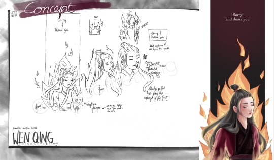
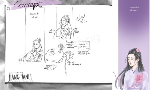
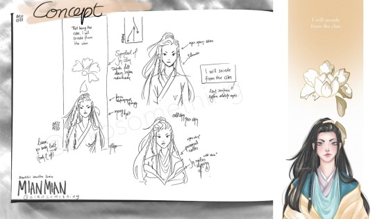
Thought it might be fun to share my concepts for my Beautiful Sacrifice Series
My Concepts
The women of The Untamed are so amazing ughhh
This whole series happened thanks to @mdzswomen s event to honour the women of MDZS. When I read about it I noticed I had never tried to draw any of these amazing women and I knew I needed to change something about that.
My idea was to create a tribute to these strong women and their decision to sacrifice everything. My choice of characters was based on the week one prompts: Jiang Yanli, Wen Qing, Mian Mian and A-Qing. There were more prompts and women, but at that time I didn’t even think I’d manage to draw more than two of them let alone a conceptual series.
It all started with Wen Qing, actually, even though she was the prompt for day two. I knew I wanted a really tall format like a banner hanging from a ceiling (as they are often used in an honorary context) and parts of the character to stick out of its boundaries.
As you can see at first I experimented with Wen Qing fiercely staring into the distance. I tried another sketch with her eyes closed and that’s what inspired all other elements, really.
I decided that I wanted to depict one of the saddest, but also most beautiful and strongest aspects of their journey: the end. I’d call it their final moment, but that doesn’t quite cut it. Jiang Yanli saving Wei Wuxian might have been instinctive, but it wasn’t done to her, she chose to push him away, whatever it may cost her. Which is why I want to go for the phrasing of it having been their final decision. It was an action. And a strong one at that. MianMian chose to end her career, unwilling to tolerate those close-minded people. Wen Qing chose to face the Lanling Jin clan, knowing death was a very likely result. A-Qing chose to signal Xue Yang’s position knowing how dangerous he was.
I didn’t want to portray the scene too realistically, but rather in a symbolic way. For the Beautiful Sacrifice Series I wanted to focus on ease/liberation, sadness and beauty. I chose to portray the deceased with closed eyes and a peaceful expression (as they don’t regret their final act), which is why Mian Mian’s eyes are wide open with her determinedly looking ahead. I also included the last sentence we hear each of these women speak in the show before their (old) life ends.
WEN QING
The first character I had a concept for was Wen Qing. I knew immediately that I wanted to include fire as the cause of her death, but I also wanted to simplify it, to turn it more into a symbol than the actual scene of her being burnt alive.
(At least I imagine that that’s what happened, I may be wrong, though. We know they got her ashes. However, she may have been killed first and burnt later. Or they made it a spectacle to watch one of the last Wen die in flames. Very cruel, but perhaps some found it satisfying).
Wen Qing’s hair is floating in the upwind of the fire’s heat. The flames point to the last thing we hear her say. The background is red for the Wen and fades to black to make the fire shine bright.
The colouring process was quite challenging. I spent days on it, it was really giving me a headache hahaha, I just wasn’t satisfied with anything, the colour palette, the shading, the lighting (it’s the first time I tried a more fancy lighting situation). In the end I put some layers on multiply, which actually helped as I now know her robes were coloured too light, which meant there wasn’t enough contrast to the bright flames in the background.
I was really insecure about the whole piece. I am still stunned that Wen Qing is the drawing with the most notes of this entire series. Thank you so much, it gave me a lot of confidence and motivation to keep trying out new stuff!
JIANG YANLI
Immediately after I had scribbled my Wen Qing concept I knew what I wanted Jiang Yanli’s tribute to look like. Soft and tender, like she is. With Wen Qing it’s the powerful flames that make her hair puff up, resembling Wen Qing’s fierce personality. For Jiang Yanli it’s a gentle breeze that lifts a strand of her hair and carries the lotus leaves with it.
Her eyes are closed as she is deceased. A lotus flower is located where she received the lethal wound in her brother's stead. The flower symbolises her sect, family and fond memories (be it playing by the water with her brothers or making lotus root soup).
Jiang Yanli is wearing my favourite outfit of hers and not her mourning robes which she died in, because I think it captures the gentleness of her personality perfectly with the pastel Jiang colour palette (and it’s actually a layer of see-through fabric in the show).
I really enjoyed colouring this piece and while it was the second design it was the first one I did the lineart and colour for.
MIAN MIAN
I wanted to include an element of disillusion since she experiences that moment of humiliation which is followed by the realisation that the Jin clan doesn’t have her back and goes against her morals.
In the caption I wrote: She spoke up, she stood her ground and then she left all these narrow-minded people behind, choosing to walk alone rather than be silenced. She was the true spark amidst plain snow and she had to realise that the white peony she served was rotten. That day she escaped these golden robes, shedding this old skin which had gotten too tight, and stepped into the future that was hers and hers alone.
The white peony is the symbol of the Lanling Jin sect and while it shines brightly on the outside Mian Mian learned to see through the façade, recognising all the rotten parts she didn’t want to tolerate any longer. With her leaving the peony sheds its petals until it vanished from her life.
In my initial sketch Mian Mian is portrayed with the simple robes she wears underneath her Lanling Jin attire. Since I didn’t give Jiang Yanli her mourning robes and didn’t plan on drawing A-Qing in her white robes either it didn’t feel quite right, though.
The phrase “shedding old skin” and the image of a snake came to my mind. First I thought about experimenting with an actual snake or the pattern of its scales. In the end I settled on the Jin robes being that old skin and showed Mian Mian’s personal robes as the shiny new skin underneath. I wanted to show that she may be stepping out of the Jin sect, but that she is starting on a new, meaningful path.
(Drawing the Jin robes was quite bothersome hahaha. I took tons of pictures of me wearing a robe, but it was so slippery that I almost pulled a muscle while trying to make it look right in the photo. I spent an hour or so on it without any satisfying result and ended up drawing it from imagination after all.)
While I loved my sketch the execution was a p-a-i-n. Colouring her personal robes almost drove me mad and the face, the face was such a struggle. I think I redrew it four to five times. I still think I could have done better, but after days of trying to fix it I decided that perhaps I need some more months of practice to get her expression right (so I might re-draw her in the future).
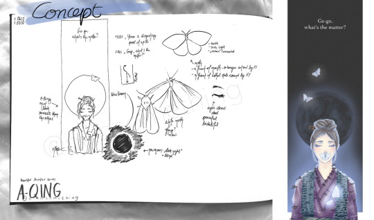
A-QING
I didn’t think I’d enjoy the A-Qing piece as much as I did!! After having drawn three artworks I was worried that I may have exhausted all possibilities / ideas and that it would end up being a repetition of what I had already done.
I rewatched her episodes for inspiration. I watched all significant episodes of all the women I drew for that matter haha. The last thing we hear her say is directed at Song Lan, actually, which in retrospect surprised me. I could have sworn she talked to Xiao Xingchen last. Or Xue Yang (like in the novel). But nope, it’s our poor poor Song Lan.
Given that A-Qing died the youngest (I think?) I wanted to make her look younger than the other women, so I kept her head round and used pastel colours on her face.
I like moths (unless they eat my clothes or settle down in my food). Moths seek the light and in some way Xiao Xingchen was that light in A-Qing’s life. With the glow they symbolise A-Qing’s soul leaving her body through the lethal wound Xue Yang inflicted on her.
I placed one moth on her mouth as she has been muted by Xue Yang. The new moon in the background stands for the eternal darkness Xue Yang cast on her as moonless nights are the darkest.
For A-Qing I wrote in the caption: She couldn’t protect the man who had taken her in and cared for her. But she stayed. She became a lonely guardian, watching out for the remains of her lost brother in the silence and darkness which were forced upon her. Until that fated day when she gave her life so that the culprit who had shattered this tender soul would be brought to justice.
I finished A-Qing’s artwork way quicker than expected. The robes were tricky with all the torn spots and loose thread, but the rest came easy. I had lots of fun with the moths and the moon. And the glow. I love that cool light blue glow.
THANK YOU
All in all I really loved drawing this series and I thank you for your support, for your wonderful tags which make me smile and giggle and for every reblog and like! Whenever I have a hard time I revisit your tags and find strength within them.
195 notes
·
View notes