#i sure do love redesigning outfits!
Explore tagged Tumblr posts
Text
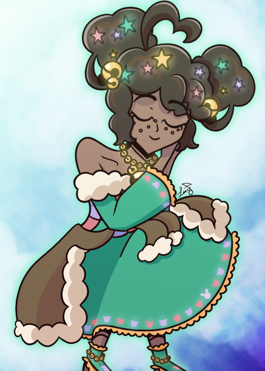
Sleepy time magical girl
#i sure do love redesigning outfits!#and if you’re worried about her mysophonia#it’s fine#the bells are silencing bells#they suck up all sound into them#how? magic#epithet erased#molly blyndeff
74 notes
·
View notes
Text
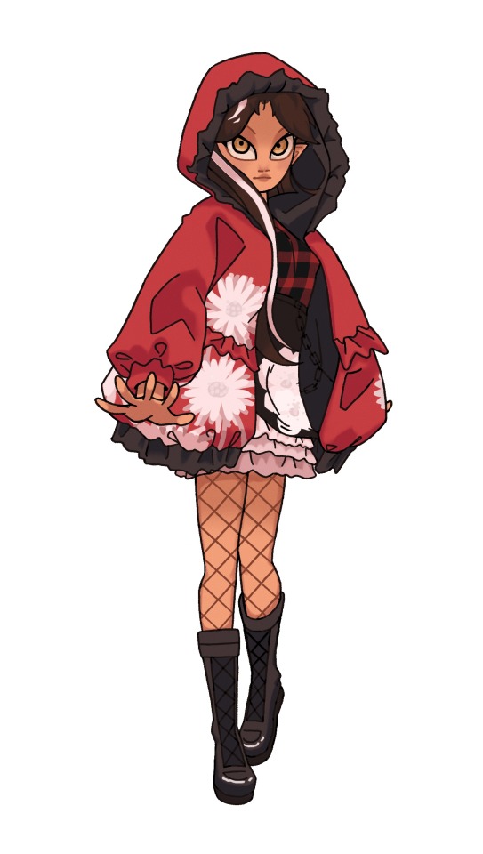
The first of my Ever After High Fan-Redesigns! Cerise Hood.
I /love/ Cerise. I think her name is the cutest (I’m glad they didn’t go with the obvious pick of Scarlett), her color scheme is amazing, and she definitely should have been a more major character. I chose to do her first because I already loved her design, and figured it would be a good test-run of this /maybe/ series(?)
For Cerise I gave her a more petite build to go along with her story of being the /little/ red riding hood. I imagine her to be around 5’1” and significantly shorter than the other characters around her, especially her sister.
Instead of a cape I fitted her with a big comfortable hoodie for a bit more modern take on the hood, though I’m not quite sure how I feel about it. I think if I were to try again I’d make the red a bit more emphasized, since for me, it’d be important that a kid walking through the doll isle would be able to identify what story each doll came from without having to check the name.
I do quite like the flowers though. In the original Little Red Riding Hood, she strays off the pass to pick a nosegay (objectively funny old word for bouquet) for her grandma to accompany the wine and cake, and that’s when the wolf sneaks away and eats the grandma. On her hoodie are Asters, which represent daintiness, as you would expect from Little Red Riding Hood. But on her dress underneath are Mock Orange flowers, which represent deceit.
I went with a sort of ‘wolf in sheep’s clothing’ theme for Cerise. Though she looks very cute and dainty, all EAH fans know that she’s anything but. And when you take her hood off, you’re left with a very 2014, almost scene outfit (though I wouldn’t go that far, since she’s still quite preppy). Without her hood, her ears, which are disguised as her bangs, flip up and expose her true /wolfy/ nature.
Anyways, I’m really happy with the final design and I think I would definitely pick up a doll of her. I’m doing a little poll on who I should draw next, so please vote if you’d like to see another :>
796 notes
·
View notes
Text
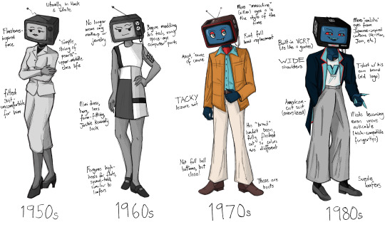
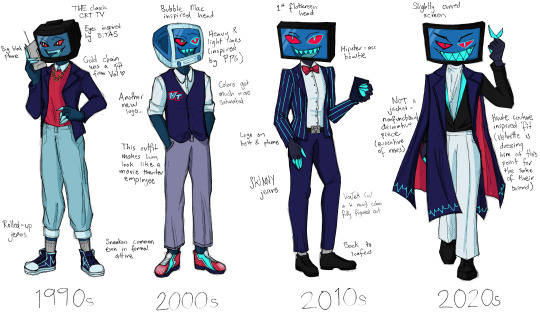
I had an idea to redesign vox because I didn't love that a character obsessed with modernization would wear a top hat and bowtie. then after a brief stint into madness where I read my partner's historic costuming textbook I drew.... all this.
(side note: the idea of vox being a trans man who transitioned AFTER death was super compelling and absolutely inspired by @prince-liest so while this is not direct fanart of their series I wanted to give a shoutout anyway!!!)
okay some TRULY unhinged rambling about historic costume below the cut YOU HAVE BEEN WARNED!
1950s: for this design I very much did not want to go to the typical a-line housewife look, because I feel that is unfitting for vox's character. instead I went for a more business look, but there is still a level of femininity that he would have been expected to perform. i wanted to express his discomfort with that through the pose and expression, though at the time he wouldn't necessarily have a framework for why he hated it
1960s: this one was very fun. i loved the idea of vox beginning to eschew some of the expected feminine presentation, and he no longer wears makeup, jewelry, or hose (though its hard to tell in black & white); however, he's kind of at war with himself in this time period. he's obsessed with seeming perfect and having a respectable image, so he would not go in for the counter-culture movements that were so big in the 60s. he's still kind of riding those coattails though, pushing those boundaries while still not acknowledging his queerness.
1970s: to me, it was very important that the gender hit as he entered the world in color. in my mind the gender euphoria is physically manifested in a wizard of oz situation - he can become who he always has been. anyway, gender aside, I think it was very important to me personally that he wore an ascot. it was for my mental health.
1980s: I wanted the 1980s to be the period where he began to gain some power and notoriety because of the de-regulation of television during this period to allow more ads, mirroring real-world history. I think if the 70s were when vox gained some real confidence, the 80s are when he got an Ego (tm). "business casual" also began to become more acceptable in this time period, and the t-shirt/suit jacket combo was very important for me to include, as to me it epitomizes the commercialism and machismo of the 80s.
1990s: this was actually the decade I was the most nervous to design, and yet I think it turned out the best? the 90s are known for grunge, which I think is NOT vox's style at all. I decided instead to lean hard into the yuppie look, which I know is more associated with the 80s but was definitely still a thing in the 90s. I also allowed a little hip-hop influence in the form of a gold chain from val, which is not something I think vox would ever pick on his own.
2000s: if the 90s were the decade I was worried about and turned out great, the 2000s are the decade I thought I had down SO GOOD and then totally floundered in execution. I still love the bubble-mac inspired head, and I tried to make his clothes as "round" as possible. I also like that this is the time where his saturation got cranked. however, I don't know if I'm in love with the vest and super bright sneakers, because again, looking back on it, he kind of looks like he works at a movie theater or best buy or some shit lol,,,
2010s: I think it's telling that this is by far the closest to his canon design (2014 tumblr lookin ass). I really wanted to pull from that hipster tech bro era, but unfortunately that aesthetic has a veneration for "retro" which again, is not fitting for vox. I still think he would wear the bowtie during this time because, well... he sure does in the show!
2020s: this was fun because I had an excuse to pull from haute couture design rather than street fashion because of the introduction of velvette into his life. I truly do not think velvette would let vox and val walk around in the outfits that they do because it would be an actual embarrassment LMAO. for this, I wanted his decorative "robes" to be evocative of the time he depicted himself as a priest AND of a cape/robe of an emperor. he does think of himself as that bitch, after all.
459 notes
·
View notes
Text
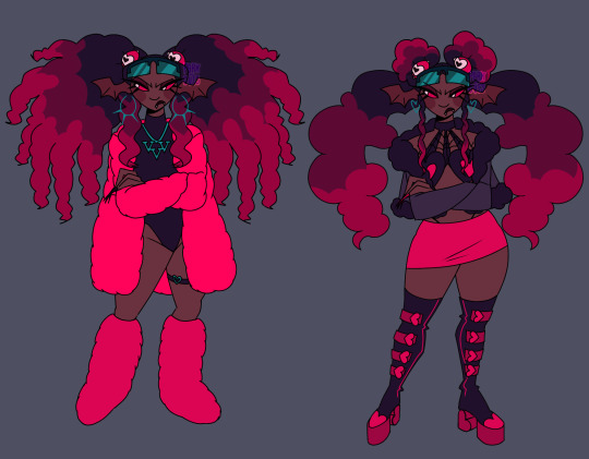
Velvette if she served cunt
Design breakdown below 👇🏾(BEWARE IT'S VERY LONG)


Alright going into detail about my gripes and edits. Like Velvette but her design is just. Not good to me. None of her (main) outfit details look like they fit to me— pinstripe pants + long fur coat paired with black crop top and scene sleeves? Skull earrings? TINKERBELL HEELS????? Tell me how any of that meshes well or even makes SENSE for the social media influencer persona she's supposed to have going on. Now that I think about it I'm pretty sure she's supposed to be clown themed... But I'm just gonna toss that idea out bc being a revered social media influencer and a clown at the same time just seems a bit oxymoronic to me, and the "clown" details aren't adding shit for me.
And don't think I forgot about her features. Pale ash grey skin and wavy hair at best. If she was supposed to be some type of creature where a nonhuman skin tone would make sense then maybe I could let it go?? But as far as I can tell she doesn't have an object or creature or animal theme like the other V's and if she does I shouldn't need to do detective work to figure it out. There is no reason for *any* of these poc characters to have grey skin, especially since they don't have any other poc features at all.
Sorry that shit gets me heated anyways. Onto my redesign. Gave her a more obviously black skin tone and textured hair bc I love a 30 inch buss down as much as the next girl but considering how there are no significant poc cast members with visibly textured hair I think she deserves to flaunt some coils if no one else will.
Ngl I'm not. A fashion girlie. Idk what's trendy idk what screams "influencer" so a lot of this was just throwing shit at the wall that I've seen around recently but it looks cute enough to me. And there was a bit of inspiration taken from Aliyahcore and ghetto fabulous fashion ❤️
If you can't tell this is shamefully inspired by lovesart23's Velvette reimagining because imo they had some outstanding ideas for Vel. I low-key stole their idea for those floating eyes in her hair that follow her around and help her keep tabs on shit it was just a superb idea for a social media overlord to me. I also took some inspo from @furbtasticworksofart 's redesign because vampire influencer sucking up the souls of her followers in exchange for content??? Too good (also the eyes were supposed to have bat/vamp wings I just forgot 😭) So yeah she's a vampire demon now. Without the features she was looking too human anyhow. Maybe she also feeds off of the energy of her followers through tech like after Vox mind controls them or whatever... Idk idk is that anything
Speaking of Vox, the screen glasses are meant to connect her to him w/ their color and shape while serving the purpose of being like a second phone she can post and check the web with. Like lovesart said in their reimagining vid, Vel doesn't really do more than pose for selfies and scroll on her phone when it comes to social media so in my head she's constantly flipping her shades on and off, using them to scroll and stay active, and they can show when she's not paying attention or respect to something/someone bc scrolling is more worth her time in the moment.
The hearts everywhere are also supposed to kinda represent social media likes + connect her back to Val w/ his heart patterns. That might've been what the hearts in her og design were for but. I just didn't like their placement bc I'm a nitpicker and a hater❕
I have so much more I could say about possible ideas for Velvette because I love evil black girls and I only want them to succeed in my media and I could treat her so much BETTER but I'll refrain bc this is way too long anyway.
Alright for reading/scrolling through all that rambling I offer you the sketches + some alt hair ideas I had
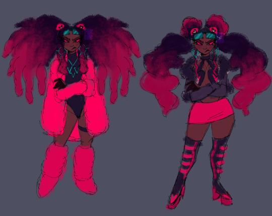
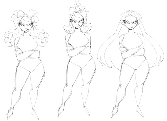
P.S. I'm very open to constructive criticism but if I see anyone just dick riding in my replies or rb's I'm just blocking you on sight ✌🏾
#hazbin hotel#velvette#velvette hazbin hotel#velvette redesign#hazbin hotel redesign#my art#digital art#character design
843 notes
·
View notes
Text
Hi! I'm Bunny and I'm redesigning the whole cast for hazbin hotel
{PLS READ THE WHY SECTION BELOW}
Anyway.... Onto my designs! I'll be detailing the stuff I changed/added
First is.,..!! Sir pentious! Weird right? You would think it's Charlie but uh nah, he's my favorite character and I wanted to make him similar to my tastes.
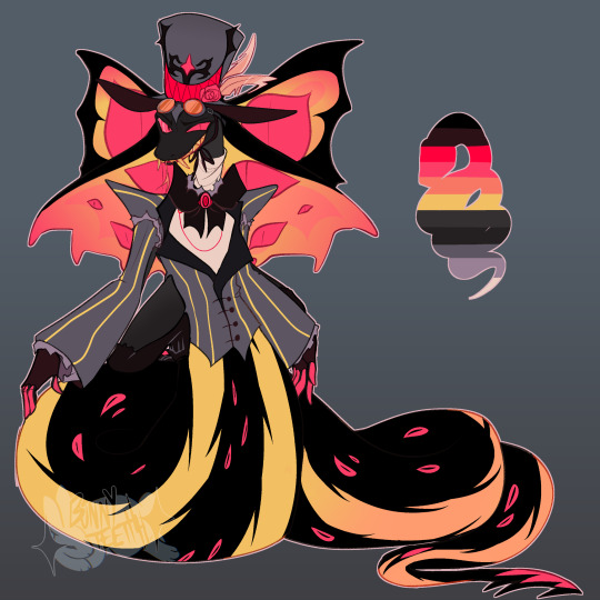
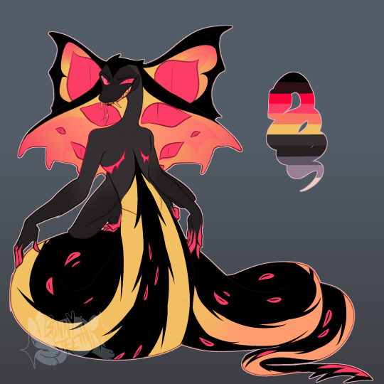
Yes he is trans! I have a small little HC that the egg boys are his boys...
And he is much longer/bigger due to this because of sexual dimorphism! But we love him for who he is now he's so silly :). He also has a barbed tail that I would say is used as a 5th hand! To grab stuff. He already has 4 arms cause why not? He needs to push himself around already..
Next is.. Angel Dust!, he doesn't have an alt version because I feel it's not needed but here he is!
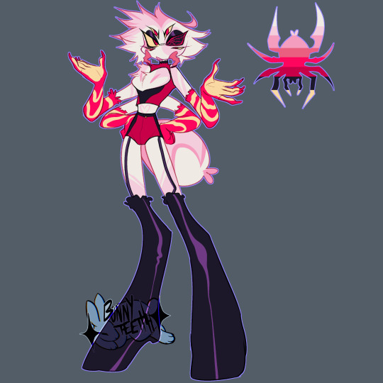
I added pedipalps, those are the mandible looking things. They are a part of spiders I think are so cool and I wanted to add them! Unfortunately they're not counted as legs and adding another set of legs to angel I couldn't figure out... But good enough!
I also changed his eyes! To include a spiderweb, I'm not entirely sure why he has that black eye, so I thought I would change it up a little bit.
A friend gave an idea that his sight from that eye is kaleidoscope-like so I'm implementing that too! And how could I forget! The spiderbutt! Without it it's kinda weird looking so I wanted to add it in cus it's so cute
Next up.... Husk! He's one of my favorite characters so.. kinda went all out on him
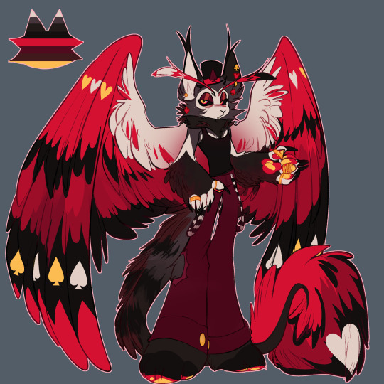
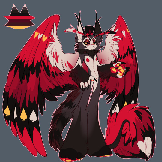
I didn't change much about him besides his patterns and colors, but generally his silhouette is the same!
I wanted to add a lot more feathers and fluff to him! And putting on the casino style bringing back the spades and hearts to his wings again!
I thought the spades were funny
Up next.. Vox!
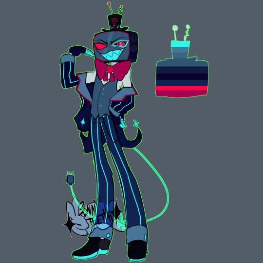
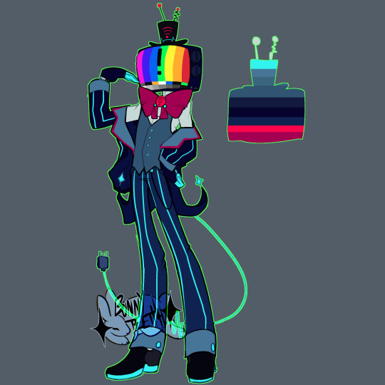
I found his design interesting that he is a flat screen TV even though he died in the 50's? So I decided to change that! Turning him into a box TV again!
And giving him a cable tail, I thought it would be clever that when sleeps he charges himself up for the day!
Next up... niffty! She's the last character I've designed so far!
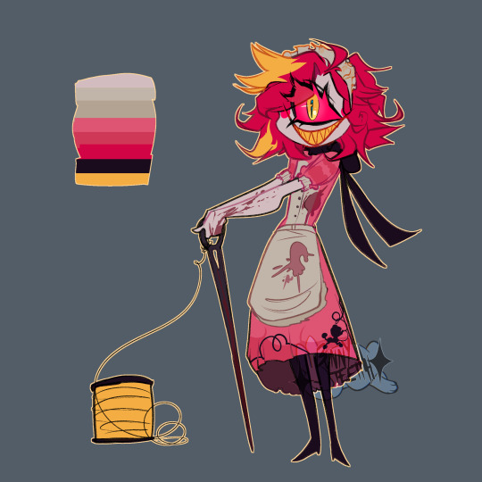
Also while looking up her historically accurate date I found out she's 22??? Weird... But yeah she did end up looking a little older here I'm glad, but I really wanted to give her a bigger needle! What's she gonna do with that small thing?
And her dress is based on 50's maid outfits! With the addition of an embroidered poodle!
.
Why?
Well first I'm crazy and second, I've been now made aware that the show itself does a certain type of representation so disgustingly that I'd rather make my own designs and fix what they couldn't do.
I don't support viv or the show.
If you want to read into it yourself I advise a trigger warning for S/A. It happens in episode 4.
#hazbin hotel#hazbin art#hazbinhotelau#hazbin angel dust#vox#niffty#husk#angel dust#sir pentious#hazbin hotel but i dont support viv or the show so i made my own designs cus ths original are kinda lackluster!!!??#hazbinredesign#charlie coming soon....#my little guys and headcanons#hazbin#hazbin husk#hazbin sir pentious#hazbin niffty#hazbin vox
564 notes
·
View notes
Text
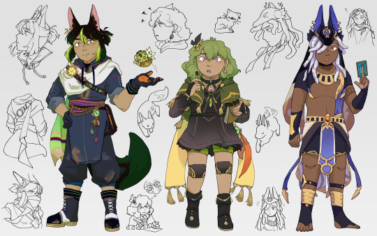
I decided to have a go at doing my own redesigns because these three are my favourites and I love them very much. further notes + sources under the readmore (warning: lots of text). I did my best with the research, but if there's anything I overlooked, I'd really appreciate people letting me know :)
Tighnari:
My main source for Tighnari was this excellent thread, from which I looked up each item of clothing individually. Since djellabas tend to be quite long, and Tighnari needs mobility for forest ranger activities, I figured he would cut and re-hem the lower half. He also has a lot of clothing pieces that are traditionally multicoloured, but to keep his design cohesive I decided to use the same colours across different items, but using a larger palette of colours than I would usually. I like the bright colours on him a lot though!
There are also some minor details I just changed because I wanted to. The flower on his chest is now a nilotpala lotus, because I thought it was nice to include his acension material/the material he asks you to help gather. The dirt stains/scuff marks are because rainforests are muddy and I wanted the design to emphasise Tighnari being very practical and hands-on with his work (see also, the specimen belt).
Finally, I shrunk the magnifying glass on his back (because I'm pretty sure it's meant to be his first magnifying glass toy and that thing is very large for a child to handle) and gave him an undercut because it seemed right. Also, I merged his front and back trailing cloths into a scarf type of thing that he could wrap around his nose and mouth to prevent inhaling spores from mushrooms.
Collei:
COLLEI my beloved. I had a mild nightmare trying to figure out a specific source culture for her design, but nobody seemed to know specifics and her outfit wasn't matching with any traditional dress I looked up, so in the end decided to keep the overall look the same. Just in case I assigned her something else, but then it turned out I missed her actual inspiration.
Anyway, I made her shoes simpler (no fur, heels, and open toes in the rainforest seemed reasonable to me), and gave her shorts. I liked the green colour because it's pretty unique under a dark dress, and pairs nicely with Nahida's white dress + green undersides. Amber's tie stays, but I made most of her jewellery smaller since it felt a little clunky for a trainee ranger.
Her earring and necklace(?) are allusions to the Evil Eye and the Khmissa/Hamsa, both symbols of protection. Especially considering the fact they're meant to ward off evil, and very common across multiple MENA cultures, it seemed fitting for Collei to have them. Also, she has Eleazar scars, and I used the design for her stockings as inspiration for the combination knee braces (similar to those used for arthritis, since Eleazar also causes stiff limbs and I HC that people affected would probably still need some recovery support)/knee pads (in the case of a fall). I like the idea that Kaveh would have helped make them for her (tangent but the fic Here is the House explores similar ideas; it's really really good, I heavily recommend it). Finally, she has curly hair because I thought it would be cute.
Cyno:
Here's the thread I found for Cyno. The main critique was to do with the eras from which each aspect of his clothing drew inspiration, but I admittedly wouldn't be able to do much about this without a lot of research. One thing I did try and verify was the small strip of cloth on the left of his chest, and I found a few wall murals where the people seem to be wearing similar strips of cloth? (example here; rightmost figure) Therefore, I didn't remove it, but if someone wants to explain Ancient Egyptian clothing history to me I'd be really interested to hear it 6.6
I might iterate on the design in the future, but for now the changes are mostly HC territory. Cyno wearing his hair in locs (a protective hairstyle) makes sense for someone who does a lot of hiking after rogue scholars, and I also gave him quite old and faded top surgery scars because healthcare is canonically free in Sumeru (thanks for that information, al-Haitham)(though tbf Cyno makes bank anyway). I also adjusted the colours a bit, since Genshin tends to use desaturated shades for metallic elements.
I also considered giving Cyno more scars, but figured that it could indicate Hermanubis' presence that someone you'd expect to get injured a lot is relatively scar-free (i.e. some sort of godly healing factor/resistance to damage). However, we know next to nothing about Hermanubis, so Cyno having a lot of scars also makes sense. This paragraph is mostly just a cry for help cyno story quest 2 literally any more elaboration about the nature of Hermanubis' pact and the Temple of Silence.
Conclusion
I wasn't intending to write one when I started the explanations but this got REALLY long so if you made it this far, thank you so so much ToT please check out the links; the threads especially were a great resource, and I'm grateful that people take the time to make them <3 genshin's character design department are cowards but I'm glad I learned some new things through the redesign process
#FINALLY#IT'S DONE#I don't know why this took so long. maybe because I was trying new art style stuff#anyway I like how this came out!! my favourite guys#my main thoughts for each of them were like. tighnari <- kind of a chad. collei <- should get to wear shorts. cyno <- gap moe#<- i say having written 9 paragraphs about the development thoughts under the readmore. wahey#big shoutout to everyone who draws the archers ripped. you guys are inspirational#genshin impact#tighnari#collei#cyno#my art
424 notes
·
View notes
Text
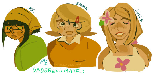
i was unmotivated to draw this week so i forced myself to draw in diff styles - and i chose to redesign emmk cus i love them both sm (even tho i dont even enjoy td anymore)
buut then i got the idea of maybeeee i could make a what-if scenario where julia-mk-emma alliance could be made
so here they are!
EXPLANATION BELOW!!! (warning, maybe ooc but it's a rewrite + redesign)
sooo what im bringing to the table is a rewrite of their characters - esp s1
JULIA
for julia, i wanted to make the twist villain thing for s2, which might sound weird... but i can explain
she mantains the happy-go-hippie personality as a facade during the time she stays in the island, whilst in the background she's actively sabotaging other contestants with the help of mk. she only shows her true colors after mk betrays her (which i kept the same, probably after the merge tho) and she gets kicked out. (iii feel like mk would stay longer BUT not be a finalist, mainly cus in this redesign she plans things through very VERY carefully)
she would be used as the main villain for s2, and she would be like julia in mid s1 probably - petty, strategic and, most importantly, deadly. she replaces her tropical, pinkish clothing with blueish popular outfits and she becomes mean as she can be. hostile, she becomes someone to fear as she turns her gentle face into one full of disgust for those around her.
MK
So. you guys know i love MK - shes the whole reason i still havent let go of td - so im giving her the best character ever!
calculative, observative, and sneaky, shes the definition of a stellar strategist. she makes herself look average just to pass by smoothly, and she sabotages everyone she cans to assure she stays that way until the very end.
though she's snarky, she understands that overdoing it might get her on a radar. she observes everyone she can to understand them on face value in order to know how to approach them.
she's naturally drawn to julia, as she notices things in her behavior that differentiate her from genuinely nice people like priya or emma. her smile twitches when no one looks, her eyes do not smile along with her mouth... she's as fake as she can be.
so she observes her during the first episodes, trying to make a conclusion and find a way to get her on her good side.
so she confronts julia alone, which makes julia drop the act and threaten her. mk assures julia that shes in no way trying to threaten her, and that she wants to form an alliance, which julia then accepts after some convincing that they were probably the best duo in the game so far.
she's still got a lot of character outside julia though, and she shows it through her snarky attitude when it comes to everything, and her master thief tactics that she uses to hack and learn what challenge is going to happen and how she's going to eliminate certain people that oppose a threat to her.
However, a duo like them always needs a backup to throw under the bus at any circumstance of danger, so they decide to pick a gullible, insecure person....
EMMA
A nice, silly girl that has some bottled up anger from years and years of frustration she was told to keep in because of her internet persona.
after a messy break up and a fine that cost her almost thousands of dollars, she's pretty sure the bottled up anger is now cracking. she's no longer a youtube star, as her ex's channel was the only thing keeping her trendy, so she no longer needed to spread herself thin to please an audience - to please him.
so! chase is here! hm! how the FUCK is she supposed to continue the game knowing that her stupid ex is in the same tv show as her?!
he's dumb, lazy, and apathetic. he shouldn't be there to begin with!
...so she tries to ignore him as much as she can, though he sometimes makes her want to scream.
either way, her ex aside, she tries to be kind to everyone she meets, but everyone sees her as gullible and naïve cus of it. shes letting everyone see her insecurities by simply existing, and though she's friends with bowie, everyone guesses she won't make it far. she's fun, silly, but also weird in her own way.
mk observes emma and concludes that she's the perfect pawn for their game, and so she finds her alone to play mindgames on her, knowing that her biggest insecurity is not being a good people-pleaser.
mk manages to convince emma that she should join the alliance, and so she accepts. emma's not happy about it though, but she understands mk wouldn't let her join if she didn't saw potential.
THE ALLIANCE
mk, julia and emma are underestimated due to their actions, so it's not hard to cheat in challenges that way. emma finds this a bit uncomfortable, but she helps them with social intel. she's the least suspicious of the bunch, so she can eavesdrop with ease since she's not seen as a threat.
they manage to kick out chase and ripper with ease, and they go unpunished through the series.
well. until mk betrays julia, that is.
mk knows that her days are counted if she keeps julia around for too long, so she frames her as soon as she feels things going against her. it is not pretty, and julia swears on her life she'll take her down.
but she didn't betray emma.
mk never mentioned emma being in the alliance, causing her to get the boot as soon as possible, which is 2 episodes after julia.
emma stays to be in the final five, but she doesn't end up winning.
mk swears it's so that they can team up next season, but it's something more.
HOW EMMK CAN STILL WIN
mk originally was going to betray both of them, but she couldn't. not emma.
emma was a genuinely nice person to be around, and though she was useless when it came to actual scheming, she was funny and understanding.
mk had a big crush, long story short, and couldn't bring herself to see emma get hurt like that. if she had had a crush on julia, which she thought she had, she would've still betrayed her. it was strategy, and there were no hard feelings.
but emma? mk believes seeing her sad face would probably ruin her. she's a truthful person, and mk admires that.
so she and emma stay friends, and continue being alliance members in s2, which escalates into something more.
S2
i believe s2 wld be julia vs mk in terms of main villains, and emmk wld be the main focus when it comes to mk and emma screentime.
julia tries her hardest to sabotage, and mk counterattacks in default, leaving them to battle for dominance all the way til the merge, when mk gets eliminated instead of julia. emma is heartbroken due to her ...friend.. getting kicked out, and she follows the next elimination.
idk for s3 but maybe mk wld be a finalist or win cus my girl needs a win under her belt!!!
#my art#total drama#total drama reboot#tdi 2023#tdi mk#tdi emma#tdi julia#td mk#td emma#td julia#total drama mk#total drama emma#total drama julia#emmk#td emmk#mkulia#(it's only mentioned once. i prefer them being platonic if im being honest)#i dont hate yuri warning i just LOVE emmk#also im not gonna draw mk like this for anything other than this redesign cus my design for intertwined is very different#i was having artblock n decided i shld expand to diff artstyles
165 notes
·
View notes
Text
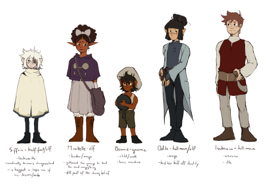
in stars and time x dungeon meshi
(extra thoughts and ideas below!)
closeups!!
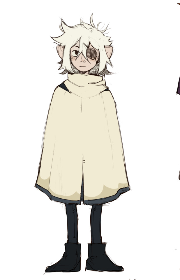
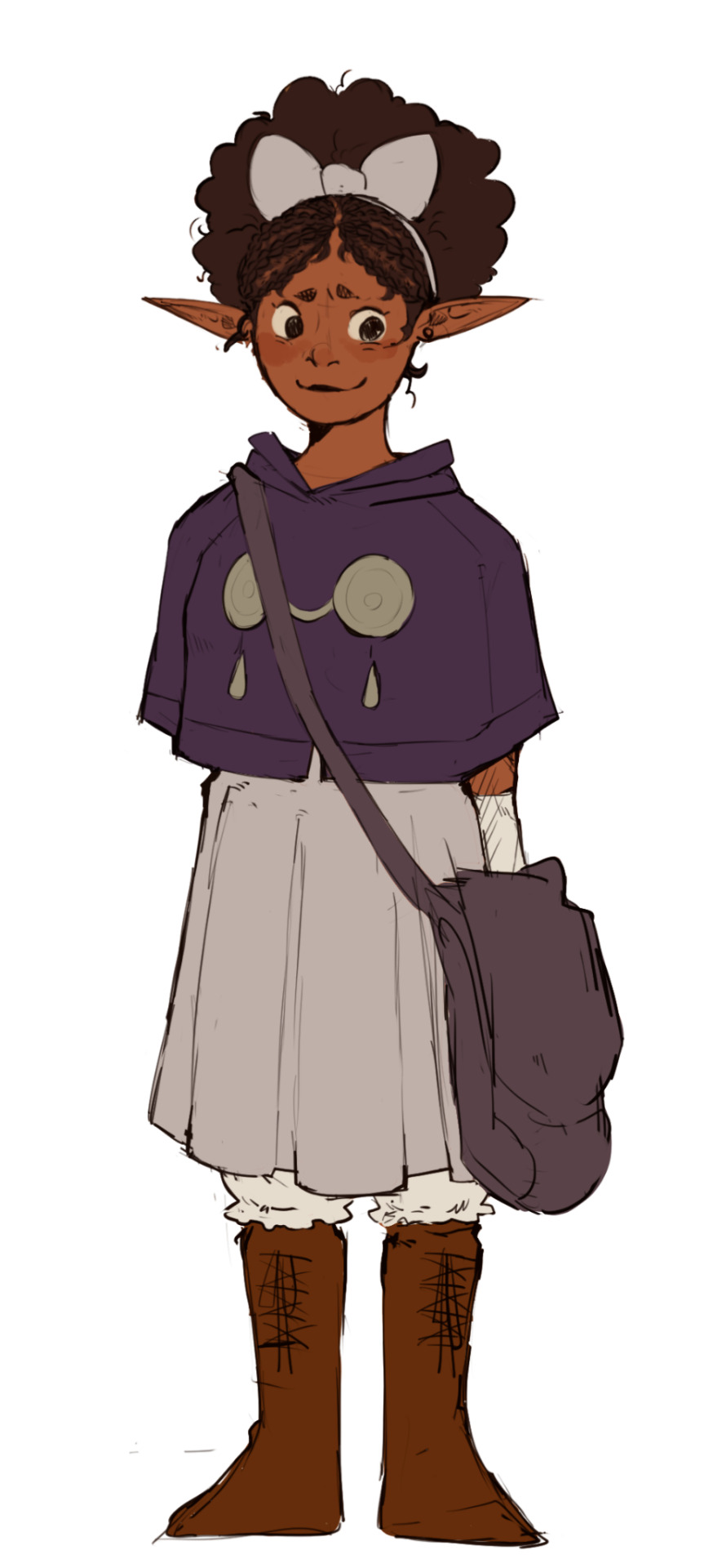
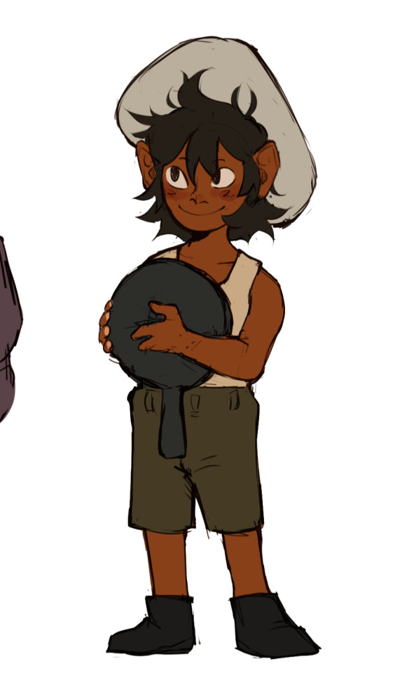
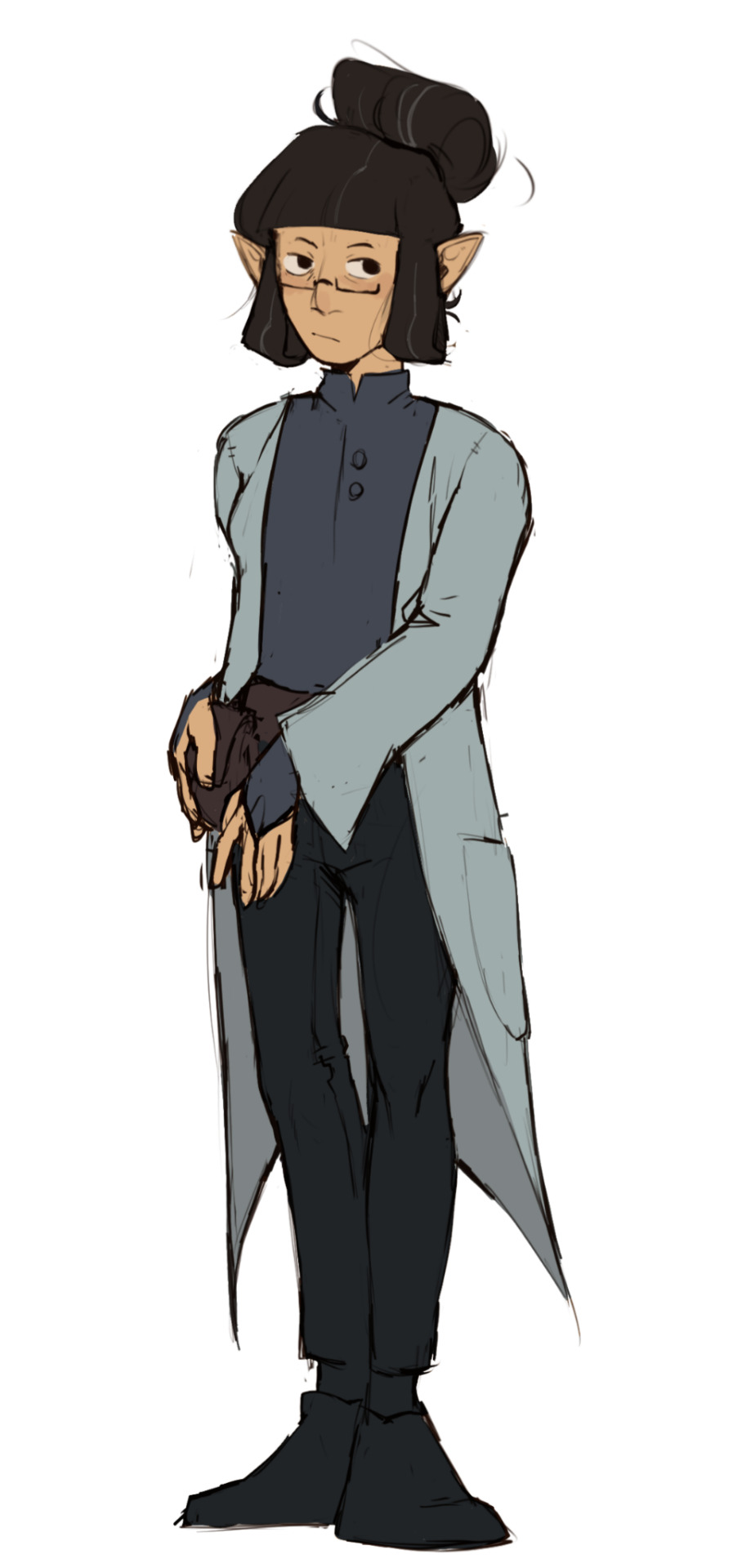
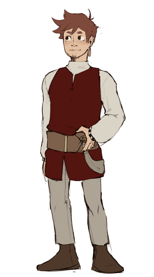
so this is more of a isat in dungeon meshi kinda au than the opposite, the idea is that the King is the dungeon lord/mad mage, his desire being to be able to freeze the dungeon and the country in time
The change belief still exists, and Mirabelle is still a housemaiden destined to save the counrty, so she goes to seek out companions who can help her on her journey
Everyone's reasoning to join is still the same as it was in the game
Also this isn't a redesign of them, more like a dungeon meshified version of their clothes + colors so they could fit in better (imo!!)
ok now onto some design notes!
Siffrin
originally he was just gonna be a half-foot, but i realized his wish to be able to stay with everyone would hit harder if he would outlive them, so i made them a half elf- halffoot
i removed his hat purely for aesthetic reasons lol, i think he would stand out too much in the dungeon meshi universe with it, but i suppose its true for ingame too so maybe ill give ut back to him if he behaves well
i also wanted to remove his hat so i could see the top if his beatifiul head
his poncho is a bit different, just a few small details so it would better in universe i think
he lost his eye in one of the previous dungeons they were going through
Mirabelle
she's still part of the change religion
i felt like her being an elf is pretty much perfect, no notes on that
i did have marcille in my mind while designing her outfit, and also theyre kinda similar overall i think?? idk but i love both of them
i gave her braids because its canon in the dungeon meshi universe that taking good care if your hair+unique hairstyles strengthen your magic and also i think its cute
Bonnie - the senshi of the group!!!
i wasn't sure what race i should make them at first because they're a kid so theres no point in chosing a shorter race to show their size i thought, but then i remember how cute gnomes are in the verse with their big ol ears so thats what they are haha
their design is probably my favorite out if anyone as well
i imagined they would join pretty much the same way senshi did
Odile
her race was also pretty much immediately decided
her clothes were the biggest struggle for me, not only figuring out how to make them look a bit more medieval-like but also the colors
i decided a while ago in my head that odiles color palette would be blue but it was still a struggle making her coat not look like a lab coat lol
maybe that was the intention but i really just wanted her to appear like a normal adventurer
Isabeau
as you can see on the page i have the least amount of ideas for him lol
i pretty much just had laios in my head while i was designing him
i do feel a bit bad for taking away his stripes and silly looking belt thingy but i felt its a bit too much for the dunmeshi verse
thats pretty much it i think!! not sure if i will draw more of this au, i just mainly wanted to get it out ot my head cus its been rotating in it since i played the game
#in stars and time#in stars and time fanart#isat#isat fanart#isat siffrin#isat mirabelle#isat bonnie#isat odile#isat isabeau#dungeon meshi#delicious in dungeon#crossover#ramblings#isat x dungeon meshi
147 notes
·
View notes
Text
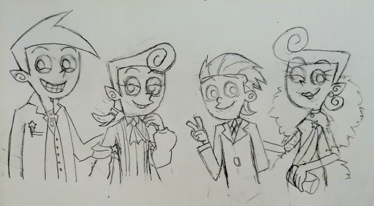
Family Dinner Night!
Congrats Peri(winkle) for finally getting the Godparenting license!!! 🥳🥳🥳 - from your loving parents and godbrother 💖💖💖

More concept art and as usual my insane ramblings below.
I NEED TO GET THE CREATIVE URGES OUT OF MY HEAD!!! It has been bothering with my motivation to finish my gazillions of homeworks lmao. I have so many ideas I need to let out!!! It's suffocating. I hope this will satisfy my creative urges for a while... Or not I will yap about my FOP AU on a separate post (when I'm able).
I can't stop being sad thinking about this family lol. Timmy 😭😭😭
I am not kidding when I say that my head is just filled with so many things that I want to contribute in the FOP fanworks lol. There's a lot I want to do, but so little time...
For now, I've decided to practice my take on the FOP artstyle. I wanted to do something simple as drawing and coloring practice. That's why the coloring this time is flat with no shadings. I think the show doesn't focus on shaded colors too much (except on scenes where there's a heavy implication of day/night, for shock value, etc.).
Just wanted to draw something cute because I haven't been feeling so swell lately. Nothing too poetic or detailed this time.
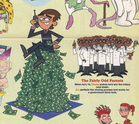
Other than that, two of the outfits this time is actually inspired by @suki-na-kumo for Peri and an image I found floating around in Twitter/X (sorry I don't remember who shared it) for Timmy's design. Suki-na-kumo's FOP family redesigns are so cool and adorable! I like that they always include flowy attributes in Peri's outfits lol. It makes him look like a pampered brat (which he kinda is seeing how his family coddles him), an otherworldly prince and also a Twink TM (that is unavoidable lol). I kinda want to draw their other FOP redesigns, but I'll just go with Peri's first.
I am not sure where that 18 year old Timmy design is from, but it kinda can be his design for those who theorise him on becoming a lawyer as an adult. There's a lot of instances where Timmy is wearing a suit in the show, but this design is one of my favs due to the hairstyle change. My adult Timmy designs in the future will be influenced from this piece of official art. I wonder if there are more Timmy designs in the wild wild west out there that I haven't seen... It is certainly an interesting find (Teen AJ is also there, and his design also looks cool to me).
Cosmo and Wanda's oufits are something that I cooked up. I don't think the coloring looks good... I just did this on a whim, and for about 13 hours. Damn, I am procrastinating on my work lmao.
Still, the context this time is, that they've had a family dinner to celebrate on Peri's achievement on finally obtaining his godparenting license!!! Good for him!!!
This is an AU if Timmy somehow was able to find a loophole in the "losing your memories of your fairy godparents after you become an adult" rule. Because of that, he continued his life as normal (as Timmy's chaotic life can be), but this time he is able to keep in contact with his fairy family even if they're not contractually obligated to stick together. Timmy does live with the Fairywinkle Cosma's around his college to early work years, but he eventually was able to move out and live on his own at where he works as a lawyer after a while in his adulthood. (His birth parents eventually went on a lifetime vacation without him or just went away for too long that Timmy just lives on his own a lot after he is 18 and above...)
Despite living on his own nowadays (In a New Wish context), Timmy does keep in contact with his fairy family and visits them when he's not busy with his job. Cosmo and Wanda still took a long vacation in this AU, first due to, yeah, Timmy is no easy feat as a godchild lol, and second, they actually want to take their time to raise BOTH of their children (even if Timmy is no longer a child/godchild) and guide them until they're stable adults. Timmy during college years actually only stays with the Fairywinkle Cosma's on holidays, so when Timmy's busy with college, that is when Cosmo and Wanda take their time relaxing lmao.
Sometimes when they really want to have some time alone or when Peri wants to see his bro, they will send Peri to Timmy's college for a day or more. Timmy babysits Peri so much during his college years lol. They both had fun though! With a lot of Peri newfound nuclear fairy power shenanigans at Timmy's college lmao. Studying law and taking the bar exam has never been more chaotic with babysitting a nuclear powered fairy child.
There's a lot more on this AU that I've been thinking, but I'll stop here for now. I need to gather my AU ideas in one post sometime later.
Also, Peri and Timmy are both adults here, Peri's around his 20's here and Timmy is on his early 30's I think. Cosmo, Wanda, and Peri are in their human disguises here, because they want to learn more about human culture (A New Wish context) while also having the desire to be more in Timmy's life.
I headcannon Timmy to be kinda short in his adulthood. This is also a nod to that episode when his fairy family used imperfect human disguises, even Poof/Peri was taller than Timmy in his human baby disguise lol. And also hey, wearing braces during his teen years paid off! (his big teeth are visible only when he opens his mouth lol)
As usual, here's some concept art and a png lineart pic if you want to use it to color it better than I did lmao. (that was a long yapping session... thanks for reading)

#the fairly oddparents#fairly oddparents#fop#fop fanart#cosmo fairywinkle cosma#wanda fairywinkle cosma#poof fairywinkle cosma#periwinkle fairywinkle cosma#peri fairywinkle cosma#timmy turner#timmy tiberius turner#lmao nerd names#fop cosmo#fop wanda#fop poof#fop peri#fop timmy#nickelodeon#cartoon fanart#usagifuyusummerart2024#infinite painter#found family#fairy#fop au ramblings in the description lol#tags might change if formatting is godawful#also first time drawing peri! as in the adult him his hair is kinda hard to get at first i drew him with eyeshadow#because he seems like the type to wear makeup maybe... timmy also wears eyeliner during his emo phase lmao peri's using his bro makeup#also also they are fighting in the written text on the photo lol this is around the time when peri got to change his name#timmy just has cain instinct he finds it funny that peri doesn't notice how it kinda rhymes with his family name lmao#so he's making fun of peri's error lmao cosmo and wanda are just sighing and amused at their shenanigans
143 notes
·
View notes
Text
IT'S STRINGLESS' 1 YEAR ANNIVERSARY (+ early concept art compilation)
Posting this dumbass little video to start off the day since we have a lot of little gifts for our awesome community today.
One of those things is something i've been wanting to do for a very long while: posting a lot of the original concept art for stringless (since ive always enjoyed seeing other people's early concepts) some of these i have posted massively before, some are completely unseen, so it'll be fun

This one is the page that started it all, his design is at the same time largely unchanged and also completely different
All i have to say is that it originally said (regarding spamton and swatch) "they bicker like an old married couple" but then i thought about it and i changed it so theyre literally just married
Didnt mean to make swatchton, made it anyway lmfao


Right after that, i got working on neo designs, I wanted to make him really scary looking, the original concept was to make him look skeletal and generally for him to look insane and like he had been reanimated from the dead, but a lot of people had told me over time that they didn't really like the design, I was very defensive over it but I ended up taking criticism and i actually really like the new neo, it balances the uncanniness of the original design with the sleekness of my new art


Payton was a natural next step, without someone to sell the thorn ring there'd be no neo, so although his design visually stayed almost the same, he went through a lot of color revisions (thanks mostly to @maskedalterego, who helped me to nail his final color palette), he suggested the gloves, and helped me to balance the saturation of the design since really I've never had a good eye for color.
His final design, color wise, was just me experimenting using the colors of my sona at the time on him, which I was hesitant to do but was so happy with the palette that I kept it.


It's interesting that he was originally intended to be the pink addison (since he sells one of the snowgrave required rings), and the reason he ended up being the blue addison was corey beepington (and the eviction notice short which I have taken one too many concepts from), this still influenced me to make his outfit pink initially, which still is a huge part of his character design


That exact same night, I created concept art for Raster (weirdly, I was sure I created them before Payton, but it might be because I was generally uninterested in Payton earlier on), their design is also largely unchanged, I just got better with shapes and color, I also ended up changing their cheek markings after seeing some swatchton fanchild art by ne0nbandit

A first until now, the first concepts for payton neo were made on paper
I took very long on this design, and I only updated it every few weeks to make tweaks because I felt the concept was too good but my execution didnt make it justice
I'm very proud of how the design looks now, as of the latest neo redesigns, I feel I could finally make this idea justice


Swatch's design went through some last minute changes, I wanted to use this color palette for swatch to contrast with spamton, but decided against it, then i changed their hair to be longer, to make their Stringless design distinct from their regular Deltarune design


Historically, these two are pretty important, the first pieces of art I ever made featuring Rakhin's old design, when he wasn't part of stringless and I was just befriending rope (he made me Payton fanart first, fell in love with his style), the contrast is beautiful
Now to finish this post, here's some unseen Snowgrave route art I made over the time Stringless has been in development, they're all pretty quick sketches, but i love them nonetheless


Thanks everyone for the insane reception this AU has gotten, I haven't been feeling very good this whole year for a huge amount of reasons I can't get into, but Stringless and its community always helps me to remember why I do the things I do
Thanks for everyone's comments and everyone's kindness, thanks especially to @theropeaaa , for being the literal other half of this AU, without whom I couldn't have ever done the Stringless pages, @maskedalterego for helping me and listening to my ramblings since the start, @scamp-boxx for being this AU's biggest hype man (the first ever comment on the first spamton concept art was by them, and they helped me nail so much of the snowgrave route), @boykisserwoah and @weirdohno , for also being here from the start and making an absolutely insane amount of fanart oh my god, @gutamajunk , for motivating me to create Raster, and writing several story outlines on the first days of stringless that were the foundation for the pages, and diaryous milch and rory, our friends that have helped with character designs, story ideas, voice acting and have generally been instrumental to what stringless is today
THANKS EVERYONE <3
-Nick
#deltarune#deltarune au#stringless au#deltarune comic#spamton g spamton#swatch deltarune#swatchton#concept art
93 notes
·
View notes
Text

I’ve fleshed out Scar and Sausage’s designs for my Chained Life au
I go a little bit more in depth on the designs under the cut.
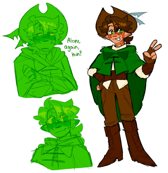
Originally I had Scar in his classic outfit because I wasn’t sure what I wanted to do, but I decided I wanted to give him a robin-hood/Peter Pan vibe.
The feathers in his hat are meant to resemble vex wings, much like his hat in HermitCraft.
I think Scar would start out more Allay on his green life but then progressively gain more Vex features as he looses lives. Since I imagine this being Scar’s green life, I’ll probably change the hat feathers to look more like Allay wings.
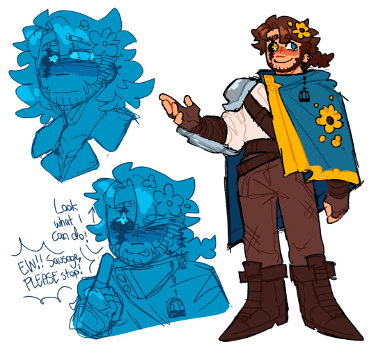
Sausage didn’t change a lot for his initial conception. I wanted to do something more interesting with his eye scar, so I made it super messed up with a flower shaped iris. The eye’s really loose and can roll past the limits of a normal eye. It could probably roll to the back of his head as well. Other than that I gave him a lot of sunflowers to pay homage to Empires Sausage and Santa Perla.
I think Imma have the freaky eye carry onto my general design for Sausage.
Im hoping to do more detailed designs for all of the characters in Chained Life and redesign old ones with my current skills. I also love seeing fanart so I hope more concrete design references will be helpful to those who want to do that.
#chained life au#trafficblr#mcyt#traffic life#traffic smp#mcyt fanart#life series#chained life#life smp#life series au#character ref sheet#character design#empires smp#hermitcraft#goodtimeswithscar#gtwscar#gtws#goodtimewithscar fanart#mythicalsausage#mythical sausage#mythical j sausage#mythical sausage fanart#mcytblr#mcytumblr#mars art
365 notes
·
View notes
Note
hii ive had this idea for a while now and its basiclly a crossover with twst and monster high, it could be a clawdeen yuu or a operetta yuu or or a cleo yuu headcannons. but theres this other idea wity SIX the musical im not sure if youve seen it but you could do any of the wifes of your choosing but i would think it would be good if they were all platonic (especially with k howard)
I'm sorry but I'm not comfortable with doing the SIX Wives because they are based on real people!
I will do your Clawdeen, Cleo, and Operetta Yuu though!

-GN Reader
-Reader IS Yuu
Sorry it's short!
-
Clawdeen! Yuu
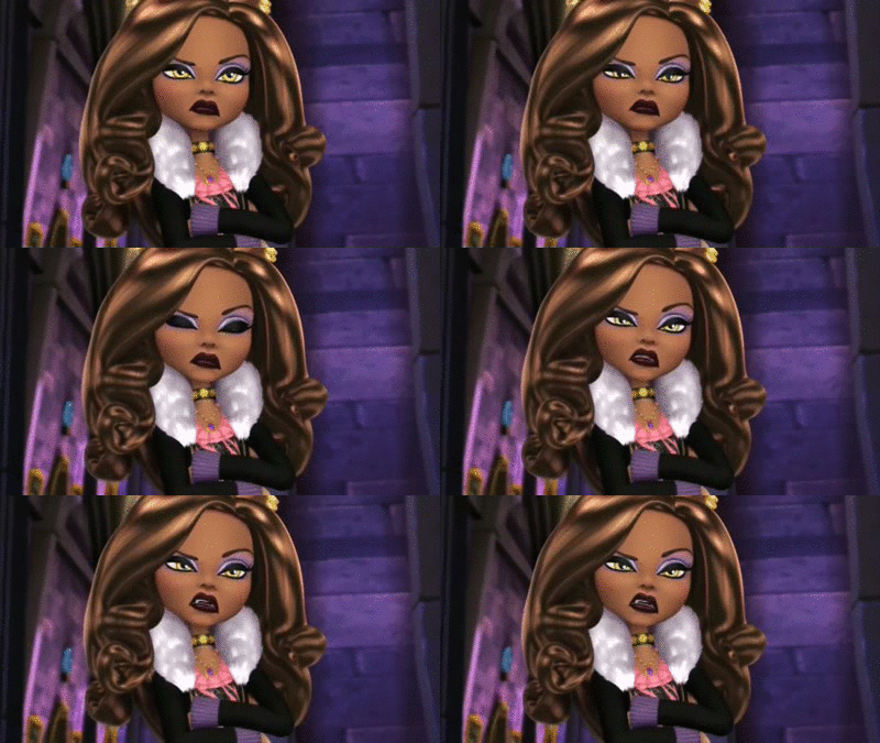
- Everyone first thinks that Y/n is related to Jack, and both of them have to constantly correct people on that.
- Y/n is unbelievably good at keeping Ace and Deuce in control because of their siblings in their world
- They probably redesigned their uniform and made a new outfit for every unbirthday party
- As much as they get along with Vil their best friend is Epel. Y/n understands why Epel doesn't want to learn useless manners and dress impractically and Y/n is able to help him make clothes he likes and that Vil approves of
- Vargas loves that they aren't afraid of playing hard and would put them in the spell drive team if they had magic
- Y/n probably spends a lot of their time at the Savanna Claw Dorm, helping Ruggie, working out with Jack, and talking (bickering) with Leona
Cleo! Yuu
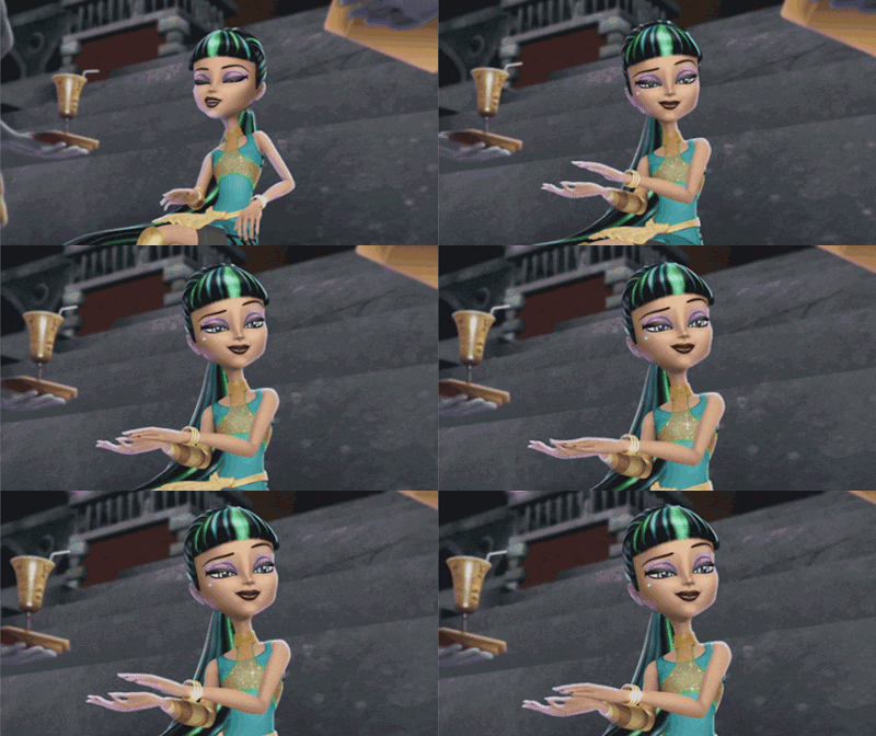
- The change of being in Twisted Wonderland was pretty hard for Y/n, not having their daddy's money and not having any respect like they did in their old world, but it didn't take long for the students of Night Raven to fear them.
- They easily became Crewels favorite, from their sense in fashion to the kindness that they only had for their friends. However, Crewel tends to get frustrated when they turn into a complete diva.
- As soon as they met Vil the two were inseparable. They did skin care together, shopped for new clothes (paid for by Vil), and even started vlogging on Magi-Cam.
-Speaking of Magi-Cam, they grew a following on their rather fast, partly thanks to Vil and partly because people were so interested in Y/n being a mummy
-Half way through the year Y/n was running the school and helping overblotted students without breaking a sweat.
-The Ramshackle dorm had never looked so extravagant, Y/n had to get it redone because it wasn't fit to their standards. (Honestly they probably broke down when they first found out they were staying there)
-A couple of students confessed their love to Y/n but they turned down each one because they were so loyal to their significant other in their original world
Operetta! Yuu
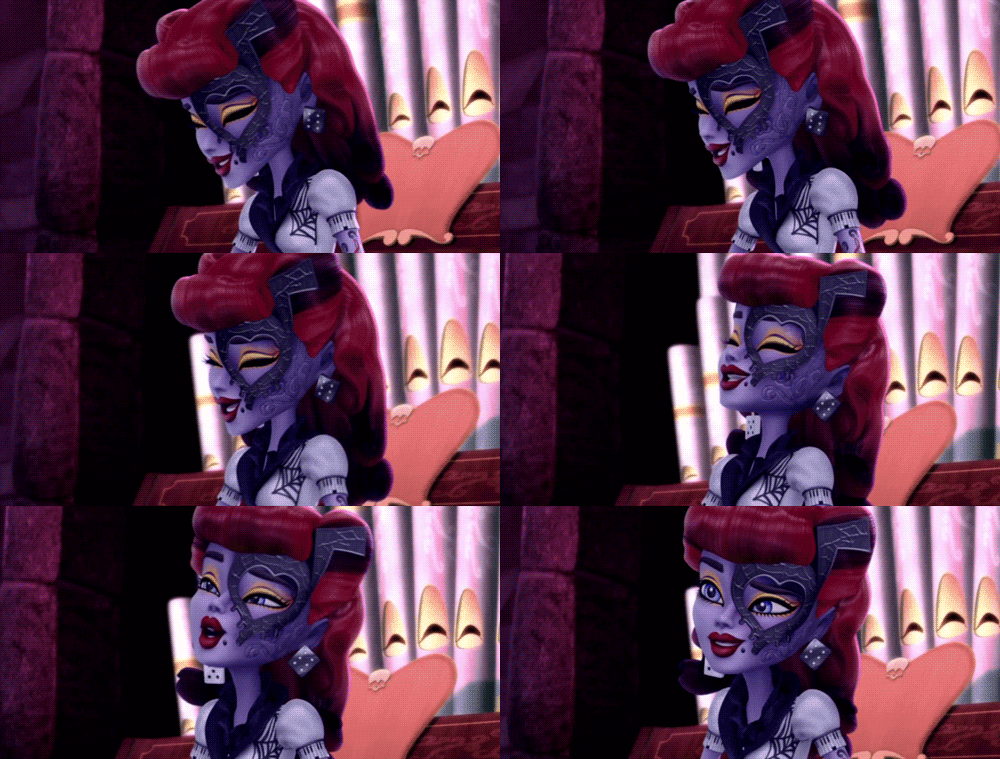
- Y/n loved the Ramshackle dorm, it reminded them of the catacombs of their old school, they were able to restore the building and kept a lot of the original features
- They play music at Mostro Lounge for extra money, because of this Azul and them are relatively close, if Y/n has any information on a student they don't like then they tell Azul
- During book two Y/n was able to shut the Savanna Claw students up so fast
- When Epel starts speaking in his southern accent, Y/n is the only one who can understand him and normally has to help translate
- Speaking of Epel, Y/n and him will play sports together and Y/n might teach him how to fight
- Vargas loves how competitive they are and finds it amusing to watch the magicless students beat up his spell drive team
- They're definitely Teirns favorite mainly because of their accent
#twst x reader#twst scenarios#twisted wonderland#twst#twisted#monster high#clawdeen wolf#operetta#cleo de nile#twst yuu
113 notes
·
View notes
Text
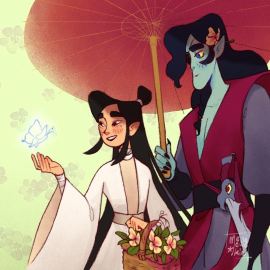
Hello!
As a first post i wanted to share my favourite bubbies and since tumblr seems more text oriented than the other socials I have, I'd like to explain what was going on in my head while doing their character redesigns~ [BOOKS SPOILERS MENTIONED]
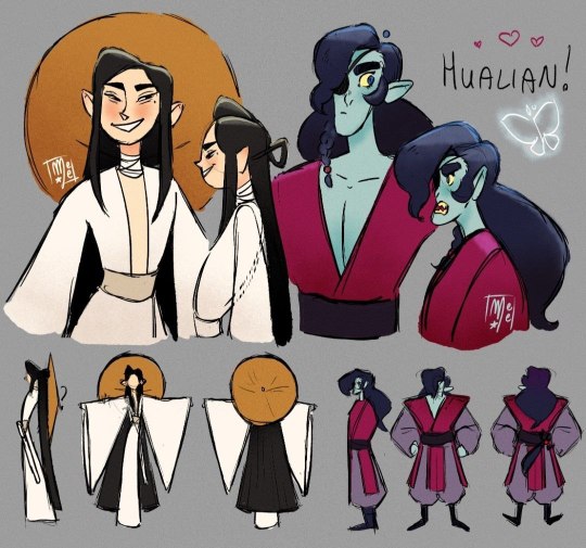
INTRODUCTION
These character designs were made back in winter 2022 for a sort of animation thesis. Many things didn't go according to plan in that school year so for lack of time and motivation I've never really finished the animatic but I will include a wip at the end of this post. The animatic was about my interpretation of their story, finding a person to call home while in a crude and terrible world.
XIE LIAN
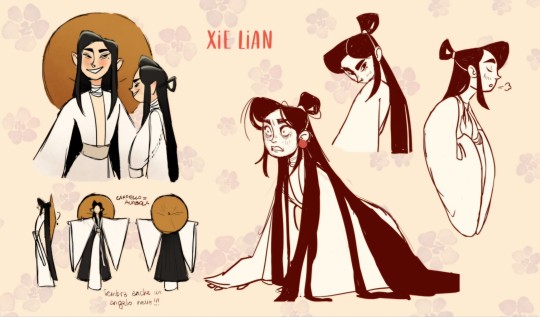
Xie Lian is the first of the two I made, his character design was very clear in my mind since the start. It's not largely distant from your official usual XL but I thought it already fitted very well.
The three main colors for XL are white, black and golden yellow. The prevalence of black and white colors was inspired by two main factors:
I personally see XL as a heavily dichotomy based character, not only in the association to the White Clothed Calamity but also in the way he's described as pretty as a flower but skillful with the sword, following a chaste path but mingling with a ghost king, all kind smiles to others but struggling with his own hope, etcetera, etcetera. He is in a constant struggle to find a third option that is better than simply bad or good, mostly in his early God's days, and also later on with ‘not knowing whether to laugh or cry’. So in here, black and white represent the reality of human nature, where you have bad and good qualities alike, a concept I think XL struggled with a lot since he was brought up as the perfect and pure prince that can do no wrong.
According to my research of the meaning behind colors in the chinese culture I discovered black and white can symbolize many things, some of which I found quite fitting for where I wanted to go with my character design. Black can stand for sadness and bad luck. White represents brightness, purity and innocence. In some instances, however, white is also associated with death and is a color commonly worn at funerals. Moreover in my own culture black and white, along with deep blue, are very elegant colors to wear. Simple and elegant is what my XL wants to look like.
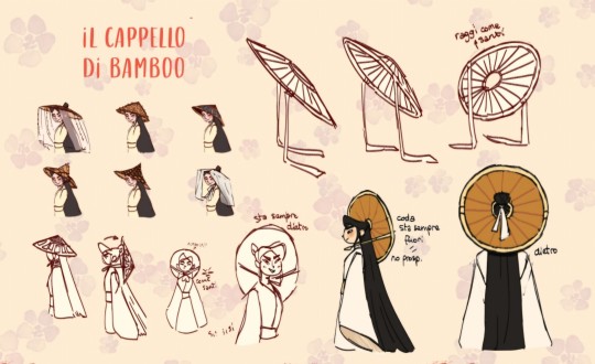
Another important part of my XL character design is his bamboo hat.
Following some good old christian imagery I used his hat as an halo. Most of the time I even ignored perspective to make sure his head is always framed in this golden saintly circle In my animatic storyline specifically it represents XL perfection. Soon the hat is lost in the mud and brought back later on by HC with a new meaning of finding yourself in a safe environment with safe people.
For most of the other design choices I took decisions based on pure aesthetics such as giving him a very elegant mole under the eye, very long and lucious hair and a very very long hanfu with some very very long sleeves. Yes, I wanted him to be very very everything because I very very love him!
Here are some other very very outfits i drew him in for fun and didn’t need for the animatic:
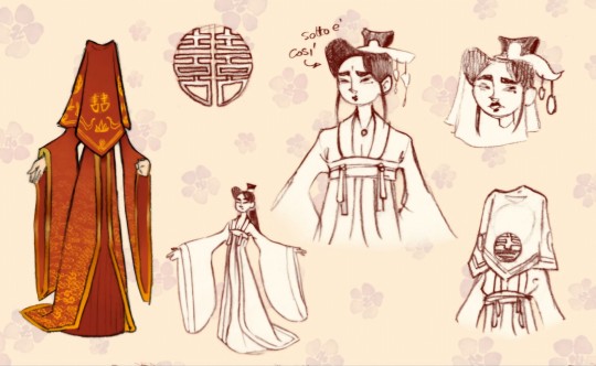
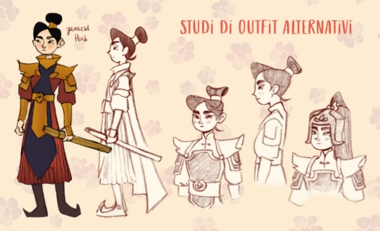
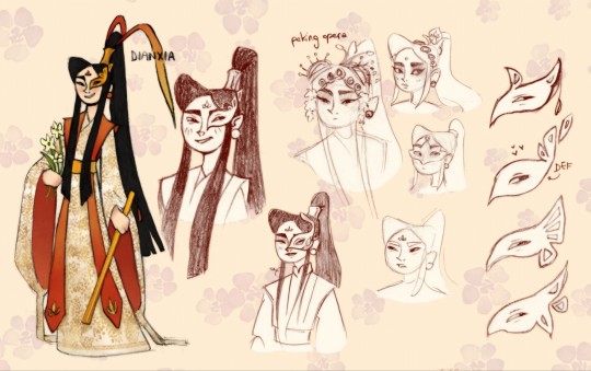
_____________________________________
HUA CHENG
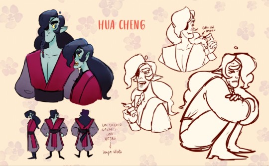
As a premise to my HC character design I want to say I am very amused at people’s different reactions to it. They are usually neatly split in two: either they hate it with a passion or just fall head over heels in love with it, no in between. I personally am in the ‘love it’ side (duh of course I am, I designed it lol) but I also understand if your first thought is “WHO TF IS THAT?”, so let me explain my thought process here.
Firstly, hot take: official HC character is made to be your perfect cool-hot-mysterious-boyfriend™ that has it more together than you do and we don’t like that in this household, at least not always. Yes he is XL’s most devoted believer, yes he is a very powerful supreme, yes he’s always there for his Gege but in the end he’s also a very traumatized person that has had a crush for a guy for 800+ years.
What I’m saying is I wanted him to be a little more relatable and goofy than what books show us so I integrated some of his personality hidden away in E’Ming. From here I got the puffy messy hair, the big round eye and the doubtful expression.

Next up let’s talk about the palette. He also has, like XL, three main colors:
Blue. Mostly of the time he spends around XL he does it in his true form, wich is the form of a dead person (even dead more than once;;). This is pretty self explanatory, when someone dies the hue of their skin goes to blue and also ghosts in general are frequently represented pale blue or white in color. As a little side note to this, I really enjoyed the blue demons HuaLian episode in donghua S2, it made me feel less alone in my smurf choice lol.
Red. This is canonically HC’s color and rightfully so! Red is widely recognized as China's color of good fortune, and in my culture, it is frequently used as a symbol of passion and the color of blood. There is really nothing better than red for Mr. Crimson Rain!
Lilac. Although I'm not sure about my research on this color in Chinese culture, I've read that it modernly represents love or romance. However, growing up in my hometown, purple (and all its shades) was always associated with ugliness and was thought to be a bad omen if worn. Whoever had the nerve to wear it was regarded as a distasteful and ominous weirdo. I think it fitted perfectly with how every other Heaven Official other than XL sees HC; someone who makes blood rain for fun and a potential and actual threat to the Heavenly Court.
As for XL, other choices I made serve a mostly aesthetic purpose. HC’s boxy build, pointy ears and the opened robe to see tiddies(🤩) are some of the notable ones.
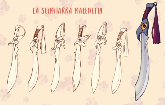
HC would not be complete without E’Ming, obviously. After comparing some different blades and trying to integrate a butterfly in the design, I opted for keeping it simple and I ended up with this wobbly shaped hilt made to resemble HC’s bang. The fact that now E’Ming looks like it has a big nose is just an added charm honestly.
CONCLUSION
Thanks for reading until this point I hope you enjoyed my yap and make sure to have a nice day/night! <33
I'll leave the link to my animatic wip here, please note once again that it is not finished in the slightes and there are also some funky expressions that don't really fit the mood lol enjoyyy!
-Sole
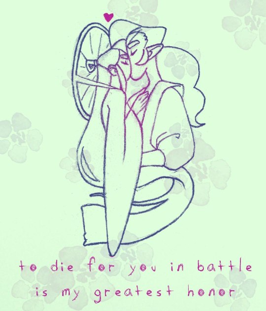
#to die for you in battle is my greatest honor#meelkiewee tgcf#meelkiewee#hualian redesign#tgcf#tian guan ci fu#hualian#hua cheng#xie lian#heaven official's blessing#hua cheng tgcf#crimson rain sought flower#taizi dianxia#tgcf fanart#dianxia#e ming#eming#gege
75 notes
·
View notes
Text
Morningstar family redesigns
I kinda wanted to expand on my choices for my redesigns for fun
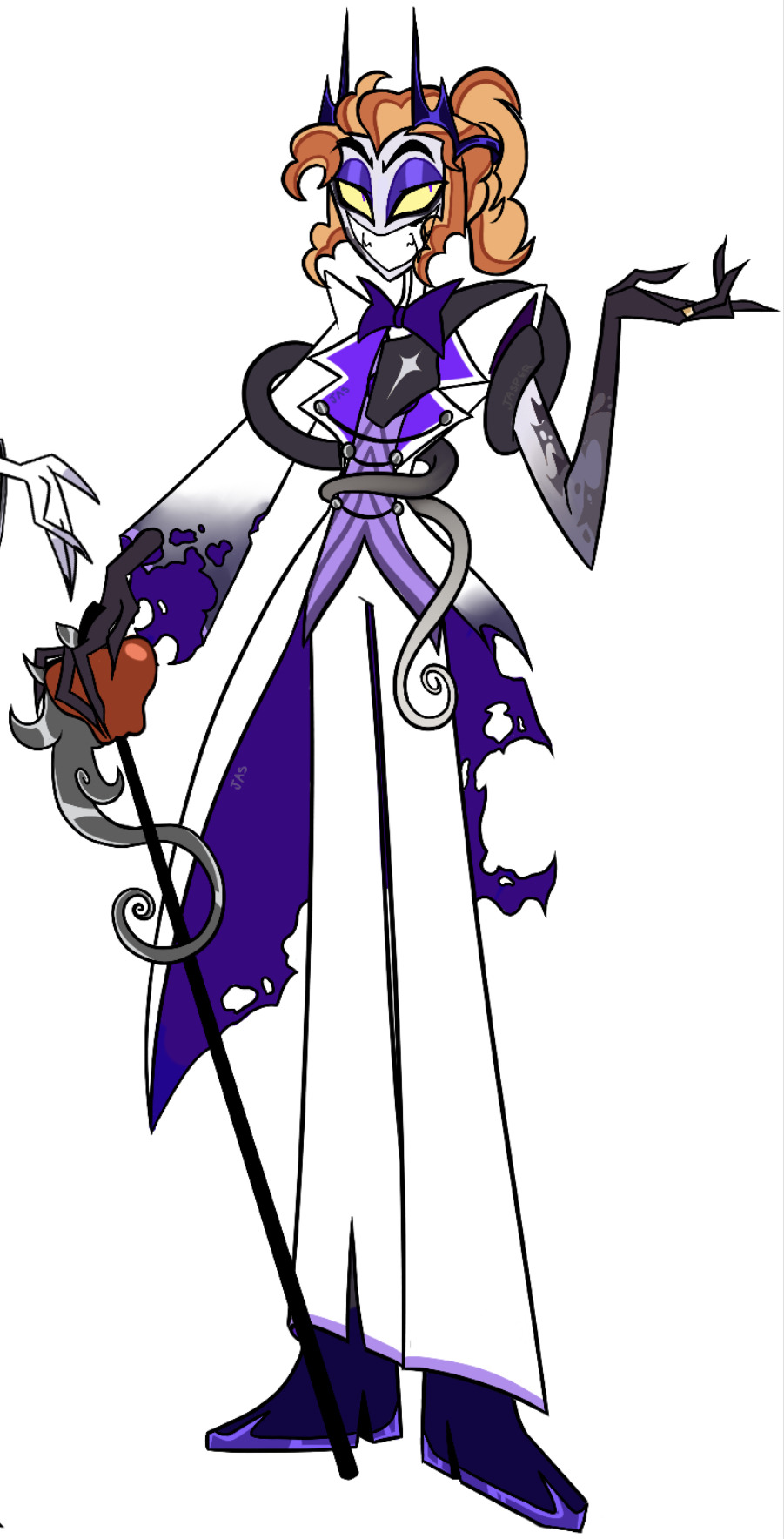
So first, Lucifer. I really don’t have a lot of issues with his original design, I think it’s fun and fits within the Hazbin universe! I just wanted to reimagine him.
I always liked the idea of Lucifer having curly reddish hair, something about his fall turning his hair red (this design isn’t 100% biblically accurate as it is just for fun), but I toned down the red to be closer to his original blonde since I also like blonde Lucifer, and I figured he’d liked to keep his hair neat so I decided to put it up and take away the hat
I wanted to keep the ring leader theme in his outfit, but I wanted to further incorporate the snake element in his design since I think he’d be proud of his fall (hence why his suit looks burnt and torn, and he shows off his burnt arm, I figured he’d do this intentionally to remind others of his rebellion)
Lastly I changed the entire family’s main colors to purple, as biblically out of the 7 sins Pride is purple and since he’s supposed to rule pride in the show I figured he’d be more purple themed then red, pretty simple🙏
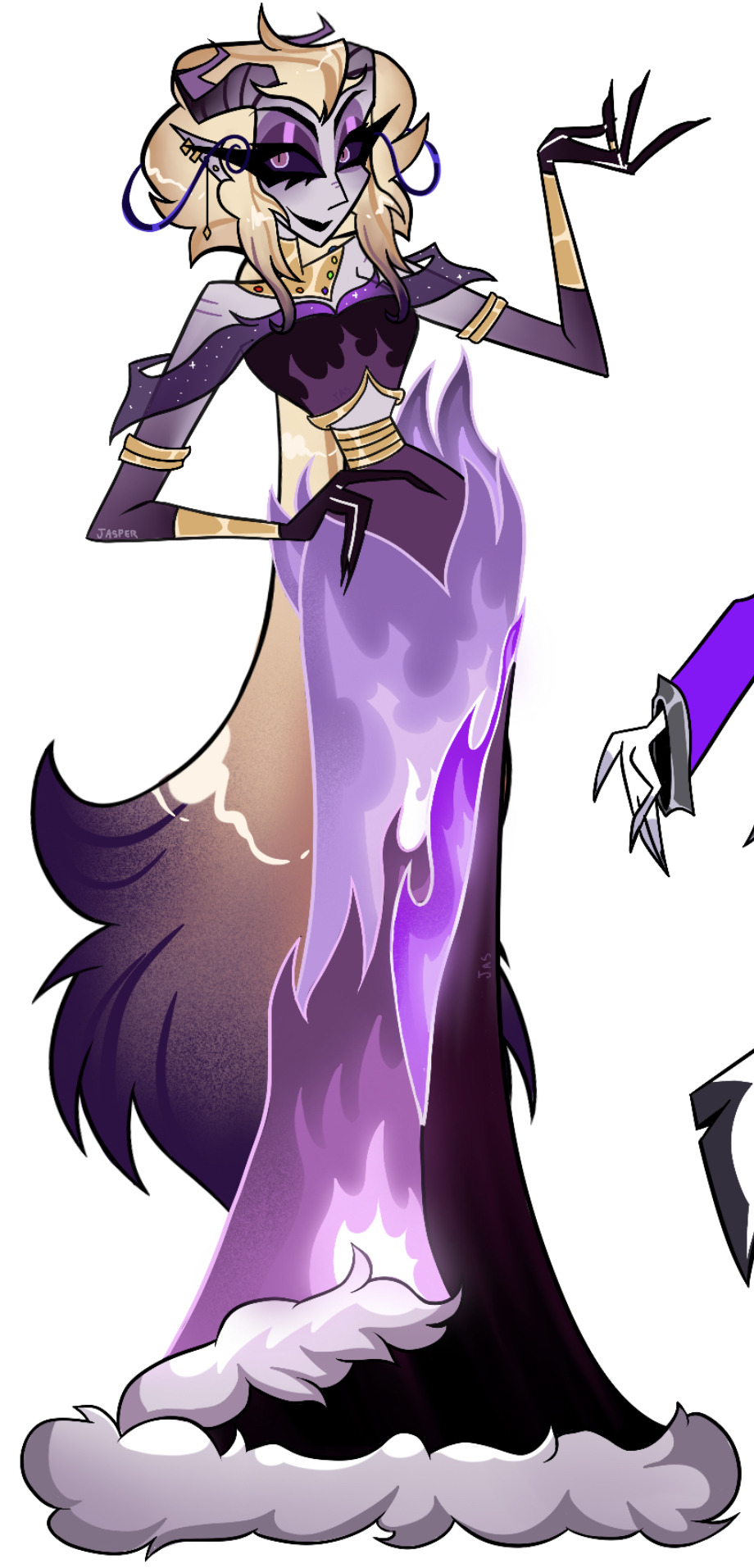
Next Lilith, I think she was the only one out of the three where I didn’t really like her original design. Not only because she didn’t have much going on, but she also looked really similar to Lucifer, to the point where they almost look blood related.
I think Viv’s choices for Lilith were a bit odd, as she had SOO much potential that just wasn’t used.
I kept her blonde hair but I gave it some tan undertones and I put it up into a semi-low slicked back pompadour inspired by some hairstyles you might see young women have in the early 1900s or late 1800s, but I gave her a little down section that fades into a dark purple and looks somewhat feathery due to one adaption of her describing her as a “screech owl”. I kept the purple theme somewhat like the original and plus she technically rules over pride as well, I would have loved to have given her a red theme if pride was red.
Based on these different adaptations of Lilith a took inspiration from each, giving her a flame-themed dress and the upper body of a beautiful women yet still somewhat demon-like, I also put some fluff at the bottom of her dress since I thought it looked kinda like smoke puffs and clouds. Her stomach is covered with gold rings that look somewhat like a snake belly, and I gave her a necklace with a style inspired by some eastern jewelry, the jewels on her necklace are each the color of one of the 7 sins which I thought would be a fun touch and a little bit of a “showing off” of her role as the queen of hell.
lastly I kept her horns since she is meant to be a succubus, but I stylized them a bit to look less like those big ram-like ones since I didn’t really like how odd they looked against her head. I also gave her long slender fingers that faded to a black naturally as in biblical lore she steals babies from mothers and I thought making her hands that she stole the children with look creepy and eerie yet still beautiful was a nice touch.
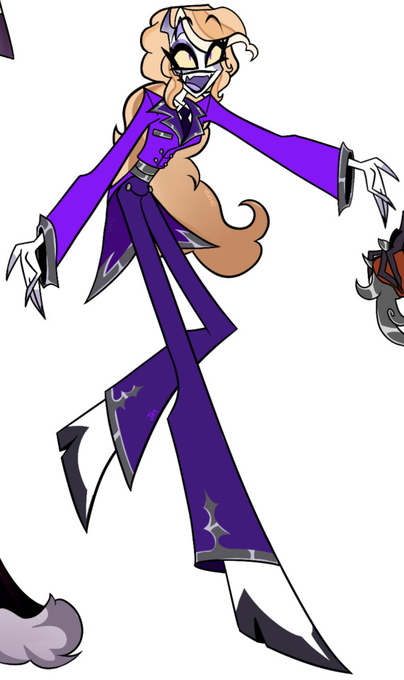
Lastly, Charlie! Again, I didn’t really have a problem with the original design. I changed her suit color and theme to prides color, put I made her hair curlier and more red/orange like her dads, and I wanted some parts of her suit to resemble his a bit hence the buttons and the back of her suit going out like her dad’s (but a bit shorter for convenience.)
I imagine her being a bit showy so I kinda decked her out in silver, I thought it’d also be a fun mirroring of how her mom is covered in gold. Her shoes are pretty similar to the original, I put a little split at the front of the shoes in the dark purple since Viv has said she has little hooves which I’m not sure is true but I thought it was a fun idea so I kinda hinted at it with that
I changed her irises (is that what they’re called?) to look more snake-like like her dad, and I gave her little horns since I thought they were cute and I wanted her to maybe show them on purpose because she wanted to blend in more with the citizens of hell so they might feel less intimidated by her presence as the princess, that’s also why I didn’t give her a crown :]
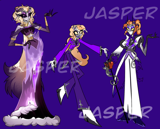
Overall this was just a fun little project I did out of curiosity and boredom, these designs aren’t made to criticize or taunt vivziepop since like I said I love her designs already
#art#hazbin hotel#hazbin hotel redesign#digital art#purple#charlie morningstar#lucifer morningstar#lilith morningstar#helluva boss#vivziepop
316 notes
·
View notes
Text
Updated designs as of: 8/20/24
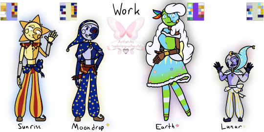


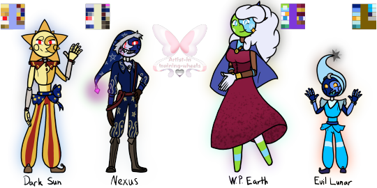
Remember when I said I was knee-deep into SAMS/LAES? Welp, I still am- so here's my (mental) designs of all the core characters (Not scaled for height)! Some notes/extra thoughts under the cut :D Added their pallets to make coloring easier!
Main 4:
Work:
I swapped Sun and Moon waist thingy; I just think they would do that since they're close. Their arm ribbons were also changed to purple to match!
Moon has a cape instead of a ruffle like Sun because... idk, I think he'd like it!
Earth and Lunar also have matching cuffs; theirs is pale/light cobalt blue.
Gave Earth's dress more Princess vibes; why? Idk, just felt like she would like it!
Sun's joints can be seen since he hasn't died and been "placed" in a new/updated body!
Casual:
Moon and Earth (kinda) have casual outfits, so I thought I'd make something for Sun and Lunar.
Sun HAS his matching friendship bracelet with Dazzle- I finally decided to draw it ^^
Sun's shirt says, "Here comes the Sun" I feel it would mostly be a gag gift, but he likes it!
I almost gave him a sweater (cause he gives me sweater vibes, tbh), but then I saw his Q&A video and went, "damn, never mind, I guess".
Lunar's hoodie was also a gag gift (cause its color scheme is similar to Gemini)- but he likes it too much, plus it's soft :D
Made Earth's sweater a bit darker, mainly cause she has a lot of light colors already (the pink comes from the sprinkle sweater!)
I also feel like the boys would take off their bells when they're not working.
It was asked how and... idk they made an interdimensional portal- I'm sure they found a way to take off the bells lmao
The other 4:
I hate how I did Ruin's rays and hat. But nothing was working for me, so... oh well...
I gave Jack the two tips for his hat because I think he'd like those- same with the arm sleeves!
Also- yes he has a friendship bracelet with Dazzle- he keeps it protected under his arm sleeve, it's identical to Sun's!
I really like how Solar came out. Specifically his boots and shirt design!
He gives me knee boot vibes, so I gave him shoes with a sun and a moon on the back (they lace up just didn't feel like adding those details)
I Like how Eclipse came out- Miiiight redesign him... depending on how the Eclipse and Puppet Show goes, but for now, I'm content :)
I never mentioned it, but I do imagine that Eclipse has a second set of arms. I would think Solar did, too, but those were taken away during his revival because of the "Eclipse sees other Eclipses as inferior" stuff!
The Evil 4:
I made Dark Sun look like Regular Sun... cause that's kinda his whole thing! But if I were to give him a different outfit- it would be Eclipse's!
Few changes to Nexus (I can't take him or his model serious tbh, I kept laughing XD), decided to give his hat a Wither shard at the tip because power (and possible corruption) go BRRRRR (Side Note: Made an AU on it :D)
I'm not sure how visible it is, but on his right cheek, you can see a virus of some kind—I really like that, so I put it on him because I really like the idea of him slowly being corrupted due to his insanity!
He has a darker shade of boots similar to Solar because... well, Solar :)
World President Earth (or WP Earth) has a lovely wine-red dress with her flag as a cape (the same flag seen in the thumbnail)!
The flag is held together by a smiley pin because why not =)
Evil Lunar (while tempting to go with Current Lunar design) has the design of the previous version because, well... that's the form he gained the power in (from my understanding)
The tip of his hat is a dying Star because that feels appropriate, in my opinion.
I MIGHT do Foxy, FC, Monty, and Puppet, but I'm not too sure, tbh, since my mental image isn't too far off from their models. Anyways, time to return to my little gremlin hole and watch the series :)
#my art#digital art#tsams#tsams sun#tsams eclipse#tsams moon#tlaes#tlaes earth#tlaes lunar#tsams Eclipse#tsams solar#tsams jack#tsams ruin#dark sun tsams#tsams dark sun#tsams Sunrise#tsams Moondrop#tsams nexus#World President Earth#tlaes eclipse#tlaes Evil Earth#tlaes Evil Lunar#So many designs!#I missed drawing like this though!#Favorite to draw was certainly Sun and Solar!#I do really like how Jack came out though!#I can't wait for more episodes!#the sun and moon show#the lunar and earth show#the eclipse and puppet show
117 notes
·
View notes
Text

Cherri Bomb Redesign (Bonus!)
Surprise!! It’s her!
I refuse to believe Cherri doesn’t have bunch of scars or injuries from using explosives and fire all the fucking time. There is no goddamn way. Also shes like running and jumping all over the place constantly she’d definitely have a running blade like 90% of the time. (Don’t walk on running blades you will probably trip) Her pant leg is ripped to look cool and also just for easy access to her leg.
I wanted this to be kind of sloppy with the colours; show how a lot of sinners dont have just a select few sins and note how often people participate in almost all of them. Ik it may not be the most pleasing colour palette to look at but that’s kind of the intention. Jumbled colours and asymmetry is really just Cherri’s thing in my head. I wanted it to look like she made or thrifted her clothes as well or like just stole them.
The bomb and cherry in her hair are supposed to kind of look like those hair bobble things that fucking HURT when you snapped them but they were cute so I feel like utilising hair bobbles is something I need to do much more

You could kill a man with these I swear to god.
Her tattoos and stuff are just basic cherries and vines and the little bomb and the bisexual symbol thing. Also bellybutton piercing is some I’ve only ever done once on an OC I have named Angela/Angie which is… kind of ironic?
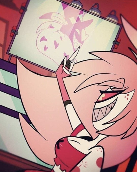

You even get a little redraw for funsies! This was done for my friend helping me with my rewrite ideas so this is like the least I can do as repayment. You can see heaven up in the corner too :3
I don’t actually have a bunch to say about Cherri’s redesign, I want her to just be this “Oh wow! Thats definitely an outfit!” kind of design cause I love those. Oh and she definitely did the raccoon tail masking bits with craft tape.
I told my friend the dumbass stick figure on her arm is put there because I was thinking of her asking Angel to draw on her and she’d get it tattooed and he cannot draw at all so he just did a stick figure and was like “this is so cool.” and it was not cool at all/j
I wouldve added more stickers to her running blade and stuff but her colour palette is already VERY full so this is the price to pay. Still not sure if I’ll continue doing these but we shall see!! The next design post is likely going to be the lineup and some side by side comparison things ;P 📺
#hazbin hotel#hazbin critical#hazbin hotel criticism#hazbin hotel critical#hazbin cherri bomb#hazbin hotel cherri bomb#cherri bomb hazbin hotel#cherri hazbin hotel#cherri bomb#cherri hazbin#hazbin hotel rework#hazbin hotel redesign#hazbin hotel rewrite#hazbin rewrite#hazbin redesign#hazbin rework#hazbin redraw#hazbin hotel redraw
86 notes
·
View notes