#i really tried with the background i am not a background artist :')
Explore tagged Tumblr posts
Text
It’s 3 AM, but fuck it, we’re being domestic | Prompts
Alternatively, just some fluffy domestic romance prompts, but they feel more cute when they’re in the middle of the night because one or both of the ship characters are insomniacs.
Dancing together in the kitchen, in the refrigerator light, and then sitting on the kitchen counter, eating ice-cream directly from the carton.
Walking barefoot on the dew covered grass, hand in hand, under the stars.
Sitting on the floor trying to piece together IKEA furniture because one person got obsessed with finishing it the same day.
Middle of the night cooking, except it’s making the weirdest most absurd dishes imaginable, just for fun.
Making love, except it’s on the bedroom floor.
Cleaning cupboards or attics and finding lpppittle mementos, childhood pictures, etc and talking about memories.
Midnight drives with street food pit-stops and making out with the car radio playing in the background.
Tossing a smiley stress ball around the house watching it knock into furniture— Bonus, if one person is tossing it and another is scrambling around trying to make sure no furniture falls over, causing squabbles.
Gossiping about annoying relatives/friends, parents etc.
Making each other coffee, except the rule is: adding all of the other person’s favorite ingredients PLUS one mystery ingredient which might be good bad or ugly. For funs~
Late night massage sessions because they’re old (they’re not even thirty. Maybe they are.) and their back huuurts.
Ramp Walk/Modelling sessions where one person tries out every single outfit in their closet, and the other one rates or judges them all and gives (mostly useless) opinions.
Doing laundry except they can’t put the clothes out for drying because there’s no sun, so they spread them all over the furniture (only the stuff that doesn’t go bad with the water-) and switch on all the fans.
Weird selfie poses and filming random tiktok dances.
Alternately, sitting side by side on the bed (or the floor—) deleting old pictures from their phones to make storage and laughing about embarrassing old pictures. (A “my phone might die of lack of storage but that super embarrassing picture of yours from six years ago isn’t going anywhere!”)
One of them randomly googling super random shit and telling those facts to the other person, and the other one, super sleepy, just nodding along to everything.
Painting dates where either both of them are amazing artists or neither of them are, (or one is and the other isn’t) and they switch canvases periodically to finish each other’s paintings. (Chaos for the ones who can’t paint, and two beautiful art pieces for the ones who can~)
Alternatively, one is an artist and the other models for them while being utterly sleepy bc Artist has insomnia :D
One is a musician and keeps the other up all night with the music. Or alternately, the partner has insomnia and the sleepy musician plays them something to pass the night (and what if it turns out to be a lullaby-)
Turning the junk, broken and useless stuff in their house into a rage room for the night.
Learning crocheting from YouTube and making each other weird little woollen mementos. (Could go for anything really. Learning shit with esch other in the middle of the night from YouTube—)
Annnnd that’s about all I got :3 I’ll probably be back with more! Prompts welcome~
#imagine your otp#otp#otp prompts#otp writing#writeblr#writing prompts#prompt list#GIMME PROMPTS#Domestic prompts#fluff#fluffy prompts
114 notes
·
View notes
Text
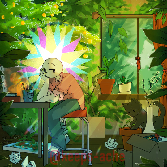
overgrowth and languor
[recommended you click and zoom] (alt versions below)
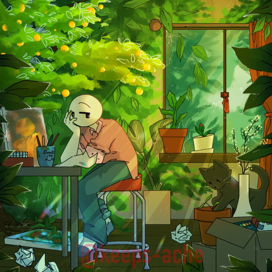

#art#my art#artists on tumblr#digital art#eyestrain#HI i am So kinda proud of this actually#still can't tell if it looks nice but!!!#//click and zoom piece again !! i was starting to think i had just given up on ever doing that again hvbhs#//!!!!#so happy i've finally finished it yay!!!#ik i used to average like working 2 days on a piece at one point but i was not nonstop-working on those so lol#//tried something with the background!!#and the inks!!#drew a cat which is very swag!!#the colours are a WHOLE new thing and i love colours that are yellow on the wheel but brown on the canvas!!#REALLY love the blue one (i wanted to have a night version and that's close enough :D)!!#i like the little orange painting in the background (a LOT)!!#overall i am changing my verdict and saying Yeah i AM happy with this lol#//but yeah gonna go post on artstreet now lol :3
3K notes
·
View notes
Text

gosh the 4th movie could never make me forget about them <3
╔═══════☆♡☆═══════╗
Program: Clip Studio Paint EX
Reference Below
╚═══════☆♡☆═══════╝

#uma x harry#uma descendants#art#digital art#fanart#descendants#disney descendants#descendants 2#harry hook#i really tried with the background i am not a background artist :')#harry x uma#harry hook descendants#descendants fanart#descendants rise of red
82 notes
·
View notes
Text
also i genuinely think within the past like year or so i finally managed to unlock some kind of perspective drawing skilltree in my head. like what do you mean it looks way more natural if the lineart gets thicker closer to the camera. what the hell do you mean Rule of Cool is often way more important than how things would actually work realistically
#trousled rambles#yes i'm gonna be staring at this drawing for like A Few Months ok leave me alone its crazy#very very weird perspective in this thing that i've never tried before and somehow it actually feels correct. how did i pull that off!!!!!!#this room does not have corners!!!!!! this desk is CONCAVE!!!!!!!!!! and it doesnt look STUPID!!!!!!!!!!!!!!!!#the desk IS like really really long but that is VERY EASY TO IGNORE FOR THE PURPOSE OF THE DYNAMICISM........I AM AN ARTIST REAL ????#IM ALLOWED TO HAVE A BIG HEAD ABOUT IT I THINK OK. I'VE EARNED IT DO YOU KNOW HOW MANY TIMES I CHANGED THIS THING'S COMPOSITION#IT EVEN HAS A BACKGROUND!!!!!!!!!!!!!!!!!!!!!!!!!!!!
15 notes
·
View notes
Text
Felt like drawing my fursona so here she is in my irl outfit just chilling

#For the street I used google street view to reference the one particular street near my university#But really the only thing traced in the monster can since I wanted it to be realistic#Also for once I actually used the photo of the sky I took as a reference#I can't believe I started this in early march...but tbf I worked very little every day#I found more joy in drawing the background ngl#I tried making my sona look as similar to me irl as possible and I think I did a pretty good job#Also yes that is the amulet of Arkay. Hehe#And yes a genshin vision because I am cringe#my art#furry#furry art#fursona#digital art#cat furry#anthro furry#anthro cat#artists on tumblr
13 notes
·
View notes
Text
Chiho Saito’s 1999 Revolutionary Girl Utena Original Illustration Collection
IT’S HERE. IT’S DONE. IT’S FINISHED. NOW…IT’S YOURS. Happy Holidays, my friends.
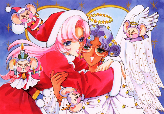
Vanna here! I have posted some already about this project, and the responses I got, public and otherwise, have been absolutely incredible. Y’all have been reblogging and hyping this before it even finished…I haven’t felt so encouraged about an Utena project since the musicals! (Yes, streams soon, I promise.) You can read the other post to get more details, and catch my post here with more details about the process if you’re interested. The long and short of it?
This is the first artbook I ever scanned. I did it in 2001. In Photoshop, using multiple scans per page that took hours to process. But it was 2001. A half megabyte file that was 1250px wide was considered extremely hardcore and impressive. That’s just always been the business I’m in when it comes to Utena art, you know?
It’s now the latest artbook I’ve scanned, and so much of the process, and effort involved, is unchanged. What has changed, is the result. Welcome to your new desktop background. Your new phone background. Your new poster print.
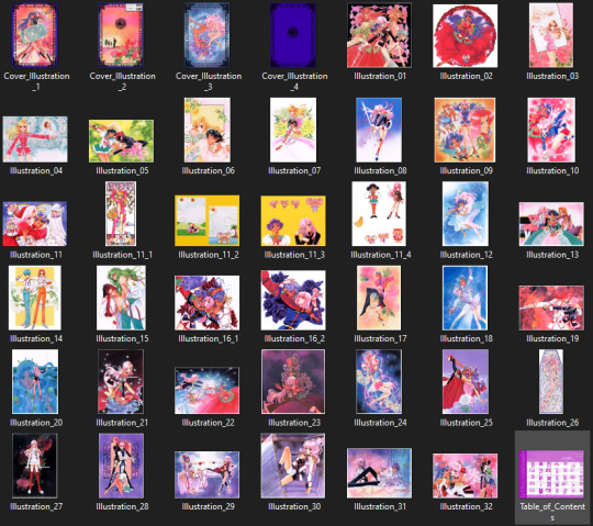
What I’ve done here is attempt to create definitive digitized images of Chiho Saito’s work as offered by this book--I have removed the print moiré of the original scans, and used my literal decades of experience to try and tease out as much information from them as possible. Without being physically in front of the original artwork (which is a thing I’ve had the great fortune to get to do) this is The Most Chiho Saito you are ever going to get. I’ve tried my best to make sure there is a way to get it that works for everyone:
Do you just wanna scope 'em out? Look at some disaster gays? Grab your favorite one or two? This is the path for you! Check out the ‘compressed’ (not very) 10k ‘web friendly’ (not really) copy at the Bibliothèque, the media archiving wing of the Something Eternal forums at Empty Movement*. All the following links are also available from here. Do you want these copies? All of them? Don't just grab them individually, friend. This batch is 375MB and can be downloaded as a zip of the individual files here on our Google Drive.
Do you like digital archiving? Are you looking for a copy that preserves the archival quality of the effort but sits nice and comfy in a single file? This is for you. A minimally compressed 10k, 513MB version worked into a PDF is now up, shiny and chrome, on the Internet Archive. Do you like the idea of the minimal compression, but want the individual files in a zip? Yep I did that too, here's the drive link.
Are you looking to print these in a larger size? This is probably the only reason on Earth you’d ever want them, and yet a bunch of you are going to go straight for these. Here are the zero-compression JPG full size copies, most of them are 15k across, like simply a ridiculous size. Pick your fave and download it from our Google Drive!
I am genuinely really proud of this work.** I was able to tease out so much new detail from these…her incredible layering techniques, the faintest brush of her highlights, and the full range of her delicate hand at whites and blacks… details commonly lost in digitization. I sincerely hope you find something here that you’re looking for, as an artist looking for inspiration, as a weeb looking for a desktop, as an archiver excited to see incredible 90s manga artwork saved forever in the digital realm. I feel like I have already said so much about them, and could keep going, but you know what? This work speaks for itself. Enjoy, use, explore, and definitely tell us what you think!
We love y’all. ~ Vanna & Yasha
* AHEM ASTERISK AHEM
You might be wondering what any of that is. Something Eternal? Biblewhatawhat??? EmptyMovement.com? You might even have done a double take at the word ‘forum.’ And you should!!!
I have a confession. This artbook was my ‘side project’ as I worked on this, *the main project.* For a couple years I’ve been banging around with a new domain, and originally I had other plans for it, but Elon Musk ruined my Twitter and Discord is well along on its way to enshittification, and well….we joke on the Discord a lot about ‘reject modernity, embrace forums’ and you know what? We’re right. So Yasha and I are putting our money where our mouths are once again, and doing something insane. We are launching, in 2023, a website forum. Obviously, this is not the official ‘launch’ per se, but I cannot announce the artbook without directing you to the forum, since it sits on the attached very cool gallery system. Oops! Told on myself. Another post more focused on the forum will be forthcoming, but if you are just that motivated to get in right away, you absolutely can! (This will help stagger new arrivals anyway, which is good for us!) If you would rather wait for the ‘official’ launch, by all means that’s coming, including a lengthy screed about how and why we’re doing this. In either case, remember: this is a couple weebs trying to make internet magic happen, we are not website developers by trade. Give us grace as we iron things out and grow into this cool new website thingie…hopefully along with some of you! :D
If you do join up, naturally, there is a thread about this project!
** If you like this kind of content, consider helping us pay for it! We do have a Patreon! If you’re wanting to use these in some public-facing distributive way, all we ask is for credit back to Empty Movement (ohtori.nu or emptymovement.com, either will work.)
I would like to say ‘don’t just slap these files on RedBubble to get easy money’ but I know that saying this won’t effectively prevent it. Y’all that do that suck, but you’re not worth letting it rain on the rest of this parade. :)
#revolutionary girl utena#utena#rgu#sku#empty movement#chiho saito#90s manga#digital archives#manga aesthetic#shoujo kakumei utena#utena art
2K notes
·
View notes
Text
Meeting my longtime artist and good friend, Chris, IN REAL LIFE!
So, I hadn't been to a restaurant in over a decade. I can't even remember which restaurant since it was so long ago. But in the past few weeks I've now been to TWO restaurants.
I am becoming a social butterfly.
And it is exhausting.
But also good.
First I reconnected with my high school best friend, John.
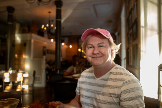
And that went great.
But then the opportunity to see my friend Chris (a.k.a @whosthewhatnow ) came up only a few days later. And this close proximity of social events scared me a bit, but I have been feeling much better since they figured out my heart thing, so I decided to try and do both things even though they were only a few days apart.
The key to this was strategic resting. As soon as I got home from seeing John, I got in bed and I didn't get out of it until it was time to see Chris. And that was just enough recovery time to pull this off. Typically a short outing requires 2-3 days of rest after.
I had never met Chris in real life. He has done nearly all of the artwork for my website and comics over the past decade. And he was a main character in my CRAPPRnauts series.
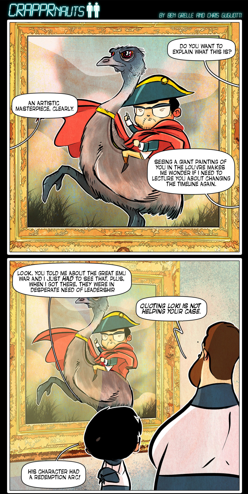
We know each other so well and it is crazy that we've never seen each other with our very own eyeballs.
He is such an amazing artist. He works fast and he adds so many cool extra details that you can stare at his comic panels multiple times and catch a new joke or easter egg each time. He is a dream to work with and my Corg Life series was only successful because he did such a wonderful job bringing Otis to life in comic form.
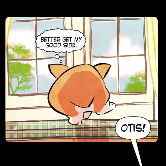
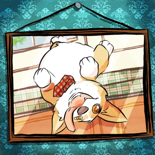
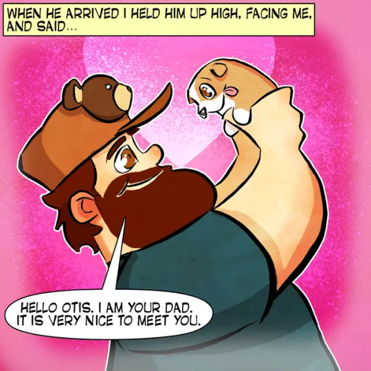
So we decided to meet up at a restaurant with his friend Michael and then I was going to take a nice portrait of him after dinner. Chris had never had a professional photo taken of himself and I decided to fix that.
I told him I had a mobile photography setup. Which, in reality, is a trunk full of lights and stands and other various camera gear that I definitely won't need, but bring anyway. It's "mobile" in that it all fits in my car if you are good at Tetris (which I am).
The restaurant was downtown and I had visions of St. Louis's famous Gateway Arch in the background of Chris's portrait. I thought that would be such a cool shot. I could see it in my head and I even dreamed about it.
So I got in my car and headed downtown and my GPS told me to exit at 249B. But I kept looking and I couldn't see the sign for 249B.
This is how much road I had left when I finally was able to see the exit for 249B.

So I ended up taking 249A and going straight to East St. Louis.
Which, if you believe the headlines, is not a place you ever want to be.
Google Maps and I have been having issues lately. They also tried to get me to take the spooky way home that night, but thankfully I actually knew the non-spooky way back from when I used to go to Cardinal games with my parents as a kid.
My short term memory was trashed by shock therapy. And so was a lot of my long term memory. But it finally came through in a pinch and remembered something useful.
I only had to loop around and cross a bridge so I didn't really do anything but touch the edge of East St. Louis. I was mostly concerned about being late for dinner more than its scary reputation. Usually those news stories about a place being "dangerous" are actually just racist and hurtful to people stuck in poverty. I mean, technically my house is in a "dangerous" neighborhood, and we do have trouble with petty crime in some spots, but aside from a few dinged-up mailboxes, I've never felt unsafe in my home.
On the way back to regular St. Louis I could see the Arch on the horizon at sunset and it was kind of magical. And I wasn't able to get a good shot of it, but it sure looked pretty from my point of view.
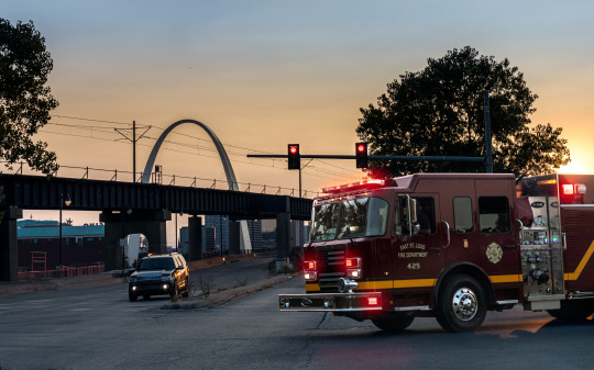
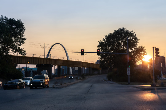
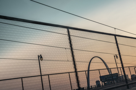
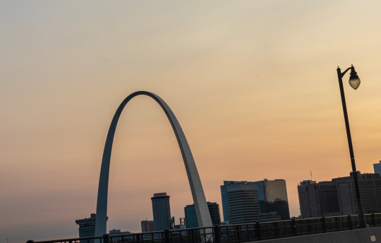
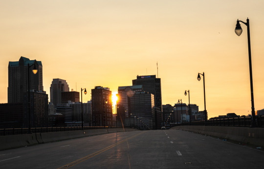
My photos kind of remind me of the beginning of movies like Training Day where they are trying to show you gritty, dutch angle shots of the city out of the car window to give you a sense of the location.
As I approached the restaurant I invented a new genre I call "stoplight photography." The sky was orange and the streets of St. Louis were just asking to be photographed. But I wasn't willing to die to get neat photos, so I just took them at every red light.

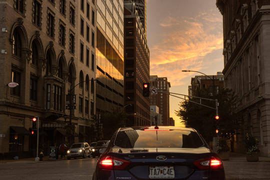
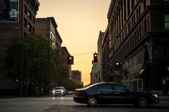
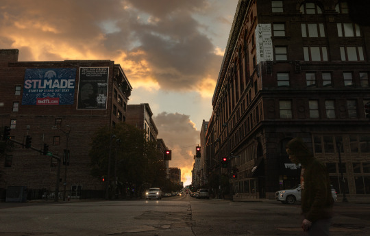
The big trick was trying to edit the dark area at the top of my windshield out of the photos to make it look like I didn't take these pictures from my car.
After a 15 minute detour through Illinois I arrived at my destination—a Mexican place called Rosalita's. It had a beautiful sign, so I took that literal sign as a metaphorical sign it was a nice place to get a quesadilla.
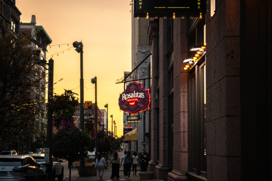
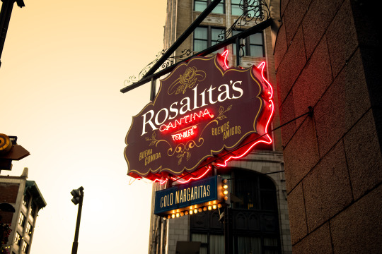
Dinner was great. Both signs were right and their quesadilla was very tasty. Chris and I both got one, so we are quesadilla twins. The waitress was one of those "I can remember your order without writing anything down" types. And I am one of those, "I get anxiety when things aren't written down" types. And, to her credit, she did not forget our orders. But she did forget to give us silverware and napkins. So I still feel like my anxiety was valid.
We told sad stories of the pups we lost. But we also had a lot of fun and laughed and I got to meet Michael who turned out to be an absolute mensch. I sometimes have trouble meeting new people with my social anxiety, but he was very affable and made me feel comfortable with his presence almost right away. He was a fan of Otis and mentioned he still has a Super Otis shirt. I always get choked up hearing that Otis is still loved. Hopefully we get to meet again.
Dinner ended and it was picture time.
I asked Chris if he wanted the high effort photo or the low effort photo. Either we figure out how to get to the Arch or we find a spot near the restaurant and just take his portrait there. Chris and Michael had a driver because they were coming from a big conference and getting to the Arch would have been complicated. So we decided to go with the low effort option.
I found a cool shop nearby that had an LED wall that changed to all sorts of different colors. And I thought that would make a neat background and give a colorful edge light on Chris's face. I pulled my car near that spot and started unloading my trunk full of photo gear.
I think Chris and Michael were a little overwhelmed when I started pulling camera gear out of my trunk like a clown pulling an endless handkerchief out of his mouth. But as far as photo setups go, it was actually pretty minimal.
Light, giant battery, light stand, umbrella, tripod, camera, rolling walker with seat.
My dad's old rollator came in clutch because I wanted to shoot from a low angle and it is hard for me to bend down. In fact, I think I'm going to look into getting an all terrain version so I can do more outdoor photoshoots.

I started shooting in the middle of a downtown sidewalk. And I was super anxious. I could not focus (my brain, not my camera). I was very distracted with all of the people walking by and staring. I was not sure if any of the photos were turning out. I wasn't even sure if they were in focus (my camera, not my brain) because I had not yet had my lens calibrated. But down the street there was a guy with an old school boombox playing random music. His music helped to drown out the ambient noise and gave me some comfort.
I had no clue if the photos were any good, but when I got home and checked them on my computer, I realized I have 12 years of experience and muscle memory built up. I probably should have just trusted myself because the photos all turned out great.
I think Chris can now officially say he has had a professional portrait taken of himself.
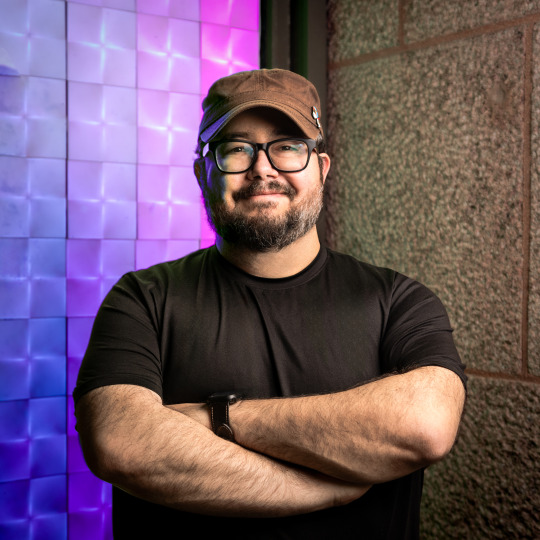
This photo has been officially loved by Chris's girlfriend and mother.

There is no greater seal of approval and I am honored.
I was able to comp in any of the colors the wall displayed from other shots in case Chris is feeling a little more green in the future.
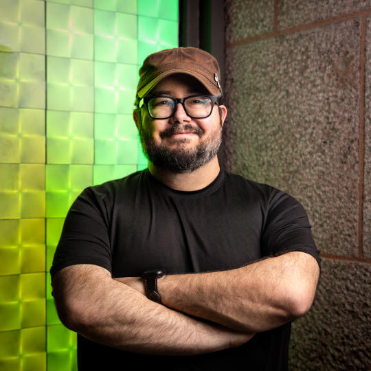
A literal rainbow of options.
I also liked this one, though it is a little more "environmental portrait" than regular portrait.
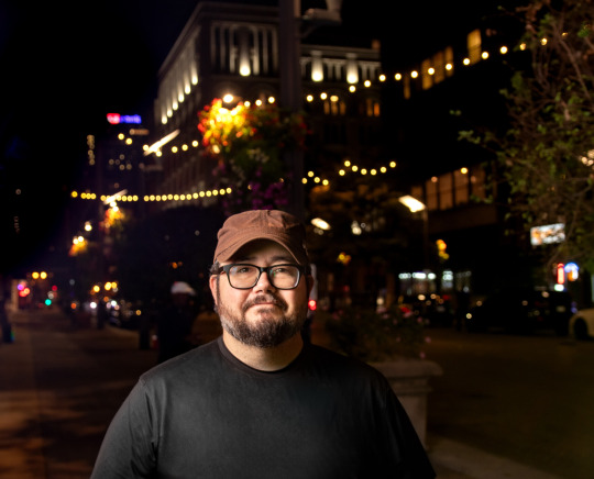
And I got some nice photos of our little group to help us remember the night.
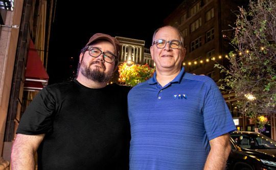
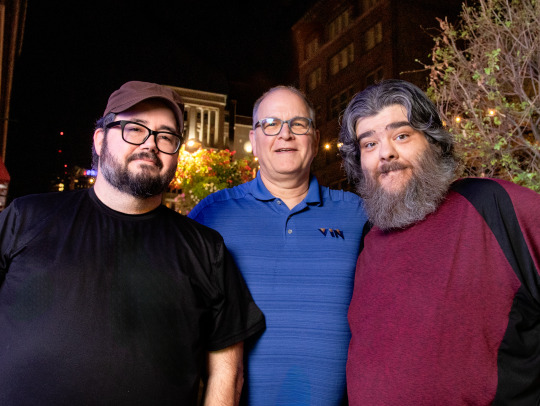
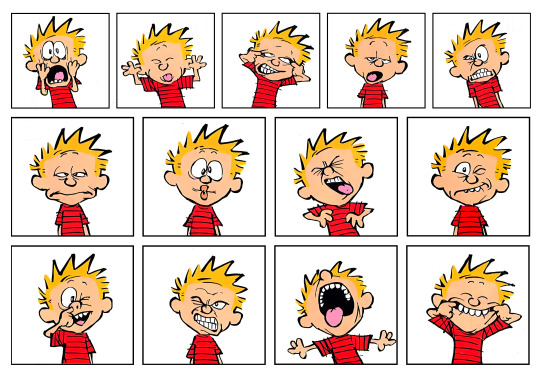
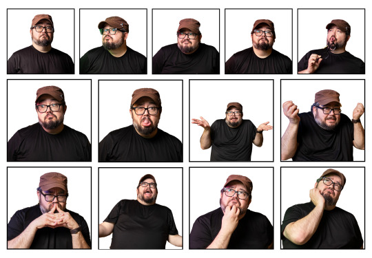
And I got a bunch of photos of Chris making silly faces like Calvin at his school photoshoot.
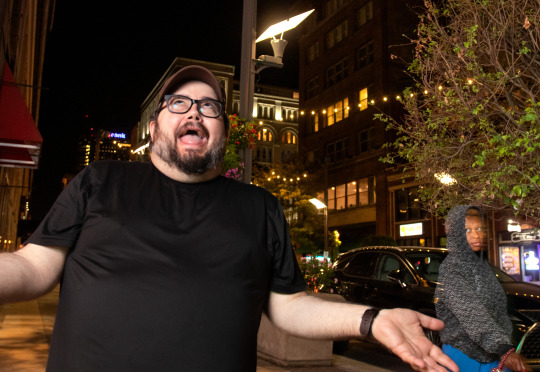
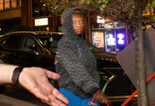
I love this woman's reaction to our little impromptu sidewalk photo shenanigans.
After we said our goodbyes and I gave my friend a hug, I was a little bummed I didn't get to photograph him at the Arch like I had dreamed.
But then I realized I had my own car and it was capable of taking me places. (I actually haven't gotten used to that after not driving for nearly 15 years.)
So I decided to drive a few blocks over to Kiener Plaza—a park with a view of the Arch.
TO BE CONTINUED...
238 notes
·
View notes
Text
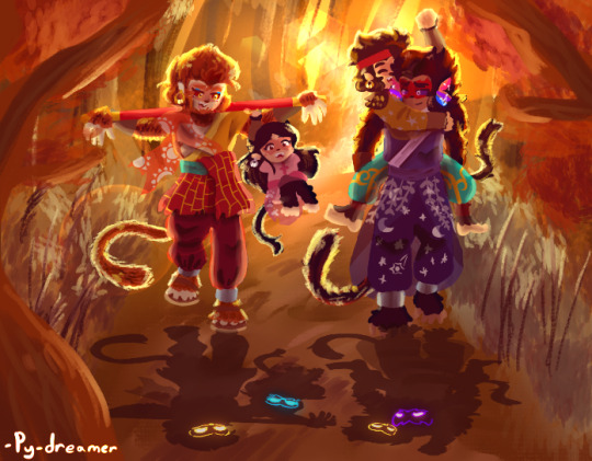
@furornocturna, @violetjedisylveon
hey! Remember that shadowalkers au wip a while back?
And I mean damn, like what a leap? Amirite?
(Just realized I forgot Mac's pouch, Mei, & Wukong's beads
...oops
Pls forgive me I'm a forgetful klutz and am lazy)
Ok so well this be quite the turnabout from the last sketch um:
I included the shadows on the floor, it is called shadowalkers for a reason, and added the wee faces in them like I did for the first piece
The background was a pain in the ass and I tried a lil something something with the lighting/lens flares. Something similar to the lighting in the piece I did where they're cuddling
Now everyone might say multiply on the layers does miracles but can I just saw 'add glow' and 'glow Dodge' are my new best friends? Srsly they give that damn good zest that it needs
I had so much trouble just doing Mac's face in particular. Like the contrast between the dark scalera and light irises was too much even though I did it before and it worked then-
And like his proportions were way off even though they matched the f*cking sketch which looked fine and they didn't match up with Wukong's at all-
Then his hair looked too big and clunky like a large chunk rather than hair and cause Mk's head was blocking it, I couldn't shade correctly-
AND I WAS STARTING TO BLOODY LOOSE IT I WANTED TO PUNCH THIS LIL BI-
But then I made his head bigger and it all worked out 'u'
Here's the og sketch for comparison:
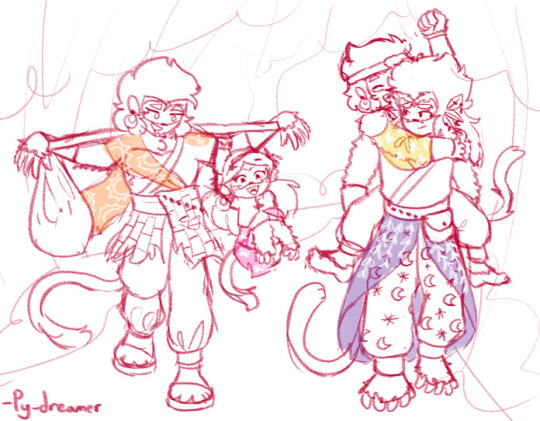
I will admit though, I am quite happy with how my art style has progressed over time and this just might be one of my best pieces.
Genuinely to any of my old marshiemallows, thanks for sticking around! And I welcome any new marshiemallows joining me on my little art adventure so here's love from a random artist on the internet who appreciates your presence to her wacky ramblings and drawings
Oh and btw, I will start to get more busy so pls relax ur expectations in terms of posting schedules (not that I really had one anyways but regardless-)
That birthday challenge was fun but man did it do a number on me
And especially cause I wanna try to focus more on writing the next chap of mah fic 'When the sun sets forever' on ao3
(Shameless plug but which you should totally check out btw, angsty monkies, time travel, Macaque bullying train, it's so much fun)
Oh! And for my fellow marshiemallows who have frequented the dreamscape a couple of times, not guaranteed and I am a wee noob with absolutely no experience in this very little chance I'll do this and it's mainly to see any interest in it so pls don't expect much-
BUT.
#lmk#lego monkie kid#my beloved#py's_art#art#lmk mk#lmk au#qi xiaotian#lmk sunburst duo#lmk sun wukong#lmk shadowpeach#shadowpeach#lmk bai he#lmk macaque#lmk six eared macaque#lego monkey king#Shadowalkers au#wolfwalkers au#wolfwalkers#big brother mk#bai he will steal your kneecaps#good dad wukong#dad macaque#soysauce duo#shadowpeach family#the hero and the warrior were like the sun and the moon#and they were also gay shadow people with two feral children!#lmk soysauce duo#lmk liu er mihou
252 notes
·
View notes
Text
FTH Fanbinding: "Concord" by Deastar
@youhideastar won my FTH auction and gave me a great gift: She wanted me to bind her CQL fic "Concord" including the thorough author's commentary she'd done. I was so happy when she chose this fic because I'd loved it so much and had pondered doing a fanbinding of it at some point anyway. 😄
Now that the book has finally arrived (spending two days in the air even, I guess, at least when one looks at the tracking info ��), I can show it off here!
I tried some new stuff on this bind and also some things that I'd only done once before and that definitely need some, uh, perfecting. 😅 But overall, I'm very pleased with how this book turned out, as it's pretty close to what I'd imagined when I started it.
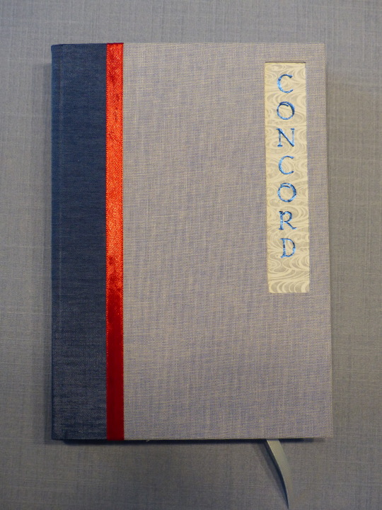
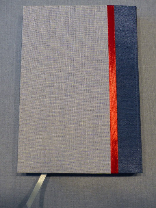
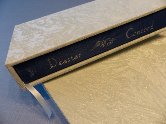
The fic is set in Cloud Recesses and Dea and I agreed that the colour blue should be prominent in the design, as it not only fits the setting, but also is of significance in the story itself. As the rules and traditions of the Lan sect also are quite important, I wanted a very clean, simple style for the case, a bit reminiscent of traditional Chinese bindings.
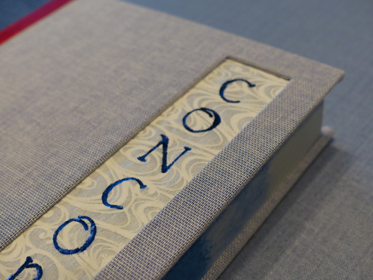
I did the title as a cut-out and used Japanese transparent paper for some extra flavour. The paper shows up inside the book as well early on and I liked the recurring motive of it. I'm also really pleased how well the hot foil came out on it! I was a bit scared that it might rip or something, but it's quite sturdy, after all.
I thought about doing a faux stab binding with red thread to get even more of a traditional feel, but then decided against it as I'd wanted to use two different blue book cloths and I felt that it might get too busy. Instead, I used the red ribbon as a nod to Wei Wuxian.
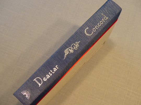
The little cloud illustration is used several times in the typeset and I like how it comes out in the title. I didn't even mess up this title, yay! (Mine's got a few tiny blotches but uh well, better mine than Dea's!)
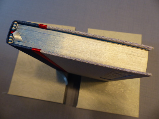
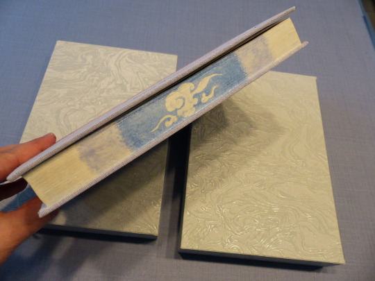
I painted the edges with metallic watercolours - the second time I tried painting edges, but this time with several colours and trying to do a little illustration as well. Big thanks to @zhalfirin who quickly answered my question about how to get the paint to actually stick. 😆 I'd read several posts about how awesome water colours are for foreedge painting, but none mentioned that this kind of paint just rubs off again (I am no artist and have no knowledge of different kinds of paint). Zhalfirin told me to mix in glue and also wax the edges afterwards, which I both did and I think it's fine now. At least my fingers didn't turn blue. 😅
I really love how the shading came out on the head/tail; it could've been better on the foreedge and it looked great while the paint was still wet. Steep learning curve, this thing. I also died trying to sand the edges and I didn't get them completely smooth, but at least smooth enough to work with. That also needs some more work, I guess.
First time I sewed endbands with four different colours! I think they came out quite well! I also forgot the second row of dark blue on Dea's book and had to unravel half the endband again when I noticed at the very end... 🤦♀️
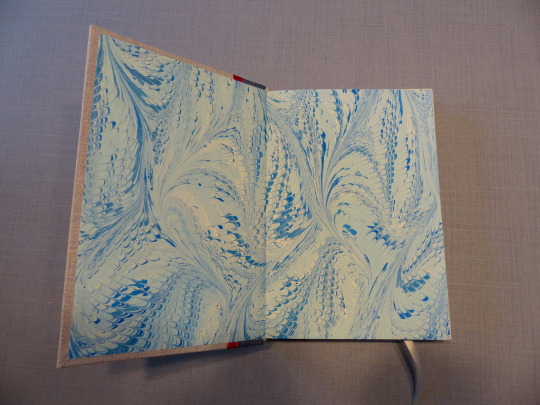
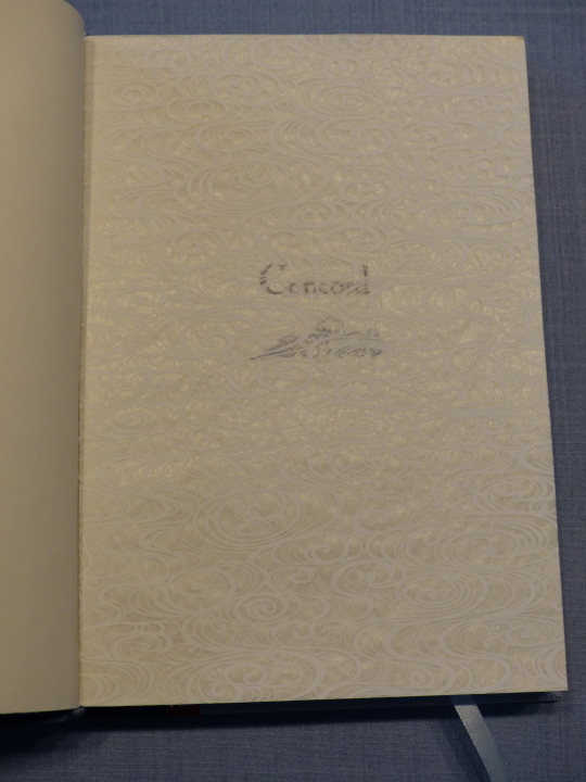
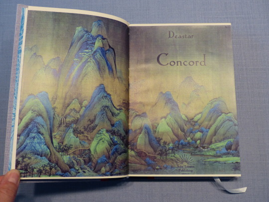
Nice marbled endpapers. For the title page spread, I used part a very famous Chinese painting, as it not only reminds me of the Gusu mountains but also, again, is very traditional. I played around with the colours to give the picture a bit of a bluer tinge.
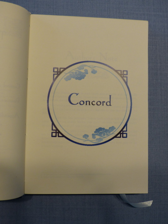
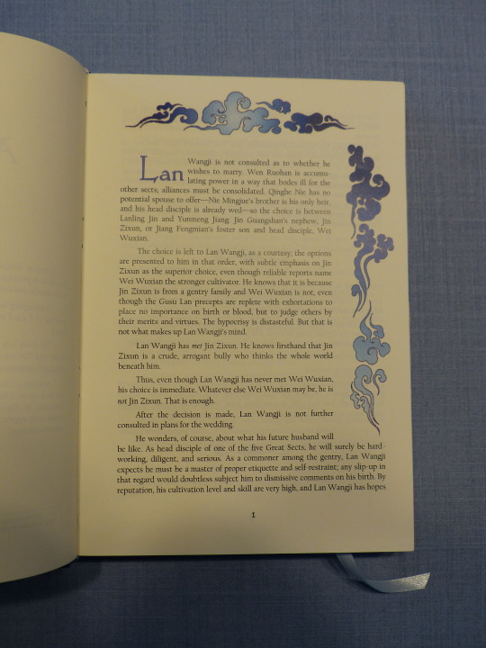
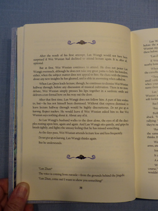
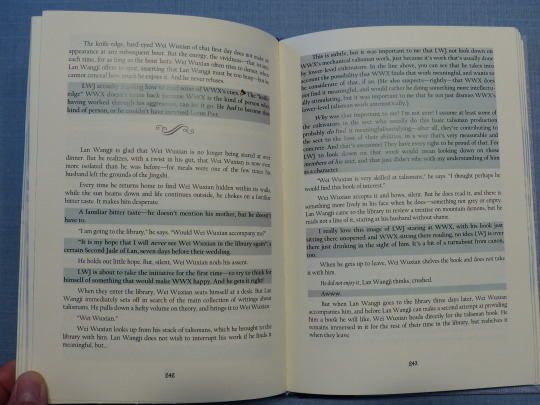

The typeset itself was very straight-forward. There's the fic without commentary, and then the second part with it. I used a grey background for the comment parts to make it stand out from the actual story.
I had lots of printer issues with this fic (my copy actually had even more issues because the printer treated every page as an image for unknown reasons and therefore it not only took forever, it's also a tiny bit blurry. Hmpf.) and the greys tended to have a bit of a blue tinge, which was not my intention. But at least it works with the overall theme, I guess! 😅
I also did an extensive Appendix with all the meta links mentioned in the commentary as well as cut scenes and a little "praise for the author" section.
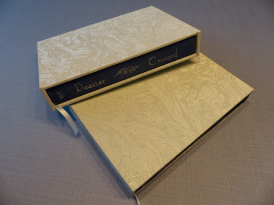
Last but not least, I decided to try making a slipcase for the first time! DAS_Bookbinding on youtube has good tutorials on that and I used one of them. It worked well on the first try. The second try, I used sturdier cardboard and should've added a few millimetres to the width, because the book didn't fit - the ribbon got stuck and I feared that it might get damaged. So I had to redo the case and then it was perfect.
I used wallpaper as cover material. 😄 The one you see on the outside? That's my living room wallpaper, a light blue with a lovely pattern and soft shimmer to it. My camera unfortunately is refusing to get the colour right.🤷♂️
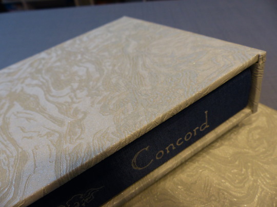
The assembling process went well, for the most part. I'd forgotten to shorten the endpapers a bit which I only realised after I'd started casing in my copy. I carefully separated the textblock from the case again and then, in a moment of complete mental blackout, tried to cut the wet paper. 🤦♀️ That didn't go well. I managed to salvage it, mostly, and of course didn't repeat the mistake with Dea's copy, but ugh. 😆
This was a super fun project and I'm very happy with it! Thank you again, Dea, for your faith in me and your super generous donation! 💙
Materials used:
Printed on Clairefontaine DCP 100g
Case and endpapers:
booklinen Colibri cornflower
booklinen Paradise aqua
marbled paper 120g
transparent Japanese paper
Hot Foil (Memory Keepers)
Slipcase:
fleece wallpaper Newroom Nisa lightblue
fleece wallpaper grey glitter
#my fanbinding#fanbinding#fth#fth crafts bazaar#fandom trumps hate#arts and crafts#the untamed#cql fanfiction#the untamed fanfiction#mdzs#mdzs fanfiction#wangxian
97 notes
·
View notes
Text
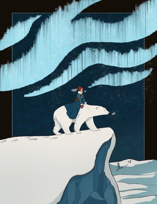
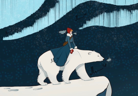
East of the Sun, West of the Moon
I have a huge weak spot for this fairytale. I had a huge old illustrated children's book of this fairytale when I was little and it really stuck with me all these years. EotSWotM is a fairytale in the realm of Eros and Psyche spin offs, Beauty and the Beast also falls into this trope but EotSWotM follows the older myth a little more closely with the Prince/Beast character sleeping beside her each night in his human form. Do you know/remember this fairytale?
I struggled a lot with the depiction of the Northern Lights in this illustration. I tried a whole bunch of greens and purples but they felt too radical for the rest of the color palette. I'll probably want to revisit this linear again someday to push the illustration to it's best version of itself. Also yes, she does usually have black hair, the background simply absorbed it too much as is.
I am the artist! Do not post without permission & credit! Thank you! Come visit me over on: instagram.com/ellenartistic or tiktok: @ellenartistic
#east of the sun west of the moon#ellenart#fairytale illustrations#digital illustration#east of the sun and west of the moon#fairytale illustration#classic fairy tales#once upon a time#lnart
533 notes
·
View notes
Text
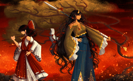
[Click image for better quality]
I FIGURED OUT A WAY TO FUCKING MAKE THE IMAGE SMALLER FOR POSTING ON TUMBLR WITHOUT SACRIFICING THE ACTUAL QUALITY OF THE IMAGE OH MY GOD
Ok so, what I did is go into the clip studio paint file, make a new file, copy and paste the group in the original file, merge everything, get rid of the extra stuff outside of the canvas, and then make the flattened image smaller and crop the canvas. Once you have that, export it and you're done. This helps maintain the actual quality of the image and also helps shrink the file size down to something actually postable (if anyone has a better way of doing this please tell me)
[Edit]: Ok I guess posting something to Tumblr just naturally compresses the image a bit more somehow because I'm looking at it now and zooming in too much makes it a bit blurry so I'm still gonna have to futz around with image quality for future pieces oof
Artist's Note:
I'm so glad I figured out a way to do this because I like working on a big canvas so I can get as much detail in as I possibly can. Only problems are how laggy it gets while drawing lol.
I had an idea for a drawing with Reimu and Zanmu because I really like thinking about their potential dynamic a lot. I also wanted an excuse to draw Zanmu again but in my normal rendering style because last time I drew her she was in my more sketchy style with generally flat colours so I wanted to draw her again. Speaking of, looking at the sketch for this is a jumpscare that I never enjoy seeing, like, man am I glad I didn't use those for my final piece.
Also about her spear. I was originally gonna make it like the ones she had in game, but it kinda threw off the whole piece. It was too big, too blue, and too flat, so I just went "fuck it" and gave her a different one instead. My headcanon justifying this is that the ones she uses in game are for danmaku battles whereas in any other fight she just uses a proper yari, or she still uses the yari and just makes it all glowy to power it up, maybe both lol. I pulled as much inspiration as I could from Sengoku era spears, and even put in some blue into the decorative part of the spear and also added a little skull to pay tribute to the original spear. Also, in my research I saw some art of izanami and izanagi making japan and saw that the yari izanagi has had a little decorative tassley thingy on it so I took some inspo from that and just made it one of Zanmu's tassles (Idk when that art was from or if the spear was still accurate to Sengoku period Japan but hey, probably the same reasons Eirin puts little bow ties on her arrows, it's just for personalization purposes).
I love rendering hair and clothes so much omg, while I like the super curly hair Zanmu, the longer, wavier hair suits her better for this drawing (I imagine it only does that like how Ghibli characters hair moves when they feel angry lol). I love making Zanmu's hair all messy and crazy, as well as giving her grey hairs, this woman has aged like a fine wine. Also, if the hem on the ends of her sleeves, top of her shirt, and her pants look like gold to you, that's because it is! It's fairly light so she's not collapsing under the weight, but it's gold! (I don't care how impractical it is, it's just cool). Not the undershirt though, it's made of a gold fabric. I had a cute idea with Reimu's hair to make it have a red shine to it. I also changed up Reimu's outfit so it isn't just a blob of red. I like it a lot when Reimu's skirt and outfit is segmented into different layers, so I wanted to incorporate that.
I tried to draw their hands differently as well, but IDK how noticeable that is. Also, I am super happy with how the side profiles for the two of them turned out, I used to struggle a lot with how to make the side profile of a character actually look like the character, so I'm really happy that they actually look like themselves.
Also added in the tree and rocks in the background as an homage to Zanmu's character art in Touhou 19, just because I was getting kinda stumped on what to do with the background lol.
In terms of a story idea with Reimu and Zanmu, idk why but the potential plotline of Zanmu wanting to ascend to godhood is so fascinating to me. Like, it is very possible that if she just convinced everyone she was a god (which would be very easy for her to do), she would become one in a heartbeat. Also, if she were to become a god, with her ability to return stuff to nothing, could she hypothetically get similar abilities to (Jojo Part 5 spoiler btw) GER? Like, idk about the death timeloop stuff, but the concept has been haunting me every night as I have been trying to find loopholes in GER's ability for a while now ( for no reason in particular). Back to the main topic, I imagine that she would probably tell Reimu that if she were to become a god she would take over the Hakurei shrine since the god there might as well be dead, and Reimu just says to her, "Over my dead body bitch." Like, I have no idea how to summarize their dynamic but like, it's the type of hero-villain dynamic where the phrase "We're not so different, you and I" would definitely be a phrase said during a fight. I think that if another IN style game were to release, Reimu and Zanmu would be in a team together. They could also have an interesting mentor and pupil kind of dynamic. Can you tell that Zanmu has been charging my mind rent these part few months? Like, instead of living in my head rent free, she kinda just uno reversed the whole situation and now she's the one charging me rent. What happens if I get evicted from my own brain? Actually, scratch that, I don't think I wanna know.
#touhou project#art#fanart#touhou fanart#touhou 19#touhou#東方project#zanmu nippaku#unfinished dream of all living ghost#reimu hakurei#東方
276 notes
·
View notes
Text
a generative AI workflow for art that can't reasonably be detected as "AI use"
before we start:
I am an artist with original art in my art tag dating back to 2017
I think intellectual property is a farce and i hate copyright
I don't think image scraping and using it as training data is stealing, the same way I don't think piracy is stealing
I have used my own laptop hardware for these image generations, not any online service
Images are not described, apologies
Step 1: Concept (txt2img)
Let's do a basic edgy fallen angel character as our example. The prompt was something like "fullbody edgy fallen angel, short hair wearing leather vest, chain accessory, broken halo, wings"

Model used: Counterfeit v3.0

Model used: Flat 2D Animerge v4.5
Step 2: Pick and choose parts, then trace


Since I've traced over a completely new image, it is impossible to detect that I've used generative AI at all. It can't be reverse-searched. For all intents and purposes, this is "original artwork by a human".
You can stop here, but I wanted to toss it back in to see what I'd get.
Step 3: img2img generation


I've added a dark background and an outline to the boots for clearer separation of character and background. This generation was done with a high CFG (guidance scale).

For reference, here's high CFG to lower CFG from left to right.
Step 4: Upscale and paintover
Obviously, these aren't flawless images. So we'll paint over some parts manually until it becomes "human art"


I only did the face for brevity's sake. I've fixed lighting, flattened out the noise, fixed her vest, and overall tried to make it more consistent. Direct paintover is a harder to execute, but it is completely possible to cover all "tells".
It's not my best work as I'm not that experienced with anime style illustration, but it will pass a general AI sniff check (using sightengine).


for comparison, here's some of my other original paintings.


Closing thoughts
You'll never really be able to actually 100% identify any art as AI generated or assisted, unless you're literally watching an artist over their shoulder. Models are only getting better at generation. Generative AI is just a Pinterest replacement in terms of art tools, really. Harassing artists and fearmongering about the use of AI is stupid and reactionary. You can still enjoy art even if it's generated.
The end

108 notes
·
View notes
Text
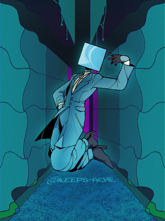
here i am!!
[separate figure and background below]
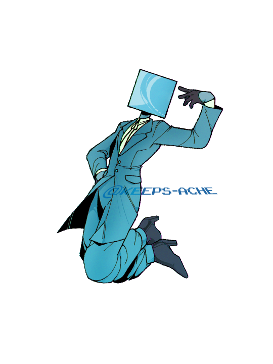
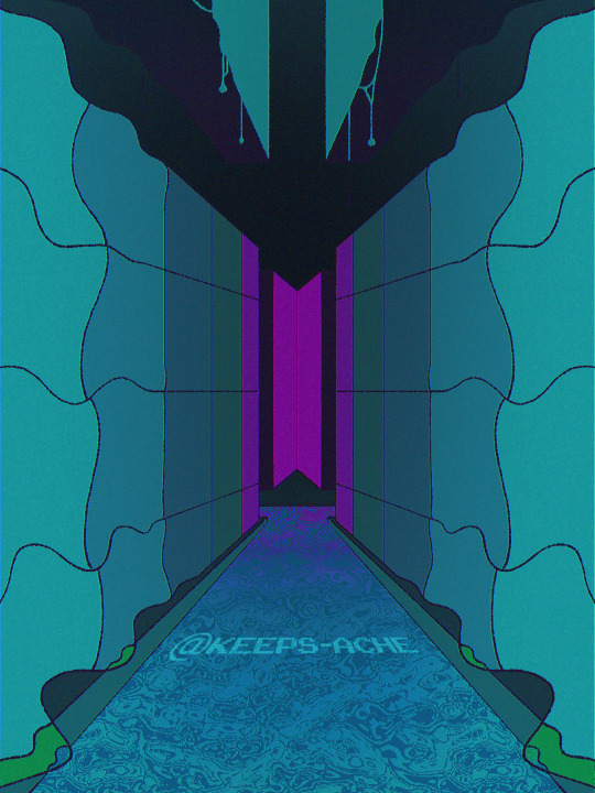
#art#my art#artists on tumblr#digital art#oc#a dollar and 75 cents#i did not do the background i meant to lmaoo--#i think it looks neat though i like it :33 :D#//lookit my lil guy. okay thank you very much hfbhs#//this was fun i need to do more with the inks in general ! !!!#also tried something with the shading - mm not sure i'm so wowed with that but it looks okey :>>#and gourhg. i may need to just handpick the colours for shading each colour because i Am going to lose it one day Loll#//yeah though uuuhm#i have no other thoughts but i'm spinning them really really fast on a lazy susan hfsh :3
18 notes
·
View notes
Note
Hi!! I’m not sure if you have already answered this, I tried to scroll through as much as I could to check lol But how clean are your sketches before you paint them? I know some people leave them as loose can be and some clean them up and even outline. So I was just wondering! :)
Hi there! Usually rather hideous so I do not share much. I use a mixed media approach to my painting, so to "sketch" I will sometimes use a mixture of 3D (I like to use Blender but I probably use it like a gorilla lol) and photobashed elements. I will build scenes kind of like a collage instead of traditional sketching first, then I will color correct them to fit together- usually I use 3D to build lighting reference. Then I run everything through a lot of filters to bring everything together better (I like to gaussian blur, then the posterize and palette knife filters in Photoshop, I've been using the oil paint filter for my vintage BG3 portraits haha) then I sketch over it more traditionally. Either I go straight into painting or I do this in black and white more recently, if I do that I add color later. The B&W process is a lot less chaotic so I've been enjoying that a lot more recently. both ways allow me to tweak character's likenesses and more importantly add in details like clothing/hair/elements like that so I'm not painting blind.
I have a lot of background in Photoshop like, for editing photography so I take a non-traditional approach to digital art. (if there even is one) It's a lot more akin to the way concept artists put together pieces, however I take them a few steps further to, hopefully, obfuscate the beginning a bit more. I love concept art but I do think a lot of it looks stiff or clearly photobashed, which I don't love the look of. A few years ago I started messing with this process as it felt like a lot of my beefy Photoshop knowledge was being wasted while I was focusing on more stylized works using Rebelle 5.
Honestly, my sketching process is the ugliest thing known to mankind and I am very self conscious about it, so I don't share a lot. It's not aesthetically pleasing, it just looks like I have no idea what I'm doing lol. I might share some about my Frankenstein process on Patreon at some point.
I believe very strongly in using the tools you have available as an artist, especially in this hellscape where AI abominations are at every corner and the pressure to create as fast as you can looms over you constantly as an artist. There are so many cool and weird ways to make art, ESPECIALLY with your computer, that there's really no excuse to use AI slop. I'd take my weirdo collage approach any day over asking some machine to poop out "art" for me.


74 notes
·
View notes
Note
AITA for "bragging" about making the deans list?
so I (19ftm) have a sorta complicated friendship with a group of friends. We're all autistic, and we all have different strengths and weaknesses. Specifically, I am very academically gifted. I graduated high school with a 3.9 gpa, consistent honor roll, APs, etc. None of my friends are even close to this. Of the other four of them, two never went to college because they couldn't do it, one is dropping out after this year, and one is a consistent c student. I don't mind this much, although I will admit it gets frustrating sometimes when I'm trying to talk about what I'm doing and they just don't get it. Recently, I found out that I made the deans list, and I was super proud of myself. I texted our gc to tell them, and one person responded saying "wow that must've been hard" in a way that felt sorta sarcastic but I ignored it. No one else responded. I assumed they hadn't seen it and while I was definitely upset, I tried not to take it personally.
Later, while we were on call, I mentioned it again. One of them, the same person who'd made the sarcastic comment earlier, responded by saying that I shouldn't brag about it so much because I knew they were all struggling academically and it was annoying to rub it in their faces that I could do things they couldn't. I got really upset, since I've had a rough year and was super proud of myself, and left the call. No one's reached out to me since.
Some important background info: everyone else has talents I physically can't do. They're all gifted artists or musicians, which I can't be because of my disability severely limiting finger and hand movement. I have never once told them to not talk about their accomplishments in those fields, even if it made me feel a bit sad. I have also gotten told off for bragging before, but I didn't get those times either. For example, they got mad when I vented about being stressed for my midterms then informed them the next day that they weren't super hard and I was sure I did great, because the friend who has since dropped out failed theirs. (If someone who understands social cues could explain how this is wrong, I would really appreciate that). They've mentioned several times that they feel stupid when I talk about the work I'm doing, as I got into a fairly prestigious university and am doing lots of rigorous work that they don't really get, but does that mean I should just not bring it up? I'm not trying to make them feel bad, I just want to talk about this part of my life and the ups and downs
118 notes
·
View notes
Text
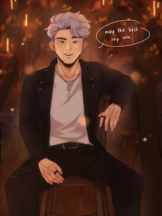
redraw of this piece!! i mentioned in that post that i would redraw it at some point and ig that time is now! (i meant to post this before id2 came out but i got really busy so y'know lol better late than never)
i like to think i've improved! still can't draw chairs though haha
side by side comparison under the cut + rambly artist commentary(?):
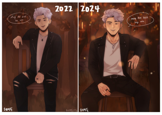
i still have a long way to go in learning proper anatomy but i think the new pose looks a lot more natural and comfortable! also ~sexier~ perhaps
i tried to make the bg look closer to the actual cg they used in the book, i am arguably better at doing backgrounds now i think! i used to not put a lot of thought into it and just blocked out random shapes and called it a day (okay, i still do that now lol but i put more care into it now !! i try to make the shapes a bit more distinct and actually plan and sketch it out rather than draw some blobs and hope for the best ldkfkhsl). also more colour range(?) to give it a bit more depth!!)
i'd also like to add that i think i'm also better at figuring out compositions now, idk how it is for y'all but when i look at the original my eyes can't help but just fall to the centre, bc there's no focal point(?) or anything that's visually interesting for the eyes to land on. plus with the way it's structured, my eyes just naturally fall to center (+ bottom half bc the skin showing through the rips are bright in contrast to the black) >_> in contrast, in the redraw your eyes are automatically drawn to the face bc it's arguably the most interesting thing on the canvas and thus acts as the visual anchor of sorts (plus there is enough contrast with the background to make cas stand out instead of blend in)
even though i cringe looking at the og i can't help but to also feel endeared bc this was one of the first immortal desires fanart i ever did and also one the first of my posts to do really well! i never expected to get that much attention since i was only posting casually but it really warmed my heart reading all the lovely comments and motivated to draw more :D
it's also really fun seeing how much my art style and techniques have evolved! i don't think i use any of the same brushes i used to use for my old pieces anymore now haha. i also watched the timelapse for the old one and am honestly kind of in awe at how my different my drawing process used to be!!
i still have a lot to learn (esp in terms of anatomy, lighting, shading etc.) but i'm happy with where i am rn! the great thing about being a hobbyist is that there isn't really any pressure for me to improve quickly so i can just take my time haha (except maybe from imposter syndrome but that's neither here nor there)
i think i could've drawn his face and expression a bit better but i think this is a satisfying enough redraw for now!
btw, these are just my thoughts! i am not an art student so the things i said might not be technically correct but this is how i make sense of things in my brain
#once again i didn't draw gabe and jade but i did that on purpose this time lol#love them but cas is the focus of this piece so i want him to shine!!#fun fact i was at my late grandma's place when i drew the original; and she had these big ass dining chairs right#i took photos of me sitting on one of those chairs for reference so the chair in the og drawing ended up being big too lmao#anw i haven't read book 2 yet so no spoilers pls !!!!!#i will read it tonight#i bought the 24hr vip pack just for this lol#playchoices#choices id#choices immortal desires#immortal desires#choices fanart#fanart#cas harlow#my art#hydn.jpg#forgive me if this is extra rambly it's midnight and the adhd is adhding
125 notes
·
View notes